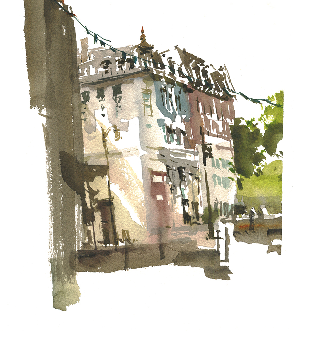
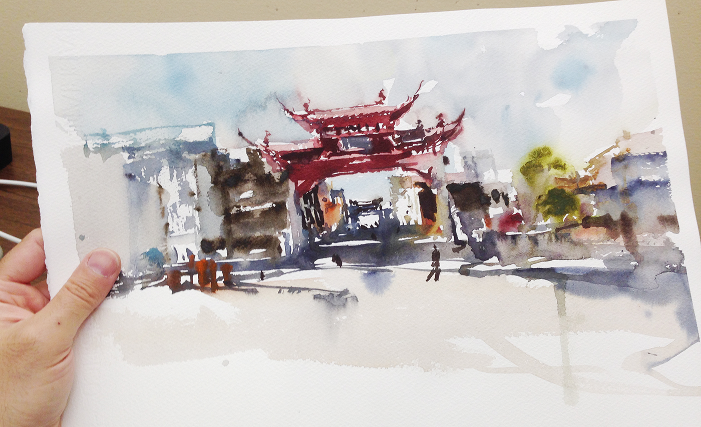
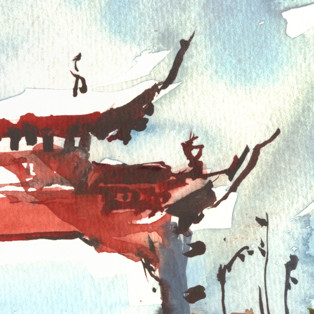
Day 20 : #30x30DirectWatercolor2018 : Broken Silhouette
![]()
I’m stretching yesterday’s mini-sketches into the second day, by giving you some step-by-step of this broken silhouette.
By the way – by my count, that’s 22/30 paintings on day 20! So we are even a little ahead of target!
How is everyone else doing?
")
")
")
")
")
")
")

![]()
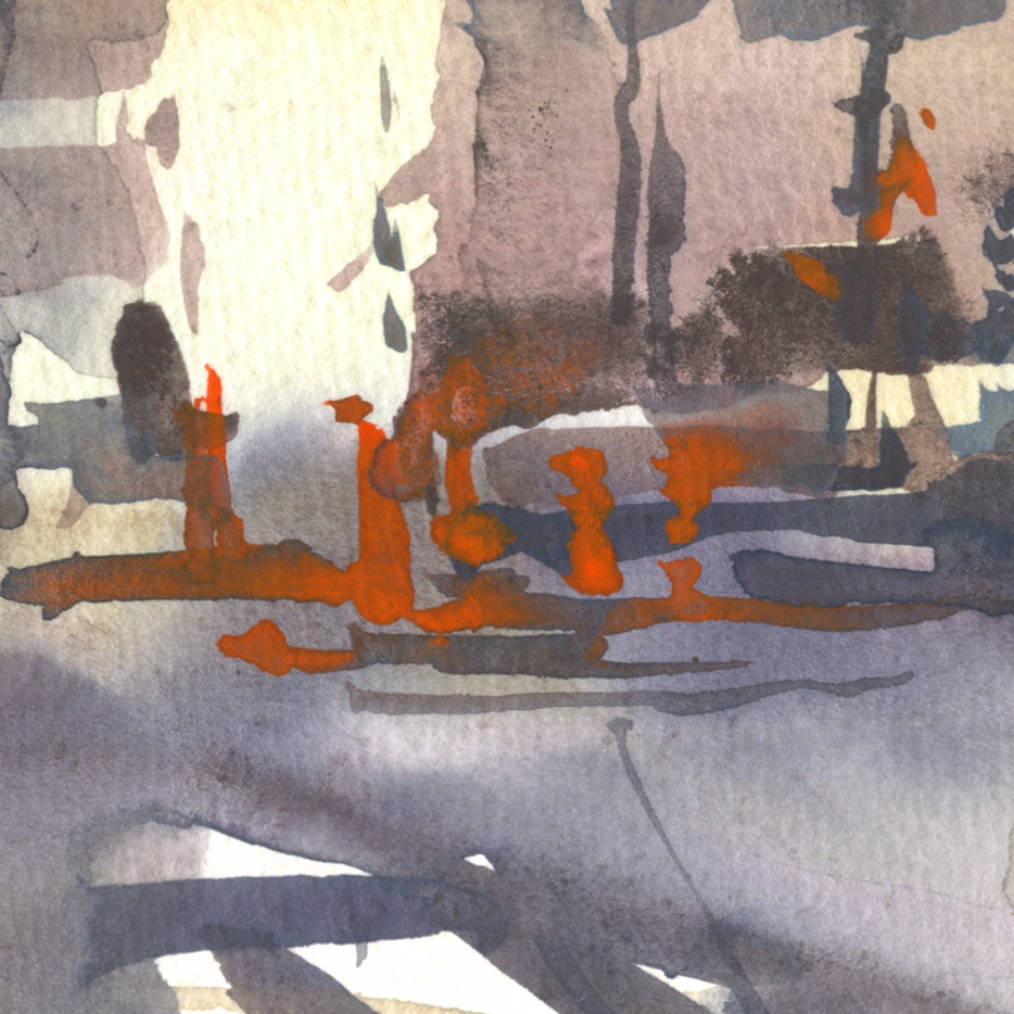
Hey! I went outside for an entire day of painting!
Just little postcards. Done on the run. Taking my time, strolling and sketching like a tourist in my own town.
Pretty amazing hey. (When you get a chance to do that).
Things are topsy-turvy around the house. (#eldercare #forgetaboutit). Any given day, something random can derail all plans.
So I made a deal to go off on my own for the entire day. Running around our old neighborhood – taking only a few drawing boards and the Art-Toolkit mini palette.
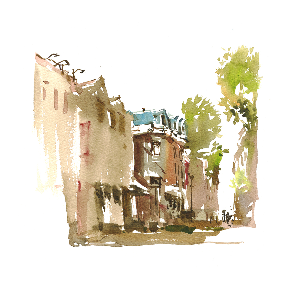
These are two-up on a 1/4 sheet. So that makes them about 7″ wide and random in height.
There’s nothing too serious going on. Just having fun, out on a beautiful summer day, making puzzle shapes. Trying to connect a block, or set of houses anyway, into a single broken-shape. (Thinking back on this, this is kind of a color-version of an old exercise of mine: Single Line Sketching).
Well, sort of a single shape, but with some tiny white gaps to allow for edges, and, then going back and re-stating darks.
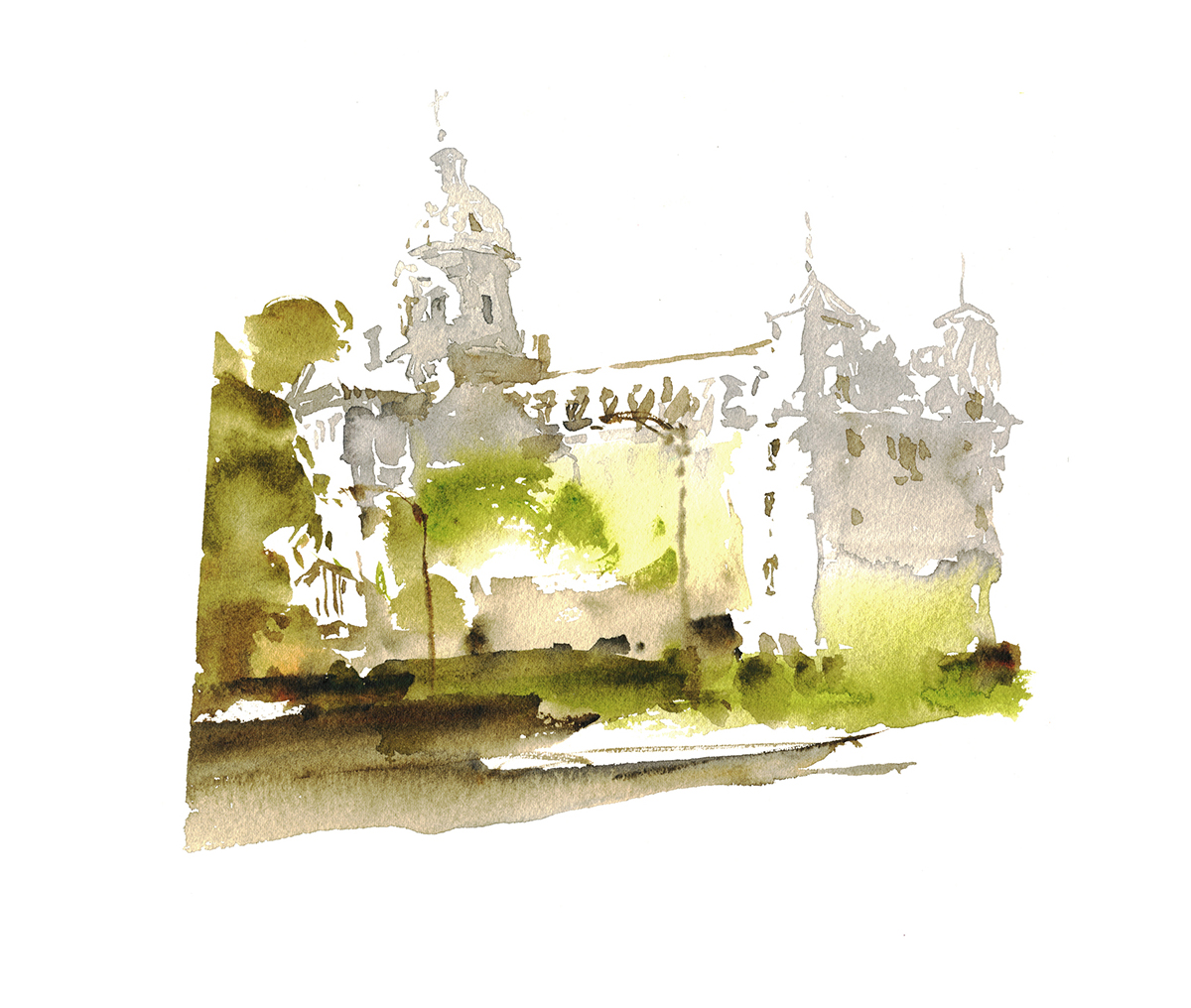
When I’m just having fun like this, the shapes get a little wiggly. No consistent perspective.
I kind of like the randomness :)


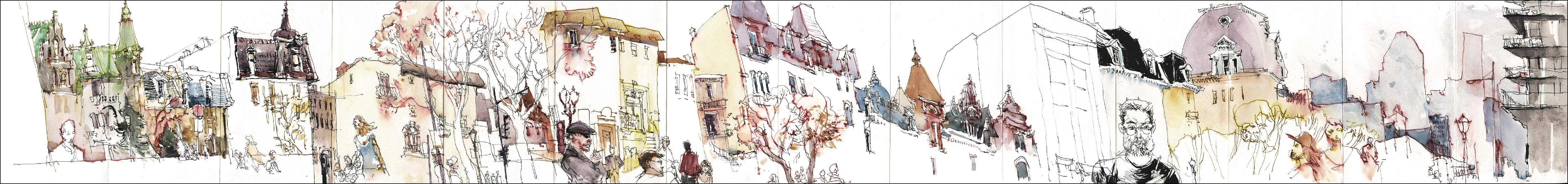
It’s fun to look at how much my drawing has changed. Here’s this same spot from my pen and ink days.

Just one slice of a concertina sketchbook, done back in 2015.
![]()
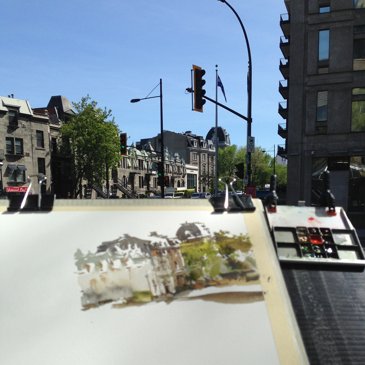
I have to say, in support of Maria’s clever invention – this is why I love the Art-Toolkit mini-palette. I’m getting old enough to want the lightest possible paint-box if I’m going to be holding up the drawing board for a full day. It’s kind of amazing how much difference this small thing makes – not having a full-sized box clamped onto the corner of your board.
It’s always the same: the less you bring, the more you draw!
~m
Day 18 : #30x30DirectWatercolor2018 : Guest Post!
No Post Today! I’m tied up with some contract work.
I do have a mid-point update from Suhita for you!
Suhita Says:
=======================================
At the halfway point of #30x30DirectWatercolor2018, and I’m looking back at the half-month with some thoughts.
If you aren’t a natural direct-watercolorist, (I’m not!) then this is a HARD challenge! To see exclusively in shape and yet keep a piece from being overworked takes a whole lot of focus. The impulse to just pick up a pen and finish the piece is strong!
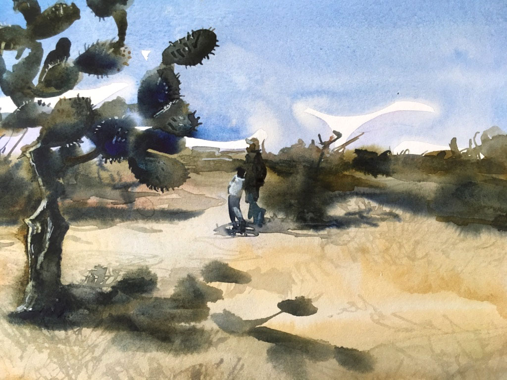
Some subjects are easier to get loose with because they’re forgiving. Like this landscape with simple perspective. Knowing I didn’t have to get the “drawing” right meant I was free to focus on capturing the feel of the blazing heat. I couldn’t resist painting in the two figures: to me, they add a story to the piece.

I was quite pleased with this next piece because it combined many challenges for me: painting a person/people without line, creating the feel of space and activity without getting too specific. And, the piece is darker, literally, than a lot of what I paint.

On other days I just took it easy and painted stuff I understood well and had painted before. Like this skull that sits on my studio table, a ready model whenever I need one. I lost painted this on the wrong side of a sheet of Arches paper.(The other side was used for a rather unsuccessful piece). Doing this totally takes the pressure off creating a ‘good piece’ and it’s amazing how much it adds to flow and looseness. if only I could convince myself to work like this more!
All my piece use white gouache. I use it like I would another color, and while I try to save my big whites, I never save smaller ones if I feel it makes me work tightly just to keep the white paper.
So what have I learned so far? (Besides that this is hard work?)
- Seeing in shape-first is slowly becoming less difficult.
- I am enjoying watching watercolor move on the paper with no line to hold it within bounds, and I’m learning a lot about pigments and transparency in the process.
- If I hang on for another few weeks and work at this, there will be more insights and progress.
————————-
Suhita Shirodkar
Blog: sketchaway.wordpress.com
Instagram: @suhitasketch
Day 17 : #30x30DirectWatercolor2018

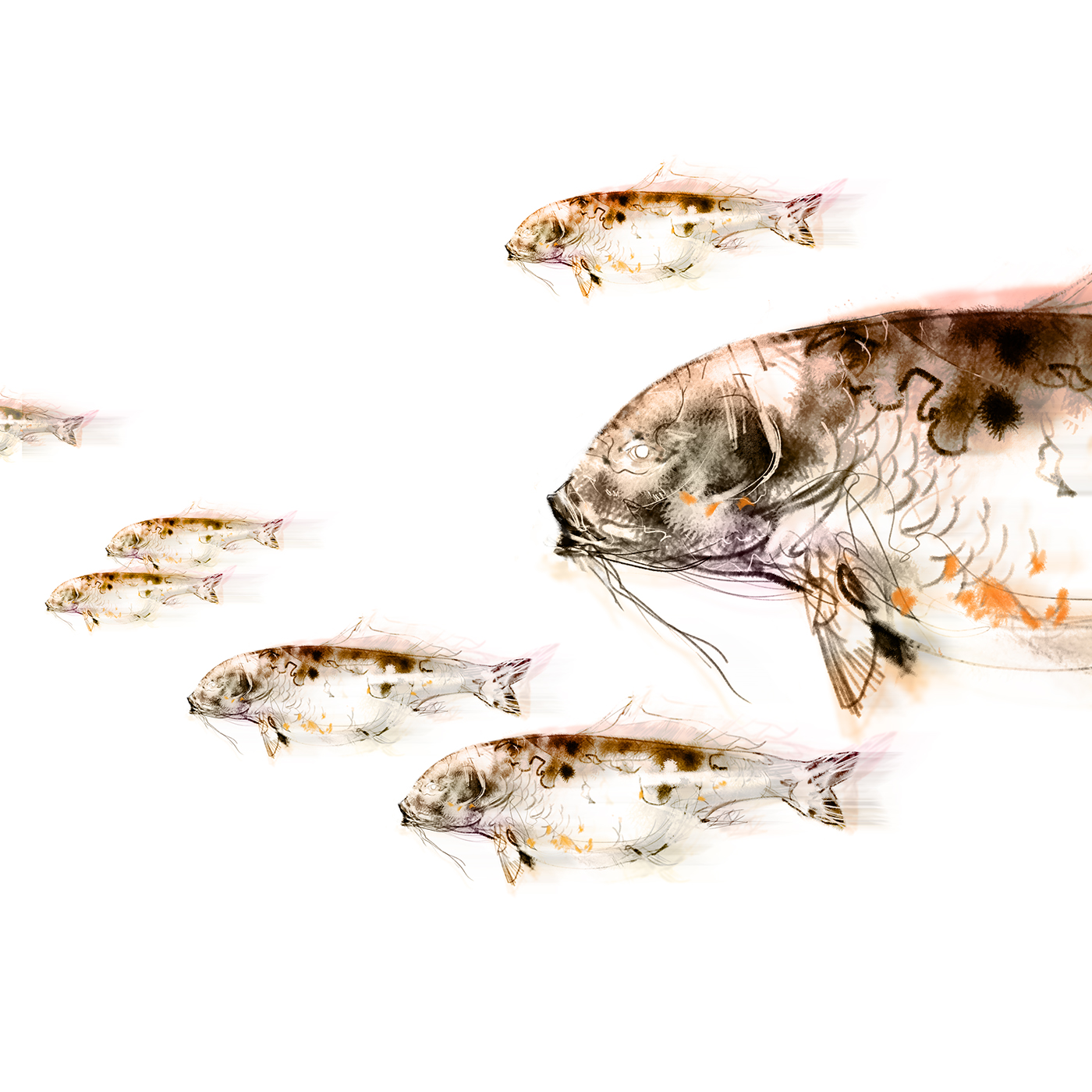
No post today – working away at the computer. So here’s a little digital sketch of a carp. (Photoshop CS)
It’s Father’s Day here in the west. My stepfather has never been particularly into fathers day, and now that he’s into his second childhood, I was thinking the eastern tradition of Children’s Day would be more appropriate. In Japan they fly flags of carp, in reference to the heroic fable of my namesake, Momotaro.
See you tomorrow!


[ The Parking Garage Series, CLEARANCE 7’2″ ]
![]()

So, I was talking somewhere in these posts, about how the Cycle of Preciousness works for me.
You’re worried about your painting turning out, but, the more you stress the more you hate it, until finally, you give up. You’re going to rip it up, quit painting forever.
That’s when suddenly things flip.
It doesn’t matter now, so you just TRY something. Something wild. Something irresponsible. Some crazy thing that’s never going to work.
That’s me and watercolor right now.
<>

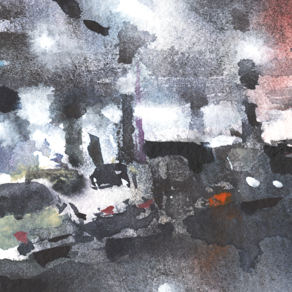
[ The Parking Garage Series, HANDICAPPED PARKING ]
This little series is asking:
How would you paint, if it didn’t matter whether they turned out?
What would you do if you didn’t care if anyone liked it?
~m

![]()
Day 15 : #30x30DirectWatercolor2018 : Breakthrough!

[ The Parking Garage Series, RAMP TO LEVEL 3 ]
We were going to the mall, because, that is what you do in our society, and I was on the lookout for compositions for 30×30.
There’s nothing more Nothing View than the inside of a parking structure. Concrete slabs, pathetic fluorescent lights, salt and oil stains.
![]()

What is going on with these Nothing Views? Maybe you can tell me?
Possibly they’re a reaction to all the pretty houses and beautiful views I’ve painted in the past. You can get bored of anything, even beauty.
Perhaps they’re about my current life situation? (Day 13’s moment of truth, if you missed it).
Mostly it’s just – I don’t have any exotic destinations on my radar, but I still gotta paint. The obsession doesn’t go away.
If the travel sketcher can’t travel, you find new ground below your feet.

![]()

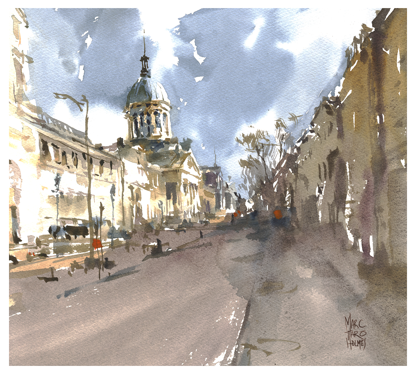
![]()
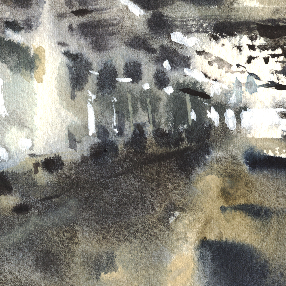
Old Port Montreal. Can you spot why this is an extra-fun sketch for me?

Here’s some process.
I start with a Dot Plot <read more about this trick here) but only worrying about the focal point, not the entire painting. I cautiously draw the tiny backlit house at the end of the street – and then blast in the big shadow side. I always say – slow on the edge (of a shape), fast in the middle. The idea with the big shape is: get it wet enough to have some natural settling in the paint, and to get through the entire shape without any pesky dry edges inside.

There’s a second big shape on the lit side, some made up clouds that look like ACK ACK in a WW2 comic, and finally the fun stuff! The calligraphic marks on top of the big shapes.
My thing right now is how abstract I can make the little calligraphy. So it reads like buildings, maybe people and cars, but it’s not overly rendered.
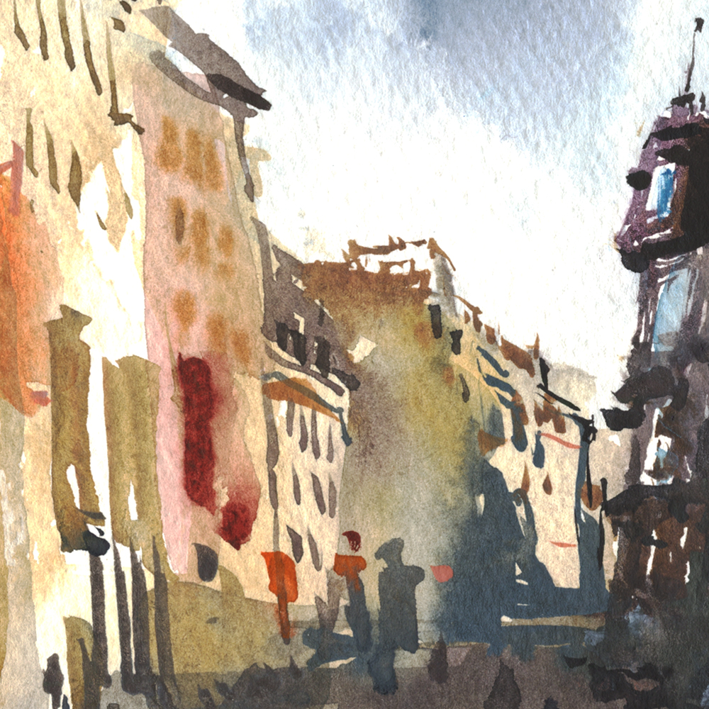
Did anyone guess the joke?
This is the same street on the cover of my first book, The Urban Sketcher – published four years ago. I’m kind of amazed at the difference. Really it’s 10 years difference I suppose, as my drawing style took years to develop, and was already changing by the time the book was in print.

![]()
Day 13 : Progress Report : #30x30DirectWatercolor2018

![]()
We are approaching halfway through #30x30DirectWatercolor2018.
I didn’t manage a painting today – but I have some stuff to talk about :)
How is it going so far?
Great!
I mean – I’m feeling good about it – now that I’ve had a few successes.
I was frustrated at first. For whatever reason, the first few days I was rushing myself and expecting too much out of each piece.
But things are clicking along. The skills are tuning-up just as planned.
Last year I attended a week-long life drawing workshop <warning, artistic nudity NSFW) which was a similar experience. This feeling of getting more capable each day. So, I knew this would be a thing, and frankly, this whole project is just a huge excuse to make that happen again.
Time for a formal confession.
Something I didn’t really spell out, and I’m not sure if anyone should even care about.
But – in actual fact, I did my 30×30 a month before you guys. I started May 1 instead of June 1. I think a few people probably already suspect this, just looking at the state of the leafless trees and grey skies in the first week’s images.
So – these posts about my daily progress – they’re coming from an alternate timeline where I’m already finished, and know the end of the story. <Please forget you know this, and just enjoy the artwork ok?)
I felt this little dodge was necessary. I had to know for sure I could both organize the event, manage my share at home, get ready for Chicago and Porto, and still get you some nice paintings.

Regular readers know we’re in a bit of a sticky situation. My stepfather went past the point of no return with early onset dementia, and we’re helping with the home-care. So, that makes things unpredictable around here.
And then there’s this:
I’ve been defining myself as a travel sketcher for almost 10 years now.
This event, #30x30DirectWatercolor2018, has been a kind of ‘gut-check’ for me.
What I’m seeing here is, calling myself a travel sketcher isn’t a good fit any longer.
Certainly, I’m not living up to the title of urban sketcher, considering the artistic rigor of the USK Manifesto.
Which, of course – I’m in complete support of the ideas behind UrbanSketchers.org. I was there when we were defining the movement, and I’ve learned more than I ever hoped, living by that credo.
But – if we just look at the first half of this marathon, despite my hopes – there’s just not much painting on location happening. By my count, only 4 out of 12 were painted from life.
Again – I’m not sure anyone should even care, or what I will do about it, but – that’s the status report right now, as we approach the halfway point.
So, anyway, I hope you guys are sticking with our little challenge. Maybe leave a comment and tell us what you’re feeling about the experiment so far.
Thanks!
~m
![]()
![]()
This one felt great to paint. The whole operation was quite smooth. All decisions happened spontaneously without a lot of debate. Sometimes I sit there thinking – omg, should I do this, I’m about to wreck the thing, what if this stroke is too much, bla bla bla. When you’re in the zone, there’s none of that. Your mind is quiet, and the image just appears without conscious thought.
That’s the beauty of being on Day 12. The continuous daily practice really feels good.
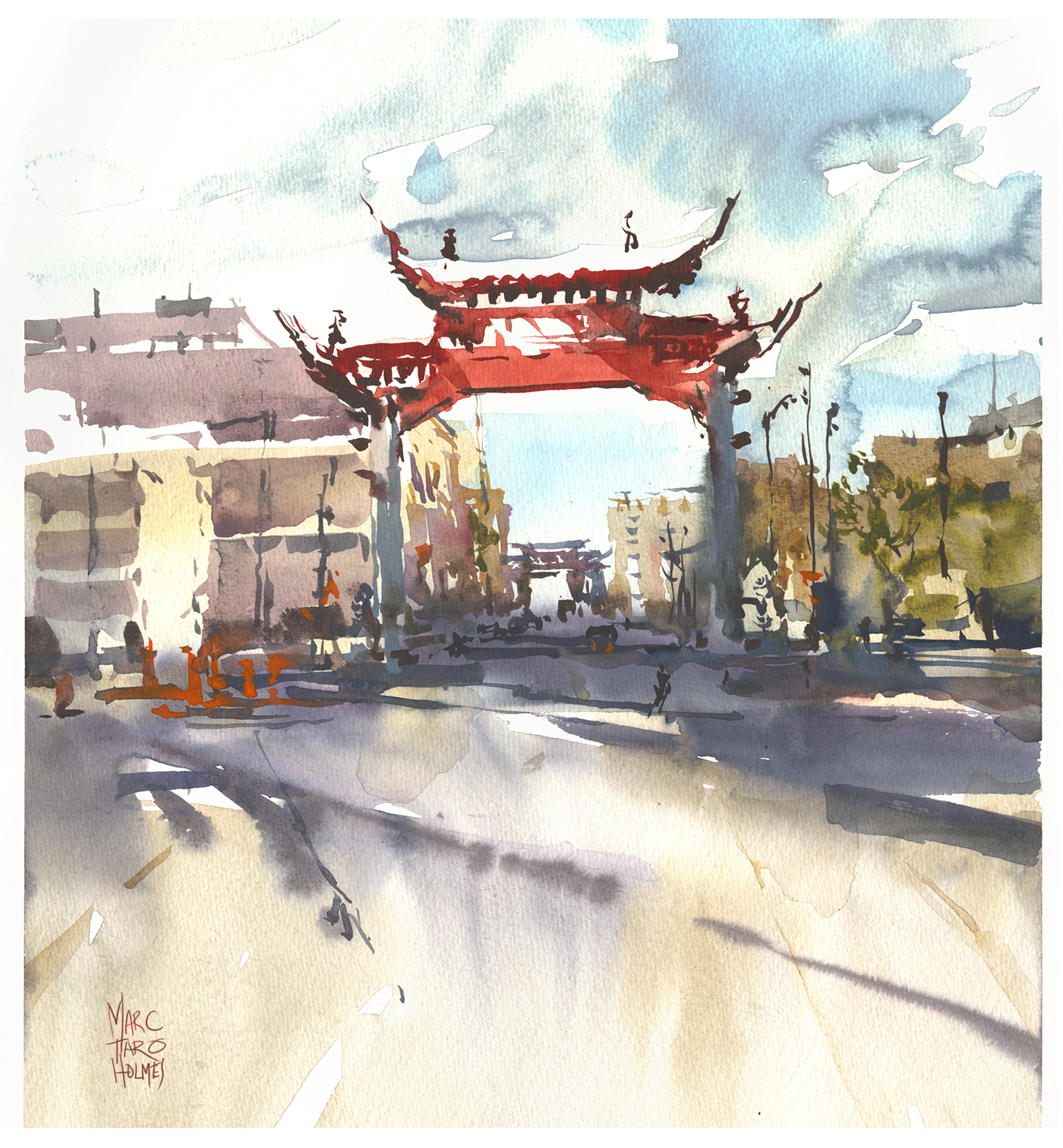
Here’s what I did to prepare.
I’ve been having so many false starts this past 12 days – I thought, why not make it official? Do a test painting. A dry run, just throwing it down to feel how it will go. Knowing in advance this one was disposable, I didn’t get annoyed as it got all blotchy and overly contrasty.
I do these tests, or false starts at the same size as the final – 1/4 sheets. Some people might say to do a small study. They’re probably smart. I’m always gambling the study will turn out and become the finish.
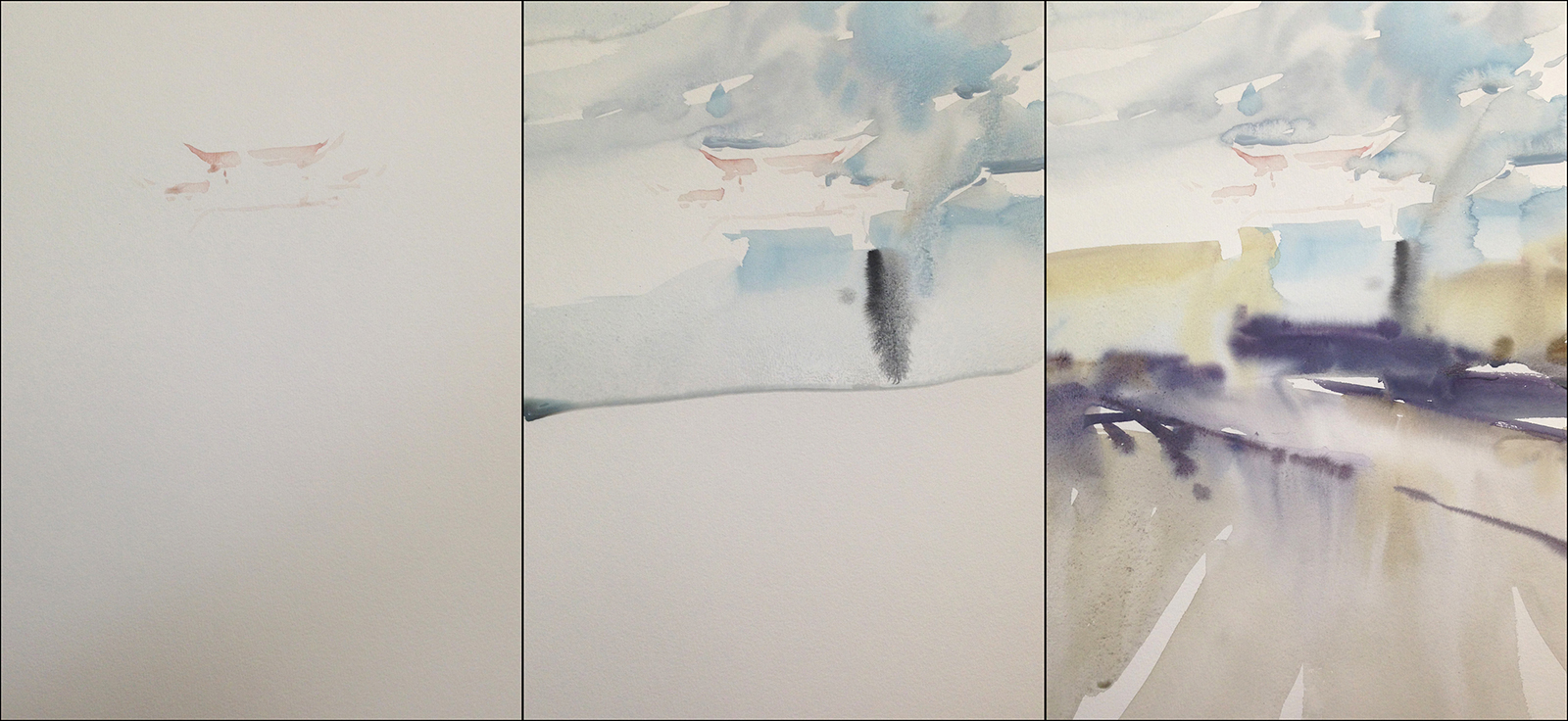
Here’s another new aspect – starting with the shadow pattern. Usually, I lay the shadow in on top of a base tone – following the concept of Larger>to>Smaller, Lighter>to>Darker.
This time, I started with a very faint statement of the gate – just a pale pink stain – so I could get the position on the page.
Then washed the sky – very wet in wet – and almost immediately the ground – and this time, I blasted in a honey consistency shadow, while the ground was damp. I think that worked out tremendously well – the shadow is more integrated into the ground than I might sometimes see in one of my sketches.
I think having done the test sketch, I could make the general shadow shape with confidence, kind of knowing already how it should go.
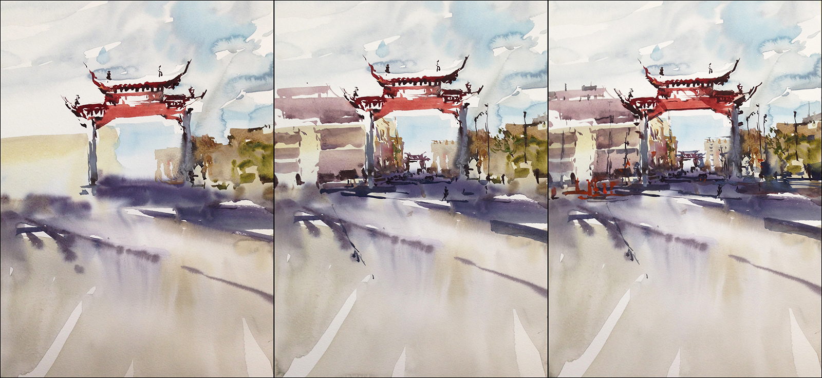
The rest of the painting is calligraphic strokes, getting progressively darker, smaller and thicker (in the mix).
I’m super happy with the clean and direct Large to Small Light to Dark execution.
The wetter than usual (for me) first pass is a nice contrast to the crisp shapes on top.
I did have to wait a long time for the first layer to dry before I could move to details. If I was in a rush I’d paint two at once, so there’s something to do while waiting for washes to dry.
When I’m on a trip I’m always a bit manic – knowing I only have one day on location. Here at home, I can just read for 10 min while things set.
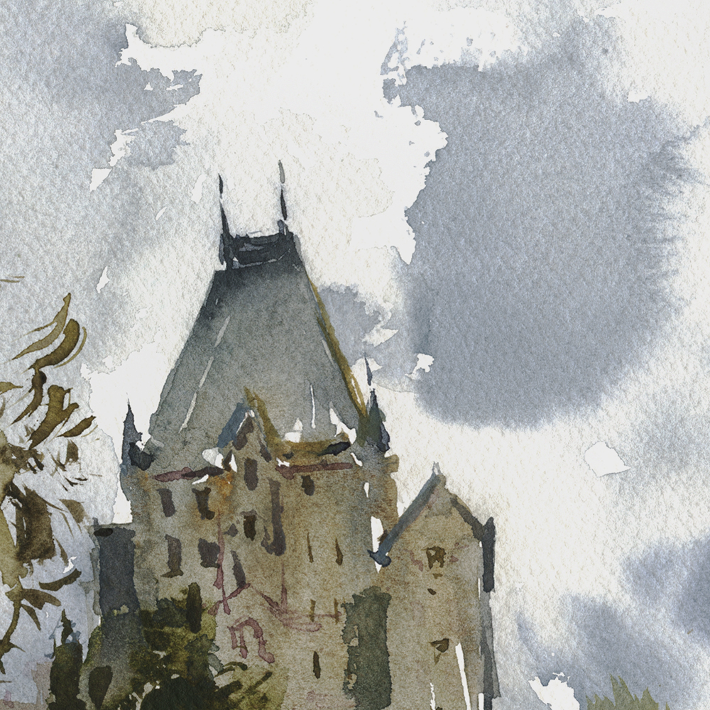
![]()

![]()
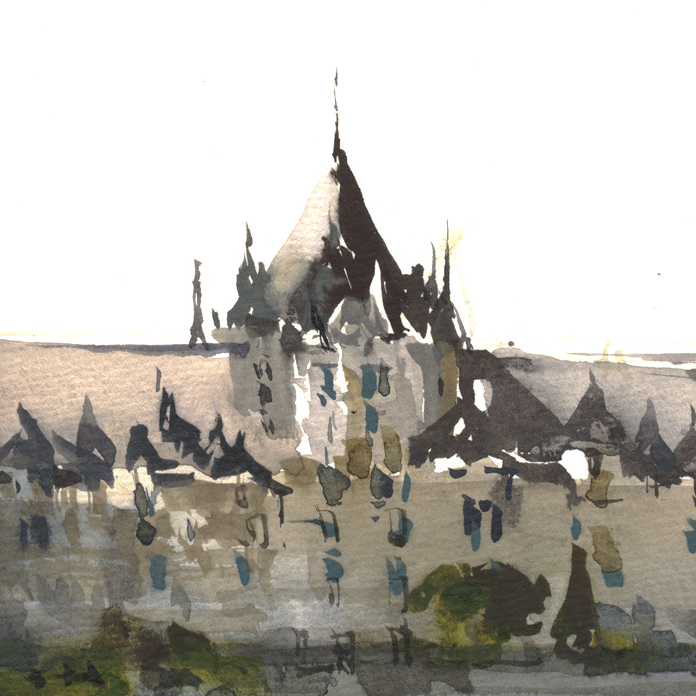
So, let’s see if I can describe what worked for me in this dome. (Bonsecour Market, in the old port area).
Normally, I would paint the dome first thing, as it is the center of interest. But – as it’s a silver, reflective object, I wanted it to integrate with the sky.
So:
A: I painted the sky first this time. My first mark was to cut around the bright, right-hand side of the dome, starting to draw the shape negatively, with dry, white paper.
B: I let the sky bleed into the shadowed left-hand side of the dome, and below, in the barrel, where the windows would later be drawn.
C: I *did not* cut around the little cupola on the top of the dome. Because I knew I would put that dark shape on top of the sky later. (Using bloodstone genuine, (an opaque-ish pigment), after waiting for the blue sky to dry). In general, you shouldn’t cut around such a tiny shape. You’ll never get a smooth sky behind it. This has to be done in one go.
So – in all cases – the shadowed left side, the bright right side, and the tiny gaps in the cupola – I made the right decisions, multiple moves in advance.
Pats self on back.
It’s the little victories that keep you motivated!
![]()

