
Just a note to say, I have a couple of my oil paintings on exhibition at the Stewart Hall Art Gallery in Pointe Claire as part of the 2016 group exhibition for their Art Rental Program.
This is an interesting service, in which the gallery offers a chance to take a ready-to-hang work of art home and enjoy it on your walls for a very reasonable monthly fee. Most works are available for under $20 a month. A great way to bring original artwork into your home while supporting a local artist.

These knife paintings were done last spring – here’s the original post about the paint out in Charlevoix. You might be interested to get a close up look at these works. They have a delicious surface, if I do say so myself.
The exhibition runs Oct 31 to Nov 29, and the vernissage is this Sunday, Nov 1 at 2 pm. Stewart Hall is at 176 Du Bord-du-Lac, Lakeshore Road Pointe-Claire, Quebec H9S 4J7.
")
")
")
As an added bonus, you can see some large-format photography by my wife Laurel Holmes. Work from our last trip to Newfoundland. This will be our first group show together! Very exciting for us :) Hope to see some of you there!
~m
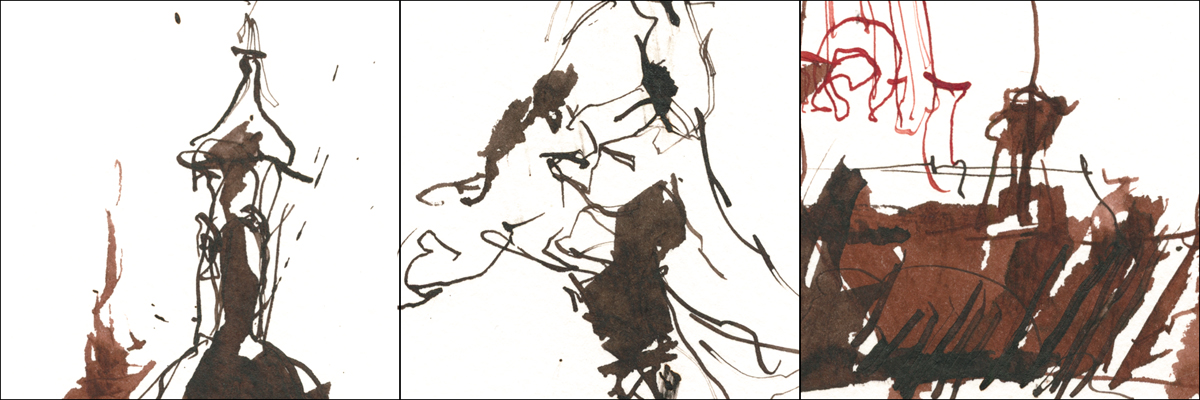
USK:MTL : Aztec Archaeology

[A small ‘mask’ – part of a broken terracotta vessel. Depicts a man as a youth, aged, and in death].
The other day USK:MTL sketchers met up at the Pointe-à-Callière Museum for an exhibit on Aztec culture.
What a fascinating show! It is closed now – we met for our drawing outing on the last day of the exhibit. We were lucky to get this great collection of work here in Montreal. A miniature version of what can be seen in Mexico City of course – but impressive nonetheless.
I’m always inspired by the imagination and unique sense of design in the ancient South American cultures. I’ve always been more attracted to Mayan art vs. the more decorative Aztec – particularly when it comes to visiting archaeological sites. But in this show, I was exposed to a wider range of sculptural forms than I’d previously seen. This exhibit presented things as a continuum of design, rather than distinct periods.
I admit to spending my whole time looking and drawing – enjoying things in a naive way – rather than actually reading any of the informative panels. (Sorry museum people! You work so hard. I’ll have to do some after-the-fact-research to learn more about what I saw).

[Brush Pen Montage of Sculptural Elements]
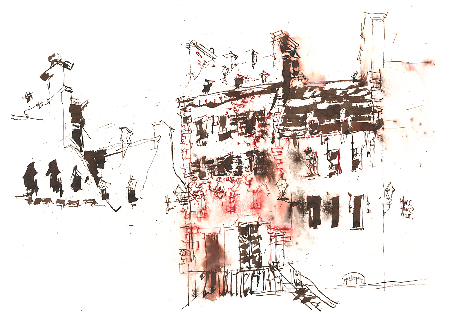
Though there were many ‘in the round’ figurative forms on display – statues and clay figurines – I’m more intrigued by the solid shapes of the architectural carving. The designs are cut into cubes or wedge shaped masses of rock, making powerfully planar forms. Everything has such a massive strength.
Like most museum shows of antiquities, the items here were dramatically lit with top-down lights casting deep shadows. I love this presentation visually – it makes for great drawings of the sculpture.
It seemed very natural to sketch entirely with a brush pen – just drawing the negative and positive shapes of light. I came in after with some accents of watercolor – as of course we can’t paint inside the exhibit hall.
But I can’t help but think – as much as I like it – isn’t this an odd practice museums do? Why do they make these things look so moody? Some of these figures are rain-deities or female figures related to fertility and domesticity. Yes, some of them have to do with death and sacrifice – but not all of them. When we see things in this theatrical lighting, everything becomes kind of like telling ghost stories around the campfire. Shining a flashlight under your chin.
When we were in Singapore recently, I noticed how the Hindu temples wreathed the statues in fresh flowers. The Buddhist temples were brightly lit with gold decoration and colorful murals on the walls. If you put one of those statues in the dark under a spotlight – suddenly it’s an angry vengeful god. Put it in a sunny courtyard draped with colorful silk and flowers – and you get a different feeling entirely.
I think it creates a false impression of these cultures. Yes, there was human sacrifice involved at times – but I can’t help thinking everyday life wasn’t as grim as people seem to think it was. I’m not saying it’s a party for the guy getting his heart cut out – but I don’t think they did that every Sunday either. I guess I don’t know for sure – readers who are anthropologists – tell us what this is all about! Write us in the comments :)

BUT – all that being said – I did do a couple of fun watercolors playing up the dramatic lighting.
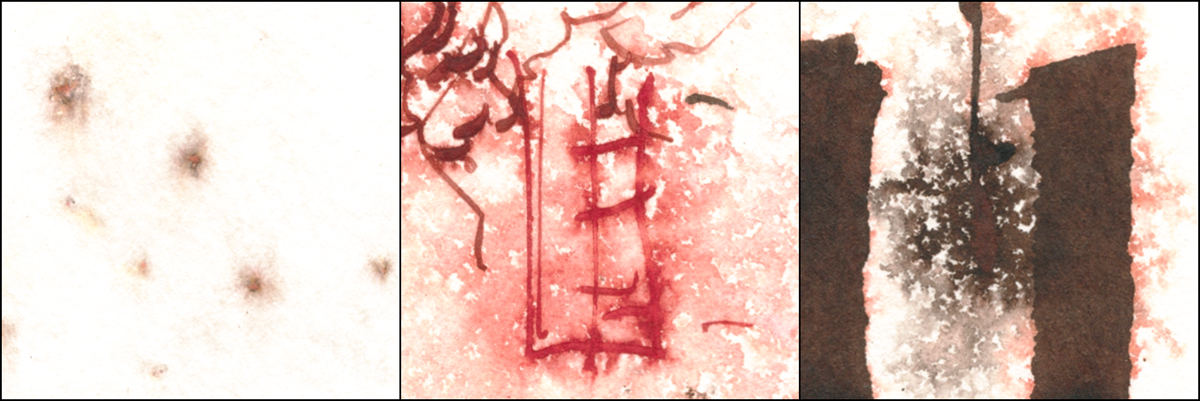
These are pencil drawings done in the exhibit on Fabriano Artistico, then painted back home. The drawings were fairly well developed, indicating all the shadow shapes.
These were sort of just playtime for me. I felt like using a tube of Payne’s Grey that I normally dislike. I had a bad experience with it and haven’t brought it out since. I’ve been meaning to just squeeze out a big blob of the stuff and use it up!
I paired that with a tube of Tiger’s Eye Genuine. A Daniel Smith Primatek color – which is in their ground-rock series. It seemed appropriate to paint carved stones with ground stone.
The background is painted with clear water and the Payne’s Grey is splattered and dropped with a fully loaded brush. The color floats on the water, and will not leave the wet area – so you get that nice sharp edge with the figure. You can get some nice floating effects if you get in while it’s wet. I actually did this twice – once with a paler tint, and the second time with full strength pigment.
I’m not sure what you’d use this effect for, other than an abstract treatment like this. But it’s fun to watch the color bloom!

Sketching Birds from Life : Video Demonstration
This summer I had the opportunity to make a series of sketching videos with ArtistsNetwork.TV – the video arm of my book publisher North Light Books. Art Net has a giant library of 4000+ videos showing artists-at-work in all media and styles. You can sign up for a monthly ‘all you can watch’ subscription – or, pick up just my videos individually on DVD or by Digital Download.
Here’s the trailer for the first episode on sketching birds from life.
We made all four videos in the Cincinnati area, each on a different field sketching topic – travel sketching, drawing panoramas, and sketching life on the street.
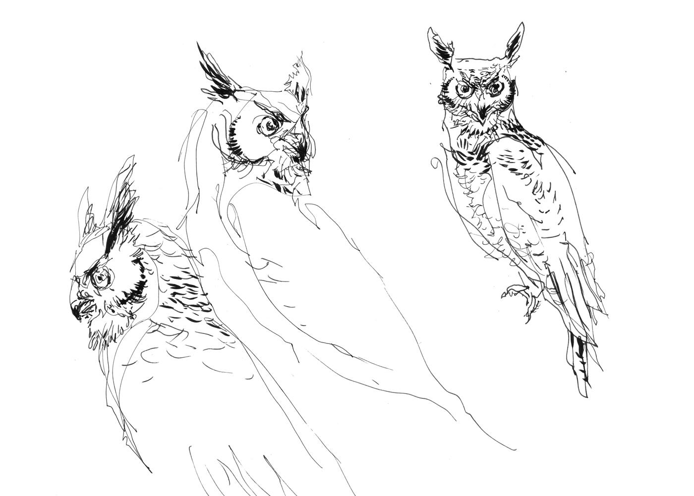
My editor at ArtNet managed to arrange a visit to Raptor Inc – a bird rescue facility near Cincinnati – where we spent the day drawing three fascinating animals: a Great Horned Owl, a Turkey Vulture, and a Falcon.


I took on each bird with a different approach, so I could demonstrate three ways I like to draw. Basic pen and ink drawing, then color washes over a water soluble drawing, and finally a sketch in watercolor – drawing directly with the brush.
I have had a previous opportunity to sketch birds from life. But it had been a while since then. It’s very different from sketching museum mounts. Birds move in their own strange ways, that are not immediately easy to draw when we’re used to drawing people.
Every time I do a workshop or a demonstration, I like to get out and do some practice work. So here’s a chance to show you the behind-the-scenes stuff I did to get warmed up. These drawings that follow are not done live in the video – they were for my own practice, and to have examples to show my thinking when I arrive on location.

The basic approach to sketching a bird is the same as any other subject. If you start with a very loose approximation of the silhouette (in pencil), it’s much easier to add details over that guideline. If you were to try and go right to the final drawing, starting with the beak and working downward, very often you’re going to develop problems with proportion. Small errors accumulate, and you end up with the head too big, or the feather patterns misplaced. By making big round shapes that describe masses – the head, the body, and the wings – I can adjust these simple pencil lines and know that they are right – (erasing if necessary) – so the permanent details that follow in ink are going to work out.
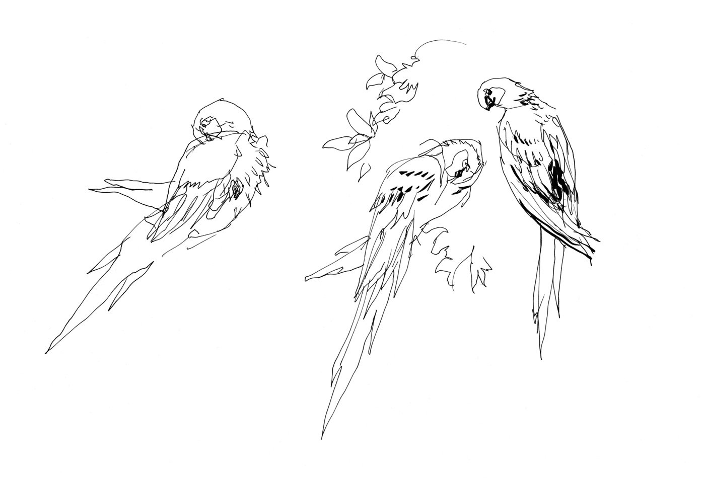
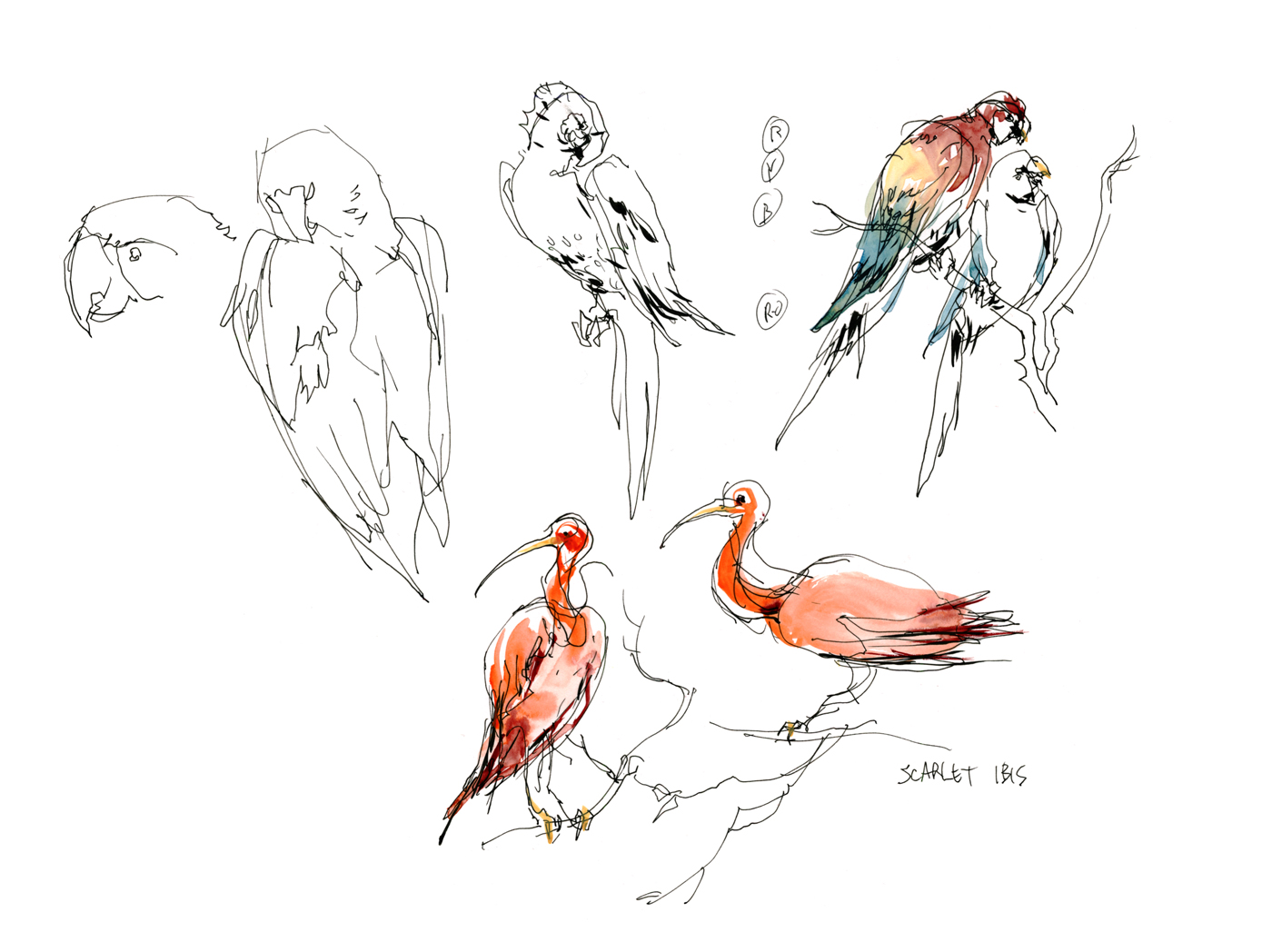
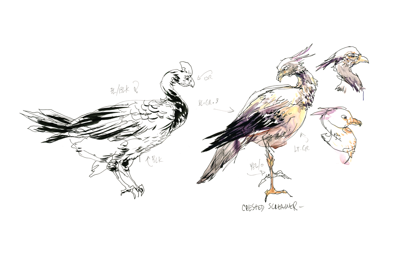
There is an indoor tropical greenhouse at the Montreal Biodome. They have parrots flying freely among the trees. This seemed like the best chance for me to observe birds in motion. They fly from perch to perch in a bit of a loop around the area. With a little patience, you can follow them around and collect sketches.
I wanted to practice with multi-tasking – working on more than one sketch at a time. When drawing animals (or people), you’ll find they tend to repeat behaviors. Taking a certain pose for a few moments then moving – but, after a while returning to the same, or similar postures.
Because I’d done some warm up drawings, I was able to relax and have fun with these poses. Going straight into ink. You’ll find the pencil stage helpful for a while – and I do it whenever I’m feeling rusty. You’ll know when you don’t need it anymore. If it starts to feel like the pencil is a chore that’s only slowing you down – then it’s time to try going straight to pen!

You might have noticed the small notes around the sketches. That’s me jotting down the colors in the feathers. It was too crowded in the greenhouse for me to paint on the spot – so I was making notes, and going out to the cafe to paint. Then back inside to sketch some more. I do this sort of thing in any place that doesn’t permit paints – like a museum or courtroom – or when I’m pressed for time.

The thing that I find the most fun about animals – they have such variety of shape and color. People, by and large, are all the same :) All our individual features and skin colors are within a fairly narrow range. Not like the amount of variation you’ll see between animals. The key to each bird is learning its silhouette with your practice drawings.

This is all the stuff that was fresh in my mind when we arrived at Raptor Inc. Maybe you’ll enjoy seeing me do it under the eye of the camera. The next best thing to coming to an Urban Sketchers conference!
It’s interesting to see the drawings come together from beginning to end. And a fun challenge for me. I had to do it right the first time and still keep up an interesting conversation. I enjoy doing these ‘performance drawings’, and hope I’ll get the chance to do more. So – thanks in advance to anyone who checks out the videos.
If you end up with any questions – these are not interactive like my Craftsy classes – so feel free to email me with questions.
~marc(dot)taro(at)gmail(dot)com
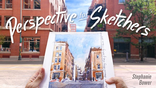
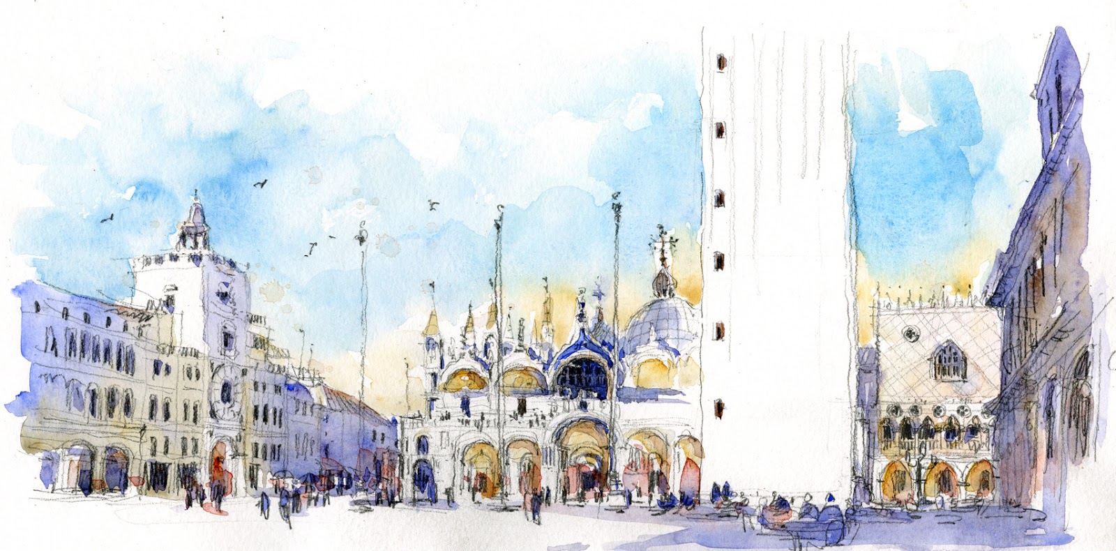
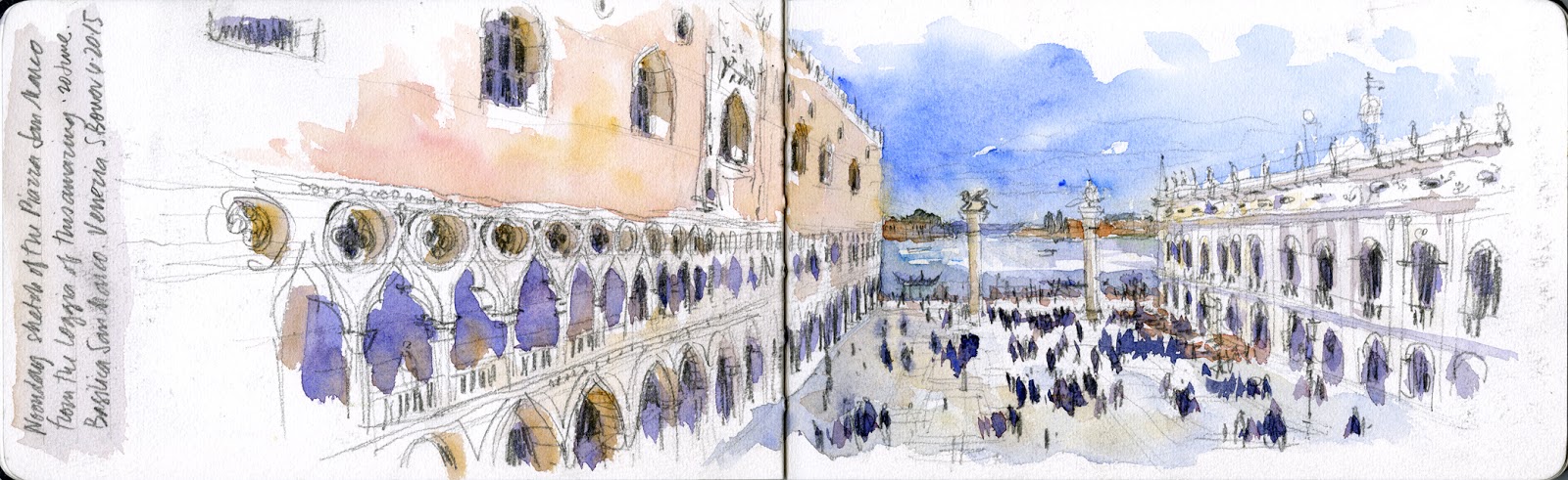
I’m excited to help spread the word: fellow USK workshop instructor and correspondent Stephanie Bower has just released an online course entitled Perspective for Sketchers in partnership with Craftsy.com.
I signed up for the course myself on day one (edit: full disclosure – as a Craftsy instructor myself, I get all the courses for free) – and have found it an excellent drawing tutorial. Perfect for anyone who wants to work on location in an urban setting, or accurately capture an inspiring interior.
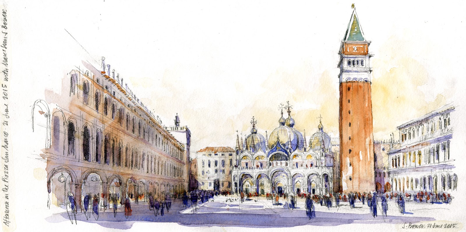
I’ve watched first hand, as we sketched side by side in Venice, amazed at how Stephanie’s impeccable technical skills and elegant artistic sensibility allow her to capture a location full of sunlight and intricate detail.
Her seven part program starts from basic principles of sight measuring – how to see angles and correctly measure relative proportions – and takes you all the way through one and two point perspective drawing.
The concepts do get progressively more complex, but each lesson builds cleverly on the one before – the instruction is clearly demonstrated with multiple examples. Students benefit from Stephanie’s years of experience teaching these skills to architects and artists, as well as her own award winning architectural illustration practice.
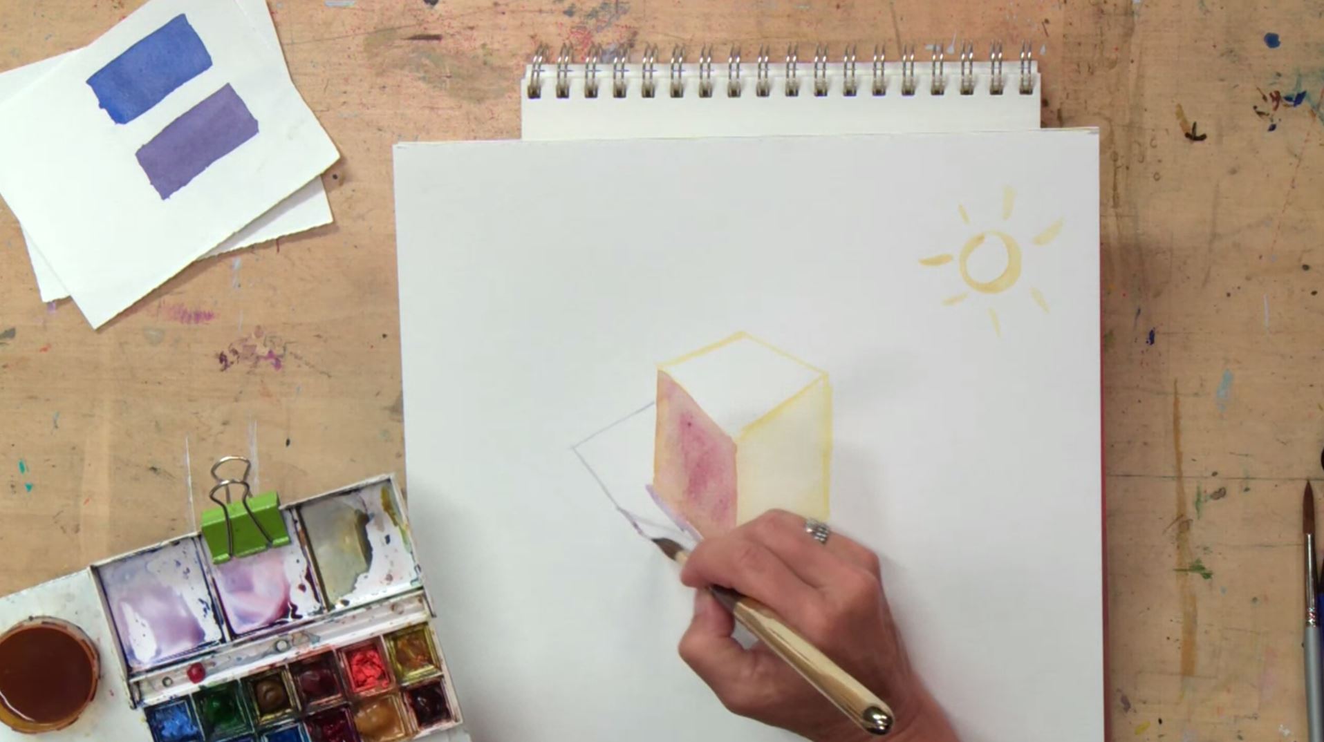
In the later lessons, after all the perspective drawing theory, there’s a section on watercolor – with a focus on seeing the light and dark sides of architectural forms. It’s a great primer on making your paintings look three dimensional.
Finally, you follow Stephanie out into the city, where she does a few more examples on location – reviewing the drawing process from first measuring to finished drawing, to completing the painted piece in watercolor.
I hope you’ll check out her excellent online workshop, and stop by her blog and facebook for frequent updates about her own sketching adventures.
Sketching People in Action at the Cortona Flag Tossing Festival : Repost with real scans!
During this summer of 2015 we were in Tuscany on a painting expedition that happened to coincide with the Cortona Flag Tossing Festival. This event is a festival of color, a patriotic display, and athletic competition rolled into one. We were there for a week of plein-air painting, but some of us took the opportunity to take in the action with a small sketchbook.
I had blogged about the event on the day using cellphone photos – but we’ve finally found some spare moments to make real scans, so we’re able to bring it to you again with real color and sharper images.
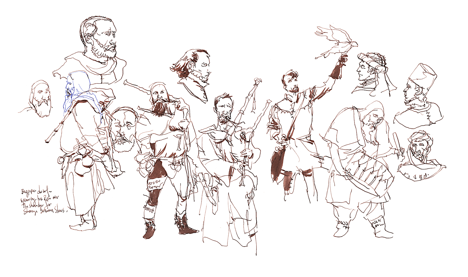
Before the Flag-Tossing Teams marched in to the sound of trumpets and drummers, there was kind of a pre-game show. A troupe of medieval minstrels played bagpipes, and a team of falconers showed off their birds. The crowd started to gather – a mix of tourists in stands and the local citizenry coming out in costume to support their teams and be part of the show.


The flag event was the culmination of a three day historic festival including a crossbow competition and a recreation of a renaissance wedding – which I think was an important alliance between Cortona and a neighboring town. The cast of the recreation are all locals, drawn from the approximately 800 residents. Amusingly, the groom was played by a tall handsome gentleman who owns one of the local art galleries, and the bride by his beautiful daughter.
Earlier in the week we’d met the Cortona crossbow team. They were out early in the morning taking practice shots at a wooden plank leaned against the doors of the towns basilica. That seemed a little odd to me, but they were having a good time and nobody was stopping them. You wouldn’t see that over here in the Americas!

The flag tossing event itself was full of enthusiasm and intense competitive spirit. Each nearby town sent a delegation, their star performers marching in through a phalanx of crossed trumpets – like gladiators into the arena.
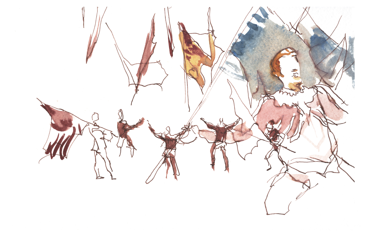
The event itself was a mix of tossers juggling flags 30 feet in the air while synchronized sprinters wove silk rivers of color around them. Every so often dueling pairs matched their talents in a kind of Kung Fu dance off. A squadron of drummers provided a dramatic martial soundtrack while flagpoles clacked like quarterstaves, whipped over ducked heads and below leaping feet.
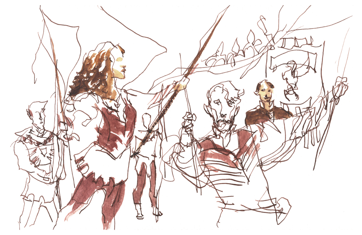
In the final spectacle all the teams ran a tight double spiral, filling the small square with upraised 12 foot flags, then peeling back out a huge iron studded gate.
This night was a terrific unexpected bonus to cap our week of sketching in Cortona!
")
")
")
")
")
")

photo: Ryan
UPDATE: Have deleted the old info in this post, due to this superseding announcement concerning new plans for a replacement instructor.

photo: Ashley Coates
Singapore Symposium in Pictures
Here’s some great memories from this year’s USK symposium in Singapore. Laurel’s posted loads more photos on her flickr, if you don’t see yourself here. I’ve heard next year will be hosted by USK Manchester. We’re looking forward to it. Will be my first visit to the UK.
Pregame Sketchcrawl in Kampong Glam
")
")
")
")
")
")
")
")
Sketching with Jane Blundel in the Chinese Garden
")
")
")
")
")
")
Sketchers Everywhere you Go!
")
")
")
")
")
")
")
")
")
")
")
")
")
")
")
")
")
")
")
")
")
")
USK Workshops
")
")
")
")
")
")
")
")
")
")
")
")
")
")
Field Testing a Steel Brush
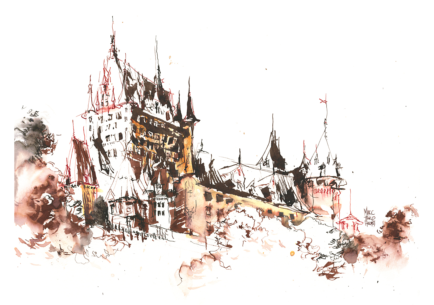
The other day we finally made it to Quebec City. We’ve been living in Montreal for about five years now, but for whatever reason, it took us this long to visit.
For our first trip, I wanted to hit the obvious highlights – the old town around the Château Frontenac. A lot of people feel they should go out of their way to find unique, undiscovered views in any town. Me, I tend to go right for the postcard view. I feel that given a limited amount of time, I want to start with the most recognizable spot, and move outward from there. I don’t know I’m that committed to this as a strategy, but it’s how I’m doing it for now.
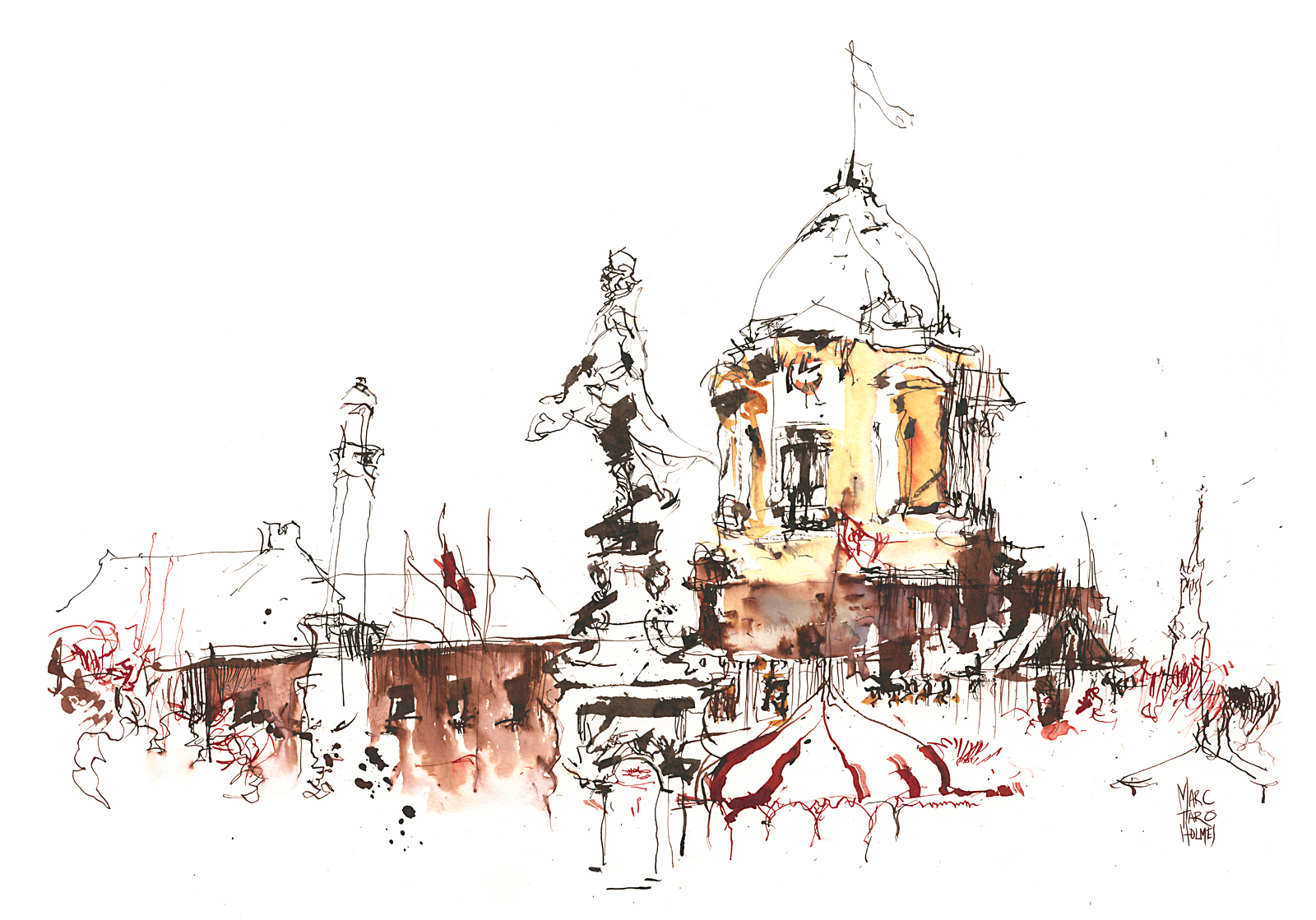
We had arranged to meet up with a friend of ours – inveterate sketcher, Larry D. Marshall who knows the city from the pages of his own sketchbooks. He walked us over to this perfect view of the cupola on the old post office. Larry’s a loyal reader of my blog, so I think he knows I’ll sketch any dome I can lay my eyes on :)
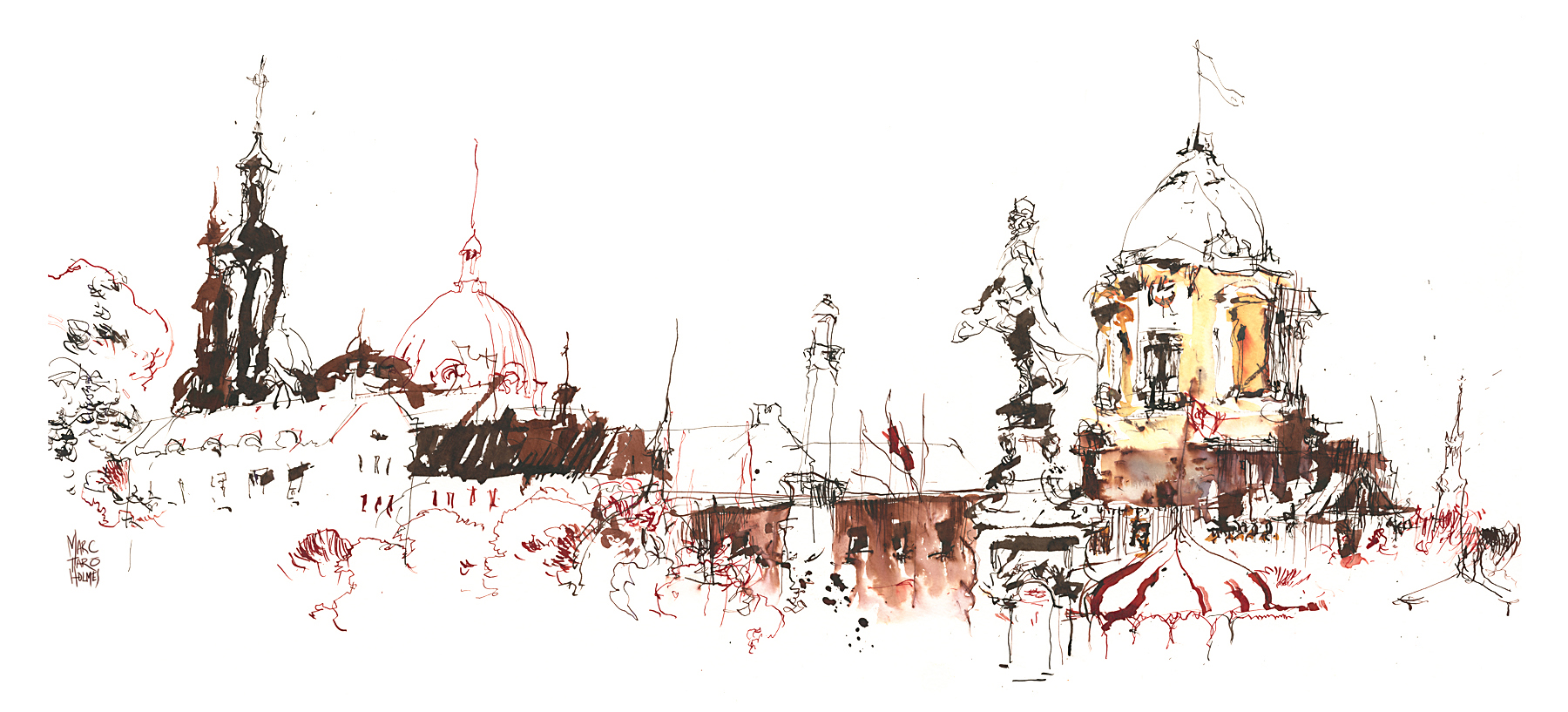
This is actually a double-page spread – here’s the sketch combined with its other half making the panorama across the square.
These drawings are in a big 15×20” pad of Canson Montval. I made sure to bring large format paper, as I wanted to play with a 3/8” size Steel Brush. Which, as you can probably tell from the sketch, is a big huge nib. I mean – this drawing looks normal in proportion – but it’s 30” across.
 The steel brush is a rectangular sandwich of thin sheets of metal, each layer with a pattern of slots. When dipped, ink clings between the sheets of flexible metal, making a juicy reservoir of color.
I’ve had a few of these nibs in the back of a drawer for 20 years. I think I inherited them from an uncle. Unless I picked them up when I worked in an art supply store back in college. In any case – I’ve had them for a long, long time, and never had the nerve to draw with them. I had a 3/4” with me as well, but amusingly, it was too wide to fit down the neck of the 5ml ink bottles I carry.
So – these are only my first few drawings with this nib – I have to say – I really like it! The nib holds a lot of ink and can make broad and juicy strokes – as if you’re working with a watercolor flat – but somehow it’s a scratchy, springy, metallic flat. And, just like a watercolor flat, you can draw with the corners and the front edge, instead of the broad width. You get these weird wedgy cuneiform shapes, as well as some jagged slender-line work.
[If you order a Speedball Steel Brush on Amazon.usa I get a small kickback – thx!]
[Note: I see these are cheaper on Dick Blick]
Occasionally the leaves of the nib will catch on the paper and fling a spray of ink drops. I like this. I’m a huge fan of tools that put you on the edge of control. It’s more fun to draw with them. I get bored if my materials are too predictable. The drawing should be an interaction between you and the media.
This last one from Place Royale – a scenic little square in the heart of the old town – has some fun effects. I wonder if anyone can guess how I got these effects?
I know we’ll be back to Quebec city sometime. There’s plenty more to draw. And I’m sure i’ll be playing with this pen some more – I’ll have to keep you updated. It might be interesting to try it with watercolor for instance. I’ll see what kind of fun and games I can get up to next time I have a day off to play with it.


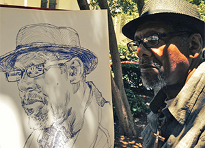
Three Pointed Questions for Reportage Artist Richard Johnson
I interviewed reportage artist Richard Johnson back in 2013, talking about his work sketching on location with various military elements in Afghanistan. He has since moved from Toronto’s National Post onto the Washington Post in Washington DC, where he continues to be a fascinating sketcher, taking on the hardest of topics.
Having spent the spring drawing an in-depth reportage of the trial of Tsarnaev Dzhokar (Boston marathon bomber), he has returned home with his sketchbook to address the issue of homelessness in DC.
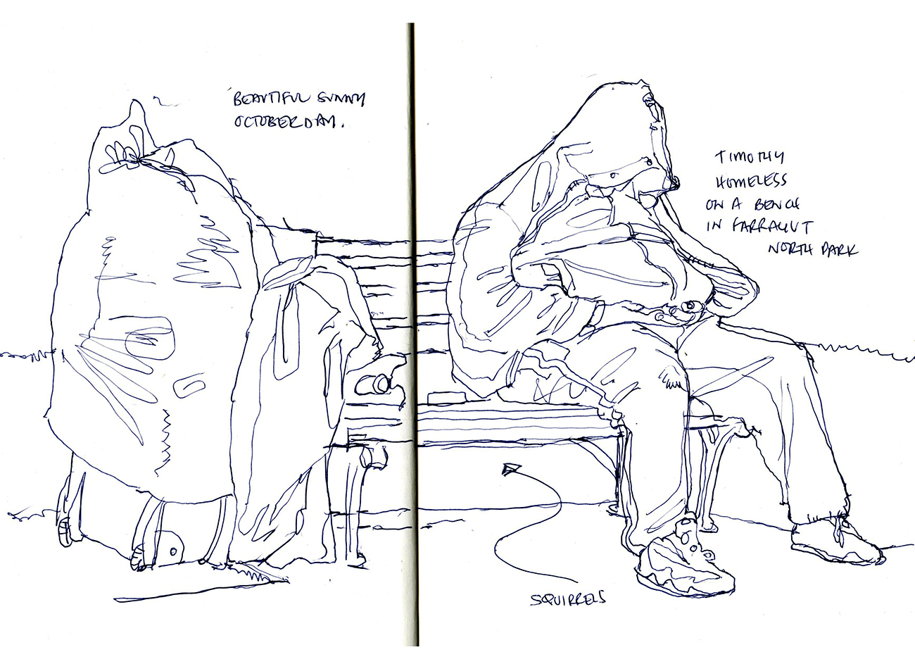
This is a social problem that’s clearly familiar to any urban dweller. But one we are conditioned to ignore. There are so many perfectly good reasons to pass by a homeless person with eyes averted. Everything from shared embarrassment to reasonable caution. We don’t know these people. We’re worried about their mental state. Few of us want to engage face to face. As an introvert myself, I hardly ever talk to any strangers – never mind people who are in quiet crisis.
As always, Johnson pushes himself past these reasonable concerns. He has a compulsion to get up close and personal. Giving us his keenly observed portraits, accompanied by the subject’s own words.
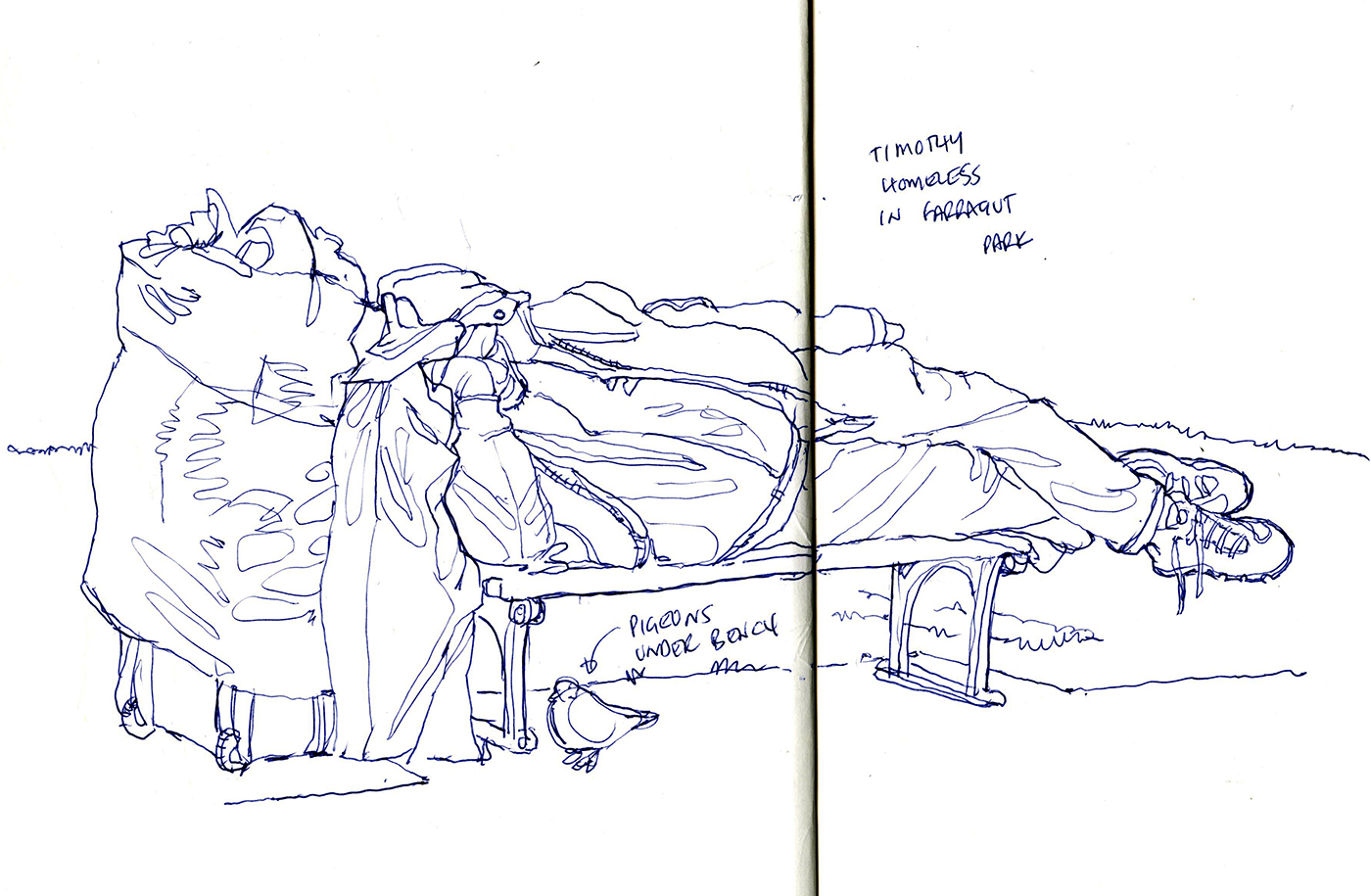
As a location sketcher myself, but not someone who has faced these kinds of raw stories, I’m fascinated with his work. It’s the kind of drawing challenge that many artists think about taking on. So I took a chance to ask him three pointed questions that might help those of us who are thinking about this kind of work. His answers were of course on point, and revealing.

MTH: Richard, thanks for sharing your reportage on the homeless in DC. I like the fact you talk about how difficult it was to engage with people. That they’re not necessarily willing to be drawn. It’s an interesting topic for a sketcher.You start the project by sketching people at a distance – would it be fair to say you were dodging the issue of getting permission at first, before eventually finding a way into the story?
R.J.: I think what we do as urban sketchers is by its very nature a kind of documentary voyeurism. We draw our own worlds because we want to show them to others, but do it long enough and eventually you end up in some gritty corner drawing graffiti scrawled on some decayed building. You are sketching it not because this is something that you would choose to show others, but because it is something that needs to be shown. That is how I got to the point where I was surreptitiously drawing the homeless.
MTH: Do you have any thoughts on the ethics of drawing without consent? Is it a dicey thing – or do you feel you’re on the moral high ground making these drawings? Do you feel it’s any different ethically for a reporter than for a hobby-sketcher?
R.J.: This is always a thorny question and one that many of us grapple with especially in this changing privacy conscious world. As a visual documentarian though, I consider it my responsibility to capture life in its purest and most natural state. That is why we urban sketchers draw what we see – not what we’d like to see, or what we have staged, or what we took a photo of. The capturing of life while immersed in the same moment as the subjects we draw raises the art we create beyond anything created from a photograph. So in my opinion, if your intentions are pure and your mind is set only on the need to draw what you see, then it makes no difference whether you are drawing buildings or people. You are capturing your world.

MTH: Have you ever faced questions about using people’s difficult situations to promote yourself? (Bear in mind, I’m on your side!) – but I’m curious about the issues around a reportage artist drawing public attention to their sketches while working with people’s true-life stories.
R.J.: As much as I love our Urban Sketchers group, I believe that there is much more we could all be doing with our skills. We have an organization that stretches all around the planet and an artistic device that affects people deeply. I think that we should all be looking for opportunities to tell the hard stories. I think we are beginning to see this happen. Some of the artwork, of devastation inside Syria, and of refugees across Europe in the last year has been particularly telling in changing public attitudes.
But more to your question, personally, journalistically I never want to be even vaguely perceived as taking from someone in pain in order to promote myself. I am the lens only. There are of course situations where I would not be able to draw without requesting permission first. My work with wounded warriors over the last decade depended on a high degree of trust and acceptance. And sometimes written permission was even necessary in order that there is a clear understanding. But regardless of the paperwork or trust gaining, my own motivation remains the same. I want to tell stories and change minds using pictures and words.
This is a power that we all have IF we choose to use it.
–
To read Richard’s full story, and see the rest of the drawings, please head over to his Washington Post article Drawing the Invisible. You can also follow his blog at NewsIllustrator.com, or follow Richard on twitter.

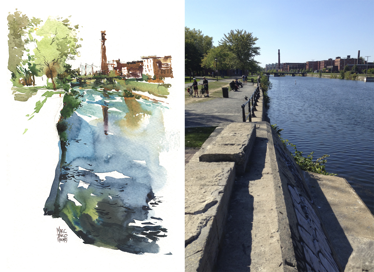
USK:MTL : Sketching Atwater Market
We had perfect lazy Sunday weather for today’s USK:MTL monthly sketching meetup. I was doing more talking than drawing today so we have a little bit of everything going on in the sketchbook. Thanks to everyone who showed up. It was fun meeting a lot of new people today.

A view of the canal – in an unusual (for me) vertical composition, thanks to a suggestion from my friend Shari. We were sitting side by side. She sketched the view 90 degrees to mine.
Here’s what we were really looking at. I was kind of happy with my redesign of what was there. Less is almost always more in a quick sketch.

A quick sketcher portrait. I don’t know this person, so if you’re the lady in the red coat who left early, this is you concentrating on your sketch :)

And, after lunch the Phil So Good quartet set up (only three of them for whatever reason?) and we all hung out and sketched them while they played for us.

