Good Question of the Week: How do I avoid ‘cartoony’ sketches?

Post Preamble: This is another in my very irregular series: Good Question of the Week. (which is not weekly by any means).
I have discovered there is a limit to the length of an answer on the Craftsy.com website.
Students ask questions in an email-like sidebar and I get notified when there’s something to discuss. Today, I found out the hard way there must be a character limit to the entry field. Because this (long winded) answer simply wouldn’t go through until I broke it into three replies.
Anway, enough inside baseball.
Here’s the question for anyone that might be interested:
Student Question: For sketching I think that line adds a freshness to the drawing but mine always turn out far too cartoony…which I don’t like. I Love the direct approach but I tend to leave that more for “real” paintings. How do I lose the cartoony effect? (ed. note: by ‘direct approach’ I think they are referring to direct-to-brushwork with watercolor).
Overly long answer: Absolutely good question [Name Redacted]! Ready for a super long answer? (Sorry, but apparently I was waiting for this question :)
So – the reason this course (referring to my Travel Sketching course) has so much emphasis on drawing-at-speed and embracing-your-errors via single line sketching in ink – is exactly to do with this problem of ‘cartoony’ sketchbook drawings.
It’s a method to push yourself out of stiff or awkward drawings, by not giving your mind enough time to over-think.
I find I have to be in a zone of seeing and drawing reflexively to avoid a ‘cartoony’ result – that I feel comes from overworking, and timidity.
(ed. note: Of course – I believe that there is nothing lesser about cartooning as an art. I love every language of drawing, and great cartooning is a very demanding mode – so I don’t mean anything snobbish about my current desire to be more painterly. I do admire cartoonists and one day might become one – if I live long enough).
Let me dive in to the reasons!
The things that I feel make a drawing ‘cartoony’ are A: rigidity and simplification, B: monoweight and closed lines, C: flat color, lack of depth.
A: Rigidity and simplification:
Cartoons tend to simplify complex shapes into something more geometric.
If you are not sensitive to tapering perspective, or a slight slope of the earth, or the lean of an old structure, or the divot of a broken brick, you might end up putting inflexible straight lines where a more organic shape might bring life.
Speed and reflexive recording of what you see allow you to exaggerate and record in a fresh way which you won’t achieve by taking pains to make a ‘good drawing’.
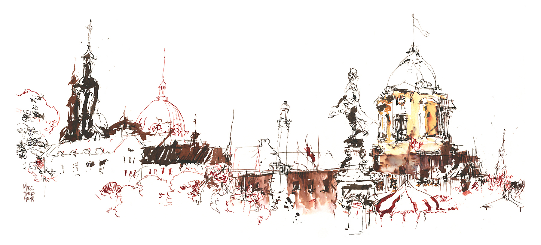
Here’s a drawing that I think you’ll agree is the opposite of rigid :)
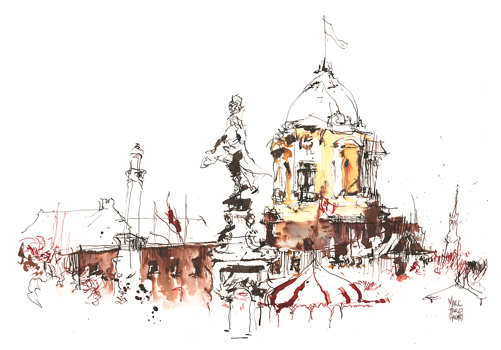
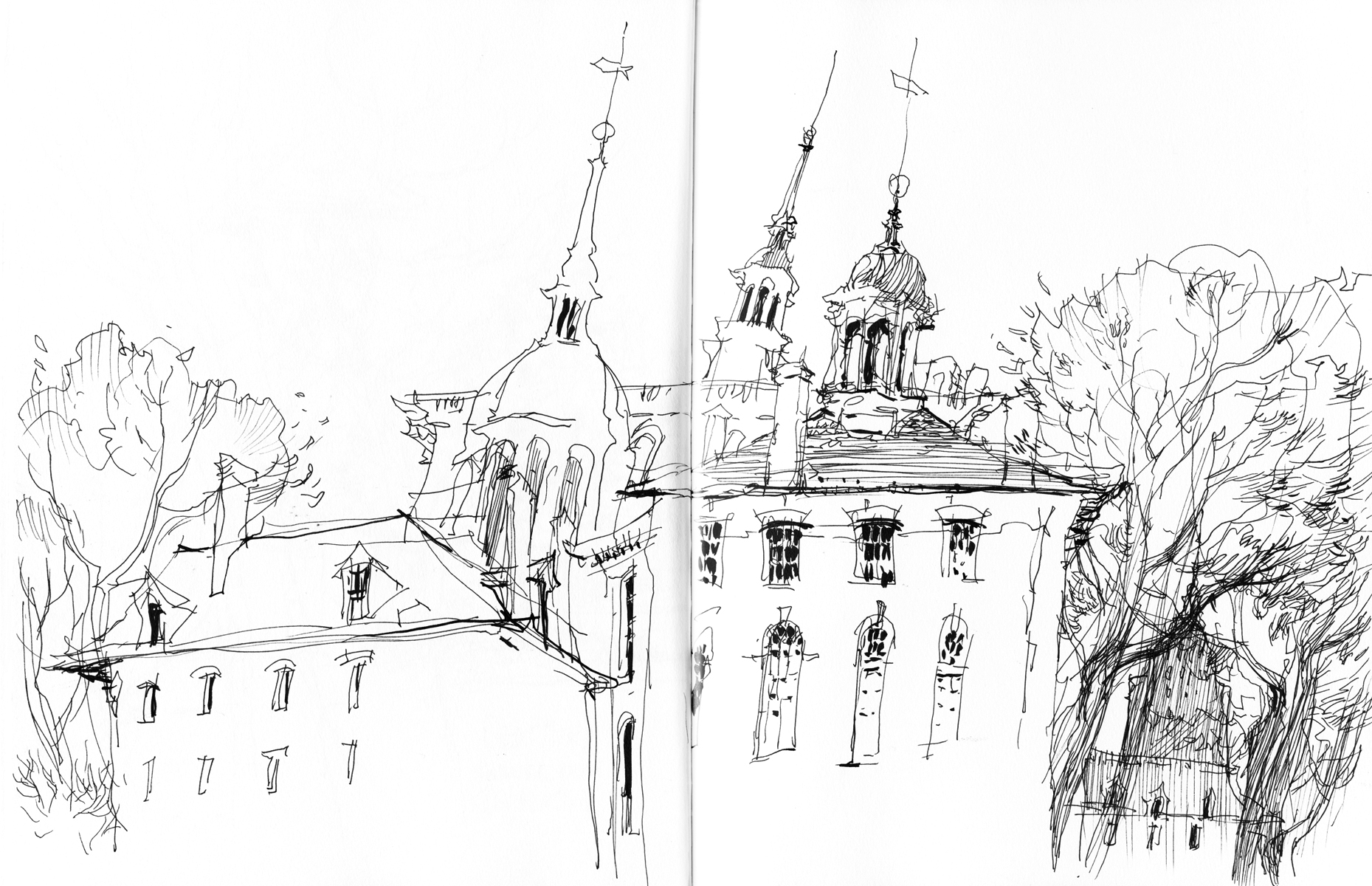
This one too, to some extent:
These were accomplished by drawing while having a lively conversation with a friend at the same time! Also by being very cold and working standing up, and wanting to get moving soon :)
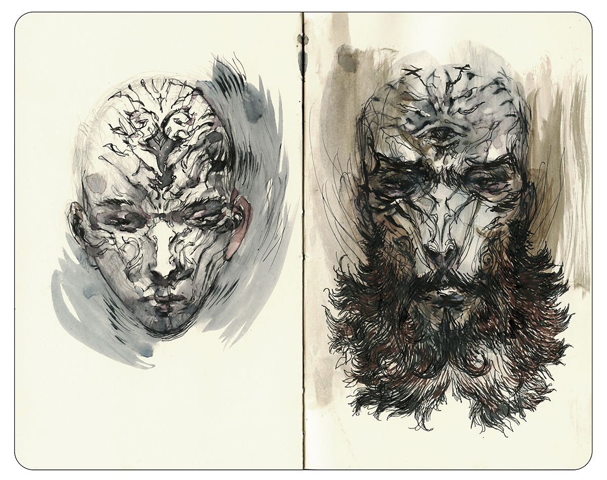
B: Monoweight and closed lines:
There is nothing more flattening than a graphic outline; a solid closed line that goes all the way around a form. This is a classic cartoon effect, meant to make a shape visually separate from a background.
One easy thing you can do is soften the ink line – I’ll point back to yesterday’s post on diluting ink, or of course there’s water soluble ink. Blending the line with water makes it much less prominent.
But if we’re talking about black ink line, that’s different.
In drawing, unlike painting, we have less natural opportunity for lost edges (places where object and ground can blend together).
What we have to do is force lost edges to happen by breaking lines. Let them taper off into open shapes. Vanish into the highlights. This looks to the eye like a painter’s lost edge.
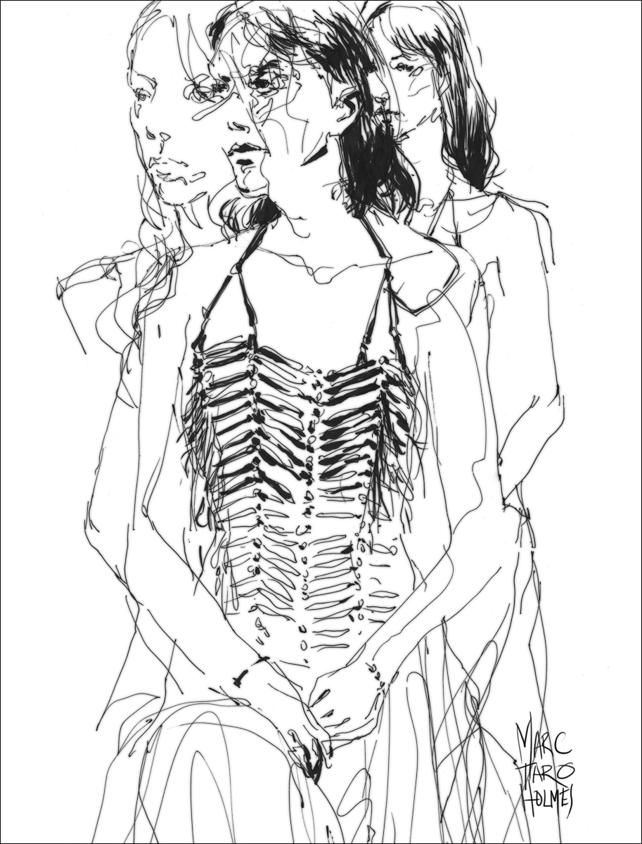
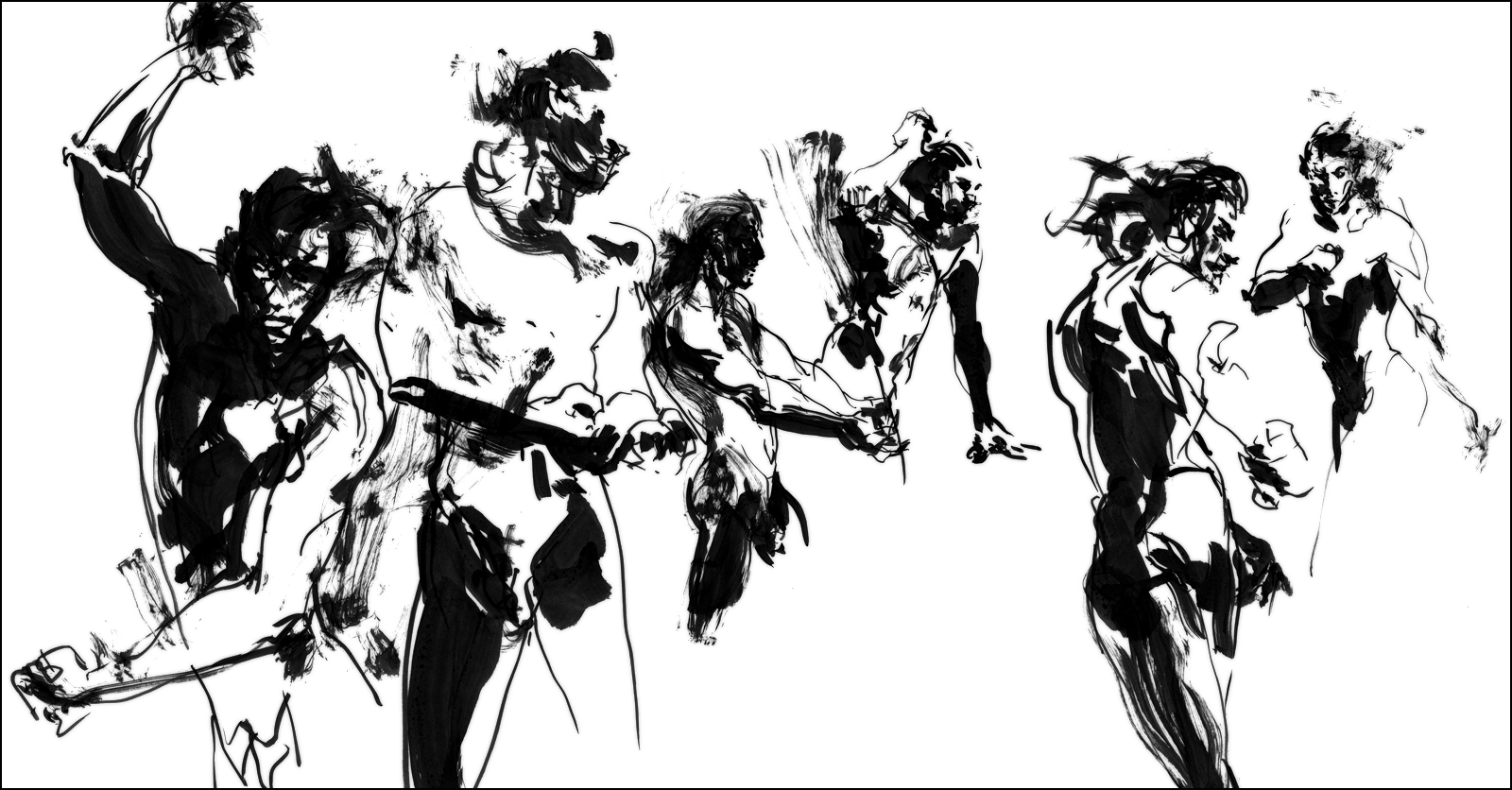
Just look at the faces in this life drawing:
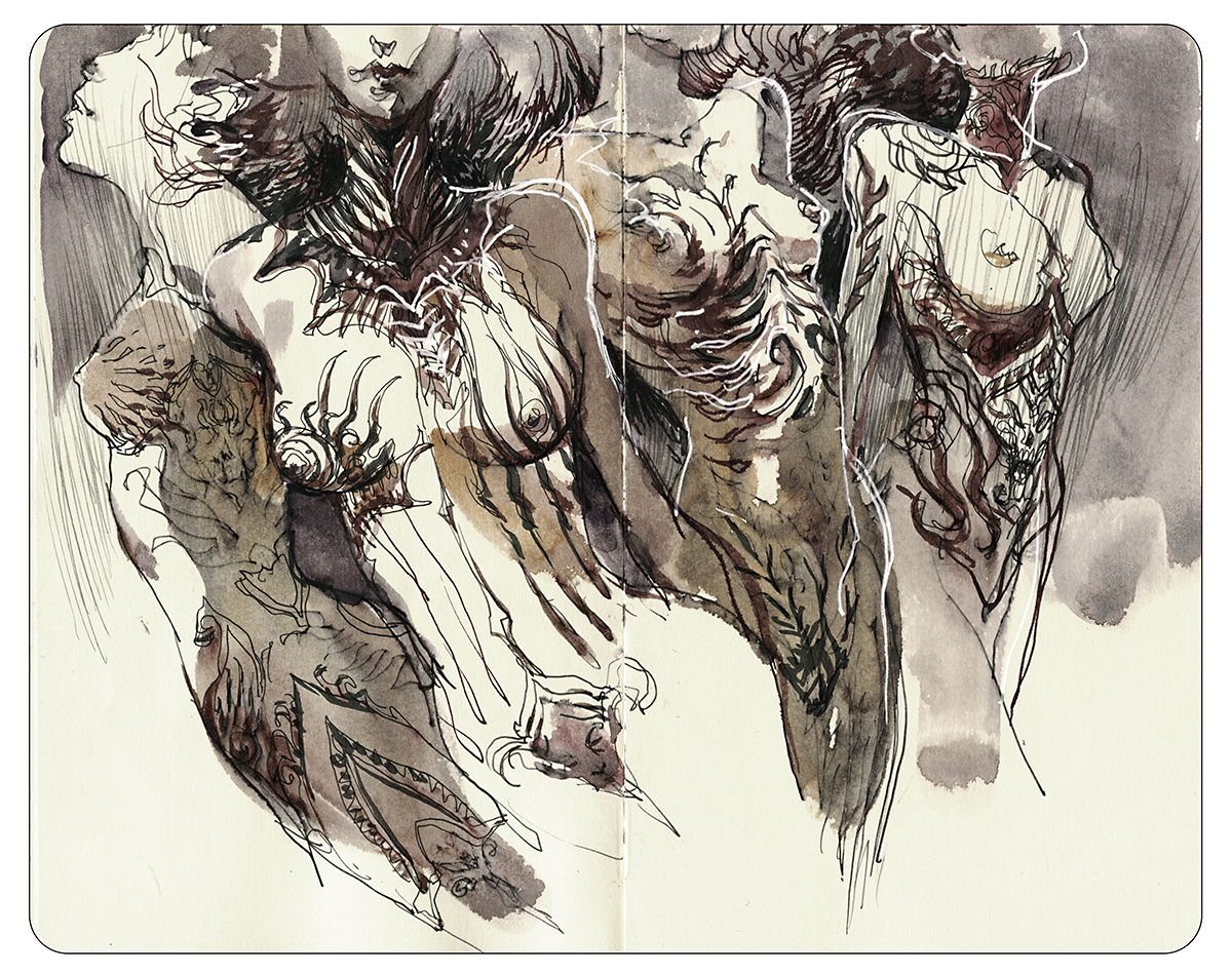
Here’s a sketchbook example of breaking line (and tone) to let in light:

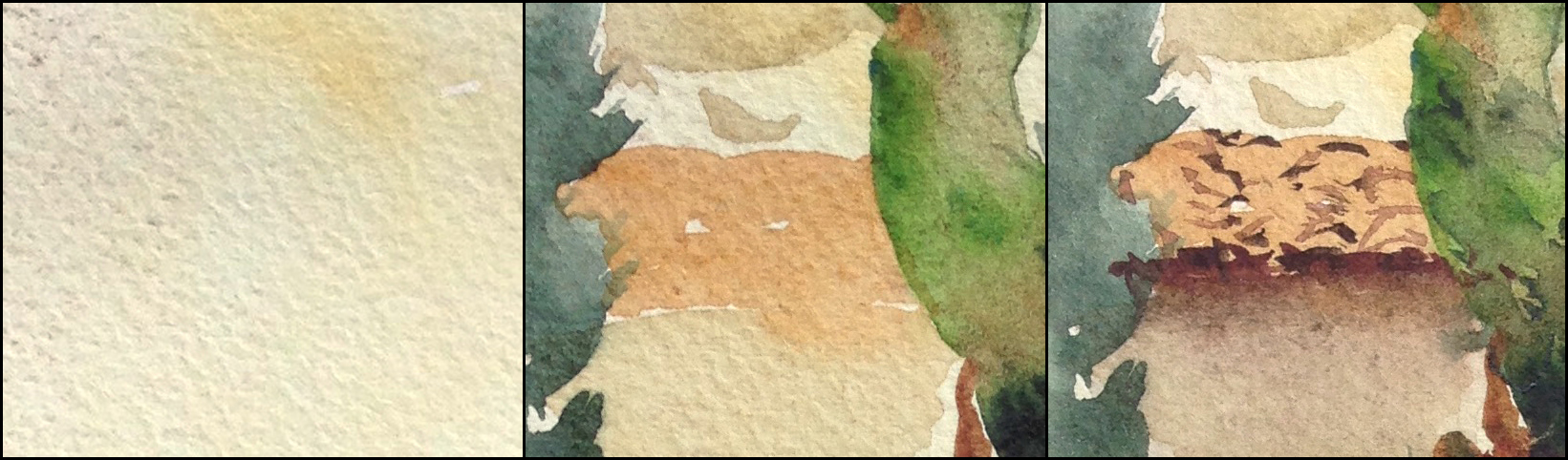
C: Flat Color, lack of depth/texture:
Cartoons (and comics) are most closely associated with flat color. It’s practically the definition of cartoony.
The first part of the answer is texture. With watercolor, we push back against any monotonously smooth passages with a combination of paper texture and brushwork.
You can use broken brushwork as seen in the Impressionists. Or charging-in to promote wet-in-wet mixes. Also a slanted board will encourage backwash/blooms and drips. These are all ways of getting natural texture, instead of clinical perfection.


The second part is depth. I should say ‘dimensionality’ – because by this I mean observing shadow shapes.
Not talking about depth as in distance toward the horizon (that’s atmospheric perspective) but what I mean is being very conscious of ‘self-shadowing’. When objects cast shadows on themselves.
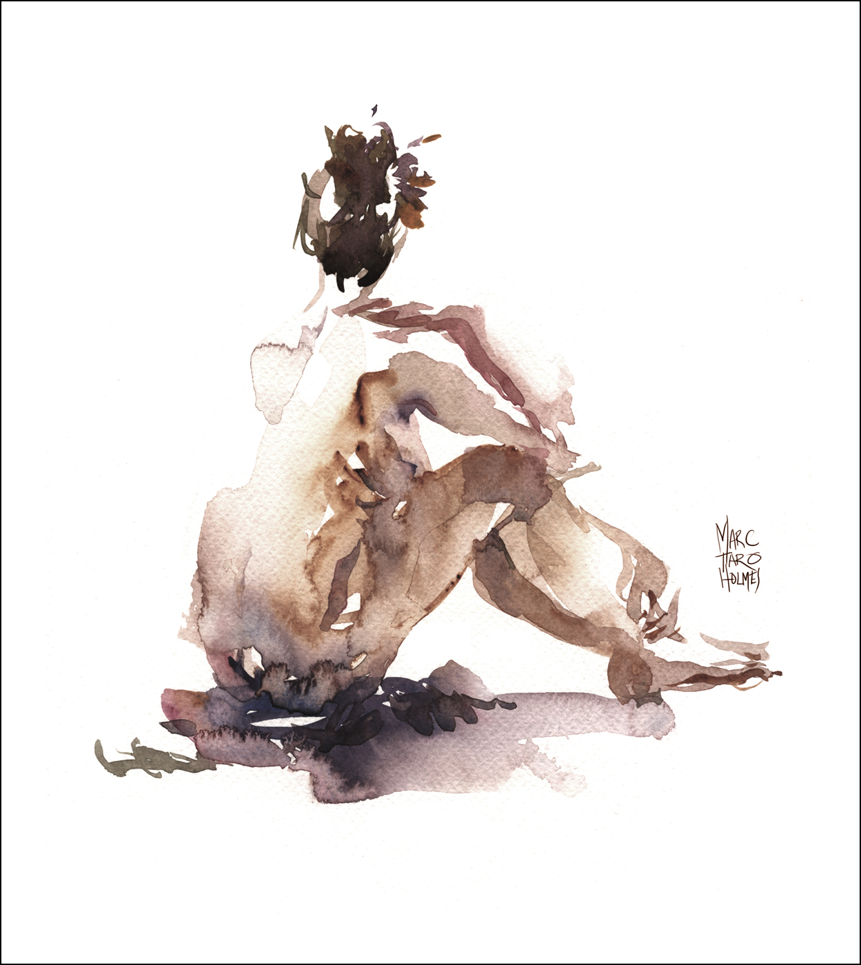
Marking what is light, and what is the shadow side is the fastest way to teach the eye that a thing is three dimensional. That’s why so many of my sketches are just white paper with only color in the shadow shapes.

And of course, you can do this in the drawing – without even any color or brush pen blacks. See how the shadows are in the drawing, even before the color.

All this combined is what makes a sketch painterly and not cartoony at all.
So anyway, just wanted to post that here, as it might make better reading on the blog, than in the questions window on craftsy :)
~m
Sketchbook Drawing Tip: Soften your Linework with Diluted Ink
I was out sketching the other day, (at the Montreal Biodome) and wanted to try a slight tweak to my sketchbook drawing method. Nothing too revolutionary – just the simple idea of sketching with diluted ink.
Sometimes I’m in the mood for an aggressive high-contrast drawing. It can be a lot of fun – especially if you’re working quickly (like these 5 min gesture drawings).
But other times I feel like having a black line under a watercolor sketch is a bit overpowering. Of course you can also sketch directly with watercolor (with no drawing at all). But that can be a bit nerve wracking. I find it takes a lot of focus. Or a willingness to draw three drawings and keep only the best one :)
So – this is a bit of a middle ground. A more relaxing way to draw.
I took a small 5ml vial of water and added two drops of Higgins Sepia. This extremely diluted mix gives you a very pale pink ink color
This simple trick has a number of advantages. The line is so pale, I don’t mind using a ‘searching line’. That is, over drawing – sketching very freely, feeling out the form with multiple contours. Sometimes ‘drawing through’. That is – drawing the back side of a form, or how a limb goes behind the body.
Because of the pale-ness of the ink I don’t care so much if the drawing is incomplete, messy, or otherwise experimental.
I know the color to follow will overpower the drawing, rather than ‘color in’ as it might feel with a black ink drawing.
A small note; this is a water soluble ink – so it would normally melt into the watercolor and bias the color. But since it’s diluted already, it doesn’t actually move on the paper any longer. It becomes no longer water-soluble. So that’s just an interesting and unexpected property.
So, there you go! A simple variation on pen-and-ink drawing you might want to try out.
~m
Negative and Positive Shapes in Watercolor

Hey everyone! I’m still living under a rock these days. A pile of rocks made of freelance illustration work that I’m gradually chipping away at. But I wanted to post something as I’m getting the itch for painting this spring in Portugal.
So, I went back into my files to bring you this demo about using negative shapes. I used this sketch as part of my online course Travel Sketching in Mixed Media. In the video I do a quick little reproduction of this painting for the cameras so you can see how I handle the paint. But I think you can see what’s important about the strategy from these phone shots snapped on location.
Whenever I’m looking at a scene I’m thinking about the silhouette shapes I see, and planning how the dark shapes will sit on top of the lighter ones below. My goal is to use the fewest shapes possible – to make the strongest composition. Too many shapes can get fiddly and confusing. I like to weld shapes – fuse some things together to make cleaner edges – as well as eliminate as many unnecessary objects as possible.
Also, I want to treat each shape as its own wet-on-dry passage. So there will be plenty of watercolor mixing and blooming inside the silhouette – but a nice sharp edge outside.
I like to say, “draw with the outside, paint with the inside”. If you get nice clear silhouette edges, the drawing falls into place. But inside those silhouettes is the texture and abstraction – and playfulness – that makes watercolor what it is.
Ok – so that’s the goal. Look at a scene, see the basic shapes, and plan what order they will go down.

So this is the first shape. A simple box that gradates from gold to green. This is the lightest local color that I will use to draw the wall behind AND the statue in front.
I make this wash in one continuous wet-on-dry shape, so that the greens will blossom upward. And I make sure to make an interesting hard edge where I’m fading out the sketch at the bottom. So it doesn’t end randomly or with uneven scratchy shapes.
I know I can let the green pigment float in a random way, because I plan to cover most of it up later. I’m already thinking a few moves ahead, to when I’ll make these blooms into small plants and shrubs.
At this point I let this first layer dry – so the next shapes can have crisp edges over top of those watery effects. On a warm enough day you don’t really have to wait long. Just until the paper flattens back and no longer feels cool to the touch.

This is the second pass complete. The most important thing I’ve done here is placed down the trees and shrubbery. You can see how each tree silhouette is grown out of wet paints – with plenty of color variation as I go. It may look like there is shading going on in the trees – but all the blending is done by the watercolor itself – not by manually smoothing with the brush. Simply place contrasting color and light and dark pigments next to each other, and allow them to blend naturally.
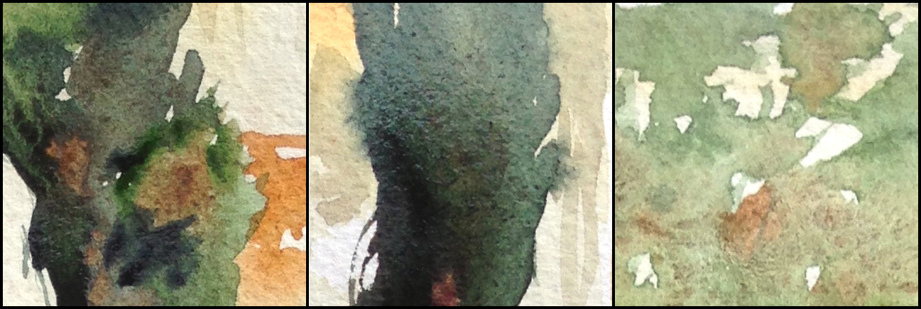
At the same time, I am allowing the background tone to show through in interesting ways. It’s important to leave small gaps and light flecks that show the first wash. It becomes instinctive – when to leave a little gap, and when to let it fill in.
And of course – there is the Negative Drawing of the statue. The outside silhouette of the statue is created by what is left out of the tree. Drawing the larger shape draws the smaller automatically.
I did use a little sketch, done with the point of the brush, so I could see where to cut out the silhouette – but really, I shouldn’t have bothered with that – eventually I’ll be confident enough to do without the guideline. I knew it would fuse with the dark green tree shape, so I risked it looking a bit labored.
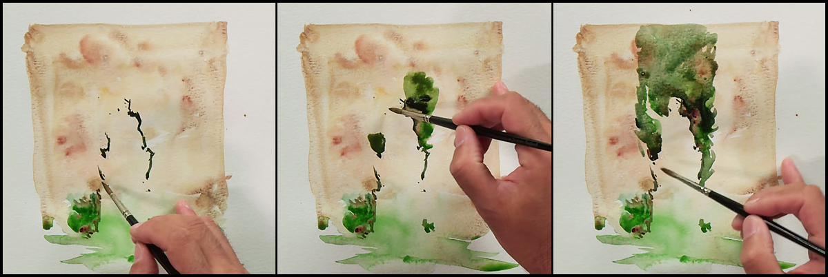
Here are a few screenshots of cutting around the negative shape of the statue. These are extracted from the video demonstration.

From here on, all the big shapes are in place, so it is just a matter of putting on small shadows. The most important being the shadows on the statue. These little shapes make the form appear. If you have the outside shape visualized correctly, then the shadows will simply fall into place and the object will look three dimensional.
This area that will become the clay roof tiles is a good miniature example of this 1/2/3 process of stacking. Everything happening at a larger scale is visible in this small area.
So – there you have it. Something I am thinking about a lot these days – the order of the shapes I plan to stack and how I’ll let colors from below show through the marks made on top.
~m
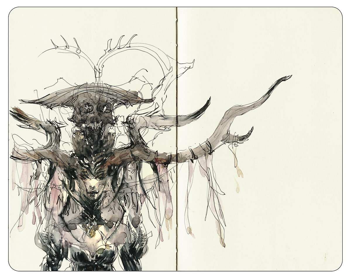
Internal Travelogue: Imaginary People

I’m still under house arrest. Drawing every day for my character design book. I had to pass up a drawing trip with friends today! It’s kind of weird, taking a long break from drawing on the street. But I probably would be taking time off for winter anyway. It’s always a struggle finding enough interesting indoor locations to make it through the winter.
No matter! I have big plans for drawing expeditions next year. I’m just keeping that reward in my head through these long winter nights in front of the computer :)
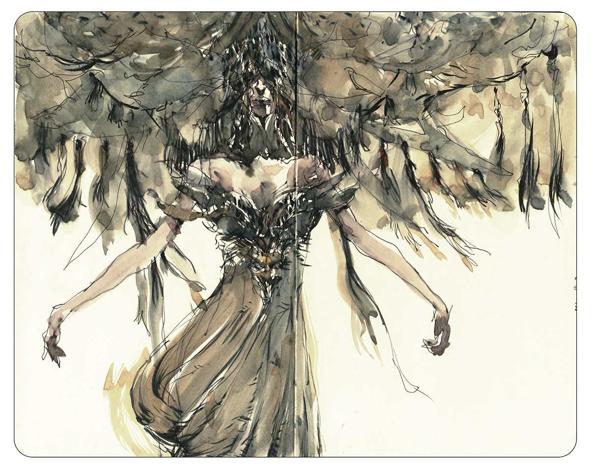
So it seems appropriate to post a few more pages from the imagination sketchbook. Last time I showed some imaginary places. This time, some of the imaginary people.
Drawing people from imagination takes a bit of practice. For me, it’s not really imagination at all – more like drawing from memory. I’ve done a lot of drawing from live models, so the data bank is there.
Inventing (vs. looking at) faces and figures is both more formulaic and more freeing at the same time. Your imaginary people might tend to look a little doll-like. A bit caricatured, a bit abstracted. Stylized to fit some kind of memory-model you’ve installed over time. But what you set aside in realism, you gain back in creativity. When will you ever get to meet people like this for real?
I don’t know if this stuff is as interesting to you guys :) That’s the other thing about sketching from imagination. It makes you self conscious! Drawing a real event, you have a valid story to tell. It’s not about your own head, it’s reportage: I was here, this is what I saw, this really happened. Once you’re inventing, things get a bit shaky. Sometimes you second guess the value of doing it.
But like any kind of art – it has to be something you do for yourself. Partially – I’m simply having fun in this sketchbook. Trying to draw without a filter. Letting the subconscious choose subjects. I have this feeling that I have to put recurring motifs down on paper or I’ll forget them.

When I don’t have a sketchbook handy, I just write lists of paintings I want to do someday.
Does anyone else do that I wonder? That does sound a little crazy. But it’s not like I’m sticking these lists all over the bathroom mirror. I keep them on my phone mostly.
It’s probably not necessary. There will always be ideas for paintings, and I don’t think you forget your own major motifs. But it is interesting to see what keeps on coming back year after year. Of all the things you draw, which ones have staying power in your imagination.
That’s the real value of keeping a journal. Looking back at them years later.
Announcing: Shari Blaukopf: Sketching the City

My frequent sketching partner, sometimes co-teacher and fellow USK:Montreal sketcher Shari Blaukopf has recently released her second workshop with Craftsy.com: Sketching the City in Pen, Ink and Watercolor.
Regular readers will know Shari’s work from our painting outings, and maybe you remember this free wet-in-wet watercolor demo she did for us back in 2013.
Shari’s also the author of Sketching Landscapes in Pen Ink and Watercolor, so it’s no surprise that this new course is a good companion class. This time out they visit various locations around Craftsy’s home town Denver Colorado, capturing demos of her sketchbooking process. Starting with sketching thumbnails, followed by a simple but precise drawing that becomes a framework for the watercolor to follow.


The program has seven chapters, each featuring more than one demonstration related to architectural sketching or street views. Alongside the start-to-finish demonstrations, Shari fits in a lot of helpful tips such as how to draw brick work or field stone, handling reflections and depth in windows, or filling streets with lifelike detail – all the signage and wires and crowds of people.


My favorite section is an excellent demo on painting complex cast shadows. This is a nice bit of brushwork creating the effect of leaf dappling. It’s helpful to see how simple the approach really is – but how brush handling is a matter of practice-makes-perfect. A great exercise for beginners ready to go to the next level.


The final demo is a panoramic park view that illustrates how to place a focal point with color and contrast. Something I’m always trying to instill in students. A drawing might include a wide view of the world, but there should still be a strong central focus.
~m
Returning to Rio: Tinting your old sketchbooks

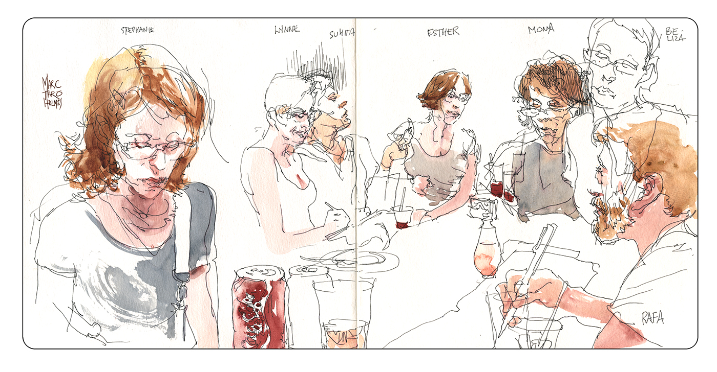
While preparing for my Craftsy.com class on Travel Sketching, I went back to an old sketchbook from the 2014 Urban Sketchers conference in Brazil. These were my doodles from the afterparty in Rio. Here’s a link to the original story. One of the best sketching walks I’ve every been on :)

Craftsy ended up using this one for the ‘title page’ of the video (though they photoshopped it into a studio shot of a sketchbook). A student recently asked to see the before and after – so here’s the original drawing, made on location, compared with the painting done almost a year later.
I think you can see my strategy here – The values are clearly established in the drawing – so when I go to color, I’m following the light’s and darks I’ve indicated for myself. And I’m thinking in terms of solid shapes of color. Not floating dabs, or brustrokes – I want strong silhouette shapes.
I usually try to paint on location, but at the time I was a bit tired of carrying my gear after almost a week of teaching and traveling. I had just been sketching with Paul Heaston – and watching him produce some excellent pen and ink – I decided to borrow his method, working with just a pen and a lot of cross hatching. It’s quite a relief sometimes to be able to pack light.
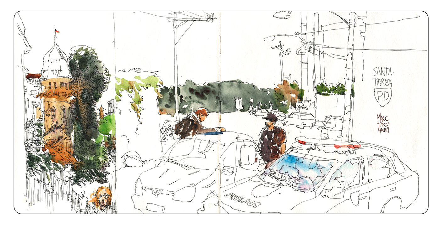

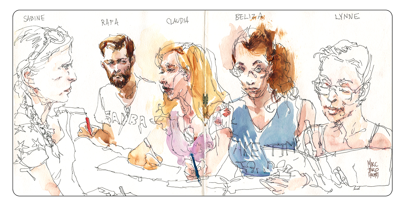
I always liked this sketch – it was Lynne Chapman’s idea to draw this police checkpoint. I’m not sure I’d have had the guts to draw them on my own, but in a sketching group you are always braver.
The police are everywhere in Rio. I had never seen so many armed cops – it seemed like the police force has to be one of the largest in any city. There were six of them on every street corner where we stayed near Copacabana. I suppose I’m being a typical nervous american tourist – even in Montreal I’m used to seeing cops in groups of four at the metro stations. But still – when walking around, I was wondering – why are they everywhere? Is the crime really that bad?
Our friend Rafa said this was a good neighborhood, so we didn’t need to worry – as long as we were out of there by sundown.

So – again, normally my advice is to paint as soon as possible after the drawings – the same day if possible, so your memory is fresh. It’s even better to paint right on the spot, so the color will be more true to life.
I don’t think I’d have gone back to these if I hadn’t scanned them. It’s a bit easier knowing you have them archived. The drawings are important memories for me and I’d have been nervous about ruining them. Of course I needn’t have worried – they always turn out in the end. If the drawing is solid the color is always a nice improvement. You really can’t go wrong :)
I’m looking forward to the next urban sketchers symposium in Manchester. We should know in a few months if I’ve been accepted as a instructor. I hope to get a chance to draw with some of these folks again :)
~m
Internal Travelogue: Working from Imagination
As blog readers know, I love to sketch on location. But to be honest, you can’t be sketching from life all the time.
It’s demanding – constantly getting to new places. Deciding where to go, finding the time, schlepping your gear. All the little travel expenses.
But that’s my personal flaw (and my motivating passion) as an artist. I’m addicted to the new. Always wanting to find the next exciting place to discover through drawing. Or wanting to return to a well known place, and see it with a new technique.

But on the occasions where I’m trapped by circumstance, not able to go exploring – well, most of the time I’ll end up drawing people. People are an endless subject – we’re always doing something.
BUT – even then, there are only so many drawings of people playing on their phones or reading on the subway you can do in a week :)
At those times – when the weather is bad, or you’re on a long flight – or you’re in bed with the flu – any time when you have nothing to sketch from – maybe then you can go back to sketching from your imagination. Like maybe you used to do when you were a kid?
Only now, as a more mature artist, I like to think the sketches are informed by what we’ve drawn out in the world. All the observation in museums and greenhouses and on the street is stored up in the data banks. So when I go to draw from imagination, it’s a mix of visualizing an idea and drawing from memory.
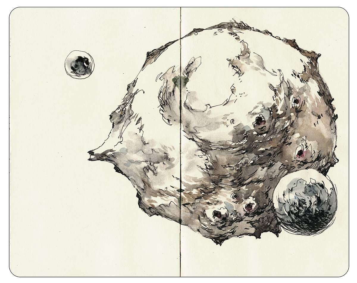
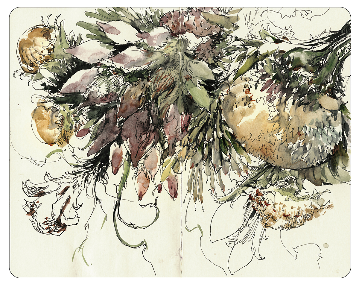
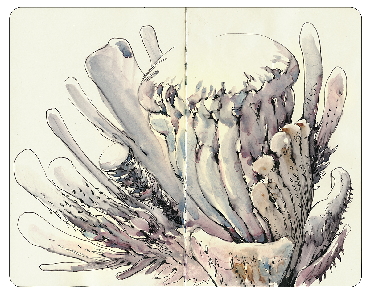
I have one moleskine dedicated to these imagination drawings. (You know me, I have to keep my sketchbooks strictly compartmentalized. No mixing subjects!) This little book is very very slowly getting filled with these alien worlds and fantasy characters.
This is a long term application of what I call ‘knitting’. That is – slowly finishing a sketch. Scribbling down something while you’re ‘seeing’ it (I’ll brainstorm ideas in pencil). And then detailing up things like surface texture and foliage gradually in ink.
Working ten minutes waiting for lunch, five minutes more standing in line at the bank. Some of these drawings took months start to finish, but only a hour or two total.

So – sketching from imagination! It’s a different kind of travelogue!
Maybe some of you have a secret sketchbook like this?
If you post any of your drawings from the imagination somewhere – let me know in the comments. I’d like to see some of your interior journeys.
~m
Announcing: James Richards: Sketching the Energy of Places

Fellow Urban Sketcher James Richards recently released his first Craftsy.com course titled: Sketching the Energy of Places.
As a Craftsy instructor myself, we get free access to all their classes, and I was excited to see his name pop up on the list.
I’ve drawn alongside James at Urban Sketchers workshops around the world, and have always been impressed by his ability to swiftly capture an urban environment bustling with street life. He’s from Texas, and has that big warm personality that seems part of the culture there.

His sketches are full of the color and activity of people in open air markets, squares, and public spaces – in large part due to his experience as a location-sketcher, his successful career as a concept designer in architecture and urban planning, and his current work as an associate professor of landscape architecture at the University of Texas at Arlington. He’s also the author of Freehand Drawing and Discovery: Urban Sketching and Concept Drawing for Designers, and is an urban sketchers.org correspondent for Dallas/Fort Worth.

The Craftsy course itself follows the format of 7 lessons, where he covers topics such as drawing people and places together – establishing the proportions of people, how to draw crowds, how to set a correct eye line for groups, and how they diminish in size as they go down the street.


The meat of the class is a demo drawing of a train station, which he draws from start to finish, taking side jaunts to explain composition, sight measuring techniques, and plenty of great information on how to capture the important details.


Along the way he gives some great lessons on specific concepts – like how to add trees and cars to your scene – the details that set the drawing into the urban space.


You get to see him finish the demonstration sketch with watercolor, introducing many useful tricks along the way – such as using white pencils to put window panes back over darks.

The lessons culminate with a trip on location where you’ll see James sketching thumbnails and sitting down to do another demo of a finished piece. He includes information on his tools throughout- (we like the same portable easel!).


I can highly recommend James Richard’s new course. If you were to combine it with Stephanie Bower’s class Perspective for Sketchers, and Shari Blaukopf’s more painterly Landscapes in Pen, Ink and Watercolor, Paul Heaston’s Pen and ink Classes; Drawing Everyday and Pen and Ink Essentials – and of course my own offerings – Craftsy is building quite a strong program in sketching! These online courses are frankly giving my art school education a run for its money.
A nice bit of feedback…
I recently posted up some drawings to the discussion forum on my Craftsy.com class as part of a long answer to a student. I was referring back to some sketches done while testing a new (old) pen nib.
I’d said:
“Continuing on with the question about – should I draw in pencil first?
Here’s a small set to emphasize my point about drawing directly in ink. Now, I know everyone sees art differently, and these might be somewhat extreme examples. But if you like the sense of freedom and exuberance in these drawings and you’d like to try to get here with your art – this is why you can’t really do it by drawing in pencil first.
You just won’t have this sense of freedom. If your mind is saying ‘I need to plan the drawing so it’s perfect’ – your hand cannot possibly be free in the execution. This is something that I’m loving more and more as I draw. I have simply made the decision that there are no mistakes in drawing. That I don’t care about accuracy, I care about my drawing. My personal mark making. Anyway, that’s just some thinking from me. Take from it if you like what you see!”
And I got a nice answer back:
“I am really glad you decided to address this, because I had been wondering the same thing myself. Since following some of your traveling sketch class I have gotten so much freer and it’s been so great not to worry about if I’m being accurate enough. I’ve loved the freedom. I’ve been away from the tutorial a bit lately, and I could feel myself getting more concerned about accuracy, less free and then giving consideration to drawing in pencil first. So, bingo! I see your comments and sketches and it’s taking me back to what I was enjoying. So, I’m going to go back and watch the videos again and do more practicing until it’s super instilled in me to continue to enjoy the freedom of ink drawing!!”
So in celebration of that nice reminder of why I do this blog, and who I made the Travel Sketching class for, I just wanted to remind everyone, that if you give out this link, any friend you send it to can register at $20 off the retail price. This is my full instructor discount, permanently on offer to you, just for reading my blog.
My Sketching People class, which just got voted in the top 5 favorite drawing classes on Craftsy (thanks for those 5 stars!), is also on at my full instructor discount – just for clicking through me you’ll get $15 off.
Craftsy gives instructors a slightly higher royalty click if you sign up to a class this way, because they know we love our blog followers, and they want us to be able to offer you the best rate.
So I’m glad to do it, please pass it on to your friends and support the blog, and thanks for being a loyal reader!
~m
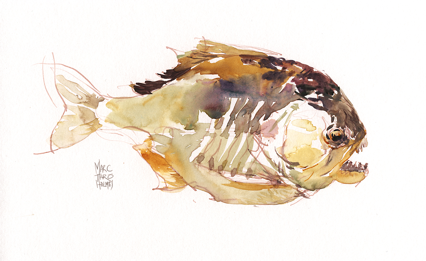
Watercolor Sketching in the Redpath Museum
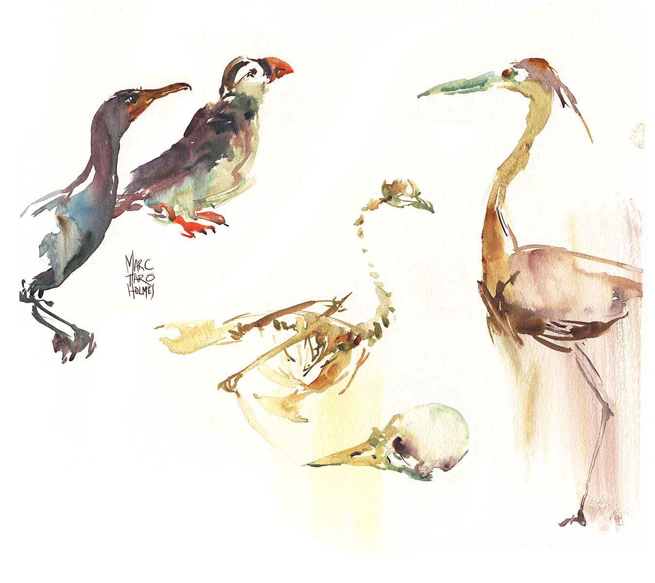
Yesterday was fourth Sunday sketching with our drawing group Urban Sketchers Montreal.
With the fall chill in the air, we returned to the Redpath Museum. Blog readers will know, I love a chance to draw from taxidermy animals and mounted skeletons. So this was just a relaxing day for me.
Here we have a cormorant, puffin and egret, along with a common farmyard chicken skeleton. I didn’t note what kind of bird skull that was – it was only a couple inches – the drawing is bigger than the real thing.
This outing I felt like some free-sketching in brush and watercolor. It’s a lot of fun taking on these delicate subjects with a direct brush drawing. When I do silhouettes, I always feel a kinship with Japanese sumi brush painting. Each rapid brush stroke combining to make an image. It’s fun, and fast, making these economical little drawings. I did more talking than drawing this afternoon and still came away with a nice collection of sketches. If you take the time to make a painstaking drawing – well I don’t think the results are any more interesting – and you’d only get half a drawing done in a day :)

The key to these water-sketches is making the silhouette in a single wet shape – so the colored strokes fuse. But also knowing when to simplify. I haven’t counted every rib and vertebra on this ostrich skeleton. It’s just the impression of the animal – not really a scientific record. One day I’d like to try for that – a perfect rendering – but that’s not the spirit of an urban sketchers meet up, chatting with friends and sketching for enjoyment.
With these ‘casual’ sketches, I sometimes take a few tries at it. So they look easier than they sometimes are. This is the second of two ostriches I did that day. My first try is sometimes a bit off – a bit out of proportion or tentative in the brushwork. So I’ll just do it again while it’s fresh in my mind. It always gets a little better the second or third time.
The thing I love about the Redpath is the Cabinet of Curiosity feeling of the place. Where else will you see dinosaur bones, Samurai armor, Egyptian mummies, sea shells, taxidermy animals, African musical instruments – all this in one small exhibition hall. It feels more like visiting a crazy uncle’s mansion than going to a museum.
We skip December, due to the holidays, but I hope to see some of you at next year’s Fourth Sunday Sketching. Just watch the USK : MTL blog for the location announcement.
~m

