Good Question of the Week: How do I avoid ‘cartoony’ sketches?

Post Preamble: This is another in my very irregular series: Good Question of the Week. (which is not weekly by any means).
I have discovered there is a limit to the length of an answer on the Craftsy.com website.
Students ask questions in an email-like sidebar and I get notified when there’s something to discuss. Today, I found out the hard way there must be a character limit to the entry field. Because this (long winded) answer simply wouldn’t go through until I broke it into three replies.
Anway, enough inside baseball.
Here’s the question for anyone that might be interested:
Student Question: For sketching I think that line adds a freshness to the drawing but mine always turn out far too cartoony…which I don’t like. I Love the direct approach but I tend to leave that more for “real” paintings. How do I lose the cartoony effect? (ed. note: by ‘direct approach’ I think they are referring to direct-to-brushwork with watercolor).
Overly long answer: Absolutely good question [Name Redacted]! Ready for a super long answer? (Sorry, but apparently I was waiting for this question :)
So – the reason this course (referring to my Travel Sketching course) has so much emphasis on drawing-at-speed and embracing-your-errors via single line sketching in ink – is exactly to do with this problem of ‘cartoony’ sketchbook drawings.
It’s a method to push yourself out of stiff or awkward drawings, by not giving your mind enough time to over-think.
I find I have to be in a zone of seeing and drawing reflexively to avoid a ‘cartoony’ result – that I feel comes from overworking, and timidity.
(ed. note: Of course – I believe that there is nothing lesser about cartooning as an art. I love every language of drawing, and great cartooning is a very demanding mode – so I don’t mean anything snobbish about my current desire to be more painterly. I do admire cartoonists and one day might become one – if I live long enough).
Let me dive in to the reasons!
The things that I feel make a drawing ‘cartoony’ are A: rigidity and simplification, B: monoweight and closed lines, C: flat color, lack of depth.
A: Rigidity and simplification:
Cartoons tend to simplify complex shapes into something more geometric.
If you are not sensitive to tapering perspective, or a slight slope of the earth, or the lean of an old structure, or the divot of a broken brick, you might end up putting inflexible straight lines where a more organic shape might bring life.
Speed and reflexive recording of what you see allow you to exaggerate and record in a fresh way which you won’t achieve by taking pains to make a ‘good drawing’.
Here’s a drawing that I think you’ll agree is the opposite of rigid :)
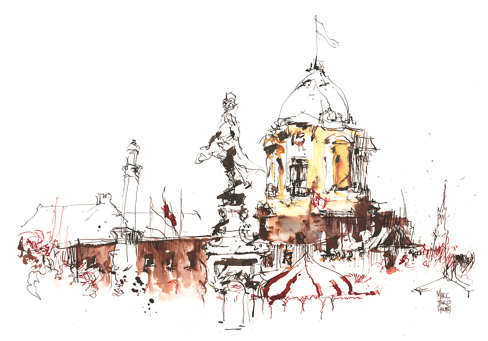
This one too, to some extent:
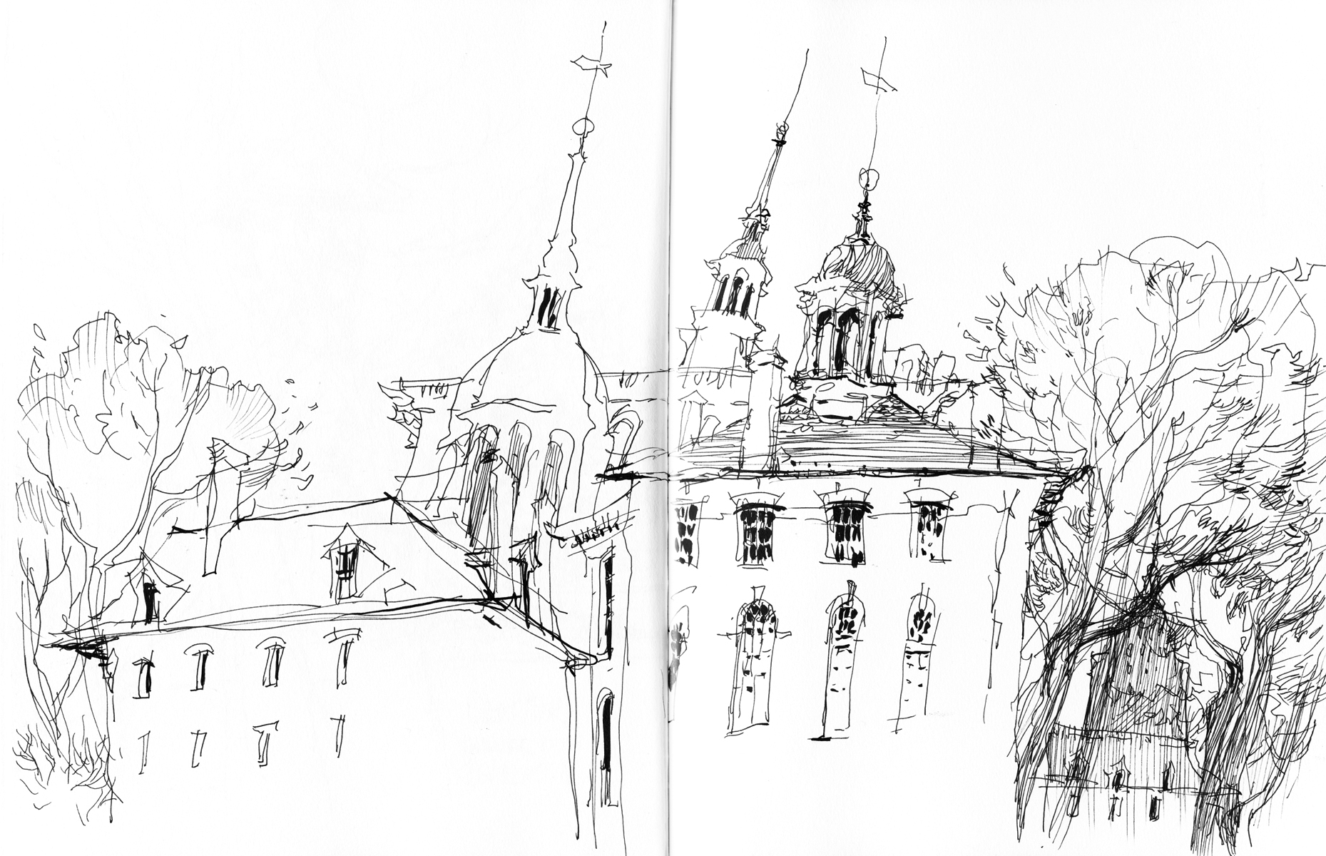
These were accomplished by drawing while having a lively conversation with a friend at the same time! Also by being very cold and working standing up, and wanting to get moving soon :)
B: Monoweight and closed lines:
There is nothing more flattening than a graphic outline; a solid closed line that goes all the way around a form. This is a classic cartoon effect, meant to make a shape visually separate from a background.
One easy thing you can do is soften the ink line – I’ll point back to yesterday’s post on diluting ink, or of course there’s water soluble ink. Blending the line with water makes it much less prominent.
But if we’re talking about black ink line, that’s different.
In drawing, unlike painting, we have less natural opportunity for lost edges (places where object and ground can blend together).
What we have to do is force lost edges to happen by breaking lines. Let them taper off into open shapes. Vanish into the highlights. This looks to the eye like a painter’s lost edge.
Just look at the faces in this life drawing:
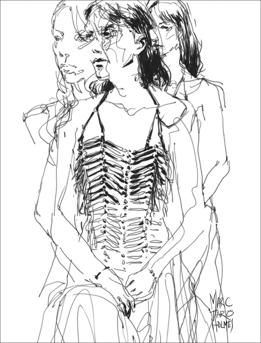
Here’s a sketchbook example of breaking line (and tone) to let in light:

C: Flat Color, lack of depth/texture:
Cartoons (and comics) are most closely associated with flat color. It’s practically the definition of cartoony.
The first part of the answer is texture. With watercolor, we push back against any monotonously smooth passages with a combination of paper texture and brushwork.
You can use broken brushwork as seen in the Impressionists. Or charging-in to promote wet-in-wet mixes. Also a slanted board will encourage backwash/blooms and drips. These are all ways of getting natural texture, instead of clinical perfection.


The second part is depth. I should say ‘dimensionality’ – because by this I mean observing shadow shapes.
Not talking about depth as in distance toward the horizon (that’s atmospheric perspective) but what I mean is being very conscious of ‘self-shadowing’. When objects cast shadows on themselves.
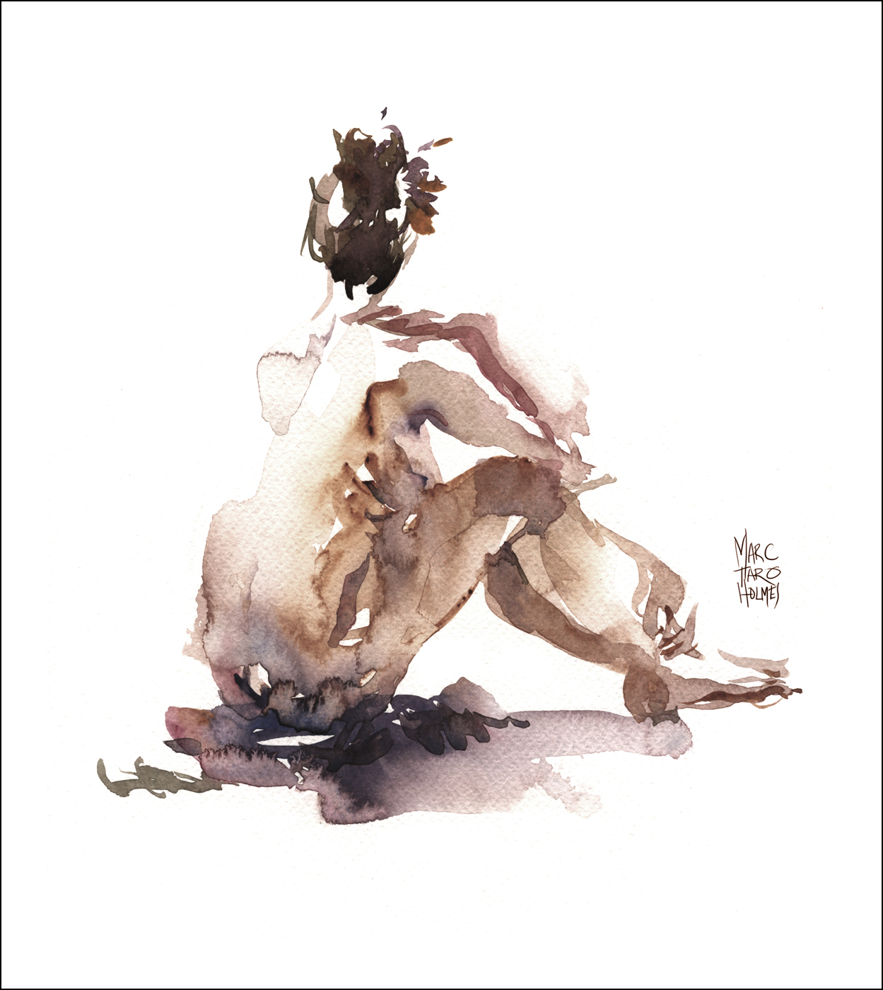
Marking what is light, and what is the shadow side is the fastest way to teach the eye that a thing is three dimensional. That’s why so many of my sketches are just white paper with only color in the shadow shapes.

And of course, you can do this in the drawing – without even any color or brush pen blacks. See how the shadows are in the drawing, even before the color.

All this combined is what makes a sketch painterly and not cartoony at all.
So anyway, just wanted to post that here, as it might make better reading on the blog, than in the questions window on craftsy :)
~m


Hi Marc
Great post, explanation and examples.
Following your example and for the same reasons I’m asking my question here rather than via Craftsy.
You say ‘if we’re talking about black ink line, that’s different’.
Am I right in thinking that black ink line is what we Brits call ‘line and wash’? And if so, how does your thinking and advice differ in this respect for that technique?
Best
Tony
Hey Tony! Manchester in only six months!
So – I was meaning there that colored/diluted ink, or water soluble ink – those are ways to make line into not-really-line at all by painting over or melting. But when you’re using just a black pen and paper, no other tricks – then you really only have one way to soften the line: By breaking it.
You have only the most minimal options with high-contrast pen-and-ink – just when you make a mark, and when you don’t :)
Thanks for the extra explanation …. just me being dense! I’ve decided Manchester might be too full on for an old’un … which is why I’ve signed up for Galway instead. Looking forward to it!
Reblogged this on Jacob Russell's Magic Names.
Hey Marc! I’ve been following your blogs on and off for the past 3 years now, and I love that you’re answering questions! Thanks so much for being willing to share your process, your sketches, your work and your insight!
Hi Marc,
Thank you for this post. I have been working on both your classes at Craftsy. Love them and your work. What you have said makes a lot of sense. I do leave open lines, but not always. My sketches with open lines are more interesting. Thanks again for sharing your knowledge!
Thank you, thank you, thank you for this. ,!!!
Marc, As always, your explanation answers a question that I
didn’t know I had.
Thank you.
Thank you
Hi Marc, Your explanation couldn’t have come at a better time. I am taking both your Craftsy classes – love them – but recently, and partly in preparation for Galway, i have been practicing more urban settings, mostly from photos. You may remember from my Craftsy questions, i live in Kenya in a mostly rural (bush actually) environment. I got so hung up on perspective of buildings that i forgot all about leaving open lines etc. and my results have been extremely stiff and rigid and unsatisfying. This was a perfectly timed jolt as to what was going wrong, thank you!
It took me some time to find the question in the course (that I am really enjoying), and your explanations were perfect, and sure will help the person posing the question a great deal.
Dear Marc,I follow your blog and I’m a sketcher too. Also working for some italian art magazines as a journalistI would like to translate your interview and to propose his publication in one of them, if you can give me your authorization. Please, let me know!wishes and thank you very much :)
IsabellaCairoli art journalist
Thank you so much for the good advice!