Negative and Positive Shapes in Watercolor

Hey everyone! I’m still living under a rock these days. A pile of rocks made of freelance illustration work that I’m gradually chipping away at. But I wanted to post something as I’m getting the itch for painting this spring in Portugal.
So, I went back into my files to bring you this demo about using negative shapes. I used this sketch as part of my online course Travel Sketching in Mixed Media. In the video I do a quick little reproduction of this painting for the cameras so you can see how I handle the paint. But I think you can see what’s important about the strategy from these phone shots snapped on location.
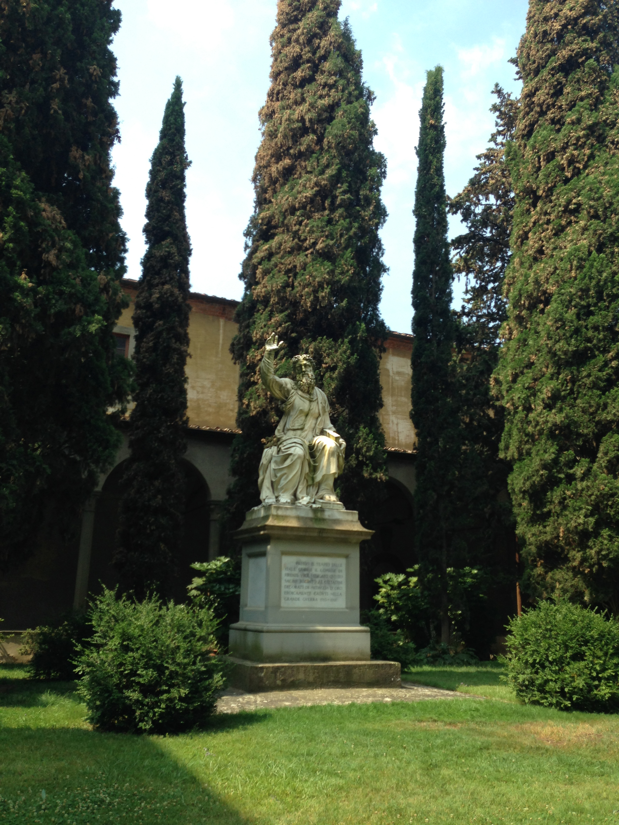
Whenever I’m looking at a scene I’m thinking about the silhouette shapes I see, and planning how the dark shapes will sit on top of the lighter ones below. My goal is to use the fewest shapes possible – to make the strongest composition. Too many shapes can get fiddly and confusing. I like to weld shapes – fuse some things together to make cleaner edges – as well as eliminate as many unnecessary objects as possible.
Also, I want to treat each shape as its own wet-on-dry passage. So there will be plenty of watercolor mixing and blooming inside the silhouette – but a nice sharp edge outside.
I like to say, “draw with the outside, paint with the inside”. If you get nice clear silhouette edges, the drawing falls into place. But inside those silhouettes is the texture and abstraction – and playfulness – that makes watercolor what it is.
Ok – so that’s the goal. Look at a scene, see the basic shapes, and plan what order they will go down.

So this is the first shape. A simple box that gradates from gold to green. This is the lightest local color that I will use to draw the wall behind AND the statue in front.
I make this wash in one continuous wet-on-dry shape, so that the greens will blossom upward. And I make sure to make an interesting hard edge where I’m fading out the sketch at the bottom. So it doesn’t end randomly or with uneven scratchy shapes.
I know I can let the green pigment float in a random way, because I plan to cover most of it up later. I’m already thinking a few moves ahead, to when I’ll make these blooms into small plants and shrubs.
At this point I let this first layer dry – so the next shapes can have crisp edges over top of those watery effects. On a warm enough day you don’t really have to wait long. Just until the paper flattens back and no longer feels cool to the touch.

This is the second pass complete. The most important thing I’ve done here is placed down the trees and shrubbery. You can see how each tree silhouette is grown out of wet paints – with plenty of color variation as I go. It may look like there is shading going on in the trees – but all the blending is done by the watercolor itself – not by manually smoothing with the brush. Simply place contrasting color and light and dark pigments next to each other, and allow them to blend naturally.
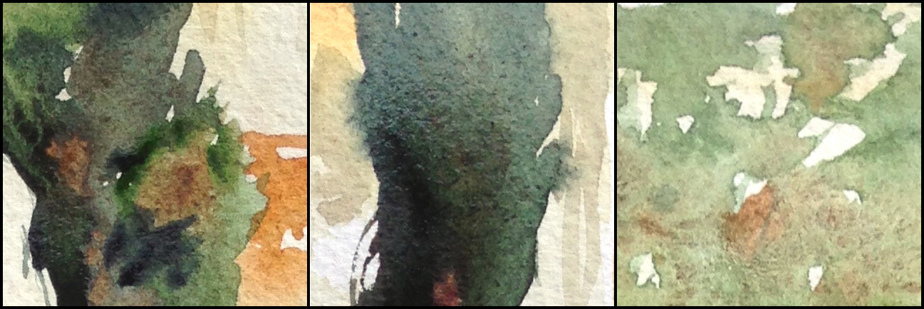
At the same time, I am allowing the background tone to show through in interesting ways. It’s important to leave small gaps and light flecks that show the first wash. It becomes instinctive – when to leave a little gap, and when to let it fill in.
And of course – there is the Negative Drawing of the statue. The outside silhouette of the statue is created by what is left out of the tree. Drawing the larger shape draws the smaller automatically.
I did use a little sketch, done with the point of the brush, so I could see where to cut out the silhouette – but really, I shouldn’t have bothered with that – eventually I’ll be confident enough to do without the guideline. I knew it would fuse with the dark green tree shape, so I risked it looking a bit labored.
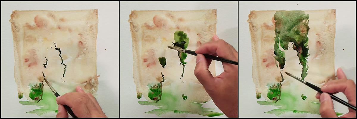
Here are a few screenshots of cutting around the negative shape of the statue. These are extracted from the video demonstration.

From here on, all the big shapes are in place, so it is just a matter of putting on small shadows. The most important being the shadows on the statue. These little shapes make the form appear. If you have the outside shape visualized correctly, then the shadows will simply fall into place and the object will look three dimensional.
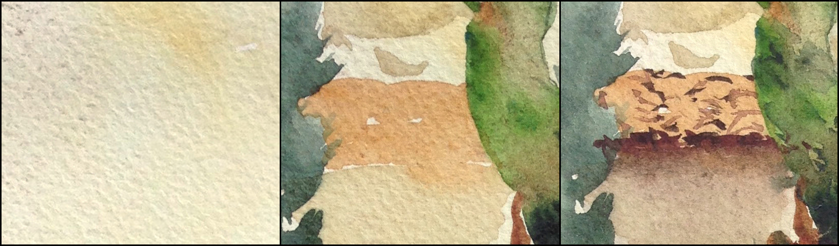
This area that will become the clay roof tiles is a good miniature example of this 1/2/3 process of stacking. Everything happening at a larger scale is visible in this small area.
So – there you have it. Something I am thinking about a lot these days – the order of the shapes I plan to stack and how I’ll let colors from below show through the marks made on top.
~m


This has been the clearest explanation of how to build a watercolor! Your on-line classes are equally as clear and make learning fun!
Thanks for saying Cathy! That’s great to hear :)
Wow – this is so helpful and well done! Thanks for sharing it. I’m eager to get started on your Craftsey class!
This is very useful Marc.
Your blog as well as your 2 classes on Craftsy(and your book as a reference) gave me so much inspiration and enjoyment that I have decided to start my own blog on sketching. I just wanted to say a big thanks for your great teaching methods and your contagious enthusiasm!
Agnès
hobbysketcher.com
Excellent! A blog is super motivation to produce work on a regular basis :)
very clear demo !!! Lovely sketch :)
You’ve not only an amazing talent for painting but for describing and teaching in an succinct and easy to understand way. It’s not often I see a step by step process on a blog without a video and get such a clear idea of how it’s been handled. Inspired to return to one of your Craftsy classes again! Thank you Marc!
Thank you! Have the Craftsy course on this – and reinforcing this one also refreshes the lesson and I need more of that! – thank you!
It’s fascinating watching you change your focus and techniques from pencil-pen-brushpen-watercolour to pen-brushpen-watercolour to just watercolour. Do you miss the drawn line that was such a strong feature of your work? I find some subjects lend themselves to strong pen lines (in whatever colour ink) and others are better with minimal or very soft linework and a more painterly approach. The pen line creates a definite ‘sketch’ and the more painterly approach can come closer to our visual reality. Good luck going pure painting – then what? :-)
Hey Jane! Having a great summer I hope!
It’s true – you have a look over my shoulder as things change over time:) I guess I think of it now as a continuum from drawing to painting? It’s maybe more about how much time I have. Or how much gear I want to bring. I might do an ink drawing if I want to work super fast, or travel particularly light. Or if I’m in a museum or theater and have to draw first, and paint later.
So I’ll never stop with the pens I’m sure! Nothing beats just pen+brushpen for pocket sketching kits. But if I get in front of a beautiful scenic view, I’d regret not painting it in full color. So the paint box is always top-of-mind when traveling.
and as for what’s next! That’s a great question:) This year I hope to try a bunch of new things!
Yes hot and gorgeous here :-) Hope you are enjoying the cold – pretty in the snow but bleak winters without snow are not so much fun to sketch. Snow shadows are a different colour in Oz. Different light I guess.
I think the key is to keep exploring and allow the subject to dictate the choice of medium in some way, rather than developing a distinctive ‘one style fits all’ approach – though many do that very successfully of course.
I enjoy switching between pencil, watersoluble pencil and ink, as I’ve been doing for 35 years or more, choosing the medium based on the subject and the time available, but obviously I can almost never resist adding watercolour too. Apart from anything else, it is so quick to get a great effect! I love your idea of freedom within the wet areas for the watercolour to do its thing – very effective.
New things for 2016 – I thought about silverpoint. Decided I don’t need new tools or equipment. Might put some grey ink in a brush pen. I do plan to do a bit of mixed media studio work. I might pull out the oils too…and I have some great travel/teaching plans :-)
Yes exactly! Probably will never have one perfect approach avoiding all others. I don’t think.
I had read silverpoint was a very slow technique? That one accumulates value gradually. I imagine that would be fun for a sustained botanical or cast drawing. (I would probably seek out a skull to draw ;) Every so often I enjoy a long, slow study of something. It’s great balance for all the quick sketching.
I am planning to get serious about oils this year as well! In a few months I’ll have a new studio space where I can get into the paints and solvents. (I work in my living room otherwise at home). If you do have a go at them send us some progress pics!
Yes silverpoint is apparently very slow but suits very detailed work – rather like etching (which I used to do) but even finer.
I’ve done quite a bit of oil painting over the years but tend to only do it outside in Spring and Autumn due to the fumes. Perhaps the water-soluble oils would be a good idea if you are setting up?
I love the feel of oils when I get started, and the scale you can work and how easy they are and the simplicity of framing them. But I hate the cleanup. Watercolour is so much more convenient and portable…
By the way – if you haven’t explored oils much, you may be interested to read Alla Prima – Richard Schmid. Probably the approach that best fits with what you are doing with watercolour painting. Direct oil painting from life.
This is wonderful, Marc! Thanks for all those instructional steps and the finished work of art is fabulous! I have your book, “The Urban Sketcher” which I love and am reading from cover to cover. Keep going hard at your art and thanks for sharing and taking us all along with you! ☺
love this and it’s certainly helped me think more as a painter than a sketcher (tho I think I would miss drawing the line with pen too much to go this way for an entire trip) I found your exercises on Craftsy to be so very helpful Marc and vow to give it a go more often. I think the sculptural form lends itself to this approach really well. Paper makes a significant difference to getting the lovely granulation and supporting the pooling and puddling of ‘juicy washes’. My sketchbook papers have not been up to the task! *note to self, invest in watercolour sketchbooks and hang the expense
I like the Hand Book Travelogue Sketchbooks for a nice bound watercolor book. I think the 8×8″ square format they have is one of my favorites for landscape format sketches. But I have pretty much switched to cut sheets of watercolor paper these days.
I enrolled in both of your classes and i like this lesson. I am slowly practicng everything. Re watching the lessons again and going to do the excercises. I live in the Philippines which is as humid as singapore, so good luck to me! Lol
An easy to understand demo. Thanks lots.
I love your way. Thanks for all.
Thank you so much for sharing the method, Marc! I already put it in practice today and the concept was so helpful.I enjoyed (and still enjoy) your Craftsy course for drawing people in motion and I think the Travel Sketching will be my next class.
Thanks Marc, an wonderful supplement to the demo in the Craftsy class. Think about a similar format for other demos from the class. You are a terrific teacher.
BTW according to Blick, Hand Book is discontinuing production of its Sketchbooks.
The 8×8 is sold out, maybe because of you. What’s your next favorite in that size?
well that sucks! That was a nice book! I’ve used their 8x10ish size. It’s great as well. I don’t like the super small ones. They have a very narrow landscape book, I think 4″high. That’s too small for me – you can only do a distant horizon in a book like that. Which is fun – but I don’t usually need a whole book full of them :)
There is a Stillman and Birn in a 6×9″ landscape format – if that comes in the watercolor paper, that might be a good alternative.
HOWEVER, my next plan is to try folding my own watercolor books! Cathy Johnson shared a video about just folding a single sheet into a booklet. So I’m up for trying that in the near future: https://www.youtube.com/watch?v=CffQyRdTDUc
Thanks for the explanation. Despite I don’t work with watercolors, it is a very good deconstruction of your creative process. It definitely made me wanna go to one of our parks and paint (so sad the cold weather makes it impossible).
Wow, reading your process only enhance my admiration towards your work. Plaudits!
Thanks for posting. I love to see how artists create a piece.
Lovely post about a lovely painting! 😄
Hello I’ve found it an excellent and very intelligible demo, that makes the difficult one is became easy thanks for sharing.
Your teaching skills are fantastic. This has been so easy to follow – in such a way, that I feel I can do exactly the same and don’t have the “I’ll never be able to do that” thought.
It is pure pleasure when one of your posts drops into my inbox.
Thank you, Marc.
Astounding and the break down of the process is really cool. Thank you!