Ashes to Ashes : Montreal Beaux Arts Pompeii Exhibiton

We’ve just had a quick visit to the Montreal Beaux Arts for the exhibit on Pompeii. (On Feb 6 to Sept 5).
This is the Roman version of the goddess Isis. Representing the ideal mother and wife, also protector of the dead and of children. She was the mother of Horus in Egyptian mythology.
The exhibition features many art objects like this Isis, as well as objects from daily life.
Pompeii was an ancient roman city near Naples, which, in 79AD was suddenly buried by 6 meters of volcanic ash falling from Mount Vesuvius.
The exhibit is all very interesting, if somewhat textbook in presentation, until suddenly you enter a room that contains these plaster casts of the victims bodies.

These plaster figures are people who might have perished in the fumes, falling ash and fires, and were encased by a hundred mile and hour landslide of liquefied earth emerging from the final collapse of the volcano.
There were over a thousand bodies preserved in this kind of natural sculptural mold. Sort of the opposite of fossilization. A void was left in the sea of pumice enclosing the bodies – rather than the people being turned to stone, as it appears at first glance.
They are captured in considerable detail. I had the impression I could see imprints of their clothing. There are no features, or hair. And some of the postures seem to indicate the pugilist stance – typical of death by fire.
I have read they no longer make these plasters, as the process destroys the skeletal remains. These actual objects might have been made before world war two. I can’t say for sure if they are the original impressions from the ash. But I expect so.

This is a chilling end to what at first seems like just another exhibition of classical roman vases and statues. This final room is undeniably moving.
There is something in our culture right now in which these images of apocalypse are all around us. We can’t help but stand and look, and think about our own future. We see climate change and over-consumption bringing disasters. Not always on the scope of Vesuvius. But still. How can we not look at these ancient Romans and think a little bit about our insignificance in the face of nature.
Sketching Tip: Seeing Darks
To me, a painting isn’t complete until is has a full range of values. Even in a quick sketch I like to see strong contrasts in the areas of interest. (Not so much in the background – as that’s often far away).
The great thing about a sketchbook drawing, is you can go right to those solid blacks using a thicker pen line or (my favorite) a brush pen.
When you draw in black ink, you automatically have the highest contrast. It’s just the white paper, and the black drawing. At that point, whatever color you splash on you can be pretty sure it’s going to work.
A short while ago I was answering a student’s question about placement of blacks in the drawing.
I find this comes up a lot – the question: “How do you know where to put the darks?” It seems there’s a natural fear of doing it wrong. The solid blacks are so powerful – they’re scary! What if I put them in the wrong place? Or use too much black? Will I ruin my future painting?
Quick answer: probably not – and even if you do, it’s just a sketch! Try it and find out :) You can always make another one :)
I’ve always found this question a little hard to answer. Because the only thing to say is, “well – you just *look* at the scene”.
Look for the areas that have the darkest shadows. Hit them with the black ink – and suddenly the thing pops out into three dimensions.
It’s like the drawing is the skeleton of the painting. Just the clean bones of the thing, waiting to be fleshed out in color.
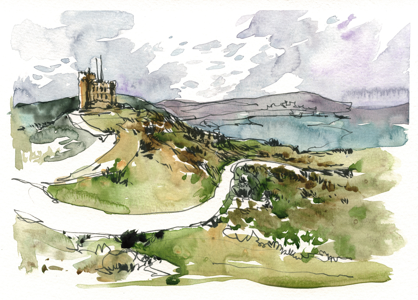
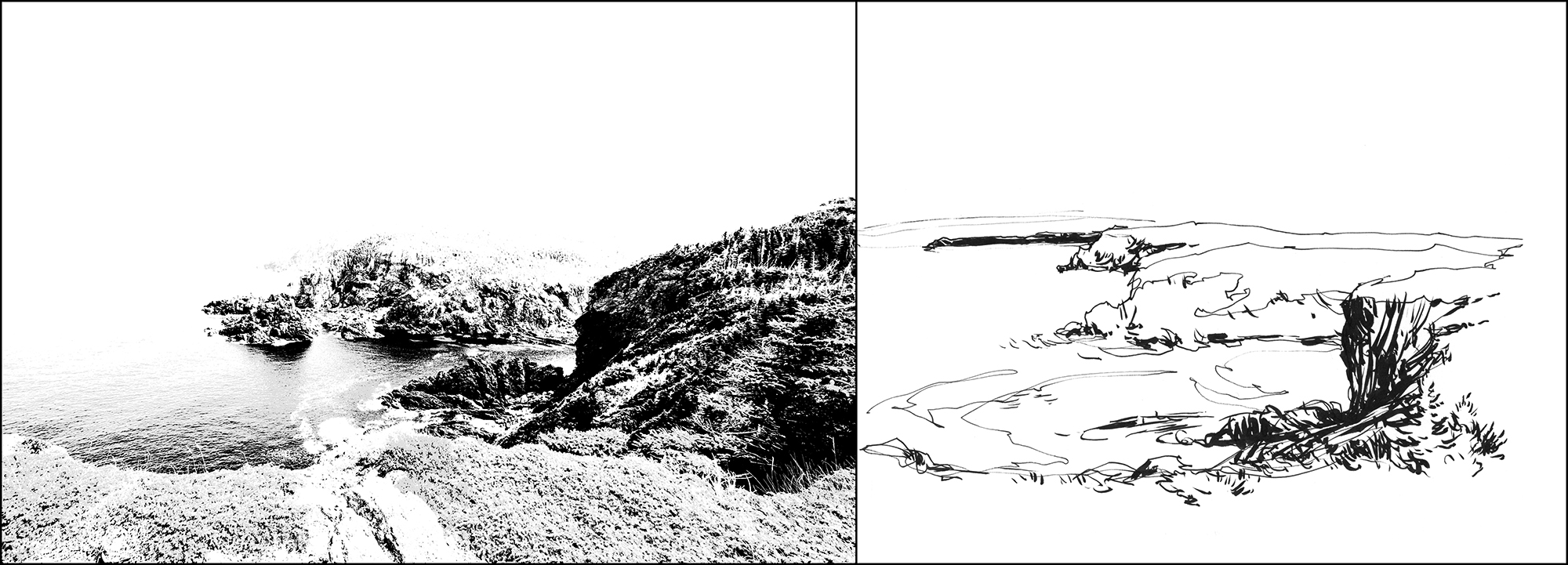
This time, when trying for a better answer, I hit on the idea of using a high contrast adjustment layer in Photoshop to show ‘scientifically’ where these darks are in the image. The idea here is to remove every color other than black.
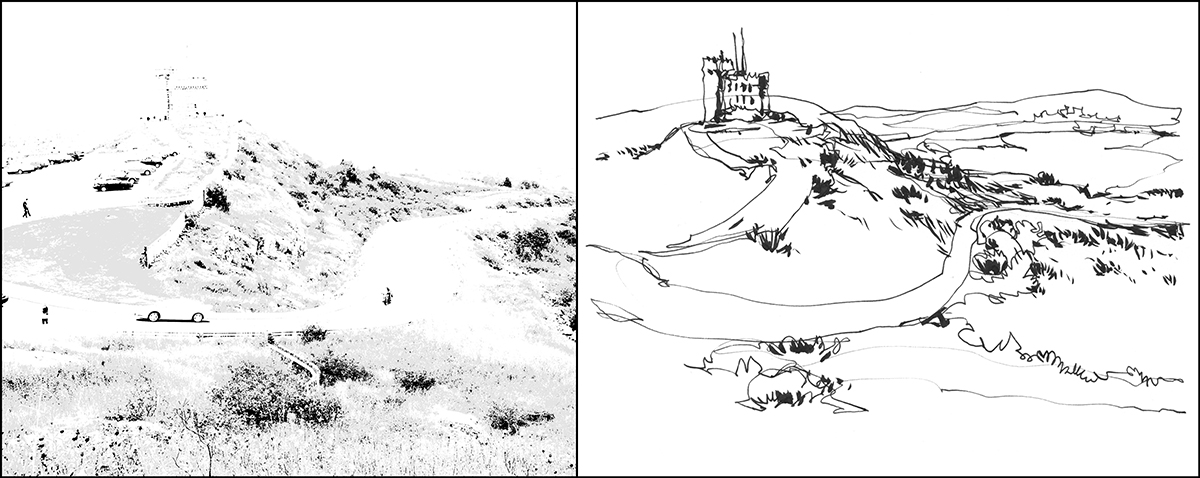
I knew this would work. But I was surprise how perfectly it matches! When you look at the isolated photographic darks next to the drawing – amazing hey?
It’s scientific proof I can draw :) I had never seen this photograph processed this way. I actually didn’t realize how close my sketch was to the real values. It’s just become second nature to look at the world, and see a high contrast version. So – there it is. That’s what you’re looking for. Just the darkest-of-darks.

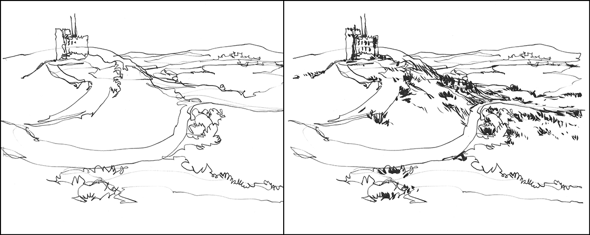
Here’s another example of this discovery. (By the way, these examples are not original sketchbook drawings done on location. Here’s a few of the original pages over here).
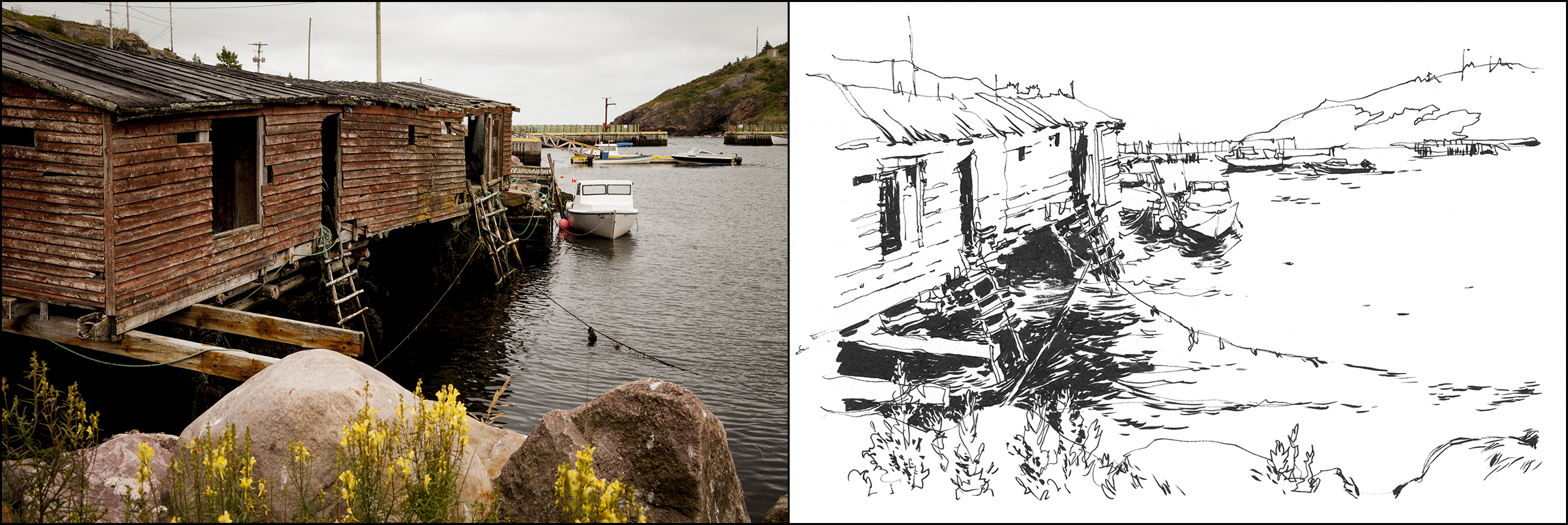
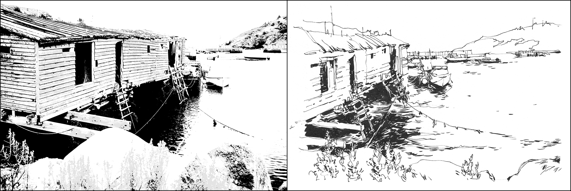
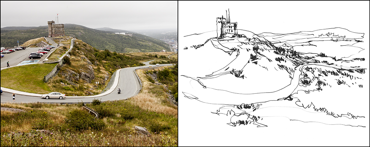
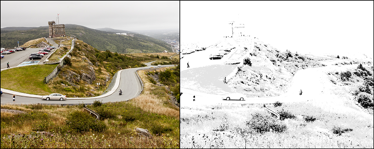
So, here’s the photo vs. the line art – and then the contrast filter vs. the same line drawing. I just can’t get over how closely the ‘eyeballed’ darks match up to the real situation.
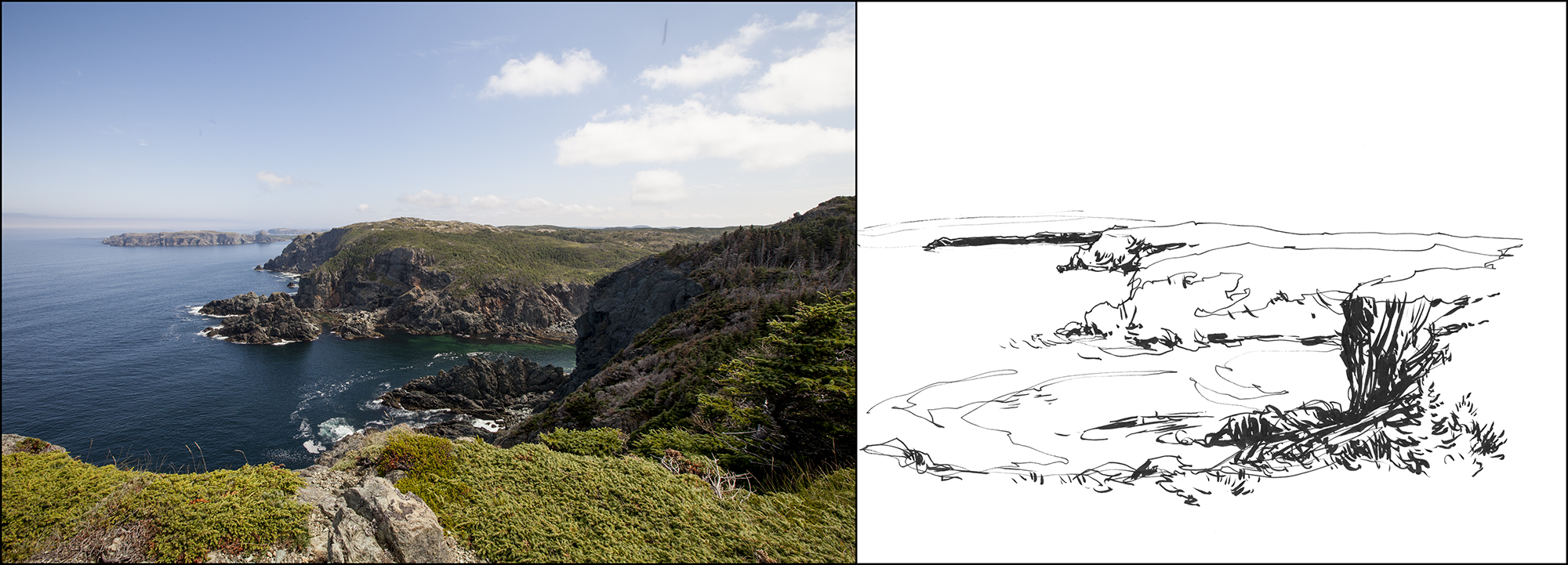
One last example, this one shows a little bit of ‘cheating’.
Here’s the photo vs. the line drawing, and then below the high-contrast version vs. the same line drawing.
Notice how in the contrast-tweaked version, the most distant spit of land vanishes into the lights? And as well, there is no top edge to the cliffs. They melt into the sky.
In the drawing, I instinctively blacked in that distant cliff – even though it is not really in the darkest dark value range. And I drew a hard line along the tops of the mid-ground ridges. These are both choices which are photographically wrong but make for a more clear rendition of the scene.
Remember! None of this was pre-planned. It’s just interesting to see how these Photoshop tests reveal that drawing is an analytical process of seeing and interpreting nature.
~m
Reporting in from Algarve, Portugal
The workshop’s just ended here. Its been a great time. Busy every day painting with an excellent group of people from all over. This was our longest workshop to date – and I quite enjoyed getting to know everyone. You break the ice after a few days, and can really start to learn from each other.
Here’s a few temporary pics from the field. More news on the trip soon. Update: Replaced terrible phone pics with real scans :) Here’s a longer post with all the seaside sketches.

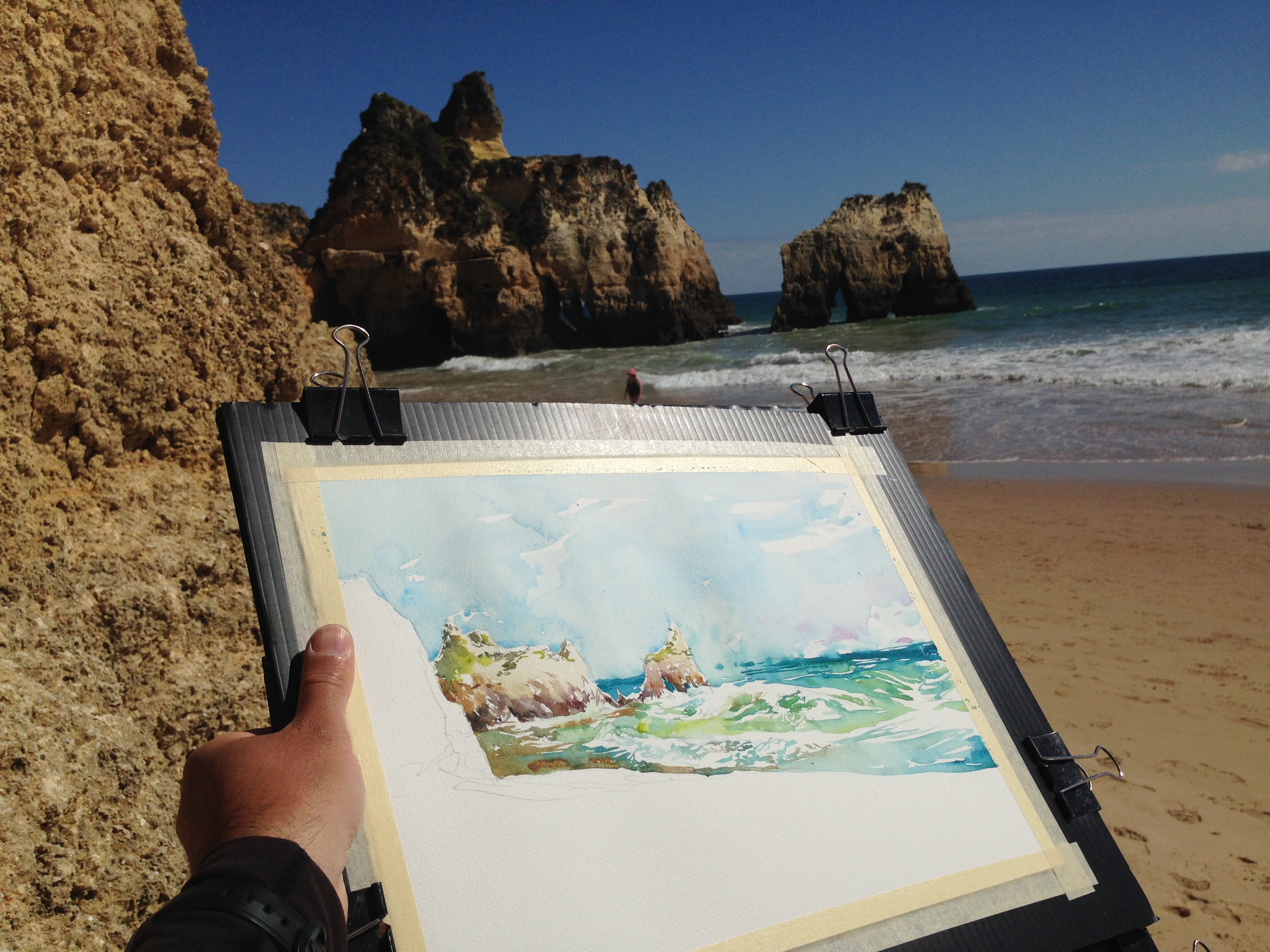
My favorite location (so far) in this area: Prainha Beach, Algarve.

This was actually an embarrassing moment. As soon as I saw the waves I was thinking – OMG I have no idea how to paint these. What was I thinking coming here!
We all did our best learning to do it on the spot.
And that is really the main point anyway isn’t it? No matter what you read and study, you only learn to paint by practice:)
~m
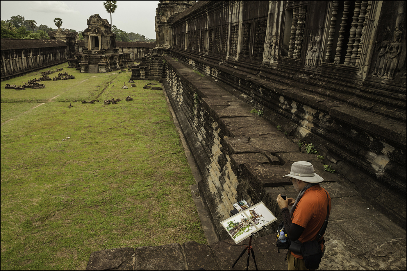
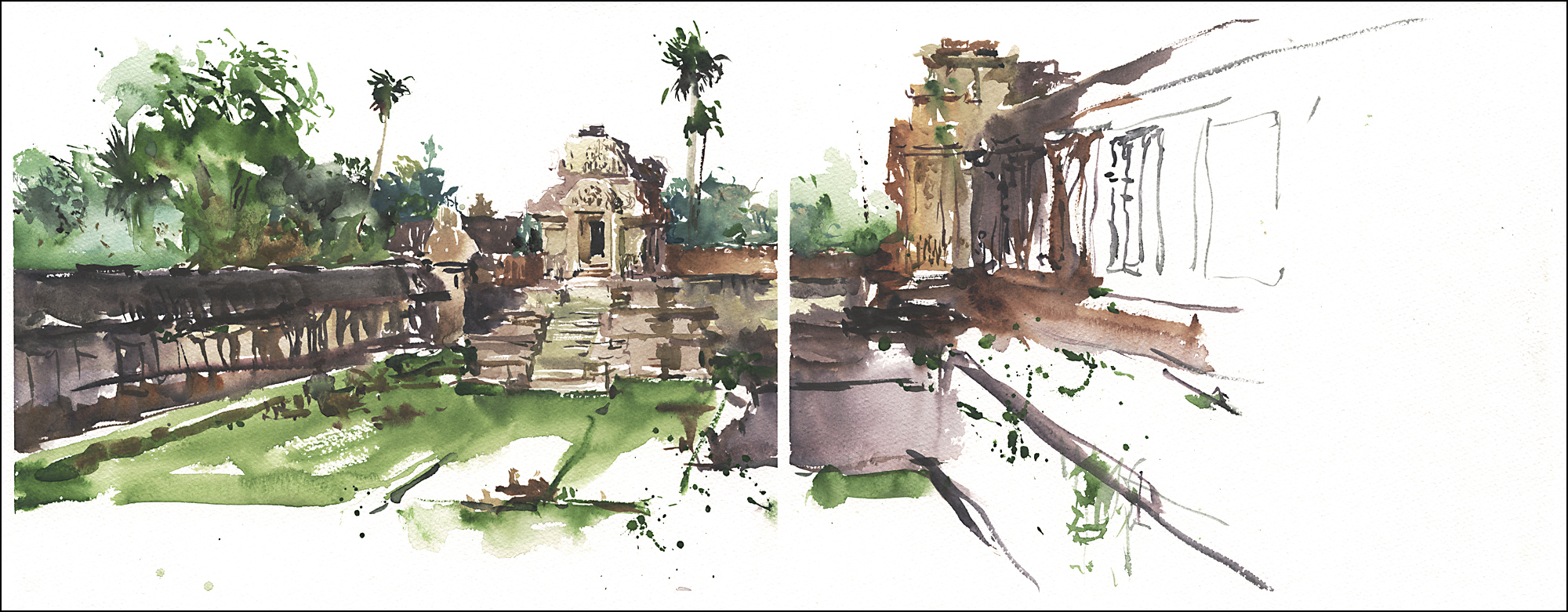
Welcome back for part two! Traveling further afield from Siem Reap, visiting the distant temple complexes.

[Ta Prohm’s small 4 face gate. An iconic sight, common to all the temples]
As you head outward from Siem Reap, the various temple complexes become less ostentatious. Some are as small as a single building in the forest, or an empty reservoir moat with a fallen down tower.
Probably the most well known from film and photography is Ta Prohm. This exotic site is overgrown with giant trees whose roots are often bursting through the stone walls. It’s probably my favorite of the temples – though it does not have the most impressive sculptures or architecture.
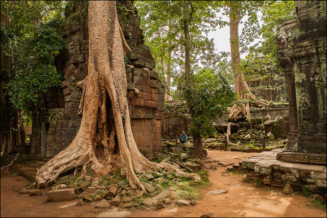

The place is bustling with workers setting up scaffolding and carrying on reconstruction. But with the constant encroachment of the trees and vines it seems like it would all vanish if they took a week off. Swallowed up by the forest.
It makes you want to rush around, sketching everything madly. Like you have only a limited time to capture everything because once you leave it’s going to be gone for good.
In fact, the experience might well be gone for a different reason. This is our second time visiting. The first trip was in 2002. We could see what tremendous difference the reconstruction makes. Things become safer. No more heaps of disembodied figures waiting to be sorted and re-stacked. No more scrambling over mossy stones and into leaning corridors that might easily collapse on your head.
Sorry to be ‘that guy’ saying how it’s never going to be the same. But really – you should just get out here and see it soon! The sites have gone from a few thousand visitors a year, to over 2 million of us playing Indiana Jones. One way or another, that much attention is changing things.
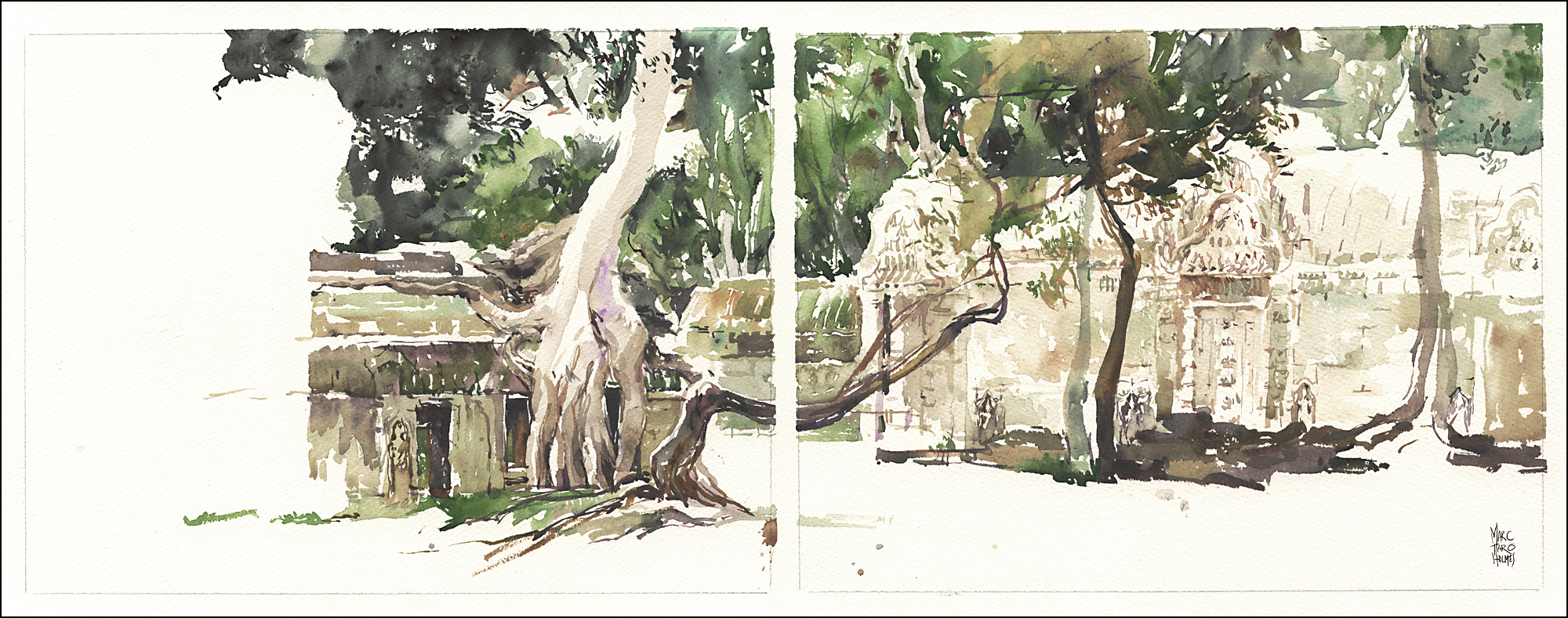
To talk about painting for a moment. In general with these sketches, you’ll see me working to simplify.
To distill the immense complexity of the carved structures and surrounding vegetation into a painted impression. A set of silhouettes.
With this one, I knew I wanted to record the complete feeling of the place. This was the one image I’d planned to get from the start. The whole trip was made to get here.
I probably spent over two hours at this spot. Not that long for a plein air painter, but quite a while for a sketcher.
I think of the mass of the tree canopy almost the same way I might paint clouds. It seems ‘all in one shape’ now, but it was grown out carefully from the edges of the buildings.
I had the most fun leaving out the negative space for the tree roots, then coming back to paint them into the reserved white. It brings the image suddenly into focus when you drop in the final puzzle piece.

Painting in the rain. There was a lot of that this trip. One day I will work out a way to wear an umbrella on my back, in the manner of the soldier’s flags in a Kurosawa samurai film.
For now I’m just tying it onto my backpack straps (Flimsy). Or holding it in the same hand as my drawing board (Very awkward). I’ve also tried lashing it to a monopod and holding it in the crook of an elbow. That works, but you have to carry the extra monopod.
All these jerry-rigs are highly susceptible to wind-gusts. So nothing is perfect.
By the way, this also works for painting under intense sun. I did a few sketches in Italy with an umbrella sticking out of my shoulder bag.
I’m starting to hate sun screen, but I also worry about melanoma. If you’re going to be out in the sun for weeks at a time, that’s getting to be a real concern. Something on the list, to be worked out in the future.
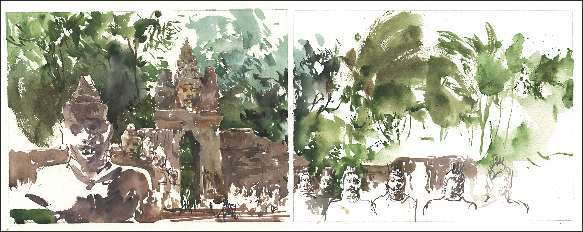

This is the South Gate of Angkor Thom. The rows of stone soldiers on the bridges reminded me of Chinese Terracotta warriors.
They are meant to be holding up a giant serpent, but the horizontal sections of the snake have fallen away. Probably to be restored soon.
When we were last here years ago, there were classrooms of kids being taught stone carving. I’m sure the idea was to plan ahead, to grow the craftspeople that are stewards of these national treasures today.

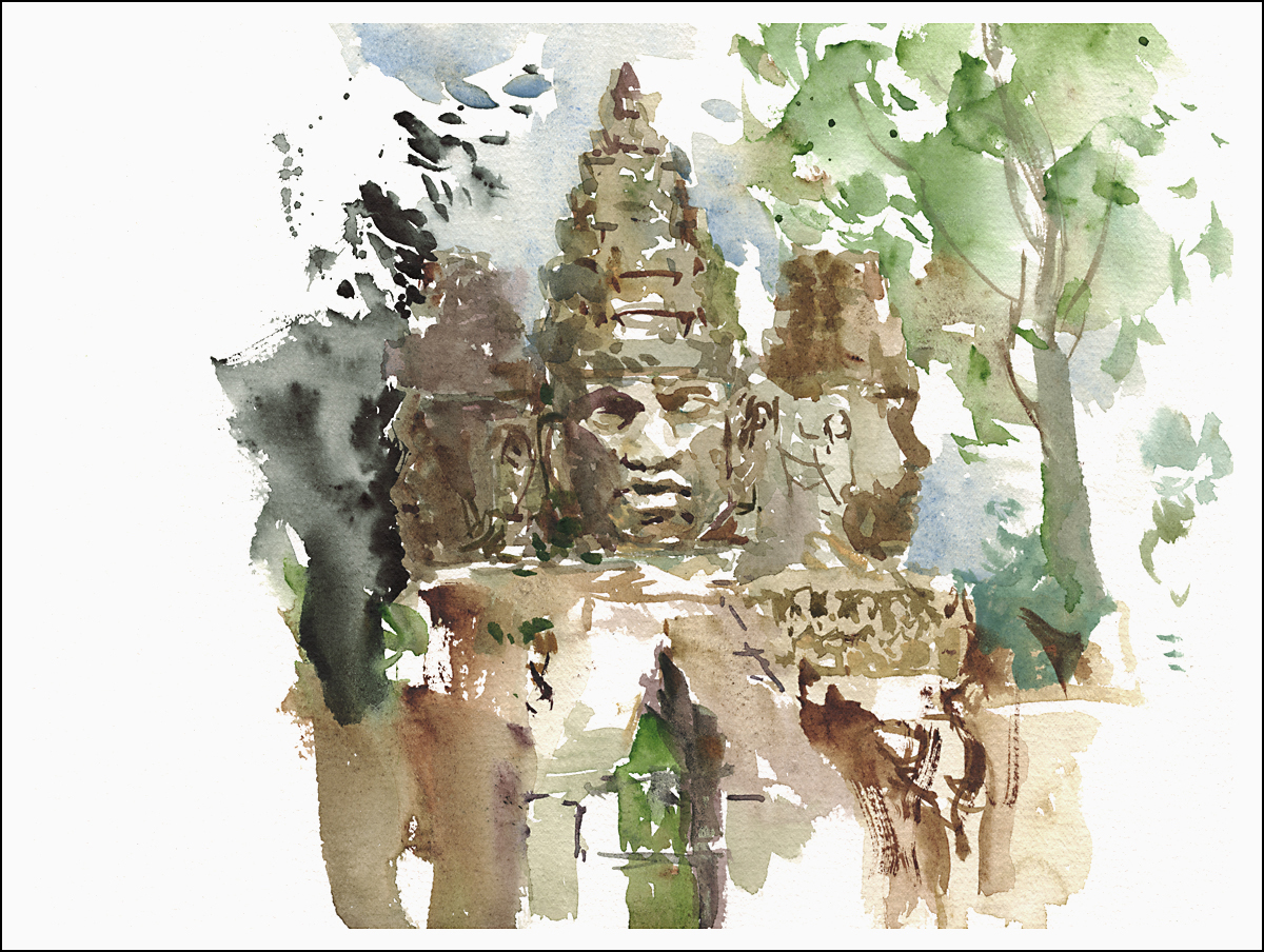
Finally, The Bayon. This tower is the best location for 4 face heads. You can climb up to the top and get eye to eye with the giant stone faces.
From a distance, if the lighting is not right (midday, or overcast), the place is really just a jumble of rocks. You have to be conscious to create organized blocks of color and value. Work to separate objects which in reality are camouflaged together.
That being said, this painting is very much ‘artistic license’. Not really a faithful representation. But who is to say? It doesn’t look like photographic reality – but the sketch will be how I remember it :)


As you read this we are probably starting the first day of painting in the Algarve. We’ll be away for a couple weeks, so I thought this is a chance to post something from the archives.
Let’s go back to last July’s trip to the Khmer temples in Siem Reap Cambodia.
Immediately after the 2015 USK Symposium in Singapore, we spent a week touring with some of the other workshop instructors. I’m sure followers of Urban Sketching blogs remember the coverage from people like Suhita Shirodkar, Stephanie Bower and Shari Blaukopf. At the symposium I’d been teaching about sketching people at high speed. But we’d also been exploring the city in our free time, getting used to the realities of painting in extreme humidity.
By the time the official programs were over, I was excited for the next leg of the trip – but I also felt like half a burned down candle.
Big workshops are an overdose of activity – all of the painting and drawing, combined with the social buzz – it can be exhausting. So the plan for Siem Reap was simply to paint every day. I wanted to do nothing else besides exploring the temples with my watercolors. No doubt there are other things to do in town. There are local arts and crafts, there’s dance and theater. There is great local food. Certainly there are fascinating markets full of street life and exotic goods. But by then I was into my zone of simply painting for myself.


So what can I say about visiting Angkor Wat and the surrounding temples that hasn’t been said before?
When visiting any great archaeological site, we are reminded that no matter how impressive our modern accomplishments (the iPad being the greatest I can think of right at the moment) humans have been constructing epic monuments for thousands of years.
The level of artistic achievement and the complexity of the engineering are so astounding that the modern mind isn’t even able to take it seriously.


[Painting Angkor Wat from the east side]
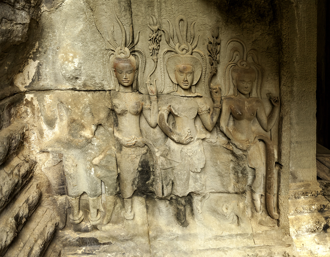
Think about the generations of effort invested in transforming the landscape on this scale. The huge reservoirs dug out of the jungle, the massive stone temples with every surface covered in sculpted carvings. I have a hard time imagining how it could be accomplished.
With any of these places – the great pyramids in Egypt or the Mayan and Aztec cities in Mexico – we have been tempted to revert to magical thinking. “Chariots of the Gods! These must have been made by aliens!”

In our modern society, where we can’t even agree to vaccinate children, it seems like cooperative effort on this scale is something out of the question. Something humanity may never see again. You get the feeling, when walking here, that this is a thing we have lost. We may never again see a culture reach these artistic heights.
I don’t mean to be romantic about it. I’m sure the reason ancient kingdoms were able to build this way had everything to do with theocratic dictatorships and the iron rule of warrior kings. You probably need a huge population of let’s-just-call-them-slaves. There is no time to worry about universal health care and education. Never mind the OSHA.
But it’s easy to brush that aside when you’re there, and simply marvel at the place. I often wonder, if these beautiful complexes were actually used by the people – or if they were gated palaces only for the privileged few. Who got to see these miles of relief carvings? Who was living in these halls lined with row on row of statues? Was it only a few saffron robed priest-kings living in luxury? or were the stone courtyards packed with people, animals and wooden houses – a chaotic village crammed inside the walls? Today it has an abandoned feeling. I prefer to imagine these empty places packed with a riot of color.
If you spend any time in the modern day temples in Siem Reap, you get a sense of that barely contained energy. The way every inch of space is used for color and decoration. There are very few solemn monastic courtyards in the bustling streets of a living Asian city.


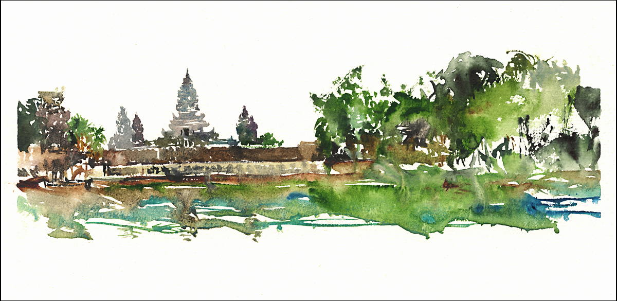
[Wat Prea Prom in Siem Reap]
Next week, I’ll carry on with sketches from the more distant temples. Stay tuned! ~m

Sketchrawl in Sagres: April 2, 2016
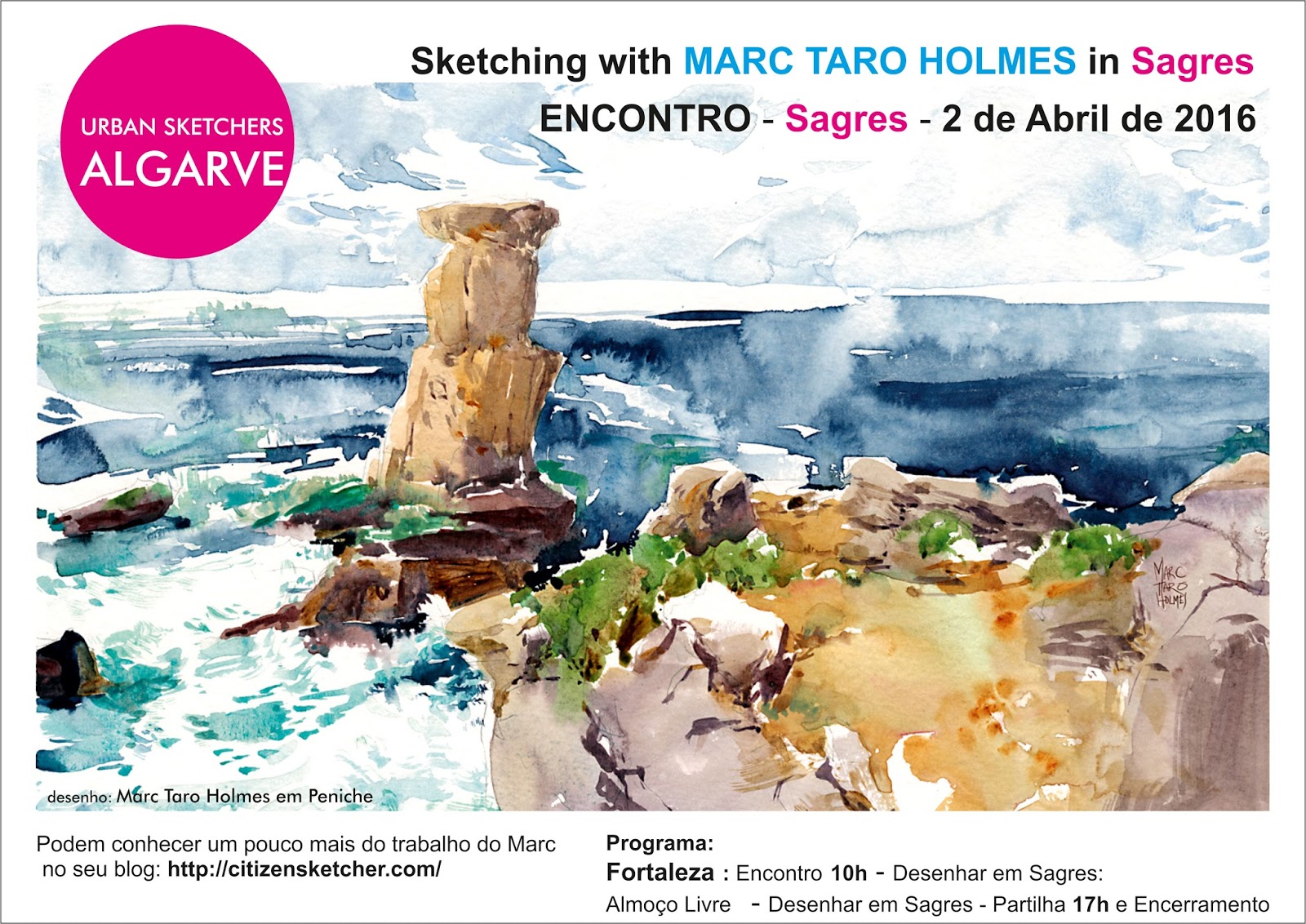 We will be in Portugal for the next few weeks, teaching and painting. If you’re in the Sagres area on April 2 – we’re joining the local USK: Algarve group for an open sketchrawl. No charge, just come out and draw. No experience necessary! But bring your own art supplies. See some of you there? ~m
For a while now, I’ve been wanting try making my own accordion fold watercolor sketchbooks.
We are doing the last minute planning before our Portugal workshop – so this seemed like the perfect time to decide if I’ll be bringing these with me.

So I quickly bashed one together, and took it to a local life drawing workshop. This was a terrific three model costume drawing event hosted by the CCGV for Montreal’s Nuit Blanche festival.
I didn’t go as far as making a fancy binding or rigid cover for this – that’s certainly an option if you’re a craftsy type – this booklet is literally just a single sheet of watercolor paper, cut and folded following a pattern. (See below). It only takes 5 minutes to make one, and that’s the kind of convenience I’m looking for.

To me, the main advantage of this process is choosing your own paper. I made this 5.5×7.5″ booklet out of a 22×30″ full sheet of 80lb cold press Strathmore Aquarius II.
This paper uses a synthetic fiber, which has the amazing ability to stay flat when wet. It simply doesn’t ripple when you paint on it. (Here’s my first test painting done – wow! – back in 2013).
I can say, it really does work. You can paint directly into this little sketchbook, and not worry about stretching or taping the paper. Exactly what I want for a field sketching notebook. You can see you get plenty of wet-in-wet wash effects. And even though the paper is only 80lbs, it stays perfectly flat.
As with any book, you still have to leave it face open to dry – so I did clip it to a drawing board while working. But overall, I think this will suit perfectly for the days we’ll be touring the Algarve.
I’ll still be bringing an easel for the ‘stand and deliver’ painting days. But when we’re walking about, I hope to take advantage of this flexible format. You have the option to sketch either single pages, double page facing spreads, or to fold out four consecutive pages to make a 7.5×22″ panorama.
After finishing the book, you have the option to flip it over and keep drawing on the backs of the pages – giving you 30 pages total. You can also unfold the spreads back to the full sheet size -so if you were painting panoramas, you can easily trim them out and be ready for framing.


Here’s a PDF of the pattern for these booklets. Feel free to share it with anyone, or use it in your classes. If you’re like me and prefer to buy your paper in full sheets, this fast and easy folding pattern means you’ll never have to buy a commercial sketchbook again!
—-
Oh yes! and here’s a few other articles on sketching panoramas – in case you want to try out the four page spreads on a nice city skyline or 360 degree view!
How to do a Post-and-Rail Panorama Drawing

Example of a walking panorama, and a 360 rotation
My ArtistNetwork.tv video on Sketching Panoramas (paid content).
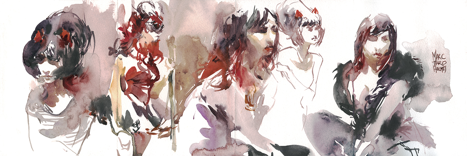
Sketching the Sketchers
")
")
")
")
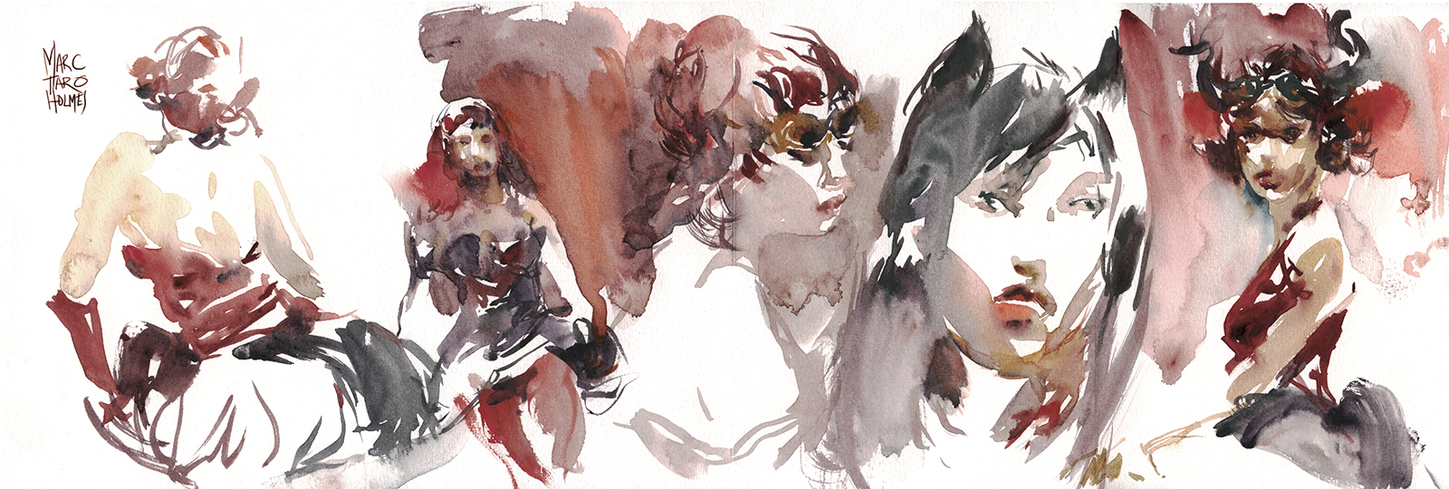
Here’s some little portrait sketches from our last USK:MTL dim sum lunch.
There’s a style right now for brightly colored eyeglass frames that makes for fun drawings. My feeling on drawing eyeglasses is – don’t draw the entire frame. Leave some of it to the imagination to avoid overpowering the face.
I suppose that is weird advice – because I can say that about absolutely anything. Don’t draw everything you see :) Less is more. Make the viewer interact with the sketch. Make the brain interpret the lines. It’s more fun for everyone.
I still had my small vial of diluted ink to draw with. I think it really works for these little portraits. They’re in a 6×9″ pad of Strathmore 400 watercolor paper. I had thought these were cheap little pads (I bought them in a Michaels in some small town, as emergency back up on a trip). But it’s actually very nice paper. I finally realized, when it comes to Strathmore paper, the higher the number the better (300,400,500).
The Urban Sketcher in Česká Republika
I was pleased to find out that The Urban Sketcher has been translated into Czech :)
I don’t speak/read the language, so I’m interested to hear from anyone if they like the translation. If anyone has a copy or sees it in the wild please let me know.
It’s exciting to think people could be trying out ‘Street Sketching’ in Prague. Send me some links to whatever you’re drawing over there in Česká Republika!
Workshop News: Galway IE sold out! Thinking about India?

July 2016: IRELAND: This just in: our Galway Ireland Urban Sketching Workshop is sold out! Thanks everyone – we’re looking forward to meeting you all and starting the wandering sketch-trek from Galway to Manchester with those that will carry on with us. We have a short waiting list building up, so you can still contact Laurel to put your name down with the hopefuls.
 FEB 2017: INDIA: It might seem like a long time in the offing – but if anyone is interested in our FEB 2017 painting adventure trip to India (Delhi/Varanasi/Agra) – it is worth it to sign up soon. We’ve just sold out Ireland six months in advance. So, don’t hesitate if you’re thinking you want in on that painting trip of a lifetime. Head over to the workshops page to get more info on registration.

Trip Planning For Portugal Begins in Earnest!
In other news: I’m starting the ramp up for travel to Portugal! Stocking up colors and paper. I think I need a minimum of 6 sheets a day to be sure I won’t be short paper. (I’m bringing 10×13″ for a standard format this time – fits in my lighter weight mid-sized bag and makes a 9×12″ original, which is a nice size for framing). And I’ve just been listening to advice from photojournalists who say ‘bring a full duplicate set of all important gear in case of loss/theft/etc’. So I’m doubling or tripling up on tubes and need to purchase a backup set of brushes to go into the suitcase. (That’s going to be a big investment).
")
")
")
")
Some news from online: Roseann Hanson of Arizona showed us this great idea (over in the Craftsy Travel Sketching class message board). She’s invented a DIY magnetic quick release for her drawing easel. Brilliant! Much quicker to set up than the threaded items you might have on a standard tripod. Read about her plein air setup and her very interesting life over on her blog The Constant Apprentice.

Here’s another brilliant invention/adaptation. Leslie Fehling of Prosperity PA is using the drop-in magnet trick for her water jar, but has another smart tip – use a drill bit gauge (Velcro’ed on here) for her brush holder. Pretty smart! Something to pick up at the local hardware store. Read the details of her compact lap-desk over on her blog: Everyday Artist.
Ok – that’s it for news from the studio – back to planning for Portugal! Hope I get some warmer weather soon to begin training in earnest.
~m

