Painting the Sea: Rocks and Water in the Algarve
 We’ve just returned from our 11 day painting workshop in the Algarve Portugal. There’s of course a wealth of things to see in the area. Much of it is pastoral landscape with picturesque towns and fishing villages. For me – a kid from the Alberta prairies – it was the beach that held the most opportunity.

Since people will ask – these sketches are 1/4 sheet, so approx. 11×15″, and the most important colors are Buff Titanium and Goethite for sand and Indigo, Turquoise and Viridian for the sea and sky.
I used Cobalt Teal Blue in Florida but I was told (by the Queen of Color Jane Blundell) how to make a more complex effect with Buff Titanium added to any cool blue or green.
For the warm colors of the rocks I went to the famous Buff Titanium again, plus Quin Gold, Trans Red Oxide and Raw Umber Violet.
So the take away is – get Buff Titanium! It’s incredibly useful as a pastelizer and opacifier. (Someone can tell me if there’s real watercolor terms for those two words?)
People are always saying ‘I don’t have that color, what is that for?’ – so there you go. It’s for everything that has a dusty yellow to warm white pastel tone. Also comes in handy for trees, concrete, even fleshtones sometimes.
 When you have a tremendous location like this, the paintings seem to make themselves. I love the elemental simplicity of rocks and water. It’s almost abstract. It seems like there’s an infinite number of compositions with the ever changing colors of the sea.

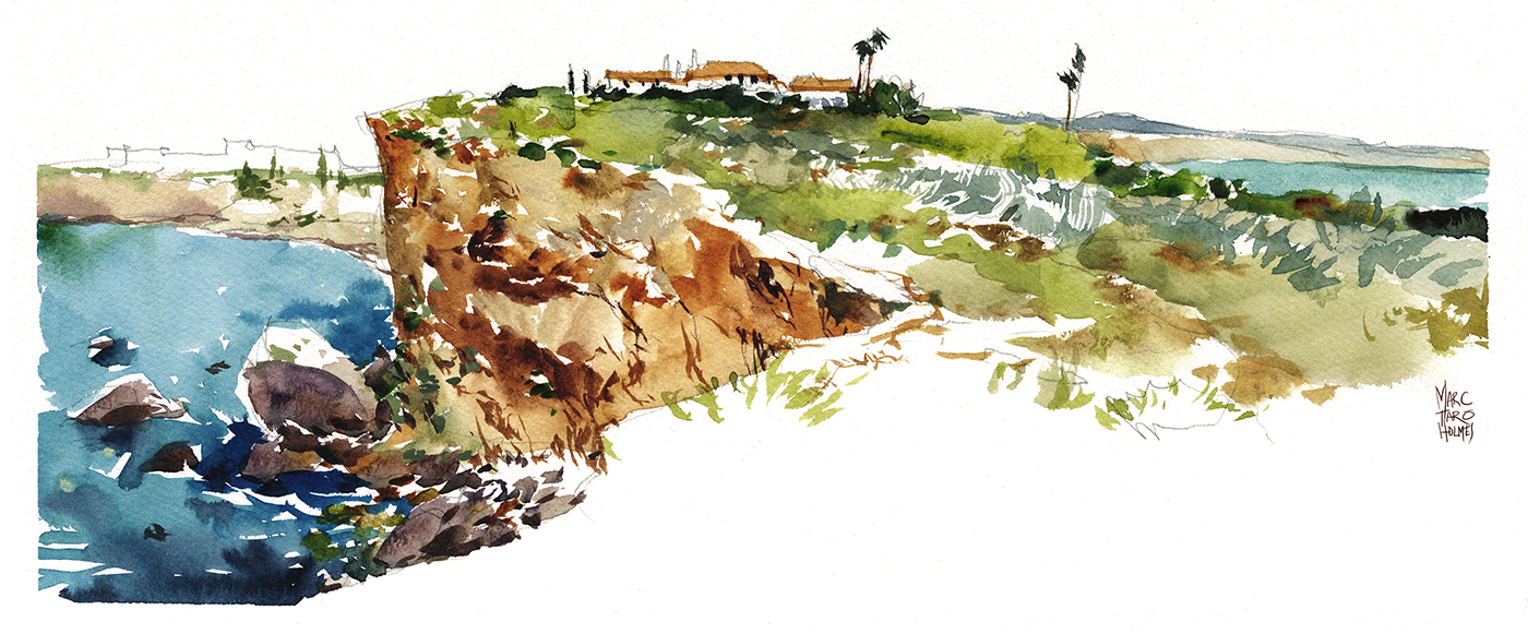
These are sketched at the far end of Alvor Beach at a small section they call Prainha. There really aren’t very many rocks here, but it was right near our home base, 30-40 min walk from the harbor, so perfect for a quick day trip to the beach.
They’re building a boardwalk all the way out here, so it will be even easier next year. Today, you can walk along the highway, or do what we did the second time and take a cab to the Restaurant Atlantida – they have the prime spot at the very end of the beach. I suspect it’s a popular choice for a sunset dinner.


If you come on foot by beach, you can get cut off by tides, so you might need to go up the cliff. There’s only one staircase in the area, which is easy to find. The main challenge at the seaside is breaking down the patterns of moving water.
Seeing zones or ‘stripes’ of color where you can see depth changes, interpreted as horizontal bands of green or blue. I think you can see three or four horizontal passages of dark-to-light, blue-to-green in this one above? It’s of course not that simple in reality – but you can make some judgement calls and simplify it into these bands. I worked fast to lay them while edges were still wet. Just don’t stop in the middle. Paint all the water in one go, and plan ahead not to run out of your water-color puddle in the middle of the page.


As well, I found I had to go back and restate the darkest blue on the horizon with more intense pigment at the very end. (After the first pass was dry).
And of course, note the reserved white of the sea foam. Those gaps are things you’ll have to try and allow to happen as you’re gliding across with sea-blue-green.
Another odd bit is the colors of wet sand – I found that hard to guess at – or the eddies of sand kicked up into the waves. These are perfect places to charge in the extremely sedimentary color DS Goethite.

At different times of day the water bounces back different colors. In the early morning, or a rainy day, it’s almost black in the foreground – reversing the normal sea-green foreground to dark blue horizon.
This one is from the Ponta da Piedade in Lagos. I highly recommend this spot – the best place for rock arches and intersecting lagoons.
In the very early morning, when the water is calm, they do stand up paddle surfing tours. It was just two of us and 10 or 12 of them out there at sunrise.
I only did one full-on painting here. I don’t know what I was thinking! But you could go back over and over and not run out of things to paint at this spot. If you do only one rocky point – this was the best I found. Locals might have better suggestions – let me know in the comments!

I noticed a lot of local sketchers using long horizontal panoramic books. It makes sense – the land here is perfect for them. There’s a 6×12″ watercolor block by Fluid paper that would be ideal for these long, low red-orange cliffs leading out to sea.
Here’s the last two of these we did at a day out with the USK Algarve group. They were kind enough to host a session where we could meet a group of local sketchers.If you’re visiting the area, check out their blog in case they have an event on.

This sketch above with a very simple long low yellow building you can barely see? – the one looking like a stick of butter in the sun? That’s the fort at Sagres. It’s a great spot with views all around it. We did both of these sketches, parking at the nearby Pousada Do Infante and looking back at the point.
Next up: sketching the towns: Alvor, Portimao, Sagres, Silvas. Stay tuned for more from Algarve!


I love your paintings and photos and the entire experience there in Portugal. Amazing colors and light! I will have to study this post because you have such good information, especially about the Titanium Buff. Which brand are you using?
Hi Margaret – that one I have from Daniel Smith. I’ve actually added all the brands onto the color list I have on this page: https://citizensketcher.com/class-notes/.
I agree with Margaret – you share some great insights here. And perfect timing because I’m headed to a beachy vacation in FL in a couple weeks! Did you do any pencil or ink drawing first or just paint directly with watercolors? It seems an opportunity to use your one-line contour technique which I’ll definitely be using in FL as I try to capture water scenes for the first time. You inspire me to keep trying – thanks again for sharing so much information & inspiration – I love reading your blog!
Yes, I do a quick little line drawing most of the time. I try to make it ‘the least amount of drawing possible’. I never want to be over-drawing it. This one has a two sketches in various states of unfinished. You can see the line drawing in the one I didn’t paint. So they all had something like that: https://citizensketcher.files.wordpress.com/2016/04/16apr15_algarve_beaches-3-copy.jpg
Oh yeah and thanks for the buff titanium tip – I always think my sand is too golden; this should help. Coincidentally, I have only one empty spot in my palette – guess what I’ll be adding? I’ll be stopping at D Smith on the way home from work today!
Gorgeous sketches, Marc! Loved reading your comments and very helpful to know your paint colour selections too. Thanks so much.
Wow what a trip :-)
I’m glad you are enjoying my favourite magic pair – buff titanium and goethite. The other property they add, of course, is granulation to go along with ‘pastelizing’ and ‘opacifying’, especially on damp paper. And Trasparent Red Oxide is a great buddy to that pair for any sandstone rock.
Here’s a link to a mixing chart with Buff titanium for anyone not familiar with this wonderful pigment http://janeblundellart.blogspot.com.au/2015/08/3-mixing-with-buff-titanium.html
Absolutely working like a charm – great advice from you that day in the park in Singapore! And I’ve put a link back to your blog right in the post so people can follow up.
In fact – I have benefited so much from that one color (Buff Titanium) that I’m trying out Holbein Grey of Grey as a cool version of that same thing – a close-to-white opacifier. Hopefully that’s not taking your advice over the cliff – but we’ll see. I’m liking it on short term trial.
I have only tried that Grey of Grey colour in Mission gold – not sure if it is the same hue but I think they copy the Holbein colours fairly closely. I just mix buff titanium with my Jane’s Grey for that more opaque light grey but there’s nothing like experimenting :-)
Looking forward to catching up again in Manchester – then Montreal all being well :-)
So beautiful!
This is definitely talent at its finest. It is great that artists can spread the word in a way that is amazing for people to see. It brings joy to my heart to see this portrayal of beauty.
Any chance you will do is again in 2017?
Fingers crossed.
You can also get buff titanium in a pan from Kremer pigments..
No I’m sorry! I won’t be doing live workshops in 2017 – here’s a post I’ve made, as I end up telling this tale repeatedly :) https://citizensketcher.com/workshops/
Beautiful touch