Sketching Tip: Seeing Darks
To me, a painting isn’t complete until is has a full range of values. Even in a quick sketch I like to see strong contrasts in the areas of interest. (Not so much in the background – as that’s often far away).
The great thing about a sketchbook drawing, is you can go right to those solid blacks using a thicker pen line or (my favorite) a brush pen.
When you draw in black ink, you automatically have the highest contrast. It’s just the white paper, and the black drawing. At that point, whatever color you splash on you can be pretty sure it’s going to work.
A short while ago I was answering a student’s question about placement of blacks in the drawing.
I find this comes up a lot – the question: “How do you know where to put the darks?” It seems there’s a natural fear of doing it wrong. The solid blacks are so powerful – they’re scary! What if I put them in the wrong place? Or use too much black? Will I ruin my future painting?
Quick answer: probably not – and even if you do, it’s just a sketch! Try it and find out :) You can always make another one :)
I’ve always found this question a little hard to answer. Because the only thing to say is, “well – you just *look* at the scene”.
Look for the areas that have the darkest shadows. Hit them with the black ink – and suddenly the thing pops out into three dimensions.
It’s like the drawing is the skeleton of the painting. Just the clean bones of the thing, waiting to be fleshed out in color.
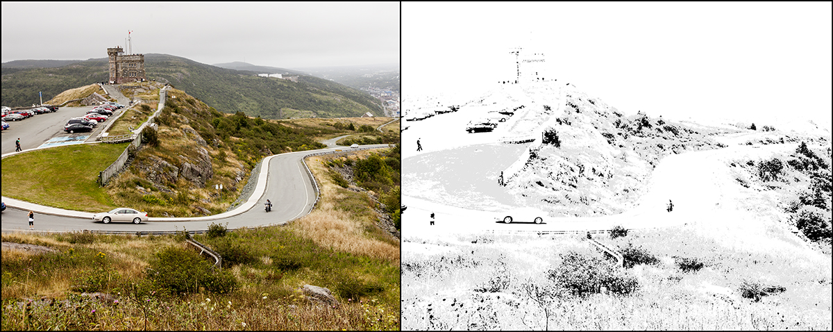
This time, when trying for a better answer, I hit on the idea of using a high contrast adjustment layer in Photoshop to show ‘scientifically’ where these darks are in the image. The idea here is to remove every color other than black.
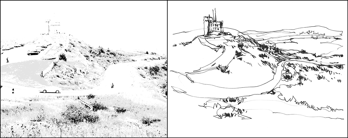
I knew this would work. But I was surprise how perfectly it matches! When you look at the isolated photographic darks next to the drawing – amazing hey?
It’s scientific proof I can draw :) I had never seen this photograph processed this way. I actually didn’t realize how close my sketch was to the real values. It’s just become second nature to look at the world, and see a high contrast version. So – there it is. That’s what you’re looking for. Just the darkest-of-darks.

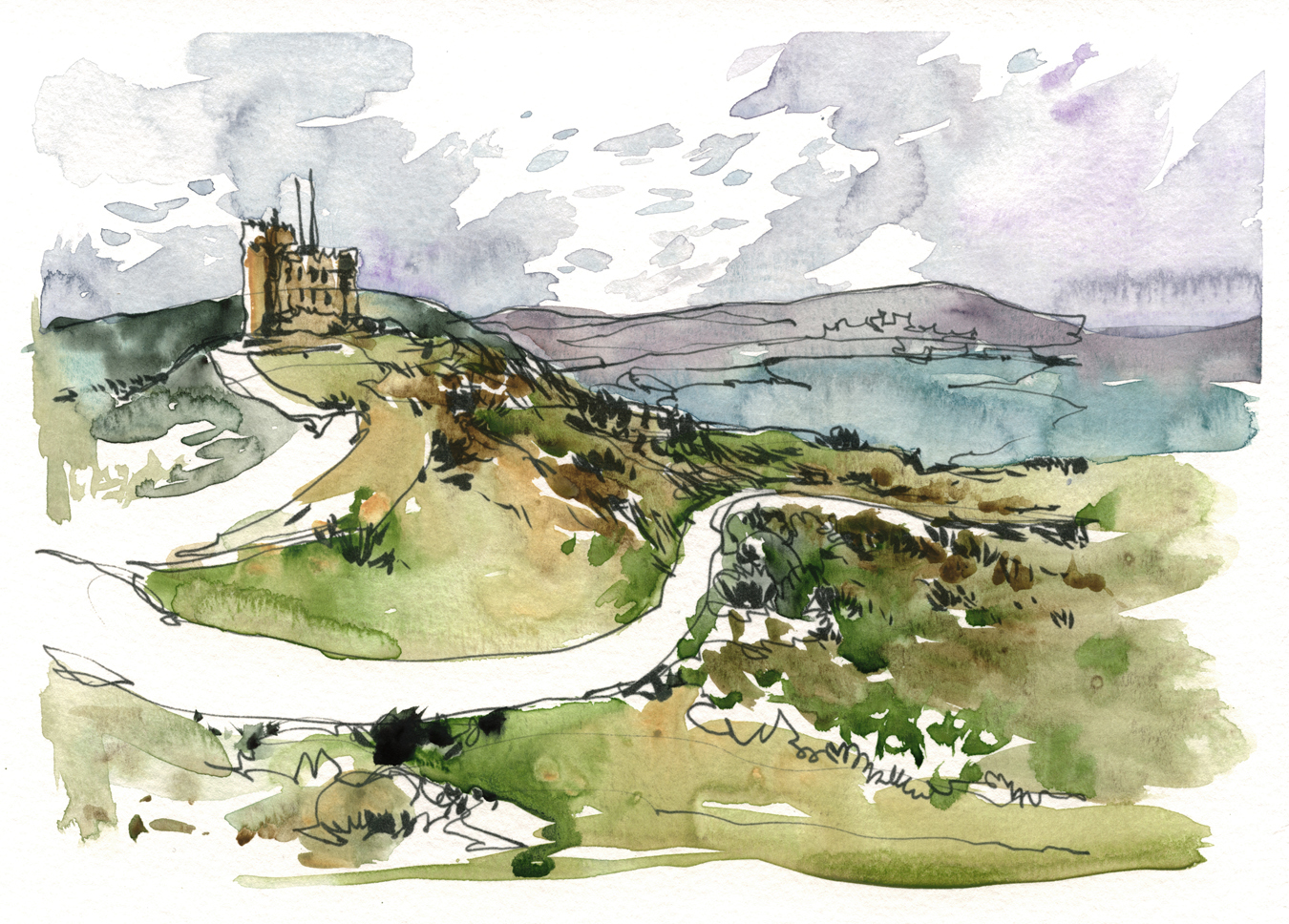
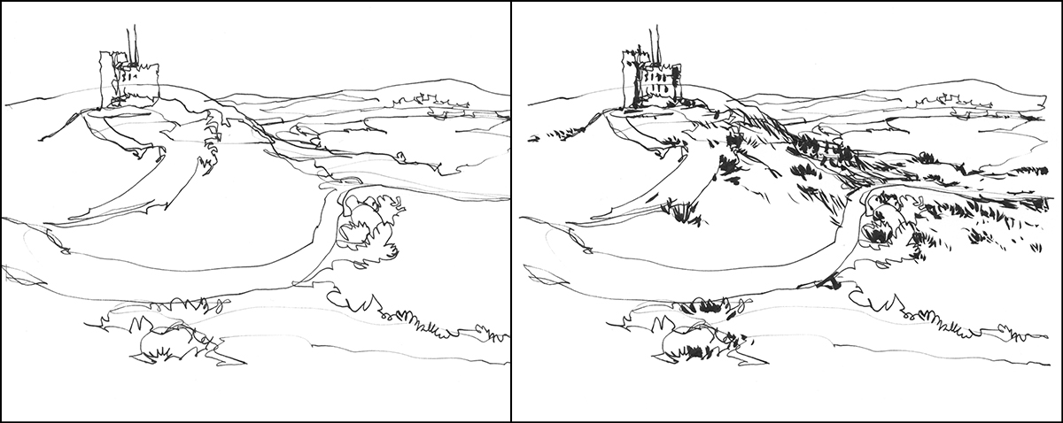
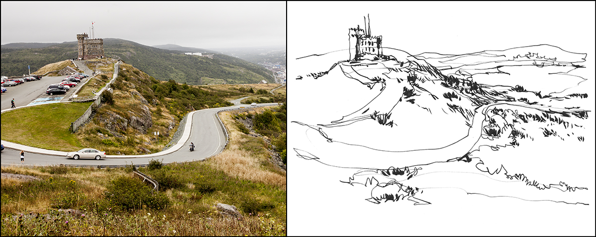
Here’s another example of this discovery. (By the way, these examples are not original sketchbook drawings done on location. Here’s a few of the original pages over here).
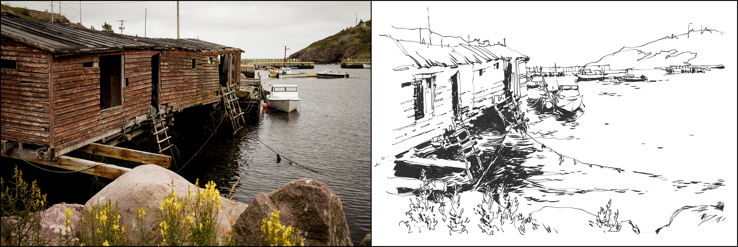
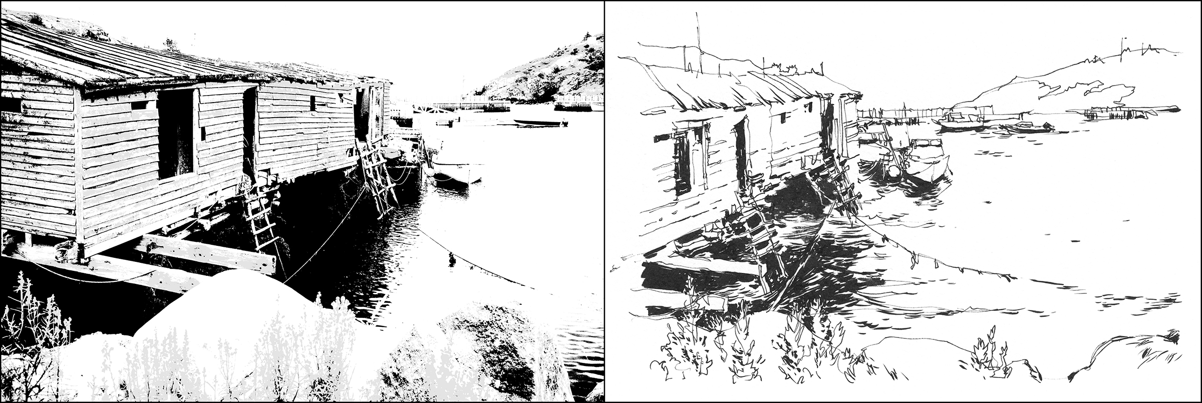
So, here’s the photo vs. the line art – and then the contrast filter vs. the same line drawing. I just can’t get over how closely the ‘eyeballed’ darks match up to the real situation.
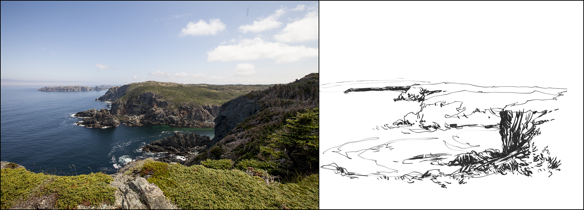
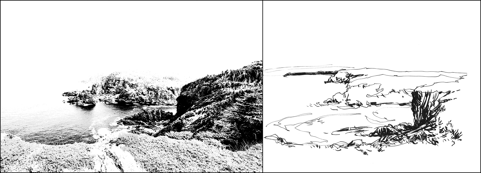
One last example, this one shows a little bit of ‘cheating’.
Here’s the photo vs. the line drawing, and then below the high-contrast version vs. the same line drawing.
Notice how in the contrast-tweaked version, the most distant spit of land vanishes into the lights? And as well, there is no top edge to the cliffs. They melt into the sky.
In the drawing, I instinctively blacked in that distant cliff – even though it is not really in the darkest dark value range. And I drew a hard line along the tops of the mid-ground ridges. These are both choices which are photographically wrong but make for a more clear rendition of the scene.
Remember! None of this was pre-planned. It’s just interesting to see how these Photoshop tests reveal that drawing is an analytical process of seeing and interpreting nature.
~m


That was a perfect visual explanation and a wonderful affirmation of the discernment capabilities of the eye, if we trust its judgement and don’t second guess what it sees. Definitely an A-HA moment for me and one I’ll endeavor to remember from now on when I’m sketching.
Hi Marc. Great post. But just wondering what your take is on the idea of major changes to real life tonal patterns etc in order to achieve a better sketch / painting? Or maybe if the real life patterns don’t attract you in the first place you wouldn’t be doing the sketch anyway? Best, Tony
That’s probably the case, that if something needed major changes, I might not be attracted to it in the first place? I tend to lock in on nice light patterns just when walking around. You’re brain gets programmed to see what you like and skip what you don’t.
One kind of ‘major change’ that I will do – is keep painting whatever light I saw initially – even if it changes out from under you. Try to sketch it in to the scene and stick with the plan! So there is that :)
~m
Thanks for the extra insight Marc.
Great teaching post on dark values, Marc. Thanks for this,
HI Marc — GREAT explanation of darks — very enlightening! ( haha)
Great post, thank you!
I loved these drawings in your class.
Great post, Marc, and I am somewhat surprised that you didn’t give your Craftsy course a plug so I will: I immediately recognized these three sketches from Marc’s on-line course which is a great introduction to one line and 5 à 7 line drawing and getting a feel for a scene. There is a lot in it and I really enjoyed it — this post makes a nice addition to the lesson on values. :)
I would also like to join E. Brancroft’s favorable review of Marc’s Craftsy course. It is full of great demos and techniques presented in easy to follow steps. I don’t foresee being able h to attend a live workshop in the immediate future,but am so thankful that I can access his instructions! (no folks: this isn’t a paid commercial – just an honest testimony!)
Very useful post. I find it helpful to squint, it really simplifies the images and tones and removes detail so I can see where the main darks are.
very inspiring work! I like the colours of your Picture. Maybe you like to look at my page too, would be nice ;)
@catveldmaus
Looks incredible and inspiring! I love when you post the photo because is like knowing how to put your glasses on and see the world
Beautiful! Greetings from Montreal. :)
Thanks for the tip about photoshop, that will help a lot on values. One thing I tend to do with sketching on location, is to ‘squint’ that seems to show the darks – at least it works for me.
Yes absoluely – and/or once you get to a certain age, you can just look over your glasses :) You get values without detail :)
Reblogged this on Edo Hannema Watercolor Art and commented:
A very interesting blog about seeing darks!
Some artist really have nice subjects and there is something missing. most of the time every piece of white paper is gone. And there are no dark tones.
I think this can help.
Well the reblog didnt work out, but I am glad you made this good piece! thanks!
Thanks Marc for an easy to understand method of dealing with darks first in your sketching. The squinting works well for me but a piece of red acrylic is even better. I have PhotoShop as well. Mainly for the cut-out filter for values. Enough of my two cents worth. Keep up the good work. You seethe example and help inspire us to do better.
I’ve heard of the red acrylic trick but have not tried it. In fact, L has and red camera filter for black and white film photography. I’ll have to give it a try.
Since I don’t have PhotoShop on my iPad I did some searching and found this wonderful app from Plein Air called ‘Value Viewer’ . You can do exactly what you mentioned above in Notan and in various levels of grey. I do not carry a PC around but my iPad is with me wherever I go so having Value Viewer is fabulous and it is free.
What a great idea! That’s amazing – there really is an app for everything.