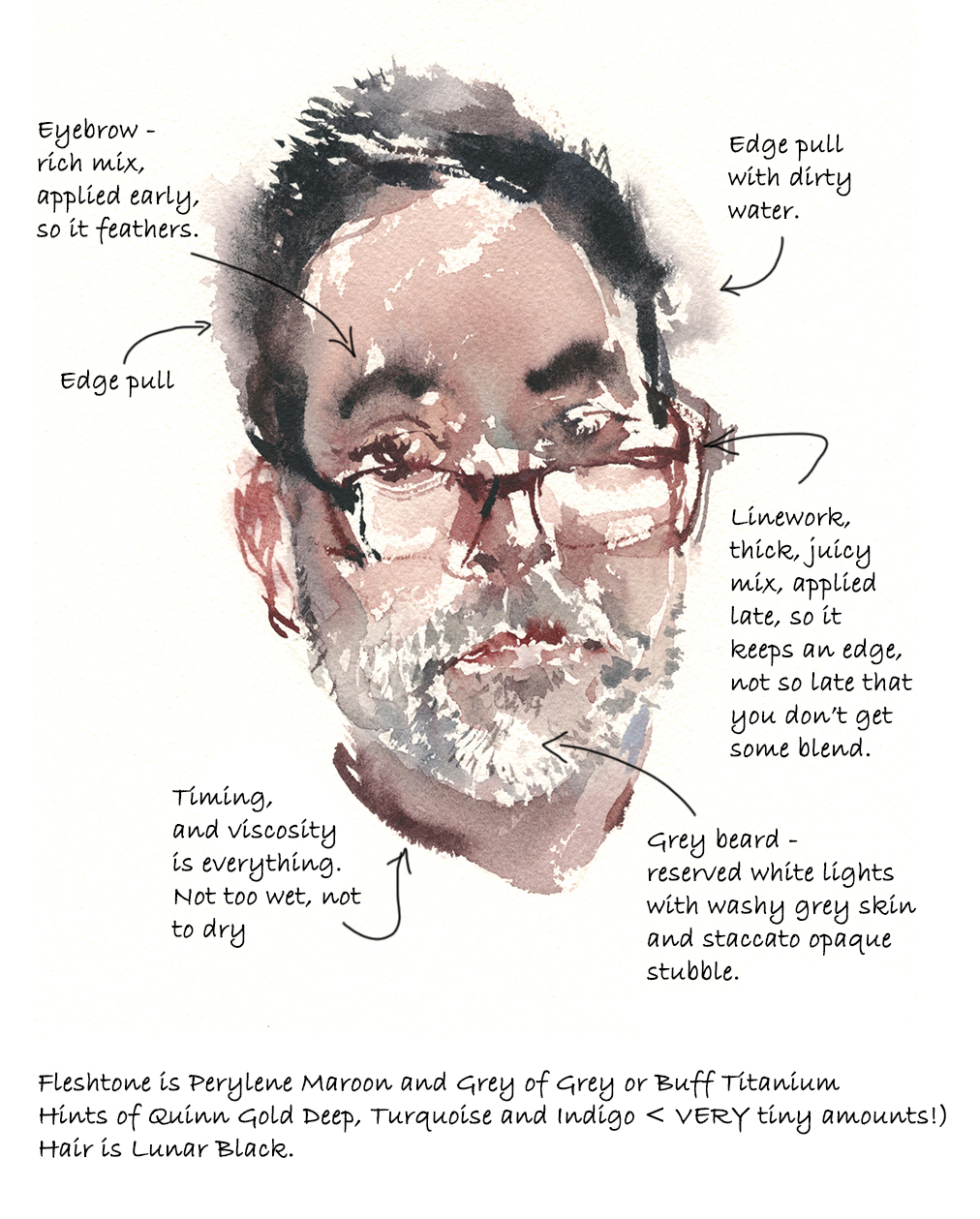
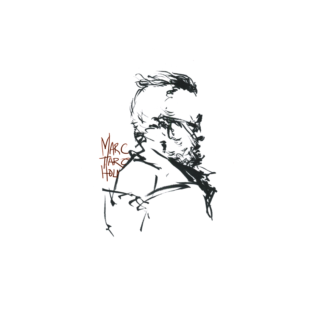
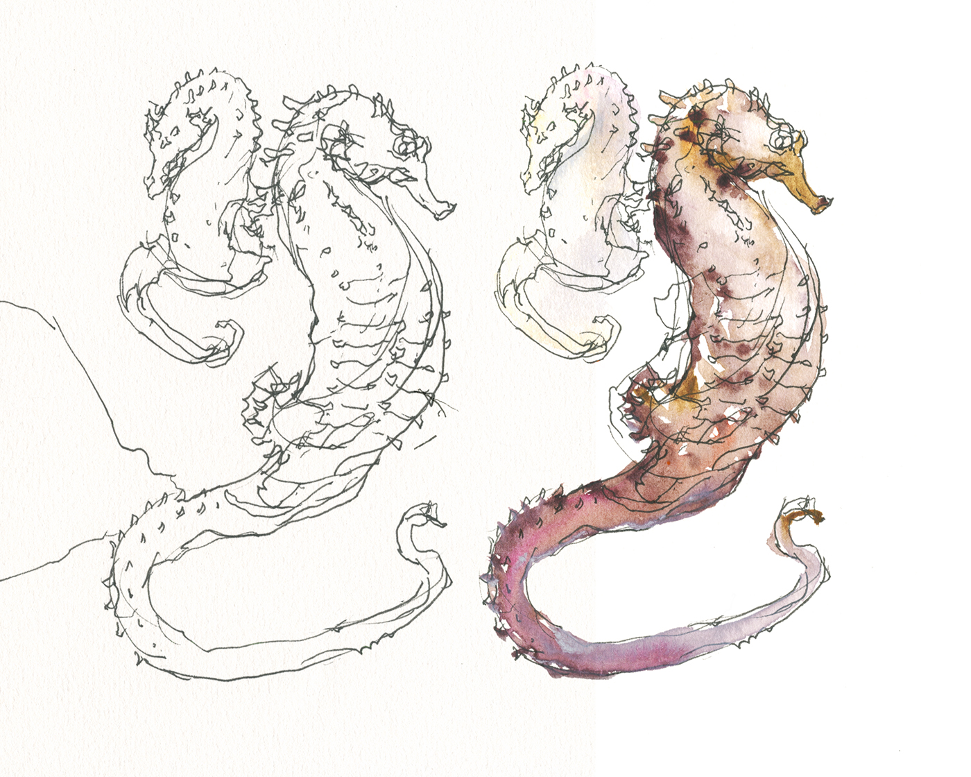
Mesoamerican Clay Figurines at the MBAM
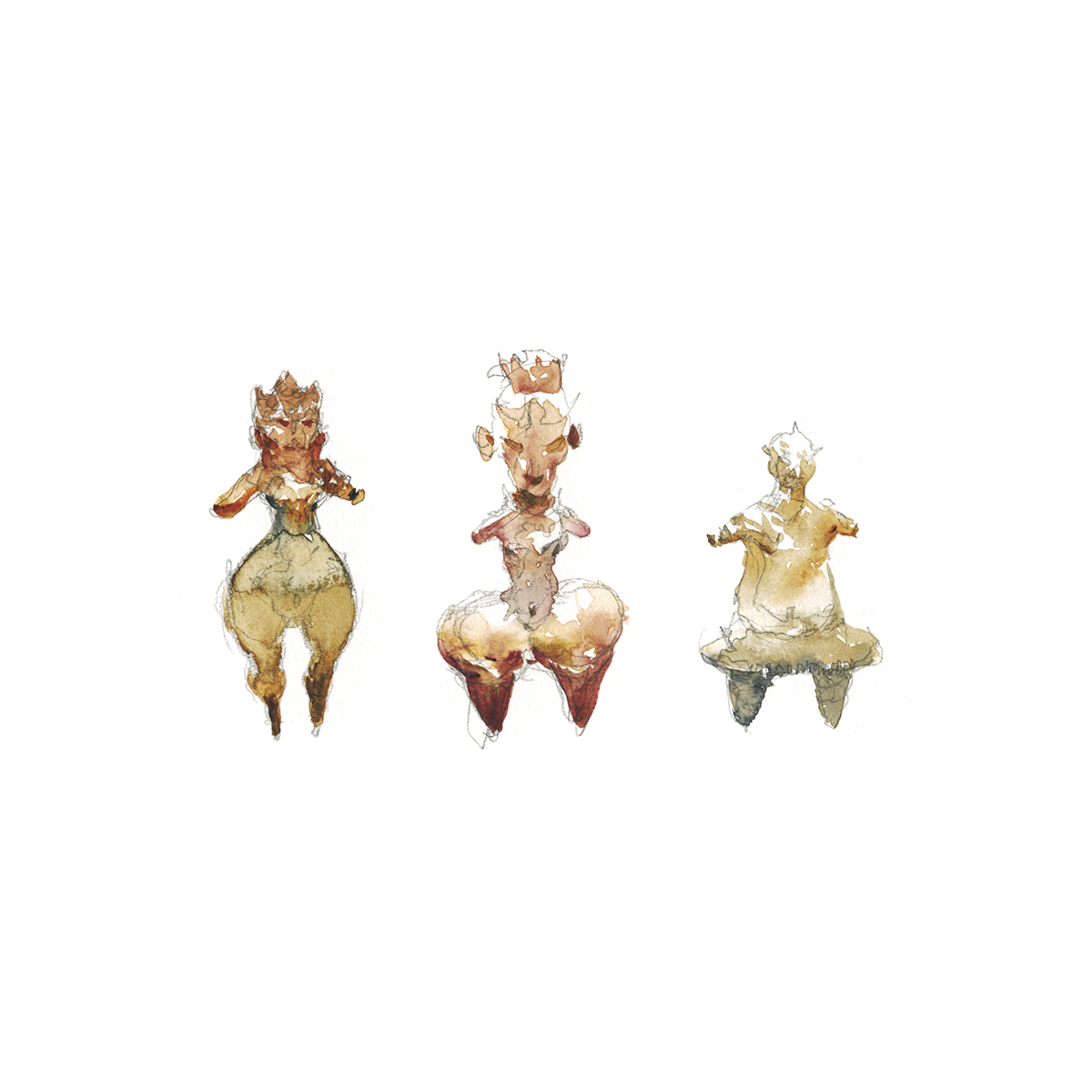
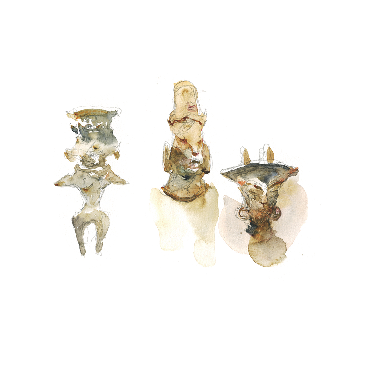
There’s a little side-room in the permanent collection at MBAM where they keep some cultural artifacts from Mesoamerica. They don’t get as much traffic as the big shows. It’s easy to pass right by them on the way to something more ‘exciting’.
My favorite display case has three small shelves of tiny clay figurines. They’re small – smaller than the palm of your hand.
I didn’t read too much about them – we were just sketching and chatting. But it’s most likely they’re fertility wishes. Something someone would make and say a prayer for conception or a safe childbirth.
Any anthropologists out there can chime in on what these are all about? (Jennifer? are you reading?)

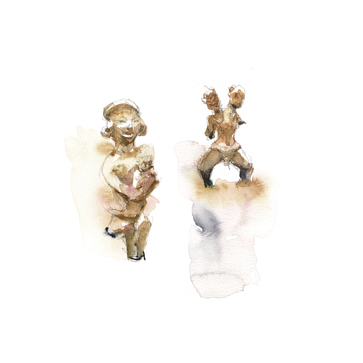
I’ve really been enjoying tiny little sketches lately. I have no time right now – life is a bit crazy – and it’s one way to keep going with not-really-daily-drawing.
There’s no watercolor allowed in our art gallery exhibits, so they’re simple pencil drawings, which I tinted later on.
I would call this tinting approach – “Puddle and Poke”.
Make a wet shape with a base tone that fills the entire figure (minus the highlights) and touch-in contrasting (cool) color washes. Then – as things begin to dry down – add some small darker accents with pure pigment. Sometimes these are tiny dots or dashes of pigment – like the eyes and mouth on the mask-like heads below.
I love the free interpretation in these figurines. It would be fun to make some of these.
Maybe I’ll get out some polymer clay someday and play around with some arcane little characters!
~m
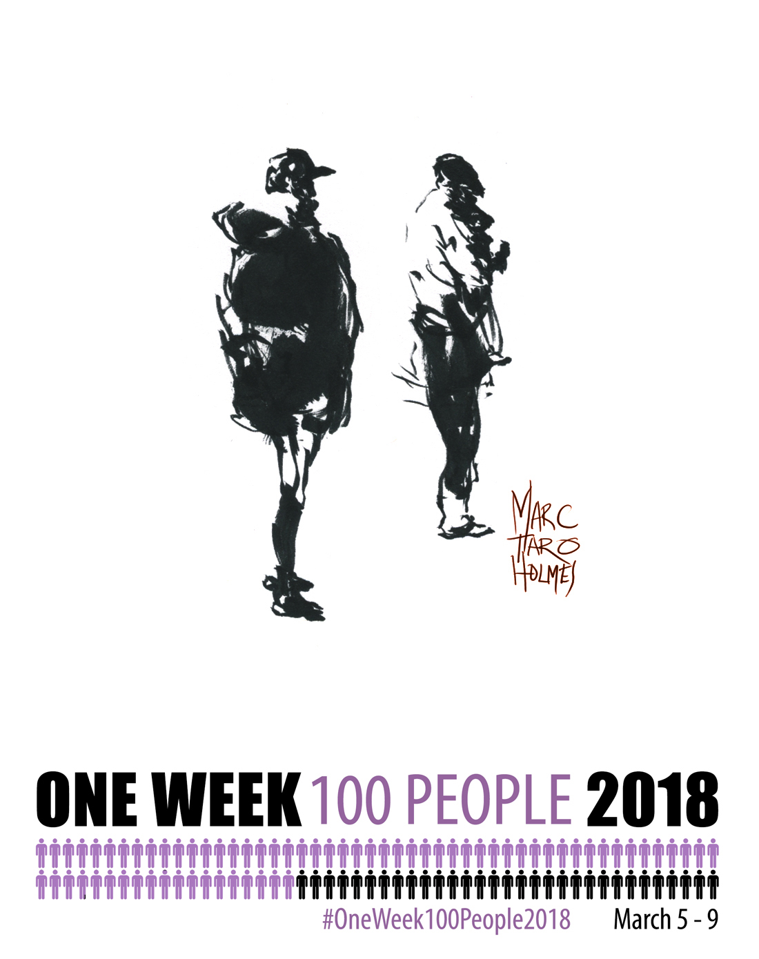
So, about those motorcycles…
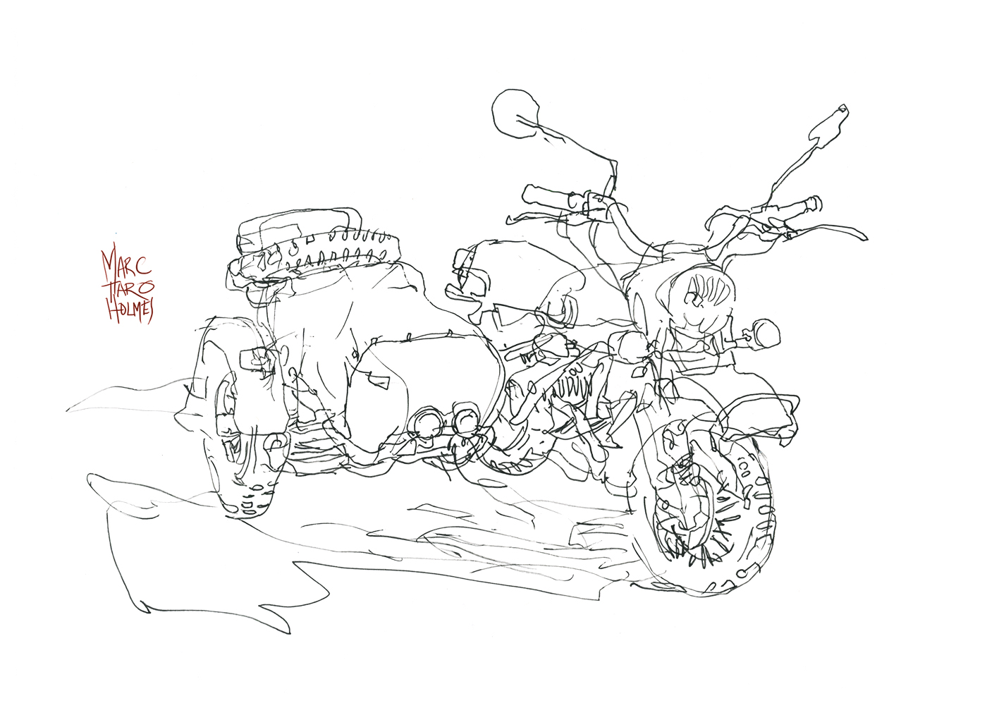
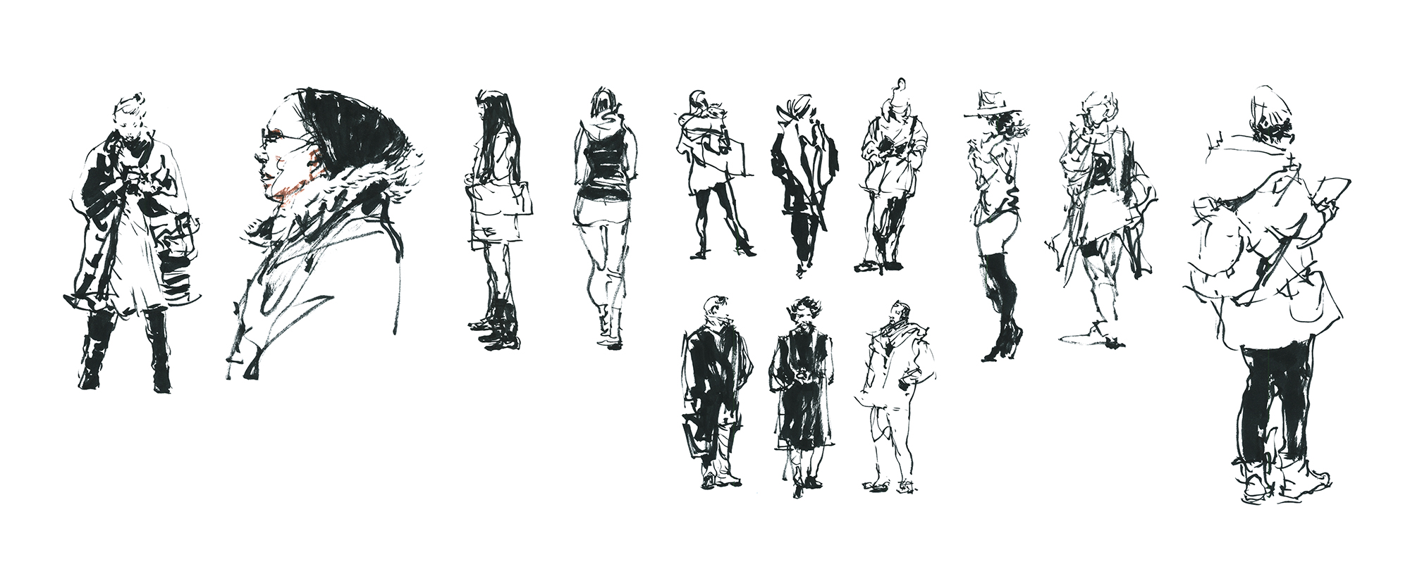
So, I was thinking I was pretty clever, going to the Montreal Moto Show to try and sketch some people for #OneWeek100People2018.
But once we got inside, I realized, yes there are a lot of people here, but – the show is kind of about motorcycles.
And I can’t draw a motorcycle to save my life.
Oops!
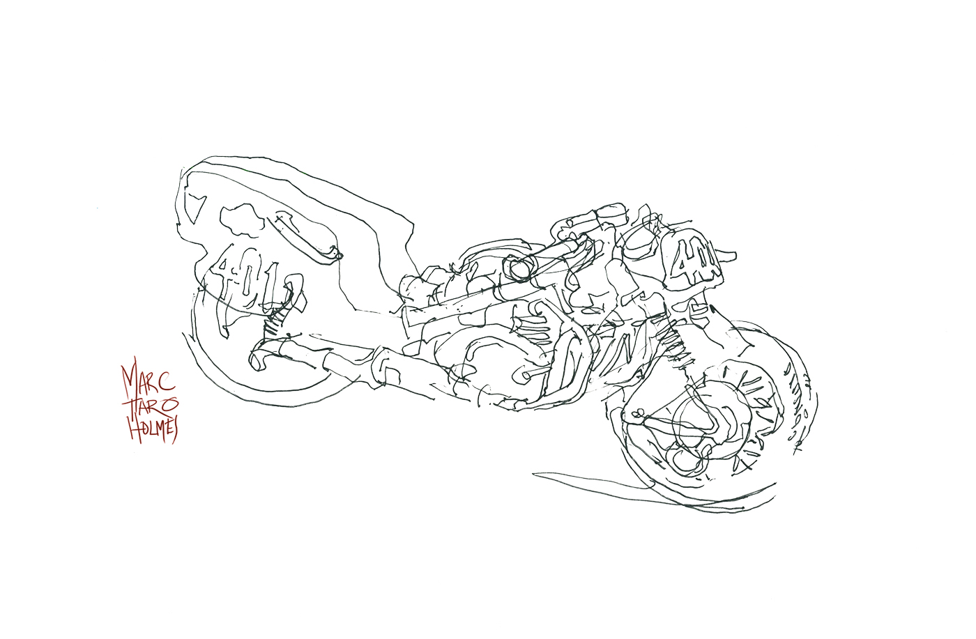
So, the first thing that’s challenging about motorcycles, is you probably don’t know anything about how they’re built. They have an anatomy, but we don’t know it like we know a human skeleton.
When you find yourself in front of something too difficult to draw comfortably – just go back to the basics. I put away the brush and watercolor, and tried to understand these machines with just a ballpoint pen.
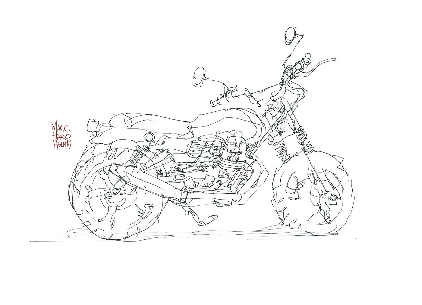
I’d start first with the shape of the tank and saddle. Kind of the ‘spine’. Followed by the big pipe of the exhaust. That way you’ve enclosed the small details, inside the larger shape. You can draw any old scribbles where the engine goes, and they’ll pretty much work.
Same with a tire. Sketch the outside circle, and the disk brakes, spokes, and tread become texture on top of the big shape.
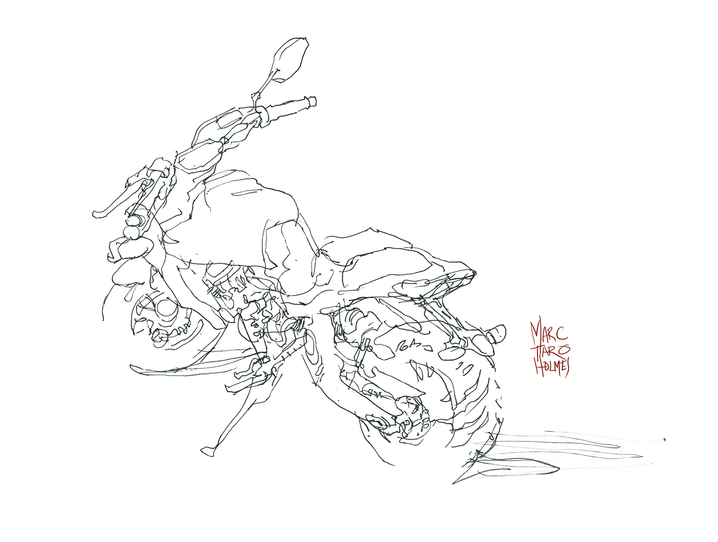
I still don’t feel like I can draw Motorcycles! But I’ve taken a few steps closer to a goal :) Which, in a way, is what #OneWeek100People2018 is was about.
~m
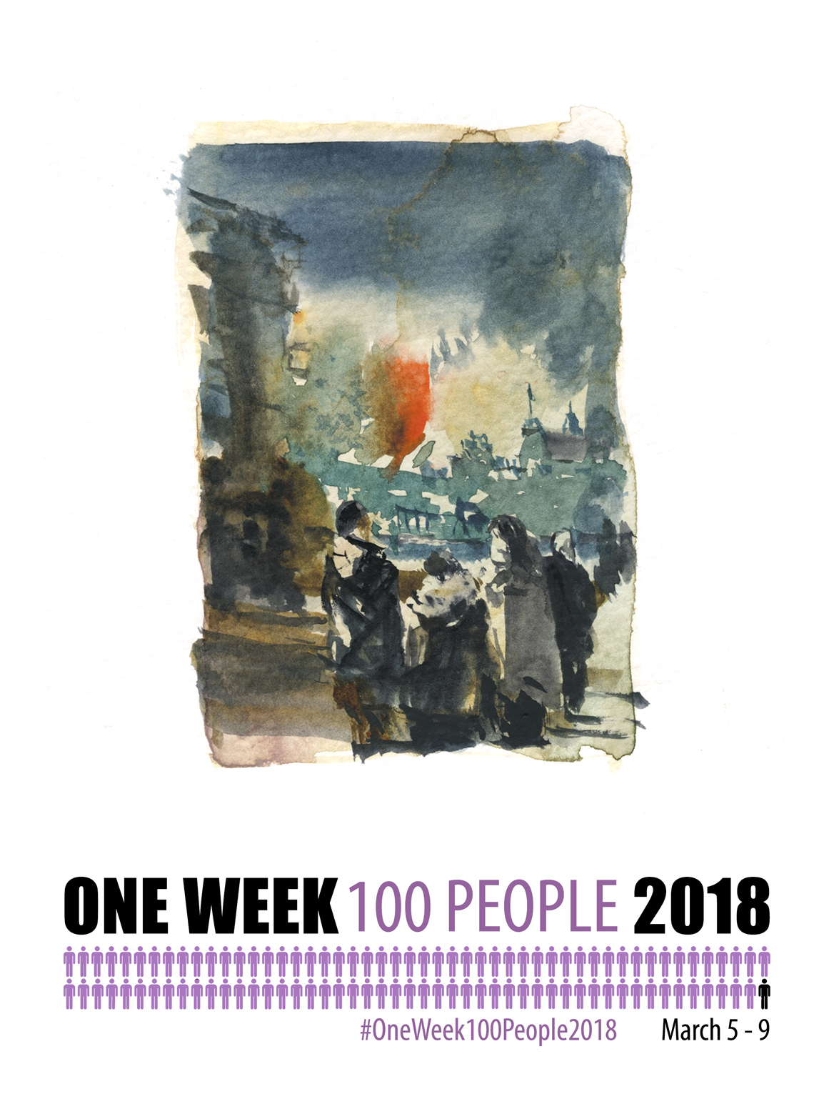
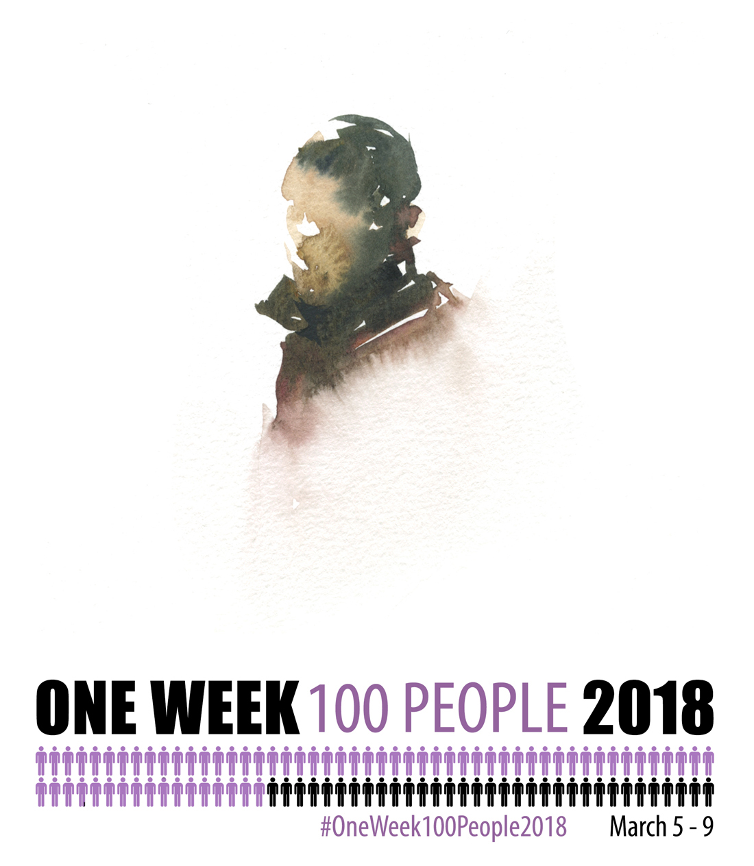
BTW, 2018 is finished, you can go here for a list of > all posts related to OneWeek100People <
I feel like there’s two ways to judge the success of your #OneWeek100People2018.
How much fun was it? < Dr. Sketchy’s Montreal)
Or, how much you got accomplished :)
Either way, big thanks to everyone who participated! I hope this jolt of inspiration can keep you going for a good long while. At least until your next big sketching event.
I know there’s always something in this terrific online community of ours. My next-big-thing is the USK Chicago Sketch Seminar in June. < Still spaces available I believe).
So – take care everyone and thanks for your #OneWeek100People2018!
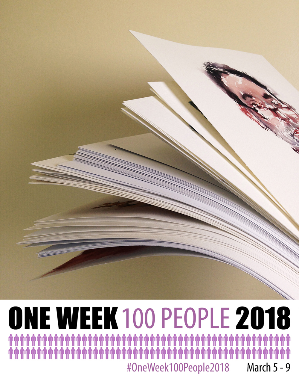
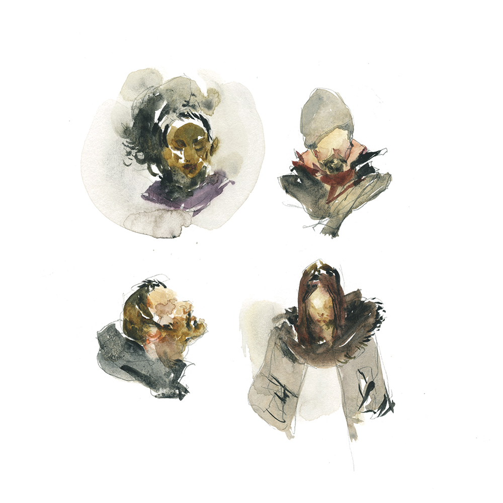
#OneWeek100People2018: Day Four: Selfie Series!
BTW, 2018 is finished, you can go here for a list of > all posts related to OneWeek100People <
Day Four – and that’s my 100 people for #OneWeek100People2018.
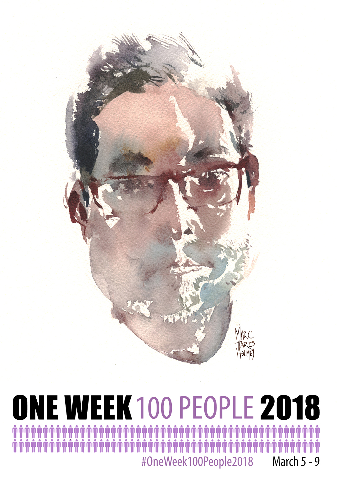
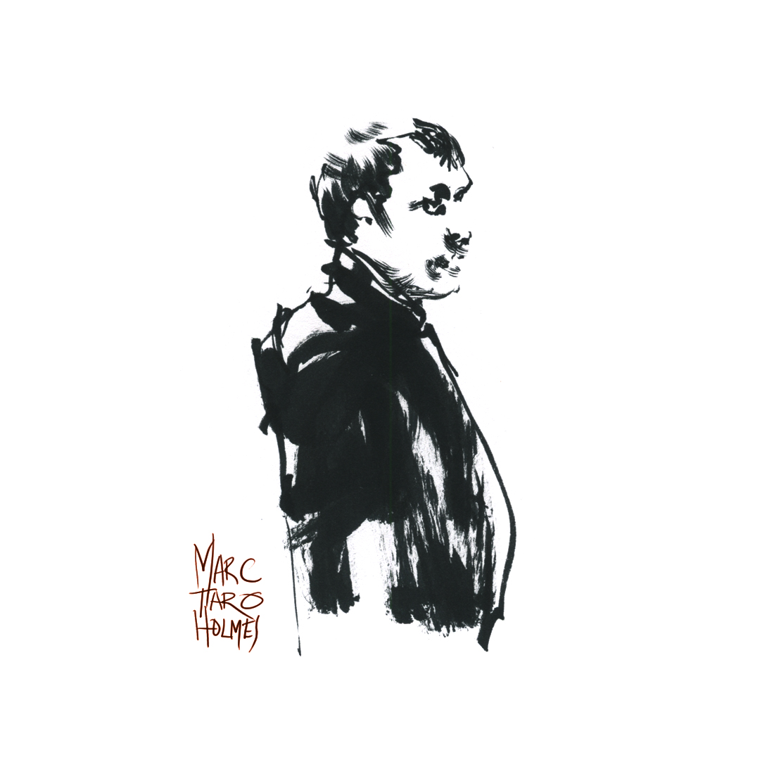
So, the thing with the self-portrait – it can seem kind of narcissistic. That’s ok. That’s probably accurate for most artists, isn’t it? It certainly is for bloggers! Of course, the real deal is, it’s one model that’s always available, and you can’t get too offended if the likeness looks weird :)
This first one isn’t a great likeness. But it’s a nice Direct Watercolor. Bold shapes, wet-inside, dry on the edges – the shape IS the drawing, right?
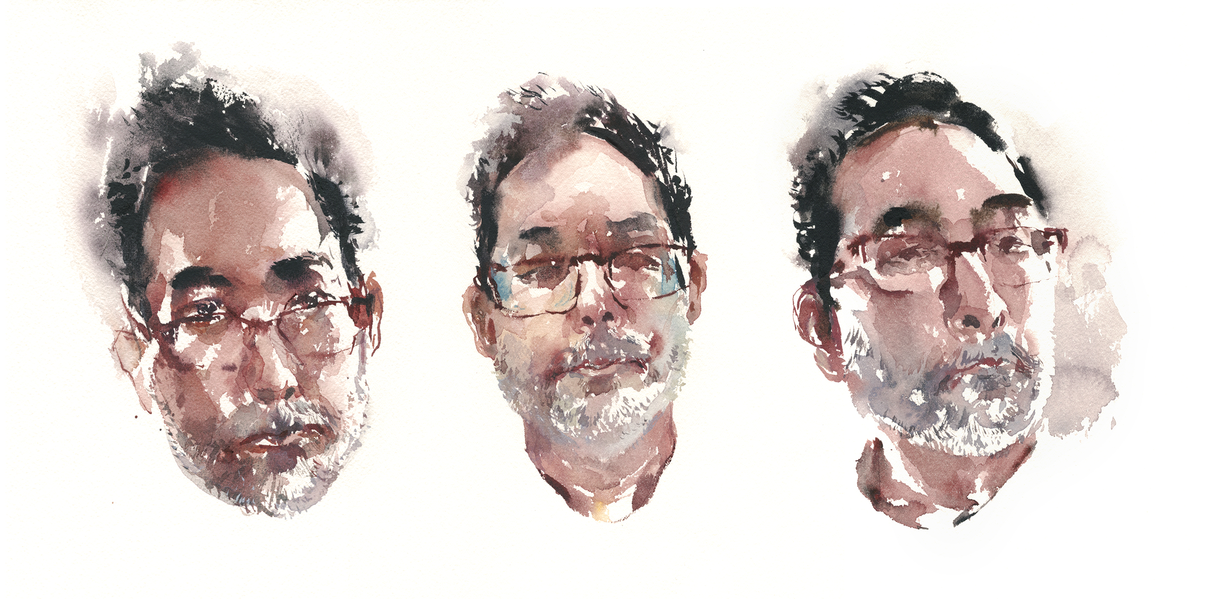
#OneWeek100People2018 is a great time to try out a selfie series. If you can take an evening and bang out five (or more) in a row, perhaps you’ll see the benefits of repetition. If you can sketch someone (or something) more than once, you’ll start to memorize the features. Each one gets a bit more on-target.
To be honest, I’m not the best portrait artist. It’s an artform where accuracy counts, and I’m too impatient for that :) I hedged my bets sketching Dave Allen the other day, so I committed to doing these straight into the paper without a sketch underneath. When you know you get more than one shot, it’s less stressful.
BTW, Note the use of the background tone to draw the lit right side on that third head. Negative painting!
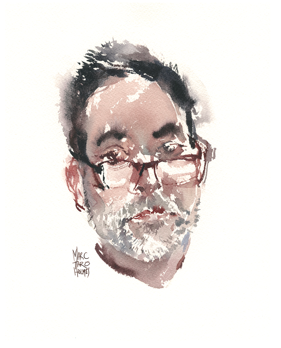
The first one is flattering via simplification, but the last one is a little bit more accurate I think. It’s still El-Greco-stretched. That’s like a visual tic of mine.
Anyway – good exercise – and I think if I kept going – like, if a person did 100 of JUST selfies (maybe next year?) – I think you’d really make some painting breakthroughs. Maybe tomorrow I might keep going?
We’ll see. I’m bored with my own face. But that’s a good reason to keep at it. Maybe it could force out some new brushwork or more daring color choices.
Ok – that’s it for now – how are you doing with your #OneWeek100People? Post your progress in the comments! It’s getting down to the wire!
Bonus notes below! >
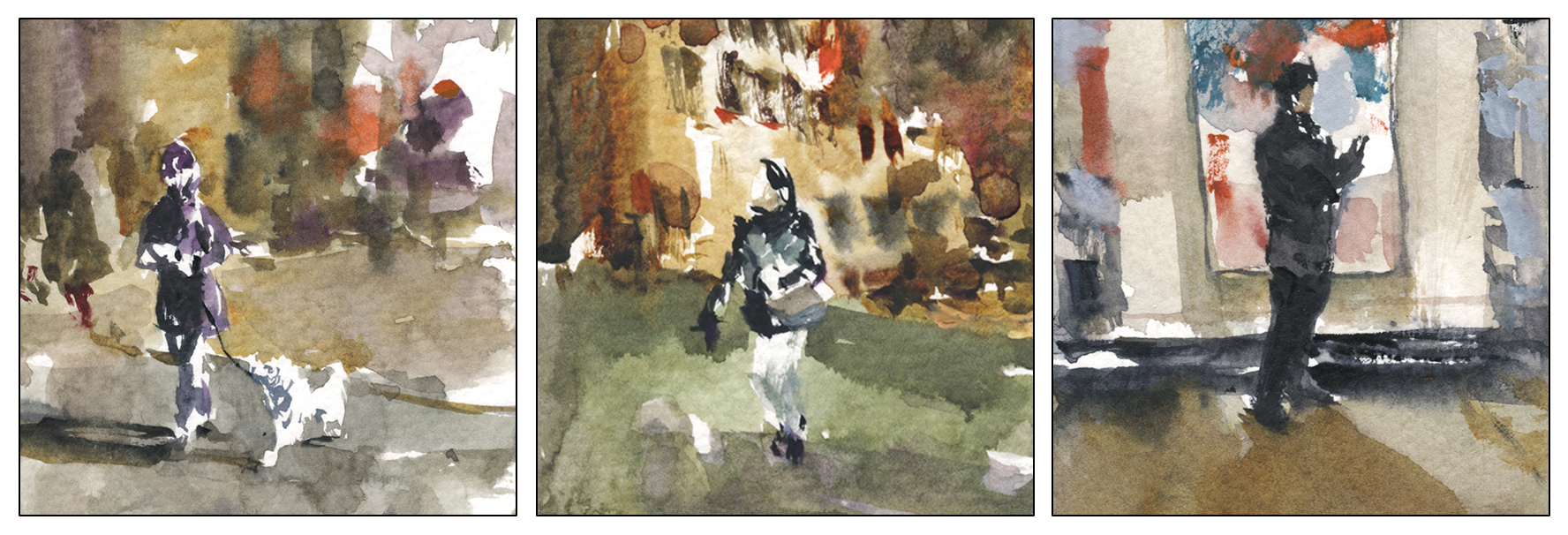
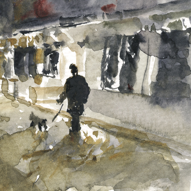
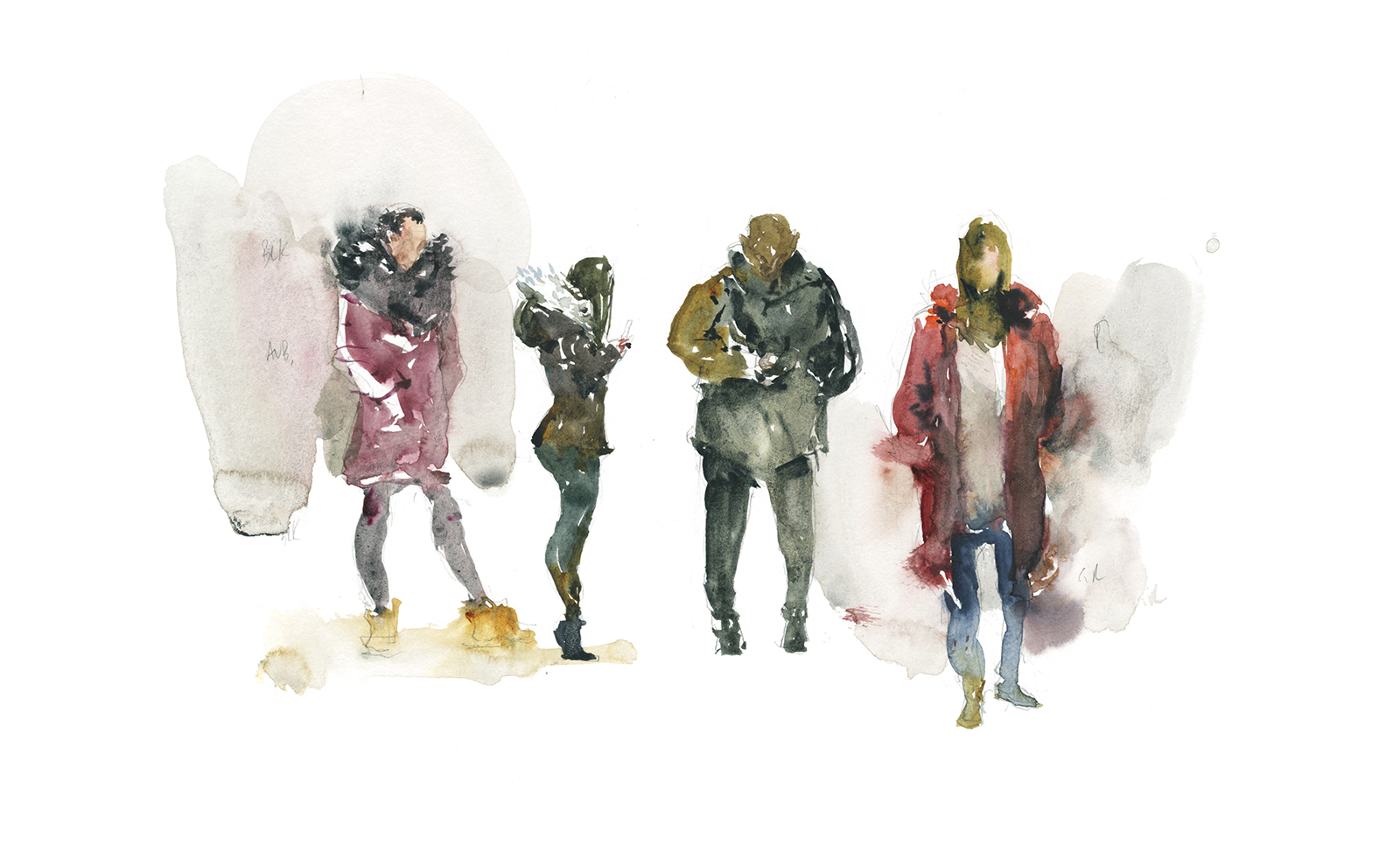
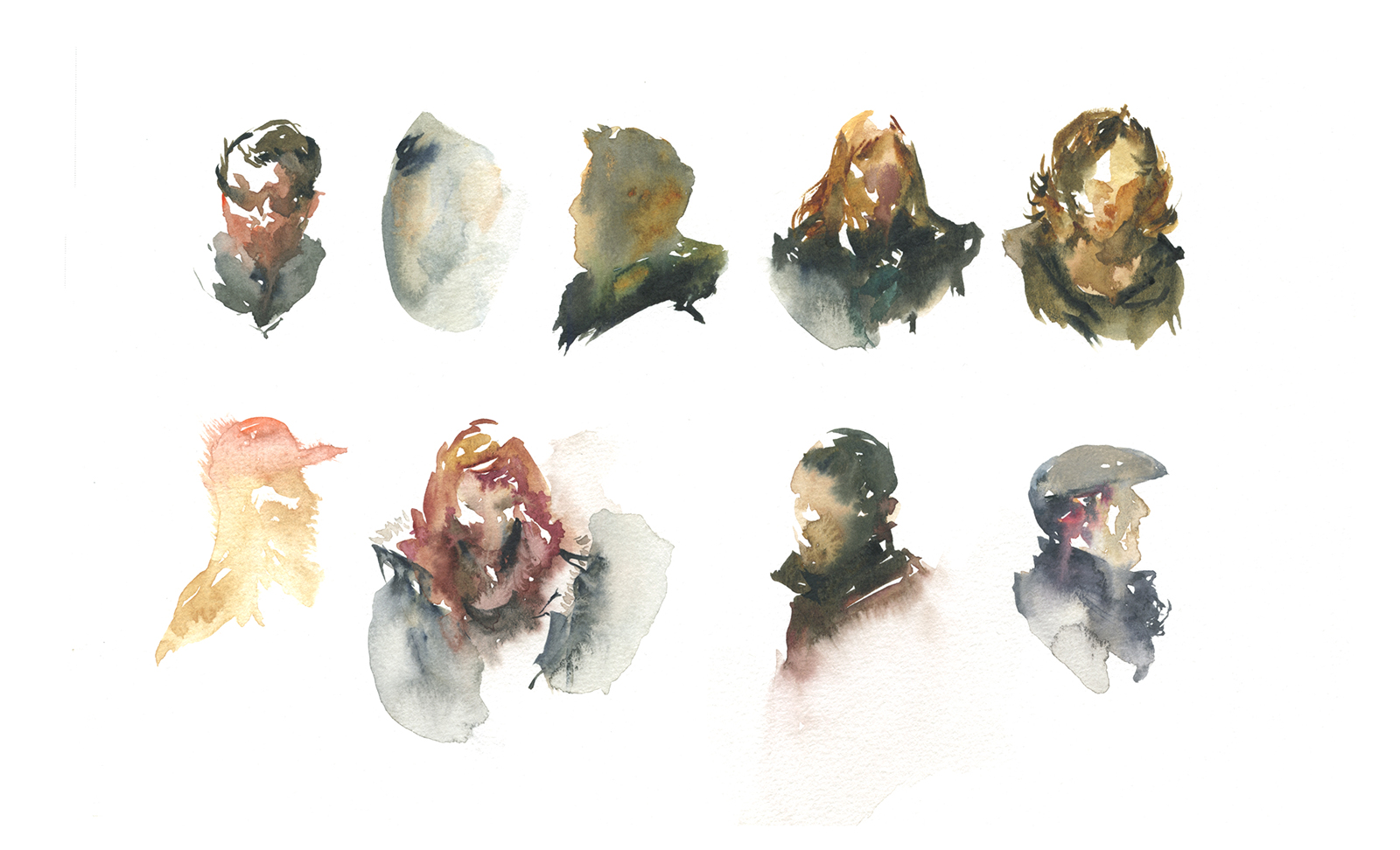
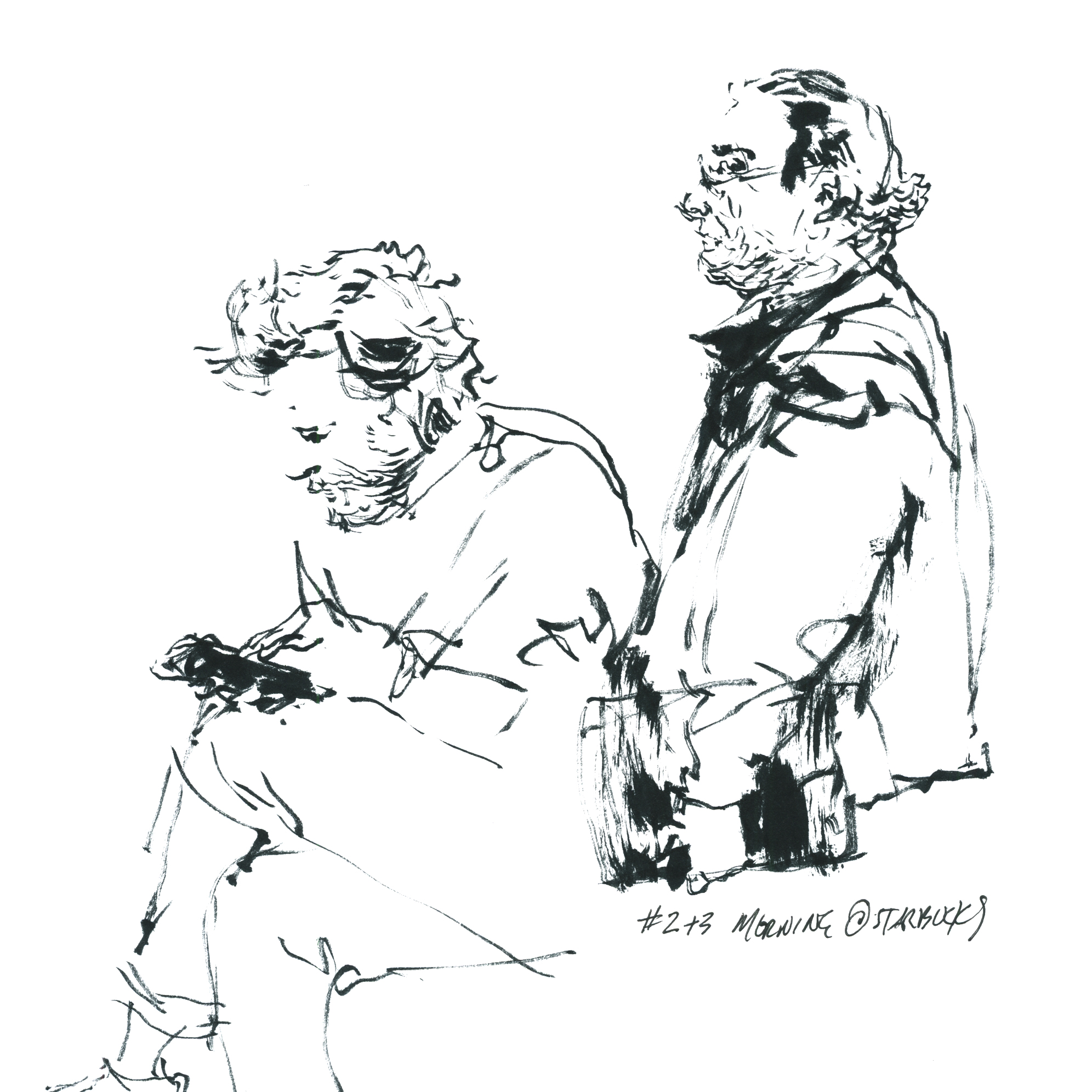
#OneWeek100People2018: Day Three: Night Sketching

BTW, 2018 is finished, you can go here for a list of > all posts related to OneWeek100People <
Day three of #OneWeek100People2018!
I hope everyone is hitting their stride? Do you think you’re seeing the advantage of daily practice yet?
I felt this one fall out of my brush without the slightest effort.
In fact, I don’t even know who painted those hands. That’s some next-level abstraction.
I’d just ducked into Cafe Pi on St. Laurent – a strange little haunt which is the home of some truly crusty chess players. Have you ever seen a bar full of old woodpushers swearing, brawling and talking trash? It’s impressive.
There was a chill dude playing live music – so I sat right down and sketched him. I hadn’t even really finished when he packed up and stormed out. Shouting that the chess club didn’t appreciate him! He could make more tips in a half hour busking the metro!
I’d been out at figure drawing < hidden naked sketch there, and another one) and on the walk back was finding all these perfect silhouettes of people backlit against the street lights.
Suddenly the whole city is looking like brush-pen miniatures :)
I’m getting kind of silly here – just seeing how small I can make these guys.
That’s a #2 Pointed Round pocket brush by Rosemary and Co.
This was my goal with this year’s #OneWeek100People2018.
To do a little test-flight, and see if I could add people into the same kind of direct watercolor I might do in a travel sketchbook.
Next trip I go on – I won’t take a pencil at all!
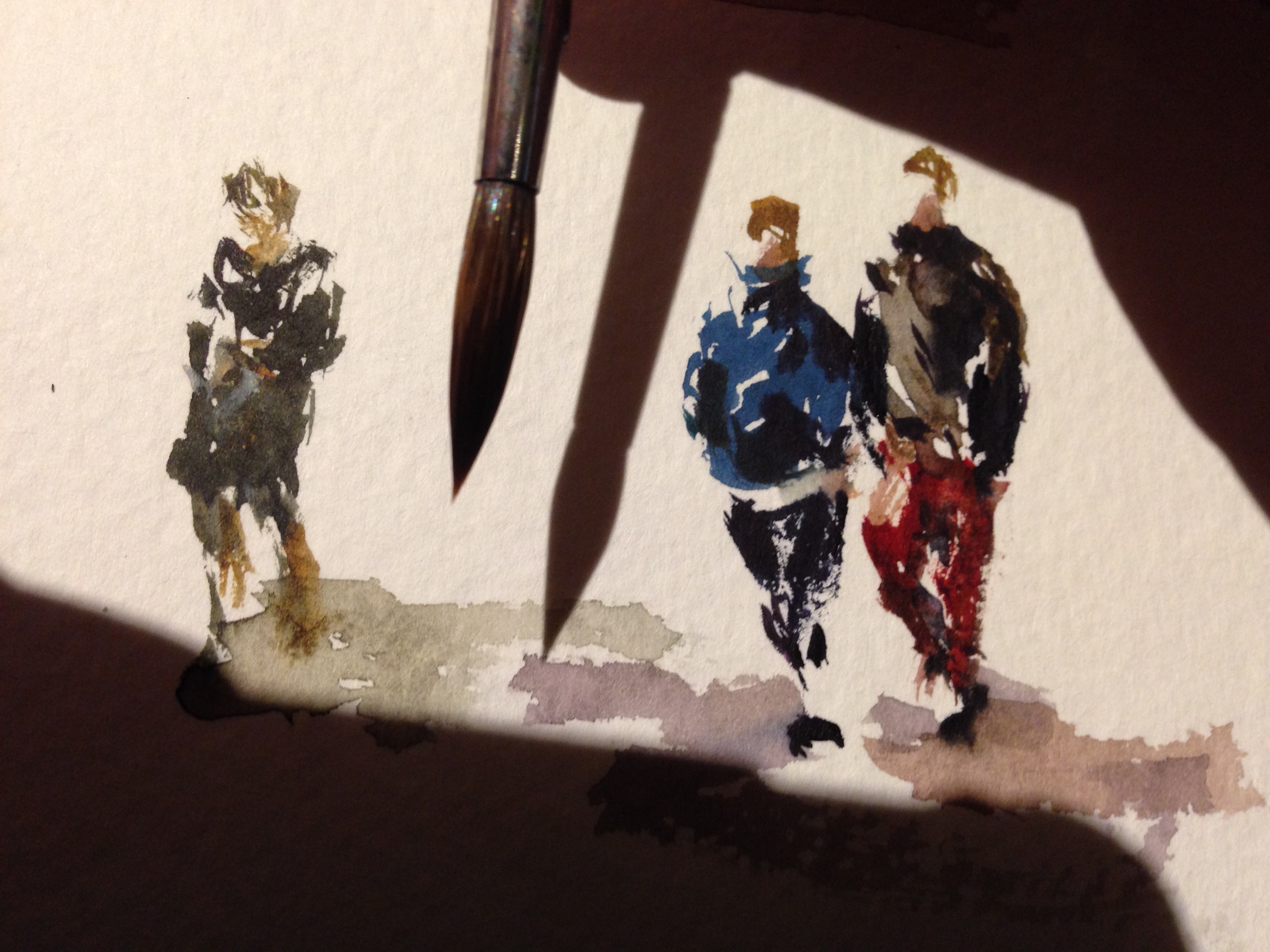
#OneWeek100People: Day Two: Direct Water People!
BTW, 2018 is finished, you can go here for a list of > all posts related to OneWeek100People <
Here’s my day two of #OneWeek100People2018 – and this is my favorite sketch so far.
(In my entire life I mean. What a little gem!)
I hope you can see the method to my madness. All the black and white silhouettes yesterday, were meant to warm me up for colored silhouettes today.
I started a few with a continuous line doodle in pencil underneath, but I quickly realized, (for the hundredth time) you don’t need the guideline. If I can do it in ink, I can do it in color!
So I took the plunge and went right in with the brush!
This is a great exercise on the very basics of Direct Watercolor painting. An easy way to get the feel for placing bits of color NEXT to each other. So one stroke fuses into the next, but the color doesn’t get muddy.
Remember – don’t manually blend or scrub any color, or even go back into the wet area. Just place color NEXT to color, and they will stitch together on their own.
[ Read all about it in my new book Direct Watercolor <affiliate link, thx]
As well – just like in an ink drawing – the tiny gaps you leave intentionally, become part of the drawing. Making the ‘broken silhouette’ slightly more understandable as a figure.
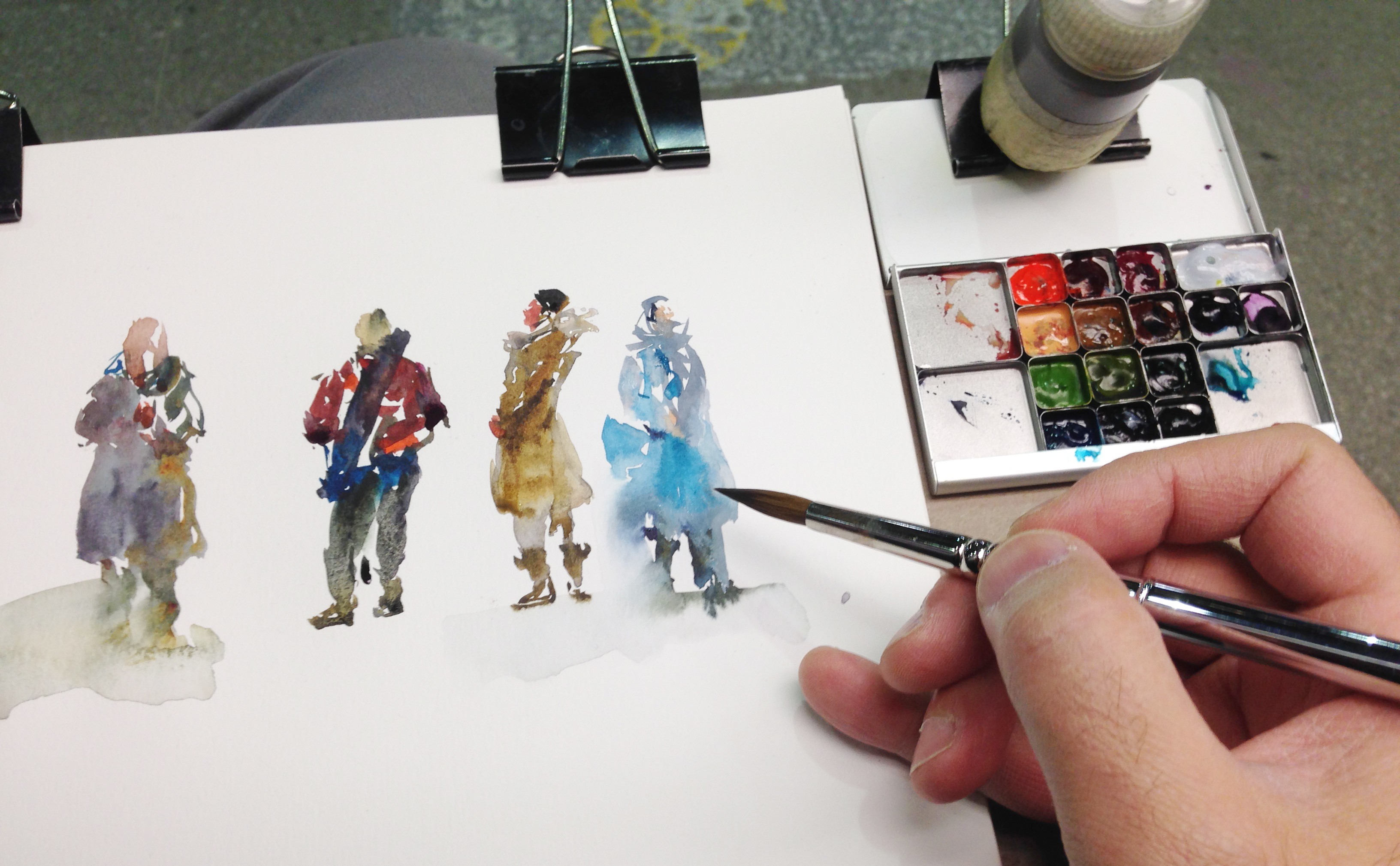
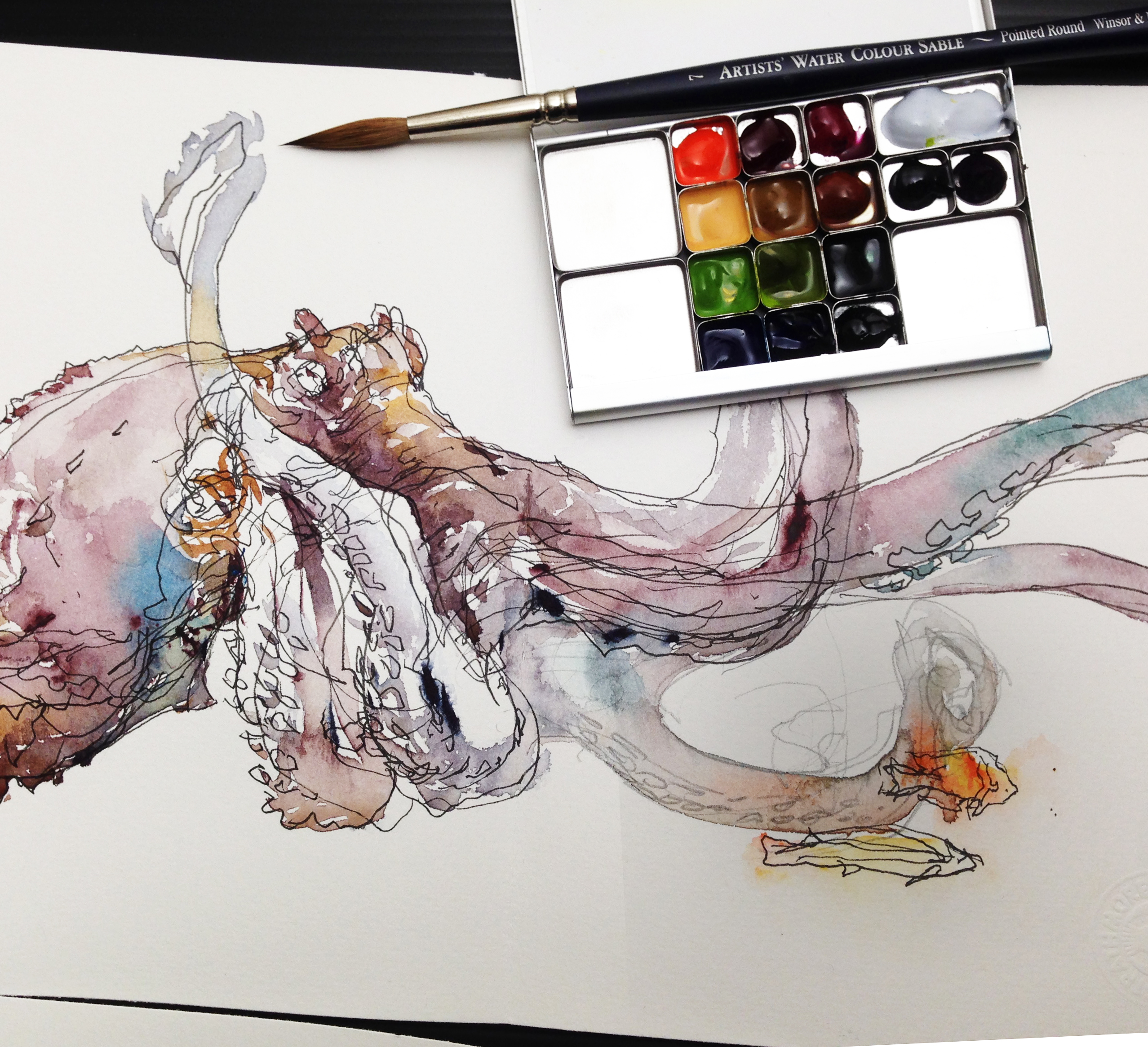
By the way, I’m still using my new ultra-mini square pans + business-card-palette from ExpeditionaryArt.com.
It’s just the thing for sketching on the go. It’s so lightweight. Make it much easier to hold a drawing board in your off-hand all day. The older I get the more I care about that sort of thing.
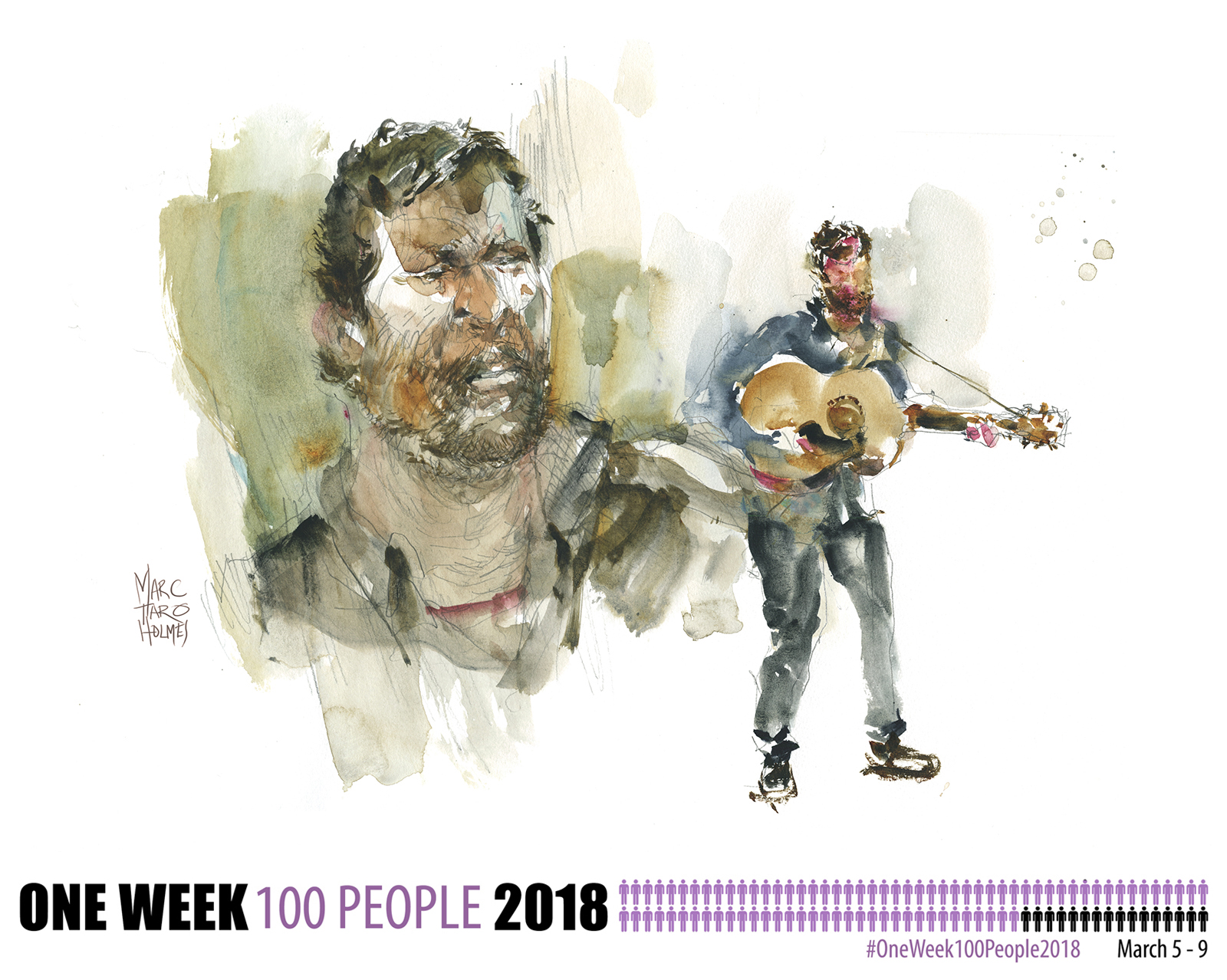
Considering I was oot-and-aboot, I took in a show – sketching Toronto based Dave Allen at L’escalier. (Have a listen to his song: “When the Demons Come“).
As anyone who’s sketched musicians can tell you – they move around a lot :)
This one, once again, has a pencil drawing underneath. When I get concerned about getting a likeness, I tend to fall back on that sketch. But I’m trying to keep it as Direct Watercolor as possible :) You have to decide how much you want a drawing as a safety net. It’s a little less stressful with a doodle underneath, but I always regret it a bit.
Kind of like eating mac and cheese. You want it, you like it, but you regret it. <The comfort-food zone.
#OneWeek100People2018: Day One: Metro Sketching!
BTW, 2018 is finished, you can go here for a list of > all posts related to OneWeek100People <
So it begins! It’s time for #OneWeek100People2018!
I hope your first day of the marathon is going great :)
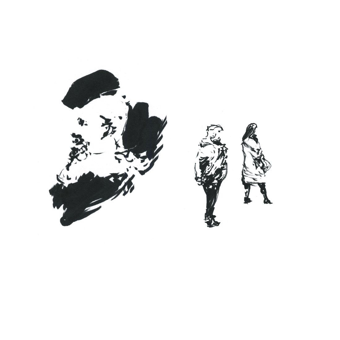
I took it low-stress, spending an entire afternoon going back to the basics – just a brush pen and some cheap cover-stock from the stationary store. The simplicity sets me free to burn up paper – cheerfully toss out the bad ones.
Last year, I started with gesture drawings in a fine-line. This time, the big black brush pen! Plus – working super small.

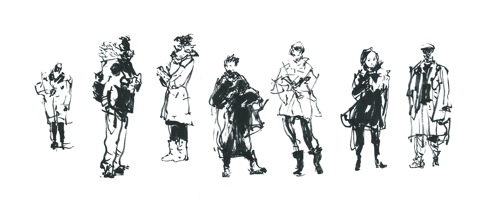
Working in miniature is a lot of fun. It’s like having a huge brush.
Fill an entire figure, head to toe, in a just a few strokes. Use the very tip for line work, then switch to the side and block in a solid silhouette. It’s so fast!
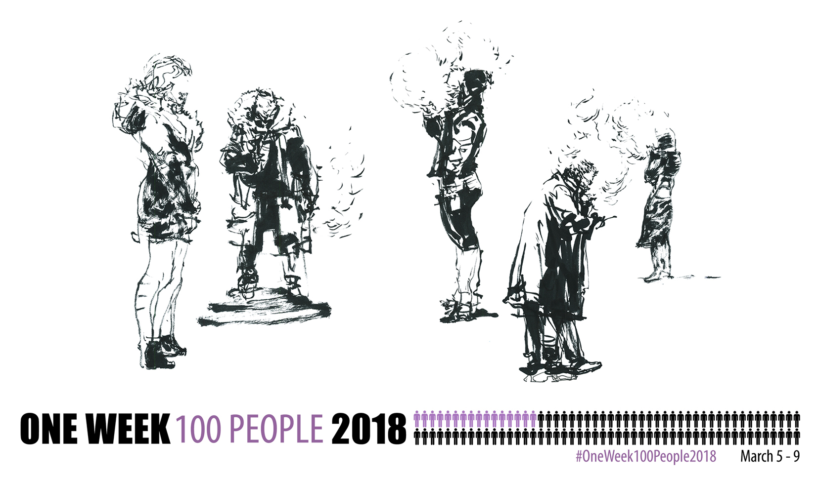
Montreal is the city of big black coats.
It makes the smokers on the street into perfect silhouettes.
I was drawing through glass windows of an office building – watching people psych themselves up for a day at work.
If you get too comfortable with the brush, the drawings start growing out of control, becoming full-page.
I think this is because I want to draw some faces.
So ok, let’s do figures and heads about the same size.
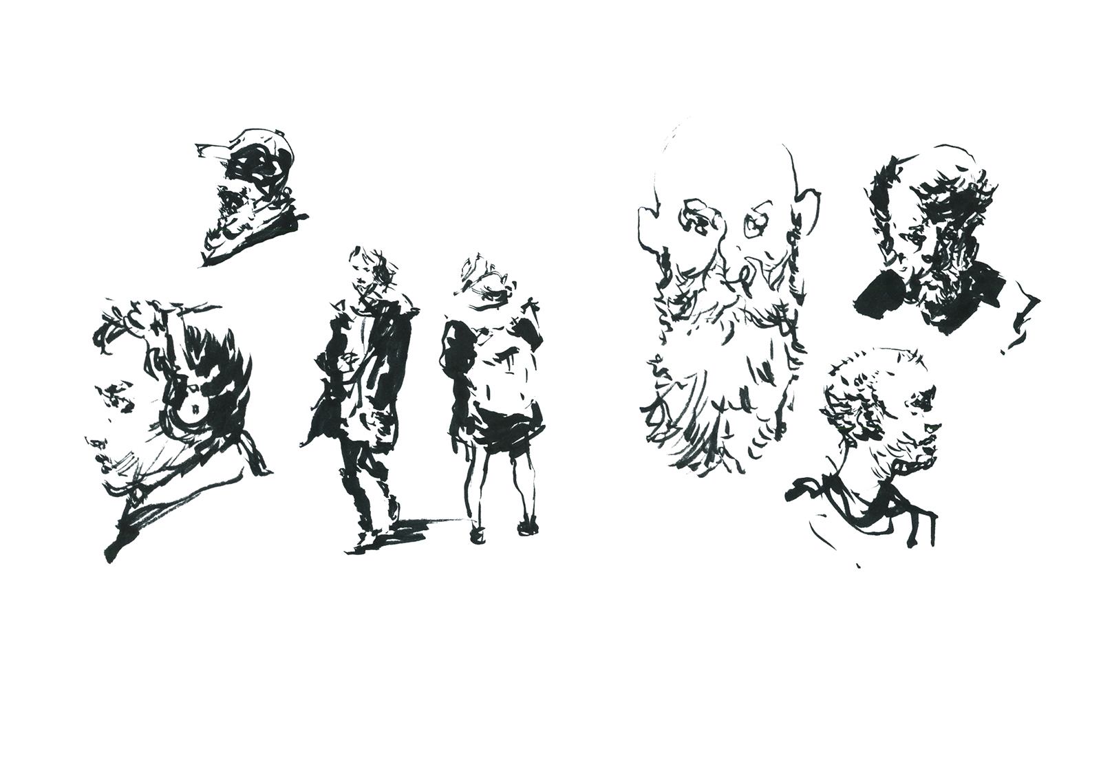
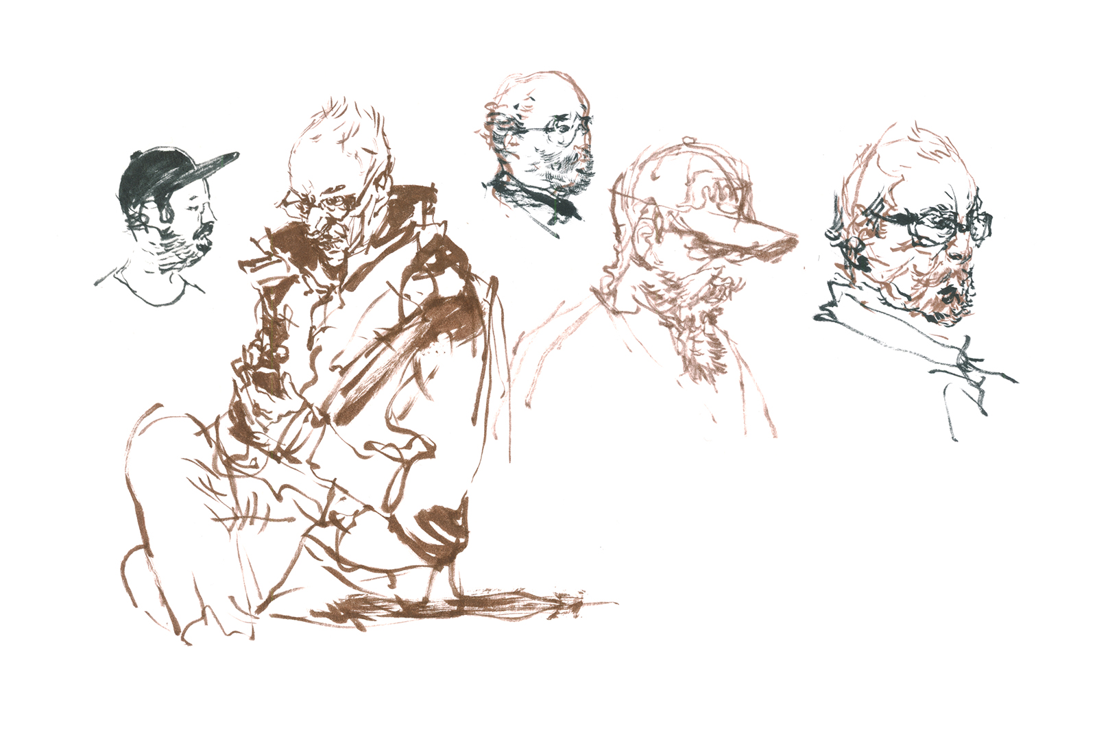
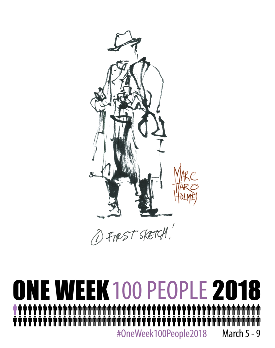
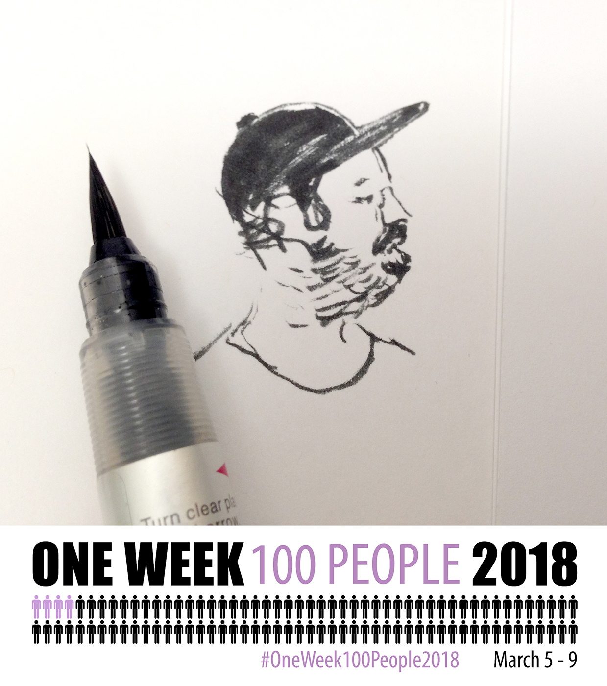
By now, I’m standing in line to get into the Montreal Moto Show. There’s plenty of beards in the lineup.

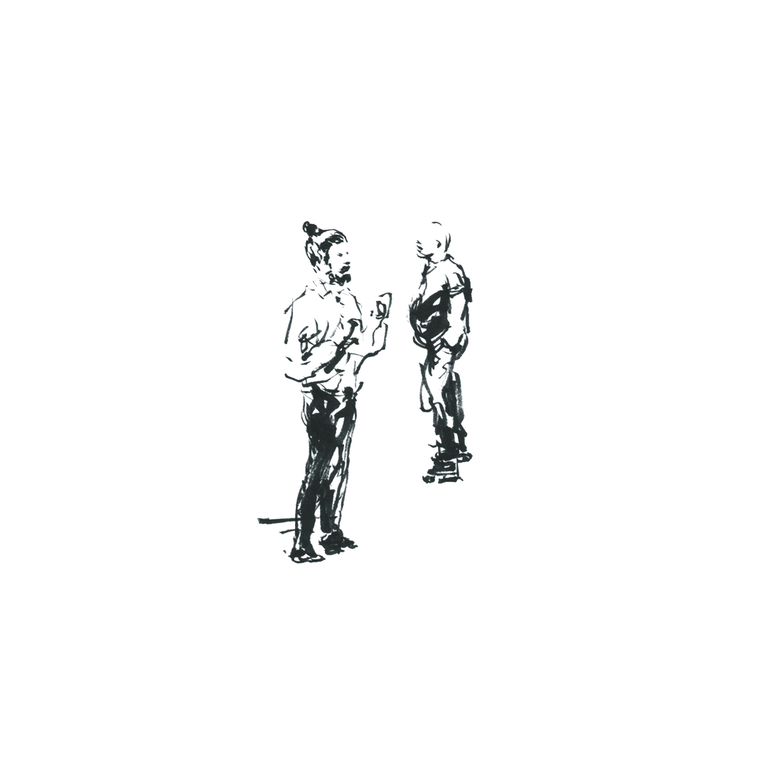
She’s looking for the mommy-and-me yoga meetup. And yes, I’m counting the kid. That little head was the hardest to draw.
Office workers go to Starbucks. Moto Show fans go to Tim Hortons.
I just got started on her, when her boyfriend came back – he’s only allowed so much time looking at motorcycles.
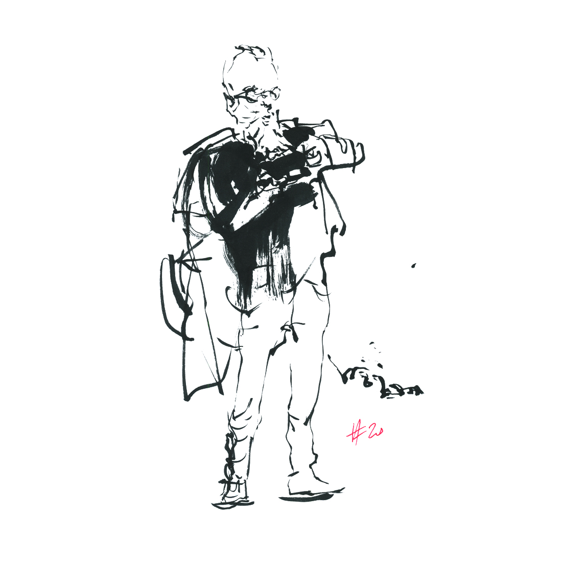
This is me being ready to lose my subject at any moment.
Try to draw from the big shape, down to smaller – so you can stop the sketch at any moment, and it still works.
That’s a nice head there – some negative drawing around his dome.
Notice how I don’t take the black all the way around? I like to leave gaps in the surrounding tone. Let the eye close shapes.

In this one, I’m getting ready to go eat, so I snapped some out-of-focus cellphone pics of people walking to the escalator. Drew these while eating. Is it cheating? You’d never know unless I told you :)
By the way, I feel weirder taking photos of people than drawing them. Nobody comes up and says “How nice, you’re taking pictures!” – but you get nice comments all the time if you’re sketching in public.
Two from a quick cellshot waiting for the walk light, and two from life while boarding the train home.
So far so good! That was my first day.
I’m kind of kicking myself now for not just finishing the 100 in a day. It would have been pretty easy. I have 69 here – and a bunch more I tossed as they didn’t stand up to inspection.
Plus I wasted a chunk of the day trying to draw motorcycles. More on that later.
Ok! – Please Leave some comments if you have sketches from your day-one already. Let’s see what everyone’s up to!
Tomorrow, I’ll post new silhouettes, this time in color.
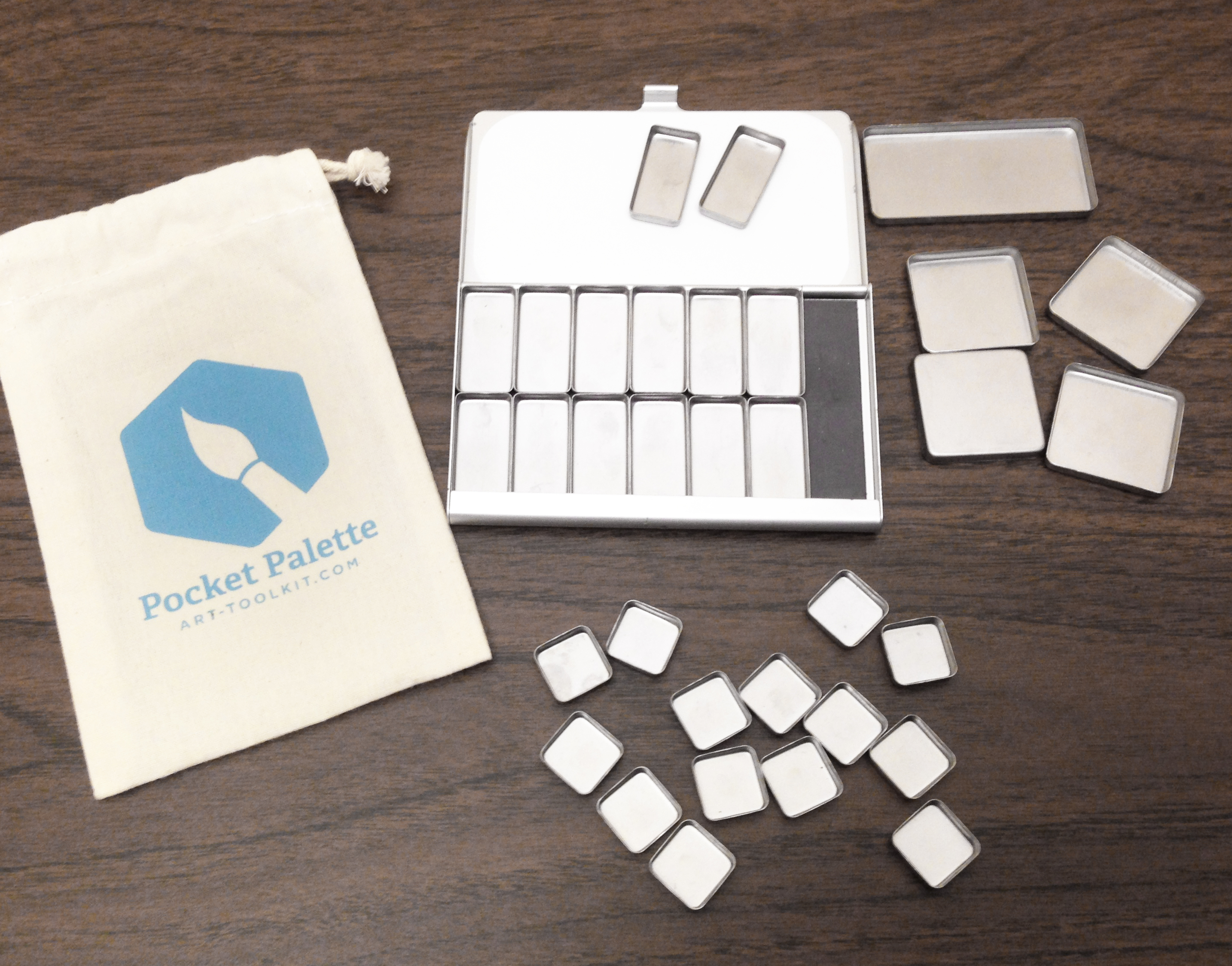
This is kind of timely news, as I’m planning to use this new piece of kit for #OneWeek100People2018.
Maria Coryell-Martin at ExpeditionaryArt.com recently sent me the next generation of her ultra-compact Pocket Palette.
The design remains the same as the original version, up-cycling pre-existing cases for 2×3″ business cards, but this update makes improvements to the magnetic tins, which should eliminate a problem with the trays rusting.
But more importantly – she’s introduced a super-cute square tin she calls a half-pan, which I find to be a perfect size.
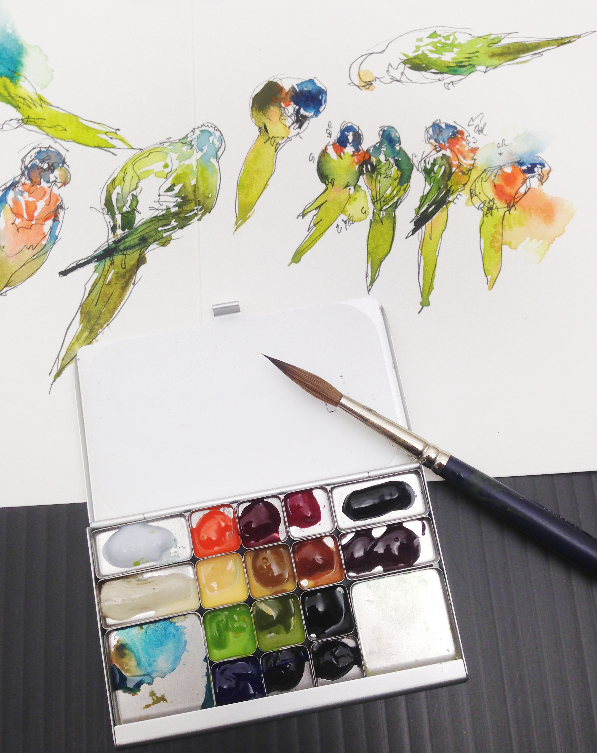
The new mini-square holds just a dot of color, only a bit more than the cap of a watercolor tube.
I love the new tray size. It’s perfect for what this palette is designed for. It’s not about carrying a lot of paint. I doubt anyone’s going to rely on this tiny kit as their only palette for a month-long vacation. This is more of an everyday-carry. Something discreet to bring to a live event, a cafe, or a museum.
In the end, I’d rather have tiny amounts of more colors, instead of larger pans of fewer, knowing I’ll only be using this for a dab of color on a sketch, or maybe a postcard-sized piece. If I ever wanted the larger trays, I’d just bring my normal 3×5″ kit.
Basically, these half-pans (which I’d personally call 1/8ths) allow me to approximate my standard palette in miniature. I don’t have to change how I work.
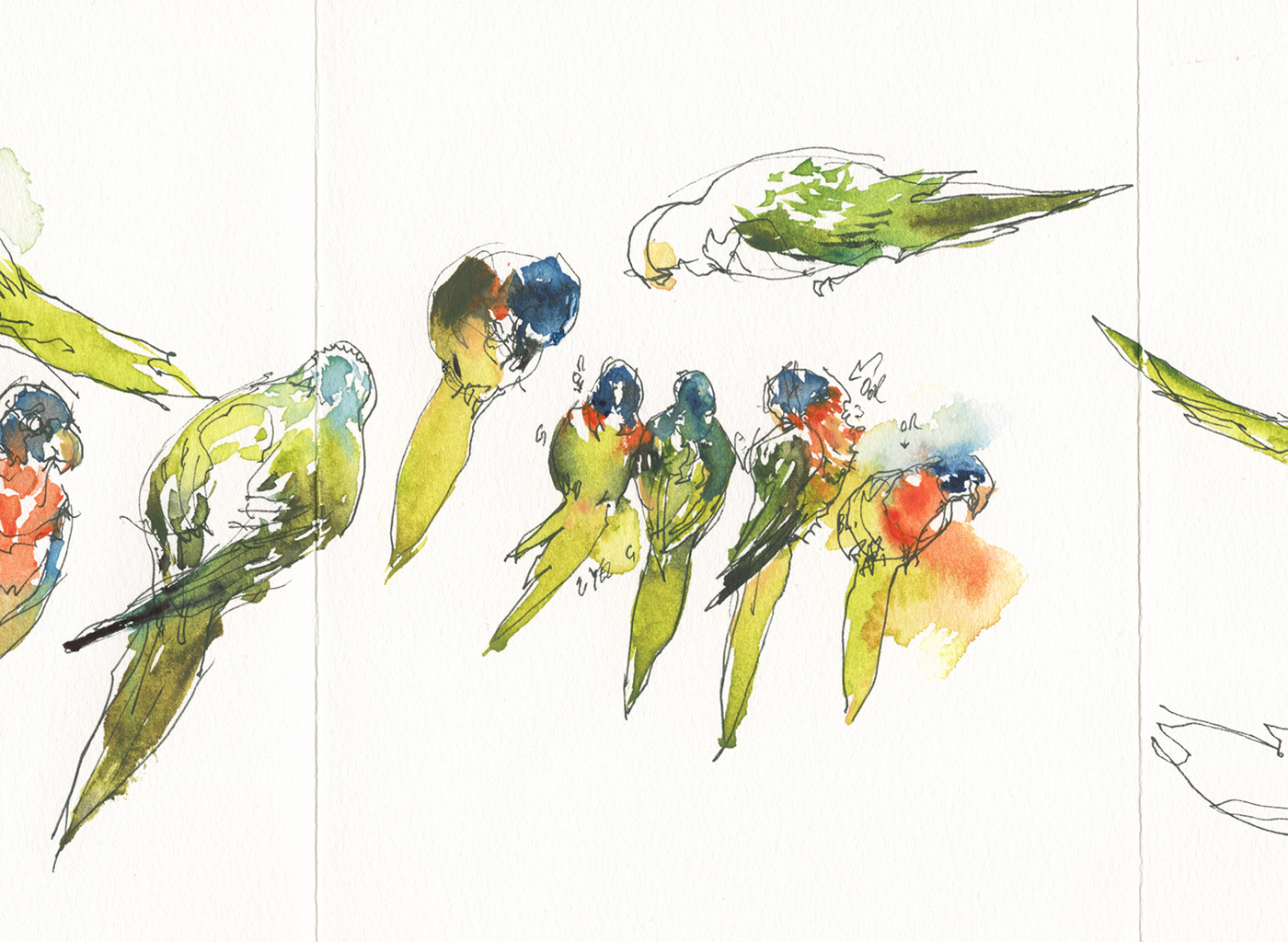
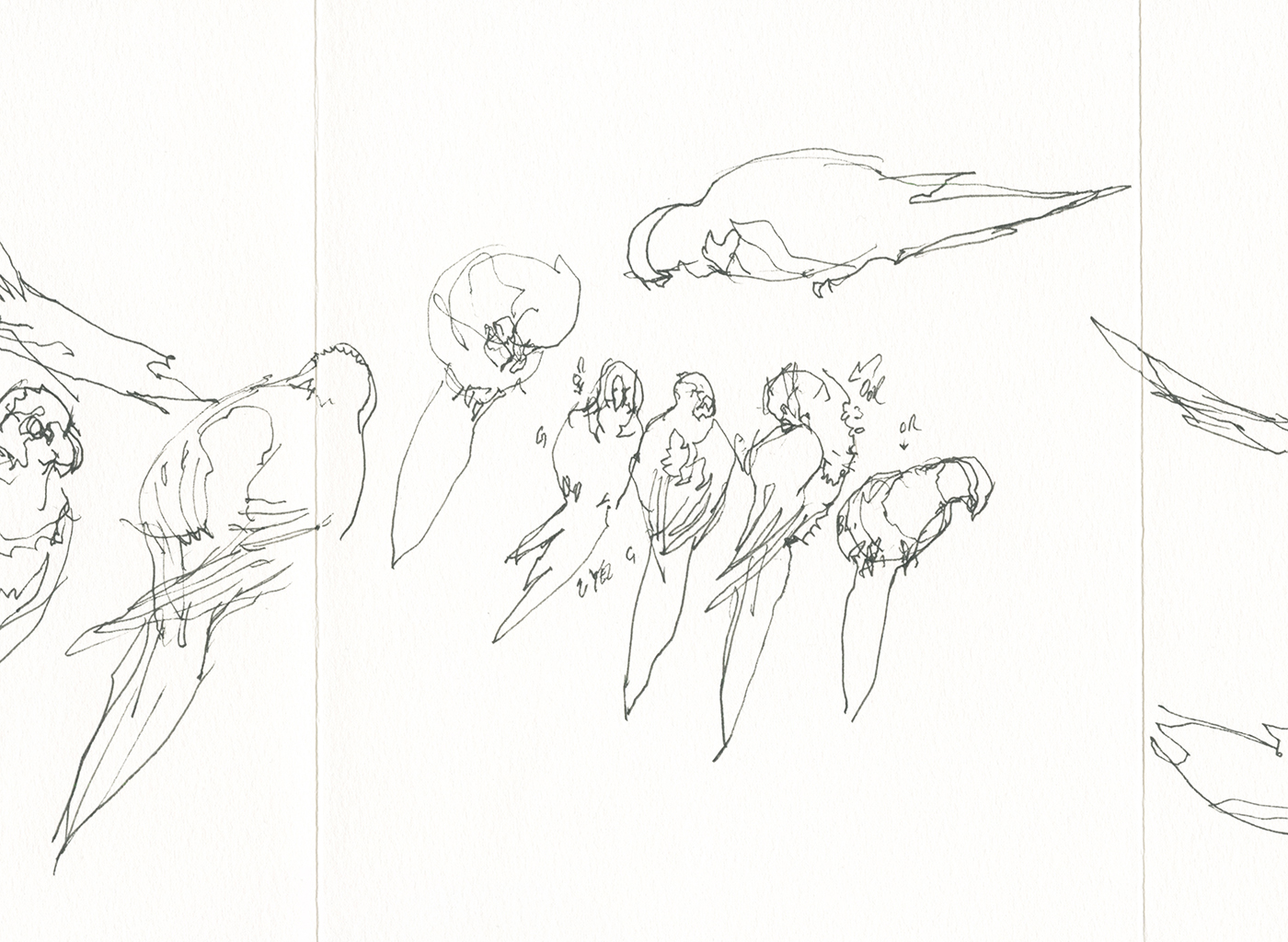
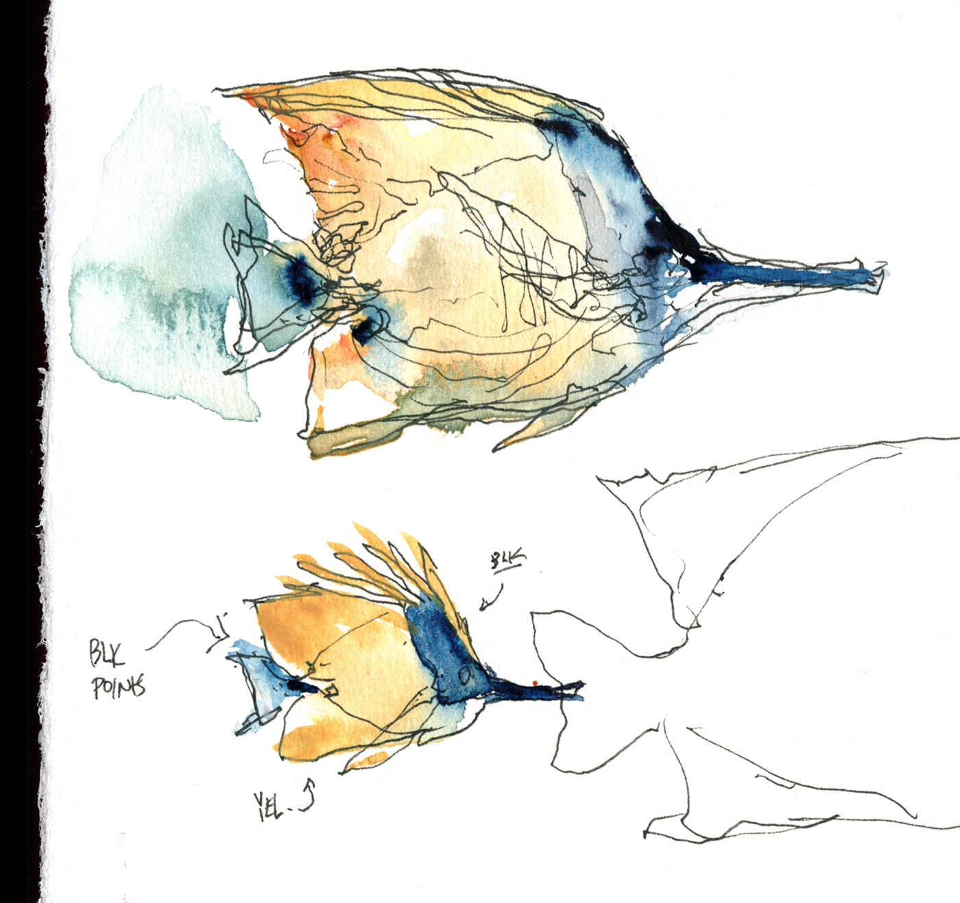
You can see, in these yellow-green lorikeets, especially on the left, and upper right, exactly how I use my rows of color.
I’m placing touches of full strength pigments – Olive green, Perlyne green, Green Gold – then an accent such as the Turquoise – and of course the intense Pyrrol Orange on the breast – but never ‘smudging’, no manual blending – simply placing the colors right next to each other. I get a light-to-dark gradient by letting the strokes fuse on their own.
Yes, I could mix these colors – but by having three values of tubes in each row, I can make gradients faster, and get the wet-in-wet fusion I enjoy.

In fact, I used the larger rectangular pans for whites and blacks in this test setup, going forward I’ll just get more mini-squares. I could add a few more specialty shades, such as Lunar Black, or Tyrian Purple.
I did these at the aquarium, but this little paint kit is perfect for any situation where space or weight is a concern. Sketching in the cafe, on a long flight, or taking a sketchbook backpacking. Whatever reason you find to go on an art expedition!
If you’re interested in ordering a few of the new pans, or a complete ready-to-go kit, head over to the Expeditionary Arts store, and use the discount code: HOLMES at checkout time. Maria says this will be good for 15% off, from now until March 31st.
~marc
#OneWeek100People2018 is coming soon!

Hey Everyone! All the posts for #OneWeek100People2018 have moved over HERE!
ORIGINAL POST:
Hey Sketchers, here’s an idea for your #OneWeek100People2018 sketching marathon.
Try some brush pen miniatures!
You can probably do 100 people in a single day if you find a crowded place, and sketch everyone SUPER TINY :)
I did these in our main Metro station downtown, so there was a never-ending set of people waiting for the train – and – I only had 2 minutes between each train car to capture a person.
It’s a lot of fun seeing what you can do with a teensy tiny miniature.
Plus, it forces you to be decisive, and, it’s really fast. You can boop them out, one after another, and you’ll find your hand-eye skills warming up.
It takes me a few tries to get a zinger. But there’s always a great one in every batch of ten.
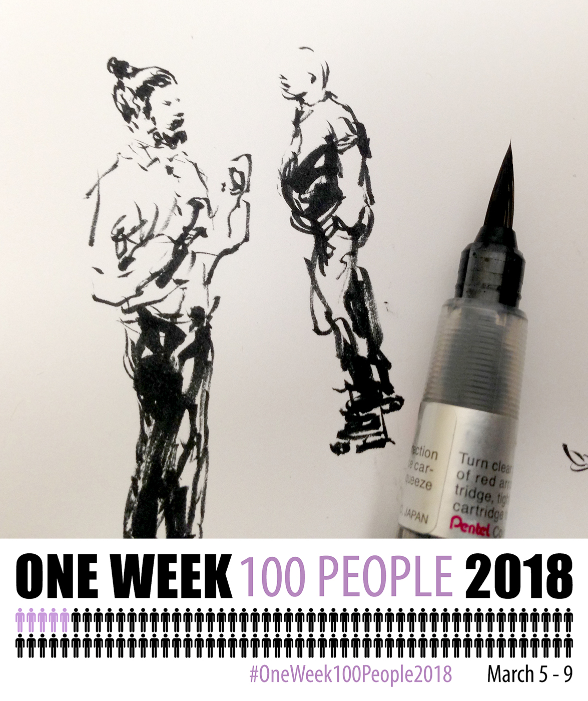
I hope you’re all getting ready for #OneWeek100People2018!
We’ll see you on March 5 with my 100 metro people :)
Interview on the self-publishing process, up on Gurney Journey!

If you’re interested in some behind-the-scenes on the making of Direct Watercolor – the ever-inquisitive Mr. James Gurney had some great questions, which we’ve posted as an interview on his blog. < Head on over to his place if you’d like to read about my process self-publishing with Amazon’s CreateSpace.

