Follow up on One Weird Color

Oh by the way – just to close the circle on the post “I’m Looking for One Weird Color“- after a tremendous discussion, with plenty of advice from all corners of the world – (that has got to be one of my most popular posts of all time) – here’s what I’ve done:
Three Weird Colors!
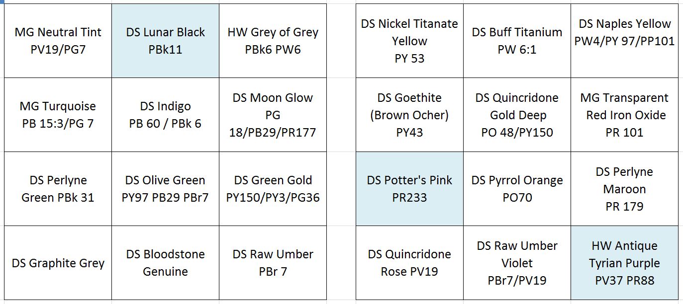
I’ve removed Davy’s Grey.
Everyone was correct, I have a lot of greys on my palette, and Davy is easily mixed. Plus, I was finding it wasn’t a great color for re-wetting.
But – Ha Ha! – I’ve replaced it with DS Lunar Black! Confounding all of you who say I have too many greys.

My rationale is – Lunar Black is a weak black – and highly granulating. So it produces effects you cannot otherwise get. Here it is below, granulating with Grey of Grey – another set-upon color you guys want me to cast aside!

I’ve also removed Cadmium Red!
Nobody saw that one coming hey?
I’ve had Cadmium red on there since art school, and I probably have not used it in years. I have a humongous tube of it – still 80% full. I just find I’m always going to the very opaque DS Pyrrol Orange or the very transparent DS Perlyne Maroon. Either warm, or cool. Never middle red.

So – I’ve ditched the old stalwart and am experimenting with DS Potters Pink.
This is a color I’ve tried once before. It’s a little off-putting at first, as it’s the weakest mix I’ve ever seen sold as paint. Made worse by the fact that the DS variant is highly susceptible to separating in the tube – giving you straight water if you’re not careful.

That being said – it’s a handy color for many kinds of architectural stone or pavement, when mixed with a bit of yellow or sepia.
Initially I was doubting, but it’s solved a color problem more than once in the last three weeks, And, it’s kind of handy – once again – for its granularity. I expect to use it in flesh-tones and portraits as well – but have not had a chance to confirm this.

And finally, my one truly weird color: Holbein Iridori Antique Tyrian Purple.

There are plenty of other purples out there. (In the past I’ve used Dioxazine Purple). And I do carry Quin Rose. BUT – I am a pawn of marketing, and this color has such a great name!
I shall call it Imp Purple after Tyrion Lannister. A royal color if there ever was one.
It’s a richly pigmented mix, and now that it’s on the tray, I find it popping up in some fun ways in my paintings. Since I’ve put it on, I’ve not used Moonglow. Which is interesting. Once you add a color, there’s a domino effect on how you use your whole palette.
Which is why I should have stuck to one, instead of Three Weird Colors!


Great choices! I don’t really like Browns so I use purple, magenta, instead.. Love the granulation from lunar black, but I have been thinking about a DS color that granulated that isn’t so dark… Imp purple looks great… I painted that horse a few times as well…thanks for the color update..
Have you tried Lunar Violet? It’s not as dark as Lunar Black.
I have not – but – is it as granular?
Yes. There are four DS lunar colors and all are granular. Black, violet, blue and earth. Many of the Primateks are also granular. The Lunar colors have a special kind of granular, like VERY granular.
This is a great post, both for it’s information but also b/c it’s funny. I’m still at a point of using a set of cheap half pans for my sketchbook work, but when next I go paint shopping, I’ll be having a look at this again. I hear you on the cad red, but the way.
I agree, great choices. I love Lunar Black and the Holbein, beautiful. I agree on the Potter’s Pink. It is sort of weird but does mix well. I am so glad I caught this post. Thanks for letting us know!1
I just recently added Potter’s Pink to my palette. I haven’t use it yet. I’m looking forward to seeing how you use this color. I loved your examples of the use of Titanium Buff, especially in the sky. I would have never thought of that. I tried it and loved it.
Great post. Sorry I missed this thread, but reading back through all the suggestions was fun. I will have to try T.Buff again—currently using Holbein’s Jaune Brilliant #1 in a similiar way—and I definitely must give Grey of Grey a spin, if only for the name! (Sodalite G. And Lunar Blue are my recent additions.)
Wonderful post – you made me laugh out loud. I’m not very inquisitive about the paints I use, placing a spot of a color that might work on my palette and swiping a dash of it on scrap paper. If it looks like it will work, I paint with it. If not, it’s left to dry. You made me think that maybe I should think about the colors I use more carefully.
Your palette makes mine look like Kindergarten compared to graduate school. But I have to agree that I got a laugh out of all of this. I can’t imagine such a complex choice of colors but I am encouraged to try some of them. I too have had cad. red since art school. Thanks for this post.
Love the colors in and the painting you posted :)
I’m waiting to hear the update on using Potter’s Pink more… I didn’t use it much at all in Chicago, though it was in my palette. I find it frustratingly ‘colorless’… but I’m going to leave it in my palette for a while longer and see where I find myself using it: it’s working for me when I remember to fade my colors with distance , but it’s not really working for me with skintones: I like them ruddier than Potters Pink lets me mix them…
So interesting to see suggestions and your choices and reasons. While I did not get in one the original asking, I will sneak in my suggestion now. The one weird color that I would keep on my pallet no matter what or where I am sketching is DS Bronsite . It is amazing when used to paint many yellow/tan buildings, sidewalks, and lots of dirt, sand, etc. It has a glint of sparkle in sunlight that is amazing. In Chicago I used it on the sandstone building across from the HUB and on the pavement surrounding the Bean/Cloudgate sculpture and several other buildings. Also, it mixes well with other colors to adjust the color.
Yay, cadmium red is gone! I have always found it orangey and not in a good way, ever since I was a kid. Add in the poisonous part and I’m not a fan.
I use M Graham terra rosa where you are using transparent red oxide. Same pigment number, but terra rosa is a more purple shade. When I thin it out, it looks more like the way humans tend to be pinkish to me. Used thick, it is a good match for expensive brownstone, not the cheap crumbly orange crap. The pricey stuff that can take very detailed carving. And it’s easy to mix a good brown brick shade with it.
Love that you added two of my favs–Potter’s Pink and Lunar Black. Try PP with the DS Perylene Maroon and it will make a beautiful, granulating color–I use it to get the color of the faded rail cars in my neighborhood. Sade of youtube fame mixes PP with Cerulean Blue for great skies. And I’ve finally been playing with Lunar Black more, love it with Cerulean Blue Chromium to make a Lunar Blue substitute, great for beach water.
This was such a fun mental exercise for us all, and very inspiring to try new supplies and change this up.
You have some great new colors in there and I know you’ll be sharing them more with us as you experiment to get the best of all three newbies :). Now where did I put that unused tube of Potter’s Pink?? ha ha
And……That Antique Tyrian Purple is already discontinued. I was lucky to find two tubes and snapped them up. I’m looking for more information on the Holbein “Antique” line. I usually use Daniel Smith but there are some very unusual colors in there that look like they might be pretty useful.
Really? Sheesh! Ah well – I mean, it’s not too far off from some of the Dioxazine Violet and Purples, so I suppose finding a replacement won’t be hard. Good thing I don’t use a lot of purples!
Well, Dioxazine Violet I have in Daniel Smith.
And I spoke too soon. Vermont Art Supply is out. I’m not spending $46 for one tube from Canada so I’ll just have to substitute.
Yikes! $46 bucks! Imagine when the Quinn Gold Deep starts to get in short supply :)
I stocked up on the original Quin Gold PO49 when I first heard it was discontinued. I already had some stocked up but I think I have a lifetime supply now.
I looked it up and the Antique Tyrian Purple is PR88. That is the equivalent of D.S. Permanent Violet or thioindigo violet. I don’t have that so will be ordering it along with the few other colors I don’t have. I’ve been using Moonglow but will give this a try, mixing my own shadows.
BTW I notice you only have one Primatek in your palette and an interesting choice. I have a few but not that one. I like the Primateks. Add a little Buff Titanium and you get some awesome effects. I think my favorite is Buff. T. and Sodalite. I think if Daniel Smith were to discontinue their Primatek line, I would go bankrupt stocking up on all of the colors I use most often.