Direct Watercolor on Sale!

Just to say, Direct Watercolor, is reduced price right now on Amazon Canada – regular $31.36, now on sale $24.59.
In the USA <affiliate link, thx) it’s only a few dollars off – regular $24.95, now for $22.46.
I’m not entirely sure how Amazon decides these things, or how long it will be on, but it’s nice to see a price break for fellow Canadians! I just want to say – big thanks to everyone who’s ordered already! Things are going very well in the first week. We came out at #1 and #2 for ebook and print charts in Amazon’s watercolor category! ~m
Announcing my new book ‘Direct Watercolor’- Available Now!

This is a super-huge, major-mega announcement! I’m so excited to be able to say, my third book, Direct Watercolor < affiliate link, thx) is available now on Amazon stores worldwide!
We have painted, written, designed and published this book, entirely ourselves.
If you’ve been a fan of Citizen Sketcher for awhile, this is an opportunity to enjoy a new and improved collection of my watercolors, and tangibly show your support at the same time. (You have my thanks!)
Due to various life-situations, some personal, and some professional, I won’t be teaching in person as much this year, and I won’t be able to release a new video class in the near future. This self-published book is my first major effort at self-sufficiency in our new circumstance.
Order Direct Watercolor in Print or eBook Edition
Amazon.com | Amazon.ca | Amazon.uk | Amazon.de | Amazon.fr | Amazon.es | Amazon.it
Order Direct Watercolor in eBook Edition
Amazon.au | Amazon.br | Amazon.in | Amazon.jp | Amazon.mx | Amazon.nl
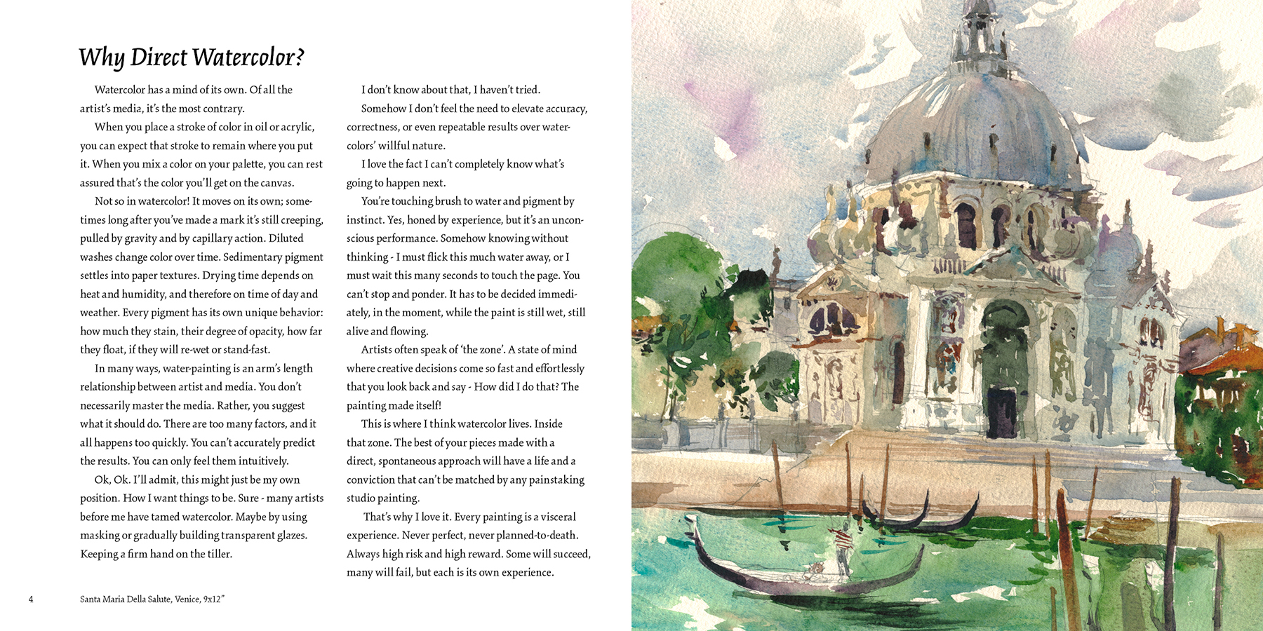
Direct Watercolor is a retrospective collection of over eighty of my watercolor paintings from the last five years. Most of them painted side-by-side with fellow urban sketchers as we gathered for our international urban sketchers symposia.


The book features my latest thinking on the technique of watercolor painting, with all new commentary on old favorites, as well as six completely new step-by-step demonstrations.
If you’ve been a reader of Citizen Sketcher, you’ll be familiar with my deceptively simple approach to spontaneous painting. I hope these examples bring it all together into something helpful for beginners, and still interesting to experienced watercolorists.

Direct Watercolor is my first independently published book and is printed and distributed through Amazon CreateSpace. As such, it is not available in bookstores at this time, only by online order.
I still have a good relationship with my conventional publisher, so The Urban Sketcher and Designing Creatures and Characters will still be selling through traditional book-channels.
It’s a big step releasing this new project on our own, but it has been an opportunity to make exactly the book I wanted, and I hope it will be the first of many to follow.
But – we absolutely need your help to make it work!
If you’d like to help, we are grateful for the assistance of every single Amazon review.
It can be as little as giving a star rating, or just a sentence or two. Every person who takes the time to send a review improves the chances my book will appear in searches and recommendations.
And please – tell your artist friends about the book! – you’ll be doing us a huge favor with every social media share and facebook like :)
As well, thanks to everyone who’s helped out in the past with reviews, by coming to workshops, by supporting urbansketchers.org, and of course being one of our blog readers. You are what got us this far.
It has been a wonderful journey, learning by doing and sharing the results with you. I hope to continue for years to come.
~marc
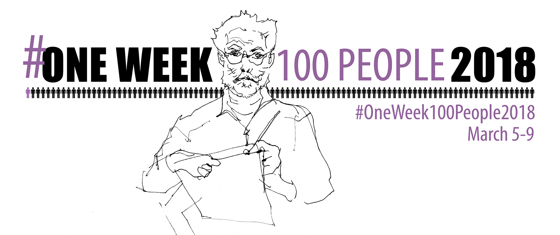
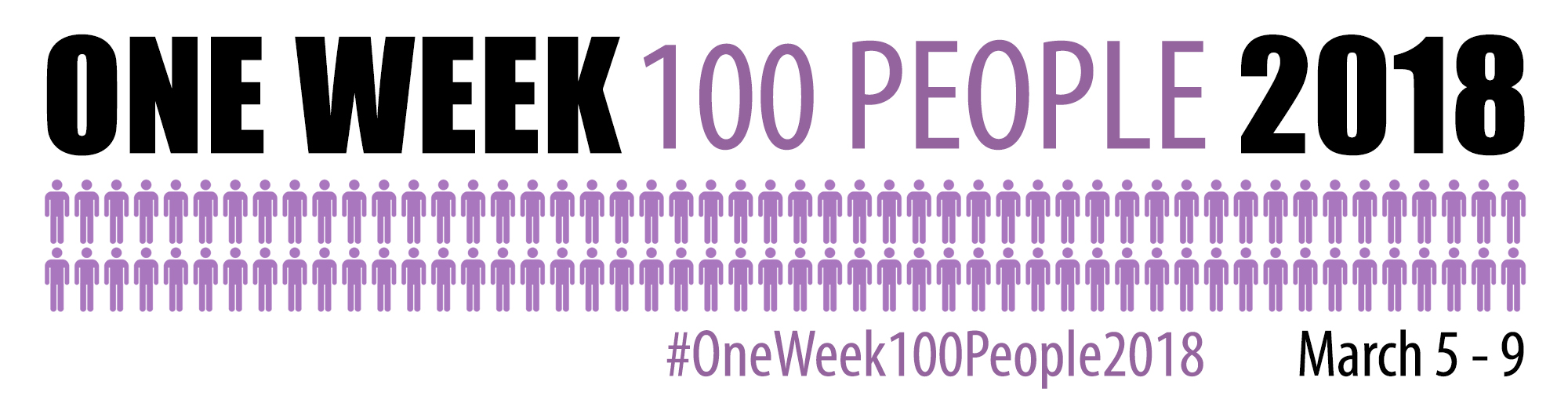
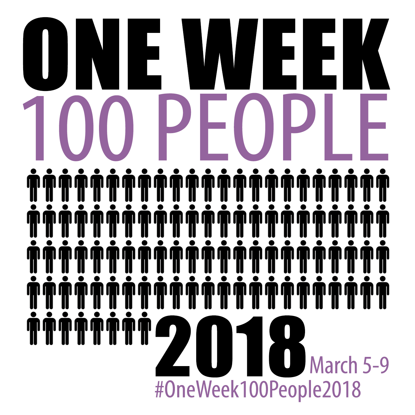
Announcing: #OneWeek100People2018 starts Monday March 5!
Hey Everyone! All the posts for #OneWeek100People2018 have moved over HERE!
ORIGINAL POST:
We’re doing it again! The sketching challenge that pushes you to draw 100 people in one week!
Taking inspiration from online challenges such as National Novel Writing Month (NaNoWriMo), or the popular Inktober, this year from March 5th – 9th, 2018, urban sketchers Marc Taro Holmes (Montreal, CA) and Liz Steel (Sydney, AUS) invite the world to join in with #OneWeek100People2018.
Oh Hai! 2018 is in the bag! Go here for a list of > all posts related to OneWeek100People <
Every aspiring artist has heard the advice ‘Carry a small sketchbook at all times!’. We’re all told ‘Practice drawing every day!’.
This is great advice, but sometimes we need a little extra motivation.
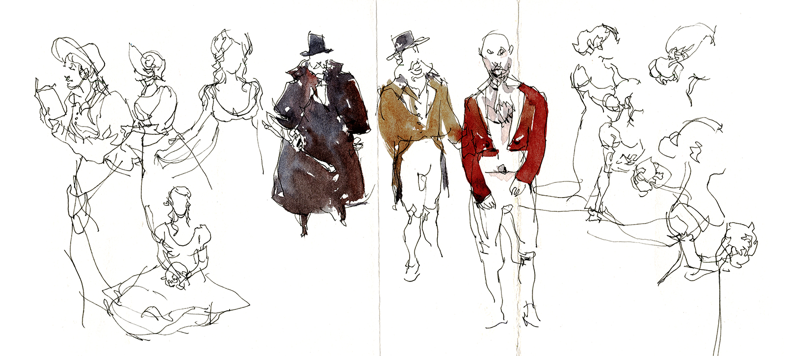
Last year #OneWeek100People had me running all over – from a jujitsu tournament to the rehearsal for a comic opera, to a hip-hop dance class.

You don’t have to go to such great lengths :)
Feel free to work from photos, or do a self-portrait series. It’s all fair game. However you choose to do it, the simple goal is: Draw 100 people in one week.
You can use any media you like: pencil drawings, or pen and ink, maybe digital sketches? Whatever you’d like to practice most.
The goal is PRACTICE. Not perfection. Think of us as your gym trainers. standing behind you yelling ‘Get out there! Keep your hands moving!’
100 people is a pretty fair goal. It’s a lot, but it’s not impossible.
It’s going to mean working hard or working fast. I like fast :) Last year I hit my entire goal on day one, and then had fun the rest of the week. If you’re doing 1-minute gestures, it’s only 20 minutes of work each day. (It can take you more time to find a group of people to draw :) But, if you’re doing 20 minute watercolors – you might have to find a way to catch up later in the week.
We’re committing to draw about 20 people a day, and we’ll be posting our work every day for the week of March 5th-9th. If you want to join in, please use the hashtag #OneWeek100People2018 so everyone will be able to find your work across all the platforms people use.
We encourage you to search that hashtag every morning, and see what other people are doing!
While you’re waiting for this year to jump off, here are some graphics you can use to make a progress bar of little people :) and – if you want, have a read through all my posts from last year. Or, here’s a google for last year’s hashtag.
Best of luck!
~marc

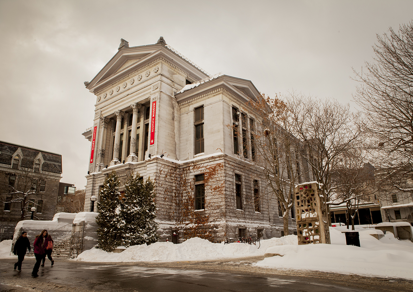
Broken Silhouettes at the Redpath

We’ve just recently spent an afternoon at the Redpath Museum. One of my favorite places to sketch in bad weather. It’s the only museum in Montreal that allows us to paint inside the exhibit.
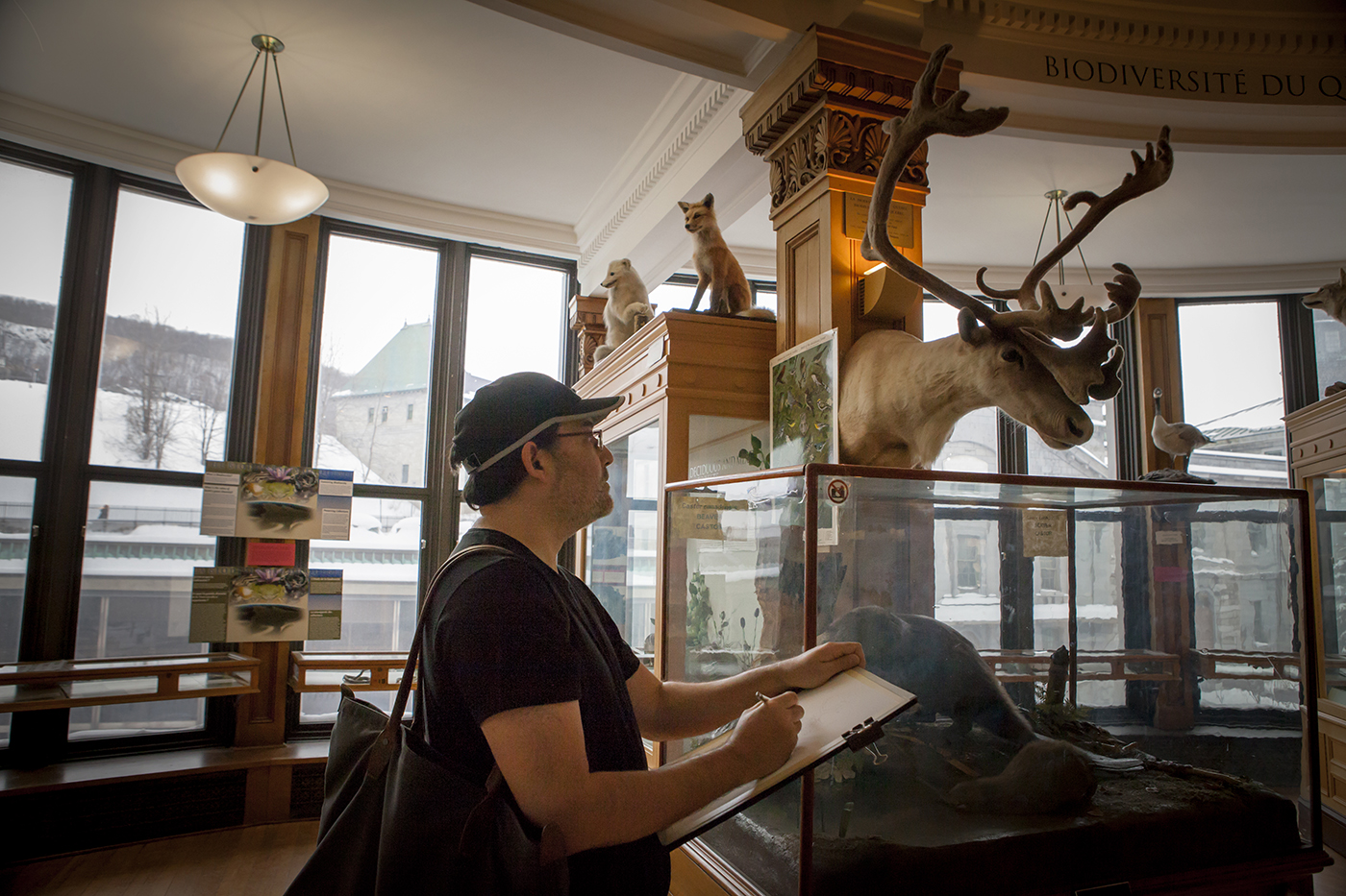
They’re getting ready for their annual fundraising auction, so we stopped by to make something for the event. (Sorry, tickets for this are sold out).
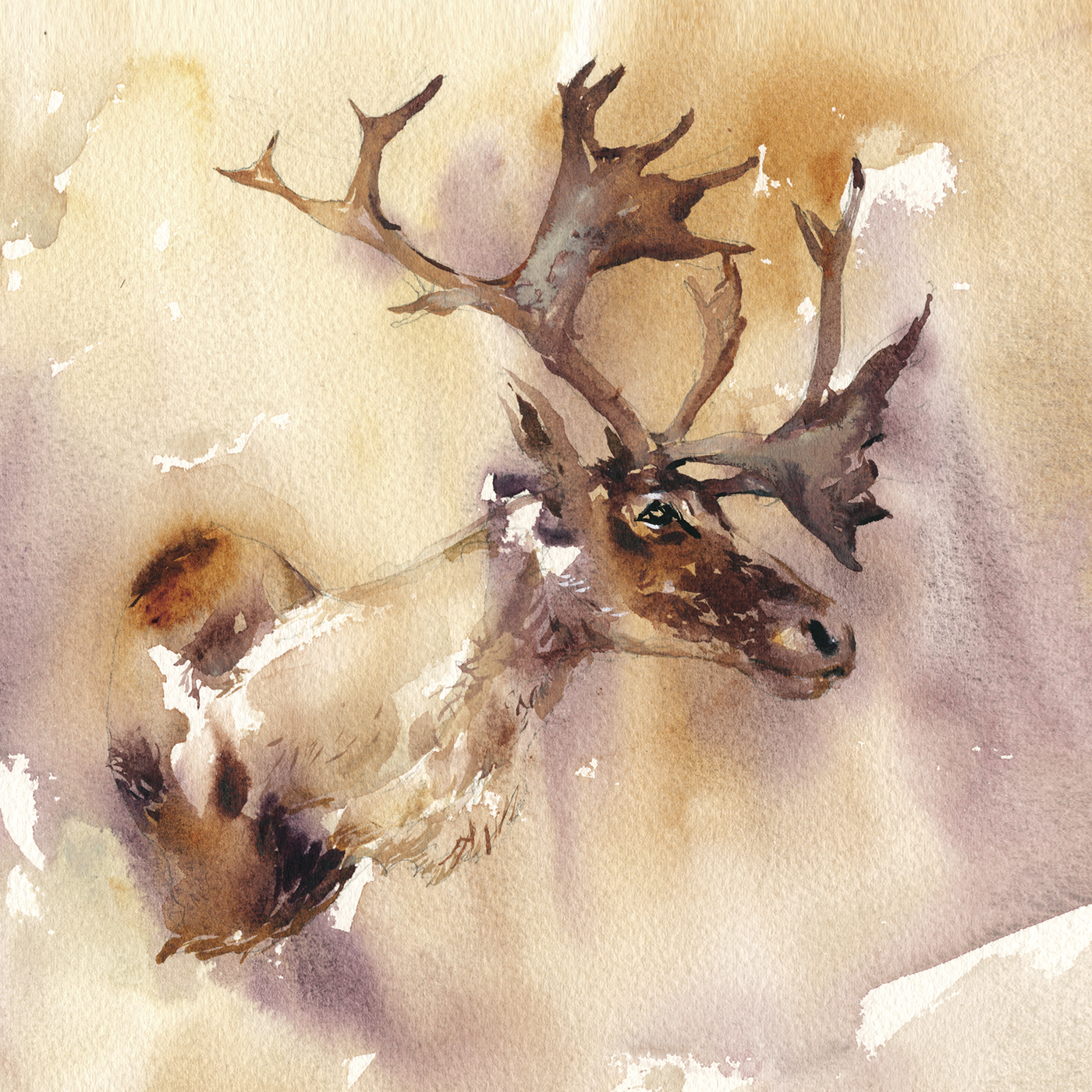
I wonder, can you see much difference between this caribou above and this ferret below? I mean, besides the obvious fact they’re different critters.
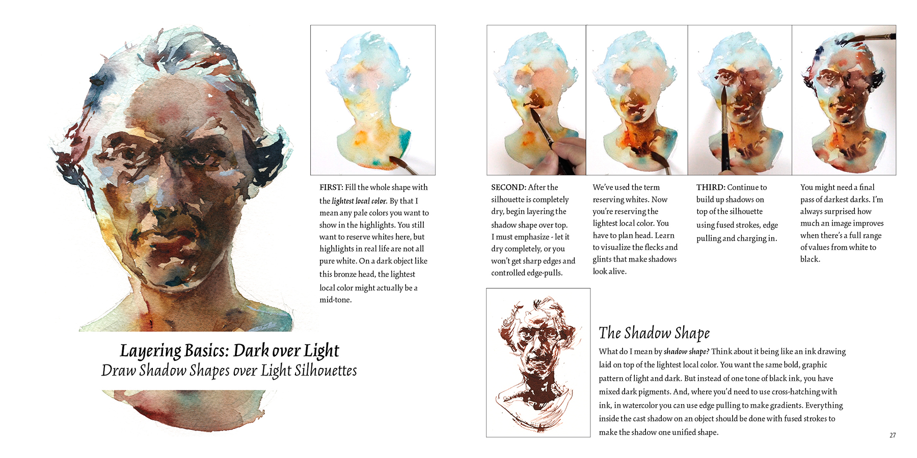
One is what I’d call positive shape, the other negative.
The silhouette of the caribou is all darks on top of the mottled background tone. (Don’t forget to wait for your wet-in-wet undertone to completely dry). The darks are placed, stroke-next-to-stroke so they fuse together – but at the same time, there’s a lot of open ‘unpainted’ space where the background tone shows through. Particularly in the neck and shoulders.
This idea of leaving holes in a shape – that’s something I was getting at in my workshop “The Broken Silhouette“. You can read more about it in the workshop notes.
I quite enjoyed this play between what is ‘solid’ and what is ‘transparent’ in the subject.
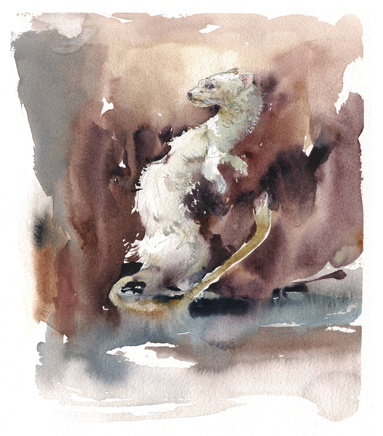
This ferret, on the other hand, being a light colored shape, has to be reversed.
The dark background is pulled towards the body on all sides, making this figure a white hole in a dark field.
This is what I’d call negative painting. Not painting the figure, but painting everything around the figure.
I like to alternate hard/soft with the edges. Some areas (like the tail) have a sliver of dry paper, making a sharp white edge. In other places (like the knee), the background is allowed to touch the wet fur, causing the pale grey to melt.
This isn’t completely planned. It’s done by instinct – and sometimes things melt more than you want. I had to use a bit of Chinese White on his front paw, to bring it back into focus. And a few dots of white along the s-curve of the neck.
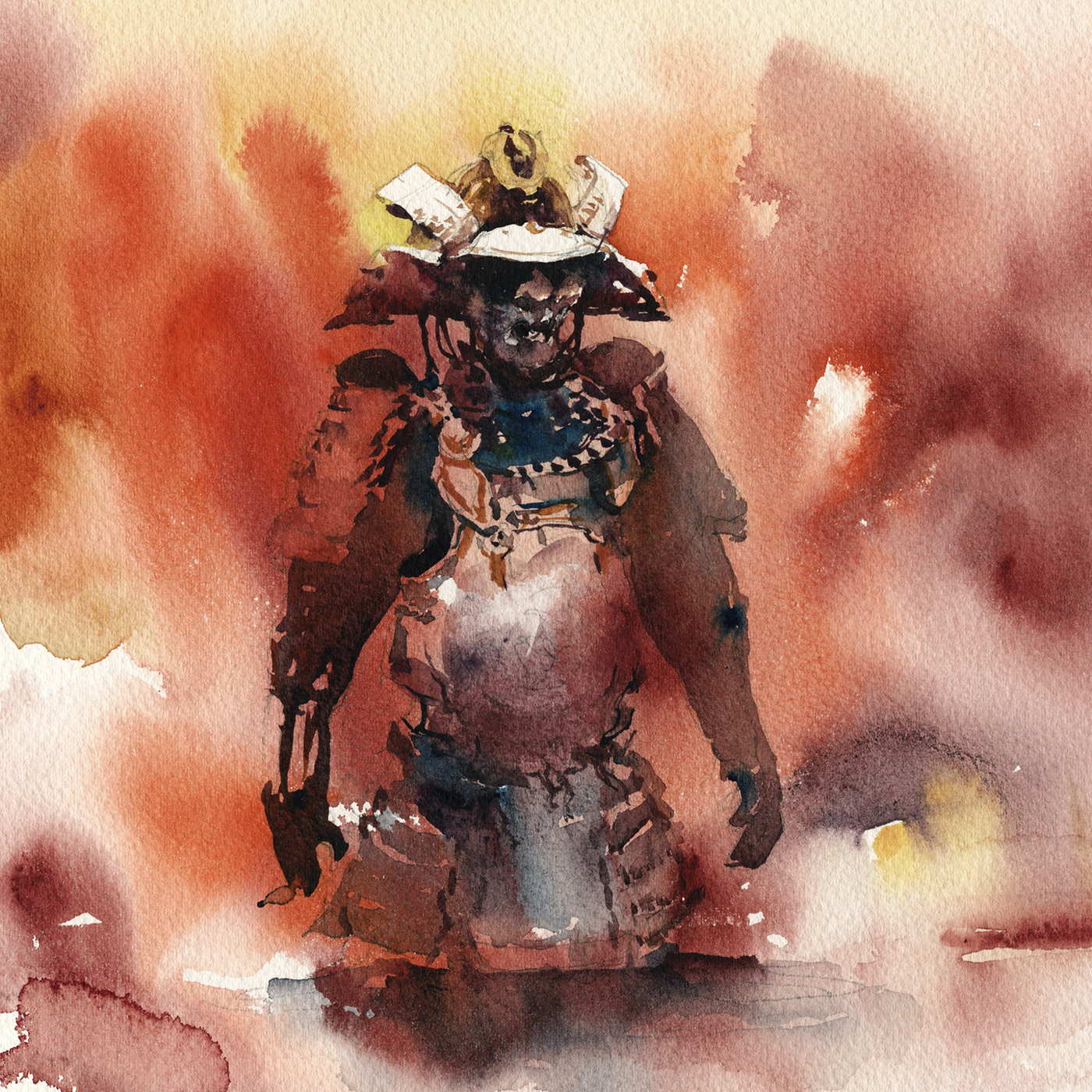
Some subjects can be a mix of positive and negative shapes.
The shiny metal helmet on this suit of Japanese armor jumps into high-relief, because of the reserved-white negative shapes on the visor. Whereas the Mempo (faceplate) below is a positive form.
The forward shoulder plate and smaller shapes on the Do (breastplate or cuirass) are negative shapes, but, being a little further from the light, I choose to reserve to the background tone, rather than 100% white.
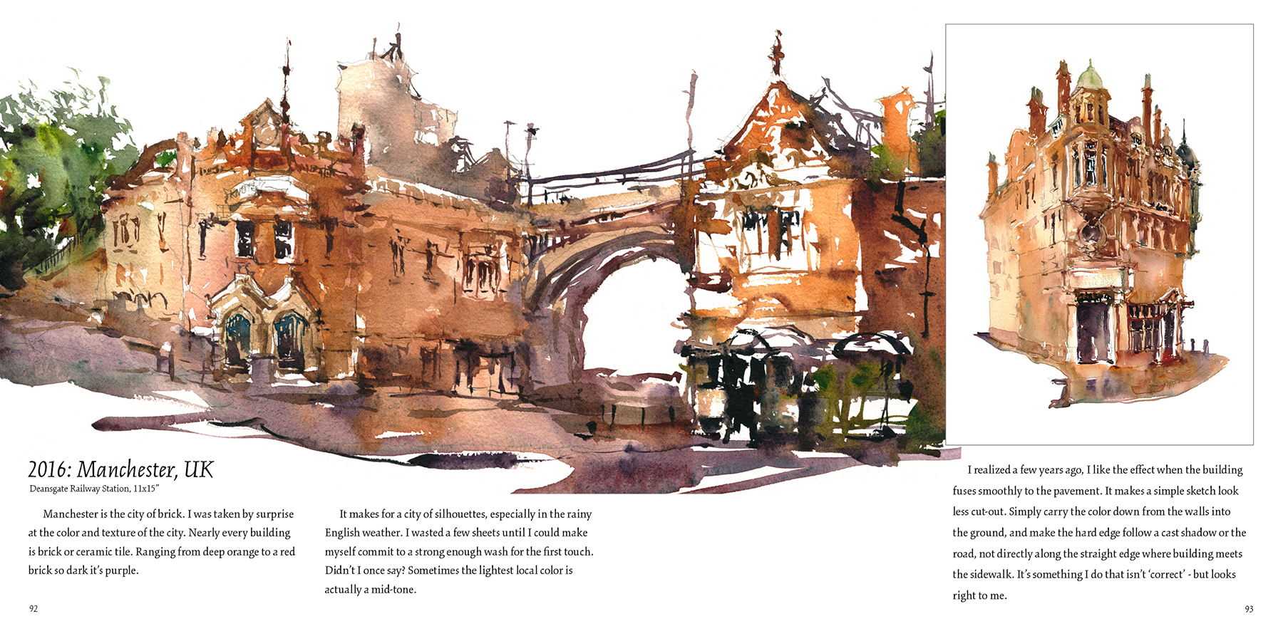
Sometimes, if I’m working too fast to wait for the undertone to dry, I might do the whole figure on white paper, all in a single pass. This gives everything a sharp focus silhouette. (See old example below). But, by planning ahead with this moody base tone, I can impart a better sense of dramatic lighting. I know nothing I do in the second pass, can be brighter than the base tone. It’s like (selectively) putting the breaks on future highlights to come. This takes some planning, or pre-visualization, but it’s easy enough to add it to your toolkit, given a little practice.

In reality, there’s a lot of fascinating detail on the armor. Mixed textures of brocade and chain-mail, ornamental rivets, and decorative plaques. But it’s a stronger statement if left in silhouette. If I wanted all that detail, I might take a photo :) Or, more likely, do a pen and ink drawing.
Right now I’m loving the game of implying shapes and highlighting edges with little gaps and holes in the fused silhouette. Drawing in the positive and negative modes simultaneously.

So, if you’re ever in Montreal, looking for something to do in an afternoon, consider our little natural history museum! It’s a wonderful space that takes you back in time. Almost a meta-museum. A preserved example of what 19th-century natural history collections were like. Provided free to the public by McGill University, (donations welcome, in the little box by the door).


Semantic Dementia and my Stepfather’s Brief Artistic Inspiration

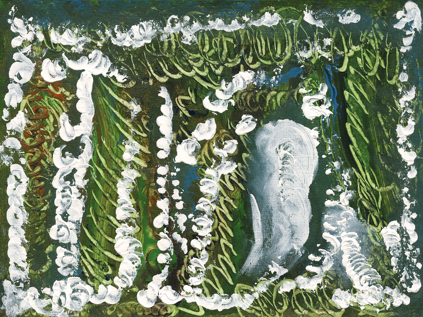
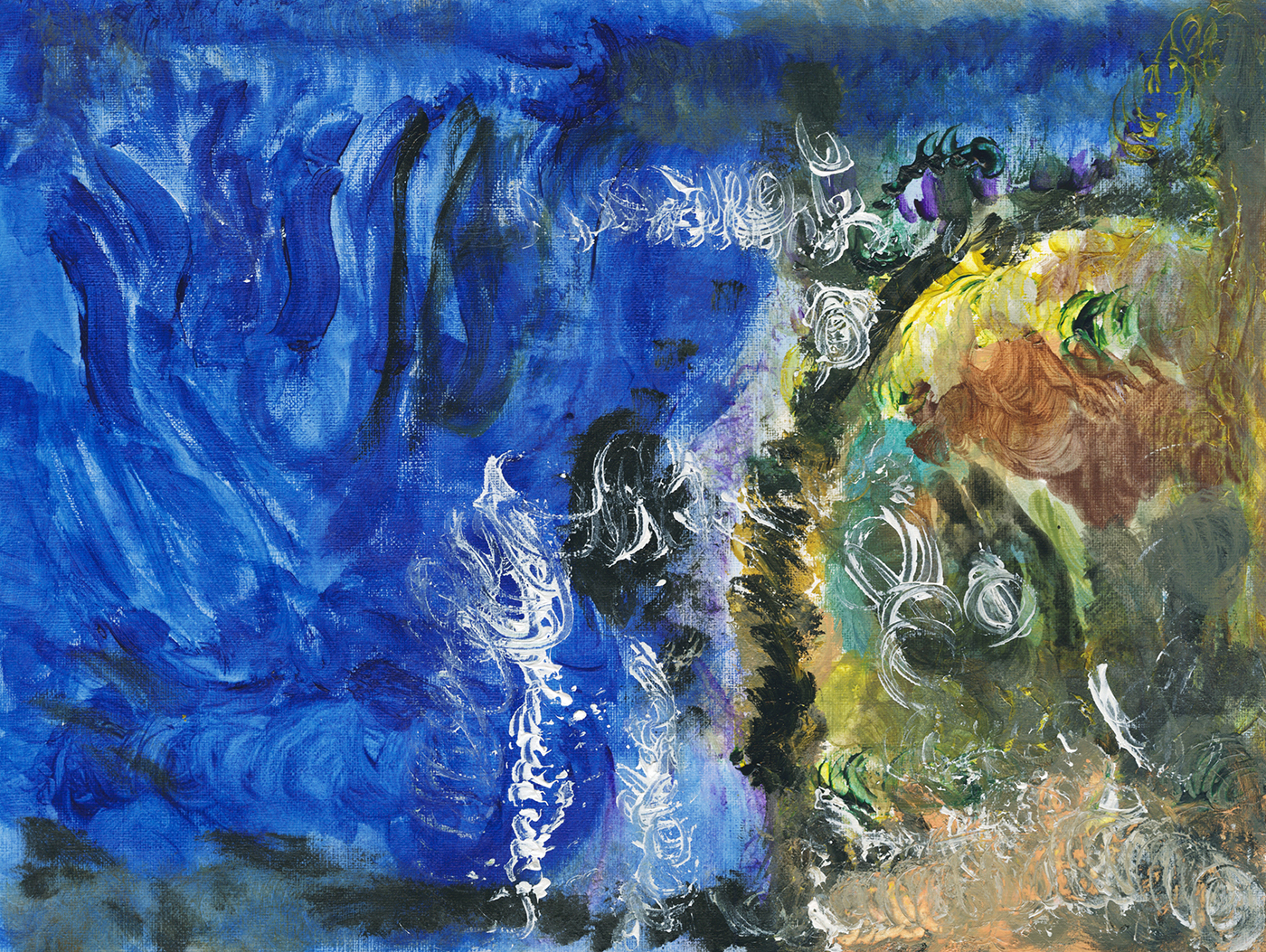
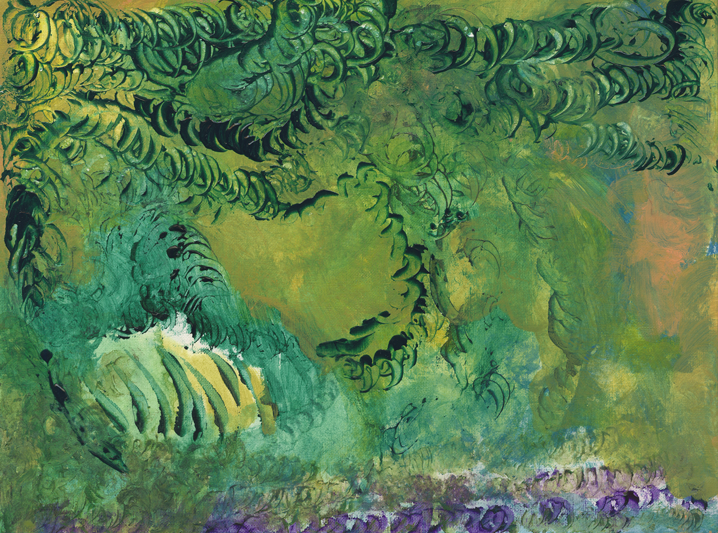
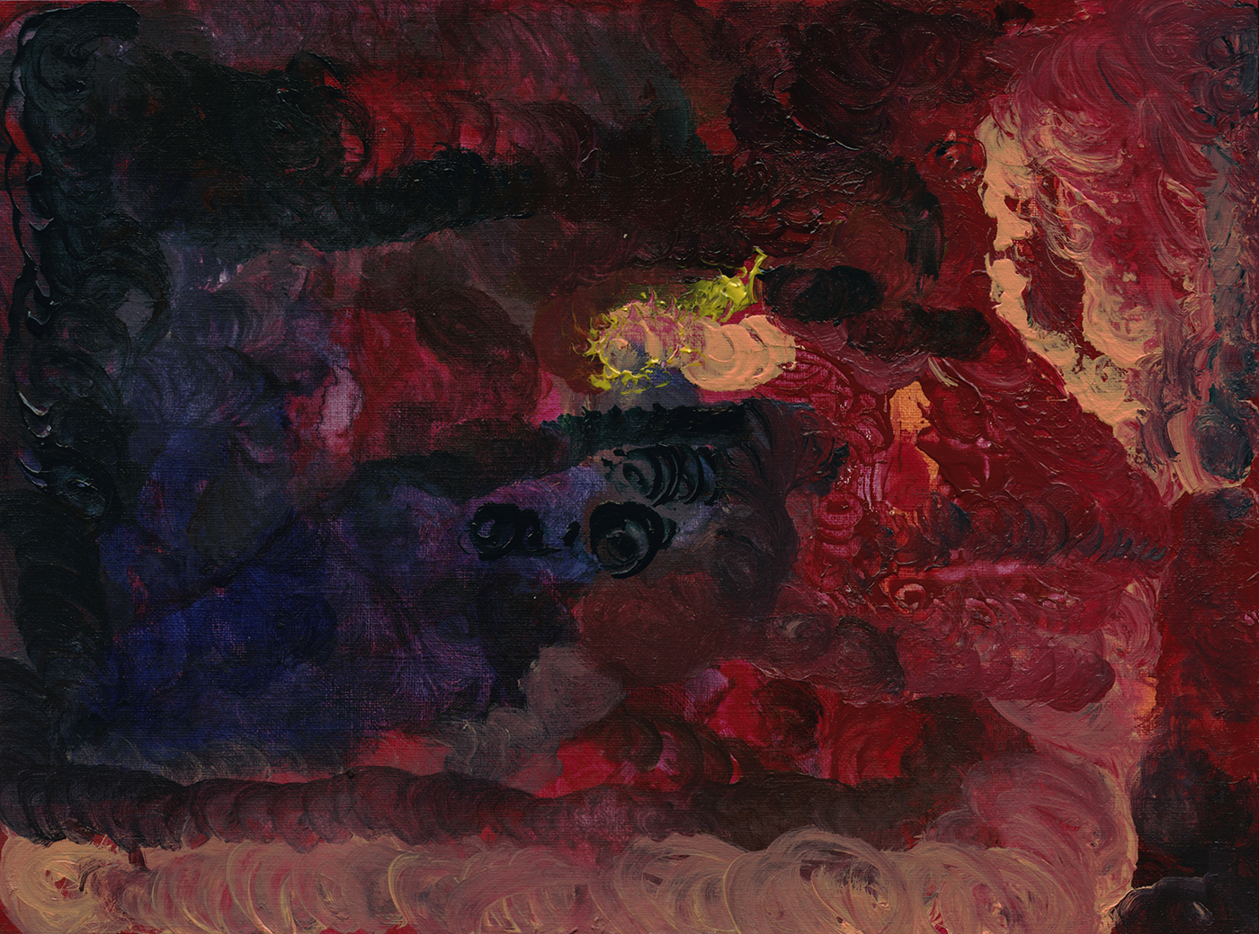
A few years back, (2016 ) my stepfather, who has advanced semantic dementia (similar to Alzheimer’s disease), had a six month-ish burst of creativity in which he made a series of paintings in acrylic.
He started quite abruptly and stopped cold-turkey when he couldn’t make the color choices any longer.
He had not, to anyone’s knowledge, ever made a drawing or painting in his life before these.
I’ve read that sudden outbursts of creativity are common in people with degenerative brain disease. I suppose, as they get worse and worse at communicating verbally, they’re looking for some other way to express themselves.
At the same time they’re losing inhibitions and self regulation, and suddenly they find themselves able to access a state of un-fettered creativity.
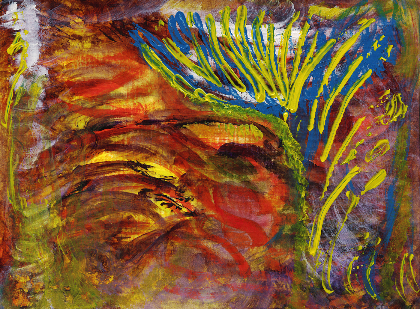
Even though these works are entirely abstract – just color and brush marks – I still imagine a surreal landscape or emotional ‘space’ created by the color.
But there’s no way to know his true artistic intent – or even if there IS a thought process behind the work.
There’s a jibe to be made between art schools: maybe this is no different from any abstract artist. Can we ever know that non-objective painting isn’t just completely random color choices?
At this point he couldn’t sign his name or print letters, or even reliably operate our coffee machine. I watched him spend 20 minutes considering (unsuccessfully) how to assemble a screw, washer and nut. So I was surprised to see this amount of dexterity with a paint brush.
He did some of the work, drawing with the paint tubes directly. Skipping the step of mixing color, using them sort of like a crayon. Squeezing paint onto the canvas.
I had an instructor back in art school who did the same thing, though his works were monumental in size and many inches thick. Very expensive paintings.
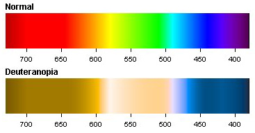
It’s worth noting, my stepfather has been red/green colorblind his whole life. So he sees these works more duo-chromatically than we do. Here’s a chart I found of what that looks like.

That might make the red painting above look like this. (Color adjusted in photoshop). But, as there’s no way to know that for sure, I won’t make this adjustment with all the work.
As well, he’s unable to tell us for sure in which orientation the art should hang. He can make a choice when you have a finished frame to show him, but it’s not clear he wouldn’t change his mind if you asked twice.
We actually didn’t take the time to watch him at work. Which, I now regret. Ironic that I’ve been teaching art for a few years, but we never talked about his things. Of course I thought about trying to help him a bit. But it’s complicated. I didn’t want to do anything to jinx his process. He was producing things at a brisk pace. People get antsy if you hover when they’re painting. So why get in the way?
Anyway, I’ve chosen the orientation for these. and that might impose a context onto them. I tend to think, this one looks like a mountain for instance, so I put it this way up.
If you ask, is it a mountain, or is it a lake, he’ll just agree with whatever you suggest.
I’ve always been somewhat stymied by pure abstraction. Not knowing how to think about it. My own work is fairly literal. I look at the world, and create a personal record. Sure I might exaggerate for effect. But essentially I paint what I see.
With frontotemporal injury, there are people that see vivid hallucinations. Others can look at a clock and all the numbers are jumbled. Some don’t see faces on people’s heads. It’s fascinating to think that these marks might represent something he’s seeing, which we will never understand.
When I look at this pale green surface, my realist’s brain wants to see a forest or jungle. It’s attractive because of the color harmonies. It seems like a ‘good mood’ kind of painting.
His moods will change rapidly over a day. But even prior to losing his self regulation, he wasn’t the kind of person to be in a good mood for long.

This dark forest is a little more of a reflection of his personalty.
I am, in a way, jealous of his freedom to use color and marks without any concern about capturing reality.
It seems like a person with dementia has an advantage over a fully functioning painter who might dabble in non-objective painting, but be unable to set themselves free of describing things.
Unfortunately, his condition is irreversibly progressive.
This burst of visual art was short lived. We didn’t keep exact track of the dates, but I’m recalling, it lasted about six months. Eventually the work began to lose the complexity of mark making and the clarity of color.
These pieces are roughly in chronological order, though there was various amounts of time, and other works, in between.

Just stop and look at this one for a moment.
It might well be a completely random creation with no meaning. Made by a loopy old dude who’s just farting around.
But if you stop and think; this is the artwork of a person who is trapped in his disintegrating mind, aware at times – or possibly at every moment – that he’s lost his intelligence, personality, now his physical independence, and fairly soon his self-awareness will be gone. It’s tempting to say that this guy who can’t speak, or even dress himself, is trying to communicate his state of distress.
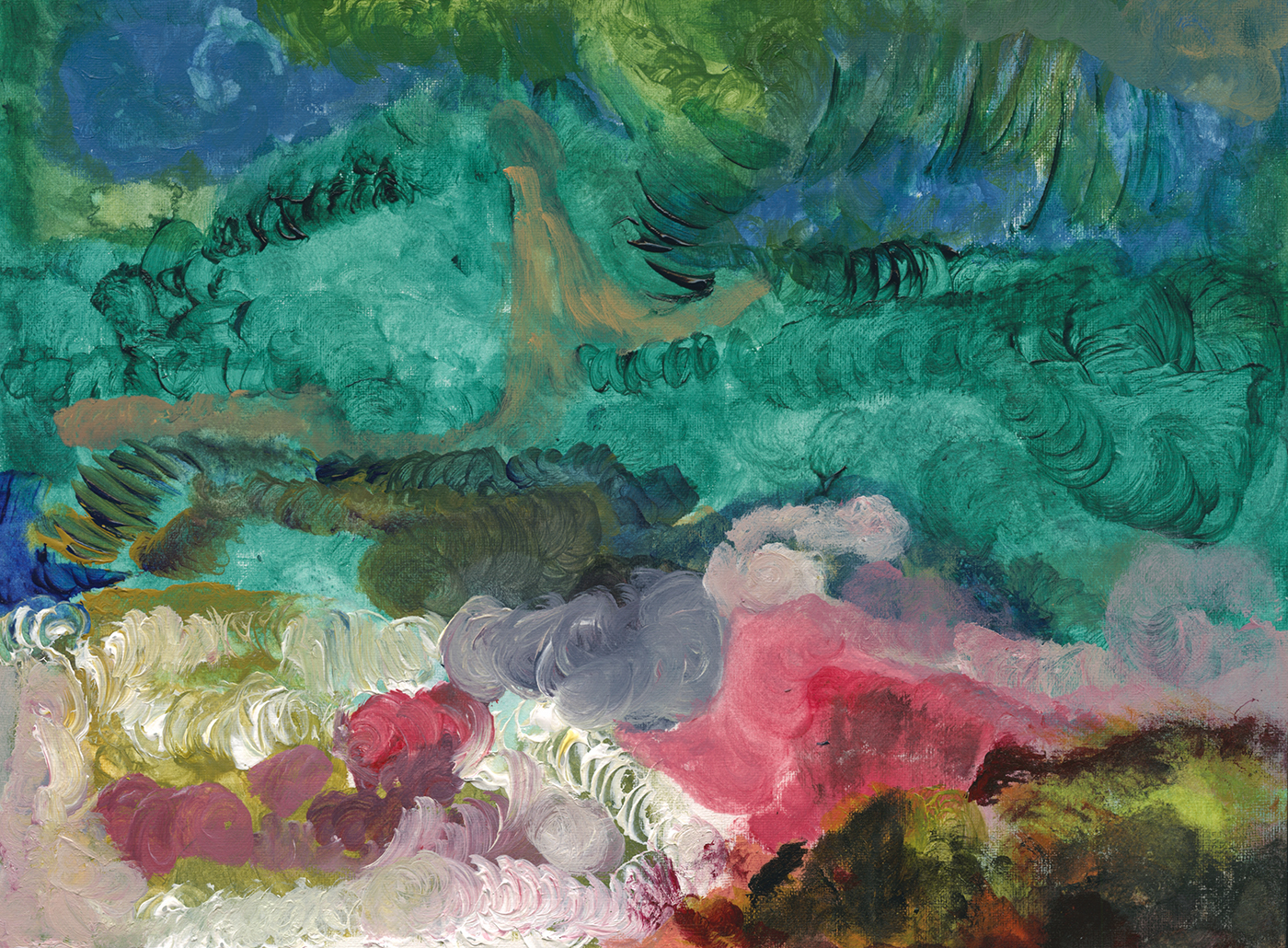
He made at least fifty (I haven’t counted exactly) of these paintings on 9×12″ canvas paper and some more on 5×7″ and 8×10″ stretched canvasses.
I think the volume of work is indicative of their importance to him. There was nothing else in this time he would devote more than ten minutes to. He doesn’t listen to music, or watch TV. He won’t sit to be read too for any length of time. Somehow, these were rewarding for him.
He would very much enjoy seeing his paintings framed, or put into portfolio books. And he’s still quite proud of having made these when he sees them today. They’re one of the few things, other than family photos, which he will always comment on.
“I did that. That’s mine”.

Then, one day, there was a sudden decline, and this was as far as he could get.
There’s a few of these essentially unfinished works, done in one color with only part of the surface considered.
Soon after the these pieces, he refused to make any more work, saying he couldn’t do it anymore.
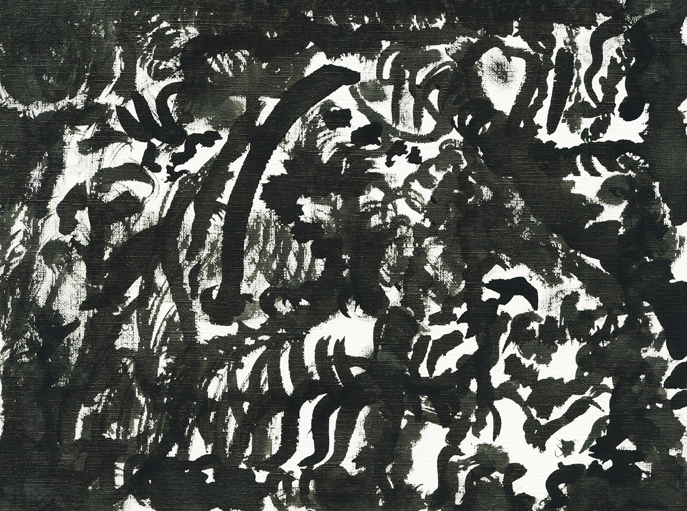
We tried to keep things going by offering him India ink, hoping it would be easier with a single color.
He made about five of these black and white drawings, and would not make any more.

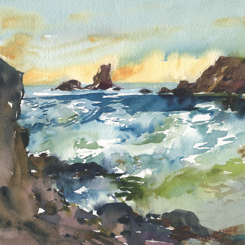
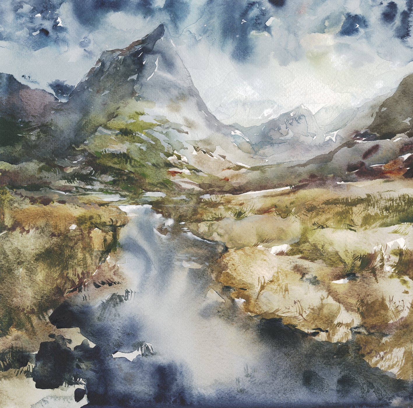
New Years on the Beach

We’re recently back from a month in southern California. Stayed in Dana Point, which is just a bit south of the more well-known Laguna Beach.
Have to say, it’s pretty nice down there. A series of beaches up and down the coast, and plenty of nice hikes into the dry hills inland. Plus, if you’re willing to do some driving, you can make it to the high desert in a few hours. We took a jaunt through Joshua Tree, and further on to Death Valley, (by way of Vegas, baby).
No fires where we were this year – but plenty of haze on the horizon. I didn’t make an effort to research if that was normal, or if we were seeing the smoke from up north?
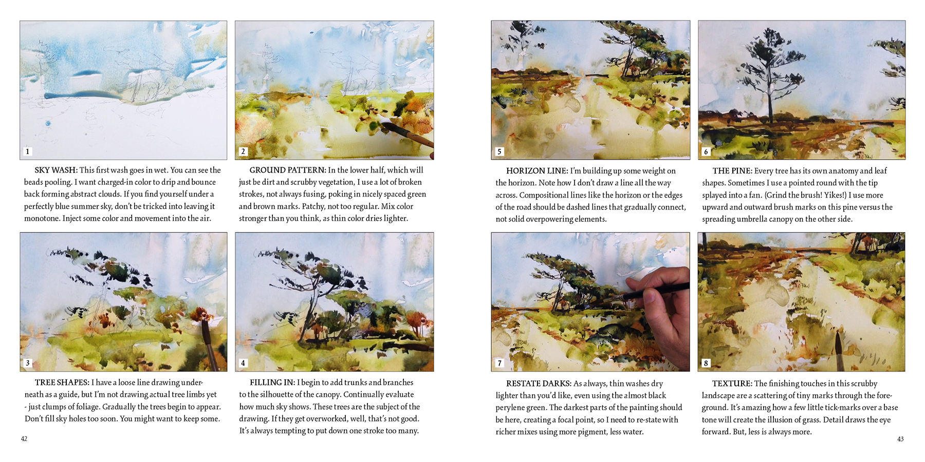
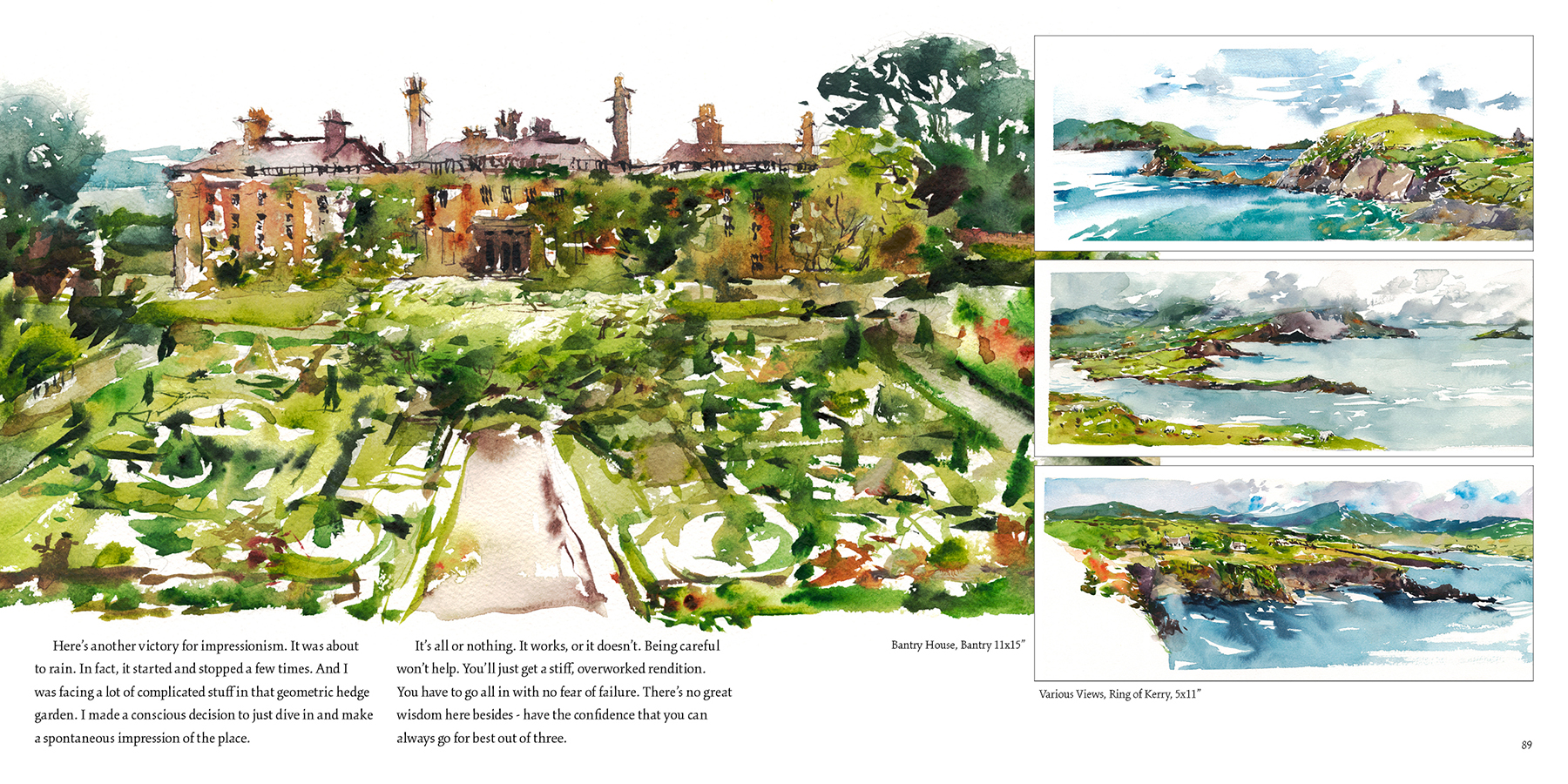
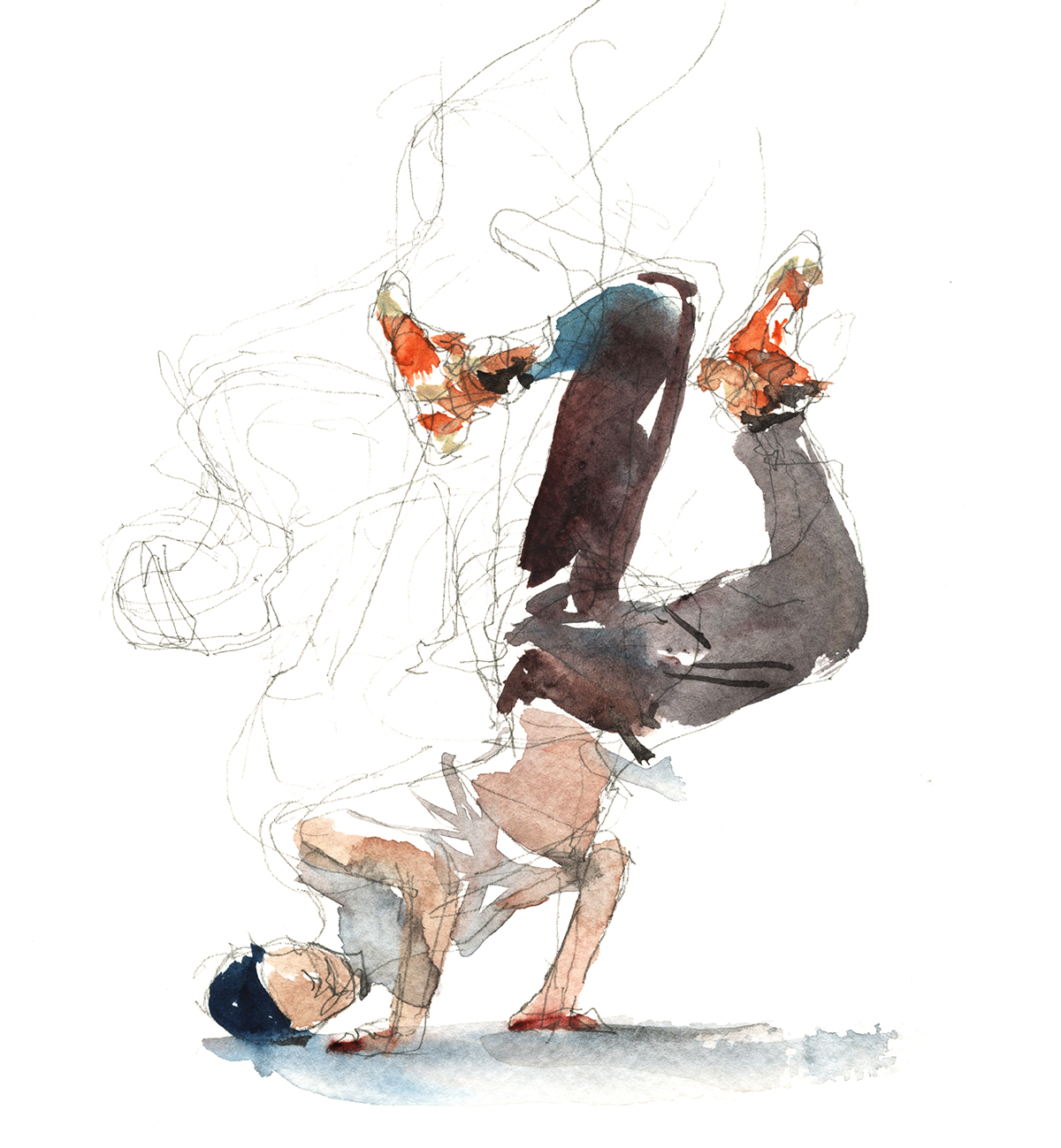
These beach sketches are the very spirit of Direct Watercolor. Not much planning, other than a single scrawled pencil line for the big shapes of rocks and water. They’re painted all in one go, because, even though it’s arid in SoCal, down by the water the paper doesn’t dry fast enough to work in layers.
Though, even without layers, I still progress from larger to smaller shapes, working a silhouette from outside-in. Going light to dark pigments, and wet (tea) to dry (honey) viscosity. The paper is still soaked when I begin to touch in opaque-ish darks. Which is fine. They blend without needing to pull edges.

It’s a bit challenging, painting on the beach, trying not to get sand into everything. The first day I took too much gear, and found it annoying juggling drawing boards, water bottles, brush case and assorted junk – without letting anything touch the ground.
Did anyone play a kids game ‘the ground is lava!’? You had to move around the playground without touching the ground. Or at least, only for a fast 1-2-3 count. Hah!
These sketches are from a second day. I cut down my gear, brought only two gold handle Escoda Reserva pocket brushes. (<that’s an affiliate link, thx). One large (#12), one small (#6) round. Plus a couple of drawing boards, and my pocket paint-box. There’s a couple shots of this setup in this NYC trip, except, using Rosemary pocket brushes.
It can be tricky getting small details over damp paper. In this one above, I was trying to put a line of trees onto the cliff in the background, but the sky was still too wet. We get an interesting ‘blotchy’ effect which actually helps the ridge in the look further away. (I think so anyway). A happy accident.

Here, I did the sky as the next-to-first thing (the sandy grey base tone of the cliff was very first). That way, after painting the water and rocks, the treeline could be the very last thing – maximizing my sky’s drying time.
Also worth noting – the cliffs here are crowned with rows of houses. Beautiful places, that look like someone’s doing very well for themselves. This time, I left all those glittering mansions out. In the past I might have focused on the houses, with their walls of glass and private staircases zigging down the cliffs. But, tiny, complicated architectural forms are not suitable to this bold, direct painting approach. And I’m getting less and less concerned making an ‘accurate’ depiction of the place.
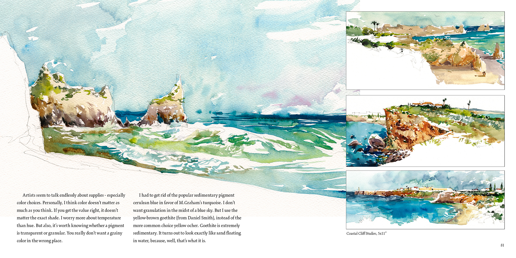
These might have been at Aliso Beach, Victoria or Thousand Steps (which is only 295 by my count). I can’t recall which exactly. We visited a lot of spots, that, while each are different, you could go to the same place at different times of day or with different tides, and it would be a new painting every time.
~m
Tasty Watercolor Fish in a few easy steps!

We’re sure you’ll love this recipe for fast and tasty watercolor fish!
They’re easy to whip up at home with whatever colors you have around the studio.

1: Prepare your fish with a simple but zesty line drawing, capturing only the silhouette, and maybe a few details around the eyes, mouth and gills. I like a 0.3mm HB mechanical pencil for easy clean up.
2: Wash your fish shape with clear water. Dampen the entire body of the fish, but I like to leave out the fins. If they stay dry, they’ll cook up to be crispy and full of flavor.
3: Now – dash in spicy colors to taste! Just toss whatever you like onto your damp fish, and the body will flood with succulent color.
4: At the very end, brush the fins, starting away from the body, connecting dry-brush strokes to the damp center, making a pleasing decorative pattern that fuses to the body.
Your fish won’t be fully done, but you’re almost there!

5: Now repeat for the background: For this step, be sure to air dry your fish. Pat the paper to test – if it’s cool to the touch, it’s still wet.
Once fully dry, just repeat in reverse – wash around the outside of your fish with clear water, not dripping onto the body, and again, spice with color to taste. If it’s properly dry your fish won’t melt. To be honest, you can rush the drying step, if you don’t mind some blended flavors here and there.
6: Let rest for a few minutes and garnish your fish with a another pass of rich dark touches that bring out the fullest flavor – especially in the fins and gills. And always the most careful touches around the eyes – they should brown into tasty sharp edges. Sometimes the crackly skin can be the best part.
Your friends and family will love your juicy watercolor fish!
Still on Hols!
Do you say Vacay? or Hols? I think that’s a US vs. Canadian linguistic tell.
Either way, have a great holiday season, see you next year!
Out of Office Message
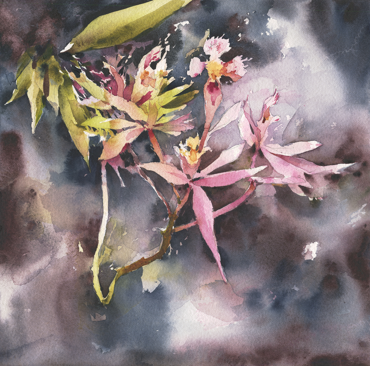
I’m out for a family vay-cay so, here’s an orchid from the Montreal botanical garden.
Back from Stowe : Studio vs. Demo painting

We’re just back from teaching a workshop in Stowe Vermont. (Thanks to the great people at the Helen Day Art Center).
Unfortunately, the last one for a while.
I say unfortunately because it went really well. I had a good time anyway. We had a great group of students who worked hard tackling the devilishly difficult still life projects I set up.
")
")
")
")
")
I’ve read somewhere, about imaging studies of the brain. The ones where they can see the neurons firing.
When a person is painting, the activity is focused in the speech centers, not the visual cortex. It appears the physical act of formulating a thought and speaking, isn’t that different than the act of visualizing and painting.
Painting really is story-telling.
And – if you’re doing both at the same time, (as you do in a classroom demo), you’re probably doing each at half-capacity :)
I’m not surprised to read that, because I’ve experienced first hand how strange it feels to be talking and painting at the same time.
It’s hard to remember what you’ve just said a second ago. And you find yourself searching for simple words. I also find, I can’t filter my stories that well. So you can ask me all kinds of things and I’ll give you an honest answer. Too honest!
But anyway, I thought it was interesting to see my practice painting at home next to the demo I did on the day.

[Studio]
 [Demo]
Partially of course, I was much too close to the demo subject. You need to back off a bit to see the entire subject. But we had to fit everyone around the painting, so, that’s just a practical thing.
But – I’ve always said – the distractions and time pressures of painting on location are one of the best ways to get lively paintings. If you prevent yourself from laser-focusing on your work, you can keep that casual approach.
It also appears that part of the magic is painting with friends. I do a lot of my best painting out with a buddy. Apparently the conversation helps me get into that mindset of only half-caring about your work.
Because, when you care too much, it gets labored. Overly self-conscious.
You never want a painting to be hard work. It should be a joy, not a second job :)

