Broken Silhouettes at the Redpath

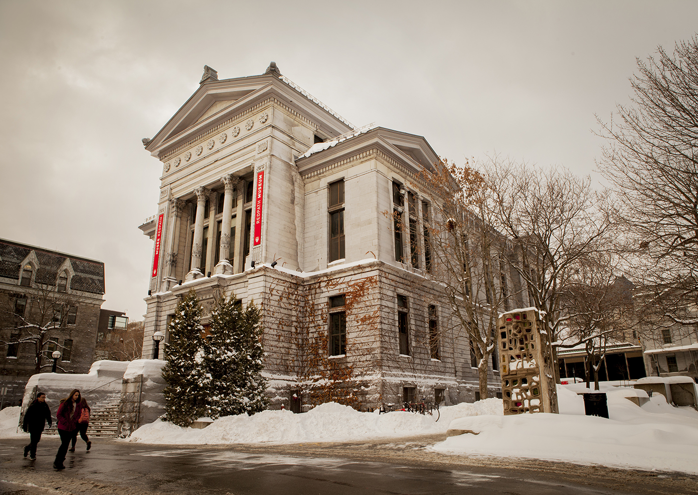
We’ve just recently spent an afternoon at the Redpath Museum. One of my favorite places to sketch in bad weather. It’s the only museum in Montreal that allows us to paint inside the exhibit.
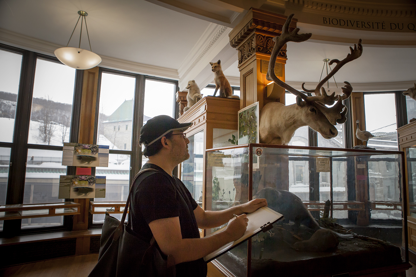
They’re getting ready for their annual fundraising auction, so we stopped by to make something for the event. (Sorry, tickets for this are sold out).
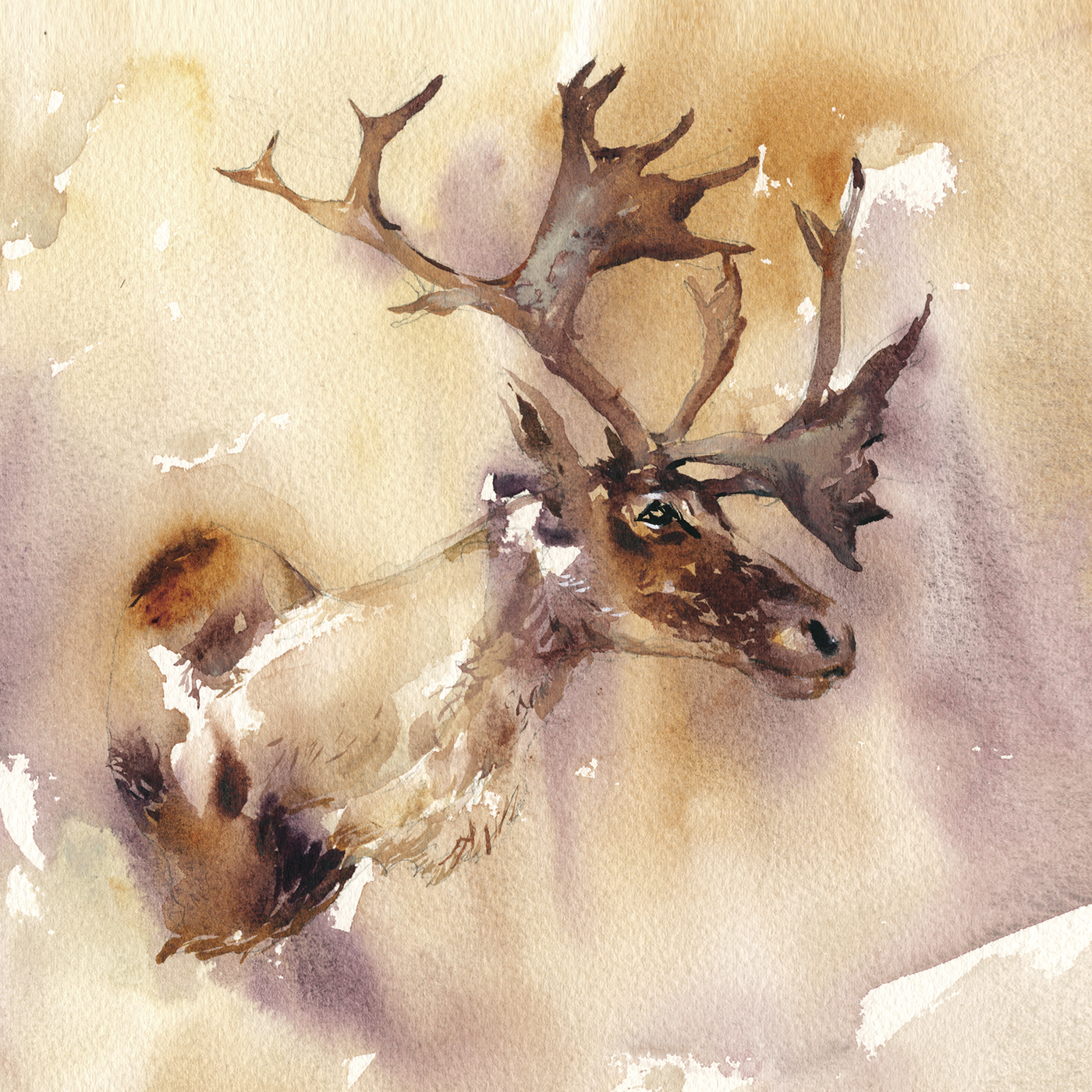
I wonder, can you see much difference between this caribou above and this ferret below? I mean, besides the obvious fact they’re different critters.
One is what I’d call positive shape, the other negative.
The silhouette of the caribou is all darks on top of the mottled background tone. (Don’t forget to wait for your wet-in-wet undertone to completely dry). The darks are placed, stroke-next-to-stroke so they fuse together – but at the same time, there’s a lot of open ‘unpainted’ space where the background tone shows through. Particularly in the neck and shoulders.
This idea of leaving holes in a shape – that’s something I was getting at in my workshop “The Broken Silhouette“. You can read more about it in the workshop notes.
I quite enjoyed this play between what is ‘solid’ and what is ‘transparent’ in the subject.
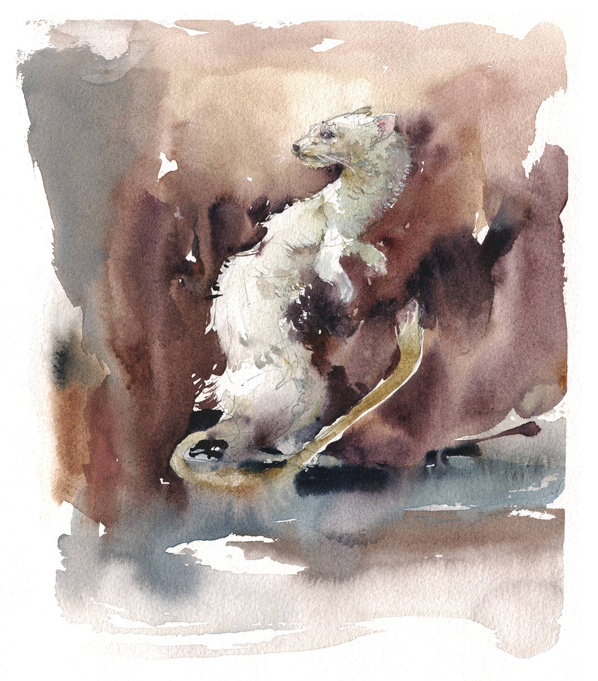
This ferret, on the other hand, being a light colored shape, has to be reversed.
The dark background is pulled towards the body on all sides, making this figure a white hole in a dark field.
This is what I’d call negative painting. Not painting the figure, but painting everything around the figure.
I like to alternate hard/soft with the edges. Some areas (like the tail) have a sliver of dry paper, making a sharp white edge. In other places (like the knee), the background is allowed to touch the wet fur, causing the pale grey to melt.
This isn’t completely planned. It’s done by instinct – and sometimes things melt more than you want. I had to use a bit of Chinese White on his front paw, to bring it back into focus. And a few dots of white along the s-curve of the neck.
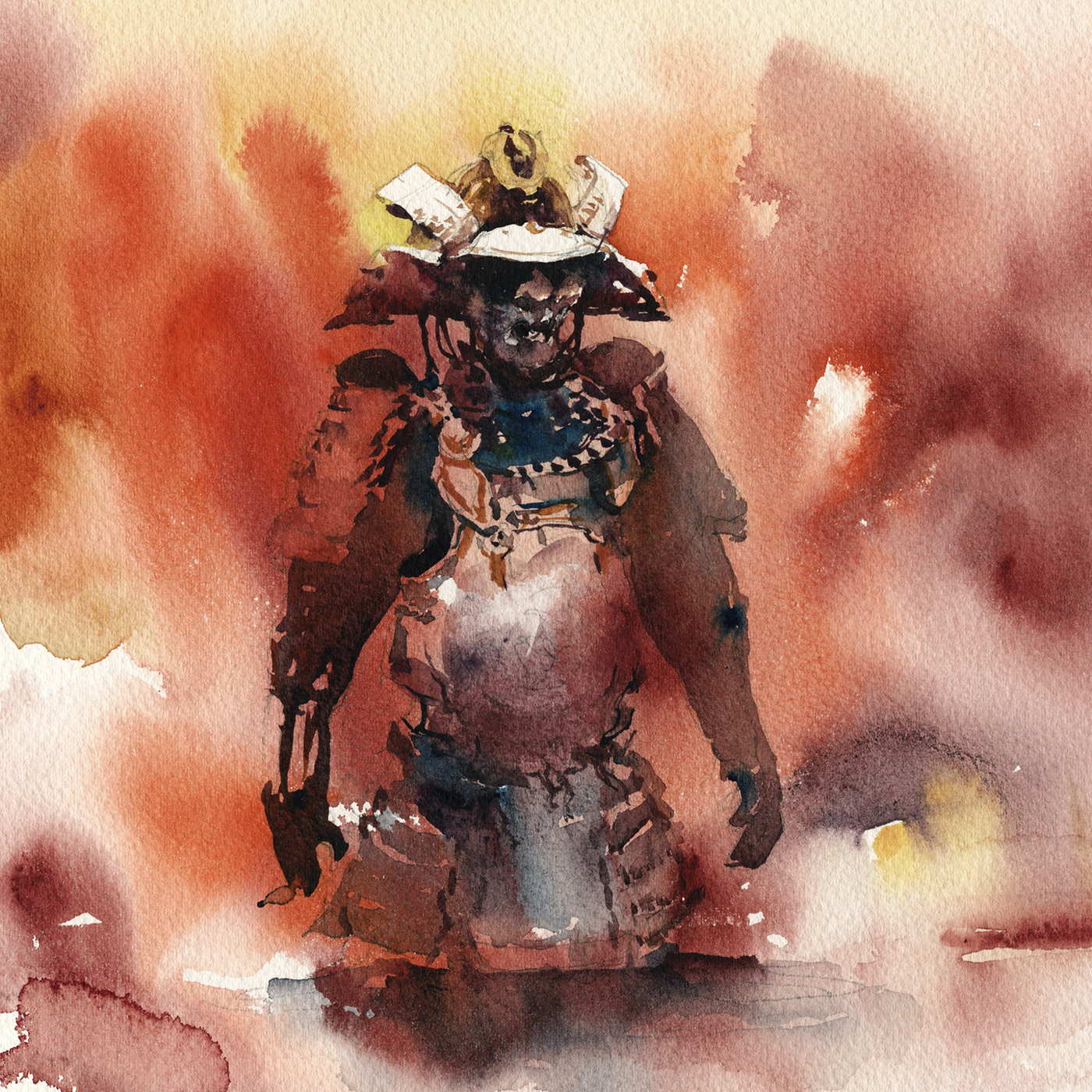
Some subjects can be a mix of positive and negative shapes.
The shiny metal helmet on this suit of Japanese armor jumps into high-relief, because of the reserved-white negative shapes on the visor. Whereas the Mempo (faceplate) below is a positive form.
The forward shoulder plate and smaller shapes on the Do (breastplate or cuirass) are negative shapes, but, being a little further from the light, I choose to reserve to the background tone, rather than 100% white.
Sometimes, if I’m working too fast to wait for the undertone to dry, I might do the whole figure on white paper, all in a single pass. This gives everything a sharp focus silhouette. (See old example below). But, by planning ahead with this moody base tone, I can impart a better sense of dramatic lighting. I know nothing I do in the second pass, can be brighter than the base tone. It’s like (selectively) putting the breaks on future highlights to come. This takes some planning, or pre-visualization, but it’s easy enough to add it to your toolkit, given a little practice.

In reality, there’s a lot of fascinating detail on the armor. Mixed textures of brocade and chain-mail, ornamental rivets, and decorative plaques. But it’s a stronger statement if left in silhouette. If I wanted all that detail, I might take a photo :) Or, more likely, do a pen and ink drawing.
Right now I’m loving the game of implying shapes and highlighting edges with little gaps and holes in the fused silhouette. Drawing in the positive and negative modes simultaneously.

So, if you’re ever in Montreal, looking for something to do in an afternoon, consider our little natural history museum! It’s a wonderful space that takes you back in time. Almost a meta-museum. A preserved example of what 19th-century natural history collections were like. Provided free to the public by McGill University, (donations welcome, in the little box by the door).


Love the ferret and caribou! Well done.. I am going to the California Academy of Sciences with a few sketchers next weekend, I am going to try the tyranasourus Rex again, she is a big girl! And very complicated!
Love reading your comments on the procedures you use to complete a painting. And I love animals…planning to go to the Redpath on my next visit to Montreal. It seems to me to have the feel of the old Banff Park Museum filled with beautiful wooden showcases of fauna of the national Park. Thank you.
Thank you for your wonderful photos and sketches from the Redpath Museum! It was a favourite place for me as a McGill student in the sixties. In biology courses we used a lot of pencil sketching for learning structures…no cellphones then!
Love the rich colorful soup you create. The demo is excellent. Have you any youtube or Craftsy videos of this process? So freeing.
Thanks for sharing!
Found your lesson on youtube. Terrific and THANKS!
Wondering what paper yr using here..?
Sketching with the Brush – YouTube
Found yr paper onsite too. You tell all still the magic….
I like the positive negative idea. Now if I can find the snowy owls hanging out around the southeastern part of Wisconsin where I live for the subjects to do some sketches of them and get some reference pictures of them with my Nikon and 600mm long lens if need be.
Thank you for sharing this :)
Gorgeous paintings … wonderful lesson in the pull between positive/negative … marvelous musings about the museum. Thank you for this MAGNIFICENT post!
Magnificent location Marc, and a great lesson, especially the armor suit experiment!
This is my favourite style! I’ve been practicing but my shapes don’t blend as beautifully as yours :P I see you don’t do too much colour mixing. I tend to want to create complex mixes and so they become super watery and light. Maybe I should stick to using colour straight from the pan for a little bit until I get the hang of the technique!
It’s true, I find too much mixing just dilutes the color. And, the more water in a wash, the more it changes (lighter) when it dries. So, going directly helps you make stronger colors.