30×30 Bonus Day! Back from USK Chicago!

Here’s me with my eyes closed behind Mike D snapping the selflie with Uma and Jingo. Just four of the many great instructors at this years USK Chicago Seminar. Look for Team Orange at USKPorto2018 next month!
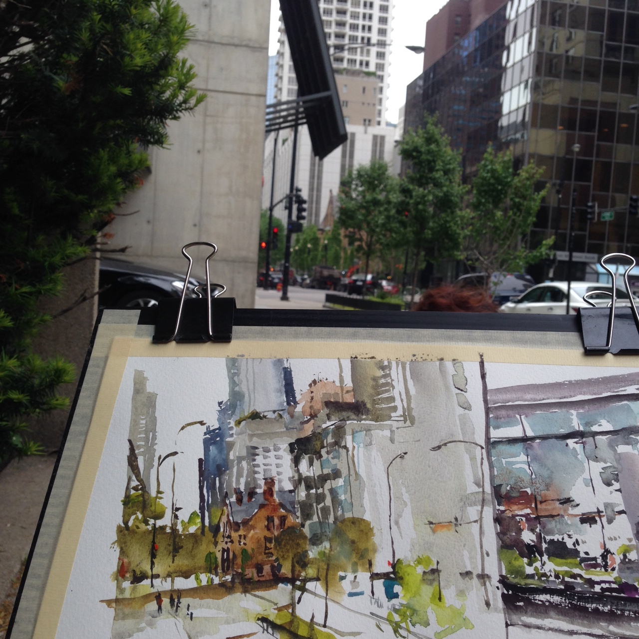
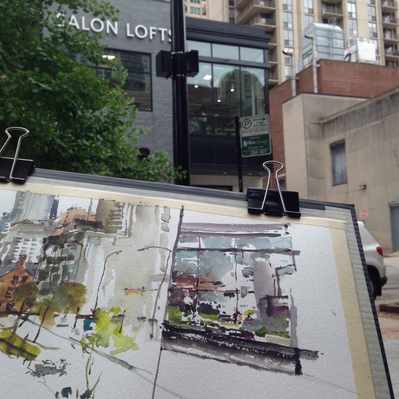
The first morning of the workshop, Uma and I had a chance for a warmup. I sketched a brownstone hidden behind some trees, and a very random choice – a second-story window. You could just see the hair salon through all the reflection.
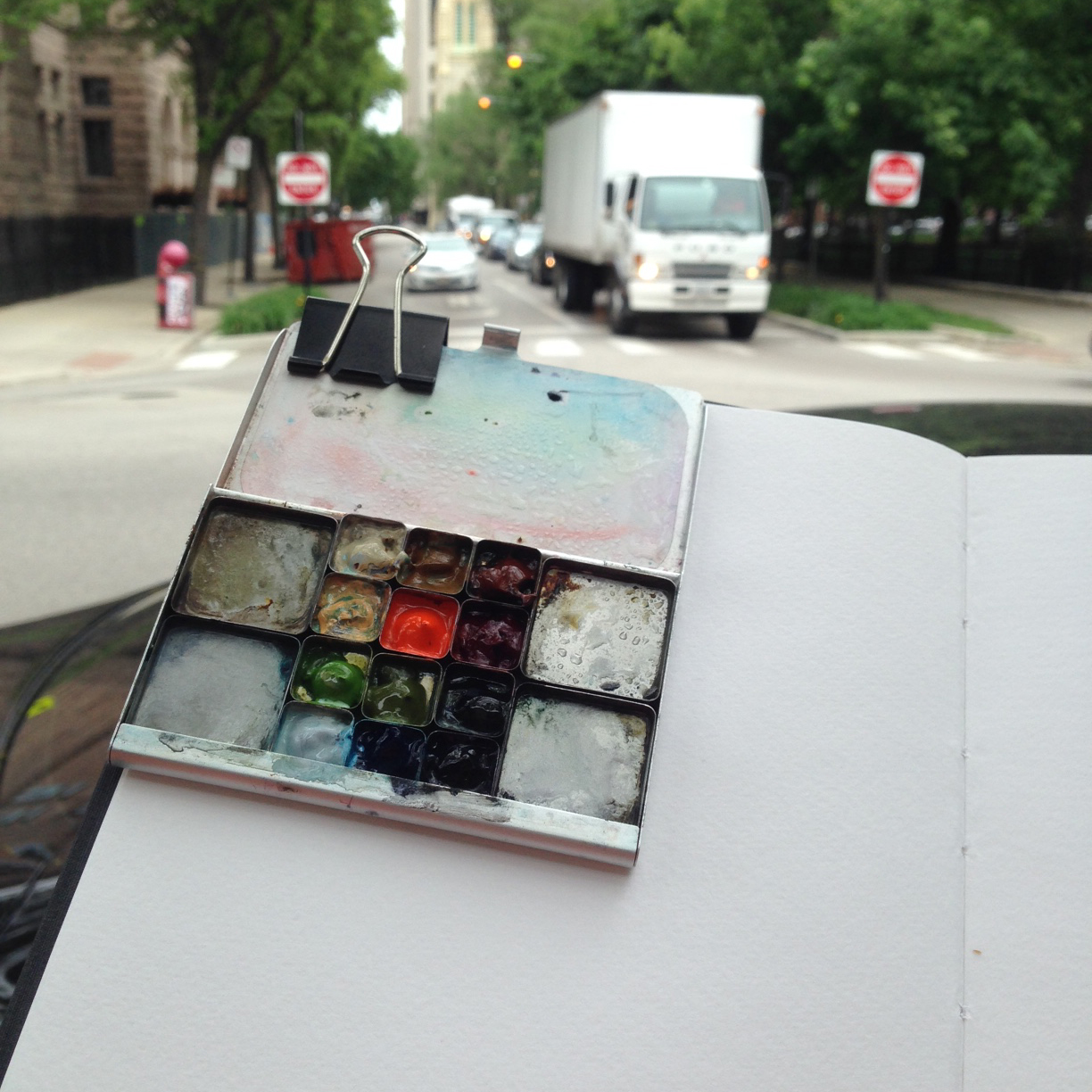
This little Art-Toolkit.com palette really is the best thing for clipping to your painting. It’s so light, It makes holding the book/board so easy.
I did a quick run around my demo spot, to pick the view. At a workshop, a spot where you can fit 15 students is not the same as where you might stand on your own. This 5-minute doodle was just a test. I did a few views this way to find something that might work.
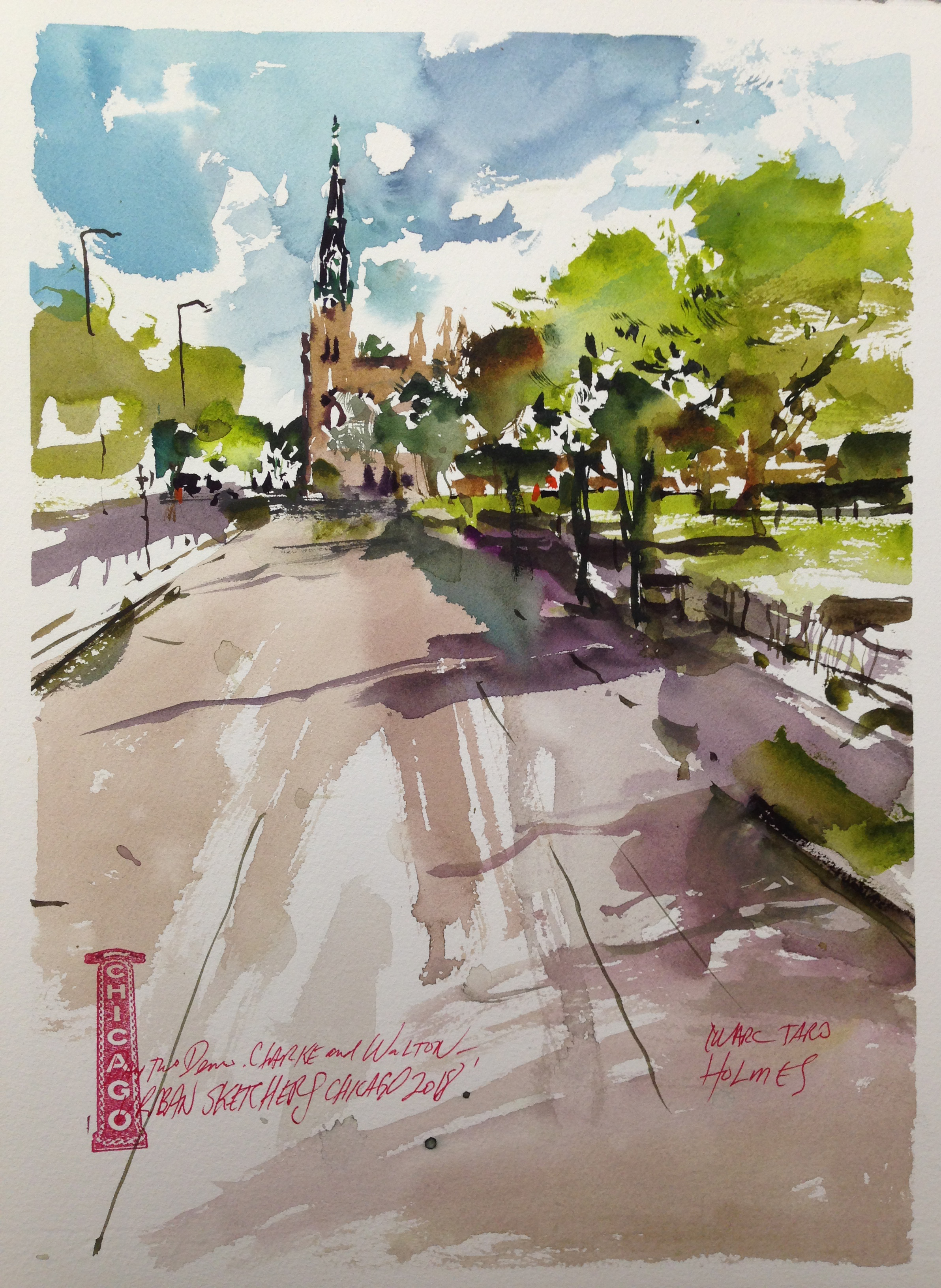
It’s always a little traumatic – trying to paint and lecture at the same time. Day Two, having had a practice run, it’s always a better piece.

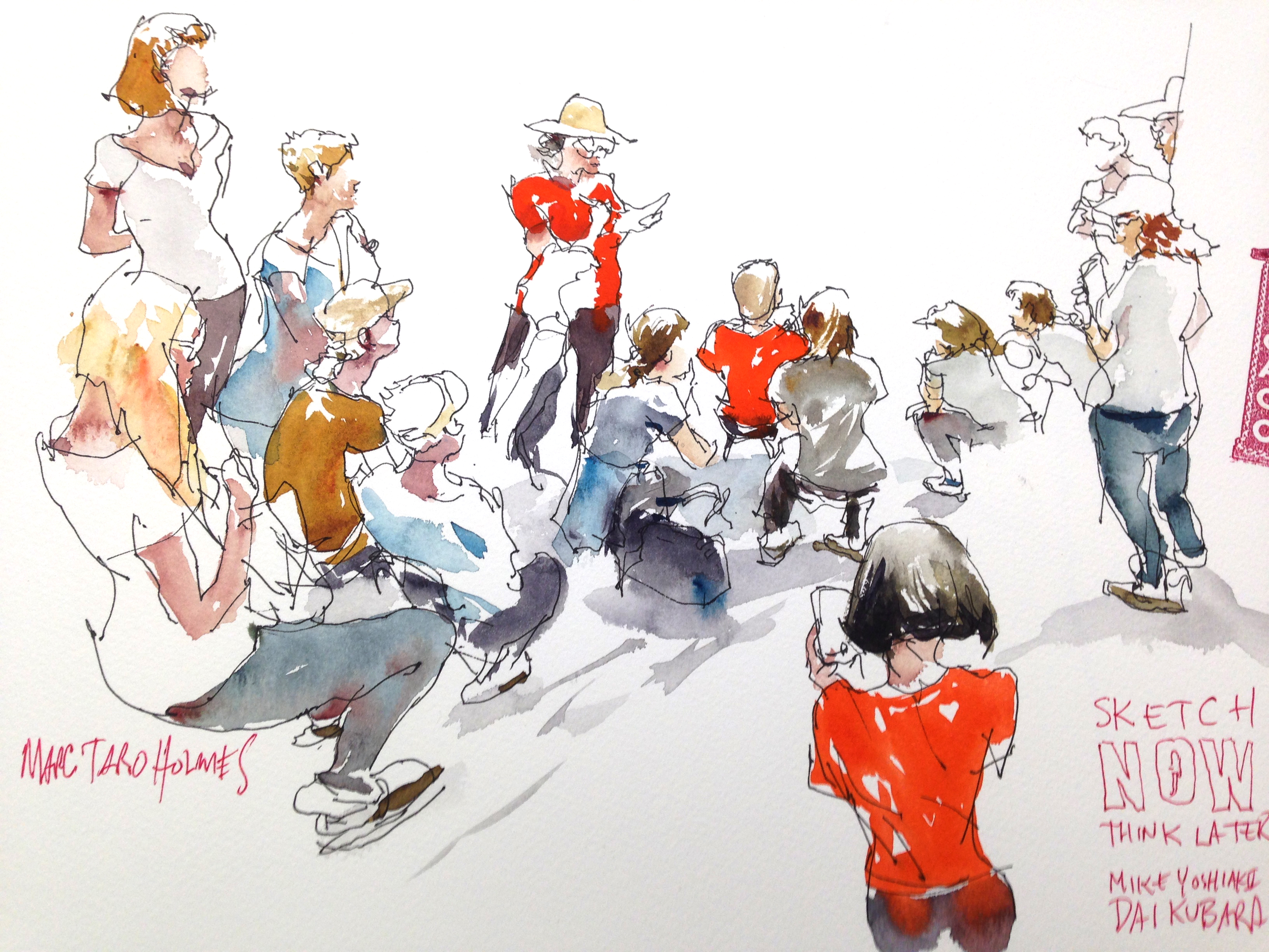
The only demo I had a chance to attend myself was Mike D’s, Sketch NOW, Think Later!
Mike is an experienced presenter. He brought a wireless camera and an iPad, to project his sketchpad to the people in the back row. Brilliant!
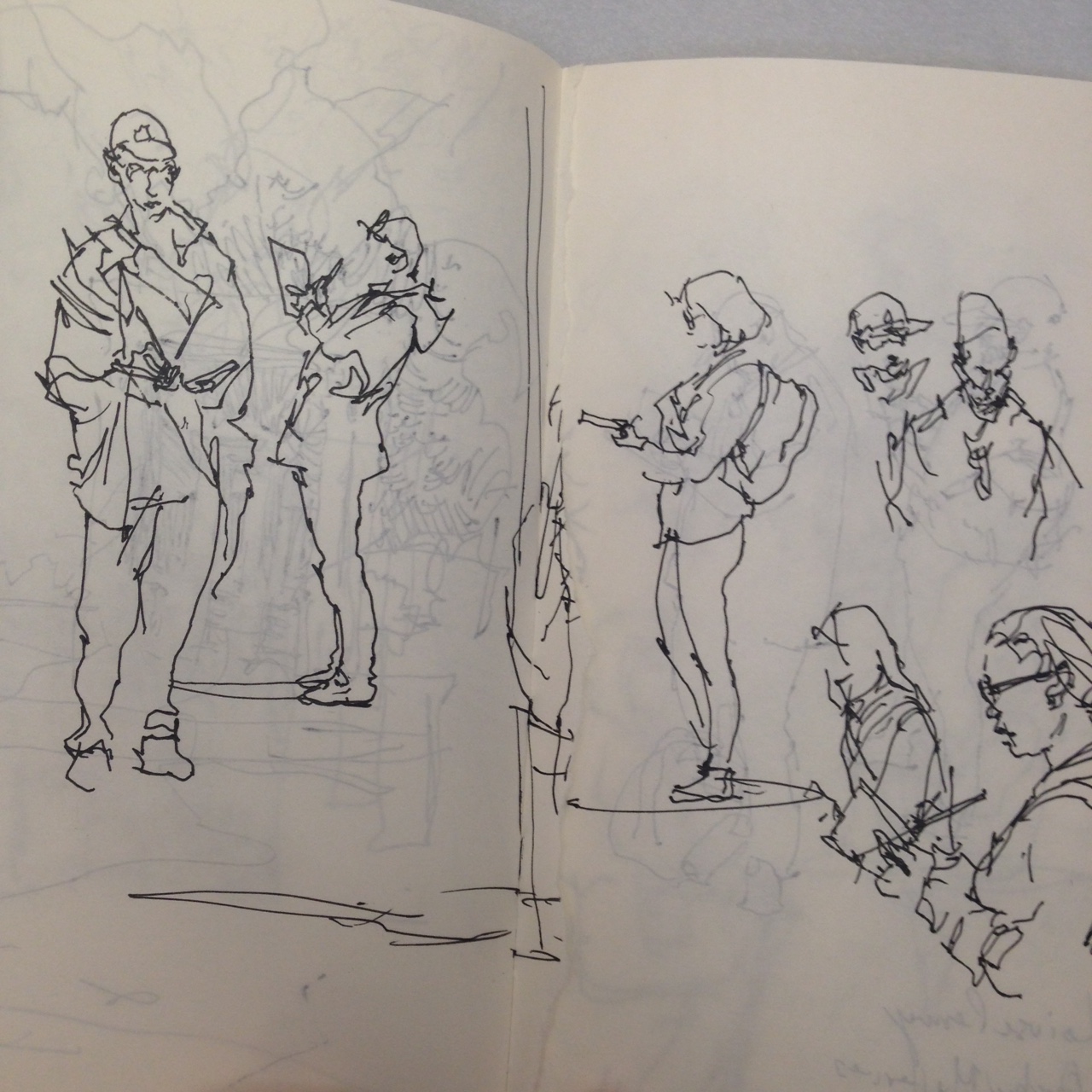
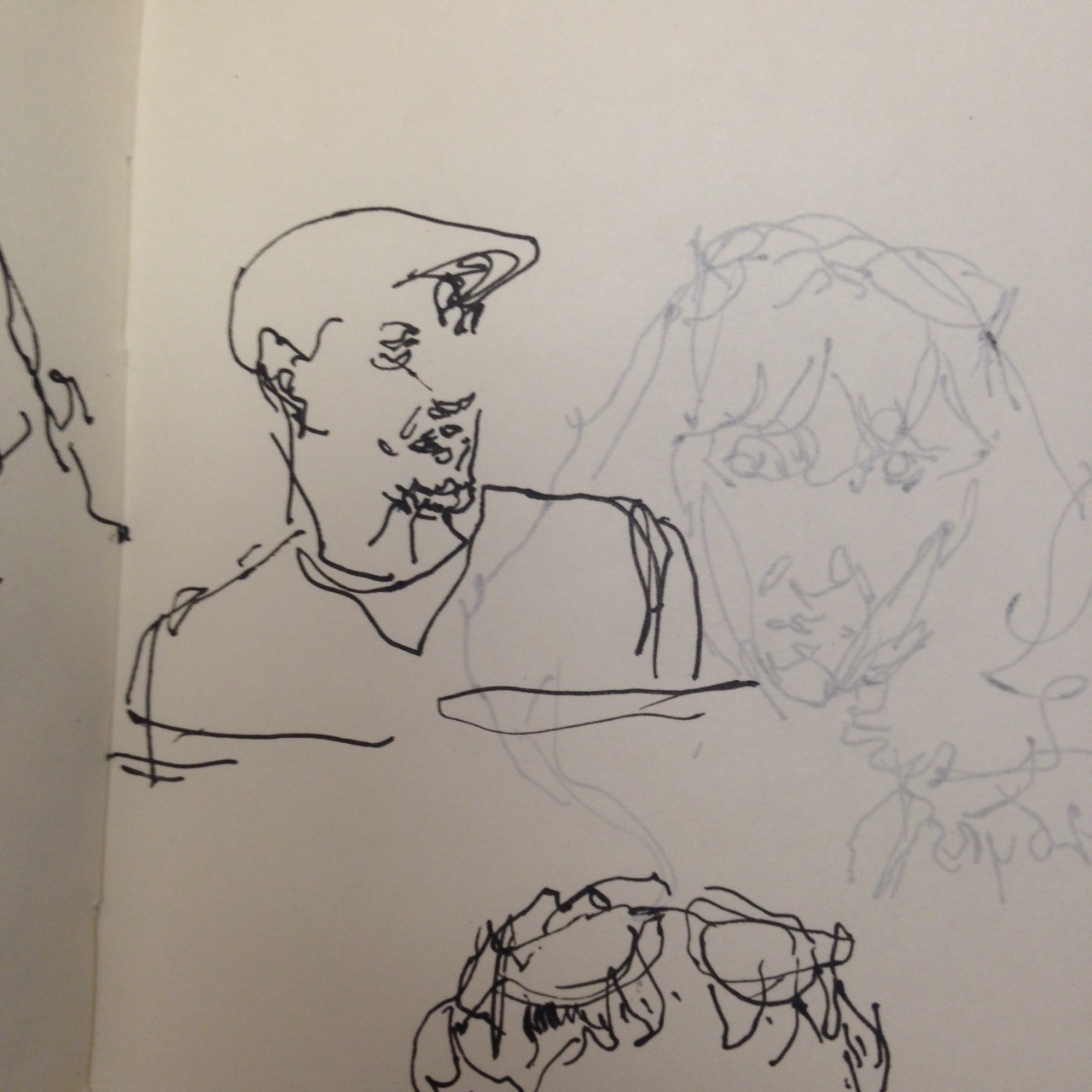
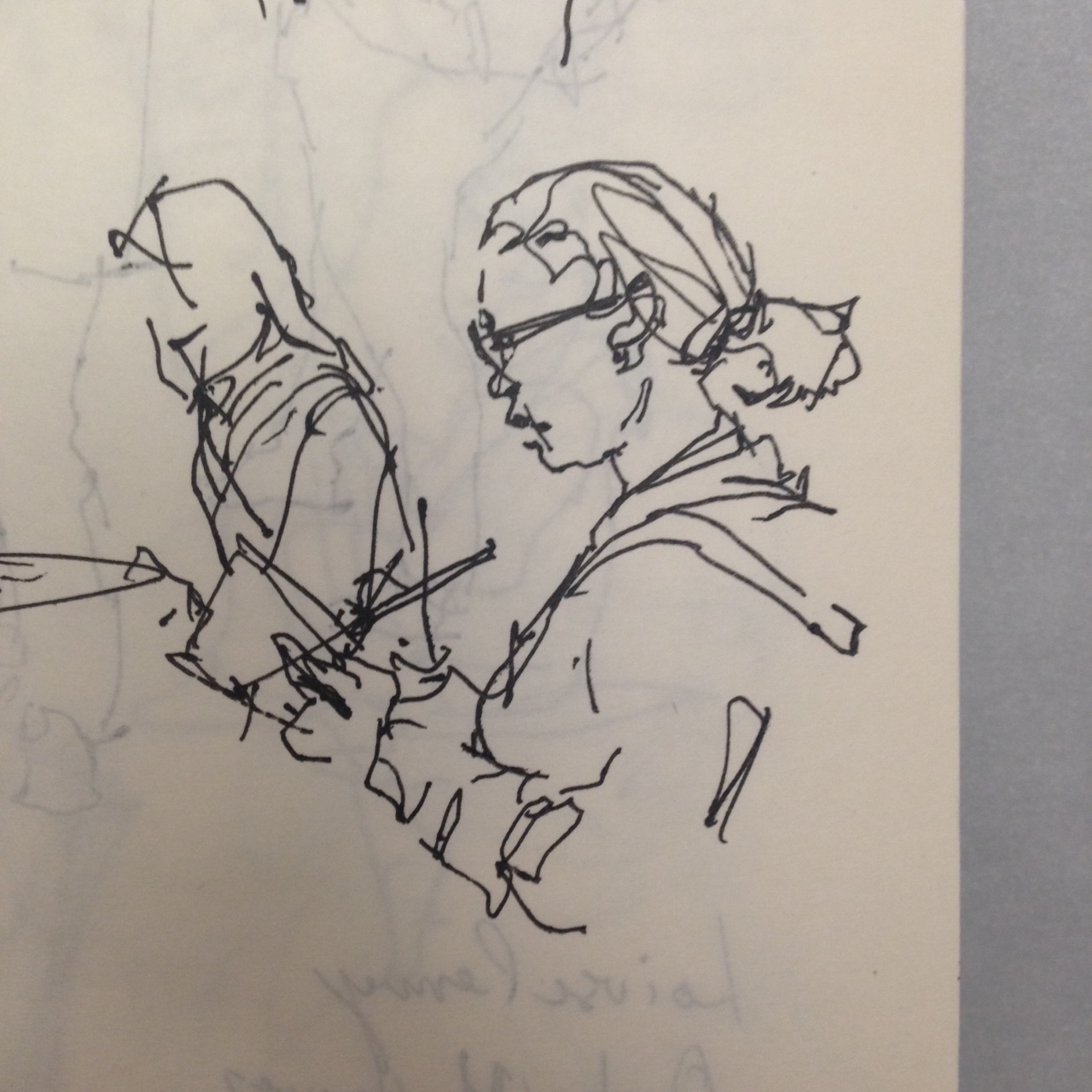
One of the best things about a USK workshop is that you can sketch all the other Sketchers, without worry you’ll be caught drawing someone.
Wes Douglas – has a great workshop on drawing cars. I regret missing that one! Cars are such a part of street sketching.
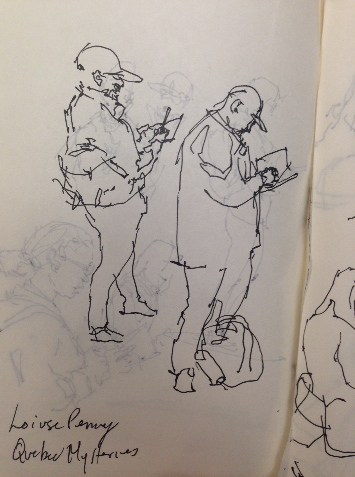
As I’m from Montreal – someone recommended the writer Lousie Penny. Mysteries set in Quebec. These kind of notes get written right into the sketchbooks.

![]()
What went wrong?
Nothing!
This is my favorite so far!
I had one false start this AM, but I quit before wasting too much time and relocated to this spot – which has been on my mental ‘to sketch’ list for a while now.
Well OK, one cheat here. I chose to leave out the cars on the freeway.
I might have been braver and tried to get them in? Even though they’re moving fast, they do just keep coming. I could draw them ‘En-Passant‘, the same way I draw moving people on a busy street.
So maybe I get to try another of these with the cars as the focus.
What went right?
Everything!
It’s another take on a Nothing View. A painting that’s not about anything. No statue of an angel, no Siberian tiger, no cute farmhouse. Just a freeway. But this time the perspective is good, the complexity of the street is well simplified, and the details are nice and sharp. Most people probably don’t want a painting of a freeway – but I’m very happy with this sketch.

![]()
Post Script: Here’s today’s false start. Before I remembered this freeway bridge, I tried this cute house over on Ponsard. I think the drawing here – the brush drawing that is – just isn’t up to snuff. For whatever reason it’s disorganized, and a bit blobby. Doesn’t make the cut!

![]()
What went wrong?
I’m trying something here, which I’m tentatively calling: Nothing Views.
That is – you should be able to make a painting of any street. Even if there’s no obvious subject. This is from the intersection of Queen Mary and Côte-des-Neiges.
My working theory is: any view, no matter how ‘boring’ – a painter should be able to make something of it.
Why is this an issue for me? I’m wondering if it’s a kind of cheating, or mental laziness if every painting you make has to have an idyllic view.
It’s a kind of burgeoning problem for me.
If I’m ONLY a travel sketcher, galivanting around the world painting ancient ruins or epic landscapes – what am I supposed to do with myself at home? What’s a sustainable kind of image you can engage with on an everyday basis? <This is an open question].
What went right?
The upper right-hand corner.
![]()
![]()
What went wrong?
Rushed out in the morning for a sketch – choose another view (not this one) based on shelter from the rain. I thought I had something workable, but two terrible attempts on location and I was out of time.

So – took a snapshot from the car, and used that for a sketch in the studio.
I’m developing a theory of painting from reference which is: Bad Photos make Good Paintings.
This is obviously me being Mary-Mary-Quite-Contrary. But my point is, a great photo has too much information. You end up being dominated by the image, slavishly painting what the photographer gave you.
A terrible photo doesn’t own you like that.

Incidentally, even back home in the studio, it’s not always easier. Here are two examples of a false start.
If I don’t come out of the blocks right, I might as well give up. I feel like the sooner you can sense the need to bail-out, the better. Save your energy for the re-do! If there’s a fundamental flaw – like too much chroma in the base color – the painting is doomed. (At least in watercolor). As well, there’s no saving bad proportions or improper placement on the page.
This is something I see far too often with students or beginners. Trying to beat a dead horse, instead of giving up and just starting again.
If the placement on the page is poor – spending time finishing that is not going to help! You’re just going to feel worse having used your whole time on that painting! Once you produce that dud, it’s as if we don’t have the energy to do it again. Or – more likely – we’re feeling a (false) sense of failure.
Think of every re-do as a victory over a bad painting! Not a failure – a necessary sacrifice.
So – what went right?
I’m remembering how to draw with the brush. What precision feels like. And remembering to pre-visualize the shape I want to draw – then draw it completely. All in one go. One shape at a time, not jumping around.
Keep edges sharp, and avoid holes in the silhouette, or any false hard-edges inside what should be a clean, simplified shape.
Also, I’m getting a good base value finally.
When a value is perfect the moment you place it – it will dry TOO LIGHT.
It has to look too dark initially so it will dry upwards to a proper value.
Watercolor generally shifts up in value – the wetter the wash, the more the shift as it dries.
Also, I feel like on day three, I’m judging paint consistency more accurately. It’s Tea in the stone walls, but Milk in the clouds, and juicy Honey in the dark trees.
Ok, that’s day three! See you tomorrow!
~m
![]()
Day Two : #30x30DirectWatercolor2018

![]()
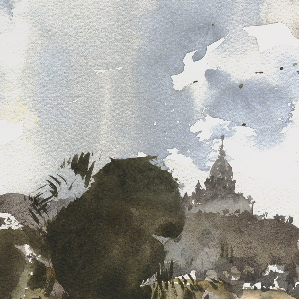
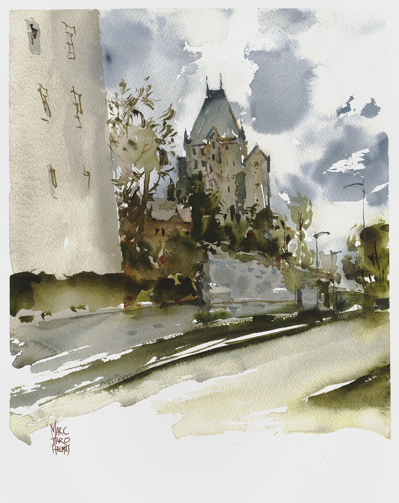
One thing for sure about Saint Joseph’s Oratory – you can see the thing from almost everywhere on the island of Montreal.
I was told when I moved here it’s the third largest domed church in the world. Though – I can’t find any proof of that one way or the other.
Across the street from the oratory grounds is the College Notre-dame. If you walk up to Jean-Brillant, just north from the main street, Queen Mary, you’ll find yourself looking at the dome from across the school’s soccer field.
On a rainy day like today, you can ignore all the details in-between and imagine the dome as some hill top church in Tuscany.
What went wrong?
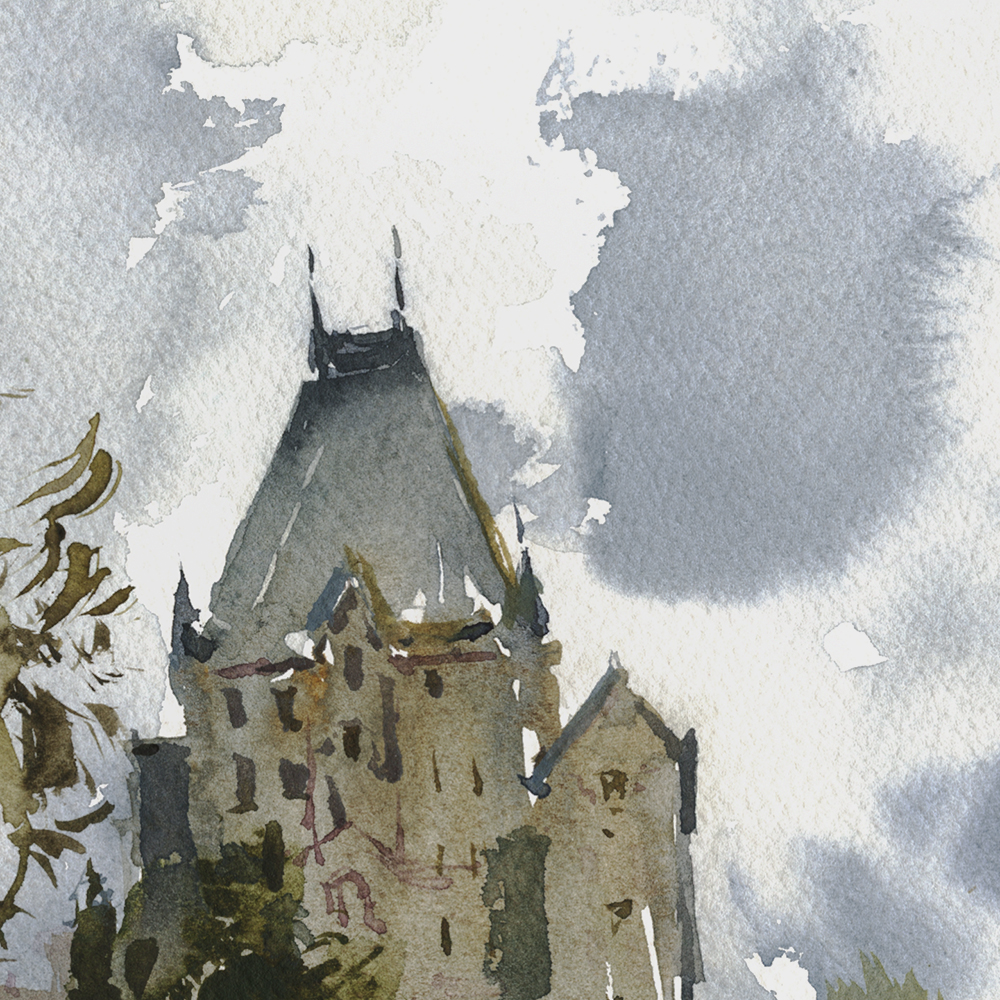
Today’s painting of the oratory is actually my fourth attempt. Here’s one of my false starts.
Sometimes you know the thing is beyond redemption and it’s best to just stop now, save your energy – and the piece of paper! If you don’t flog it to death you can still use the back of the page for another try.
This one’s a flop for A: poor placement on the page, the horizon is too low, the oratory too centered. B: Too much chroma. The colors in the foliage are much too bright, the darks too contrasty. It looks like a glorious fall day, not a rainy Montreal spring.
I’m sure the problem is, I’m rushing myself.
My whole plan for this 30×30 thing was to pop out first thing each morning, fresh as a daisy at sunrise, dash off a wonderful little sketch, and be home before breakfast. (Seriously! I imagined myself having breakfast out as a reward). Hah! In fact, I’ve been wasting time and paper all day!
Here’s another reject. This one is just out of control. The brushwork is sloppy, the reserved whites too coarse, and the building looks like it’s been through an earthquake.
This is probably normal for day two. It’s going to take a while to knock-off the rust from our long winter. I envy southerners who can paint outside all year round.
I don’t mind this tree. Maybe I should have just cropped it and called it my Day Two.

What went right?
This is something that happens to me fairly often. Getting frustrated, and having to mentally re-set. I try to recognize the feeling when it happens and just shut down the frustration.
Sometimes I rip up the bad sketches right on the spot, to get a little revenge. Then I end up deciding, I’m clearly a fraud, and I’m going to give up painting forever, so – I’m just going to have fun with one last sketch.
That’s when they turn out!

Any pressure on myself to succeed, (like, I’m going to launch an international painting event and show everyone how great I am! <hah!) and you’ll stiffen up, become afraid to take risks, and otherwise interfere in your own success.

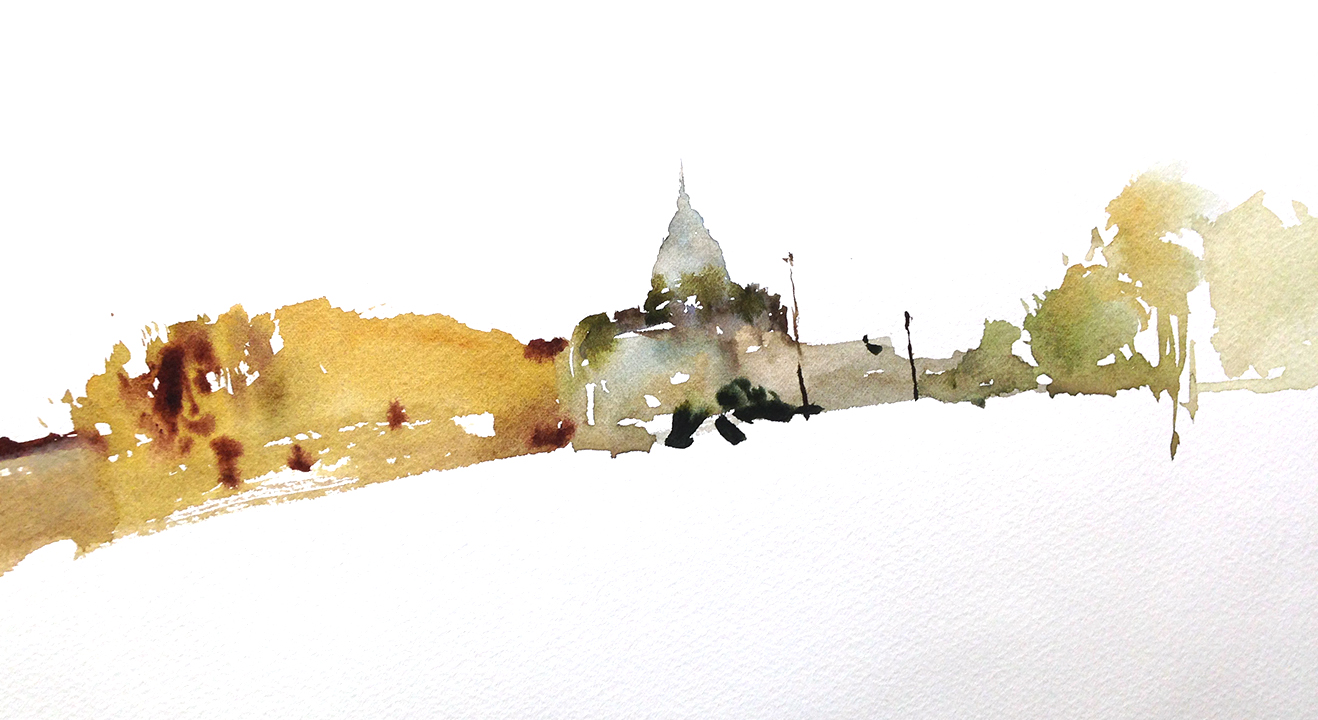
It might not look like it in the snapshot – but this view is a better choice of subject than the Snowdon Theater. Certainly better than the failed attempt this morning. I tried to pick views based on cover from the rain, instead of holding out for a subject that grabbed my imagination. That never works. This is one case where drawing from a photo was useful. (I did the painting from this cell-shot). Bad weather makes for atmospheric views! But it’s no fun painting in the rain. (I mean, I’ve done it – but I need some external motivation – like being at a workshop, or on a once-of-a-lifetime trip.)
Also – I’m remembering my own advice from Muckross House: Get further away from the subject! If you can’t see the details, you’re not tricked into over-drawing.
~m
![]()
Day One : #30x30DirectWatercolor2018 : Street Scene

![]()
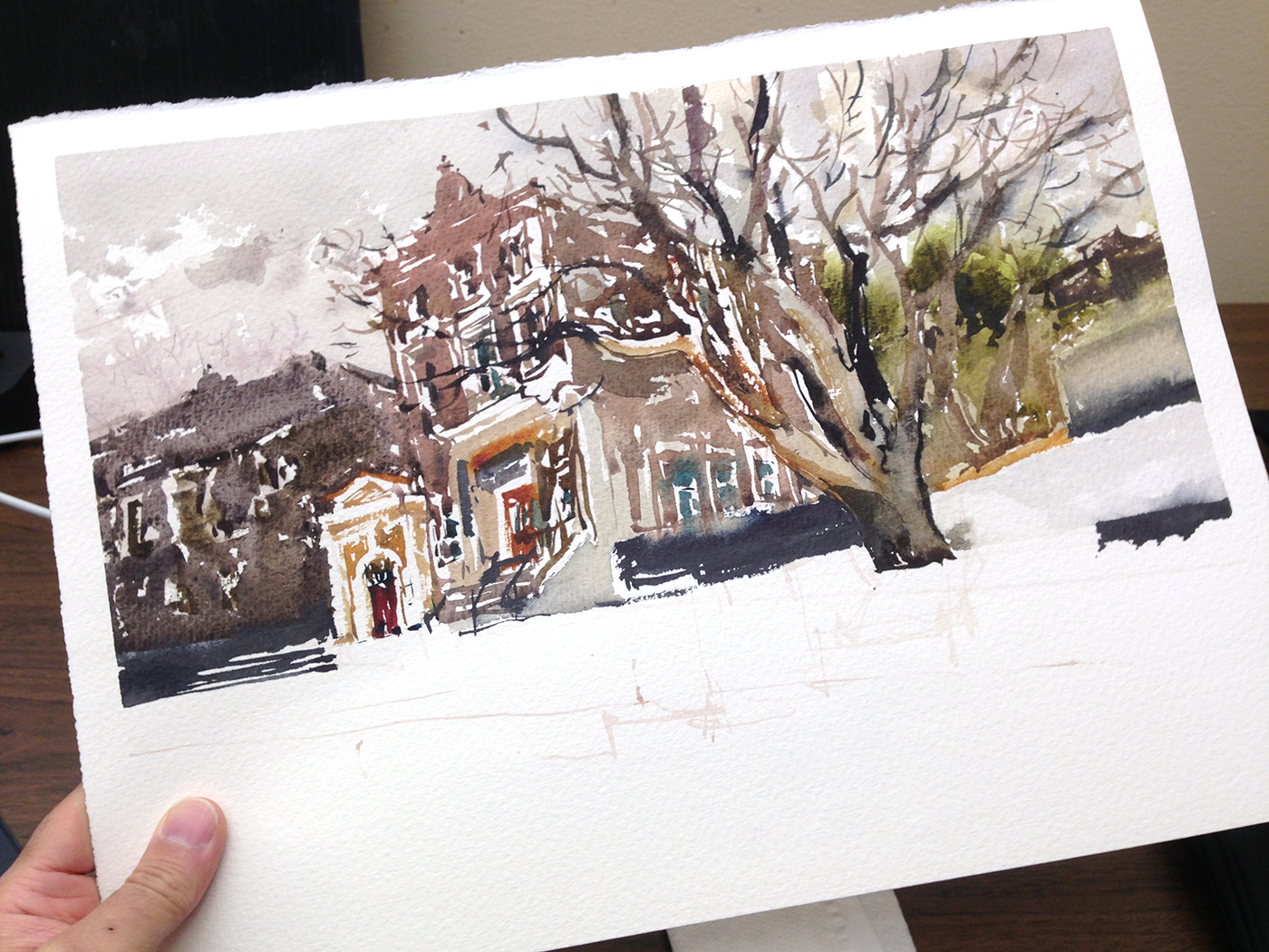
So! My day one begins on an overpass above a busy freeway, in high winds and direct sun – my first plein air painting day of the year.
Ed Note: I’m actually in Chicago right now at their 2018 USK Sketching Seminar. But! Luckily I planned ahead. I’ve started my #30×30 early. Don’t worry – I will absolutely do it in 30 consecutive days! I’m doing the same challenge as everyone, I’ve just shifted the time-window.
This is a sketch of the Snowdon Theatre. Or, at least the block it’s in. It’s the tall streamline era sign in the middle there.
This abandoned neighborhood landmark has been disused for as long as I’ve been in Montreal. There was a sports camp for kids in there for a while, until the place fell so fully into neglect it wasn’t safe for habitation. I suspect the roof fell in or the pipes burst at some point, and that was the last straw.

OK so, what went right?
I picked a cluttered view, with no clear center of interest. I knew I wanted to draw the old theater sign – but otherwise, it’s just a jumble of boxy functional buildings and freeway-junk. Considering that – I’m quite happy with my version of this un-romantic reality. I think it’s succeeded despite itself. This is a slice of my everyday life, seen as a work of art.
What went wrong?
What didn’t! I’m so out of practice with street sketching it’s not even funny! Things were so awkward. Constantly searching around for where I put my binder clips, or digging for a brush in the very bottom of my bag, or what pocket has my spray bottle. I’m using too much mental energy on the basic functions of getting paint and paper together, and I think it shows in the painting.
There are no clear silhouettes. It’s broken up with patchy white spaces, making the forms dissolve. The flattened lack of perspective, and the strange tilt – while it’s an artistic solution – is also kind of a reflex. A self-defense technique of style over substance.
The first solution to complicated perspective is – ignore it! If that was good enough for Cezanne, it should be good enough for me. But still – I feel the stylization is kind of a crutch. You can only get away with playing the artistic license card so many times in a row.
Anyway – that’s my day one! It can only get better from here :)
~m

![]()
CSPWC Exhibition May 27 to June 22, Etobicoke ON.

The Canadian Society of Painters in Water Color, (of which I’m a member) is holding their members’ exhibition, Water Reflections from May 27 to June 22 at the Etobicoke Civic Center Art Gallery, Etobicoke, ON.

They’ve chosen one of my two paintings here for the exhibition. It’s either the Top Of the World, Laguna Beach (above) or this one, Joshua Tree, CA.
Which one would you choose? :)
~marc

![]()
Here are two ways a painter can see an object: A: as a positive shape, or B: a negative shape.
On the left, the silhouette of the horse. Simple eh? Easy :)
On the right, the silhouette reserved out of the background and then filled in with the ‘shadow mass’ of the horse.
I think you can see how the negative shape is more complex. You have a figure-ground relationship. The horse (the figure) interacts with the values in the background, and, there is the implication of falling light, created by the white left over in-between.
Why do we care?

When painting directly in watercolor, sometimes leaving white negative spaces, is a very effective way to build up a scene. Water shapes have to stop somewhere! You can’t have wet edges touching willy nilly – or the drawing will lose clarity. You can use a negative silhouette to draw a shape, leaving dry paper for later – or – to put other shapes on top.
")
")
")
Here’s how I drew the Positive Horse.
I start with a Dot Plot. <read more about that]. This is a way I can do some measuring, but avoid making a committted underdrawing. What I’m sighting in on here is the base of the horse’s neck (the shoulders) , the point of the jaw, and the tip of the rump. (Now that I say this, it’s pretty similar to the way I suggest drawing people in this free download. <pdf).
After the dots, I might draw some lines – which I convert into shapes as I go. <Remember the previous demo]
Most people (me included) find this positive method fairly straightforward. It’s easy to undersand, and then you just have to master the mechanics. Brush dexterity, and mixing viscosity.
")
")
")
Here’s how I drew the negative horse.
Start with a dot plot. And then just put a value into everything that *ISN’T* the horse.
I don’t know why this is harder to execute on – but it often is for me. It should be just like drawing a white horse. But somehow, it is harder to visualize.
Also – you have to work faster. (You can tell I’m rushing by the out of focus photos). Anway – if you want the background to completely knit around the figure – with no unwanted hard edges in the fused wash – you have to use a larger brush (for more water) and keep the tone shapes moving, wet edge to edge – so they melt into each other.

There ought to be a third example, which I neglected to make – which is, of course, combining the two approaches.
You could paint part of the subject in positive and the rest is negative. Say, you start the horse head in positive mode, then cut out the rest of the figure. In a way, I’ve done this here. The legs are little positive shapes (on top of that pale gold) holding up the body.
I will try to make an example of combined pos/neg approach (I would call counterchange). and stick it in here later.
Using this technique, you can build up a scene like a puzzle. Fitting silhouetted shapes together, positive next to negative until you have the composition.
Here’s a few older examples.

Can you see the Shape Puzzle underneath this sketch? How the houses are simple negatives cut out by the trees? (and then later filled in with some shadow – like the horse!).

I exaggerated the size of the trees, and simplified them into masses, so I could make a nice clear silhouette of this general store. Then I went back and put in the shadow shapes that make balconies and windows. But if you ignore that, it’s just a white horse cut out by background :)
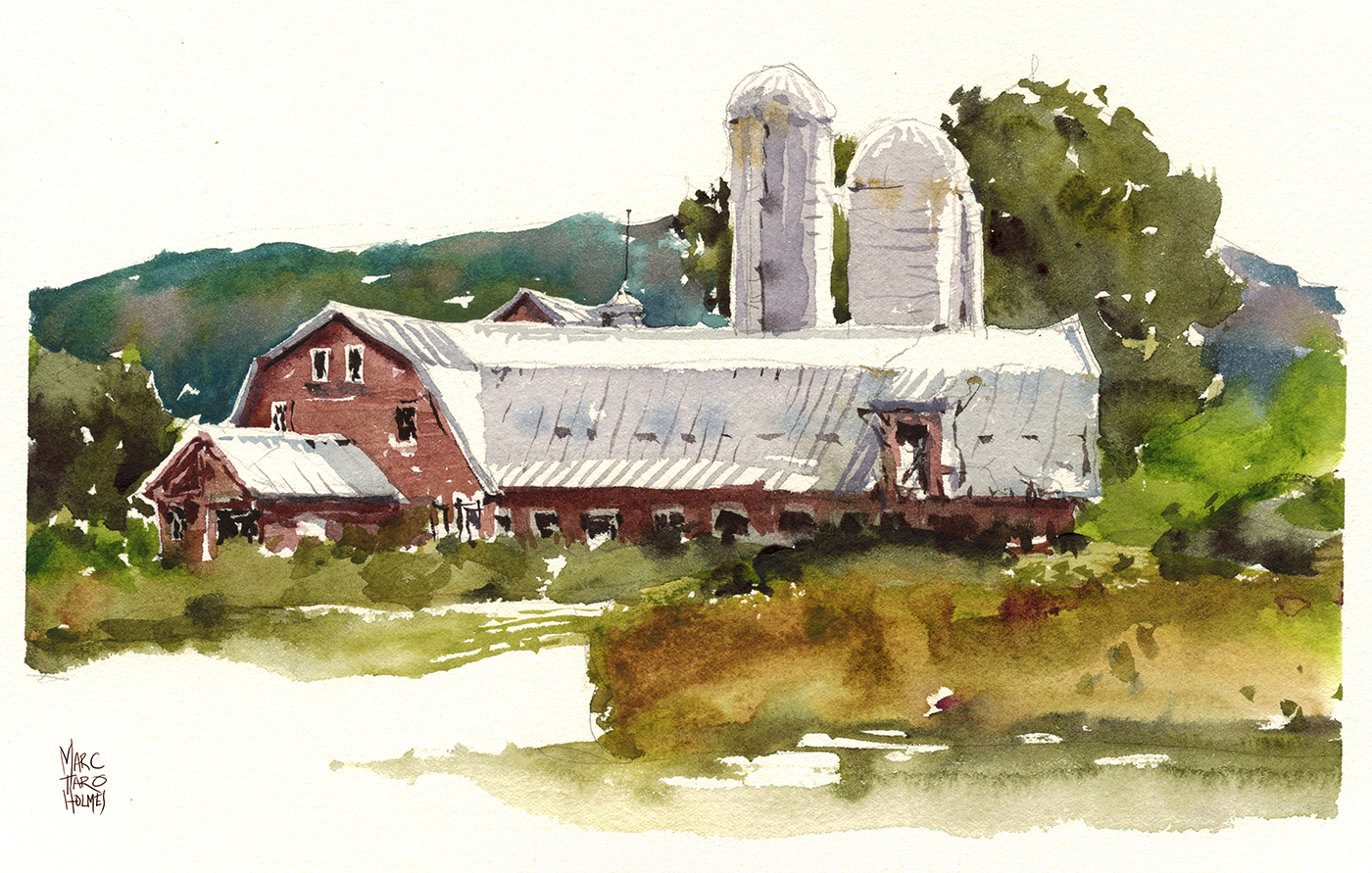
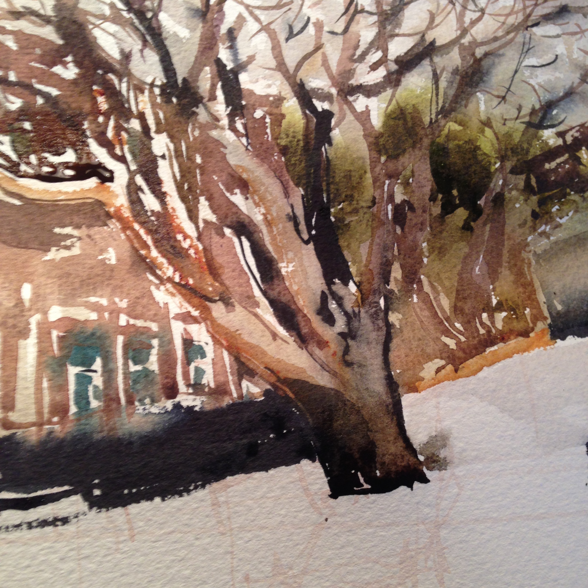
Now you can really see the trick underneath rgiht? :) The metal roof of the barn is a huge negative shape, cut between the trees and the red wooden siding. Then we just add some shadows to the negative shape, and voila. You’re in Vermont.
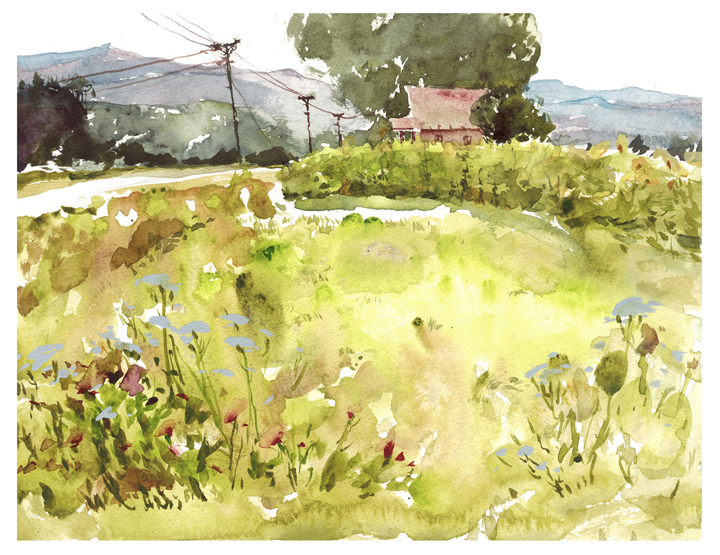
Sometimes the trick is subtle. See the negative cutout of the farmhouse? (Which I filled in later with faded red). Now it’s obvious how I used the trees (re-composing, simplifying, silhouetting) in order to make the little house into a nice clean shape, which is the focus of all the compositional lines created by the other color blocks.
I kind of regret the smaller tree on the right. It looks like a bite taken out of the house. But oh well, we can’t fuss over plein air paintings.
![]()
Ok- that’s some food for thought for your #30x30DirectWatercolor2018!
We’re starting soon, a little over a week to go!
~m
Converting Line to Shape in Direct Watercolor
![]()
What if I want to paint Direct Watercolor, but I still think in line?
That’s certainly my situation. I want to paint, but I think in line :) It’s such a habit from years of drawing.
So!
I’m thinking about my upcoming demos in Chicago and Porto, and how we might break down Direct Watercolor into achievable exercises for people.
The first thing should probably be – how a beginner might approach brush drawing.
I’m thinking of calling this Converted Line. But it might also be called Absorbing your Lines.

If we begin by drawing with the brush – well, it’s harder than drawing with a pencil.
There’s no erasing, and, of course, the brush tip is harder to draw with.
BUT – the advantage is – we get a WET line, which we can simply ABSORB into shapes made with the side of the brush.

In this way, the drawing progresses from LINE to SHAPE >>>> at the same time <<<<.
(Don’t wait so long that your line is bone-dry, or it won’t melt into the shapes as nicely).
I think this is more organic than a drawing in pencil and filling with color later.
But also, this helps us see how little drawing we actually need to see a shape. (With practice).

Sometimes it’s too organic! You *will* sacrifice accuracy. That is absolutely true.
But what you get in return is a kind of internal blending of color, that you cannot achieve any other way.

l still try to proceed [Larger > to > Smaller] and [Lighter > to > Darker]. Just as if I was tinting in the Tea, Milk and Honey method.

And I still have to wait for the shapes to dry before I put in some small touches with more brush-line.
It might seem a fruitless exercise when seen in isolation like this.
Why do I want to make this clumsy drawing? When I can make a better (more accurate) drawing with a pencil?

Because the goal – eventually – is to use less and less and less guiding line, and be able to think in wet shapes.
Shapes fuse together in more solid, structural ways. And – eventually – can give you a feeling of minimalism, in which less is more.

And of course, shapes can be knit into the background, to make a fully integrated water painting, which begins to consider the figure-ground relationship – and later on, the use of depth in the background, as well as any number of things that can be your next level of practice, after you are comfortable with brush drawing, and painting directly!
![]()
The Direct Watercolor Palette : From Art-Toolkit.com

I’m pleased to show you a little side project that’s evolved out of #30x30DirectWatercolor2018!

One of our 30×030 guest-artists, Maria Coryell-Martin is the designer behind Art-Toolkit.com, a project where she’s creating the ultimate compact watercolor palette. Her system is a unique product based on her experience as a travel sketcher in the most extreme locations around the globe.
At the same time, it’s super-cute and fun for people who are just scooting around town making sketches in their daily lives.
I’ve talked before about the kits Maria has sent me to play with. This year, in preparation for the 30×30 event we decided to go one further!

The Direct Watercolor Palette is a 12 color selection, chosen by me to be my absolute minimum landscape and urban sketching palette. These colors are based on the larger 21 color palette I’ve fine-tuned while working on my book Direct Watercolor.
These are my desert island choices. When I want the smallest possible portable kit, this is what I’d bring.
Maria has created a special limited edition of her Art-Toolkit, set up in my ideal layout, with two big mixing areas, and 12 mini-pans pre-filled with Daniel Smith watercolors in my color choices.
Supplies of this kit are limited! If you’re in the market for a compact kit – maybe to help you with your daily paintings in #30x30DirectWatercolor2018 – order your limited edition Direct Watercolor Palette today!
>
BONUS TIP! Maria is also running a giveaway for the Direct Watercolor Palette on Instagram. Visit @ArtToolkit [www.instagram.com/arttoolkit/] to enter!

![]()

