Comparing Positive to Negative Shapes in Direct Watercolor

![]()
Here are two ways a painter can see an object: A: as a positive shape, or B: a negative shape.
On the left, the silhouette of the horse. Simple eh? Easy :)
On the right, the silhouette reserved out of the background and then filled in with the ‘shadow mass’ of the horse.
I think you can see how the negative shape is more complex. You have a figure-ground relationship. The horse (the figure) interacts with the values in the background, and, there is the implication of falling light, created by the white left over in-between.
Why do we care?

When painting directly in watercolor, sometimes leaving white negative spaces, is a very effective way to build up a scene. Water shapes have to stop somewhere! You can’t have wet edges touching willy nilly – or the drawing will lose clarity. You can use a negative silhouette to draw a shape, leaving dry paper for later – or – to put other shapes on top.
")
")
")
Here’s how I drew the Positive Horse.
I start with a Dot Plot. <read more about that]. This is a way I can do some measuring, but avoid making a committted underdrawing. What I’m sighting in on here is the base of the horse’s neck (the shoulders) , the point of the jaw, and the tip of the rump. (Now that I say this, it’s pretty similar to the way I suggest drawing people in this free download. <pdf).
After the dots, I might draw some lines – which I convert into shapes as I go. <Remember the previous demo]
Most people (me included) find this positive method fairly straightforward. It’s easy to undersand, and then you just have to master the mechanics. Brush dexterity, and mixing viscosity.
")
")
")
Here’s how I drew the negative horse.
Start with a dot plot. And then just put a value into everything that *ISN’T* the horse.
I don’t know why this is harder to execute on – but it often is for me. It should be just like drawing a white horse. But somehow, it is harder to visualize.
Also – you have to work faster. (You can tell I’m rushing by the out of focus photos). Anway – if you want the background to completely knit around the figure – with no unwanted hard edges in the fused wash – you have to use a larger brush (for more water) and keep the tone shapes moving, wet edge to edge – so they melt into each other.

There ought to be a third example, which I neglected to make – which is, of course, combining the two approaches.
You could paint part of the subject in positive and the rest is negative. Say, you start the horse head in positive mode, then cut out the rest of the figure. In a way, I’ve done this here. The legs are little positive shapes (on top of that pale gold) holding up the body.
I will try to make an example of combined pos/neg approach (I would call counterchange). and stick it in here later.
Using this technique, you can build up a scene like a puzzle. Fitting silhouetted shapes together, positive next to negative until you have the composition.
Here’s a few older examples.

Can you see the Shape Puzzle underneath this sketch? How the houses are simple negatives cut out by the trees? (and then later filled in with some shadow – like the horse!).

I exaggerated the size of the trees, and simplified them into masses, so I could make a nice clear silhouette of this general store. Then I went back and put in the shadow shapes that make balconies and windows. But if you ignore that, it’s just a white horse cut out by background :)
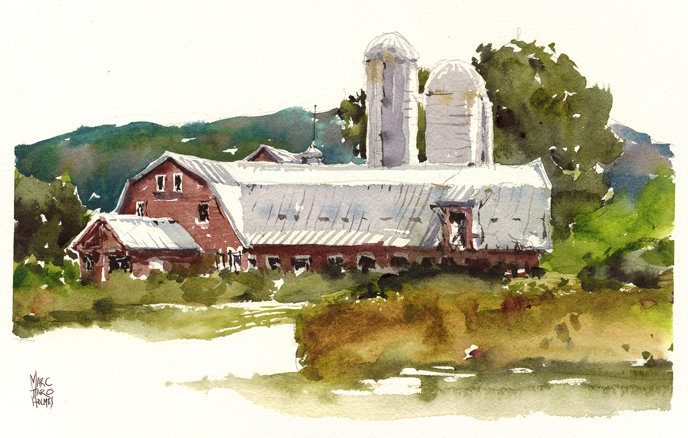
Now you can really see the trick underneath rgiht? :) The metal roof of the barn is a huge negative shape, cut between the trees and the red wooden siding. Then we just add some shadows to the negative shape, and voila. You’re in Vermont.
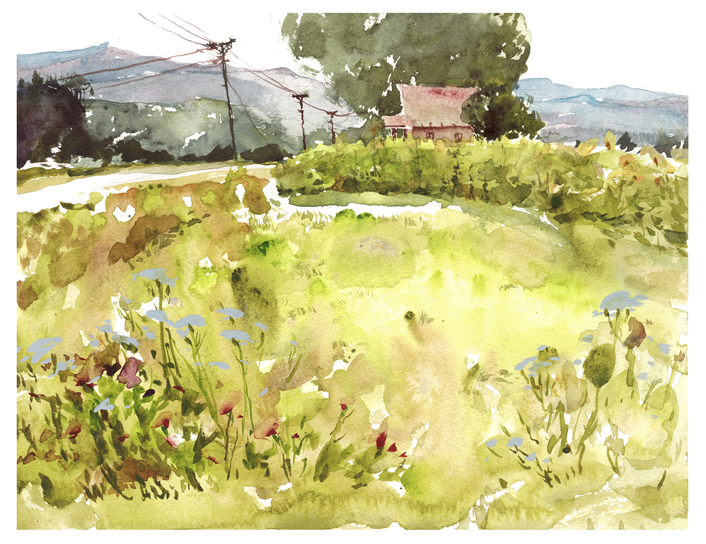
Sometimes the trick is subtle. See the negative cutout of the farmhouse? (Which I filled in later with faded red). Now it’s obvious how I used the trees (re-composing, simplifying, silhouetting) in order to make the little house into a nice clean shape, which is the focus of all the compositional lines created by the other color blocks.
I kind of regret the smaller tree on the right. It looks like a bite taken out of the house. But oh well, we can’t fuss over plein air paintings.
![]()
Ok- that’s some food for thought for your #30x30DirectWatercolor2018!
We’re starting soon, a little over a week to go!
~m


Thank you for sharing the ‘figure/ground’ concept, Marc – – it is so valuable, and makes recording a subject so much more logical. . . albeit difficult. But once your’re used to using that approach, it’s heaven on earth. I enjoy your step-by-step explanation of using that system.
Thank you for that tutorial Marc. Could you explain what the 30×30 Watercolor 2018 is? Is it open for other people to participate in?
Many thanks for your examples and explanations, Marc, just what I needed for June 1st!
Thanks for the lesson on negative painting. I’ll have to train my brain to see differently but believe the trial will be go great benefit….if I can work it out! I appreciate your patient guidance, helping make complex seem easier. Thank So!
Fantastic. Thanks.
This is how I feel when I see how good marc’s direct watercolor sequences are: http://i0.kym-cdn.com/photos/images/original/000/572/078/d6d.jpg
ahhaha! I sent this exact picture to someone the other day!