Day Five : #30x30DirectWatercolor2018 : Freeway Sans Traffic

![]()
What went wrong?
Nothing!
This is my favorite so far!
I had one false start this AM, but I quit before wasting too much time and relocated to this spot – which has been on my mental ‘to sketch’ list for a while now.
Well OK, one cheat here. I chose to leave out the cars on the freeway.
I might have been braver and tried to get them in? Even though they’re moving fast, they do just keep coming. I could draw them ‘En-Passant‘, the same way I draw moving people on a busy street.
So maybe I get to try another of these with the cars as the focus.
What went right?
Everything!
It’s another take on a Nothing View. A painting that’s not about anything. No statue of an angel, no Siberian tiger, no cute farmhouse. Just a freeway. But this time the perspective is good, the complexity of the street is well simplified, and the details are nice and sharp. Most people probably don’t want a painting of a freeway – but I’m very happy with this sketch.

![]()
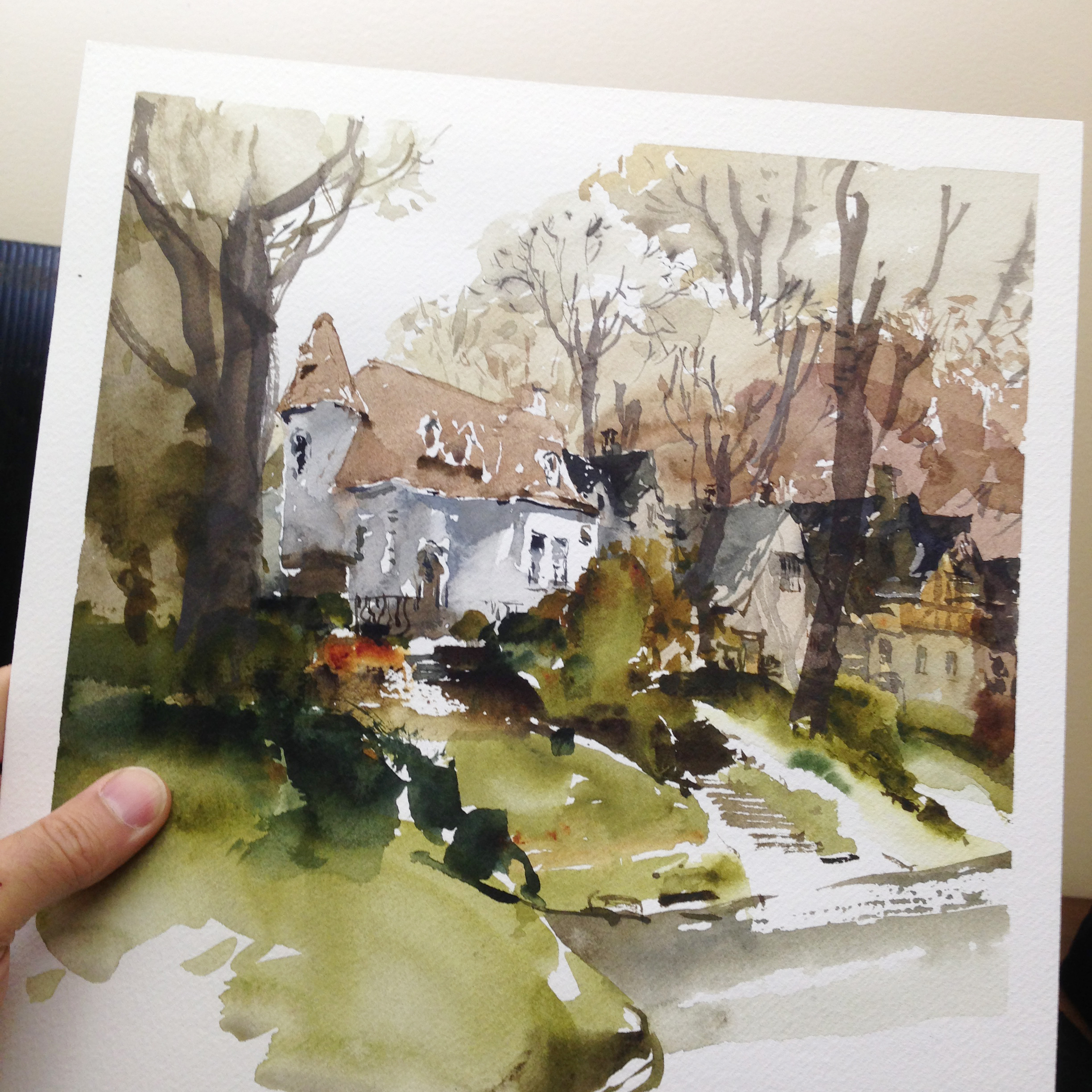
Post Script: Here’s today’s false start. Before I remembered this freeway bridge, I tried this cute house over on Ponsard. I think the drawing here – the brush drawing that is – just isn’t up to snuff. For whatever reason it’s disorganized, and a bit blobby. Doesn’t make the cut!


A couple comments. I am always interested in such a painting of a freeway or a street. I love these myself but wonder why. Maybe it is the interesting perspective.I also like drawing/painting the back of trucks that are ahead of me on the road–when my husband is driving, of course.
But also, Marc, your colors are what I like. They just go together. Can you say what you used on the first two? I am trying out a few of those on your palette that I have never used as
bloodstone genuine. Also wonder how you ever heard of some of these and began using them.
While the foreground may be blobby in the third, the houses are lovely.
Aaah now you see I love the houses, love the trees and love the bushes – the colours work well together and its got just the right amount of wonkiness – I think its great!
You need to take a stiff drink and re-appraise the house drawing. It is spot-on. The bridge drawing is loosey goosey and dull. Both, of course, are interesting. If you hadn’t of described it, however, I would have taken it for a canal.
What I am watching you for is how you pinpoint blacks, which, BTW, you didn’t in the bridge drawing. Your blacks are masterful!
Oh yes! It is a canal. This freeway is down 20 feet or so below the road way so surface traffic can cross normally.
My favorite by far is the houses painting. You captured the neighborhood, kept some lights and have lovely darks. Shows what I know…the highway looks well done but not as exciting.BTW, check out Elaine Nunnally’s work of highways in luscious colors. She just received her AWS letters for these works. Thanks for your posts, they are very informative and encouraging. Please don’t be so hard on yourself.
Just to say, about the being “hard on myself” – (many people are commenting) – it’s not like that at all! I enjoy the battle with the paint. Is a wrestling match, and it’s a thrill to be victorious :) A little defeat gets the blood up! So I say things are failures – and I have to work past the preciousness – but it doesn’t discourage me in the least! It’s part of the inspiration:)
This is a great challenge Marc. Thank you. It’s great seeing and reading about your results.
its just difficult not to break all my brushes and wish I could channel Marc!.. always an inspiration.. love the tender calligraphic lines, fine brushwork.. bravo, again and again…
I absolutely love the house painting , as it has a magic I love the dare I say messy approach, that’s a compliment, I do not like neat .
I love both but the house wins the day for me hands down .Love it
Wow! That freeway! Bravo! But I tend to prefer “nothing views,” too. It’s like telling a joke with a deadpan voice, and everyone does a double-take, then laughs. ;-)
– Tina