DVD Review: James Gurney’s Gouache in the Wild
 James Gurney, plein air painter, art educator, illustrator, and Rube-Goldberg-Easel-Maker has recently released another of his instructional DVDs on field sketching. Gouache in the Wild is a 72 minute art instructional video, available by digital download, or on DVD.
This video is a natural follow-up to his earlier release Watercolor in the Wild. The two make a good companion set. Considering his preferred method of using opaque water-based gouache over a loose and colorful under painting, one can see how everything learned from the previous watercolor program could be used in tandem with what we learn here today.
Gouache in the Wild presents multiple small paintings (six in total) which you watch in jump cuts taking you in compressed time from the initial drawings through key points in the process, onto the finished work. Each small sketch is painted entirely on location, taking us to a variety of subjects – landscape, urban settings, and some unique still-life situations.
We get to see plenty of footage of his careful brushwork in real time – seeing how he advances the image methodically. Like other great painters I have seen, Gurney ‘goes slow to go fast’. He is never rushed, every stroke well considered and placed with skill. Every color mixed once, and placed down without fussing. As he never seems to make a mistake, no time is wasted guessing a color or fixing a brush stroke. It’s really quite remarkable to see. This is a thinking person’s painting!
There is enough time spent showing close-ups of the palette to see his mixing. As well, we get lots of shots of his portable easel and various ‘tricks of the plein air trade’. Always helpful to see an artist’s setup. Plus we get frequent breaks to find out more about art materials. Intercut with the painting progress, Gurney lectures about the history and properties of gouache, the best brushes and paint brands, and the colors he chooses.
The take away here is Gurney’s passion for the potential of this under-utilized medium. He is here to demonstrate how gouache can offer you all the advantages of opaque painting in oils or acrylics, but in a fast drying, clean and portable, water-soluble media that is highly suited to working on location, sketch-booking and the small studies which many painters enjoy on location.
As a ‘mostly purist’ watercolorist I have often wished for the ability to return a lost highlight, or insert some skyholes into foliage. Even if you don’t intend to adopt gouache as a full time medium, there’s a lot of good examples here leading towards a mixed media approach.
Gouache in the Wild is independently produced by James and his wife Jeanette. Purchases go directly to supporting his art practice, his blogging, and future releases of more videos.
~m
Sketching Rodin at the Montreal Fine Arts

This summer the MFA here in Montreal has been featuring an exhibition of sculptures by Auguste Rodin. (On until October 18).
The show is titled Metamorphoses: In Rodin’s Studio, and in keeping with that theme, it features a collection of fascinating smaller works and sculptural fragments, mostly presented as plaster casts.
It seems, the way the show’s curators present the work, that these small models were Rodin’s real passion. I would like to think so – they seem so full of energy and keen observation – as compared to the bombastic bronzes made for the courthouse steps.

There are of course monolithic figures as well. The famous Thinker, as well as figures from The Burghers of Calais. And this standing nude. Possibly it is Meditation: The Inner Voice. I can’t recall the title. But this one caught my eye. The stretched neck and classically antique severed arms are an ongoing theme in Rodin’s work.
But it was smaller works that drew my attention. I didn’t even look at the Thinker. To me, it’s been rendered uninteresting – conceptually buried by thousands of copies, editorial cartoons, and humorous t-shirts. Much like the unfortunate fate of the Mona Lisa.
These exciting smaller works are, I suppose, studies. Temporary works in clay, from which moulds have been taken, allowing the artist to make a plaster cast for use in the studio, or – when he had something noteworthy, these casts might be copied into marble or re-cast into bronze.
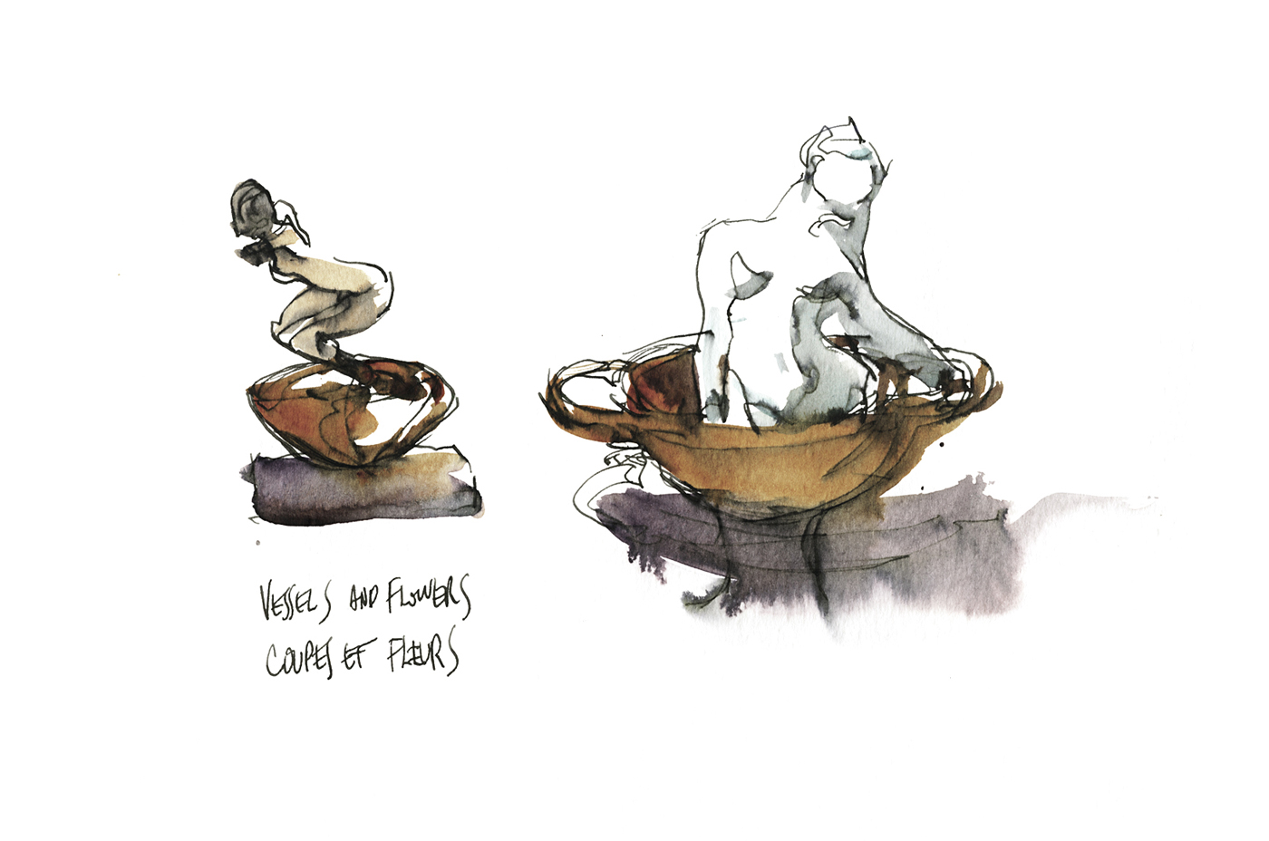
One room of the show is dedicated to what Rodin called “Coupes et Fleurs” (translated as Vessels and Flowers). In these, he combines ‘authentic’ classical objects – small clay jars and cups purchased from antique dealers – with fragments of statuary. Some do resemble vases and flowers. Some appear to be bathers. In others, the pale plaster figures rise out of the jars like incense smoke.
Later in the exhibition we see a series of charming arrangements, in which he combines broken fragments of plasters into new works. Using the head from one study on a torso of another, combining figures in interesting juxtapositions. Making new stories out of old.
This kind of playful re-combination of his leftover works seems like a very contemporary idea for the turn of the century.

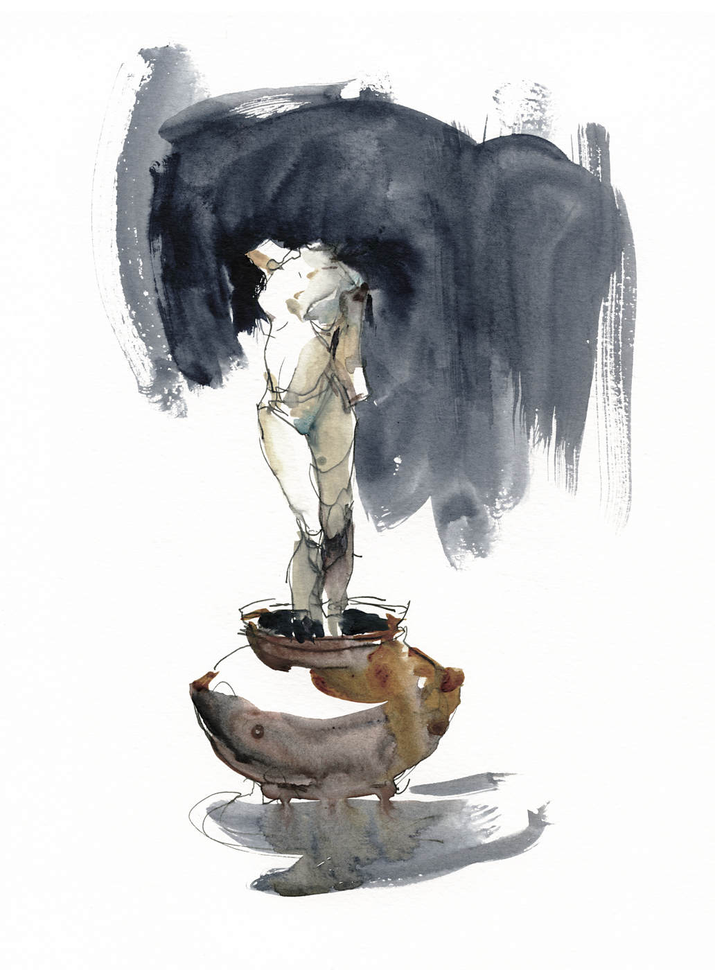
My personal favorite of the show is a set of copies of his infamous Iris, Messagère des Dieu. (Iris, Messenger of God). As I recall, there was one in stone, and one in bronze on exhibition.
It is impossible to look at this piece from 1895 without thinking of The Origin of the World by Courbet (1866).

At this time, with the movement away from the baroque and towards truth and naturalism in art, it was inevitable that male artists would produce these sort of frank depictions of the female body.
Once these artists, academicians and rogues alike, give themselves permission to seek personal obsessions – rather than continue to serve up re-heated bible stories or historical propaganda – then the confrontationally eroticized nude seems unavoidable.
It can’t be denied, even to a modern audience, Rodin, and Corbet before him, are leveraging tremendous conceptual power by breaking social taboos. This supercharged exhibition of the body made for a lot of headlines. Any publicity is good publicity.
Friendly critics could call it a celebration of female power. Less compliant feminist analysts might see Rodin as the patriarch – appropriating the female body, using it for his own aggrandizement, and the titillation of his clients.
No matter how you react to the sculpture – it’s a striking piece – the most impactful in the show. Demonstrating both total mastery of modelling, and Rodin’s daring as an artist.

It is interesting that this too is one of his recycled works. I am reading on the Musee-Rodin site that the Iris figure was taken from a swooping angel-winged version of the Messenger – now turned right side up, and exposed with the contortionist’s flexibility of Rodin’s favorite models.
I cannot find (with a quick search) a confirmed account of who the model was – but even if this was a re-used torso, the sculpted limbs and splayed pose must surely have been done from life.
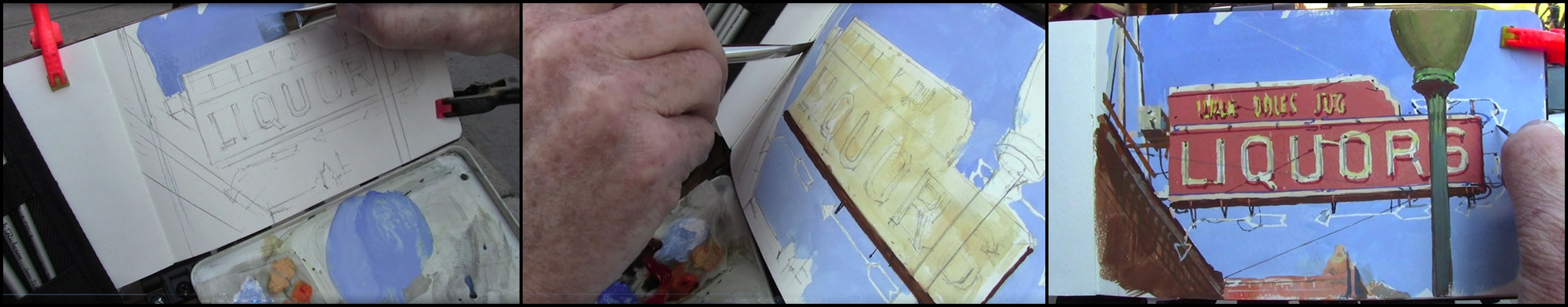
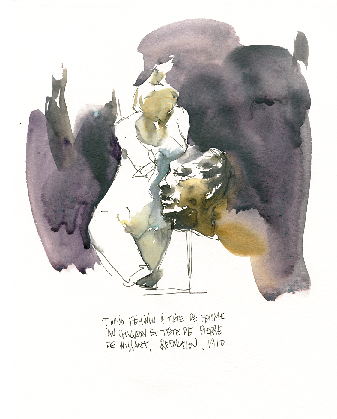
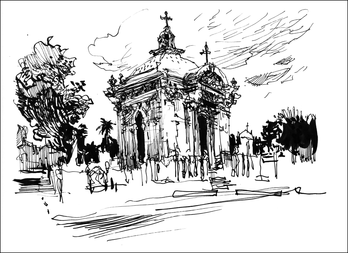
For sketching fans, here’s a look at my process. These sketches were drawn in a Moleskine Folio Watercolor Album (11.75×8.25”) while in the exhibit, using fountain pen and water soluble ink. Then painted off-site with a small watercolor kit. I’m impressed the museum does not restrict us to sketching in pencil, but of course, you have to leave the exhibit to paint. The drawings couldn’t have taken much more than five or ten minutes, most even less. Making it possible to draw standing without unduly blocking people in the crowded exhibit.

Of particular interest here is the (new to me) pigment Graphite Gray (Pbk #10). Used very wet, with a loaded brush in the shadows – most visible in Iris, and Meditation. I’m very much liking this extremely sedimentary silvery grey. It really does look like pencil or graphite stick, in watercolor form. I think it would be an ideal color to take to any major metropolitan area.
Other colors in this mini-kit: DS Moonglow, Quinn Gold Deep, Cobalt Teal, Perlyne Maroon, and Indigo.

~m
The Hand Drawn Snapshot
I show a lot of ‘nice’ sketches on this blog. What I consider finished works. Things where I took a reasonable amount of time (45 minutes? an hour?). And things that often call for an easel and a watercolor kit. Today I wanted to show the opposite. Sketches that took 5 minutes or less. Drawn in a cheap 3×5″ pocket book with flimsy paper.
Sometimes when you’re travelling, you’re not in the mood for carrying your gear. Or you’re with people, and you don’t feel like asking everyone to wait for you. That’s when I go into snapshot mode. Drawing standing with two pens (my current favorites: a Platinum Carbon pen, and a Kuretake Sumi brushpen). Often I don’t even stop walking – getting the first few lines in, then doodling from memory while walking away. It doesn’t take any longer than pausing to take a photo. And I enjoy the feeling of filling up these tiny sketchbooks. The drawings are so fast, you can easily fill a book in an afternoon.


I enjoy these little booklets as keepsakes of the trip, and as small studies that I might paint from later. I might just take a detail – a boat I liked, or the shape of a palm tree, into a future studio painting. Mostly though, I just do them for the pure fun of it. Even if I never look back at them, every drawing builds your visual memory. Just like taking snapshots – probably they just go into your albums and lurk on your computer (or on my bookshelf) – but the act of taking them is a way of looking deeper at a place. It makes for lasting memories. And maybe when I’m old(er), those albums will come back out again. Who knows!
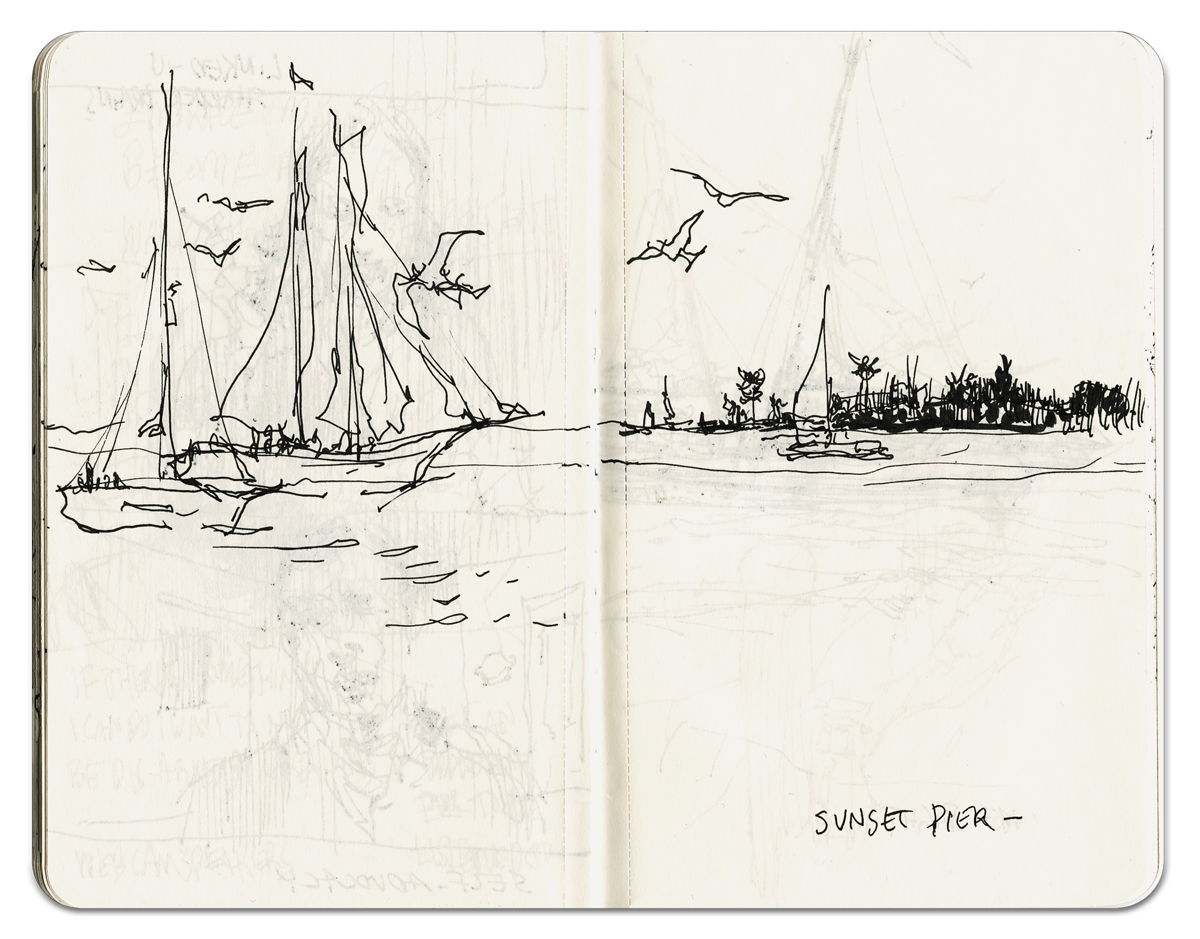
You can see the ‘for real’ paintings from this trip to Florida over here, and some more over here.
~m
Sketching Characters at Montreal’s 18th Century Market

Every year the Pointe-a-Calliere museum takes over their corner of Montreal’s old port to put on the 18th century New France marketplace.
It’s always a great opportunity for USK:MTL to get together and sketch.
I imagine most people have some sort of costumed re-enactors group in their area? These guys above are the Compagnie du 2e Battalion du Régiment de la Sarre.
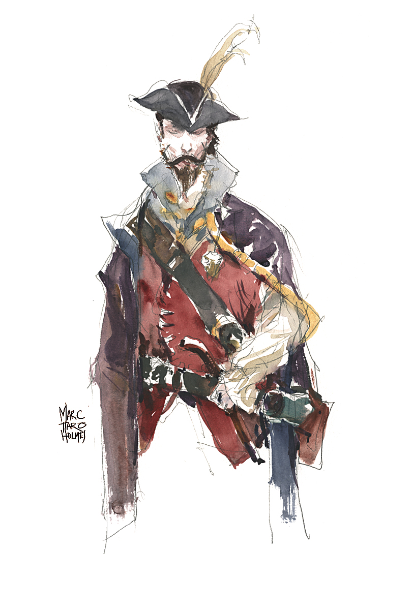
You might want to scout around your own area online. Many cities have some sort of military re-enactors, a local crew of pirates, or a medieval history group. I highly recommend this sort of thing for a fun afternoon sketching characters in fancy dress – and an opportunity to draw as much as you like without your subjects running off. (Not that they won’t move, but at least they’ll stay in the area :).
If anyone else has sketches from costumed events (or might be a re-enactor themselves?) – why not post a link to your drawings in the comments – and tell us when and where the event takes place. Maybe there are some people in your area that will turn up for the next event – sketchbooks at the ready!

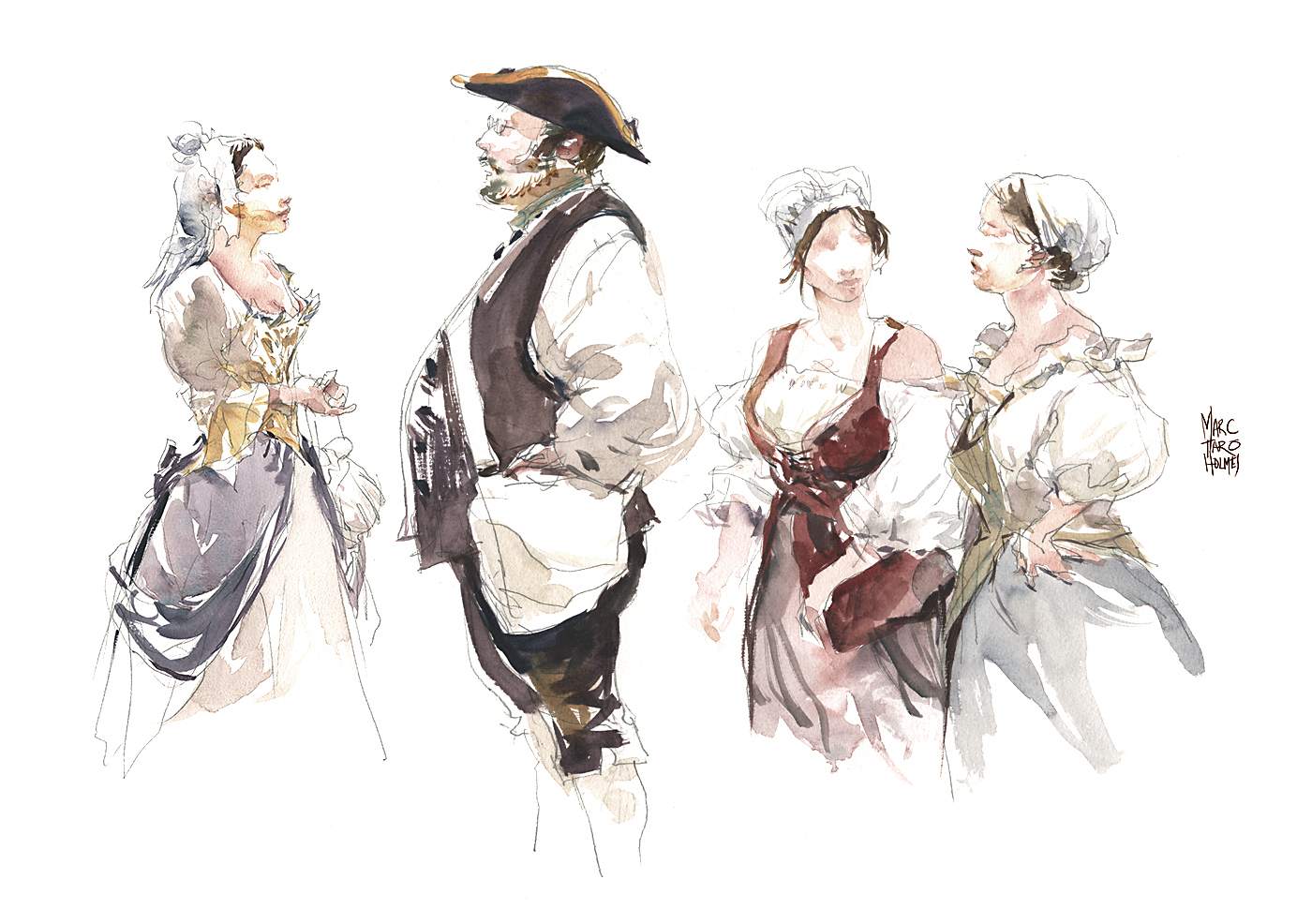
For the artists out there, these are sketched in pencil while walking around following my subjects, and tinted with watercolor during lunch and teatime. I skipped drawing in pen and ink over the pencil as I sometimes do. These days I’m tending to do either pencil + color or straight-to-ink + color – but rarely all three, pencil and ink and color.
Even though I do recommend all three when teaching beginners, after a few years of thinking about this, I feel it drains some ‘freshness’ (and slows you down) if you do too much drawing before the paint.
So – as you get more comfortable, you can skip one step – and just get more drawings done in the session :)
~m
Painting Underwater in Singapore

[Chinese Garden, Jurong, 9×24″]
Let me just say – Singapore was nothing like what I expected.
This is entirely because I’m uneducated, and had no idea what to expect.
Other than it being a modern Asian city with a booming economy. And a democratic republic with a pretty decent reputation for transparency. What I was not really aware of (being basically clueless) was how multicultural it would be.
It was inspiring to see temples of three religions side by side on ‘harmony streets’. Buddhist, Muslim and Hindu all equally well used by a variety of people. It was equally great to see every hawker center (open air restaurant courts) representing ethnic foods from all these cultures. And then to see, in the faces of the people on the street, all these races intermixed.
I would hope this could just be normal everywhere – but it seemed to me a unique aspect of the city. Good for you Singapore! Thanks for that experience :)

[Japanese Pavilion at the Chinese Garden, Jurong, 9×24″]
The other thing that completely overturned expectations was the fact you cannot paint in Singapore.
Well – eventually you can adapt. And certainly the locals can paint just fine. But I for one, found it to be the most challenging environment of any place I’ve ever watercolored. It reminded me most of that time I painted in the rain in Ithaca.
The challenge was not because of difficult subject matter or any lack of views – but simply because of the climate. The HUMIDITY. (And the heat). But my goodness – the HUMIDITY.
You might see a kind of wild abandon in the painting style on display here? A kind of splashy wet-in-wet and a sort of ‘mosaic’ feeling? Shapes floating on white spaces, a kind of composition that is perhaps on the edge of control? This is my compromise for the shocking conditions we encountered.
Simply put: watercolor will not dry in 100% humidity and 110 degrees.
I suppose the up-side is you have as much time as you like to work wet-into-wet. I had paper remain wet for over four hours. When you made a painting, you had to carry it flat for the rest of the day or colors would actually drip off the page. Some days I ended up only doing two paintings, needing to drop them off at the hotel between outings. My usual method of working larger-to-smaller and wetter-to-dryer in progressive layers, was simply off the table. If I’d have been working in a sketchbook, I imagine all the pages would be stuck together.
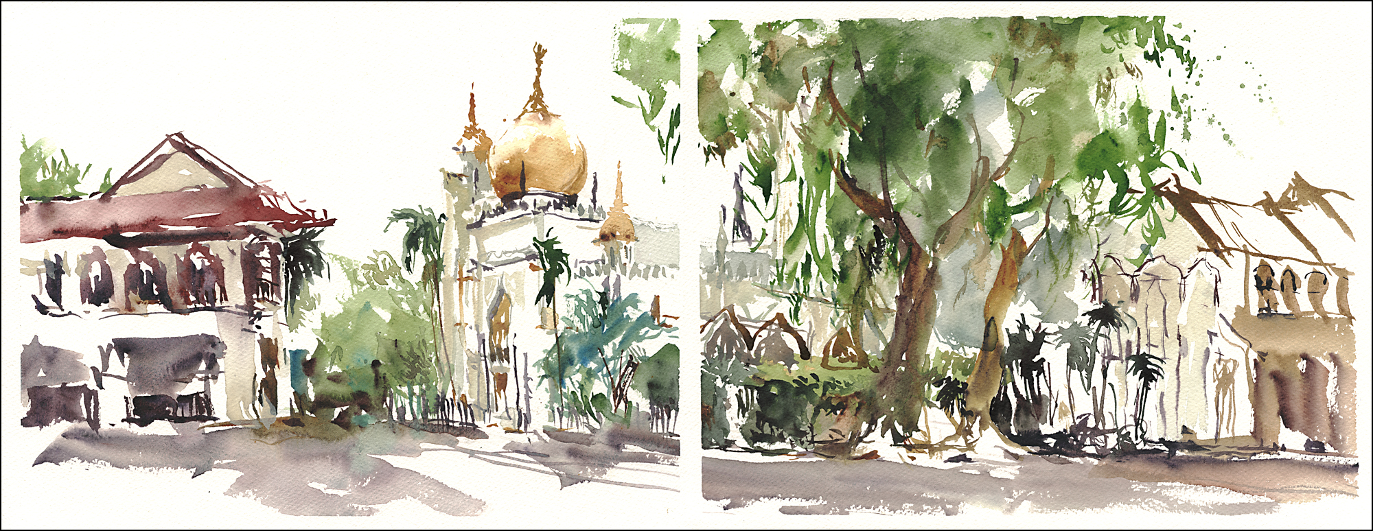
[The Sultan Mosque, Kampong Glam, 9×24″]
So – these works are not done in layers at all – but are made working edge-to-edge, stroke next to stroke, in a single wet shape. They are more reliant than ever on white space – defining shapes with dry paper edges.
I think I gravitated to this fix for the weather because I was just back from filming: Travel Sketching in Mixed Media.
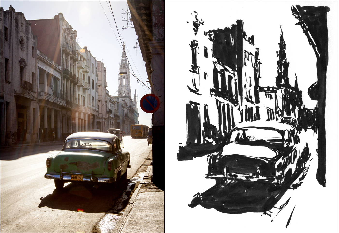
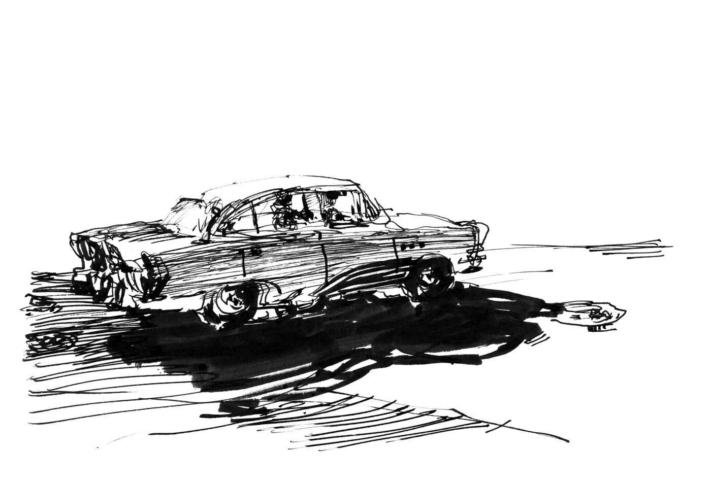
If you look back to the previous post on the Brush pen silhouette exercise where I’m talking about shape welding and ‘growing silhouettes’ with black ink. This is exactly what’s going on here:) It’s amazing how descriptive you can be even with just black ink. You’re training yourself to make shapes with solid masses, and to be decisive about what you leave out. The small gaps and edges in the brushwork – the negative shapes – can be equally descriptive as the positive forms. All of these works, especially the Mosque above, are done with this kind of thinking – but with watercolor instead of ink.
I’m glad I filmed the class before going to Asia :) Thinking about teaching something, is the best way to get better at doing it. If I didn’t have this concept in my back pocket, I’d have been one frustrated sketch-tourist in Singapore.

[Giant Super Tree Sculptures at Gardens by the Bay, 9×24″]
Here’s a sneak peek at the second concept in my new video class Travel Sketching in Mixed Media.
The course starts with the slightly more obvious approach of doing line drawings and tinting them with color. Then, by taking a look at the *opposite* way of thinking – building up from silhouette shapes instead of line – we can start to think about how a tonal sketch might work. To me, when they say painterly – this is what they mean. Thinking about masses of value, rather than linear contour.


In the course I go into a few ways to arrive at a study in shapes – the solid masses you can do with a brush pen, but also the accumulation of different line weights you can make with pen-hatching.


And finally, closing that section I show a sketch done with water soluble ink – in which you do a bit of both. Making a line drawing that you convert to masses by blending shapes with water. You can do this right on the spot, or come back later with the water.


I hope you’ll get a little something from each of the three ways to think about silhouettes and masses. This approach has been very useful for me on my recent trip to Asia – I’ll show you some more of that in the next few days :)
If you’re interested in joining the class to see the sketching happen, I have a special discount ($20 off the retail price!) for anyone reading this blog. Click over here to register at your Blog Reader’s Discount!
Just a quick note – three more days to see some original artwork from myself, Shari Blaukopf and Jane Hannah on display at Stewart Hall Art Gallery in Pointe Claire QC. We each have a variety of framed artwork, and a few sketchbooks on display. If you’re in the area, the show remains up till Sunday afternoon.
Video Trailer for Travel Sketching in Mixed Media
This just in: The teaser/trailer for my new class Travel Sketching in Mixed Media. This short video gives you a brief look at the seven sections included in the 2.5 hour video series. Check it out, and don’t forget, if you register here on the blog, you get $20 off the retail price. (Click here!)
Travel Sketching in Mixed Media Live Today! Lesson Sneak Peek!

The new video course is live for registrations as of this morning! Super exciting for me – I’ve been planning this for months now, and am very pleased to see people already signing up! Thanks everyone!
As a bit of a sneak peak of what’s in the course – here’s a capsule summary of the first project: Single Line Sketching. (You can read more about this exercise over here – in my notes from my 2015 USK workshop in Richmond, VA).

My main concern when designing the Craftsy.com course was unlocking your ability to sketch quickly.
I don’t mean to pressure people about drawing faster. It’s not a race – you shouldn’t feel anxiety about drawing at a lightning pace. But on the other hand….the faster you can doodle, the more often you’ll grab a spontaneous drawing when you see one.
There’s nothing more fun than seeing a glimpse of a lovely view and saying – ‘hold on a minute, let me grab a sketch’. I hope that we’ll all gain the confidence to just dash off a drawing when we feel like it.
This is the big secret to productivity in the field. Having fun with it, being relaxed, and a little bit ‘uncaring’ about results. Just draw, and enjoy the feeling of capturing the memory of a place. You’ll love showing those sketches to friends and family later, or even just looking back at the books yourself.
Single Line Sketching is something that is easier to show than to explain :) Which is what’s great about video :) But here is the sketch I’ve made from this view, in only a minute or two.
The idea is to follow the horizon line with one continuous line – without picking up the pen. Just make a scribble that loops back across itself and wanders around the important silhouette edges – like dropping a thread that drapes over the horizon.
The technique might seem overly simplistic – but it’s a sure fire way to teach yourself to simplify and find the important shapes. And it’s also just the first step in the process.
If you have a few minutes more – or if you can steal some time later on as you’re travelling (waiting in train stations or airports, taking a break in the cafe, all those bits of downtime that you have on the road), the next steps are accenting your drawing with darks, and then – where the real fun begins – tinting into the sketches with color.

You’ll be able to see me go through a few of these examples in the video, showing how easy it is to bring your sketches to life with glowing shapes full of color.
")
")
")
b")
There are still quite a few concepts after this first sketchbook drawing style approach. I’ll go on from there to talk about working from shapes instead of a linear drawing, some discussion about simplifying perspective, and then moving on to demonstrate the steps I use to rapidly sketch in watercolor using a stack of layered shapes. More about all that in future posts!
")
")
")
b")
I hope I’ve intrigued you about the class. If you head over to register now, I’m offering $20 off the retail price – just for being a supporter of the blog. These courses and my books are what allow me to keep on sending you drawings. So I hope you’ll enjoy the program, and get inspired to go sketching! And please – share these links with your friends. I’d like to reach as many sketchbook artists and journal keepers as possible.
Thanks
~marc
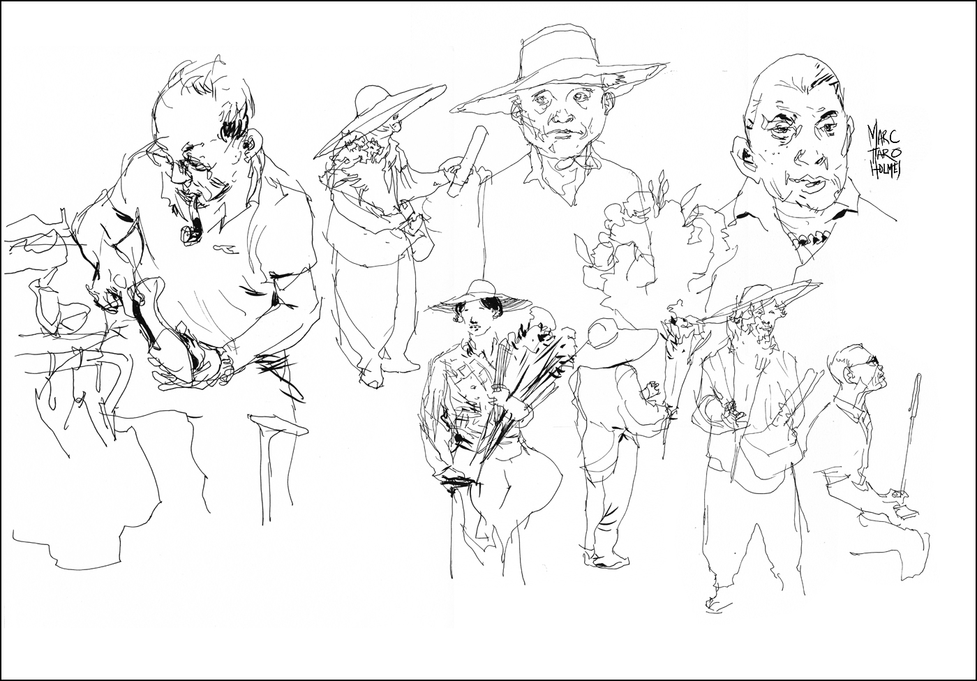
Singapore Workshop Results: Street Portraits and Crowd Shots
We’re recently back from the USK symposium in Singapore.
After a few years of going to the annual international event, I’m starting to take it as a normal experience. But really – it’s far from normal. It’s actually super duper amazing :)
Gathering together with artists from all over the world for a massive festival of drawing. To be able to draw from sunup to sundown with other obsessive sketchers. When I look back on it, it’s astonishing that this outrageously fun event is made possible every year by everyone’s combined efforts. The behind-the-scenes planning of the symposium committee, the support of the sketchers who come, the hard working local volunteers, and the goodwill of instructors coming from all corners of the earth.


This year my small contribution to the program was a workshop on Street Portraits. In my personal work recently, I’m doing a lot of plein air painting – but back a year ago, when planning for Singapore, I was launching my Craftsy.com course on sketching people, so this was foremost on my mind.
I was surprised to see, when designing the class that in even the short time since launching my online course, I’ve already improved tweaked my process for drawing people.
I have been trying to keep up with self-training. My hundred person challenge for instance, or the occasional afternoon out sketching at a pub. But I have not really been going to life drawing in a serious way. The last time was back in January. There just hasn’t been time with all the travel we’ve been up to :) (First world problems hey?). So, imagine my surprise, when I go back to street portraits – suddenly I have a lot of new ideas that come from my travel sketching.
Sketching landscapes, has made my people drawing better! Who knew? Ha.
The shortest explanation of the new approach would be: Go directly to ink without a pencil gesture > Greater emphasis on Silhouette Shape > Less concern with inking black shadows – as I know that the watercolor will handle the values.
I admit – there is always going to be a high failure rate with direct-to-ink sketches from life. But it’s just paper at stake. I’m totally OK with flipping the page and sketching another one. (This is why I like loose paper vs. bound books).
I drew the shoemaker on the far left (above) six or seven times over the course of the three day workshop. (His portable workbench was right next to my teaching spot). Gradually you can get a subject’s routine down – seeing the ‘working pose’ between reaching for tools, tamping his pipe, and selecting another shoe to work on.
In the end, despite many false starts, I have this fresh, lively drawing, that I couldn’t have gotten any other way. (Here’s an old post that illustrates this perfectly).
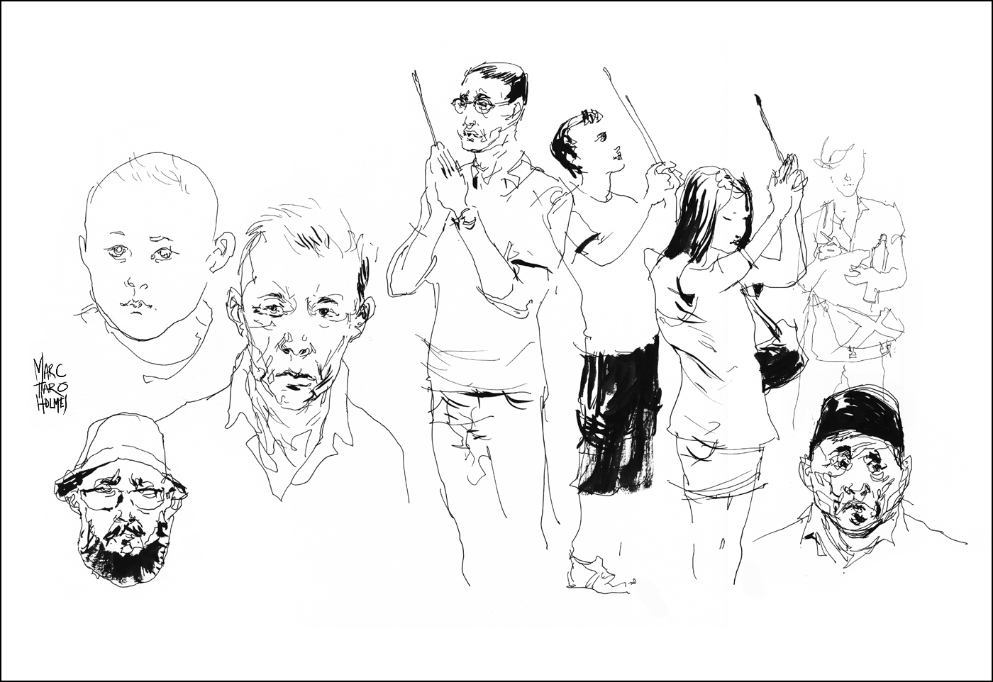
The faces on the left here are good examples of my current theory “head-shape/hair shape”. (See class notes).
I’ve chosen to teach this direct-to-ink approach even to beginners, because A: it’s much faster this way and B: it makes a more spontaneous drawing. I now think that any added difficulty students might have at first (when going straight to ink (or watercolor)) – will be overcome by a few weeks practice – and will pay back 100 fold in more responsive, honest, direct observational drawings.
This doesn’t mean I never-ever use a pencil-gestures-and-inking-over approach. Just that I always say – you can only teach what you do. So I have to show what’s on my mind right now. Even if it changes year to year.
Anyway – this is a complex question – and I’m sure I’ll be mulling over the value of pencil guides vs. direct ink drawings more than a few more times this year.
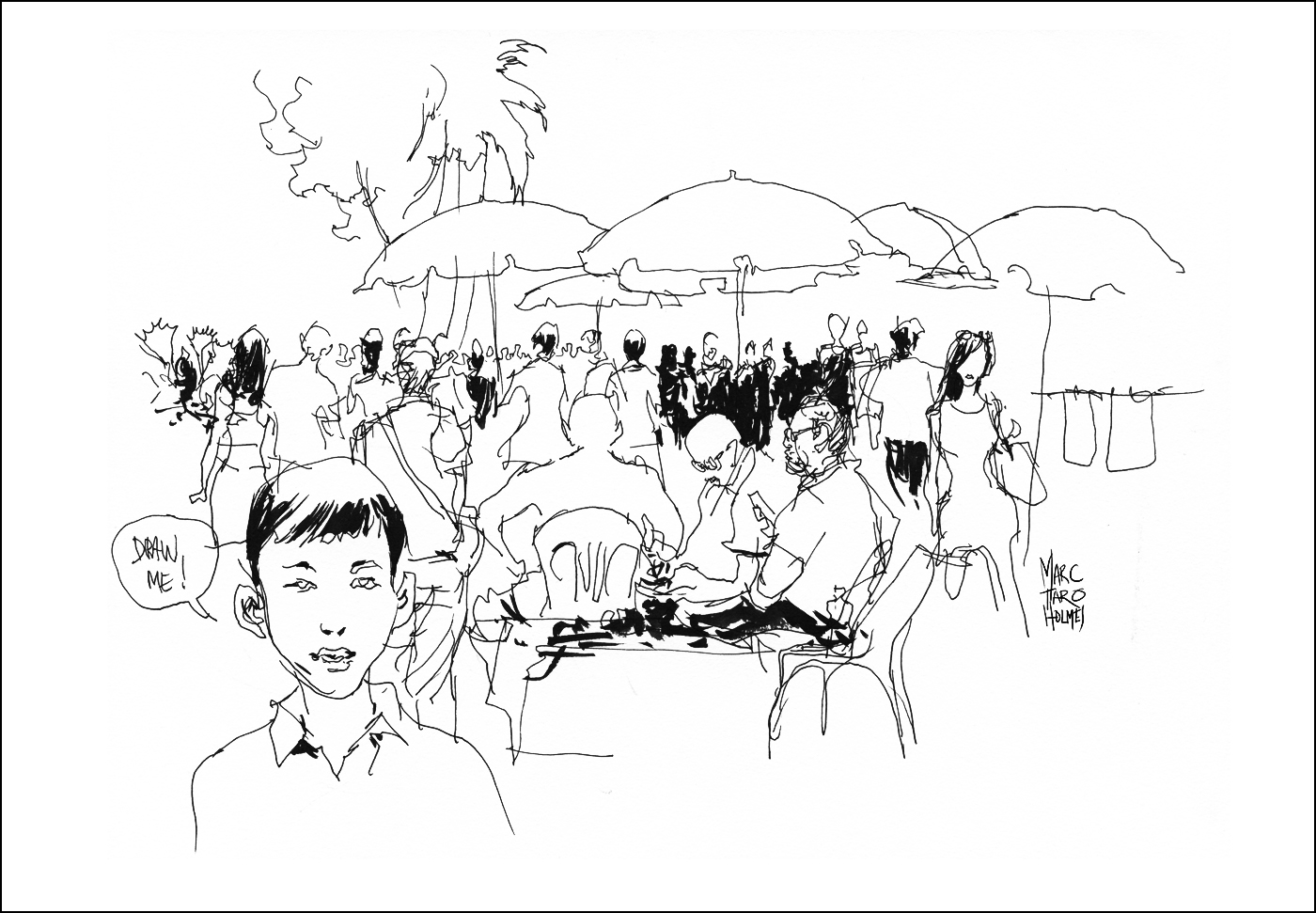

I hope you’ll check out my class notes from the workshop. There are a few good tips for portraits, and a good trick for drawing crowd scenes to back up your stars. You can get the free PDF below (click the image) or from my download page over here.
As well – in celebration of the launch of my new Craftsy.com class on Travel Sketching in Mixed Media – I’m also putting my original Sketching People in Motion class on sale – $15 off – for any readers of this blog. (Click over here to register).

~m

