Sketching Rodin at the Montreal Fine Arts

This summer the MFA here in Montreal has been featuring an exhibition of sculptures by Auguste Rodin. (On until October 18).
The show is titled Metamorphoses: In Rodin’s Studio, and in keeping with that theme, it features a collection of fascinating smaller works and sculptural fragments, mostly presented as plaster casts.
It seems, the way the show’s curators present the work, that these small models were Rodin’s real passion. I would like to think so – they seem so full of energy and keen observation – as compared to the bombastic bronzes made for the courthouse steps.

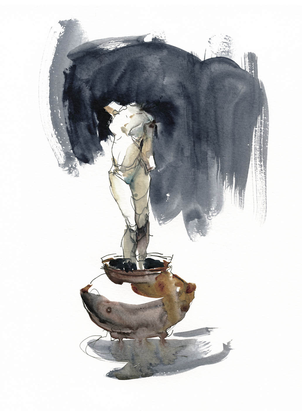
There are of course monolithic figures as well. The famous Thinker, as well as figures from The Burghers of Calais. And this standing nude. Possibly it is Meditation: The Inner Voice. I can’t recall the title. But this one caught my eye. The stretched neck and classically antique severed arms are an ongoing theme in Rodin’s work.
But it was smaller works that drew my attention. I didn’t even look at the Thinker. To me, it’s been rendered uninteresting – conceptually buried by thousands of copies, editorial cartoons, and humorous t-shirts. Much like the unfortunate fate of the Mona Lisa.
These exciting smaller works are, I suppose, studies. Temporary works in clay, from which moulds have been taken, allowing the artist to make a plaster cast for use in the studio, or – when he had something noteworthy, these casts might be copied into marble or re-cast into bronze.
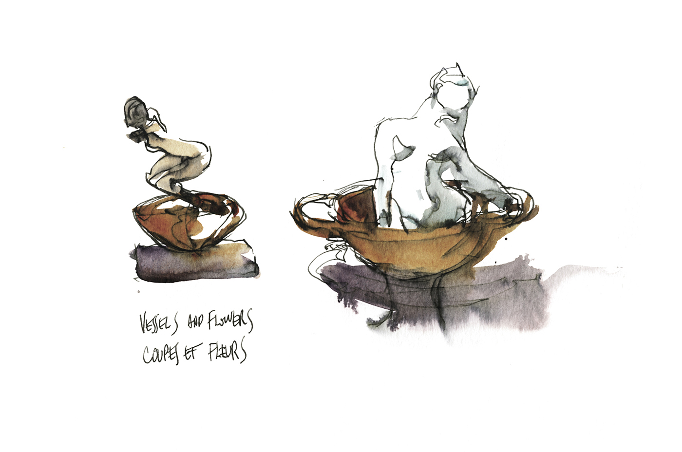
One room of the show is dedicated to what Rodin called “Coupes et Fleurs” (translated as Vessels and Flowers). In these, he combines ‘authentic’ classical objects – small clay jars and cups purchased from antique dealers – with fragments of statuary. Some do resemble vases and flowers. Some appear to be bathers. In others, the pale plaster figures rise out of the jars like incense smoke.
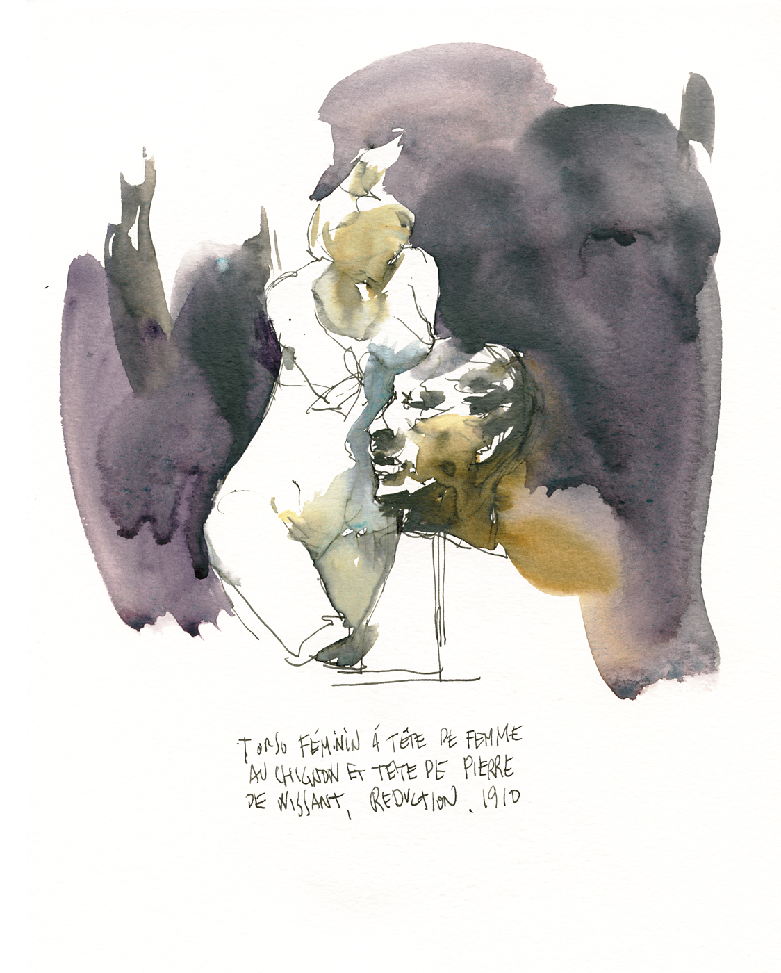
Later in the exhibition we see a series of charming arrangements, in which he combines broken fragments of plasters into new works. Using the head from one study on a torso of another, combining figures in interesting juxtapositions. Making new stories out of old.
This kind of playful re-combination of his leftover works seems like a very contemporary idea for the turn of the century.

My personal favorite of the show is a set of copies of his infamous Iris, Messagère des Dieu. (Iris, Messenger of God). As I recall, there was one in stone, and one in bronze on exhibition.
It is impossible to look at this piece from 1895 without thinking of The Origin of the World by Courbet (1866).

At this time, with the movement away from the baroque and towards truth and naturalism in art, it was inevitable that male artists would produce these sort of frank depictions of the female body.
Once these artists, academicians and rogues alike, give themselves permission to seek personal obsessions – rather than continue to serve up re-heated bible stories or historical propaganda – then the confrontationally eroticized nude seems unavoidable.
It can’t be denied, even to a modern audience, Rodin, and Corbet before him, are leveraging tremendous conceptual power by breaking social taboos. This supercharged exhibition of the body made for a lot of headlines. Any publicity is good publicity.
Friendly critics could call it a celebration of female power. Less compliant feminist analysts might see Rodin as the patriarch – appropriating the female body, using it for his own aggrandizement, and the titillation of his clients.
No matter how you react to the sculpture – it’s a striking piece – the most impactful in the show. Demonstrating both total mastery of modelling, and Rodin’s daring as an artist.

It is interesting that this too is one of his recycled works. I am reading on the Musee-Rodin site that the Iris figure was taken from a swooping angel-winged version of the Messenger – now turned right side up, and exposed with the contortionist’s flexibility of Rodin’s favorite models.
I cannot find (with a quick search) a confirmed account of who the model was – but even if this was a re-used torso, the sculpted limbs and splayed pose must surely have been done from life.
For sketching fans, here’s a look at my process. These sketches were drawn in a Moleskine Folio Watercolor Album (11.75×8.25”) while in the exhibit, using fountain pen and water soluble ink. Then painted off-site with a small watercolor kit. I’m impressed the museum does not restrict us to sketching in pencil, but of course, you have to leave the exhibit to paint. The drawings couldn’t have taken much more than five or ten minutes, most even less. Making it possible to draw standing without unduly blocking people in the crowded exhibit.

Of particular interest here is the (new to me) pigment Graphite Gray (Pbk #10). Used very wet, with a loaded brush in the shadows – most visible in Iris, and Meditation. I’m very much liking this extremely sedimentary silvery grey. It really does look like pencil or graphite stick, in watercolor form. I think it would be an ideal color to take to any major metropolitan area.
Other colors in this mini-kit: DS Moonglow, Quinn Gold Deep, Cobalt Teal, Perlyne Maroon, and Indigo.

~m


Incredible sketches…I enjoyed reading this very much!
Thank you Marc for such an interesting commentary of your visit to the Rodin exhibition.
Awsome !
Fabulous coverage Marc. I feel like I have been there. Thanks too for the information about Graphite Gray. Love the palette you used. Nancy
>
What water soluble ink do you use? I find that the amount of spread varies widely. Great sketches. Your work convinces me that drawing is the key to working in watercolor
Hey Larry – I use a few – Noodler’s Red/Black for one, and in this case Lamy’s Black are some of my favorites. I’ve had great results with a few colors from Private Reserve, Vampire Red, and Sonic Blue are ones I recall off-hand.
Thank you so much for this tour of the exhibit. I am unable to get to many exhibits at this time and your post is almost like I was there. Almost. Love the sketches and our small studies are where the energy is for sure! Thanks again!
Wow.
I am currently taking your Craftsy class, and this is such an inspiration. Thanks for sharing your sketches AND your process!
This is a wonderful article, Marc – you paint with words as beautifully as you do with pen, brush and paint!
Nice sketches and article! Thanks!
stunning sketches, they look like they flew from your head, heart and hand..not to mention the many hours you have worked at it to be so good.. lovely…
Great article & sketches! Thank you for posting this!