
Finally we’re here! Day one of #30x30DirectWatercolor!
I had great plans for this year’s event. I was going to dive back into street-sketching. Immerse myself in the challenge of plein-air painting. Make more dark and dramatic paintings full of the night-life and vibrancy of Montreal!
But of course, the universe has its own plans.
So – – – plan B eh? Hmmmmmm.

Luckily, Laurel has a large archive of photos from all the years we’ve spent travelling and painting at Urban Sketchers workshops.
I’ve gone back in time, and selected views from past sketching trips. I’ve tried to focus on places I’ve already drawn, so I have at lease some touchstone to the place. Even if it’s been years since I sketched there.
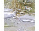
So today, we’re back in Lisbon. This is just a typical street, somewhere near where we had the workshop, nothing important about this view – other than the light and zooming perspective.
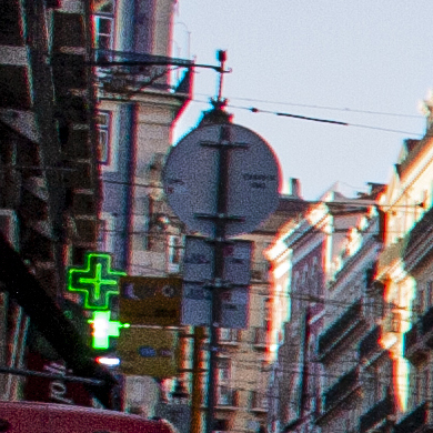
This is just a funny bit here. I painted a huge dome in the distance – just for fun – but the shape I saw is just a traffic sign in real life.
Hah. You see what you want to see I guess :)
Speaking of which – I’ve been painting squares for the last couple years (and I’m still in love with that format) – so I think somehow I can’t “see” any other way. This is the crop I prefer (today).
I chose the set of photos I’ll be working with a few principles in mind.
I wanted as much contrast as possible. Some dramatic darks to sink my teeth into. And – people in the shot. As many as possible. I sort of thought I might even add in more people to make the scene more lively – but in fact I didn’t.
When push comes to shove, I can’t make up people that have convincing, true-to-life gestures. Even when it’s just people walking, they have a life-like posture you can’t invent.
I’ve always been a happy, colorful watercolorist – but I want to capture a darker, grittier mood. Which I managed last year in a series of abstract landscapes.
In my plein air work, it’s usually been about looking for sunny days and good times. – more about having a nice day out I suppose, than creating a work to hang on the wall.

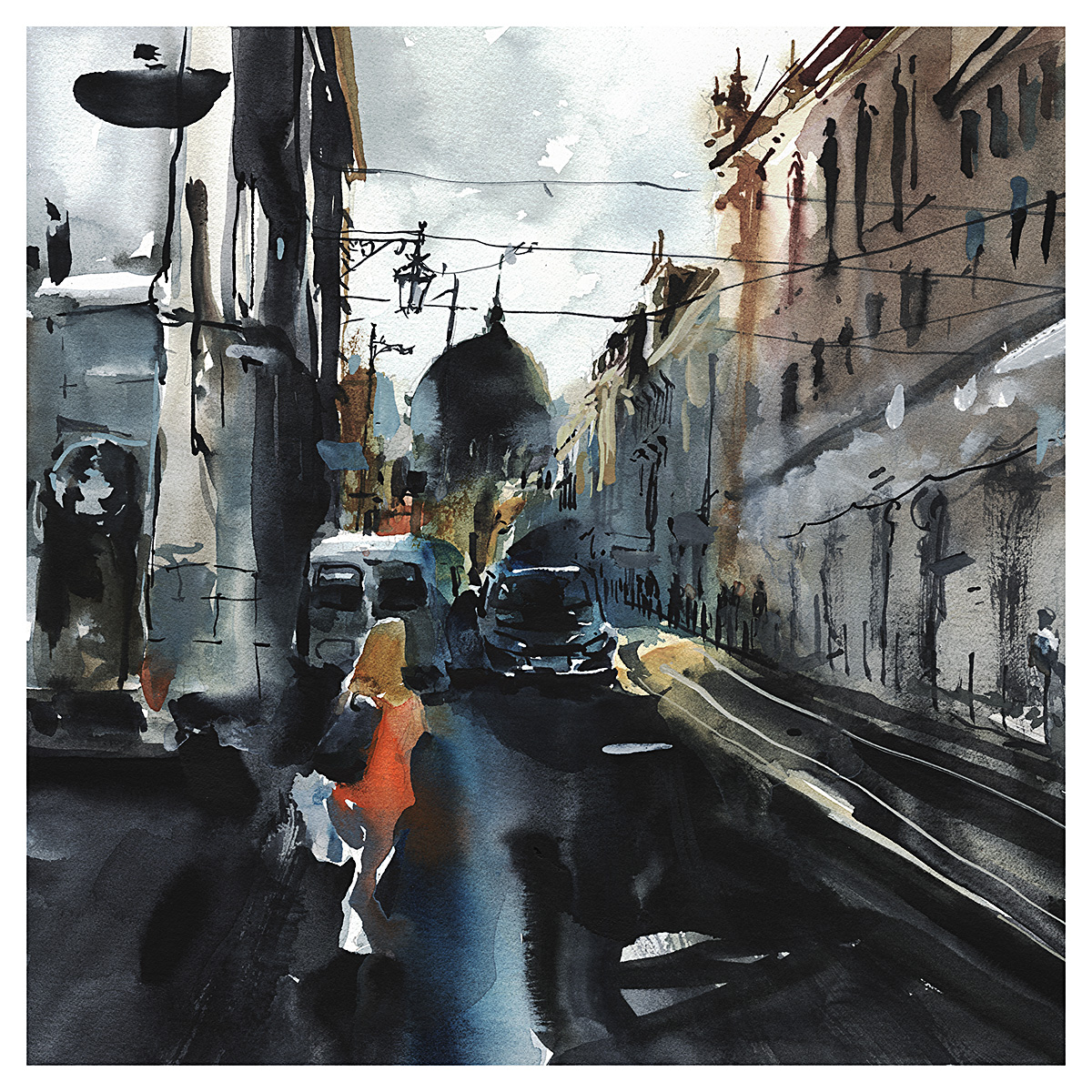
Oddly – despite my stated goal of depth and drama – I didn’t feel right with my first version. It felt kind of shouty? Perhaps it’s the lone figure stepping tentatively out into the road. But something made me immediately feel – I should tone it down.
At the time I was much happier with this second version – but now, a couple days later I’m not sure what the big deal was. It was kind of ok before.
Sure – I like the subtle grey palette below – and a better sense of the perspective – but at the same time, it lacks the drama.
Which do you prefer? The Dark Street or the Grey City?


![]()
With #30×30 fast approaching, I’ve been thinking about The Value of Daily Practice.
I started this painting marathon a few years back, to see if I can trick all of you into helping me paint.
There’s nothing like taking peer-pressure and a little FOMO, and turning that into something good for you.
Now that I’ve convinced a few thousand of you to go along with it, I’m in the enviable position of having no choice! It’s easy for me to tell the fam, I can’t paint the window trim, clean the garage, do whatever – because it’s #30×30 and I have work to do! See you next month chores and distractions!
(Thanks to all of you for that btw.)

But I do think – if you have serious ambitions about art – you really need to make the art-habit happen permanently.
Just like exercise or playing an instrument, it has to be integrated into your daily life.
So how can we make this happen? Let’s boil down some thoughts:

Less Education, More Practice
Yes, education (art classes, technique videos, workshops) this can help – but – taking classes should not replace practice.
Art is like body building.
People can show you a technique – but no amount of tips and tricks will help you lift the weight yourself. It’s physically impossible until you build the muscle.
Nobody doubts this about weight lifting, because you can see muscles. It’s less obvious with art, because muscle-memory is invisible.
Still – it’s literally impossible to watch something for the very first time, and immediately use what you’ve learned. You physically can’t do it until you etch the hand-eye pathways into your brain – with some practice!
So – if you’re spending more time taking classes (or worse, watching videos) than you’ve been spending on practicing skills – try flipping that around.
Self-training should be at least 100x the amount of time spent in classes.
Maybe you need BIG GOALS as well as little ones.
School, and later work, kind of ruins all of us.
When you’re being pushed by grades and assignments – sure, you do the work – but you’re not necessarily learning self-discipline. You’re doing it because someone’s making you do it.
#30×30 is a way to borrow motivation from others. To sign up for a mutual light-shaming :) And I suppose there are enough online challenges. (I like the community around #InkTober for instance – (thanks Jake Parker!)). A person could jump from one peer-group to the next and cobble together a kind of full-time support group. Or of course there’s drawing clubs – like Urban Sketchers! Joining a monthly meet-up (when we’re out of lockdown) will get you 1/30th of the way there :)
So clearly – we can’t entirely rely on art-clubs and social-media challenges.
I think we need BIG PERSONAL GOALS.
Things that are so difficult, they are always there in the background. Things that won’t be eclipsed by smaller successes. Sure you finished this one marathon – but there’s always a bigger goal on the horizon!
Some of mine are:
- Master the art of Painting Big – Before I die I want to have at least one wall size painting I’m proud of. I’m a speed painter. I’m quite bad at anything that takes more than a few days to complete. This is an aspect of art that’s been blocking me for years, and I’m going to beat it one day.
- Have a Solo Show Once a Year – I want to be at the level where I can reliably produce 25 truly great paintings a year. Sounds do-able you say? I need to make two great paintings a month! Not every painting turns out, because my standards are always rising. Sometimes it’s 1 in 3. Sometimes it’s less! If you start talking only the very best-of-the-best – what if it’s one in 10? 20? – If I want to start showing professionally, this is something I have to overcome – and I don’t see any other way besides daily practice.
- I’d like to Produce a Book Every Year – Creating original painting is well and good, but I think people need other ways to collect and participate. Publishing artist monographs gives people who can’t necessarily afford to buy originals a way to engage with your work. I won’t be making a book out of this year’s #30×30, but I hope to have something else to announce before the end of 2020.

You need a Studio Space.
Even if it’s a closet. Or the space under the stairs like Harry Potter.
I made my first studio space by setting up a row of shelves a few feet out from a wall, making a little hidden ‘room/hallway/crawlspace’ where I had a folding chair and a tv-tray. Later I moved to the garage, and I’d go paint for an hour before I had to leave for whatever terrible day job I had at the time. I think I was working as a paint-mixer back then. At least I was learning color theory!
I’ve done a lot of street sketching – that’s what 90% of this blog is about.
Using the world as your studio is certainly a solution.
But it can take too much time to get out and put yourself in front of a subject! Half your working day is spent travelling to the drawing spot.
So – when you’re ready to take your training to the next level – you need to take this step.
There’s three things I like about having a full-time studio space:
- Hang your own work near your easel – It makes a huge difference seeing your own work every day. It’s a kind of mental-focus-lock on your own style. Spend a few moments before every painting absorbing your own brush-strokes, your own color sense, your own compositional balance. Always be comparing work-in-progress to your current ‘top ten’ (or five or three – whatever you have). It’s a visual reminder of how you saved a floundering painting last time. (Every painting flounders in the middle stages). Replace your ‘top ten’ regularly until, eventually, you’ll have solidly defined what you like. You’ll have a target to aim for, and confidence that your own work is good.
- Don’t Ever Completely Clean Up – Sure – I like to be organized, but – I don’t like to put everthing away. I want zero friction between me and painting. You need to be able to walk in the room and start immediately. If I’m away from my watercolor for a few days, I keep spritzing my paint every night so it’s fresh when I come back. For oils, I just leave wet paint out on the palette and put glass jars over the piles. If you never let your oil brushes dry, you never have to truly clean them. Just wipe down with linseed oil and resume painting within two or three days. These are a few ways to make the act of starting frictionless.
- Make it your Desert Island – The biggest secret to my own daily practice is ‘going to work’. We drive a few minutes to the studio, and, once I’m there, there’s nothing else to do besides paint. Sure I take phone breaks. But I don’t have a tv, or a computer to play games. (My weakness). And it’s a pain to drive home at rush hour. So once I get into the studio, I can sometimes work till 11 at night. I don’t know how many people can have this privilege of space and free time. But you need to try this immensely satisfying feeling of having as much time as you need to paint.
Ok, I better close it there.
I hope you’re gearing up for a great month of painting with us!
Get your projects lined up, be ready with enough reference to work from, make sure you order paint and paper to last the whole month.
It’s back for 2020! #30x30DirectWatercolor!

It’s coming! The annual event where we paint thirty watercolor paintings, in thirty days – and invite everyone to paint along!
Watercolor is a unique experince.
I don’t believe there’s another artform where the color moves on it’s own? Why would an artist even want this?
As much as we try to control the outcome, at best, we’re partners with the pigments. We set the stage, direct the performance, but the water has the final say.

This is what makes regular daily practice such a tremendous learning experience for a watercolorist.
So much of the work is instinct. A gut feeling about timing on wet paper, about richness of color mixes. It’s painting by feel and by experience, and learning to live with the results.
Painting day after day, at least an hour or two a day – for a significant period of time – even a month is only a taste. This will hone your instincts like nothing else you’ve done as an artist.
I know it’s a lot to ask of yourself. It means sacrifices of your time, and your other interests. But honestly – isn’t art like playing an instrument, or excelling at a sport? There’s no replacement for committed, enduring, self-guided training.

So this year, for the third year in a row, we’re inviting you along for the journey.
Come join us in the #30x30DirectWatercolor Facebook Group.
The challenge is simple: For the entire month of June: paint every day – and post your work – so we can see each other’s progress, hold each other accountable, and inspire each other to keep going – to stick out the entire marathon, and come out the other end changed as artists!
Here’s some important links:
- Follow this link for More Info on the Group Rules:
- Want even more info? Here’s the entire thirty days of my posts from 2018 and 2019’s #30x30DirectWatercolor.
- That’s it! – Click Here for the Facebook Group and let’s get ready to paint!
- I’ll be posting my own work there, (and here on the blog as well), but I’ll be commenting on everyone can get to, starting June first – hope to see you there! ~m
![]()

[ Affiliate Link for my book! Thanks so much! ]

[ A Counterfeit Sanctuary is Better than Nothing, 10×10″ Oil on Panel }


Mother’s Day is coming soon, so all my impasto Oil Paintings are on sale 25% off for the month of May!
Bonsu Free Shipping to USA, EU and CA by air and AUS and NZ by surface!

[ Big Rock, Little Rock, 5×5″ Watercolor – SOLD ]
I’ve also posted ten new Miniature Watercolors. Check the shop today – these affordable pieces sold out quickly last time!
Here’s a few of my favorites :) Thanks so much for your support. ~Marc

[ Glacier Fed Lakes, 5×5″ Watercolor -SOLD ]

[ Tropic of Turquoise, 5×5″ Watercolor – SOLD ]

[ Minus One Influencer, 5×5″ Watercolor – SOLD ]
Earth Day eBook Sale!

Today, April 22, is the 50th annual Earth Day, and of course, the issue of the day should be climate change.
Likely, 50 years ago, the day’s founders were mostly concerned with industrial pollution. Along the way we have added desertification, plagues of locust, worsening storms and an annual fire season – all tied to a few degrees of shifting temperature.
Yet – who has time right now to think about abstract future worries? When the right-now is so up-ended?
Covid-19 is showing us what it’s like to be in the grip of forces we can’t control.
We are living through a pandemic caused by a virus – the smallest of things in nature. What will happen when the largest things begin to shift – the ice caps and the seas?

[ Two Million, Two Million, 18×18″ Watercolor – SOLD ]
Last year, I used our collaborative project #30x30DirectWatercolor to paint a series of abstract landscapes, attempting to visualize this abstract existential crisis.

[ The Divide, 18×18″ Watercolor ]
You can view just the paintings in this series on my portfolio site MarcTaroHolmes.com – or – read about the making-of on the #30x30DirectWatercolor 2019 page – or – you might purchase a copy of my artbook The Apocalypse Variations, where you’ll find the more personal narrative presented next to the paintings and the preparatory sketches.
In honor of Earth Day, I’ve put the eBook on sale for only $US 4.99. (International prices will vary by region). I’ll leave it at this reduced price through the month of May.
The print version is reduced as well, but it seems wrong to suggest you order a book to be printed and shipped on Earth Day, of all days :)
Thanks Everyone! ~m

[ The Narrow Path, 18×18″, Watercolor ]
The Imaginary Journey

[ Cold Mountains Colder Rivers, 5×5″ Watercolor – SOLD! ]
It’s been grey and cold the last few days in Montreal. Spring seems to be coming sooooo slowly. But of course, that is the cabin fever from Covid quarantine speaking.
We’ve been in isolation since some time in February – because – I don’t actually go out that much :) I’d been happily staying home painting most days, until suddenly, I had no choice!
The irony.

[ Walk the Alpine Meadows, 5×5″ Watercolor – SOLD! ]
So – as a kind of isolation-therapy, I been making a series of small watercolors.
These are only 5×5 inches. Some of the others are 4×8″ I was purposefully aiming for a gem-like quality. Perfect little semi-imaginary landscapes.
I do start with a found photo, then pretty much ignore it and paint what I want.
I’m finding, after a few years of my oil painted landscapes, I’ve developed a taste for a certain kind of view. A sweeping vista if you will. Even at this small scale, I want to feel the immensity of the landscape. To be able to look deep into the distance. To feel like the mind is voyaging, even when the body cannot.

[ Lush Valleys Laid Out Before You, 5×5″ Watercolor – SOLD! ]
I have recently taken a new interest in selling original art. You may have noticed :) I’m talking about my online Etsy shop all the time.
Partially this is practical – I’m not travelling and teaching any longer, and I’m not doing game design at the moment. (I’m so far out of the world of digital art now, I can’t see going back). So I’m exploring new ways I might make a living as an artist.
I’ve always painted for myself. Using art as a reason to get out into the world and fully experience it through painting. Not to mention, treating all art-making as a kind of sport. A kind of constant challenge to myself to get better, to improve my skills. It’s an incredibly rewarding past time, seeing yourself get better. I don’t play an instrument, but I expect it’s something like that for people who go from clumsy scales, to being able to actually enjoy listening to themselves play.
I’ve been spending more and more time in the art studio these last two years, living with my walls filled with my own landscapes. I’ve realized they really do change my mood for the better. I really do feel something when I can look into one of these magic windows and send my mind on a little flight of fancy.
I don’t think this is only because I painted them myself. I think anyone could have this experience of living with art, and finding it liberating – freeing us a bit from our daily worries.
So I’ve started to think about art in different terms. Almost like a kind of service. What I can do with brush and paint, that might bring real value into people’s lives.

[ Follow the Land up to the Sky, 4×8″ Watercolor – *Still Available :) Along with few others on the shop. ]
I don’t know if you feel the same about looking at art, or making paintings. Maybe you do?
Let me know if you’ve had a similar experience having a painting in your home.
And – I’ll leave you with saying – I’ve listed this series of work up on my Etsy.com shop. I hope you’ll stop by, and see if you’d like us to send one of these Imaginary Journeys your way!
~m

[ The Quiet Land Before the Dawn, 4×8″ Watercolor – SOLD! ]
Past Their Prime

[ Past Prime, Sacred Lotus in Autumn, 10×14″, Watercolor – SOLD! ]
These are Indian or Sacred Lotus plants, seen in October last year, with the flowers long gone and the giant leaves turning into curled brown rags.
Even without the iconic pink blooms we usually see, they’re beautiful in the right light.
I’m a huge fan of green on green paintings. I had read that the human eye sees more shades of green than any other color. I don’t know if that’s just the physics of light, or because our eyes evolved in a plant-filled natural environment? Either way, I love a warm green-gold color palette.

Like the sketch of Thomas Hardy’s cottage from a few days back, this was an exercise in carefully tinting my favorite Daniel Smith Green Gold in various different directions.
I pushed a puddle of Green Gold into the sunlight with Nickel Titanate Yellow, or the shadow with M.Graham’s Turquoise, and aged the leaves with sedimentary DS Olive Green, and my off-whites (Buff Titanium and/or Holbein Grey of Grey), and in the brown areas, DS Goethite (Brown Madder), DS Quinacridone Gold Deep, and M. Graham Transparent Red Iron Oxide.

People say – always mix your greens – meaning making greens from yellow and blue.
But I disagree. I just start with green! and only nudge it a little.
And I try to mix as little as possible – that leads to watery paint. I place rich pigments side by side – so the colors mix on the paper.
I’ve arrived by experiment at the colors that look good to my eye – and I pretty much stick with them. Everyone needs to tinker with their palette and come to their own conclusions. But I prefer staying away from the more chromatic mixing primaries – often you see recommendations for Cadmium Yellow and Phtalo Blue – and instead staying in a warm, neutralized color-space. I find it makes the paintings much more restful.
Ok, take care, stay home and paint, and talk to you soon!
~marc
Playing Koi During Quarantine

[ Playing Koi, 11×14″ Watercolor – SOLD! ]
So, I went back to my Koi fish from a few days ago, and painted him with some of his brothers.

This sketch looks like there’s a lot of accidental color bleeding – but really that’s not the case.
I painted each fish individually, one at a time. It was quite organized actually.
I start each fish by wetting its body and fins with clear water, let it pause just a moment to be not-sopping-wet – then touch the fish with an intense color – letting it flood into the fish silhouette.
(You might remember this is called ‘charging-in’).
Same with the floating leaves. Just touch some strong pigment to the wet-shape.
I like to touch the nose of the fish, or the tips of the leaf, so the color flows from the edge, towards the center.
 ‘
‘
Sometimes I’d do that twice. (To get a darker color). Like the yellow fish with the orange nose. (Upper right)
Or I’d touch, leave a gap, and touch again, like the red fish with the white bands. (upper left).
Then, after my fish are fully dried, (it’s just orange fish on white paper at this point) – I wet AROUND the fish with clear water – inverting the wet shape – and painted in the dark background with bold strokes of indigo.
When that scary dark paint touches paper, I don’t have to worry about carefully painting around the fish – because I already did that with clear water. I just touch my water and the dark indigo goes where I want. This is a kind of ‘safety first’ approach :)
If you mess up the cutting in with indigo, that’s bad. But If you start with clear water and mess up – you can just let it dry and start again.
I admit it’s a little tricky to see the wet area – you have to look for the wet shine. Sometimes slanting your lighting helps see your invisible-outline.
Any effect of the fishes’ color bleeding into the background was created by dropping Pyrrol Orange into the wet Indigo. Making it look like the wet-touched-wet – but that never happened. There were no accidental bleeds – it just looks like it :)
Fun hey? By letting the water control the flow, you get all the creativity and spontaneity of watercolor – but you keep it under control so you’re happy with the accidents!
—

Oh and, Iif you want to try this at home (maybe with your kids) – Here’s an older example that’s much easier to draw :)
~m
Far From The Maddening Crowd

[ Far From the Maddening Crowd 8×8″ Watercolor – SOLD! ]
Painting of Thomas Hardy’s cottage, from a found photograph.
I don’t have a particular fascination with the writer Thomas Hardy, he of Tess of the D’Ubervilles, but – he did have a picturesque cottage.
I’m not even much for sitting in the garden. But I suppose if I had one like this, perhaps I’d be out there, penning longhand letters with watercolor embellishments.
Sometimes I see something online that just grabs me – this place just said – ‘I should be a watercolor’ :)

Another found photo, translated into a watercolorist’s version of the idyllic country home.
Aren’t these the kind of place you’d like to be spending your quarantined days? If there’s any such thing as a nice place to be waiting out this particular storm.

I though this was an interesting bit of painting. Here’s two of the windows on Uncle Tom’s Cabin. One ‘disorganized’ and one ‘organized’. That is, one where the window panes and reflections are broken up into a loose abstraction, and one pretty much painted as it looks.
I’ve always done this with windows. (And any repetitive element). I have this feeling – they’re identical – but it would be tiring to the eye to actually paint them to be identical.

Here’s my advice on painting trees.
Don’t paint any trees.
Paint colored shapes that have interesting edges. Imply adjacent tree canopies and shrubs by making fused masses of green, and slightly changing the green as you go. Don’t let any two green blobs be the same color where they meet. Each leafy blob, a different temperature..
I make all the calligraphic leafy texture with a splayed-out sable round.
Jabbed, twisted and smooshed into the palette till the hairs splay out into a natural rake that changes with every stroke. I keep all my long-hair brushes when they lose their point, and use them for this abuse. They get better with age.
My greens here: Green Gold, Olive Green, Perlyne Green – all Daniel Smith.

Here’s an interesting contrast. The difference between touching rich pigment into wet paint, and touching rich pigment side by side on dry paper.
Soft vs Hard Edges.
My mantra: Soft Inside Shapes, Hard Outside Shapes.
Draw with the wet/dry edges.
")
")
")
")
")
Here’s a couple of galleries of the step-by-step process.
Light>to>Dark Value, Thin>to>Thick Pigment, Large>to>Small Shapes.
")
")
")
")

[ The Wordsmith 10×10″ Oil on Cradled Panel – SOLD! }
In celebration of the April event, Camp NaNo, I’m putting my small series of Paintings for Writers on sale for 25% off!
—
Update 03: The last little typewriter looked so lonely there, I’ve taken it down for now. Maybe I’ll be back next Nano with some more word-machines :) You can still click through the images to the shop and check out the landscape paintings on offer. Thanks, Marc
Update 02: The Wordsmith – Sold! Thanks again my friends :)
Update 01: The Great American Canadian Novel – Sold immediately on posting! Thanks very much!

[ The Great American Canadian Novel”, 10×10″ Oil on Cradled Panel – SOLD! }
Well – inspiring myself actually.
I participated in last November’s NaNo and had terrific results. I finished a collection of short stories, which I’ve put into print with Amazon. (More on that soon).
These contemporary impressionist paintings are ideal for hanging over your writing desk. Lending you momentary support every time you rest your eyes. I feel my searching, intuitive paint handling visually convey the writer’s struggle! The quest to make something great out of a blank page.

[ Magic Realism, 10×10″ Oil on Cradled Panel – Delisted]
Just mail me if you’re living somewhere else and we can discuss special shipping arrangements.
I hope you’ll consider one of these original works of art as a perfect reward for finishing your novel, or as a gift for the writer in your life!

