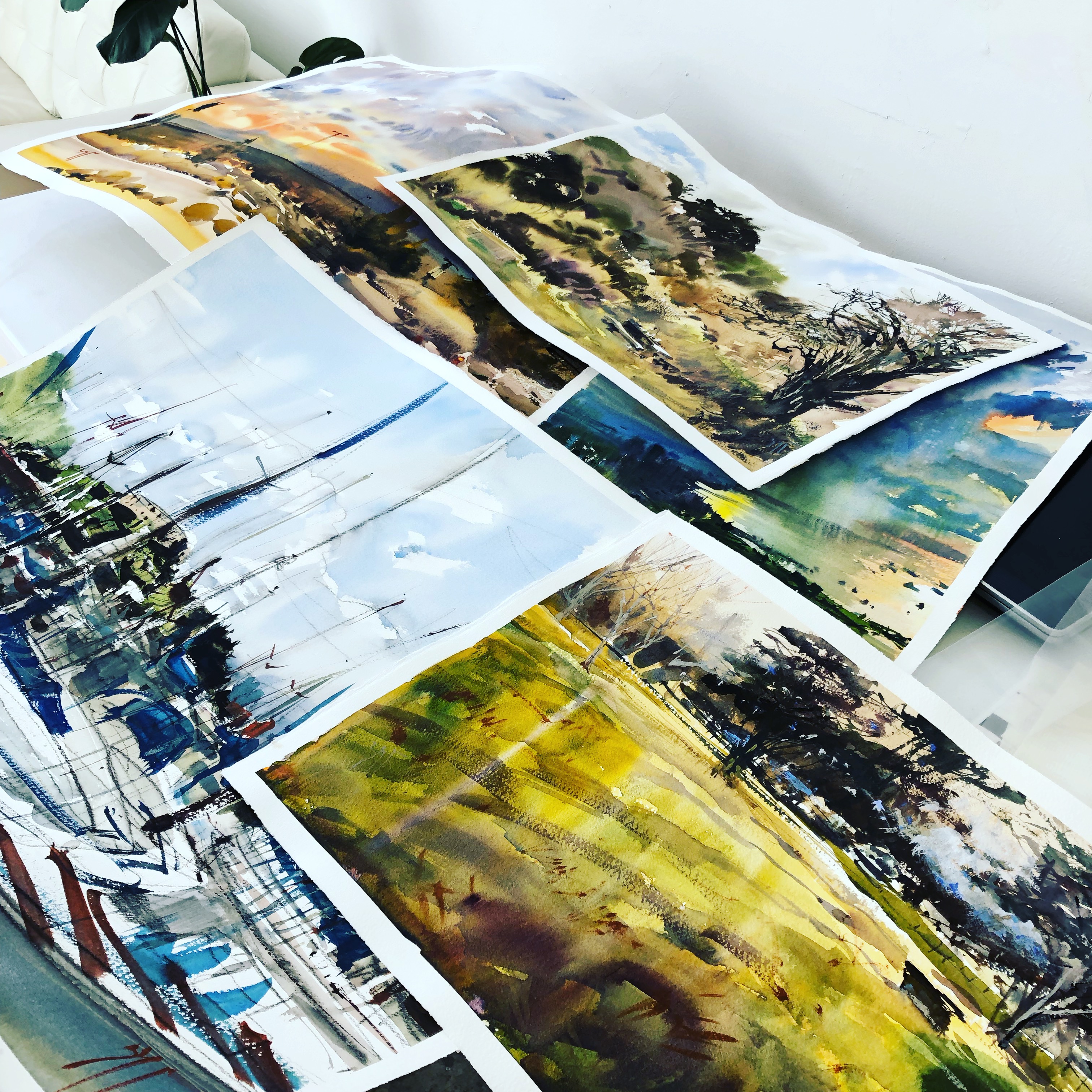
#30x30DirectWatercolor 2019 : The Apocalypse Variations

Day Zero: My Goals for #30x30DirectWatercolor2019
I’ve been thinking about my goals for #30×30.
If any of you guys are participating this year – maybe you are also planning right now?
It’s an interesting working model – a 30 day marathon. A self-contained chunk of time. Significantly longer than a week-long sprint (for instance #OneWeek100People). 30 days is long enough to complete something major, but short enough that you can pose yourself an interesting (risky?) problem. Maybe one that won’t have a solution. Or won’t become the mainstream of your art practice.
If you succeed – great. If you fail – ah well, not the end of the world. :)

To that end I’ve set myself some simple-but-ambitious goals for #30x30DirectWatercolor2019.
- Main Goal: Paint 30 watercolors in a new body of work, with a consistent theme/style. This is going to be the next logical step for me and Direct Watercolor. I’m working in the studio, as opposed to on location, working from invented compositions rather than life, and, working with larger brushes and pre-mixed paint, as opposed to my plien-air field kit.
- Bonus Goal: Extract two pieces to enter into our national competition (CSPWC) which happens to be due at the end of June.
- Double Bonus Goal: Produce a monograph about the project. Kind of a companion pice to the first Direct Watercolor book, but even less of an art-instruction and more of an art-art book.
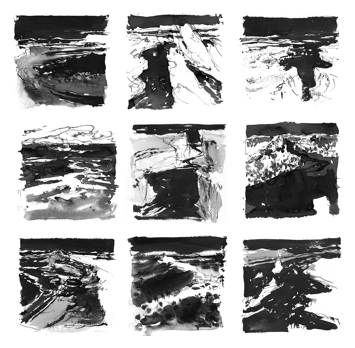
- Prep Work: (Already Complete!) This year I wanted to be ready *before* the first day with at least 30 preliminary sketches. (Final set is somewhere around 45). I chose to make monochrome studies – sometimes called Notan sketches. Though a true Notan is pure black and white (with no halftone) I’ve allowed the colors to smudge. I did these sketches digitally, (Procreate on iPad) in order to work rapidly, and with the ultimate in flexibility.

Ok! That’s my plan.
What about you guys – does anyone have a specific project this year?
It’s ok if not. “I just want to do 30 in 30” is totally fine :)
But if you *are* doing something structured please drop me a comment or email – it’ll be interesting to hear what people are up to. I would like to keep track of any interesting slash ambitious projects.
Our co-moderator Uma Kelkar has a very interesting project which she is calling VIVIFY. This is going to be a scientific study into the effects of music on painting. Do you listen to music? or paint in silence? I personally listen to podcasts when painting. A habit I picked up from my days as a digital illustrator. But – I’m participating in the study myself and I’ve been assigned to the silence group! It’ll be interesting to see how that feels.
If you want to find out more – or volunteer to join the study – check out her project notes.
Ok – see you next weekend for #30x30DirectWatercolor2019!
-m

-<>-

Good morning everyone! It’s the first day of #30x30DirectWatercolor2019!
Day One! #30x30DirectWatercolor2019: Re:Introducing Uma Kelkar
I wanted to start out easy with a mini interview with our co-organizer Uma Kelkar. (NOTE: All the paintings in this post are Uma’s work.). I’ve been getting to know her better during the ramp up to #30×30 – so I took the chance to ask her some pointed questions.
MARC:
This is the second year we will be doing 30×30 together. I know we both have big plans. (Find out more about Uma’s Project Vivify)
I want to ask you a few things that are on my mind. And I hope new readers can learn a bit about you.
I know you do both watercolor and iPad paintings. We both have worked in tech, and know the power of new media. So my first question: Why do you persist in making art ‘by hand’? (paper, pigment, and brush) – versus committing to making images ‘with technology’. (Software, photography).
UMA:
Art is primarily selfish and I enjoy pleasing myself with it. All self-pleasurable things build on themselves – and especially watercolor painting which is never the same as the day before.
It keeps giving the self-satisfaction – even self-consolation at times. My relationship with painting is almost sexual – when the brush touches the paper and I get the right value and smooth gradient with a brush, it’s akin to sexual pleasure.
MARC:
I certainly appreciated Uma’s answer :) but I asked her for some more about digital painting – because it’s on my mind this year, considering my own strategy for 30×30.

UMA:
“The brush touch is better than an iPad touch. The ‘feedback’ – the drag of the paper and the spring of the brush. In comparison, the iPad feels cold. The glass surface is too slick, to un-yielding”.
“There’s pleasure in controlling something that doesn’t want to be controlled.” (watercolor). Digital drawing takes away this risk and therefore makes it less thrilling. Also – it’s faster – 30 minutes of watercolor gets you so much more than 30 minutes of digital”.
(Ed. note; paraphrasing a chat) In fact, Uma says she tried to enjoy digital with every generation of the iPad, but it just wasn’t good enough until the introduction of the iPencil in 2017. It is only with the new pressure and tilt control that she finds the iPad to be a real tool for art.
MARC:
Assuming you are painting primarily ‘from life’ – (I see mostly “places” in your published work) why is this your subject matter of choice? Is it simply convenience, is it a question of skill-building, or is it driven by (your belief about) what other people like?
UMA:
“When we spoke this morning Marc, you hit the nail on its head calling art as a stand-in for virtual travel.
Painting rescued me when I was a new mother by being this intimate activity I could do just for me, where no one else’s opinion mattered but mine and the watercolor usually reacted to my emotions.
My older son was still young and I couldn’t travel. A full-time startup job and there were no more hours in the week to make trips. So, painting beautiful scenes was my escape. I’ve always wanted to live among trees (I am a complete wimp about rats/mice/bugs but I think I will overcome this fear). Trees calm me down.
Hiking is another family past time. Hiking and drawing is a way to make time for art. With a young family whose day time was precious, we could unwind in nature and I could get a quick painting in.
This is the story of why I became a ‘landscape’ painter primarily in the eyes of the viewer. For the record, I draw absolutely everything and my collection of bathroom sketches is extensive. Where do you think new moms draw? Bathrooms!
Anyhow, Silicon Valley lifestyle led to another skill: I spend about 2-3 hours daily in mind-numbing commute. Which means, if I see a good composition, I can actively see, note it to memory and then repeat the looking either next day or the next time I pass by the composition.
I recall this scene when I paint next. I front load my memory with the scenes I have seen and when I am back in the studio (yes, got a studio in 2018) I can put down the atmosphere I felt onto paper.
At least that’s what I’d like to think I can do.”

MARC:
Later in a chat, Uma said some more about how she balances work, life and art. She says it’s actually an advantage to have a busy life. That she would not make the art she does if it were not a conscious decision to make time every week.
Being a working mother forces her to be present and ready to create when it’s time. It sounds like a good solution to never having artist’s block.
Uma also talked about the importance of building a supportive circle around your art.
UMA:
“You need a supportive family – even the kids – they see you happy, so they want to make the time for you to work – that’s important. To make them part of your art practice”.
Uma says – and I think this is genius – she consciously trained her family, but at the same time they want her to succeed and make art, so it’s a positive, virtuous feedback loop.
I asked her if she ever resents her career and family – many female artists have been vocal about the sacrifices they had to make in order to be artists. Uma says this is not the case. It works for her, and it is not her ambition to be a full-time artist. The proper balance of art, a tech job, and family is exactly what she wants.
Very interesting answer! I don’t hear that often in artist interviews.

MARC:
Last question: Is it necessary for art to have narrative or conceptual content? (Story, Politics). Or is it sufficient that it be a physical/visual experience for the viewer? Is painting propaganda, or is it a message for the viewer? (or a roller coaster ride).
UMA:
”Art has to work for the creator. Eventually, as long as the artist does the job of sharing her/his work, the requisite audience pools around artists whose work they connect with.”
I think she slightly dodged my question – which was aimed at ‘what is the message behind your art’. But she said later in the chat that this isn’t really relevant or important for her.
Her work doesn’t have a pre-determined agenda because it’s a reflection of her experiences. She is producing art as part of her life. Her work is a projection of her feelings when she’s in a place. The world around her is reflected back in her paintings.
“This is a kind of ‘documentary’ or ‘journaling’ art practice that I think is the core of plein air painting or urban sketching or any of the various movements where the artist is going out into the world to see what they can find.
There is more ‘out there’ to inspire than back in the four walls of the studio”.
>>>>
So that was a fascinating discussion! It’s been great to learn more about what goes on inside the head of one of my favorite painters.
I can’t wait to see what Uma does with this year’s 30×30 painting marathon.

-<>-

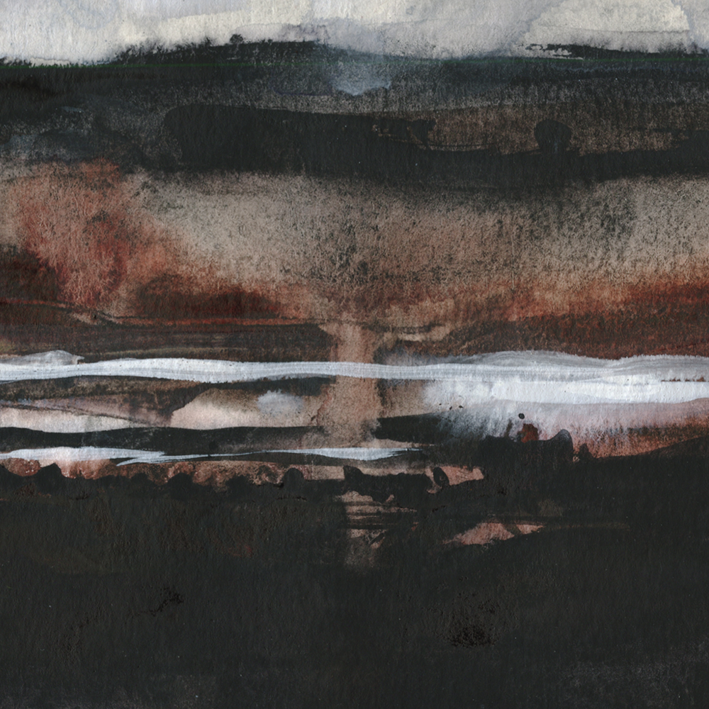
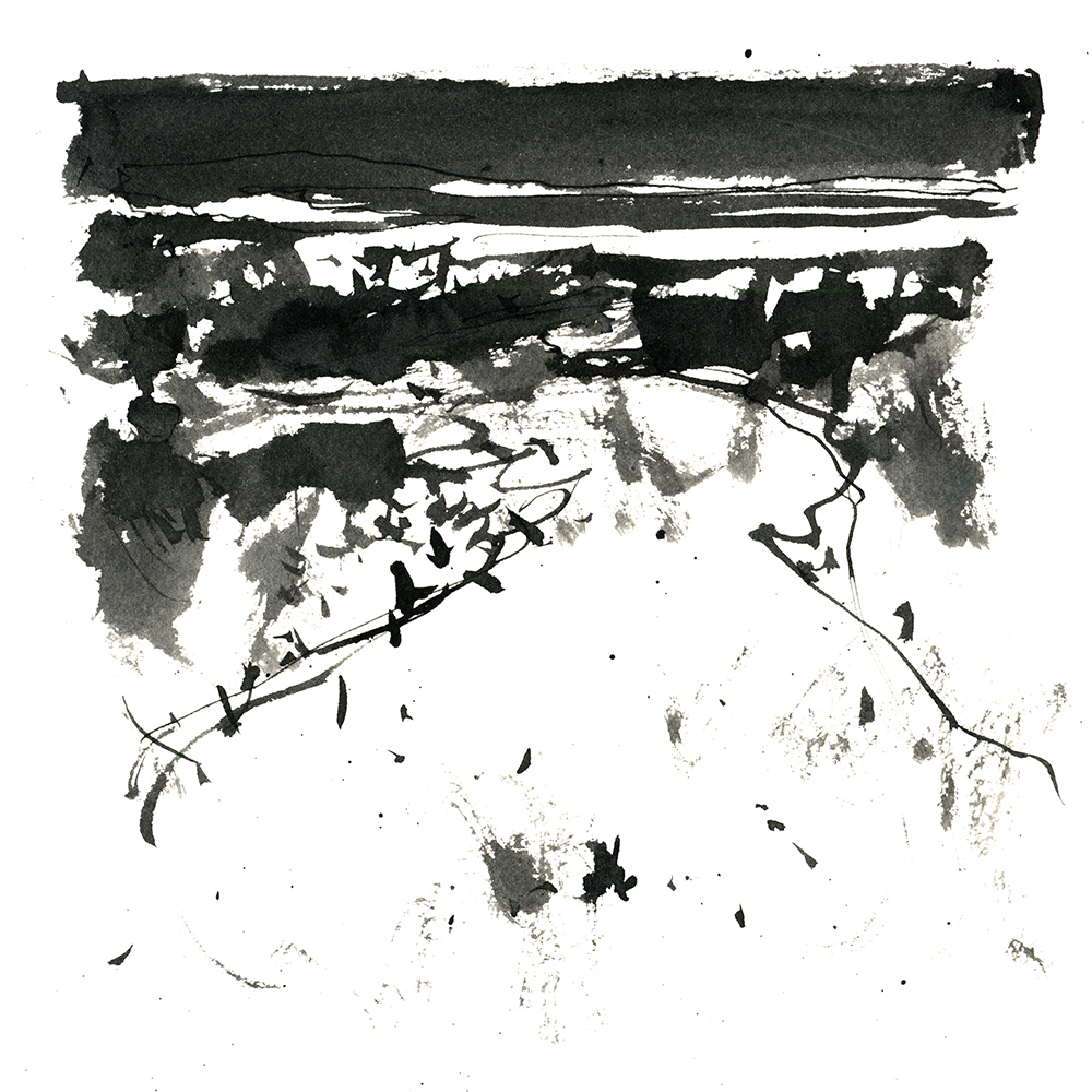
Day One : #30x30DirectWatercolor2019 : Stormy Skies
Ok! Here we go with thirty paintings in thirty days! Wish me luck and you’ll have that goodwill back in spades for your own painting marathon :)
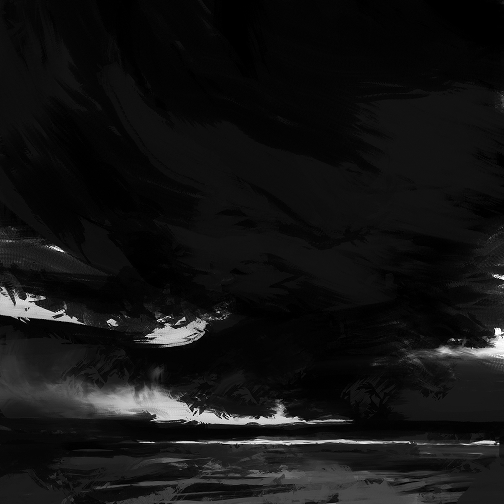
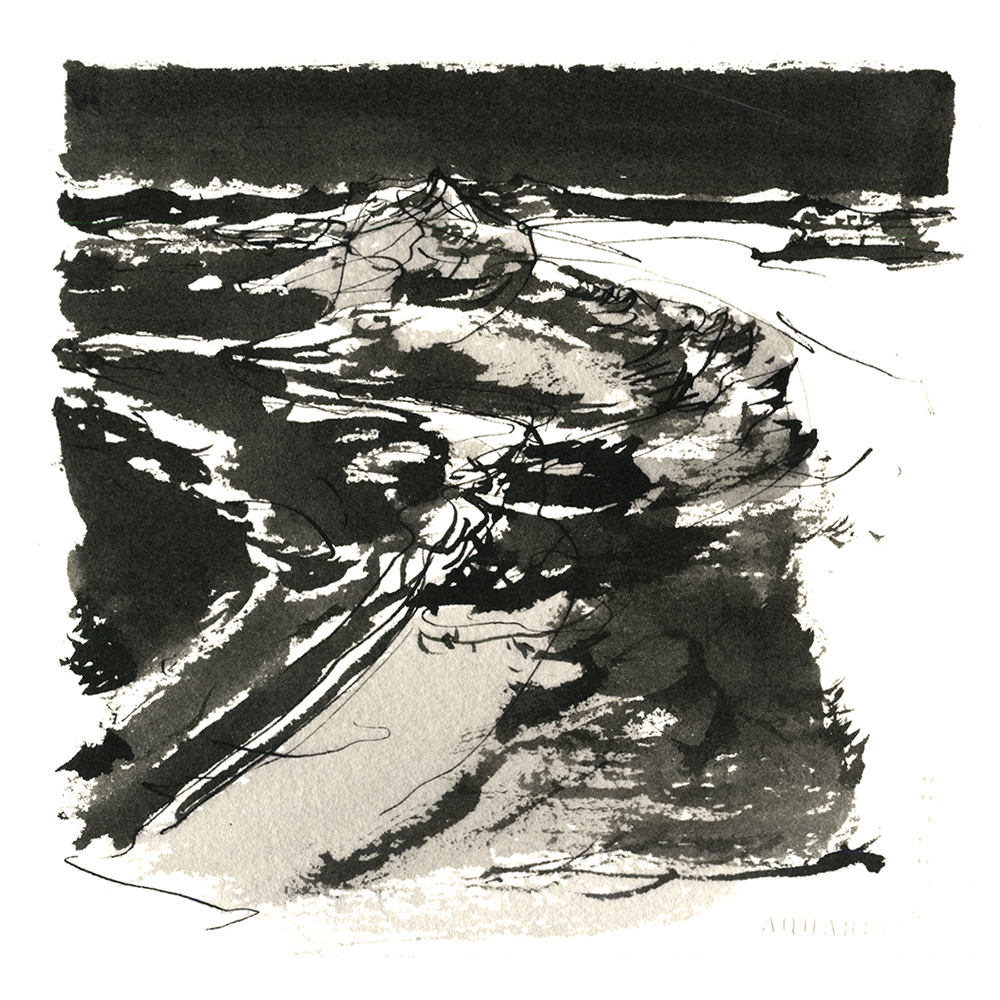
This was my very first sketch. It was the first idea for the entire series, containing everything all in one painting. The massive black shapes, the high contrast glints, in a way, this is the first drawing and the best one in the series.
At this point I’ve done 45 or so black and white digital sketches like this, and am just starting to translate them into watercolor. I’m very interested to see what actually happens. My hope is, I can take these black and white shape sketches and add color instinctively. With no plan when I start, just instinct.
It’s quite a gamble, to do the entire project based on this theory :)
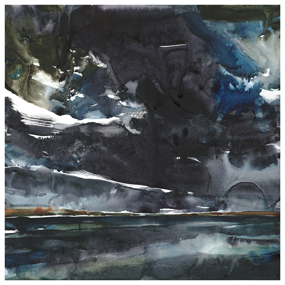
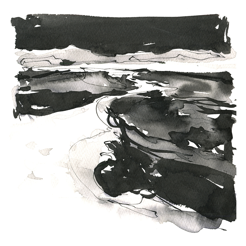
That’s probably why I did three versions of this right off the bat. All painted on the same day. These cloudscapes can go pretty quickly. There’s so little drawing to do, I can simply start filling the page with color.
Each one of these uses wet-on-dry painting. That is, starting with dry paper. I paint the sky all in one go, trying to preserve the whites as little gaps in my huge brush strokes.
I leave a little dry edge so it doesn’t bleed into the sea, and repeat the process – painting the lower half, all in one go.

The biggest difference is the use of granulating blacks in the second piece.
I’m using Lunar Black. A pigment from Daniel Smith. Here, I probably mixed it with Turquoise, which is giving a blue-tinted bleed.
Lunar Black in an incredibly granular pigment that just falls out of the washes in this pebbly effect. It’s hard to control if you want a specific effect, but I love it for what it does on its own.
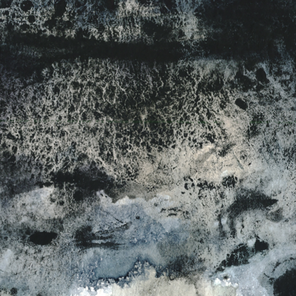
Now. This third one. I intend to show it like this.
It’s a perfect painting of a field of dirty snow. Something I know quite well from living in Alberta.
It is, of course, the third variation of the sky. But I happened to put it down on the table flipped, and found out by accident that I like it.
I don’t know what you think about flipping a painting and saying – “Oh yes, I meant to do that. This is perfect”. But A: I don’t care, I like it. And B: I don’t care, I like it. :)
I mean – it works! There’s kind of a weird psychological kink among *some painters*, where a thing has to be as hard as possible or it isn’t worth doing. If something came accidentally, then it’s not valid. Because you didn’t sweat for it. I think it’s tied to the idea that the number of hours something takes is how you measure its value.
I just don’t think art is measured per hour like plumbing or legal representation. Art has an inherent value. The mystic power of a painted image to create an imaginary world into which your mind can travel. This has nothing to do with whether “it happened by accident”, or, “it took me a hundred hours to paint it”. Because of course, an accident isn’t always an accident – it can be experience. The ability to see something and make a decision to accept it.
Besides. If I’d never told you, you’d never have known.
-<>-
Day Two : #30x30DirectWatercolor2019 : Digital Sketch Video
Some people have been interested in the digital sketching process – so – here’s a video export.
I used the app ProCreate on the IPad. One of its neat features is the ability to automatically make these replays of every brush stroke. If only it was this easy to record a watercolor!

[^ Just a screenshot ^]
Things to note:
Big brushes: I use the biggest brushes I can. Even bigger relative to the image size than with real-world media, because digital makes it possible. In real life, this would have to a 6” diameter Japanese calligraphy brush. And it would take a bucket of paint. This would be pretty messy and expensive (so much paint!).
Layer/Draw/Erase loop > A: Swipe and Erase: This is something I do all the time. It’s essential to my approach to digital painting.
- Use a new layer so I can lay a big swipe of color across the painting.
- Erase it back to the shape I really wanted. I just find this more accurate – and I get more interesting edges than if I tried to force the software to draw exactly the right shape in one stroke. Especially for something tiny like this ribbon of light onto horizon.
- I use the ‘Jagged Brush’ preset in ProCreate quite a bit – (it’s like a splayed mop) and I use the same brush on the eraser, so none of my digital mark-making has that ‘overly clean’ look of digital drawing.
- Stay away from the generic mono-weight digital pen stroke!

Swipe and Smudge:
- Make a new layer,
- Sketch in some lines, patterns of dots, or just draw a brush swipe,
- Smear the edge of that shape with the smudge tool (shaped like a finger).
- This is similar to the stroke-erasing method, but gives a different edge quality. It’s sort of how you expect blending to work in oils, but much cleaner. More perfect amount of blend. You can also adjust the size and pressure of the blend tool.
I should also say – I do not use an iPencil or other stylus. I prefer to just paint with my fingers. I can’t be bothered keeping the pen charged etc, and – you’re always doing things like [two-finger pinch and zoom] or [two-tap for undo], [three-tap for redo]. I find it annoying to put down and pick up the pen all the time. I just finger paint the whole thing and I have gesture controls – at my finger tips! <wooomp wahhhh – dad joke]
Anyway. I find digital painting terrific for studies. I’m not sure I’ve figured out using it for finished work yet. But one day! I keep hoping it will become a wonderful new art form. It has so much promise for ease-of-use and instant sharing.
Feel free to post any of your own digital art in the comments!
~m
-<>-

“You Can’t Step in it Twice”, 18×18″.
Day Three : #30x30DirectWatercolor2019 : You Can’t Step in a River Twice
I’ve been painting in oils for a year or so > Instagram Link < which has been the longest break I’ve taken from watercolor in – what – 15 years?
But getting back into water media was not a problem in the slightest. If anything, I feel better at it than when I left. Not sure how that works. Magically *any* kind of painting seems to make you better at *all* kinds of painting? That’s good news.
This sort of thing has actually happened to me before. One year, back in the days of art directing, I was managing a big project and didn’t draw for an entire year. Magically, when I got back to it, I was better than before. Weird hey? I was thinking about drawing the entire time. Maybe that’s enough.
Anyway – watercolor > OMG it’s SO FAST. It’s crazy how much faster you have to move compared to oils. I’m literally running for fresh water at times. Literally leaping across the studio to grab paper towels when a bad drip happens (That was just bad planning). Frantically adjusting the tilt of my clunky tripod.
Watercolor flows instantly. You can cover a whole painting in seconds. Nothing like the calm, steady, stroke-by-stroke buildup of oils. I’m paranoid about waiting too long for a touch, losing the wet window. Once the paper dries, it’s never the same. But at the same time, you can’t paint back into a wash too soon. If it’s soggy, you don’t get any interesting edges.
This might be what separates Direct Watercolorists from Oil Painters. It might be too stressful for some people :)
I always felt this is why Sargent switched to watercolor in later life. (Pet theory). For a person who liked alla-prima painting with big brushes – a watercolor wash is the biggest brush you’ll ever have.
Doing these thick, densely pigmented surfaces, I feel like I’m breaking the rules of watercolor. I’m using such rich paint, it ends up looking chalky in areas. But I don’t mind. I’ve always felt like pale, tentative watercolors were a plague on young artists. My mantra is “More Paint, Less Water’.
I should note: I keep two large jars of water, so always have a dirty and a fresh water. I don’t want to have an emergency and not have clean water. I always find a reasonable time to change it out, so I have that backup. If you need to lay clear water – to draw out pigment (edge-pulling, [as per this video], or to lift an overly aggressive mark – or if you switch from a dark sedimentary color to a clear bright color – you can’t use dirty grey water.
So – always keep one water clean! That’s why, in the field, I use three small Nalgene water jars instead of one big one. So I have two backups to try and make it through a sketch.

Ok, that’s it for today! Let me know how your marathon is going? Is it hard to get started? Or hard to get your everyday things done once you start painting? :)
~m
-<>-

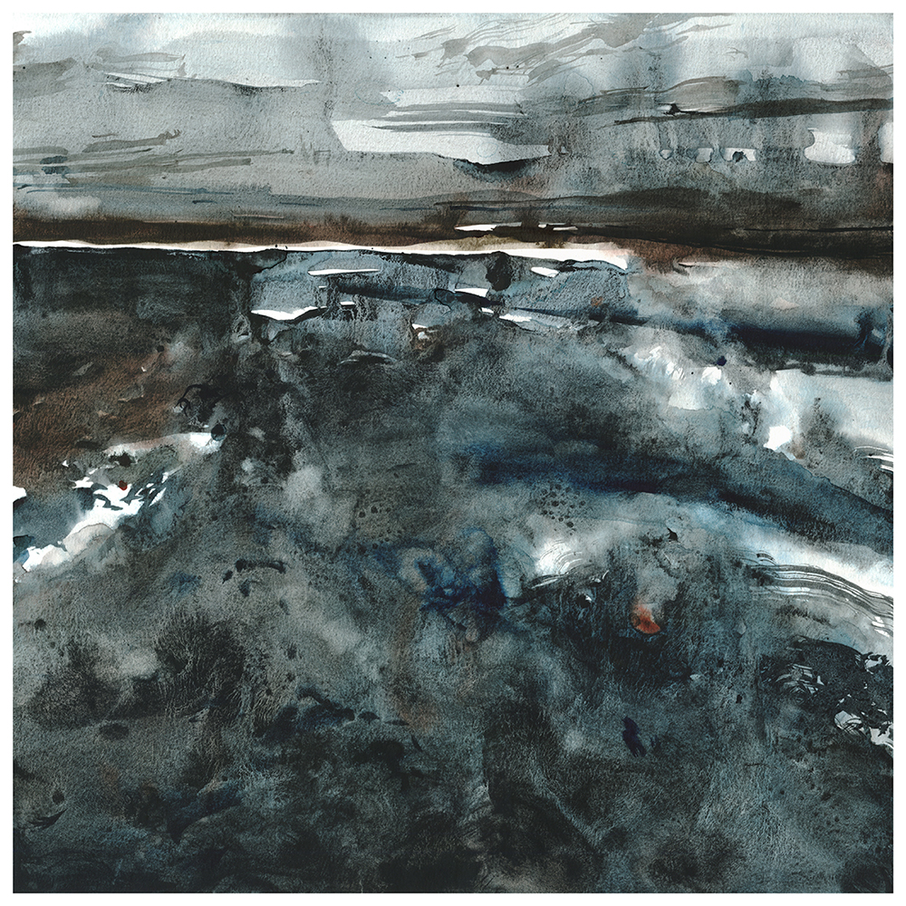
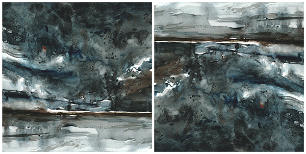
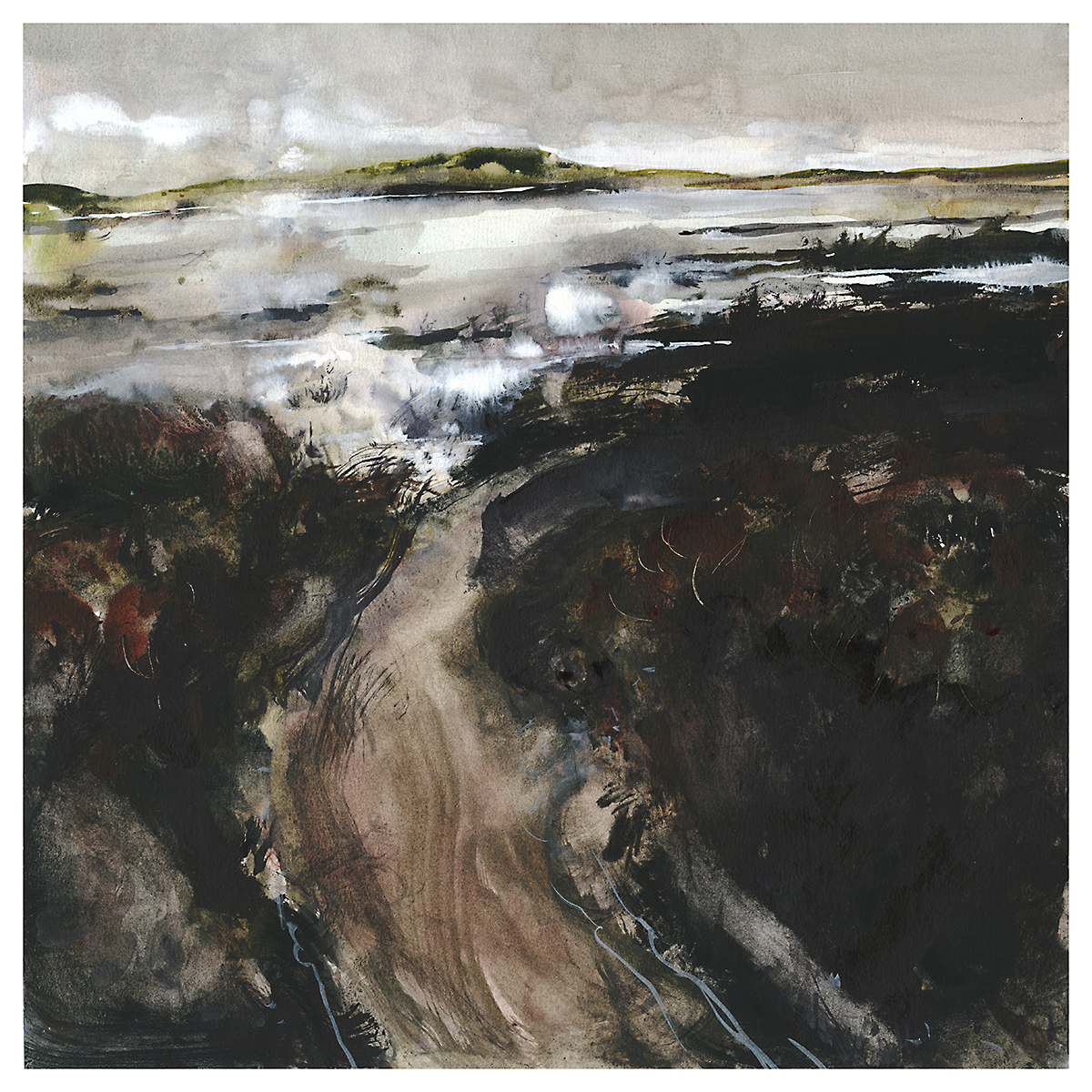
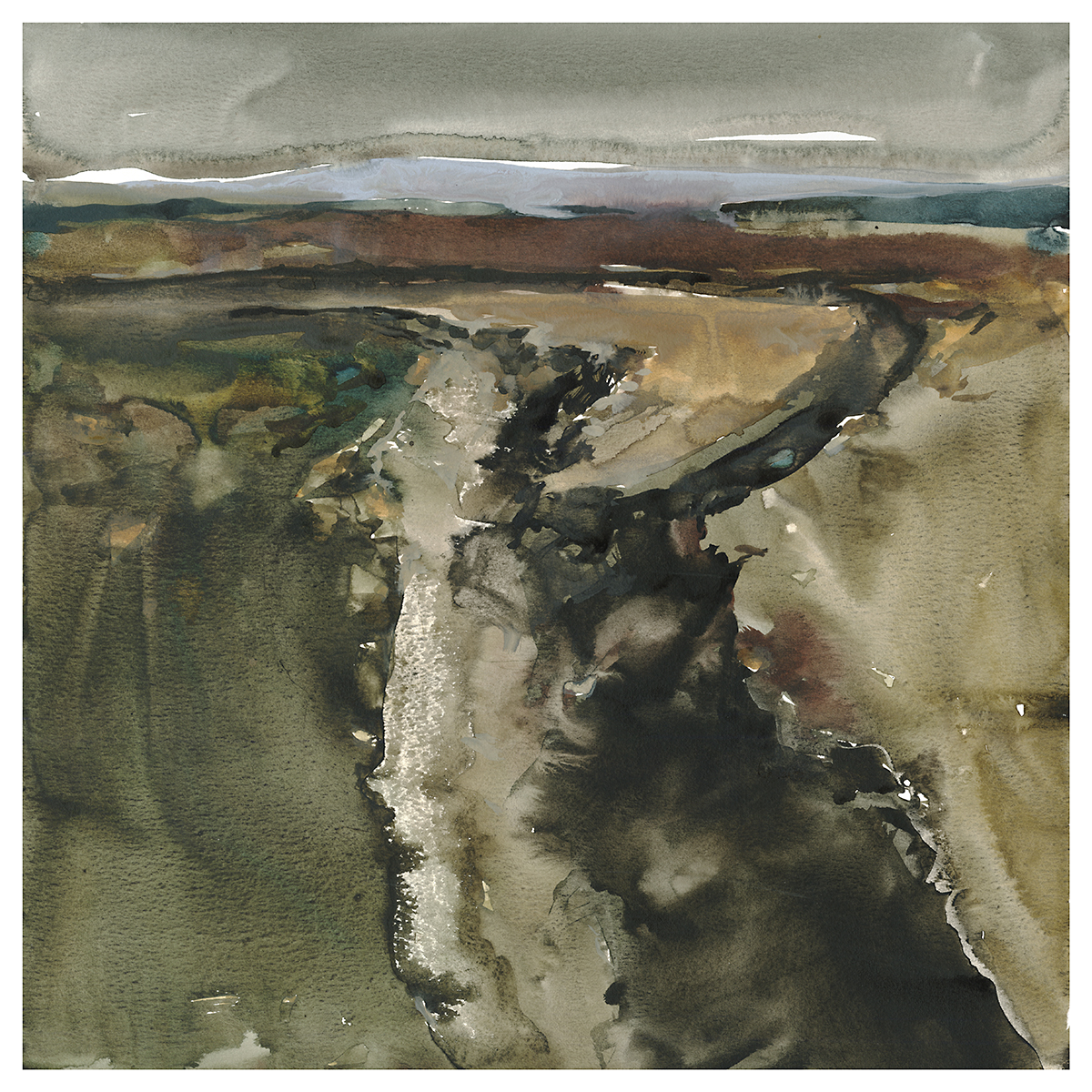
“The Divide”, 18×18″
Day Four : #30x30DirectWatercolor2019 : The Divide
I should talk about premixed paint.
These paintings are all 18” square. Not unusually large, but larger than I would normally paint in the field.
When I’m on location, of course, I only have a folding palette. I learned to paint with only the small mixing areas in the lid of the paint box. Often I pull paint right from the pan and mix it on the paper – not in the palette. As long as I’m painting smaller than half-sheet, this usually works. But – it does tend to push me towards smaller sizes. The amount of generous wet paint I have on hand is limited by the size of the paint box.

WELL, THAT HAS ALL CHANGED!
I started something new for these which is *Mixing Cups*!!! I’m using 30ml medicine cups. The ones for dispensing pills or liquid meds – I happened to have some sleeves of them handed down from the parents’ job at the hospital. I’m sure you can buy these online or at a pharmacy.
All I do is squeeze a dollop of paint and mix in the bottom of the cup. I used to talk about Tea/Milk/Honey – but now I am using what I call Wasabi Consistency.
You know the green horseradish paste you get with sushi? If you’ve ever mixed that – the idea is a dab of paste and one or two drops of soy sauce. (I use one or two spritz of water from my mini-atomizer bottle). Mix that tiny amount of water into the tube color (I use a needle pointed palette knife) and you get a nice gummy paste. Like a sludgy consistency. You do not want to just toss your wasabi blob into the soy (water) – or all you get is a diluted watery mess with floating flecks of un-mixed wasabi. Yuck. Don’t do that to your expensive sushi. You want a nice smooth paste. I’m sure there’s another cooking analogy here – but the idea is – the thickest possible gummy mix.
The Wasabi mix is too thick to actually paint with. (Except I do – in the dark black/brown here I actually do). But what I do is keep that sludge in the bottom of the cup, adding to it when necessary so I never run out. When I need paint, I take a brush loaded with the right amount of water, or the right amount of another pigment, and pull out a measure of wasabi, blending it on the side-walls of its own cup.
It’s a bit weird. But it’s like each cup is its own little palette. This does dilute and/or tint the paint in the bottom, but that stuff is so concentrated you can’t really lose your intended color.

If I need a volume of tea – for a sky or something – I just take a new cup and make a batch of thinned paint. Periodically I take all these little staining-dregs and pour them together, or just find a place to use them on the painting. I end up with quite a collection of these cups in play. Maybe 10-15 at the most. I do have a traditional paint box, but I only use the mixing areas occasionally. Mostly its straight from these cups onto the page.
This is not quite pouring – but it’s close. I can bring the cup right over the paper and add large amounts of paint incredibly quickly. So yes – this isn’t something I could do on location. There’d be nowhere to put all these little mixing cups.

Alrighty. That’s it for me. See you tomorrow? Hit me up in the comments with your early-marathon pieces!
~m
-<>-

Day Five : #30x30DirectWatercolor2019 : Melt Water
I have always thought oil paints were better suited to detail and realism. Because of their ability to correct themselves in so many ways. Now I suppose I would add digital art to that. If I wanted realism, I’d absolutely be working in 3D these days.
Watercolor, on the other hand, is naturally suited to seascapes, clouds, anything fluid and dynamic.

I’ve never been to the Antarctic sea. But I’m pretty sure this is what it looks like.


-<>-

Day Six : #30x30DirectWatercolor2019 : The Marathon Continues
This one isn’t my favorite. Though it does have some nice areas.
Each time, I look at the work before and see if I can push it a little bit. Eventually, I push something too far. I think this is maybe enough with the blacks.
I think I’m using Neutral Tint mixed with a Lamp Black. Can’t be sure what was in the mix, as, I have different blacks – but all the mixing cups look the same after a while :) Probably should have labeled them.
But you can’t read black marker on cups of black paint :)
This is the nature of a series of work right? Set some parameters and start producing work quickly – staying (mostly) within the guidelines, but testing out variations. Each time they will be versions of the theme. You won’t always like every single one.
Sometimes though, the ones you don’t like at first, end up being favorites later. Have you ever have that happen with an album? The song I always skip ends up being the only one I play a year later.
~m
-<>-

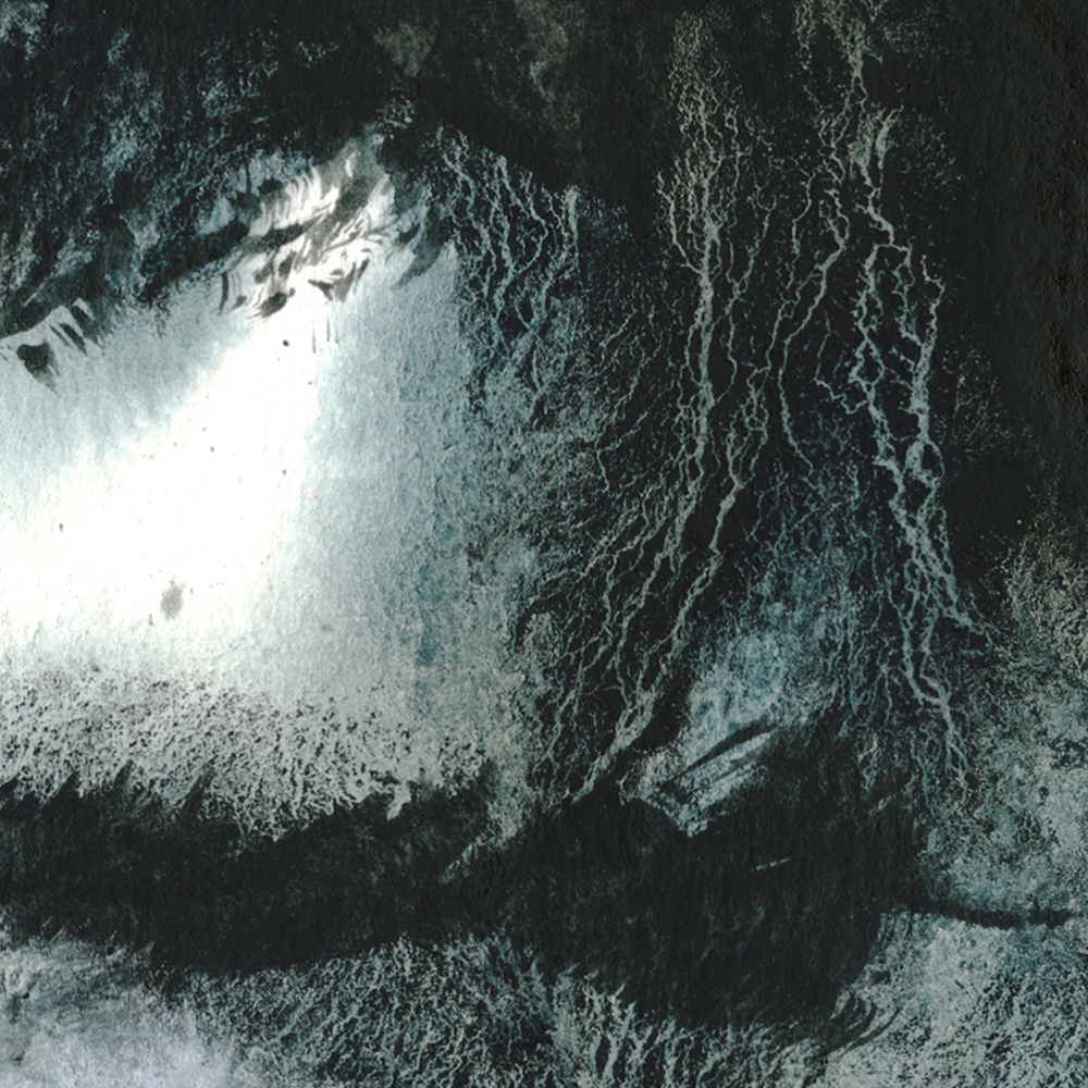
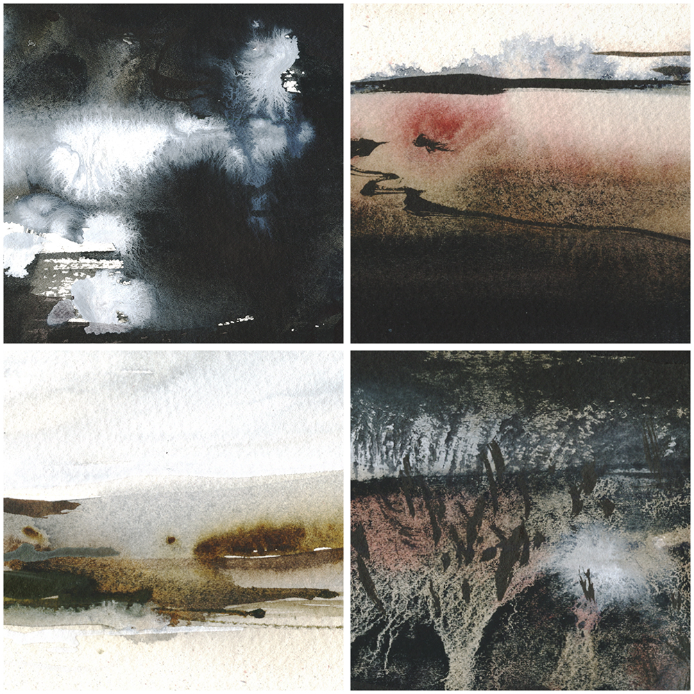
Day Seven : #30x30DirectWatercolor2019 : Headlands Heartlands
I have this idea that paintings are Psychic Teleporters.
Great paintings can send you a mental journey. Drawing you in and transporting you somewhere. It’s even more interesting when that place doesn’t really exist. You’re picked up and transported somewhere – even if it’s just into a mood the artist has set down.

I think this is a universal ability. To anyone born with sight. But it might be something you can get better at over time? Being a skilled viewer of paintings.
Being able to look at a painting and getting drawn in – even if that painting isn’t necessarily realistic. At first, we need completely realized paintings to be transported. But the more we look at art, the more we’re able to go into an imaginary place.

A while back we finally got around to hanging some paintings in our dining room. Now, every morning across the table, there are these portals to other places. I can spend a few minutes diving into each one.
Want to practice your high level teleporting? Here are some totally abstract places :)


-<>-

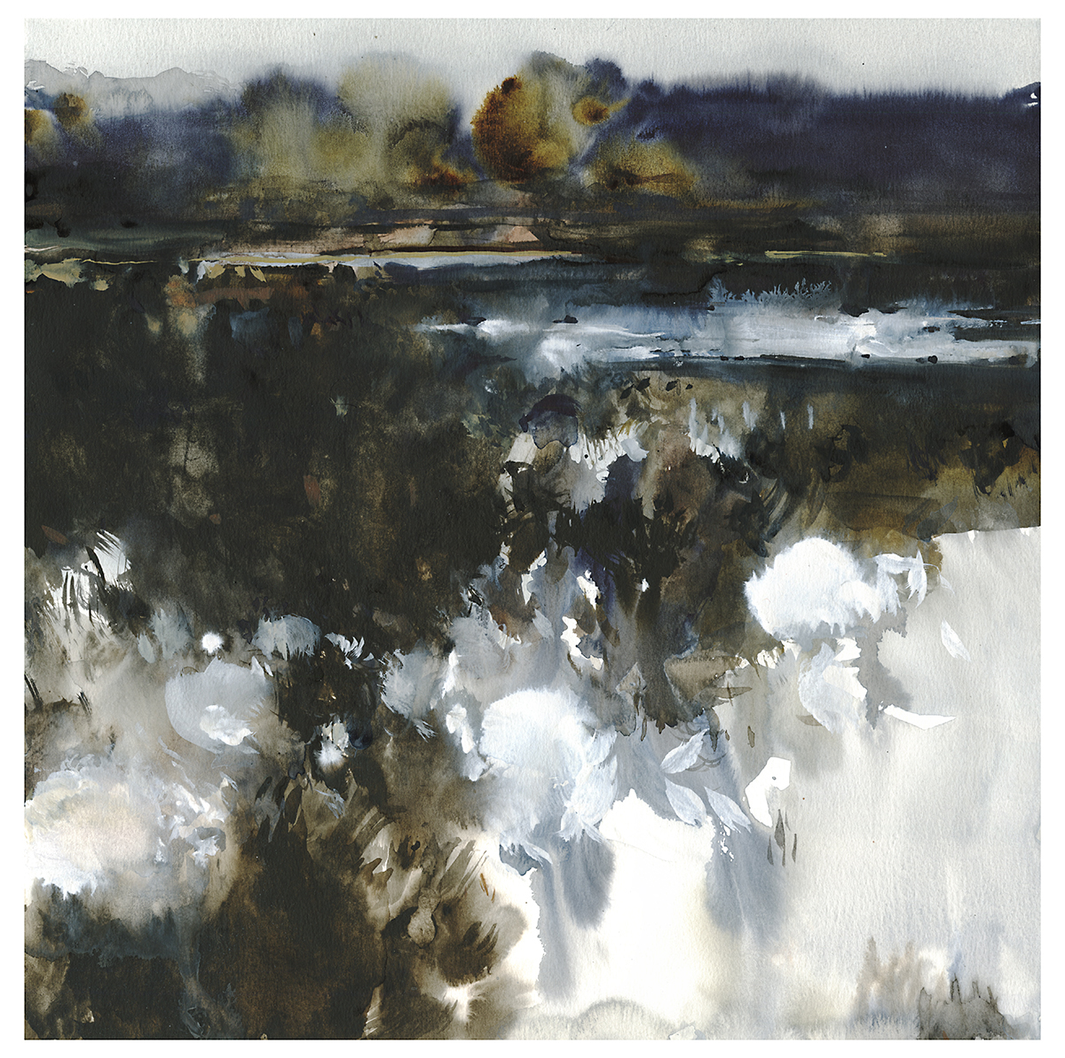
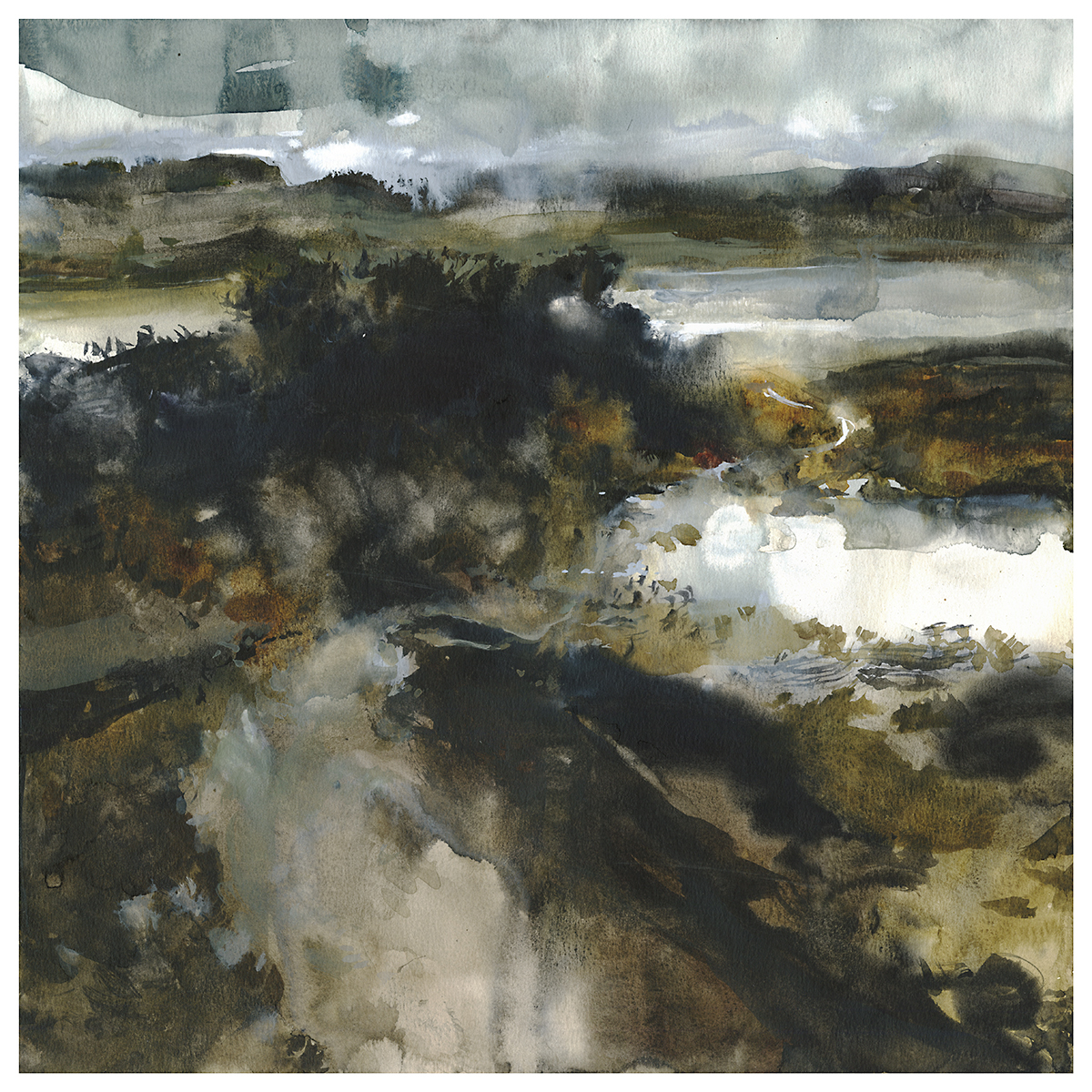
Day Eight : #30x30DirectWatercolor2019 : Two Million
OK, this is my favorite painting ever! (I’m always saying that. I think it’s best if that’s your attitude about every new painting). I love the amount of abstraction – but it’s also exactly what I wanted – a foggy, brooding rendition of a wetland marsh.

The sketch was from imagination, but, also fairly similar to a place I painted in real life – though you would never know it looking at the plien-air version. Doing the notan sketch, I was just free-forming it, and this dark, forbidding scene appeared out of the heavy values.

I liked this so much I did a second version.
I was researching bogs and peatlands after the fact, and I came across Bolshoye Vasyuganskoye – a region in Russia of some 2 million square kilometers containing 2 million lakes. I’ve never been up north in Quebec, but I have this feeling there are areas that look like this. Home to moose and waterbirds and a million wetland creatures.

I feel like I’m hitting my stride. This is a pattern for me with these painting marathons. It takes a few days for the best paintings to appear. I can expect, from past experience, that I’ll peak a bit after the mid-point. I’ll get tired, and things will decline toward the end. But right now, I feel 100% in the zone.

This is a new thing for me. Not a landscape, not an abstraction, but something in between.
There are a lot of things I love about painting in a marathon-series. Mostly, I feel the pace of the work is important. Painting very quickly – to meet self-imposed deadlines – and painting every day – it starts to push a little further each day. You have this desire to do something a little better than the day before. Soon enough you’re past your comfort zone. I don’t find myself settling for repetitive, safe compositions – because I’ve *just* done the last painting and I have to make this next one stand out. That’s a good kind of pressure on your work.

-<>-
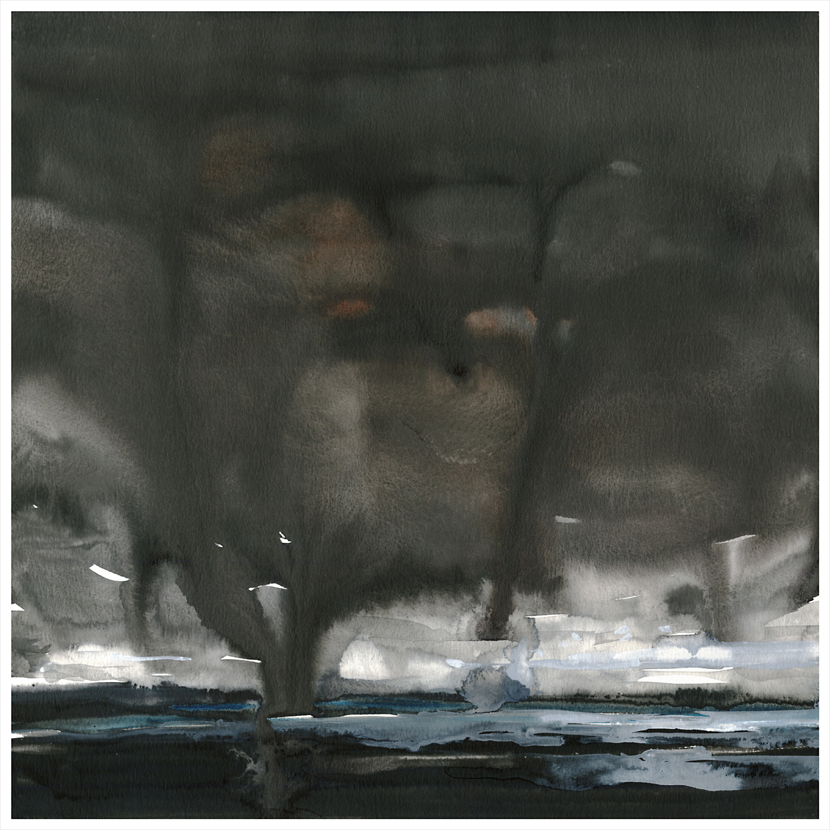
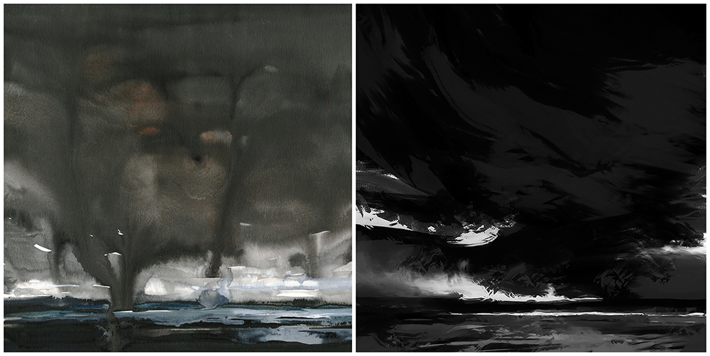
Day Nine : #30x30DirectWatercolor2019 : Apocalypse Now
I wonder if this one didn’t capture the mood of the sketch? Maybe…maybe not…still debating with myself.

In my mind, looking at the black and white, I was seeing a great green slow-moving river surrounded by jungle, something like the Amazon. Seen from the point of view of a boat drifting downstream. Made me think of Joseph Conrad’s Heart of Darkness. For me, first encountered as a teenager through the Coppola film Apocalypse Now.

I did a couple more tries, but – ultimately I think this one still has potential that I haven’t captured. Something about it isn’t black and glossy enough for this series.
No worries, there’s always other go.


-<>-
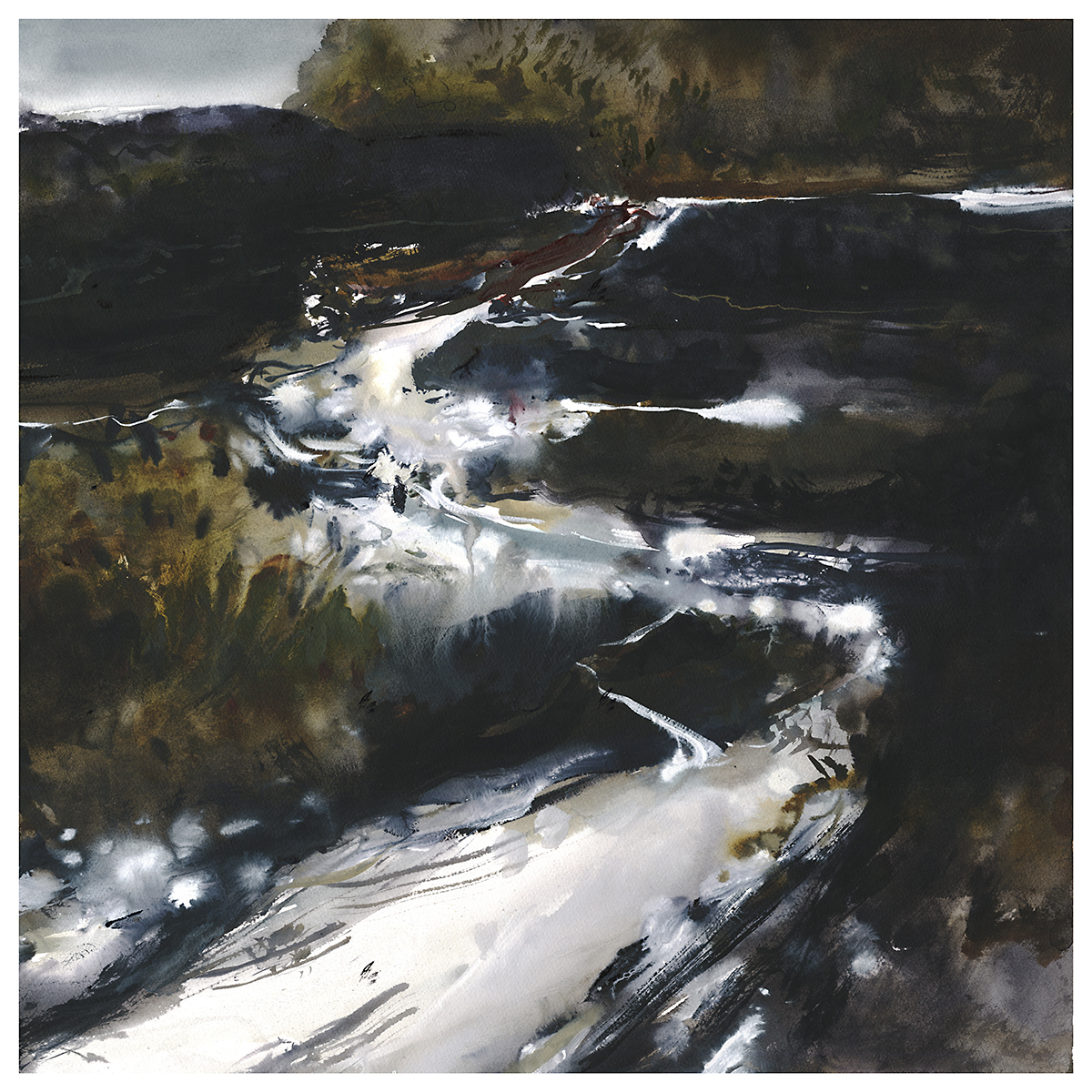
Day 10 : #30x30DirectWatercolor2019 : Wreckers’ Beach
I have this theory that landscape paintings are a kind of magic teleporter.
When I look at a great painting, I feel like I’m actually there – traveling into the picture plane.
I’m telling myself a little story about wandering down this path towards the seashore, early morning mist sparkling on the water. It’s cold out, and the land is back-lit, pushing everything into shadow. I can see the path wind out of sight, off the edge of the painting and into the dunes. There’s a little inlet here, with the sea out in the distance.
You can create a whole novel imaging yourself traveling through the image.

Perhaps, this was the goal of all the plein air painting I’ve done. To build up a mental library of scenery for future-me to draw upon. Except, I’m pretty sure I’ve never actually been to this place.
~m
-<>-
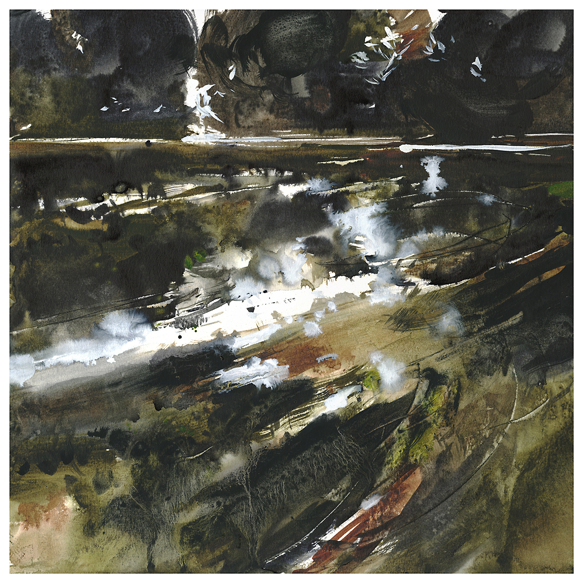
Day 11 : #30x30DirectWatercolor2019 : Wet-in-Wetlands
The sketch for this – just something that appeared – ended up feeling oddly specific to me. I think it’s a recasting of an oil painting I did last year. But its also a memory of a visit to the nearby Coopers Marsh. Though it doesn’t look anything like the work I did on location.
Of note to watercolorists: these paintings – the whole series – use a fair bit of white pigment. Both Titanium White, and a mix from Holbein called Grey of Grey – which is just a dirty white. I’m not even sure why they make it – but I find it attractive so I guess that’s why. A cool grey mix that explodes nicely when placed into wet. If you had to make it from black and white, I suppose you’d be hard pressed to get it as pale as it is.

I know many people don’t use white in their watercolor paintings. Our national watercolor society doesn’t even allow any significant use of opaque pigments in the competition entries. They used to have an arbitrary rule of only 10% opaque pigment allowed. Lately they’ve been saying, opaque pigment must not be a “significant portion of the work”.
Whatever that means.

But of course, the use of mixed whites is completely different than reserving paper. Mixed pigment can bloom and float, and it takes on the color of nearby wet areas. Reserved white will always be hard-edged and overly brilliant.

So, if it’s mist, weather effects, frost or seafoam – or returning white glints to a dark passage – I think watercolorists should reconsider the old-school mentality forbidding white. Just the same as banning black. Nothing should be off limits if it gives you the results you’re looking for.

-<>-
“The Falcon Cannot Hear the Falconer”
Day 12 : #30x30DirectWatercolor2019 : Seascapes

“The Blood-Dimmed Tide is Loosened”
-<>-
Day 13 : #30x30DirectWatercolor2019 : Shots From Above
I was looking at the work of Chris Dahl-Bredine. He’s a photographer, and the pilot of some kind of odd-looking ultralight aircraft. His Instagram is full of fantastic shots – similar to what we’re becoming used to from drones – but he gets himself up there and sees it first hand.
This one is inspired by one of Chris’ photos. (Unfortunately, I’ve lost the link to the actual shot, but his whole page is worth a look – or a follow!).
I’m not sure why I’ve deviated today from my process – painting from my own sketches.
I suppose the issue is – I’ve never seen this myself, and the moment I did, I wished I had!
My sketches all come from my memory. What else? So – if never seen it, how can I paint it? And if I have seen it, how can I not paint it?
Other people’s work is sometimes an important launching point.
These days, the practice of painting from photos goes somewhat against the grain. We’re told by the art-zeitgeist that every work should be entirely our own creation. As if that was possible. There’s rather too much concern about copyright violations if you ask me. (Which you didn’t). Not that I feel people shouldn’t own their own work, of course, I do. Entirely so, when it comes to commercial use. But I feel – on the other hand – that artists should be able to use anything they see as inspiration. Anything and everything. All of history, and certainly all of the ocean of images that we call the internet. To do otherwise is to ignore the culture we live in.
I wrote about the practicalities of copyright-and-painting at greater length over here.
But! This goes against the grains of my goals for #30×30 – so – I’ll be back to working from my sketches tomorrow :)

-<>-
“I Need a Good Long Walk”, 18×18″ watercolor on paper
Day 14 : #30x30DirectWatercolor2019 : The Long Walk
Usually, I go back and forth about which I like better – the digital sketch or the watercolor. I think here, the watercolor is the better version.

Though…no…I can still go back and forth. The digital sketch looks like it’s pre-dawn. Where the watercolor is just an overcast day. I’ll have to try a version that’s a real effort at a nocturnal painting.
It’s all going to depend a bit on your monitor. And the lighting in your room. Things that look dark, but still visible, on an iPad can be pitch black on a PC monitor. Its a thing called ‘gamma’ – sort of a contrast setting in the different operating systems. IOS devices have a truly bright screen. And they’re often higher resolution than a laptop or this – my desktop.
That’s one thing about painting irl (in real life). You see, what you see. No wondering what the other person is viewing it on.
~m
-<>-
Day 15 : #30x30DirectWatercolor2019 : Hump Day
Day 15. The mid-point.
We’ve made it halfway. The early excitement is burning off. Now we’re reaching into our reserves.
Starting to get tired maybe? Projects that seemed fascinating at the beginning might be wearing thin?
The big gains that we were expecting might not be visible yet. Because it doesn’t work that way. The leaps in skill are going to happen after it’s all over. After your brain has had time to write new pathways etched by your practice.
You don’t get a big reward in the middle of the race.
Sorry.
This is when you will be most tempted to cheese out a few easy sketches. And if you have to – if you need a break, to get a second wind – then you have to. Take a few days off. Or paint some flowers. Or an empty seascape. Or some clouds. Something where there’s nothing to stress over.
Or spread out everything you’ve done so far and post a snapshot of that. It’s probably looking pretty good if you step back :)

-<>-
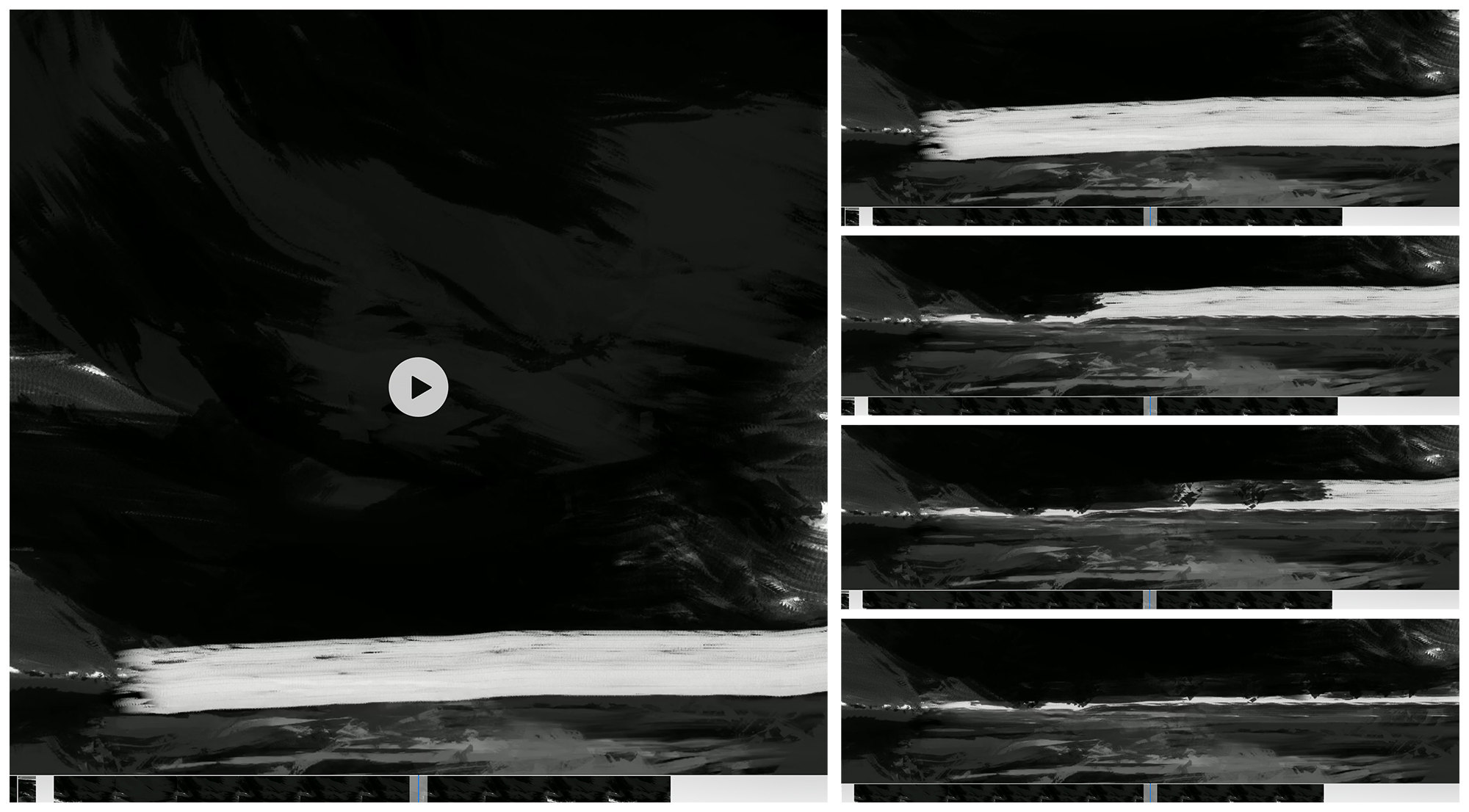
Day 16 : #30x30DirectWatercolor2019 : All the Water in the World is Connected
Here’s another video replay of the sketching process.
I find the sketching phase extremely important. Because I’m making the watercolor all-in-one-go, I really need a clear idea of where the lights and darks are before the brush touches paper. I’m not sure it would be possible to make watercolor entirely from nothing. You’d have to be fantastically lucky, or be drawing something you knew absolutely by heart.
Well, I suppose – similar to drawing directly in ink – you’d have to progress with tiny marks at first. Measuring out space, placing elements, and only then closing shapes. I guess – once you put your mind to it you can do anything.
But it’s much easier to just mess around in digital ink! You can push pixels until they’re in the right place.

-<>-
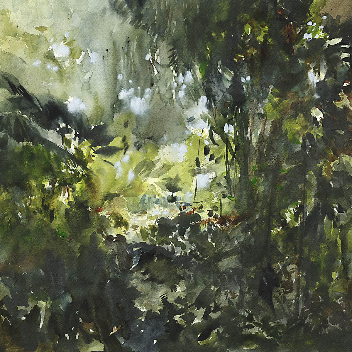
Day 17 : #30x30DirectWatercolor2019 : Epic Fail!
Any painting marathon is not complete without a public failure.
I really don’t know what I was thinking when I made this. What convinced me to try this image?
It’s absolutely wrong for this series. Completely missing the point of the other pieces. Completely lacking the long views to the horizon that draw you in. Completely the wrong color palette.
This wall of foliage might have some interesting shapes – but it does not compose into a view. It is not a landscape.
If a good landscape can transport you to a place – this composition is bouncing me off. Pushing me out of the picture plane.
So – despite the nice touches of brushwork here and there – this is a failed piece. It’s simply not what I’m looking for in this series.
I figure – if you’re going to fail – fail big! And this is an Epic Fail.


-<>-

“The Fifth Element isn’t Iron it’s Us”
Day 18 : #30x30DirectWatercolor2019 : The Chinese Elements

# Earth #

@ Air @

~ Water ~

& Fire &

“There Never Were More Than Four”
-<>-

“Black Ocean Event” 18×18″ watercolor on paper.
Day 20 : #30x30DirectWatercolor2019 : Black Ocean Event
I’ve been thinking about something I want to call “Emergent Subject Matter”.
I didn’t think this was possible, but this series is making me think – you can make a work of art without knowing what it means to you.
If you asked me last year, I’d have said – that’s ridiculous. That’s just someone who has nothing to say. Or they’re making it up. That’s pretentious.
But, this is how I feel today.
I sketched these sketches – the whole series of Notans – in an academic mode. Thinking about composition and formal concerns. Graphic design issues.
Now I’m painting these pieces in a flood of water and color. Building texture, making marks. Working in a flurry of activity, fully engaged in the process. Your conscious mind is full of painting technique. Your unconscious – it isn’t talking. You’re far too busy painting to be thinking deeply.
Practically speaking, the painting is soaking wet. The paper is cockled with water. Everything is dark and glossy, the colors are nothing like what they will be when it all dries down.
Later, after it’s complete, and you’re looking at it as an outside viewer – you can have a real reaction.
Just like you’re standing in a museum wondering – what was the artist thinking?
-<>-
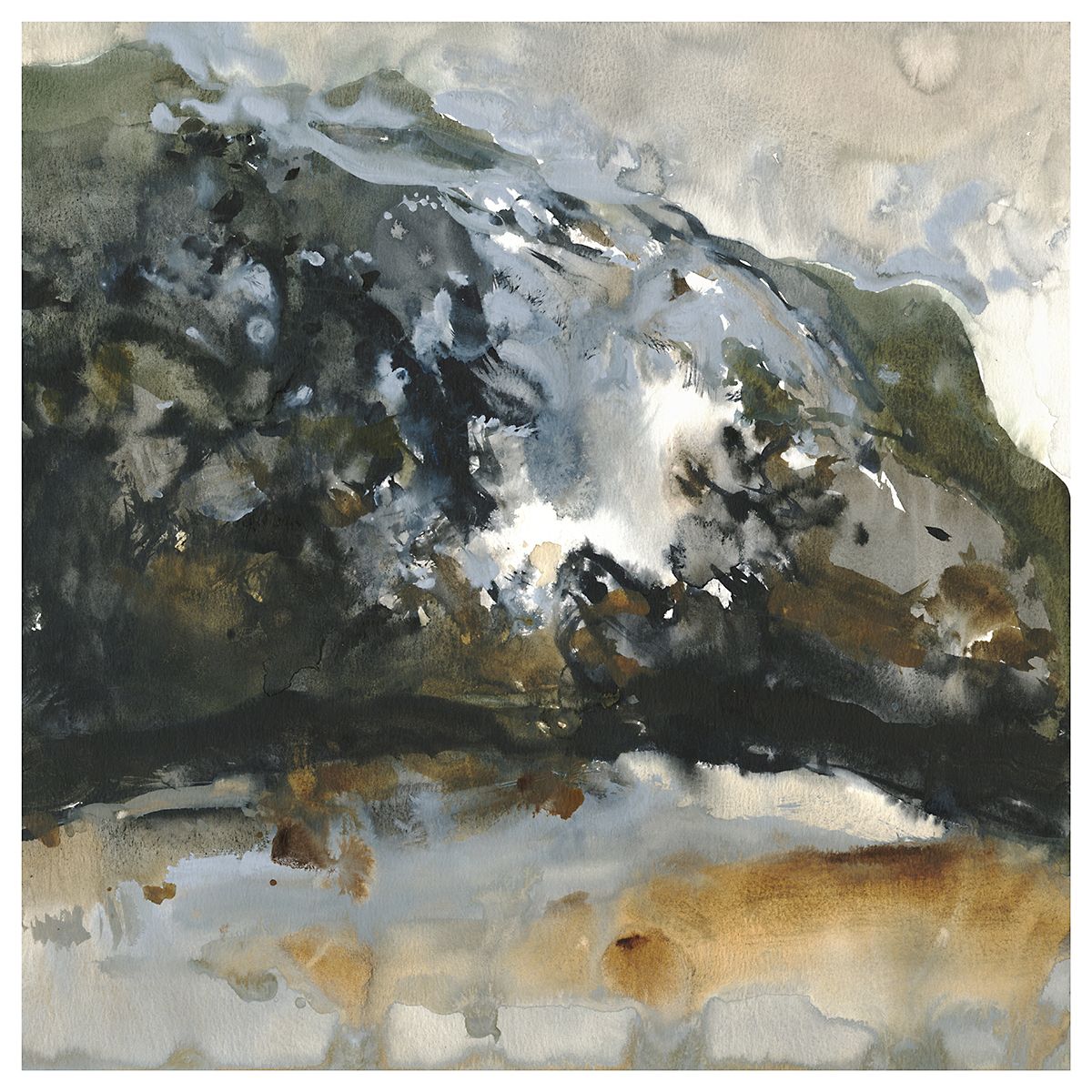
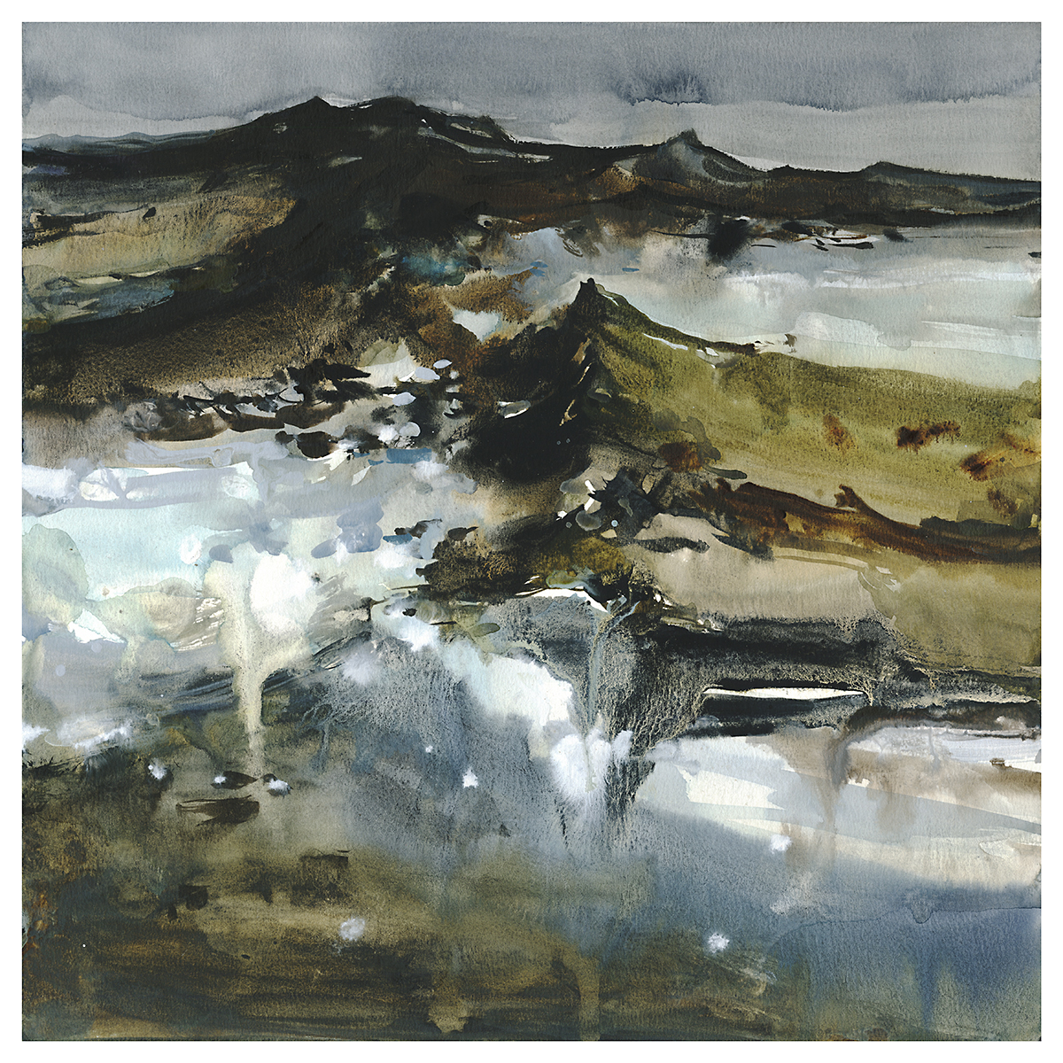
“Geologic Timescale”, 18×18″ watercolor on paper
Day 21 : #30x30DirectWatercolor2019 : The Mountain
To me, this one has potential for scaling up.
If you sit with it in your hands, it looks massive. This wall of rock.
I grew up in Alberta – though I didn’t appreciate the Rocky Mountains until I’d left. It’s an incredible feeling being up in those places, with towers of rock all around you. I regret that I didn’t get into rock climbing when I was younger. I don’t think it’s something I’ll get around to in this lifetime.

So yes – questions of scale.
This is one thing I have not defeated with watercolor. The ability to paint truly large paintings. This series is not large. They’re all 18″ paintings. For practical reasons of space and timing during this marathon.
But! I do plan to scale up some of these pieces later. The question will be if I do them in Oil or keep pushing Watercolors larger.
There are definite practical issues. Sourcing larger paper for one. You can’t just pop out and buy larger watercolor sheets. Ordering them is expensive if I have to get them outside Canada. And I expect half the time they’ll arrive damaged, considering the issues with shipping a huge flat fragile object. I suppose I’d have to look for larger rolls. But that would be an issue and a half dealing with that. Getting it off the roll un-damaged would probably require building a stand for the thing. And then dealing with the curl of the paper. And mounting a sheet on what? I’d be limited to 4×8′ plywood. I’d have to build some kind of work table. Aieee! See?
I suppose really, I could work in panels. Do it like Japanese screens.
I also have to wonder if the watercolor would perform at larger sizes. The distance color will creep is partially up to the length of the fibers in the paper. I’m not sure that this will simply scale up.
See – these are the things that push you towards Oil (or Acrylic) when you start thinking about truly large paintings. Because I would like to see this one six feet high!

-<>-
Day 22 : #30x30DirectWatercolor2019 : Hurricane Season
“Hurricane Season”, 18×18″ watercolor on paper
Here I am again, returning to my very first sketch.
Look how much you can get out of the same bit of inspiration. I felt like I hadn’t done a good enough job at the blackness – so I went back.

These drips are not *entirely* intentional. But on the other hand, I don’t mind either. I mean, they are intentional in the sense that I know they will happen – if I soak the paper and paint at an angle. I enjoy learning to live with what the water does.
The end result, I feel looks like a massive waterspout. I like it.
I left it. I could see many others not liking the results. But what are you going to do? You can’t have a personal vision without doing things some people won’t like.

The sky, by the way, is a huge wasabi-wash of Daniel Smith’s Graphite Grey. (Tinted with a few random things).
This is a color that isn’t much good for anything in the natural world. Maybe certain kinds of rocks. A stone beach if you could find one. I do believe I used it in my parking garage paintings last year. It does have a unique velvety texture that I haven’t seen in any other pigments I’ve tried.
-<>-
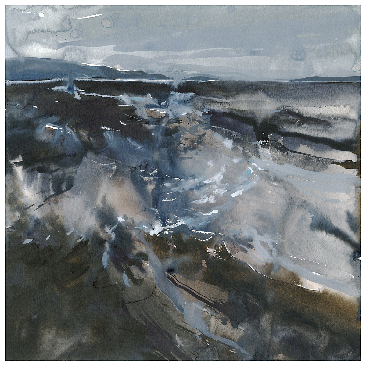
“Ten Thousand Foot View”
Day 23 : #30x30DirectWatercolor2019 : Ten Thousand Foot View

-<>-

Day 24 : #30x30DirectWatercolor2019 : Re-Inspiration
So, I’ve been fussing with something here in the past few days, which is that I’ve used up the inspirational value of my digital sketches. (For now).
I did – I think 45 sketches – to get me to 30 paintings. It was sort of a random number. I just sketched whatever was in my head and stopped naturally when the ideas started slowing down.
After you’ve been painting all the best ones – the ones that grabbed your eye – eventually, you’re down to the dregs. There really isn’t anything worth painting left!
So – I had to take a day off and sketch some new ideas.
Just for a break, I went back to the familiar – and painted in ink and wash with Chinese brushes.

Tomorrow, I’ll ‘re-boot’ with some of these new inspirations.

-<>-

“The Vanishing”, 18×18″ Watercolor on Paper
Day 25 : #30x30DirectWatercolor : Vanishing Lake
There are some experiences in life that stick with you. I frequently think back to our trip to the vanishing Salton Sea.
Of course, it doesn’t look like this at all. But I’m enjoying this exercise in sketching from imagination and memory and re-interpreting my own drawings.
-<>-
“Footfalls Throw Dust”, 18×18″ watercolor on paper
Day 26 : #30x30DirectWatercolor2019 : Walk the Desert
-<>-

“Castle Bravo”, 18×18″ watercolor on paper

Day 27 : #30x30DirectWatercolor2019 : Castle Bravo
The detail of waves above is painted with Holbein watercolor Grey-of-Grey over a damp wash of Neutral Tint and Indigo. An example of how watercolorists might benefit from more opaque painting techniques?
It’s interesting how things in life keep looping back. I am finally getting around to internalizing what I saw Sargent doing with body color at an exhibition in 2014.
That’s playing the long game for you.

-<>-

“The Narrow Path”, 18×18″ watercolor on paper
Day 28 : #30x30DirectWatercolor2019 : The Narrow Path
Well – I do believe I quietly crossed the finish line a while ago. If I look back, this is painting number 34 of 30 – if I’m counting right?
It’s been a tremendous experience for me this year. Looking back at my primary goal – to produce a body of new work with a consistent feel, and new confidence with watercolor – I feel well satisfied.
I had a secondary goal of sending some of this work to the Canadian watercolor society. That’s in the judges’ hands as we speak. I’ll be able to report back soon if they are also fans of Direct Watercolor :)
I have one more bit of news, but I’ll push that off till tomorrow.
I hope all of you hit your thirty – or are expecting to make it in the next few days. Feel free to post your success stories in the comments! Let’s get the last few paintings out and take a well-deserved break!
~m
-<>-

Day 30 : #30x30DirectWatercolor2019 : Do Not Go Gently
I want to thank everyone who participated in this year’s #30x30DirectWatercolor2019 marathon.
I spend altogether too much time talking about myself on this blog.We’ve had over 3500 people this year in the facebook group.
There’s a lot to see from all different levels of artist, and every kind of subject matter.
It’s been a whirlwind of activity. Exciting to be around everyone making great art. Keeps the blood flowing, and has kept me painting.
We (myself and Uma) will leave that facebook group open in the break, but we won’t be checking it much – until next June.
Feel free to continue to talk amongst yourselves.
Now that we have this critical mass of members, I expect there will always be some activity in there. People have been joining even up to the very last day.
Again > Tremendous thanks to everyone who participated! And I will keep in touch through these pages at CitizenSketcher.
~marc

“Do Not Go Gentle Into That Good Night”
-<>-

