Past Their Prime

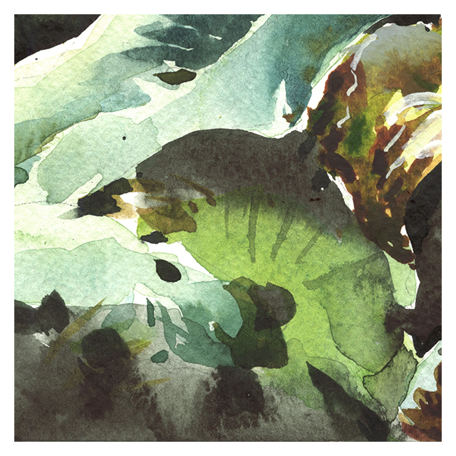
[ Past Prime, Sacred Lotus in Autumn, 10×14″, Watercolor – SOLD! ]
These are Indian or Sacred Lotus plants, seen in October last year, with the flowers long gone and the giant leaves turning into curled brown rags.
Even without the iconic pink blooms we usually see, they’re beautiful in the right light.
I’m a huge fan of green on green paintings. I had read that the human eye sees more shades of green than any other color. I don’t know if that’s just the physics of light, or because our eyes evolved in a plant-filled natural environment? Either way, I love a warm green-gold color palette.

Like the sketch of Thomas Hardy’s cottage from a few days back, this was an exercise in carefully tinting my favorite Daniel Smith Green Gold in various different directions.
I pushed a puddle of Green Gold into the sunlight with Nickel Titanate Yellow, or the shadow with M.Graham’s Turquoise, and aged the leaves with sedimentary DS Olive Green, and my off-whites (Buff Titanium and/or Holbein Grey of Grey), and in the brown areas, DS Goethite (Brown Madder), DS Quinacridone Gold Deep, and M. Graham Transparent Red Iron Oxide.

People say – always mix your greens – meaning making greens from yellow and blue.
But I disagree. I just start with green! and only nudge it a little.
And I try to mix as little as possible – that leads to watery paint. I place rich pigments side by side – so the colors mix on the paper.
I’ve arrived by experiment at the colors that look good to my eye – and I pretty much stick with them. Everyone needs to tinker with their palette and come to their own conclusions. But I prefer staying away from the more chromatic mixing primaries – often you see recommendations for Cadmium Yellow and Phtalo Blue – and instead staying in a warm, neutralized color-space. I find it makes the paintings much more restful.
Ok, take care, stay home and paint, and talk to you soon!
~marc


Ooo DS retired Quin Gold and all the blues!
My mistake, the Turqouise I use is M.Graham. But Re: DS Quin Gold Deep being discontinued yes! It’s (was) a nice bright-er, clear-er version of Burnt Sienna – so I suppose worst-case I can go back to that – but it’s also pretty close to Transparent Iron Oxide Red (though not as dark). I suppose there will be some alternative appear:) We must adapt! But I still have a few tubes of it for now :)
Good to see your posts on watercolor. Loved your oils, but missed you doing WC.
Hi Marc – Thank you so much! Impressive but at the same time, restful, palette. Totally agree, I love a warm palette, too. Stay safe and healthy!
Hety Skyler
On Sat, Apr 18, 2020 at 3:11 PM Citizen Sketcher wrote:
> Marc Taro Holmes posted: ” These are Indian or Sacred Lotus plants, seen > in October last year, with the flowers long gone and the giant leaves > turning into curled brown rags. Even without the iconic pink blooms we > usually see, they’re beautiful in the right light. I’m a h” >
Thank you for your great postings. I particularly love this one. For years I only mixed greens from yellow and blue, mostly cad yellow light and cobalt blue or pthalo blue and then maybe mixed violet into them to gray them down. Recently I discovered Daniel Smith Green Gold and Perylene Green and love them. Mixing Perylene green and Indigo blue makes a beautiful dark green! I will try the greens you recommend. Thanks for sharing your beautiful artwork and ideas!
Janette Rozene
janetterozenefineart.com
I also enjoy your posts on watercolour, and today’s post on greens was very informative! And restful! Thank you.
Marc, this is such a beautiful piece–finding so much to see in the fading plants. Thanks for all the info on color–lovely. Best to you and stay healthy.
I just read the text….too complicated. Of course,….I seem to be skimming a lot of text all over the place. And probably quickly deleting emails I should explore more. Oh, well…..
Sent from my iPad
>
Yes….bit wasn’t so interested in today’s blog…
Sent from my iPad
>
Love your opinions on greens! I do it the same way. Not mix from yellow/blue every time but take 2-3 greens I like In the palette and only „adapt“ them if I want to.
I want to try out the mixing options of my palette though as an option.
Such a wonderful painting and informative text! Did you paint the background in step two?
Hey Moony – It was kind of 1:2:3 – 1: All the light colors in the leaves, 2: All the dark colors in the leaves, 3: Then all the background cut around. The beauty of a dark background, besides the contrast which I like, is that you can do any thing you want splashing around the lights, because you’re ‘cutting-in’ the dark around it. Fixing up the edge of all the leaf shapes. ~m
Oh, great! Thanks for the detailed description!
Always amazing to see your paintings, and I love the information about the color mixes and the colors you use to obtain your effects. Thank you so much, Marc!
You`’ve inspired me to go outside and paint close up of the flowers!
Love this. Not normally a fan of all green paintings…..(maybe because I live on the flanks of Mt. Hood in Oregon and am surrounded by it at all times) …..but this watercolor is perfect to my eyes. As a beginning watercolorist, to me it seems to embody the perfect balance of all the principles I have been attempting to learn. Thank you, Mark for sharing your knowledge and experience….and beautiful paintings.
Hi, Marc, I’m with you on the greens. Thanks for your pigment suggestions, I don’t use many of those. Debbie
>
Oh quite lovely!
>
Hi Marc,
I couldn’t find a Transparent Iron Oxide on DS paints when I looked on the Dick Blick website. I found Transparent Yellow and Red, though. Could the Red be substituted to get that color continuum? Thank you.
Hey Susan – my goodness that is my mistake – mine is M.Graham Transparent Red Iron Oxide – so I had the name AND the maker incorrect! I will go fix that now. Thanks.
No problem! Thanks so much for the info.
I was wondering if you would consider doing a virtual petite course in the near future? :-) You’re a born educator, in addition to the world-class artist skills.
Wow, don’t have to go outdoors to get my dose of sunshine with these paintings! Excellent capture of sunlit greens. Thank you!