
The Urban Sketchers symposium is always a highlight of my year. This past July we gathered in Manchester, UK for three days of watching demos, taking classes and sketching in the streets. You can just see Pete Scully in the back there, and I’m sitting next to Paul Heaston – and chatting with Stephanie Bower as we all show up for the day of teaching.
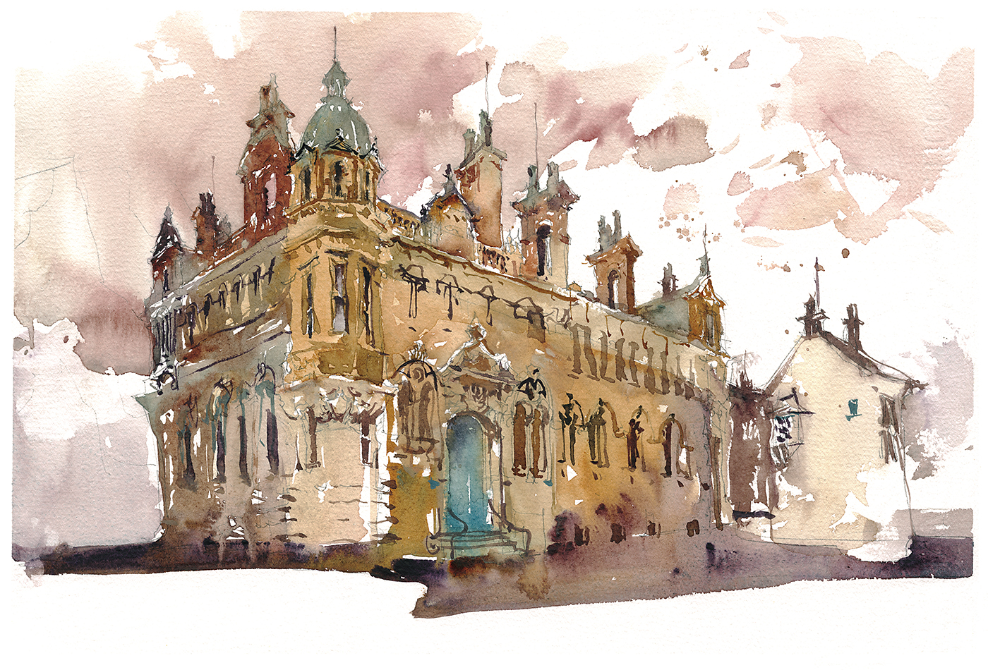
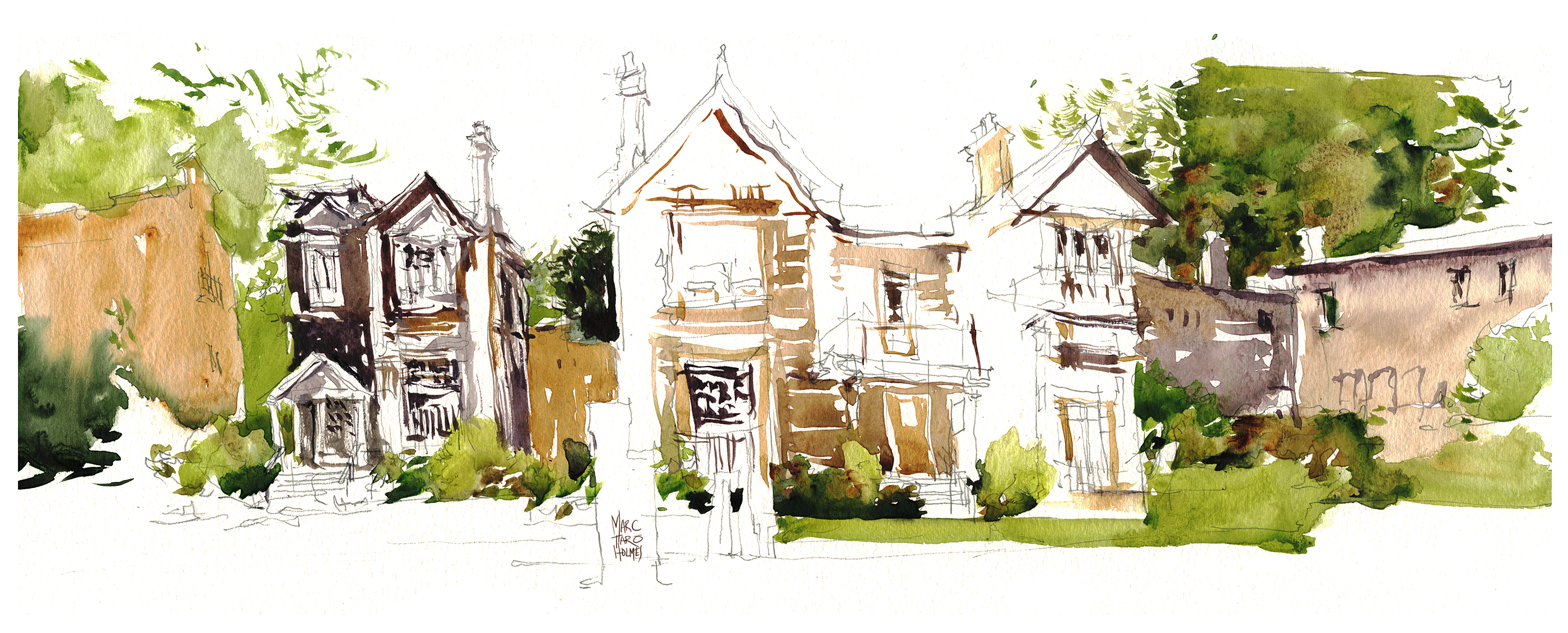
It was a shock to the system having just spent a week in Ireland (Tease: those paintings coming up soon!). The sudden change from rolling green hills to this magnificent brick architecture was challenging for sure.

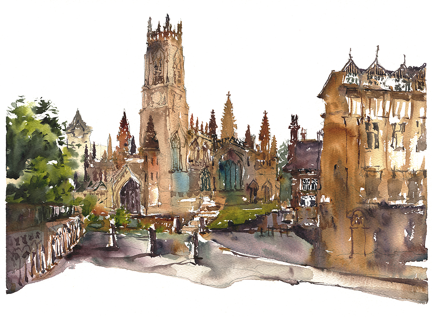
It took three or four of these quick sketches for me to feel like I was capturing the rich rust-red of the brick, and the big scale of the structures.
Recently I’ve been starting a painting directly on white paper – fusing stroke-into-stoke to create solid shapes. What I call “growing a wash“. But the deep tone of these brick buildings requires combining a strong silhouette underneath, and darker shadow-tones over top. The color would simply be too pale without two or three layers.
I pulled out my old strategy, Tea, Milk, Honey for these. I always say, the first color pass should be the Lightest Local Color (which will then show through gaps you leave in the shadow tone to follow). It’s just that sometimes the lightest color is fairly dark – especially with wet brick on an overcast day.


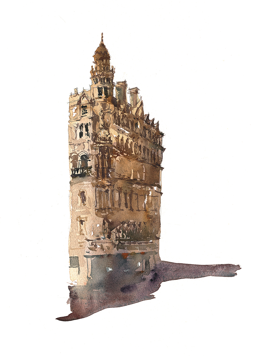
Can you see how these sketches are each a single wet shape, left to dry, then detailed over top with the darks of windows, doors and moldings?
Sometimes if I run out of time or get rained out (Hello Manchester!) I can finish those second layers later. As long as I get the color ‘concept’ on the spot, I can probably put the shadows on from memory. Especially if there’s a pencil drawing underneath. Though in these I was only drawing the simplest silhouette before diving in.


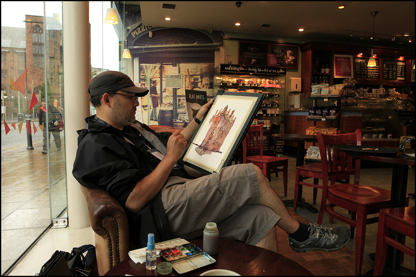
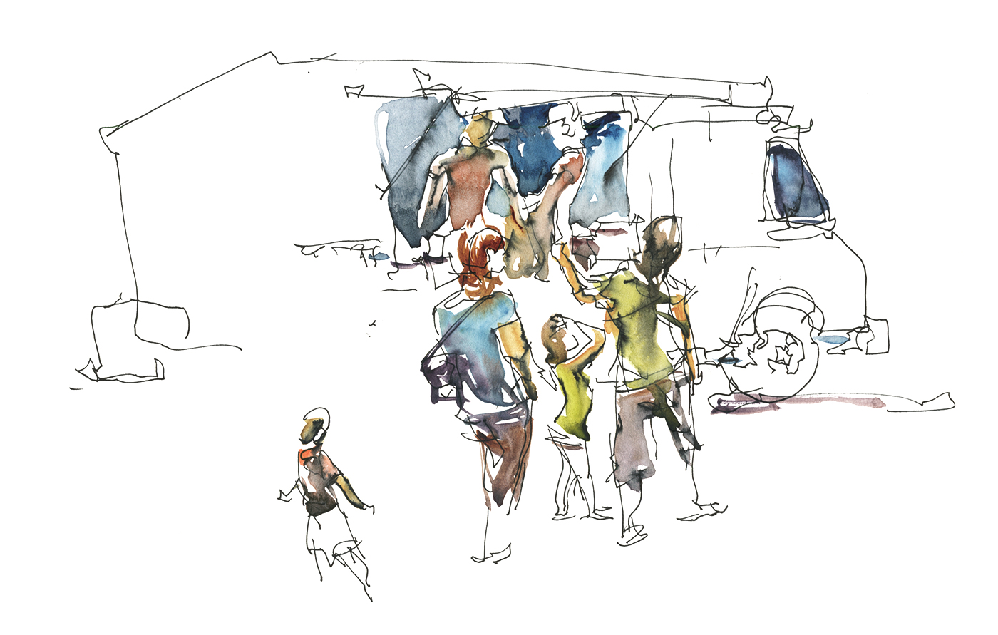
Because some of us are teaching all day, a few of the instructors like to do an early morning sketch.
Here’s some of us looking homeless and blocking the entrance to the Tescos. This was not a comfortable spot. Heavy foot traffic of people desperate for morning coffee, and full-on road work to our immediate right. But that does mean you can use the construction barriers as a temporary easel. I’ll often look for something like this. A trash bin also works well – and keeps you out of the flow of pedestrian traffic at the same time.
These morning sessions might be the only time some of us manage to draw together at the event. I always learn a lot from this time. It’s great to be able to watch the others work. But as well, we have to work fast! And the pressure is on. To do a painting between breakfast and the first workshop – and to not embarrass yourself next to your fellow teachers :) What a great training ground. Especially doing this three or four days in a row. Something I *should* do at home, but rarely find the time. By the very last day you’re fully tuned up.
That’s both the fun, and the curse of travel sketching. The whole trip comes down to those last few sketches, when everything falls into place.


I freely admit my sketch (above) of the Knott Mill Station isn’t particularly accurate. But it’s one of my favorite. I would stand by the changes I made. Mostly removing clutter so you can see the arc of the train bridge and making a more interesting roof-line.
One thing I love about this painting is the fact my mechanical pencil jammed in the middle of the drawing. We only had so many minutes before Anne-Laure had to catch the train, so I had to just keep going! In the end, I like how there’s more accuracy on the station entrance, and a more expressive painting on the shops to the right. This follows along with my theory of ‘paint the best part first’. As long as you get the main subject down, it doesn’t matter if you lose control at the edges.
This one is also proof that the secret of expressive brushwork is: Tight Time Limits.
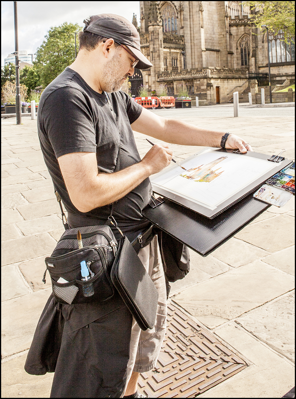
Here’s a better look at Anne-Laure’s painting kit, and my new bag, which I copied from what she showed me in Portugal.
All the cool kids are painting standing up these days.
I have adopted the idea of her art-bag. This an incredibly useful tip. She has a jar of water open in a small pocket on the front of the bag. Also, her brushes stick out of the open main body, ready to hand. Carrying an open water container in your bag like this keeps both hands free for board and brushes.
Here’s a video she made showing her bag of tricks.
My painting water is actually inside the bag sitting on the bottom. I just reach into the bag to wet my brush. It doesn’t spill as there are three 125ml bottles wedged in there. There are some pen pockets inside this particular bag that are perfect brush holders. Extra (rarely used) brushes go in that case caribiner’d on the strap. The small palette you see clipped on the boards, goes in the very bottom of this square bag and stays reasonably flat while walking around. It’s the perfect fit.
This bag is a Think Tank Speed Changer* that I’ve hung on a shoulder strap. (*affiliate link, mainly for product info, thank you for your support).
It’s just a cube with two pockets and some webbing on the front, where you see a bit of paper towel and my water misting spritzer.
I wouldn’t have bought this bag *just* for this – even though it’s the exact perfect wonderfullest size for this painting kit. It’s a bit pricey. But my wife already had it as part of a fancy-schmancy lens holding harness.
I ‘borrowed’ it permanently as she calls that rig her ‘please rob me suit‘ and doesn’t take it travelling.
The last day of painting, after the workshop was formally over, I was lucky to end up at the Manchester cathedral at the same time as the famous sketcher from Penang, Kiah Kiean. It was a real treat make a drawing side by side with one of my urban sketching heroes. Definitely check out his work!

So! That’s all from Manchester. Thanks so much to everyone who worked so hard on the USK symposium, and everyone who came out to support the event! Without you guys, I’d never have been introduced to the marvelous brickwork of Manchester.
~m
My Team Sketching Card Game from #USKManchester2016

If you head over to my free downloads page, I’ve just posted up the resource material for my team sketching card game, which was designed for my workshop at the recent international symposium, #USKManchester2016.
I know a traditional watercolor demo from me would have been a crowd-pleaser. But this year I wanted to present something that could *only* be accomplished at an event full of hard-core street sketchers :)
This project/game/drawing activity is designed for everyone to draw in their own style, with their own favorite materials. The underlying goal is about helping a group to work together. The deck supports a team of 10-15 artists (or more) making a complete catalog of a drawing location in a single afternoon.
It’s a scale model of how any sketching group can work as a team to document their city, or cover an event.

I think everyone involved in our Manchester sessions had a great time. And I hope some of you might be interested in downloading the workshop notes and giving this a try with your local sketching group.
Besides the core USK audience, I hope there are art teachers who might find this useful. I think it would be perfect for a high-school or college level class.
Feel free to pass round the files. And if anyone does try it out – send me some pics from the event! ~m

Liz Steel’s Sketching Now: Buildings

Just wanted to pass on the word that Liz Steel’s third online course on sketchbook drawing is opening for registration.
I always look forward to sketching with Liz at the international Urban Sketchers symposia. She’s a voracious sketcher, taking on any and all subjects. I’m sure you’ll feel her excitemtn and enthusiam for sketching in her videos.
Check out her SketchingNow site for more info on all three courses:
Just a great day painting :)

Sometimes there’s not much to say about a painting except, wow, I had a great time with this one.
Two months ago USK:MTL was out at the botanical garden for our monthly meetup. I ended up wandering off on my own and finding this pond with some slightly out of season water lilies.
It was incredibly nice painting weather. When it’s hot and dry with a nice breeze? Perfect for my kind of wet-on-dry watercolor. The paint get’s whiny if it’s humid. On a hot dry day you can easily work in layers. Less waiting around for paper to dry.

I feel like a dedicated painter would haul their gear out into the hinterlands and find some amazing vista. But sometimes you can just have a great day painting in a park at home. I was just having fun watching the fish, dragon flies and these cute turtles paddling around the pond.


Fingers crossed to get a few more of these days as we head into second summer!
~m
Chateau Ramezay Garden
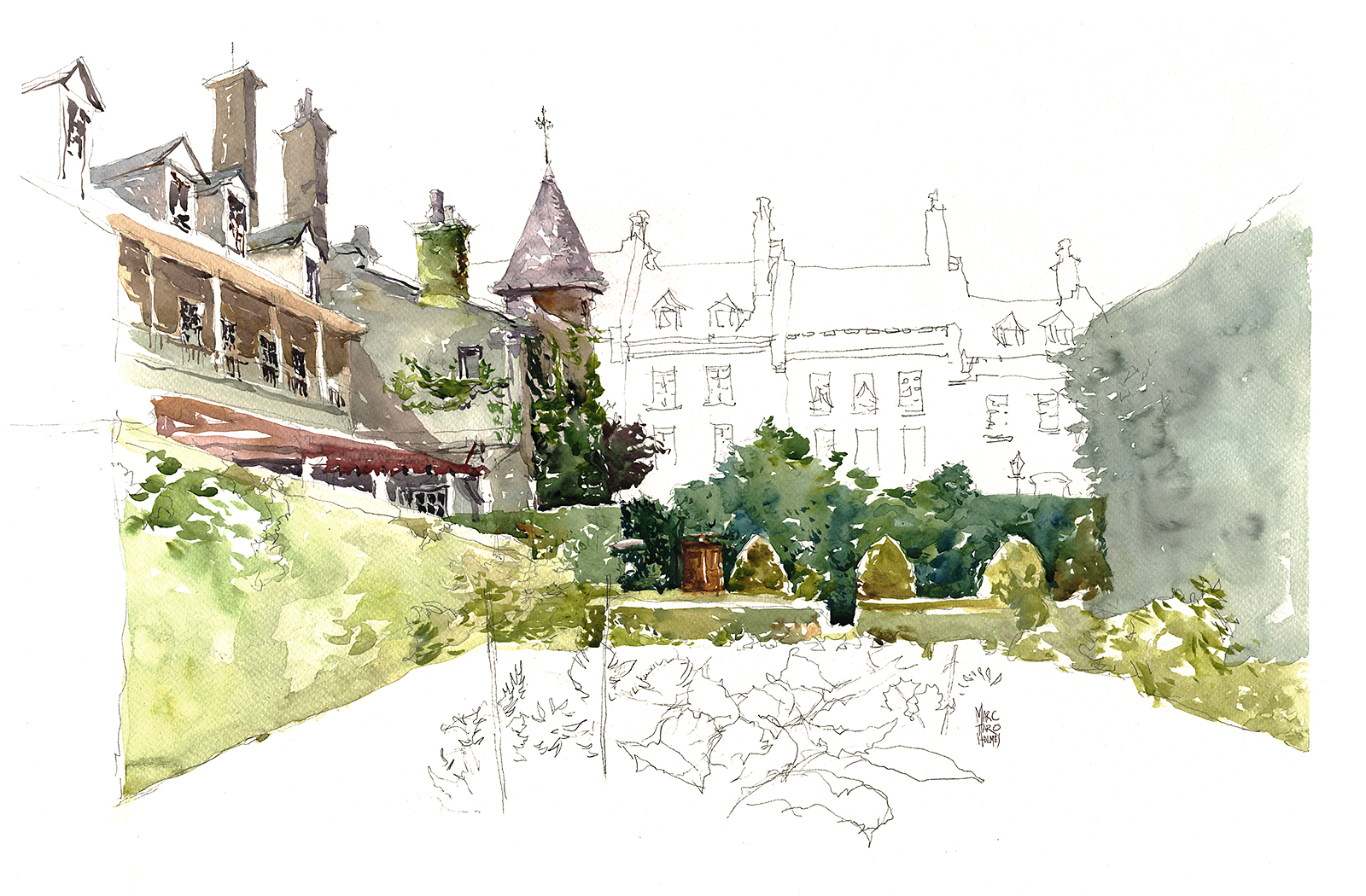
We’re still in the UK, probably hanging out with some other die-hard sketchers after the main event is over.
To tide you over until I can bring back trip-stories, here’s a sketch from the Chateau Ramezay in Montreal. We were downtown for something else that didn’t pan out – so we took the opportunity to hang out in the shade and make a painting! I’ve painted this (almost) exact same view before – but you can see, I’m just a smidgen faster these days.
Ed. Note: We should be arriving in Manchester for the USK Symposium today! I wrote this before we left home. I was just finishing these drawings, which I did as part of my research for this year’s workshop. Wish me luck – once again I’m trying out a new class on the eager sketchers here in Manchester! ~m
As a person who travels and sketches, something I’m frequently bumping up against is my lack of interest in perspective drawing.
This above is one of the few ‘proper’ ones I can find in my archives. (Christchurch Cathedral in downtown Montreal).
I know perspective is one of the big innovations from Western Art, and is the key to convincing realism.
But – as we’ve heard a few weeks ago from Georges Braque, perhaps correctness isn’t the only thing that matters?
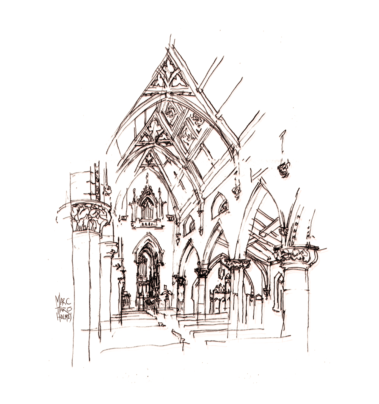
Typically, inside a venerable old church, or a fusty museum, (the kinds of places I find myself drawing interiors), there are amazing things all around you.
I just want to get it all in! And as fast as possible! There’s an entire castle to draw today! (Or whatever it might be).
Proper perspectives can get in the way of a suitable speed of execution.
I feel that even an experienced artist needs to take their time planning one of these. Setting up the vanishing points and guidelines. Measuring things to see where they fall in the structure. Learning the underlying grid the architects have built.
I would say, most artists that do these well spend at least a half hour setting up the drawing. And of course, it shows! They get great results. But it’s hard for me to delay gratification like that.
Plus, when I have a wealth of detail around me, it’s always frustrating to leave anything out. When something is drawn correctly – most of the time that means you can’t really see it. Unless, like many architectural draftsmen, you’re making *huge* drawings.
In a sketchbook-sized perspective, once you’re past the second pillar in the row – I bet you can’t really see the carving any more.
Not to mention, if your viewpoint is fixed, that fancy carved candlestick that you’re dying to draw? It might be just outside a doorway, only a few degrees beyond reach.
Wouldn’t it be great if you could somehow see around corners?
So here’s a few things I find myself doing, right or wrong, to make sketches that are high on ‘sense of place’, if a bit low on realism.

I have this principle I call ‘Roof Line/ Ground Line’ – which I talk about in the Painless Perspective chapter of my online drawing class. (Or you can read about it in this post).
Essentially, the idea is to sketch the ‘mountain range’ of a building or block, and then the grounding line, where everything touches the earth. See those two lines above – that’s what I mean.
The Roof Line and the Ground Line. I sketch those first, and then everything falls in place.

So how does that help us when we’re drawing an architectural interior?

We can apply this basic principles, but instead of a roof/ground, we have a ceiling/floor line. Any time you’re in a room or hallway, you can count on this odd “X” shape to be your guide.
You might start a drawing by actually sketching the X shape lightly in pencil, or just by visualizing it, or by doing a Dot Plot.
Then just proceed to hang your drawing of the room from that ceiling/floor framework.
Here’s the important thing:
Even if the proportions of your X are wrong – it doesn’t matter!
Just finish the drawing based on what you’ve sketched – don’t worry too much about reality. Once you’re long gone from the place – what is more important? The accuracy of the sketch, or the fact that you finished it!
I’d say, having something to remember the place wins out.
And besides – over time – as you get some practice – your estimates will get more accurate.
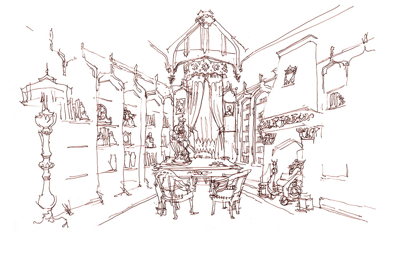
This study-slash-library is in the Chateau Dufresne in Montreal. I most wanted to capture the carved wooden built-in bookshelves framing the room – but also to include the best pieces of ornamental clutter on the shelves and desk, and to note the ornate fireplace with it’s iron dragons.

Here’s another example – this one gets tricky.
This is a long corridor inside the Victorian style Redpath Museum on McGill Campus.
Now, what I will often do, in a situation like this, is cheat a bit.

This long hallway was of course much narrower, and much longer than the study from the Dufresne above.
I wanted to get the various skeletons hanging on the walls, and some of the display cases – and I needed the items on the wall to be easily seen, and simple for me to sketch.
So I’ve distorted reality – spreading out the hallway so that I’m looking at both walls more flat-on than in reality.
After quickly sketching in an X for of the ceiling / floor, I stand with my back to the right hand wall to draw the opposite (left) side with the turtle skeletons – then physically move my view point – putting my back to the left hand wall to draw the opposing (right) side with the office door.
I started the drawing from the very back of the hallway, because of where the skeletons are hung, but moved to around the middle point so that I could peek in at the academic clutter inside office door.
There’s no way to actually see into that door from the back of the hallway – so I had to edge forward to get it in.
With this trickery, we able to see the most interesting parts of the two walls, somehow magically in the same drawing.
This isn’t correct by any means – but it’s lets me see what I want to sketch.
Take that, Rules of Perspective!

Ok, third example on an interior – this one even more un-likely.
What I wanted to draw most in this little stairwell in the Chateau Dufresne, was the statue of the frolicking couple in the niche between landings.
(Sorry, it didn’t turn out very clear in the sketch – it’s a dude throwing his girlfriend up in the air while stepping on an old man. Typical French Rococo stuff. Why wouldn’t you want a thing like that in your hallway!?)
But at the same time I was interested in the yoke-arched doorways and ankh shaped windows that are quite distinctive of this house.
That Ankh pattern is repeated in almost every major archway in the house. It makes me thing the was some secret-society mumbo-jumbo going on in this place. Some gatherings of old men in silk robes going about expanding their minds and contemplating the mysteries of the universe.

So, to get this ultra wide view in, once again, I’ve moved from one side of the hall to the other in the middle of the drawing. Sort of ‘drawing cross-eyed’.
In one half of the drawing I can see into the next room, and in the other half I can’t!
Perspective is shattered!
But still – it’s a fun little drawing with a unique point of view.
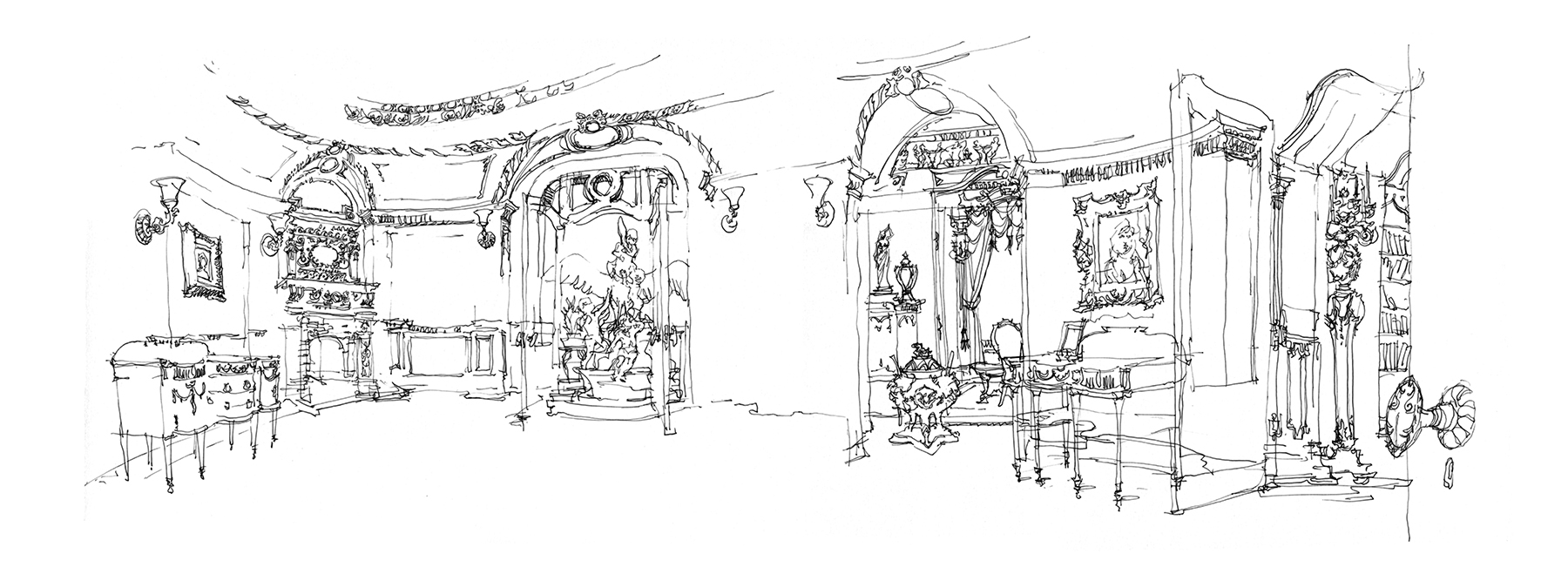
Ok – Finally, let’s forego perspective drawing entirely.
In this sketch, I started at the fireplace on the far side of the room – and just kept on drawing.
Moving around the room in a kind of continuous panoramic drawing.
Imagine you are standing in the center of the room, and just pivoting. Drawing each important landmark on the walls as you come to it. I actually had to do more moving than simply rotating, as the center of the room was blocked with various furniture and display cabinets.
I sketched each of the exits to the room, and kind of back-filled the furnishings and connected the paneled walls in between as if they joined seamlessly.
You might want to try this with an accordion book, so you won’t run out of space. Or, you can do as I did and just draw over the edge of the page onto a new sheet, adding sheets as required. The bigger the room, (or the more stuff crammed into it) the more length you might want for the drawing.
As I drew left to right across each of the three entrances, I was shifting my viewpoint so I could get a good sight-line into the rooms beyond.
Similar to what I had done with the office in the museum. I wanted to give the best peek at the silly furnishings in each adjacent room.

I’ve decided to call these kind of sketches Panopticons. For the ancient Greeks, a Panopticon was a particular type of building, usually a prison or a library, in which every room could be seen from a central point.
I guess their enemies and their books were the two things they most wanted to keep an eye on.
Makes sense to me!
I had a great deal of fun with this one. Just drawing, and making it up as I went along.
I plan to see what else I can do with these kind of interior panoramic sketches – and I’d be interested to hear if anyone else is playing around with similar ideas.
Why not drop me a note or a comment if you have some drawing experiments to share?
~marc
Pirates at the Old Port
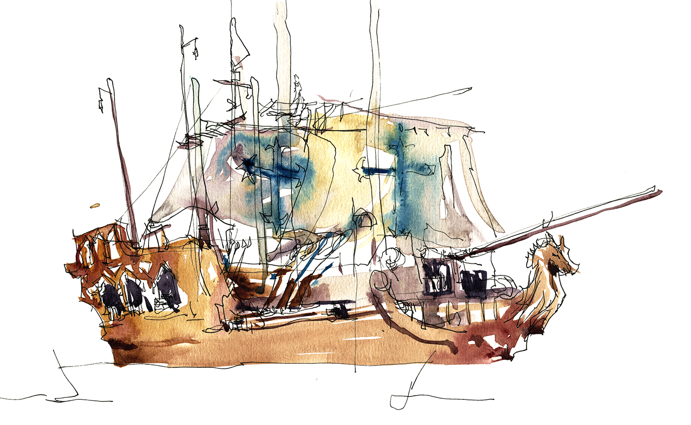
Here’s a fun thing: Some entrepreneurs have set up a couple of faux pirate ships at the quay – big wooden platforms with numerous tall masts. The ‘boats’ are lashed together with a series of swings, zip lines and rope ladders making a kind of giant jungle gym. Kids and even adults are having a great time climbing all over these things. It’s quite high over the port, so the view is probably pretty good. Everyone is clipped in with a climbing harness, so it’s *fairly* safe.
If you’re making a day of this, maybe go first to the pirates exhibit at the Pointe-à-Callière, and then take the kids to the ‘real thing’.
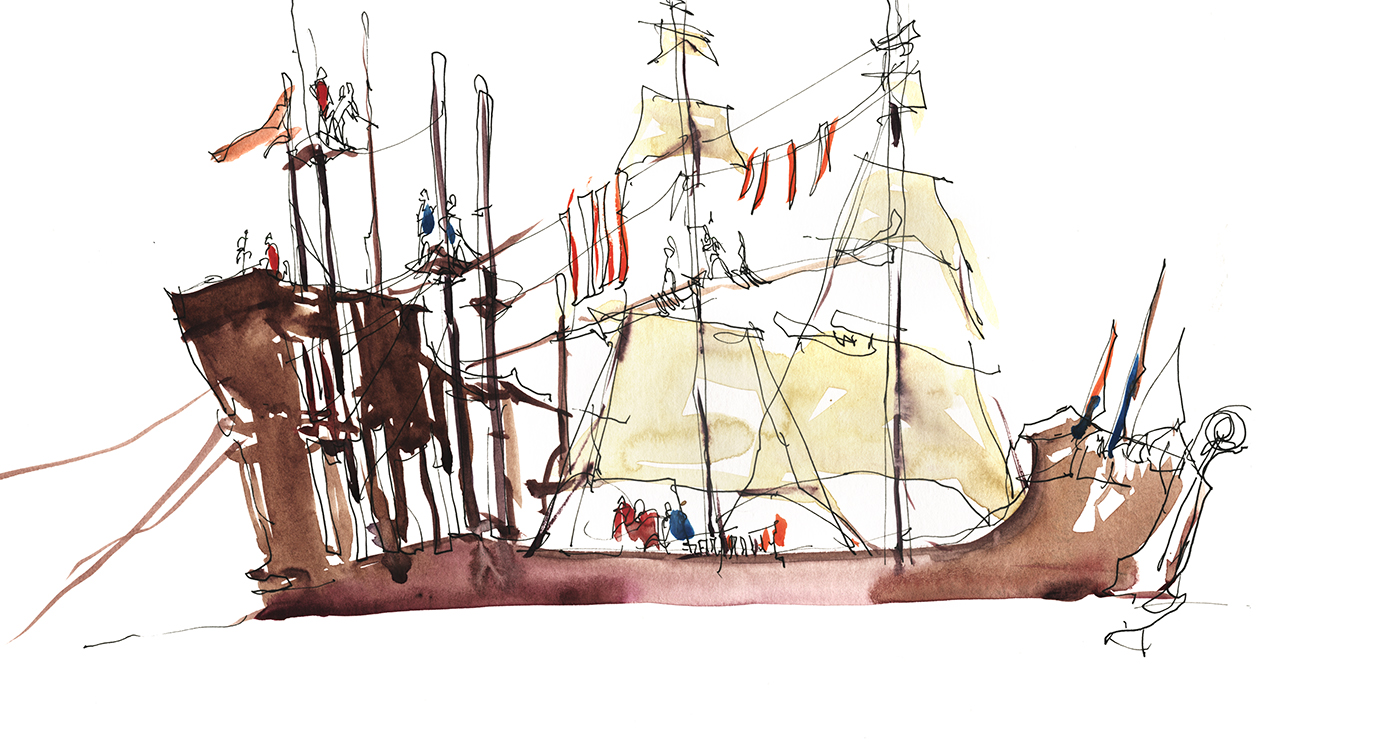
If you’re down on a sunny day there’s always a crowd of people to sketch – even if it’s not Jazz Fest or Grand Prix. Just stroll up and down the pier taking in the street life. Our touristy horse drawn carriages are still around, but they might be banned by this time next year on animal welfare concerns. We’ve just added food trucks (last year? or the year before?) and there are always street musicians. It’s a perfect day for a sketch-walk!

Up and Down the Mountain

Here’s a few more summer greens that have been on the easel recently.
Just a little sketchcrawl, up to the top of the mountain. That (above) is the back of the Mount Royal Chateau – not its most fancy view – but this week I picked the big trees over the glass city or the stone steps.

I met up with some painting pals and we hung out in the cemetery (as one does), and then wandered over to Monkland village.
By the end of the day the painting was getting more abstract, and more fun.
I’ve learned the trick about plein air painting in Montreal. You go when the weatherman says go :)
Painting Demo: Leafy Tree Canopies

One thing about living in a four season climate – you get to rotate through your colors! Montreal has two distinct red/brown seasons. Fall of course can be beautiful, and very early spring has a red-brown look that can be calm and restful in its own way. But when the leaves first burst out on the scene, they are a special kind of green/gold.
I’ve had to go and get another color: DS Green Gold (PY150/PY3/PG36). In the past I’ve based my green foliage mixes on Sap Green, but I find lately it’s too dull for these fresh spring greens.
I’m still following my own advice of course and injecting color variation (<click over for a more complete demo) into wet areas as I go, so there are no boring passages. I think of it as having a ‘home color’ which I’m adjusting with every stroke to be slightly towards its neighbors or its complements.

Of course there is the grey winter season as well. This is a bit of a romantic color scheme based on blue grey, using DS Perylene Green (PBk31). A favorite color I really couldn’t live without when it comes to pine trees.

To be honest, most of the time the winters here are really an overcast brown, rather than the prettified snowy blue.
In this case you just mix some dirt using a bit of everything. Quin Gold Deep and Ultramarine Blue, or some Bloodstone Genuine and Raw Umber Violet, 0r whatever random pigment is accumulated in the corner of your palette. Perhaps in winter it would be good to add Sepia to my color choices?
With leafless trees, you can see how point work is the main issue. Taking your time and drawing twigs. This is when the sharp sable quills earn their high salary.
Though I’ve done a few clusters with an improvised ‘rake’ – that is, a sable brush splayed out like your fingers spread wide. (You just mash the brush into your palette and twist it to splay it out). Just use the very tips of the resulting fan to get parallel strokes.
Another important trick, is not to worry about connecting every twig to the trunk. Some of them can just be a cloud of floating marks.
When you look at a distant leafless tree, you get an impression of branches. You can’t really see specific twigs – (once you move down from actual branches of course). So I think about the muscularity and the rhythm of the main branches – and then I surround them with a kind of loose net of mark making.
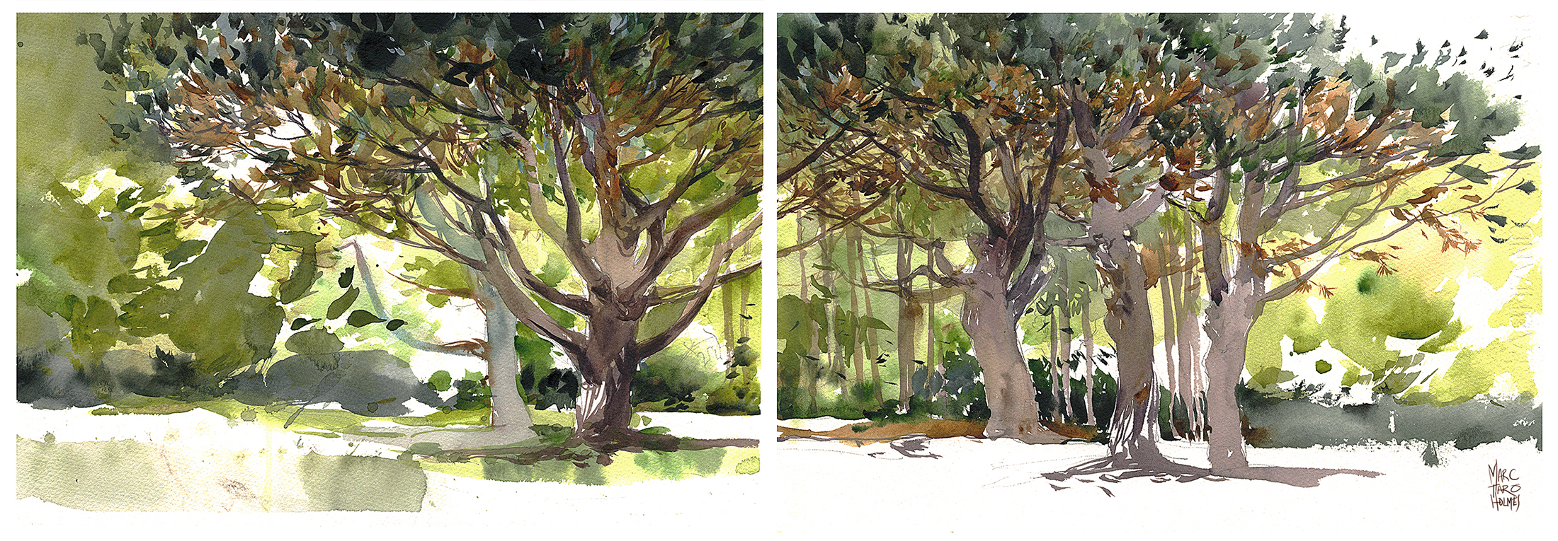
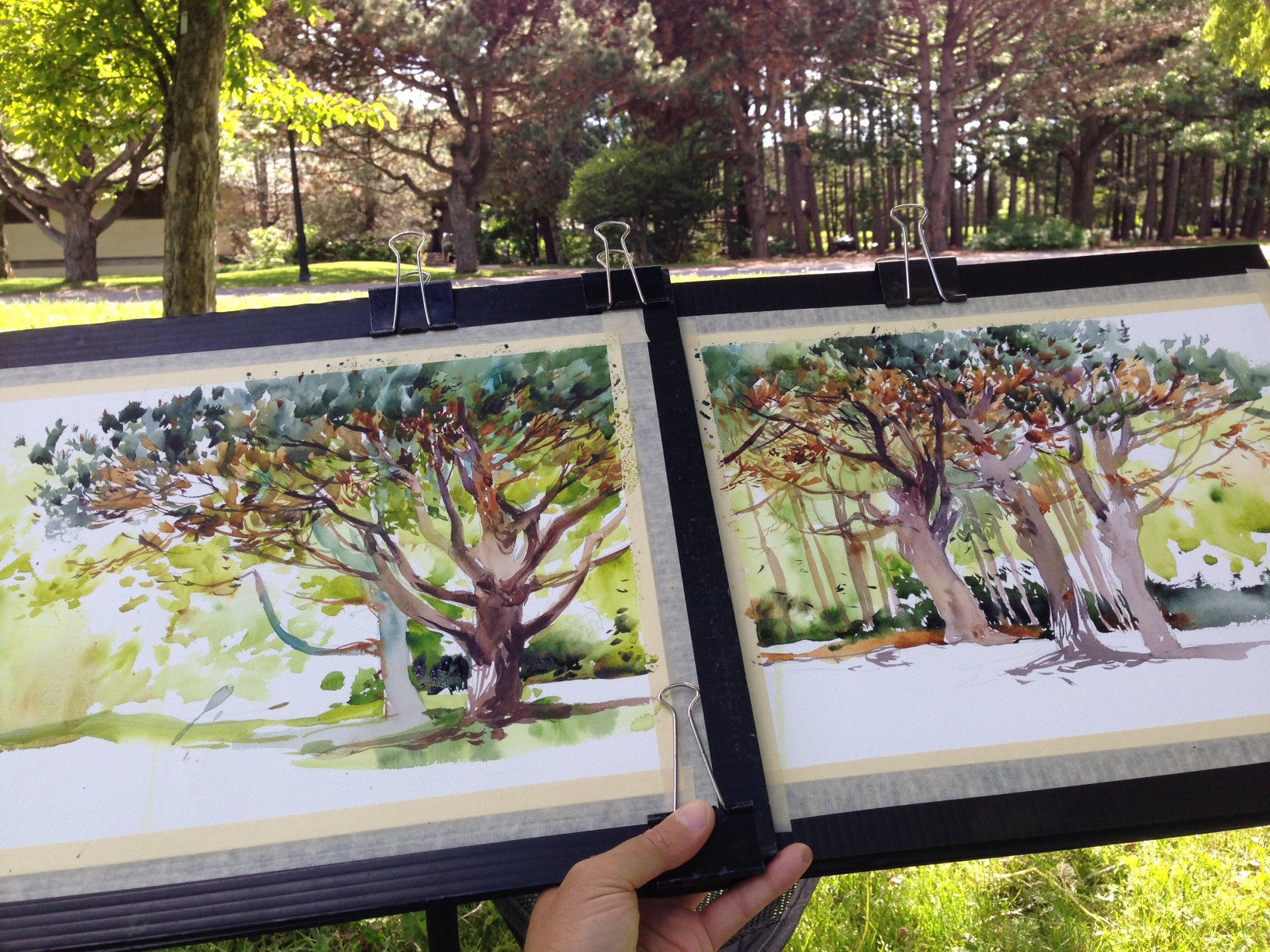
That’s what I wanted to talk about today – the idea of painting foliage with broken brush strokes.
I am *usually* trying to make solid shapes. A human figure, or a shape like a sky, or the roof of a building – this might be done in a single solid wash. One wet puddle that goes on in a continuous motion with no gaps. Or at least, with carefully placed gaps. Well, the trunks of the trees are examples of this solidity.
But for leafy foliage on the other hand – I might use a net of small strokes. Little dabs, like what the impressionists called broken brush strokes. I have seen Stapleton Kearns use the term ‘colored rice‘. Many small dashes and dots and placed brush points that accumulate into a cloud.

So I might start with a drawing of the tree trunks, then make a pale, cloudy green background that will show through where want it later.
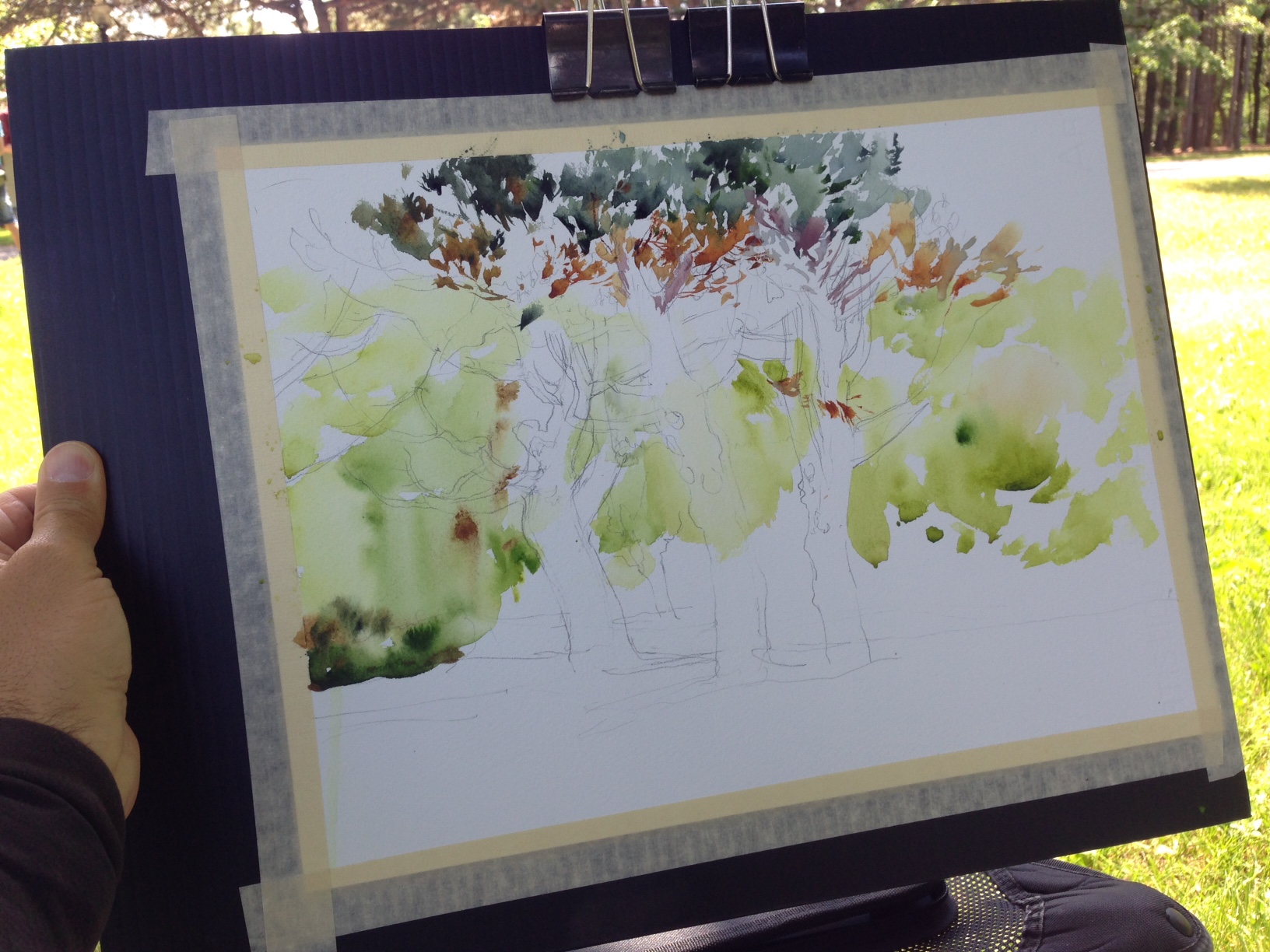
Then I begin building the tree canopy with these dabs of color. Placing them next to each other, like small tiles in a mosaic. I let a few of them touch so the colors intermingle. You want to work with fairly rich paint so you are putting enough pigment down in these touches.
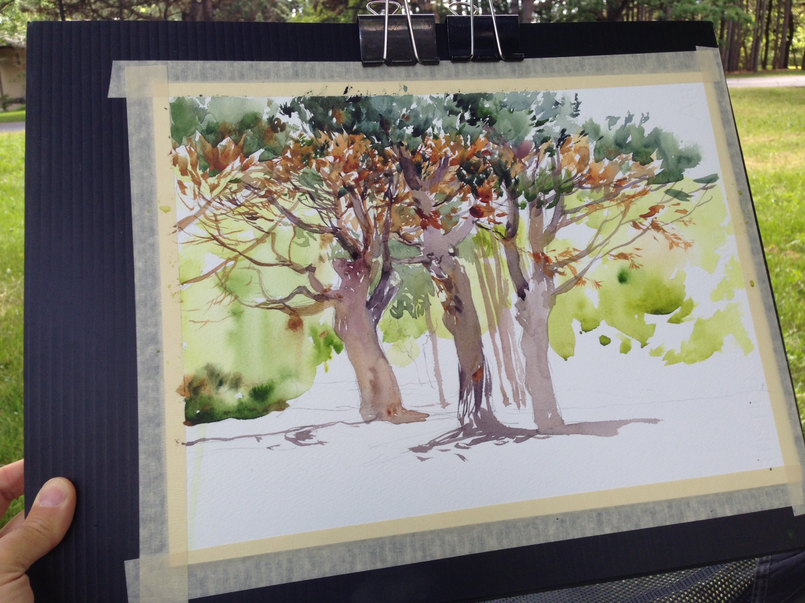
After enough of these dabs, your tree trunks have been clothed with foliage!
I think this is a kind of painting best suited to a beautiful day in the park. This is not for rushing around getting multiple sketches in a day. I suppose you could sketch the trunks, and finish the foliage at home (if you run out of time). But I was painting these from a very comfortable Adirondack chair under a shade tree in Montreal’s botanical garden. So I was perfectly willing to spend a lazy afternoon enjoying myself!
Hopefully this summer you’ll get a few beautiful days like this for your own sketching!
~m
Book Review: The Painted Girls, Cathy Marie Buchanan
I’ve recently finished reading The Painted Girls by Canadian author Cathy Marie Buchanan. (2012, available in paperback, hardcover or ebook).
I realize I’m a little late to the game, as it’s been available for a good while now. But nonetheless, some of you out there might not have gotten around to it either.


The Painted Girls on Amazon.com | Amazon.ca
The novel is historical fiction set in Paris around 1880, told from the alternating points of view of two sisters.
Marie, age 15 who is a student striving for a position as a dancer at the opera, and Antoinette, 19, who is already washed out as a ballerina, working as a walk-on extra and desperately avoiding her alcoholic mother’s career as a laundress.
As an aside, Ms. Buchanan has been chastised on various book review sites for the names Marie and Antoinette being too cute for credibility – however this bit is a true fact, not the author’s choice, so any tut-tuts should be aimed at the girls’ mother.
( Sketches after Degas )
Being an artist myself, I was initially brought to the book by Marie’s story.
As a “petit rat” – a student of ballet from ages 10 to 15, the young Marie is pushing herself to the limits of her growing body, attempting to rise to the physical demands of the upcoming examinations – hoping for promotion to the stage, and the steady wage it will earn.
Every calorie she can beg, borrow or have filched by Antoinette, is crucial to her success. Naturally the stipend allowed dancers is not sufficient for a girl without family, so she works early mornings kneading dough in a bakery to save the strength in her legs for the days training.
Her focused drive to master the demands of the ballet earns her the eye of artist Edgar Degas, who was well known to haunt the opera school, sketching in classes and rehearsals, obsessively drawing the girls in their awkward postures of exhaustion.
He is involved in a search for a new modern mode of drawing that is aggressively stripped of romance. Nothing idealized, only reality laid bare. I found Marie’s story the best part of the book’s historic recreation. We experience the obstacle course laid out before these aspiring dancing girls. The unflinching standards of performance, dress, and decorum that serve as a sieve, filtering out all but the most ruthlessly determined and privileged.
Marie is only able to advance by selfish dedication to art, and the opportunity to earn a small wage modelling nude for the 50 year old Degas.
The girl’s never very deep innocence is peeled off bit by bit as Degas’ drawings of her developing body become sought after by ardent collectors.
Meanwhile her success as a dancer becomes a two-edged sword. Elevation inside the opera putting greater and greater demand on her to pay for tutors, purchase silk slippers and tarlatan skirts.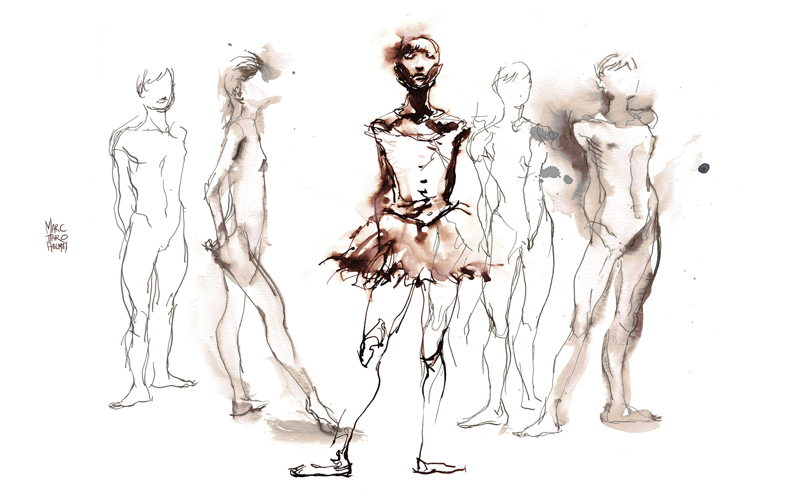 Ms. Buchanan brings us one of the fascinating stories in 19th century art. The real life story of the models behind the paintings.
 In some ways the turning point of the story is Degas’ wax model La Petite Danseuse de Quatorze Ans. (The Little Dancer).
This wax model over an armature of wire, leather and old paint brushes, dressed in actual clothing and with a wig of real hair, becomes the ultimate expression of Degas’ obsession with drawing Marie.
However, public reception to the sculpture was mixed.
The 3/4 life size figure is lauded as the first truly modern sculpture. A triumph of realism in art. Degas turning his back on the pearly-white floating nymphs found cluttering every over-stuffed parlor and gilded brothel in Paris.
Yet, The Little Dancer was simultaneously rejected as simply too ugly. A female ape, a barbarian Aztec, a sinewy-muscled circus acrobat.
Given the frank realism of the work, reaction to the sculpture is also the honest truth that Paris’ elite would never truly accept an underfed guttersnipe like Marie as a prima ballerina. ( Monsieur Degas )
Of course, I’ve neglected to mention a whole other story in the book – that of the older sister Antoinette. Her tale is torn from the headlines of the time.
We see her diamond-hard stubbornness, pressed into her by the crushing poverty inherited from a dead father and neglectful mother, inevitably turn into an ill-fated love affair and an inexorable slide into the underbelly of Parisian society.
Hers is the life of a failed dancer, an actress of little note, and a girl looking for more options than her social class allows.
The intersection of these two girls’ lives is where the real plot develops – and I’ll leave that bittersweet story to your own reading of The Painted Girls.
You may order the novel from my Amazon affiliate links below – and if you do, you’ll be giving me a small tip, which goes towards maintaining this blog and my drawing practice.
Thanks in advance
~m
The Painted Girls on Amazon.com | Amazon.ca

