Urban Sketchers Montreal in La Presse

If you download today’s issue of La Presse (Sat Nov. 12) available for free on the Apple App Store, you’ll find a terrific feature in the Voyage section all about Urban Sketchers Montreal! Read more…
Watercolor Figures Wet-into-Wet

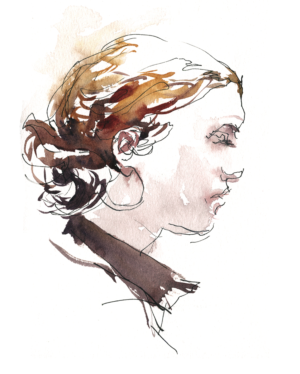
A few weeks back I’d been sketching at the UQAM intensif. Maybe you remember me saying I felt those paintings were ‘over drawn’? Relying too much on the pencil line.
The other day I dropped into an afternoon session at the CCGV, and this time – left the damned pencil at home! It’s the only way to break myself of my drawing :)
Or, more honestly – to make myself draw with the brush, rather than the line.

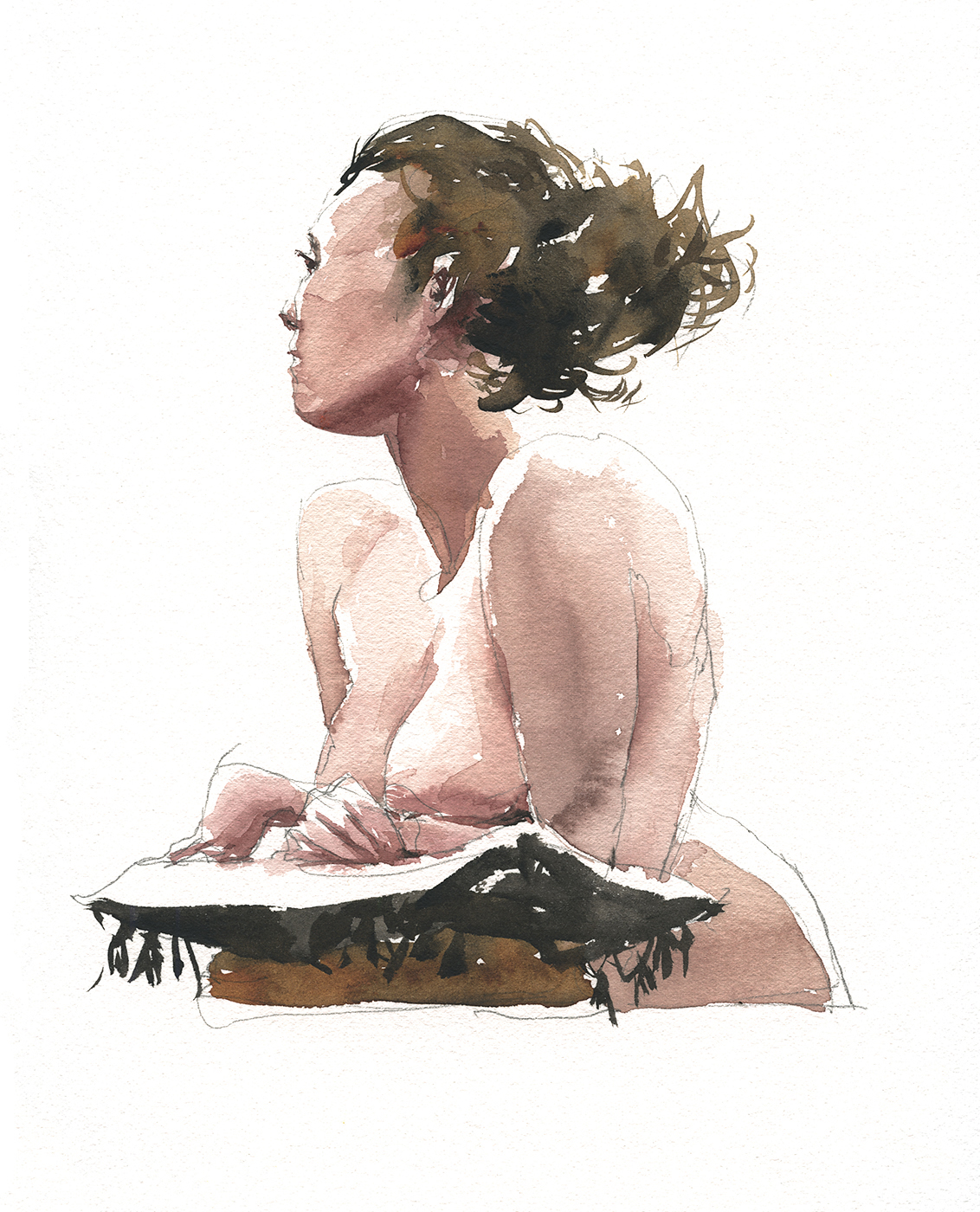
This was a different model, and shorter poses – but just look at how interesting the washes are, (above) as compared to when you’re tinting a pencil drawing. (below).


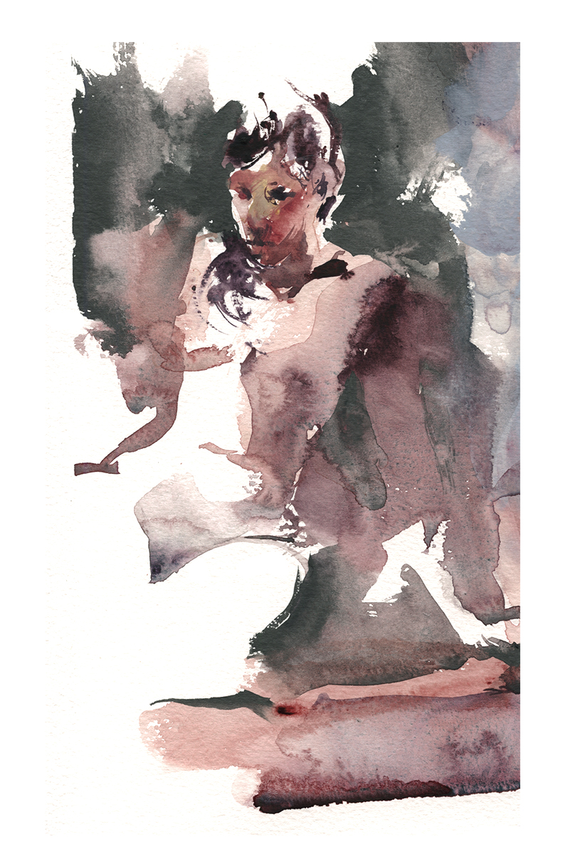
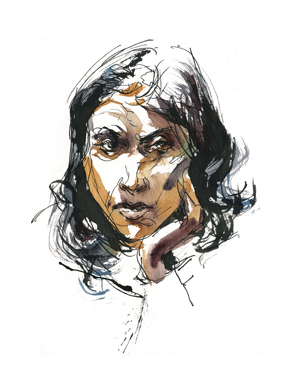
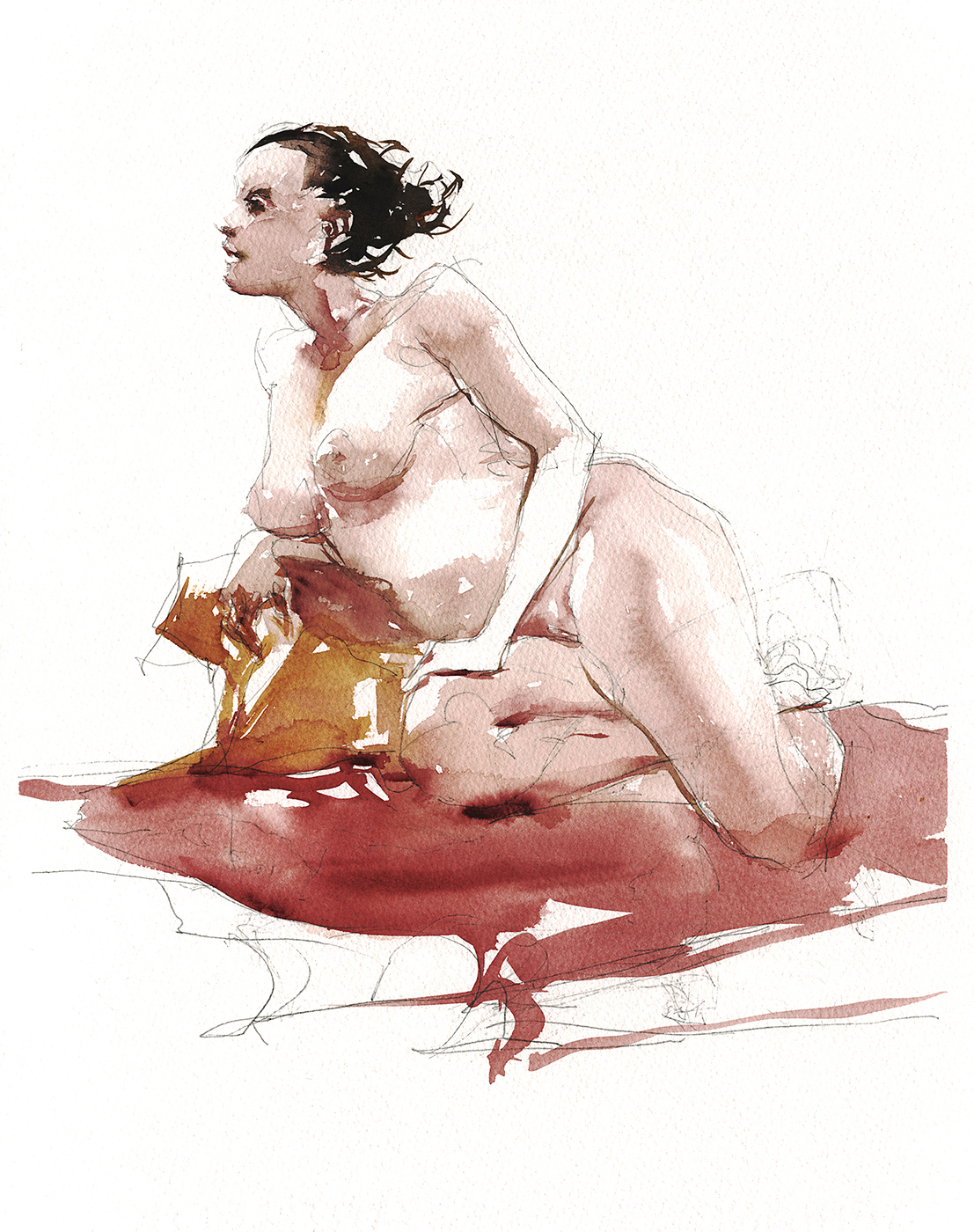
I was also determined to work faster, and wetter. These two are the same pose. Instead of using all my time striving for perfection, I went back to the art school approach, and did multiple sketches, trying to get as many as possible in the available time.

The other advantage of working two (or three) at once – you can just keep moving. While the paint is wet on one – skip to the other. Here’s a pose and a re-take on the head. I was trying for a better likeness – but also a more interesting figure/ground.

So, that’s the way it goes with this strange pursuit of watercolor painting. Back and forth between direct brushwork and more precise drawings, continually looking for incremental improvement :)
A Marathon of Miniatures in Watercolor

A few weeks back, I had the urge to do a major painting expedition. I was in the middle of an illustration deadline, and all that picky computer work was making me crave some watercolor. I wanted very badly to take a week off and just paint every day. Sadly, there wasn’t time for anything like that.
So what’s the solution?
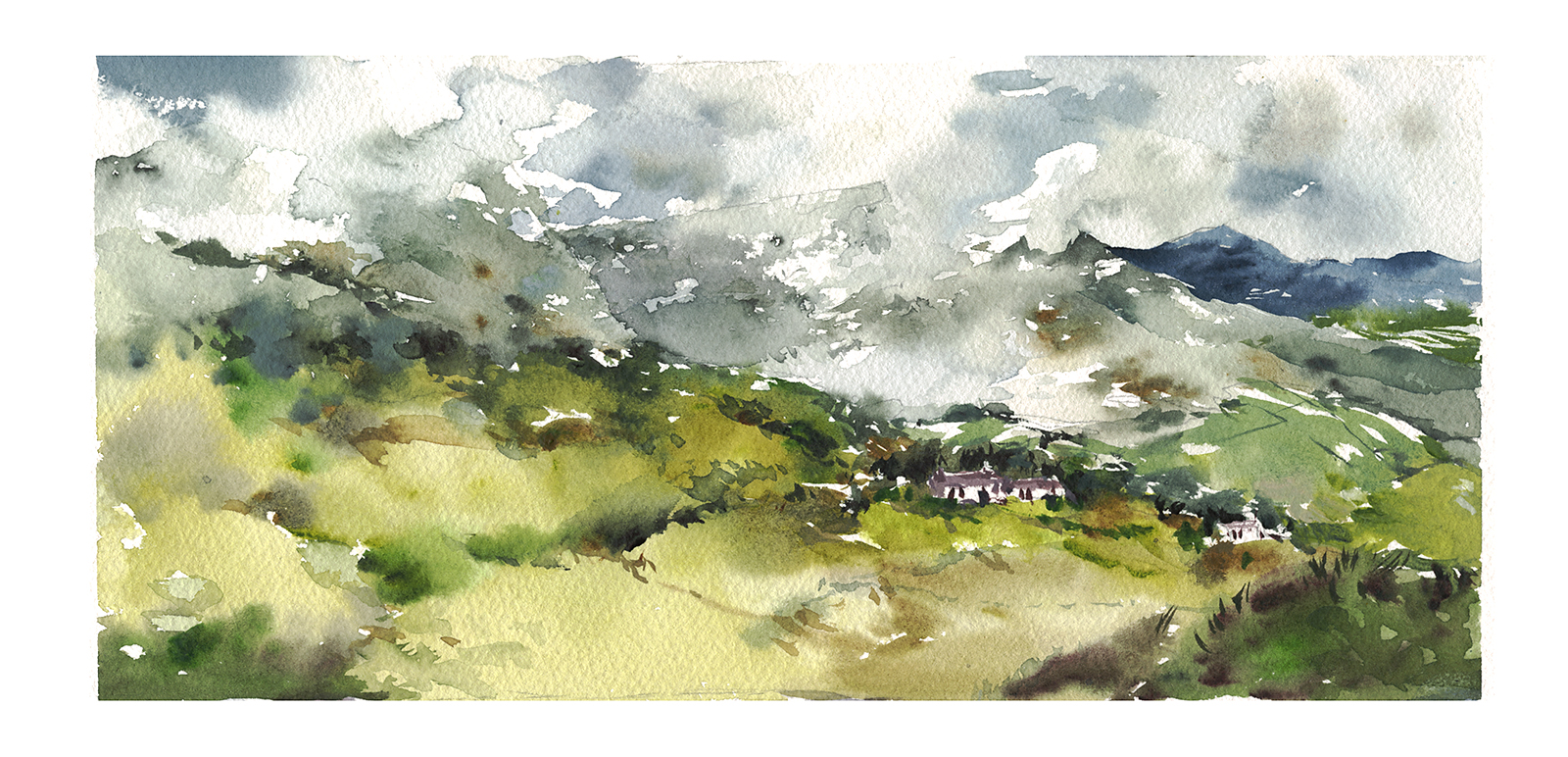
The Ladies’ View at the Canadian Society of Painters in Watercolor

This is my watercolor of the Ladies’ View. (Half sheet, 15×22″, on 140lb Fabriano, painted in studio).
This is a well-known spot in Ireland, overlooking a series of small lakes leading into the Killarney National Park. As the story goes, Queen Victoria’s ladies-in-waiting arrived at the top of the pass and declared it the best view in Ireland. Maybe they were simply done with the harrowing mountain roads. This was as far from Muckross House as anyone wanted to go:)

Beautiful as it is, there are certainly great spots all over the five peninsulas – most popular being the Iveragh Peninsula (the Ring of Kerry). But to be honest, every high spot has a view, every coast has cliffs, and every valley has misty mountains. The best view in the southwest of Ireland is wherever you’re standing at the golden hour.

I did this quick sketch on location but I don’t really feel it’s a successful piece. We only had a narrow gap between rain, and I got too fixated on the lakes, and somehow lost the sense of scale.
On our return I decided to redo my field sketch in the studio, and it’s a good thing – as it has been accepted in the 2016 Open Water exhibition of the Canadian Society of Painters in Watercolor, which opened last night at the John B. Aird Gallery in Toronto.
I’m pleased to say, The Ladies’ View has won me the 2016 S.J. Sloan Award, and – (this just in!) – I’ve been elected to lifetime membership in the CSPWC – which is a rather nice bit of encouragement.
I consider myself a beginner when it comes to studio pieces. I haven’t really done that much work at home, being more of a plein air painter. But this is something I’ve been interested in taking more seriously.

Here are a few of the other pieces, done back home in Montreal. These are all warmups for the Ladies’ View. There’s a common theme here – which is, going back for the sketches that I couldn’t get on the spot. Some, like this one, I simply ran out time. The fog closed in and this view across the inlet vanished.

Or, in this case, we were perched dangerously on a curve in the road, looking at the mist rolling down onto a little harbor town, The clouds were moving so fast, and I was a little paranoid about delaying our drive and ending up still on the mountain after dark. So I didn’t sketch on the spot -but I knew I’d be returning to this image.
I rather like the 9×12″ sketch above. It has a lot of dynamic brushwork. But here below is a half sheet, attempting to do a better rendition.

I think the difference between the smaller sketch and this 15×22″ version illustrates exactly where I’m ‘stuck’ with watercolor right now.
You can get very used to the behavior of pigments at a certain size, and on your favorite paper. I have an instinctive feel for how fast to work and how much a given pigment will float. When I scale up, I think I lose that freshness, that ‘untouched’ manipulation that I get from watery blooms and pulling edges.
This is just a temporary problem I’m sure:) Anyone who knows me can guess my feeling about this challenge.
All I need to do is paint 100 half sheets, then a 100 full sheets and I should have learned what I need to along the way :)

Given how these recent experiments turned out, I have a few things on my list to try next, starting with larger brushes. I have some large (1 and 2″) flats that I’ve been wanting to try out. I intend to try mixing in jars, and pouring paint, and doing more work with atomizers. I’m determined to grow the size of my studio paintings, without losing the spontaneity of the watercolor.
This last one here is a great composition found by accident while walking across an un-named field. I’m very happy with this piece – but I feel like I’m looking at the same size of brushstroke as I use on a miniature, simply propagated over a larger sheet. My self-critique is – that is too many strokes! It is in danger of feeling over worked. Watercolor should have an element of controlled accident. I never want it to become labored.
But anyway – we’ll see what happens with these theories soonish. For now, we’re off to Toronto to see the show! If you know anyone in the area, here’s the details:

I just want to also say – it’s neat to see my Urban Sketching co-conspirator Shari Blaukopf’s painting used for the Open Water announcement :) (Well, the sky anyway). Congrats to her for also making it into the show! It’s kind of fun to have both of us in there at the same time.
~m
Announcing my second art book: Designing Creatures and Characters: How to Build an Artist’s Portfolio for Video Games, Film, Animation, and More

Order Designing Creatures and Characters from Amazon
( US | CA )
Hey everyone! I’m excited to announce: my second art book is on sale now at bookstores everywhere!
This is my second hands-on workbook for artists. This one is full of practical answers to the question “How can I get a job as a Concept Artist in video games or animation?!”

If you know an artist who’s a fan of fantasy or science fiction. Who reads comics and plays video games, and would love to become the creative genius behind all those monsters and heroes – this book is written just for those beautiful dreamers.
I feel lucky to have a unique perspective on the topic, having worked on both sides of the job. I’ve spent 20 years working in entertainment media, first as an Art Director, hiring and managing teams of artists, but eventually succeeding in becoming a full time Concept Artist. This was always my goal – there’s no greater luxury than getting to draw from your imagination, then helping teams of talented 3D artists and animators bring your ideas to life. It’s incredible to think this can be a lucrative professional career!
The book brings you my real-world answers to the questions; “How do I build a portfolio without having actual experience? What do art directors look for in a candidate? How do you come up with ideas day after day? What do I have to do to get this awesome job!? and once I get it, how do I become amazing at it?”
Find out more about what’s in the book, over here in my books section. Or just head over to Amazon and order a copy today!
Order Designing Creatures and Characters from Amazon
( US | CA )
Travel Sketching in Ireland Part Two: What did I learn?
Let’s try a different approach for this post. Here’s the rest of my recent paintings from Ireland. With each one, I’ll try to distill down the main thing I learned from it.
(Note: This is part 2/2 – the first half of the Irish paintings are over here).


Muckrose House, Killarney: Get further away to see the real picture. It helps you remove unimportant detail.


Portumna Castle and Gardens: Don’t avoid backlit subjects for fear you can’t see details. They make for strong silhouettes. The French call it contre-jour / against the day.


Starting up Valencia Island: Design Don’t Document really works. The blue valley in the far distance is a better backdrop to this table land. Bringing it forward / scaling it up – that worked. Those little houses are fascinating. They deserve more prominence. Paint what’s interesting, not what’s real.
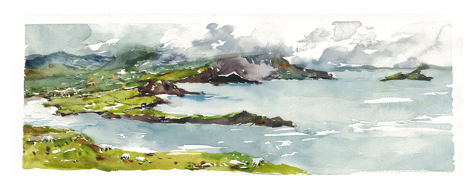

View from Valencia Island: He who hesitates is lost. When you see a composition – grab it. You never know how long it will last. It was only about twenty minutes from sunny day to zero visibility.
Compare these two hey? Only a few hours and 5 minutes down the road.


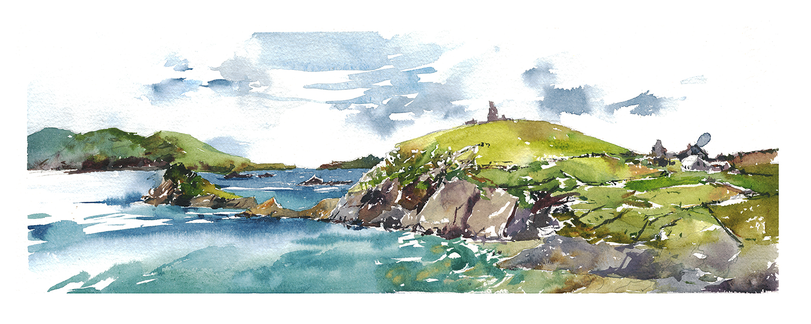
Dingle Peninsula, 11am vs 4pm: Bad Weather makes for Great Paintings. Felt great painting in the sun that morning – but the result is empty calorie candy floss next to the afternoon’s sketch. Don’t accept the easy views. Keep looking. Get out early, take a break, stay late.
(Note: This is part 2/2 – the first half of the Irish paintings are over here).
If you’re spending any length of time plein-air painting in Ireland, eventually you’ll be painting in the rain.
I wouldn’t actually want it any other way. It gives you a romantic landscape of deep greens and floating cloud that seems to be made for watercolor.
Of course you can bring an umbrella. But I’m getting averse to even the smallest extra bit of weight in my drawing kit. Plus there is the issue of how you’re going to paint while holding an umbrella? That starts to make you want to bring an easel – and then with easel and umbrella – you’re going to be in real trouble if there’s wind.
So let’s talk Five Strategies for Painting in the Rain:


Rain Strategy 01: Ignore it!
These two were sketched up on the rocky tableland they call The Burren. There isn’t a bit of cover for miles in either direction. Just a huge heap of boulders with the occasional wind-dwarfed tree, and the farmers fields cutting up the landscape.
So if it’s just off-and-on again showers, or a light mist – well – that you can just ignore.
It should give your painting a kind of wet-in-wet effect that you won’t get any other way. See how the green hills are blooming into the sky? That’s a pretty nice watery bit. And in the second sketch – how there are rain-marks all over the surface?
In general, a light shower can actually work in your favor.
So I’d say, a rain coat is more important than an umbrella. Just stand your ground and keep painting. It will probably pass.
If you pack up and run for cover, I am quite sure tea and scones will sound much better than waiting around hoping to set up again.


Rain Strategy 02: Cover your painting, if not yourself:
These were painted at the Cliff’s of Moher, in a more persistent drizzle.
I loved the dark skies and the way the cliffs turned into silhouettes in the distance.
It was quite windy, as you might imagine, but there was a stone wall along the cliff edge, which made for a very convenient standing desk. Actually, there are low stone walls just about everywhere in Ireland. A very convenient country to be a street sketcher.
So, when it became clear it was going to rain all day, I tried something a bit different.
I normally paint on paper taped down to coroplast backing boards. I took two of my boards and hinged them together with tape, making a kind of ‘laptop’. Or you might say, a slim hard cover sketchbook with only one page inside.
This way I could work holding the boards about a quarter of the way open, peeking into the narrow gap.
This kept the paintings out of direct rain – and let me walk around with them still wet, (keeping a finger between the boards so the pages didn’t touch). I’m sure a lot of you do this with sketchbooks all the time.

Rain Strategy 03: Worst case – you can paint from the car.
I first saw this little ruin in the form of a porcelain miniature in a gift shop in Kenmare.
Then we saw the real thing across an estuary, and had to drive around until we found the one-way bridge that leads you onto its spit of land.
Most Irish castles are just lone towers, so it was nice to see the crumbling walls covered in ivy. In this case, there was a little parking lot right at the bottom of the hill – so I took the easy way out and painted this from the car.
I did need the window open to see anything so I still got wet. Until someone left and I got the one good parking spot front and center.
If you want to lay darks onto a wet painting like this – you have to use the pigment as thick as possible. I remember touching dark areas over and over. They would sneakily melt into the ground. I believe I put this under the car fan for a while to get it ready for adding the darkest-darks. Plus I have a very opaque pigment: Bloodstone Genuine, which I use when I need good coverage.


Rain Strategy 04: Make an Annotated Sketch and heed the call of Tea and Scones.
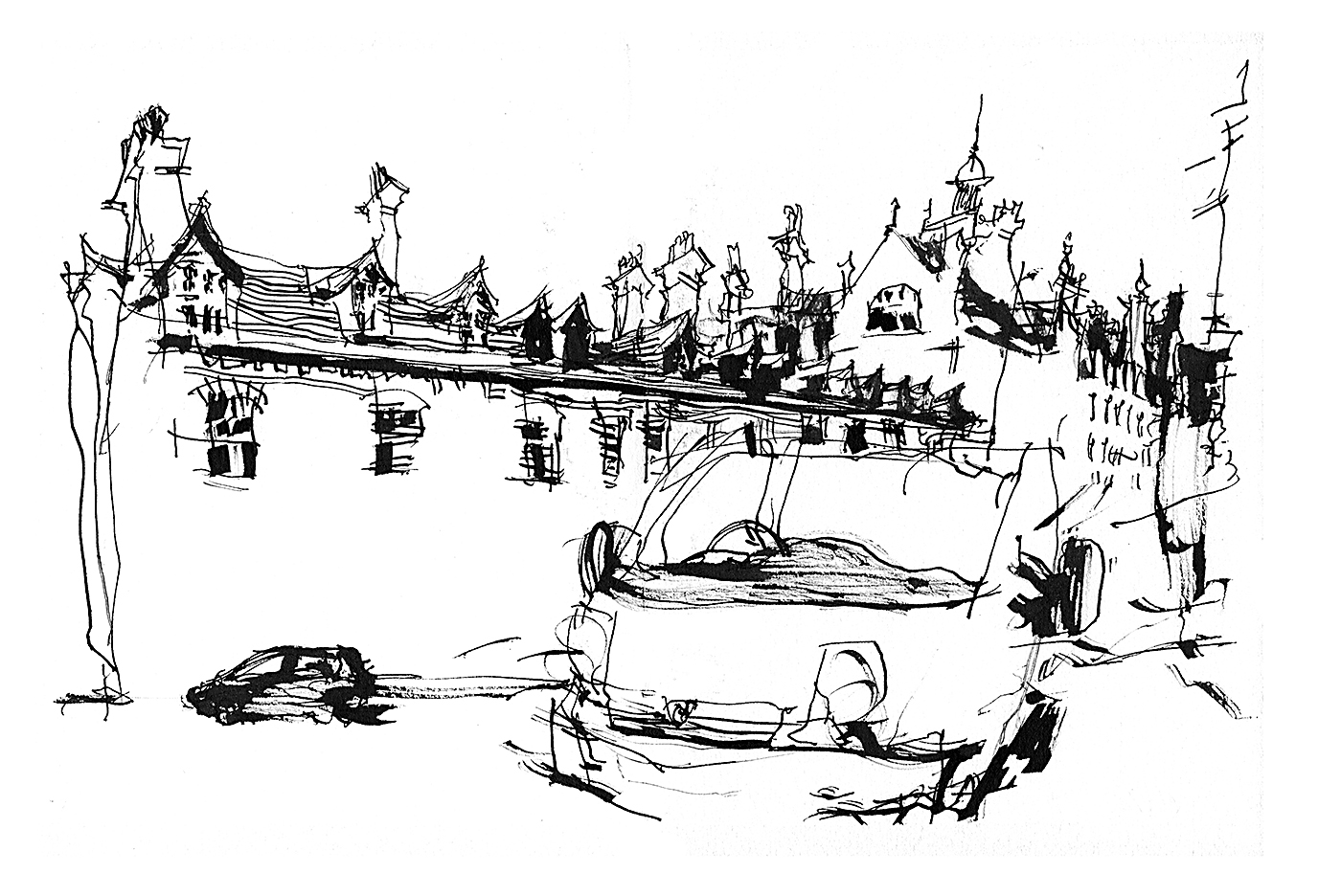
Here’s a couple of thatched-roof houses in the village of Adare.
I love these cute drawings, as they look much better than the real thing.
There was a fire at the first house, so it’s partially in ruins. There are blue tarps, chain link fences, and a burnt couch on the lawn. Unlike a photographer, I can just quietly leave all that out, and still make a good sketch.
The method here was to make a very simple pencil drawing just outlining the major shapes, and underneath I write a pigment code and a value number.
You need to sketch quickly enough that your paper won’t get saturated. Once it’s wet through, you can’t draw in pencil any longer. The paper gets too soft and the graphite won’t transfer. So keep the drawing as bare bones as possible. Which is a good idea any time really.
I would jot down a letter number code for each major shape – like PG5 for Perlyne Green Value 5 (in the upper right of the top sketch for instance), or PG3, for the upper right in the second.
I’m talking about a 5 value scale here – it’s just easier to estimate than the traditional 10 scale. With 5 values you have White(1) and Black(5) – which is an easy call – so all you ever need to evaluate is Light(2), Middle(3) or Dark(4) . That’s something anyone can eyeball.
As long as I have that simple code, I can paint it from memory.
There is a much more sophisticated method called the Munsell Color System, which I have never bothered to learn. (Feel free if you have the patience, then you can explain it to me!)
This is one benefit of sticking with the same limited color palette for quite a while. I immediately know the pigments I’ll use.
I do recommend heading straight to a cafe and painting while the memory is fresh.
You can also snap a cellphone photo to remind you of what you saw – as long as you don’t rely too much on that for color choices.
Rain Strategy 05: With the right paper, even in solid rain, you can still draw.
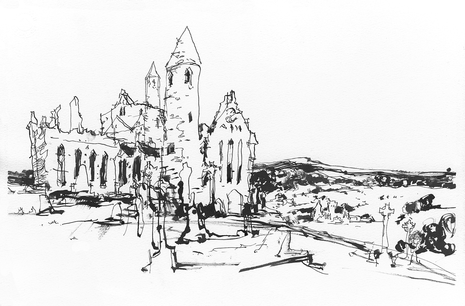
When we stopped at the Rock of Cashel we had some serious rain.
This was one of the more interesting ruins we visited. The old walls are only partially roofed in, which is always a melancholy feeling. You can’t help but think of mortality and the fall of man, seeing these soaring walls crumbled around you. A mood emphasized by the weathered graveyard out back.
Poke around the tombstones and crypts however, and you’ll find some excellent stone carvings.
So, initially, with my new weatherproof confidence, I tried a painting. But it simply washed away. I kept putting down color and seeing it just run off the paper.
So this time I had to bail out and draw in waterproof ink (I use Platinum Carbon black).
These days I like to jump directly from my thinnest pen up to my thickest. So going from a crow-quill to a 3mm wide chisel nib. It gives you the best combination of detail and ‘brushwork’. Remember to pull the nib, not push – especially with damp paper.
But the trick here really is the paper.
For all of these, except the painting in the car and the annotated sketches, I am using Strathmore Aquarius II. The same paper I use for my accordion folding sketchbooks.
This paper is a unique blend of natural and synthetic fibers that is pretty much waterproof.
No matter how wet it gets, it won’t ripple. Even if the paper ‘swells’ and raises up off the taped board – it does not develop those rises and troughs (sometimes called cockling). Given a little time to dry out, it lays completely flat. You wouldn’t have to tape it at all – except that’s still a good idea in case of wind.
>>>
So there you go: The bottom line is – everyone should try painting in the rain!
Photographers have a saying: Bad weather makes good photos.
If you’re starting to feel all the sunny days in the park are robbing your work of some gravitas – head out on a dark and stormy afternoon, and see what you can do with it!
>>>
Note: This is part 1/2 of the 2016 Irish painting trip. You can read the second post over here.
~m
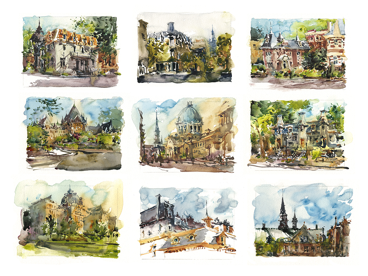
Have you ever seen a Mitchell Scroll Writer Nib?
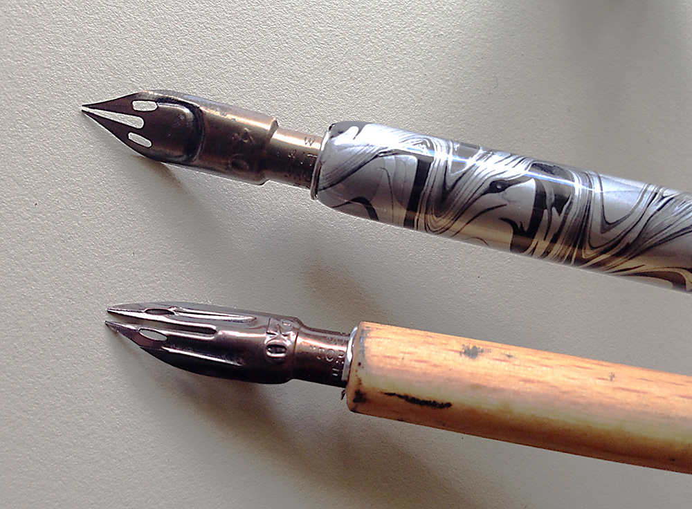
I bought these pen nibs over in Manchester. We popped into an excellent local store – who’s name I should have written down – (someone will remind me) (edit: H.Blyth and Co) – and I picked them up on a whim. I love the dual-line they make! Great for shading twice as fast with a dipping pen :)
They’re branded William Mitchell’s Scroll Writer and come in sizes marked as 10 point increments between 10 and 50. (Not sure if that’s millimeters of gap? Whatever).
Point is – they’re a lot of fun!
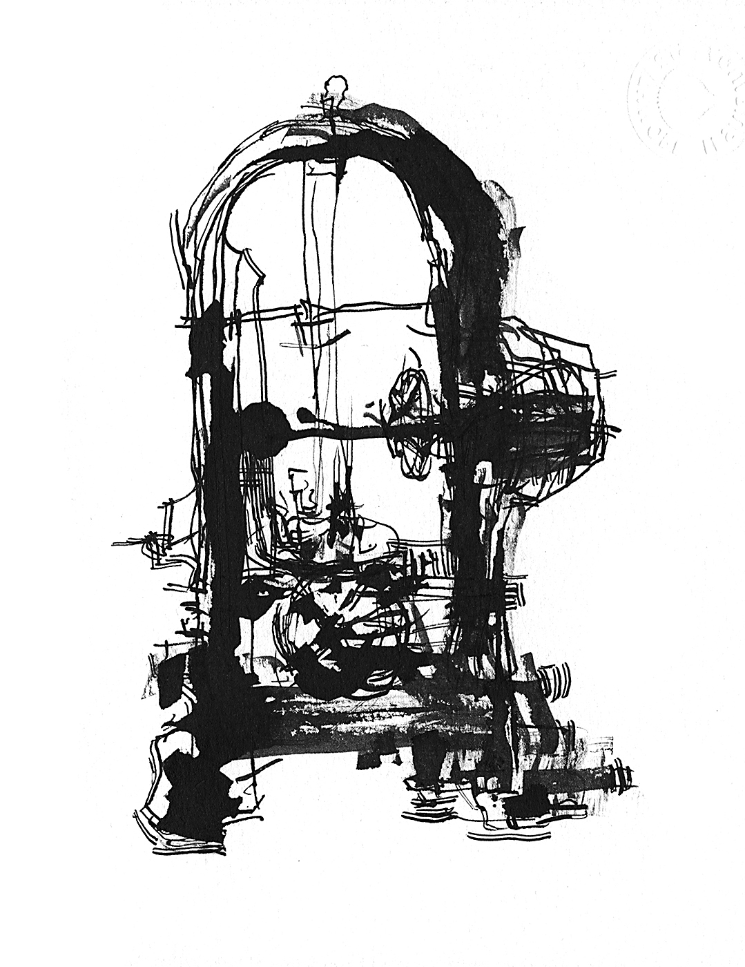
You can see the effect used in the roof of this block of British council houses. I just get a kick out of the fact you get twice as many lines for ever stroke. Double your normal drawing speed! (hah).

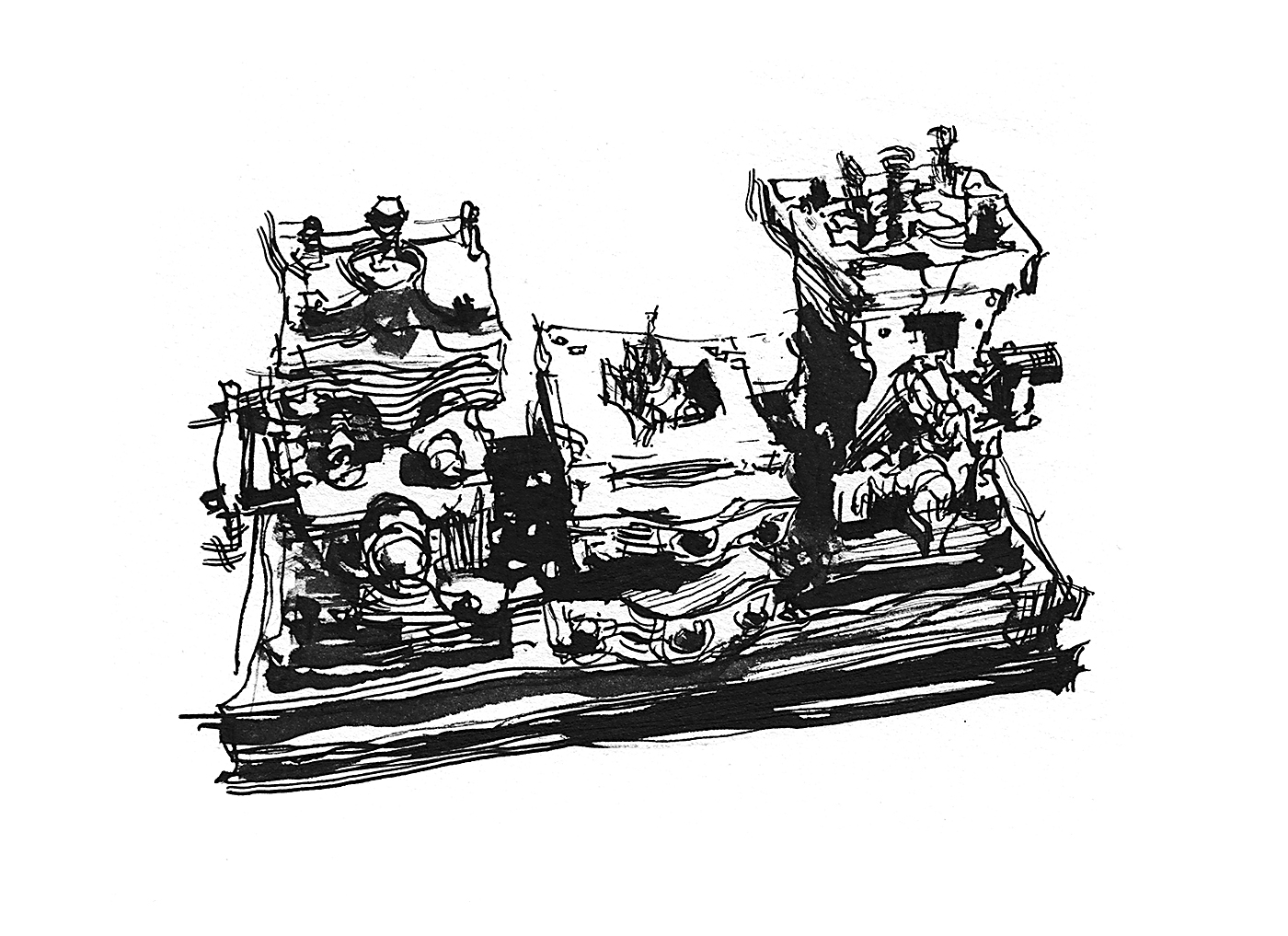
I used them here in the shading on this bizarre piece of machinery from the Manchester Museum of Science and Technology. I didn’t even bother learning what these black iron hulks did. I only had time to sketch their crazy shapes.
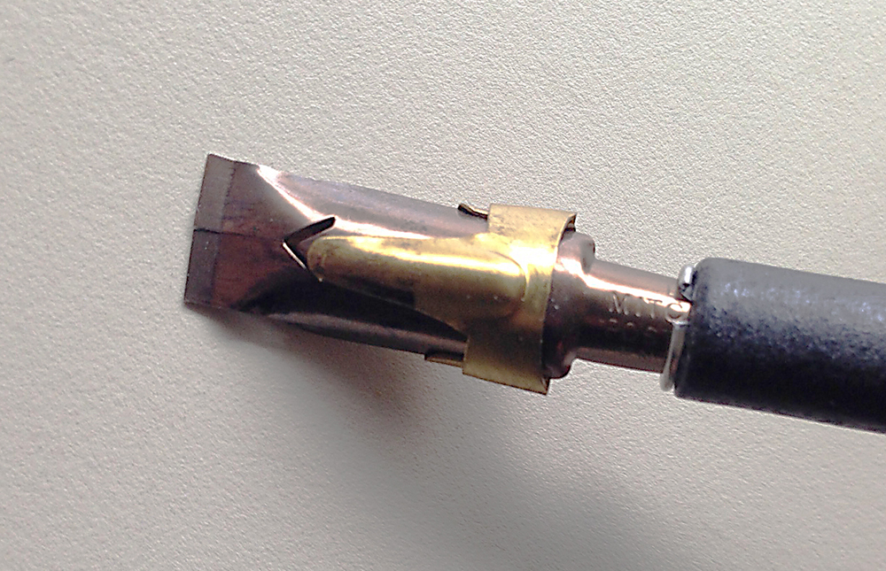
This one is the William Mitchell Poster Pen. Also available in a variety of sizes. This is the biggest nib I have that is not a steel brush. I can’t wait to try this out on some gesture drawing classes.
The Mancunian shop we visited sold nibs and holders al la carte. I haven’t seen these nibs around locally – but I can’t say I’ve looked too hard.
For now I see they can be had online from The Great Calligraphy Catalog – or there is a box set on Amazon (*affiliate link – thanks) that has a few scroll writers included in a grab bag selection. No doubt you’ll find them in plenty of other places as well. Have fun trying these out if you find some!
~m
USK Manchester Symposium : People Sketching
The most fun thing about the annual Urban Sketchers Symposium is the general acceptance for portrait-stalking.
We get to draw each other without that normal nervous feeling. You know? – If you draw a friend or family member, there’s that little worry – what if this one doesn’t turn out!? With other sketchers, it’s easier. Everyone understands.
Plus – you never have that instinct “don’t get caught staring!” And even better yet, nobody thinks you’re not paying attention when you sketch them.
So here’s some of my sketches from the various lunch breaks, after-parties and sketching hangouts:
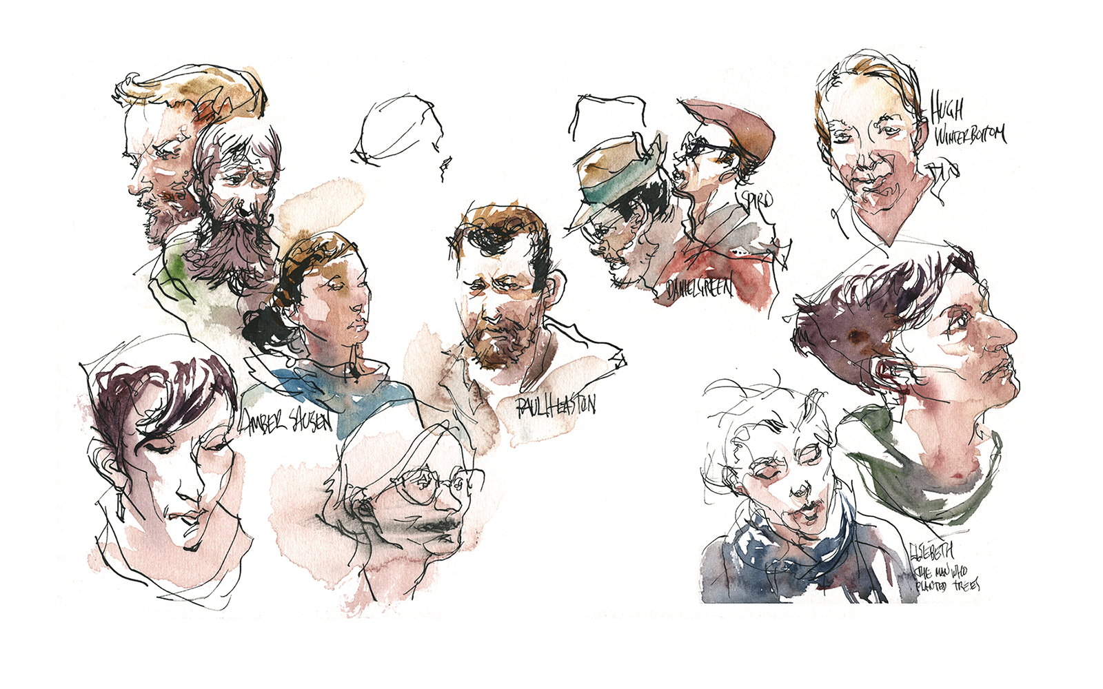
There two Genine Carvalheira’s in here, a smudged Jenny Adam, a not-so-great Amber Sausen, a pretty good Paul “Jetlag” Heaston, The Dapper Hat Twins, Daniel Green and Spyro Rondos (Shari’s sig-other), plus Brits Hugh Winterbottom and Elspeth Murray.
Retake of Amber Sausen (who got me playing Pokemon Go: #TeamInstinct because I’m the Yellow Peril).

The never-holds-still-when-talking Liz Steel who y’all know around here. This one drawn with my new magic pen nib (more later on that).
Suhita Shirodkar: regular symposium sketch buddy and fellow Craftsy instructor, also a tireless editor of UrbanSketchers.org

Lapin sketchbombing the leading ladies: Fernanda Vaz de Campos, Simone Ridyard and Elizabeth Alley

Sketchers milling around waiting for the auction to open. Marion Rivolier is in there somewhere. Can you guess which is her? (Also – this is last day workshop burnout. Down to the printer paper and ballpoint pen! Can’t manage much else :)

Liz Ackerley who took us on a guided tour of local murals – She’s just done an exhibition-and-book of urban sketching with views that incorporate the murals of Manchester.

And, best portrait sketch of the event: This fellow stopped for a chat while I was meeting Hugh and Elspeth. Couldn’t resist sketching that Manc mug!
2016 UQAM Life Drawing Intensive
So hey! As you’re reading this, I’m heading off to the South Carolina Water Media Society to jury their 2016 exhibition, and to teach a weekend workshop. After that it’s Savannah Georgia for three days leading a sketching group in-and-around their historic district. So it’s time to post-date some of the material I’ve been scanning and organizing.
Remember when I said I was taking a week long life drawing workshop?
Here it is!
Twice a year (Spring and Fall) Local artist Lyne Paquette organizes a 5 day event at the Université du Québec à Montréal called the Atelier Intensif, where you are offered the chance to draw or paint all day for five days straight.
Fast poses in the AM and long poses in the afternoon. Prices range from $120 for the full five days to $15 per individual sessions a-la-carte. Tables or Easels can be supplied, and your space is reserved with your deposit. Email: lyne(at)lynepaquette(dot)com to find out more.
I’ve done it twice before: 2014, and when we first came to town in 2010. It’s such a great opportunity. I always regret if I can’t go. Besides the fact it’s very reasonably priced (yay, Montreal!) it’s just tremendous to get that much continuous time to paint.
You can do things on the fifth day that you can’t do on day one. Your instincts are honed by that steady practice.
I suppose that is exactly what I said about the Urban Sketchers symposium. But it’s really true. If you can carve yourself out a week to paint all day, every day – I think you’ll feel the difference it makes.
I don’t mean to be discouraging to people who are only able to do an hour or two here and there. (Like myself on most weeks!) It *is* the only way to fit art into our busy lifestyles.
But maybe, if you think of it like taking a holiday, or going on a spiritual retreat, or some kind of luxury spa vacation, you’ll be able to justify that time.
I honestly think doing something like this can jump you months ahead in your artistic development.


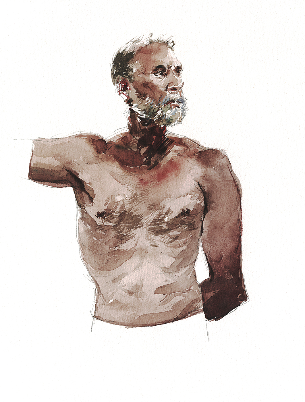
Looking back at this darker skinned male model – I realize now, this was exactly what I did when faced with the somber brick architecture in Manchester. Of course I had not thought of this sketch at that time – but this very solid, deeply saturated first wash, followed by shadow over top – it’s the same approach.
I’ve been taking about Tea, Milk and Honey layers for a long time. But I’m still learning my own tricks! The mantra: More Pigment Less Water keeps sounding better and better.
So there you go – evidence of what I always say. Figure drawing can teach you everything you need to know about painting.
(Well, ok, not perspective – but my stance is you don’t *really* need to know perspective).
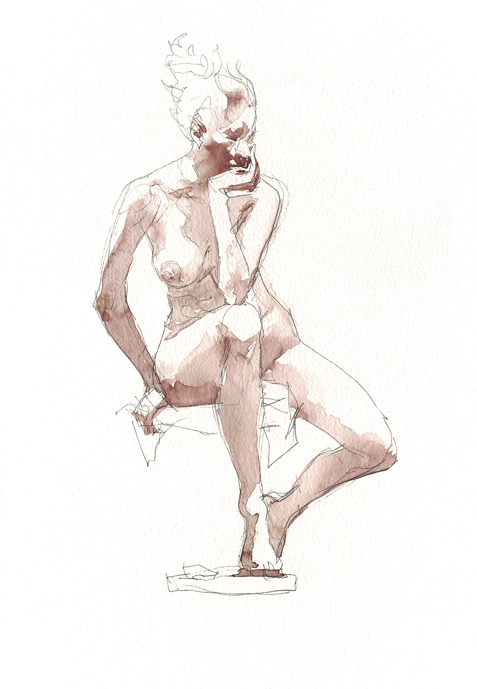
Take a minute to look at that pose. Look at that pose!
The alignment of weight bearing points on chin, elbow, and foot? and the repeating shapes of bent arm and knee? All that with a mood of melancholy – you are looking at one great model there.
That is not me inventing things – that is her putting it into the pose for us.
This class is ‘in the round’ (360 around the model stand) – I feel like I won the lottery being in the exactly right spot for this one.
So I want you to click to enlarge this final image.
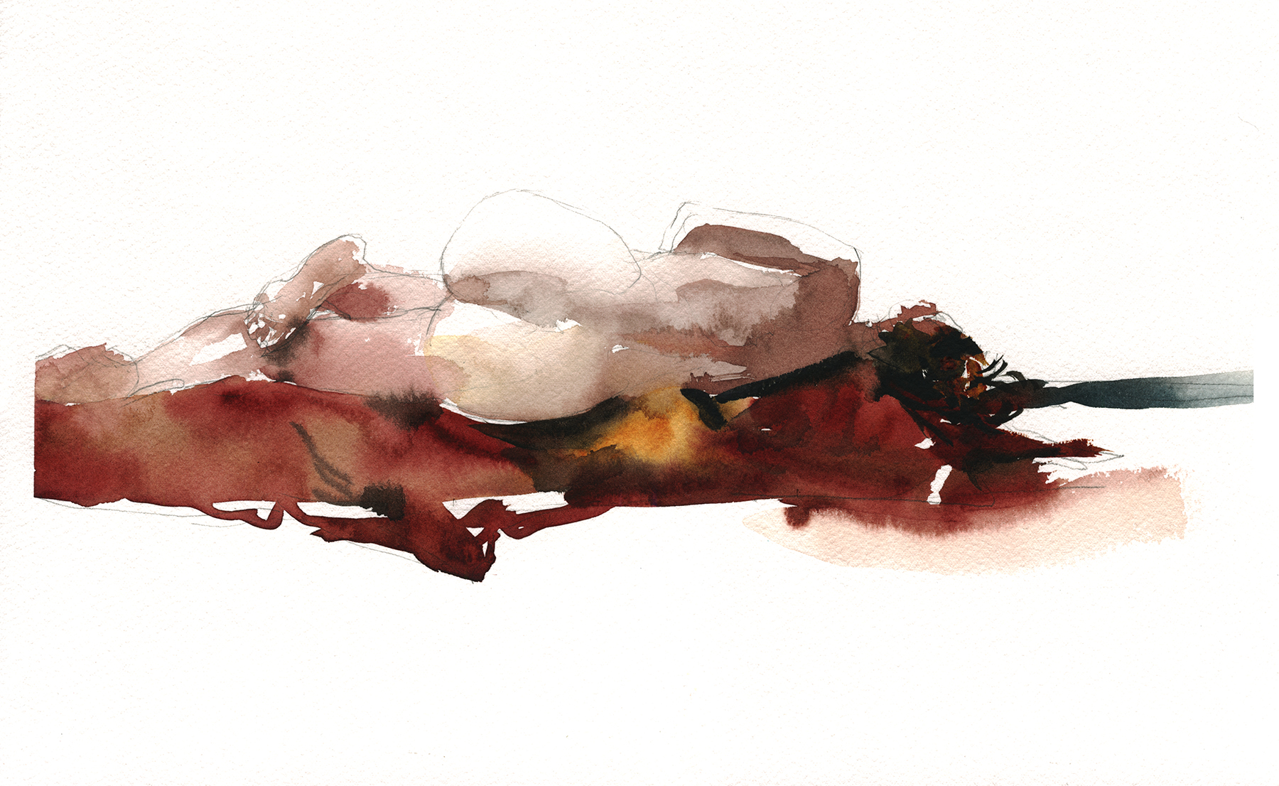
I think I had some good stuff this season. But the entire week really came down to this last sketch. It’s the one out of this set that I really think is a painting, rather than a tinted drawing.
There was a lot going on right about the time I took this course. I really wasn’t ‘up for it’ in some ways. (Just overworked for the last few months). In fact – I think I went backwards between 2014 and this year.
Actually I can tell you exactly the reason I think that. In 2014 I went with my friend Emily Leong, and she (being an abstract watercolorist) motivated me to leave my pencil behind. If I have the damned thing, I’m going to draw with it. I have such an instinct for contour drawing I can’t resist going for the sharp edged line.
Regardless – it finally came together for me in this one. Which was the point really! Even though I didn’t have the time, I knew I needed this week as a break – and a refresher course – between everyday work, and heading off to Manchester and Ireland.
Next few posts I’ll show you those Ireland paintings I keep teasing you about :) I like to build up some suspense!
~m

