Watercolor Figures Wet-into-Wet

A few weeks back I’d been sketching at the UQAM intensif. Maybe you remember me saying I felt those paintings were ‘over drawn’? Relying too much on the pencil line.
The other day I dropped into an afternoon session at the CCGV, and this time – left the damned pencil at home! It’s the only way to break myself of my drawing :)
Or, more honestly – to make myself draw with the brush, rather than the line.

This was a different model, and shorter poses – but just look at how interesting the washes are, (above) as compared to when you’re tinting a pencil drawing. (below).


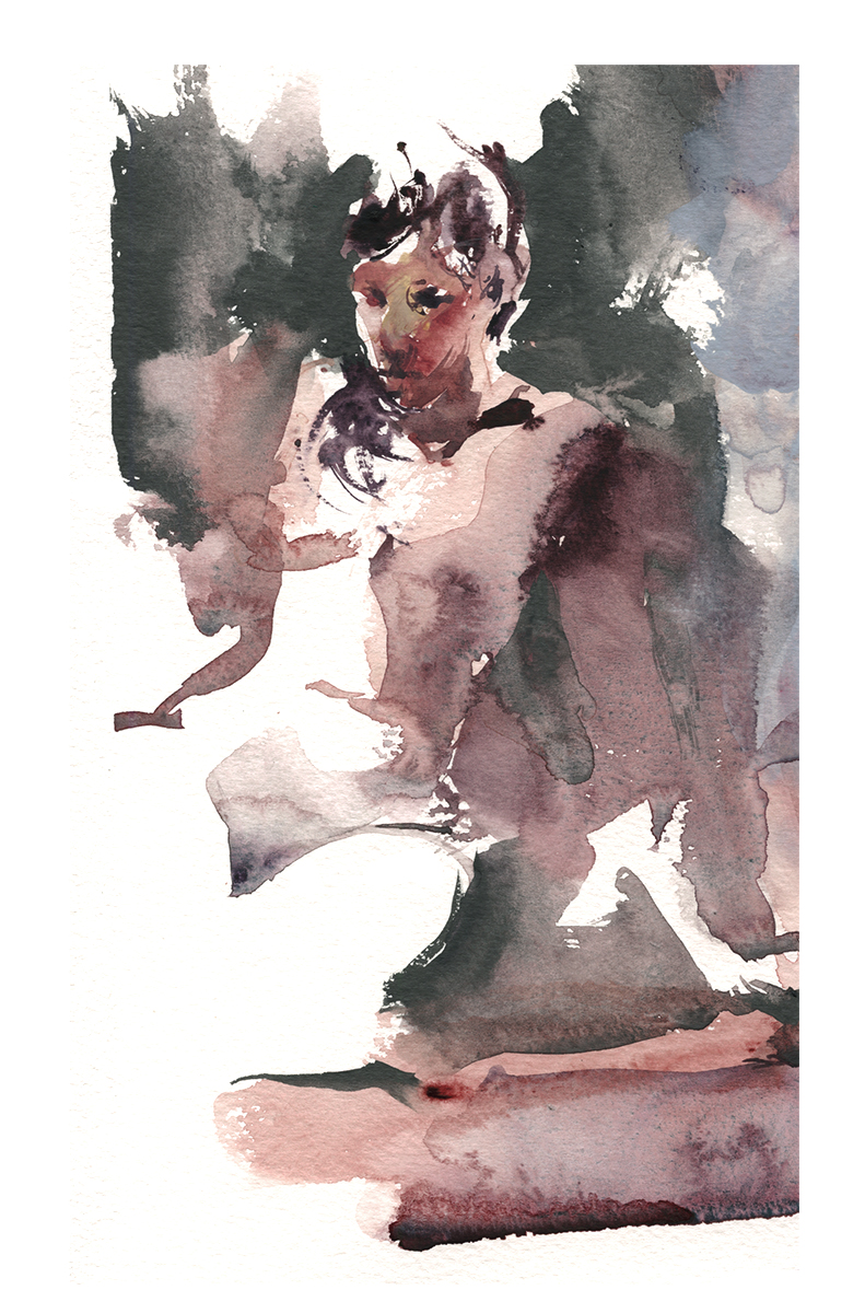
I was also determined to work faster, and wetter. These two are the same pose. Instead of using all my time striving for perfection, I went back to the art school approach, and did multiple sketches, trying to get as many as possible in the available time.

The other advantage of working two (or three) at once – you can just keep moving. While the paint is wet on one – skip to the other. Here’s a pose and a re-take on the head. I was trying for a better likeness – but also a more interesting figure/ground.

So, that’s the way it goes with this strange pursuit of watercolor painting. Back and forth between direct brushwork and more precise drawings, continually looking for incremental improvement :)


Great. Wish I Could do that
These are wonderful – so loose and so expressive. Thank you Marc for always inspiring me/us to loosen up, stretch, discover, and improve.
Super, I love them. I recently got a large mixed media pad to take to Life Drawing with a view to using watercolor or ink. Your work inspires me to try. May I ask what the color is you used for skin tone….maybe Perylene Maroon?
One word: WOW!
Hey Carmel – yes Perlyne Maroon as the base for flesh. Some Moonglow and Bloodstone Genuine for hair, and the occasional orange tint with Qunn Gold Deep. Some Graphite Grey and Neutral Tint in the backgrounds. Here’s a post when I was first trying this formula out: https://citizensketcher.com/2015/02/14/testing-some-new-colors-plus-finally-getting-a-nice-portrait/
Thanks for the tip on the colours you’ve used for the skin tones – those look like some Daniel Smith names to me – I’ll try to look them up and see which of my winsor and newton colours come closest! Beautifully rich and expressive sketches though – well worth leaving your pencil at home to get these!
These are wonderful studies
Amazing! I do like your pencil and wash images enormously but I see what you mean about those drawn with the brush. It must be wonderfully liberating.
Beautiful! Do you mind saying what size paper and brush you were using? I have done some watercolor only portraits, and while I loved the process, and even liked the result, I had trouble keeping distinct details. I suspect I mostly need more practice, (and patience for letting the paint dry before I add to it – your suggestion about doing a few at the same time is brilliant), but I was also wondering if the size of my paper might be relevant. I will have to experiment and find out!
Hey there – so – often I go to figure drawing with a bunch of scraps of paper. These are mostly done on the back of older paintings :) So some are nice sizes like 9×12″, but others are just random. I’m going to say none are smaller than 8″ high, none bigger than 14″. Brushes are #7/8 Winsor and Newton Artists’ Watercolor Sables in pointed round, and #3/4 Da Vinci Sable Mops. And a #5 DaVinci Series 803 Blue Squirrel Oval Wash/Filbert/Cat’s Tongue/Whatever they call this one.
Thank you so much for your detailed reply. I have realized my problem is not leaving enough white space on the page. Thank you for your blog – it continues to be an inspiration, and I really appreciate it.
Just too awesome, welldone
Thank you, Mark, this was very inspiring. Must try that perylene maroon…
William Turner was working all the time with many paintings at once. It’s a good idea.
I stumbled across your post while looking for ideas on how to sketch figures in watercolor without using a pencil. Can’t believe I found what I was looking for. I have limited skills and have confined myself to using one colour, Dark Umber or Sienna to keep it simple. I find it too confusing introducing other colour while racing to get the shapes down for the shorter poses. Thanks so much for the inspiration Marc.