Push Processing

I was out doing some life drawing the other day.
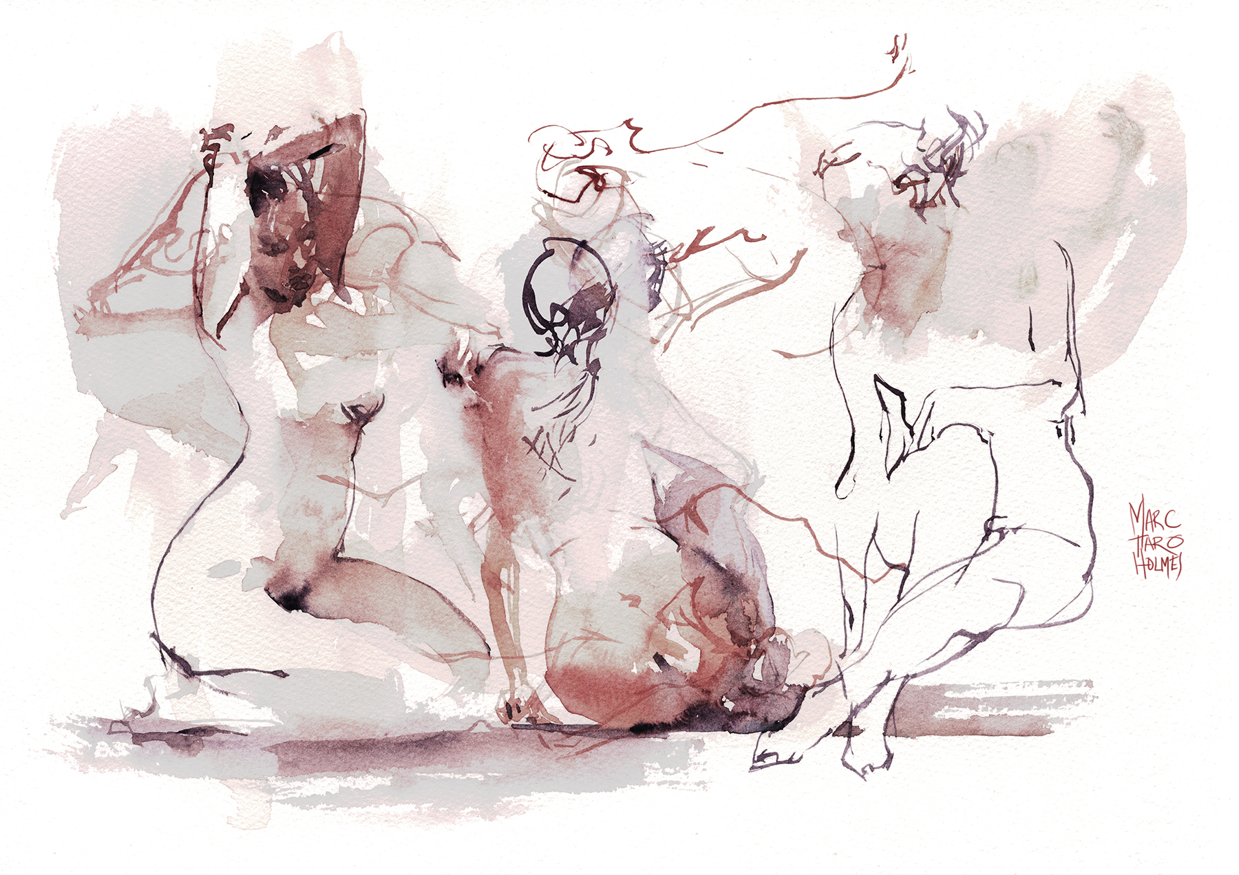
I often say I learned everything I know about drawing from the model. Back in college it was the only observational drawing in the curriculum. So it’s still where I go when I want to test a color, or try out a technique.

I’m still working on this approach using shapes, rather than (relying on) line. This one (above) is probably the only good one from this session. The drawing is made of three shapes. From left to right: The light side edges are drawn with the background tone, then there is a gap of reserved white, and the shadow side edge closes the light-shape with a fused midtone. I don’t count the darks laid on top such as hair, under hand, knee and thigh. It’s just three shapes – with accent touches :) So, that is a goal of mine. To be able to do anything with three shapes.
I’ve done so much drawing over the years, I can’t seem to break myself from using line. I’m not even sure that I would want to :) But it’s a thing that’s always in the back of my mind these days. Banishing ‘artificially’ drawn contours might be the skill that unlocks the next level of painting.

Still, most of these are more like 50/50 line and tone.
I suppose – if I keep working on the white page, there’s no choice except using a line to create an edge. So the answer next time will be: do them all with a background tone! I dunno why that’s so hard for my brain :) But the truth is, when faced with a 5 or 10 minute drawing, you fall back on instinct. You draw by reflex. There’s not much time for conscious thought.
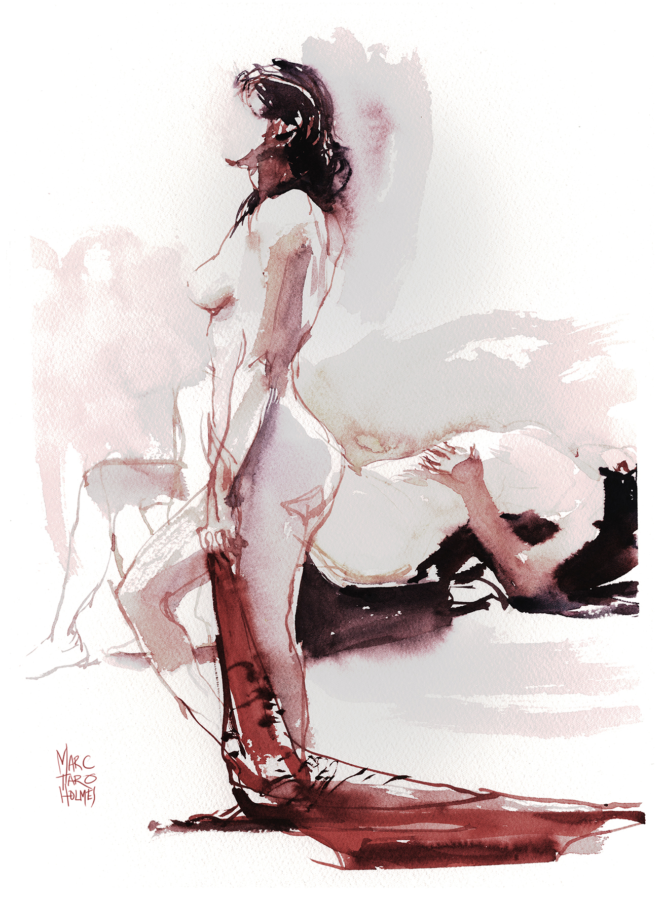
Right about now, someone will be asking me about the color.
Hah! Well, it’s just my normal favorites for dark-haired Caucasians: Perlyne Maroon for the base of the skin, Buff Titanium for pastelization (not a real word) and Raw Umber Violet / Bloodstone Genuine / DS Moonglow for darks – BUT – then I’ve been playing around in Photoshop.
I like to mess about with curves adjustment layers, just to see what it might look like had I painted it differently. Every so often you come up with something by accident, that you might want to do on purpose another time.
This sort of digital color grading is how I learned to paint stronger, darker watercolors over the last few years.
Back in the day, my watercolors were always too pale and too primary. I used too much water, and too pure color – cadmiums, and blues like Ultramarine or Cerulean. So – I would adjust the scan in Photoshop and see that if I’d pushed the values deeper, darker and more desaturated, I liked them so much more. Over time, I learned to match what I liked in the digital corrections, in real life by changing my palette and using more pigment.
I don’t mean to say anything deep here – just showing how I’m always doing the same sort of things, but also – always experimenting in small ways. Stretching a tiny bit each time. Gradually creeping towards better paintings.


Wonderfull sketches !
Lovely lovely lovely. I like the fluidity of your work.
It is so helpful to me to read and see your process. Gives me the impetus to stretch myself. Thank you!!
These are lovely. My nudes are tending to more abstraction with blocks of thick impasto. Alla prima in off beat colors.
I like the way you used negative painting in the first few figures. These are all nicely done!
Love all of these Marc. Superb. So soft and feminine too so I’m thinking you’re also pushing your feminine side too. LOL
Marc, the sketches/watercolors are just lovely. I sure like that shade of maroon you are using, a limited and totally effective palette!
I understand your need to push yourself to work only in shape… but for the rest of us your combination of shape AND sensuous line continues to provide inspiration and joy
Your drawings are superb. I love the energy in the mark making whether with pen or brush. I miss life drawing classes very much and even more so looking at your wonderful drawings.
It’s interesting to hear you say you like to go to life drawing to test or experiment. I find that whenever I get a new brush pen or thick pencil or whatever, I like to try it out first at life drawing before taking it out “on the road.” No matter how challenging, I guess the model is still a tiny bit more predictable than whatever the outdoor world presents. ;-)
Tina
Totally! It’s like the testing lab. Doing portraits is similar too. Great way to test run something and not have to travel for an hour to get on location, only to find it doesn’t work like you expect :) (Been there, Done that!).
I’m glad I read this today. I’m doing a sketch every day this year and I’m already relying on drawing 80% of the time. I think that if that’s your strength or if you do watercolor (which usually begins with a drawing-and I am always teaching drawing in my watercolor classes!) it does become your go to. It helps me to read about your skin tones and dark tones b/c I have been using other artist color choices and am finding its not for me. It works for them, but I need to make it mine! Your thoughts remind me after a break from my art, that its about process and pushing those boundaries.Always learning so we can always be teaching! Thank you Marc!
Nice Marc. Your work is very inspirational and has motivated me to get out more and draw / paint what I see. Thanks for sharing!
These are such wonderful sketches!!
So free, so lively, so juicy!!! 😝
Just a thought as an idea to get rid of the lines, if you want too.
With a juicy enough line and a good timing, the idea would be to soften all the lines with a damp brush, just on one side. 😉
On the light side of the figure, you may soften it, bleeding the outside edge of the line to create a negative painting effect whereas the darker side of the figure could be a shape or a line softened in the inside.
Do you get what I mean? I know my explanations are not so good!! ☺
It’s interesting how processing helped you to know how you liked your sketches and how you should paint to get the look you like! 😊
Have a good day!
Anne-Laure
Yes – I’m heading that way – but maybe softening with color rather that just water too – really it’s just shape painting like we did together – I just need someone to watch over me and slap my knuckles with a ruler whenever I make a line not a shape :) hahaha.
I love the way you drew each figure expressing their own story.
Marc, what are the paint colors you’re using in the figures? So beautiful.
Well the color in this one is a bit tricky! Have a look at the bottom half of the text – I explain what I’m doing with color and photoshop trickery!
Such wonderful sketches! It’s always inspiring to see your way of painting a life model….with or without lines ☺ do you have a preferred size paper to paint in the life model sessions? Thanks for sharing Mark!
Hey Padma – for life drawing, I will sometimes do multiple drawings on a half-sheet (11×22″). But if I have a lot of scrapped sketches lying around I;ll bring all these random sized pieces and paint on the backs :)
I learned as an artist that shading is everything.
Gorgeous color and line work. I love it and look forward to seeing more sketches from you.
. Your work is very inspirational and has motivated me to get out more and draw / paint what I see.