One Minute Watercolor: Equestrian Statue
Every so often, as I find the time, I’ve been working on my video editing skills. Here’s a one minute short done as a test for an all-iOS workflow. This is shot on iPhone5 and edited in iMovie on the iPad pro. I’m looking forward to bringing video to what I’m doing here on the blog.
That’s all for now – enjoy, and have a great new years! – m
Winter Watercolor : Five Tips for Sub Zero Painting
Over on USK.org they’re doing an article on winter sketching, and they’ve tapped a few northern correspondents for our top tips on winter sketching. Click on over for the full article.
Inspired by the request from our editor Suhita, I check the weather – and it’s zero centigrade today (Dec 13). which is pretty nice considering the forecast has us in for -16’C this weekend. Therefore – today it is! I grab my go-bag and head out for a quick sketch in the snow.
![]()
Good Question of the Week: Is Waterproof Ink Safe for Pens?
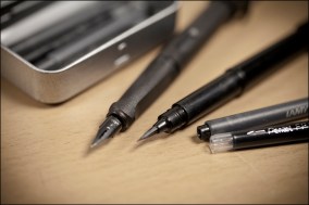
A student recently inquired: “Hi Marc. I went to a store in Los Angeles today to buy a recommended fountain pen with waterproof refill. The owner did everything possible to dissuade me. She said that the waterproof ink ruins a fountain pen very quickly because the ink dries in such a way that it clogs the pen. Only a dip pen, she said, should use waterproof ink. I didn’t buy it. What gives?”
What does Marc say?: “They don’t know about Platinum Carbon Black I guess :)”
Platinum Carbon Black is the ink I use for waterproof drawing. It’s fully pen safe > in my experience < I’ve used it in their name-brand Platinum Carbon Pen, a number of Noodler’s pens, and a number of Lamy pens. (Link to my drawing gear page). There are other nano-particle inks, but it’s the only one I’ve tried personally.
And then, maybe just don’t stop drawing? Don’t leave your pen in a drawer for weeks. Pen collectors might only take out their Aurora Diamante to sign checks for charity donations and real estate deals. Just draw every few days and the ink keeps flowing :)
The thing is, ask an antique car guy about taking care of a car and they’ll say; don’t drive it in the bright sun, don’t let kids in the car, for goodness sake don’t live in a place with winter!
In other words, pen collectors treasure the pens as objects. Artists want to use them into the ground, and treasure the drawings they make.
If Platinum Carbon does shorten the lifetime of then pen – I really don’t care, and I’ll never even know – I buy Lamys for around $40, and hope to lose them in an alley in Macau or a taxi cab in Havana!
Have you tried Sktchy?
Billed as the social media app for artists and muses, Sktchy, (available free from the app store) offers an unlimited supply of portrait subjects right in your pocket.
The concept is simple: People upload photos of themselves, you sketch and post, and everyone enjoys the feedback. It’s kind of a self perpetuating feel-good loop – and there’s nothing wrong with that :) Anything that motivates you to paint right?
You get a steady supply of people to draw, they get a kick out of being drawn, and eventually you have a little collection of your favorite selfie photographers and the sketchers who sketch them.

The app seems a little light on the social networking. People can (and do) leave comments on your drawings, and you’ll get feedback right away in the form of Likes (they call Wows). But that’s it really. No replies, or chat history. Also, artists can’t message models, which is probably a good idea.
There’s a noticeable self-selection-bias towards women and girls offering themselves up as muses. You’ll have to scroll for a while to find a dude. You’ll probably find a cat first. But isn’t that the same in any art gallery?

Persist for a while though, and you’ll find any type of model you can imagine.
So – if you feel like sketching someone, and don’t want to be running out to life drawing or the local cafe – download Sktchy to your iOS device.
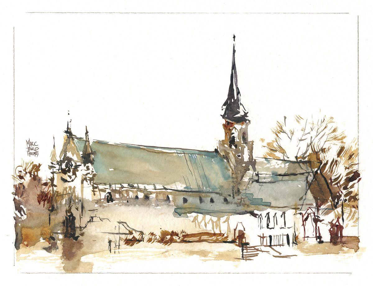
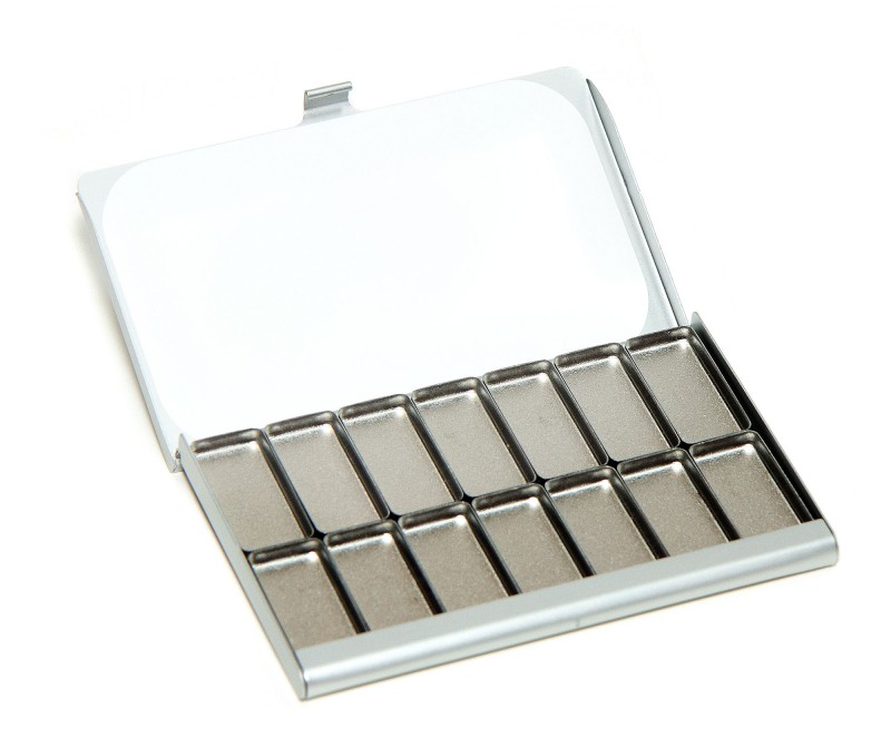
Oot and Aboot with the Expeditionary Art Pocket Palette
The other day was Fourth Sunday, our regular get-together with USK:MTL. I went out for a second round with Maria Coryell-Martin’s Pocket Palette. (Which she graciously sent to me to try out). (Here’s the full review if you missed it).
 USK sketch-outs are a social affair. You can spend more time chatting than drawing. We had a lot of new visitors because of our article in la Press. In fact, I met the person who owns the house I sketched for the piece. That was kind of fun :)
The social aspect makes for better drawings sometimes. I was more slow-and-steady than my previous night-shoot. You get a more delicate sketch by taking your time. I wasn’t keeping track but let’s say these were around 20-30 min each. They’re small, so that’s a fair while for a tiny drawing.
These are similar to the 5×7″ish miniature watercolors I did last month. But, unlike last time, they’re drawn directly with the brush (instead of over a pencil sketch). A lot of tiny point work with the #7 round sable.
This is my fall colors limited palette: Neutral Tint, Raw Umber Violet, Quinn Gold Deep, Buff Titanium and Grey of Grey. I’ve used the tiniest touch of MG Turquoise in the windows.
And – just a reminder about using Maria’s discount code EXPLORE2016 sometime before the end of December if you want to pick up an Expeditionary Art Palette of your own.

Expeditionary Art: Late Night Adventures in Montreal
 Winter is coming in Montreal. That (normally) means the end of painting outdoors for awhile. But – it so happens Maria Coryell-Martin at ExpeditionaryArt.com has sent me one of her Pocket Palettes to review.
Maria is known for using her ultra-light gear on expeditions to the south pole, where the size and weight of gear in your pack are a matter of life and death. (Just ask the Franklin Expedition).
So I figured, if the pocket palette works for her, it should work on an arctic expedition of my own. I’m heading to downtown Montreal on a November night. Forecast says -3 Celsius! I want to try this thing out in the worst conditions possible. Dark, cold and tired – sketching doesn’t get more fun than that :)
About the Palette: Read more…
Being Judge and Jury: Selecting Artwork for the South Carolina Watermedia Society’s 39th Annual Exhibition
I was just recently down in South Carolina visiting the SCWS to teach a workshop, but also, to jury their 2016 members show.
This was the first time I’ve done this – being the sole juror responsible for selecting awards winners. I was flattered to be asked – but talk about pressure!

Judging another artist’s work is a delicate topic. I wouldn’t want to be casual about any decisions. That’s not respectful of the artists’ time and commitment. Read more…
USK Instructor Interviews up on YouTube
This just in: my Urban Sketchers ‘Meet the Instructor” video just went up :)
It’s kind of fun to browse all these miniature interviews with your favorite Urban Sketchers!

Spend a little time getting to know us, and see what we might be teaching next year at the 2017 International Symposium in Chicago. (You know, assuming we get in! Everyone is encouraged to send in their own proposal, here’s the call for entry).
I hope some of you come and teach. If I make it in, 2017 will be my seventh year. It would be fantastic to see some new faces on this page.
Suddenly, Compositions are Easy. Weird.

Recent life drawing session at Syn Studio. Sketching on half-sheet (15×22″) with a pointed round and limited color.
I’m sure I’ve mentioned, in the past, I used to make collages by taking a stack of individual drawings and designing the page in photoshop.
(Here’s a little how-to on that process).
Weirdly, in an example of the way the brain works, I’ve suddenly become able to simply sketch a collage right onto the page – and basically be satisfied with the ‘un-planned’ page design. The first one (below) is a little less perfectly planned. But those were the fast poses.
Kind of neat how some skills just unlock by accident.


Book Review: The Capillas of San Miguel de Allende
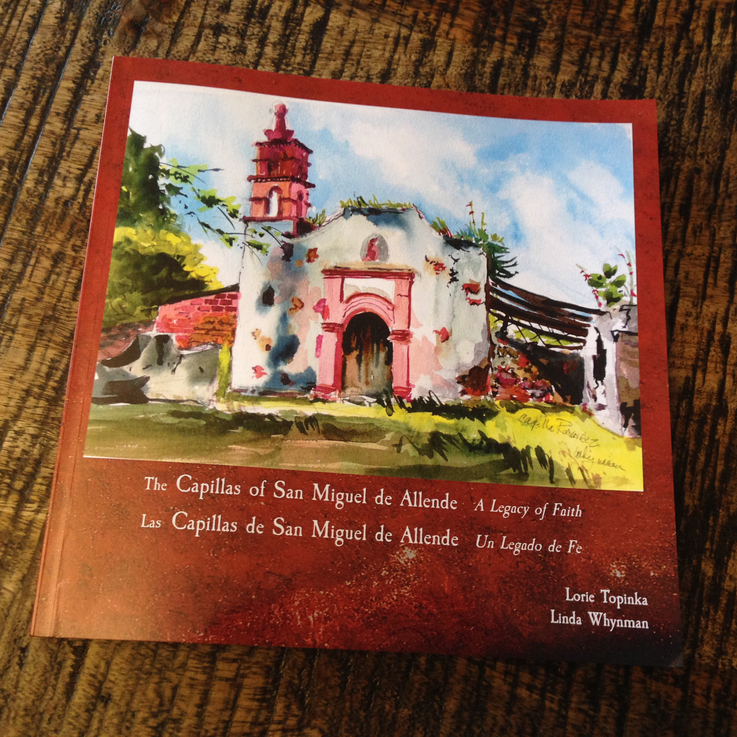 Every so often an inspiring project is brought to my attention. The Capillas of San Miguel de Allende: A Legacy of Faith by Lorie Topinka and Linda Whynman is exactly the kind of sketching narrative that I love to hear about.
Their book is an excellent resource for anyone inspired to try an off-the-beaten-path sketching adventure near San Miguel, Mexico.
I was pleased to get a copy from Lorie, and am excited to give everyone a peek inside.
Some time ago, these two painters began a personal project to visit and paint as many of the local Capillas as possible. They have taken their ‘treasure hunt’ for these historic brick and plaster chapels and expanded it into an informative guide for other travelling sketchers. Read more…

