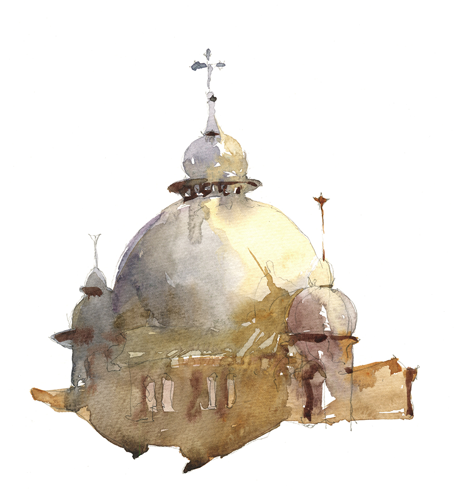
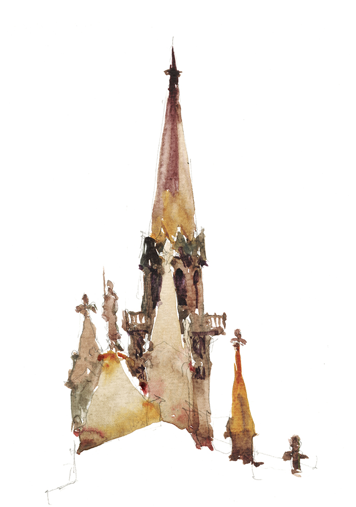
Painting NYC with Rosemary and Co Travel Brushes

Getting to be a ways back now, Rosemary & Co sent me a set of their travel brushes, saying, give them a go and tell us what you think. It was winter at the time, so today’s the day I finally get down to a review.
And I’m happy to say, I like’em a lot!
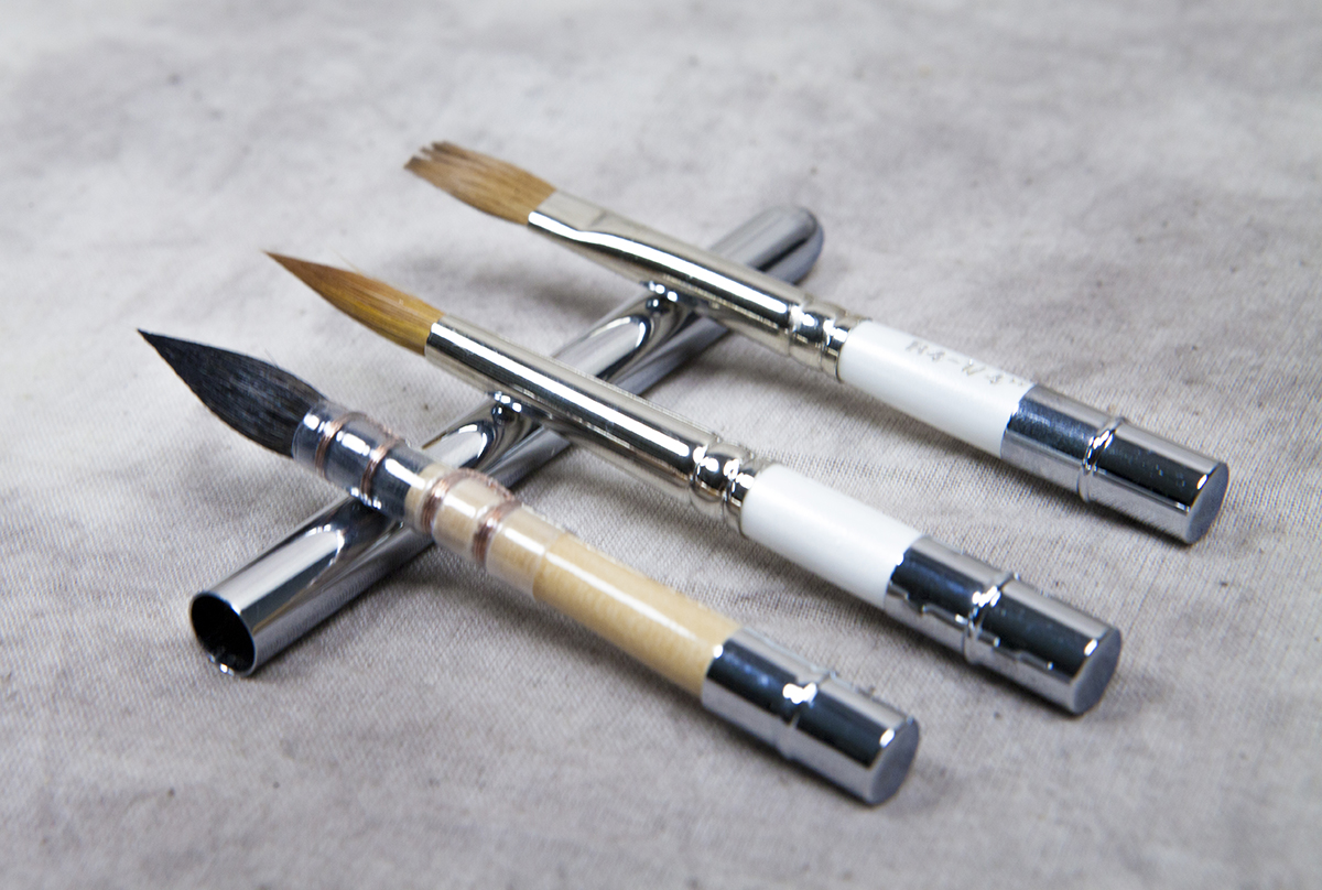
They’re a nice sharp sable brush, just a good as any I’ve tried. But – these are the reversible/pocket brush models, where the brush slips back into the hollow handle. So they’re extra convenient for packing along on a holiday.
Just what the Urban Sketcher ordered.
You can throw them into any old bag or pocket, and they’ll always be protected.
They come in natural Sable (my preference for watercolor) and, quite unusually, Rosemary offers them in a wide range of brush types, including Flats (one stroke), Riggers, Filberts, a Comber (rake), Mops and even a Dagger (in a mixed Sable/Nylon blend). As well, there’s a few sizes of Squirrel mops, if you like the softer hair.
Now, I personally like to do everything with a pointed round, so that’s all I used on these sketches. But for those who want more variety, this is a nice option I haven’t seen in competing travel brushes.
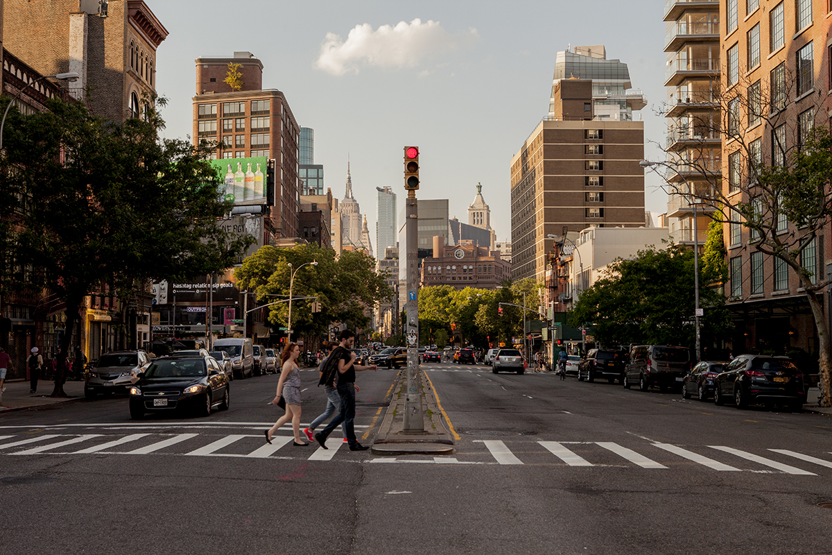
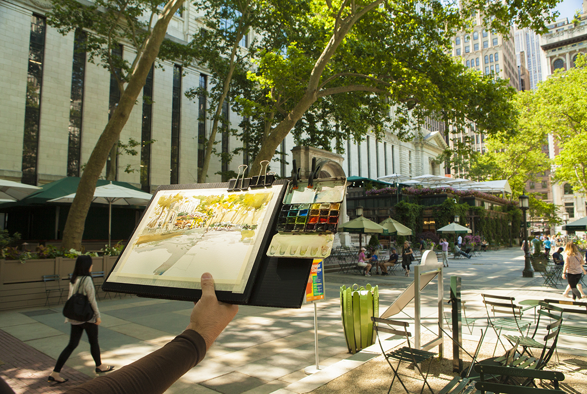
You know, I haven’t really done a lot of street-sketching in NYC. It seems like every time we go, it’s for a museum exhibition. So it’s great to get out on the street at last.
btw, all the photos on the blog (unless otherwise credited) are by Laurel A. Holmes. Ya’ll knew that right? :)
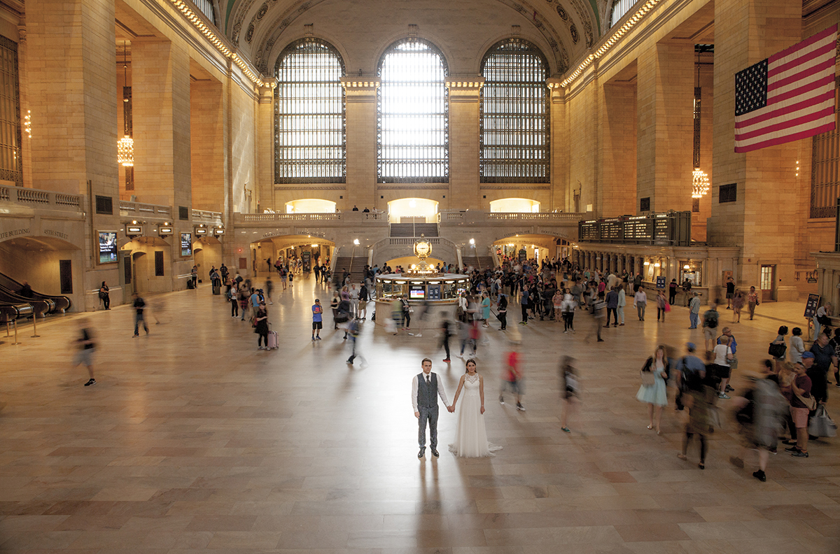
We took the train in, starting from Grand Central Station, and just started walking with no particular itinerary.

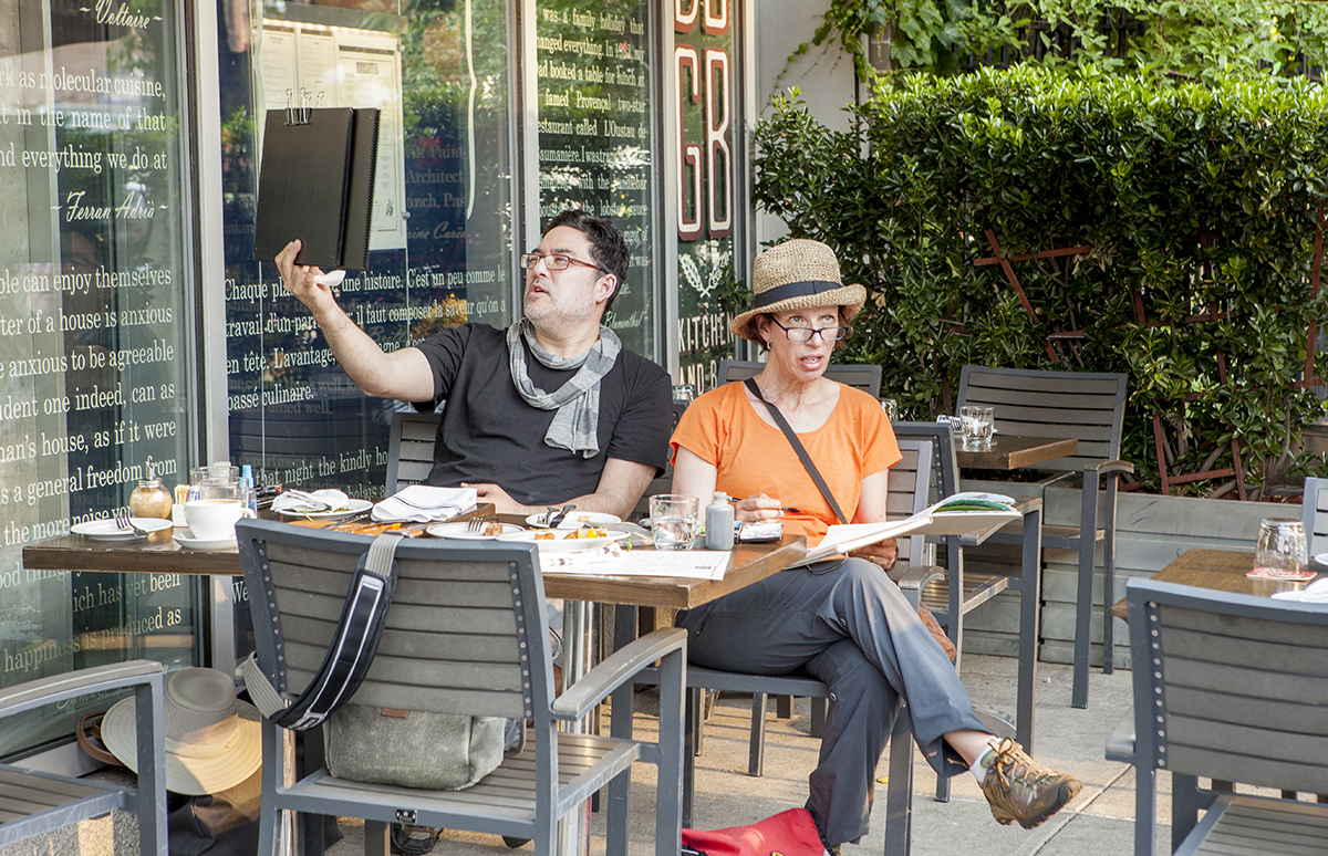
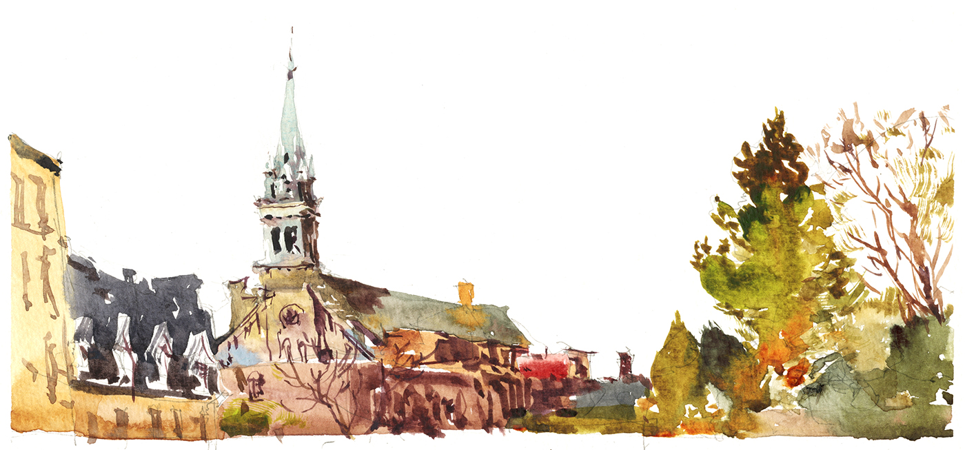
We were there with our painter-friend Shari Blaukopf. She knows the town well – so she made sure we found some great spots – like this cafe in Bryant Park, behind the public library.
I won’t go on any further about the brushes – I’ll be sending a full review to Paint and Draw magazine in the near future. I’ll give you a heads up when that’s out.
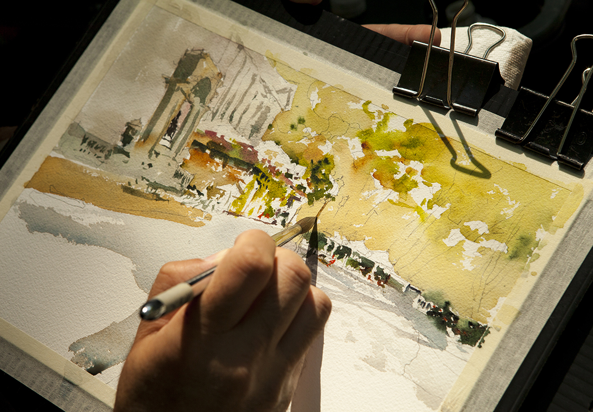
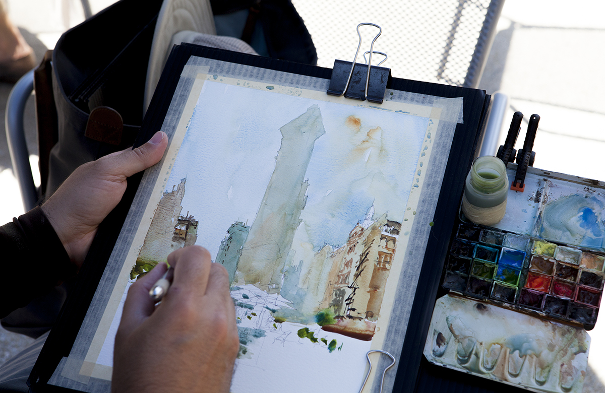
But suffice to say, I painted this whole sketch with Rosemary’s #10 pointed round. It does everything I’d ever need, at least at the 9×12″ or quarter sheet size. They don’t quite come large enough for bigger paintings. I go up to a #4 mop or #14/16 round for half sheet.
But for what I’m doing here, one brush handles both broad passages and ultra fine lines, and can be splayed for dragging or raking leaves and branches.
I like to get a lot of mark making out of the one brush – it’s too much trouble to be switching back and forth while sketching on location.
After Bryant Park , we did some shopping at Muji (Shari needed a hat).

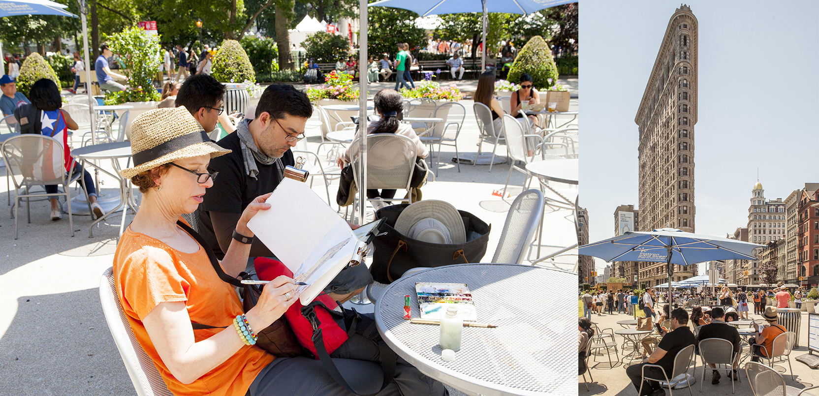
And we ended up at the Flatiron. (There she is with her new hat).
There were huge crowds at the nearby NYC BBQ Festival. I saw squads of photographers standing in the street to get the classic Flatiron shot. Somehow. people didn’t seem to know about this cafe at the base of the building.
Incredibly, they have a sign front and center, declaring “You don’t have to buy anything to sit here.” You can bet I took them up on that.
What a deal! It left me with a much better feeling about NYC than our time in Venice Italy. I’ll tell you. Every square inch of shade, every single chair in Venice – locked down and guarded!
I mean, I don’t mind buying a coffee for the chance to do some sketching in comfort. But hey – free is free.
Thanks NYC! What a great day :)

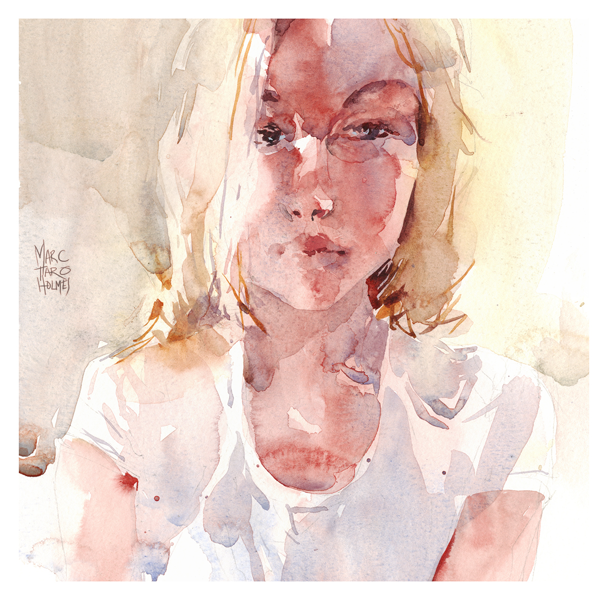
Skchy App Portrait : Tove Mar
We’re heading off tomorrow to New York for the painting event at the NY Botanical Garden.
I’ve been packing my kit, checking three times over to be sure I have everything.
I bring the minimum amount of gear on an outing, but that means I can’t forget even one tiny thing. I leave my binder clips at home and suddenly I can’t paint! I’m so used to using the same setup every time.
I find if I do a little sketch the night before a demo, then I know for sure I have all my usual tools.
I should be painting some flowers or something! I’m a bit worried I’ll be the least botanically-savvy artist in the garden. But I didn’t have a perfect subject handy – so I thought – been a while since I did a portrait from the Sktchy app.
Let’s do one just for fun.

Here’s some still frames from a video capture.
I’m getting pretty good at recording video :) but still a bit slow at processing it and getting it out to you. The editing and voice over is creating a little blockade. So the full video is going into the bank till I have time to get my backlog handled.

This sketch is a classic application of my mantra: Tea, Milk and Honey.
I’ve started the head with wet, diluted, washes of Perlyne Maroon, mixed with Buff Titanium, Naples Yellow, and a new blue I’m testing – Daniel Smith Verditer Blue (PB28, PB36, PW4).
The white cotton shirt is the same mix, in reverse proportions. This keeps a harmony in the sketch – and captures the transmitted color of skin underneath a thin t-shirt.
In my first wash I’m looking for a fuzzy silhouette of the lightest local colors. These days I’m trying to restrain myself as much as possible in the first pass. It should be a fuzzy, light filled shape, with no detailed drawing.
I always want to get to the details immediately. But you have to delay that gratification.

After allowing the first wash to dry, I can begin to lay Milky pigments over top of my transparent Tea. Sometimes I’ll draw in a form like these lips – then lift or blend parts of it – to soften it into the under-painting.
I’m always trying to see how little I can draw.
I’m trying to do more with incomplete shapes. Leaving gaps of under painting, that bridge a distance between darks. Rather than literally drawing on the features – just imply their small shadows.

As the darks on the face begin to build up, I transition to Honey mixes – less water, more pigment.
Also using darker colors such as Raw Umber Violet and Indigo. Essentially the same Magenta/Blue color harmony, but one notch darker in tone, and with less saturation.

The darkest darks are in the shadow under the hair – right behind the neck – and the pupil in the eyes.

And the last touch is a few dots of Grey of Grey in the (not quite) whites of the eye. It’s never pure white – that would be too strong.
So, no philosophy today! Just a simple sketch, trying to capture the softness of a young woman’s features.
Kenneth Morgan : Semantic Dementia in his own Words
This is a time-lapse digital sketch of my stepfather, overlaid with quotes from a conversation we had, over the course of an afternoon and an interrupted night. This was about six months ago? Maybe a bit longer.
It’s made in the iPad app Procreate. Which generates these time-lapse animations automatically.
Ken has a form of semantic dementia, which affects his ability to communicate, his short term memory, and spatial problem solving.
I guess we all know someone, or someone with parents in this situation? These people go through significant personality changes, and a drastic reduction of quality of life.
Today, he would be hard pressed to articulate his thoughts this clearly. Often he is unable to get through a sentence of complete words. At other times, he might read a fragment of text seen in passing, or say a complete greeting. He occasionally does a form of jazz-scat, what wikipeida calls ‘wordless vocables’.
I wasn’t sure if I’d post this. It’s been hanging around my hard drive for a while while I thought about it. But I suppose it’s his last words on the subject, so I felt like I would go ahead and share.
~m
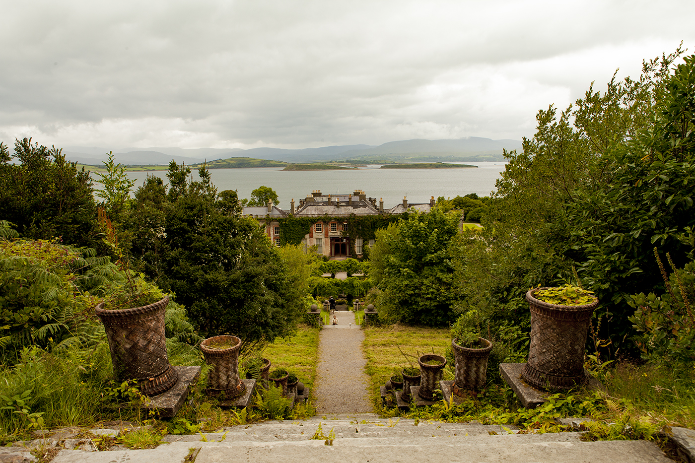
Case of the Missing Mansion : Bantry House, Ireland

We’re away from the studio right now for a family reunion sort of thing. So here’s something from the archives.
Sometimes I have this instinct to save my favorite paintings.
To put them on hold. Not show you guys – and maybe I’ll have the chance to use them for something amazing. I don’t know for what. Perhaps they become grist for a making-of article. Or get submitted to a competition. You never know.
But ultimately, that’s a little silly for an art-blogger. By the time any of that happens, you have new favorites. These old gems just get put to the bottom of the stack, never to see the light of day.

So that being said, here’s my absolute favorite sketch from last year’s trip to Ireland.
This is Bantry House and Garden. A beautiful spot a little south of Glengariff, at the base of one of the fingers of rock that make up the Wild Atlantic Way.
So. What do you think about this one?
I couldn’t really defend it as a portrait of the house could I? It’s very much a dashed off impression.

There was, of course, rain approaching. This is Ireland after all.
If you’re in a rush – the clipped maze in the hedge garden is enough to make you despair. It’s something that should not be tackled casually.
Yet – it’s this very urgency that I love. The simple fact that it’s unreasonable to even try to get this one – is why it’s so fun to do. This painting symbolizes the reason I paint, even when clearly it’s a fool’s errand.


Sunday June 11, from 11am-4pm, I’ve been invited to paint a public demonstration at the New York Botanical garden.
Everyone is welcome to bring your art supplies, (EDIT> however not all areas will be open for public painting, due to congestion on the walking paths. I believe that drop in painters will be directed to the Conservatory Lawn).
In addition to the artists scattered throughout the garden, there will be guided tours featuring the current Chihuly exhibtion, along with demonstrations of flameworking by Urban Glass. (Which is a fascinating sketching subject!).
There will be over 30 established plein air painters, including the event’s headliner James Gurney, plein-air master Garin Baker, renowned painter and art-blogger Stapleton Kearns, Montreal’s own Shari Blaukopf, NYC urban sketcher and reportage artist Veronica Lawlor, and USK past-president Jason Das – along with many more artists I’ve yet to meet.

In preparation for the event, I’ve been warming up with some studies at home. Here’s a series, based around reference photos of roses and common rose diseases.
I know that’s a bit odd, but there you have it.

I’ve always been interested in botanical art, but not so much the classical perfection of the best botanical artists. For me, it’s more that plants are just so weird! They come in so many bizarre shapes and sizes.
I don’t know what area or subject I’ll be offered at the gardens – but part of me hopes it’s bromeliads or cacti :)
I’ll post an update when I hear what my actual spot will be, and if you’re in the New York area this June, I hope you’ll stop by the NYBG and say hello!

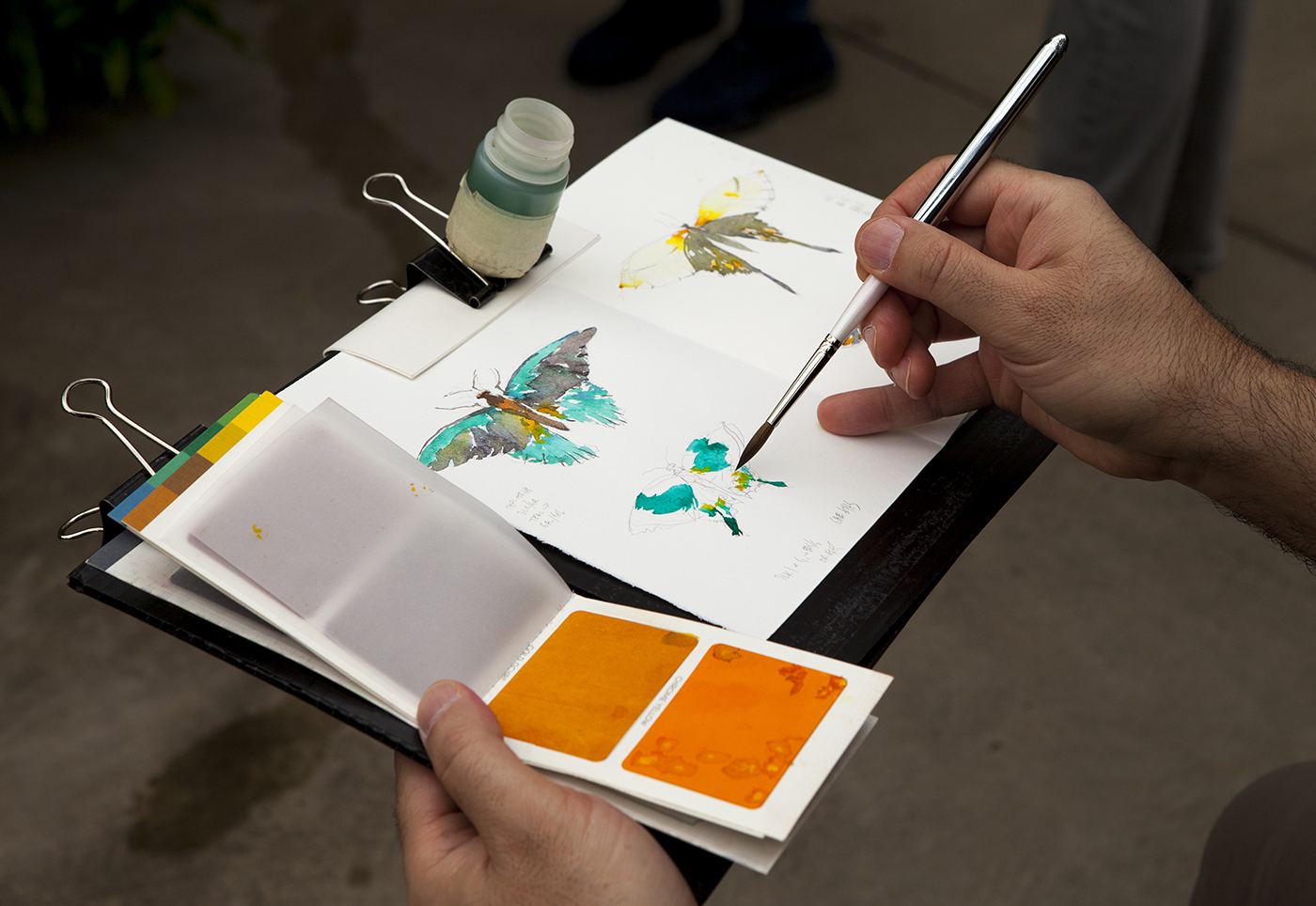
Viviva Colorsheets : Hands On Testing
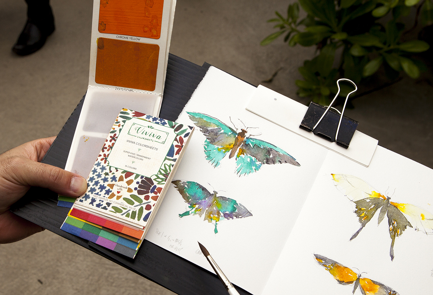
Art materials entrepreneur Aditya Vadgaonkar reached out a few weeks ago, offering me a sample of his new crowdfunded product, Viviva Colorsheets.
Vadgaonkar is currently seeking production costs on Indiegogo.com, with pre-purchase tiers from $15 for a single booklet, up to $315 for a 25 pack. Enough to outfit a class full of art students.
As well, he’s offered readers of Citizen Sketcher a special tier, which gets you a pair of watercolor booklets for $25.

The product is a modern update to a concept pioneered by Peerless Watercolors in 1885.
They take the form of dry sheets of paper, impregnated with transparent watercolor pigment. You simply touch the paper with a wet brush to lift off color.
Viviva sheets have 16 colors, packaged in a folding booklet, with two colors per page, and a wax paper leaf between. This catches any damp spots as you flip pages.
It’s a convenient solution for anyone who wants to carry an ultralight selection of watercolors, with no fear of spillage.

Right off the bat I could see the value for museum sketching. Or in this case, the crowded Butterflies Fly Free exhibit at the Montreal Botanical Gardens.
We went on the last day of the show, which was packed shoulder-to-shoulder with families and excited kids. The kind of situation where you need to be as compact as possible, as you’re going to get jostled.
This would be the perfect pairing for a water brush. One of those plastic jobbies where the water is carried inside the brush handle. But I personally won’t use them. I truly dislike the nylon brush tips.
Someone should make a crowdfunding proposal for a water brush with a decent brush! That could be the next big thing.
In this case, I’m using a tape-and-magnet-bottle and a new pocket brush provided by Rosemary and Co. I’ll have more to say about those brushes later :)

So – what did I think about the Viviva pigments?
Color me impressed!
The paints lift easily off the paper and are surprisingly concentrated. You get intense, strong color with a single touch. The color is completely transparent, and blends well, one into the other.
I can’t speak right now about the archival rating of the pigments. The color is intense enough, that I have my doubts about that. But this really isn’t the point with this kind of product. It’s not for the museum, it’s for your sketchbook!
There are some downsides to the booklet format. The color sheets are glued into the paper backing, so there’s no way to rearrange the palette. With Peerless colors, the sheets are bound like leaves of a book, so you can cut out small pieces. Some people tape a strip of colored snippets to a card, and use it as a bookmark/palette.
And of course, there’s no possibility of lifting an impasto off the thin coating of color. If pan color is thinner than tubes, these are even further in that direction. So they’re better suited to sketching high key subjects like these bright insects. Or perhaps casual portraits, or a sunny day on vacation :)
As well, the dry sheets don’t always resemble the actual color – so you shouldn’t separate them from the printed color guide along the bottom of the booklet. But this is also a small quibble, as the booklet is cut so the tabbed color chart helps you jump right to the color sheet you need.

My final assessment:
If I was carrying paints back and forth on public transit every day, or going on a backpacking trip where every ounce matters, or a carry-on only flight – I’d certainly consider these convenient color booklets.

Find out more about Viviva Color Sheets on their Indiegogo page. There’s only 16 days left for them to reach their funding goal!

Watercolor Silhouettes : Puzzling out a Painting
Here’s a couple of simple silhouettes, captured on a spectacular day of sun in a month of spring rain.
The great thing about painting – you’re always evolving. No matter what your level as an artist – you can (should?) always have an inspirational goal. Some skill or philosophy on the horizon.
This season, I want to double down on the use of silhouettes.
My painting has always been a bit ‘unfinished’ – (intentionally :) – with a lot of negative space, and places that show the drawing. I like it that way. I’m not after an overly polished look.
But as well, it’s an artifact of the way I draw – sketching contours in line, then looking for the shapes of cast shadows.
One way to counter any tendency towards jumpy/patchy/uneven structures – is to look for back-lit situations.
What the Plein-Air painters call Contra Jour – or Against the Day.
Position yourself with the sun behind the subject – and the silhouette is spelled out for you, clearly visible against the sky.
In a more complicated scene, you can have fun welding one silhouette to the next, making an entire street into a fused shape. I tend to march across the painting working left to right with light values, then sweeping back over top with darks.
I want to occasionally touch wet edges, so some shapes leak into their neighbor. Making linkages to avoid any isolated objects floating in space.
If it’s a dry day (or you’re in the full sun), it helps to work briskly – keeping up with the wet paint – but not so fast you can’t control your brushwork.
At the end of the sketch, I’m trying for the feeling of a single silhouette that’s built out of colored blocks – fit tightly together like a puzzle.
Someday soon I’ll have some video for you, so you can see the shape welding step-by-step. But it’s not that hard – remember: Larger-to-Smaller, Lighter-to-Darker and you won’t go far wrong.
~m
False Starts : or, It’s Good to Throw out the Baby
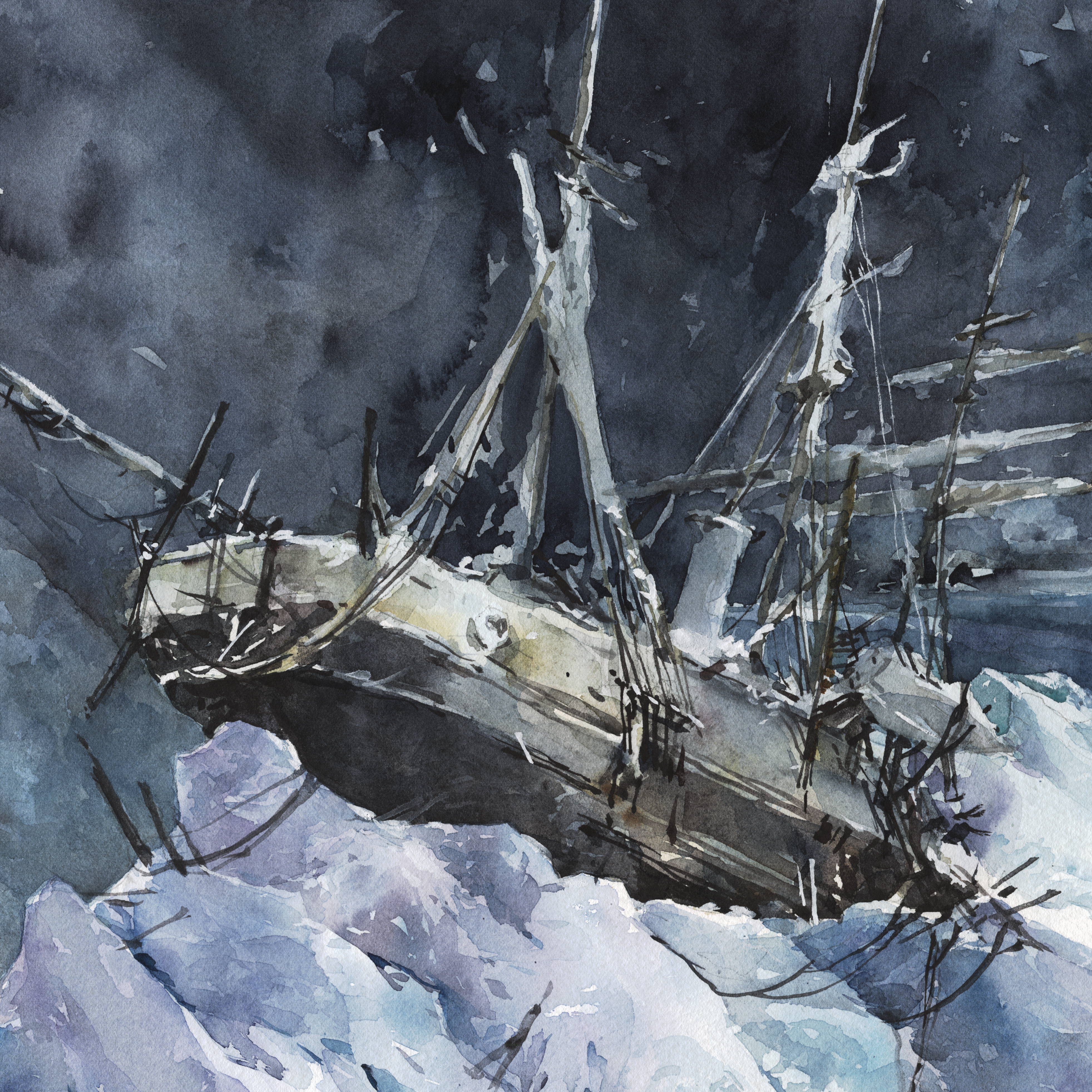
 Last post I was saying how I’ve always wanted to do a shipwreck painting – based on some of the first paintings I remember from art history.
I’m proud I finally managed it because it’s a technical victory for me, and it was accepted into a show – and I hear I even took second prize. (yay!)
But, actually, I was kind of surprised the jury chose the ship painting – instead of this one – my current favorite painting ever:

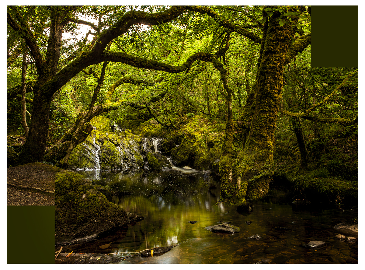
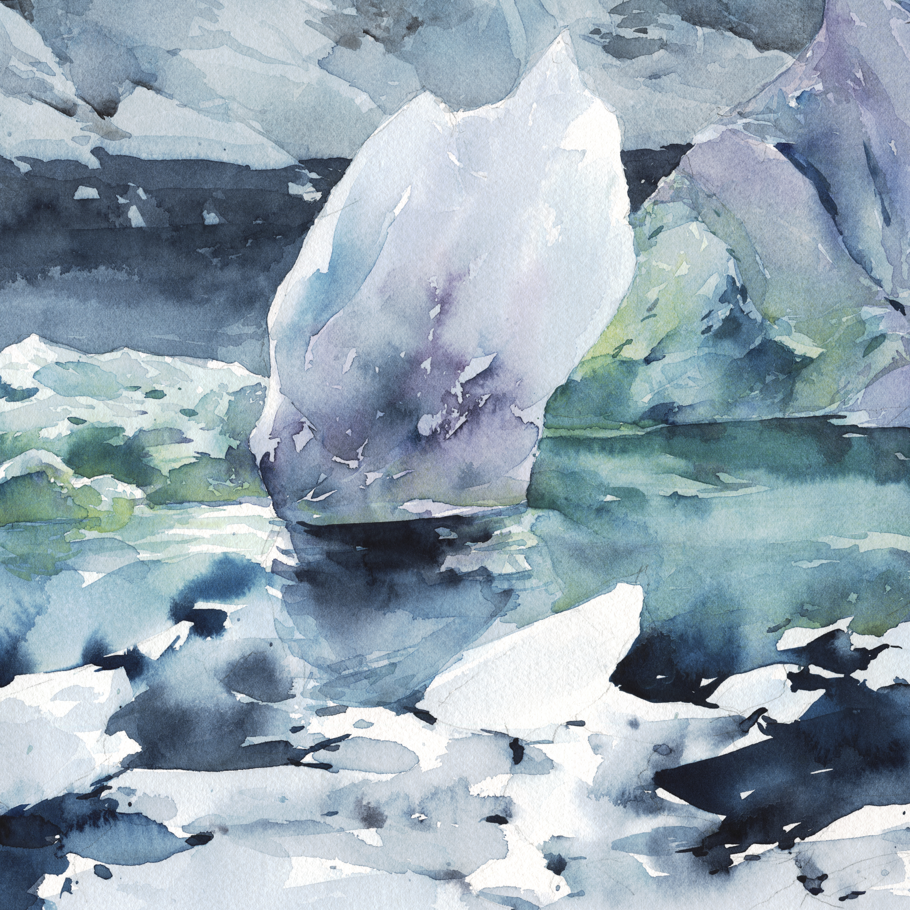
This is just something we found. Not a landmark or a destination view – just what you see while walking in the forest.
There’s no great meaning behind it – except the shared meaning that’s always present in works about nature.
Don’t we all have a feeling of contemplation, or inner peace when we find ourselves wandering alone, surrounded by nature? I think that’s a common response.
We call these kind of places magical. Or say they’re a sanctuary.
So, unlike my shipwreck, which is a narrative – an illustration, really – with this glade in Glengariff, I simply want to make you feel what I felt, on discovering this shallow pool surrounded by mossy oaks.
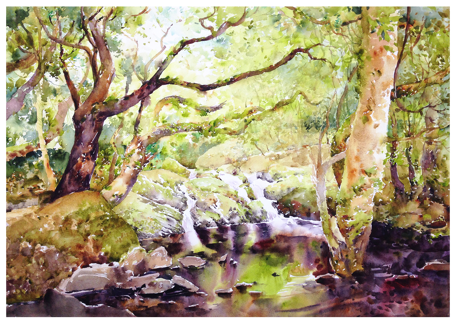
But, if I do have a fatal flaw as an artist – it’s that I’m in love with studying my own paintings! I hope one day I’ll be able to let go of all this navel-gazing – but it’s part of my process right now.
So, for the interest of all the other auto-didacts out there, this is the secret sauce behind the final painting.
This (above) is my false start.
A painting I wasn’t satisfied with. In fact, I disliked the results enough, it provoked a complete redo. Starting again immediately on a fresh sheet, with a new drawing.
These are both studio paintings. Full sheets of 200lb Fabriano paper (so that’s 22×30″). Painted from Laurel’s photographs taken on location. And of course, I intended this to be the final work. I didn’t plan to do it twice in a row! Each one took a couple of days to draw and paint, and I didn’t have the extra time to spare.
I probably shouldn’t recommend you do this – paint the whole thing twice back to back. But it does work!
You see the same sad story in art history. In which the artist had to go through dozens of studies before ‘suddenly’, they’re able to pull it off.
Just look at Sargent painting Madame X – over 30 times. Or Monet testing the Rouen Cathedral in every possible lighting situation.
Looking back at the reference – maybe you can see why the first draft just wasn’t good enough.
I’d done a fair job capturing the trees, But it’s not so much the drawing – it’s the values that weren’t working.
My classic complaint with watercolor – too pale! You need to feel you’re *inside* the forest. That deep shadow under the canopy.

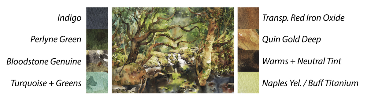
To get darks like this, while working as directly as possible in watercolor (that is, attempting to get the color in the first pass – but often needing three touches in total), you have to use your pigments at full strength. Taken right from the well.
At the end of the day, it’s funny how much the painting resembles the paint box :)
You can see all my color choices right there in the pans!
Endurance: or, The Argument for Inexorable Progress
I’ve always admired the genre of marine painting, with it’s ferocious battles and poignant depictions of hopeless shipwrecks.
I’m pleased to be able to say, my painting Endurance is appearing in an upcoming Canadian Society of Painters in Watercolor show, at the Santa Fe Gallery in Owen Sound, Ontario. (April 8-May 26, 2017).
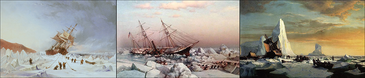
In particular, I’ve always been fascinated with the sub-genre of the ice-bound ship.

One of the first paintings that I remember really looking at as a kid (like, looking at for more than a few seconds), was Caspar David Friedrich‘s The Wreck of Hope.
Friedrich’s painting has been associated with Mary Shelly’s Frankenstein, appearing on the cover of various copyright-free-classics editions. I believe that’s where I saw it first. Most of my early exposure to art was paperback book covers.
The painting was also exhibited under the title: An Idealized Scene of an Arctic Sea, with a Wrecked Ship on the Heaped Masses of Ice.
I didn’t exactly set out to clone Caspar – but that title is quite appropriate to my own.

My other inspiration was Frederic Edwin Church‘s icebergs. Another of my first experiences with a painting that formed long term memories. I don’t know when I saw this first, but I’ve always remembered this painting.
I had read Church painted this from the deck of a ship travelling to the Antarctic. That’s not true – he did it back home, working from his sketches. (Probably with the secret assistance of photography).
I also remember a story that this canvas was lost for years, eventually found in the attic of a boy’s school in New England. This is probably also not true.
Though there’s some evidence that might be a true-fact about an entirely different F.E. Church painting.
I’d written one of my only memorable college papers on Church. Making the argument that in the 20th century, film effectively murdered and cannibalized painting.
In Church’s time, viewing a gigantic painting was essentially an IMAX experience.
A panoramic ultra-real illusion placed before our optic nerves is functionally different than a conventional painting. The brain reacts differently to something that completely dominates our field of view. Soon the idea of IMAX will seem quaint – after VR, and whatever direct-brainwave interface comes next.
Back in Frederic’s day, people would line up around the block, plonk down their coins, and have the velvet curtain drawn back for five minutes in front of his epic canvasses.
Clearly, we’ve missed that boat. Born a bit late for that kind of success as a painter :)
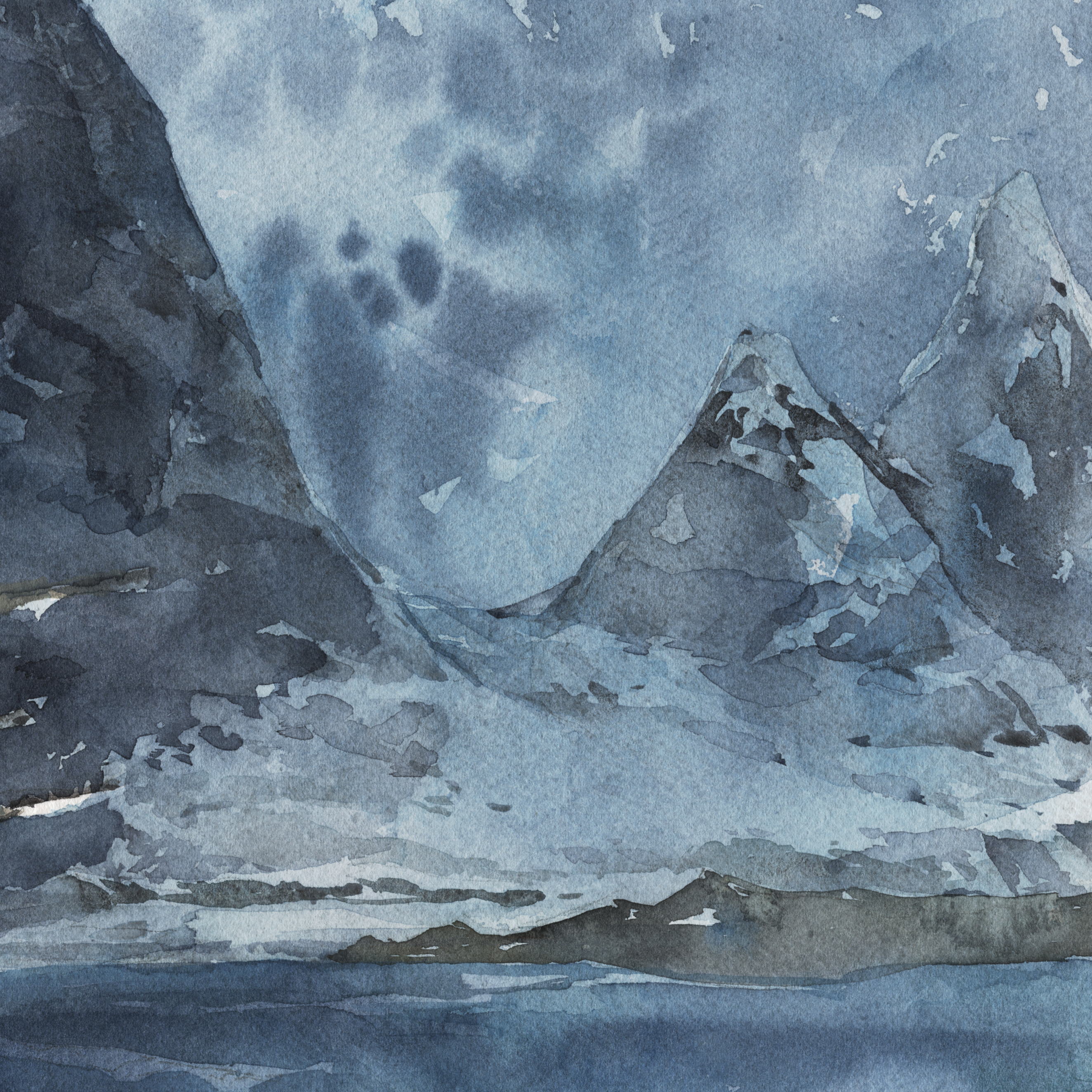
My painting is based (vaguely) on the infamous Franklin expedition, but more directly on the slow destruction of Shackleton’s ship Endurance. His expedition waited for months, camped out on the ice, making futile repairs – pointlessly reinforcing the splintering hull. watching as their vessel was inexorably crushed. Hoping against all evidence to the contrary that the ice might spare them.
I’m sure the debate raged nightly. Start walking south, knowing most of them will die? Could you drag a small boat back to the edge of the ice pack? Or just hold out till spring and hope the ice will part? Maybe send someone back to lead the rescue mission. I wouldn’t want to be one of the people left behind watching the dwindling supplies.
So, I’ve always known I would paint one of these ice-ships – and finally, the time was right.
The truth of the matter is, I was waiting for my own miracle. For my abilities to arrive at the stage where this was within reach.
I’m plagued with an impatience about art. I find it excruciating working on a long-term project. I’m at my best when a thing is finished in under an hour.
There’s a long list of projects that I’ve abandoned, simply because they took longer to complete than my short window of attention.
The key for me, was being able to draw well enough that I could sketch this all in one go.
The old wisdom is to painstakingly draw your image on disposable paper. Working out your composition, erasing or redrawing, whatever is necessary to perfect the design.
Then, you’re supposed to transfer your rough drawing to your pristine watercolor paper.
Some people use a graphite transfer paper. Some shade the back of the drawing. Some project the drawing and trace. Some people go so far as to pounce the drawing.
The fact is, I despise all of these methods! I’m simply unable to transfer a complex drawing without becoming overcome with boredom. Every single time I’ve attempted it, I get a stiff, unpleasant drawing that looks over-cooked.
Finally, I’ve reached a fluency with drawing, that I can sidestep all that rigmarole.
Don’t get me wrong, I did use photo reference. I made a little collage out of various pictures of ice, and an actual photo of the Endurance, and sketched that a few times. That way I had something to look at, and could just do the final drawing directly onto the watercolor paper.
It’s the first time this has clicked for me. That I’m able to look at my rough drawing and my reference, and simply re-draw it side by side – and have it come out exactly the same, but better.
Kind of amazing. But there you go. There *is* a pay-off for years of training :)
Then, there is the ability to paint values in watercolor.
I don’t want to dwell on this. I’ve been banging on for years about achieving the full range of values in a watercolor. If there’s one great weakness to this media, it’s the natural tendency for transparent watercolor to come out too pale.
So again, all I can say is; there is a moment in time, after sufficient practice, when you can simply do this.
You’ve learned the behavior of your pigments so instinctively, and figured out what colors give you the range you need, then suddenly, you can put down a value correctly ‘by feel’. Or know how many layers you can use to get there without killing the luminosity.
I’ve always wanted to make big, epic paintings in the manner of these works I admire from history. And I always thought I needed to discover some superior working method. But for me, it was never a matter of proper planning, or setting aside enough time, or taking pains not to make mistakes.
It was simply a matter of staying the course.
Training (field sketching) and analysis (this blog over the years), and countless partial failures (that you’ll never see), and eventually – reaching the point where it can just fall off your brush.
Thanks for reading this long musing – and next time I’ll show you the one that didn’t get selected by the jury! For whatever reason, they never take my favorite.
~m
One Minute Watercolor: Tinting a Single Line Sketch
I found this old footage on my hard drive the other day. This is an example done back in 2015 for a workshop on travel sketching. I still have a free PDF of the exercises up here for download.
It’s a sped-up time-lapse video, which is not my favorite way to show drawings – so I though I’d make it into a One Minute Watercolor short :)
It’s easy to *say* – just draw without lifting the pen :) Harder to actually do it! Here you can see exactly what I mean when I say – ‘stick to the spirit’ of single line.
I was trying to do this in 5-7 lines. But I see a bunch of single-line people in there – so I’m not sure how few lines it really was.
In any case – don’t be so strict with it you end up hating the drawing :) But use it as a way to encourage simplification. And speed!
~m

