False Starts : or, It’s Good to Throw out the Baby
 Last post I was saying how I’ve always wanted to do a shipwreck painting – based on some of the first paintings I remember from art history.
I’m proud I finally managed it because it’s a technical victory for me, and it was accepted into a show – and I hear I even took second prize. (yay!)
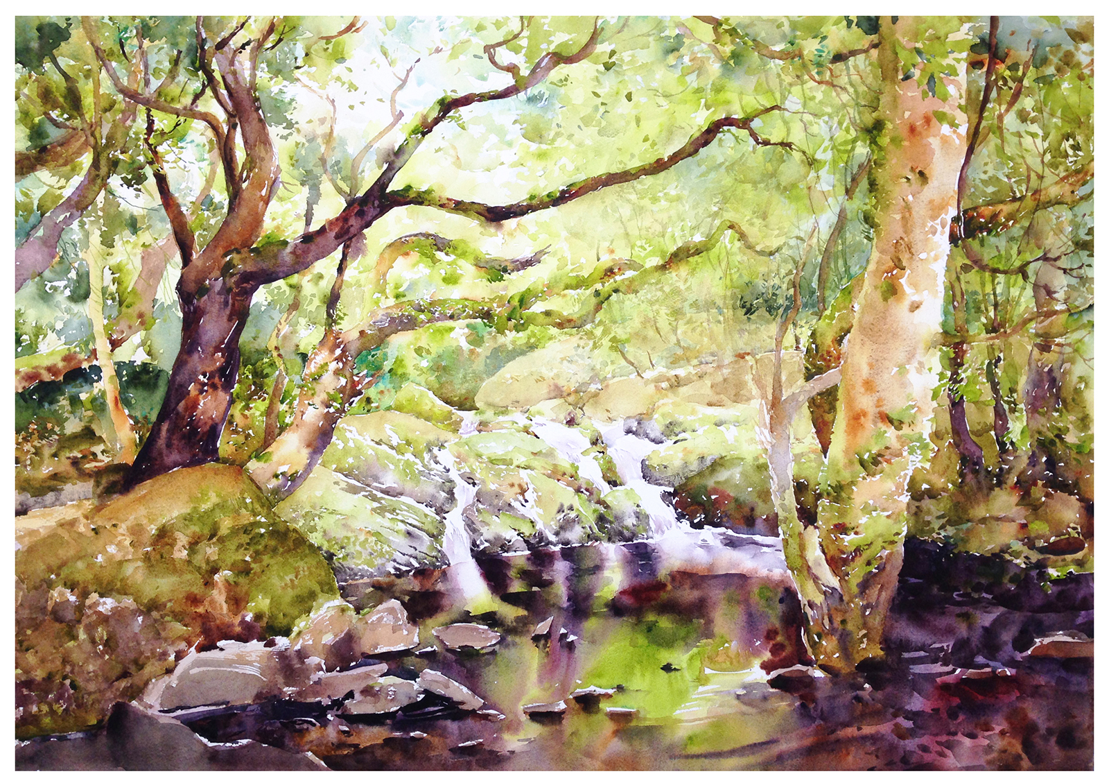
But, actually, I was kind of surprised the jury chose the ship painting – instead of this one – my current favorite painting ever:

This is just something we found. Not a landmark or a destination view – just what you see while walking in the forest.
There’s no great meaning behind it – except the shared meaning that’s always present in works about nature.
Don’t we all have a feeling of contemplation, or inner peace when we find ourselves wandering alone, surrounded by nature? I think that’s a common response.
We call these kind of places magical. Or say they’re a sanctuary.
So, unlike my shipwreck, which is a narrative – an illustration, really – with this glade in Glengariff, I simply want to make you feel what I felt, on discovering this shallow pool surrounded by mossy oaks.
But, if I do have a fatal flaw as an artist – it’s that I’m in love with studying my own paintings! I hope one day I’ll be able to let go of all this navel-gazing – but it’s part of my process right now.
So, for the interest of all the other auto-didacts out there, this is the secret sauce behind the final painting.
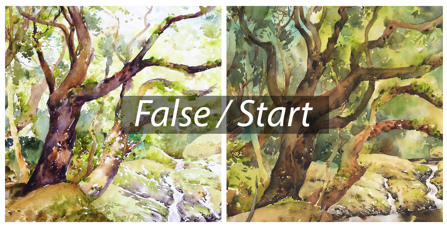
This (above) is my false start.
A painting I wasn’t satisfied with. In fact, I disliked the results enough, it provoked a complete redo. Starting again immediately on a fresh sheet, with a new drawing.
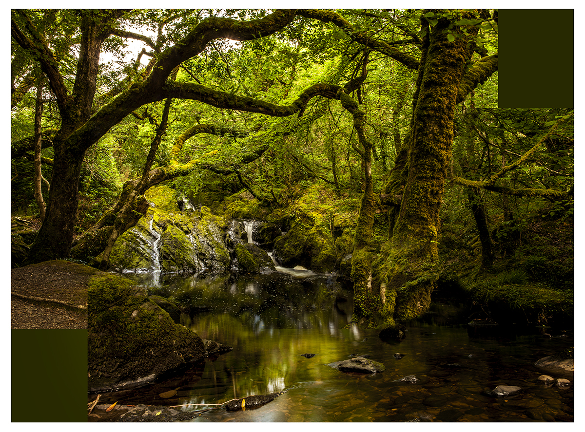
These are both studio paintings. Full sheets of 200lb Fabriano paper (so that’s 22×30″). Painted from Laurel’s photographs taken on location. And of course, I intended this to be the final work. I didn’t plan to do it twice in a row! Each one took a couple of days to draw and paint, and I didn’t have the extra time to spare.
I probably shouldn’t recommend you do this – paint the whole thing twice back to back. But it does work!
You see the same sad story in art history. In which the artist had to go through dozens of studies before ‘suddenly’, they’re able to pull it off.
Just look at Sargent painting Madame X – over 30 times. Or Monet testing the Rouen Cathedral in every possible lighting situation.
Looking back at the reference – maybe you can see why the first draft just wasn’t good enough.
I’d done a fair job capturing the trees, But it’s not so much the drawing – it’s the values that weren’t working.
My classic complaint with watercolor – too pale! You need to feel you’re *inside* the forest. That deep shadow under the canopy.

To get darks like this, while working as directly as possible in watercolor (that is, attempting to get the color in the first pass – but often needing three touches in total), you have to use your pigments at full strength. Taken right from the well.
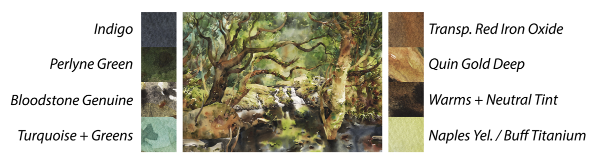
At the end of the day, it’s funny how much the painting resembles the paint box :)
You can see all my color choices right there in the pans!


Congratulations on your second prize! I thought the shipwreck was great, but I agree with you…this one puts you at the scene! Thanks so much again for sharing your process!
Hi Mark – I like both paintings equally. Both paintings evoke different feelings, the lighter painting is just that – ‘light’ in mood as well as colour, it feels whimsical – if I was a child I would be totally captivated by this painting as it feels like something out of a magical fairytale… The feeling of ‘light’ in the second painting with darker values conveys a feeling of calm and order – that everything is where is ‘should’ be which appeals to the grown up in me, whereas your first painting appeals to the child in me.
I subscribe to the blog of a watercolourist who often does multiple versions of one painting – she’ll do the drawing a number of times until she’s happy with it, then tonal studies on different sized papers, then she’ll do a a number of paintings using different colour combinations on various sizes of paper before she finally does a full sheet version of the final painting – no, she is not a professional artist, though she is quite prolific, this lady works part time and has 2 school aged children. I only starting painting 2 years ago and have just recently discovered this lady’s blog and her process and patience deeply inspired me.. and yes, I realised this is the only way I was going to end up creating work I’m happy with…
I agree with Magdalena – I love both paintings. They both evoke different feelings….the second one is more enigmatic and calming…. the dark water pulls me in…. “what lies beneath?”….The deep dark blue/grey (indigo?) is more mysterious and magical than the lighter and warmer red/purple water…. I’m in awe – they’re both wonderful paintings :)
I agree with Magdalena – I love both paintings. They both evoke different feelings….the second one is more enigmatic and calming…. the dark water pulls me in…. “what lies beneath?”….The deep dark blue/grey (indigo?) is more mysterious and magical than the lighter and warmer red/purple water…. I’m in awe – they’re both wonderful paintings :)
Both paintings are gorgeous. I love the luminous quality of the water reflections in both paintings, but honestly, I think there’s room for improvement in the composition.
The shipwreck painting has lots of strong diagonal lines (spar of the boat, slope of icebergs), which provide excitement and movement. I think I would have put the boat closer to the lower left (at the 1/3 mark from bottom and right edges), to give more ‘breathing room’ for the boat to move forward and maybe emphasize that the ship is dwarfed by this enormous iceberg.
The forest waterfall, however, is a moving subject that gives the feeling of zero movement. the waterfall is dead center, the trees framing it are symmetrical, and the river comes straight towards the viewer. Personally, I would have exaggerated the angles a little to make the eye move around more and I would have moved the waterfall out of the center position. I think I would have used a lower eye-level, so that the rock in the left foreground provides a sense of depth.
I should add that I’m speaking as a photographer. When it comes to watercolours, I wield a brush with the finesse of a Viking using a fork, but with the help of your book, I hope to improve. :-)
Some good thoughts Avital, the symmetry is something I’ve always had – it was amazingly rigid in my early drawings. You could practically fold a page in half and have things overlap.
Composition is a funny thing and even though I teach everything from rule of thirds, root rectangles, iqnformal grids, golden section and phi proportions I always underscore that these are starting points and not to be afraid to break the rules and go with your gut instinct on an individual piece. For me the ship wreck painting compositinally reflected the lifting motion of the ice pushing the immobilized ship upwards further and further, speaking to the hopelessness of the situation. While I found the symmetry of the Irish landscape emphasized the beauty, strength and peaceful mood that Marc described, like a moment frozen in time.
I tend to agree about the composition of the forest scene but I feel like at least some of the issues I have with it (that Avital points out) could easily be remedied by cropping it about 25% on the bottom and left edges so the waterfall is more in the lower left corner. That would cut out a bunch of the still water reflections at the bottom and you’d lose almost all the tree on the left :-( but it would improve the composition, IMO.
This doesn’t diminish my admiration for your technique and style, though. I’m still in the serious “wow, that really didn’t work” beginner stages of watercolors so even a ho-hum composition on a great painting is still miles ahead of my basic skill set.
We critique because we care, right? :-D Keep up the great work!
Thanks for sharing your thought process. It feels like a dark earthy, magical place, this spot in the forest. You captured that feeling in your last picture. I can feel it, by looking at it. ( and cudo’s to Laurel, for the picture, she caught it perfectly)
Quelles sont les couleurs dans la boite d’aquarelle ?
Merci
There’s a full list of colors here: https://citizensketcher.com/class-notes/
Reblogged this on World4Justice : NOW! Lobby Forum..
Very fun to “analyze” YOUR paintings, but you know me, Marc, I know nothing of watercolors. But I’ve been studying recently and so your post is timely.
I have to say that I see in both paintings much of what I’ve been reading and trying when it comes to generating depth in paintings, as well as stuff I’ve seen regarding painting tight street scenes with lots of shadows. Have you seen John Salminen’s Master of the Urban Landscape? Once you flip through his book you’ll never think of watercolor the same.
I see virtues in both paintings. The first one does seem to let the light in from the background, but maybe too much and you lose the darkness of the foreground. But this one has lower contrast in the background than in the foreground and I find you’ve lost some of the resultant depth when you went darker in both foreground and background.
Comparing the one you like to the photo suggests you were struggling to keep the foreground green when, in fact, it should have been in complete shadow and the greens and browns should have been neutralizes almost completely. I know that feeling as I do this with every shadow I try to make :-) Anyways, thanks for sharing this as it’s great to see a master talk about his process. Now, where are my crayons.
Thanks for your thought’s.
Brown’s and Green’s are the nemeses of the watercolorist. I avoid them at all cost. I admire both of your attempts. You did them both well.
“I probably shouldn’t recommend you do this – paint the whole thing twice back to back. But it does work!”
It´s the only way.
In regards to dark value washes I assume that you are mixing from your pans filled with dried paint. Recently I read an article by someone who had taken workshops with Alvaro Castagnet and Joe Zbukvic, who both use very dark value washes in their work. He said he learned that the key to achieving those types of washes is to mix them exclusively with paint fresh from the tube rather than pan dried. I use mostly M. Graham dried in pans, which rewets quite strongly, but testing this premise proved that the tube fresh washes were much darker and richer than the pan mixes. They were also very easier to achieve. I’ve had some conversations with Winsor Newton, who use two formulas for their watercolours; one for their pans and another for their tubes. They don’t recommend reusing their tube paint once it’s dried because certain ingredients evaporate in the drying process making it harder to rewet to full strength. Might be a similar thing happening with other brands. Be interested to hear of your results if you try this comparison.
Absolutely right – Fresh is best! – Next time I do a full sheet I’ll make sure. As I do let paint sit in the wells – I’m too cheap to just throw it out :) (Also, I try to paint every day (when I’m in painting mode, for that very reason).
I’ve gone away from Winsor Newton by and large, for that reason – poor re-wetting. I do like the M.G’s for this, (They seem to never fully dry). But – I use such small wells (half pans) and it gets used up very quickly the way I paint. So I’m always ‘topping up’ the dreges with fresh stuff. Also, if I haven’t painted in a while I ‘tune up’ the paint by misting it every few hours the day before I head out painting. So the ‘top up’ goes onto old stuff, as re-wet as possible.
Congratulations on your 2nd prize, Marc! An amazing accolade for a fine painting, which I greatly admired. However, if I had to pick a favourite, then I would also choose this beautiful one of the mossy trees in the forest. You were totally within your rights to decide you weren’t happy with the first effort, then straight away do it a second time. I have done this same thing myself on a few occasions. To be honest, I didn’t enjoy the process of repeating a painting, but at the completion of doing this each time, I have been very happy with the resulting improvement, and the end result. As the artist, we are always our own worst critic! I really love the deep tones of the forest that you have been able to capture, and sharing your colour chart is very much appreciated. It is beautifully done and the merging of the greens and browns is so skillfully done. As you know, this takes practice and skill to achieve with watercolours. Gorgeous work, Marc. Thanks so much for sharing with us.
Congratulations on your award ! Well, I don’t see the problems in any of the paintings – either I have a loooong way to go or each of us have our own subjective tastes and likes :)
Hi. I think your artwork is amazing. It has a great presence. The drama and other elements that made your boat picture outstanding was what they saw first I’m sure. Your landscape is also a very dramatic piece. It must have been a hard choice to make.
I love all 3 of your works, Marc! That anyone would presume to teach you anything, particularly regarding composition and depth, is beyond my understanding of that sort of rudeness. I look at all 3 paintings and marvel at your courage to tackle such difficult scenes and regardless of which one was your personal favorite, they all have their own unique characteristics, feelings, challenges, strengths and personalities: much like humans. To pick them apart for this reason or that is disrespectful of the effort, talent and heart of the artist. Don’t listen to the critics. It’s oh so easy to sit at a computer and poke jabs at someone’s work and, therefore, their heart. You are amazing and always so instructive. Thanks for sharing your soul with us. Lastly, hearty congratulations on your award. You deserved that and more.
Hah :) well thank you, that’s lovely :) but really I don’t mind! I enjoy getting a wide range of opinions. It makes the work better to hear quibbles and corrections!
Chalk me up to the camp that likes both equally. To me the lighter version evokes images of early spring, when the canopies are freshly emerging with the brilliant lime green leaves beginning to unfurl, and the light is passing through to the forest floor with more intensity. If youd said it was the same scene painted in April and again in July, I’d totally see that.
You should be a writer. Great visuals in your descriptions.