Lining up to visit Parliament

Sometimes it seems like I never draw anymore! With my watercolors – once you master mixing stronger colors, (and add some rich-dark pigments to your palette), you can do anything an ink drawing can do, but with the ability to work with shape as well as lines.

Still, there’s nothing more instantaneous than a direct ink drawing. Or more convenient. You can’t beat the immediacy of just a pen in hand.
These are done with a platinum carbon pen (extra fine line) and a brushpen (extra bold, of course).
They’re all done while waiting in line to visit the Canadian Parliament buildings in Ottawa. Then, carrying on doodling while following the cellphone snapping tour group.
I’ve drawn this place from the outside – but never taken the time to go in. But we were vising with friends for the weekend, so we thought, ok – lets finally do this touristy thing.
Ok, well, the opening sketch up top is from breakfast at the hotel, not the tour itself. Our friends were some kind of card carrying VIPs. They had us upgraded so we could all enjoy the view from the members lounge.

So, actually, I hate to admit it – but the tour is kind of worth it. I must be getting old! I’d never have stood around for this before. But I was surprised to find myself enjoying it.
The interior architecture is fabulous – especially the Gothic library, the only one of it’s kind, done in carved white white pine. (No drawing allowed there, too hush hush. Important people working on important speeches!)
The halls are full of big’ol historical paintings and memorial statues. The docents do a great job of explaining the quirky traditions of our governments’ hallowed halls. Even with the canned jokes they must have to deliver 100 times a day.
")
")
")
")
I suppose, every so often it’s worth it to go on a holiday and leave your paints behind. Not everything has be a trophy winning piece – isn’t that right Lord Stanley?

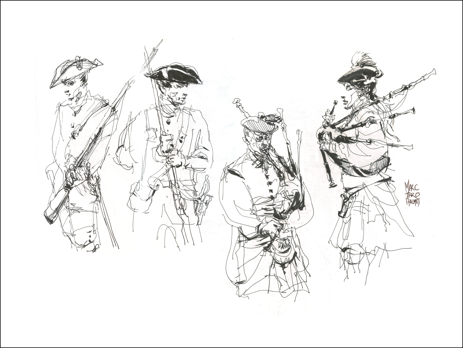
Traditional Methods

You have to love sketching in museums – the lighting on the objects is always dramatic. You can learn a lot about drawing complex forms, using this kind of classical lighting.
Something about a museum trip encourages me to slow down and take my time sketching. There’s that hushed library feeling, if you can avoid the days there’s a school trip.
Nothing much to say about these, except, I’ll never pass up a chance to draw a suit of Samurai armor :)

Morning at Cooper Marsh

Cooper Marsh Conservation Area is a little over an hour’s drive from Montreal. Just over the provincial border into Ontario. You’re not too far from the US – the nearby town of Cornwall has a bridge crossing to upstate New York.
The park is open all year round, and is free (with optional donation).
You’ll find a visitors center with basic facilities: washrooms, picnic tables, vending drinks, but no food – though you’re less than 10 min from the town of South Lancaster, with the usual roadside attractions.
You’ll also meet a friendly docent who can give you an orientation. They’ll tell you about a pair of boardwalks (East or West) that will each take you a short 1 km-ish walk over the lush wetlands. It’s a rustling sea of tall grasses and water-plants, and home to a tremendous variety of birds. The rockstars being Grey Herons and some kind of falcons. There are wooden sheds that serve as bird blinds, if you’re so inclined to wait it out and see the wild life up close.
We did see an ermine, which was pretty cool. And there are supposed to be beavers, but they’re in an area that’s flooded for now, so out of reach of casual walkers.
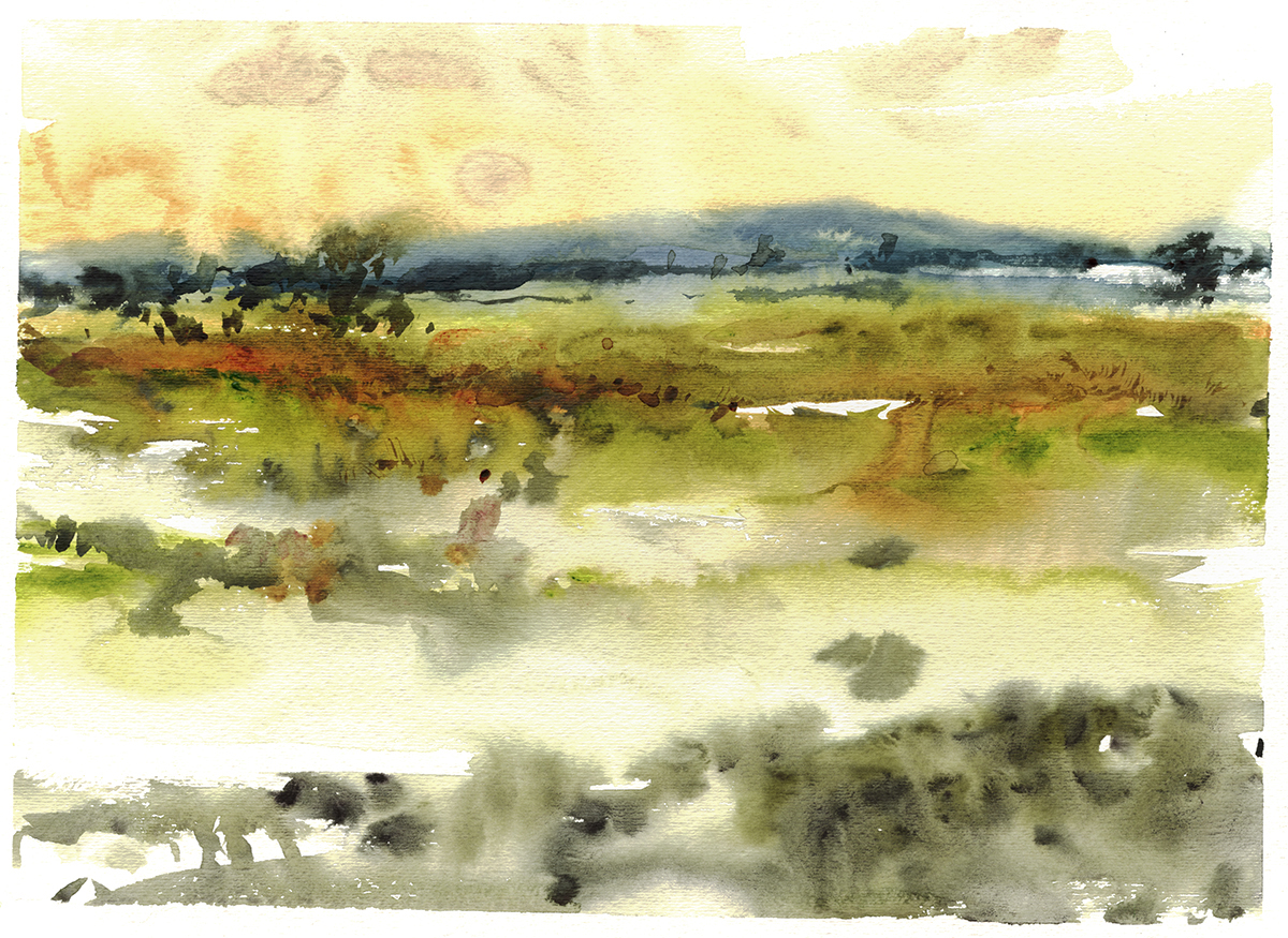
I had brought some random paper with me – on a mission to use up some old pads I have in the studio. Big mistake! This was cheap machine made cellulose paper – and boy was it TERRIBLE. We’re always telling people not to use student grade stuff, but you forget why.
It’s like painting on butcher paper. It doesn’t absorb the pigment. Color comes out weak and scrubby looking. There aren’t any long fibers for color to creep along. It just feels plasticky. In open areas here you can see an icky mechanical texture, like a cheap canvas print. Not pleasant to work on at all.
I suppose, being out in the early AM humidity I couldn’t totally hate the lack of detail I was getting.
Those textured bands of color are masses of bushy grasses. I wouldn’t want to try to actually paint the millions of tiny grass blades. I think a distant foggy impression is the better part of valor.
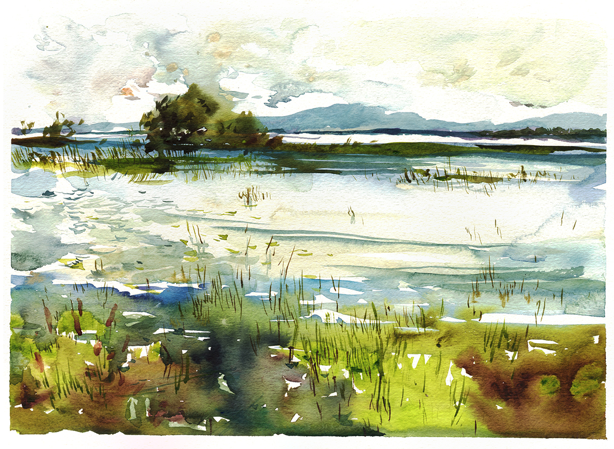
Later in the day the sun came out, giving me a more predictable watercolor experience.
If you walk out on the non-boardwalk paths – it’s a long walk inside a trench of trees and tall grasses. But eventually you come to a lookout platform where you can see the grasslands gradually becoming open water. Here you’ll see jumping fish, shore birds and turtles. And zillions of frogs along the way.
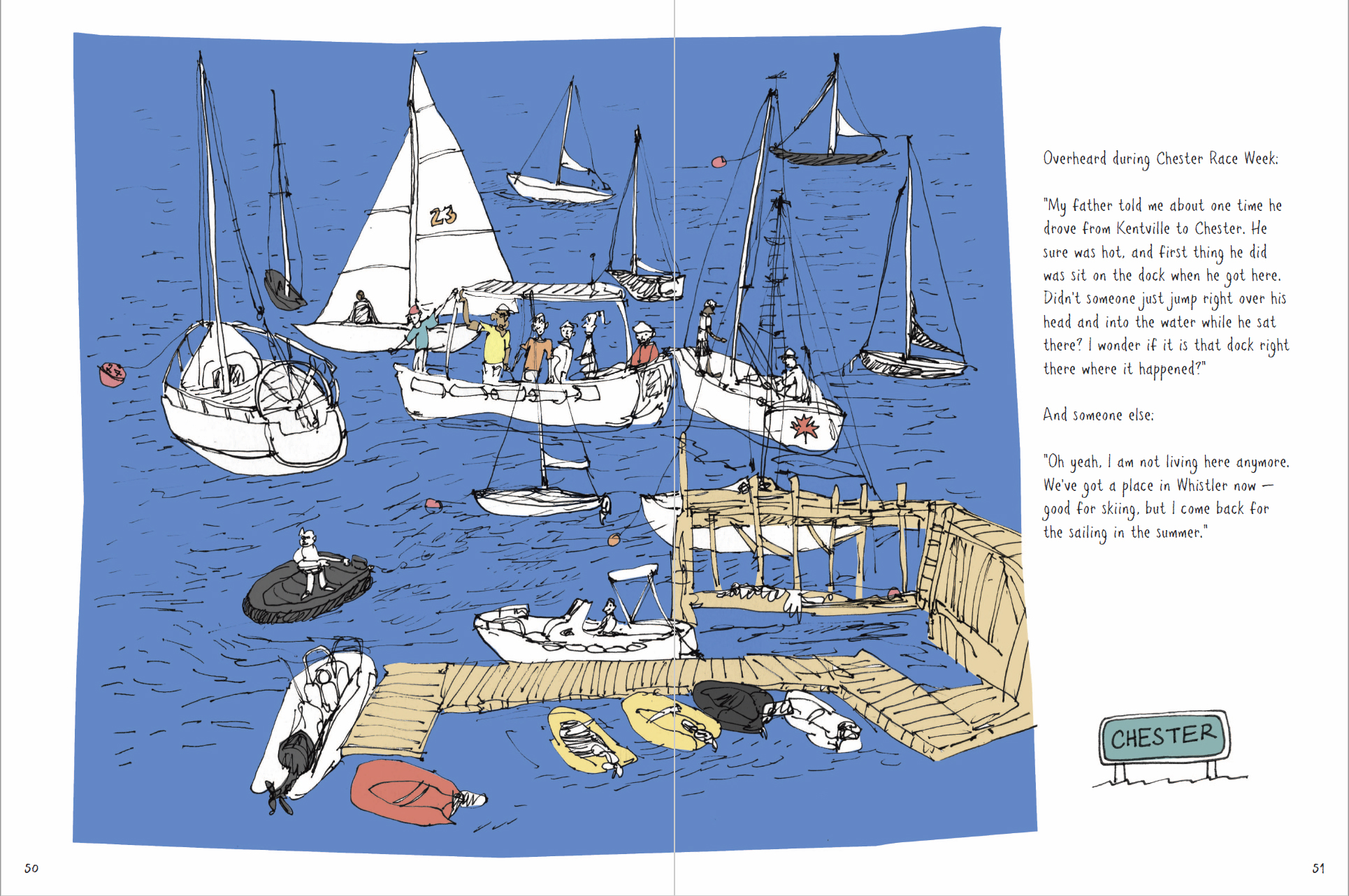
Book Review: Sketch by Sketch: Along Nova Scotia’s South Shore, by Emma FitzGerald
 Artist Emma FitzGerald has just released her second book of sketches and stories about Nova Scotia. Sketch by Sketch (128pp, fully illustrated in color) is available in bookstores starting Sept. 15, 2017.
This book is a natural followup to her debut, Hand Drawn Halifax, which we’ve previously reviewed here.
The first volume took us on a local’s tour of FitzGerald’s adopted home town – this time we’re travelling down the rugged coast of Nova Scotia. Home to fishermen and boatwrights, and the ancestral territory of the Mi’kmaw people.
FitzGerald’s drawings remain fresh and direct. Charming sketches, clearly executed quickly – in the moment. Probably she does many of these agile pen drawings, looking for the perfect gems.
Along the way, she collects stories and bits of overheard conversation relating to whatever she’s inspired to sketch. FitzGerald has an engaging conversational style of writing. She gives us factual anecdotes about the history of the towns and waterways, or short bio’s of the quirky entrepreneurs that work and live in these small communities. But the highlights for me are her cleverly annotated overheard conversations.
I get the feeling a young woman quietly sketching in the corner can probably get away with a lot of eavesdropping. Her pen jots down bits of cross-talk along with her un-spoken retorts. She’s got the sharp tongue of an East coaster, but the politeness of a Canadian not to speak up – at least not that she tells us.
The stories, next to the drawings, gradually build up a sense of the region. We clearly feel the locals’ love of this challenging place to live. Something you can only get from a sustained sketchbook. Not the flyby sketch-tourism of the weekender or the round-the-world traveler.
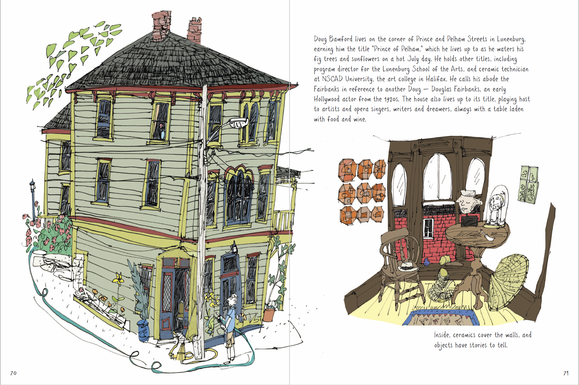
As with the first book, at the heart it’s about the community. Through her drawings we check in to some of the area’s odd little ventures. Such as The Littlest Flower Farm – a woman who harvest flowers from natural sources – road side ditches!
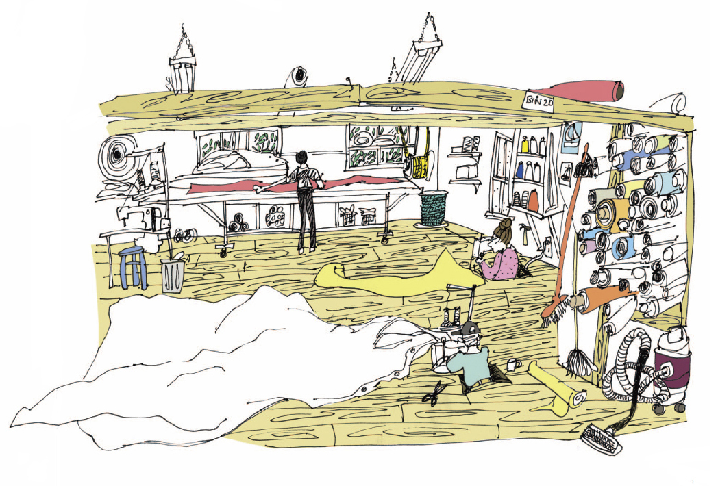
Or a workshop of sail makers who sew while sitting in holes cut through the floor – so the sails can spread out on the floorboards.
We get local recipes, such as Rose Vinegar, and the secrets of how IronWorks Distillery gets the pear into the bottles of Pear Eau de Vie.
FitzGerald’s second sketchbook is a perfect companion to the first, and a great gift for anyone summering on Nova Scotia’s South Shore. Certainly every Bed and Breakfast in the area should have these on their lending shelf :)
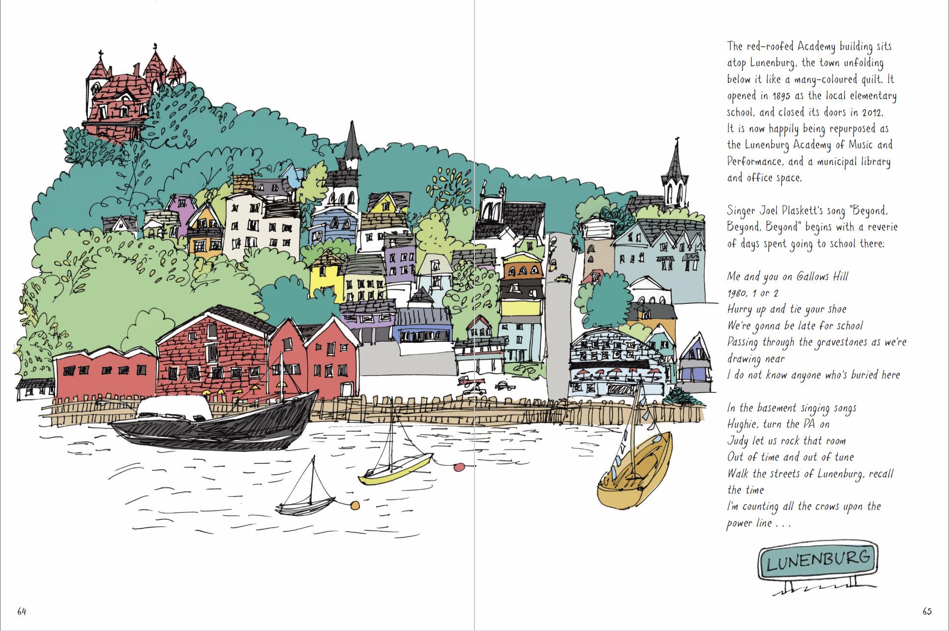
If you’re in the Halifax area, Emma is doing two public appearances to promote the book and meet her readers! You can get a book signed, or just say hello in person on Wed. Nov 22 at the Central Library’s Paul O’Regan Hall, 6:30 to 8:30 or at the Lunenburg School of the Arts, Nov 23, 7-9pm. If you do stop by to say hello, perhaps you can ask her about her next project Hand Drawn Vancouver! to be published by Appetite of Penguin Random House, projected for release in 2019.
You can purchase Sketch by Sketch at the usual online retailers [ Amazon.com | Amazon.ca ] <affiliate links, thx], or check your local bookshop. If they don’t have it, I’m sure they can place an order from Formac Publishing of Halifax.

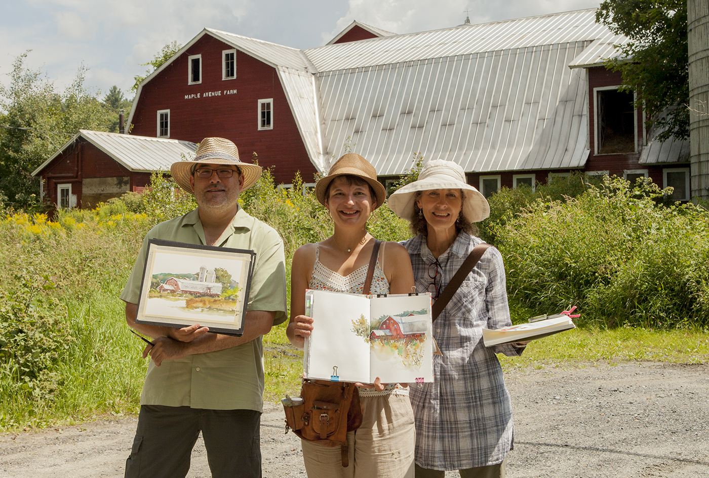
Vermont Sketching Tour

The final leg of our Urban Sketchers painting tour was three days in Vermont, painting with Anne-Laure and her friend Carol. They’ve both gone on to continue painting in Boston and New York, and I’m back to normal life in Montreal.
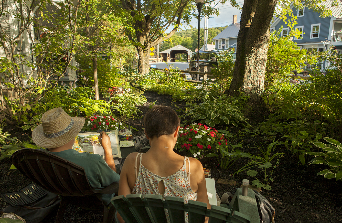
A little different than the chaos of the Chicago streets hey? Just a pleasant afternoon sketching the oldest covered bridge in Vermont.

I showed this to a guy down by the Round Barn Gallery and he said “Oh, the Warren Store”. So I guess it’s a good likeness.
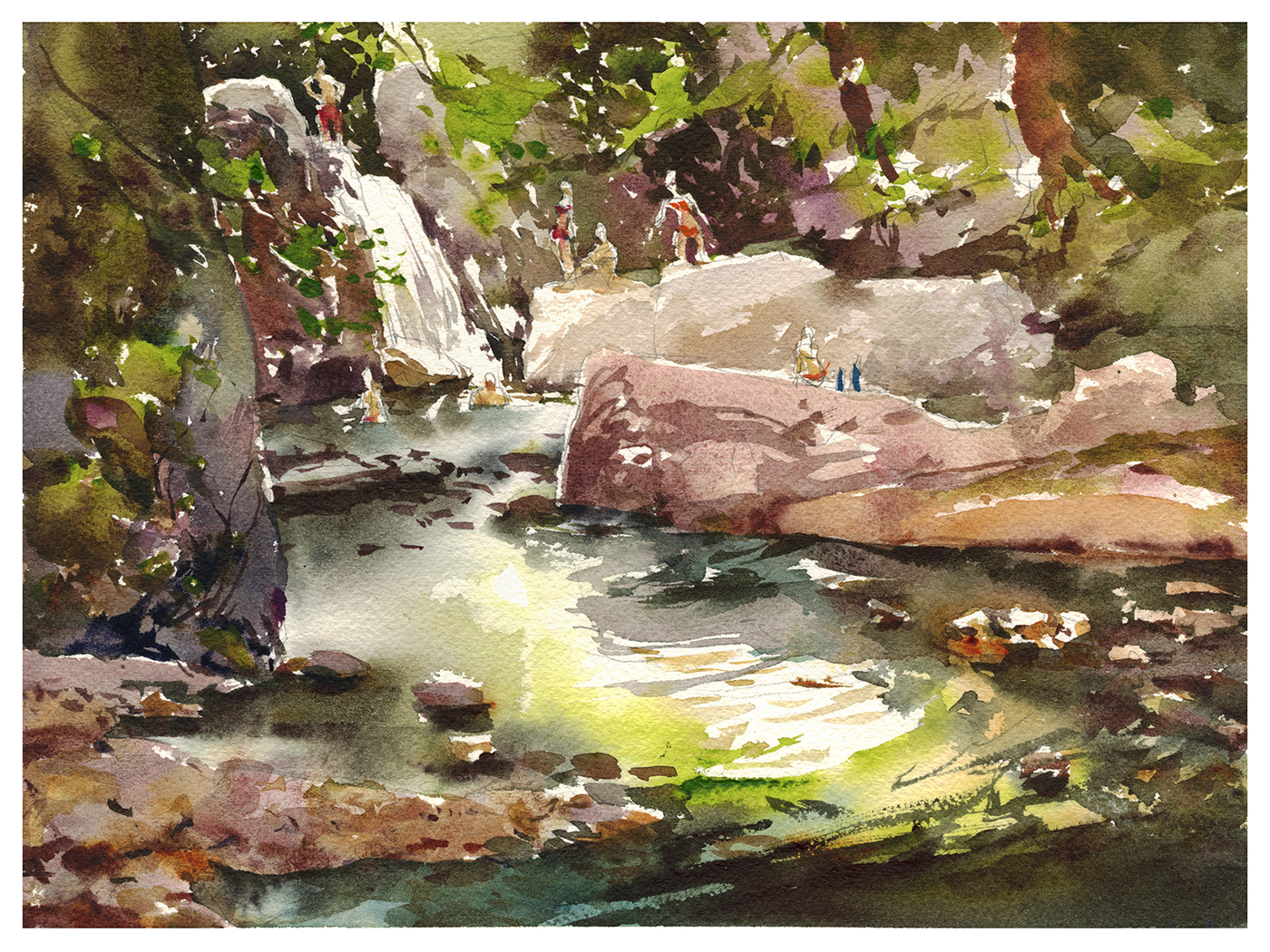
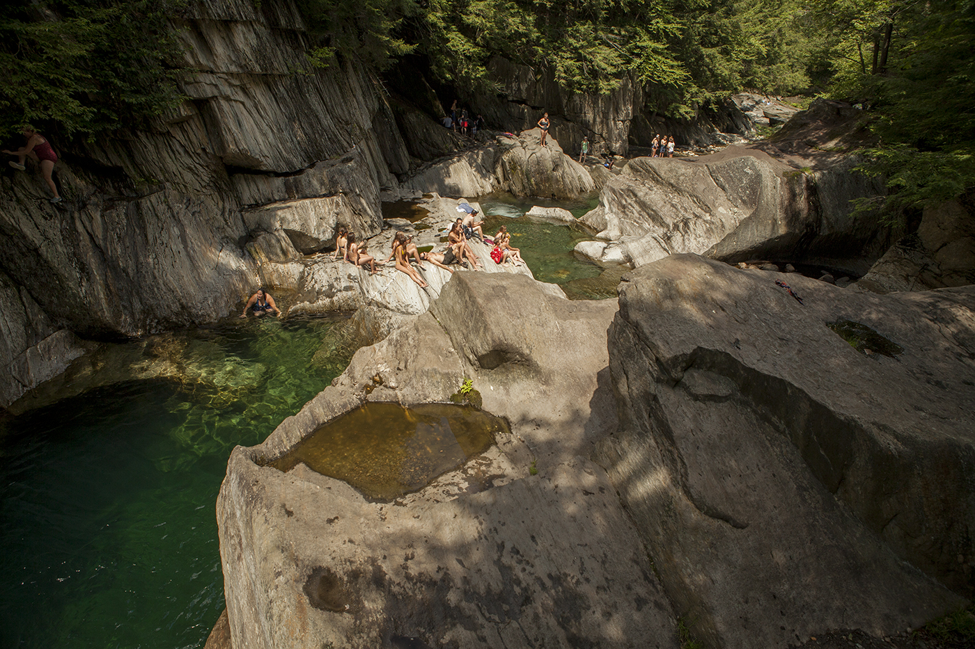
Swimming holes are still a thing in Vermont.
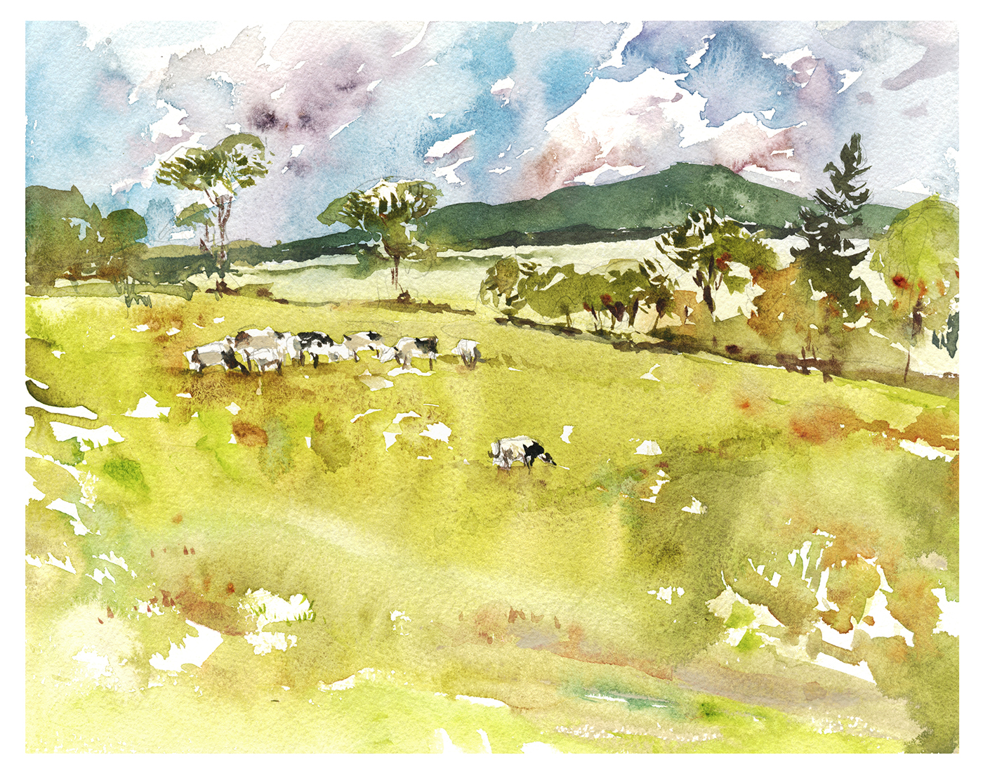
I finally got it – why they call them the Green Mountains. You can’t go wrong with a scenic shot around here. These picturesque mountains make every sketch a winner.
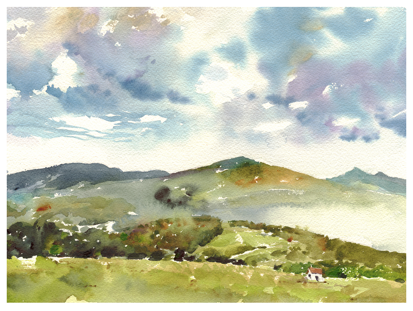
Our host Carol can wake up to these mist shrouded hills every morning.

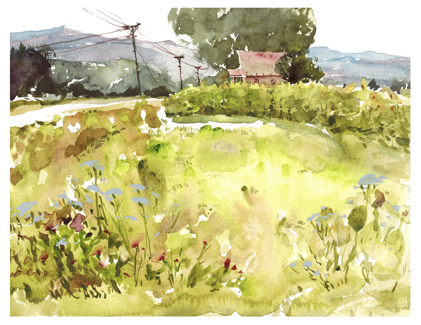
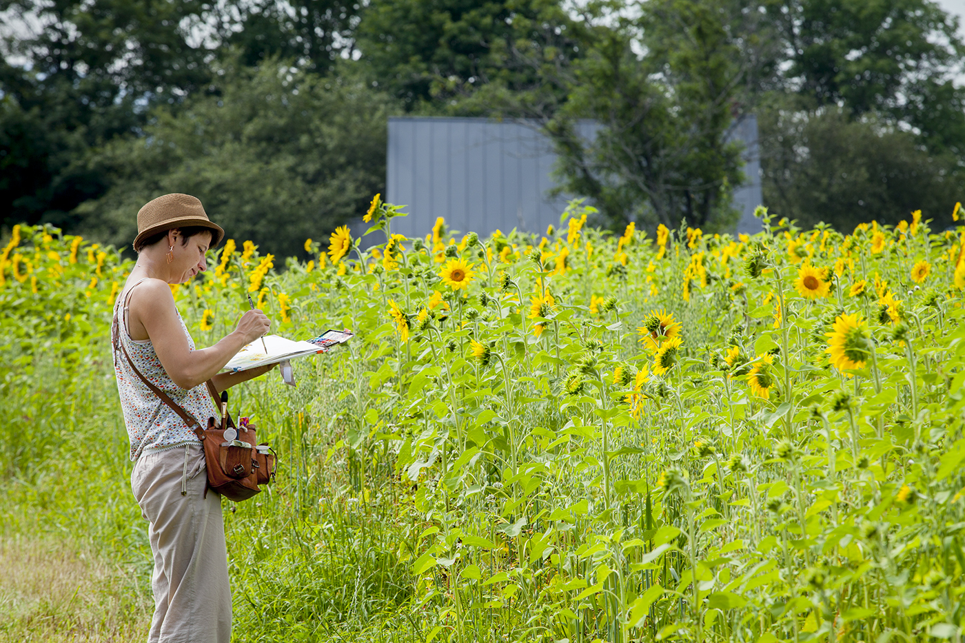
I didn’t get the amazing sunflowers into this sketch. Though I did make a bid for the Queen Anne’s Lace.
A field of flowers is something I haven’t quite figured out. Do you cut around them? But they’re so tiny! Do you try to add them afterwards with opaque? You’ll loose the glow for sure! For now, they’re downplayed in this sketch.

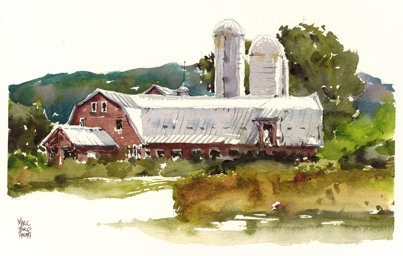
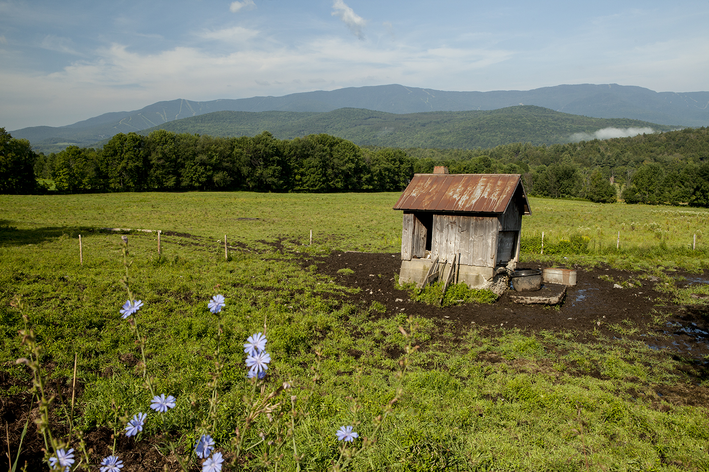
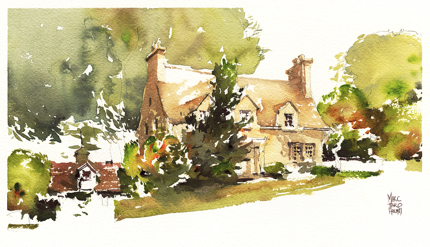
Couldn’t skip painting a barn. I mean, they really are part of life in Vermont. Seems like every other shop, art gallery and restaurant – even the craftsman homes, are made from refurbished barns.
Our host Carol (normally a pastel painter, but this week a watercolorist alongside us!) made sure we got a painting out of every bit of daylight :)
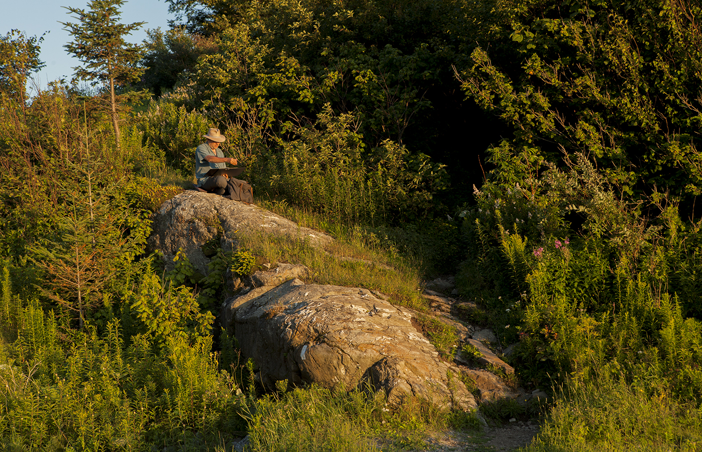
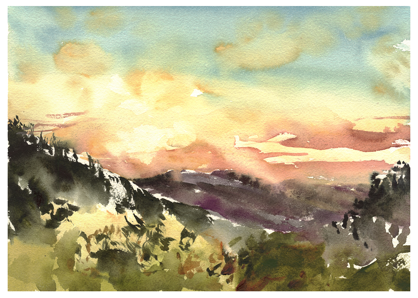
Even this final gasp of sunset over the mountains.
We had a great time in the short visit down here – and I can say, if you’re looking for Plein Air Painting – my goodness, give Vermont a try.
Montreal: The New Drawing Spots

By the end of the second week after Chicago, some great things are happening.
I will say I was getting pretty tired by this time. All the days up early and out late with our guests. All the travelling.
But at the same time, two weeks of painting every day is an incredible opportunity.
A lot of the watercolor process is unconscious.
The pigment-to-water ratio, the timing of when paper is wet vs. damp vs. dry.
These things are all done ‘by eye’.
As well, your sense of proportions, and how you simplify – it all becomes a little more instinctive.
I feel like these ones at the end of the week are making better use of interlocking shapes.

Most of these houses are just on the street near our home in Montreal. But this last one is a bit of an outlier.
We headed out to the Marguerite D’Youville bird sanctuary in Chateauguay – for a change of pace from all the architectural drawing.

This is the view from a small dock, looking out over a flooded field of dead trees and scrubby brush.
I was after the feeling of dark water underneath a skin of pale duck weed.
I think it’s usually much greener out here, but for whatever reason, this year it seemed to be a wheat-grass sort of color.
This park is a terrific place for bird watching. We saw herons, egrets and eagles, along with the usual songbirds. My favorite being hummingbirds that come to the feeding stations. And, if you come when it opens at 9AM, you’ll see plenty of deer. There’s also a chance for fox, raccoons, and marmots.
Follow up on One Weird Color

Oh by the way – just to close the circle on the post “I’m Looking for One Weird Color“- after a tremendous discussion, with plenty of advice from all corners of the world – (that has got to be one of my most popular posts of all time) – here’s what I’ve done:
Three Weird Colors!
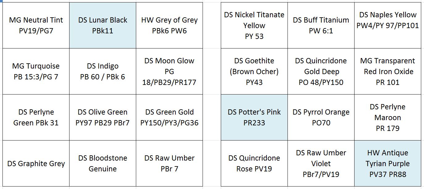
I’ve removed Davy’s Grey.
Everyone was correct, I have a lot of greys on my palette, and Davy is easily mixed. Plus, I was finding it wasn’t a great color for re-wetting.
But – Ha Ha! – I’ve replaced it with DS Lunar Black! Confounding all of you who say I have too many greys.

My rationale is – Lunar Black is a weak black – and highly granulating. So it produces effects you cannot otherwise get. Here it is below, granulating with Grey of Grey – another set-upon color you guys want me to cast aside!

I’ve also removed Cadmium Red!
Nobody saw that one coming hey?
I’ve had Cadmium red on there since art school, and I probably have not used it in years. I have a humongous tube of it – still 80% full. I just find I’m always going to the very opaque DS Pyrrol Orange or the very transparent DS Perlyne Maroon. Either warm, or cool. Never middle red.

So – I’ve ditched the old stalwart and am experimenting with DS Potters Pink.
This is a color I’ve tried once before. It’s a little off-putting at first, as it’s the weakest mix I’ve ever seen sold as paint. Made worse by the fact that the DS variant is highly susceptible to separating in the tube – giving you straight water if you’re not careful.

That being said – it’s a handy color for many kinds of architectural stone or pavement, when mixed with a bit of yellow or sepia.
Initially I was doubting, but it’s solved a color problem more than once in the last three weeks, And, it’s kind of handy – once again – for its granularity. I expect to use it in flesh-tones and portraits as well – but have not had a chance to confirm this.

And finally, my one truly weird color: Holbein Iridori Antique Tyrian Purple.

There are plenty of other purples out there. (In the past I’ve used Dioxazine Purple). And I do carry Quin Rose. BUT – I am a pawn of marketing, and this color has such a great name!
I shall call it Imp Purple after Tyrion Lannister. A royal color if there ever was one.
It’s a richly pigmented mix, and now that it’s on the tray, I find it popping up in some fun ways in my paintings. Since I’ve put it on, I’ve not used Moonglow. Which is interesting. Once you add a color, there’s a domino effect on how you use your whole palette.
Which is why I should have stuck to one, instead of Three Weird Colors!
Old Haunts Week
In the week immediately following the USK Symposium in Chicago, we returned to Montreal, accompanied by sketchers Liz Steel and Anne-Laure Jacquart.
As a blogger, I’m starting to feel behind the times. Those of you who follow my friends on Instagram, might have already seen some video from this week.
So I’m not going do another day-in-the-life sketchwalk report. Instead, let’s look at a few favorites from our recent sketch-tour, next to some some flashbacks from older drawings of the same spots.

This sketch is way back in Oct 2012.
I’d been on the Plateau at Mount Royal Metro, drawing with water soluble ink in fountain and brush pens.
This domed tower is on top of the public library directly across the street from the metro.
Through the thin paper of this cheap sketchbook, you can see a more pointed bell-tower sketched on the back page.
This one is on your right when you come up from the subway.
Standing back on this same spot, five years later – I’m not sure if I remembered these two overlapping drawings, or if it’s simply a matter that these are the only interesting things to draw at this spot. Either way, my new sketch (at top) literally combines the two towers into one composite drawing.
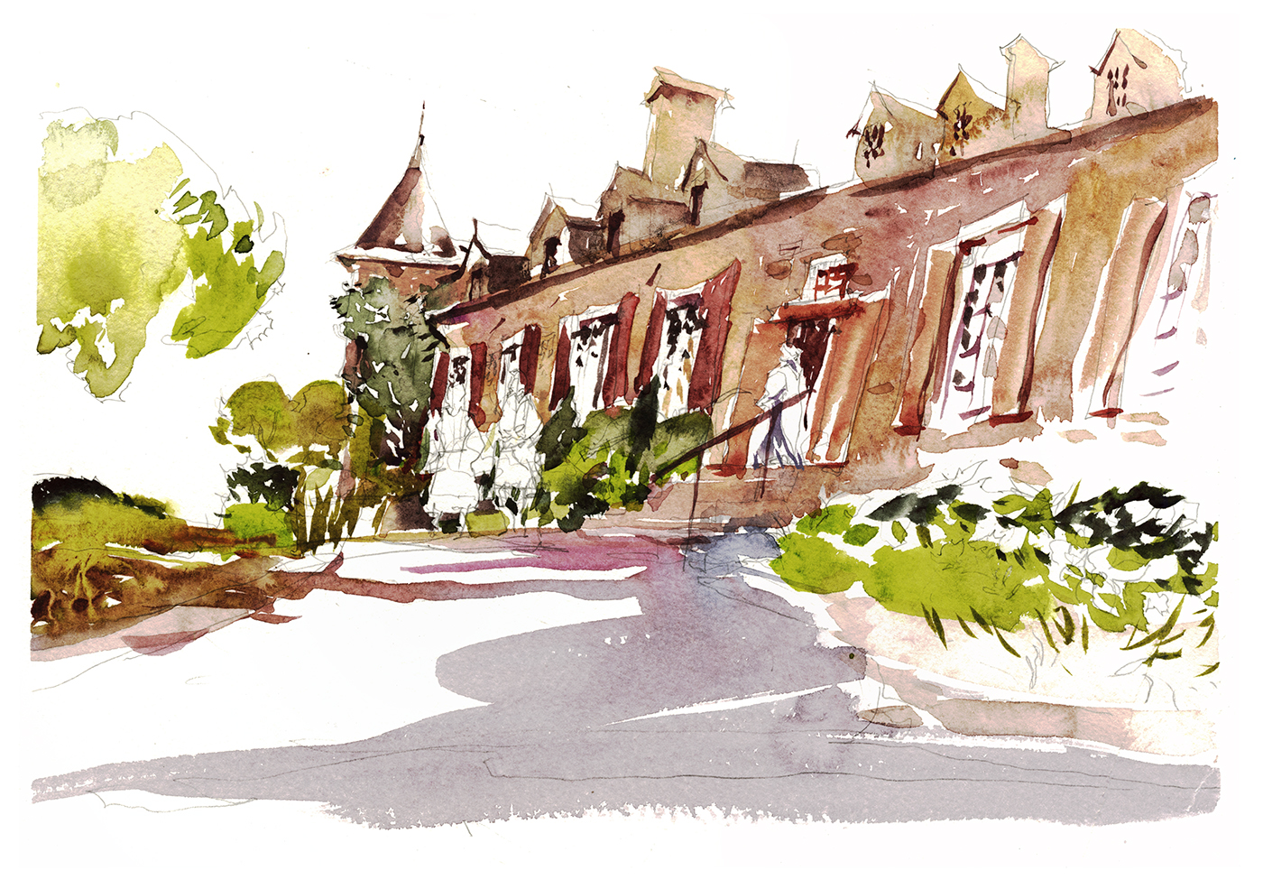
This one is the Chateau Ramsay, sketched from ground level just inside the front gate.
I always take visiting sketchers here, as it’s right next to Place Jacques Cartier, has it’s own little walled garden, plus the city hall is right across the street.
I was just playing with this drawing – exaggerating the upward angle, and playing fast and loose with the windows and shutters. Not even putting any color on the people out front. They aren’t drawn all that well really – just some lazy scribbles.
But maybe that’s because I’d already sketched them in 2014! I doubt it’s the exact same historic re-creators – but it was probably some of the same costumes.

Here’s my 2014 sketch of the house. Back then I was using pen and ink and wash, and I was much more concerned about getting the entire building into the frame. Even though, I was writing at the time about designing a good picture, not just making a snapshot. It’s fun to see, 3 years later, how much I’ve taken my own advice.

Somewhere during all this we stopped by Place D’Youville, which is a small public square, crowned by this is old fire station, that is now the civic history museum.
Not the fancy one at the Pointe, but the quaint little one that tells the story of Montreal’s recent past.
Here’s some sketches of what was inside back in 2012.

Again, we can see how back in July 2012 I was spending a few hours on a complicated production, that tried to capture the thing as accurately as I was able.
At this time I was painting in three passes I called Tea, Milk and Honey. Something I still use to this day – but in a much less rigid, step-by-step approach.

I think perhaps this one was my best?
The most recent 2017 version might have become too cartoon-y. This one, executed from I think, Oct 2016? was maybe the best compromise of line drawing and wet-in-wet shape work.
Turns out this might take the record for ‘most sketched by me place’ in Montreal. As I’ve also drawn it back in 2014 in one of my very first experiments with Direct Watercolor.

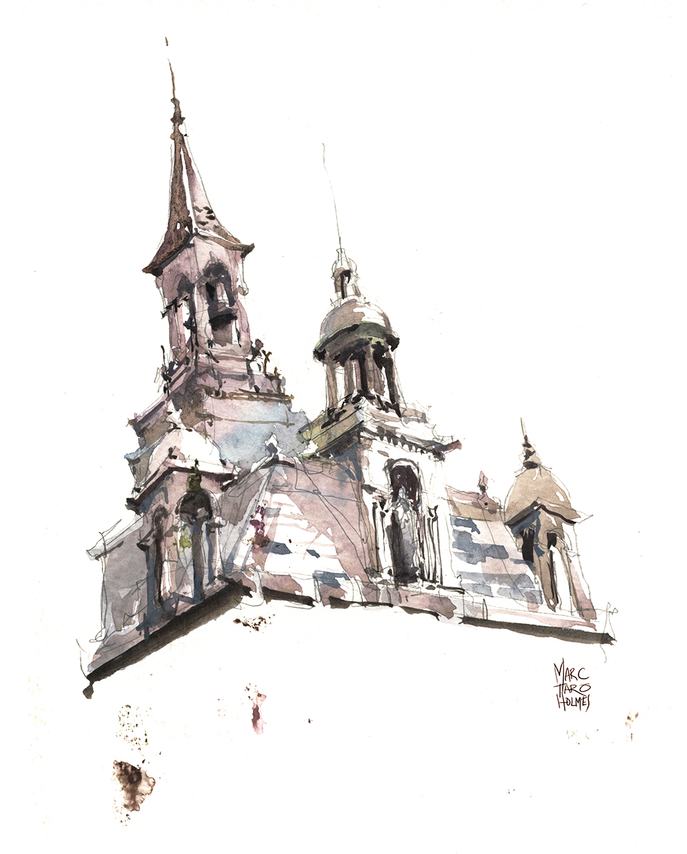
Ok one last place: St. Joseph’s Oratory.
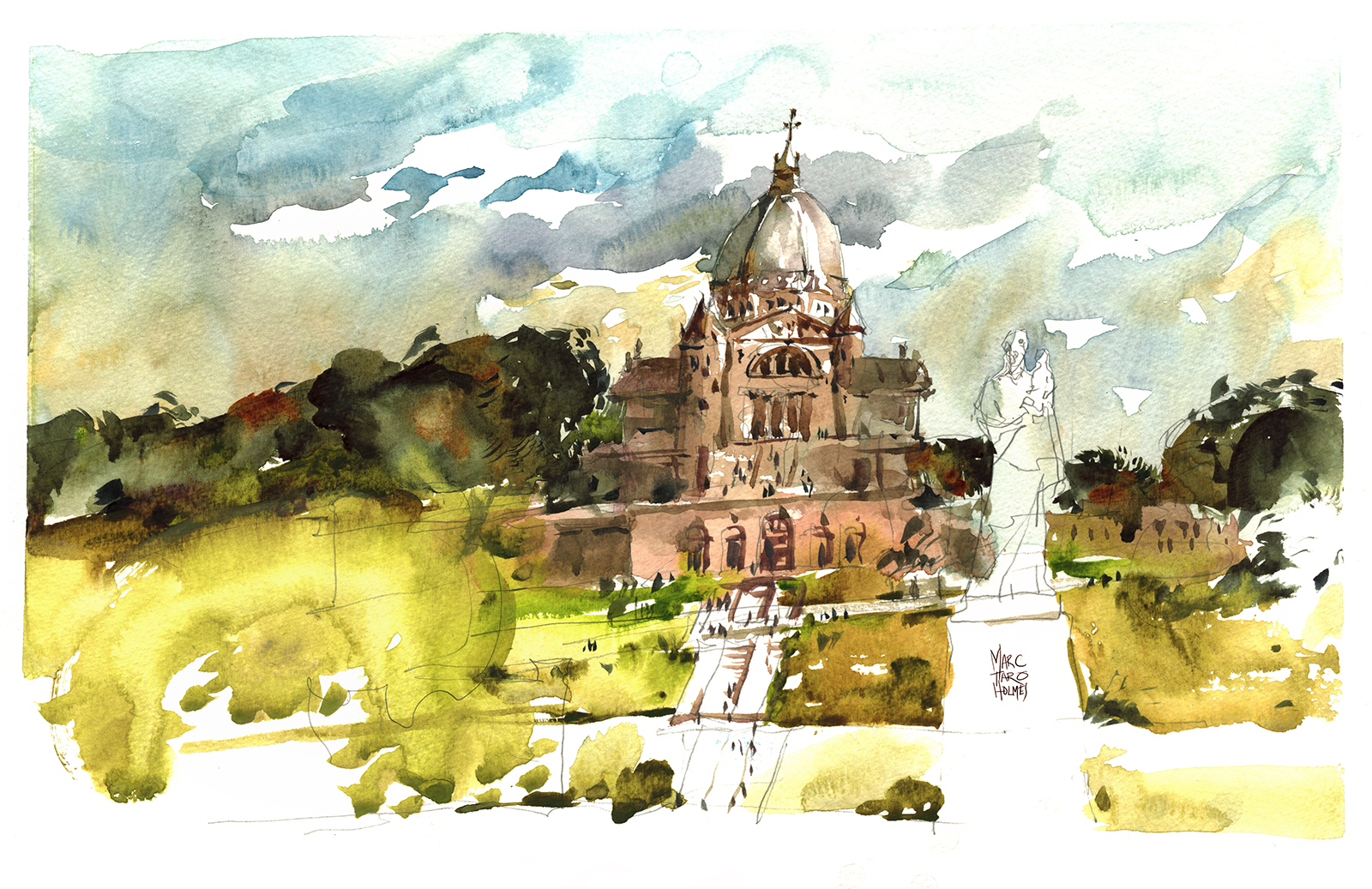
Another spot, I’ve drawn time and time again. There’s even a fifth version that appears in my book.
It’s fun to watch my own confidence with paint mixing develop over time.
Keeping in mind, some of these below took four or five hours in the studio, whereas the 2017 version was a 30 min sketch.
Whatever this latest version lacks in accuracy or fine detail, I think it makes up in spontaneity and boldness of execution.
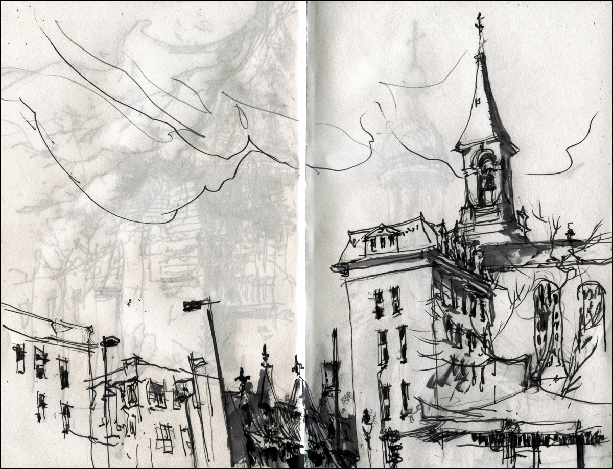
Look how tentative my first steps were!

2011

2012

2012, studio remake.
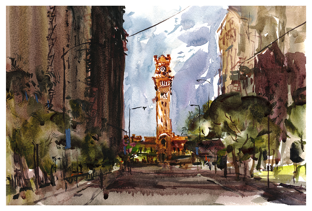
Chicago: The Daily Sketches

Naturally, the highlight of the USK Symposium is meeting up with old sketching friends who you only see once a year.
It’s become a tradition, after seven years of going to this event, for some of us to head out in the early morning, and do a sketch before class.
Sometimes it’s the only chance to do a drawing for yourself that day, what with the demos, classes, and interviews.

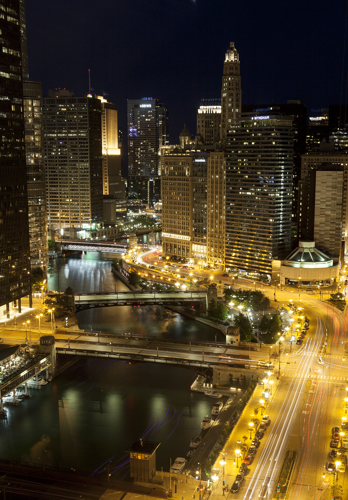
This was my all around favorite from Chicago. It’s right in my comfort zone. Crazy complicated subject, with my patented white background.
The Elevated Train seems like a terrific icon for the city. It’s so gloriously industrial. No design sacrifices, just raw functionality. The thing is so loud!
But at the same time it’s got a kind of elegance. A monumental structure, running right through the heart of downtown, like a relic from a bygone era, still part of everyday life.
This one was sketched with a pencil – I mean, come on – that’s too complicated to wing it right? But at the same time, there’s a lot of Direct Brush work in the impression of the superstructure. I like that mix of observation and invention.
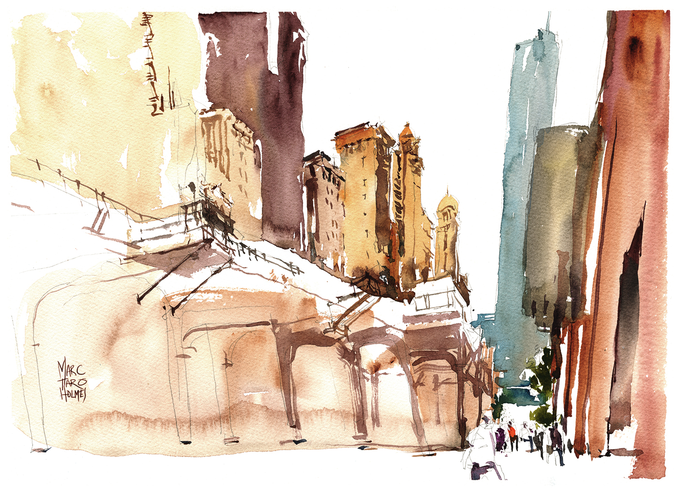
The scale of the city is a bit of a shock. Montreal isn’t exactly a dot on the map – but I’m not used to these enormous buildings. The only way to suggest the scope is to get in some tiny details at street level. These little people are what make the scene.
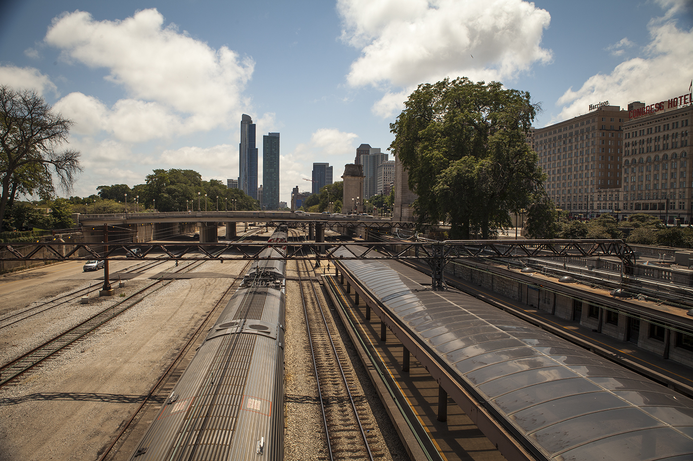
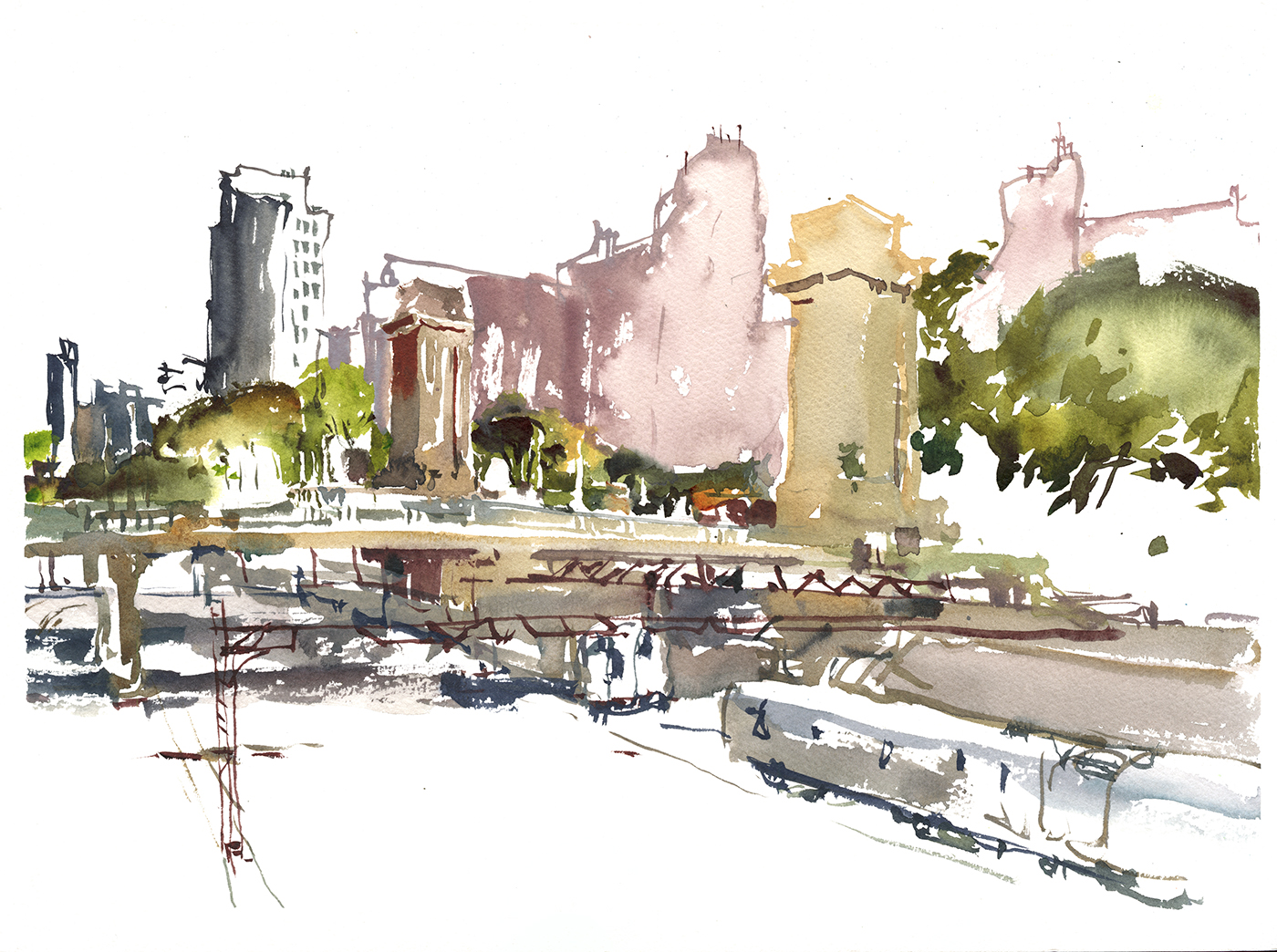
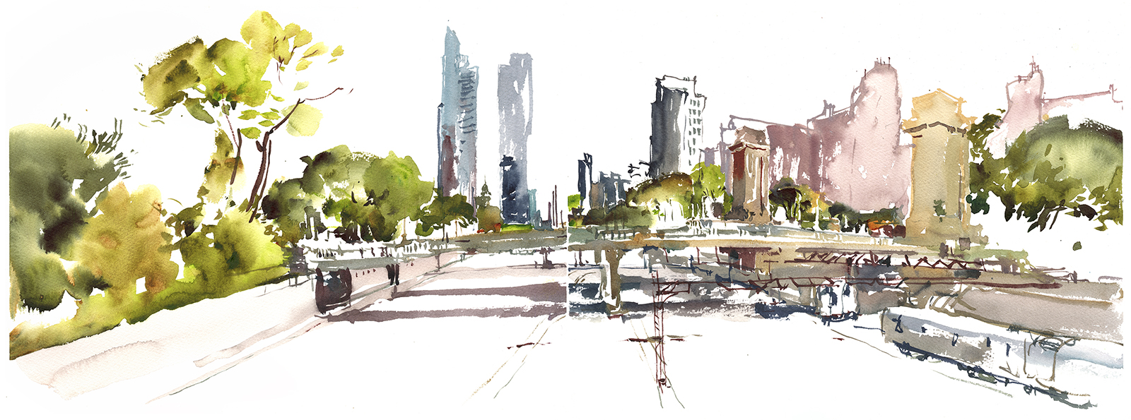
This is Dearborn Station – painted direct-to-brush. It’s nicely spot lit in the morning, even though we’re still in the dark canyon of the street.
The red brick tower is a bit of a flashback to Manchester last year.

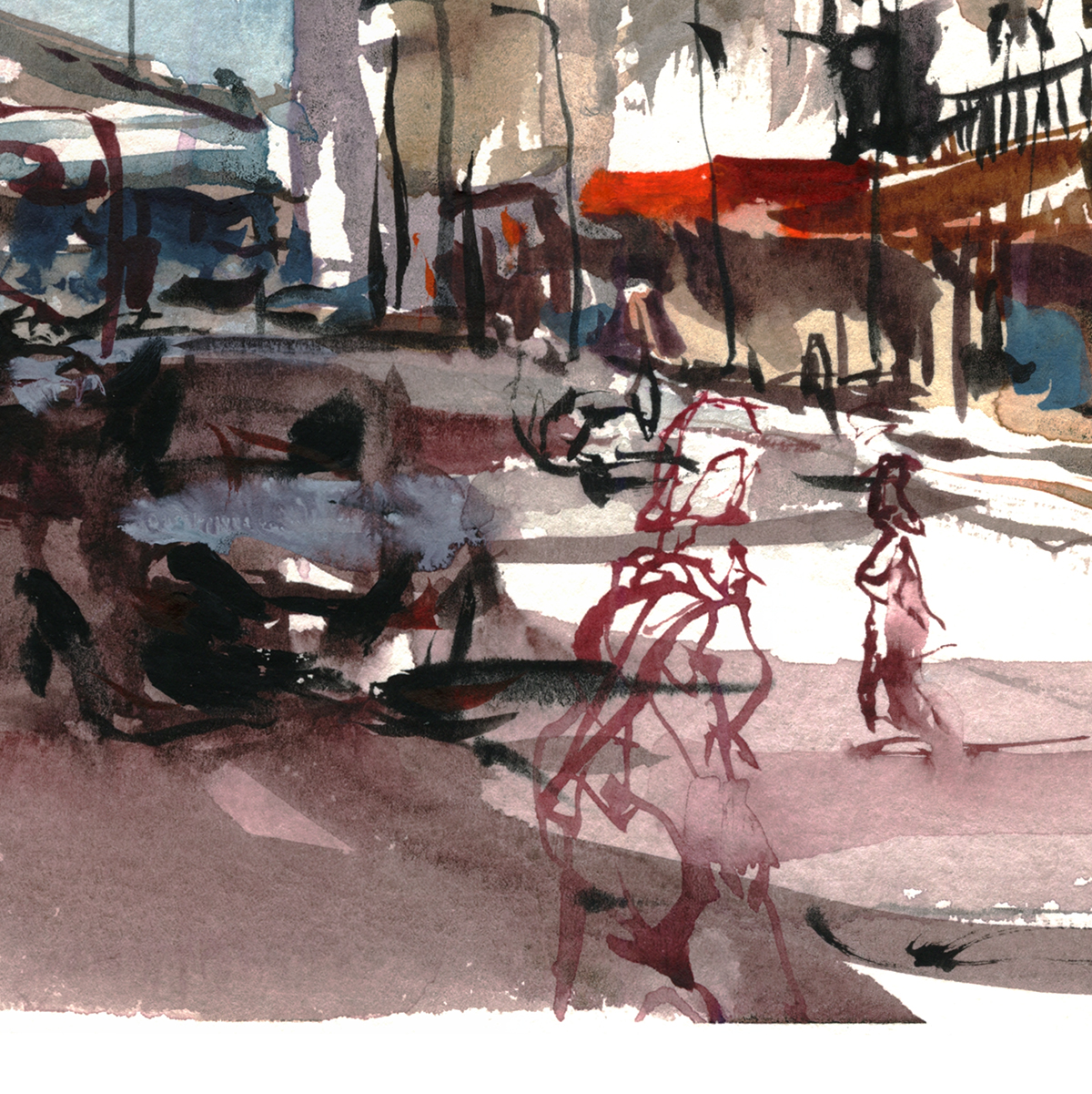
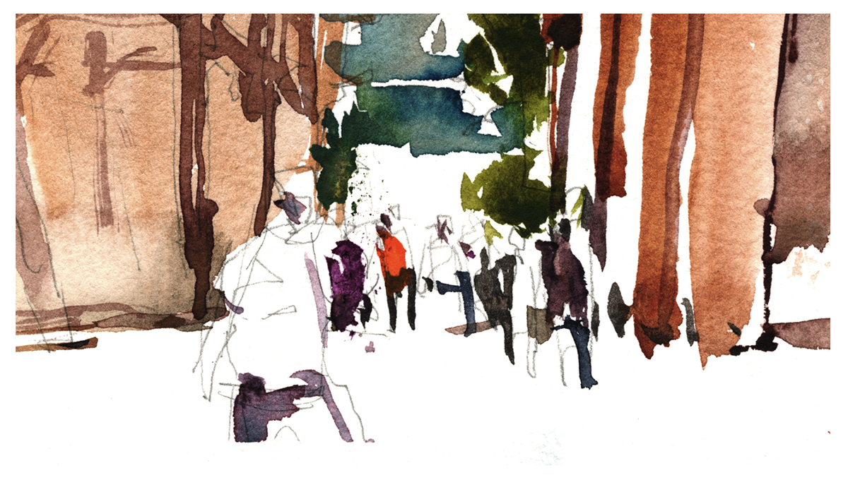
This ordinary street view has some nice raking light in the AM. It’s kitty corner opposite the Calder Flamingo. We came for the monument, but you paint what the light gives you :)
My favorite part of this very rapid sketch is the interaction between this car – painted with a ‘shape’ mentality, and these moving people – sketched in with the brush tip, in continuous line.
Like I was saying last post – even if you ultimately won’t stick with Direct Painting – it’s this kind of experimental feeling that broadens your range of brushwork.
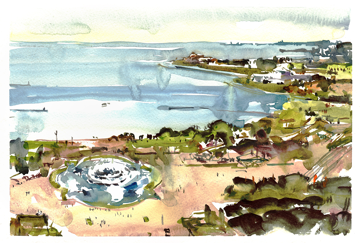
And finally – the panorama from the 21st floor! Another highlight to the weekend was being part of a small group of instructors invited up into the student residence to draw this incredible view of the city. (Sorry to people that couldn’t be there, but there was some nitpicky deal about limiting entry, due to it being college property, with all those impressionable youth on hand).
There were some other great views from other high rise decks – but none that I managed to capture.
Doing one of these is an all or nothing roll of the dice. You just start blocking shapes, and never look back.

The double page spread goes from Navy Pier on the left to the Field Museum on the right, with the Buckingham fountain in between.
I recognize this is in no way a realistic sketch – but man, was it a lot of fun to do :) And as far as I’m concerned, that’s what matters.
")
")


There was of course, so much more to paint. A weekend only skims the surface. And – I think it’s worth saying – you’re not seeing a number of what I consider failed experiments. Due to this year’s high risk, high reward adventure in Direct Sketching, I would say I only had about a 50% success rate. But that’s what you have to be willing to do, in order to grow your work past the first formulas that tease you with success.

It’s getting to be a huge cliche on Citizen Sketcher – but I hope I get a chance to get back here to paint some of what I missed. The ones where I went down swinging, defeated by the epic monument that is Chicago!

As always, Photos: Laurel Anne Holmes
Report from the Urban Sketchers Symposium, Chicago 2017
We’re recently back from the USK Chicago Symposium, followed by somewhat of a prolonged after party, which we’ll be talking about in due time.
As usual I’m looking over the sketches we brought home and thinking – what have we learned from the workshop?
I think we learned that Direct Watercolor (no drawing – all brushwork) is hard!
But really worth the exercise.
It’s not that I’m going to give up drawing. This is not a religious conversion. “Burn your pencils!” (not).
You’ll see that I go right back to drawing as soon as the symposium is over. BUT – the thing is, if you try it, for even a few days, your painting instincts can take a big jump forward.
You learn first hand how much you don’t have to draw. How much you can really do with a brush.
So when you do return to the safer world of drawing under a watercolor – maybe you’ll break away from slavish coloring-in. Maybe you’ll have gained some of that freshness we love in watercolor.
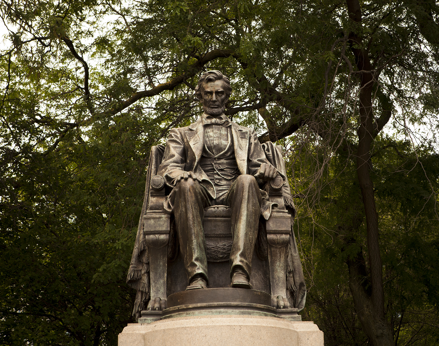
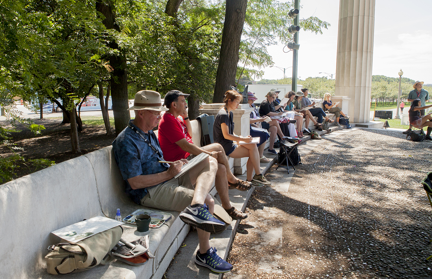
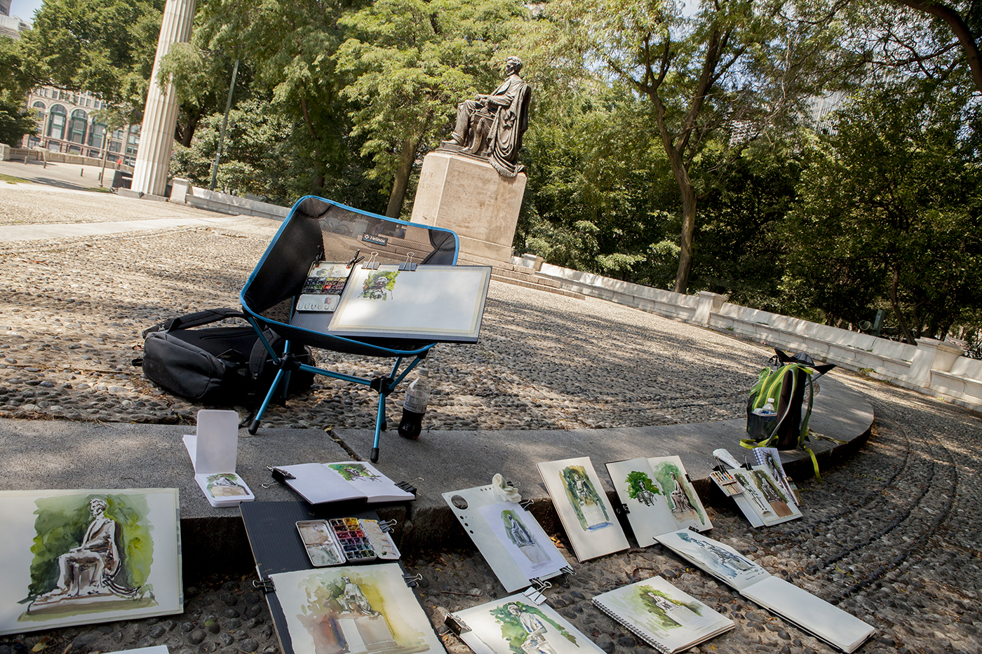
We began classes each morning with two examples of Broken Silhouettes. One positive, and one negative shape.
Fortunately, there were plenty of sculptural examples right near the workshop meeting place.
If we look back at my outline for class, I think these first two subjects were easy enough to follow.
Combining line and shape together, in a single pass, using just the pointed round brush to either draw a shape – or to draw around a shape – using the background tone and then going back for interior details.

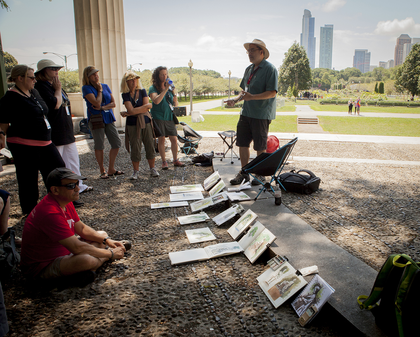
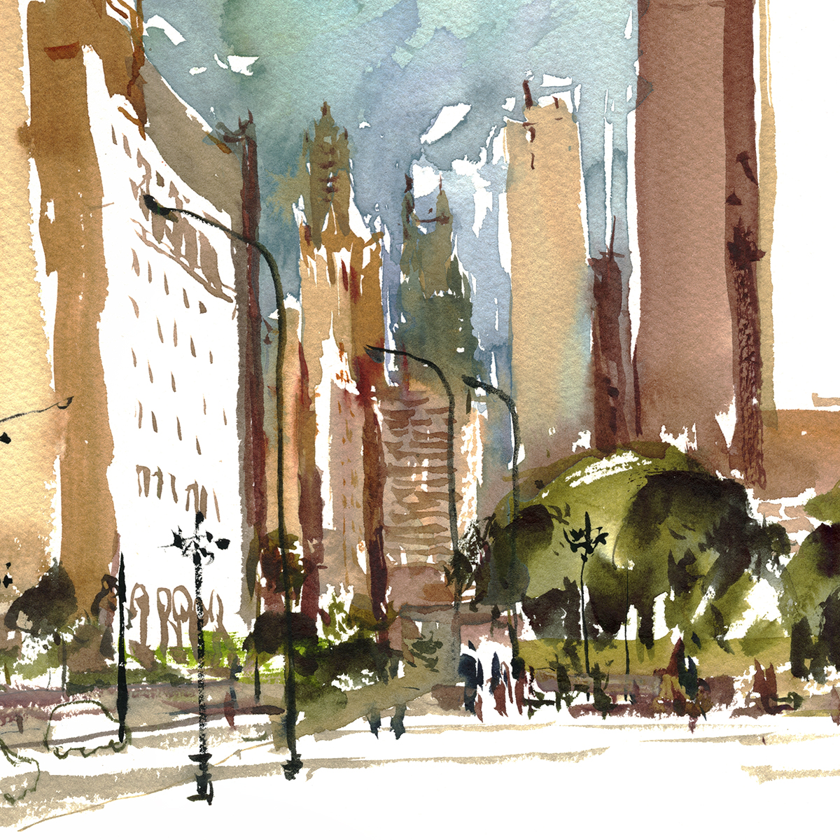
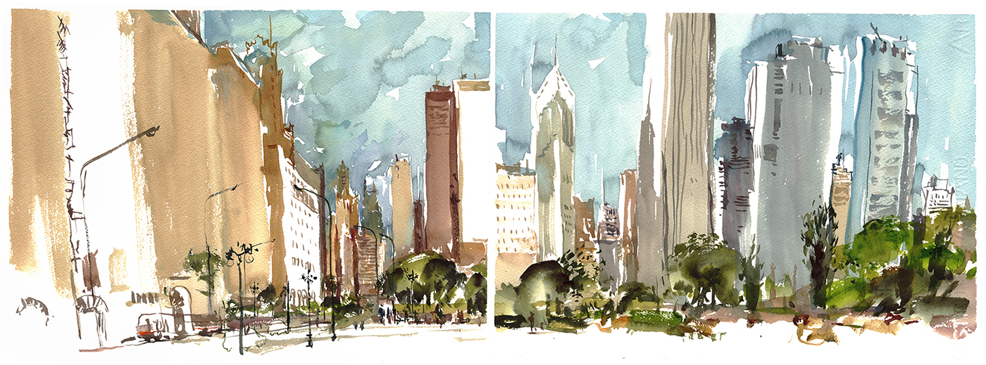
But after that we took a leap of faith, and had people dive into a classic skyline view of Chicago.
Which I think, on reflection, might have been a big ask :)
Looking north we had the Magnificent Mile in the distance, looking south (my favorite) the park surrounding the Field Museum and some glass towers rising above the train yards.
It shouldn’t matter what you are sketching – even if it’s an intimidating view. Everything can be reduced into a set of silhouette shapes.
A row of skyscrapers is no different than the lone statue. Think of it as a row of bricks.
Especially if you decide you don’t care about architectural rendering, and you’re just going to make a lively sketch. You can still feel the presence of the city, even if you reduce those huge buildings with hundreds of windows into flat shapes.
Just keep thinking about the silhouette edge of the horizon, and make sure there are some tiny elements for scale in the foreground.
I asked people at various times to try either the positive shape approach (as above), or the negative shape approach (below) – where the sky is used to cut out white silhouettes of buildings – which we go back into with shadow shapes.
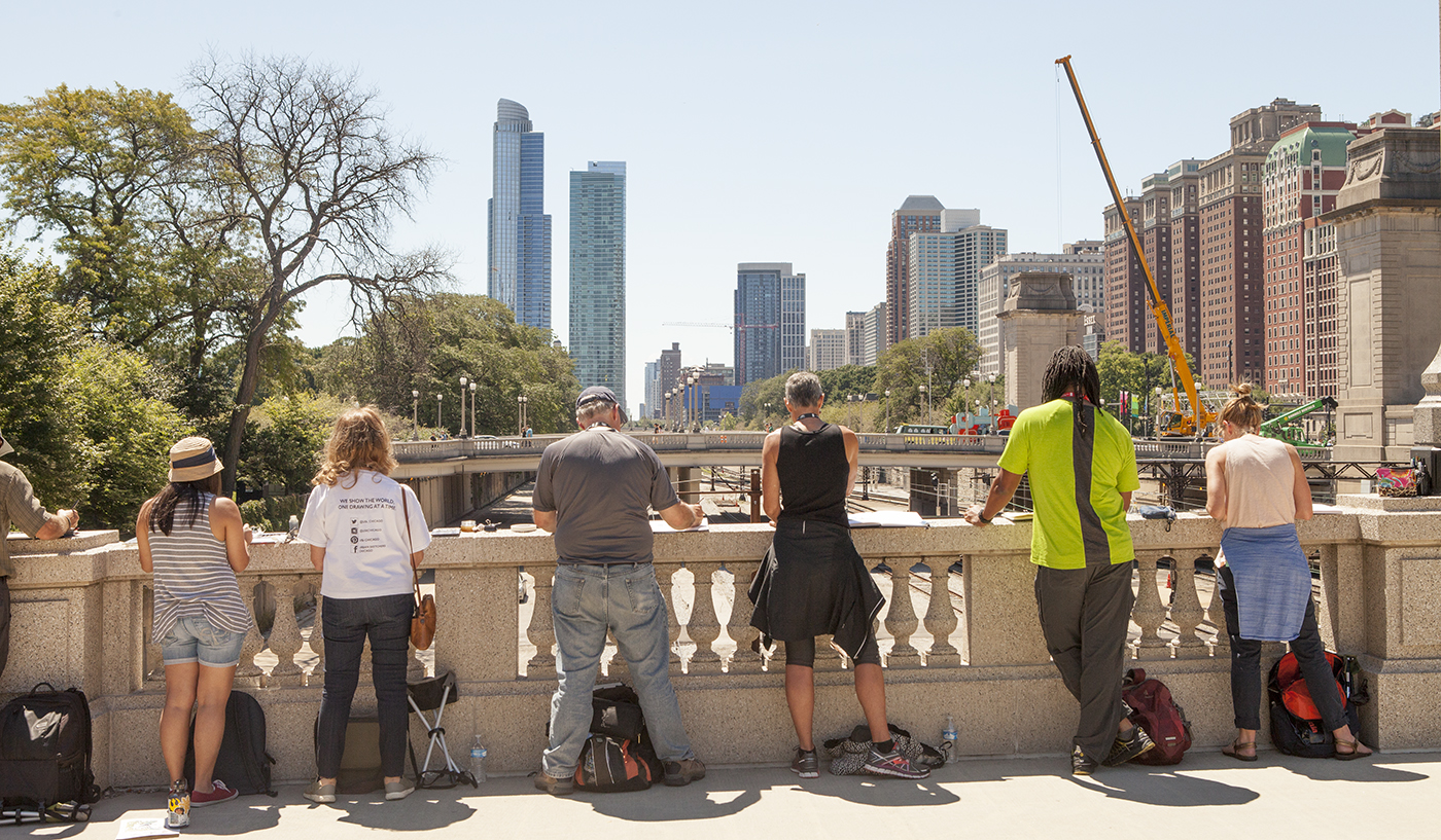
The very best thing about the symposium is the enthusiasm and excitement everyone brings.
Everyone rose to the challenge of this unreasonable assignment!
Students are here to push themselves. To try new concepts with different artist instructors each day.
For an instructor, the symposium experience is different than any other workshop. These are the most passionate sketchers from their various home towns. The ones crazy enough to fly across the country, or even across the ocean, just to spend a long weekend drawing with 400 other people from sunrise to sunset.
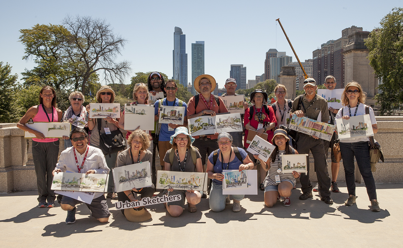
So, I honestly want to thank everyone who took my workshop. I always head home from a USK event with a newfound passion for sketching that I pick up from my students. Thanks to all of you, and I hope we’ll get a chance to sketch together again soon!

