Vermont Sketching Tour

The final leg of our Urban Sketchers painting tour was three days in Vermont, painting with Anne-Laure and her friend Carol. They’ve both gone on to continue painting in Boston and New York, and I’m back to normal life in Montreal.
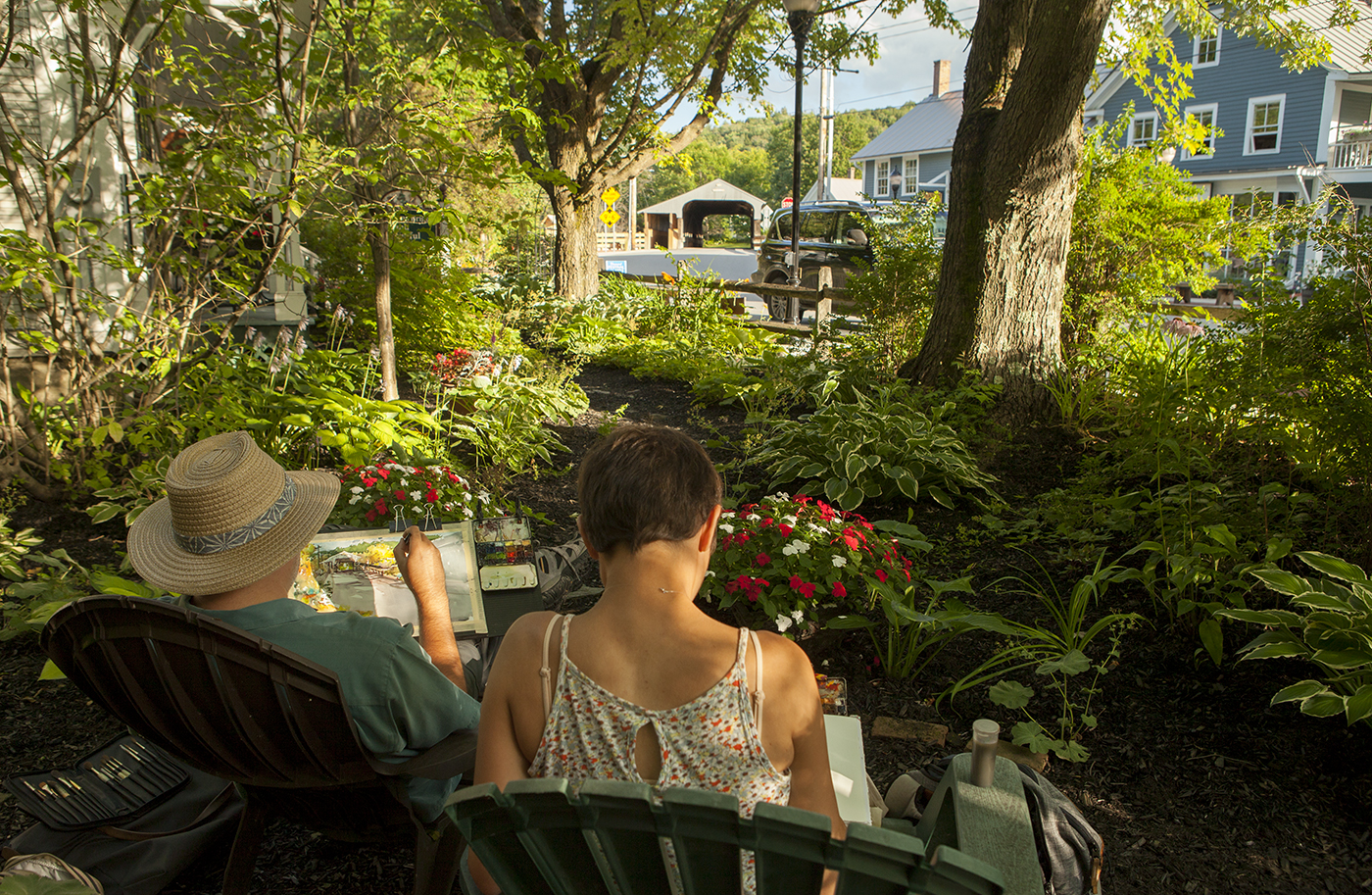
A little different than the chaos of the Chicago streets hey? Just a pleasant afternoon sketching the oldest covered bridge in Vermont.

I showed this to a guy down by the Round Barn Gallery and he said “Oh, the Warren Store”. So I guess it’s a good likeness.
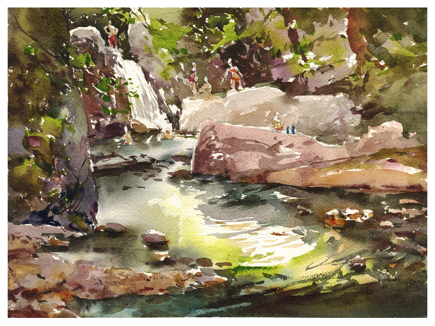
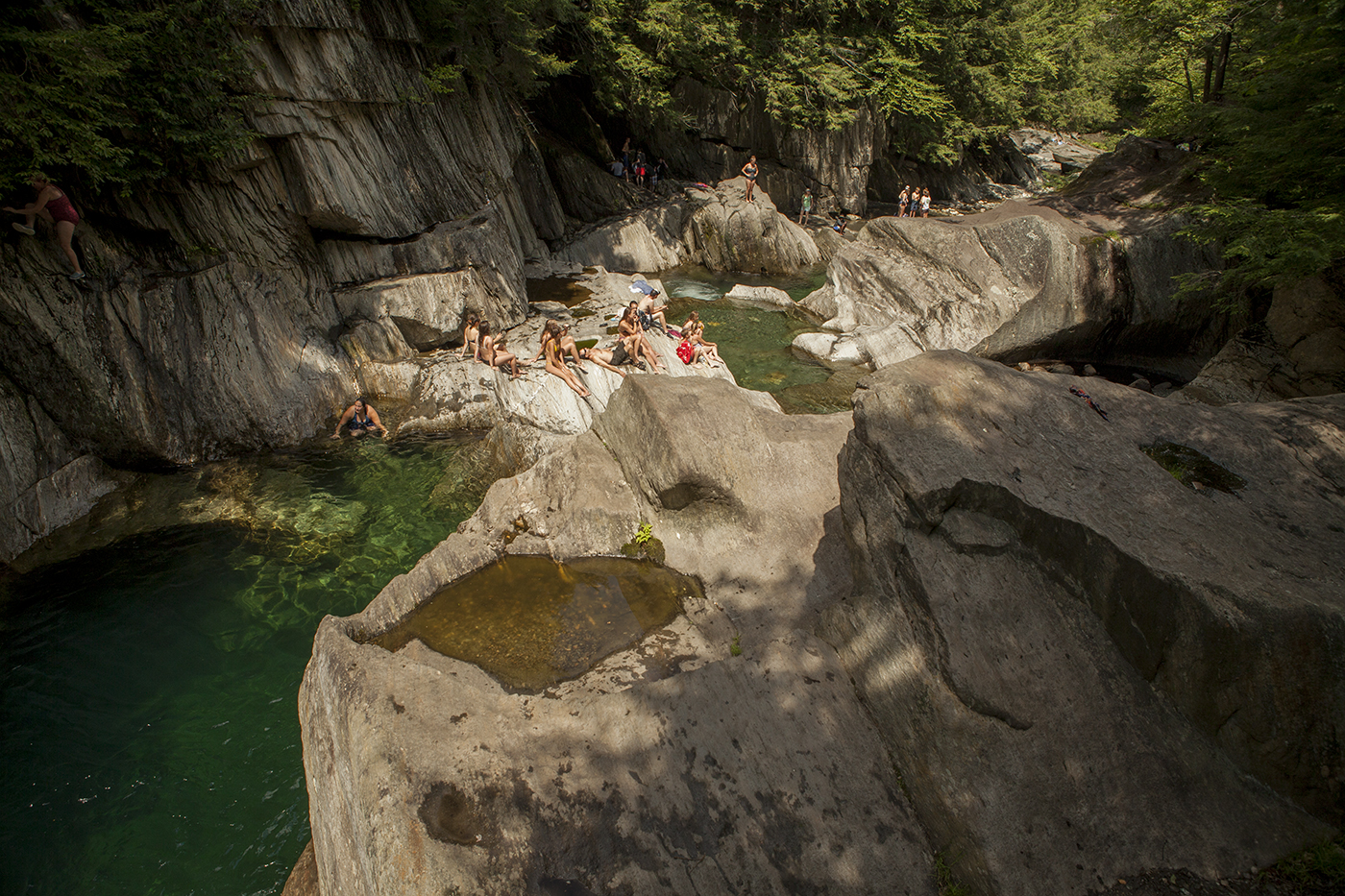
Swimming holes are still a thing in Vermont.
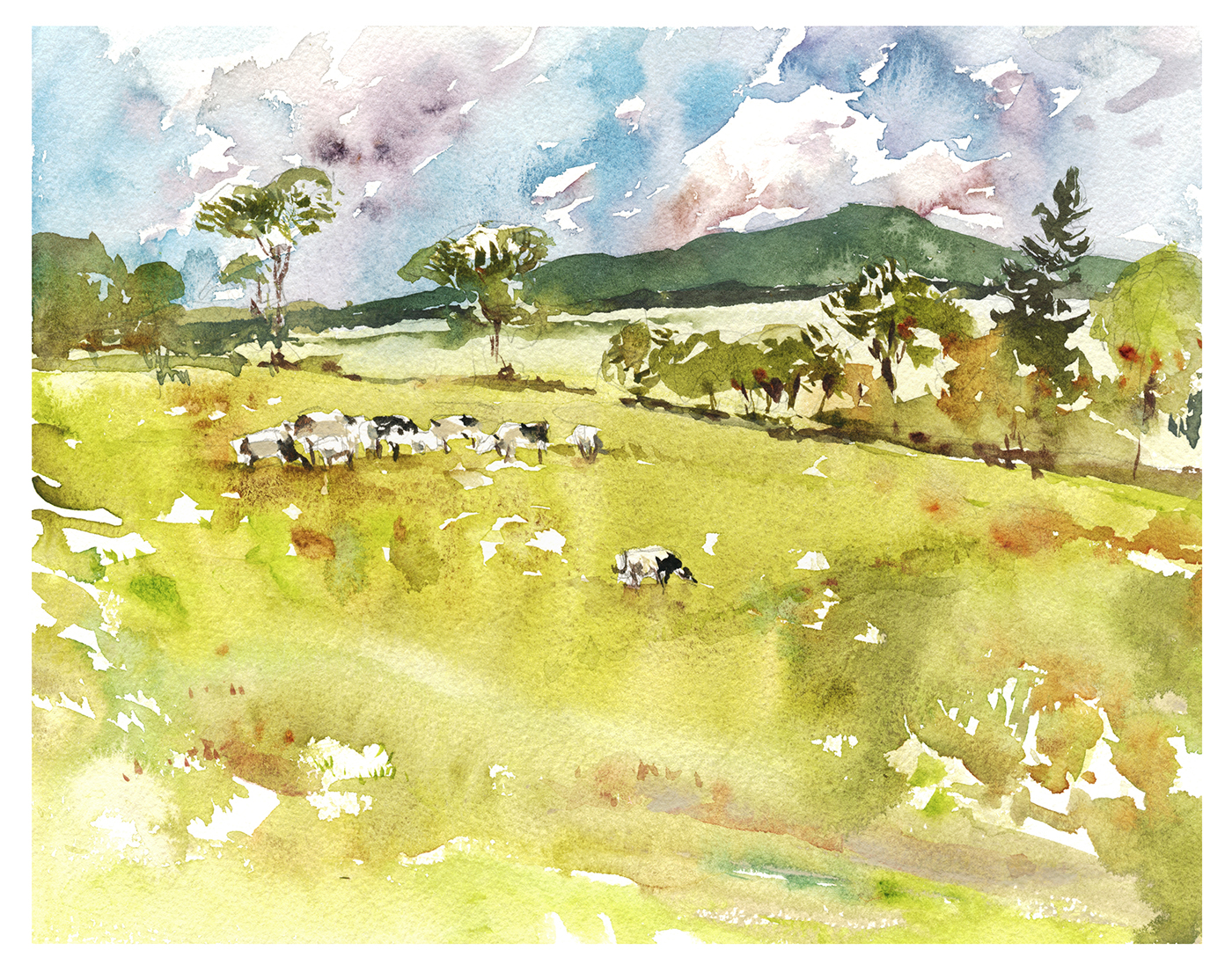
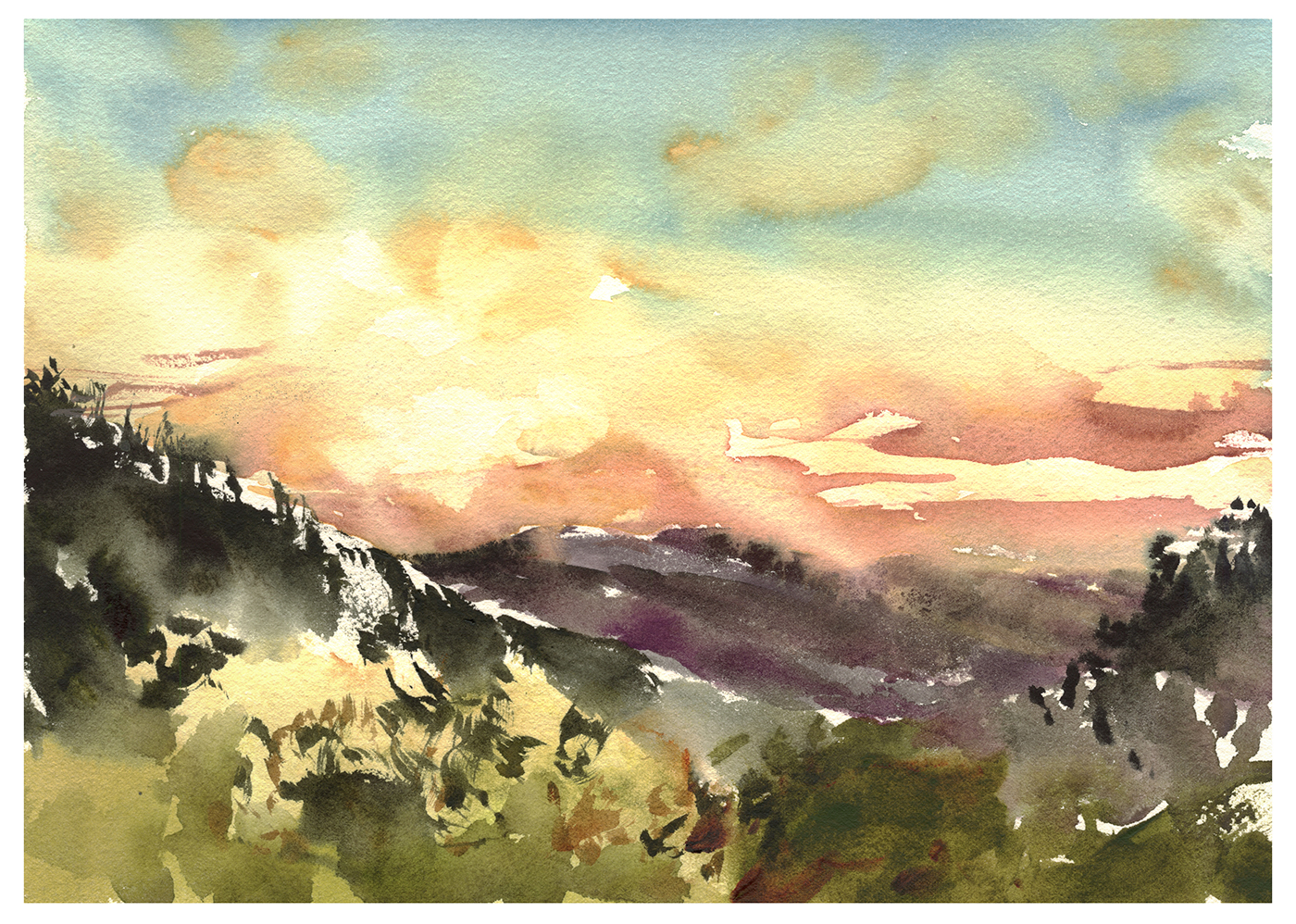
I finally got it – why they call them the Green Mountains. You can’t go wrong with a scenic shot around here. These picturesque mountains make every sketch a winner.
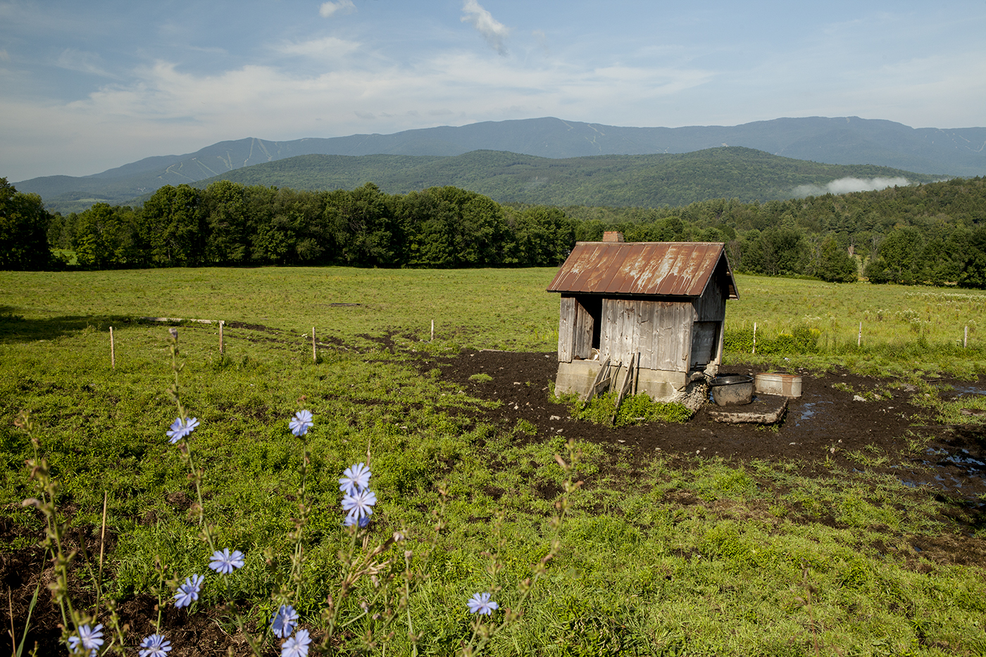
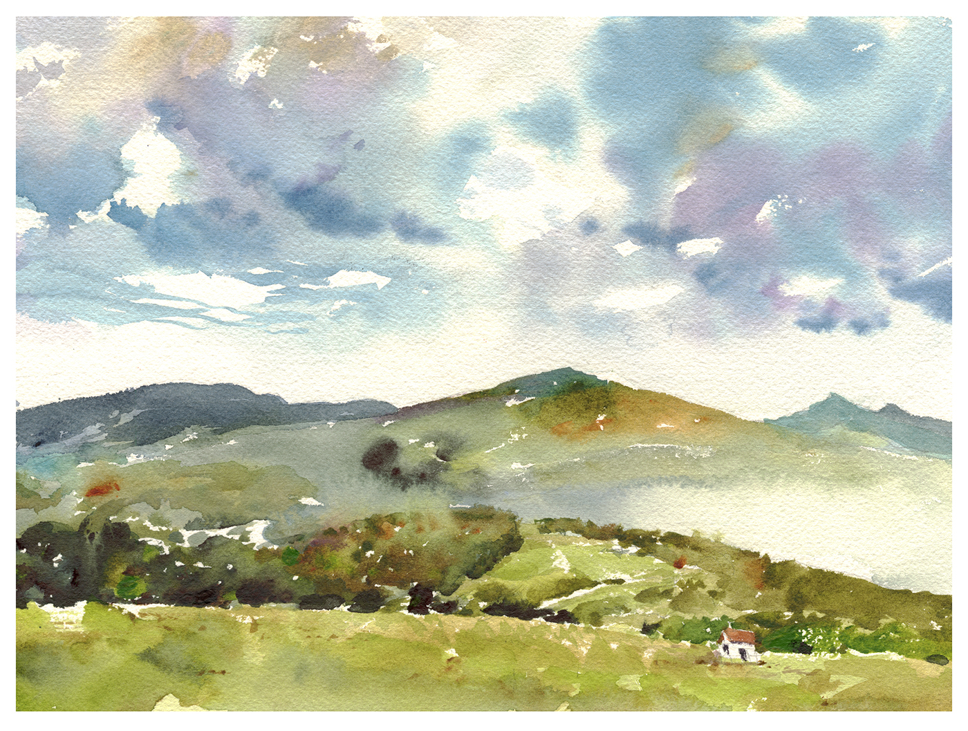
Our host Carol can wake up to these mist shrouded hills every morning.
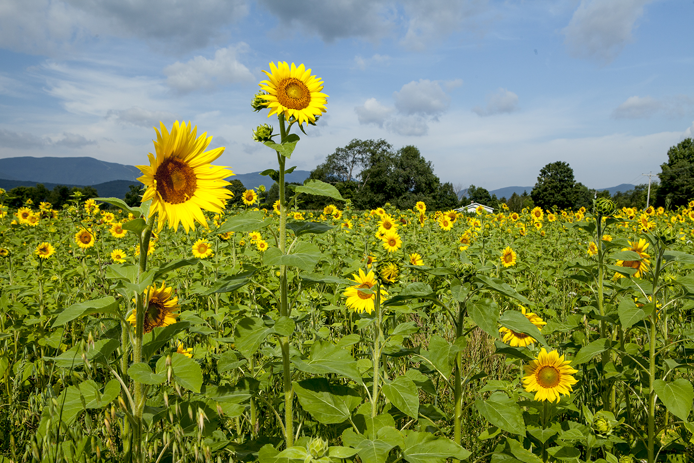
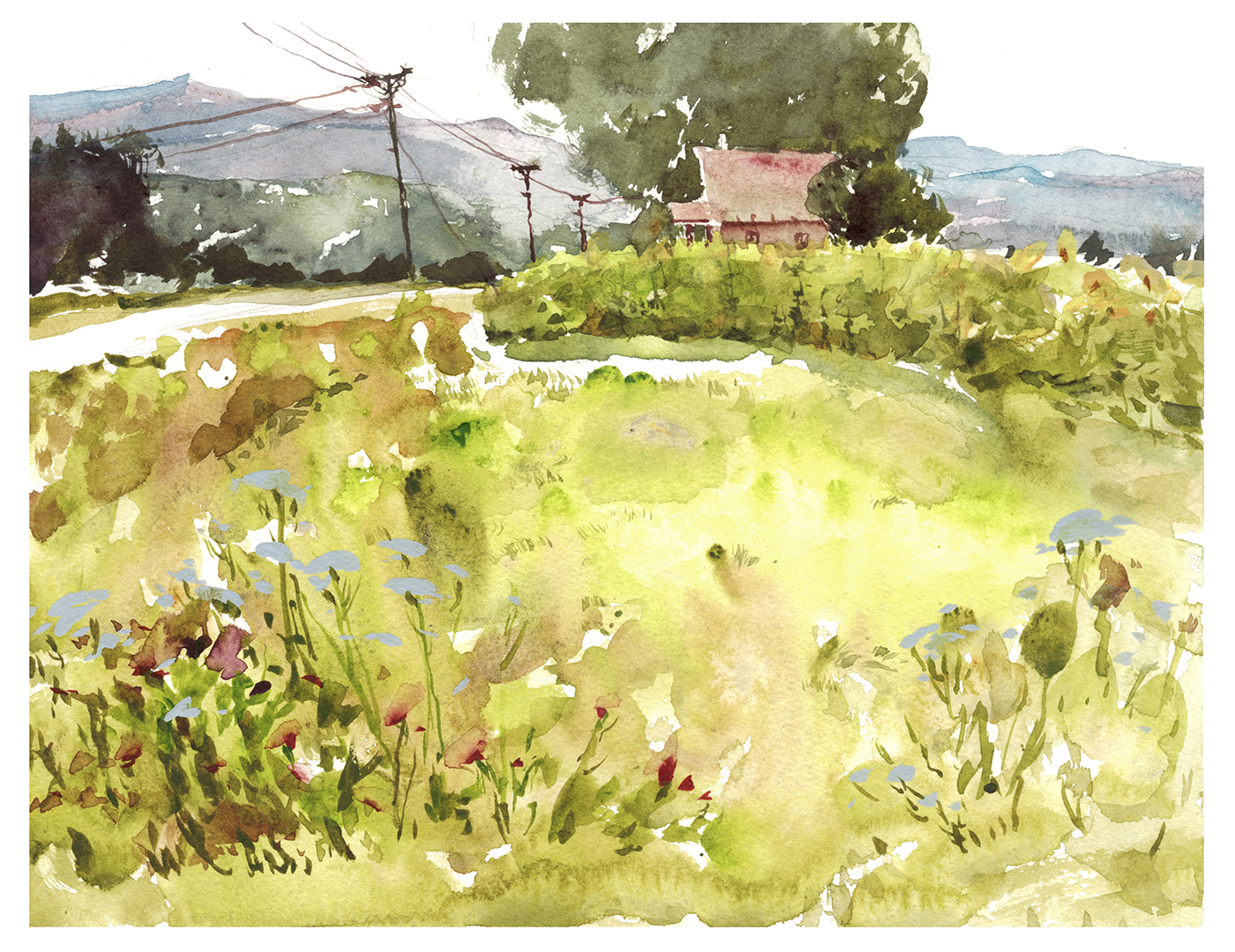
I didn’t get the amazing sunflowers into this sketch. Though I did make a bid for the Queen Anne’s Lace.
A field of flowers is something I haven’t quite figured out. Do you cut around them? But they’re so tiny! Do you try to add them afterwards with opaque? You’ll loose the glow for sure! For now, they’re downplayed in this sketch.
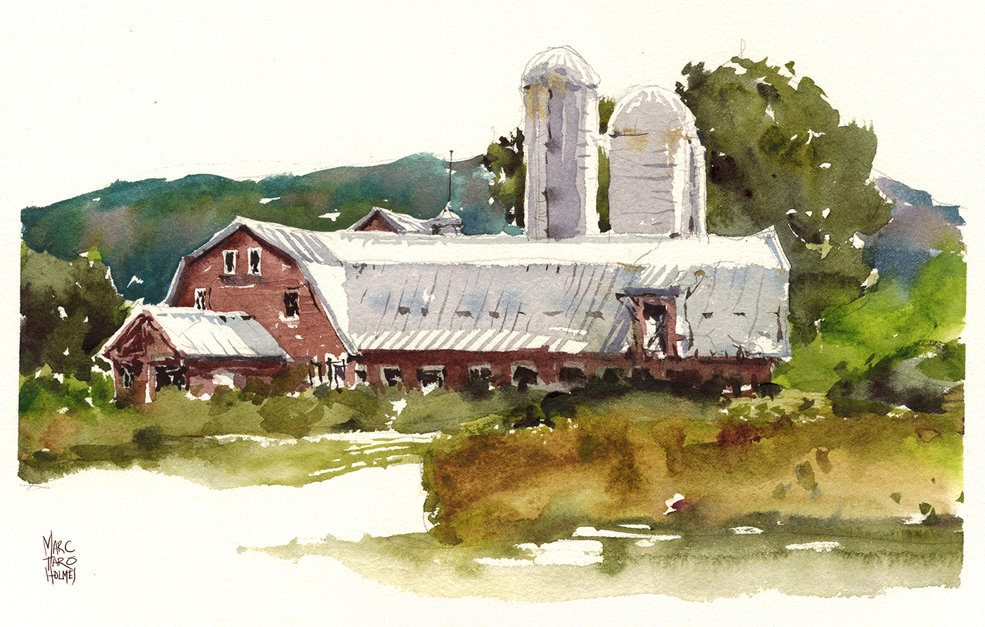
Couldn’t skip painting a barn. I mean, they really are part of life in Vermont. Seems like every other shop, art gallery and restaurant – even the craftsman homes, are made from refurbished barns.
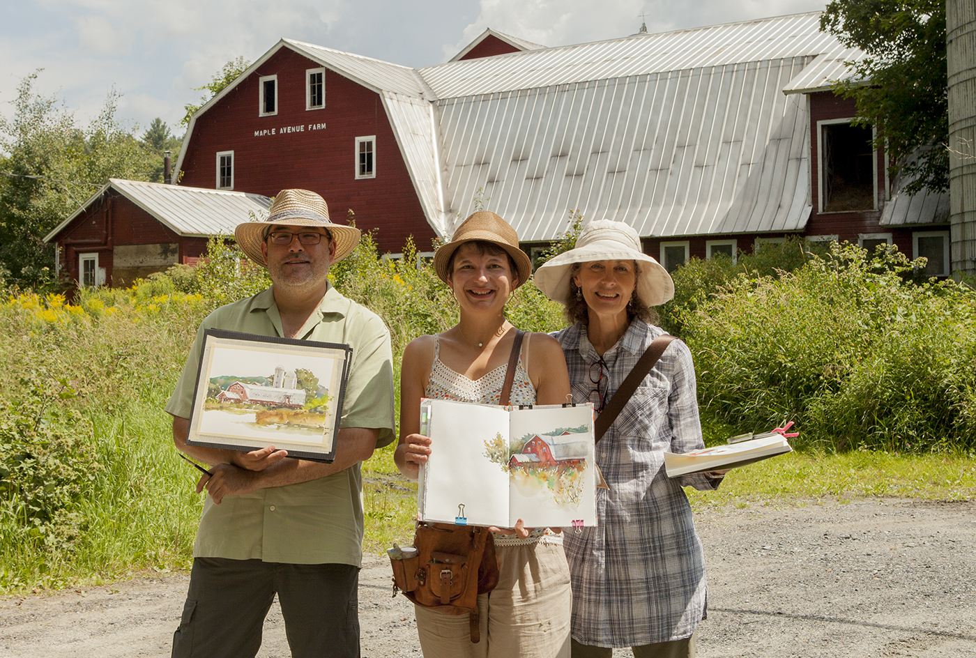
Our host Carol (normally a pastel painter, but this week a watercolorist alongside us!) made sure we got a painting out of every bit of daylight :)
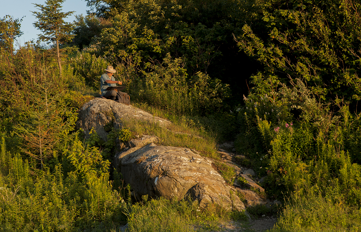
Even this final gasp of sunset over the mountains.
We had a great time in the short visit down here – and I can say, if you’re looking for Plein Air Painting – my goodness, give Vermont a try.
Montreal: The New Drawing Spots

By the end of the second week after Chicago, some great things are happening.
I will say I was getting pretty tired by this time. All the days up early and out late with our guests. All the travelling.
But at the same time, two weeks of painting every day is an incredible opportunity.
A lot of the watercolor process is unconscious.
The pigment-to-water ratio, the timing of when paper is wet vs. damp vs. dry.
These things are all done ‘by eye’.
As well, your sense of proportions, and how you simplify – it all becomes a little more instinctive.
I feel like these ones at the end of the week are making better use of interlocking shapes.

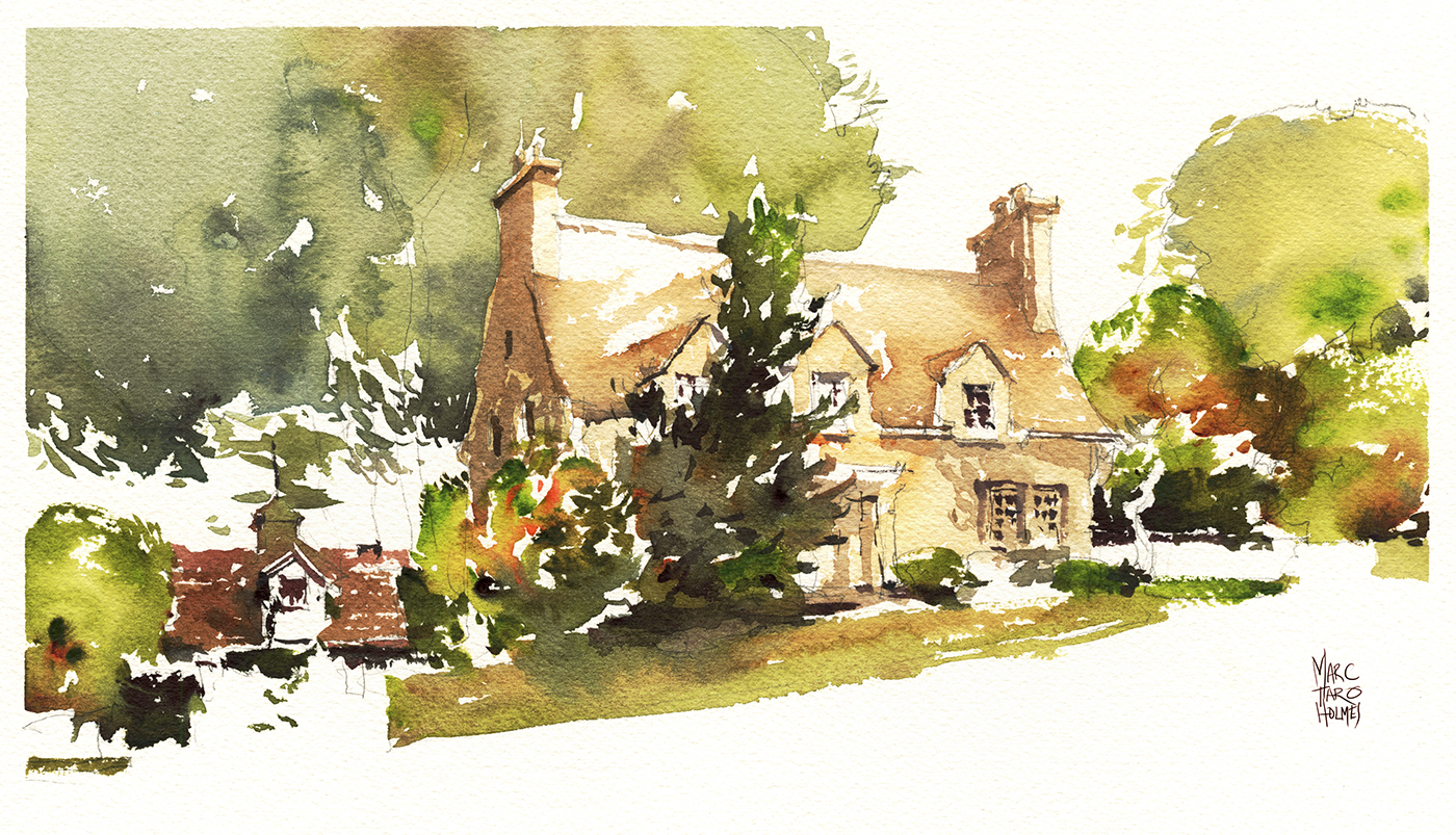
Most of these houses are just on the street near our home in Montreal. But this last one is a bit of an outlier.
We headed out to the Marguerite D’Youville bird sanctuary in Chateauguay – for a change of pace from all the architectural drawing.

This is the view from a small dock, looking out over a flooded field of dead trees and scrubby brush.
I was after the feeling of dark water underneath a skin of pale duck weed.
I think it’s usually much greener out here, but for whatever reason, this year it seemed to be a wheat-grass sort of color.
This park is a terrific place for bird watching. We saw herons, egrets and eagles, along with the usual songbirds. My favorite being hummingbirds that come to the feeding stations. And, if you come when it opens at 9AM, you’ll see plenty of deer. There’s also a chance for fox, raccoons, and marmots.
Old Haunts Week
In the week immediately following the USK Symposium in Chicago, we returned to Montreal, accompanied by sketchers Liz Steel and Anne-Laure Jacquart.
As a blogger, I’m starting to feel behind the times. Those of you who follow my friends on Instagram, might have already seen some video from this week.
So I’m not going do another day-in-the-life sketchwalk report. Instead, let’s look at a few favorites from our recent sketch-tour, next to some some flashbacks from older drawings of the same spots.

This sketch is way back in Oct 2012.
I’d been on the Plateau at Mount Royal Metro, drawing with water soluble ink in fountain and brush pens.
This domed tower is on top of the public library directly across the street from the metro.
Through the thin paper of this cheap sketchbook, you can see a more pointed bell-tower sketched on the back page.
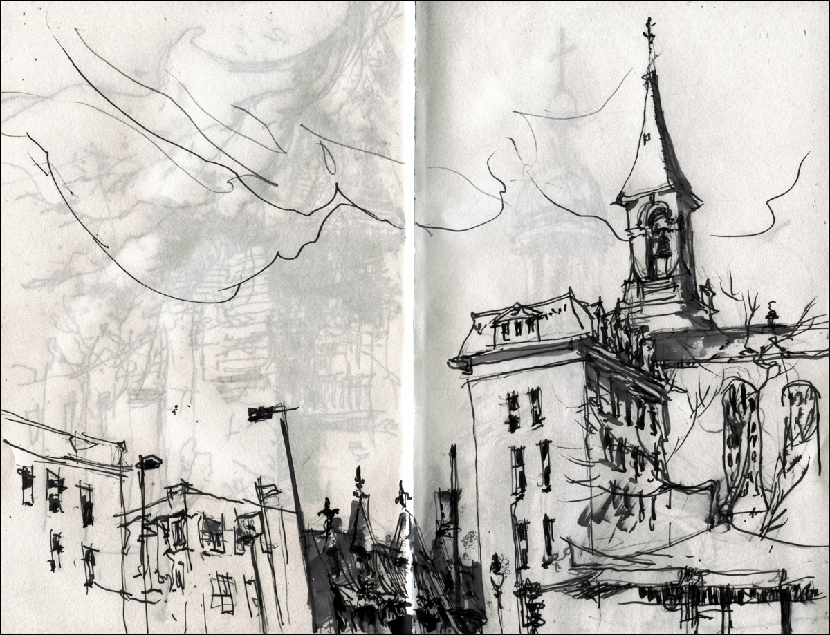
This one is on your right when you come up from the subway.
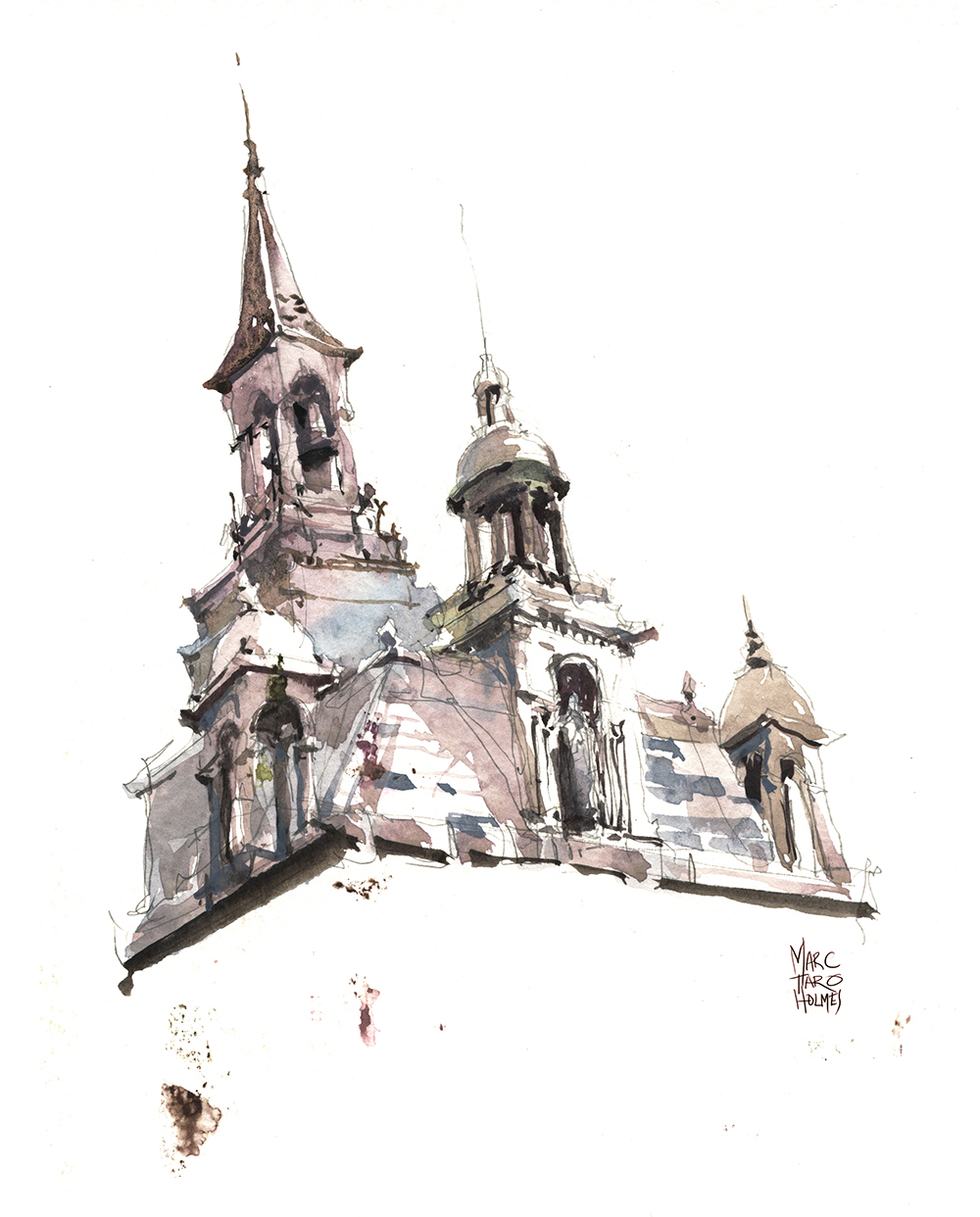
Standing back on this same spot, five years later – I’m not sure if I remembered these two overlapping drawings, or if it’s simply a matter that these are the only interesting things to draw at this spot. Either way, my new sketch (at top) literally combines the two towers into one composite drawing.
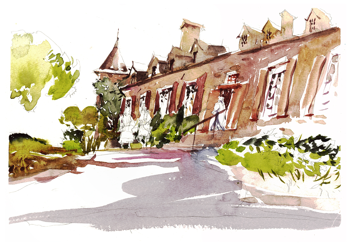
This one is the Chateau Ramsay, sketched from ground level just inside the front gate.
I always take visiting sketchers here, as it’s right next to Place Jacques Cartier, has it’s own little walled garden, plus the city hall is right across the street.
I was just playing with this drawing – exaggerating the upward angle, and playing fast and loose with the windows and shutters. Not even putting any color on the people out front. They aren’t drawn all that well really – just some lazy scribbles.
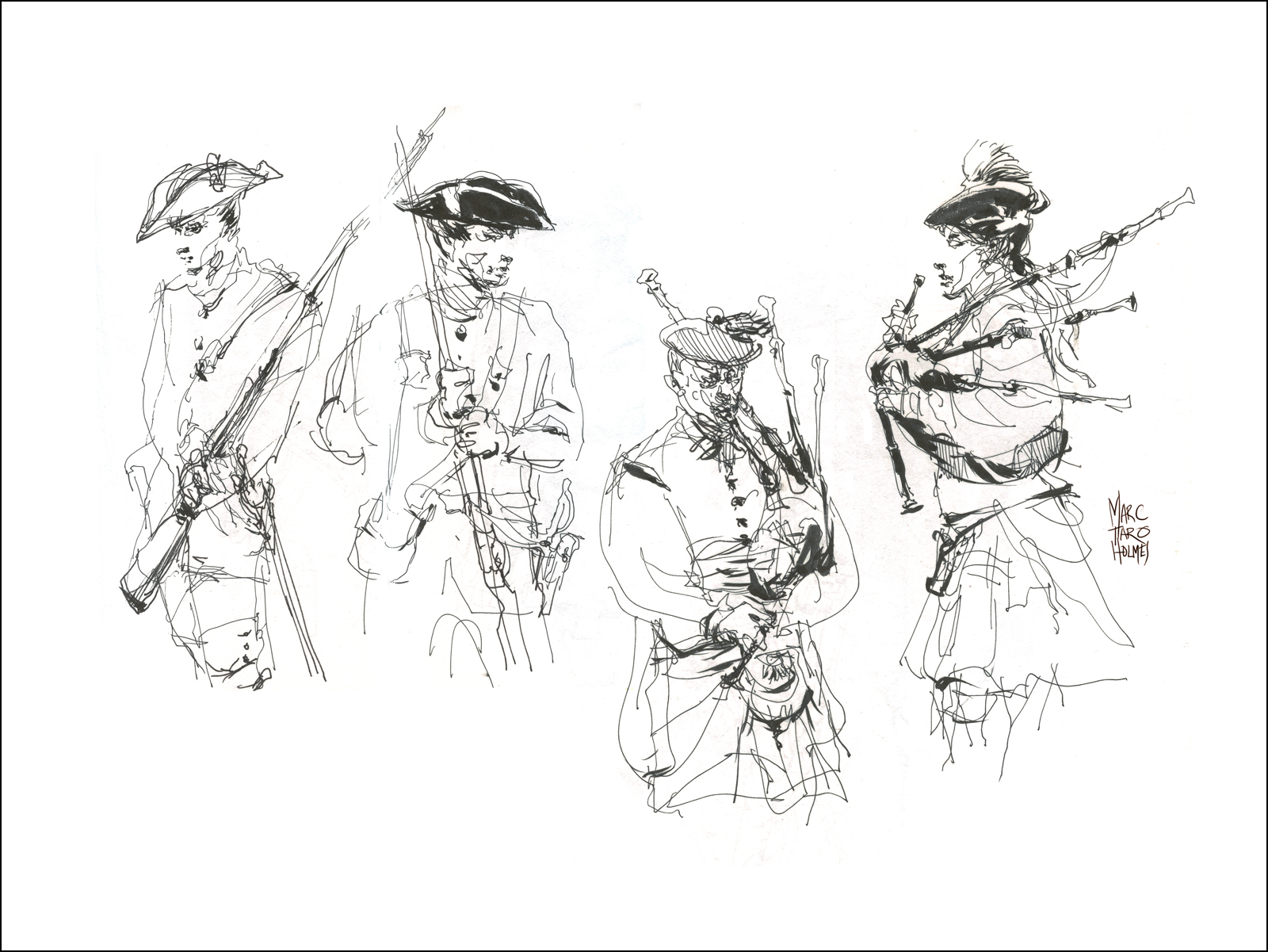
But maybe that’s because I’d already sketched them in 2014! I doubt it’s the exact same historic re-creators – but it was probably some of the same costumes.

Here’s my 2014 sketch of the house. Back then I was using pen and ink and wash, and I was much more concerned about getting the entire building into the frame. Even though, I was writing at the time about designing a good picture, not just making a snapshot. It’s fun to see, 3 years later, how much I’ve taken my own advice.

Somewhere during all this we stopped by Place D’Youville, which is a small public square, crowned by this is old fire station, that is now the civic history museum.
Not the fancy one at the Pointe, but the quaint little one that tells the story of Montreal’s recent past.
Here’s some sketches of what was inside back in 2012.

Again, we can see how back in July 2012 I was spending a few hours on a complicated production, that tried to capture the thing as accurately as I was able.
At this time I was painting in three passes I called Tea, Milk and Honey. Something I still use to this day – but in a much less rigid, step-by-step approach.

I think perhaps this one was my best?
The most recent 2017 version might have become too cartoon-y. This one, executed from I think, Oct 2016? was maybe the best compromise of line drawing and wet-in-wet shape work.
Turns out this might take the record for ‘most sketched by me place’ in Montreal. As I’ve also drawn it back in 2014 in one of my very first experiments with Direct Watercolor.

Ok one last place: St. Joseph’s Oratory.
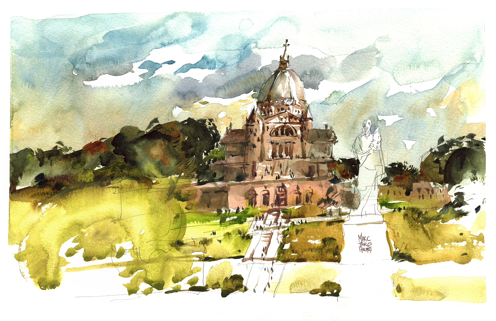
Another spot, I’ve drawn time and time again. There’s even a fifth version that appears in my book.
It’s fun to watch my own confidence with paint mixing develop over time.
Keeping in mind, some of these below took four or five hours in the studio, whereas the 2017 version was a 30 min sketch.
Whatever this latest version lacks in accuracy or fine detail, I think it makes up in spontaneity and boldness of execution.
Look how tentative my first steps were!

2011

2012

2012, studio remake.
Chicago: The Daily Sketches

Naturally, the highlight of the USK Symposium is meeting up with old sketching friends who you only see once a year.
It’s become a tradition, after seven years of going to this event, for some of us to head out in the early morning, and do a sketch before class.
Sometimes it’s the only chance to do a drawing for yourself that day, what with the demos, classes, and interviews.

This was my all around favorite from Chicago. It’s right in my comfort zone. Crazy complicated subject, with my patented white background.
The Elevated Train seems like a terrific icon for the city. It’s so gloriously industrial. No design sacrifices, just raw functionality. The thing is so loud!
But at the same time it’s got a kind of elegance. A monumental structure, running right through the heart of downtown, like a relic from a bygone era, still part of everyday life.
This one was sketched with a pencil – I mean, come on – that’s too complicated to wing it right? But at the same time, there’s a lot of Direct Brush work in the impression of the superstructure. I like that mix of observation and invention.
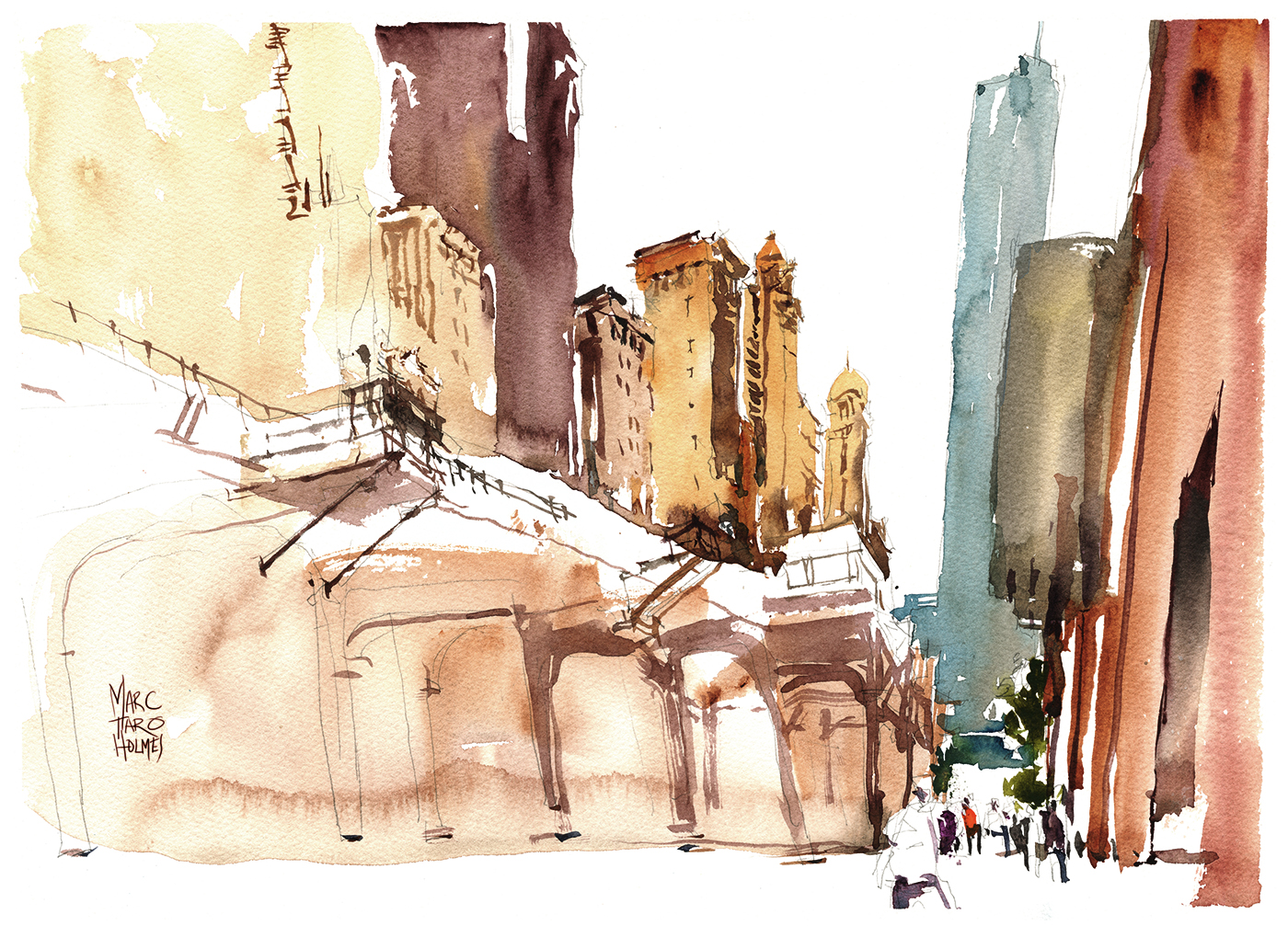
The scale of the city is a bit of a shock. Montreal isn’t exactly a dot on the map – but I’m not used to these enormous buildings. The only way to suggest the scope is to get in some tiny details at street level. These little people are what make the scene.
This is Dearborn Station – painted direct-to-brush. It’s nicely spot lit in the morning, even though we’re still in the dark canyon of the street.
The red brick tower is a bit of a flashback to Manchester last year.

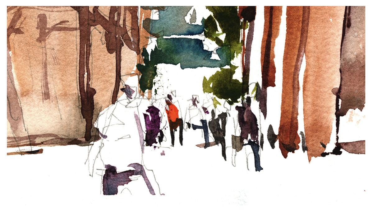
This ordinary street view has some nice raking light in the AM. It’s kitty corner opposite the Calder Flamingo. We came for the monument, but you paint what the light gives you :)
My favorite part of this very rapid sketch is the interaction between this car – painted with a ‘shape’ mentality, and these moving people – sketched in with the brush tip, in continuous line.
Like I was saying last post – even if you ultimately won’t stick with Direct Painting – it’s this kind of experimental feeling that broadens your range of brushwork.
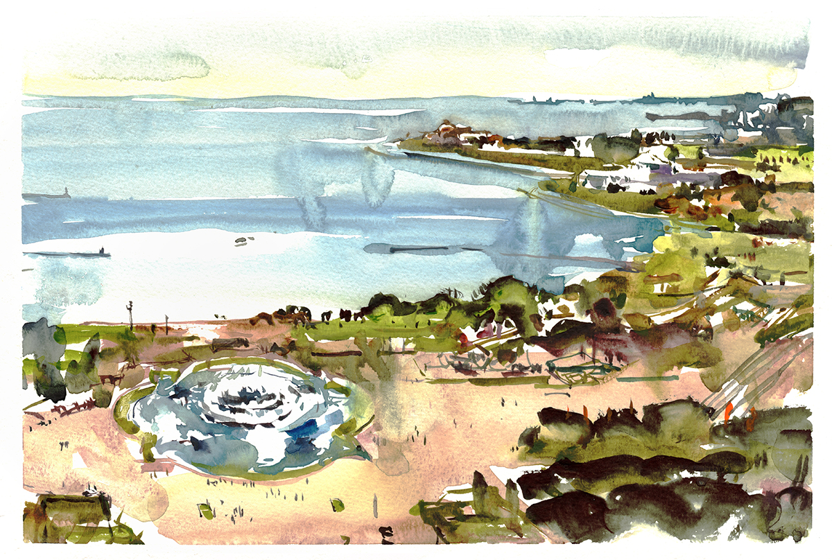
And finally – the panorama from the 21st floor! Another highlight to the weekend was being part of a small group of instructors invited up into the student residence to draw this incredible view of the city. (Sorry to people that couldn’t be there, but there was some nitpicky deal about limiting entry, due to it being college property, with all those impressionable youth on hand).
There were some other great views from other high rise decks – but none that I managed to capture.
Doing one of these is an all or nothing roll of the dice. You just start blocking shapes, and never look back.

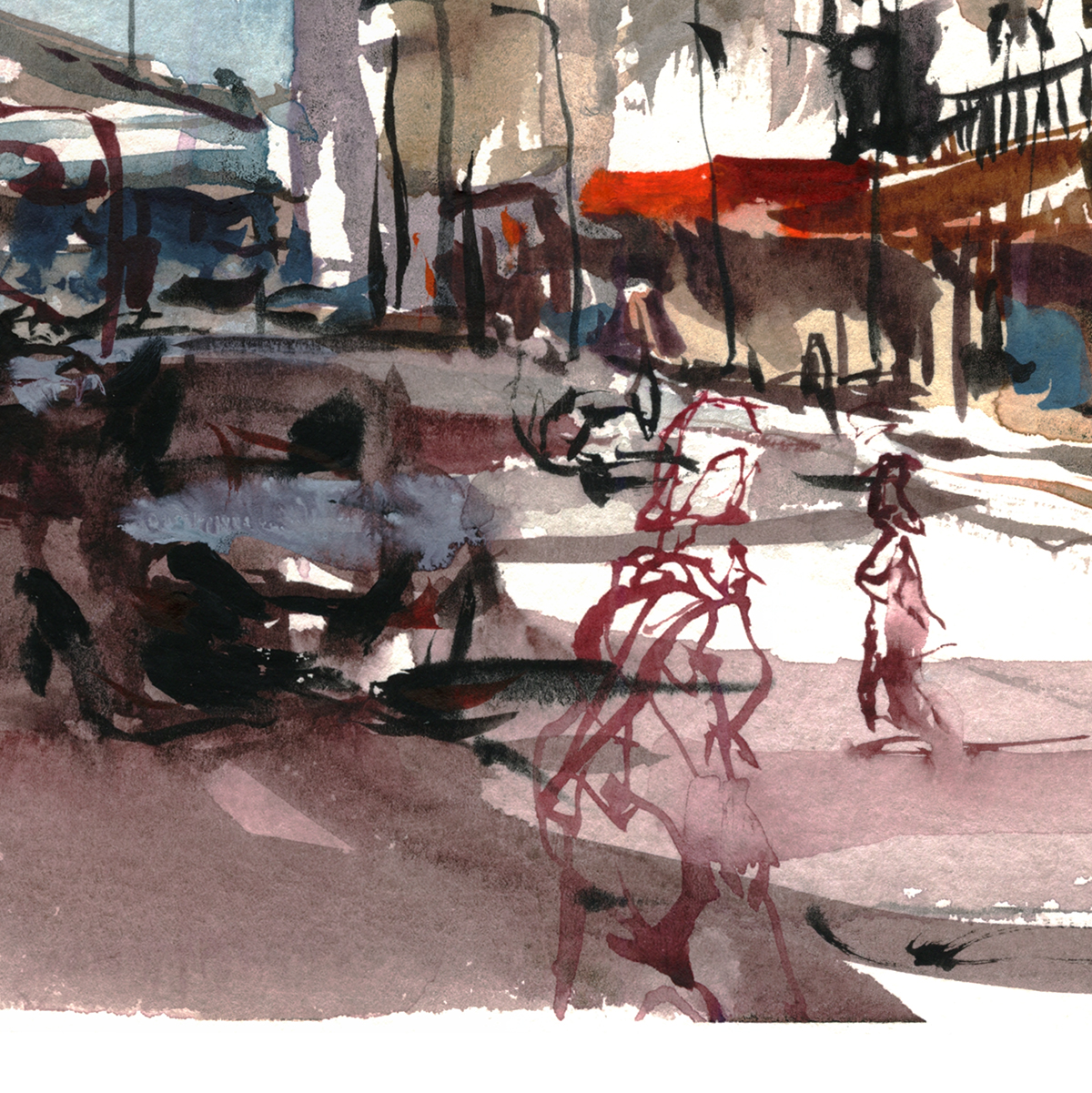
The double page spread goes from Navy Pier on the left to the Field Museum on the right, with the Buckingham fountain in between.
I recognize this is in no way a realistic sketch – but man, was it a lot of fun to do :) And as far as I’m concerned, that’s what matters.
")
")


There was of course, so much more to paint. A weekend only skims the surface. And – I think it’s worth saying – you’re not seeing a number of what I consider failed experiments. Due to this year’s high risk, high reward adventure in Direct Sketching, I would say I only had about a 50% success rate. But that’s what you have to be willing to do, in order to grow your work past the first formulas that tease you with success.

It’s getting to be a huge cliche on Citizen Sketcher – but I hope I get a chance to get back here to paint some of what I missed. The ones where I went down swinging, defeated by the epic monument that is Chicago!

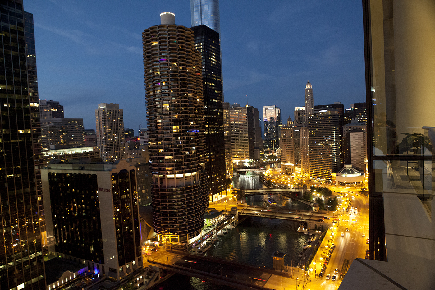
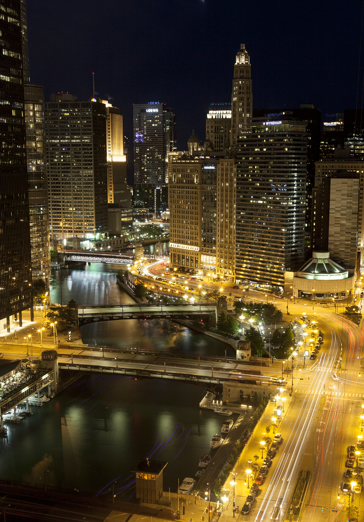
As always, Photos: Laurel Anne Holmes
Portrait Night

There’s an ad-hoc portrait sketching night at Montreal’s George Vanier cultural center. (Unfortunately, the session is closed for this summer, but they should be back in the fall? – Just check GVCC’s site).
These guys have a clever system. Each artist takes a turn in the chair, posing for the others. Saves on hiring models, and you get more variety of people.
I think these were 15 min? I remember them feeling like a huge rush. Like I held my breath the entire time to get them done. But then sitting for mine seemed to take an eternity.
Right now I’m just back from the USK workshop in Chicago – probably we’ve been doing a lot of these while sitting around the dinner table!
These are small heads, probably 3.5″ high.. These have been sitting around for a while, so I can’t be sure, but I’d say my home color was Perlyne Maroon, modified with Grey of Grey, Naples Yellow plus various accidental touches.. Then Raw Umber Violet, Quin Gold, and Transparent Red Oxide for dark hair.


Bringing Montreal’s History to Life
This year is both Canada’s 150th and Montreal’s 375th anniversary, and as such, I recently had a small part to play in the Pointe-à-Callière Museum’s exhibit on the archaeological excavation of the first Fort Montreal, which was a very small stockade, right where the Pointe museum is today.
I myself have not seen how these drawings got used, but I hope you’ll see a few of them on the panels in the future exhibition.
This was the second set of illustrations I’ve done on Quebec history. A few years ago I contributed to a book covering pre-historic Quebec, up to first contact by Jacques Cartier.
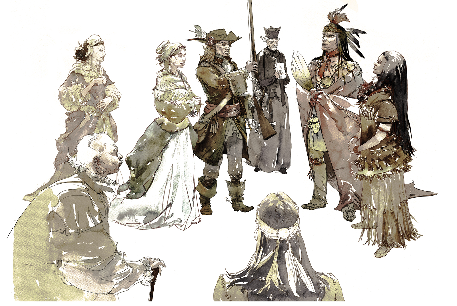
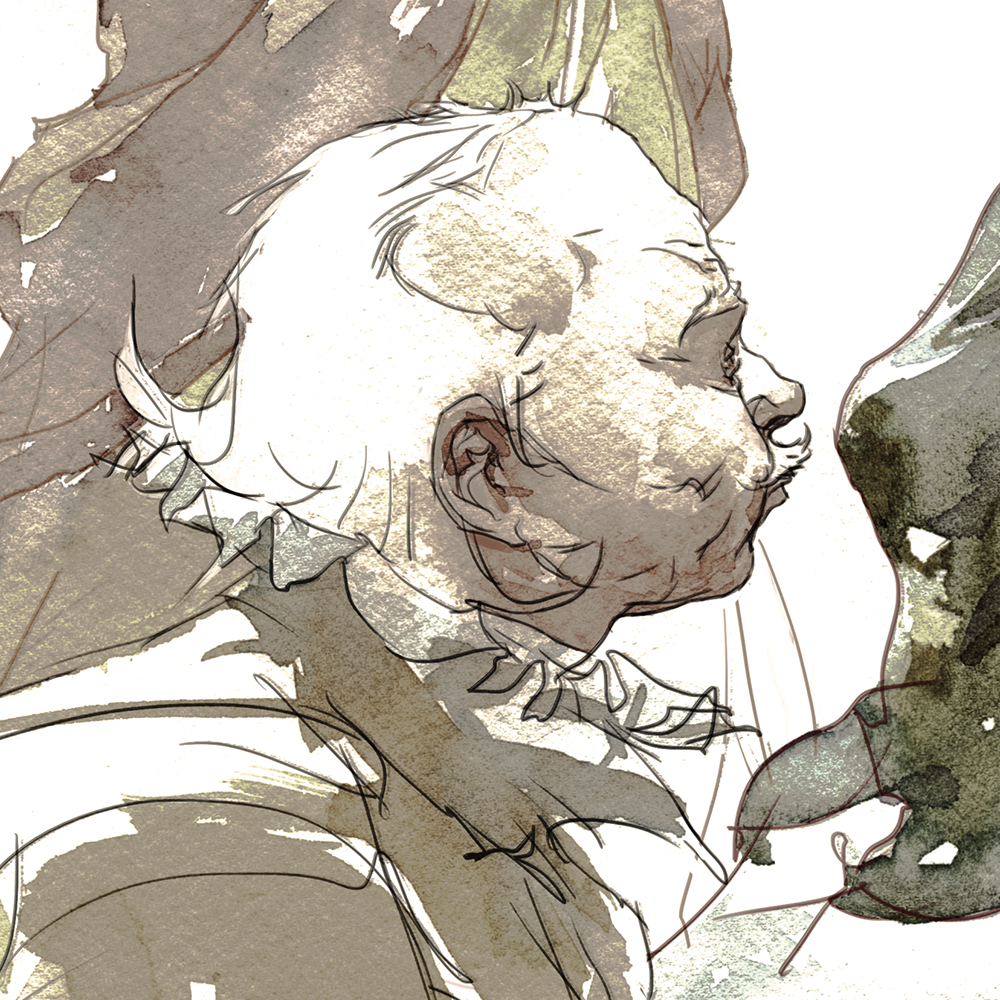
This time, I was tasked to visualize some of the people involved in our first footfall on the island. I did paint some backgrounds for these, but I prefer the characters without.
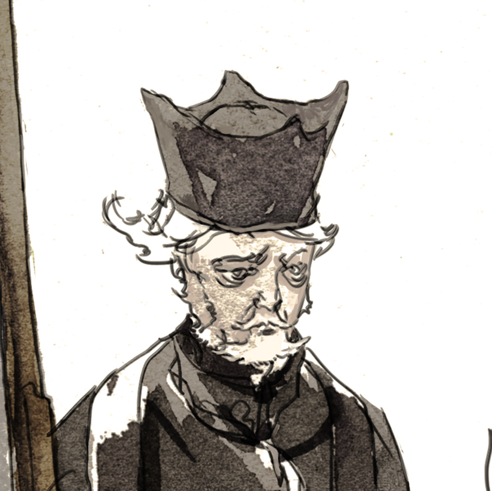
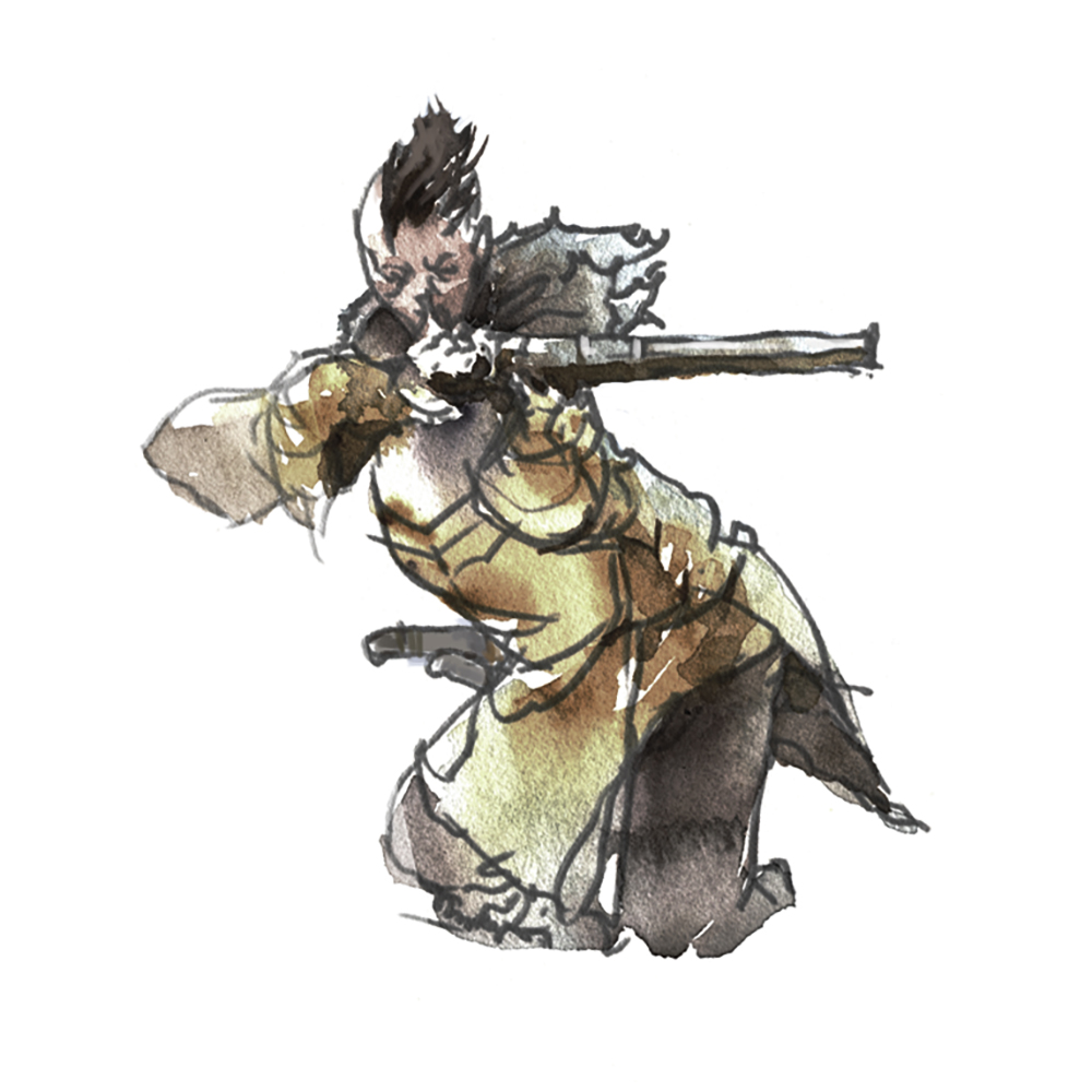
Here we see our colonial leaders, the soldier Paul de Chomedey – who, for some reason is always called Maisonneuve. Also shown at the top of the post, doing his soliderly duty, shooting people in the face.
That image comes from a well documented story, in which the colonists came out from behind the protection of their walls (and therefore their cannons), but were swiftly driven back. Maisonneuve being the ‘last man standing’, while everyone fled.
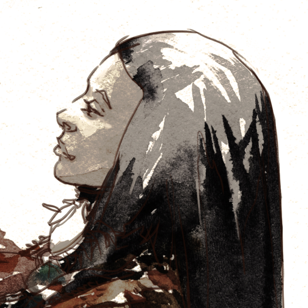
Also shown, at Maisonneuve’s side, the colony administrator, (and nurse) Jeanne Mance. As well as their Algonquin allies – led by chief Tessouat the Second, shown here being baptized as a Christian, in return for a musket.
Interestingly, Tessouat the First is said to have had only one eye. The younger Tessouat, *also* had only one eye. Which is suspiciously convenient to me. It sounds like he sacrificed his eye in order appear to be the reincarnation of the chief.
Jean Mance is also an interesting character. She held the purse strings. And she held them very tight for years, gambling if her tiny colony could survive without the further expense of hiring professional soldiers. Eventually she did pay out, saving the remaining colonists, and their Algonquin neighbors.
This seems like a typical administrator’s move. There are never any funds, until suddenly, there are :)
I found it fascinating how well the colonists documented their expedition. We have the names and ages of all the residents of the first fort.
I had more fun imagining the ‘supporting cast’ – such as the 76 year old nobleman Pierre Puiseaux and the 47 year old Jesuit Barthelemy Vimont
Or Tessout’s bride, who’s name, I’m sorry, I can’t recall.
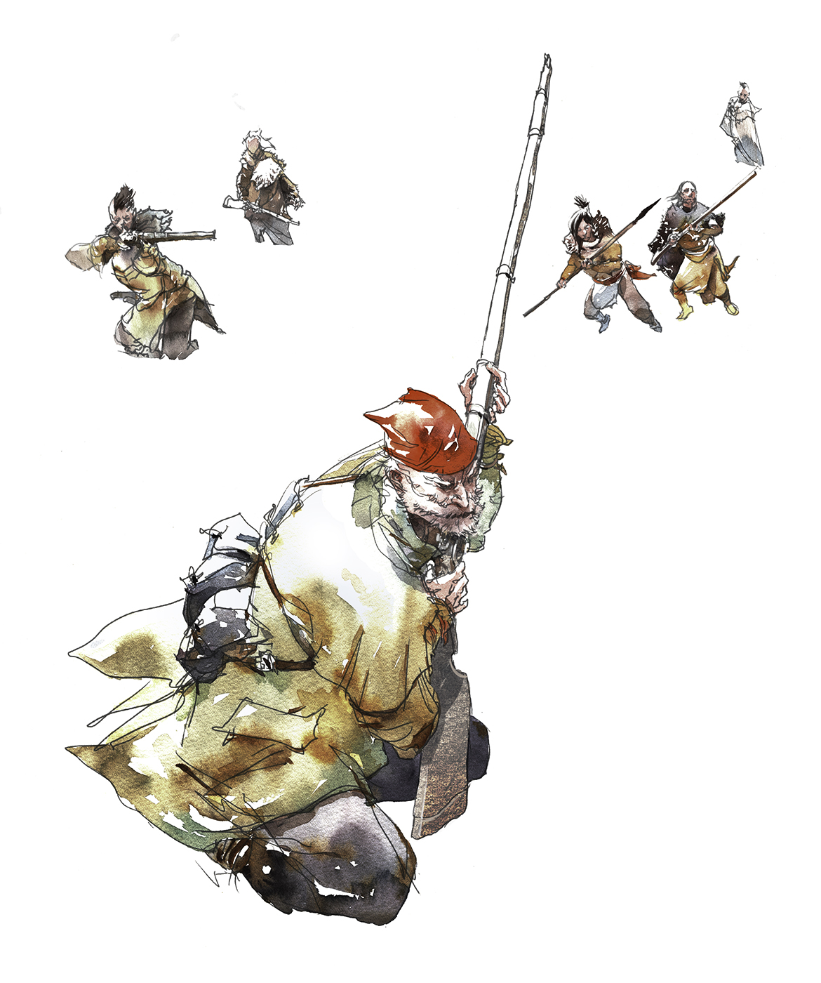
Last time, I was not able to sneak in a girl among the native hunters. But I still like to think the Iroquois would be equal opportunity raiders.
Way in the back – you’ll see this lady, about to take a pot-shot at Paul de C.
This project was a great deal of fun. I’ve always wanted to do a comic book – and even though these were only a few still images, I did enjoy packing them full of story telling!
What’s in my bag, Chicago 2017 Edition

Many urban sketchers out there are packing their gear for Chicago as we speak.
It seems like a tradition to post a “what’s in my bag” article.
Lately I’ve been carrying around a beach bag style shoulder bag. Which has been nice, as it’s super simple to find things.
But somehow, my lifestyle lately has been going downhill. I’m getting old, fat and tired! Things have been a little crazy, and fitness went off the list for a while. Big plans for a re-boot very soon. Upshot is, I’ve been getting a sore shoulder from a one-armed bag. (Probably more from my digital art tablet at home, not my limited time out sketching). But I figured I’d switch to a backpack for a while.
In the real world, people are carrying around larger laptops and tablets these days – so the bag makers have started coming out with these square backpacks.
I saw this one and I thought: perfect for drawing boards!

This is my ‘fully loaded’ MEC Outpost Daypack.
I don’t know the final weight here, but it’s mostly air inside – (coroplast groves, etc) – so under 2lb’s for sure.
It’s the exact size for 12×16″ drawing boards, which is the minimum for 11×15″ quarter sheets of watercolor, given some room to tape them down.
I’ve got 10 panels in here, and all my various other gear, including the most comfortable folding chair I’ve ever tried.

This is the Helinox Chair One.
I was sketching with Jane Blundell and it got the thumbs up from her. I agree it’s a great option. It’s a little slow to unfold and setup, but it’s ‘hella comfortable. Like a la-z-boy for sketchers.
I’ve started carrying it around like a weird umbrella once I’ve bothered to sling it together. A bit odd looking yes – but it’s essentially weightless. So that’s an option for someone who re-locates many times in a sketching session.

The other reason I went for this bag is the little zipper compartment on top. This is probably for your phone or passport or whatever (as it’s theoretically a back-facing security zipper), but it’s perfect for my paint box – as it keeps it horizontal, in it’s own compartment, resting securely on top of the sandwich of drawing boards. This way, no matter how fresh and juicy the paints, they won’t leak between the pans.
Usually I have the paint box on the very bottom, being held horizontal by all my gear – but that means you can’t get it out without dumping the stack, which is less than ideal.

The remainder of the main compartment holds a minimal painting kit. Small waters, Atomizer, Binder clips, Tissues, Three sizes of travel rounds (2 large Escoda, and 1 medium Rosemary pointed rounds, then a Rosemary quill, for foliage and drybrushing). Pencil and Eraser, which I hope not to need for my workshops in Chi Town. And even a water bottle for me, plus probably a small bag of snacks on the day. (Dried Mango!)
So, I’ll report back after I get a few more days of testing this setup – but one way or another, this is what I’m taking on the road this summer.
Feel free to post if you’ve got your own ‘Everyday Carry’ photos up online.
~m
Oh and, here’s some previous years when I carried a tripod easel, brought an ultra-small pen and ink kit, and a bag that’s good for larger panels.


We’re getting close to the USK Symposium in Chicago. That means many of us will be sketching more sketchers than we’ve ever sketched before!

Past USK President Elizabeth Alley suggested we re-boot this spring’s one week 100 people speed sketching project as a warm-up for all the drawing we’ll be doing together in Chicago.
A symposium is the perfect place for this. We have all these people, who honestly don’t mind if we draw them :) Every workshop, lunch break, and every after-party will become a continuous marathon. If you want to get in some practice – all you have to do is sketch 100 people in one week, the week before :)

Have a look back at some of last year’s posts for inspiration, and you’ll see it’s absolutely a great goal for any sketcher, at any skill level.
We’re going to run a round of sketches from July 17 to 21, and this time use the hashtag #OneWeek100PeopleSymposium.
I think if you’re still posting your 100 people during the symposium that’s cool – but we don’t want to take away from USK’s own tag: #usksymposium2017 so don’t forget to use both.
Also, here’s the graphics in blue, (Square / Strip) if you want save them locally and use them to make a progress bar:)
Have fun! ~m
Guest Artists in Montreal: Come Sketch with Liz Steel and Anne-Laure Jacquart: Saturday August 5, Place Jacques Cartier

On the way back from the Urban Sketchers conference in Chicago, sketchers Liz Steel of Australia (author of 5 Minute Sketching: Architecture) and Anne-Laure Jacquart of France (author of 52 Défis Créatifs pour le Photographe and others), will be visiting Montreal.

We’re hosting an informal public drawing day on Saturday August 5th at 10:30am, meeting at Place Jacques Cartier.
We’ll draw in the square til 12:30pm, then meet again after lunch at 2:00pm somewhere on the rue Quai de l’Horlage.
We’re easy to find – just look for the people with sketchbooks and drawing boards!
There won’t be any formal instruction, just drawing together.
But you’re welcome to come draw with us, ask questions, and show your own sketchbooks.
Hope to see you on the 5th!
~m
A Rose by any other Name

I’ve always wanted to be able to paint those lush flower paintings that you see in the museum. Big fluffy roses and peonies. Those ones that are a kind of Vanitas – capturing the fleeting perfection of a bloom.
After the NYBG outing, I felt I hadn’t really gotten to the meat of painting a flower (as it were). So I’ve been trying it out some more in the studio.
I feel like I need to make the paint handling instinctual, so I can work towards a more serious effort at a real vanitas sometime in the future.

This is a small sketch, on a leftover scrap of paper, about 11×12″. My home color is Quinacridone Rose, tinted with a variety of things.
Just like last time (my roses from life), I started with the bright clean color of the blossom, then came back around with dark foliage.

I’m looking to make all the soft edges inside the bloom in a big rush of broken brush marks – so they fuse wet-shape to wet-shape into the ‘ball’ of the rose.
My mantra: “Draw with the Edges, Paint with the Insides”.
I can come back after they dry with the fewest possible dark strokes on top – to imply separation between petals.
Not perfect – but I’m enjoying the feeling. As I’m doing them, I’m remembering any success I had out in the field came from working quickly, without much concern for how it turns out.
Let the petals fall where they may.

That seemed to go fairly well – so I scaled it up to a full sheet (22×30″, 200lb fabriano artistico). This time my home colors are Pyrrol Orange and Naples Yellow, tinted with a variety of things.
Here’s a progress shot showing the first pass of wet-on-dry blooms (on the left), and the second pass of the dark background marching across the page.
Remember. I start with the paper bone dry. But this time, I pulled my first touches further, dragging color out with clear water, making the proto-blooms softer and brighter. Trying to leave myself more options for re-building petal shapes on top, and for cutting into the flower with the background.
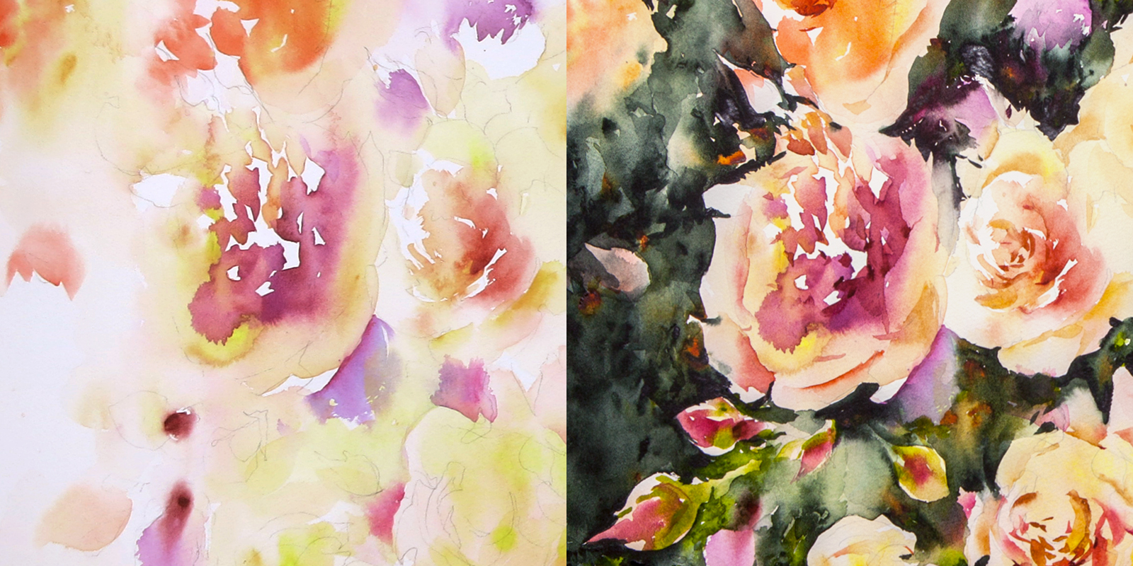
I’m not making an attempt at a botanical study here. Much as I admire that kind of faithful accuracy in other people’s work – today I just want exuberant color, and a lot of ‘random’ watery effects (Not random of course; by now I know what I’m going to get).
I’ve got a few photographs on hand, but I’m really just looking at them for color suggestions. The shapes of my blooms are complete inventions. And I’m not making any attempt at painting actual leaves or branches into the background.

I’m quite pleased with the final effect. Considering it’s my, what, fourth or fifth try with a floral subject?
I find this one to be graphic and painterly at the same time. It’s one step toward abstraction.
I think a floral painting allows me to do this – I don’t feel compelled to describe something ‘correctly’ – like I might do with an urban sketch of a specific place. Much like painting rocks and water, or trees, or any natural subject – there’s less need to get it specifically right, and more opportunity to learn the language of the brushwork.
I think the next step is more work from life. To get more of a feeling of the full, fluffy roundness of a bloom.
Looking forward to more experiments – but it’ll have to be later in the year, as I’m about to do a serious dive back into street-sketching, in preparation for the Urban Sketchers symposium in Chicago.
~m

