![]()
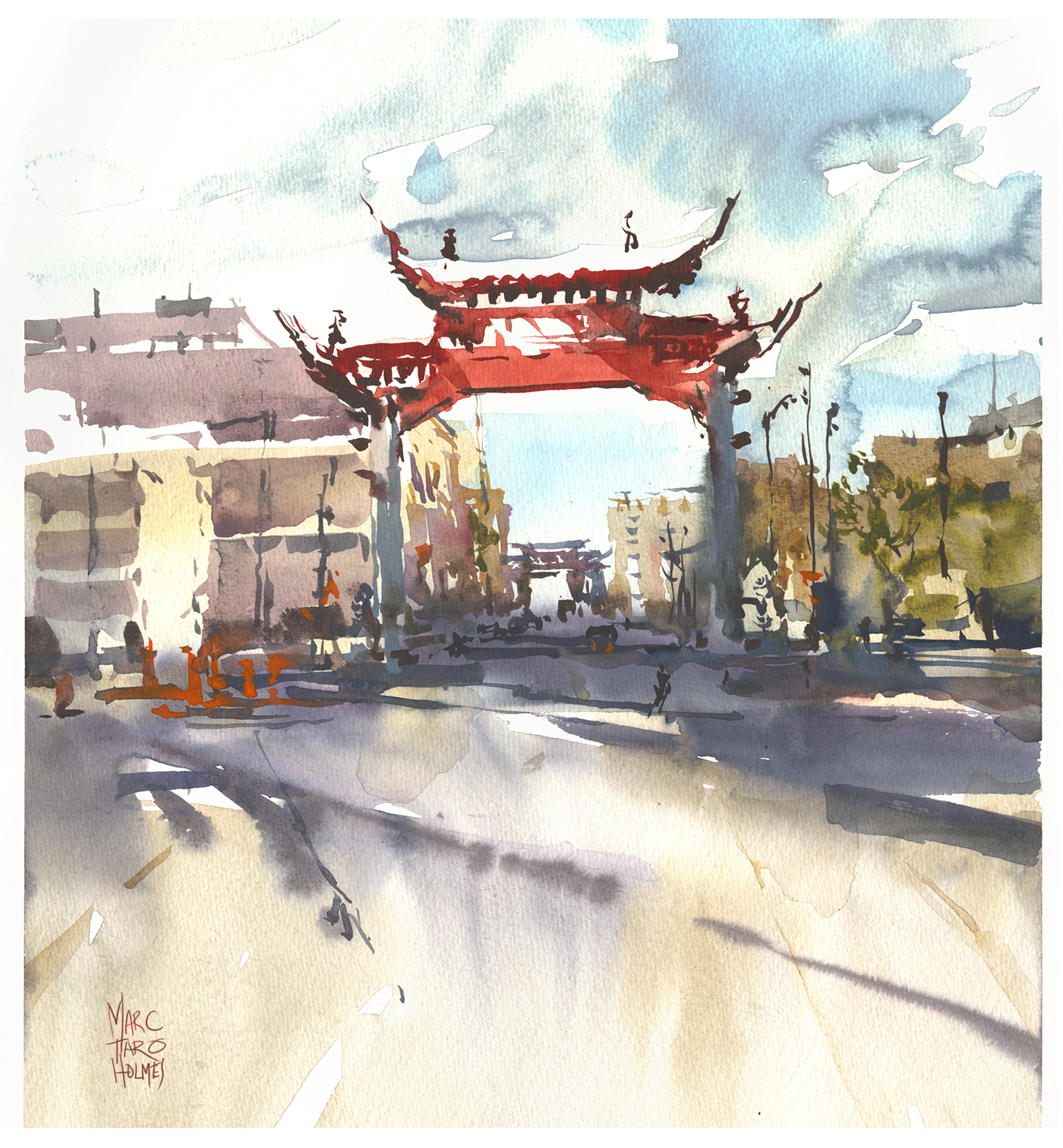
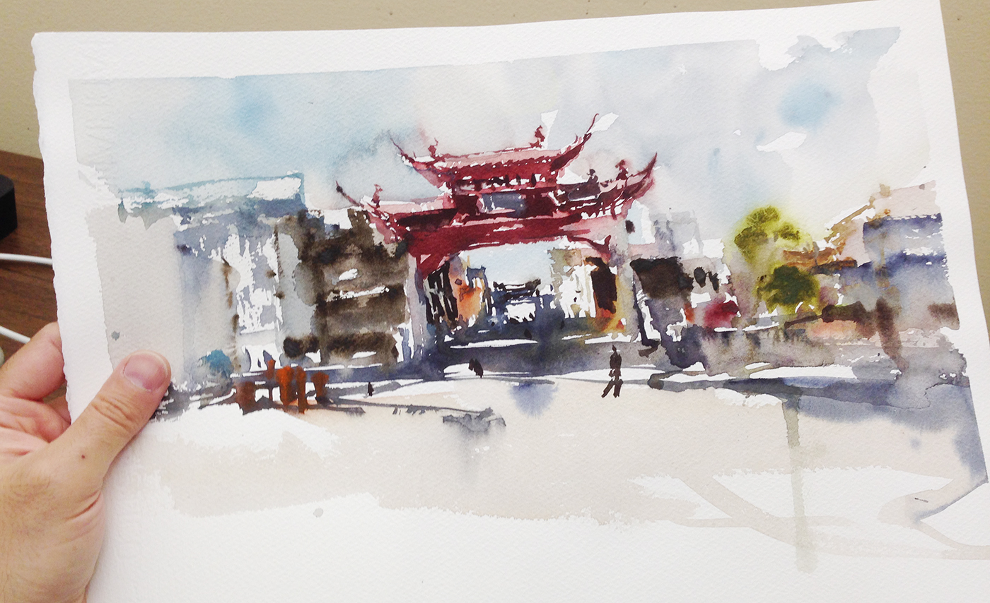
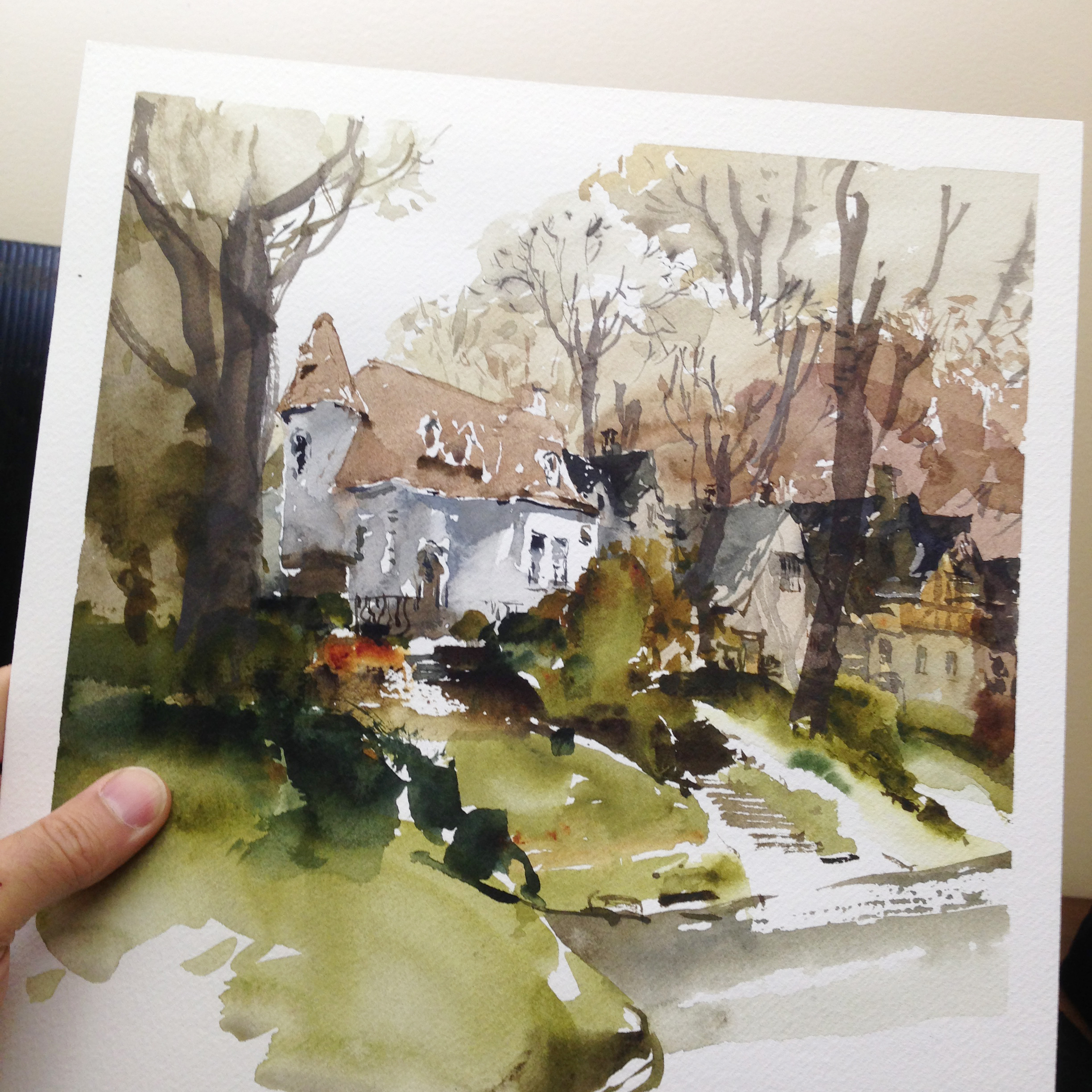
This one felt great to paint. The whole operation was quite smooth. All decisions happened spontaneously without a lot of debate. Sometimes I sit there thinking – omg, should I do this, I’m about to wreck the thing, what if this stroke is too much, bla bla bla. When you’re in the zone, there’s none of that. Your mind is quiet, and the image just appears without conscious thought.
That’s the beauty of being on Day 12. The continuous daily practice really feels good.
Here’s what I did to prepare.
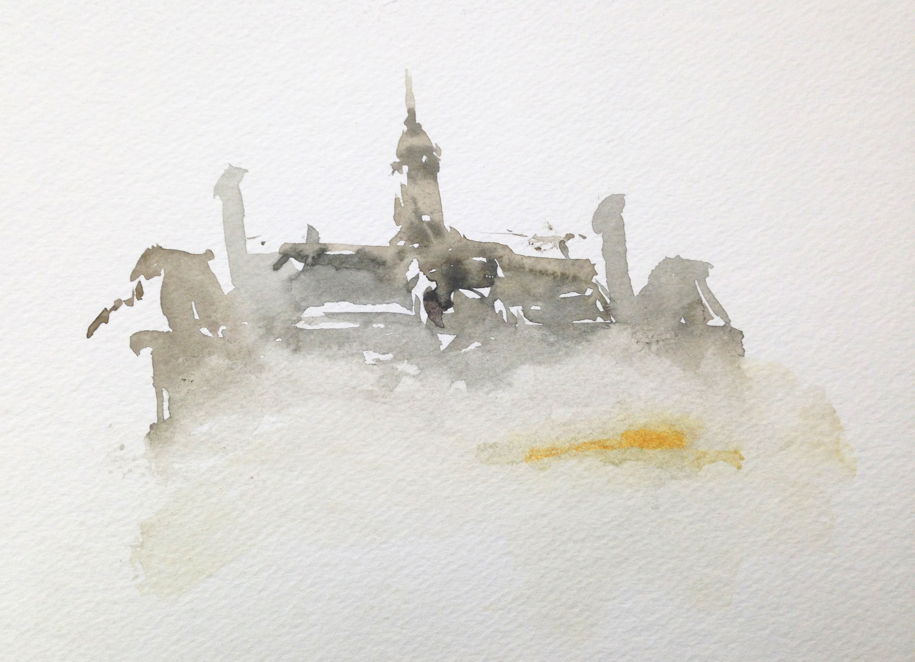
I’ve been having so many false starts this past 12 days – I thought, why not make it official? Do a test painting. A dry run, just throwing it down to feel how it will go. Knowing in advance this one was disposable, I didn’t get annoyed as it got all blotchy and overly contrasty.
I do these tests, or false starts at the same size as the final – 1/4 sheets. Some people might say to do a small study. They’re probably smart. I’m always gambling the study will turn out and become the finish.
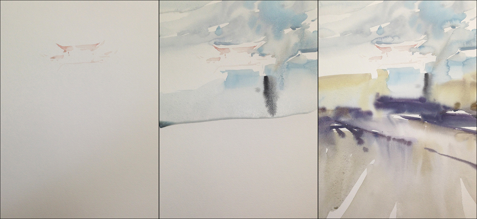
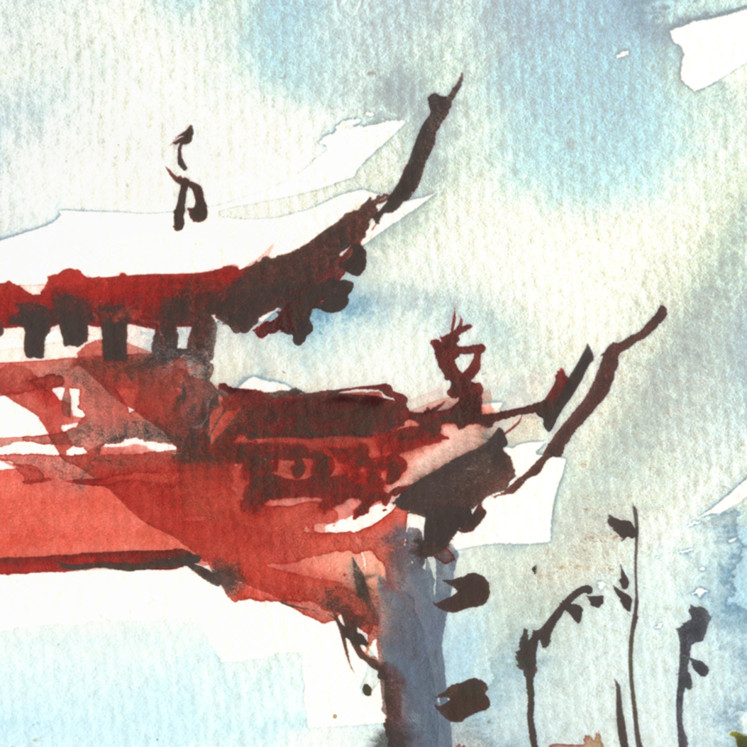
Here’s another new aspect – starting with the shadow pattern. Usually, I lay the shadow in on top of a base tone – following the concept of Larger>to>Smaller, Lighter>to>Darker.
This time, I started with a very faint statement of the gate – just a pale pink stain – so I could get the position on the page.
Then washed the sky – very wet in wet – and almost immediately the ground – and this time, I blasted in a honey consistency shadow, while the ground was damp. I think that worked out tremendously well – the shadow is more integrated into the ground than I might sometimes see in one of my sketches.
I think having done the test sketch, I could make the general shadow shape with confidence, kind of knowing already how it should go.
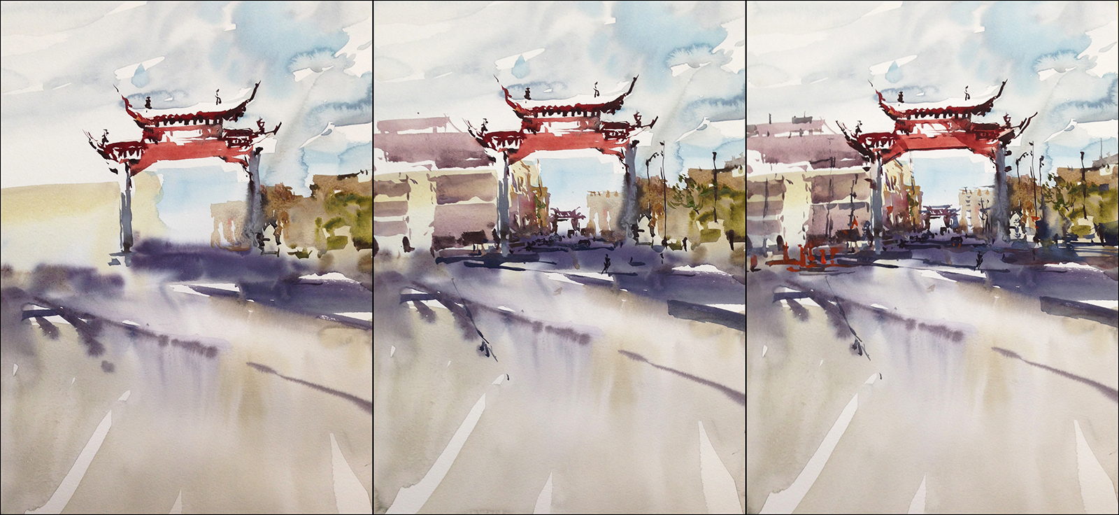
The rest of the painting is calligraphic strokes, getting progressively darker, smaller and thicker (in the mix).
I’m super happy with the clean and direct Large to Small Light to Dark execution.
The wetter than usual (for me) first pass is a nice contrast to the crisp shapes on top.
I did have to wait a long time for the first layer to dry before I could move to details. If I was in a rush I’d paint two at once, so there’s something to do while waiting for washes to dry.
When I’m on a trip I’m always a bit manic – knowing I only have one day on location. Here at home, I can just read for 10 min while things set.
![]()

![]()
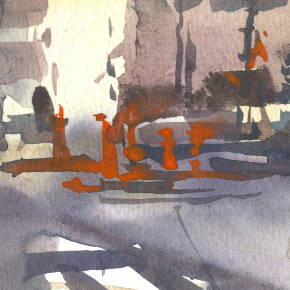
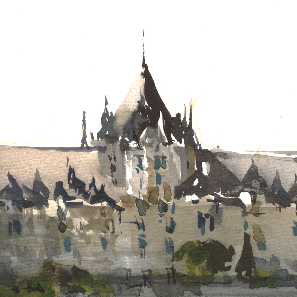
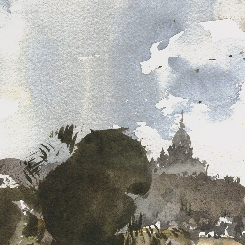
So, let’s see if I can describe what worked for me in this dome. (Bonsecour Market, in the old port area).
Normally, I would paint the dome first thing, as it is the center of interest. But – as it’s a silver, reflective object, I wanted it to integrate with the sky.
So:
A: I painted the sky first this time. My first mark was to cut around the bright, right-hand side of the dome, starting to draw the shape negatively, with dry, white paper.
B: I let the sky bleed into the shadowed left-hand side of the dome, and below, in the barrel, where the windows would later be drawn.
C: I *did not* cut around the little cupola on the top of the dome. Because I knew I would put that dark shape on top of the sky later. (Using bloodstone genuine, (an opaque-ish pigment), after waiting for the blue sky to dry). In general, you shouldn’t cut around such a tiny shape. You’ll never get a smooth sky behind it. This has to be done in one go.
So – in all cases – the shadowed left side, the bright right side, and the tiny gaps in the cupola – I made the right decisions, multiple moves in advance.
Pats self on back.
It’s the little victories that keep you motivated!
![]()
Day Ten : #30x30DirectWatercolor2018 : New Perspective

![]()
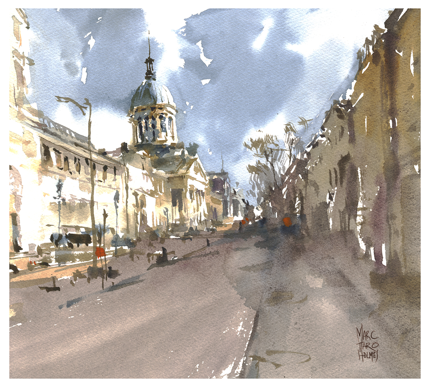
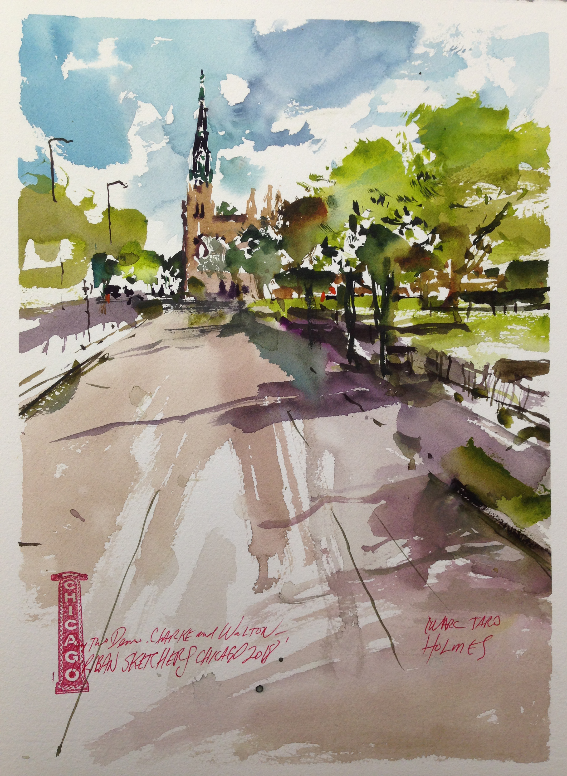
Ok! So. I went back and re-did my city hall painting – working from a photo back home.
This is pretty much the scene I failed to get on the spot – except – it’s about 50 yards further downhill. Got to remember the mantra: Get further away from the subject!
With the buildings smaller in the distance, it’s easier to treat them as simple forms with minimal detail. Just big shapes! I was previously getting lost on the details of the tower, the statue of Jaques Cartier on the plinth – there’s a clock on the front of the building, there’s decorative moulding and pillars on a balcony. Too much information!
All this stuff can be ignored when you pull back and paint the *entire* town square – not one individual building.
I still find this particular piece to be tentative. A bit of a shy statement. Dry and scratchy in some areas. But! I’m enjoying the brush-work calligraphy in the street vendors, and in all the windows and restaurant awnings on the far side.

![]()

![]()
Ah, overconfidence. Thy name is watercolorist.
Or something.
I mean, if we weren’t unreasonably optimistic, would we even be trying Direct Watercolor?
I had three false starts today! Which made me quite annoyed, as I was trying to paint our city hall – which I’ve painted many times before, and thought would be a piece of cake. But just couldn’t get it this time.
This is Fail #2. I won’t show you Fail #1.
I suppose this isn’t the worst thing ever made – but it’s cluttered, monochromatic, poorly proportioned, and far too pale! This is what happens when you try to draw nitpicky details – almost like a line drawing with the brush – instead of seeing shapes.
This is Fail #3. At this point, I just gave up. This initial shape was monochrome and way way too watery. It’s like a ghost! Someone suggested ice cream and I promptly gave up.

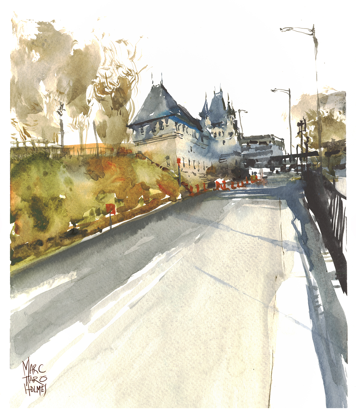
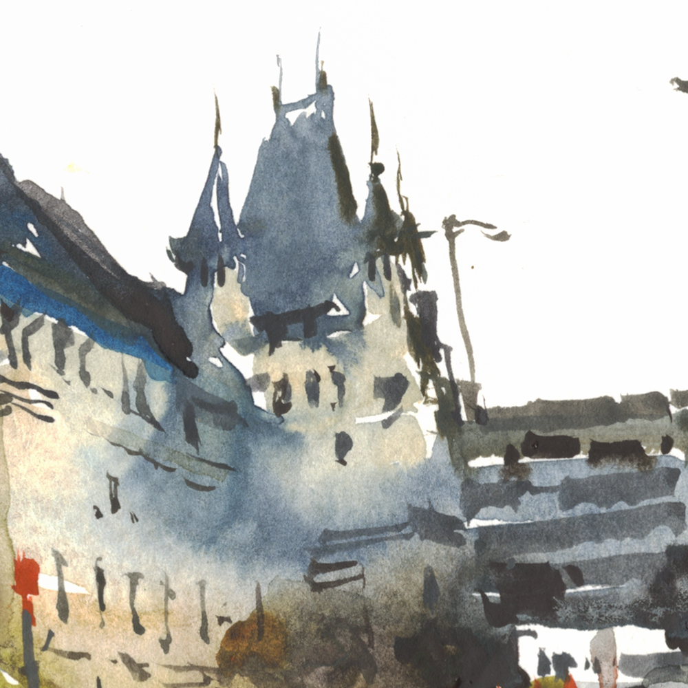
Out of desperation, we relocated behind the Gare Viger. Our old train station, which is now – I think, a convention center? – and shops.
There’s a pedestrian overpass that gives you a great view of the back side of the building. We’re looking over the parking lot in the unfinished foreground. It’s amazing that this old building is just as detailed on the back as the front. No budget-cutting in those days.
This view works for me, as it’s straight-on. No perspective problems! Much easier for my pea-brain.
My second rule of solving perspective. Move! Til you don’t see any :)
And, when I talk about false starts here – honestly – refusing to do a line-drawing before painting – insisting on going directly in with a brush – this is only being obstinate.
Some subjects really should have a bit of a drawing. These buildings are fantastically complicated.
I think, back when I was doing finished drawings underneath everything, these subjects attracted me, because of the complexity. All the cupolas and towers and clocks – something to sink your teeth into. Now that I’m doing Direct Watercolor – I’m getting more interested in painting the wider view. The city skyline, instead of a portrait of a fancy building.
But – struggling with the lack of drawing aside. When I *do* finally get one of these – there’s something about this spontaneous, calligraphic brushwork that I really love! It makes the torn up paintings (on expensive paper today! <oh, the pain!) just the price of achieving success.
At the end of the day, I know I could get better and better at tinting drawings. I probably should have stuck with that. I still might go back! But doing this stuff is taking one step back from draftsmanship in order to take two steps forward toward painting.
![]()
![]()
Driving up Dr. Penfield, behind the McTavish Reservoir. I love the fact that a water tank in Montreal comes with a chateau. Isn’t this the best city for an urban sketcher?
I suppose the elegant roof-line makes this not quite a Nothing View. It’s halfway toward my old-fashioned architectural portrait. But you could call it a kind of action-shot of a building?

![]()

![]()
You really can see St. Joseph’s from everywhere on the island.
See it in the distance there? There’s supposedly a city by-law that no structure can be taller than the top of the mountain – just to keep this view intact.
Confession: this was painted, once again, from a drive-by-photo. In fact, I did it yesterday, right after the water tower. That’s how we’re getting 30 paintings in 30 days! By using every free moment! Even if it means doing three in one night to get ahead :)
What went right?
I’m super happy with the adaptation – the simplification, and stylization of negative space, turning what is otherwise a Nothing View, into a painting. I’m slowly realizing what has been working for me with these.
If the view is about nothing – you’re free to change anything.
When you’re painting an architectural portrait of a well-known landmark – maybe you feel, you have to get it right? But with this kind of casual snapshot, I can do whatever I want! Haha!

What went wrong?
You know – right now, I’m ready to say – nothing!
At this stage, after so many false starts this week, I’m pretty much in love with this painting.
It’s not perfect, but it’s in the spirit of what Direct Watercolor is for me.
Painting by instinct, making silhouettes, and letting the pigment move freely inside shapes.

Quick tip: These last few days with rainy skies – I’ve been doing these by pre-wetting the sky shape with clear water, then charging into the damp paper with a milky mix of grey-of-grey, indigo, and touches of turquoise. While I’m painting the sky, it’s the only wet shape. The blue hill for instance, is dry. So the water can go crazy in the wet sky, and won’t enter the dry land.
~m
![]()
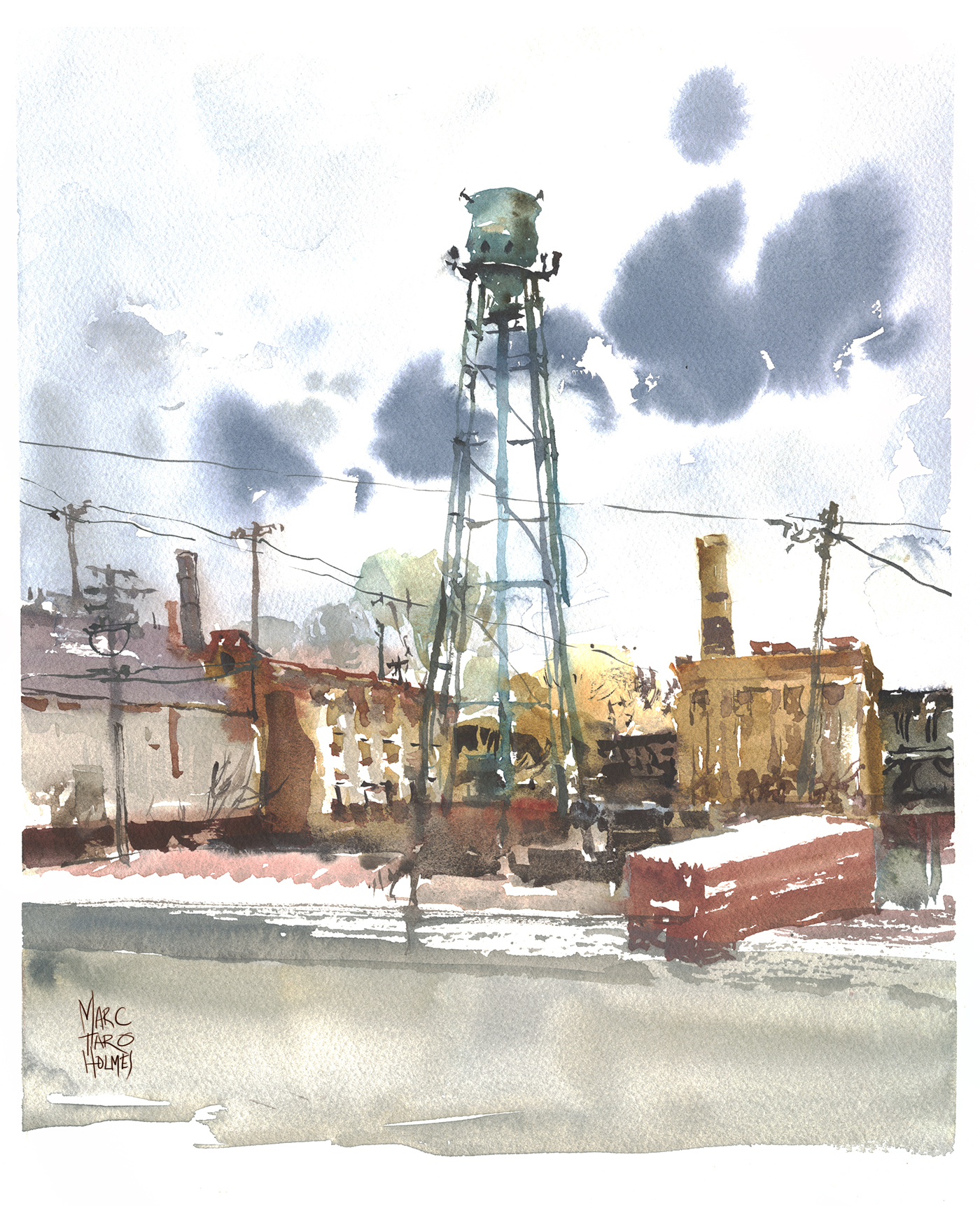
Day Six : #30x30DirectWatercolor 2018 : Water Tower
![]()
Another Nothing View!
I’m having too much fun with these. They are so against-type for me. It’s almost a joke among my friends – any Gothic church or over-the-top opera house is a ‘Marc Sketch’. I would never paint something like this water tower! But here it is, and it was fun to do :)
This is a slice of Highway15 Sud that we end up crawling past due to our eternal bridge construction. It’s painted from another drive-by photo – another example of Bad Photos make Good Paintings. We’ll see if, by the end of 30×30, that can become an official rule around here.

I was going to take progress shots, but I got distracted and only have the one. Anyway, here’s how I started – right into the water tower. It’s such a prominent figure in this painting, I guess I couldn’t start anywhere else.

![]()
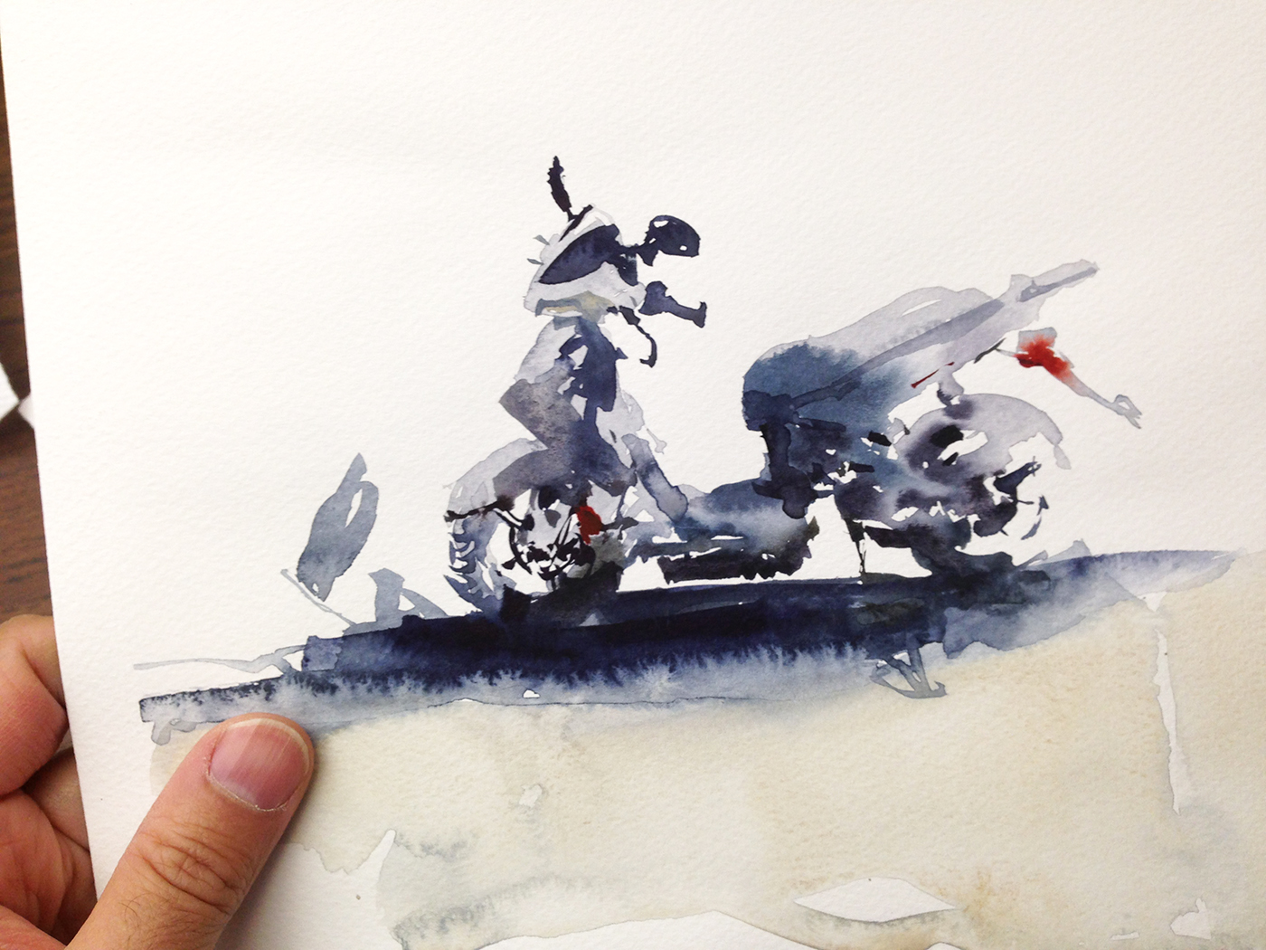
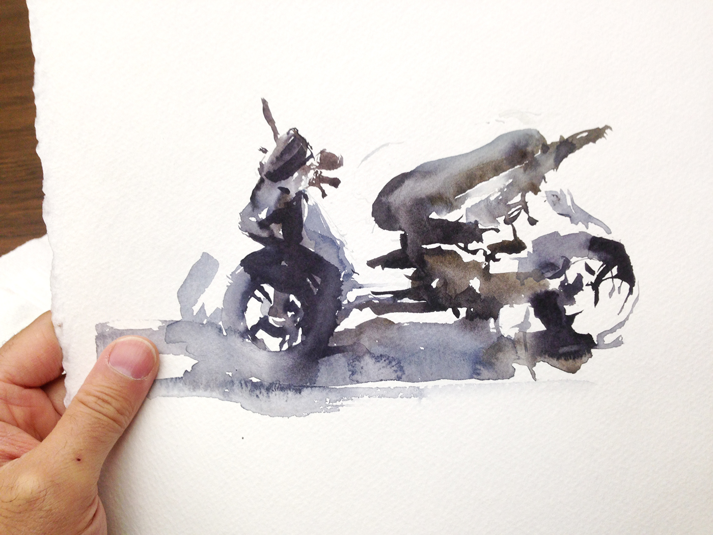
Post Script: Here’s a couple false starts, trying to get in a quick one of this scooter. For some reason, I’m obsessed with failing at drawing motorcycles!
I wasn’t going to show these, but I was feeling guilty. I mean, there was some big talk at the beginning about showing everything, success or failure :) I dunno, about these. They’re a bit rushed. I might try again later.
30×30 Bonus Day! Back from USK Chicago!
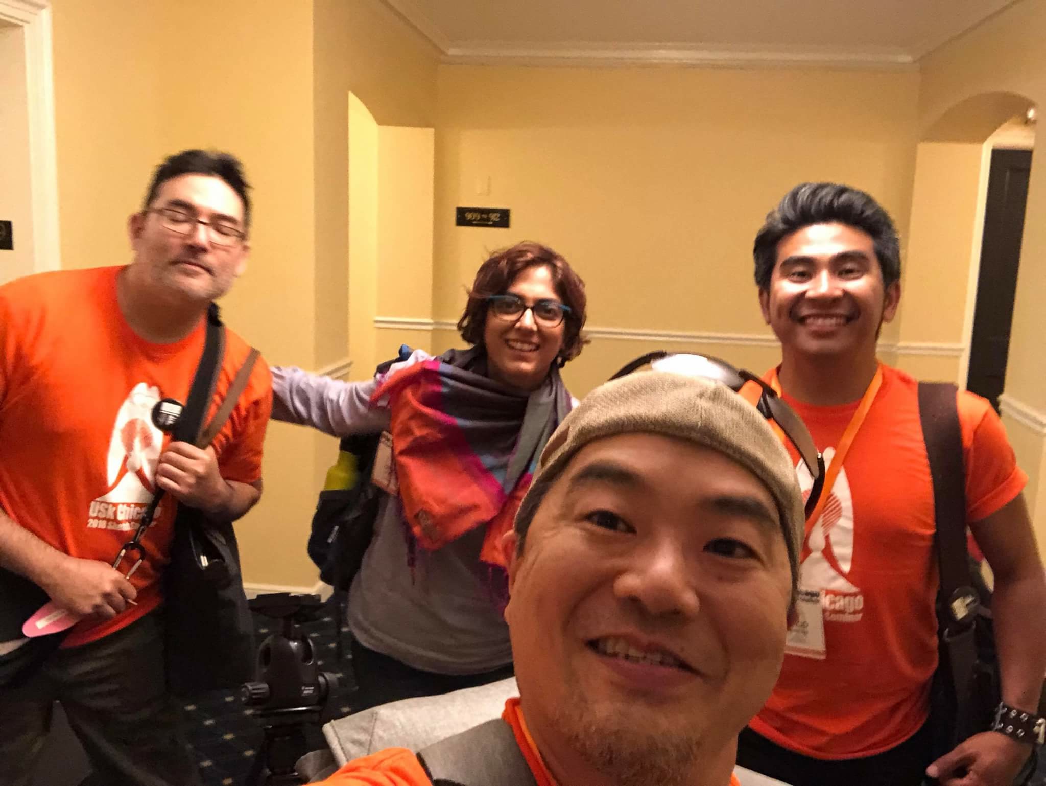
Here’s me with my eyes closed behind Mike D snapping the selflie with Uma and Jingo. Just four of the many great instructors at this years USK Chicago Seminar. Look for Team Orange at USKPorto2018 next month!
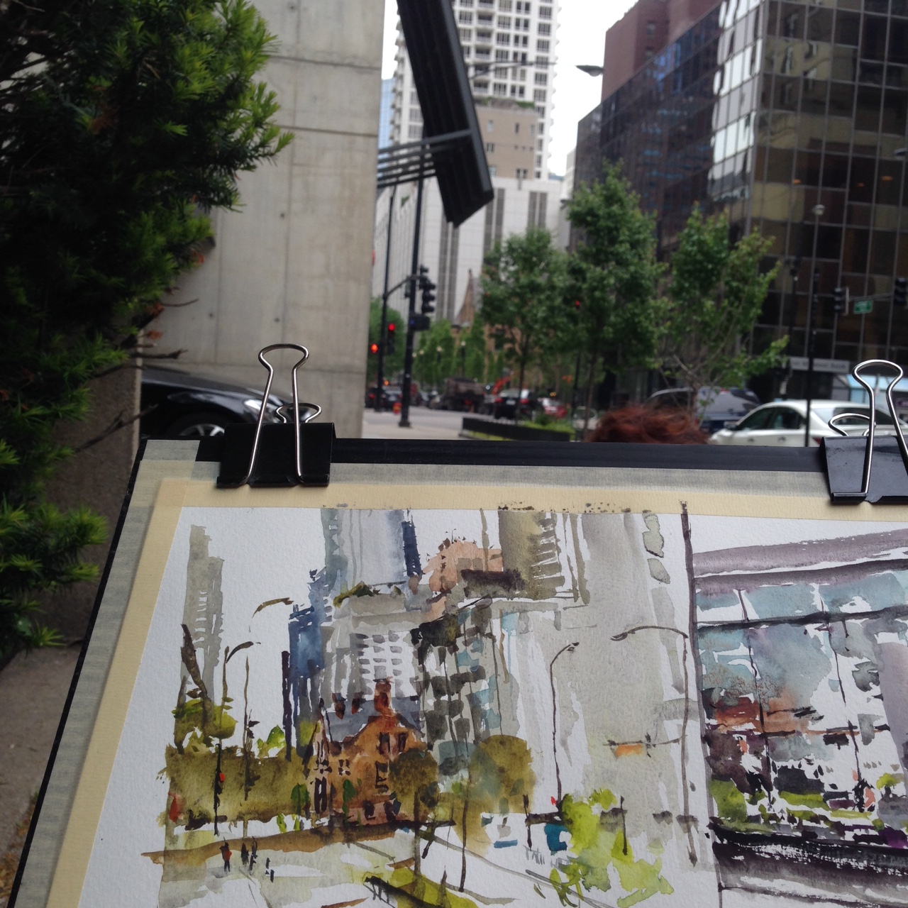
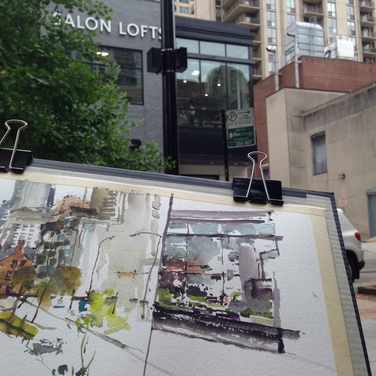
The first morning of the workshop, Uma and I had a chance for a warmup. I sketched a brownstone hidden behind some trees, and a very random choice – a second-story window. You could just see the hair salon through all the reflection.
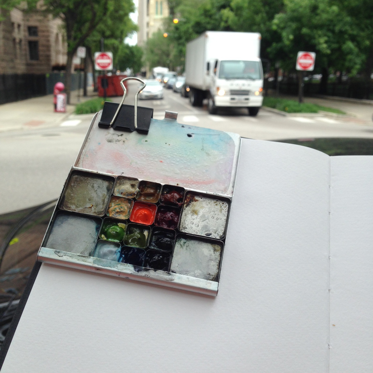
This little Art-Toolkit.com palette really is the best thing for clipping to your painting. It’s so light, It makes holding the book/board so easy.
I did a quick run around my demo spot, to pick the view. At a workshop, a spot where you can fit 15 students is not the same as where you might stand on your own. This 5-minute doodle was just a test. I did a few views this way to find something that might work.
It’s always a little traumatic – trying to paint and lecture at the same time. Day Two, having had a practice run, it’s always a better piece.
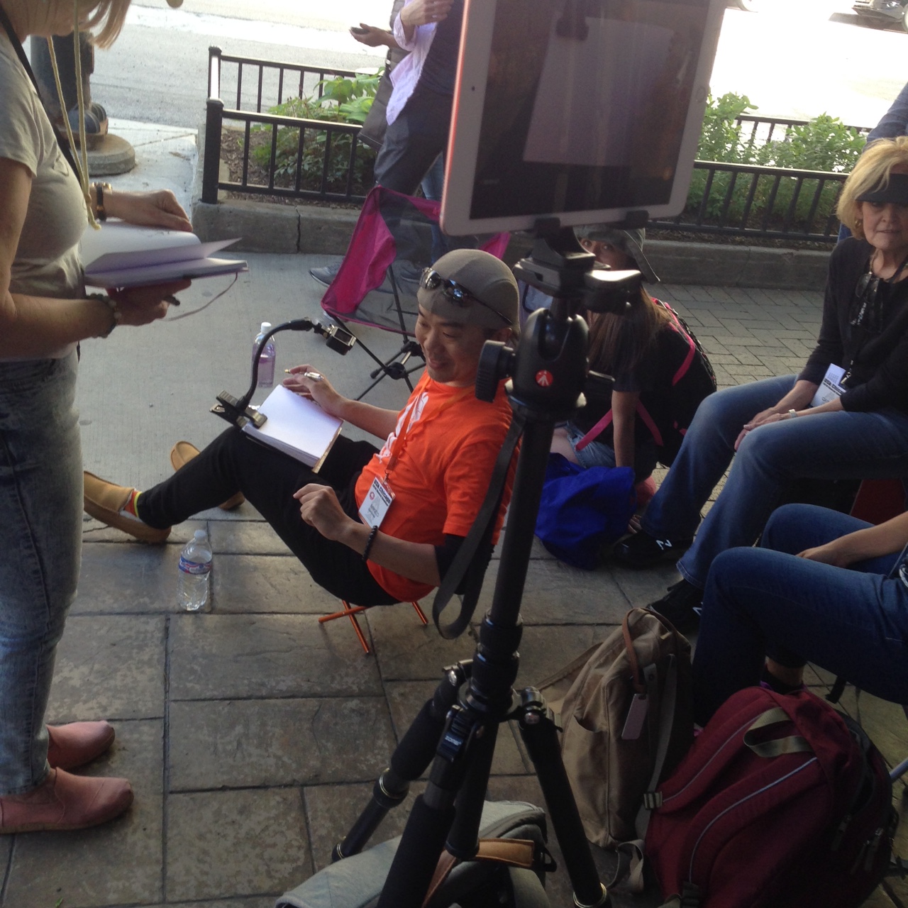
The only demo I had a chance to attend myself was Mike D’s, Sketch NOW, Think Later!
Mike is an experienced presenter. He brought a wireless camera and an iPad, to project his sketchpad to the people in the back row. Brilliant!
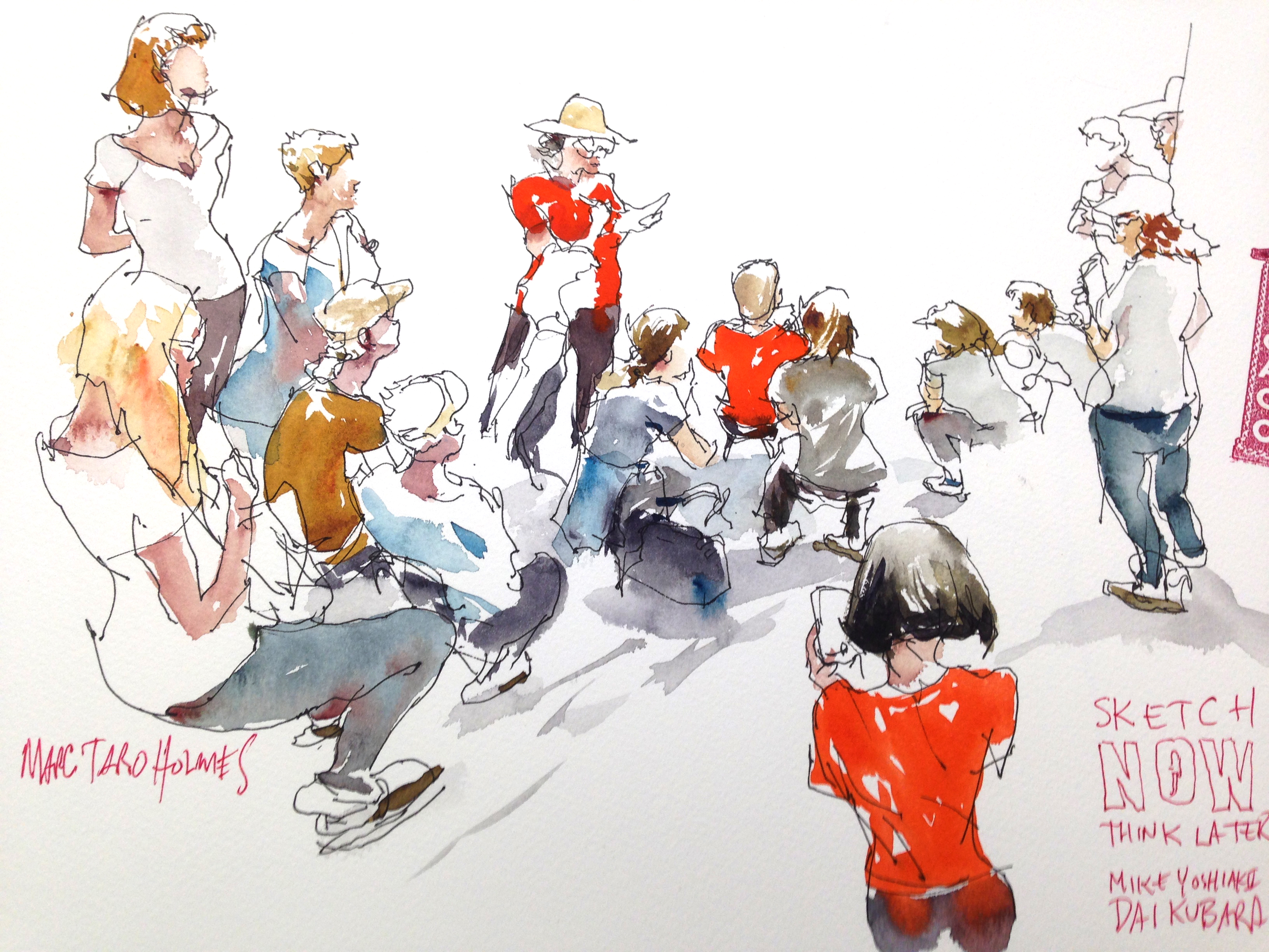
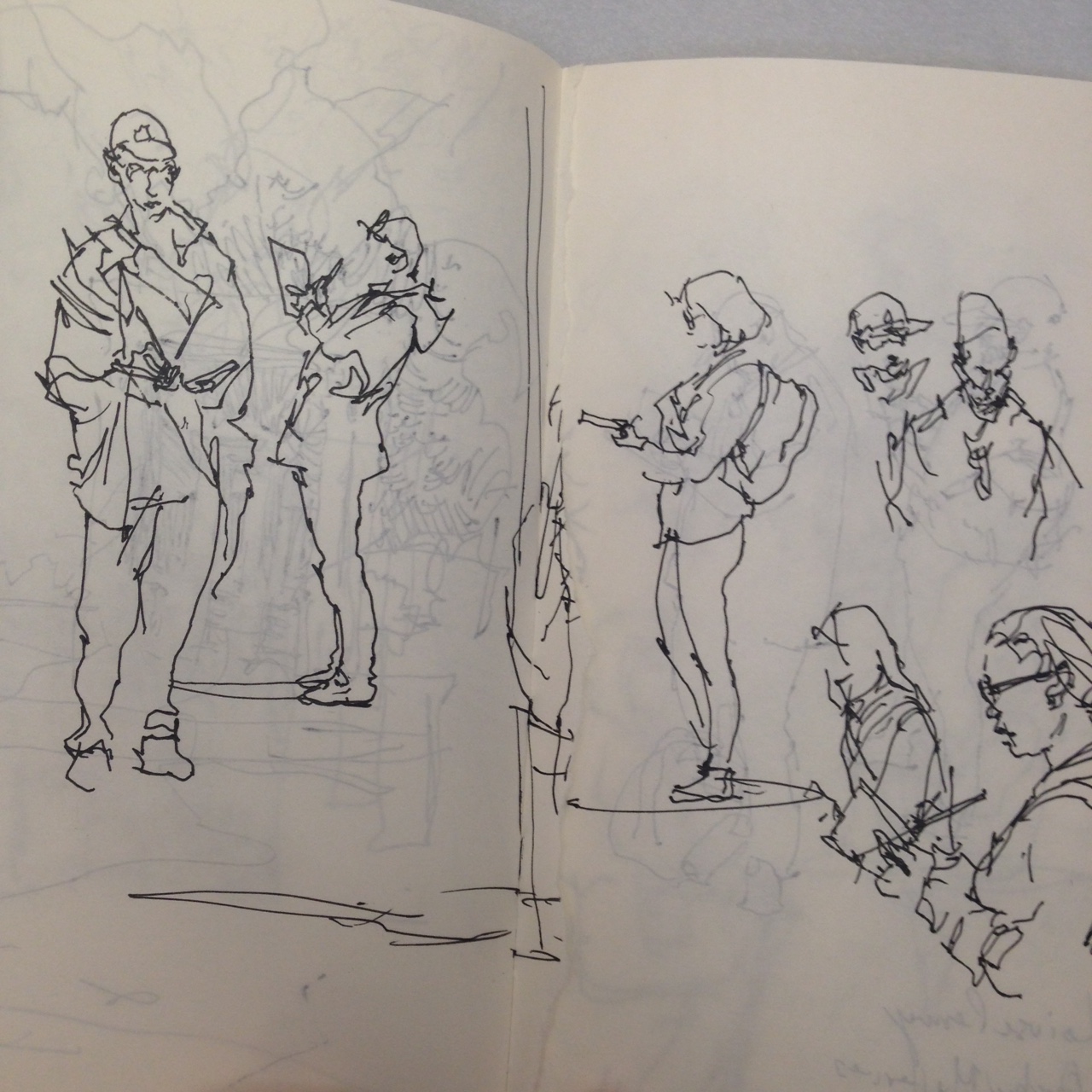
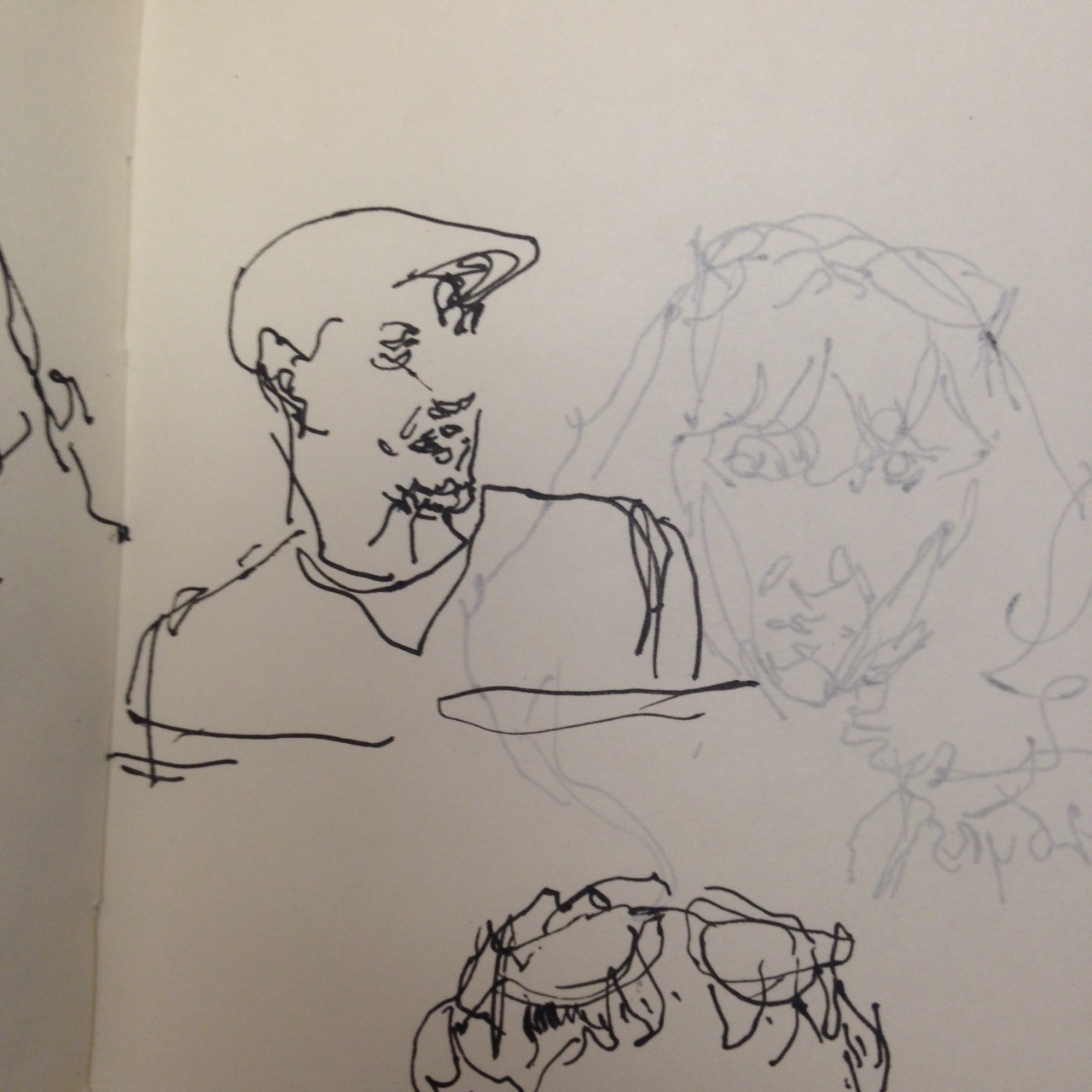
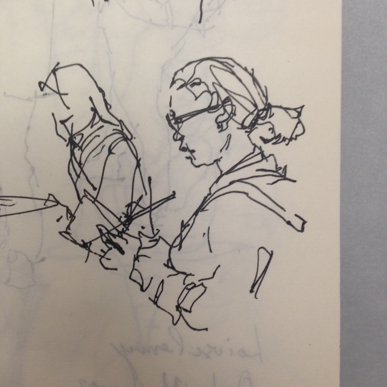
One of the best things about a USK workshop is that you can sketch all the other Sketchers, without worry you’ll be caught drawing someone.
Wes Douglas – has a great workshop on drawing cars. I regret missing that one! Cars are such a part of street sketching.
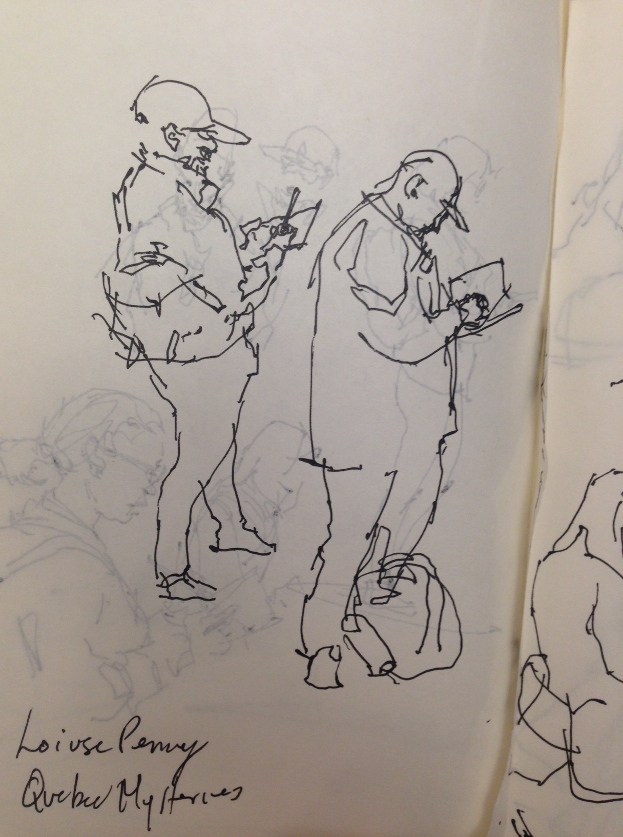
As I’m from Montreal – someone recommended the writer Lousie Penny. Mysteries set in Quebec. These kind of notes get written right into the sketchbooks.

![]()
What went wrong?
Nothing!
This is my favorite so far!
I had one false start this AM, but I quit before wasting too much time and relocated to this spot – which has been on my mental ‘to sketch’ list for a while now.
Well OK, one cheat here. I chose to leave out the cars on the freeway.
I might have been braver and tried to get them in? Even though they’re moving fast, they do just keep coming. I could draw them ‘En-Passant‘, the same way I draw moving people on a busy street.
So maybe I get to try another of these with the cars as the focus.
What went right?
Everything!
It’s another take on a Nothing View. A painting that’s not about anything. No statue of an angel, no Siberian tiger, no cute farmhouse. Just a freeway. But this time the perspective is good, the complexity of the street is well simplified, and the details are nice and sharp. Most people probably don’t want a painting of a freeway – but I’m very happy with this sketch.

![]()
Post Script: Here’s today’s false start. Before I remembered this freeway bridge, I tried this cute house over on Ponsard. I think the drawing here – the brush drawing that is – just isn’t up to snuff. For whatever reason it’s disorganized, and a bit blobby. Doesn’t make the cut!

![]()
What went wrong?
I’m trying something here, which I’m tentatively calling: Nothing Views.
That is – you should be able to make a painting of any street. Even if there’s no obvious subject. This is from the intersection of Queen Mary and Côte-des-Neiges.
My working theory is: any view, no matter how ‘boring’ – a painter should be able to make something of it.
Why is this an issue for me? I’m wondering if it’s a kind of cheating, or mental laziness if every painting you make has to have an idyllic view.
It’s a kind of burgeoning problem for me.
If I’m ONLY a travel sketcher, galivanting around the world painting ancient ruins or epic landscapes – what am I supposed to do with myself at home? What’s a sustainable kind of image you can engage with on an everyday basis? <This is an open question].
What went right?
The upper right-hand corner.
![]()

