#30×30 Day 06 : Green as Broken Glass

These sea-green shallows are from a rocky beach in California.
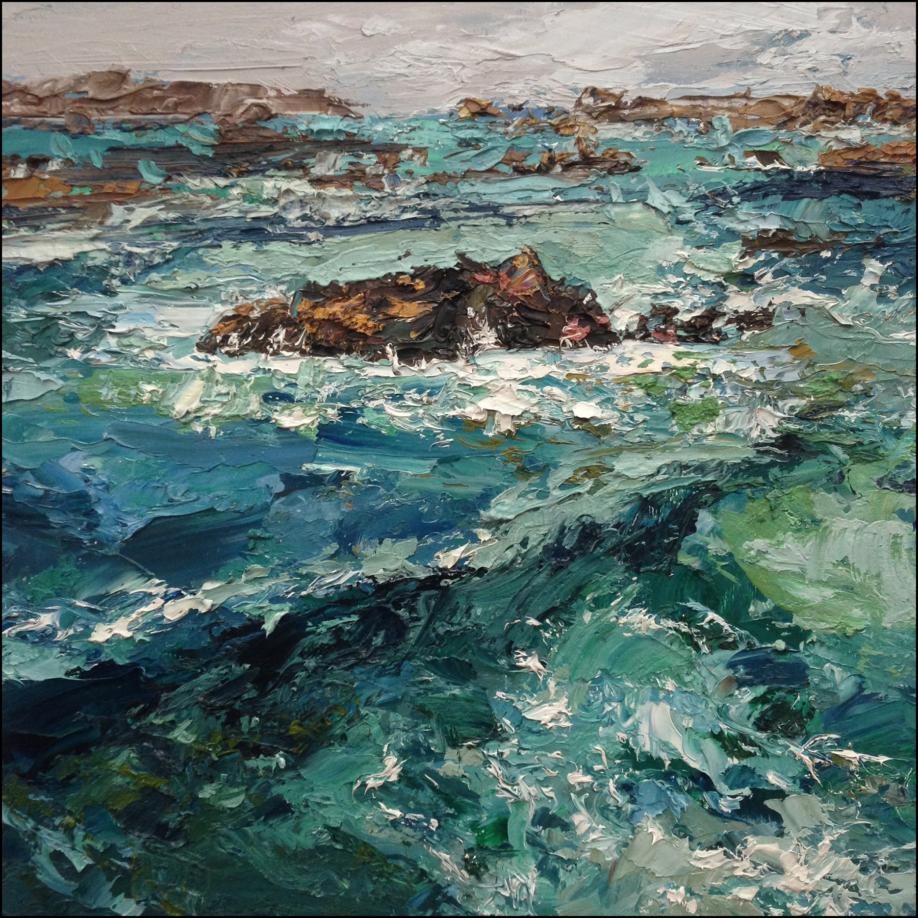
My ‘inspiration oil’ is one of my very early impasto paintings, painted in 2017 after visiting the Algarve in Portugal. We were there a bit too early in the season. It was much colder, much more stormy than I expected out of a trip to Portugal.
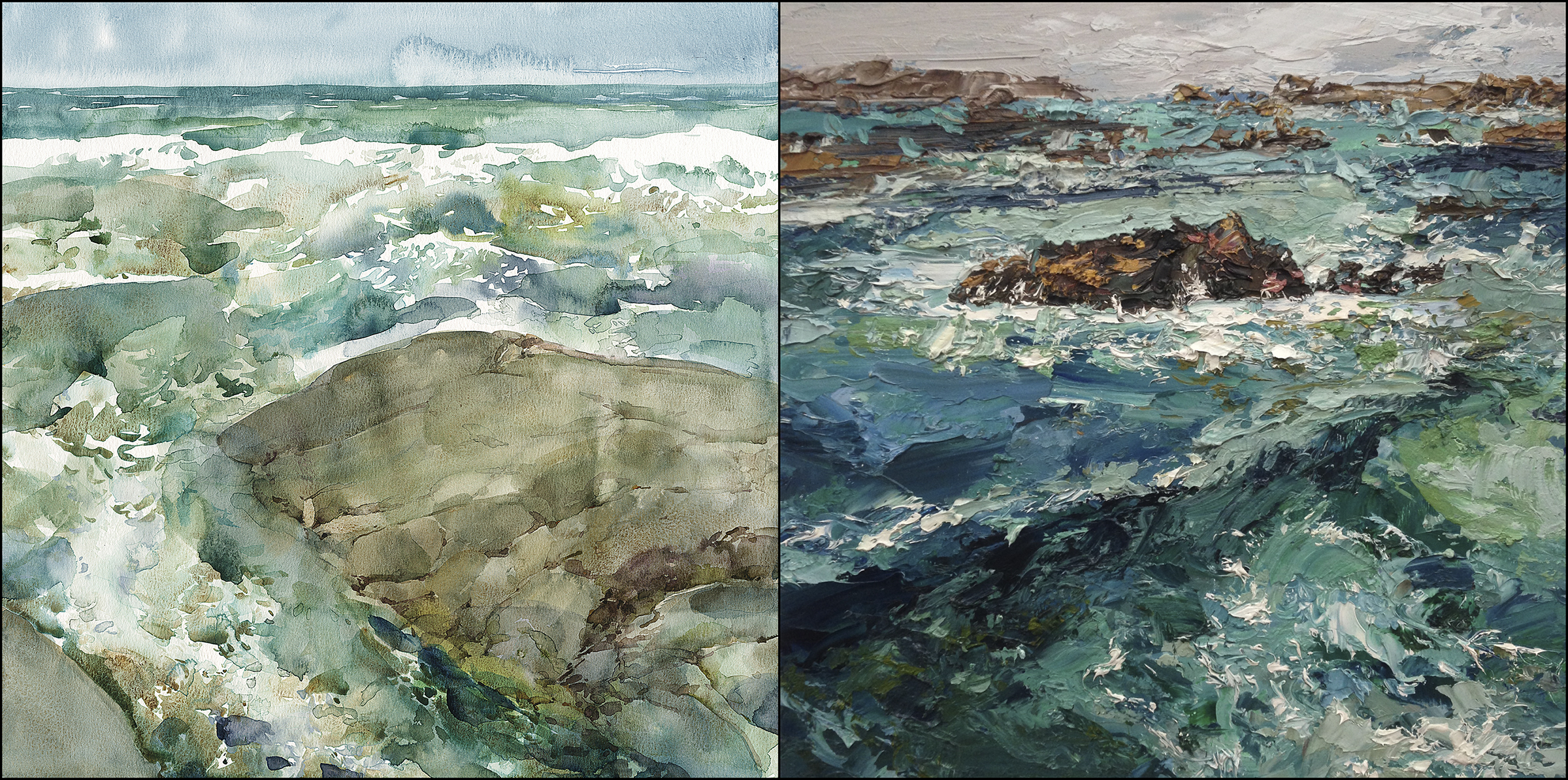
Here’s the paintings side by side for easy comparison.
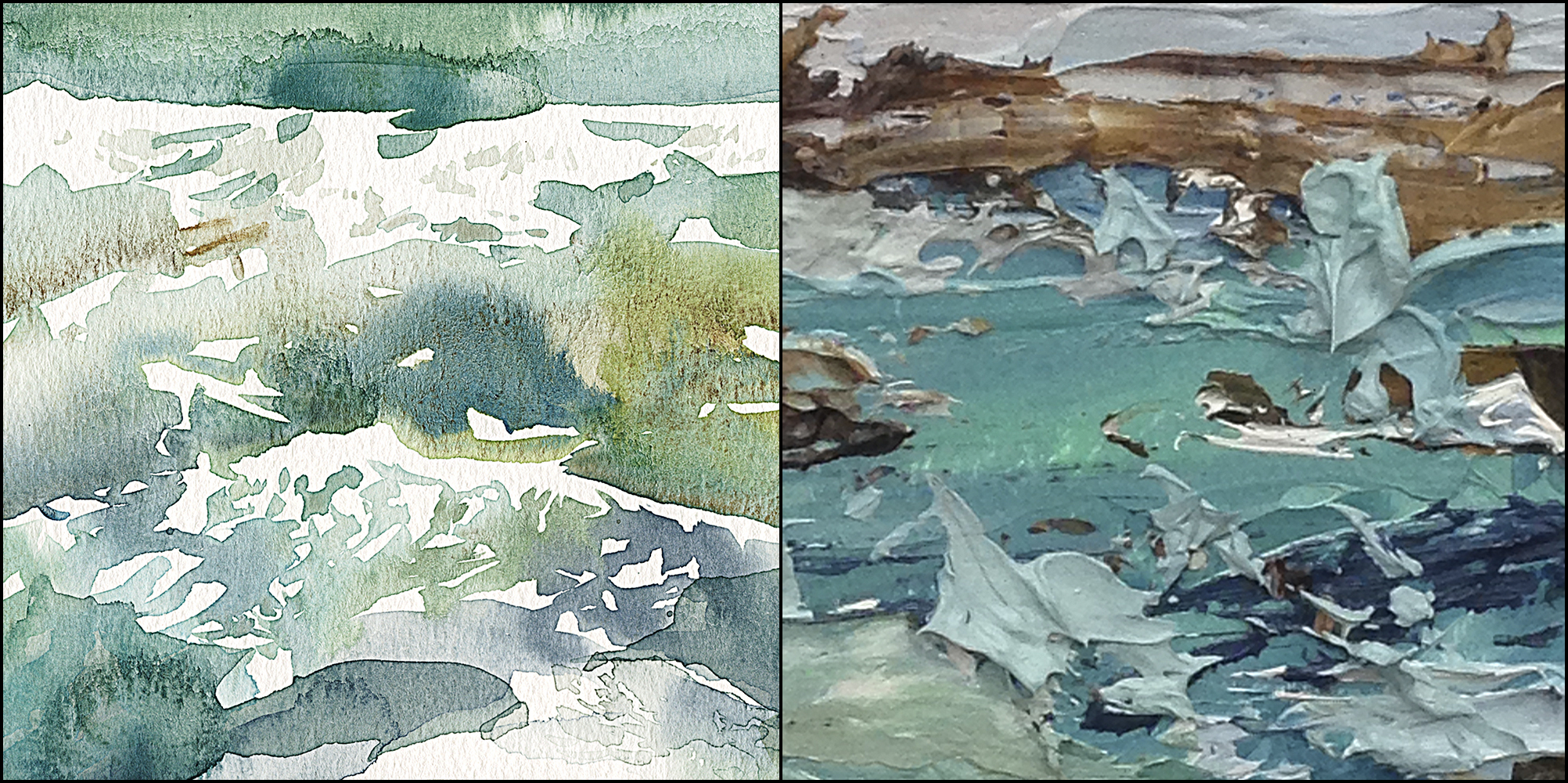
And here’s a close up detail.
Interesting hey?
They are very different in feeling and effect – but, I see the same impatient gestural hand at work. My painting-brain is the same, even if the surfaces are day and night.
In the watercolor, I love what the floating pigment creates. Blooms of lighter weight pigments, versus the sedimentary effect – the settling of tiny grains of sand, dropping out of the water, accumulating in the low spots in the paper. It’s almost a model for the real sea.
In the oil, I’m enjoying the freedom to make flecks of sea spray or jagged bits of rock, without having to play the careful dance of negative painting. The leaving out of highlights – all that thinking ahead like a chess player. With this particular painting, I remember coming back and re-working it a few months later. Something that’s impossible with watercolor.

Yet somehow, a watercolor can be a light and breezy sun-washed thing, that so far, doesn’t happen naturally for me in oils.
I realize there is nothing stopping me from making high-key oil paintings. But, it’s this question of what is the natural strength of each media. I have been striving in my personal work to make watercolor more dramatic. More moody, with greater intensity. Perhaps, that’s going in the wrong direction! Maybe the watercolor should stay here, in this happy place, and leave the stormy seas for the oil paintings.


Do you find that writing about your art gives you ideas? It sounds as though you’ve found an intriguing direction for experiment — making the oil more dramatic and moody. As you note, one can always make the oil more high key, taking the Monet direction — which is wonderful. But one can also make oil darker, exploiting its natural darkness (of the linseed oil) and take it in the Rembrandt direction.
The Rembrandt direction seems to be the road less traveled at present, perhaps because Rembrandt painted so few landscapes. But the ones he did make are so amazing — very much about drama and mystery.
Love these landscapes. They’re wonderful, in both media, each in their particular way.
Oh absolutely! I suppose it’s like journaling – (but I find writing for an audience more motivating than solo journaling). But yes – posing yourself a project and journaling it out – very good for clarifying your thoughts. I like to have a formal “policy” – like a written mandate for my art :) otherwise I’d be all over the place. No two paintings would be the same and I’d never develop any expertise!
I was curious because I find that writing helps me a lot. Most of that sort of writing is in journals, but I’m starting to use my blog as a tool for invention. For one thing it’s easier to retrieve ideas in a blog since there are tags and search engines!
I do bullet journal as well, for productivity and memory aid, and to track brainstorm. I use the notes app on my phone because it’s searchable and can reorganize into folders.
Hey, Marc, (very) generally speaking, are you using lots of tea washes on top of one another to achieve those beautiful, transparent overlays? Beautiful work!
This particular one was very much all-in-one in the water. You can tell from all the hard edged little whites. The rock is build up a bit more with a glaze or two.
Absolutely stunning, Marc! Out of your thirty, could this be a contender for the winner this year? Question —how did you create the ‘cracks’ on the rock? I remember this effect on your ‘Joshua Tree’ painting. Did you paint silhouettes within the rock and the ‘fine lines’ are the borders of the silhouettes? Also —how did you control the direction of the bloom where ocean meets sky? I see that the line of the ocean is solid —perhaps you painted the line after bloom dried?
The bloom – that is when you add water or more watery paint to a wet shape right? So the new water flows down to the dry edge (the blue sky was one rectangle of damp) and it bounces off the dry edge and blooms up. It’s literally a 2 dimensional splash, in slow motion.
The cracks – it’s like I make big soft pillowy rocks and where there are white gaps or small overlaps I hit them again with the tiny darks or small blends pulling in one direction. The combination looks like faceted edges.
Good questions!
Enjoy seeing what happens when YOU are in your happy place!
Marc I love the greens you gave in your watercolor. Is it Antwerp blue or some kind of
Tourqouse. Please tell me. Your watercolors are awesome.
Hey Grace, so – I have a greenish blue called Turquoise – I think I prefer the M Graham version, but I’m sure I’ve added a sharp yellow – I use Nickel Titanate – for no reason I could articulate other than I like the colour – it’s basically a lemon yellow. So there are those and possibly Green Gold from Daniel Smith, and then the “sandy” color is Goethite, a very neutral and sedimentary raw sienna or yellow ocher kind of color.
Love your moody watercolors Marc, and your explorations in the different mediums. I have your dark and moody watercolour book to look at when I feel my sketches are getting too ‘pretty’
Love your stormy watercolour! Great to read your thoughts.
Good to see new watercolors again, Marc! I like where you are going with the idea about pursuing lightness and watercolor, and darkness with oil. Does that feel more intuitive to you? If so.. keep going in that direction! I really like this wc painting.. the textures and granulation. The abstract feel in a representational painting. Love and it‘s very inspiring and encourages me to play more in my watercolor journey.
Love the work!
Beautiful!
Just coming around to finding these – and I LOVE these! thanks for sharing your colors, too~!