#30×30 Day 05 : Death Valley, Nocturne
Ok this is something. This is something.
It’s a bit early yet at Day Five – but this might be my favorite of the year. We shall see!
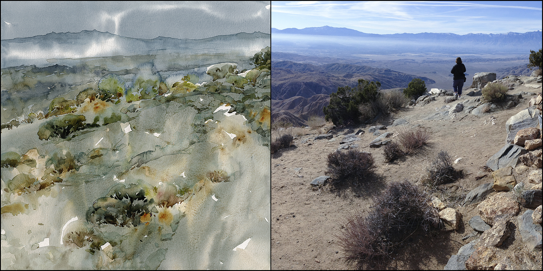
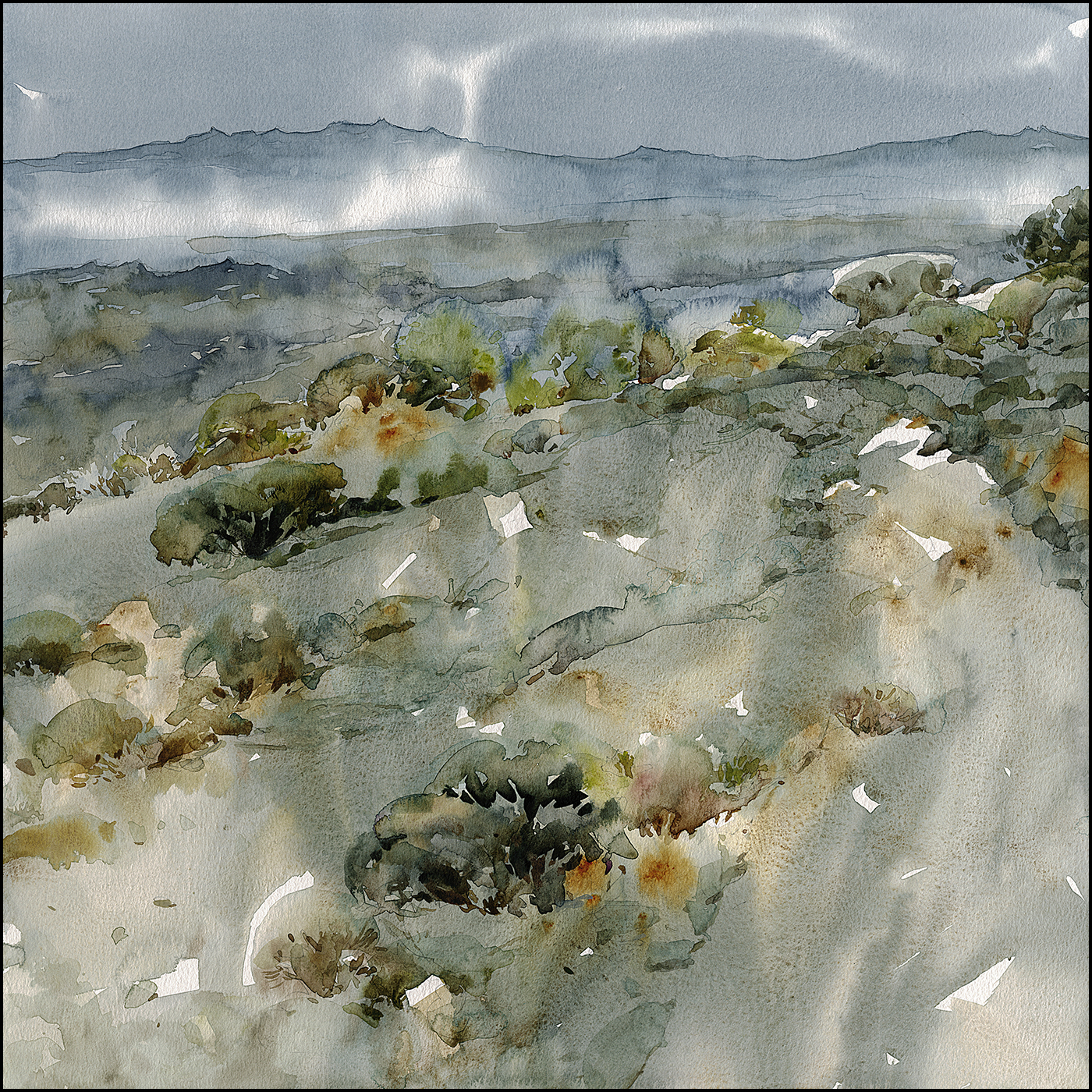
Whenever we are in the area (which, I have no idea when that will be again), we make it a point to go to Death Valley. It’s really quite a fantastic place. This isn’t exactly the best view of the park – but it’s the kind of desert painting that I love. The strange desolation, decorated with dried skeletons of plants.
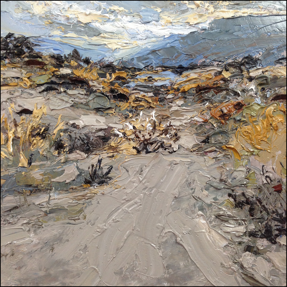
This is the inspirational oil, Pull Over Anywhere and Make Art which was painted from a ditch on the side of the road half way between Laguna Beach and Joshua Tree.
Again – I’m not really trying to duplicate the oil – but to make a watercolor with a similar spirit.

I started this watercolor with a grey blue sky that washed down into a cool sandy color.
This is breaking my own rule – intentionally creating an under-tone! That’s not alla-prima!
But – Always be Breaking Rules is a personal motto. And motto’s trump rules, so it’s ok.
I know the whole thing about the desert is the heat. But if you’ve ever been in Death Valley, it’s freezing at night – and especially when you get up for your wife’s early morning photo expeditions.
This Blue-to-French Grey undertint created a magical ‘desert nocturne’ which I was able to use through the entire painting. There really is something to putting down an under-wash and painting over it (when it’s dry). This is as opposed to the purely Direct Watercolor method of working into the white paper. So – there we go, rule breaking.
This one would more honestly be be wet-on-dry, or Tea Milk Honey as I used to say quite a bit, rather than a pure Direct Watercolor, which would be alla prima.
I think I said something before about how I don’t really care for delicate transparent watercolors. But – every once in a while you come up with something that is quite amazing, and you have to admit – subtle isn’t always ‘weak’.
It’s possible that I say these things because I don’t really know any better.
Transparency – who cares! I like my aggressive drippy water experiments! Go bold or go home!
But then, when you get ahold of some new skills – like mixing more subtle greys, and pre-mixing enough pigment to pour the whole sheet (things I would never do in the past, when I was working in the field with a 3×5″ travel kit) – then you might find yourself changing your mind about things.
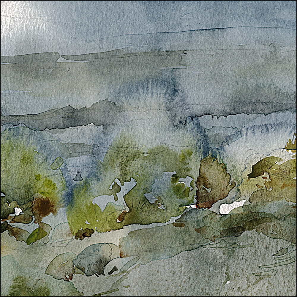
This is the heart of this painting for me. The ghosts of some desiccated bushes. If you’ve ever been out there in the desert, you’ve seen them too.
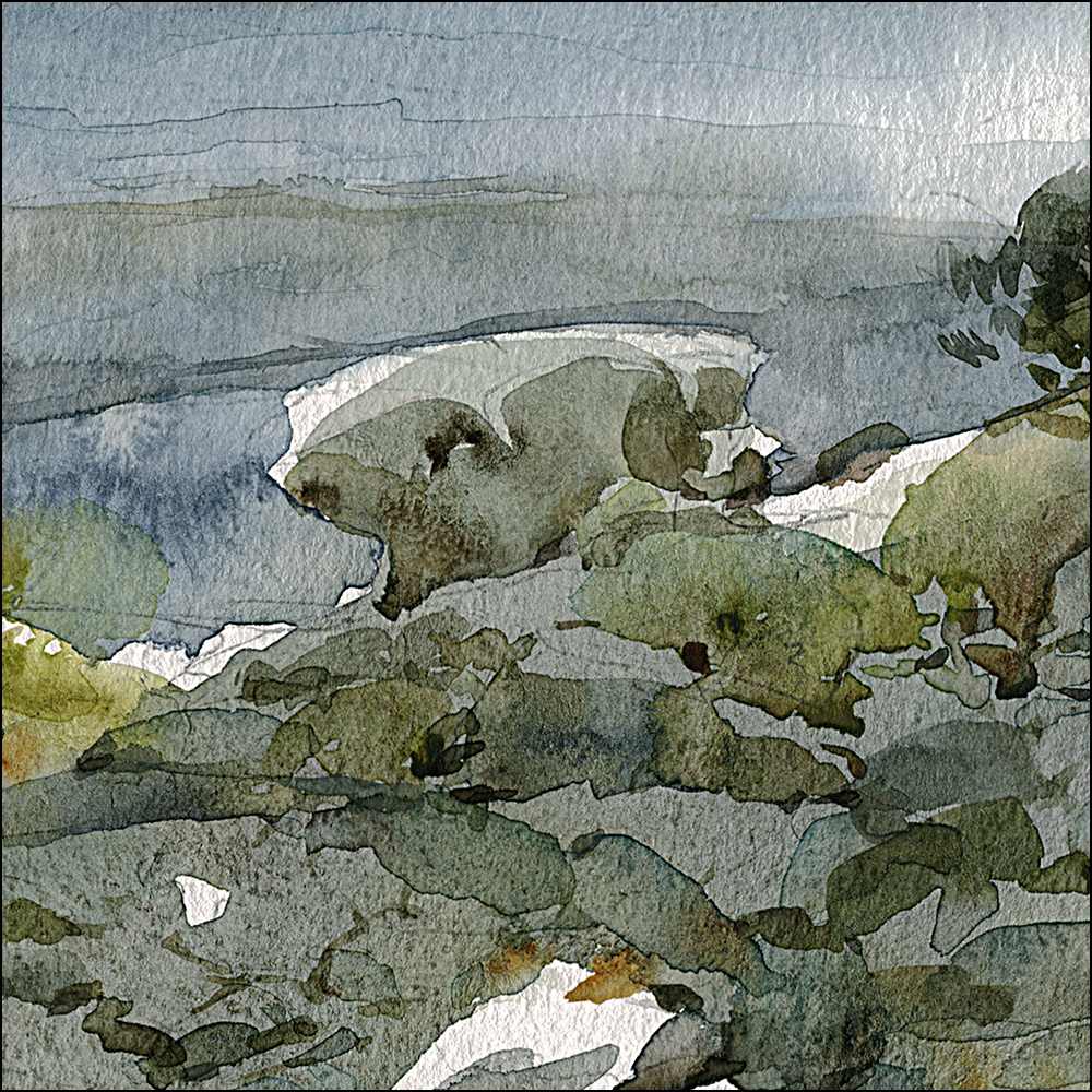
And here is a weird mushroom rock.
So that was Day Five!
Thanks for following this year’s #30x30DirectWatercolor. It’s already going places I did not expect.
~marc


And I love the mountains in the distance…the glow, subtle texture and defined ridge…and what that does for the foreground
Did you do the mountains by adding a second layer of slightly richer grey and then defining the edge w a pen or is the sharpness of the edge from paint alone? Or something completely different? :-)
Really appreciate your musings (as I try to develop an ability to think more artistically myself).
Cheers,
Paul
Hey Paul! Interesting your eye goes right to that edge! – so, partially, I think its slightly exaggerated in the scanning process – I do use a ‘sharpen’ on the scan, it brings out the paper texture you can’t otherwise see on screen. But that line is absolutely there in the original. It’s only a little darker here? I’ll say 10%.
It does seem to happen when you lay wet color on top of dry color – you can see it on the edge of, say, the blackish-green shrub in the very middle foreground? and the ‘blob’ a bit above and right? I think it’s a matter of, when the stoke is wet-on-dry, and when the pigment has some black in it – (colors such as Indigo or Perylene green) some pigment will collect on the edge of a wet stroke, making that ‘outline’ naturally.
It’s like the bathtub ring I suppose. The sediment that collects at the waterline.
I do think it happens more on paper with stronger sizing. The color tends to ‘float’ more, and ‘absorb’ less. The effect is even more noticeable on a completely waterproof surface like YUPO (if you’ve ever used that material). Today, I’m using a generic store-brand cellulose paper – one of those big 16×20″ pads. (Our local shop DeSerres brings them in but they’re ‘store brand’ so you don’t know the manufacture. It’s a lot like Canson Mi-Teintes in feel). I can’t bring myself to use good quality cotton paper (say my favorite Fabriano Artistico) because some days I’m throwing away a lot of sheets, and I just can’t paint as care-free as I would like with ‘expensive’ paper.
Either way I do like the effect. It’s rather handy to have the water automatically do some drawing :)
Glad you got in to this, Marc. I was about to ask a similar question.
Marc,
Thanks for the very thoughtful response…I really appreciate your knack for teaching and willingness to share your experience.
Cheers,
Paul
Love Death Valley…love your paintings!
Amazing…..thank you for sharing!