Hibernia Bank

Here’ s my contribution to this Saturday’s World Wide Sketchcrawl! I took the opportunity to re-visit one of my favorite buildings on Market street, the Hibernia Bank. It remains as gothic and distressed as ever. Crown jewel of the Tenderloin.
If you’re visiting the city, it’s a short walk on Market west from the Powell street BART stop, between 6th and 7th. Right across from the Market Street Cinema. (Which is not the kind of cinema you might expect).
I see some new plywood up on the windows, and could hear some crashing and banging – so perhaps renovations are finally underway. I hear the intent is to create a new set of high-end shops. It’s perhaps a bit ambitious right now, seeing as the immediate area is a little urban blight-ish, and there are many recently empty storefronts in the higher traffic areas towards Embarcadero.
I’ve drawn here two or three times before – I want to finally get a drawing of this building that I really love before it becomes a Gap or something equally silly. It really needs to be a public library or an art gallery or something suitable! Here’s hoping.
Trinidad, CA

Driving up the coast of northern California. I’d heard the town of Trinidad was the place for amazing tide pools. We seem to have come at the wrong time, or at the wrong beach or something – but we did find this scenic view. I couldn’t resist this towering rock with the miniature forest on top. It’s like a giant Bonsai garden. There’s some incredible forest around this area as well. Intensely overgrown, fern covered, mossy. I’m going to have to head back and do some more painting up there. I tried a few sketches, but for now, I was defeated by the dense forest. Sometime soon I’ll head back and take a second shot :)
Bad Unkl Sista

My second time at Bad Unkl Sista’s Metamporphica drawing event. Impressive mythic costumes, contortionist modern dance, beautiful models, and live music! It’s a great evening of art. [ Linkage: busstopgallery.blogspot.com – badunklsista.com ]


Oakland’s Cathedral Building
Originally the Oakland Federal Building, this Gothic revival flatiron lords over the intersection of Telegraph and Broadway. It’s definitely the princess in a neighborhood full of fascinating architecture. It was a sunny spring day today – but I felt this marble tower deserved a standoffish wintry feel. I’m glad we made it over here before the foliage returned. Now I feel like I’ve been to New York for the day.

The House on Masonic

Sketchcrawl! (Belated)

Finally! It’s not raining when I have a chance to draw!!!!
I couldn’t make this past Saturday’s sketchcrawl – so I met up with a friend the next day, and we did a mini-session. Here’s a couple drawings from Haight Street.

Metamorphica

Bad Unkl Sista is an experience. They’re a mashup of Butoh without the depression and couture without the haughty. However you try to classify them – what they are is art, imagination and drama. Oh and humor, sex and silliness. And they put on a hell of a drawing event. Here’s some sketches from last night’s Metamorphica.


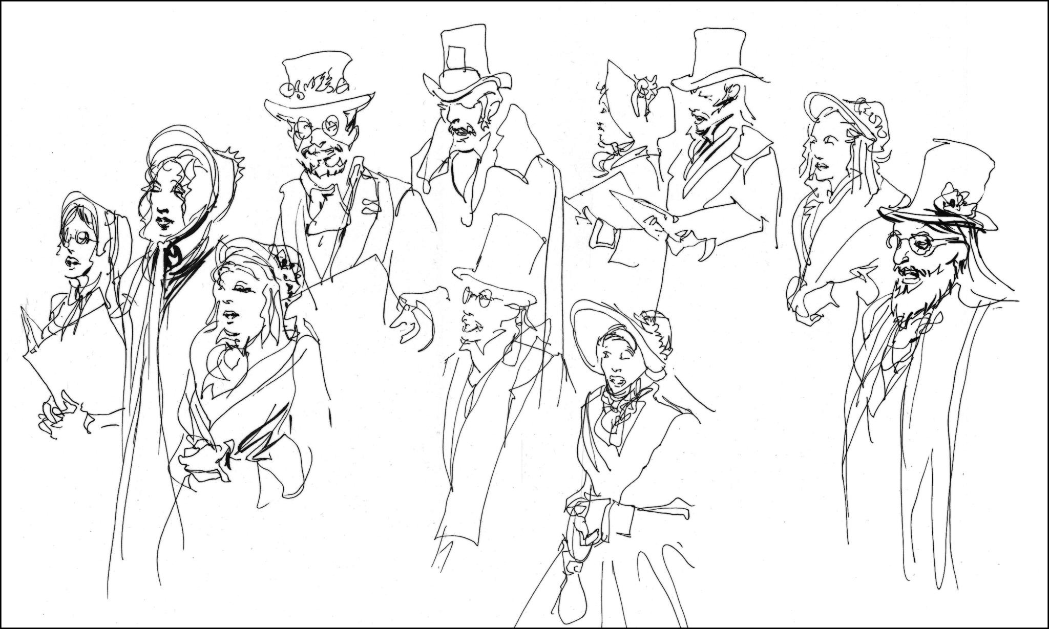
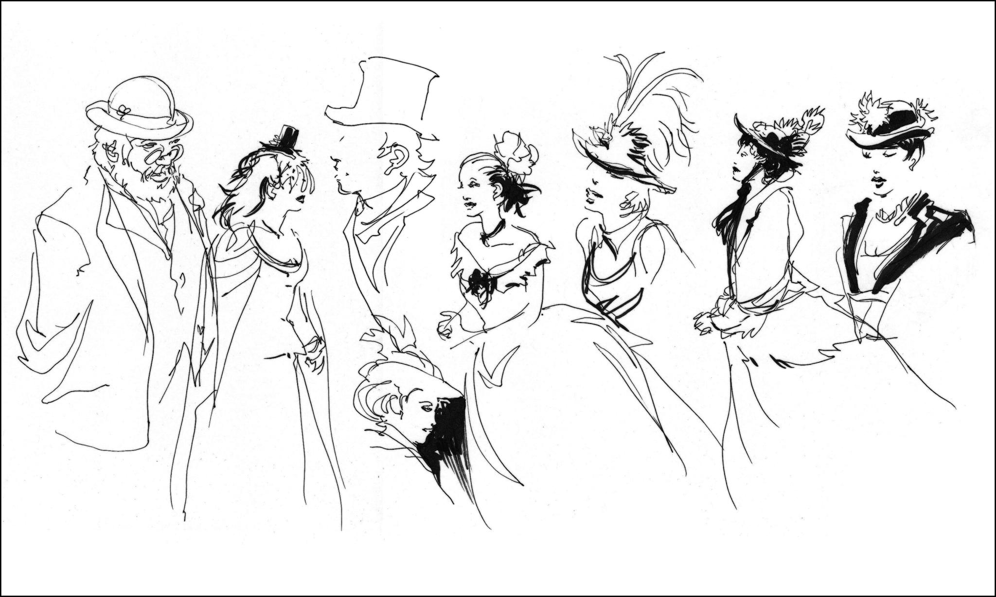
Return to the Dickens Fair
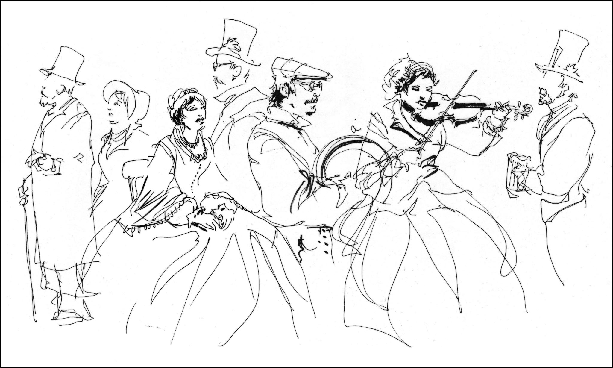
I spent this afternoon drawing with some friends at the 31st annual Dickens Fair. This is the second year we’ve gone (Check out last year’s sketches. I’m getting faster!)
Every year around the holidays seemingly hundreds of people turn out in Victorian Era costume for a gigantic event. It’s half party, half trunk show, half interactive theater – and it’s packed wall to wall with outrageously good costumes! These people really take their craft seriously.
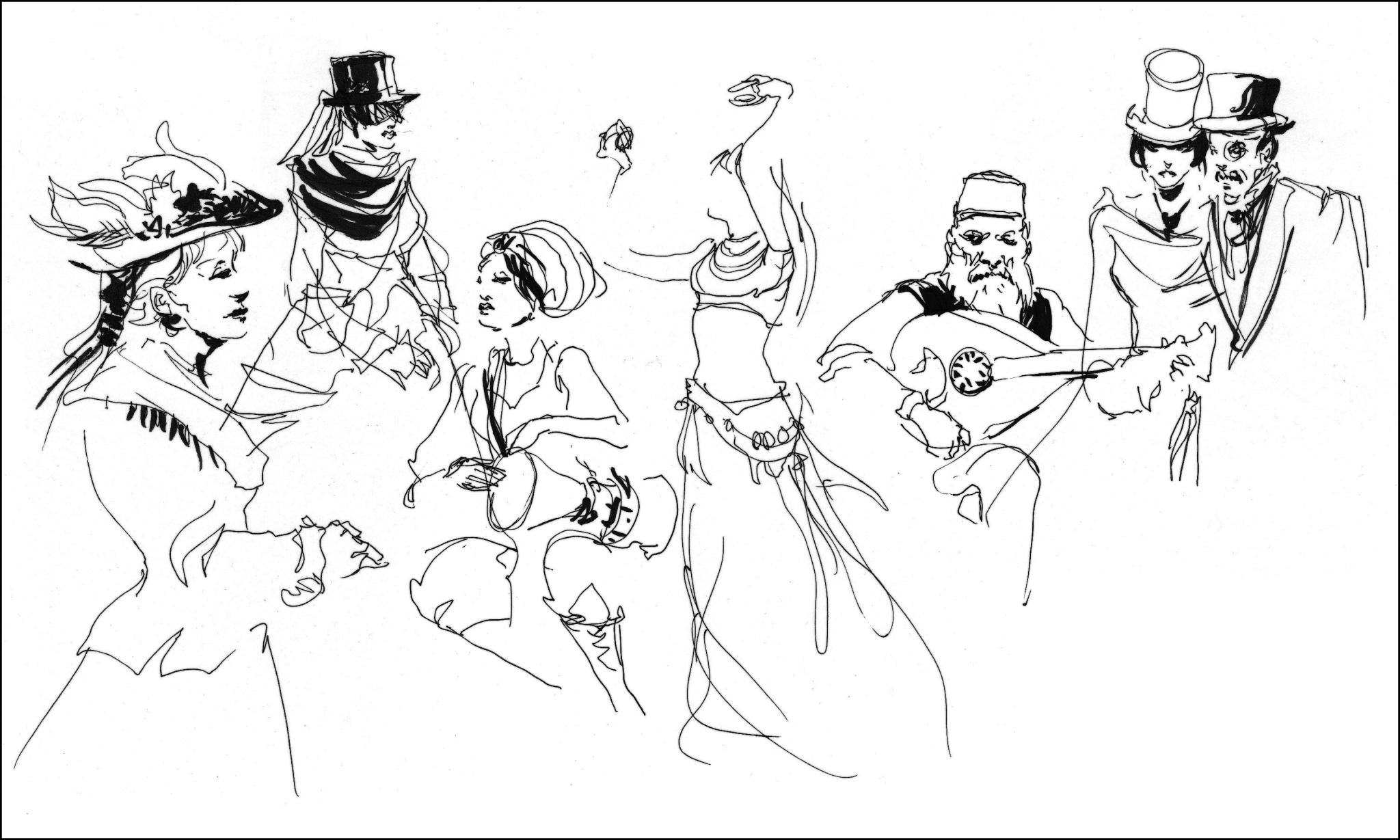
Here’s some sketchbook pages – just a glimpse at the variety.
There are pirates, rail barons, fortune tellers, carolers, street urchins, admirals, dancing girls, hussars, chimney sweeps, Turkish merchants, deep sea explorers – it just goes on and on. My favorite has to be the Dark Garden corset makers shop – they have models holding 10 and 20 minute poses in their windows all day long – sketch artists couldn’t ask for a better show :)
SFO Daytime Landing

It’s urban sketching from 6000 ft :) Here’s the view as you come into SFO airport.
Ok ok, it’s not really a location sketch. Yes, it’s from a photo out the window. But hey – it looked just like that.
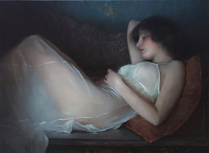
30×40″ oil on canvas, with palette knife. This is part of what I’m submitting to a group show we’re doing at the office. More on that when I have the info about the opening.
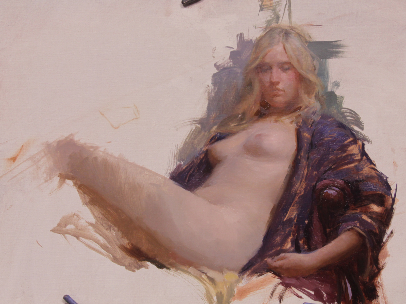
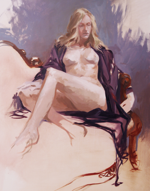
Lipking Workshop
Just came back from a workshop with artist Jeremy Lipking. I went in with some theories of how he might work – but found it quite unlike my expectations!
I’ll try to sum up what I saw in the the three days of painting:
I found him very likable. He’s a very low key guy – down to earth, slightly sarcastic sense of humor. Not a huge talker – he covers the key points and will always answer questions – but most of the day is you painting alongside him – watching his work evolve.
You have to be ready to observe – he’s not big on verbalizing his process. But it’s not like there are many secrets to it (other than great judgment, earned over time). You can pretty much see what he’s doing – you just get a little crazy with envy attempting to do it yourself. It’s all skill and experience – no tricks.
He loves cool subdued neutrals and pale glowing fleshtones – but he paints with brilliant cadmium colors. No reliance on greys or mud mixes – just what I’d call a ‘fairly standard full spectrum’ selection.
Two each of; red, yel, blue, green (one warm, one cool of each), black, white, and two wildcards – transparent red oxide (kind of uber-burnt sienna, good for flesh), and one custom mix – a kind of pale chalky warm blue (used as a cooling tint).
He uses these colors to make a symphony of greys. Nothing is overly chromatic – there’s usualy more use of stronger color in the transitions between values, or inside shadows. (no black shadows at all).
(specific pigments: Titanim White, Cad Lemon, Cad Yellow, Cad Orange, Cad Red, Alizarin Crimson, Trans. Red Oxide, Ultramarine Blue, Cobolt Blue, Viridian Green, ‘Gold Green” (kind of a dark Sap Green I’d never heard of before) and Ivory Black (which I didnt see him use).
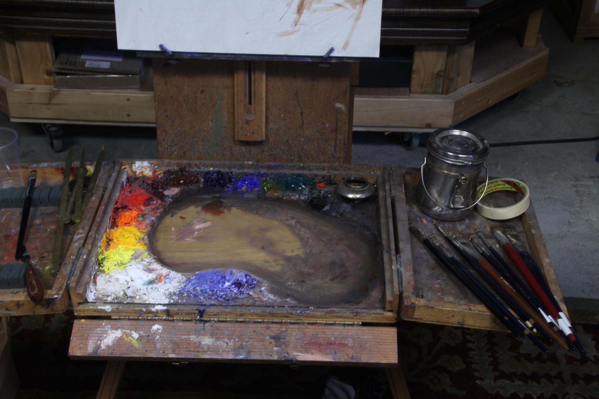
(Jeremy’s palette)
His paintings have elegant draftsmanship, but in fact he doesn’t start with an underdrawing. He just dots in the crown, the chin, the feet and the ‘furthest extents’ – (like, the elbow and the feet). So we’re talking five or six dashes, and that’s it!
These dashes are carefully measured – he took about a 20 min to do this stage. He says this is so he knows the figure is placed as he wants in on the canvas before he puts a week into the painting.
He’s measuring with the brush at arms length – a simplified sight-size method – measuring the head, and estimating everthing in ‘scaled head units’ on his canvas. So it’s ‘eyeball scaled sight size’ not a rigid academic approach.

(Jeremy’s demo – day one)
His method seems to be based almost entirely on a sensitivity to color. He is able to see and immediately reproduce extremely narrow midtone values. He works methodically, from the figures face outward and down, finishing as he goes, apparently not needing to go back to correct. Each stroke is considered.
He seems to paint slowly, but the painting actually progresses quite quickly – since every stroke is the correct value! He won’t make more than a few strokes with loaded brush – alwasy mixing exactly what he means to place.
His work appears to be ‘realistic’ a first glance – but it’s in fact very idealized. He’s compressing the values he sees into a narrow mid-tone space. It’s a really calm, serene kind of rendition of what’s in front of him.
His demo painting seemed to be 20 or 30 percent darker than reality – as if we’re seeing the model in a dimly lit interior. He chooses to ignore a lot of cast shadow and specular highlights in favor of a clean soft silhouette. The best example is his preference to leave out the highlight on the tip of the nose. He seems to think it’s distracting – too ‘sharp’ a note.
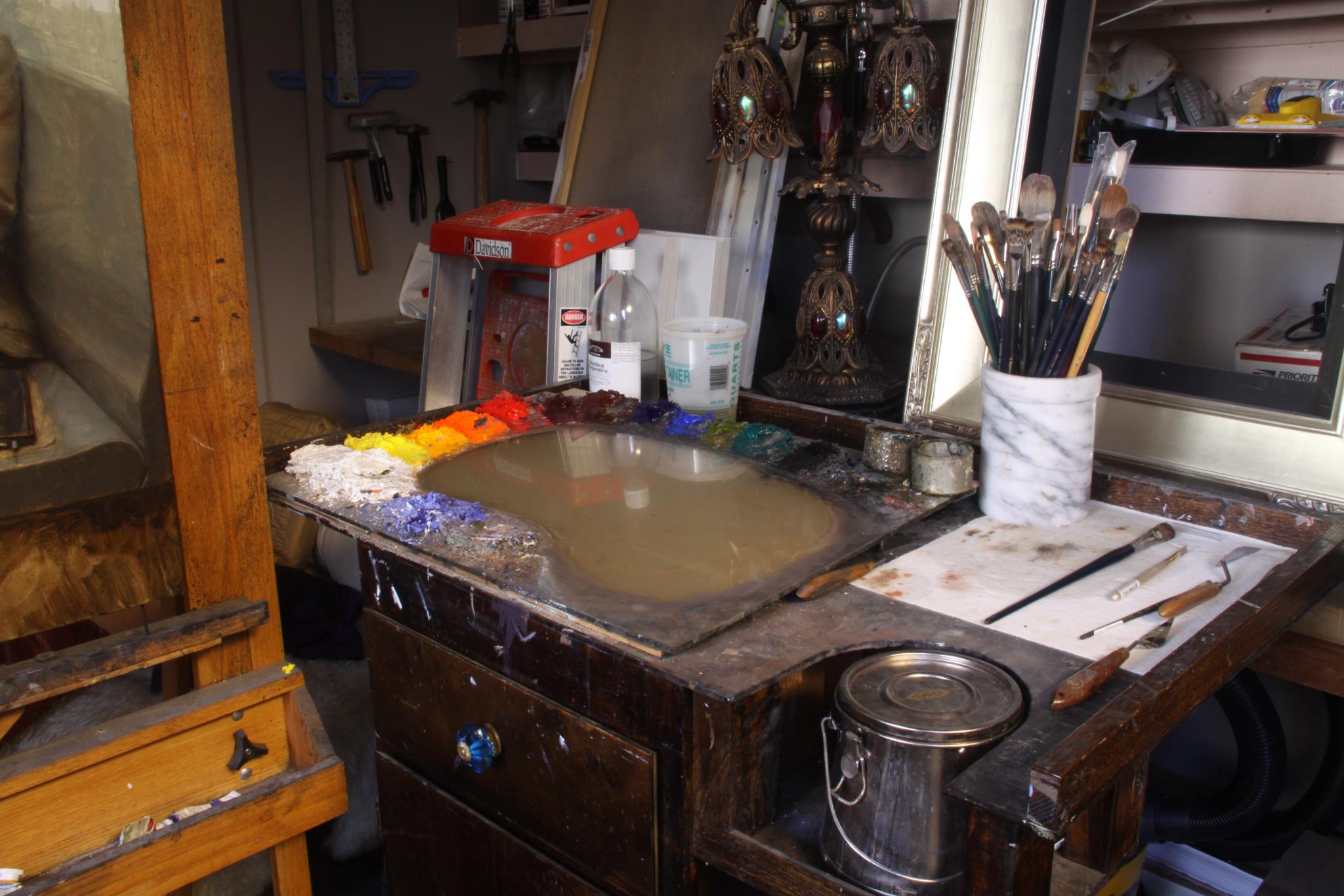
He favors mongoose hair brushes. The top brand being Langnickle. They’re pretty awesome I must say – hold tons of paint, are very springy, but are suprisingly random. The hair feels ‘spikey’ – the stroke is kind of crosshatched or dry-brush feeling. Seems very well suited to a smoothly blended painting.
He will take a clean brush and blend back unwanted thick ridges on brushstrokes – but I dont think you’ll ever see him using a blender on the painting. I didn’t see one anywhere in the studio.
It think that’s about it. If you were thinking about taking his workshop – I’d go while you have the chance. In a few years he might get a lot more expensive!
(Jeremy’s demo – day two)
(my weaksauce version)
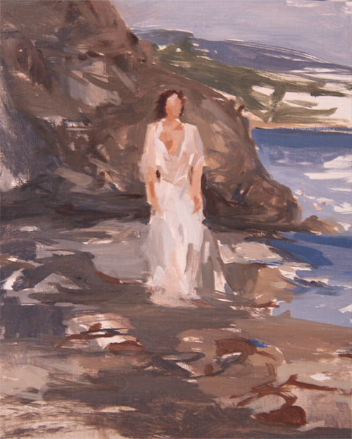
The third day was kind of the cool part of this trip. We esentially blew off the studio and went to the beach. You really can’t get a lot of painting done while chasing the light and running from waves, but it’s a beautiful way to spend a day in Malibu.
")
")
")
")
")
")
")
")
")
Model: Maude Bonanni, Photos: Laurel Holmes
At this point I have a long way to go to approach Jeremy’s work :)