Lipking Workshop
Just came back from a workshop with artist Jeremy Lipking. I went in with some theories of how he might work – but found it quite unlike my expectations!
I’ll try to sum up what I saw in the the three days of painting:
I found him very likable. He’s a very low key guy – down to earth, slightly sarcastic sense of humor. Not a huge talker – he covers the key points and will always answer questions – but most of the day is you painting alongside him – watching his work evolve.
You have to be ready to observe – he’s not big on verbalizing his process. But it’s not like there are many secrets to it (other than great judgment, earned over time). You can pretty much see what he’s doing – you just get a little crazy with envy attempting to do it yourself. It’s all skill and experience – no tricks.
He loves cool subdued neutrals and pale glowing fleshtones – but he paints with brilliant cadmium colors. No reliance on greys or mud mixes – just what I’d call a ‘fairly standard full spectrum’ selection.
Two each of; red, yel, blue, green (one warm, one cool of each), black, white, and two wildcards – transparent red oxide (kind of uber-burnt sienna, good for flesh), and one custom mix – a kind of pale chalky warm blue (used as a cooling tint).
He uses these colors to make a symphony of greys. Nothing is overly chromatic – there’s usualy more use of stronger color in the transitions between values, or inside shadows. (no black shadows at all).
(specific pigments: Titanim White, Cad Lemon, Cad Yellow, Cad Orange, Cad Red, Alizarin Crimson, Trans. Red Oxide, Ultramarine Blue, Cobolt Blue, Viridian Green, ‘Gold Green” (kind of a dark Sap Green I’d never heard of before) and Ivory Black (which I didnt see him use).
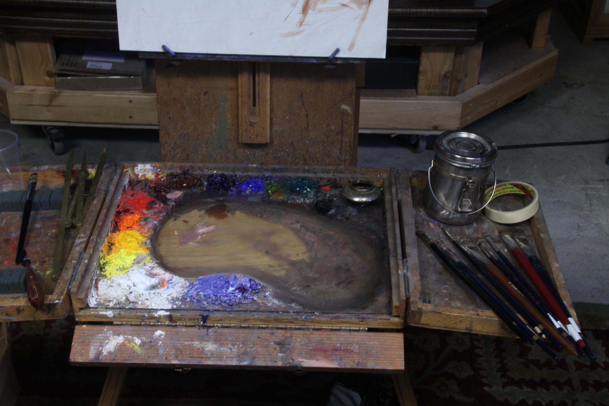
(Jeremy’s palette)
His paintings have elegant draftsmanship, but in fact he doesn’t start with an underdrawing. He just dots in the crown, the chin, the feet and the ‘furthest extents’ – (like, the elbow and the feet). So we’re talking five or six dashes, and that’s it!
These dashes are carefully measured – he took about a 20 min to do this stage. He says this is so he knows the figure is placed as he wants in on the canvas before he puts a week into the painting.
He’s measuring with the brush at arms length – a simplified sight-size method – measuring the head, and estimating everthing in ‘scaled head units’ on his canvas. So it’s ‘eyeball scaled sight size’ not a rigid academic approach.

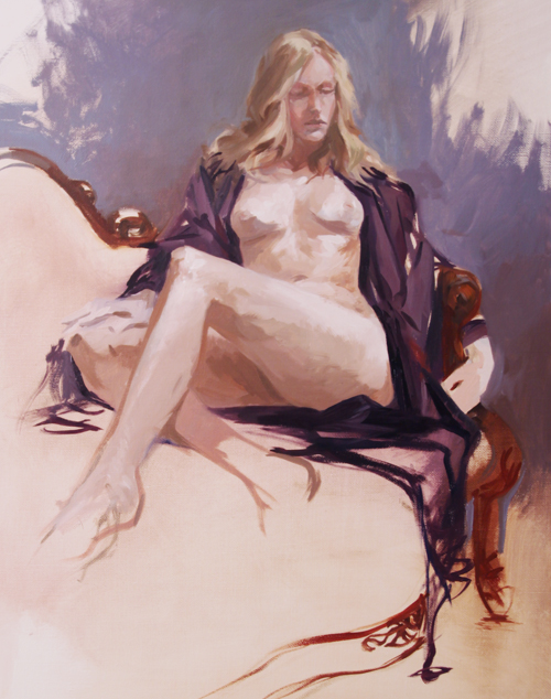
(Jeremy’s demo – day one)
His method seems to be based almost entirely on a sensitivity to color. He is able to see and immediately reproduce extremely narrow midtone values. He works methodically, from the figures face outward and down, finishing as he goes, apparently not needing to go back to correct. Each stroke is considered.
He seems to paint slowly, but the painting actually progresses quite quickly – since every stroke is the correct value! He won’t make more than a few strokes with loaded brush – alwasy mixing exactly what he means to place.
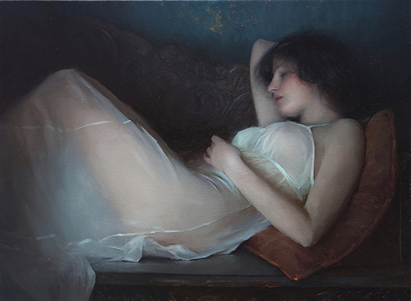
His work appears to be ‘realistic’ a first glance – but it’s in fact very idealized. He’s compressing the values he sees into a narrow mid-tone space. It’s a really calm, serene kind of rendition of what’s in front of him.
His demo painting seemed to be 20 or 30 percent darker than reality – as if we’re seeing the model in a dimly lit interior. He chooses to ignore a lot of cast shadow and specular highlights in favor of a clean soft silhouette. The best example is his preference to leave out the highlight on the tip of the nose. He seems to think it’s distracting – too ‘sharp’ a note.
He favors mongoose hair brushes. The top brand being Langnickle. They’re pretty awesome I must say – hold tons of paint, are very springy, but are suprisingly random. The hair feels ‘spikey’ – the stroke is kind of crosshatched or dry-brush feeling. Seems very well suited to a smoothly blended painting.
He will take a clean brush and blend back unwanted thick ridges on brushstrokes – but I dont think you’ll ever see him using a blender on the painting. I didn’t see one anywhere in the studio.
It think that’s about it. If you were thinking about taking his workshop – I’d go while you have the chance. In a few years he might get a lot more expensive!
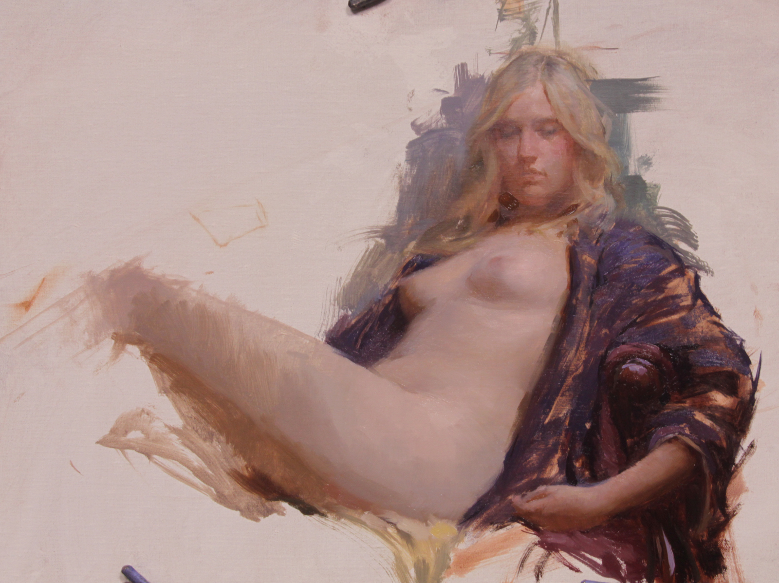
(Jeremy’s demo – day two)
(my weaksauce version)
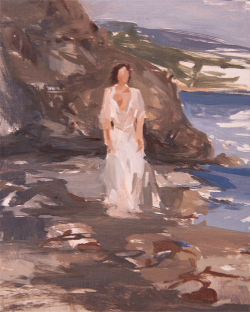
The third day was kind of the cool part of this trip. We esentially blew off the studio and went to the beach. You really can’t get a lot of painting done while chasing the light and running from waves, but it’s a beautiful way to spend a day in Malibu.
")
")
")
")
")
")
")
")
")
Model: Maude Bonanni, Photos: Laurel Holmes
At this point I have a long way to go to approach Jeremy’s work :)


Wow! Fantastic post. I’m a big fan of Jeremy’s work and a little insight into his way of painting is wonderful. I have to say yours turned out very nice as well.
Did he use any medium at all or just straight paint?
ah yes -forgot to mention – he uses gamsol and walnut oil – quite a bit actually – the paint is very fluid – gradually getting thicker as you refine details over the two days.
“Gras sur Maigre” as the painter repeats in Amelie ;)
Thanks for the thorough, step-by-step explanation of the process Marc, very valuable information ;))
Thank you SO much for this!!
Thank you that was very helpful
An excellent assessment of Jeremy’s approach. I have just attended his workshop in Yorkshire and this is a really clear description of his methodology. The precision and thought behind every brush stroke is wonderful to behold
Did he use a medium !