Don’t Document; Design
Some part of my brain has always been into rules and systems.
I’ve always jotted little notes while painting. Things like last weeks bon mots “Don’t Document; Design!” or “Change Plane = Change Temperature.” I like it when I come away with a new theory to field test for a while. I’ll push a rule a little further each time until I’ve found the limit of it’s usefulness.
Sometimes a thing is in my head for long enough and gets internalized – sometimes I decide it’s an edge case that’s not going in the book.

So here we have the old Presbyterian college at McGill (now the department of Islamic studies). It’s quite a complex structure. Lots of unusual angles. Many bits and bobs. Possibly, a fun, expressive drawing wasn’t the perfect match for this place? Or who knows, maybe they need to lighten up in there.
Anyway, here I’m seeing how far I’m willing to go with expressively inaccurate drawing and pushing temperature shifts all the way to complementary colors. The jury is still out. Maybe I went too far. Maybe not far enough. More experiments are required.
Next post — the take away is: “Select/Deselect”.
Peerless Watercolor
Here’s something you might consider if you need the lightest possible watercolor kit. These are paper thin sheets of film coated with intense watercolor pigment. You’d only need this little booklet and a waterbrush. Great solution if you’re climbing Everest or something :)


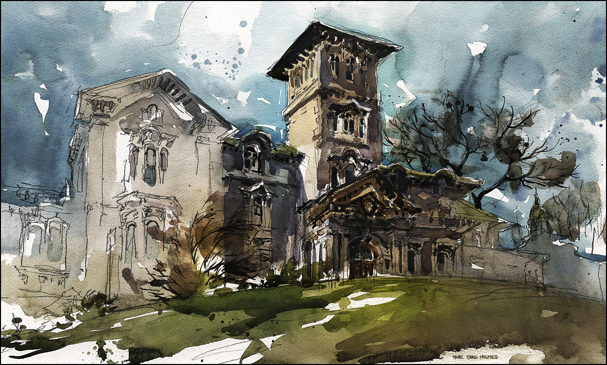
The last couple days I’ve been out painting Lady Meredith House, at the corner of Pins and Peel, in the heart of the Golden Mile.It’s well situated on a steep corner and has a fantastic roof line, studded with witches hats, tall slender chimneys and decorative brick work.

I pass this house frequently, and have always wanted to paint it, in fact, this is actually my third sketch at this location.
By that I mean, I just did three days in a row in the same spot.
Why? A little bit crazy I guess. I’m having some sort of perfectionist fit this week. Normally I’m quite free about sketching – whatever I get is fine. Some turn out, some don’t. It’s all part of the process.
But these days I’m feeling I have to up my game, as I’ll be painting live at the Urban Sketchers workshop in Santo Domingo this July, and at my own 3 day sketching event in Portland this August, (in partnership with fellow Montrealer Shari Blaukopf).

Normally I might have been happy with my first sketch. But this time, I couldn’t live with it. There are numerous flaws. First among them is dead, monochromatic color.
I used a single color (Burnt Sienna for the brick, and Payne’s Grey for the roof – and pretty much just layered them darker and darker each pass.
Yes, this is a dark building, so it doesn’t take reflected color the way a light colored structure will. But, still no excuse for drab earthy tints. My take away from the first failure was: use stronger colors and let them mix on the page! Never just add grey to make shadows – use a complimentary color to make a complex dark mix. And whatever you do – don’t be boring! Unified shadow shapes does not have to mean monochromatic passages.
Second major problem – the house is just plonked there, like it’s in the middle of a farmer’s field. I like a strong focus of interest, but simply leaving out the environment doesn’t work. The house just sits there like a lump.
It’s too big on the page, there’s no sense of space. It’s such a static, dull, leaden composition. It’s almost not a composition at all. I’m not too happy with all the fiddly (also monochromatic) bits of foliage either. It looks like a bed of lettuce under that turkey.

This is my second attempt. I addressed the boring composition – climbing up behind the wall of the Irving Ludmer Research facility (which I painted last year). This gives me an interesting design element in the foreground.
I did a better job planning the surrounding trees, and included a bit of environment (the lamp post, the house behind). Unfortunately however, I was so excited about this foreground I ended up jamming the house up against the top of the page.
As well, the bricks are still too monochromatic. It’s better, but still just variations of Burnt Sienna. I realize now this is the first time I’ve painted bricks – so this might be a natural learning curve :)
I could have said, okay,okay, I’m getting somewhere, onto the next thing. But – what can I say. The good weather lasted, so there I was on day three, doing it again.

In my third (success at last!) version I have the more dynamic composition, the more lively color – and I addressed two other things that were bugging me. More attention to the rule “Contrast of Shape” inside my brushstrokes – so there are some big sweeping marks in the trees and sky to contrast with the small details in the house – avoiding a tendency to make a lot of similar shaped strokes, and helping to focus the eye toward the detail at the center of interest.
I also realized I wanted to think about each plane of the house as having a different color and temperature. To break up those damnable bricks into shapes (planes), and better describe the complex structure. Every time a surface changes direction, it should change color and temperature.
It’s also interesting that the version I like the best is the least accurate drawing. What can I say? I find this an elegant fanciful building, so when I finally let go and drew it expressively (in this case, elongated and with pushed perspective) it really started to speak to me.
Sorry for the long post, I hope it’s helpful to some. I’ll leave you with a classic Fisherman’s Trophy Shot – the “yes, I really painted this on location”.
Short piece of coverage on Spacing Montreal
Just an interesting tidbit: Spacing Magazine, (a group organized around urban planning related topics) is doing a series of spotlights on Urban Sketching – starting with a few of my sketches of Montreal. Nice to get a little coverage from them. I hope to do a bit more with the Montreal group. I always enjoy their feature where they show two shots of street; present day next to a turn of the century photo.

Now why would I try that? Sketch: Sunrise at Niagara

[9×12″ canson block, shot on iPad, some digital contrast enhancement]
We’re in Niagara, it’s been rainy and overcast all day. But there was a small window of blue sky at sunrise. Normally this wouldn’t be something I’d attempt painting – but Laurel announced she was getting shots of sunrise – so I could come along, or – well actually I was coming along if I liked it or not :)
Besides it being six bloody o’clock, it was 2 degrees C and 143% humidity down by the falls. This is pretty challenging atmospheric conditions for watercolor. So – here’s what I got. Was a bit like painting on a stay-wet palette. I can’t paint moving water at the best of times. So I’m really posting this one for the curiosity value more than anything.

I didn’t want to carry a lot of stuff last weekend. It was raining, and I knew we’d be moving around from place to place. Here’s a shot of how I do my large format sketches on letter sized paper.
Everything is getting scanned for the blog anyway, so I don’t mind having to patch it together in photoshop. Often I’ll draw people or cars on separate sheets and add them to a drawing. I collage the sheets together using the layer mode ‘darken’. Often I’ll put a curves or levels adjustment layer over the top to eliminate any shadows from paper edges.

USK Montreal – report from Sketchcrawl #35

Just back from my first Sketchcrawl as part of Urban Sketchers Montreal! If you’re in Montreal, and looking for a sketching buddy – friend us up at facebook.com/UrbanSketchersMontreal.
We were a small but dedicated group today. Put in five hours of drawing, chit chatting and having lunch. Generally a congenial way to spend a rainy day.

First stop was the Centre d’histoire de Montréal. When it rains, it seems sketchers seek museums. This place is probably typical of smaller civic museums. The final resting place for a random assortment of 19th century ephemera.
The star of the permanent collection is a huge statue of Lord Admiral Nelson (freshly relieved of one arm). Back in 1805 some group of city elders felt it was a good idea to memorialize England’s naval hero, who’d so recently trounced the dastardly French.
This might have been a wee bit divisive at the time. But on the other hand, the French Canadians could take some solace in the fact they sniped him out of his shoes at the peak of his triumph. Took the wind out of *his* sails.
So, our particular Lord Admiral Nelson now oversees once high-tech portable sewing machines, beaver top-hats, worn leather shoes and various other examples of Montreal urban history. I’ve placed him above the view from the third floor of the museum.
We finished up at Concordia, in a small student lounge with a cool aerial view of St. James the Apostle church. Was a fun shot to draw, even though we had to sketch through the moiré pattern of a giant graphic pasted on the windows.
Was great hanging out with a few of Montreal’s Urban Sketchers. Hope to see a more locals out next time!
Watercolor Apocalypse at the Theatre Rialto
So there I was, sketching up in Outremont, at the Theatre Rialto on Parc. It’s a beautiful day, I’m thinking I’m just going to hang out and do a nice sketch. Little did I know I was heading into The Watercolor Apocalypse.

The story goes like this:
Wow, this is such a cool building, I really dig the repetition in the façade.
But it’s sort of a flat fronted thing, and I’m jammed up close to it, what can I do to make this more exciting?
I know! How about a really aggressive line drawing in ink – I won’t even worry about perspective, this will be really cool!
Oh wait – no ink in my bag. Oh well, no worries, I’ll just use Paynes Grey.
La, di, da, drawing away – really liking the expressive line, people stopping by to chat, moms pointing out the nice artist to kids.
Hmm…we have a wicked aggressive drawing now – what about a touch of color. Just a hint of the sandstone.
BABOOOMM! Explosion of pigment! Big blobs of semi-solid pigment ballooning color everywhere!!!! Kids fleeing, storm clouds gathering. People rush by with eyes averted.
Apparently, spackling on the watercolor is not like drawing in ink AT ALL.
Beads of sweat flying, try scrubbing out with stiff brush – nasty blue grey smearing everywhere, the nice drawing vanishes, and so does every bit of white on the page. All contrast is lost! My beautiful reserved whites!
AIEEE! Must try some opaque highlights to pull this back! Slashing now with the brush. Stabbing highlights onto the page. But what is this! Am I seeing things? The dabs of white gouache darkening before my eyes. Invaded from below by the insidious Paynes grey.
I am bested – driven from the field. There is nothing left but to wave the white flag of paper towel.
This thing gets a scrubbing like Cinderella doing the grout with a tooth brush. Thank goodness for real watercolor paper.
By accepting defeat and giving up, I accidentally do the right thing. I walk away disgusted, and let the soaked paper dry completely.
After that, I can touch in some gouache that doesn’t melt instantly this time, re-state the darks with real ink, and resort to some contrast correction in photoshop. And finally, stick it in the pile of paper that gets a life drawing on the back.
Achievement Unlocked: inked in flesh!

I was contacted the other day by a certain F.H., just to let me know he has immortalized my Samurai Armor sketch in his flesh. You have to see that as a compliment!
This has to be an important landmark in your artistic career. It’s not technically an absolute first for me. There are a few people out there wearing the Neverwinter Nights eye-mark that I designed back in 2000. But this is the first (that I know of) where someone has inked one of my drawings. And they chose one I like too – so very good! Thanks to F.H.! Both for choosing my sketch, and for sending me a snap of the ink.
I don’t know who did the tattooing – but they did a pretty accurate job. I’ve always wanted to design a tattoo for someone. If anyone wants to give over their body as a canvas – I do have some ideas. But I might need your entire surface area. Get in touch if you’re up for it!
St Patrick, patron saint of frozen artists
I went out yesterday, meaning to sketch from an indoor vantage point I’d seen a few months ago. Only to be stymied by routine security. Long story, perhaps I’ll get the shot another time, when the public is actually allowed in. Since I couldn’t get my chosen view, I hit the nearby streets.
I can tell you, April 05, 2012, here in Montreal – it is NOT WARM ENOUGH TO DRAW OUTSIDE!!!
In my giddy anticipation of drawing from a seventh floor window I wasn’t properly dressed for standing around for two hours on the street. I managed to do the sketch and put down a huge mottled Vandyke/Cerulean wash – then I had to hightail it for a nearby cafe.

I finished this up huddled over some bacon pizza. It was an accident. I was delirious from cold and ordered the first thing that caught my eye. Perhaps my shivering frame was demanding calories to burn. When they make bacon pizza here, they use the whole hog. I mean, there were five layers of laminated bacon in some places. Duly resurrected, I finished my sketch.
This is St. Patrick’s Basilica on 460 René-Lévesque. Built some 150 years ago, it would have been high above the city, on the outer edges of the Irish immigrant neighborhood. Today it’s right in the center of downtown. One day I’ll make it inside to see the pillars made of massive oak trees, and the combined fleur-de-lis and shamrock heraldry.

