Lipking Workshop
Just came back from a workshop with artist Jeremy Lipking. I went in with some theories of how he might work – but found it quite unlike my expectations!
I’ll try to sum up what I saw in the the three days of painting:
I found him very likable. He’s a very low key guy – down to earth, slightly sarcastic sense of humor. Not a huge talker – he covers the key points and will always answer questions – but most of the day is you painting alongside him – watching his work evolve.
You have to be ready to observe – he’s not big on verbalizing his process. But it’s not like there are many secrets to it (other than great judgment, earned over time). You can pretty much see what he’s doing – you just get a little crazy with envy attempting to do it yourself. It’s all skill and experience – no tricks.
He loves cool subdued neutrals and pale glowing fleshtones – but he paints with brilliant cadmium colors. No reliance on greys or mud mixes – just what I’d call a ‘fairly standard full spectrum’ selection.
Two each of; red, yel, blue, green (one warm, one cool of each), black, white, and two wildcards – transparent red oxide (kind of uber-burnt sienna, good for flesh), and one custom mix – a kind of pale chalky warm blue (used as a cooling tint).
He uses these colors to make a symphony of greys. Nothing is overly chromatic – there’s usualy more use of stronger color in the transitions between values, or inside shadows. (no black shadows at all).
(specific pigments: Titanim White, Cad Lemon, Cad Yellow, Cad Orange, Cad Red, Alizarin Crimson, Trans. Red Oxide, Ultramarine Blue, Cobolt Blue, Viridian Green, ‘Gold Green” (kind of a dark Sap Green I’d never heard of before) and Ivory Black (which I didnt see him use).
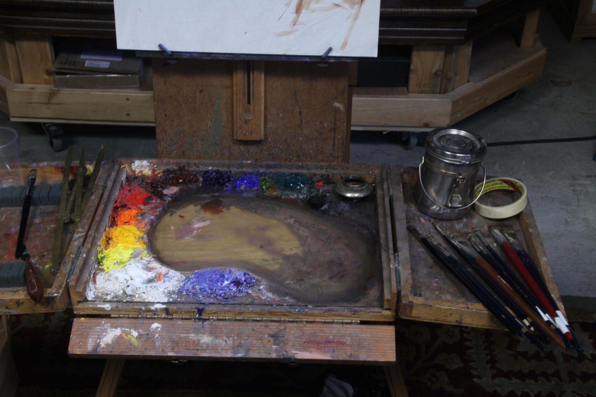
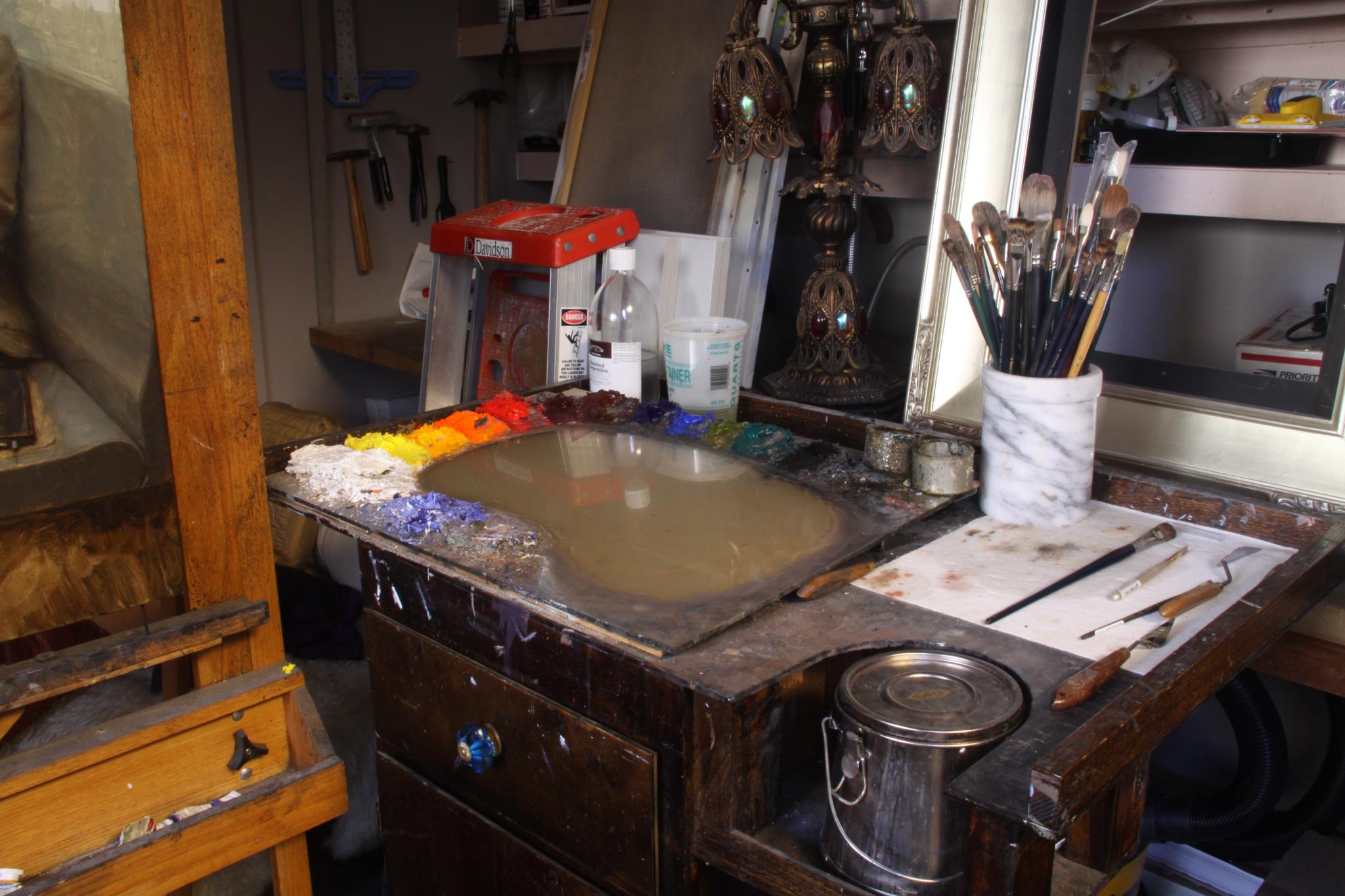
(Jeremy’s palette)
His paintings have elegant draftsmanship, but in fact he doesn’t start with an underdrawing. He just dots in the crown, the chin, the feet and the ‘furthest extents’ – (like, the elbow and the feet). So we’re talking five or six dashes, and that’s it!
These dashes are carefully measured – he took about a 20 min to do this stage. He says this is so he knows the figure is placed as he wants in on the canvas before he puts a week into the painting.
He’s measuring with the brush at arms length – a simplified sight-size method – measuring the head, and estimating everthing in ‘scaled head units’ on his canvas. So it’s ‘eyeball scaled sight size’ not a rigid academic approach.

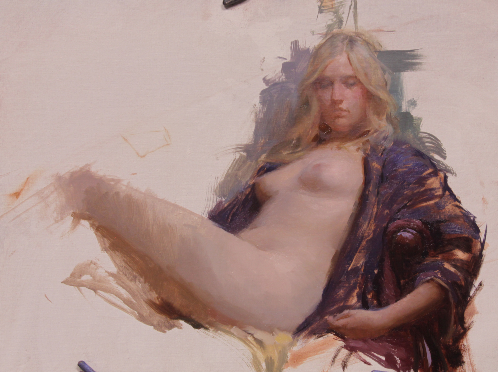
(Jeremy’s demo – day one)
His method seems to be based almost entirely on a sensitivity to color. He is able to see and immediately reproduce extremely narrow midtone values. He works methodically, from the figures face outward and down, finishing as he goes, apparently not needing to go back to correct. Each stroke is considered.
He seems to paint slowly, but the painting actually progresses quite quickly – since every stroke is the correct value! He won’t make more than a few strokes with loaded brush – alwasy mixing exactly what he means to place.
His work appears to be ‘realistic’ a first glance – but it’s in fact very idealized. He’s compressing the values he sees into a narrow mid-tone space. It’s a really calm, serene kind of rendition of what’s in front of him.
His demo painting seemed to be 20 or 30 percent darker than reality – as if we’re seeing the model in a dimly lit interior. He chooses to ignore a lot of cast shadow and specular highlights in favor of a clean soft silhouette. The best example is his preference to leave out the highlight on the tip of the nose. He seems to think it’s distracting – too ‘sharp’ a note.
He favors mongoose hair brushes. The top brand being Langnickle. They’re pretty awesome I must say – hold tons of paint, are very springy, but are suprisingly random. The hair feels ‘spikey’ – the stroke is kind of crosshatched or dry-brush feeling. Seems very well suited to a smoothly blended painting.
He will take a clean brush and blend back unwanted thick ridges on brushstrokes – but I dont think you’ll ever see him using a blender on the painting. I didn’t see one anywhere in the studio.
It think that’s about it. If you were thinking about taking his workshop – I’d go while you have the chance. In a few years he might get a lot more expensive!
(Jeremy’s demo – day two)
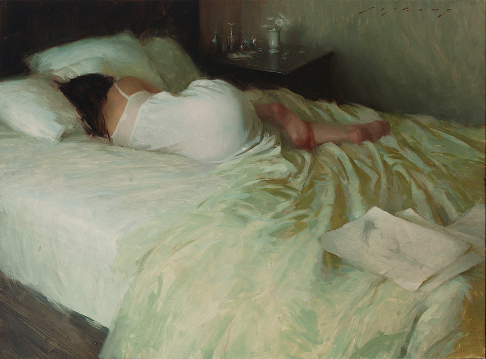
(my weaksauce version)
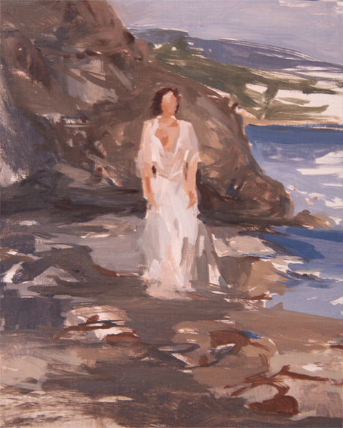
The third day was kind of the cool part of this trip. We esentially blew off the studio and went to the beach. You really can’t get a lot of painting done while chasing the light and running from waves, but it’s a beautiful way to spend a day in Malibu.
")
")
")
")
")
")
")
")
")
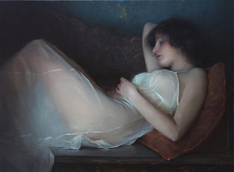
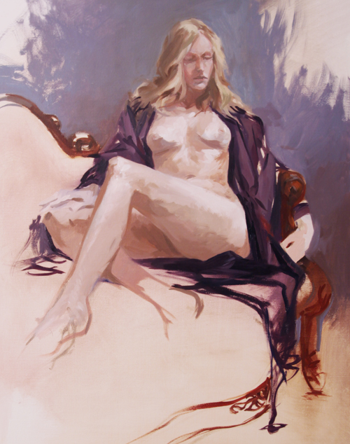
Model: Maude Bonanni, Photos: Laurel Holmes
At this point I have a long way to go to approach Jeremy’s work :)
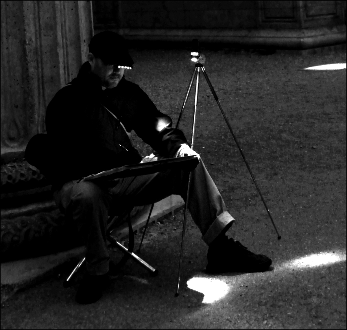
Night Sketching at the Palace of Fine Arts

Our drive home from the city takes us past the Palace of Fine Arts – which we’ve drawn many times during the day.
I’ve always wanted to come back after dark and draw the spotlights on the sculpture. I found a good view from the ‘far’ side (opposite the Exploratorium entrance) where the lighting makes a great light-on-dark-on-light counter changed silhouettes.
If you’re out here Friday nights you might meet a crazy group of skaters that descend on the place with a mobile sound system. (Link: The Midnight Rollers).

Here’s a snapshot of my new night drawing setup. An LED bike light taped to an ultralight tripod, and a fisherman’s ‘ball cap light’ clipped to my hat brim…makes drawing in places without streetlight a lot easier. Added bonus – it makes raccoon eyes glow green. A little creepy at first.
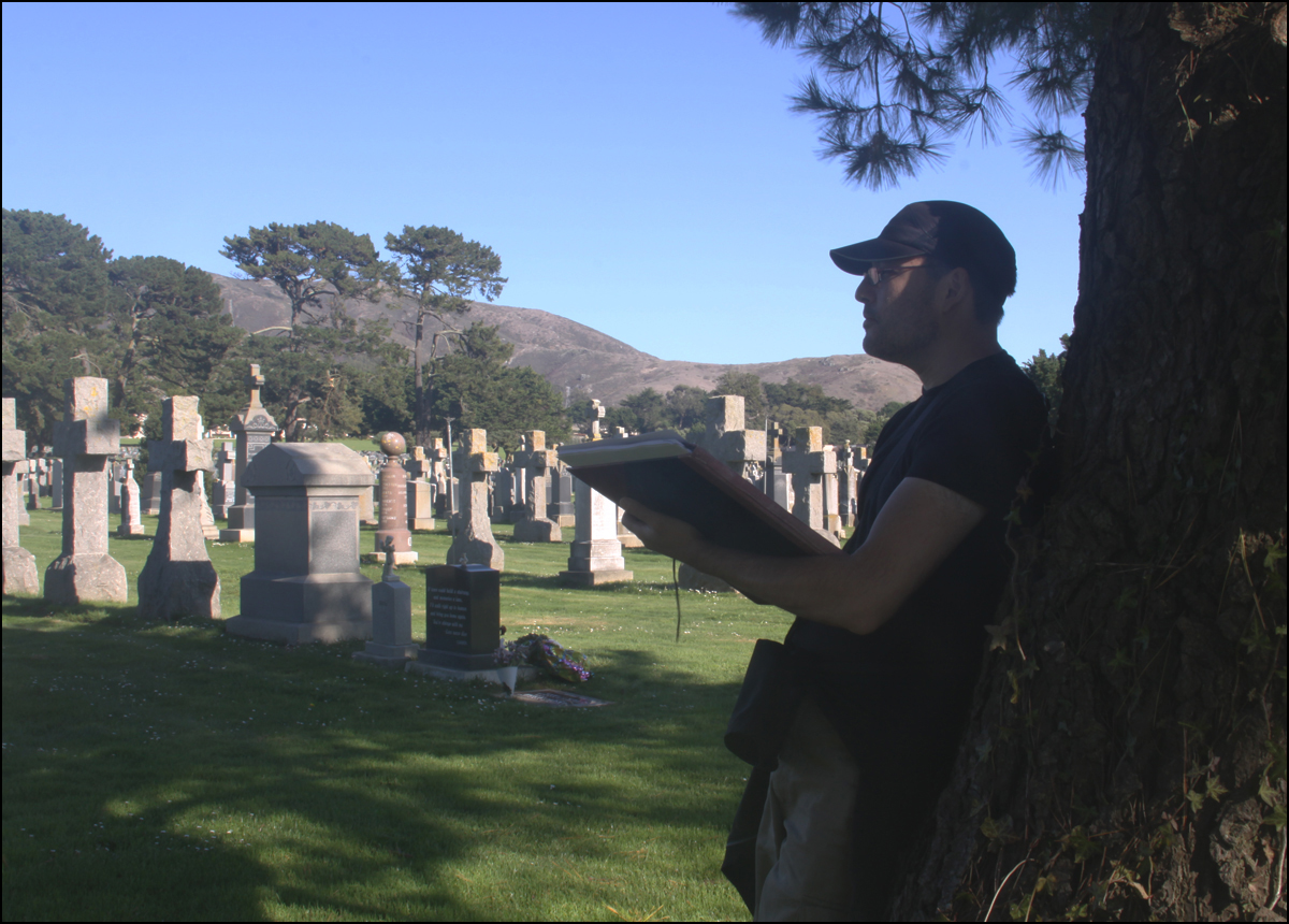
Halloween in Colma

Spent part of the Halloween weekend sketching with some friends. It seemed appropriate to visit the cemetery :)
There were a few people out taking a gothic stroll – but really, it was such a nice day – was hard to feel very spooky.
The Knives Come out Again
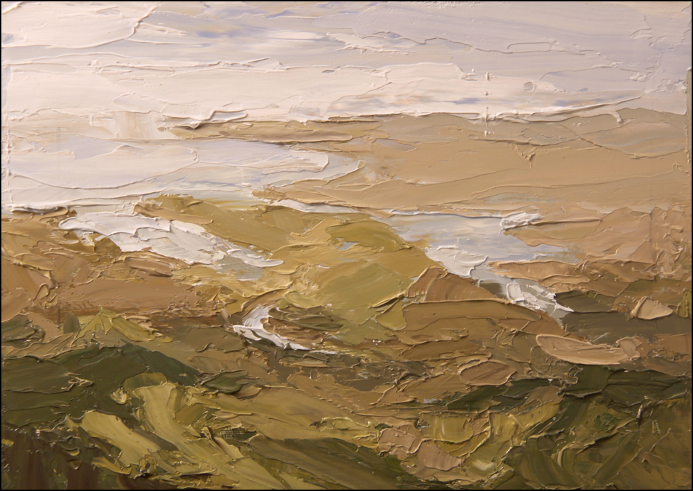
10 am – View from Mount Vision

2pm – View at Chimney Rock Trail

5:30 pm – McClure Beach
Just back from two more days painting at Point Reyes. Same as last session – 9×12 oil paint on panel, all knife work.
The thing I like about the palette knife – every stroke is clean color. No loaded brushes messing up your pigments. I can’t imagine cleaning my brushes between every stroke out in the field. You’d need solvent, and you’d end up making bags of waste paper towel. None of that is a problem with knives.
These sessions were either incredibly windy, doused in surf spray, or plagued with flies – so anything that gives you the color you want with less fuss is full of win.
I guess the bottom line is – I love the texture you get. I try not to get too artsy here on the blog – but I have to say, I’m mesmerized by the expressive marks! It’s like begin back in art school.
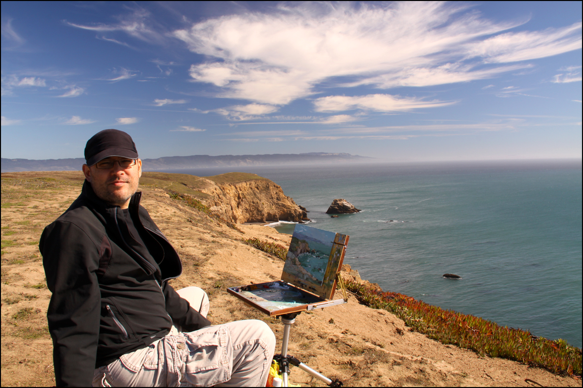

Painting with Knives

Sea Lion overlook, just next to Point Reyes lighthouse.

Trying out something different here. Painting on location, oils on panel – 8×10″, working entirely with palette knives. It’s probably not for everyone, but I enjoy the really juicy surface.

Up on Mount Tam, looking at SF. This one is became a bit too abstract, but you’re looking down at Tiburon and San Francisco from 2500 ft.

That’s one thing about this technique. You have to sacrifice any desire for minuscule detail, in exchange for pure color and luscious surface texture.
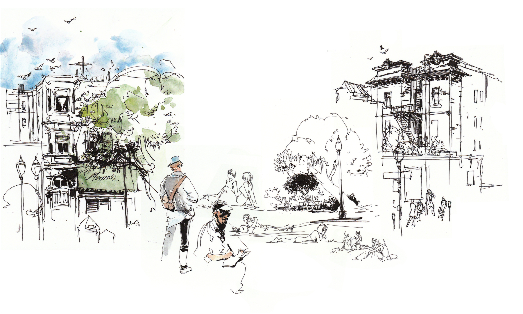
North Beach Sketchcrawl
Spent the day sketching at the North Beach Italian Festival. Topped it off with incredible pasta at Pomodoro on Columbus.
Orpheum Theater
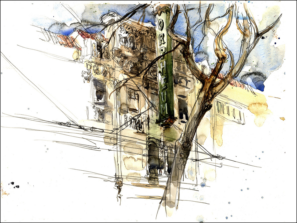
Just a quick street sketch of the Orpheum Theater on Market Street.
Light wasn’t great today, but I went at it anyway. Once you’re out there with your stuff, you might as well get to work. I notice my perspective is getting very strange lately. I’m doing a bunch of retro video game graphics at work, it must be affecting my eyes. I’m seeing in isometric perspective!
Sketching Samurai at the Asian Art Museum

Went down to the SF Asian to see the Art of Samurai show. I’m a big fan of the museum – but their exhibit space is so small! I always come away from the special exhibits wanting more. But that’s just greed I guess – the shows are always quality over quantity.
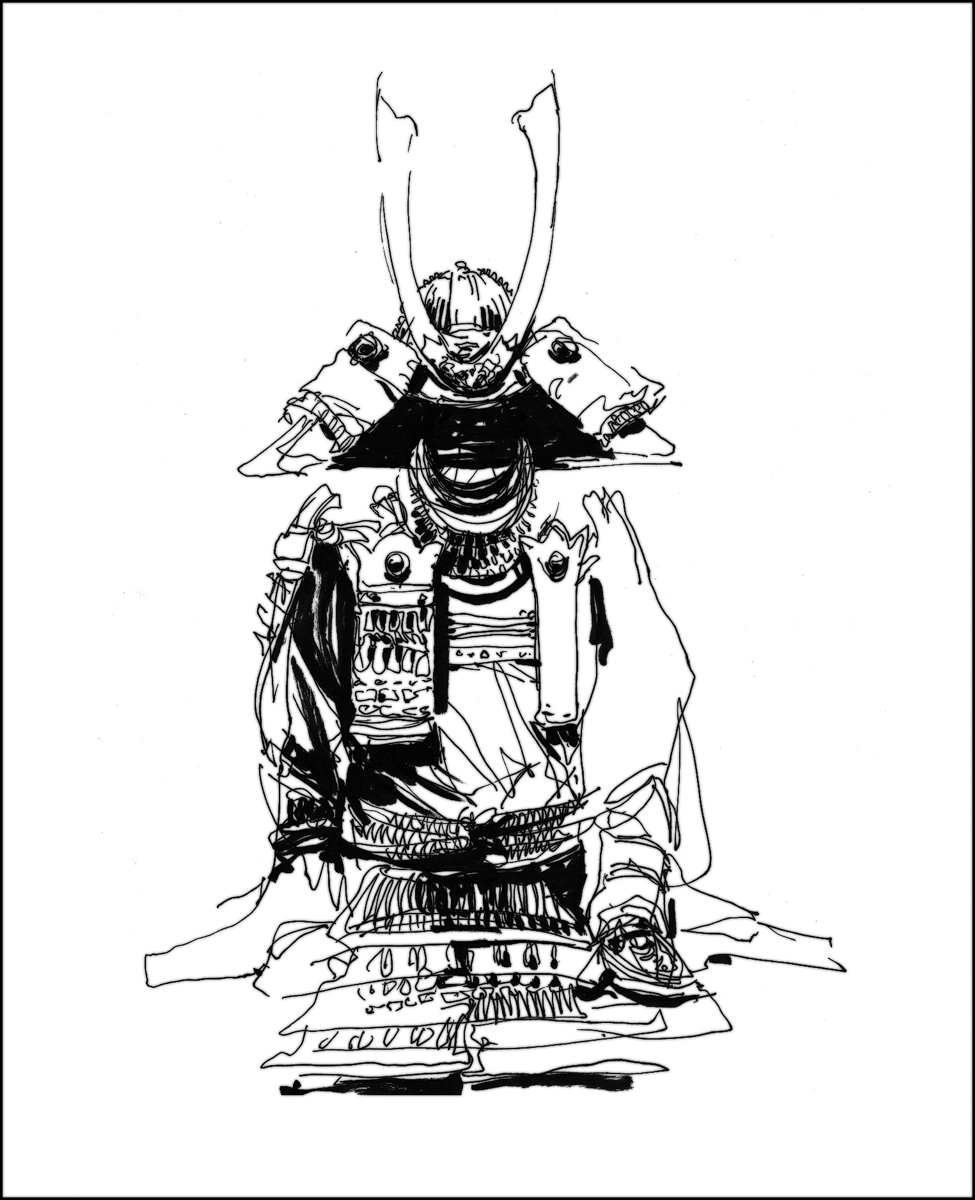

I love drawing this stuff – in fact, Japanese armor was one of the very first subjects I ever drew. It has that combination of gothic subject matter and intricate detail that I find very satisfying.

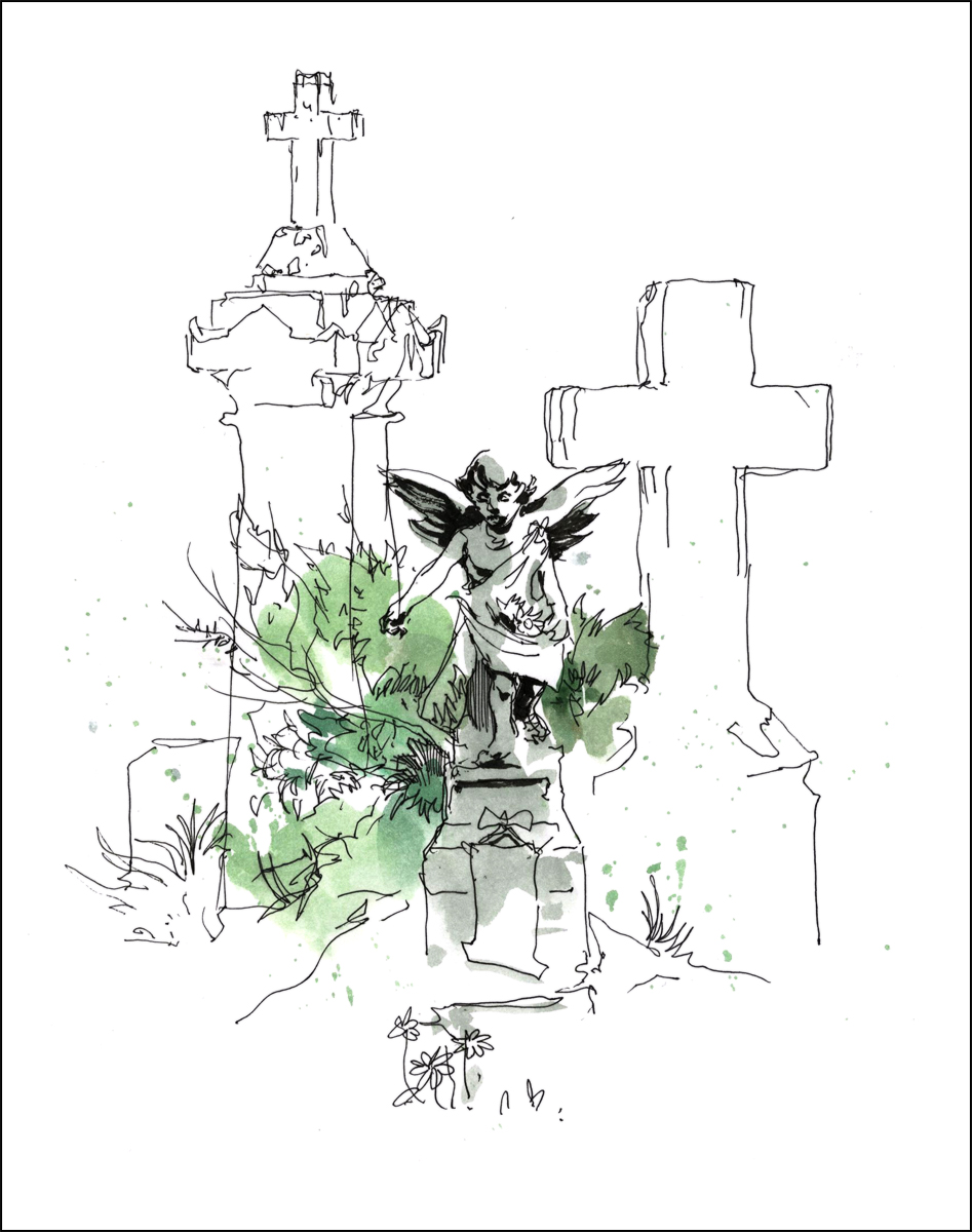
Sketching the Necropoils at Colma

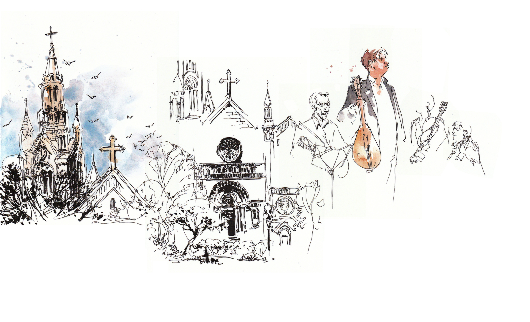
Last weekend we took a stroll through the vast necropolis at Colma CA.
In places you can turn and see rows and rows of monuments spreading out like a miniature city.
Wikipeda says: “With much of Colma’s land dedicated to cemeteries (17 for the interment of humans and one for pets), the dead population outnumber the living by thousands to one. This has led to it being called, “the city of the silent,” and also has given rise to a humorous motto among some residents: “It’s great to be alive in Colma!
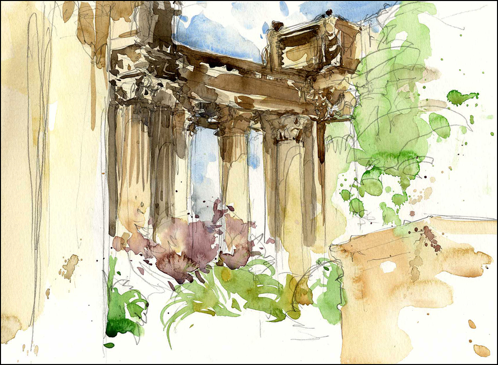
Sketchcrawl at the Palace of Fine Arts

This Saturday was World Wide Sketchcrawl at the Palace of Fine Arts.
I have mixed feelings about this monument to industry. It has a kind of artificial atmosphere – like walking through a huge (beautiful) stage set.
Though you have to be impressed with the sheer chutzpa of its’ life cycle. Originally built for the 1915 Panama-Pacific Expo, it was part of a 600 acre artificial city that dominated the Marina district for one year.
Architect Bernard Maybeck planned from the beginning that the structure would be allowed to fall into disrepair – he felt that every great city needed picturesque ruins.
I doubt California will be making that kind of symbolic gesture with public monies any time soon.
Subsequent generations have had to raise funds to restore Maybeck’s folly – preserving its idyllic ruined state. It’s main social function today seems be as a backdrop for wedding photos in the day time. and glow-in-the dark hula hooping videos at night.

On related note, I highly recommend Erik Larson’s book “The Devil in the White City“.
It’s an engaging history interweaving the break-neck public works project that was the 1893 Chicago World’s Fair, against the parallel true-life story of serial killer H.H.Holmes, one of America’s earliest recorded mass murderers.
The book isn’t about about San Francisco’s Palace – but story of the rise and fall of the White City must have been similar in scope.

