Workshop Scouting: Place D’Armes
I was down at Place d’Armes today, scouting for a good angle for my demo in August, and dry-running my ultra-small sketching kit for BCN. This is a little 5×8 S&B sketchbook. It’ll be great to get down here with a full watercolor kit!
There’s things to see in every direction – and plenty of small scale details if you wanted to sketch an ornate entrance, a fancy window frame, or one of the ornaments on the fountain – but the square does kind of orbit around the statue of Paul de Chomedey. I avoided Notre Dame Basilica (directly behind me) as there really wasn’t any directional light today so it just looks like a grey wall. I’ll see if I can pull off a good one of that someday. You really need to be there in some raking light. I’ll have to figure out the best time of day.
Mount Royal Park – too slow for Tam Tams
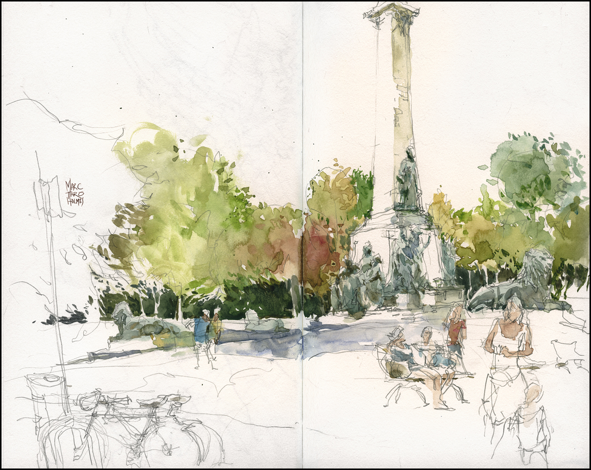
Just back from the USK:MTL outing to Mount Royal Park. I started with our Angel-on-a-stick (properly called the George-Étienne Cartier Monument) while waiting for the Tam Tams to get going. (Every weekend in Montreal they do a drum circle onomatopoeiclly named ‘the Tam Tams”). I’m thinking, this is cool – sketching with a sound track – I’ll enjoy this for a while. But by the time I get my act together to go sketch the musicians there’s a HUGE crowd gathered. No doubt it has something to with the pretty girls belly dancing. So – no way I can get a good view. After being rained out of at least two tries at sketching Tam Tams – I’m still going to have to back!
After lunch at the shiny new food trucks (Montreal has just allowed street food to be a thing) the group actually did a something very cool. Everyone agreed to do a test run of next week’s workshop exercises. I had a chance to see what people had trouble with, where I have some blind spots, things I might not have explained thoroughly. So that’s pretty awesome of everyone. Makes the upcoming workshop that much better. I’m impressed they were willing to give up half our sketching day to help out. Three cheers for USK:MTL! I’m just processing my own sketches from that. So I’ll post them later, along with a quick outline of the exercises in case anyone wants to try some drills at home.
Drawing People in Motion – in Barcelona
Next week we’ll be heading to Barcelona for the USK symposium. I’ve been busy planning my workshop on the subject of spontaneous drawings of people ‘in the wild’. That is, un-posed, un-official subjects, as opposed to posed models.
In many ways it’s more fun than going to life drawing class. It’s certainly more challenging to capture people in motion – plus we’ll be trying to tell a story at the same time.
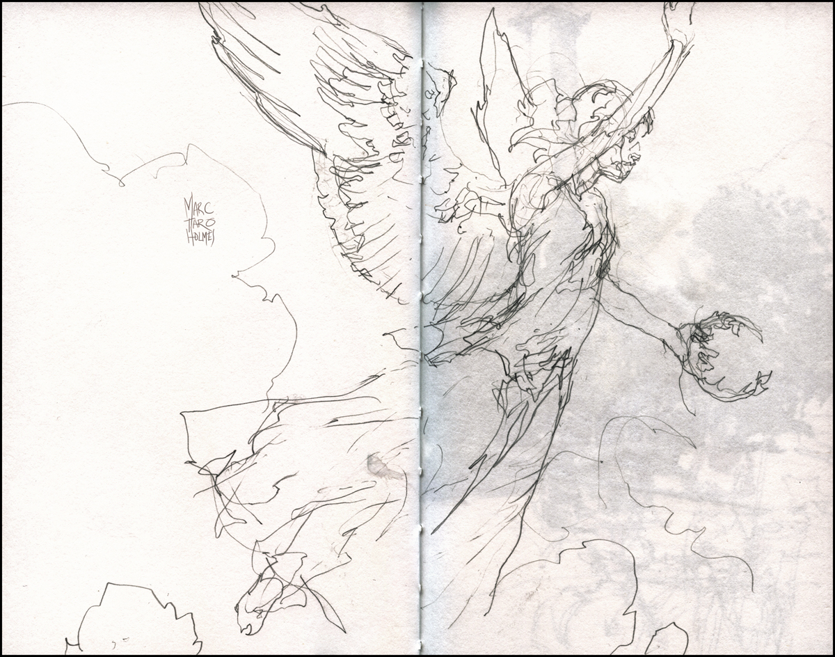
The ‘handouts’ are based on these sketches from the FIMA festival (Festival International Montréal en Arts) in Montreal. I was downtown working on a collaborative mural with a bunch of artists from EnMasse and Trio Magnus, among others.


So – just like last year, I’m posting my course notes – in case anyone who can’t make it to BCN is interested. This year I did it up as a PDF that illustrates the sketchbooking process. It views well on an iPad in iBooks – or of course on any PC in Adobe Acrobat (or most web browsers for that matter). Head on over to my new ‘Downloads’ page to get your copy HERE:

There is also a companion video – done at home using sketches from a USK:MTL sketchcrawl in our underground Metro. This was way back in early spring – that’s why everyone is wearing toques and scarves. It’s five minutes of me sketching under the video camera. Seems like the best way to show exactly what we’ll be doing in the workshop.
~m
Worlds shortest trip to the Met


Just back from the Sargent watercolor show in Brooklyn. I’m processing some notes about that extravaganza. In the meantime, here’s page from some other museum we stumbled into.
In Flight Sketching
I see a lot of sketchers doing the old ‘seat backs and sleeping passenger’ sketch after a long flight. Somehow I’ve never done one of those. I did have a few jpgs of Nerdrum paintings on the iPad – so I did a little in-flight study.
A first fling with Strathmore’s Aquarius 2
A while back my friend Ray Murphy showed us his custom sketchpads made from Strathmore Aquarius 2. He had the fervor of the converted – extolling the magical convenience of this synthetic material. It’s main claim to fame – it always stays flat. I was intrigued at the idea of a watercolor paper that doesn’t require preparation. So – I’ve ordered up 10 sheets, and this is my first test flight.

Strathmore says:
500 Series Aquarius II® Watercolor Weight: 80 lb. (22″ x 30″ x 500 sheets) 170 g/m2 Surface: Cold Press
This unique light weight sheet is made with a blend of cotton and synthetic fibers. This fiber combination allows this sheet to resist buckling and the need for stretching when applying light to medium wash. The lightly textured cold press surface is excellent when combining drawing media with watercolor and for fine detail work.
I say:
Paper Texture: Alien Skin
Most of my work is on cold press (textured) paper. You get used to the knobbly surface giving you a texture when you dry-bush or feather. But I’ve done my share on smooooooth hot press – and that can be very nice too – particularly how the water puddles around and makes lots of wrinkly back-wash.
Aquarius 2 is neither.
The Aquarius sheet (I will drop the 2 henceforward) is like the skin of an alien.
It’s very very very slightly textured – gives the impression of having thousands of tiny pores. There is even an odd matte look to the dried painting – where these pores present as an even dusting of speckles.
This is a classic case of ‘different’ not ‘better’. It’s something out of left field that will either bother you (because it’s not like what you know), or present a new opportunity, if you’re open to it.

Paper Weight: Tissue of Titanium
80lb paper in a big sheet feels awfully thin. It’s like a large sheet of trace. It feels delicate, but with the magic of science, it’s actually quite tough. You can scrub considerably harder than should be possible, without fear of shredding the paper. (Though, oddly masking tape does lift small ‘fuzzy’ tears in the surface).
I can’t help but think that a collector would feel ‘cheapened’ to hold the painting – as compared to the medieval parchment feeling of traditional 140lb, or the sexy sexy heft of 300lb~! (If only I dared to paint on precious 300). So if you’re presenting the work, might want to have it framed in advance.
Washes: Where does it put the stuff?
I’m having a hard time articulating. The feel of pigment going down on Aquarius will throw you off at first. Somehow it can take massive amounts of water, without feeling like anything is happening. It doesn’t get glossy, it doesn’t get rippled (much). It’s like the worlds thinnest sponge.
Water just keeps going in.
The paint won’t bloom out of the stroke unless the levies break. You need a total flood to make a wet-in-wet effect. You can do it – but it takes quite an effort. You’ll need a very large brush that holds a lot of water. Probably even pouring water might help.
But at the same time, somehow most marks on the paper are quite crisp. Touches of pigment don’t travel very far. They don’t float on the surface and bloom, and they certainly don’t ‘creep’. Paint basically stays where you put it. Aquarius acts very prim and proper. It’s calm, it’s predictable. I think if you have a tight, illustrative style – you might fall in love with Aquarius.
I’ve decided, me, I don’t like that aspect. You might not mind, if you want your paintings to be respectful of you. I like an unruly painting that does what it wants. Floating around, blooming like kudzu. Doing all kinds of stuff when I’m not watching.
It is however, 100% true that this paper does not wrinkle. You could absolutely paint on it without stretching. That part is super attractive. In that way, it’s perfect for plein air. I could bring one slim panel, and use binder clips to mount sheets on the fly. Probably I’d carry the paper in a tube – I doubt it would keep the curl. I get the feeling there is a huge amount of potential for doing large work in a place I’d normally decline to drag heavy pre-stretched boards.
But I can’t say it’s convinced me to switch from Arches or Canson for day-to-day use.
Now – if they came out with a rough surface – that, I would really love to try.
But – I’m going to keep working with it, and give you something more than first impressions. I honestly think once I get the intuition for the water/pigment balance – things will improve. And that no-stretching aspect will always be tempting me.
London in fast forward
Just back from London – was invited across for the weekend to demo at an entertainment industry workshop. Ended up running the life drawing sessions while other artists did live digital painting demos. Was amusing to be working on paper in a room full of computers and projectors. I suppose I enjoy being contrary.

We were all doing our best to be available for critique of portfolios and talk about games and film art as a career – plus of course plenty of pubbing with an array of inspiring artists – so I was only able to steal a couple hours for a race across London with my sketchbook. A little sketch-crawl from Southwark to Waterloo.


Apologies to the USK’ers in London – I had so little notice that I’d be invited for the event, then so little time while there – I didn’t make the effort I should have to meet up and go drawing. I hope to be back soon for a real sketching trip!
Compostion: The Gradient of Interest
I’m starting to think about upcoming workshops – warming up for teaching this summer – so I wanted to refresh my memory on how I actually paint.
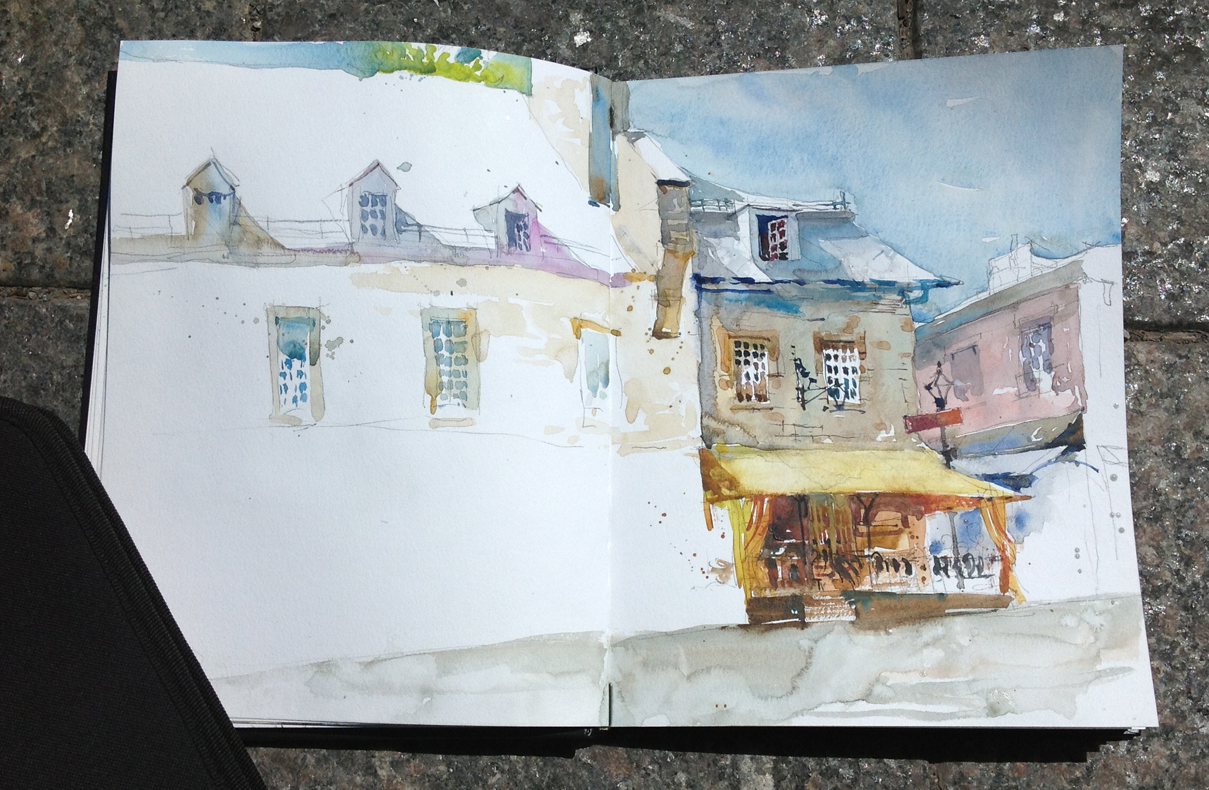
Whenever I’m trying to consciously think about painting, I take progress snapshots. Maybe some of you want to try this yourself? Just phone pics of the work is fine. Shoot a snapshot whenever you take a break. It helps to go back later and see what you were thinking. Allows you to install the steps in your memory, so you’re just a little more likely to be organized the next time. And it can help you find the point when you over-work something.
Looking back, I thought this page from the other week was a good example in a few ways.
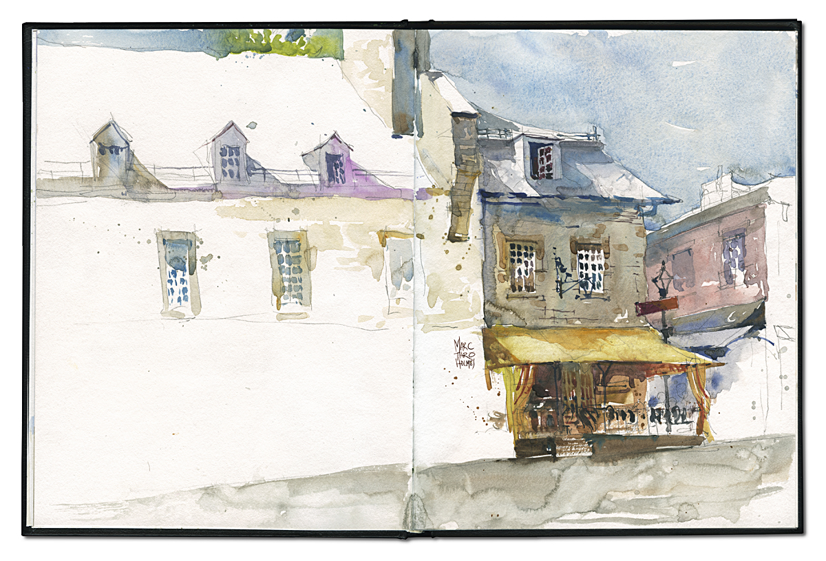
Here’s what I was actually looking at.

Kind of a good example what they mean by ‘simplification’ hey? They keep telling you to do that – simplify. But what does it really mean? Creating Focus. Leaving out whatever is in the way of that single thing that drew your eye.
Clearly, I don’t want the truck in my sketch :) that’s easy. But also I see immediately that the yellow awning and cafe below it is the interesting part of this view. Not the people setting up their booth. Not the larger building, but the smaller one.
So even in the drawing, you can see the focus being created with composition. Leaving out most of the blue building, but using it to be a big directional arrow pointing to the subject. Clustering all the detail – all the little active shapes – under the awning. Leaving out distractions – even tho’ I love lamp-posts and foreground trees! It was hard to force myself to leave that stuff out.
I like to say to students – “spend half the time on the drawing and half on the paint”. People never want to do that. They want to get right to the color! But if you delay your gratification, you’ll be much happier. See how the shadow shapes in the roof-line are sketched in the drawing? The design is solved before I go to color. It’s great to be able to put aside the design thinking – so when you’re painting, you can just paint. The work is done, so you can play with the color.
So, this is the first pass – the wet-in-wet wash. This is what they mean, ‘work larger to smaller’. Only the big blocks of color. This also is when you let the watercolor mingle naturally. This is why you’re not oil painting. Watercolor should be allowed to do it’s magic thing. Take advantage of the physics of water.

Then finally, after an hour or more of delaying gratification – you get to draw the details! Maybe it’s just me – but it’s the detail that I love. I really want to just start noodling immediately with tiny tiny shapes. But if you do that, you’ll lose the ‘life’ – the freshness that make a sketch appealing.
These smaller shadows, and dark darks are when I start painting wet-on-dry – so I can get a sharp edge when I want it. (Window panes!) And I’m using less water, more paint, so my shadows have solidity.
The eye loves three things – contrast, chroma (intense color) and detail. If they are not kept in the same place – the eye will wander – seeking information and entertainment. A tight composition keeps the darkest darks, the smallest details, and the brightens colors in the same place. The focal point.
See how each window gets progressively more interesting as you work left to right, then down to the bright awning, until suddenly you’re walking into a nice cafe! Looks like a great place for lunch :)
I like to call this the “Gradient of Interest”. All the elements working together to lead the eye.
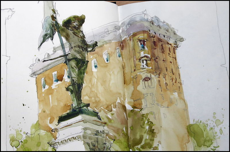
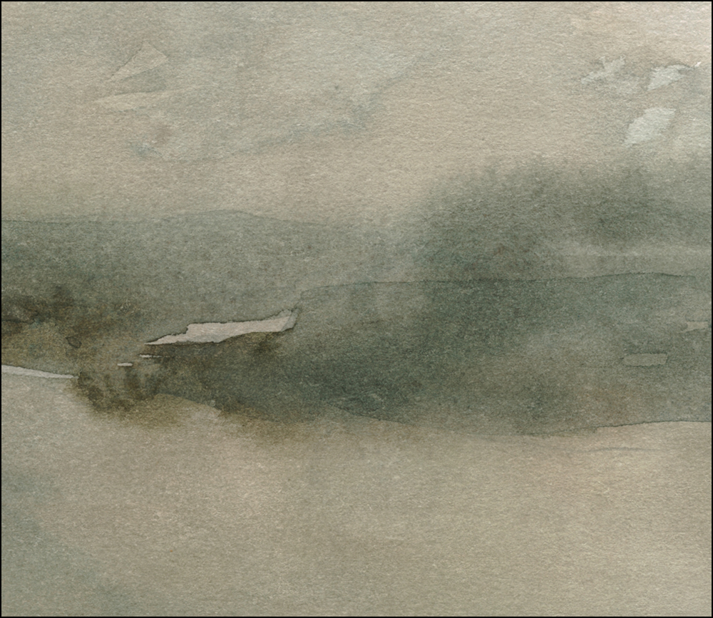
Solo Sketchcrawl, Old Montreal
Just completed a big freelance project – drawing on the computer for seven straight weeks. As a reward to myself, (and as a field test for my Sketching-in-Barcelona hot weather gear) I took the entire day off to enjoy Tuesday’s 26 degrees. I can report – Sun Sleeves by Pearl Izumi really work. And I’m remembering how to paint in direct sunlight.

Its amazing how we went from watercolor-will-not-dry to watercolor-dries-instantly in only a week. I’m not in any way complaining. It’s awesome that plein air season is here! These are all in and around the Old Port of Montreal. (Place d’Youville, Place des Armes, Place Jacques-Cartier). All places we might visit in our August workshop.

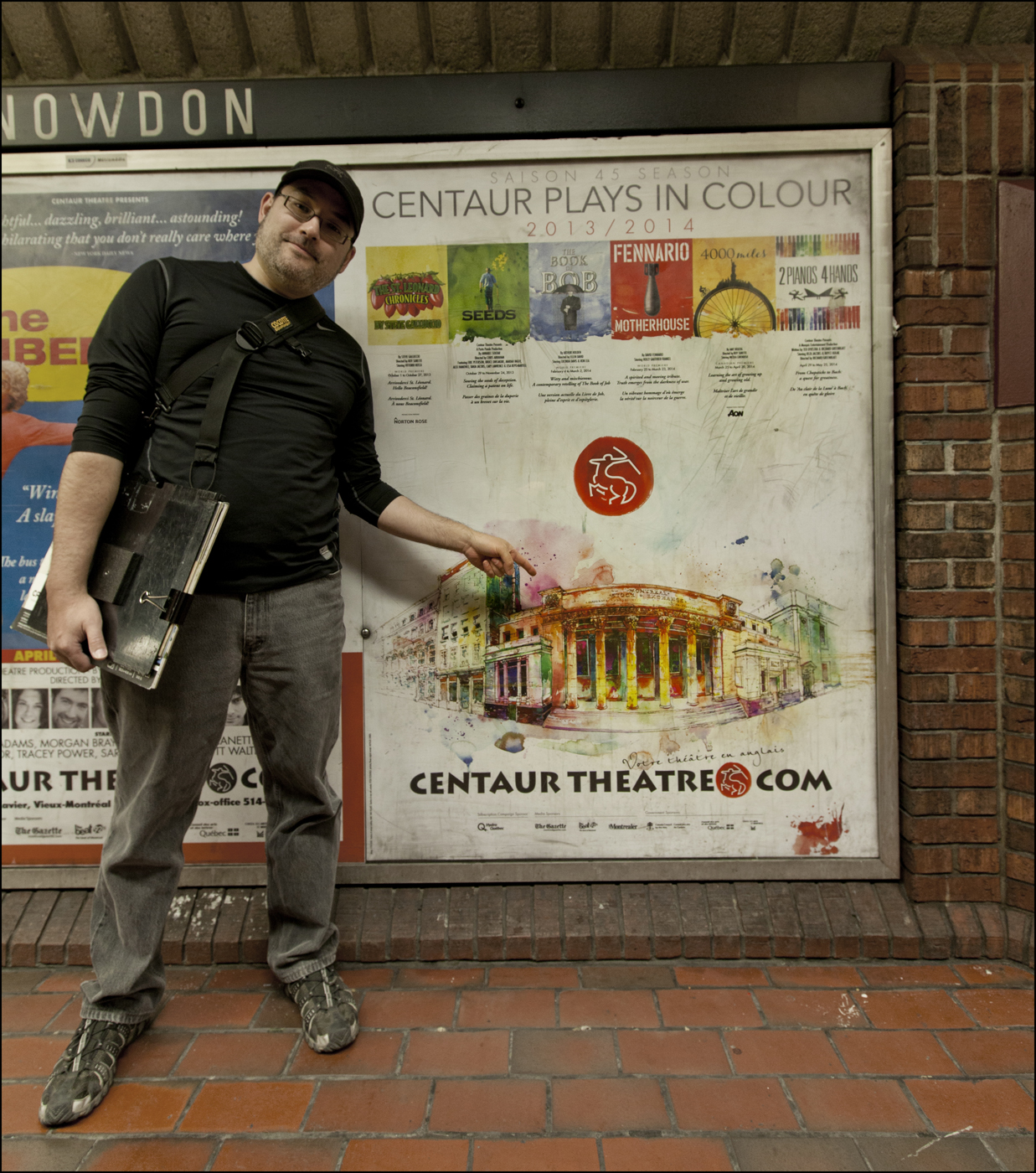
Oh hey! My painting in the Metro :)