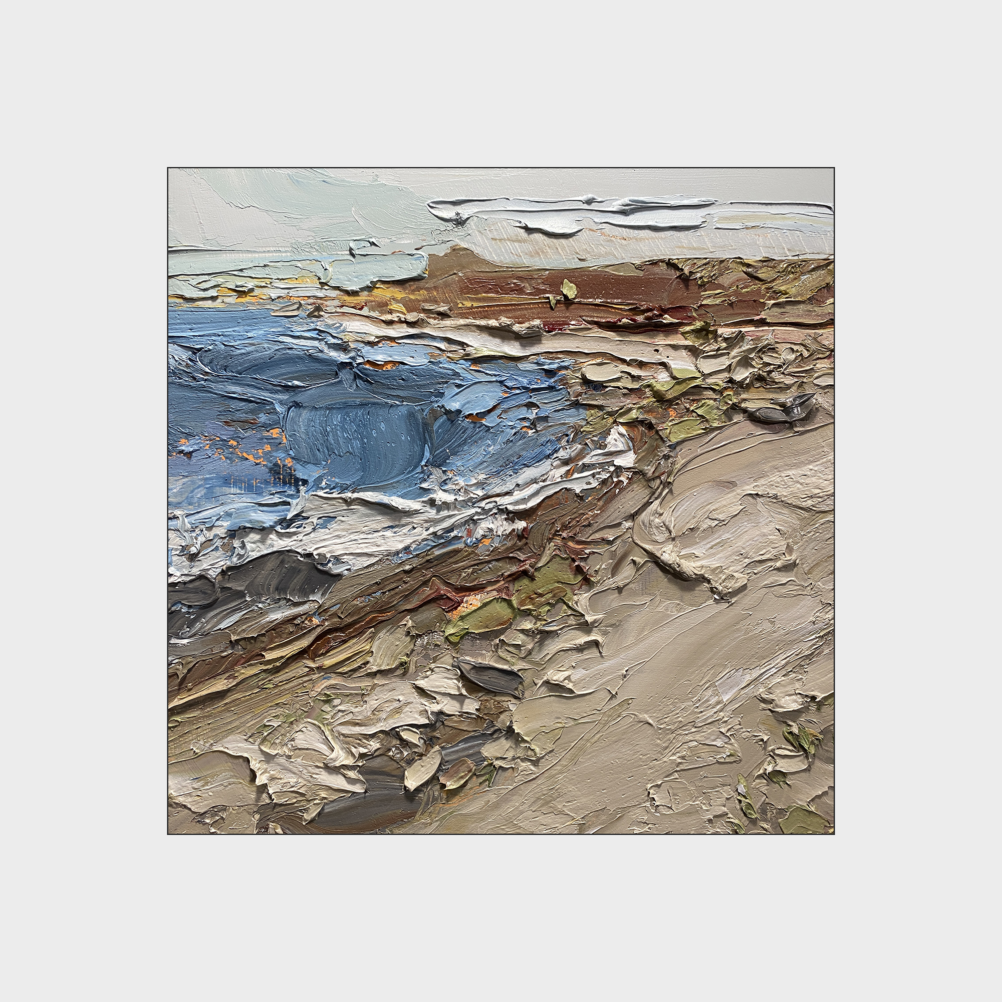
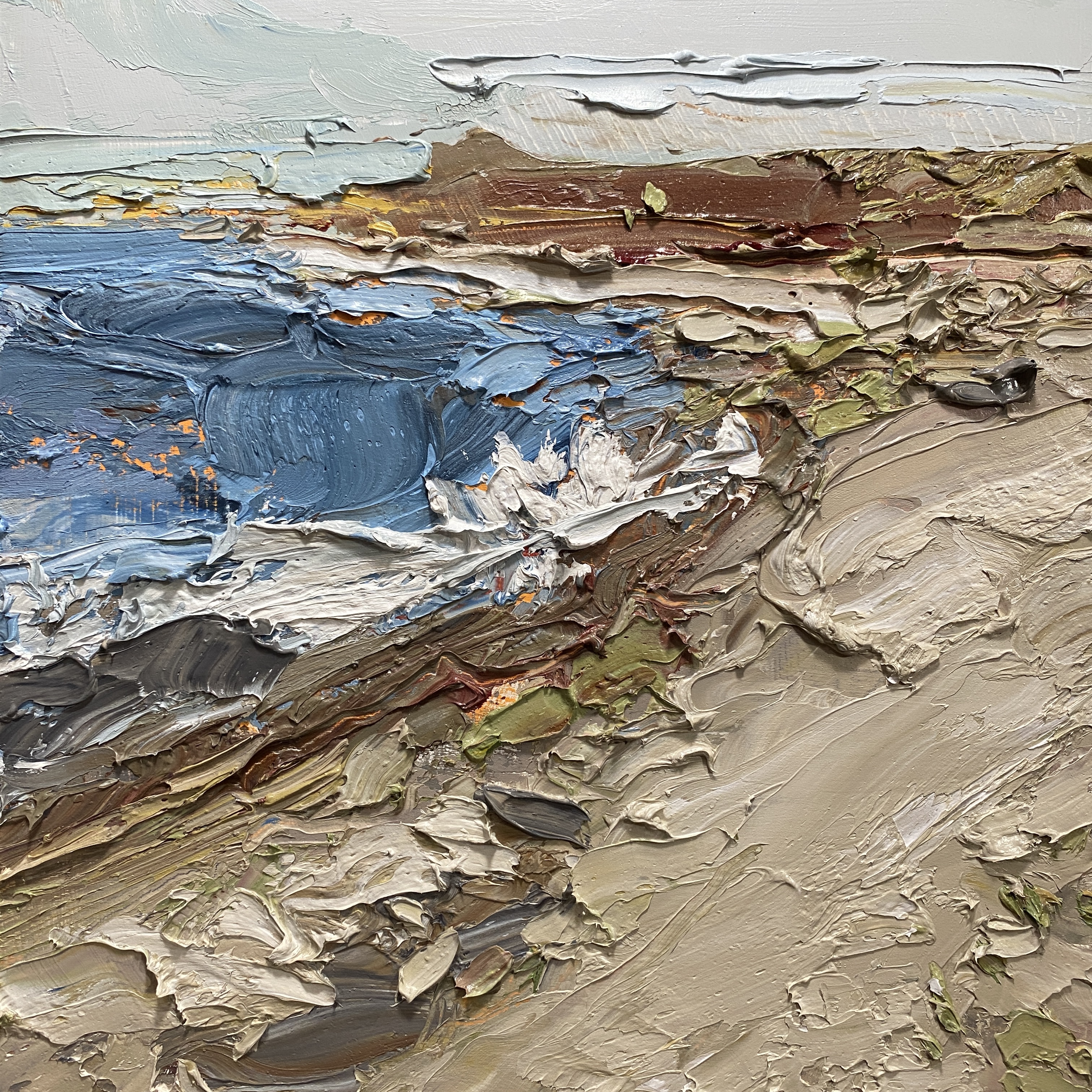
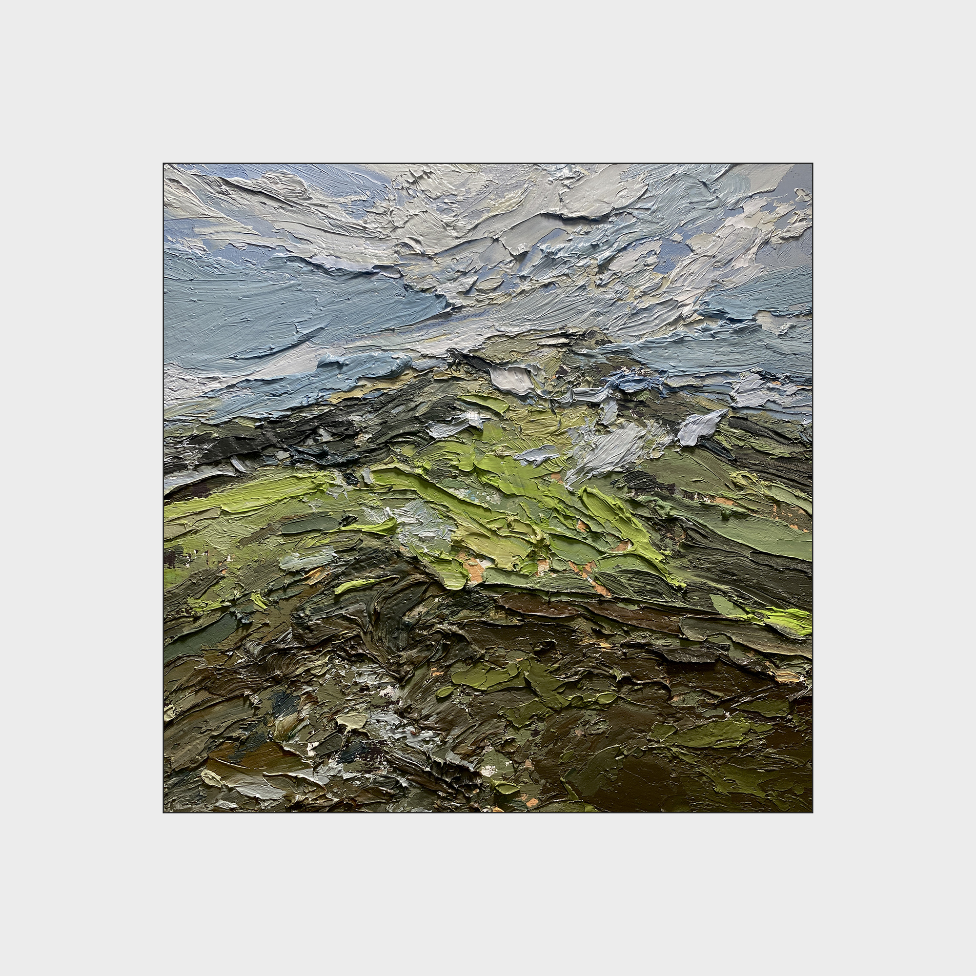
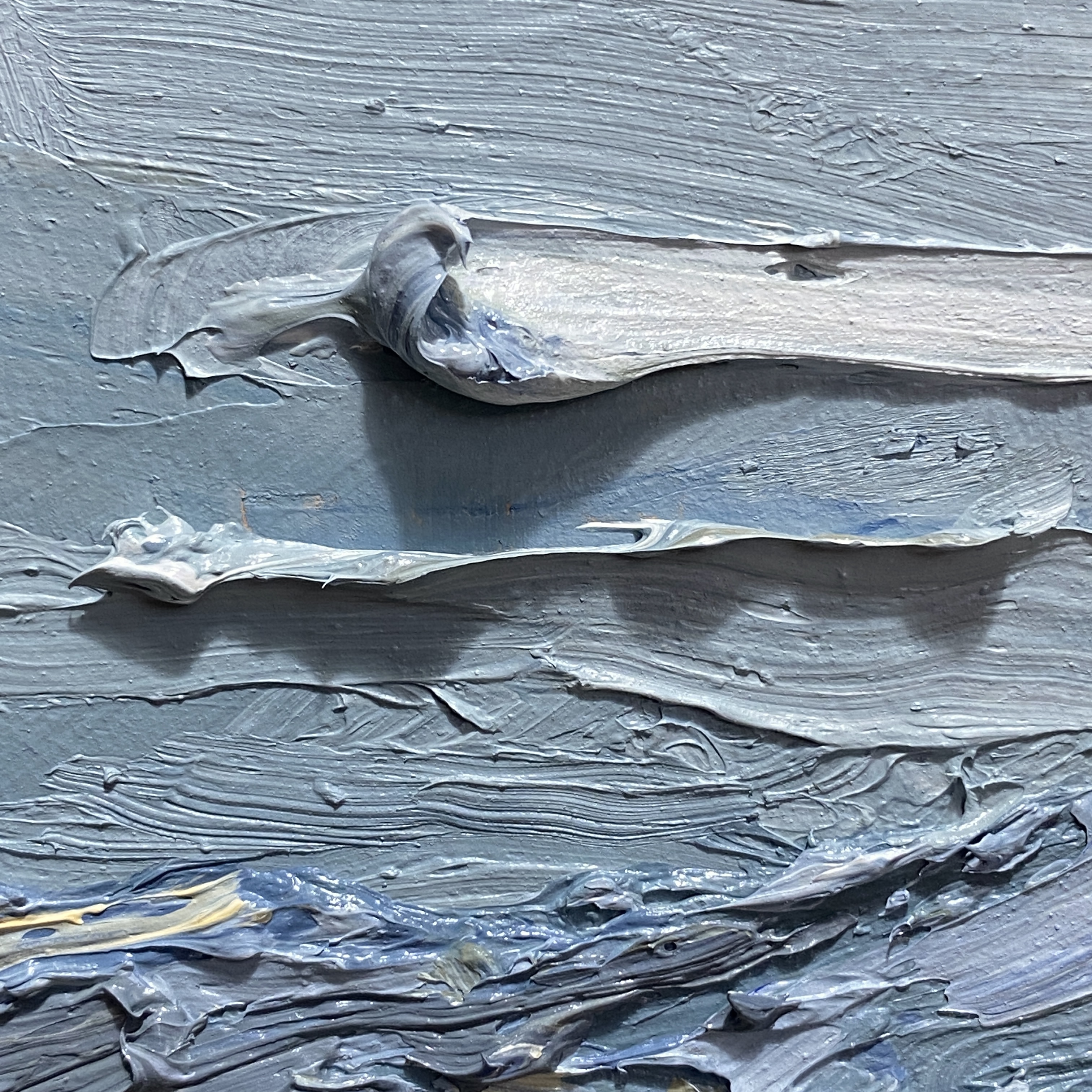
2024 #30×30 Day 14 : Redux

This is another example of deleting a painting.
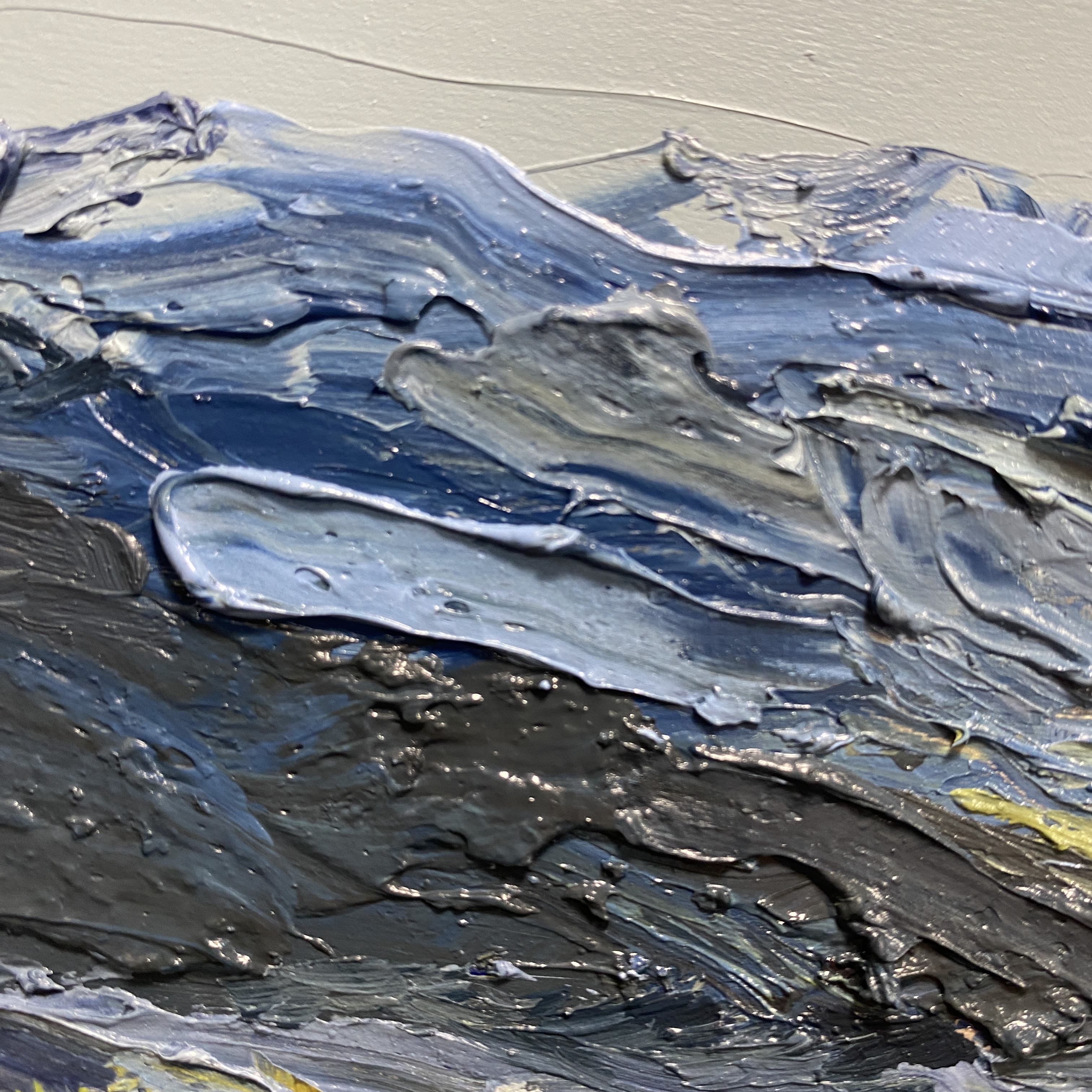
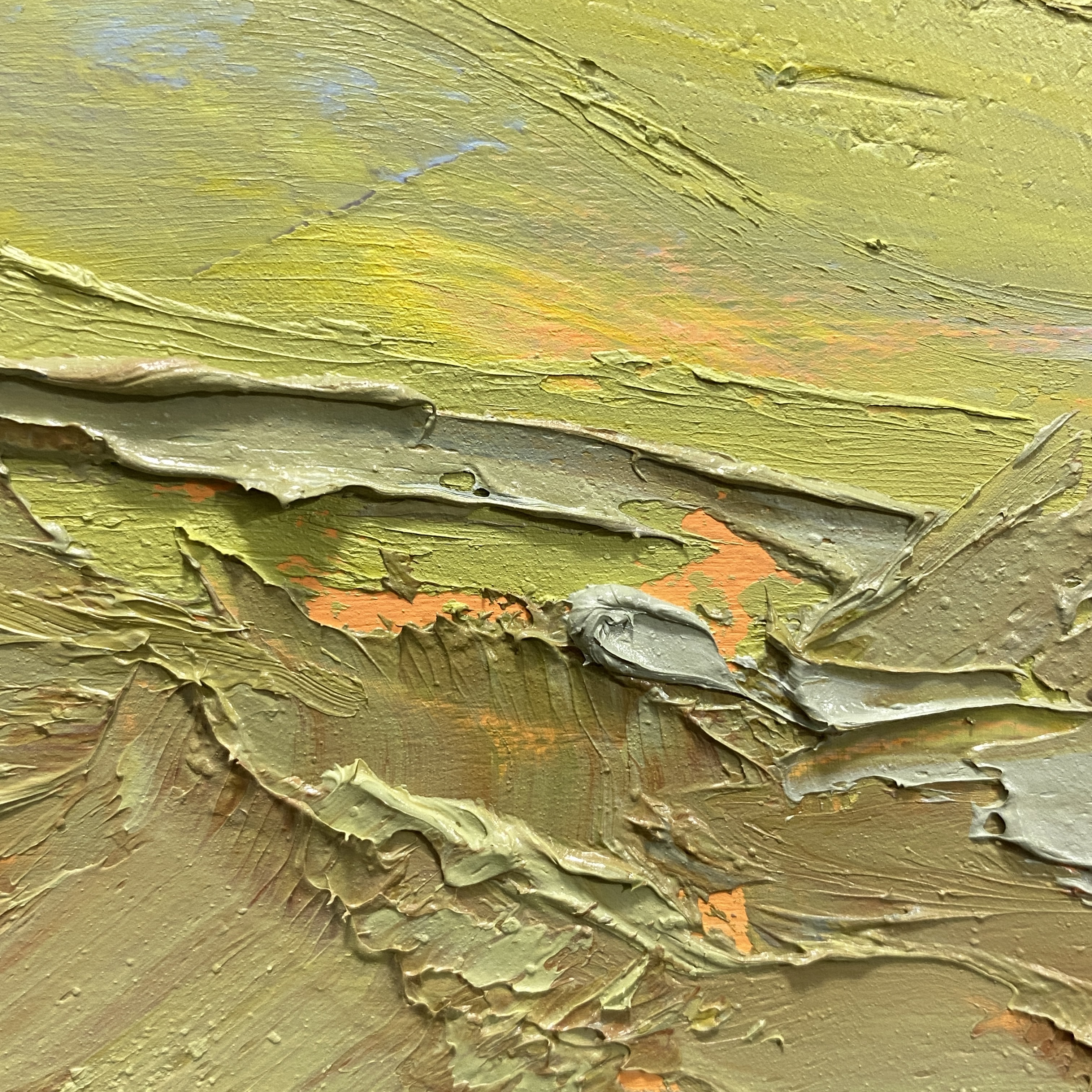
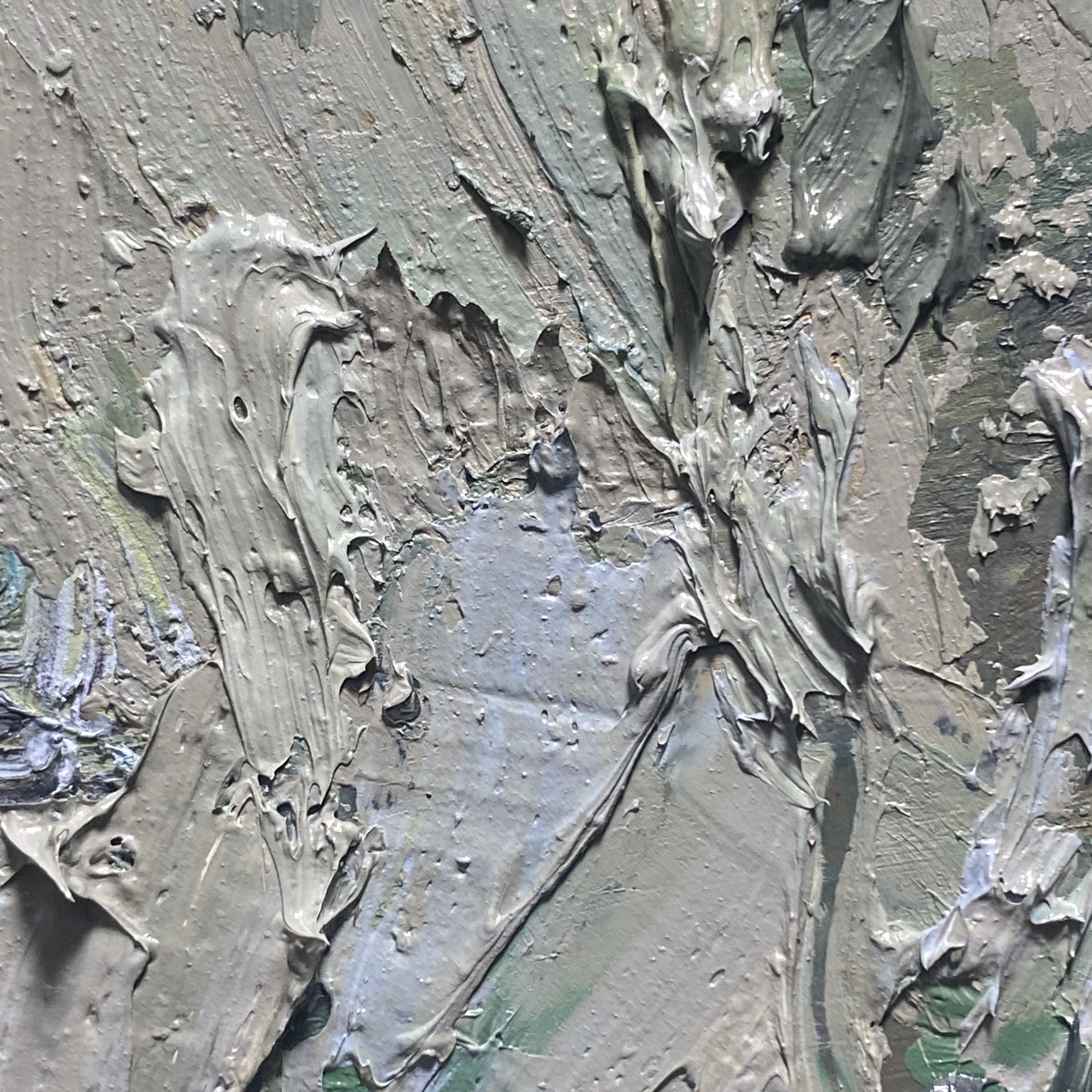
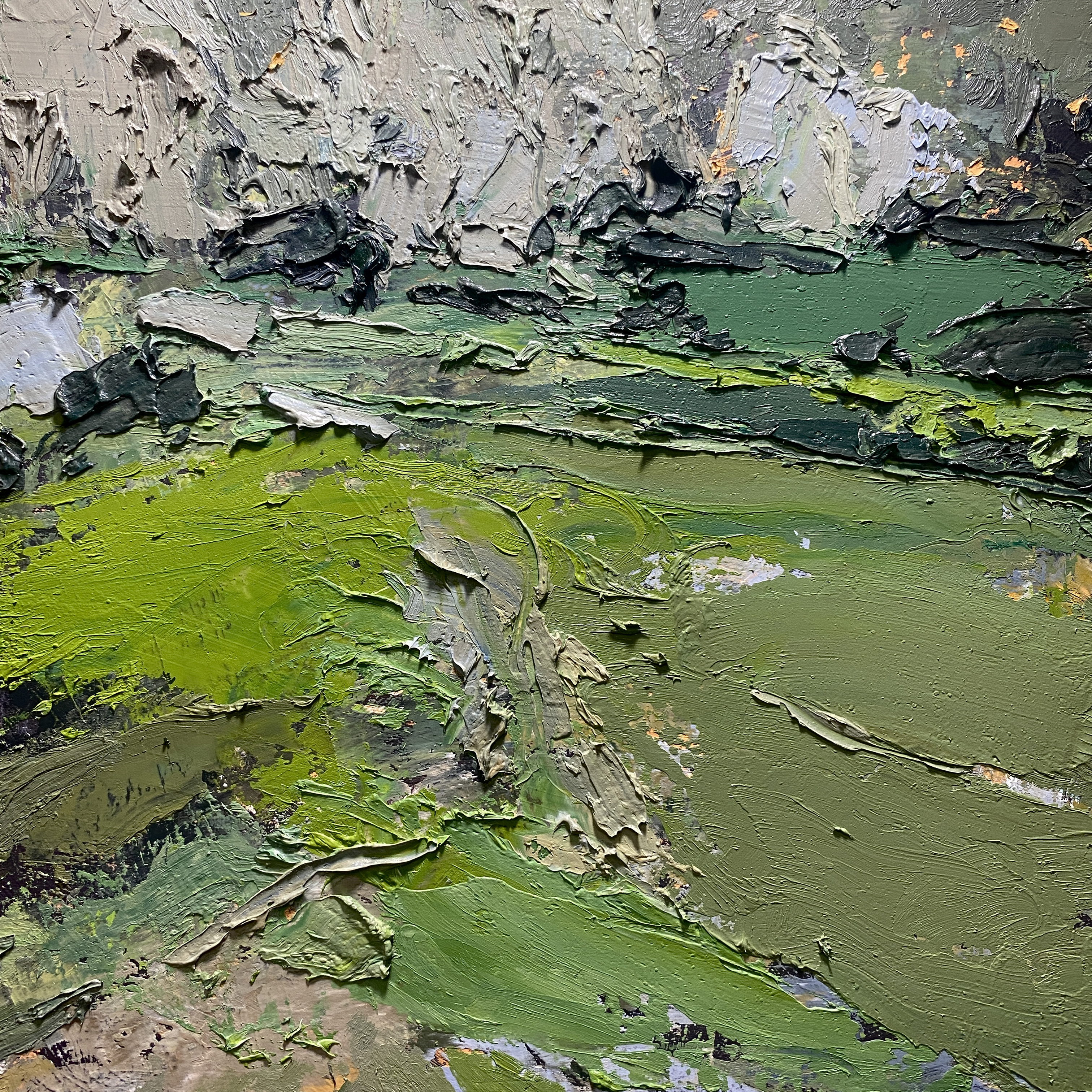
After finishing the one on the left, it felt a little chaotic. The impasto wasn’t working for me. It’s just instinct really, but I want the raised elements to cast shadows that help the drawing. Direction and placement of the ridges does actually matter, even though they might seem ‘random’ at first glance.
Because I decided to delete it the same day, it was simplicity itself to scrape off completely. The paint is still fresh, and I can collect each major color into its own pile for reuse. Some of the muddier mixes get saved off to the side, and I used them to neutralize other things, in the same way I’d use Neutral Grey in watercolor.
It may not have been necessary to completely sacrifice the first painting, but I’m much happier with the cleanliness of this revised version.

The second version is painted directly on top of the first scraped panel, so there is less of the under-painted orange, which I think is fine. It was a bit overdone before. Here it mainly shows in scraped lines, which I draw with the tip of a rounded, blunt palette knife. (Which I clean after every mark! Palette knives are great; so easy to keep clean :)


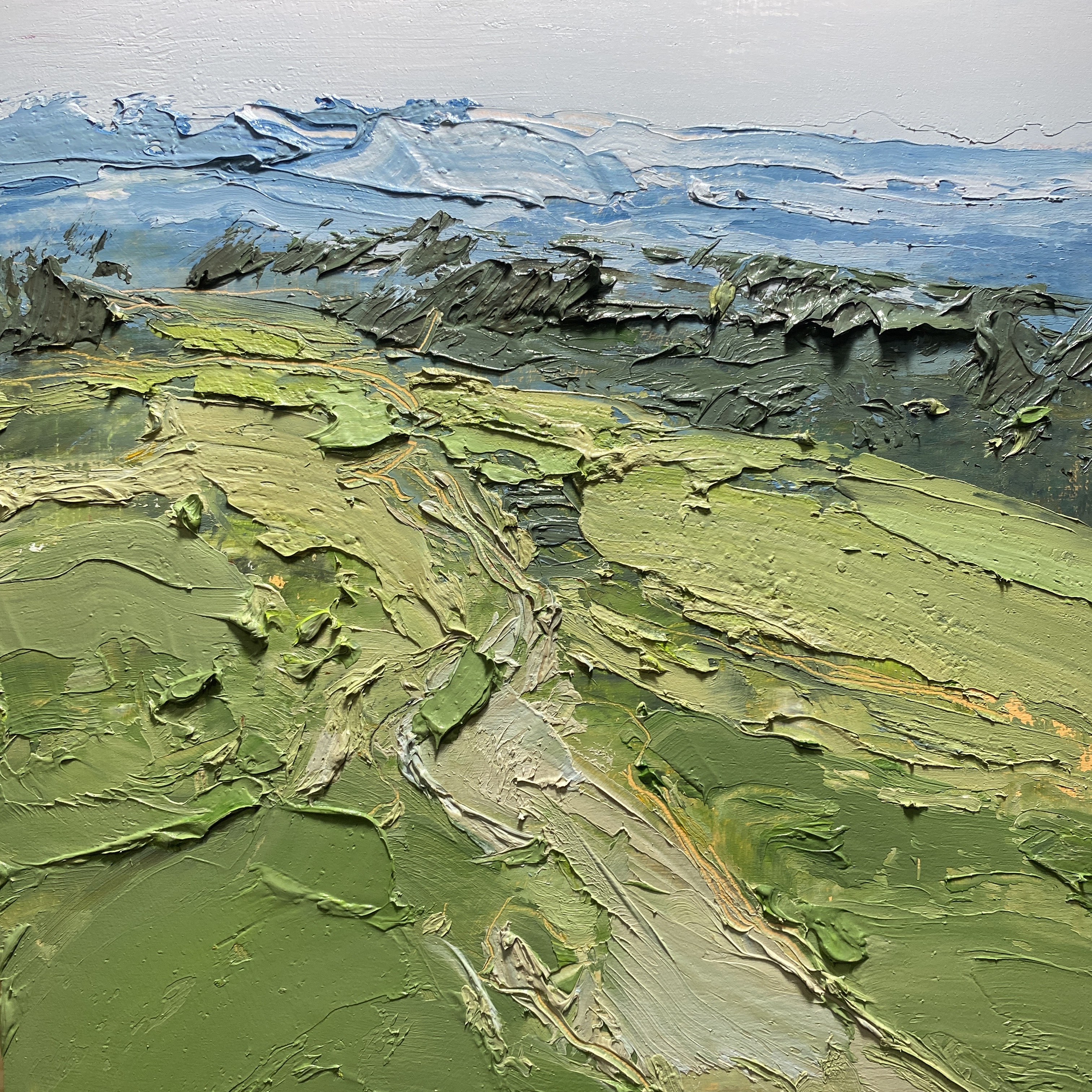
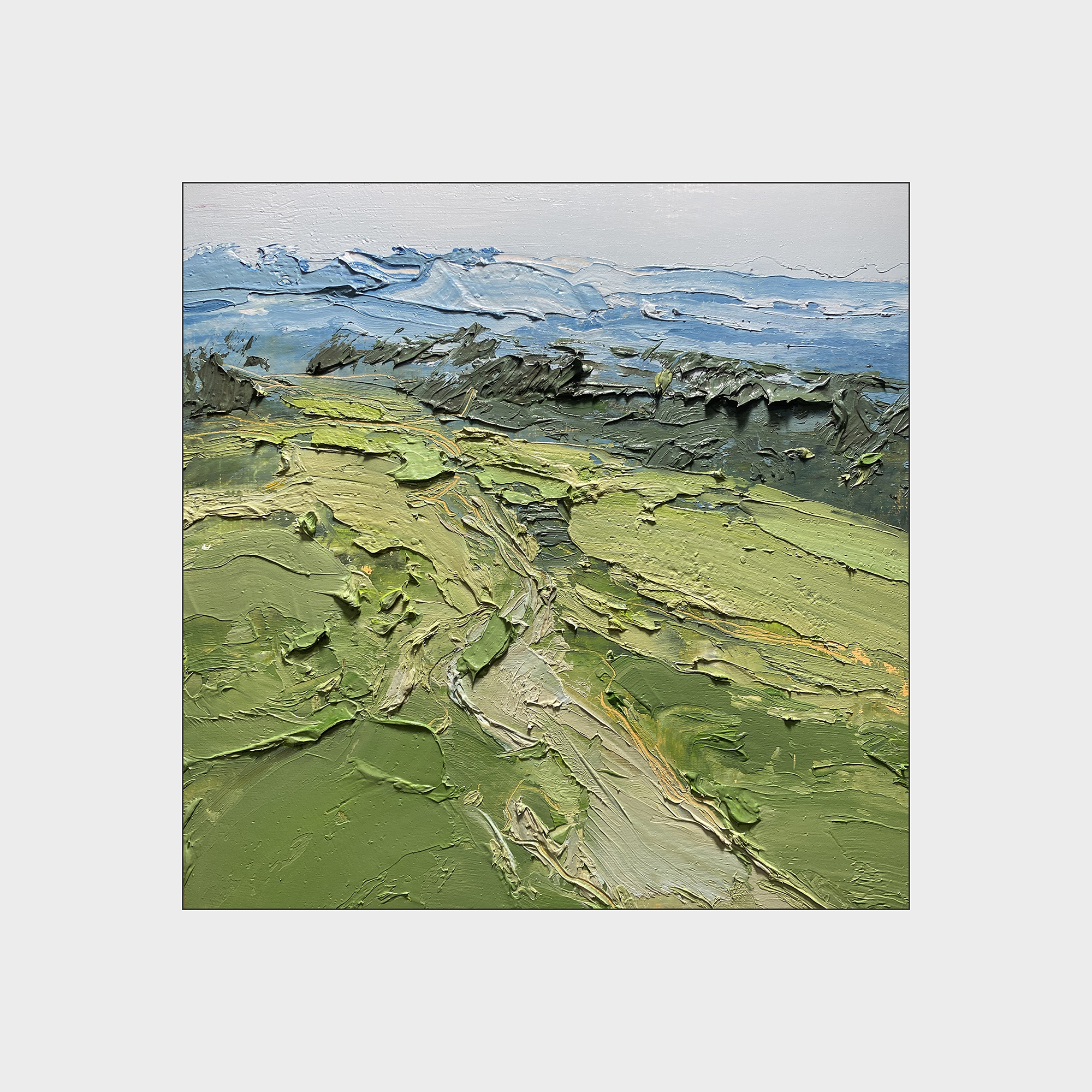
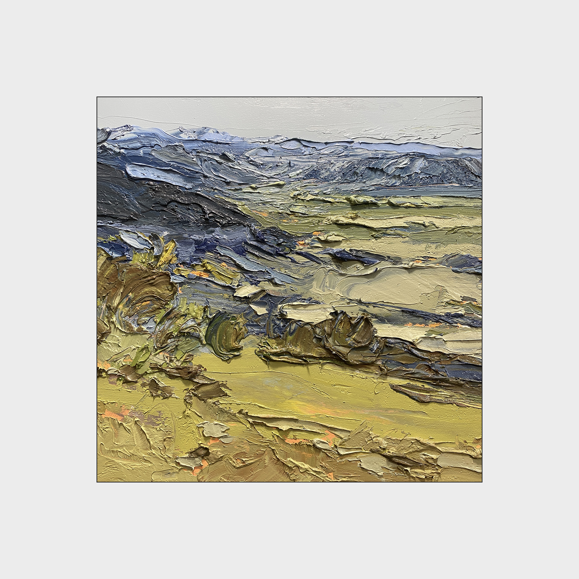
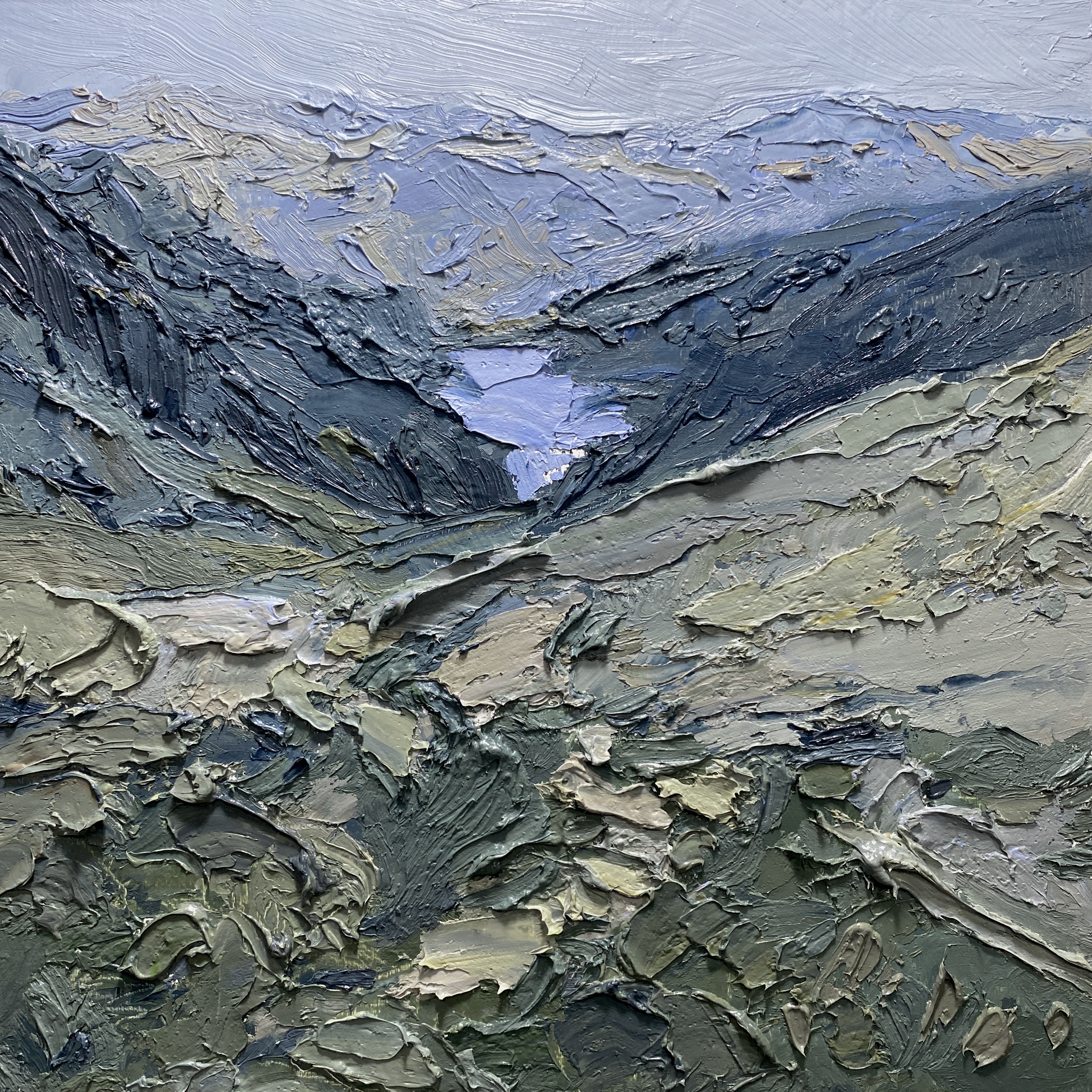
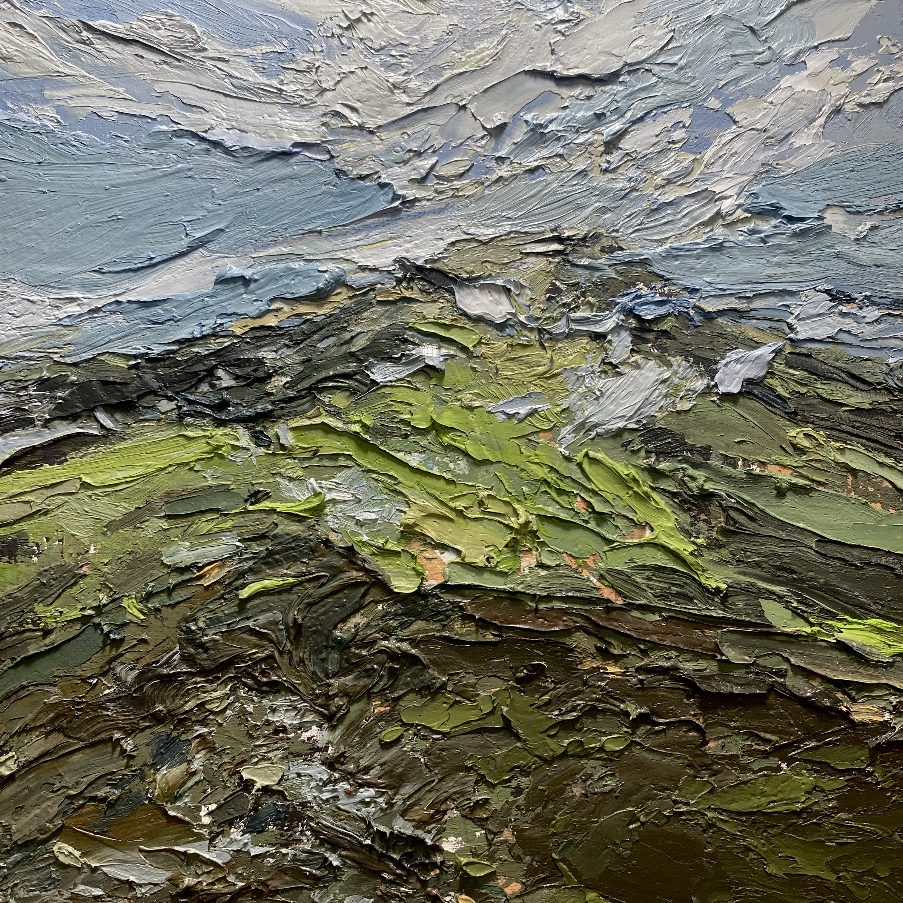
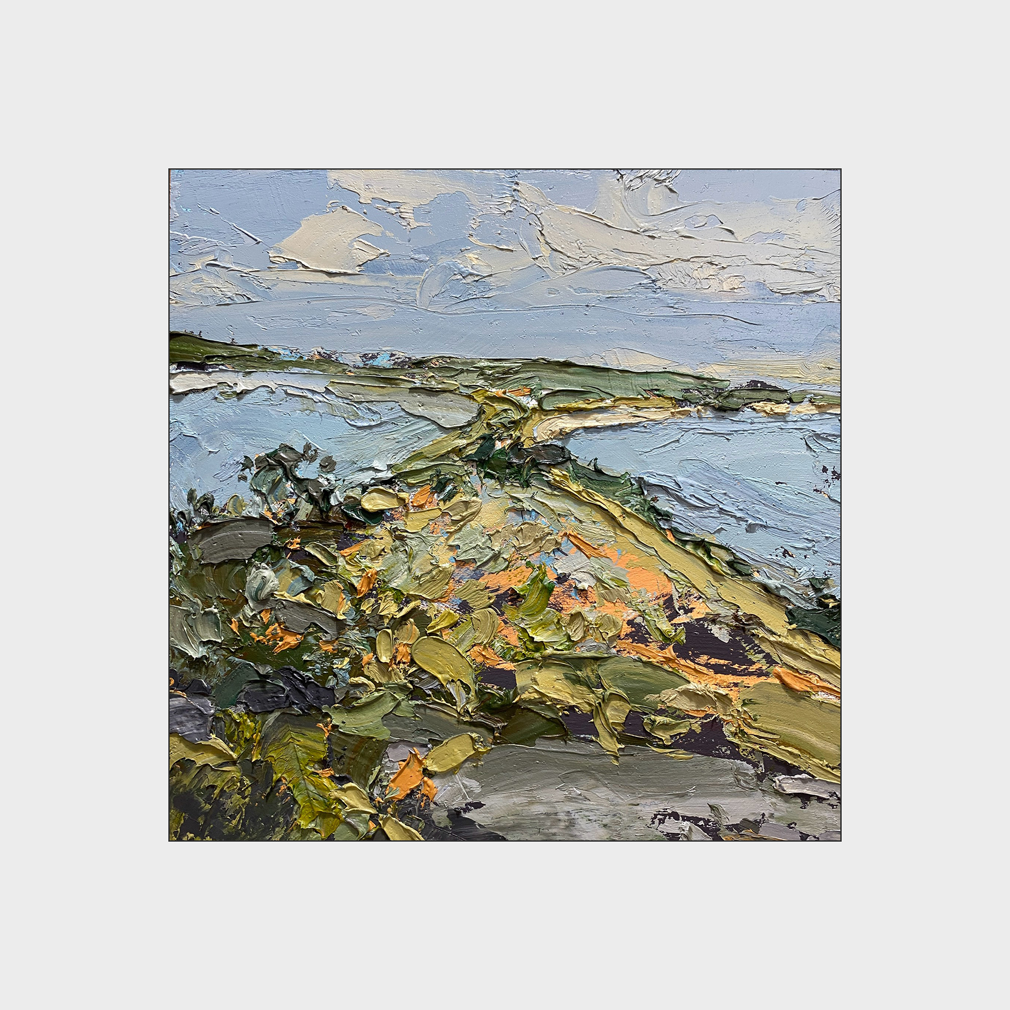
2024 #30×30 Day 12 : Compulsive Nature
10×10″ Oil on Panel.
Untitled today! Because I’m not sure if I like this one.
But- the more I look at it, the more I like it. But my first reaction was that it didn’t turn out. Most likely thing is; I’m not responding to the colors. I do prefer green and grey :) I always love a green/grey painting.
When I was young, I painted everything in this blue/tan combination. Looking back at my work from undergrad (if it existed, because I’ve tossed the vast majority of it away) you would see painting after painting in this same color scheme. I didn’t know I was doing it at the time, but it was obvious looking back.
It comes from growing up in Edmonton, Alberta where the only color is blue sky. The land is just mud, slush and dead grass much of the time. Totally true; ask anyone who lived there. In my biased memory, green summer only lasts one week. Fall is a single day, and the trees are yellow in the morning and moldy brown leaves by 4pm. It’s also twilight until midnight in the summer, and it never gets to high sun in the winter. Dull, dull dull.
Now that we live in Montreal, we have a long chartreuse spring, a lush green summer filled with flowers, and a multi-colored fall that happens in three waves. Up north, in town, and then down south across the border.
In any case: I’m not the hugest fan of this one.
But I also know if I look at it in a year, I won’t know why I was complaining. The longer you wait, the better they look.
It’s already growing on me.
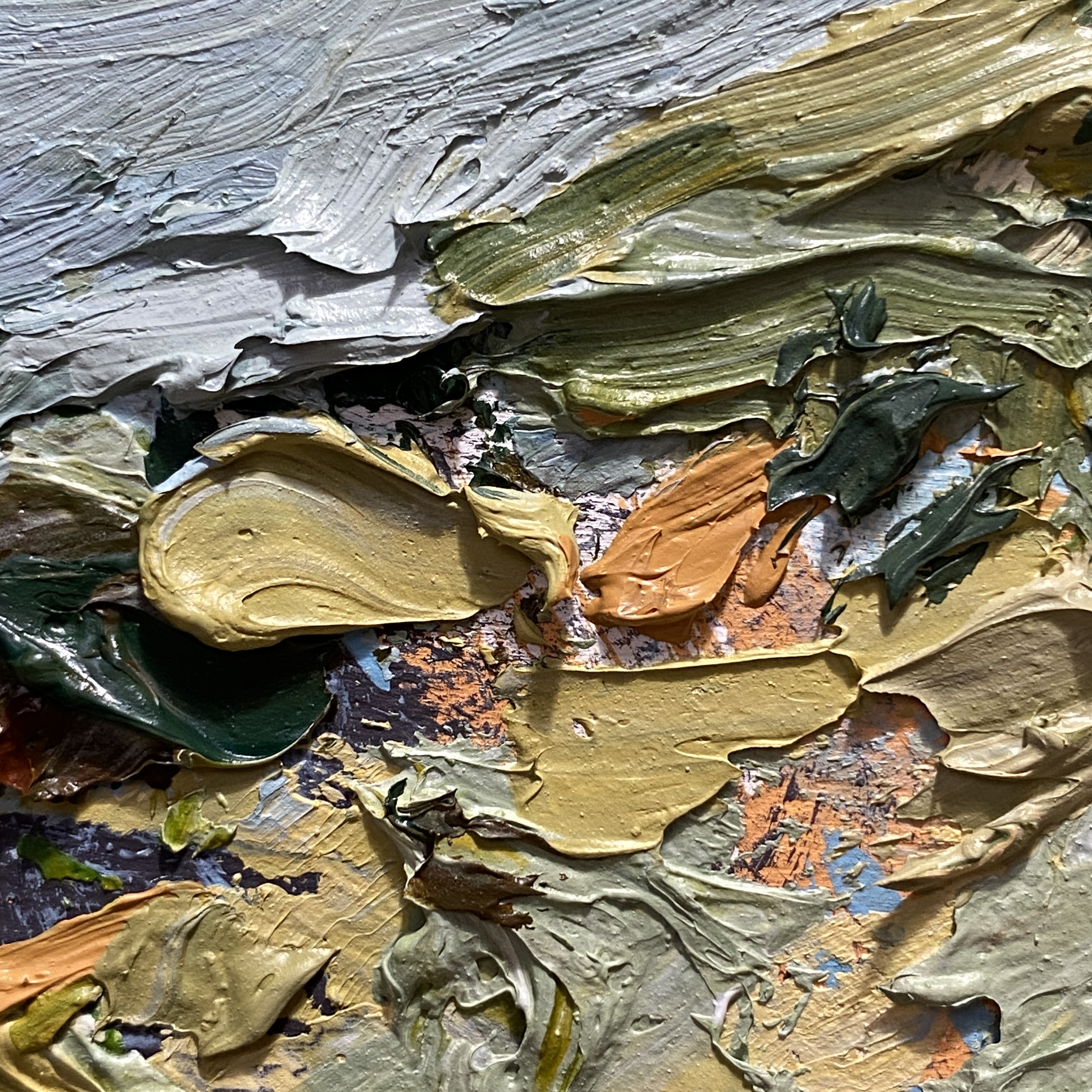
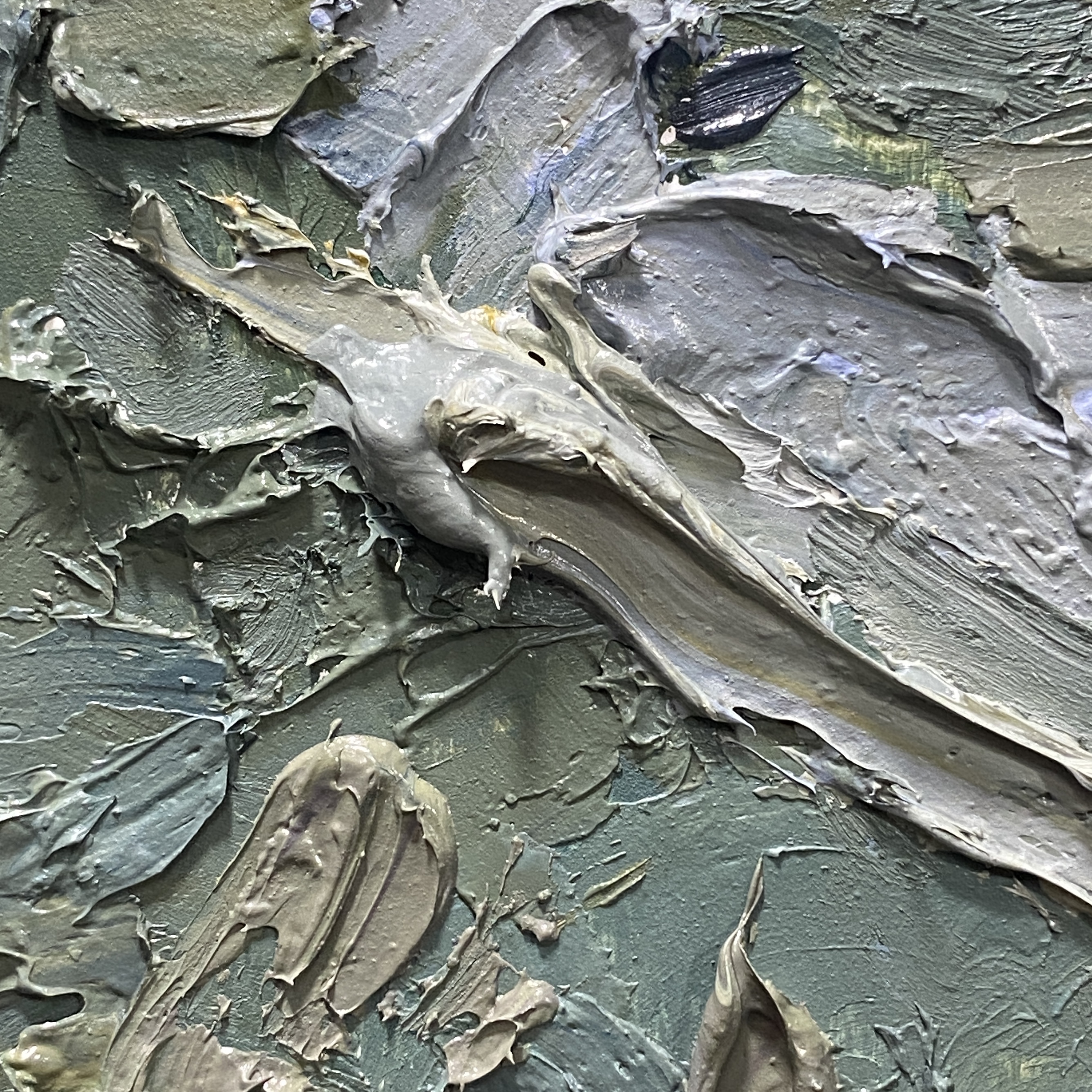
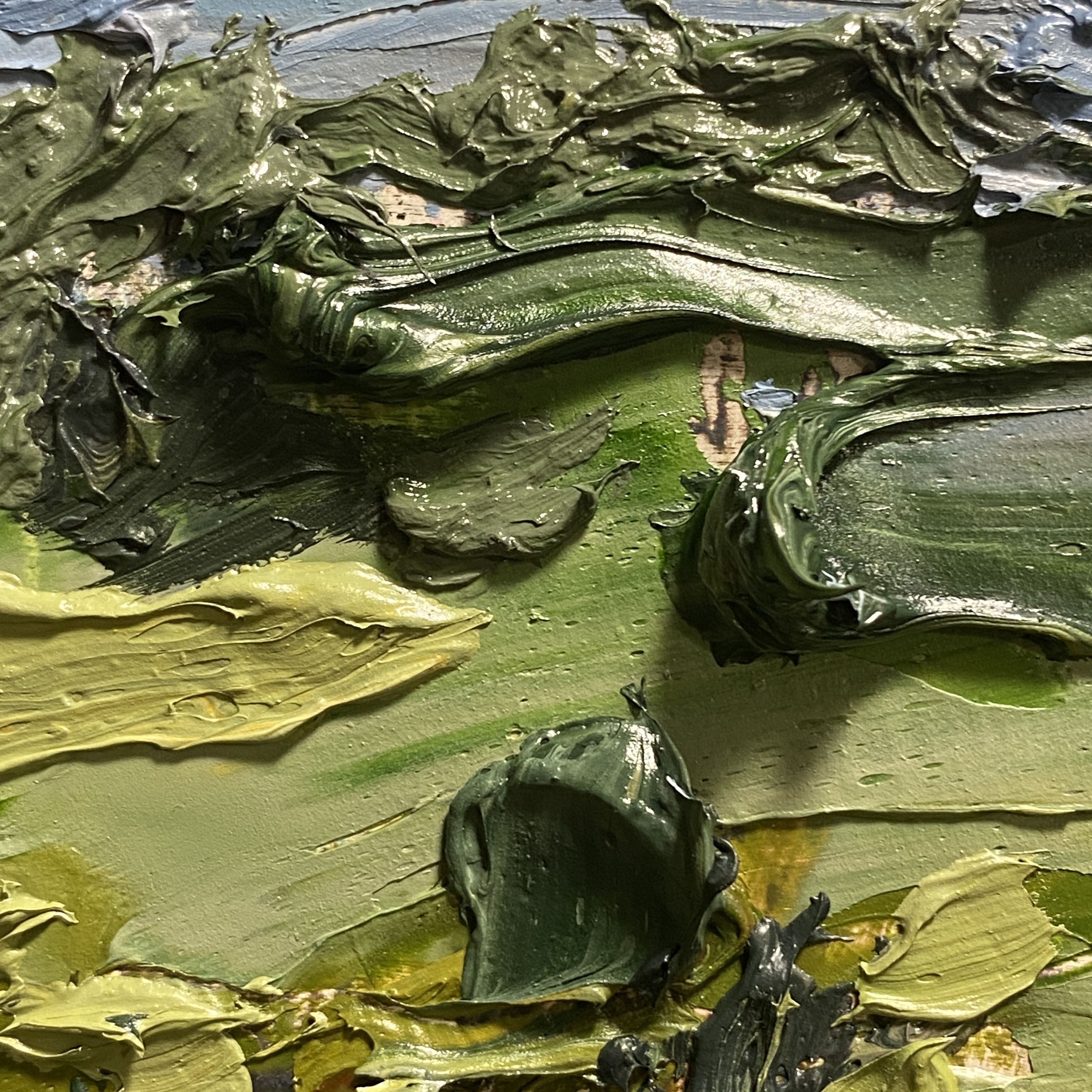
2024 #30×30 Day 11 : The Loaded Brush (or Knife)
10×10″ Oil on Panel
“What is that saying about stepping in the same river thrice?’
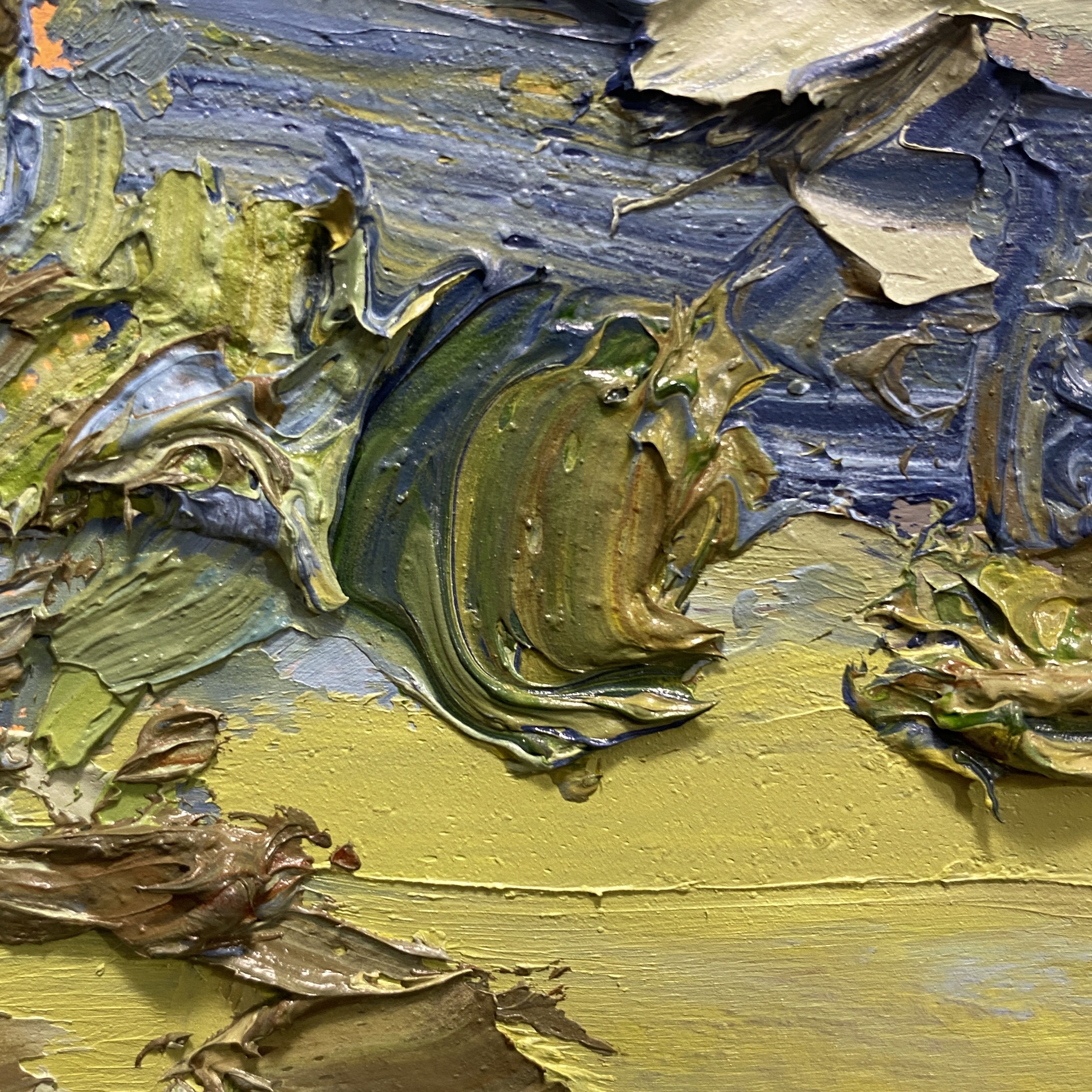
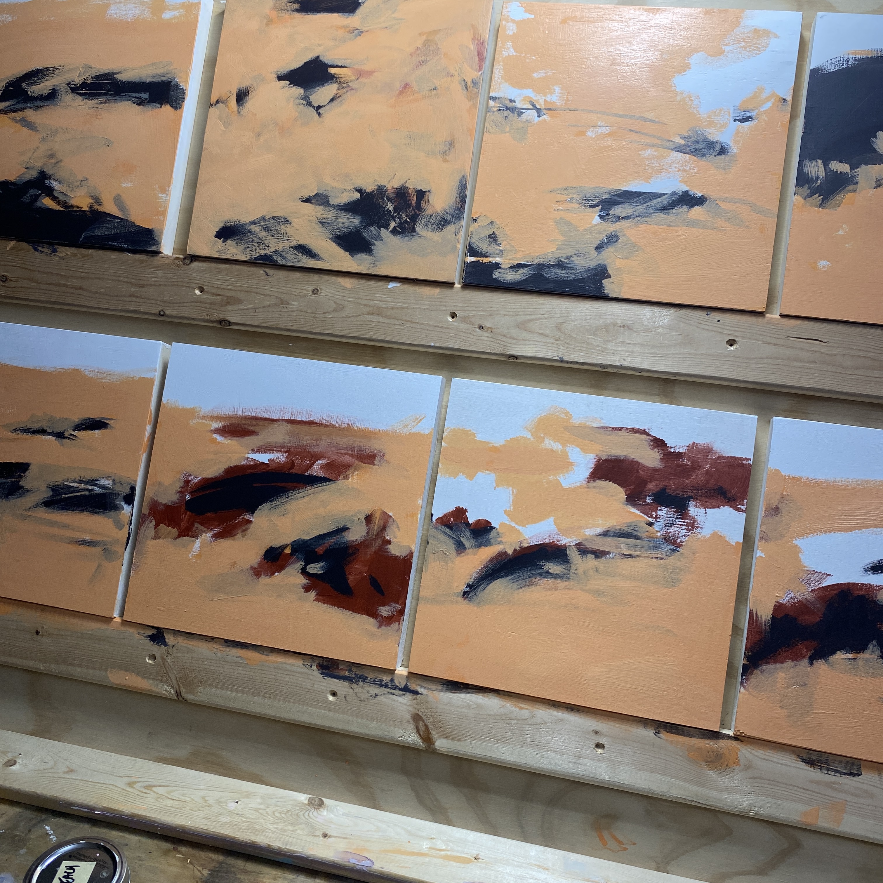
Every painting starts by making piles of color. I just make piles of color till I have everything I need to fill the image. Sometimes I’m looking at a photo and matching colors. Sometimes I’m just choosing combinations I enjoy.
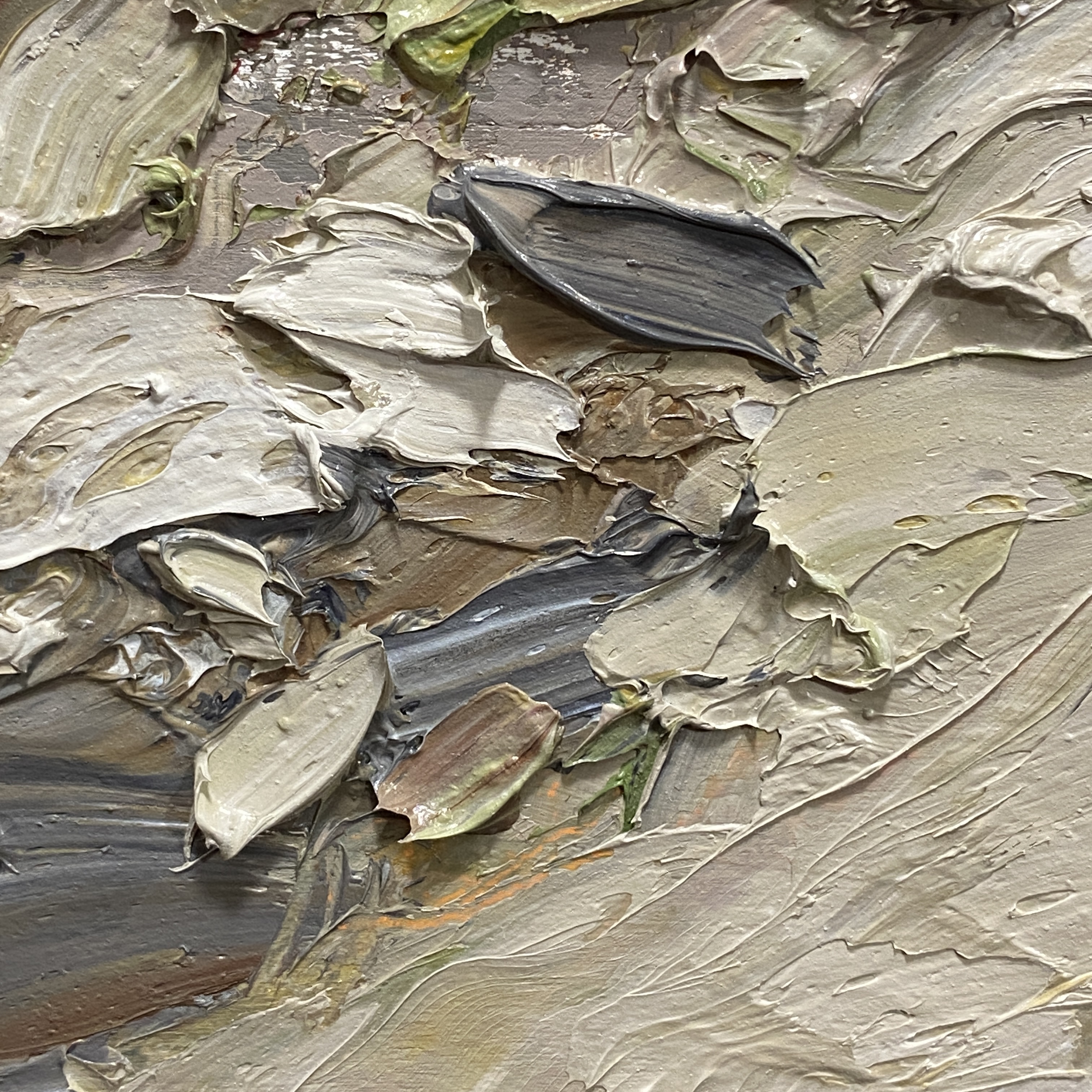
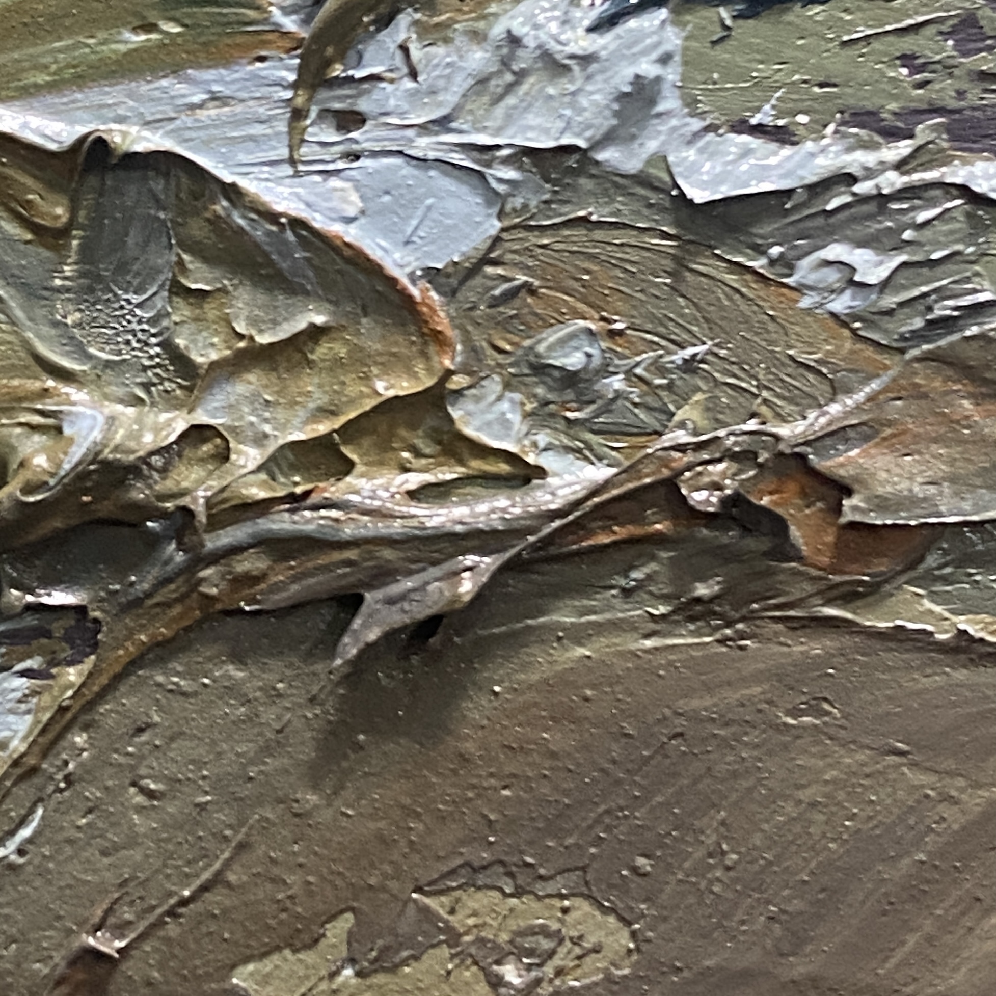
This ‘shrub-mark’ here is a single loaded knife (or brush) stroke. You can see the multi-colored effect, as opposed to a single-color mark like the gold schmeer at the bottom. You can use the brush like a little spatula, scooping up different colors on each side – or – you use a palette knife to place colors onto the brush in a row of blobs. Choosing of course, what order you want the colors to appear.
Sometimes I mix a pile of ‘dirty’ paint from two or three clean mixes. But I don’t whip the colors together very well. The result is an even more randomly multi-colored mark. I’ll often pick up color right off the painting, mix it with some other hue, and put it back down in the same place.
Either way, the goal with loaded marks, is optical blending. Step back from the painting, and it should resolve. Maybe more so, maybe less so, depending on how boldly it’s painted.
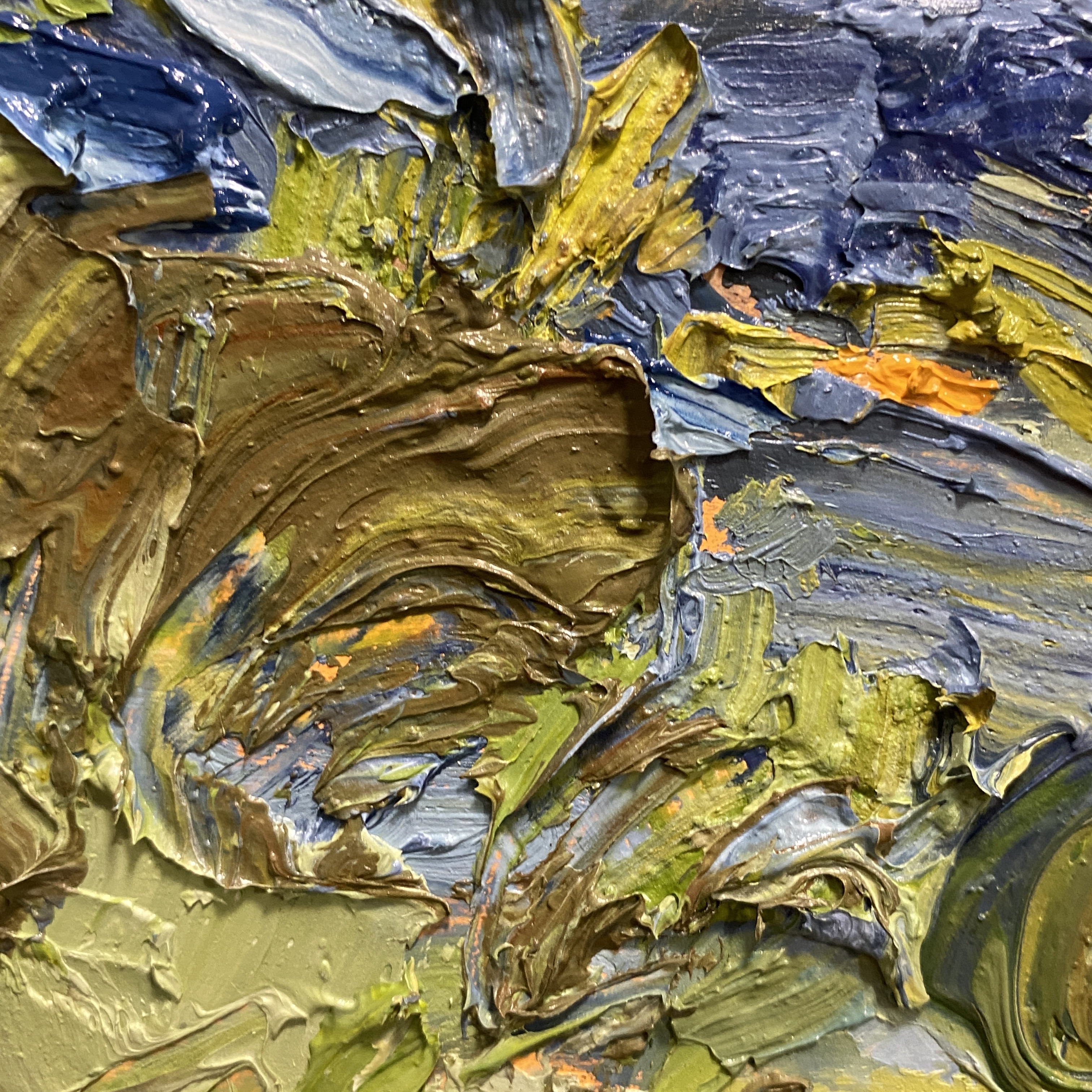
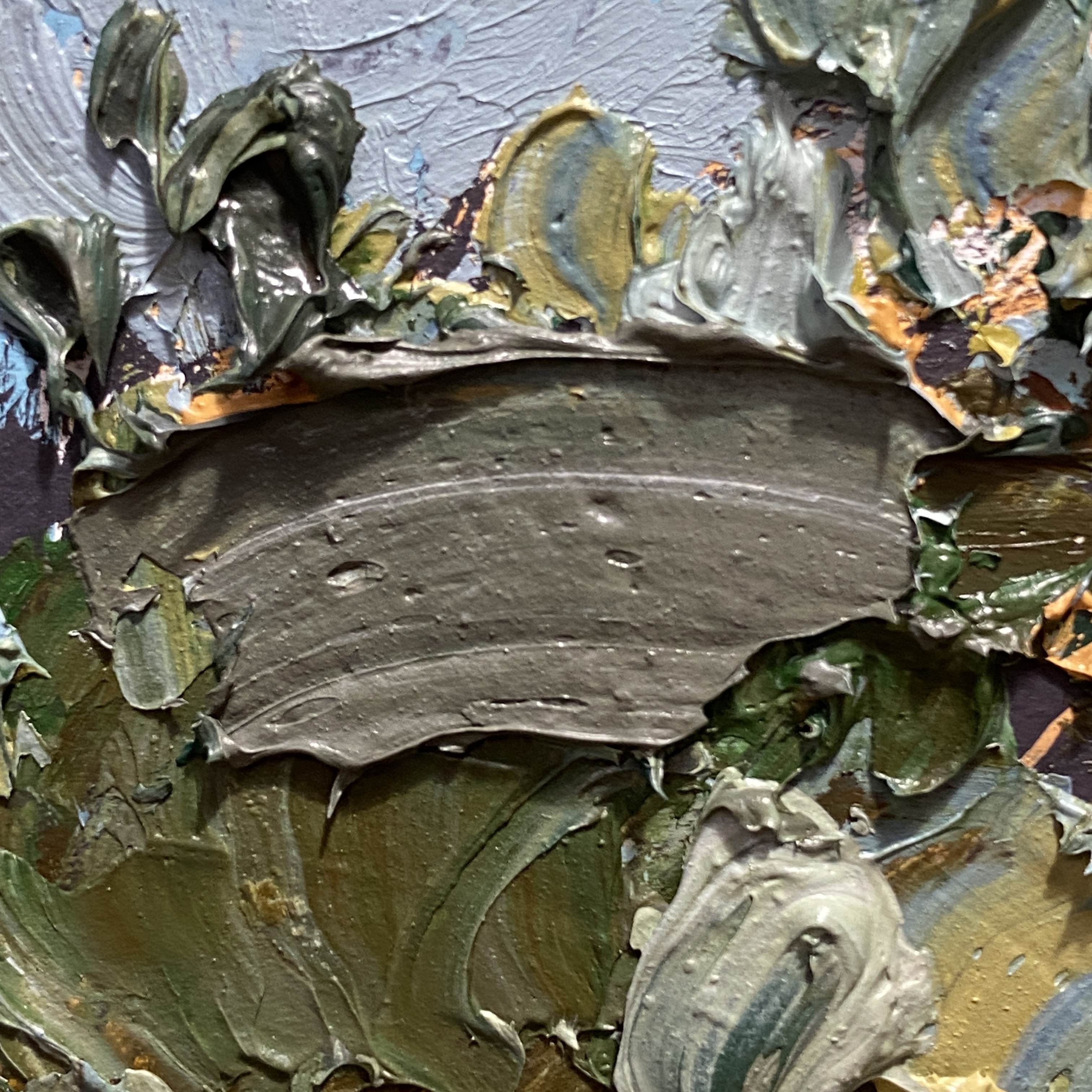
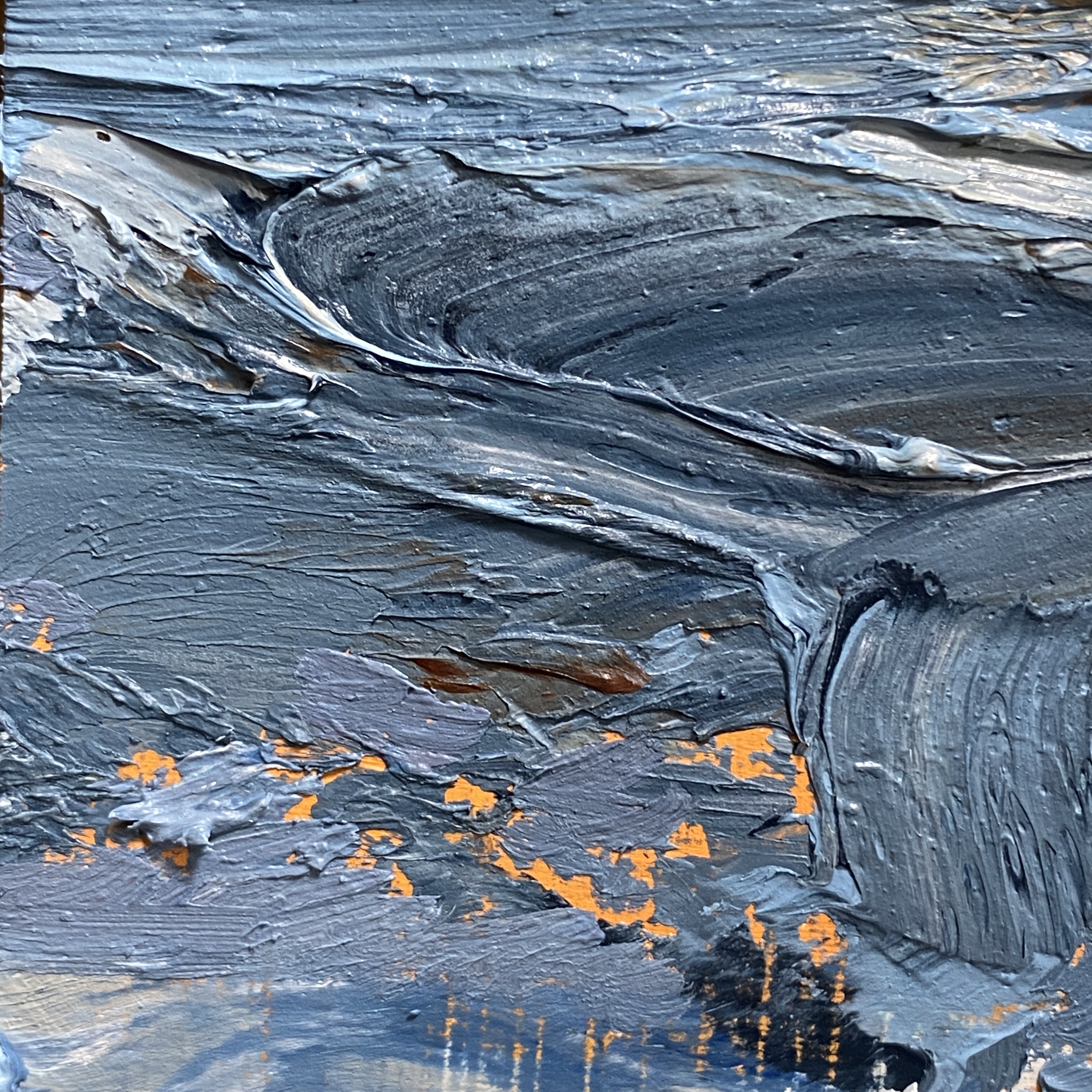
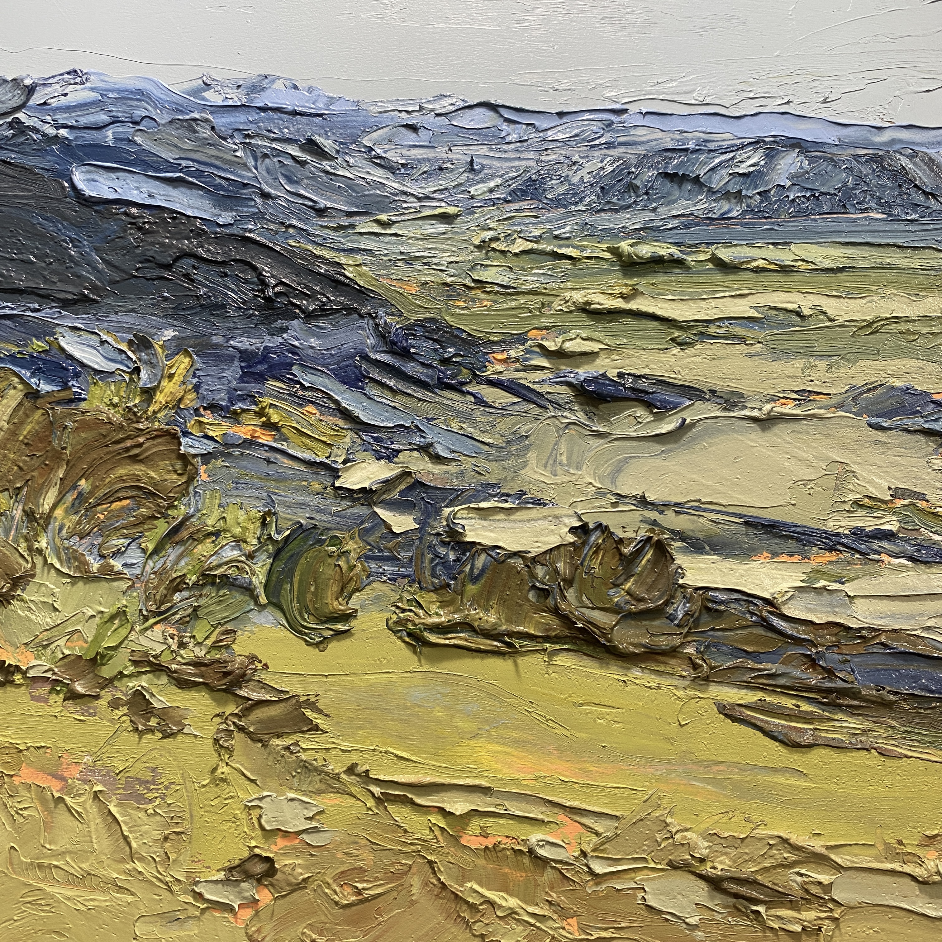
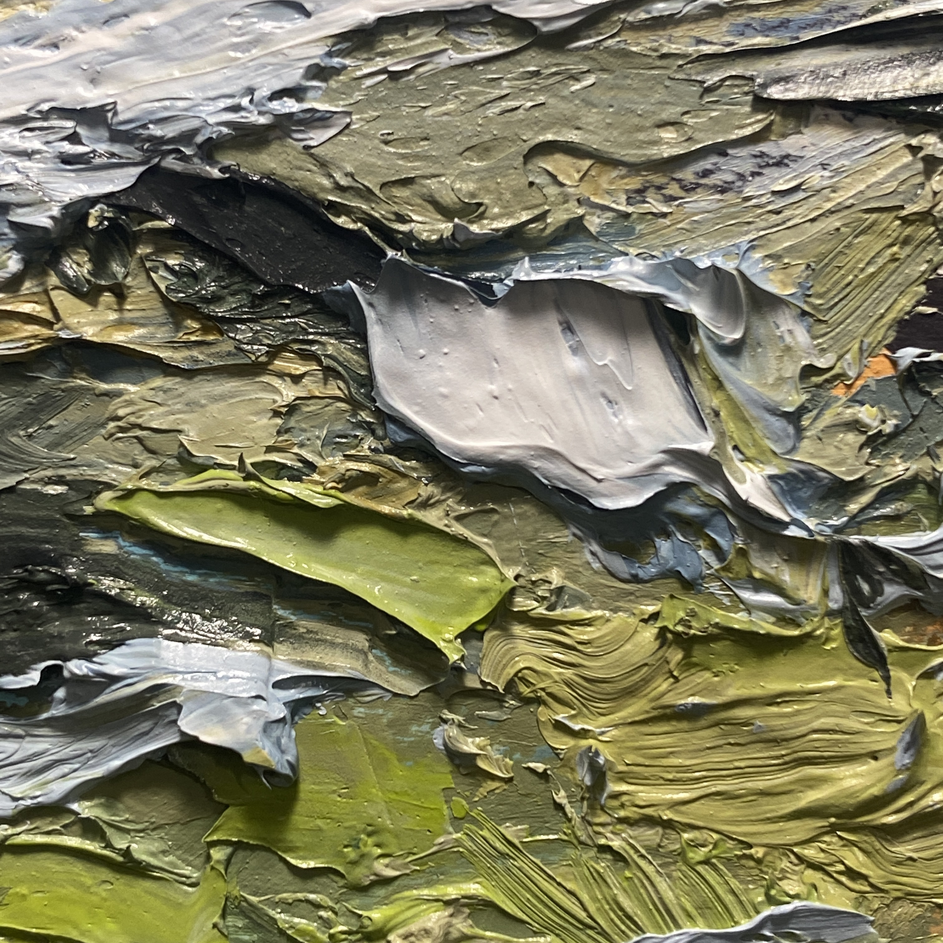
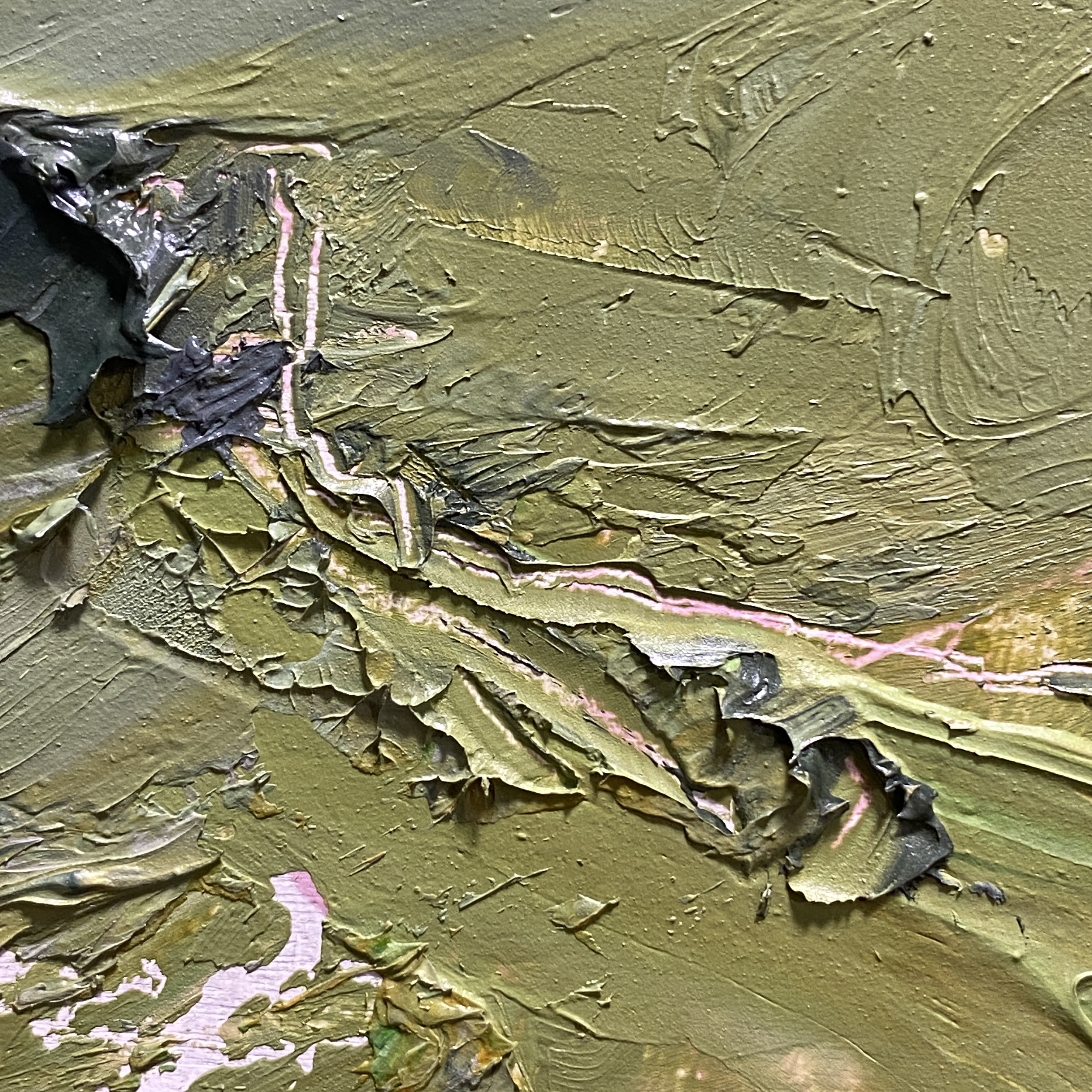
This orange is a colored ground showing through.
In this case I painted a bright peach tone with an acrylic/gesso mix. I don’t paint it uniformly, and sometimes I paint big shapes or marks with two or three other colors.
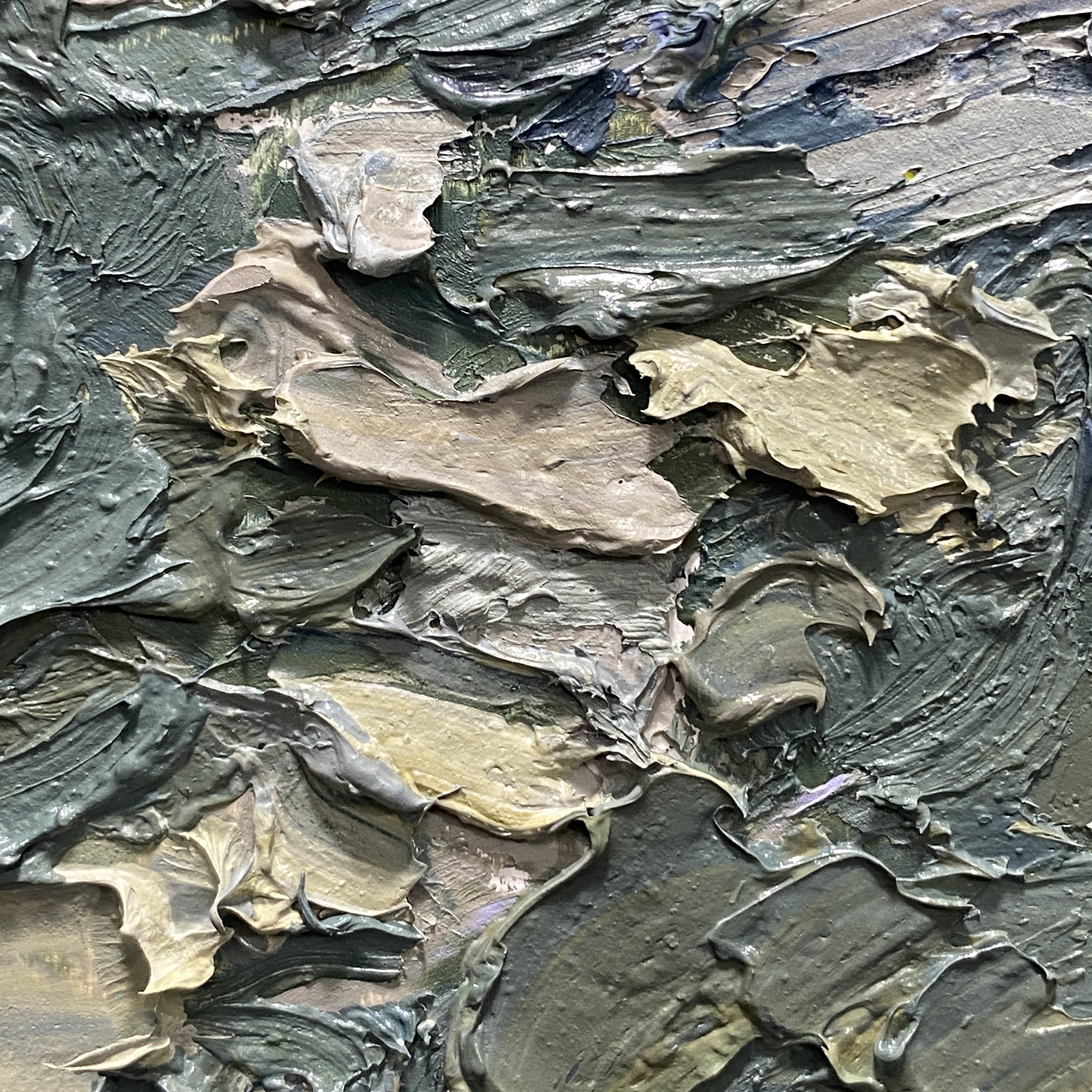
Actually, here’s a shot of what some underpainting looks like.
Some of the very best underpaintings are just an old painting you’re painting over. You get the most random-but-harmonized undertone that way. But I only do that if I’ve deleted a piece immediately. (Before it’s dry).
With my heavily textured work, if the painting is dry, it has to be scraped or sanded down, and that’s messy/difficult/time consuming/toxic. It’s more toxic to breathe paint dust than it is to paint normally with solvent, which I also avoid. It’s not just the mask wearing, it’s the cleaning the room as well. I paint in my living room these days so – I don’t want cadmium dust accumulating in the floorboards or couch cushions.
But – I will scrape a wet painting down immediately after finishing, or halfway through, or sometimes the next day if it’s been bugging me all night. Better to ‘delete’ sooner than later! More energy left to restart. And the sooner you scrape it down, the more of the paint you can reuse :)
2024 #30×30 Day 10

10×10″ Oil on Panel
“Choose your goals wisely,” says the sage. “You only get three of them.”
I stand there, legs trembling, gulping at the thin air.
“Just kidding,” he winks. “You might not get any.”


2024 #30×30 Day 09

10×10″ Oil on Panel
One day she asks me, “What if you have a vivid memory of place, but you’ve never been there.”
“Is that possible?”
“Just say it is.”
“Ok?”
“Well – then, it’s the same as having been there, isn’t it?”


2024 #30×30 Day 08
10×10″ Oil on Panel
“The Journey was a dream, the destination a myth, but I have this rock in my pocket.”


2024 #30×30 Day 07

10×10″ Oil on Panel
“Stop trying to impose meaning,” he says. “It’s not about anything.”
She turns, eyeless behind her shades. “Quoi? J’avais mes écouteurs.”


2024 #30×30 Day 06

10×10″ Oil on Panel.
“Ug. So much green.”
“There’s a rare green pigment made by scraping verdigris from Shang vessels.”
“What? That’s bullshit.”


2024 #30×30 Day 05

10×10″, Oil on Panel
“What if,” he asked, “there was an island where dreams came true?”
She laughed through her nose and bit her thumb. “Make sure you’re alone out there.”


2024 #30×30 Day 04 : Spit vs. Isthmus
“In summary, a spit,” he said, with a finger pressed to the bridge of his glasses, and growing worry that his audience was drifting away, “is a projecting depositional feature; whereas an isthmus is a strip of land connecting two larger landmasses.”
10×10″ Oil on Panel