Richmond Workshop: After Action Report

We are just back from the USK workshop in Richmond VA, held in conjunction with the exhibition on Urban Sketching at the Virginia Center for Architecture. Thanks to Jessie Chapman and Marshall Dreiling for organizing the weekend.
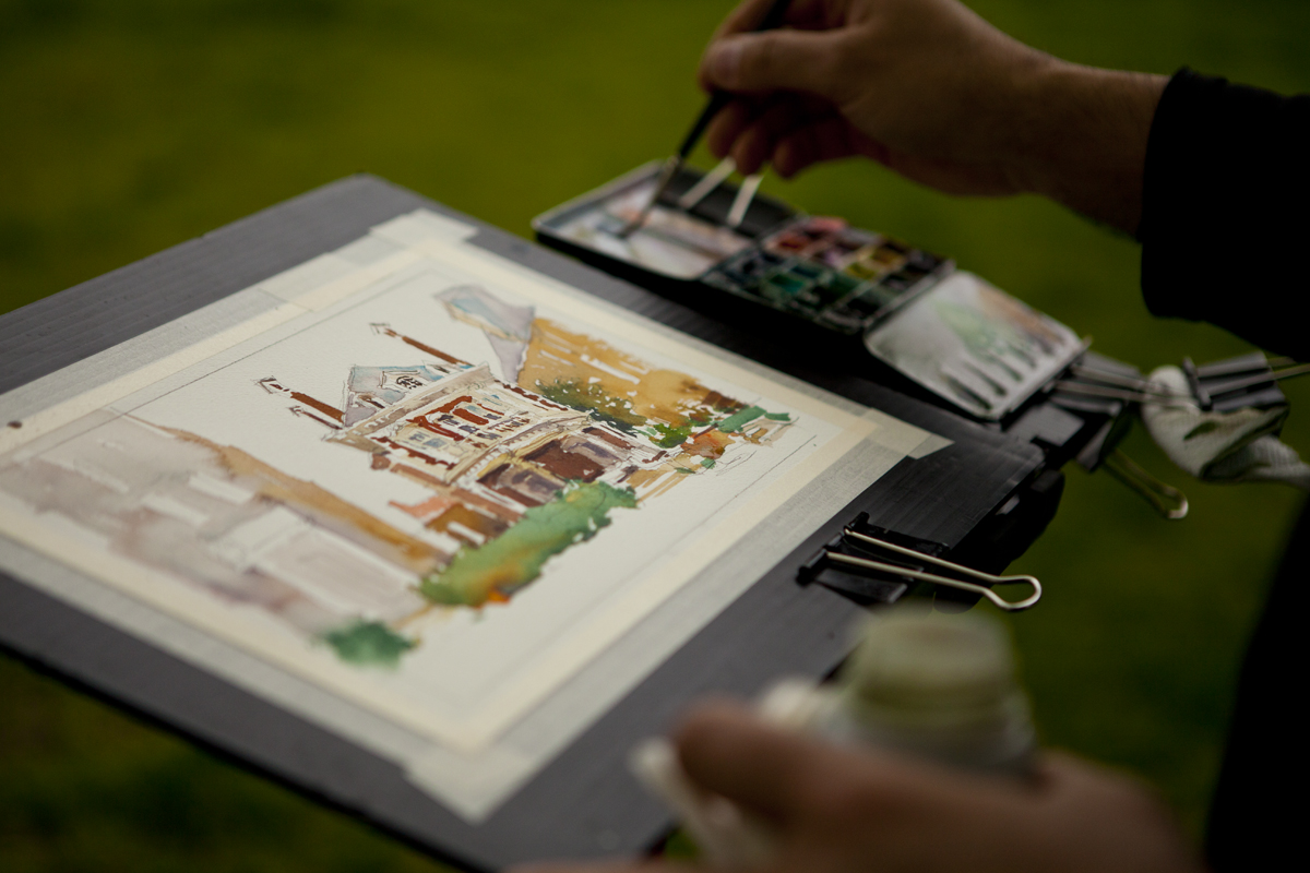
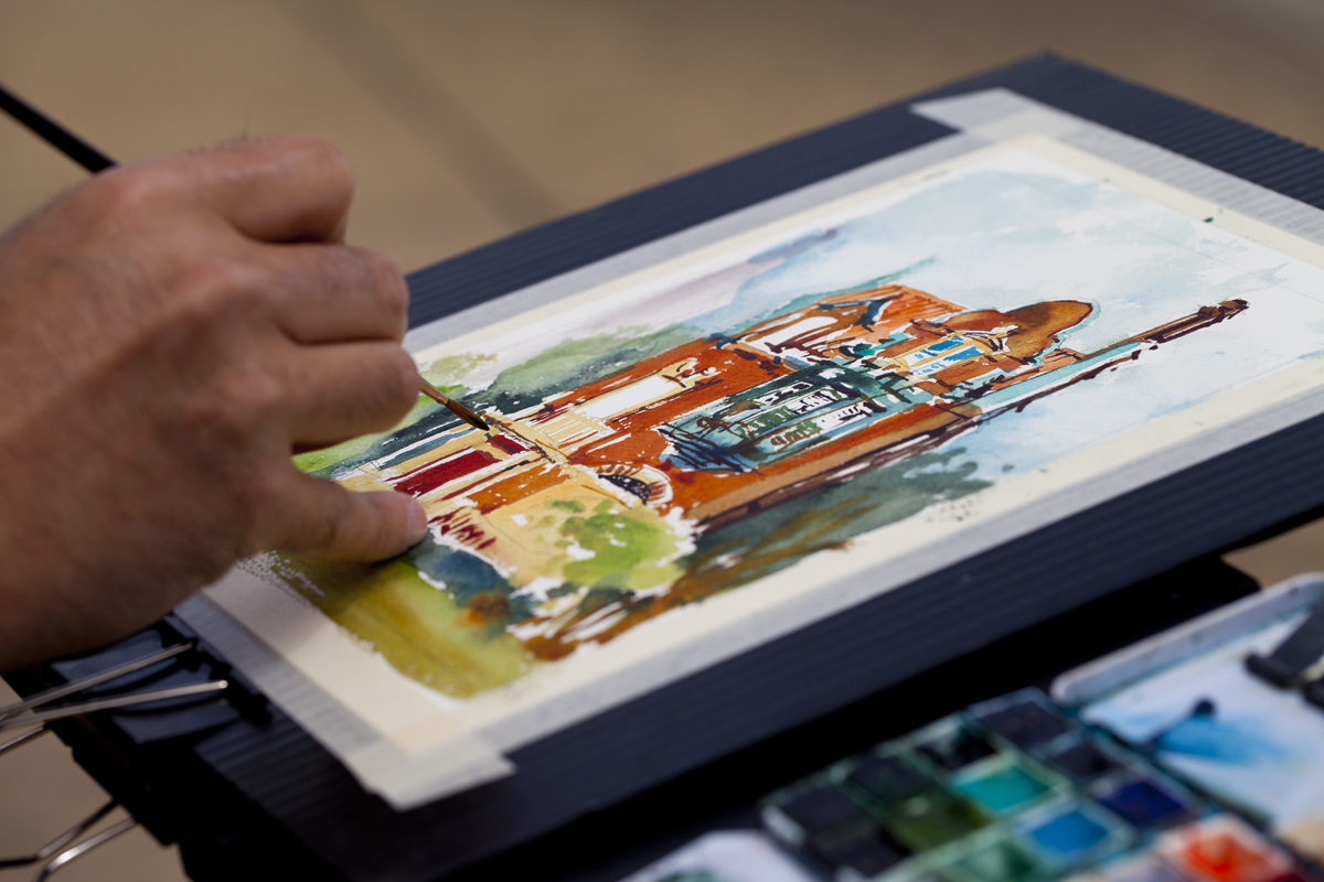
This was a fundraising event, with a portion of the proceeds split between VCA and USK. While I was there, I took an extra day to do a solo sketchcrawl, and I’ve donated a few small watercolors to an auction that will happen around the end of the exhibit – which is up until July 5th. If you’re in the area, the exhibition is well worth a quick visit – and the Branch House (above) is a great sketching subject.
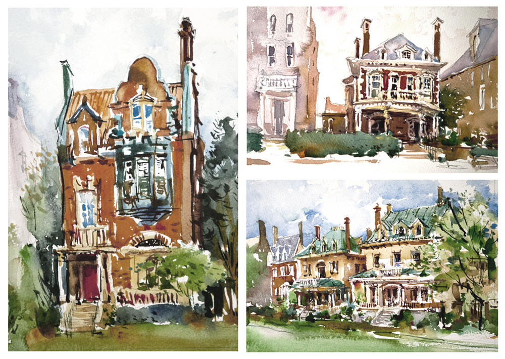


We had a great group from a variety of sketching backgrounds. It was the kind of team I love drawing with. Everyone was fully engaged – putting a lot of effort into the exercises, working to improve their sketching, but enjoying themselves at the same time. It’s always a lot of fun spending a few days drawing with people. I’m already looking forward to the next workshops in Italy and Singapore.


Direct-to-Ink Exercises: Part Three: Post and Rail Panorama
This is the one of three exercises from the Richmond workshop : 01 Single Line | 02 Tone Shapes | 03 Post and Rail Panoramas
Ok, I’ll admit this last exercise is less about your pen work – but it’s a good application of the previous two exercises. Plus, this is a very common situation when you’re travelling with a sketchbook. Don’t you always go to those tourist spots with an amazing view? And of course you want to get it all in. (Note: In fact, we did not do this exercise in Richmond. I wanted to do it, but I think I’d put too much on the timeline. Everyone got a worksheet with these notes, so they can try it when they get home. ~m)
Here’s one way to tackle a panorama without getting lost in the details. (And without spending all day at it).
Direct to Ink Exercise: Post and Rail Panorama

- Decide how wide you want to go. The wider the field of view, the ‘shorter’ your drawing will be compared to its length.
- In a small book, this can make your drawing little more than bumps-on-a-horizon-line.
- Choose how many pages in your drawing. Will you work across a double page spread? Or keep going as you flip the page? There are also accordion fold sketchbooks that offer plenty of length.
- I prefer loose sheets as I like to start in the center, and work outward in both directions.

- To begin, choose a landmark that is the most important thing in your view. Something highly distinctive, a recognizable part of the skyline.
- This is your first ‘post’.
- The idea is to build your drawing like a fence. Placing posts, and joining them with rails.
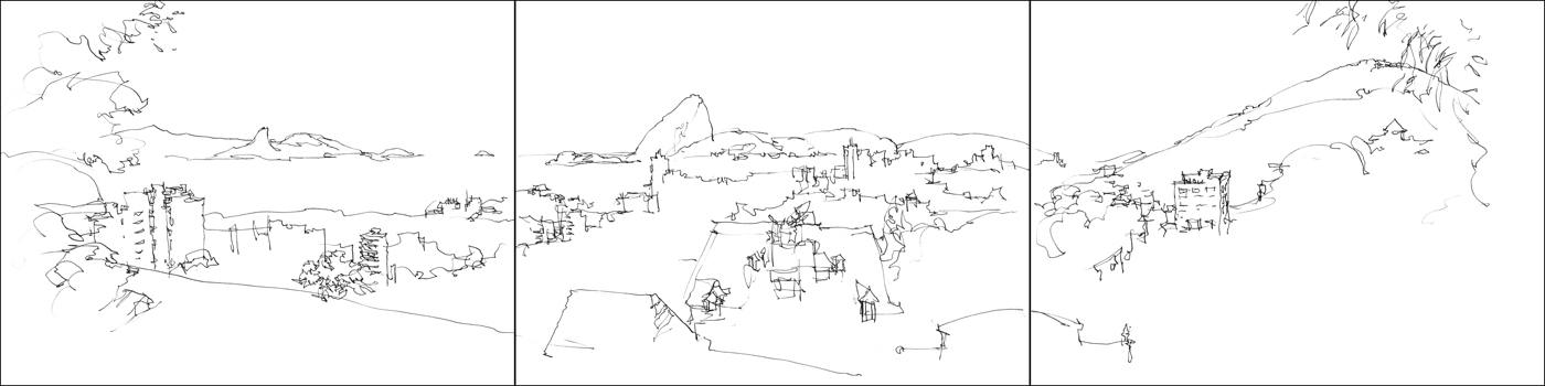
- Each ‘rail’ is a Single Line Sketch (see Exercise One).
- If you want to make it a little easier, roughly sketch a few key posts in pencil first, and you have a chance to do some sight measuring before the ink.
- Personally, I try not to be obsessive about accuracy, and often enjoy going straight to ink (or watercolor).
- Then it’s simply a matter of squinting at the values and scribbling in Tone Shapes (Exercise Two), and adding color if you want.


Direct-to-Ink Exercises: Part Two: Tone Shapes
This is the one of three exercises from the Richmond workshop : 01 Single Line | 02 Tone Shapes | 03 Post and Rail Panoramas
Direct to Ink Exercise: Tone Shapes
- Every scene can be thought of as three values: Light, Middle and Dark.
- In this exercise, we will create the silhouette shapes you see, with masses of accumulated pen marks.
- Think of it as simply scribbling in the dark shapes. working from left to right in a continuous ‘blob’.
- This exercise will develop your ability to see the composition as a big shape.
- You’ll find this skill invaluable as a painter. But even if you stay with drawing, you’ll benefit from a better sense of mass and volume.

- This time, do not outline. Instead, build values shapes from the inside out with passages of pen hatching.
- Merge the shape of cast shadows into connected mid-tone shapes. High key passages can be left as negative space.
- Foliage and trees, or dark rooftops can be seen as solid dark shapes.
- Try to imply internal structure by varying your mark making.

- It’s ok to ‘color outside the lines’. Just approximate what you see – try to interpret reality into simple shapes.
- Dark masses (windows, contact shadows) can be done with the brush pen.

- These tonal drawings should have more solidity and sense of three dimensions than the previous line drawings. Compare your linear sketches vs. your tonal ones at a distance. Stand back a few feet. See how the big tone shapes hold up?
- This is why paintings work on the wall, and drawings work in a book. You read a drawing, you view a painting.


- When you’ve tried a few of these ‘shape only’ exercises – add back in the Single Line Drawing.
- Use the line for detail, the tone shape for masses.


Direct-to-Ink Exercises: Part One: Single Line Sketching
I’m going to do a short series of posts about the exercises from the Richmond workshop. This is the one of three exercises: 01 Single Line | 02 Tone Shapes | 03 Post and Rail Panoramas
These projects are designed to be quick jolts of inspiration. Something you can do in under an hour.
Each one is a visual/perceptual game. Just have fun playing with them, and see what you can do. Don’t worry too much about the results – these are aimed at fun and relaxation.
Although, I hope at the same time, they will get into your subconscious and help you be more spontaneous, more ready to just throw down and make a sketch in a few moments.
You will not need any special supplies. Just a drawing pen and a brush pen. Any brand will do (but I do have supply notes here).
These types of sketches all work very well with watercolor (because, that’s my ultimate goal – drawing methods that translate well into painting). But for the first few times, don’t worry about tinting your sketches. Just concentrate on feeling what it’s like to draw quickly with confidence.
Direct to Ink Exercise: Single Line Sketching
- In this exercise we’ll be sketching with a continuous line.
- We’ll do five sketches in 20 minutes. Work small. 4×6″ or 5×7″ would be great.
- When you start drawing, don’t allow yourself to pick up the pen point. Make the sketch in a single, uninterrupted line.
- Keep the pen moving, letting the line flow between objects, cross forms, and break out of shapes.

- Finish the line drawing with the brush pen, placing darks in trees, windows, and cast shadows.

- It’s best to work on location (you can see so much more looking around), but if you want to draw at home, Google Street View or Image Search are good resources.
- This probably won’t be easy at first – but that’s ok! You are learning with every sketch. The more you do, the faster you learn.
- See how far you can get with one uninterrupted line.
- Feel free to leave things out – edit reality.
- You can pause your pen and study what’s going on before continuing.


- If you accidentally lift – just keep going where you left off. Don’t be too strict.
- Work left to right, leave negative shapes, break forms, join shapes, connect objects to the ground.
- Use overlapping objects to move the line back and forth in space.
- Have FUN with it!
Direct to Ink Exercise: Cinq-à-Sept Sketches (5-7 lines)
- After a few rounds of Single Line Sketches, your drawing hand should feel more relaxed.
- Now try a slightly larger drawing with more detail. 6×9″ or 8×10″.
- Aim to get three drawings in 45 minutes.
- Don’t lose the feeling of flowing lines and rapid observation.
- This time: allow yourself 5 to 7 continuous lines. One line for each major object or passage in your drawing.

- The limit is meant to keep the drawing fresh. Don’t worry too much about the exact count.
- Establish a central shape in a few lines, then do the background with another line or two. Save a couple of lines for people, cars, and small objects in the foreground.
- Remember to weld shapes when possible, to reduce the number of objects. Feel free to leave out detail in areas away from the focus.
- Reduce distant figures and street clutter to brush marks and floating squiggles.

- Save some time to go back and add darks with the brush pen.
- These drawings will look great with color but don’t stop sketching yet. Paint them after you get three in 45 minutes. Often I’ll paint in a café when I’m taking a break to eat.
- If you are spending a day on location, see if you can get 8-10 sketches in an afternoon of sight-seeing.

Arrived in Richmond!

Sketching event begins tomorrow. More on this later :)
24 Color “Full Spectrum” Paint Box

PLEASE NOTE: I began playing with this 24 color palette in early 2015, and have made numerous small changes to the color selection. Both from my own test paintings and feedback from other professional artists.
I don’t think color I’ll ever stop testing colors – I already know I want to switch out Fuschite for a warmer yellow green like Rich Green Gold (out of stock in my local shop today).
I’ve edited this post as I make changes – and I’ll keep doing so as I move colors in the set. So you can check back here for the ‘final’ (current) word on my color choices.
I still recommend a traditional split-primary palette to beginners – listed over here on the watercolor materials page. The split-primary was how I learned to mix color and I think it’s easier to understand at first.
I call this 24 color selection a Full Spectrum Palette. It has a warm and cool side, with Blues, Blue/Greens, Greens and ‘Blacks’ on one side, and Yellows, Earth Tones, Reds and Violets down the other. I’ve arranged the colors in a kind of light/mid/dark philosophy in their rows – (such as the violet row) – sometimes it’s more of a warm-to-cool gradient – such as the Blue/Green row.
This is a 5×8″ (when open) paintbox as compared to 14 in my previous 3×5″ bijoux box. I like the larger mixing area offered by that flip out panel below. I like to pack small, but upsizing to this kit was worth it for the mixing area alone.
Let me know if you’d make any replacements to this mix. I’m always curious what other people are using for pigments!
FURTHER NOTE: I can also say, now that I have tested artist grade tube colors and equally high-quality pan colors side by side – there is a noticeable difference in how they re-wet.
In a typical usage case artist grade pan colors release more pigment faster than most of my tube pigments – IF that is – the tube color has begun to dry out in the tin. This is typical after two or three days in northern climates.
If the paint is fresh from the tube, there is no difference to re-wetting – and in fact, tube colors allow me to pick up juicy gobs of color and let them mix and bloom on the wet paper.
This means, if you don’t paint that often, pans might be the better choice. (The re-wetting is very convenient). However, if you like to paint very wet, or with a lot of blooming color – then tubes will win out – but you have to keep your paint fresh.
~m
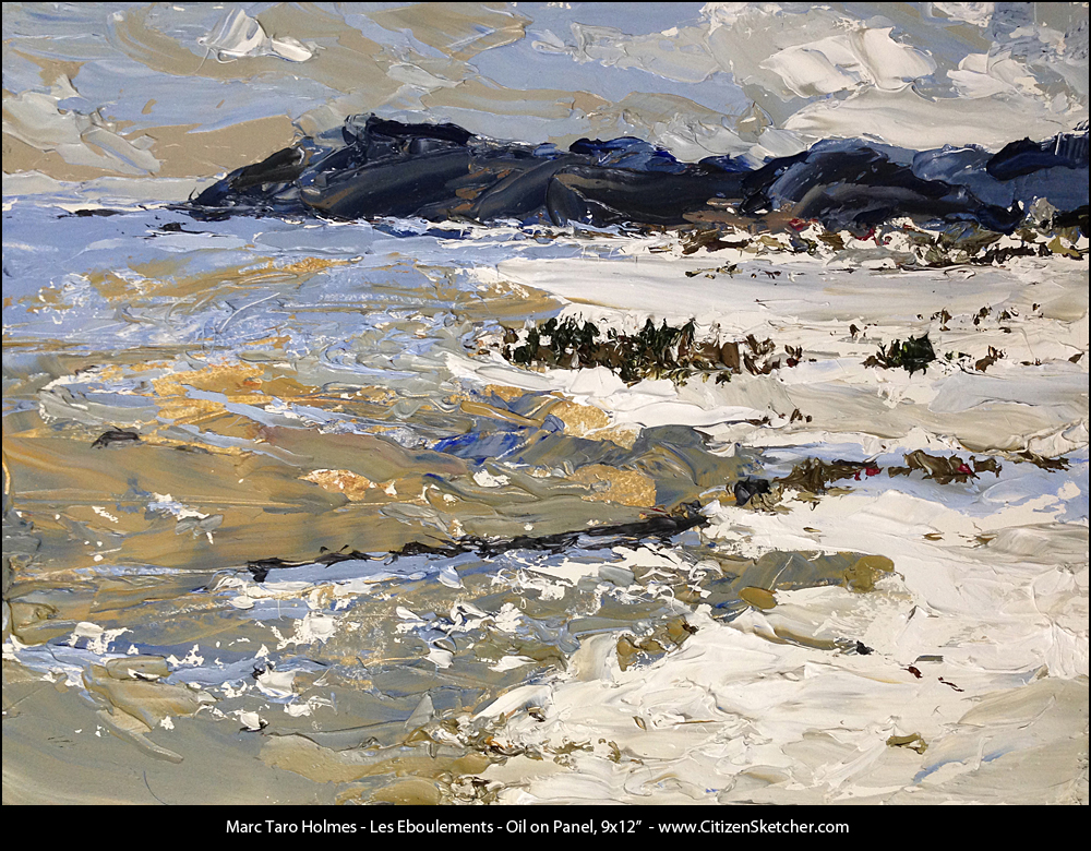
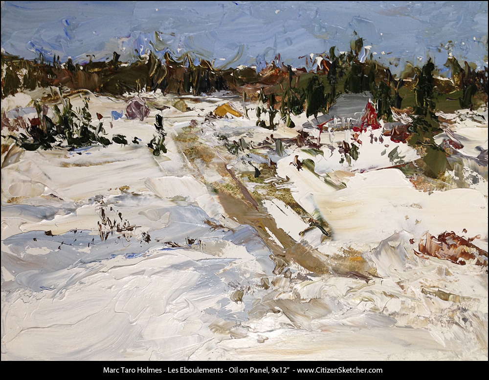
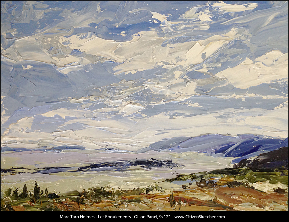
Quebec Spring : Subzero Plein Air
Every year, around this time, a group of die-hard plein air painters gather in the town of Les Eboulements, about an hour east of Quebec city.
The paint-out has been going on for upwards of 40 years, bringing serious outdoor painters from all around Quebec and Ontario. This year I was fortunate to be invited, and jumped at the opportunity.
Artists in attendance included Catherine Young Bates, Helmut Langeder, J Allison Robichaud, and Stuart Main – among many others.
It was an honor to paint with these experienced artists, each of them demonstrating the hard earned skills of a lifetime of painting on location. A highlight of the event was the nightly rounds going from room to room seeing what each painter brought home from the day.
These artists bring with them a direct continuity with the region’s history – painters like Bruno Côté and René Richard who made Charlevoix famous. I heard stories of ‘the good old days’ when there would be over 60 painters coming and going in this small Quebec town, from as early as January, working in weather as cold as -30.
This week, there are still 10-15 foot snowdrifts in some areas, but the high was around 0c/32f. You can withstand that long enough to paint if you have some serious boots and thermal underclothes. I had read Stapleton Kearns’ article on proper painting boots a while back. It’s good advice.
I knew however, that it would be impossible to paint with my usual watercolors. They simply won’t dry on the page at this temperature, making it hard to get sharp edges or deeper shadows. People have suggested the trick of painting with alcohol instead of water – but I can’t seem to make it work. So I reached back to something I tried out first in 2009. Painting on location with oils and a palette knife.
I think the watercolor concepts I rely on – working larger-to-smaller, seeing the large shapes of the design, and thinking about injecting color variation, translated well into oil paint.
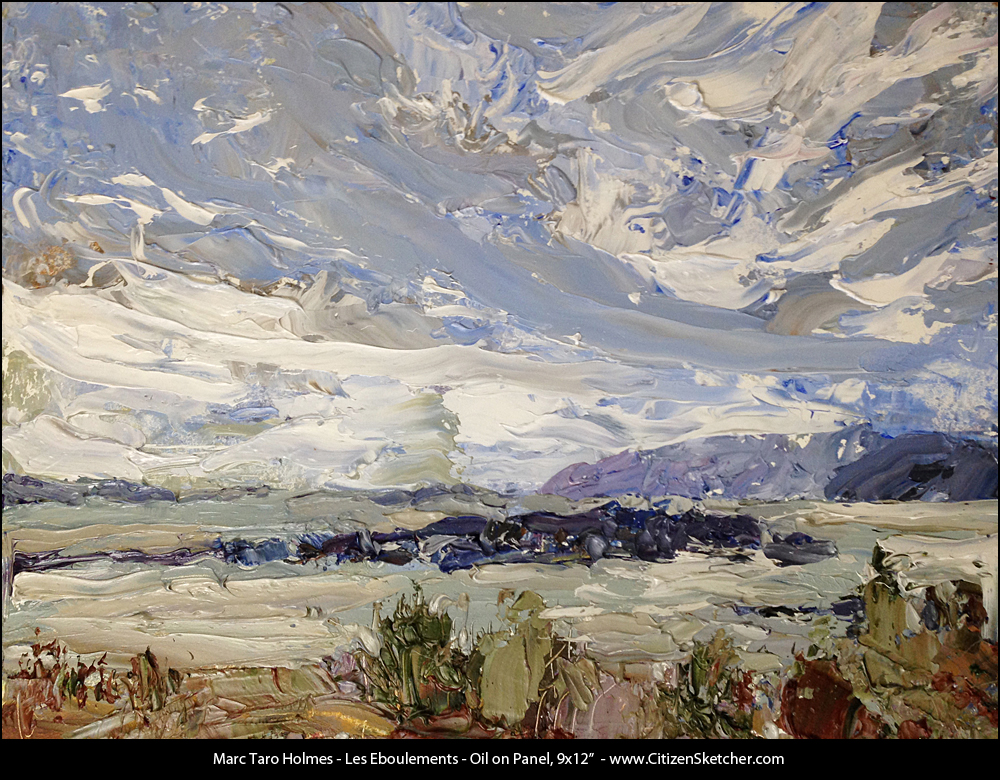
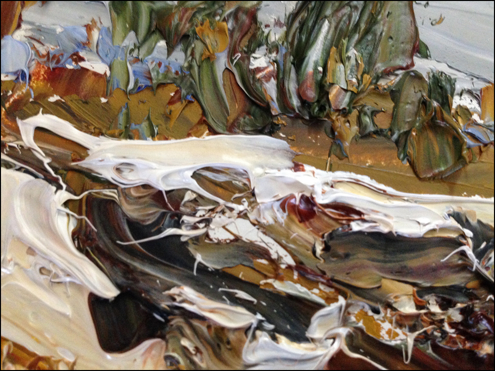
It was quite fun to layer on the rich pigment:) It’s the exact opposite of transparent watercolor. I’m not in the least bit sure why this is a ‘natural’ way for me to paint in oil, but it certainly feels right. Possibly it’s the pace at which you can work that feels similar. (About 45 minutes a painting). I’m starting with a 1″ knife for the under painting, stepping down to a ‘butter knife size’ and finishing with a needle pointed detail knife. Much like the #14>#6>#1 rounds that I might use normally.
As much as I enjoy this technique, this was just a brief infidelity. I will be returning to watercolor for the summer. We have trips planned to Italy, Singapore and Cambodia and Prince Edward Island, and I think it’s simply too difficult to bring wet oil paintings back from these far flung locales. So the knives will go back into the drawer until next winter. Unless I get a chance to do some more with it in the studio. The oil is seductive. But I must be disciplined! There is only so much time to paint, and I have to stay in training for sketching workshops this summer :)


Still. That is so juicy. Tasty looking no? We’ll see what happens with this over the coming year!
Sketching Jam


My friend Elissa suggested the Sunday afternoon Irish music jam session at McKibbins down on Bishop. Always a great way to un-wind the pen line – listening to some live music and sketching the players.
I’m posting these up for students in my Sketching People in Motion class. These are slightly different from the course work. In the videos I demonstrate using pencil first, before refining in ink. That really is a valuable step for beginners. But, if you’re getting comfortable with your people drawing, I suggest going straight in with the pen, as I’ve done here.
Note how I’m keeping the color washes to the shadow shapes – leaving the lit areas white. Crucial to save that untouched paper-white. Keeps the sketch fresh. Also note how I’ve accented shapes of base color with darker touches of richer color (in the faces and hair), in the exact same way as the brush pen accents the pen line. It’s the same thinking – Large-to-Small / Light-to-Dark.
As well – online students will note – pretty much no hatching at all in these. I just point that out to say – what you see in the video is a process that works – but you don’t have to use every element in every drawing. Take what you like, and use more or less of it.
Thanks! And see you guys in the comments on craftsy.com. (Register at my everyday blog readers discount).
Potrait of the Pointe
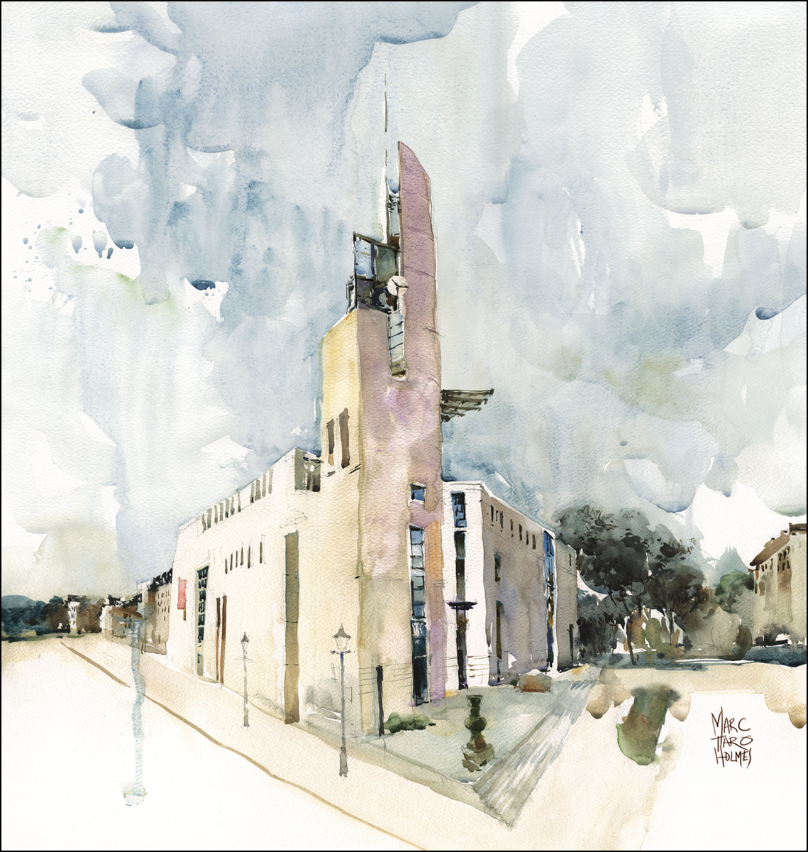
This is something out of the ordinary for me. I don’t normally paint contemporary architecture. I can’t say I’m comfortable with the smooth surfaces and straight lines. But I’ve recently been invited to do a portrait of the Pointe-à-Callière Museum for the cover of the 2015/16 Educational calendar. I very much enjoyed the challenge of this modernist structure. Perhaps this small bit of experience will help out with painting in Singapore this summer.

I just heard from Patrick over at Toscana Americana that we still have a few spaces left for the Cortona workshop. I also hear they are extending the early registration offer of US$200 off enrollments between March 22 and April 30. If you’re planning to be in Europe this summer, I hope you can attend!
More info here | Click here to register


