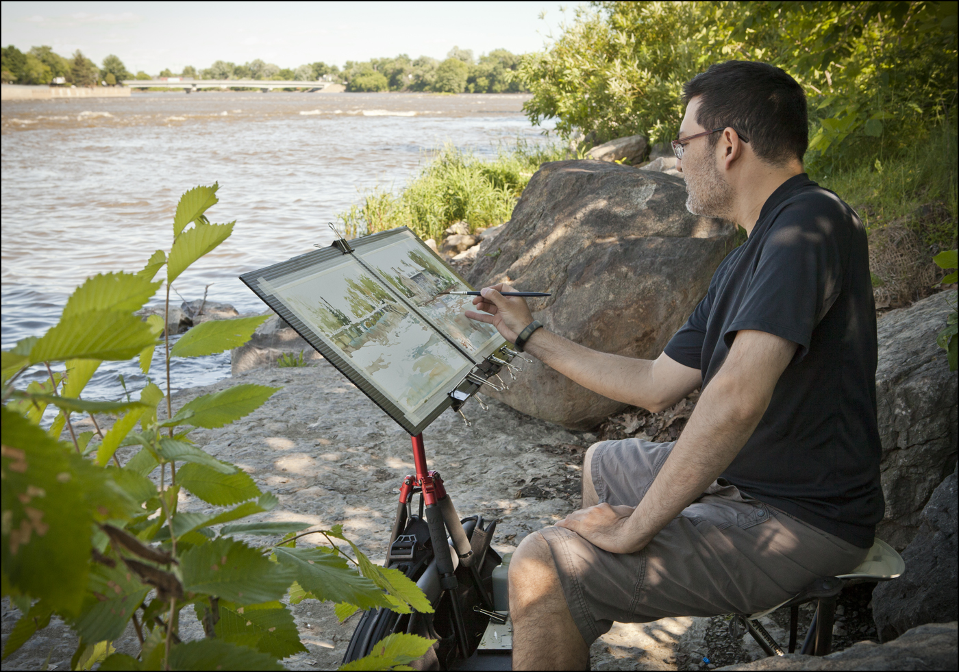
Go Bags Go: Field Sketching Kits for the Brazil Symposium
It’s last minute packing time before the Urban Sketchers symposium in Brazil.
I’ve been waffling back and forth over what to bring. There was a time I was willing to carry the kitchen sink, but these days my 40 year old neck is telling me to pack light.

[The old me, in Santo Domingo with a huge tripod easel]
Experience from last year in Barcelona suggests being attentive to ‘bag security’ while in Brazil. There were a number incidents of theft from distracted sketchers. Mostly phones and tablets. This is easy enough to avoid. Just don’t bring those items. But, in any crowded city, my general policy is: never put your bag down, never spread your stuff out, be able to walk away at any time. This is not just paranoia, it’s handy for staying out of the way of traffic, avoiding panhandlers, dodging police, etc.
So, here’s what I’ve settled on. The plan requires two bags actually.
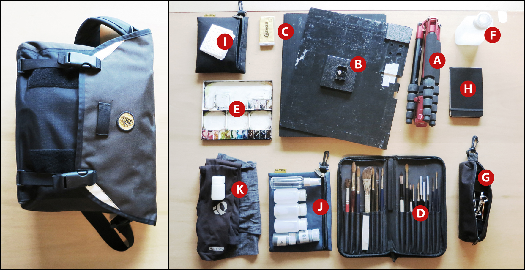
Go Bag Watercolor! 14 Liter 34x26x14cm Cocotte FRED. Loaded weight 11lbs.
CONTENTS: A: Sirui tripod, B: Eric Michaels tripod accessory tray, C: 6 – 11×14” Coroplast drawing boards (thus, 12 sheets of paper – more than enough for a day – typical over-packing!), D: brush case full of too many brushes (I will probably only use the #10 round), E: Holbein 12 slot tin palette, F: 250 ml Nalgene water jar (optionally x2 – will see if I need more), G: bag of bulldog clips for dogging down boards, H: Moleskine mini-sketchbook (removed) I: pouch with paper towels, eyeglass cleaner, J: pouch with black and sepia washable ink (removed), 60ml water bottle for ‘kung fu grip’ and misting bottle. K: sun screen, sun sleeves and scarf (yes, I’m over doing the sun safety – but now that I’m outdoors ‘full time’, better safe than sorry). There’s even space remaining for a water bottle.
You’ll note the absence of any drawing supplies. This my minimum kit for watercolor. If I bring pens, I’m going to end up drawing :) I just like drawing too much. But mainly I want to be able to grab the bag and go, knowing I’m set up for watercolor. This is the way my creativity works: I set up a project for the day, and do ONLY that. Otherwise I’d be bouncing around and never finish anything.

Go Bag Sketching! 6 Liter 27x19x12cm Cocotte FRIDA. Loaded weight 4.6lbs.
CONTENTS: A: Hand Book 8×8” watercolor sketchbook and coroplast backing boards. B: pouch with tin boxes of (way too many!) pen cartridges and pencil leads (what is wrong with me? it’s not like I’m going to run out this many times! Security blanket behavior!), black and white gouache, kneaded eraser, C: mini-kit of W&N half-pan watercolors and #10 DaVinci sable travel brush (don’t know what I’ll do if this wears out/gets lost – I bought it back when I had a job!), D: pencil box with Lamy Safari fountain pen, 0.7mm pencil, Kuretake #13 brush pen, E: Tachikawa nib holder and various nibs, F: Pouch with 30ml bottles of black and sepia (washable) ink, 60ml water bottles, sun screen, sun sleeves and scarf. G: That’s not really there. Combined with H.
If I can manage it, (convenience/willpower) I might do all my drawing with the dip nibs, allowing me to ditch all those pen cartridges. That would be nice. I could lose all the tin boxes and probably save half a pound.
Printable Cheat Sheet for Tea, Milk and Honey Workshop
I’ve done up a little ‘cheat sheet’ for my class at the USk Symposium in Paraty. It’s a single page (folded) booklet crammed with notes about my watercolor field sketching process.
Naturally it’s meant as a companion to the workshop, but even if you can’t make it to Brazil, it can still be a handy guide.
I find, once I dive in to a sketch, it goes by in a blur. So it’s good to have a plan in the back of your mind. Maybe tuck the booklet into your sketchbook, and just glance over it before you begin – kind of a refresher about strategy.

You can download THIS PDF FILE, (also found on my Downloads page. Send this link to friend). Then print it and fold it: in half lengthwise, and in half again shortwise – to make the booklet. It’s set up for Letter size (8.5×11″) and uses the entire page so un-check ‘fit to printable area’ (under the page scaling pull-down) to use every square inch on American sheets or, if you’re using A4 leave that feature checked and you’ll get a bit of extra white on around edges.
Feel free to use this handout in your own workshops or classrooms, even if they’re not a USK event!
~m
Illustrator James Gurney, best known as the author of “Dinotopia“, and the instant art instructional classic “Color and Light” has recently released an art instructional DVD all about field sketching in watercolor.
The self-published video is available from his website, either on DVD ($US 32), or by digital download ($US 14.99).
James graciously sent me a copy of the DVD to review. On the disk you get an introductory chapter covering his well-chosen field kit – a set of art supplies that packs down into a tiny bag – followed by six ‘over the shoulder’ narrations, each taking a watercolor sketch from start to finish. You’ll see a few architectural subjects, some of his hallmark ‘travelling-naturalist’ studies of animals, and a ‘portrait interview’ of a civil war re-enactor.

I talked to James last year, around the time of his Dinotopia Exhibiton at the Arkell Museum. Back then we discussed his philosophy to do with sketching on location, and a little bit of the “making of” process behind this DVD. Go back to that old interview if you want to see shots of the gear he’s used to make these sketches.
What you are getting with these video tutorials, above all else, is the benefit of Gurney’s tremendous experience.
The subjects of the sketches are not actually that important. I liked some of his locations quite a bit, others were a matter of taste. But what is of great value is seeing how he finishes these pieces. Watching step by step through his planning and blocking-in stages – crucial phases that make his remarkable finish happen ‘like magic’. If you hadn’t seen the loose, open brushwork at the beginning, you’d swear his final work was the result of painful nitpicking – rather than his free, confident sketching hand.
He truly is making it look easy. But that’s worth seeing – so you know for real how to get there yourself.

Gurney has streamlined his portable art kit to exactly what he needs and nothing more. It’s a minimum of equipment, but he wrings every ounce of performance from it.
Using three kinds of material – pan watercolors, watercolor pencils, and washable (Higgins) ink, you’ll see him create a full range of values from subtle glazes to darkest darks, just as you would expect from an accomplished oil painter working in watercolor. Much like we observed at the Sargent watercolor show in Brooklyn, Gurney paints solid, massed in figures, followed up by well observed surface textures. These are on-the-money pictorial studies, quickly executed, under sometimes difficult conditions. Live animal subjects, rapidly setting sun – things one might reasonably avoid – (he says he enjoys the challenge!).
I highly recommend the affordably priced download for anyone who wants to learn more about achieving realistic paintings on location. There are actually some bonus items with the download that you don’t get on the DVD. More content for less – you can’t argue with that.
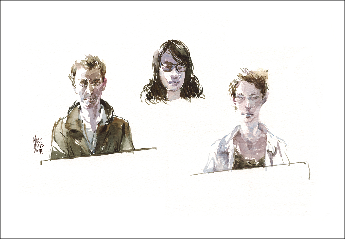
Sneaky Portraits

I used to do a lot of life drawing classes. I have heaps of that sort of stuff over here on my Flickr.
That’s how I learned to draw after art school. Nobody did drawings on location at my college, and strangely not much still-life either. It was either drawing the figure, or drawing from imagination. So for years after art school I just kept at it. Sometimes going three nights a week during my peak years.
Right after my recent direct-to-watercolor marathon I signed up for a week long figure drawing workshop at UQAM. If you live anywhere near Montreal, they do this class twice a year. A solid week, 9-5 in the studio, with a wide variety of models. I don’t know of a better workshop deal anywhere. This is my second time doing it. I hope to find the time again next year.

This year something weird happened. Suddenly I found myself with extra time. Usually I’m working right to the last micro second of a pose. But this year, with all the recent plein air painting practice I found enough time in between long poses to do these sneaky portraits in the margins.
This has me looking forward to Juliana Russo’s Portrait Exchange in Paraty.
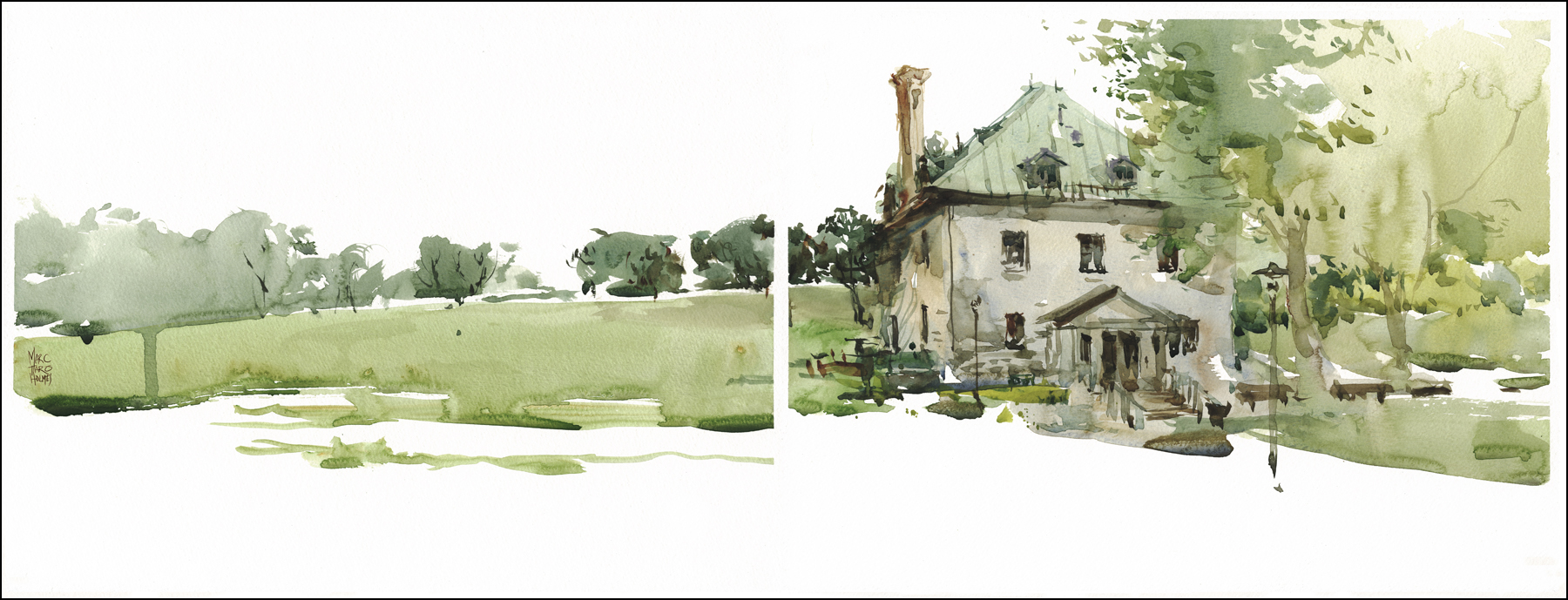
Direct to Watercolor Part 4 of 4 : Back to the City
Note: If you’re linking in from somewhere, this is part 4 of 1 / 2 / 3 / 4

[Square Saint Louis, Montreal]
I figured it was time to try direct watercolor painting on some complex urban subjects. My previous paintings had been somewhat easier to manage, being in more simplified settings. (Huge tree shapes, isolated, simple structures).
So I headed down to Montreal’s ‘painted ladies’ – the Victorians at Square Saint Louis. This first try was a bit of a shock – harder than I expected to capture these intricate rooftops. All the gingerbread and fish-scale tiles. You can be the judge if this one is a success. I’ll call it a learning experience.
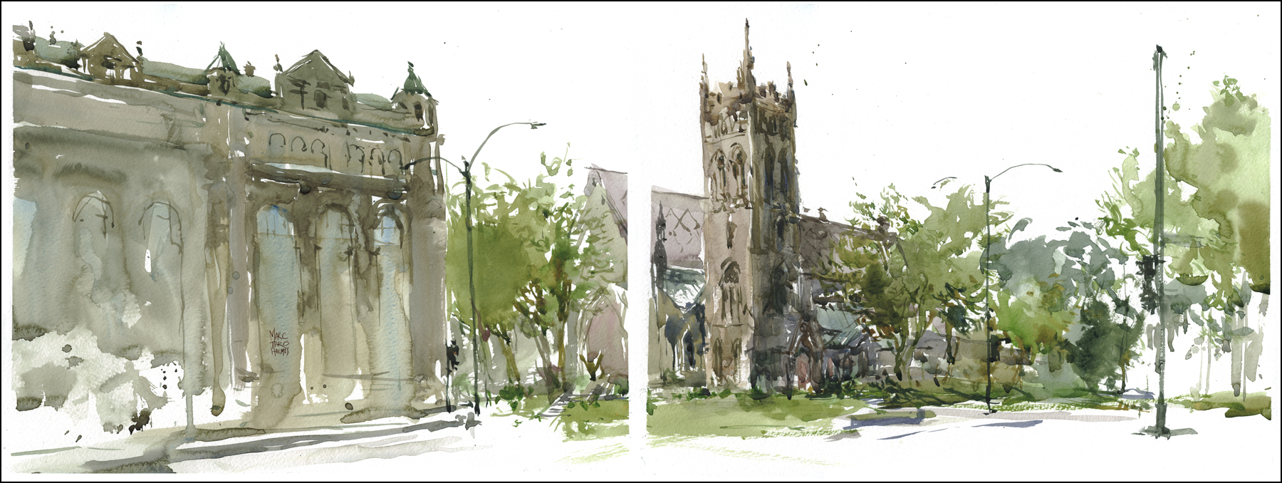
[Saint George Anglican, Montreal]
Moving on to this view of Saint George Anglican church, in downtown Montreal, across the street from the monolithic sandstone block of our central train station, I find a more suitable view.
Still quite a challenge. In real life it’s a busy intersection, lots of traffic, and much of the important information in the church is covered by foliage.
Here’s a series of steps showing how I broke the view into ‘The Three Big Shapes’. I have a section in my upcoming book, in which I suggest a theory. An iconic, or ‘symbolic’ landscape painting could be made of only three shapes – Sky, Ground and Subject. So I say three big shapes, even though in reality it might be five, or seven or how ever many shapes you need.


Any scene, no matter how complex, can be simplified into these ‘puzzle pieces’. What I’ve been calling logical chunks’. The goal of the exercise is to see how FEW of these shapes you need to use. This is the essence of simplification. What can be merged into a shared silhouette? What internal details can be abstracted away?

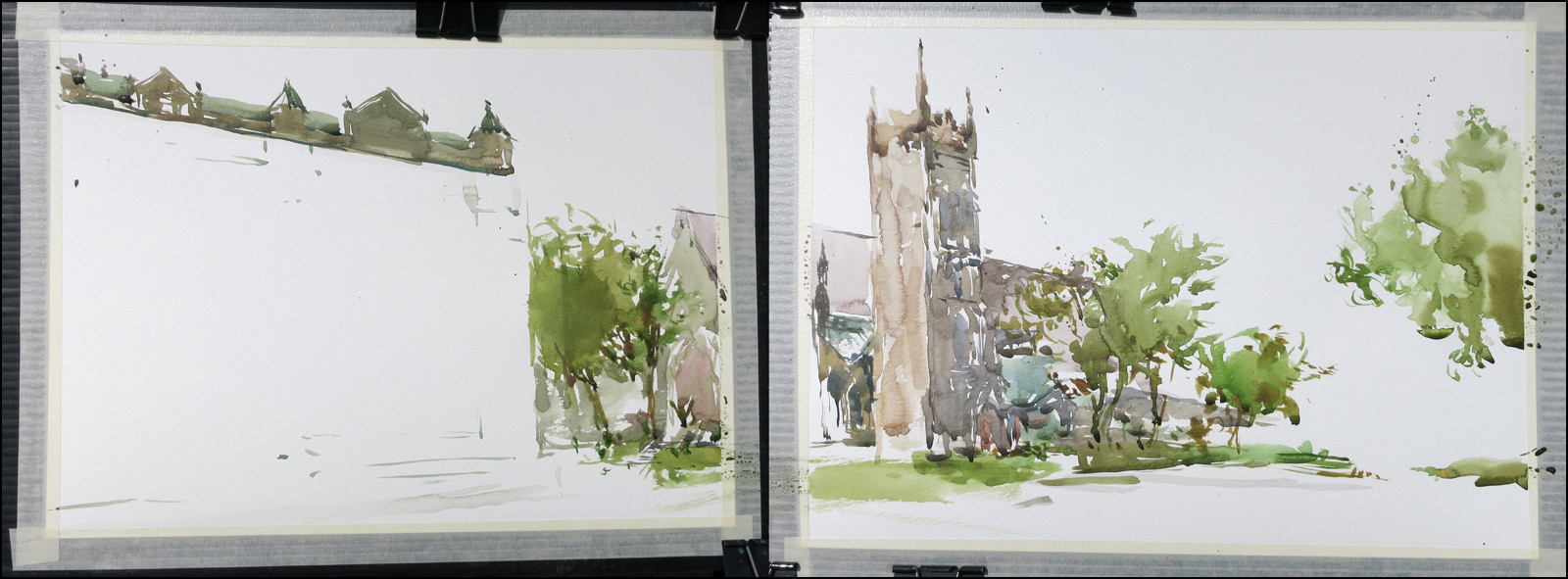

I try to make each of the shapes I’ve identified with one continuous bead. Carrying a wash down the bell tower, stopping at a logical spot along the ground line. Or working across the roof line of the train station, infusing the whole shape with the grey-green tone of copper cladding. This gives the puzzle pieces an internal unity of color, and sharp edges between plane changes. Where you stop an edge is just as important as where you start.
The last step is the small dark details that turn the puzzle pieces into architecture. All the window ledges, lamp posts and traffic lights. What architects sometimes call ‘street furniture’.
So, thanks for reading all of this! That’s the end of my project on direct-to-watercolor urban sketching. I hope that was interesting, and as always, feel free to send any questions you might have.
Note: If you’re linking in from somewhere, this is part 4 of 1 / 2 / 3 / 4
~m
Direct to Watercolor Part 3 of 4 : Step By Step Process
Note: If you’re linking in from somewhere, this is part 3 of 1 / 2 / 3 / 4
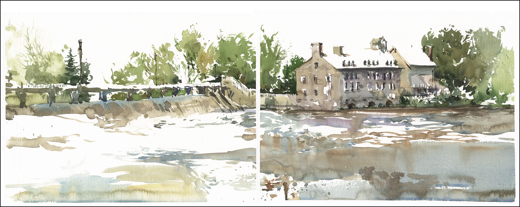
[Terrebonne Mill, L’ile des Moulins]
Ok, this is from the second week of this painting project. Now that I was more confident with this process, I took the time to make progress shots. These are just handheld snaps, so the quality is poor, but I think they will serve.

Here’s the location. Out in Terrebonne QC, at a historic site on L’ile des Moulins (Google Map).
There’s a big old mill here that makes for a dramatic subject. Water flows through a kind of sluice gate/pedestrian bridge thingy, and under the foundations of the old stone structure. It’s a great subject for this kind of painted sketch. The architecture and parkland behind lend themselves to graphic simplification.
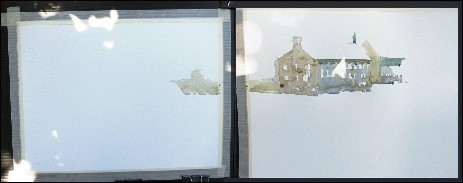
At this point I’m not even seriously doing the Dot Plot method any longer. I used perhaps three marks to establish the placement of these two buildings. I one at the chimney, the roof line, and the base of the rightmost structure. Mostly I just visualized it all in my head – since the composition here is fairly simple.
I’m blocking in ‘logical chunks’. Not working all over the painting, just drawing each major shape as it interlocks into the next. I’m able to make some transitions by letting objects touch in small ways. And I can charge color into my wet shapes, making the interiors of the washes as interesting as possible. The paper is dry, so that the edges of each silhouette shape are clean and sharp.

Putting in the bridge was a bit nerve wracking. I was sorely tempted to get out a pencil and give myself a guideline.
Thankfully, I knew I’d have that moment of weakness, so I didn’t bring one with me.
The only way I’ve been able to pull off this whole series, is by taking all drawing materials out of my bag, putting down the pens, and walking away from them. Honestly, if I had a pen, I’d have used it.
Since I had no choice, I had to figure the bridge out with the brush. Looking at the silhouette – finding the key shapes – the repeating piers that support the pedestrian deck, creating the gaps where the river flows down a concrete embankment.
It was important to me to drastically simplify things. There’s a lot of pipes and mechanics under the bridge – but this is not the focus of the painting. The eye is meant to go to the mill on the other panel. So I know I need to limit this to a calligraphic silhouette.
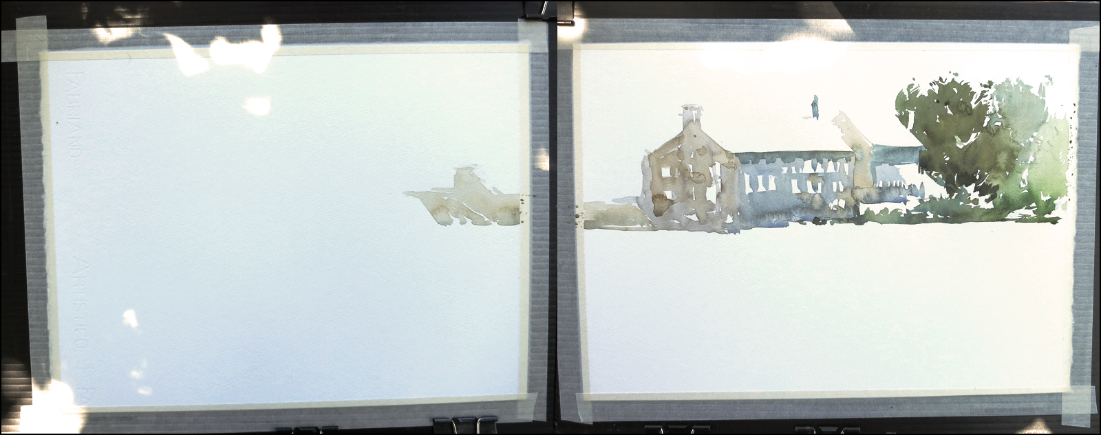
The river was comparatively easy – you can’t really go wrong painting water – it has no particular shape. Just keep it flowing and let the watercolor do the work.

The bridge comes to life when I put in the tree line. I create the sunlit upper deck simply by leaving it out. Just like the shiny tile roof of the mill. The bridge deck is drawn with negative space. I have to prevent myself from putting people on the bridge. It’s not the focus – so it doesn’t deserve too much detail. I’m referring (yet again) to my foundation principle ‘The Gradient of Interest’. (There’s at least three or four exercises on this topic in my upcoming book. To me, this is the essence of a ‘quick’ sketch. The strength of the composition, the control of where the eye goes).
The last step is the darkest darks. The semi-opaque touches, most visible in the windows on the mill. This stage is the closest to drawing in ink. The dark paint mix has a similar consistency. I usually use a mix like Prussian Blue and Burnt Sienna. Or these days, Shadow (Perylene) Green and Burnt Sienna. Warm and Cold, in varying proportions. I’m still using the relatively large #7 long hair W&N for this detail work.
I feel like this painting has come full circle, bringing back some of what I love about ink drawing, but in a subdued way, more suitable to plein air painting.
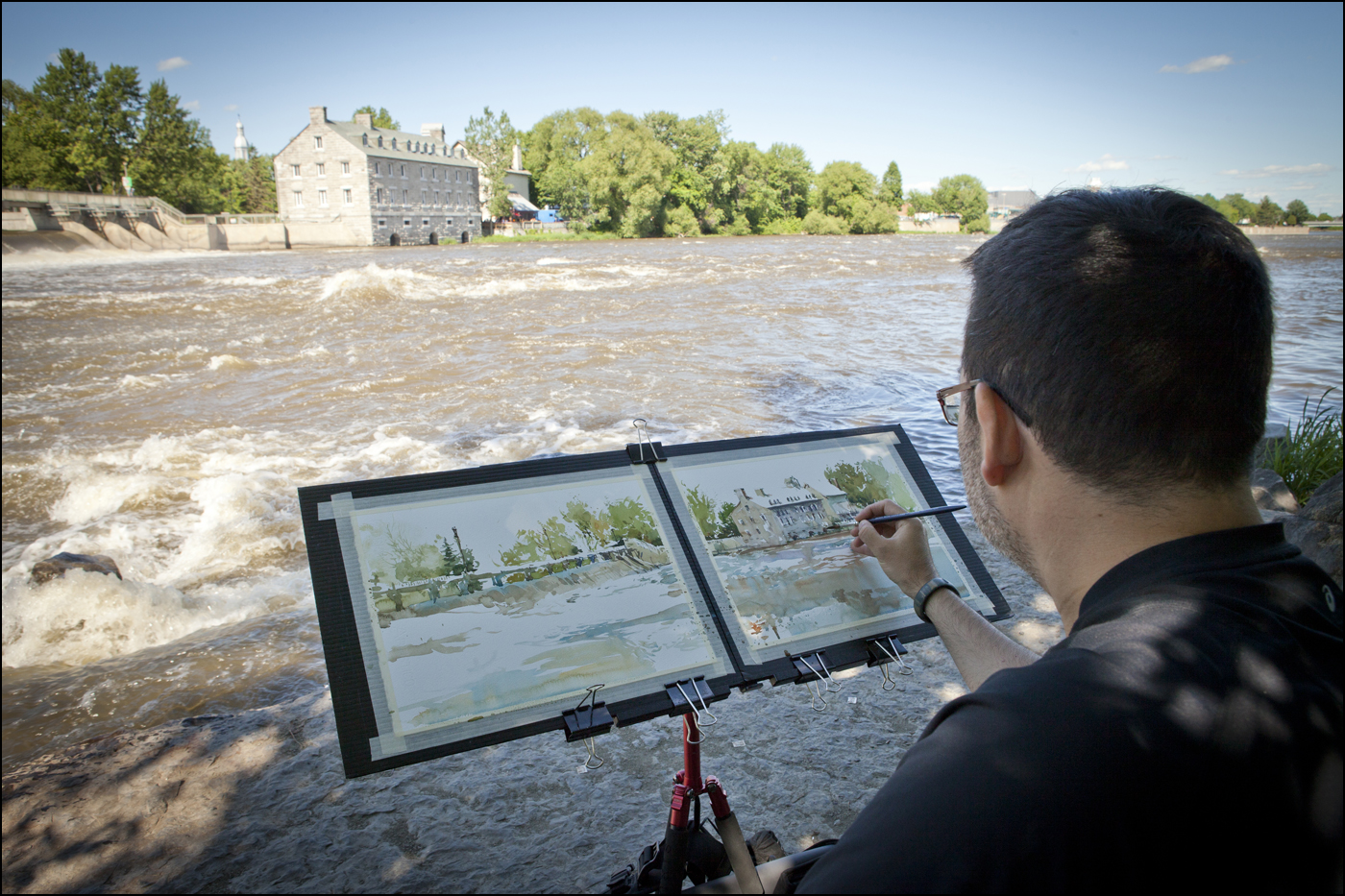
Here’s a better look at my diptych setup. Two watercolor quarter sheets, taped onto Coroplast panels clipped to my lightweight folding easel. Sort of like a giant sketchbook spread. You might say, why not one long panorama? Well, no great reason. Except that with two panels I can turn them face to face and put it all away into a large courier bag. If it was a single sheet, I’d have to carry the paper under my arm. I’ve certainly done that before – but I’m trying to field test how I might work on a long term trip – and I don’t want to be travelling with big drawing boards.
Note: If you’re linking in from somewhere, this is part 1 of 1 / 2 / 3 / 4
Direct to Watercolor Part 2 of 4 : Field Studies
Note: If you’re linking in from somewhere, this is part 2 of 1 / 2 / 3 / 4
After my recent breakthrough pages from last Friday’s post. I went out and did some messing around. Stuff that I won’t show you. About five pages of throw-away studies. Enough to confirm that I actually had a process locked down.
Then I went out and did two days of sketching on the mountain, up in Parc du Mont-Royal.
I was taking it easy, yet still doing three or four sketches a day. There were a few false starts I didn’t keep (the backs of those sheets get used for figure drawing class). One thing for sure, working direct-to-watercolor is faster that drawing-then-painting. It takes almost exactly half the time to do one of these. Go figure! Almost if it’s true, that a line drawing is just as much work as a painting.
[Maison Smith, Parc du Mont-Royal]

[Maison Smith Montreal, Back Yard]
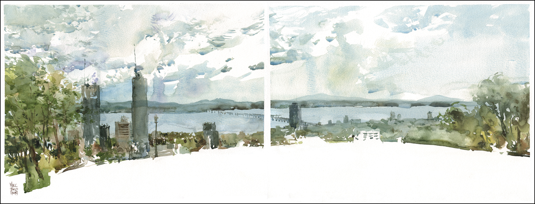
[Panorama from the Chalet du Montreal]

So, I feel I’ve gone from a fairly tentative sketchbook exercise in brush drawing, to some paintings that I’m pretty proud of. So, how is this jump possible? Lets see….
Switching to natural sable brushes:
I don’t like to talk a lot about tools. (Though you’d never know it reading this blog). I feel that asking ‘what brush did you use’ is a distraction from more significant questions. BUT – that being said – a nice fat sable with a belly full of paint and a needle fine point makes a real difference.
I am mostly using a #14 Escoda, #10 DaVinci, and #7 Winsor and Newton Artist Watercolor Sable (in the long hair version – similar to a rigger).
Doing Tea, Milk and Honey in smaller areas:
I’m still using the three step process I call ‘Tea, Milk, Honey’, but instead of systematically working the entire surface, I’m working sub-sections of the painting each on its own clock. Working in logical chunks like the silhouette of a tree or the ‘box’ of a building. I’m doing this so that I can get down to the darks sooner. While a patch is still wet.
More pigment!
I’m mixing the paint richer, wetter and with more pigment than I used to. My previous paintings, built out of layered series of stains, actually use very little paint in comparison to these more aggressive mixes. I’m using a mix of Winsor and Newton, Holbein, and Daniel Smith tubes. There’s a list of colors in this post.
Investing in ‘direct’ drawing skills:
I’ve been talking a lot about this thing I call ‘The Dot Plot Method’ recently. That approach evolved naturally out of drawing directly in pen and ink. I started working exclusively in washable ink a few months back, in order to wean myself off the pencil. The ability to erase an under drawing, to make multiple stages of corrections, was allowing me to make very detailed, delicate, (dare I say, finicky) paintings. Drawing, and then tinting over top, was a crucial phase in my development, but I have known for a while I wanted to be more spontaneous than that.
By working my way through a few sketchbooks of water-soluble direct-to-ink drawings, first by melting my drawings, then later by washing color right into the water-soluble line, I’ve been training my ability to visualize space, and my brush handling, to the point where I can draw directly in color without the preparation of a pencil drawing.
Working medium size:
These odd compositions – 11×30″ diptychs – are a thing I settled on so I can work a bit larger than sketchbook size, but not so big that packing the gear becomes a problem. I went through a phase where I was working way bigger. Up to 24×36”. But that’s simply unwieldy for urban sketching. A gust of wind and suddenly you’re Mary Poppins. Plus everything scales up. The weight of a bigger tripod, the unwieldy panel under your arm, the size of the brushes required, and the time it takes to cover all that paper. It wasn’t something I could expect to take with me on a trip – such as the upcoming Urban Sketchers conference in Brazil.
Next post – a step-by-step process example!
Note: If you’re linking in from somewhere, this is part 1 of 1 / 2 / 3 / 4
~m
Direct to Watercolor Part 1 of 4 : First Breakthrough
Note: If you’re linking in from somewhere, this is part 1 of 1 / 2 / 3 / 4
At the moment I’m out of town visiting the old stomping grounds in Alberta. The next four posts are going to be about a recent three-week watercolor sketching project.
The other day I had an abrupt breakthrough. I feel like I’ve changed the way I draw ‘overnight’.
Not truly overnight of course. I know in reality it’s been a very gradual change, two steps forward, one back, taking about five years. But it still feels like a light bulb suddenly went on.

These sketches are something I almost never do. Drawing directly with the brush, with no preparation.
Simply starting with a silhouette in watercolor, and working into the simple shape. You can clearly see the ‘big shape’ of the unfinished neighboring building in this second sketch.
If you’re a reader of the blog, you’ll know I’m all about my under drawing. So this is sort of a big thing for me! I have always felt (and still do) that a painting never gets better than the drawing it’s based on. If the drawing isn’t strong, adding value and tone isn’t going to save it. Quite the contrary – it’s the silk purse and sow’s ear all over again.

Looking at these older sketches from the 2011 USK symposium in Lisbon, I think you can clearly see my love of drawing, and the way I’m using it as a scaffold for the paint.

When I teach, I’m always telling people, ‘Spend as much time on the drawing, as you do on the painting’.
The drawing is the planning phase. Where you establish correct proportions and plan the big blocks of color. The painting itself is the reward. The brushwork can be light and lively because there’s no more thinking required.
But somehow today, after (about) five years of drawing followed by ‘coloring in’, I’ve reached a point where I’m wanting to draw directly with the brush.
My breakthrough sketches might not seem like a significant improvement. They might even look like a step backwards at the moment. But, in the next three posts I’ll show what I did from here.
Note: If you’re linking in from somewhere, this is part 1 of 1 / 2 / 3 / 4
~m
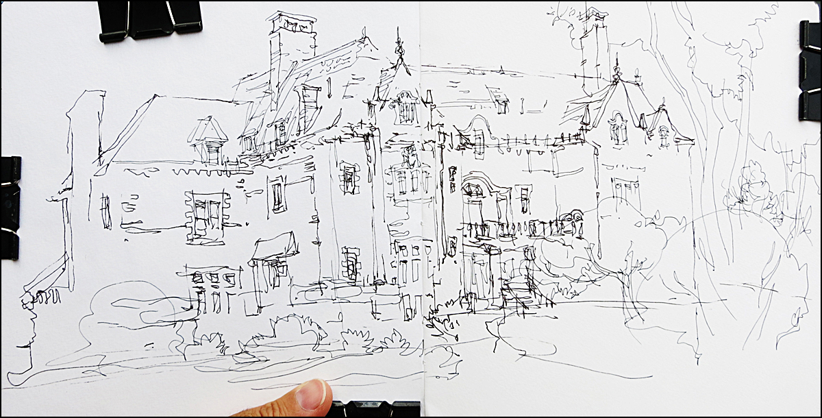
Step-by-Step Drawing Example : Davis House Dot Plot

The other day I showed you a quick example of what I’m calling ‘Dot Plots’. I really need a better name for this. Maybe somebody who isn’t such an autodidact can tell me what it’s called? I came up with this on my own, but there is probably an official name for this trick.
Anyway – I was out sketching the other day, and got another good example. Here’s the step-by-step shots:

This is the first pass of the Dot Plot.
What I have here are a set of small dots and dashes that describe for me the roof line of my subject, and where the ground line falls. The two major perspective angles I need to know in order to fill in the ‘face’ of the building.
It’s just a matter of putting in a small mark wherever there is a corner or intersection. The peak of each cupola, the width of each column of windows. You can stop whenever you have enough measurements to see the silhouette. Once you’ve got the ‘box’, you can just pile the details inside.
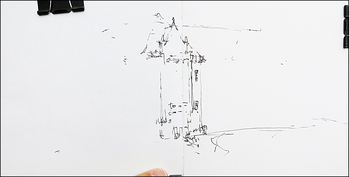
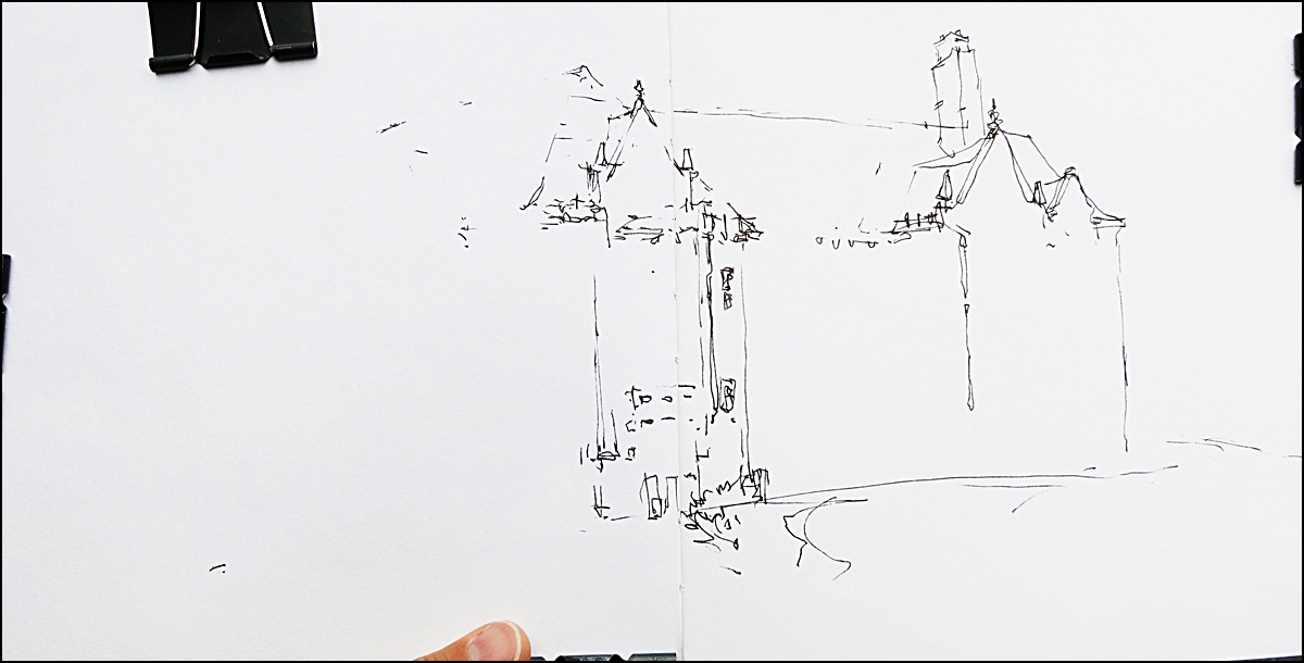
Ta da! See how the building appears, simply by connecting the dots? This is what they mean when they say ‘work larger to smaller’.
It might be easier for beginners to do this in pencil. You can poke in a few of these tiny markers, and if a quick sight measuring check says they’re wrong you only have to erase a few dots, not a whole drawing. When I’m doing it like this in ink, if I mis-place one, I just ignore it, and put another in the right place. At the end of the drawing, you don’t notice any stray marks.
I talk a fair bit about sight measuring in my upcoming book on sketching. (Sorry, sorry, relentless promotion. Baby needs a new pair of shoes). But, even while doing so, I try to give you the techniques to escape measuring as quickly as possible.
My philosophy is, learn to make measuring instinctive. It really should not become labor. That sucks all the fun out it. I don’t think anyone enjoys the measuring part of sketch. We’re in it for the excitement of the rapid scribble! The lightning fast impression. The measuring is only so we’re not disappointed later, coming home with an out of proportion sketch, or a drawing that’s crammed into the corner of our page.
Personally, I’m aiming for the best of both worlds. A way to get just enough accuracy to keep my left brain happy, but to go fast enough to keep my right brain engaged.
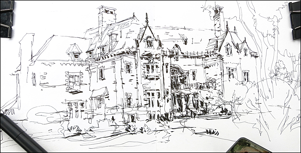


By the way, this is Davis House. It’s in is in a great location on De La Montaigne where you can sketch five small buildings surrounding a cute little park. A real oasis for sketchers. If you’re ever in Montreal, and find yourself near McGill, you might like this spot. (MAP).
Oot and Aboot

Out and about sketchcrawling with a buddy from the old gaming days. We went into this little place on a whim – could hear the music from the open balcony. Sat right up front to sketch the band, which ended up meaning we sat at their table. So we showed them their sketches and hung out.

The ladies at the bar were less cool with being sketched. Got the cold shoulder when they saw it. I guess in this setting, ‘acting sketchy’ gets you classed with other stalkers. Oh well, can’t win them all.


