Cutting Room Floor : Sighting the Maya
Welcome to another episode of Cutting Room Floor. Drawings from The Urban Sketcher that didn’t make it into the final edit, or were perhaps shown on the smallish size.
I had to do the previous post on the technique of sight measuring because this one is about the payoff of that method.
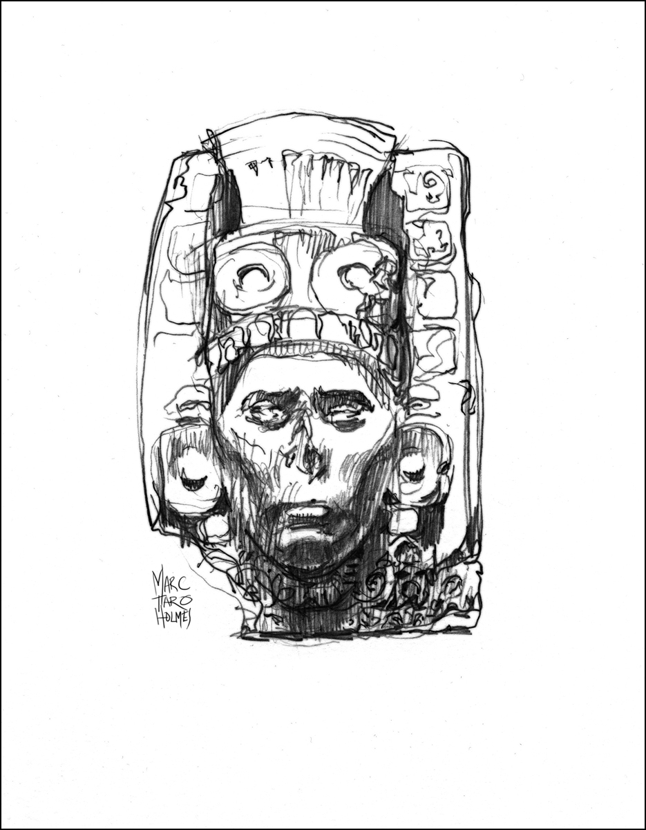
These are older drawings. From 2012 I do believe. At the time I had traveled to Toronto, and then Ottawa (Museum of Civilization), to sketch an exhibition of ancient Mayan stone stele, and terracotta funerary urns. I know – too cool right!? That’s my kind of drawing party right there.
There’s a funny story about the first attempt.

This weekend was a breakthrough drawing event for me. I’d been studying at Montreal’s Atelier de Brésoles, (outstanding instruction, I highly recommend them), and all the theories of sight measuring had come together.
Sketching these fantastically detailed things was pure fun. Like playing a technically demanding piece of music, and finally enjoying hearing it from yourself.

It’s mesmerizing doing detailed studies. The world fades away, and there is nothing but the drawing and the objects. I think it’s therapeutic. A kind of meditation.
Brings to mind a recent NYT piece “The Art of Slowing Down in a Museum“.

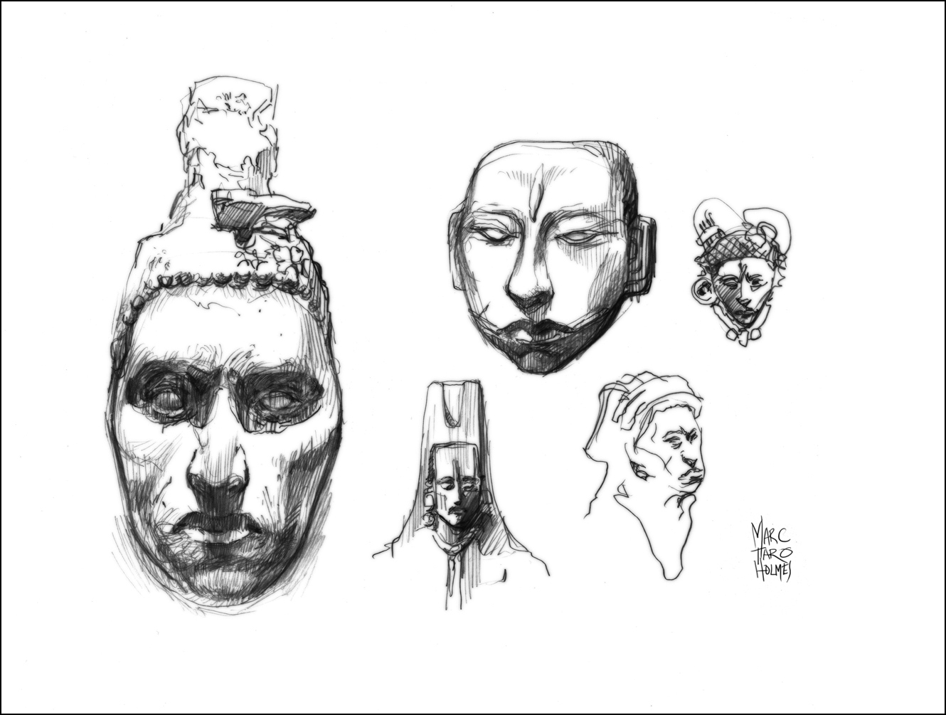
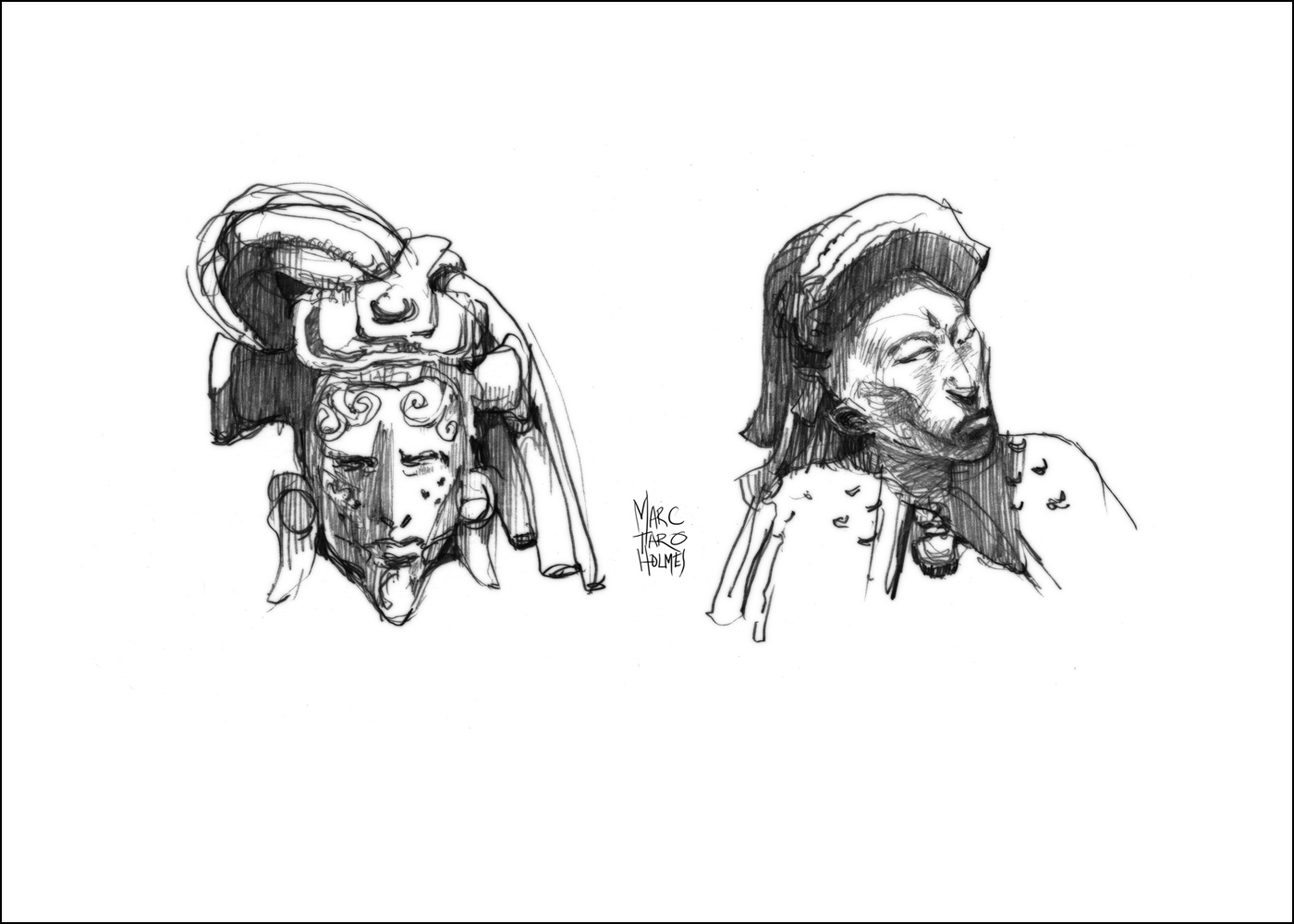


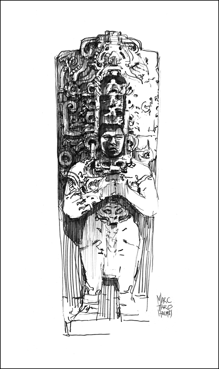
All these sketches are 0.7mm HB mechanical pencil on plate finish Strathmore Bristol – darkened for presentation during the scanning process. This last one is a watercolor copy of the original location drawing, done at home in the studio with the assistance of a reference photo for better proportions.


Just to announce – USK Quebec Sketcher Bethann Merkle is hosting a field sketching workshop in Glacier National Park. Friday June 19th, 2015. The emphasis will be on fusion of art and the natural sciences. If you might be in the area this summer, find out more here.
Student Question: Sketching Small
Followup to a students’s comment/question about how to sketch very small.
The trick is simplification. Here’s some big heads in a small book, versus a really tiny portrait. It means leaving out all the non-essentials.
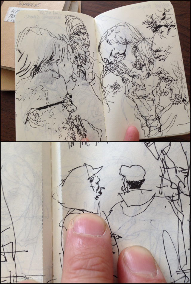
Recently, (prepping for People in Motion) I’ve started sketching in some very tiny books (on the subway, or whenever I’m waiting around somewhere). For very fine work like this I’m using a Platinum Carbon Fountain Pen, Super Fine. (Plus these water PROOF refills: Platinum Carbon Ink Cartridge – Black). and Moleskine Cahier Journals (3 x 5″).
Life Sketching vs. Studio Montage
My video class on Sketching People in Motion is in full swing. Which means I’m getting lots of great questions from students.
The course starts with the basic techniques of speed sketching, followed by tinting in watercolor, and some demonstration of direct watercolor sketching.
In the later lessons, I get into some discussion about ‘reportage’. The practice of using your sketches to document events.
This montage of sketches from the Corning Museum of Glass is one of the more complex examples I talk about near the end of chapter 7. We do an animation showing how it’s put together, but I’ve had a question about it in the class discussion, and I’d like to go into more detail here.


I love this kind of drawing. It’s a way to get out into the world and discover things I would otherwise never encounter. [Beekeepers | Rock Climbers | Trial Lawyers | Alzheimers Patients]
To some extent, every sketch done on location is a documentary. But in these reportage drawings, I’m consciously trying to show a sequence of events. To visually describe a process.
I suppose it’s just part of how I learn. I have a very short attention span. I’m not sure if it’s pathologically short – but it seems to be sometimes. The act of drawing things allows me to slow down. To stay locked into something long enough to try and understand it.
I always feel, when teaching sketching, that there are two things I’m responsible for.
Primarily we’re here to learn the actual skills. That’s what most people are wanting. This is in fact the easy part. Hand skills are just a matter of showing clearly what to do, and tricking the student into a lot of practice.
But secondly, I feel I have to touch on Aspirational Goals. What we are ultimately going to do with this skill. Fun as it is to simply sketch, with no motivation beyond doing it (Life Drawing) I think we must have, in the back of our minds, a real world application.
Maybe we want to be travel sketchers, seeing the world and reporting in our sketchbooks (sounds great right?). Maybe we want to be investigative journalists, or biographers of great individuals (or all three!). Whatever your goal – the question is – how will you use your sketches to communicate?
I don’t want to actually start quoting the lesson from class. But I do want to show exactly how I did this particular composition.
The heart of the question is Location Sketching vs. Studio Work. How much do you draw on-the-spot, and how much do you finish later.
I firmly believe the best drawings are completed entirely on location. You have 100% of the information you need right there. All the color, composition and detail of real life to choose from. Anything you do after is going to require visual memory (which is a trained skill), or reference material (which is impossible to collect at the same time as sketching – unless your wife is a photographer), or you might even be tempted to fake things (aiee!). This all means, I prefer to do it right there, beginning to end.
However. There are practical concerns.
I can, and do, bring large sheets of paper on location. My largest field sketches are 18×24″. The only limit to how wide a view and how many details I can get in, is the size of the board I can carry around all day. That’s why I’ve started to do diptych’s on location. So I can use two boards, spread open like a sketchbook, and go even larger.
But – when you’re seated in an auditorium, or standing in a small space, or are with an audience of folks who don’t want to be distracted, sometimes you simply have to work on a smaller scale.
The actual original drawings for this montage are done in a Stillman & Birn Epsilon at 6×9″. I’m sketching these as quickly as possible, doing what they call Key Framing (freezing motion).
It is a juggling act between A: what can you see from your vantage, B: what you have time to draw before it’s gone, and C: what you need next to explain the action – what part of the operation is missing? The goal is for every sketch to show something new. Usually, you don’t have time to repeat yourself. Collect information and keep moving. Prioritize – what is the anchoring activity, and what doodles might support it. (Here’s an older example).

Doing all these small sketches allows me great flexibility. I never have to erase – just flip the page. I can do a few very rapid ones, because I know they are going to be in the background, or used as ‘supporting cast’ for the main actors. I can write notes about color or action, that I will erase later.
In my head, I’m already combining them into a collage. The old-school method for the actual combination is to trace your drawings – or transfer with graphite paper. I do this digitally these days, simply because it’s faster. Collage in Photoshop, and print to the final paper.
Nobody regrets the vanishing art of tracing. In fact, mid century illustrators didn’t trace either – people used to physically cut and paste sketches and do large photo prints to paint over. Talk about costly and time consuming. I’d rather take my chances doing it all in one drawing if it came to that. I suppose that is part of why illustration used to be a highly paid career. (I suppose it’s still ok? Will let you know re: that).
Here’s a few steps from the in-class animation showing how all the loose sketchbook pages are combined together:


After that, it’s simply a matter of tinting the drawings. (That’s lesson 4 in the series).
OK! sorry for the long winded post – but I wanted to be able to fully answer the questions that came up. I hope it’s interesting for anyone who is thinking to take their field sketching further – illustration, journalism, fine art – even comics and cinematic story boarding.
~m
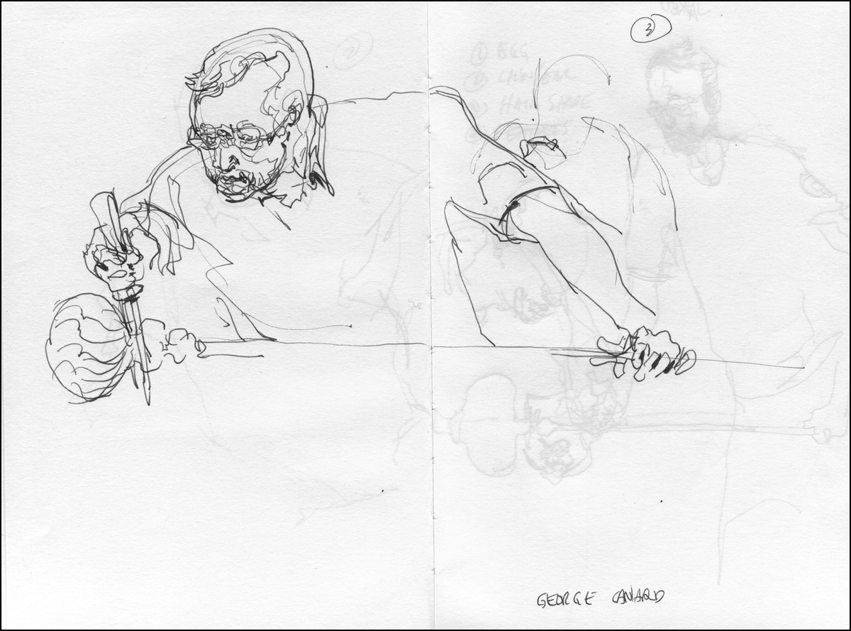
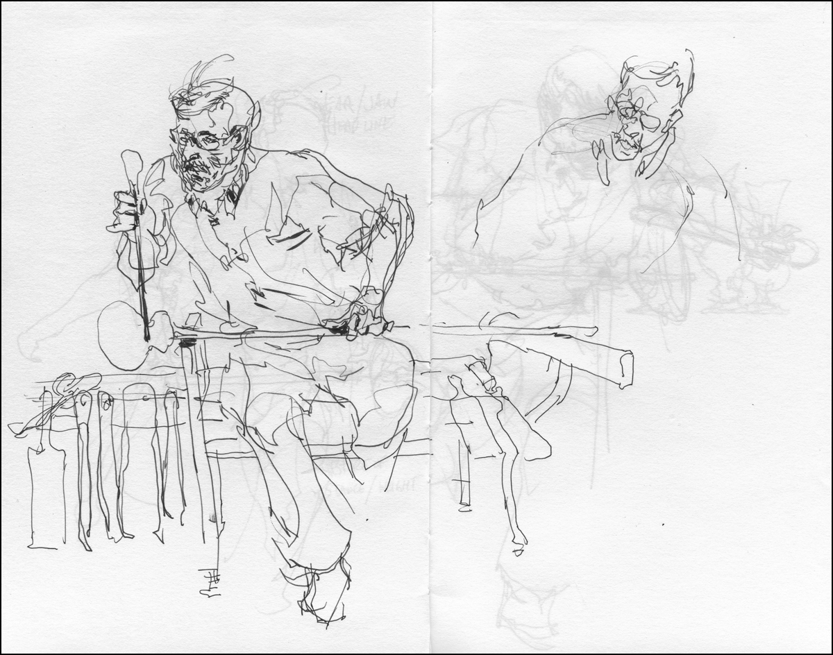
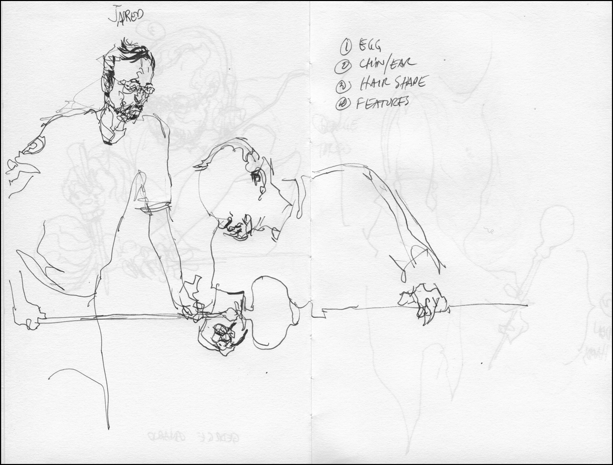
The Medea Effect : Day 02
I’ve been back for my second day in rehearsal with James Loye and Jennifer Morehouse at the Talisman Theatre production of The Medea Effect, (Get Tickets Here)
After my first day of pencil sketches, I was excited to return and do watercolors on location. It so happened, this day they were going over some of the same material – the first quarter of the story – in which the characters spar. Ada, the aging actress pressing her case with Hugo the young genius director.
Good, in that, I was able to carry on right where I left off. But, on the other hand, I’m still in suspense how the story ends!

At the start of each day the actors do an exercise where they interfere with each other’s personal space. Pushing back and forth with their presence, moving about a tight circle without colliding. Initially the overbearing director looms over the pleading actress. It almost looks like psychic pushing hands Tai Chi. They are exploring physical stances, becoming comfortable projecting a shifting balance of power between them.
“Yes, I’m proud of each of my wrinkles. I know why they are there, I could catalog them, say which one appeared first and why, I could trace the path of my wrinkles, name each tragedy”…
Talisman Theatre has its own interesting story. Very much a reflection of Montreal.
From their own site “Talisman has a vibrant, living mission: to produce English-language premières of Québécois plays for Montreal’s public and students”. I think that’s a fascinating response to the perception of Two Solitudes in Quebec culture. They continue: “…we retain the essence of traditional Québécois theatrical practice as part of our hybrid development process; and we have developed a talented bi-lingual team with its own distinctive artistic approach.”
My answer, whenever asked about my own progress with the French language, is that drawing is so consuming, I couldn’t possibly study another language at the same time.
So I have no qualifications whatsoever to say – but to my ear, the translation by Nadine Desrochers from Suzie Bastien’s original, sounds authentic. There are word choices that seem pitch perfect.

“They are an obstacle to her fall. And her fall must be perfect. Let me try. Let me say those words. Please listen to me”.

“SLAUGHTERS. SLAUGHTERS. SLAUGHTERS. Her children. The FLESH of her FLESH”.
Directed by Emma Tibaldo (a older piece on her here), The Medea Effect is on stage February 3 to 7, 2015 at the Segal Centre Studio. (Get Tickets Here)
Announcement: Urban Sketchers Workshop, Coventry UK, April 8-10
Urban Sketchers Isabel Carmona, Simone Ridyard and Swasky are putting on a three day workshop in Coventry, UK.
I won’t be able to attend myself, but encourage anyone who might be in the area to find out more on the USK workshops page.
Book Excerpt : Simple Sight Measuring Example
This is the second in a post series of ‘excerpts’ from my book The Urban Sketcher. This time I’m going right back to the very first lesson in the book; Sight Measuring.
I shouldn’t really call these excerpts. This is more like the director’s cut. Here’s the full length text, before edits for word count limits and layout. Mainly, because this is the text I have easily available in electronic form, but also, so you get the full explanation, and larger pictures.
[Excerpt from The Urban Sketcher Begins]
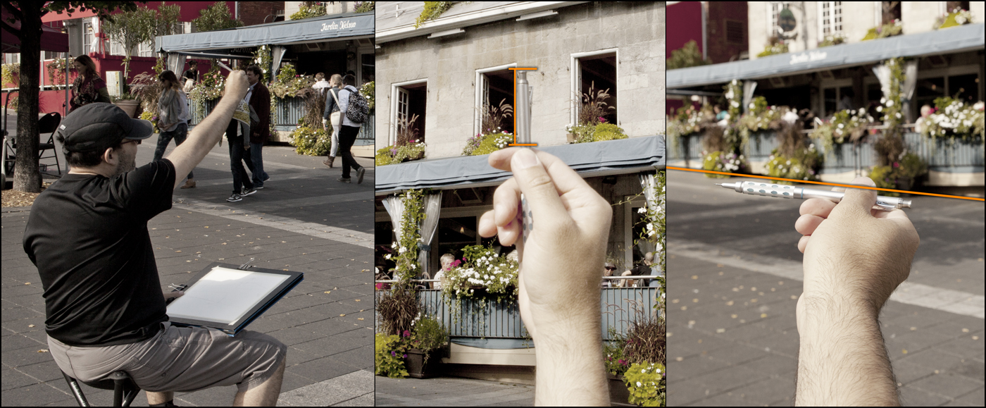
You are probably familiar with the image of the artist with their arm extended, holding a brush upright, their thumb up like a hitchhiker. Usually they are shown with their eyes squinted and tongue sticking out. This is not just a funny cartoon image of an artist – it’s a real measuring technique!
In this shot I am checking things like the angle of the sloped street, and the height of the windows.
The idea is, we want to spot errors in proportion in the first few minutes of a sketch. I use two simple techniques called Sight Measuring and Angle Checking. These are a simplified version of what academic ateliers might call Sight-Size Drawing.
There’s nothing worse than drawing in a lot of interesting details, only to realize you’ve drawn an important part out of scale. Or worse yet, you haven’t judged the height right, and you’re about to go off the edge of the page. That has happened to me many many (many) times. It’s quite frustrating to say the least :)


This sake set, found at a Chinatown knickknack shop, is a great introductory subject for sketching ‘outside in’.
To recap, the plan of attack is: get the outside silhouette shape first, spot check your accuracy, and then proceed to subdivide into smaller and smaller details until the whole thing is drawn.
The very first step is to decide roughly how large you want the drawing on the page.
Mark a small dash at the top and the bottom of your subject and lightly sketch a ‘scribble’ of the outside shape. No internal detail, just the silhouette, as if it was cut out of a piece of paper. (Pencil sketch is darkened for clarity).
This simple outline is all you need to ensure accumulating proportional errors don’t expand off the edge of the page. You have a ‘box’ to work within. All future details will fit inside this box. Or that is, they will, once we make sure the silhouette is accurate.
The best thing is, that scribble only took a few seconds. We don’t mind correcting a scribble. There is nothing to lose. If I’d gone right into the pattern or shading on the object, I’d start to get that feeling of, ‘oh, I like what I’ve done! I can’t erase that – it will be ok, I’ll just keep going’. Until, suddenly it’s not ok – it’s way off :)

Here’s how sight measuring works.
As you look at the subject, extend your arm straight (elbow locked), and line up the tip of your pencil with the top of the subject. Slide your thumb down until it’s lined up with the base. That position you’ve marked on your brush or pencil – that is a unit measure you can use to check against other objects.
(Line A)
Keep your thumb in position on the pencil to preserve the measurement you have marked. Keep your elbow locked to maintain the same distance from the subject.
Now, look for something you can compare your measurement against.
It so happens that the height of the jar is equal to the width across the three cups.
(Line A = Line B)
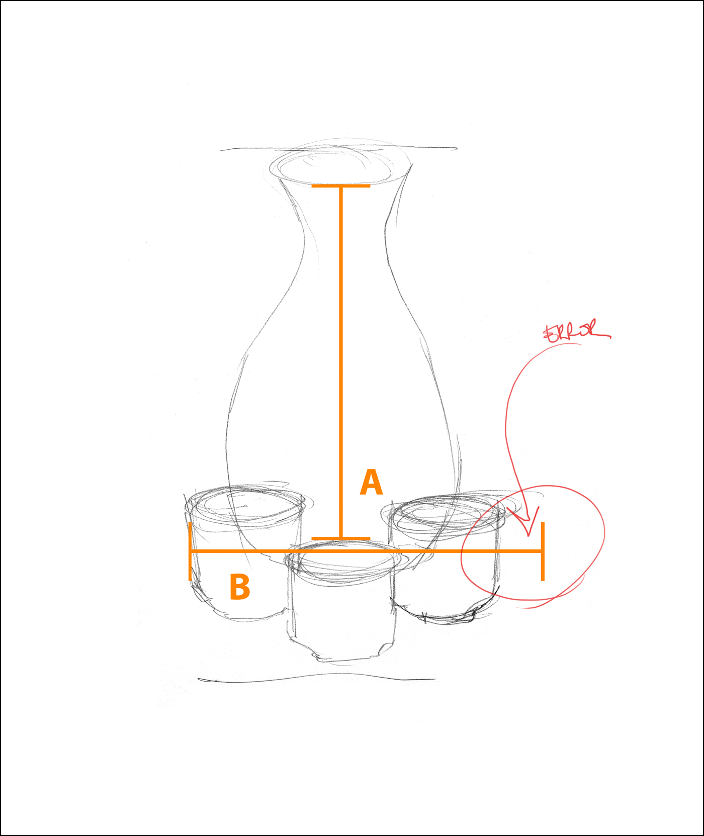
So, if we compare the height and width on our drawing– oops! The drawing is not correct.
See how we have caught that error with this simple measuring trick?
It’s really not a big deal, this is a pretty small error. In a simple subject like this it wouldn’t really matter that much, it’s not like people won’t know it’s a sake set :) But since it’s so easy to spot the issue and fix it, I might as well refine my sketch. I’ll make that fix to the silhouette so that the jar height (A) matches the cup width (B).
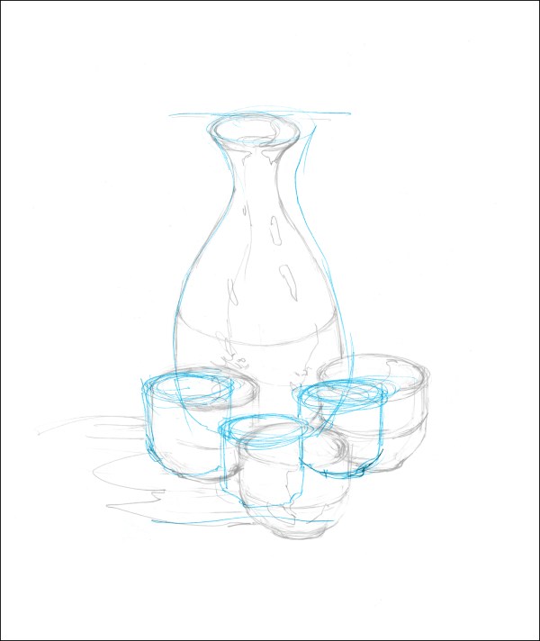
Blue lines are the original scribble, grey pencil the revised drawing.
The other big thing in this step is to sketch in the dividing line between the dark ceramic base and the upper patterned area. And, I fix a proportion error on the width of the neck.
This is what I mean by working larger-to-smaller. Once you have the outside shape, what is the next biggest thing you can draw? The ‘waist’ of the bottle is the next-to-largest shape. Dividing the jar in half. If you keep dividing each shape by half, eventually you are drawing very small details.


The other kind of sight measurement is what I call an Angle Check. Measuring the slope between two points.
When drawing outdoors, this is ideal for finding roof lines or checking perspective on narrowing city streets.
Place the base of the pencil on the first point, (the edge of the cup) holding the pencil perfectly vertically, rotate the tip until it lines up with your second point (the lip of the jar). In this case, rotating counter clockwise.
Now – lock your wrist. Don’t lose the angle of the pencil. Place it over your drawing, and see how well the angle lines up with what you’ve drawn. Not too bad hey? It’s looking reasonably close after widening those cups.

At this point, my planning is done. I can sit back and have fun with the pattern. That fish scale design is what attracted me to the thing in the first place. But by starting outside-in, I can see for certain I have a shape I like before I get into those details.
I want to be able to freely scribble in that pattern, without a care in the world. It’s a picky thing, sketching those repeating shapes – and I don’t want to stiffen up while doing it.
I wouldn’t feel as ‘ free’ if I wasn’t sure about the underlying structure. If I had to start and stop the pattern a few times, erasing and correcting the shape, it wouldn’t turn out as ‘loose and sketchy’ as I want.
Oddly, it’s the measuring that allows the sketch to look spontaneous. I’ve heard artists use a saying; ‘loose is how a drawing looks, not how it’s made’.

This particular example is fairly faithful to reality, because the subject is an easy one. As we move on through the book, you’ll see I only use as much precision as I need to get the sketch on paper. Those measurements only took seconds to do. In no way do I want this to become hard labor.
My feeling is, you should do whatever measuring you need to do so that you are satisfied with your drawing. You decide how accurate you want it to be.
I enjoy it when everyone can recognize my subjects, but I don’t want to be doing so much measuring that the drawing feels mechanical. Accuracy is a skill I want to have, it helps me do more challenging things. But I don’t ever want it to slow me down.
[Excerpt from The Urban Sketcher Ends]
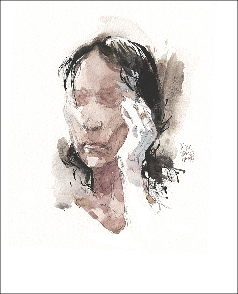
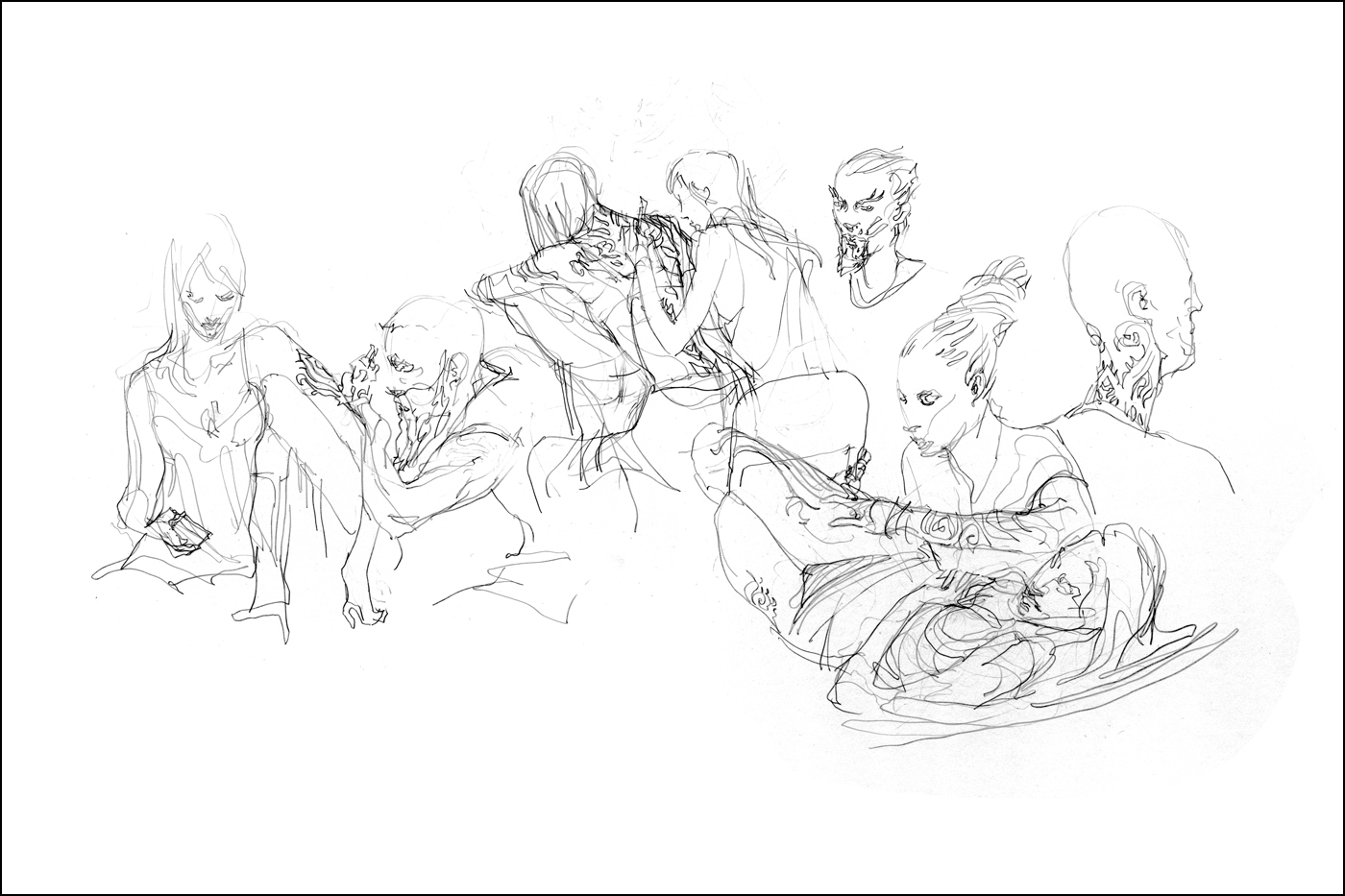
Cutting Room Floor : Montreal Tattoo Expo


Here’s a few drawings from the 2013 Montreal Art Tattoo Expo that didn’t make it into The Urban Sketcher.
In the book one of these drawings is broken down into six step-by-step illustrations, showing exactly how these are done.
It’s kind of fun to see a gradual improvement from the sketches I did at the 2012 show.

Called out by the Model
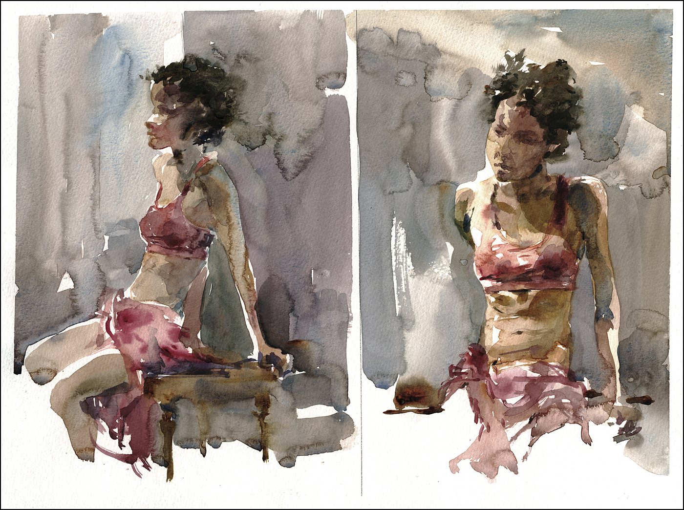
[Long pose session, these were half hour warmups. Watercolor, 12×16″]
I was at the daytime long pose session at George Vanier Cultural Centre, which is always a nice opportunity. It’s one hour longer than a standard life drawing workshop. Which is just fine by me. I like to get at least two watercolors out of a long pose – so that extra hour to warm up feels like a luxury.
I was happily sketching way – trying to to focus on a few things:
- Draw directly with the brush (dropping my pencil drawing safety net),
- Establish a silhouette with the first few strokes,
- Work color variation into the shapes while wet, (charging in).
- Don’t neglect the background tone. I’m often making figures on blank whiteness.
That was going well enough. But in the break our model called me out.
“I look like a 9 year old girl!” she says.
Rightly so. That was a weird mistake. Not sure how it happened. Her head had definitely gotten large and child like.
In the second half, I pushed to get a real likeness. I’ve been giving myself a free pass on likeness for so long (I mean, you have to start somewhere, and getting a nice figure is hard enough, I just say “Don’t worry if it doesn’t even look like them. After the model is gone, who’s going to know?’). But the time has come that I have to be able to get both a painting and a portrait, hey? If I’m going to do this work professionally :)
I’ve only done a few commissioned portraits – and each and every one of them has been sweating bullets. Until this year. Magically – that practice stuff is starting to pay off.
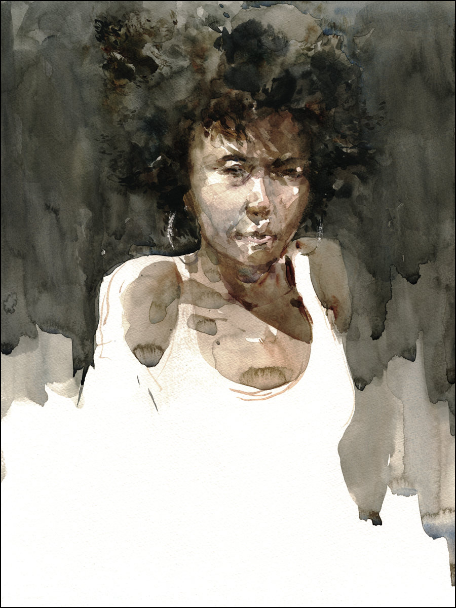
I’m pretty happy with this one. In particular, the shape of her hair and cast shadows on the forehead. At the time her hair was throwing me off my stride – I only realized it after the fact – it’s because Afro-textured hair doesn’t reveal the shape of the skull like I’m used to in a Caucasian. Funny – It’s one of my own bon mots that a portrait is just a ‘Head Shape / Hair Shape’. Yet it took me a few tries to get it right on her.
I’m glad Sarah called me out. I needed that push. That right there is a hidden reason to work from life. You don’t get that collaboration from photo reference.
Brush-wise: In the future I have to focus on a few more things:
- Make the shadow shapes melt a bit more into the light,
- Same with the background – more lost edges – less cut out shapes,
- Wet-on-dry gives you plenty of control – but it errs on the side of sharp edges,
- I’m going to experiment with painting the figure in reverse silhouette next time – to allow better melting into the background.
Book Excerpt : Sketching En-Passant
I thought I’d do a few posts excerpting sections from my book The Urban Sketcher. I’ll be resurrecting some stuff that was cut due to space limitations, and taking the opportunity to show larger images than we can get away with in print.
Here’s the section as it is in my manuscript, before the final edits in the book:
>>>>
[Excerpt from The Urban Sketcher Begins]
Exercise #9: Sketching En Passant: or The Long View: So the final situation to discuss is the capturing of people who are truly in motion. Not conveniently doing something for your amusement, but only seen for a few moments as they flow through your drawing. I call it ‘en passant’, the chess term for ‘capturing in passing’.
In the normal case of a person walking towards you, even in the best situation where you have an unobstructed view, you have only the time between spotting your approaching subject and about 20 or 30 feet before they pass you by. It’s very rare that you have a longer sight line than this. People in the extreme distance are just too small, and are frequently blocked by the crowd in front.
So we can say you have a 10-15 second window to sketch. I would agree, that is not a lot of time. But! Of course, I have a strategy for this situation.
There are two things you can do to help yourself out. The first, and most basic, is to widen the window of opportunity. Try and find a position that gives you the longest possible view of the most people.
You want to be a small island in a river of people, with a long straight, preferably up or down hill view. (A steep angle allows seeing over people’s heads. They don’t obscure each other as much).
To avoid being jostled by pedestrian traffic, I’ll lean with my back against a wall or a lamp post, so I’m only a little bigger than an obstacle they’d have to avoid anyway.
If you can get up somewhere, a balcony or bridge, you can benefit from the bird’s eye view. Other possibilities are the head of a long escalator, (trapping people for a few moments gliding up to you). Or across from the exit to a stadium or theater when a big show is letting out.
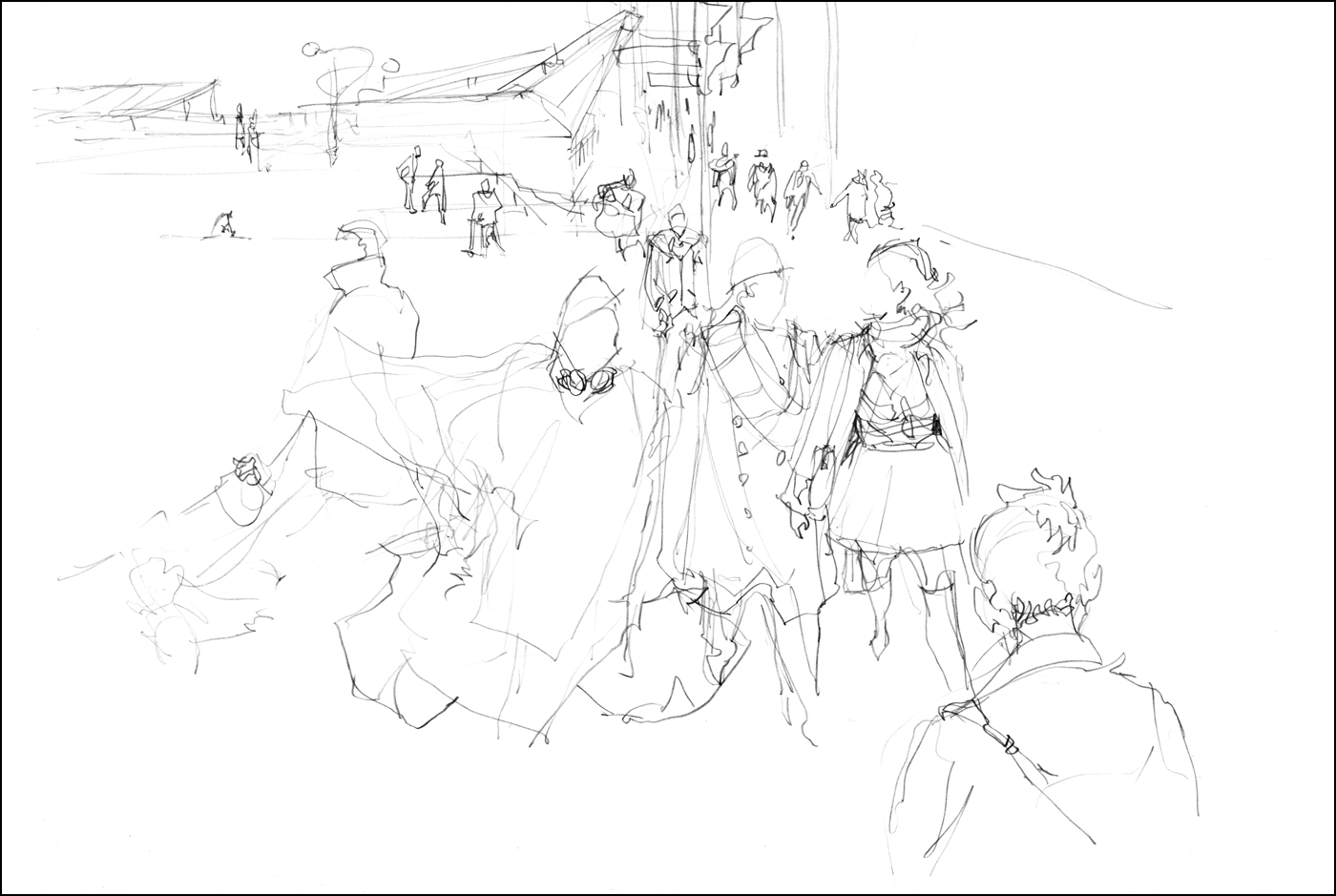

If nothing else presents itself, you can use any major downtown intersection during rush hour. Scribble people waiting for the crosswalk as they stream out of the office buildings.
The further you can see, and the more populated the street, the more fuel you will have for your fire. You want the best possible view for the longest possible time. (Even if that’s not very long).
In these examples, I scribbled in pencil and did calligraphic line over top using three colors of ink and a dipping nib. It was a cold windy October day, so I had plenty of interesting scarves, hats and jackets to sketch. The best character was a person wearing a neon orange plastic rain poncho and dragging a pair of bulging black garbage bags. This is a classic example of something you couldn’t make up.
The second thing you can do to increase your time window, is to cheat.
Don’t restrict yourself to one ‘exposure’. Instead of trying to draw an entire person in that 20 second window, I create a composite figure, combining multiple passersby, as if they were key frames of a single character in motion.
In a given crowd of people there are always ‘types’. People dress according to fashion trends, their jobs and economic standing, and the local weather.
In a street market in Asia there will be a never ending selection of wiry guys in t-shirts, shorts, and flip flops, often carrying heavy loads on their backs. On a blustery day in Montreal, everyone has long scarves, layered jackets, and wool caps.
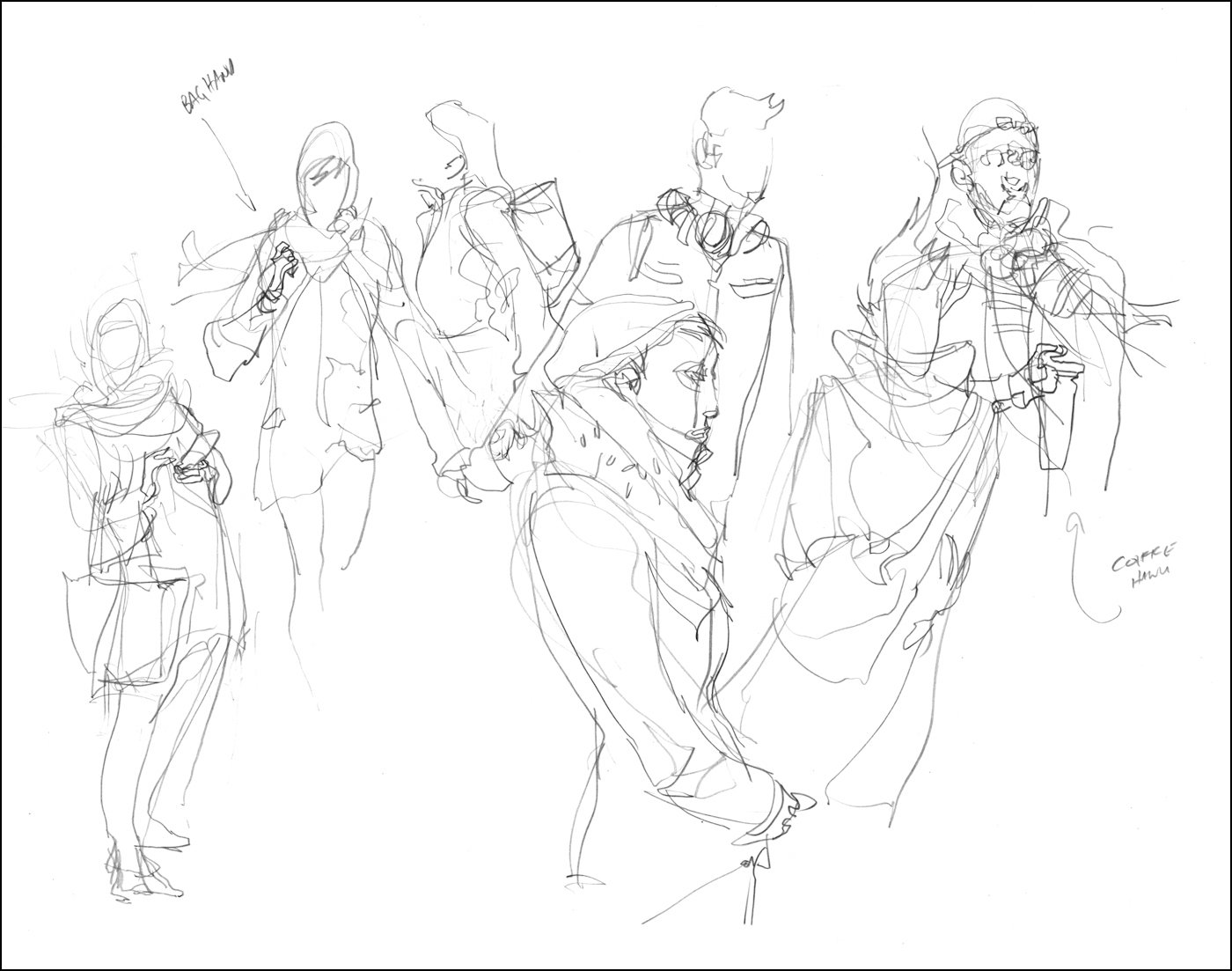

You can choose a ‘type’ – such as the smartly dressed man walking his dogs – and if you’ve chosen well, you’ll get another matching type in short order. In this area of expensive condos, it didn’t take long to get another dog walker.
Just as with the key frames of repeating motions, I can combine these passing ‘twins’ into a single drawing. Try and spot your character types as far back as possible, and keep your eye on them. Don’t get distracted by anyone else until they get so close they’re about to stride out of your working zone.
If I can gather one detail from each person – the shape of a hairstyle, a pair of glasses, the clasps on a bag – fairly quickly I have an entire composite figure. The gesture is the framework I am looking to fill in. I am adding appropriate details on top of the gesture, so it hangs together as a convincing person.
The character types that are more common are by definition best descriptions of the time and place you are in. Whatever you are seeing a lot of, is what will get drawn.
Try to get four or five character types going at once and you can do the multi-tasking trick while you wait for clones to appear.


This is an excellent time to try skipping pencil and going straight to ink – if you dare! Speed is of the essence here, so perhaps this is the best time to save a step. En passant is a great way to become more comfortable sketching without the safety net of pencil.
You end up drawing so many people so quickly this way, it’s possible to get a tremendous amount of training in a single day. A year’s worth of life drawing classes in a week.
A serious student might set aside a small sketchbook, and try to fill the entire book with direct-to-ink en passant sketches. Can you devour your way through an entire book in a week? Or a month? If you can do it, without editing yourself, or concerning yourself with ‘quality’ – simply devoting yourself to the process, I am sure you will see tremendous results.
Here’s an example where I went directly to ink. I’m using all the ideas we’ve covered, drawing Outside in, gesture followed by Calligraphy, and Spot Blacks. Doing it all in one continuous process.
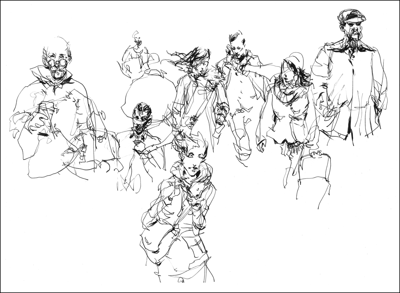

With these ones I’m using the Lamy Safari Fountain Pen and a Kuretake Sumi Brush Pen, then melting the water soluble ink with a little clean water.
I normally prefer the more aggressive line weight of a dip pen, and the more expressive range of a natural brush – but when you are doing it as fast as humanly possible, these kind of cartridge fed fountain pens are more practical. The chance of an ink spill goes up considerably when you’re in a rush.
[Excerpt from The Urban Sketcher Ends – thanks and hope you like the book!
Order now from Amazon or your local bookshop].

