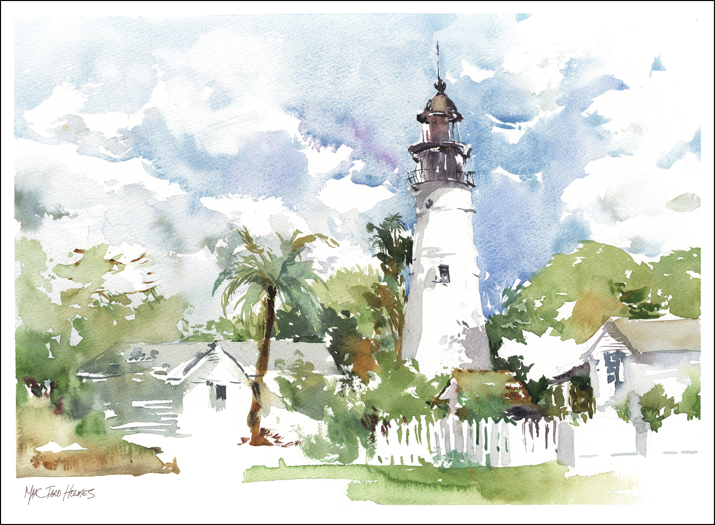
We’re just back from Florida, travelling by boat down the Intracoastal Waterway. Which is one of many things in this world I had no idea existed.
The Intracoastal is a continuous water course combining natural rivers and man made canals to make a 4800 km protected passage along the Eastern Seaboard. We traveled from West Palm Beach to Key West, taking about three days each way.
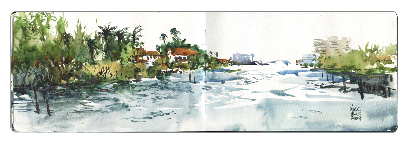
This massive landscaping project was probably constructed for cargo and military traffic, but today it’s a watery highway for sporting craft, party barges and the yachts of the rich and famous. Great sections of the canals are lined with beautiful houses and private docks. Not to mention hotels, marinas, and all the infrastructure to support vacation cruises (did I mention bars?).
Sketching from the stern as we cruised at 10 knots past palm trees, palatial mansions and mangrove islands – for me, it’s the ideal way to discover this unique coastal lifestyle – so different from my own western Canadian experience.

The first day found us passing under a series of drawbridges. The boat captains are in constant radio communication with the bridge crews, trying to time our approach to cross below when they’ve stopped traffic. It must be a daily annoyance to the locals. Having to wait at raised bridges while gleaming pleasure craft glide by.
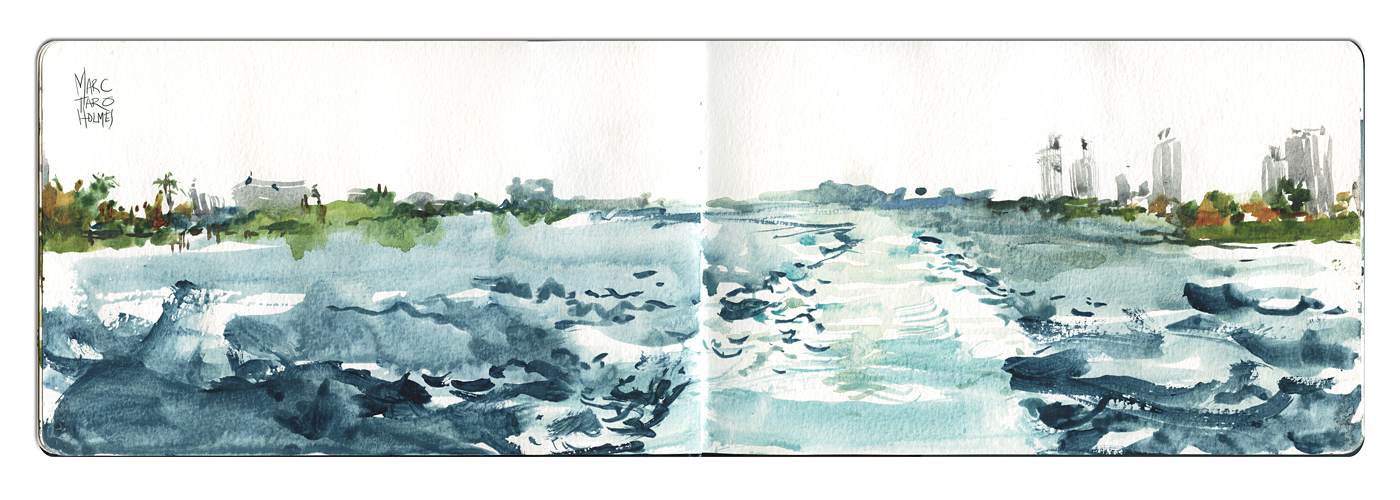
Being a son of the prairies, this was by far the longest I’ve spent on and around water and boats. I still haven’t recovered days later – I can still feel the boat moving, despite begin on dry land. But the sheltered inland waterway gives you flat water, protected from the ocean’s wave action, so it wasn’t so bad sketching while underway. These were all painted rapidly in a 5 x 8.5″ Moleskine Watercolor Notebook. The panoramic spread is perfect for the low profile of South Florida’s mangrove swampland.
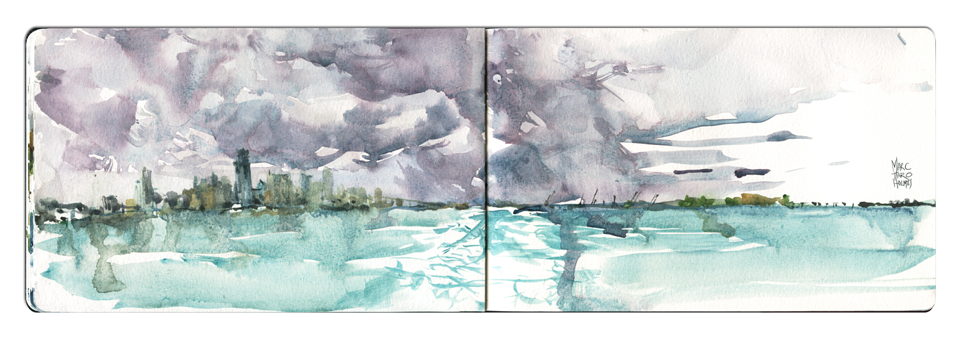
The Florida cloudscape is also something new to me. Skies over water are amazing. Towering clouds form and reform in minutes, making an ever changing subject. A real change from the flat grey of Montreal’s winter.
I had planned ahead, and brought a couple of new colors, which you can see prominently in this sketch. DS Cobalt Teal Blue and DS Moonglow
. The teal is an ideal color for tropical water. I was glad to have it throughout this trip. Moonglow is kind of a gimmick. It’s a convenience mix of Viridian
, Ultramarine Blue
, and Anthraquinoid Red
– (for which you could substitute Perlyne Maroon) – so I actually have all the required colors in the 24 pan kit I was using. I *could* mix this shadowy purple as I go. But on the other hand, Daniel Smith is bottling it for you, so when you’re painting a storm coming in this fast, you don’t have to faff about.
More about skies and water next time when I’ll show the larger paintings from this cruise.
~m
If you are in the Montreal area, you might be interested to come see me doing a 90 minute watercolor painting demonstration at the Hudson Artist’s Association.
Wednesday, March 18th
Ste-Mary’s Parish Hall 273, Main Road Hudson
Starting at 7:30pm
I’ll be showing some original paintings from recent trips to Rio and the Florida Keys, and will be demonstrating my current favorite method for field sketching in watercolor – a kind of ‘alla prima’ approach where I draw directly with brushes and build a painting out of bold silhouettes of rich color.
Hope to see you there!
~m
Good Question of the Week: Desert Island Brush Choice
A person taking my Craftsy.com People in Motion class recently asked a classic question in a creative way.
“Hi Marc. I’m enjoying your course and so great to see you demonstrating your techniques after following your blog. If I can please ask you. if I had only one brush (to take to a desert island) what size and kind would it be?”
Short Answer: This is a great question – and very hard to answer. But considering you are asking about travel – I’m going say it would be a #10 Da Vinci Maestro Series 1503 Travel Brush.
(That’s an Amazon affiliate link, but you can find them at any major online retailer of your choice – they also come in a much more affordable synthetic line).
The thing I love about a good sable brush – it has both a super sharp point, and at the same time, holds enough water to lay on it’s side and make a big shape. You can do an entire painting with this brush, from biggest shapes to smallest detail – (as long as it’s a smallish painting – 8×10 sort of size).
Plus, you can rely on the Da Vinci travel brush for their indestructible PVC self-enclosing body. You can take this brush anywhere. Throw it in a bag and leave it there for years. Even carry it in a jacket pocket. The only thing to know is, even though there is a tiny hole in the cap for air flow, you do have to open it up and let it air dry overnight (especially if you’re in a humid climate), so the ferrule doesn’t rust.
I will say, this brush is hard to find in shops, and is a bit pricey because of price fixing cartels and international trade regulation on pure sable hair.
You don’t *have* to get the travel model – I often carry normal wooden handle brushes in a zip up brush case. But, that’s clearly not as portable.

Longer Answer: If I was allowed to add only a second brush it would be a Winsor and Newton Series 7 sable in a #2 long hair version. It is almost a rigger in length.
W&N also has a line called Artist’s Water Color Sable that is very good as well. Sort of a second tier of hair, that seems very nice, and comes in a similar long-hair style.
I use these for tiny linear details, such as tree branches, long hair, wrinkles in fabric, power lines, water ripples – whenever you are drawing something detailed and linear or dashed in nature.
So, one big brush, one tiny.
Bonus Answer: I am loving having a dagger brush. Great for foliage, water and skies. Very expressive to draw with. I’m trying this new synthetic called Princeton Neptune. It seems fairly nice for a synthetic brush. Very soft-yet-whippy. But I haven’t had them long enough to really say much yet.
I am also carrying a Princeton Neptune Oval Wash (sort of a huge filbert shape) in a 3/4″ size – for skies and large foregrounds of grass or water.
Quest for the Perfect Sketching Bag : Timbuk2 Especial
Last summer’s painting season I found myself doing a fair number of panoramic diptychs. I’ve been using two 1/4 sheets of watercolor paper (11×15″) taped to 14×18″ coroplast boards to give me a wider landscape format. I expect I’ll be doing more of these this year.
I quite enjoy the panoramic feeling – and it’s super convenient to do it in two panels. Much like a big sketchbook, being able to ‘fold them up’ allows me to easily carry a big painting like this to pretty much any location.
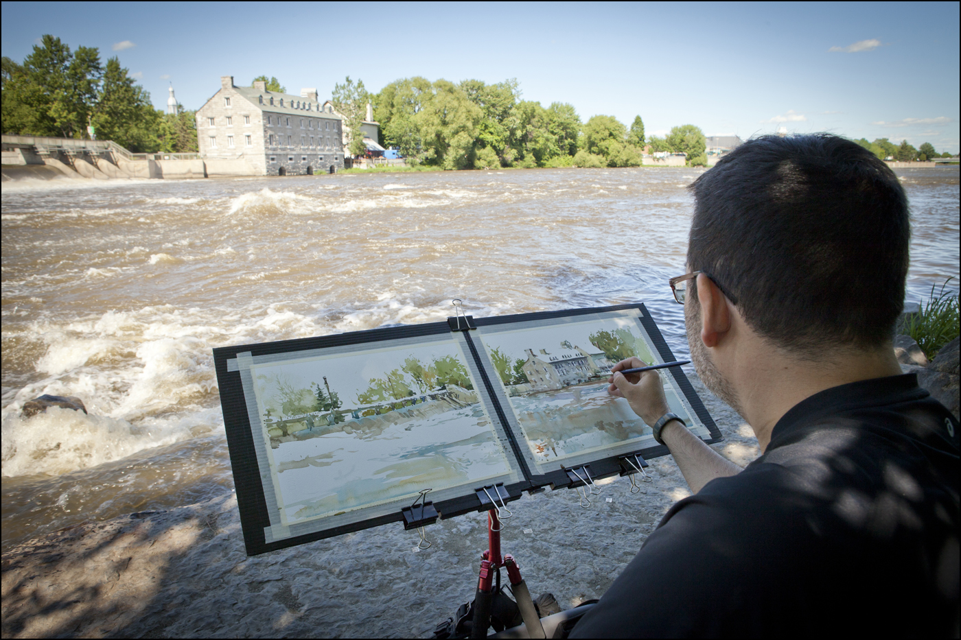
Oddly, one piece of gear that becomes a huge part of this trick, is my new(ish) shoulder bag.
It seems like a minor detail, but it makes all the difference to have just the right bag. I like to be able to setup and take down quickly. Sometimes you simply won’t get the shot if you don’t throw down your gear and get started. But I also like to keep most of my gear still in the bag at my feet – in case I have to relocate quickly. Like that time we were painting on a not-actually-out-of-service train track.
Here it is. My ideal sketching bag, the: Timbuk2 Designs Especial Cycling Messenger Bag

This expandable beauty fits my 14×18″ drawing boards like it was custom tailored for them. I can carry a fat stack of six panels, and still fit my Sirui Tripod, palette, water bottles, and brush case. The magnetic assisted tie-down straps are speedy and secure – allowing me to reliably stuff it just a bit beyond its official capacity.
It has two well-positioned luggage handles on the short side, so on the subway or in a crowded restaurant, you can carry it briefcase style, and not bark anyone’s knees.
The shoulder strap is comfortable, and easily tightened to snug the bag to your body – and can even be re-positioned to change the angle on your back in case you’re a bit taller/shorter than average.

I particularly like the easily accessed side zip pockets (one on each side). These are designed to be reached without fully removing the bag from your shoulder. Great for your small sketchbook and pens, so you can instantly have a book out and drawing for those action shots. Or for your keys, so you can stumble through your door without having to dump your paintings on the doorstep.
So, there it is – a simple bit of kit, that makes it a little easier to do larger paintings out on location.
Biodome Redux : Big Ink!
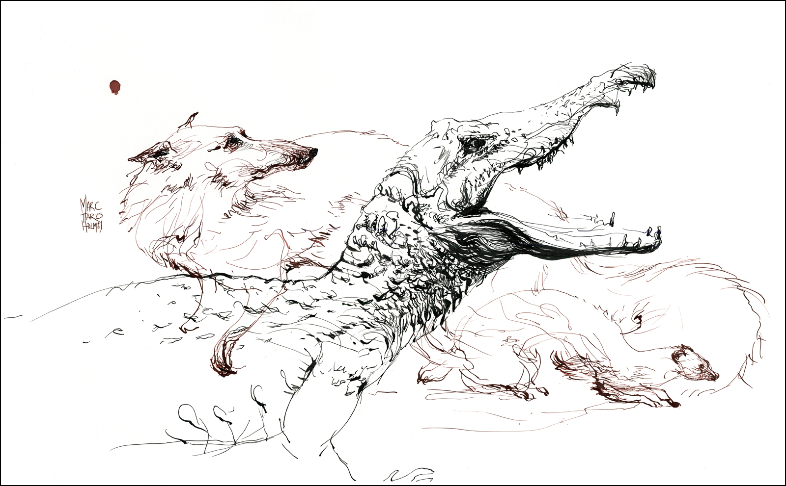
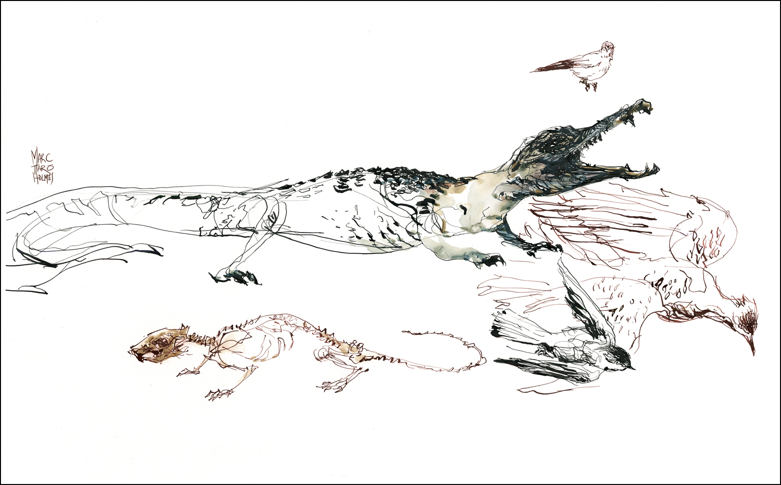
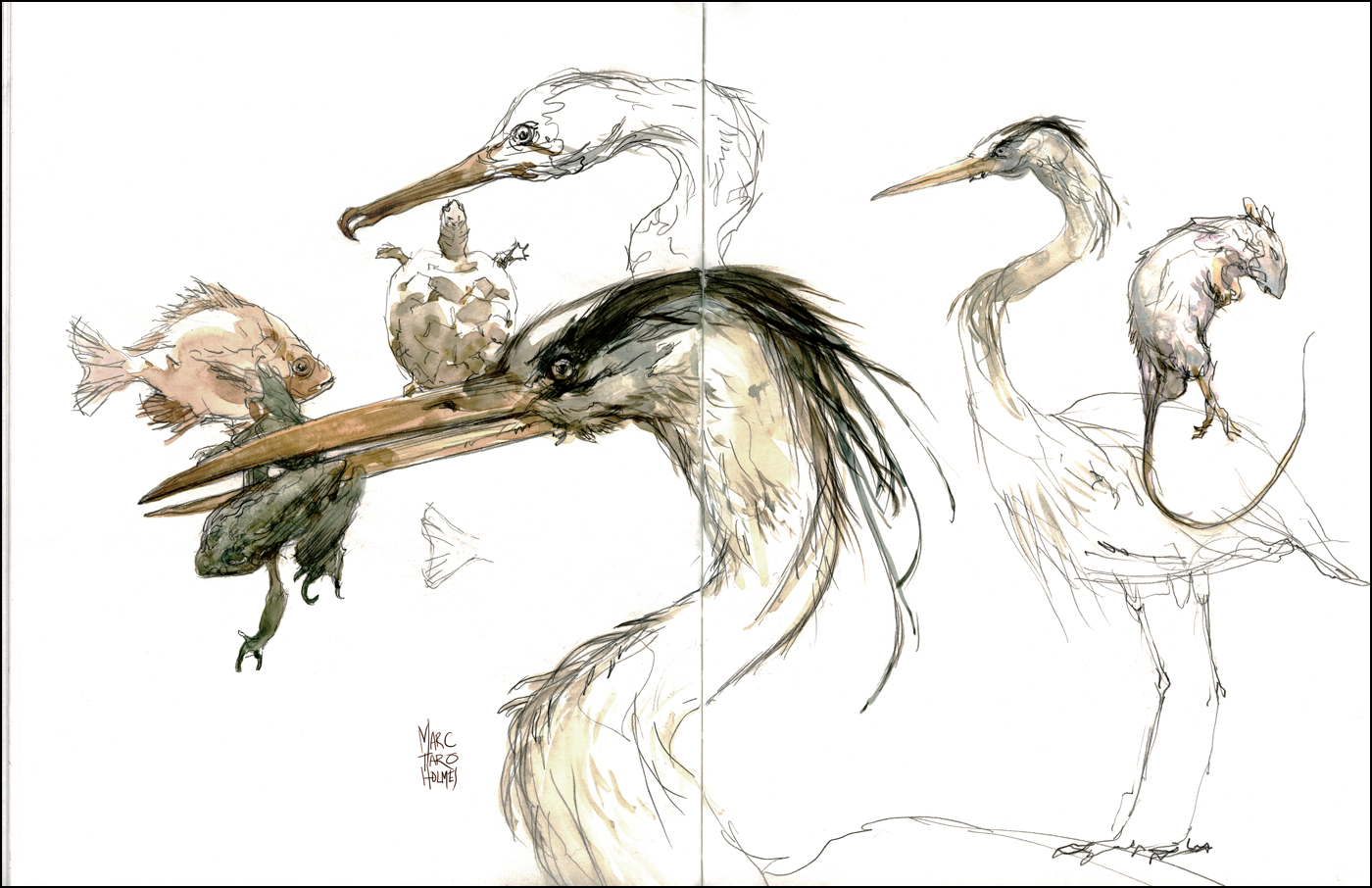
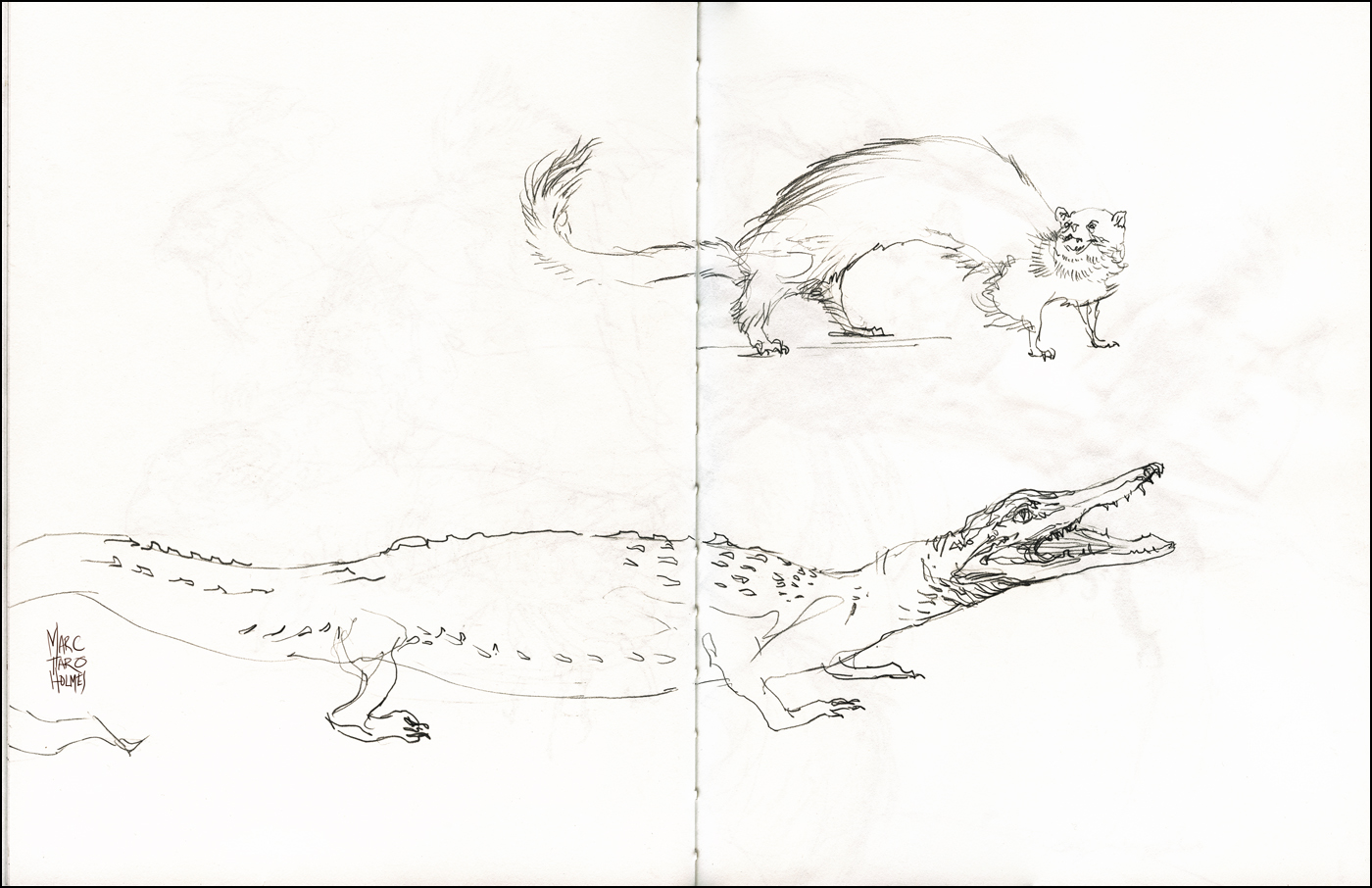
Here’s my sketches from the recent USK:MTL day trip to the Biodome Naturalia taxidermy collection.
Considering we had just scouted the place the week before, I wanted to switch up my technique. Last time was pencil and watercolor in a sketchbook. This time, large format (14×22″) ink drawings with the dipping pen. This format was probably too big honestly. I think 12×16″ or 11×14″ might have been fine. But it does allow you to crazy with broad pen strokes.

My main goal for today was becoming completely comfortable drawing with a bottle of liquid ink.
This might sound silly, but the fear of spilling ink has been the main thing holding me back from drawing with dip pens on location. I do love fountain pens, and they are a great solution for travel. But I’d rather be drawing with these more flexible nibs.
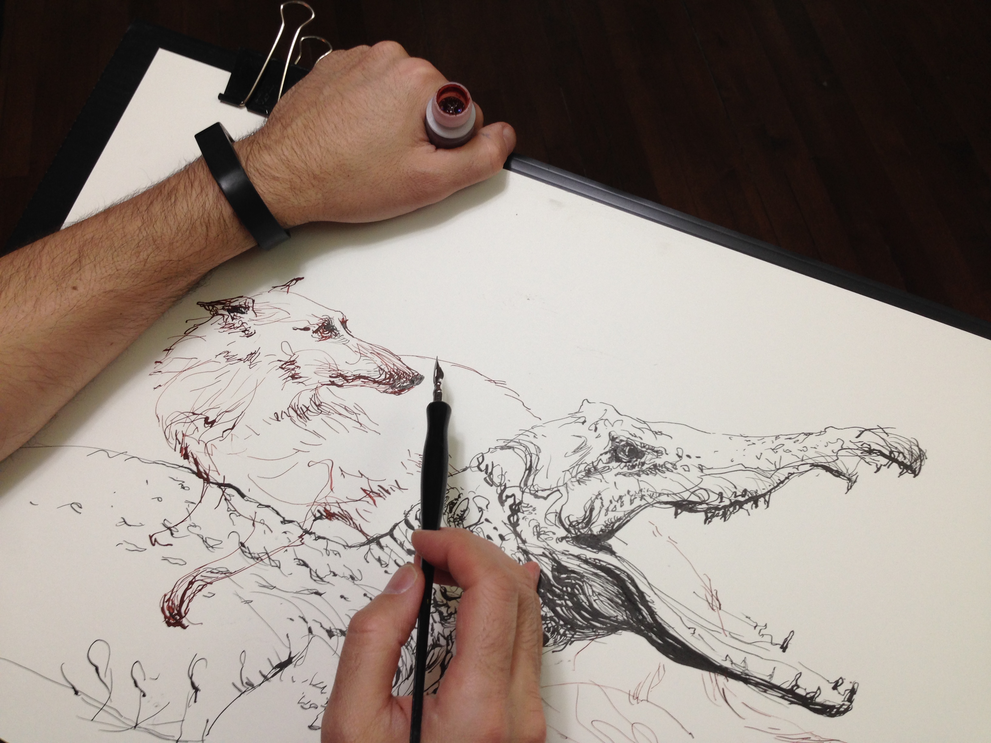
After some tinkering around, this is my current solution: I carry the ink in (very small!) 5 ml HDPE (Nalgene) bottles, and hold the bottle in the same hand that supports my stack of coroplast drawing boards. The vial of ink is safely clamped in the crook of my thumb. The bottom edge of the panel is tucked against my well cushioned body. It’s very stable while standing, even walking around while drawing. I think it’s pretty much spill-proof. Plus – it’s only 5ml. So if you did spill the whole thing, it’s not the worst mess.
One can easily carry a couple of these vials of ink in a pocket, trusting to the indestructible Nalgene bottle, which makes it easy to switch up colors as you draw.
I know, I know! This is some tedious stuff here – all this bla bla about how to hold a bottle! Yet these are the kind of things that are endlessly fascinating to urban sketchers :)
Welcome to the Biodome : Field Sketching in the Dead of Winter
Was over at the Montreal Biodome, scout-sketching with some USK friends who introduced me to the Naturalia Room.
It’s an educational space aimed at schoolkids – but ideal for artistic practice. They have a large open space with tables and chairs surrounded with taxidermy animal mounts and biological specimens. All sorts of things for a person to study. I seems (on one trip worth of scouting) to be less crowded that the Insectarium, and with more variety of subjects. Even better – it’s free!

We’re going to head there with the full Urban Sketchers Montreal group on the 22’d. Anyone in the area is welcome to stop by. Opens at 10:30am, and is near the Viau station on the Green Line.

No matter what kind of artwork one is pursuing, I think this kind of study is the ideal foundation. If you want to capture a rapid gesture, or an impressionistic view, the first order of business is being confident with your drawing. This kind of studio work is just the thing to tune up observational skills. Hope to see you there.
Testing some new colors : Plus, finally getting a nice portrait
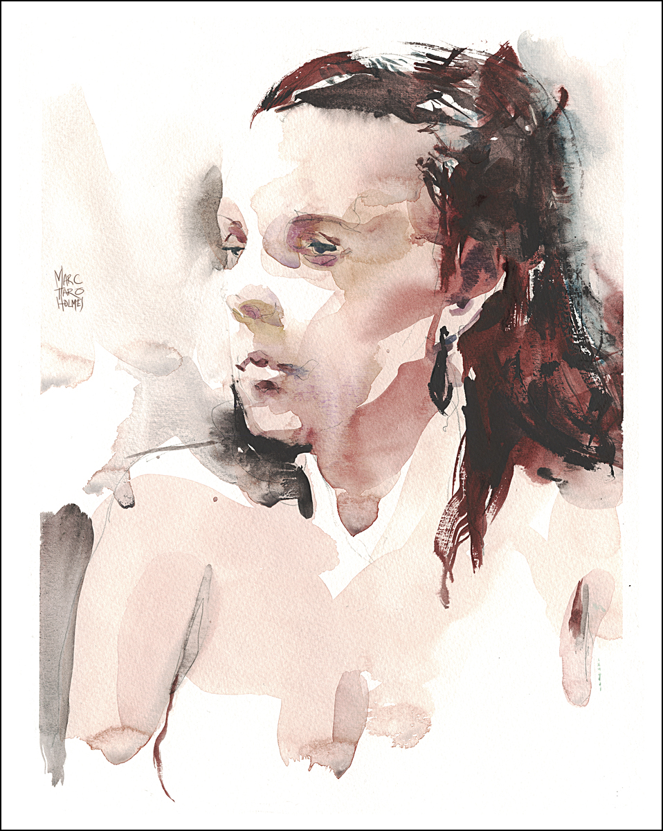
Trying out a new color: Daniel Smith Perylene Maroon.
I’ve learned this new term : Masstone. That is, the color when the pigment is applied full strength – as compared to when diluted. This pigment’s masstone is pretty damn nice if I might say. A deep purple/red that tints out into a fairly passable Northern European skin tone. This sketch is a good example I think.
This sketch is almost entirely done with the one color, Perylene Maroon. Using with a bit of DS Bloodstone Genuine for the darks in the hair, maybe the lightest hint of DS Quinacridone Deep Gold under the nose and along the left eye (an accidental touch really) and one stroke of DS Mayan Blue Genuine
at the back of the head.
This may be the perfect limited palette for figure painting dark haired Caucasians.
I’ve been idly looking for a solution for the poor light-fastness of my favorite cool-red Alizarin Crimson, which is well known to be unreliable when exposed to the light. Much like the Caucasians it is used to paint.
There’s a pretty straight-up hatchet job of poor pale Aliz over on Handprint.com. After reading that I had to do something about switching.
The only thing that is a bit daunting about this Maroon is its powerful tinting strength. The DS version I’m testing seems to easily overpowering other colors. It’s almost like there might be ‘beginner’ and ‘advanced’ palette choices. Alizarin is a pliable color. It’s compatible with a lot of things. I normally mix with Ultramarine blue to make darks, Burnt Sienna and Yellow Ocher to make flesh – both of which this new Maroon can simply do on its own. But I also use Alizarin in foliage quite often. Being a nice complement for green. So. I’ll have to keep testing and let you know how I like it in situations other than the life model.
DS Bloodstone Genuine on the other hand is challenging in the opposite way. It’s a velvety dark in masstone – a rich warm black. But weak as a kitten in dilution. I actually really like it – but it’s very hard to use. You almost need to use it impasto to get any power from it when edge-pulling with water. But it made a beautiful sedimentary haze next to her left eye socket – and in the hair mass behind her jaw.
Oh, and yes – this sketch was another incremental break-though for me. I’ve painted with Elissa many times – but it’s taken multiple tries, before I can finally recognize her. I really can’t emphasize enough how hard likenesses are. I don’t think it’s possible to get a great rendition on the first try. At least not by me. I keep gaining respect for the real portrait painters out there.
Wintering Bikes
(This is an older post that got accidentally deleted – so, re-posting back up).
Here’s a slice of life in Montreal. The mournful sight of bikes rusting away in the snowbank.

There’s lots of reasons to bike in Montreal. The bike lanes pretty much go everywhere, and there’s nowhere to park a car anyway. Plus it’s greener and all that jazz. So lots of people bike. Some ride all winter – snow and sleet be dammed. We’re Quebeckers! Mon pays c’est l’hiver!
Here on the Plateau, people live in these 100 year old buildings with precarious external staircases. There’s no place in your tiny apartment for a bike even if you didn’t fall to your death trying to take it upstairs. So you’re always seeing them on the sidewalk, locked to a little iron railing, axle deep in the snowbank.
After the melt the streets are littered with these frozen bike-corpses chained to posts. Many have been crippled by the snow plows crushing their wheels in to pretzels. It’s like the Russian front for bikes. Dead soldiers frozen into the ground. If you’re a bike, you do not want to get sent to Montreal for the winter.
Good Question of the Week : Why is there no Paper Texture in your Scans?
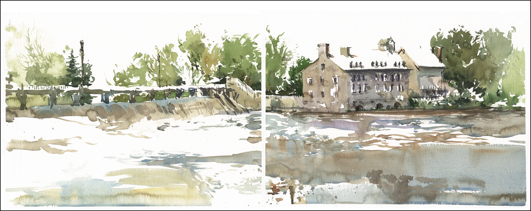
Oddly, two people just asked back to back, “why it is there is no paper texture in your scans? You can see what they mean in this one (windmill). When you click to enlarge you can see texture in the wash, but not in the white paper.

When you scan watercolor paper, the bumpy surface of the paper will show up as an undesirable grainy texture in the white areas. Or, simply have a grey or yellowish cast.
When you take a snapshot (especially a cellphone photo) the white of the paper can be quite dark – giving the whole thing a lifeless feeling. So yes, I do some color correction in photoshop to get it the way I like it. It’s not a big task – a few minutes on each image.
And you can in fact make some improvements to your painting. When I started painting, my work lacked for color – and I used these kinds of photoshop color corrections to teach myself what I wanted in a real painting.
Keep in mind – scans will never look exactly like an original. A lot of complexity is lost – especially in the lightest tones. And further, you never really know what people are seeing. Everyone’s monitor is different. I know my iPad looks desaturated compared to my desktop, and many of my things look neon to when seen on expensive iMac monitors. (I’m PC by nature – being a video gamer).
SO! Here’s how I get rid of any left over paper texture in a scan.

The untouched scan, as it comes in with paper texture. Scanner is an Epson Perfection V500 Photo.
If the paper is rippled from water, this causes shadows, and you may have to be more heavy handed with the following adjustments. Or resort to some manual erasing.
I use a stack of books to press the paper during the scan. Sometimes I leave the book-weighted painting under a sheet of plexy for a few days prior to scanning. See – expensive art books are good for something!
Also, if the painting is larger than the scanner bed – scan it in overlapping pieces and used File>Automate>Photomerge to join up the pieces.

A CURVES adjustment layer (the blue row in the layers palette – shown in the adjustments panel below) – to keep the mid tones stable, but bring back some of the darks and the lights. Each piece is slightly different – but you will see it’s a matter of clicking points on the curve (line graph) and pulling them down towards the histogram (bar graph). You can just twiddle those little points around, and see how you like the changes. Nothing is permanent, so just play with it, watch what it does.
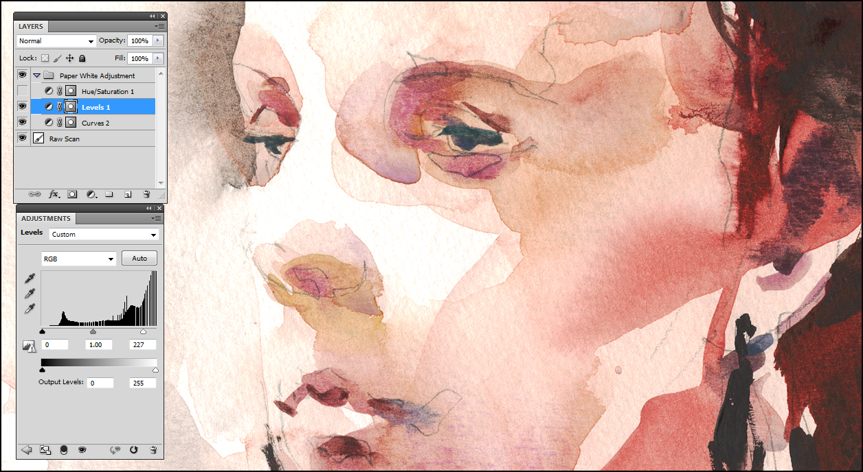
A LEVELS adjustment layer to bring the white point in considerably. Everything in the graph to the right of the white ‘carrot’ on the slider will be pushed to pure white. Values to the left of the ‘black carrot’ will be turned 100% black. This is, I do believe, called ‘clipping’.
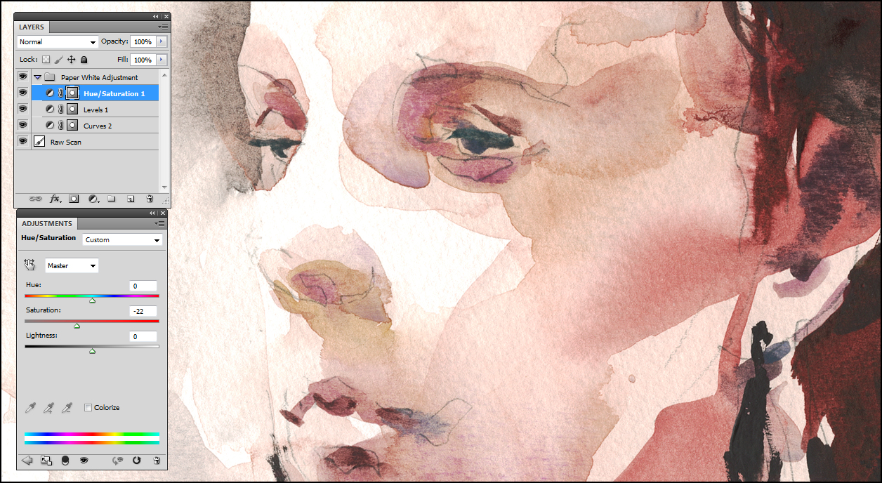
The last adjustment SATURATION ( in this case, taking it DOWN -22) – because the previous process exaggerates the colors.
If you open the first and last images in two different tabs, and flip back and forth, the effect is more visible.
This is not a perfect color match to the actual painting, but it’s within the 80% rule.You can go out to a photo printing service and get better resolution and color quality – but even then results vary. For most uses, this process should work fine.
I have been known to use this effect to desaturate intentionally on occasion. Sometimes quite a bit. Sometimes, for reasons of mood, I prefer the look of a less colorful painting.
You can use this general approach to boost up the strength of pale drawings, or shift the color drastically to create artistic effects. As an illustrator, it’s tremendously useful. I do feel however, you shouldn’t make unrealistic changes to the image of a painting you intend to sell – it might be misleading to a potential customer. I try to use the heady power of photoshop only on illustrations – where the finished art is the printed page, or a fine art print.
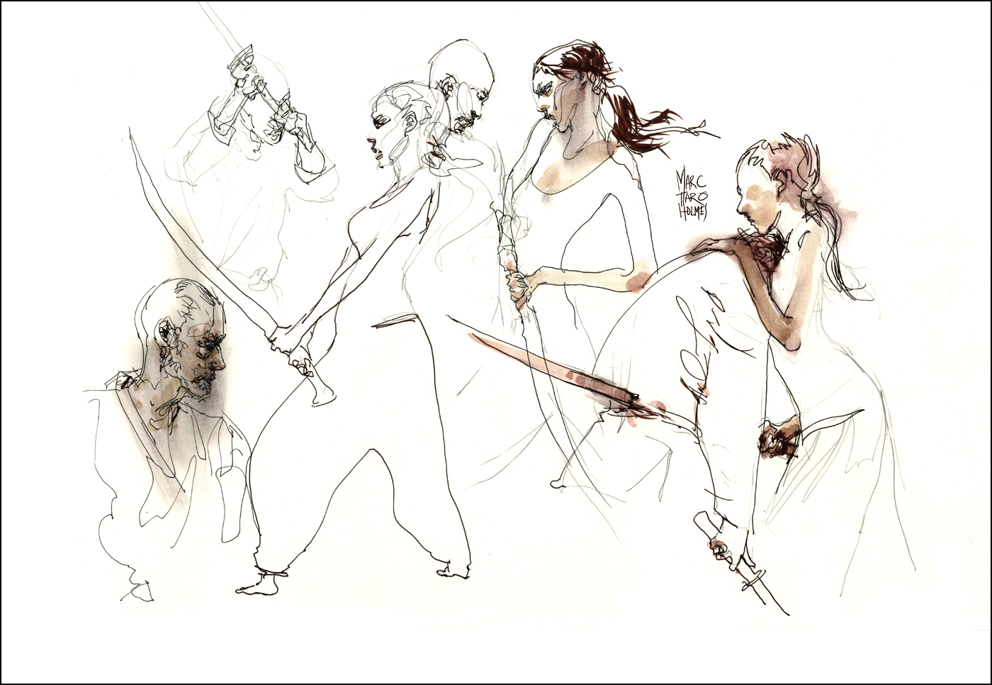
Kung Fu Fighting : Fast as Lightning
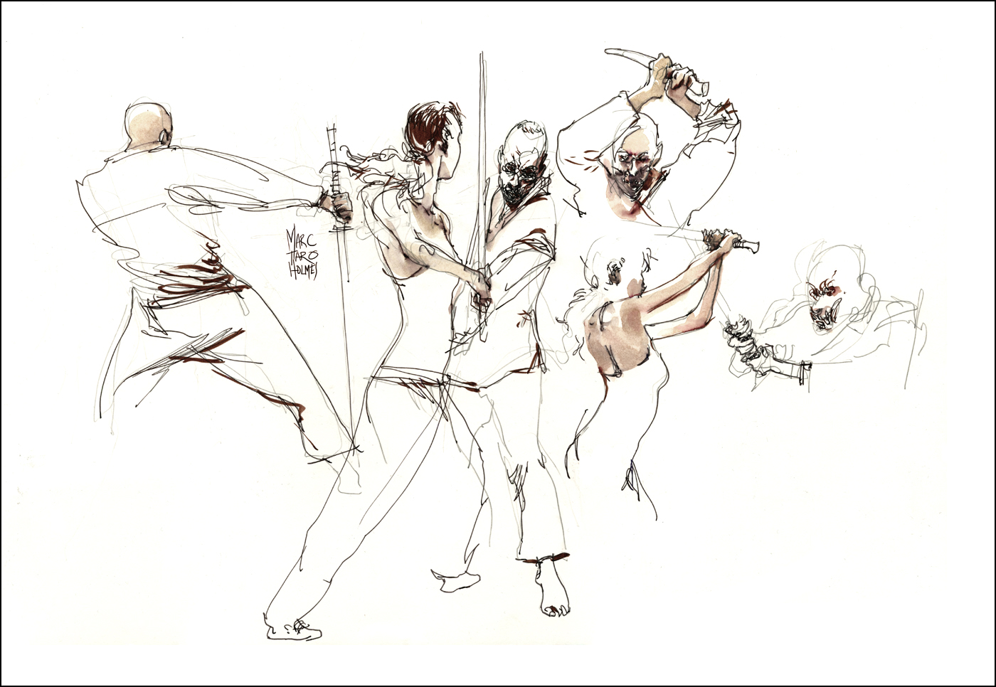
I was just over at Montreal’s Syn Studio sketching a duo of cinematic fight choreographers. Putting a bit of the Martial into the Arts :)
Considering my video-workshop Sketching People In Motion is in full swing, I couldn’t pass up this speed-sketching workout.

This event was three hours of slow motion fighting. They would work out a combat exchange, making sure to take turns dying, and we’d sketch furiously as they moved through it in slow motion, repeating the sequence four or five times.
Occasionally they’d freeze a pose for a while – but never the most dynamic ones. Impossible to freeze yourself begin punched up on your toes like a cartoon boxer :) Sometimes they’d be ‘helpful’ and rotate their combined axis – supposedly showing us another angle – but really just messing us up completely.
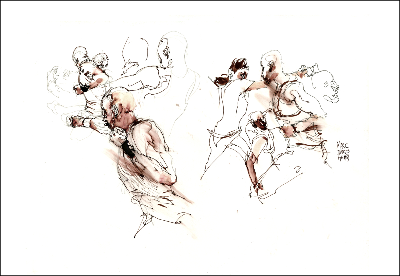
You can see visible evidence of the three-step sketching process in these drawings. It was going so fast I didn’t always finish the figures. I’m starting with a pencil, doodling through the first slow mo, and then coming back for refining detail in ink as they repeated the sequence five or six times through.
Usually I’d focus on refining faces and hands. In the breaks between fights I’d place some darks with a brush pen. I have Kuretake Sumi Brush in the red barrel version loaded with a 50/50 black/scarlet ink mix, just for these occasions. The blurred red effect is smearing the fountain pen ink with a bit of paper towel.
Other color notes were made with watercolor melting the dark red pen line.

I suppose some of this looks a little violent. But you have to imagine them doing it in a light-hearted manner. Cracking jokes and making crazy faces. Dying with lots of gurgling sounds. It seems like a good job for a couple of over-grown kids.
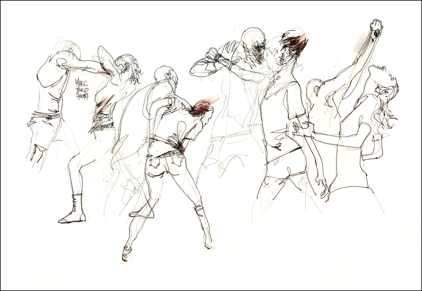
These are 15×22″ on some 20 year old unidentified 100lb-ish paper stock. (Felt a lot like Moleskine classic paper). I used three art boards with sheets taped on both sides, so I could draw faster. Just swap boards and keep drawing. No waiting for the ink to dry. Wet boards are leaned up against my chair while dying. Swapping back to old boards in the breaks for brushpen and watercolor.