Black Friday : Best Buy St. James
True work-from-home-guy story:
So, the other day I’m on going downtown, and I’m like – why is the train so busy?
I need some headphones. You know, another cheap set of earbuds cuz, eventually the whole yarn-ball of earbuds in the drawer is composed of ones that flicker on-off at high speed and you’re down to using the plain white one that came with your phone – the ones that feel like they’re going to fall out any second.
So I go into the Best Buy and don’t even get one step in the door.
It’s a wall of people with four registers lined up back to the escalators. I’m like – what is going on?
Then I remember oooooh, it’s Black Friday…riiiiiiight. It’s Christmas soon. Right.
180 degrees – about face – head directly out of the door – take a few steps up the block and settle in to do a sketch while ignoring three different groups of dudes trying to get TVs the size of billboards into their uncle’s double-parked SUV.

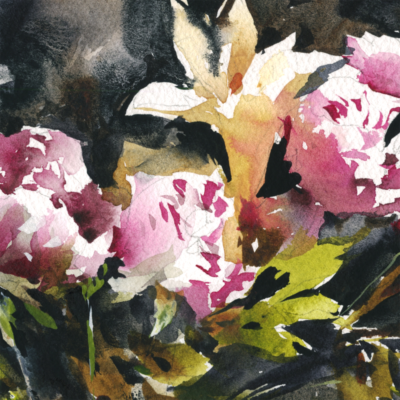
Winter Sketchcrawling : The Statue Run

For a while now I’ve been heading down a path where if I don’t have an entire day for painting, I won’t go out. Which is pretty odd, considering how much I talk about the joy of integrating sketching with our daily lives.
But these days I don’t often have a full day free. And with the weather here getting crisp, you really can’t be standing around in the park anyway. So I set myself a goal – do an errand that needed doing, but make it into a sketching run.

I grabbed a folded accordion book, and made a dash downtown by metro, with the goal of walking through my favorite square (Dorchester), heading over to the best pen store in Montreal, (Nota Bene), then zipping through the new wing of the art gallery where there’s some 19th century statuary that I haven’t had a chance to look over.

So, after running through Place du Canada – still full of Remembrance Day wreaths on the war memorials, I ducked into Marie Reinne du Monde for some stone saints and bronze angels.
It’s interesting to see where some of our social dynamics come from. Nothing but row on row of greybeards up on the walls. They sure venerated their old men. Which as an old man in training, I can’t complain about too loudly. But it’s striking how it’s uniformly an old boys club of authority figures – until you get to the heavenly angels – then it’s all pretty girls in transparent gowns.
Sorry to be so blasphemous – but it’s right there on the walls. The church doesn’t pass the Bechdel test.
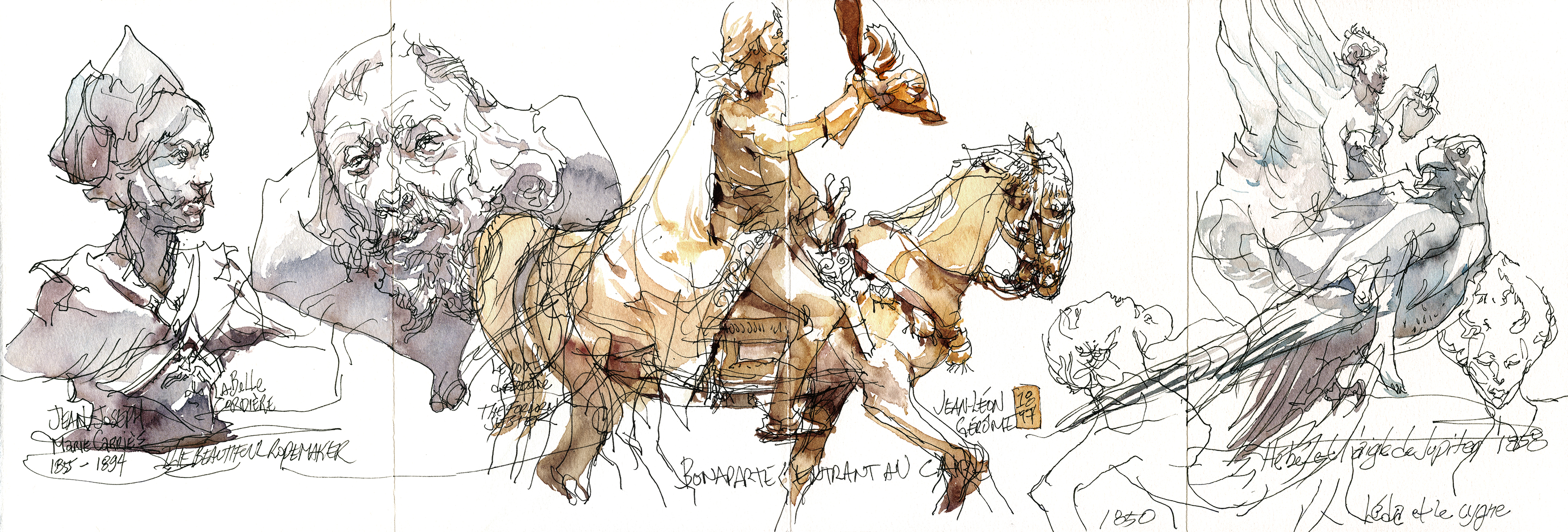
Finally ending up at the Beaux Arts. My favorite of the new pieces was the brazen figurine of Napoleon credited to Jean-Léon Gérôme. I only know him as a painter, so it’s very interesting to see this finely crafted horse and rider. I’ve been wanting to try my hand at sculpture – but I always feel like that would be cheating on my first love of painting.
Maybe next year I will set aside some time – I’ve been dying for an excuse to buy some gear for it.

Zoo-Illogical Sketching

Happy Thanksgiving ‘Murica! From the wild turkeys at the Montreal Zoo Ecomuseum.
For a huge bird with impressive plumage, they’re astonishingly ugly when you get up close. What on earth is the point of all that knobbly skin on their heads? Nature is impressive in it’s variety – but it doesn’t always care what looks good to us :)
The turkeys at our particular zoo are quite tame, coming up to the fencing and hanging out with you, making them quite easy to draw. Unlike say, foxes, who hide in gullies and under logs and only pop up to dash across their enclosure.

I was surprised to learn that not all red fox are red. Of the pair on hand this day one was the orangy red you’d expect, the other was black with silver tips, excepting the very end of his tail, which was a traditional pure-white fox tail.
It’s getting late in the year to be outside sketching, I had five layers of coats and sweaters. The fox was so puffy with his winter coat he looked more like a badger. But he still did that pounce-straight-up-in-the-air which is so distinctive of foxes.

Naturally, when drawing animals the challenge is their constant motion.
It seems, if you can see them, they’re moving. For sure, most of the time you can’t even find the animal in the cage. Or finally you see an unrecognizable ball of fur way up in a tree or in the back of a shelter. But the other common behavior, in everything from wolves, to big cats, to this fisher (in the weasel family but sometimes called a pekan or fisher cat) – is pacing.
They run loops around the enclosure. Back and forth, around in circles, never stopping. Most of these animals have worn a path into the perimeter of their space.
So, when sketching, it’s a matter of waiting on them. Working on a pose every time they loop by. I think you can see in fox above, and this fisher, that I’m starting the drawing with scribbles – just open lines and suggestions of contours – I’m doing a lot of guessing – until gradually committing to certain arc of spine or set of leg positions.
That’s the key for me – just keep drawing right on top of the sketch. Your drawing might look hopeless with all these corrections. But as soon as you throw on color, it makes the final pose jump out, and all the searching lines become unimportant. I don’t mind leaving the sketching in. It’s just part of the the look of a spontaneous drawing. I do the same thing when drawing people from life.
The name fisher by the way has nothing to do with fishing or eating fish. Wikipedia tells me it’s based on fitch, a name for the European polecat.

Whereas the otter – definitely eats fish.
We came by just in time see the keeper tossing in some silvery herrings, which were chomped down, bones and all, in about five minutes. Only leaving a tail stub behind.
Interesting to note how the otter and the fisher are very similar in build – but the fisher – being a forest creature, has a light fluffy tail (like a squirrel) where the otter has a thick, muscular, short-haired tail (almost rat like to be honest). You can see right away the otter is built to swim, with that powerful tail being the outboard motor, where the fisher climbs and leaps through the trees, using the tail for balance.
It’s always fascinating to me when I figure something out just by drawing. The whole process of being observant is – (ha ha) – kind of eye-opening.

So, lets end the Ecomuseum with the green frog.
I don’t know why, but there’s an old fashioned epithet where they call French people Frogs. My understanding is it has to do with eating frogs? Which personally, I wouldn’t consider that an insult – I love frog legs. I had some great ones in Cambodia, the size of chicken legs. Delicious!
But I suppose people are able to make anything into a slur, just by the way they say it. I wish someone would call me a frog – I’ve finally got my bonjour to be good enough that people here in Montreal talk French to me.

Here’s a few more animals from life – these remaining ones from the Granby Zoo.
It was weird to be at these two places (though, not in the same day – they’re nowhere near each other).
The Ecomuseum only houses animals from Quebec. There’s a quality of life rationale – that their living conditions are as identical as possible to a natural space. And that the climate is right for them by default. (Eg, no African elephants standing knee deep in snow). I also believe their animals are rescues or second generation thereof, and can’t be released back into the wild for various reasons.
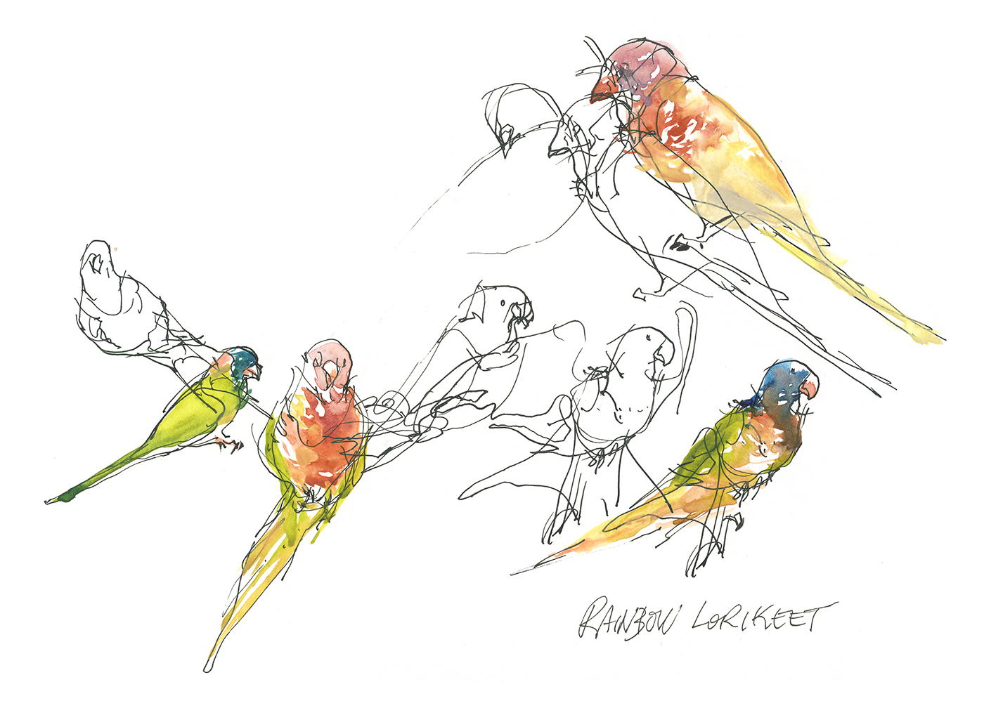
The Granby Zoo on the other hand is full on razzle dazzle. Alligators and tigers and colorful tropical birds.
There’s a weird Jurassic Park slash King Kong vibe all over the place – huge plastic logs and fiberglass bamboo signs. Trying for a safari feel I suppose? I mean, the place is attached to a waterpark called ‘Amazoo ‘- which I had zero interest in checking out. Zip down the Anaconda Slide, stop by the Tiki Dog stand!
Well, I was tempted by the Bear Paw hut.

A significant portion of the Granby zoo was set aside for an exhibit of anamatronic (robot) dinosaurs. They made a terrific racket fake-roaring and fake-screeching on loud speakers. A: it seemed like a huge cash grab to get the kids in to see these mechanical leaping lizards and B: it has to be stressful for the real animals hearing these mega predators bellowing from sun up to sun down. I know it was bugging the hell out of me.
It’s a bit hard to take it seriously as a zoological institution. You’re left with the simple feeling that it’s a cynical for-profit business crammed full of unfortunate creatures.
So, I dunno what to do about all that. I want to think I can enjoy an afternoon drawing animals. But I’m not sure if I should be giving these sideshow operators my money.
It feels cleaner somehow to draw taxidermy animals at the Redpath. Sure they were killed for a museum some time in the last century. But at least the critter goes on to a peaceful afterlife working for science. I think the argument in favor is, a properly cared for taxidermy mount will last forever.
So, we’ll see how much more zoo drawing I end up doing.
I’d be quite willing to donate myself to the plastination people if you want to draw my corpse in a museum! Possibly that will make up for some karmic debt.
Travelling to the Amazon (by way of the museum)
Montreal’s Pointe-à-Callière archeological museum has been presenting an exhibition: Amazonia: The Shaman and the Mind of the Forest. I’ve left this post sitting a while so I the show’s now gone – maybe you saw the show? maybe not – but anyway, here’s my drawings :)
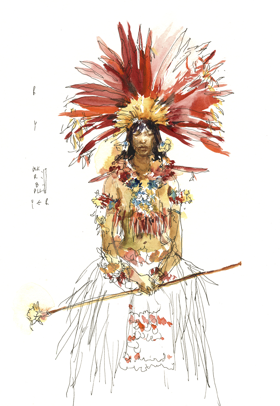
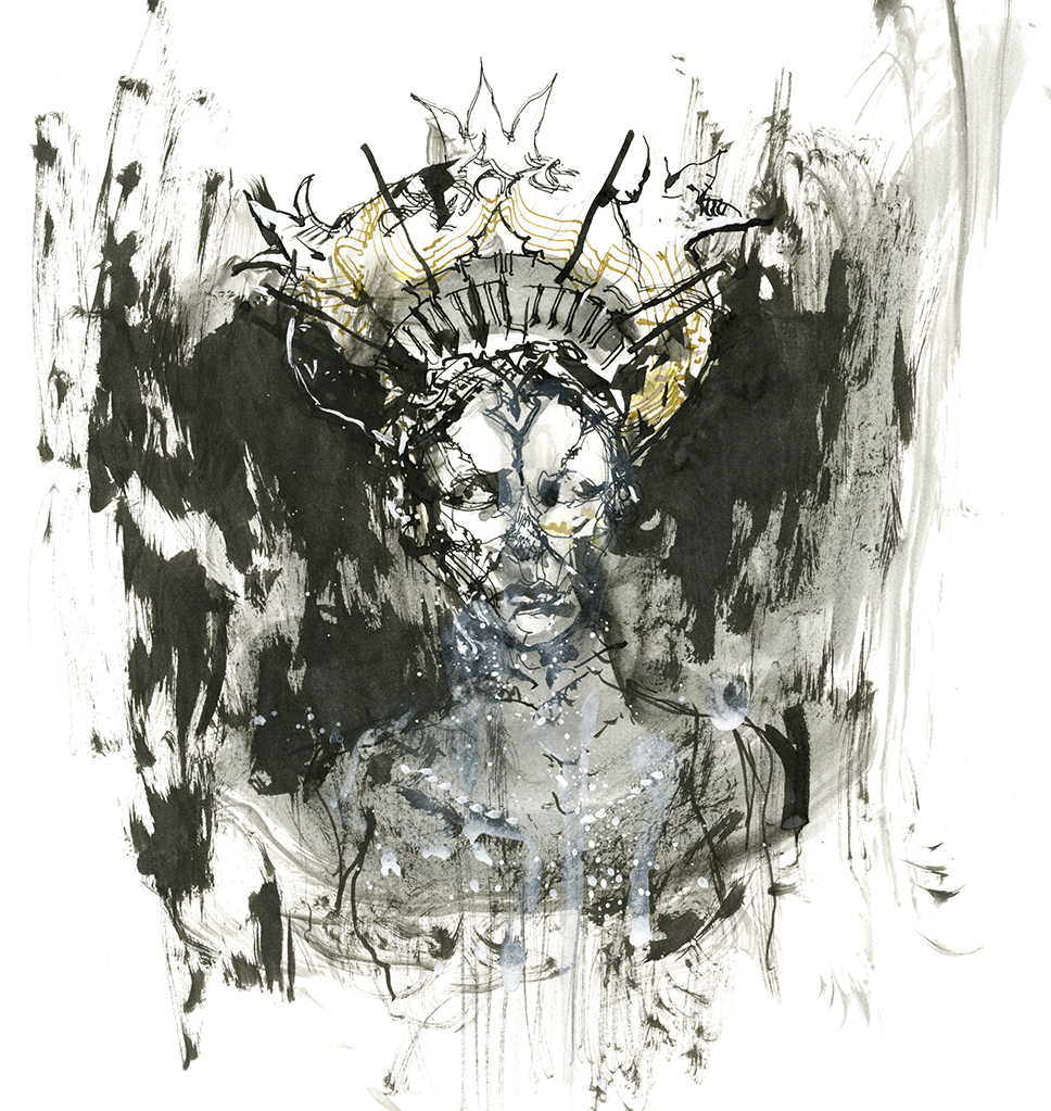
The exhibition featured a collection of wickerwork masks – which I’d more reasonably call helmets or hats – as they’re designed to mount a sculptural element on the wearer’s head, and disguise/camouflage the face and body in a veil of dried grasses.
It’s my understanding (from reading wikipedia) that these masks are worn in ceremonies involving the ingestion of hallucinogens. To the people of the Amazon, these were probably nature spirits come to life.
Many of them represent the fish or animals of the region (the one on the far left was a catfish spirit), but some are so abstract, it’s impossible for an outsider to say what they represent.

A great deal of the exhibition was devoted to colorful feathered headdresses and body ornamentation. So naturally, there was also a cabinet of taxidermy birds to show us the where the plumage comes from.
Apparently these feathered accessories were among the favorite things for European collectors to bring back, (next to shrunken heads!).
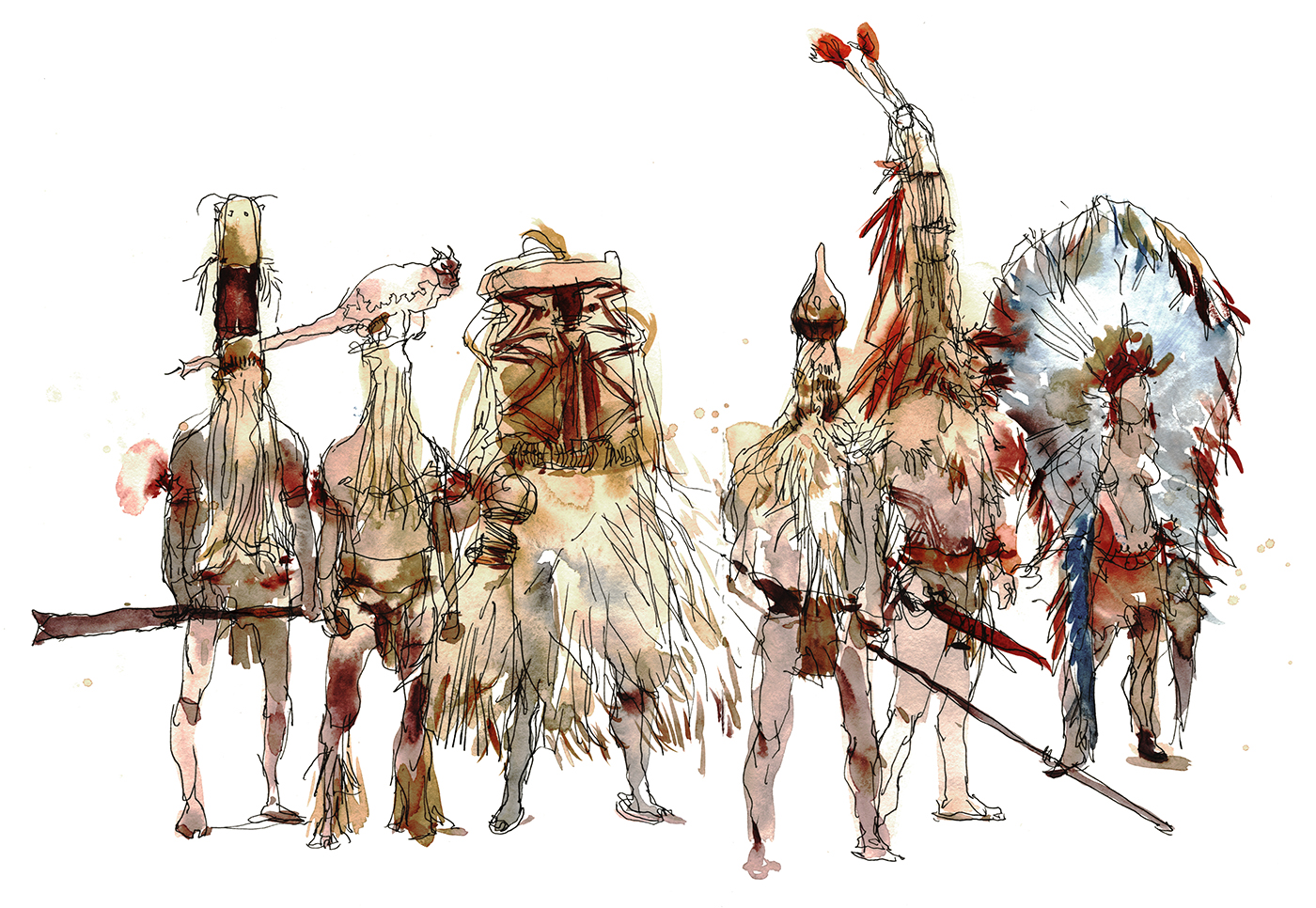
so we have a large number of head-dresses on display, as well as the usual collections of decorative baskets, pottery, spears, bows and stone axes. The items we’d find in any hunter-gatherer society.

I did not find myself sketching the spears and daggers. They’re not a particularity interesting subject I suppose? Today anyway.
In fact, I found a lot of the show – masks and headdresses levitating in darkened cabinets – to be very hard to relate with. Often you couldn’t tell if you were looking at the front or back of a feathered crown. Or if something was a pectoral or a kilt. Certainly you had no idea who really would be wearing these things – male, female, young or old.

I suppose some of that is my own fault, as I was racing through the exhibition only looking at the objects – not reading the information. I find these days so much of the educational content is in video or audio guides – which I do not enjoy.
I can’t be standing around watching the videos when I have sketches to do :)

There was however one wall of contemporary photography, showing native peoples and their lives today. To me, this was the most interesting thing in the whole exhibition. Surrounded by these displays of well lit but somewhat clinical artifacts, I found myself drawing from photographs.
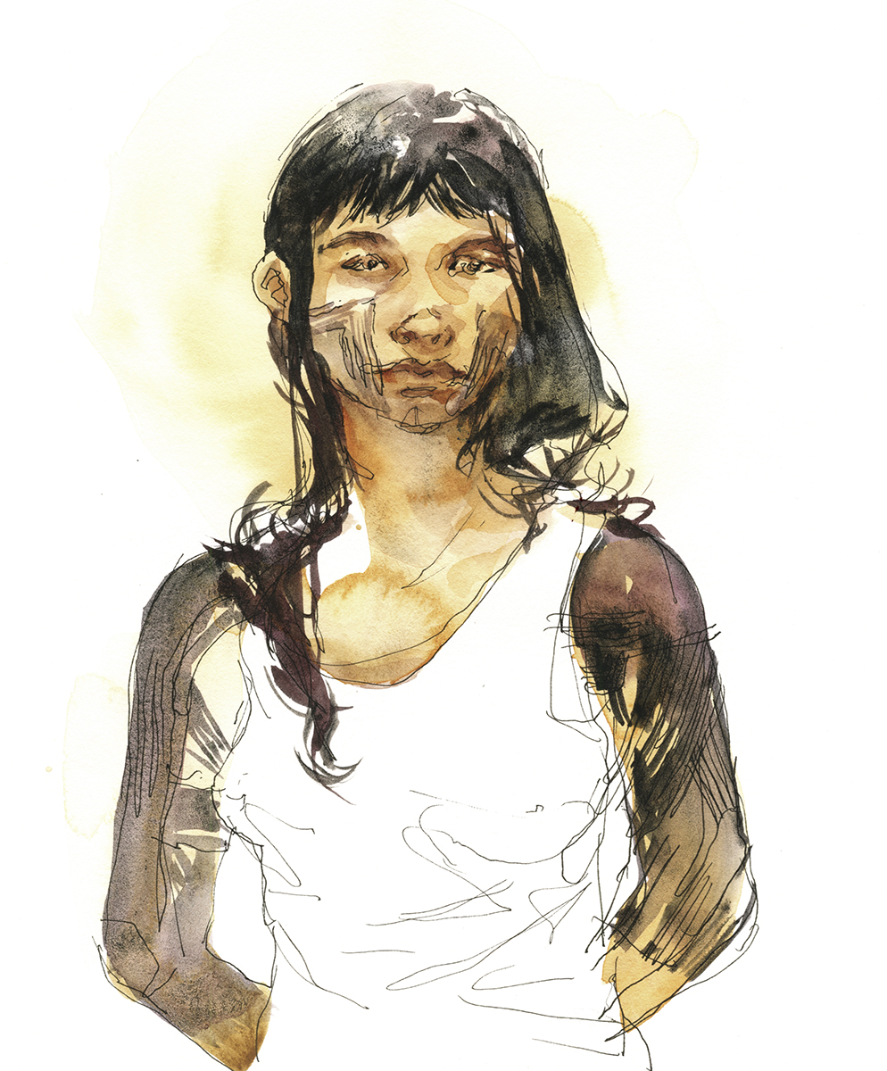
In some of my drawings, where you see cultural objects worn by a person – what I’ve done is drawn someone from the photo exhibit, and given them an artifact from a nearby display.
This is probably a bit misleading. I can’t be sure I’ve associated the right gender or tribal person with the right artifact. But to me it’s a way of visualizing the Amazon.
I suppose, given an unlimited budget, the museum might choose use sculpted figures? But sadly the days of life-size dioramas with wax and plaster figures seem to be over.
On balance, I think this is a worthwhile drawing exercise.
Next time you’re in an exhibit of historical arms and armor, or stone-age pottery and household implements, use your imagination and sketch some of the people that might be using these artifacts – instead of simply drawing floating objects in display cases.
Even if you’re not historically accurate, you’re bringing things to life.
The anthropologists can always write me to correct my sketches! I’d be happy to know the real story.


Post Modernism Post

I’m never completely at home with a post-modern subject. I find the lack of ornamentation actually makes it harder to draw. Where are the gargoyles and Gothic arches? I’m supposed to draw these concrete abstractions?
Originally I was going to trash my drawing of Place Des Arts (our performing arts plaza in Montreal) – except, afterwards I saw my friend Liz’s version.

What struck me is – while the drawings are somewhat different – the way we each simplify the view is fascinating in it similarity.
Isn’t it interesting to compare two different artists seeing the same abstract patterns in the curving concrete and dark panels of glass. It’s very hard to find any perspective cues in this post-modern structure, so we’ve both approached it in the simplest terms – a pattern of light and dark.

Announcing: Watercolor Workshop Dec 2, in Stowe Vermont!

There’s only a short while left to register for my one-day workshop: Still Life in Watercolor!
Given the time of year, we won’t paint on location – rather, it will be a full day in the studio. I’ll demonstrate some key concepts in the morning, then we’ll spend the entire afternoon guiding you through your own watercolor(s). We’ll have a variety of things to work from, but you may also bring objects from home if you have some favorite subjects around your studio.
Click Here to Register
Saturday December 2 – 9:30am to 5:340pm
Stowe, Vermont, at the Helen Day Art Center, 90 Pond Street, Stowe, VT 05672.
($135 member/$160 non-member)
A great painting starts with a great drawing. Any flaws in the sketch will be there in the finished piece.
So we’ll start with my sketching methods – some easy techniques for measuring proper placement on the page, checking object proportions, and thinking about overlap of shapes – but most importantly how to simplify complex objects into a silhouette + shadow shape.
We’ll also cover my three favorite methods for manipulating watercolor: Growing a solid shape, Charging-in, and Edge Pulling.
I’ll talk about layering from lighter to darker in three steps which I call Tea, Milk and Honey, and what that actually means for different objects of various values and materials.

Beginners are welcome, and we’ll work at your own pace. If you’re feeling confident, you can take on a complete composition of multiple objects – or – work on sketches of individual pieces.


My approach to watercolor is based on years of sketching on location. I hope to inspire you to capture the world around you, without getting overwhelmed by unimportant details. These are the watercolor sketching skills that can introduce you to travel sketching, drawing the figure from life, or plein air painting.

Hope to see you in Stowe next month!
Click Here to Register
Saturday December 2 – 9:30am to 5:30pm – Stowe, Vermont, at the Helen Day Art Center, 90 Pond Street, Stowe, VT 05672.
($135 member/160 non-member)

Book Review: Sketch Now Think Later, by Mike Yoshiaki Daikubara
 I’ve been a fan of Mike Yoshiaki Daikubara for a while now, so I was pleased to receive a reviewers’ copy of his latest book: Sketch Now Think Later: Jump into Urban Sketching with Limited Time, Tools and Techniques.
Daikubara is an urban sketcher based out of Boston MA, one of the home towns I’ve collected along the way. Unfortunately, I didn’t street-sketch when I lived there, so I’m catching up on what I missed by following his blog.
He’s a prolific sketcher, having trained himself to work fast and use every stolen moment of downtime. That’s no doubt helped him to publish his four previous titles (available online), as well as two more books of early work, now sold-out of print.
This, his latest book, is a beginners guide to Urban Sketching, published by Quarry Books, an imprint of the Quarto Group.
Sketch Now Think Later is a trade paperback book (5.25×8.25”) of 112 pages, looking a bit like a Moleskine sketchbook with an elastic bookmark.
It follows the now-classic approach of an Urban Sketchers monograph; starting with a deep dive into the sketching tools Daikubara carries every day, (something every travelling artist has honed down to their personal minimum), and gradually expanding into his techniques for line art, how he handles color, and how he annotates his pages of sketches.

Daikubara, like many Urban Sketchers, is a visual journalist. His drawings are insightful snapshots, not labored renderings. Spontaneous sketches briskly capturing whatever drew his eye, without any wasted energy. The sweet-spot between fine artist and reporter is a balance every Urban Sketcher has to find for themselves.

It seems to me he weighs in on the side of obsessive note-taker.
His sketches are also his diary; noting down odd details such as laser-sighted measurements of spaces, quoted snippets of conversation, contents of containers, tiny step-by-step illustrations of how things are built, or how they function. (This from his industrial design background no doubt). It’s these annotations that make his drawings fun to pore over. You feel as if you’re over his shoulder listening to him think as he sketches. Always learning something new about his subject.

Like his drawings, Daikubara packs the book’s margins with commentary – and they’re where the book excels. While written for beginners, Sketch Now Think Later is so jam-packed with information, even a practiced sketcher will pick up a thing or two from the many sidebars and captions.

The book is available from Daikubara’s site, your local booksellers, or – if you’d like to support my blog, you can order through the Amazon affiliate links used in this article.

~m
Jean Paul Gaultier at the Montreal Beaux Arts
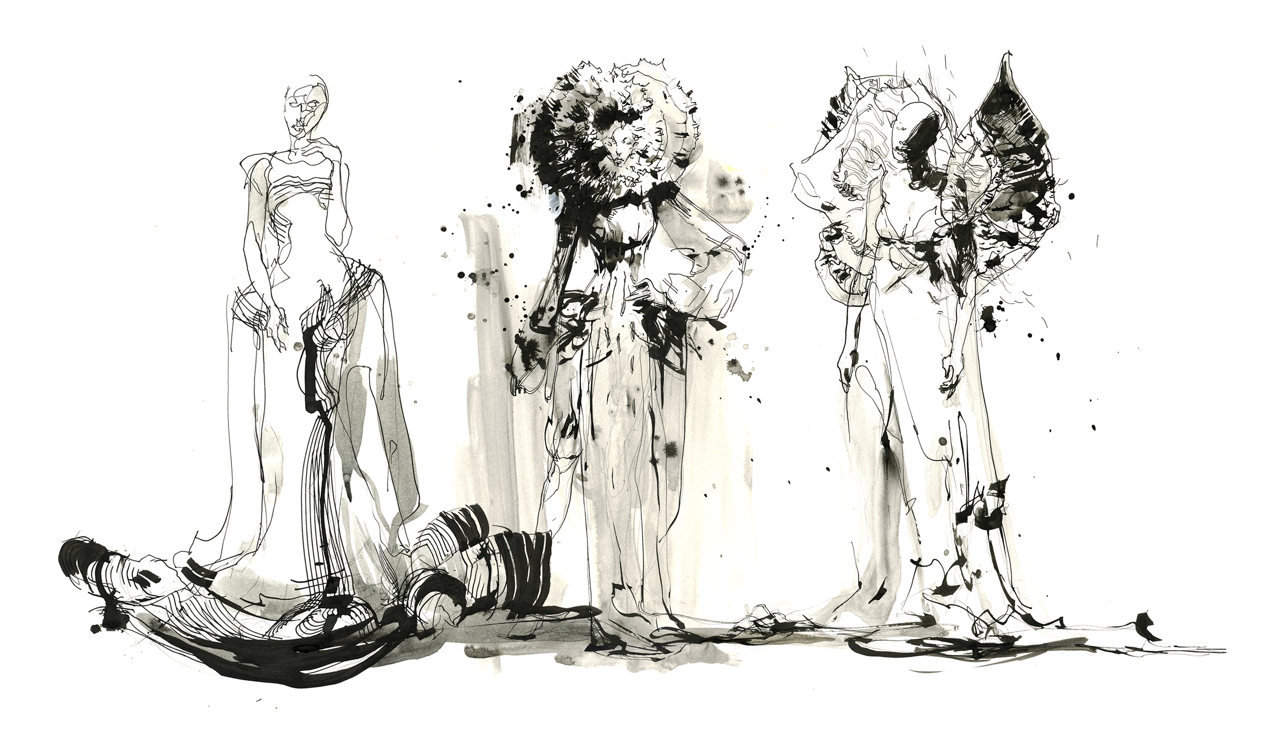
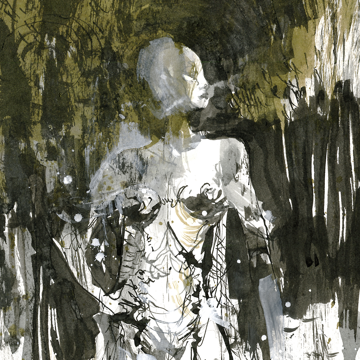
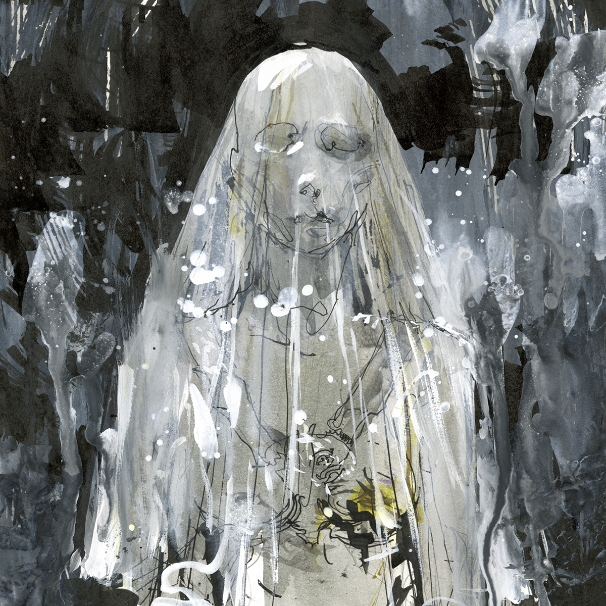
There is as was a show on at the MTL Beaux Arts, (closed Oct 22, sorry) featuring wedding dresses by fashion designer Jean Paul Gaultier.
It’s just a one room exhibition, with, mmmm, I’ll say about 30 mannequins? Each dress has it’s own theme – many of them borrowing from history, but others based on abstract forms. Everything is in high key neutrals and draped in yards and yards of gauzy veils.
The faceless mannequins are blank masks that occasionally come to life with the projected faces of models. But, strangely they only talk back and forth in banalities. How they are jet lagged, or which expression is good for the camera.
The white-on-off-white theme got me thinking – what a great subject for #Inktober2017. An event I’ve largely ignored this year, but hey – y’all have probably been watching other people doing it?
What a challenge to draw all these white dresses with black ink :) But of course here I’ve cheated – using my usual Platinum Carbon Black sparingly, and relying on dilute Lexington Grey, (sometimes just dirty water), Rome Burning (a pale gold) and Liquitex acrylic ink in Titanium White.
Did you know they made white ink? It’s not really all that white. I can’t imagine what it’s really for. You could never use it properly on black paper for instance. It’s only about 25% opaque. And it settles instantly making it very hard to pick up on a pen nip. I only tried it with a brush. I wouldn’t recommend using these Liquitex acrylic inks in a fountain pen.
In any case, I really just used it for glazes, drips and spatters. Any sharp bright white retouches you do see here are ordinary white gouache.
That’s pretty much cheating in the world of #Inktober2017 right? By now it’s basically a black and white painting.
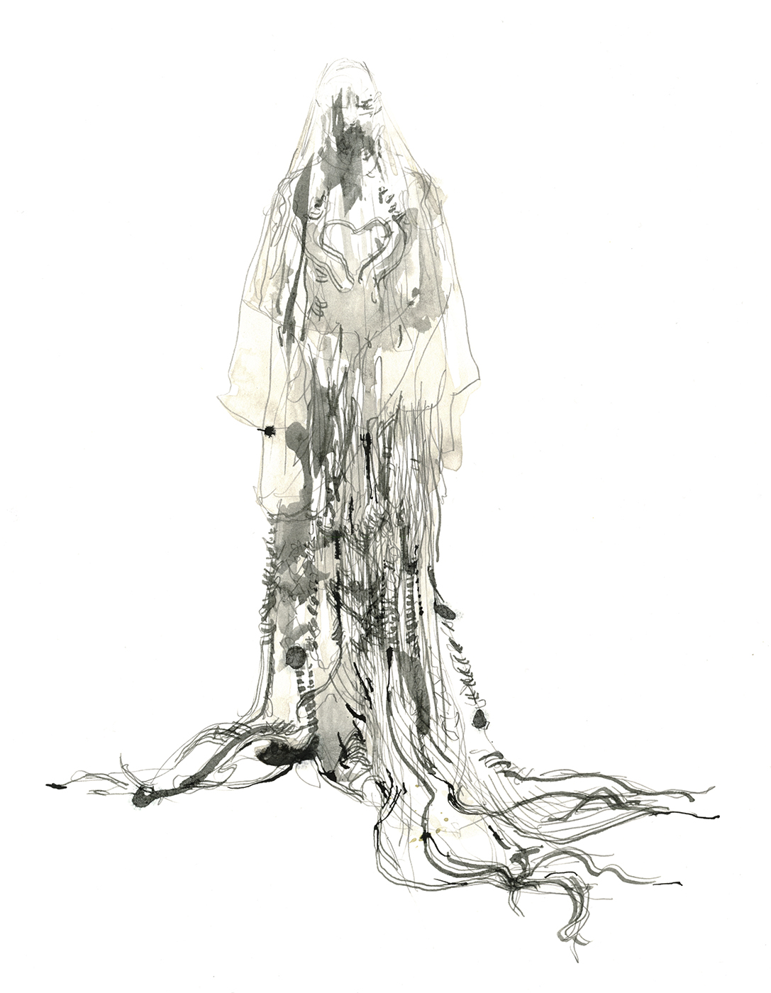
This one was my favorite dress. A kind of cable knit Irish sweater-dress, dissolving into a ragged net of ropes and fibers. It has a look of seaweed, or fishing nets, and reminds me of the myth of the Selkie. There were no titles on the work, but I’m sure that was the theme.
I know people will ask, so no, I didn’t ink-paint these in the museum. Splattering indelible black ink in the small room full of white dresses. That would have got me quickly ejected.
When I sketch in a museum I just get the most basic drawing inside the exhibit, then usually step out to the lobby or the cafeteria to paint. Or one memorable time, the washroom, as the building was deserted on a weekday morning so I figured I’d use the entire counter top.
This time, I just took them home and I inked over my very light 0.3mm pencil drawings done on 11×14″ plate bristol.
I wanted to use a wide range of tools including scroll writers, steel brushes, music nibs, some worn out synthetic brushes, some splatter, some dripping, even a little finger painting.
But my current favorite lines are coming from a new set of witch pens. I think I’m going to move exclusively to these, so I can have this conversation:
“What are the best pens to sketch with?”
“Witch Pens”
“Your dipping pens – the ones you sketch with…”
“yes, Witch Pens!”
“er, yes… but which one would be your favorite pen?”
“Exactly!”
“No, I mean – what KIND of pen do you like the best!”
“Witch Pens!!!!”
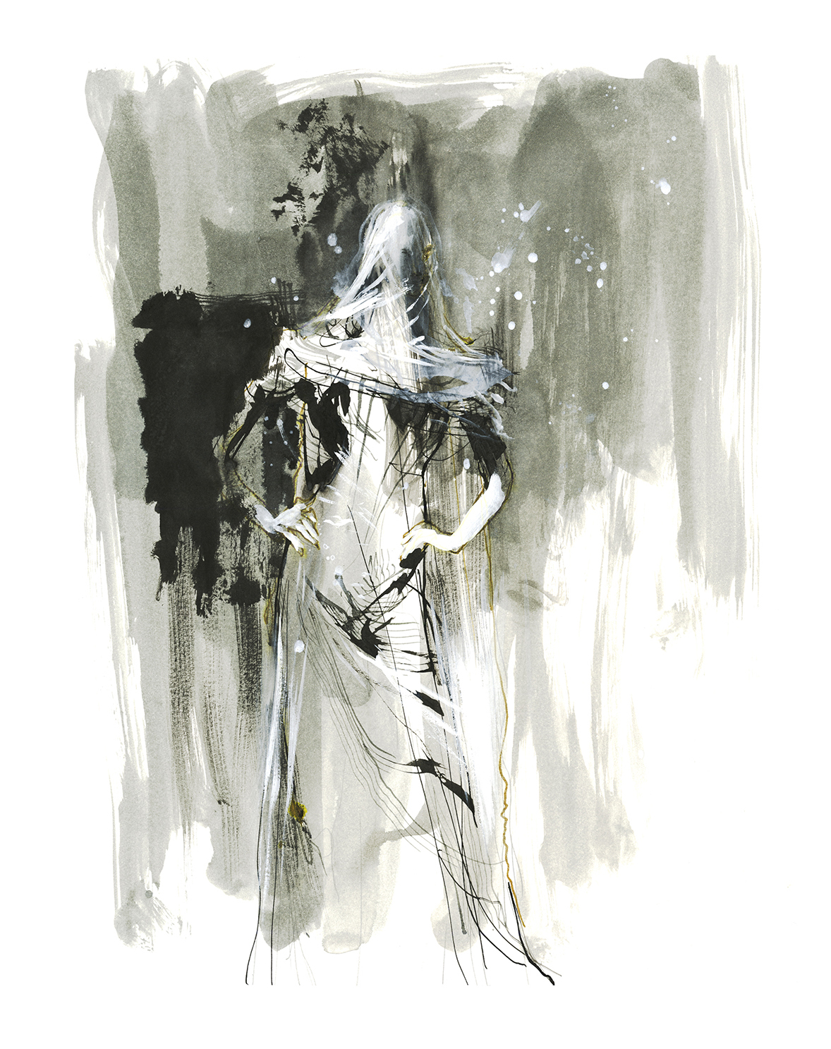
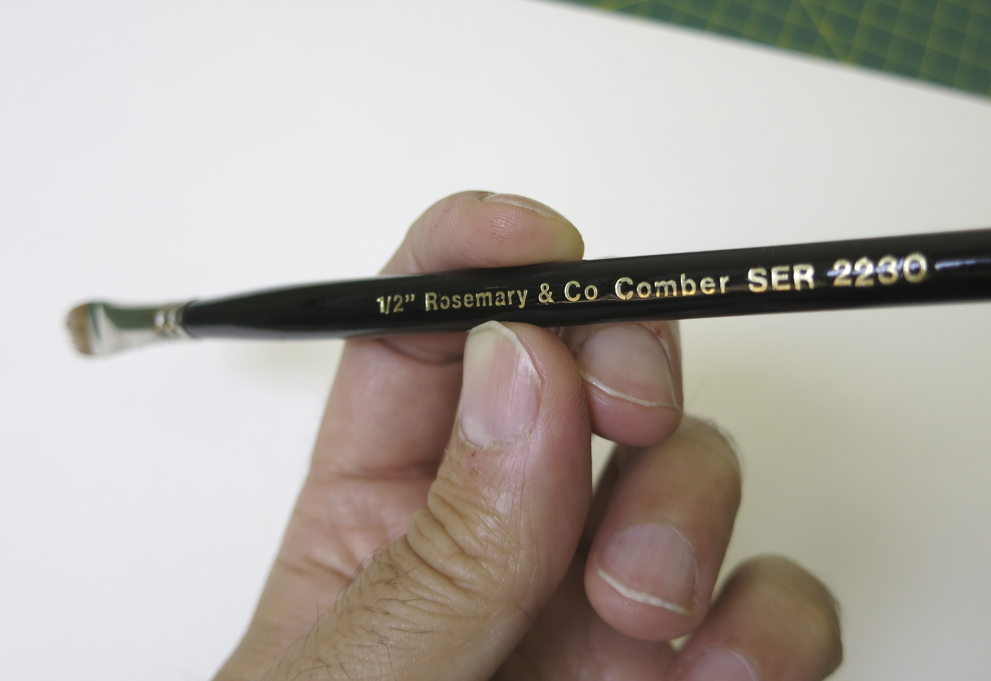
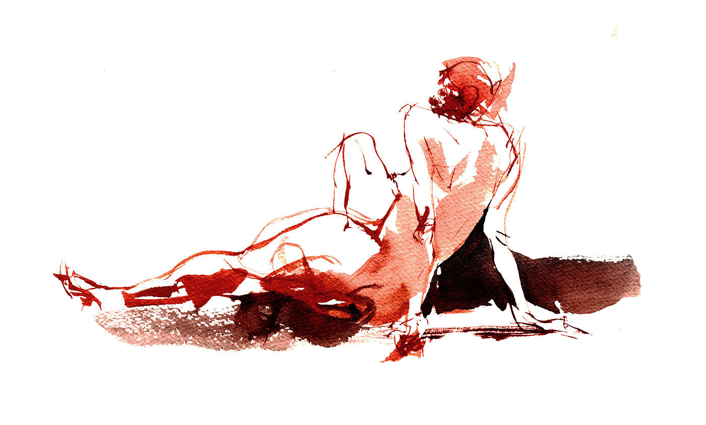
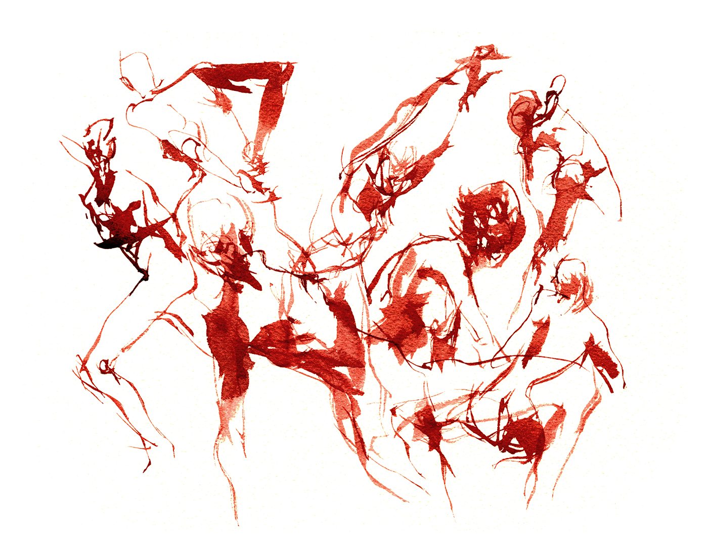
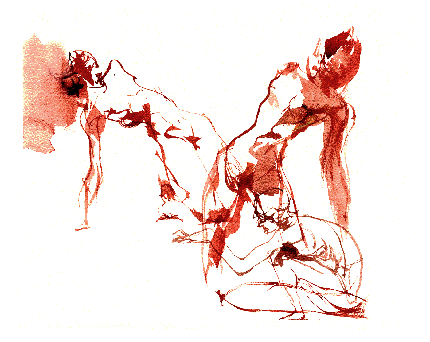
New Brush: Rosemary and Co, Comber Brush

The second interesting brush Rosemary offered me, was their Series 2250 Flat Comber.
The gimmick here is, we have a flat, with tiny serrations along the edge. Giving you rake-like marks – a series of parallel lines.
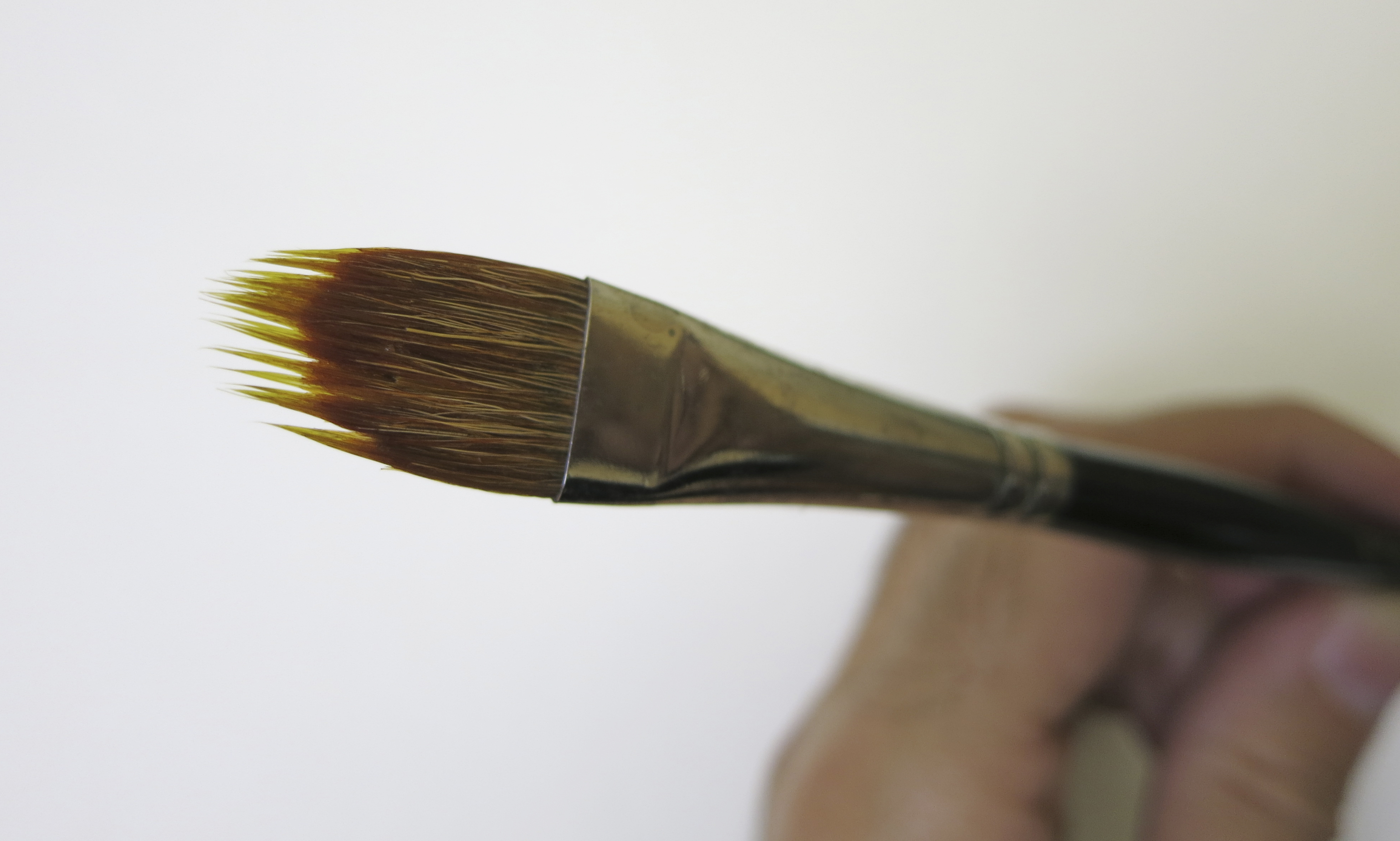
I do this normally using a pointed round and grinding the brush into the palette so the tip splays out into a jagged fan. But that’s kind of a grim way to handle your brushes. Nice that Rosemary’s created this serrated flat, to give you a similar effect.
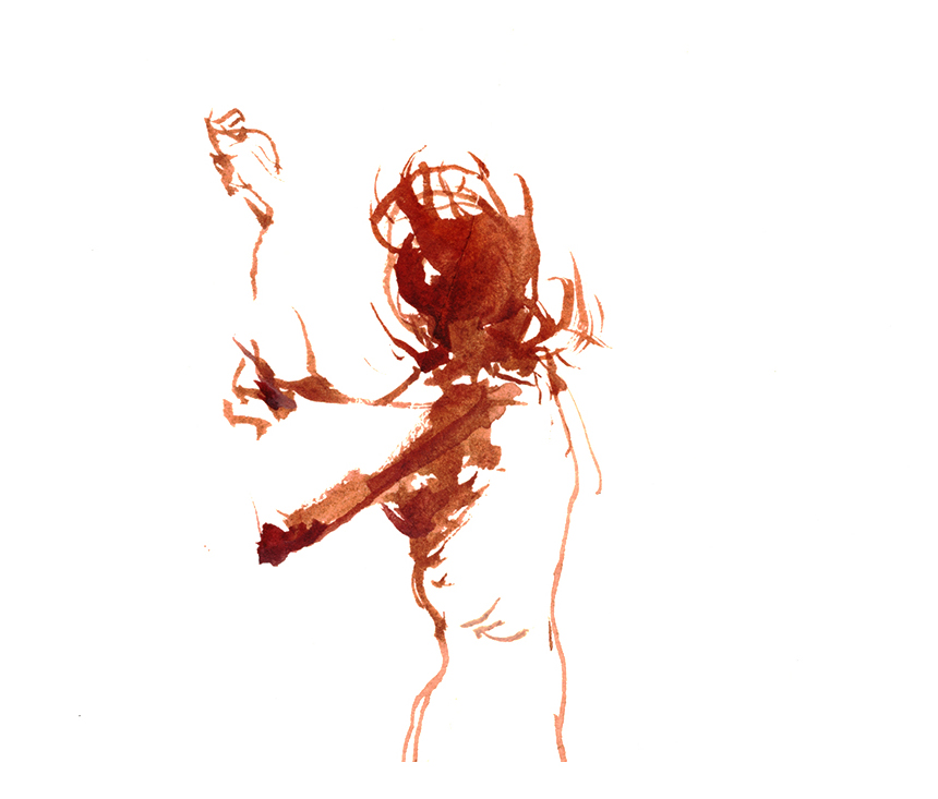
I have a few more examples from figure drawing, but there’s hand-drawn nudity involved. If you’re of legal age to view such scandalous material, you can click over to my life drawing blog. Otherwise, you’ll have to take the word of that one example above.
But seriously, it’s really a neat effect – and I’m sure I’ll find many applications for this brush next time I go landscape painting.
~m
New Brush: Rosemary and Co, Pyramid Brush
I’ve recently been given a couple of brushes to test – this first set of sketches is the Rosemary and Co Series 40 Triangular Pyramid brush. It’s a natural squirrel hair fiber, with a needle sharp point and an odd pyramidal brush-body.
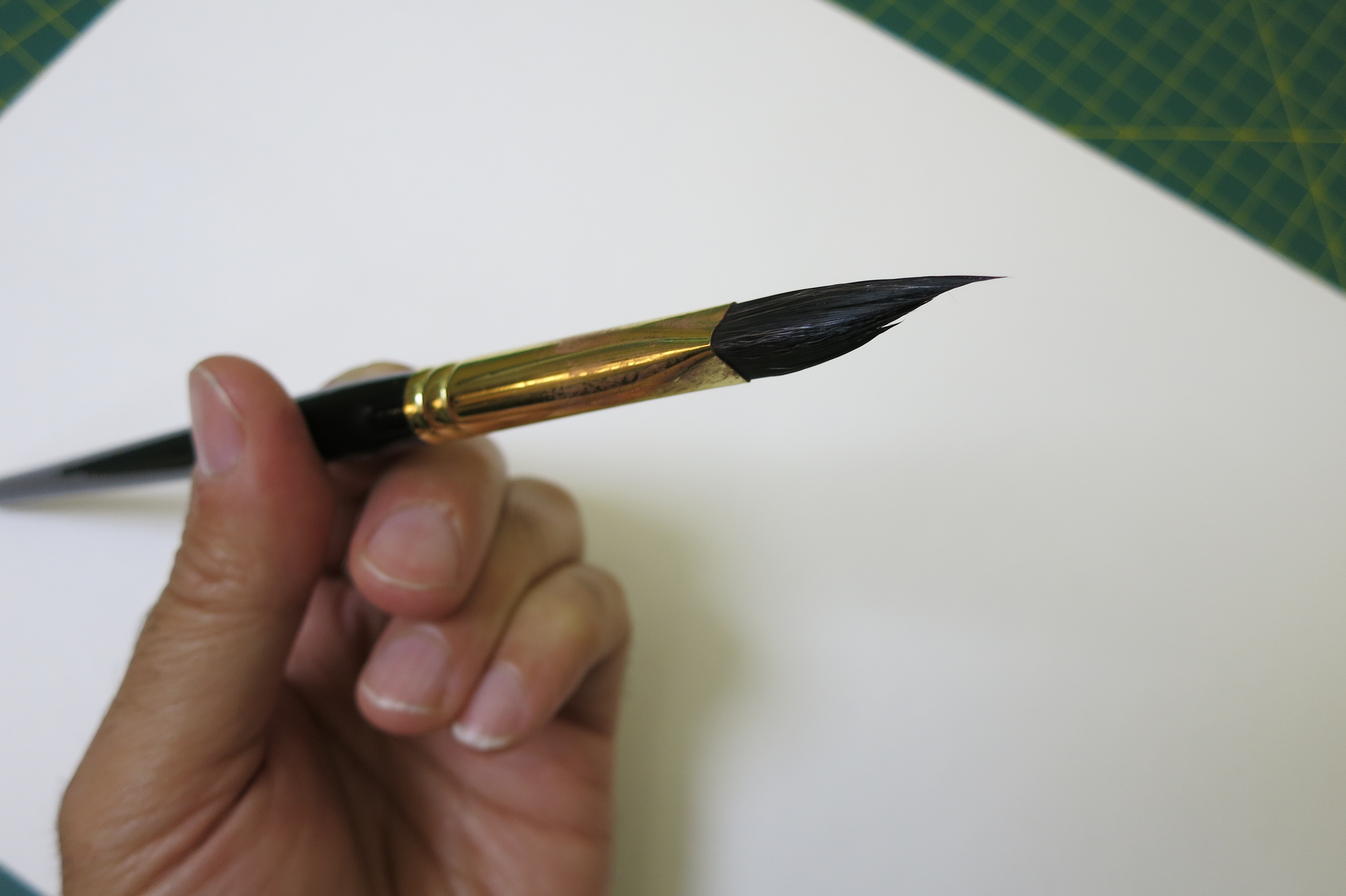
By popular demand – photo of what the brush tip looks like. (Sorry, mine is a little blood-red spattered now).
My first impression – what fun brush!
It’s a little weird – getting the feel of it on my first attempts. But the fine line drawing with the point is excellent, and you’re able to lay it on on the triangular sides, squash into a wedge, or twist the pyramid to get unpredictable chisel shaped mark making. It goes from thin to thick very quickly, with a fun feeling of being on the edge of control.
If you’re at all a fan of gesture drawing, or a direct, calligraphic kind of painting – you might very much enjoy this brush. I’ll be looking forward to doing some more figure drawing or street sketching with it.