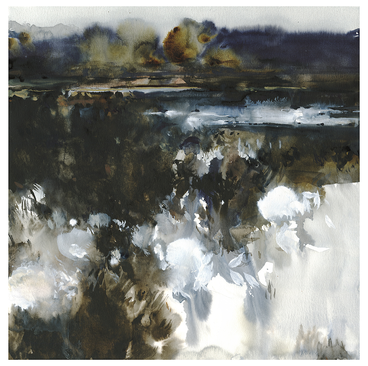
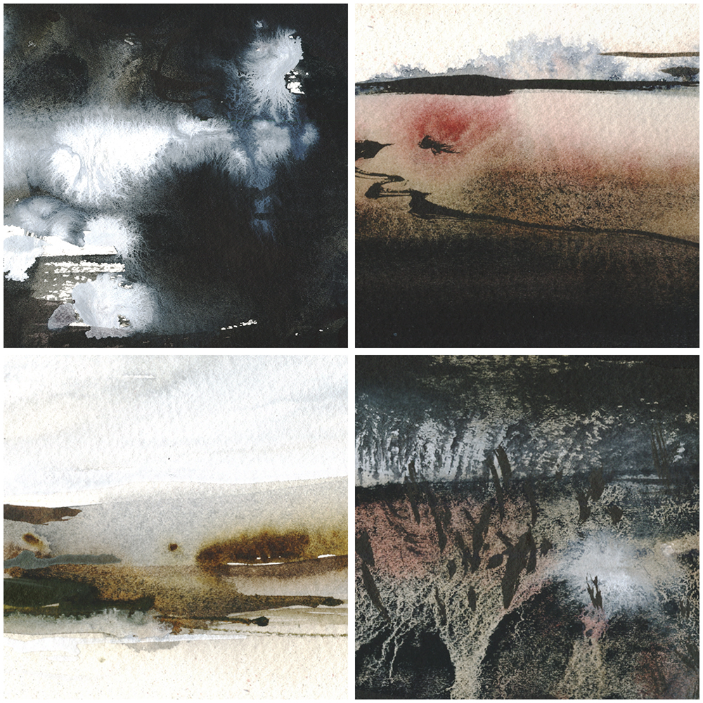
Day 14 : #30x30DirectWatercolor2019 : The Long Walk
“I Need a Good Long Walk”, 18×18″ watercolor on paper
Usually, I go back and forth about which I like better – the digital sketch or the watercolor. I think here, the watercolor is the better version.

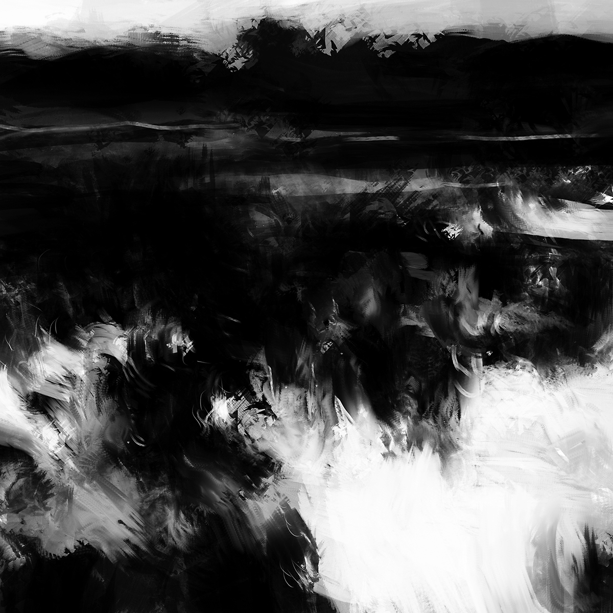
Though…no…I can still go back and forth. The digital sketch looks like it’s pre-dawn. Where the watercolor is just an overcast day. I’ll have to try a version that’s a real effort at a nocturnal painting.
It’s all going to depend a bit on your monitor. And the lighting in your room. Things that look dark, but still visible, on an iPad can be pitch black on a PC monitor. Its a thing called ‘gamma’ – sort of a contrast setting in the different operating systems. IOS devices have a truly bright screen. And they’re often higher resolution than a laptop or this – my desktop.
That’s one thing about painting irl (in real life). You see, what you see. No wondering what the other person is viewing it on.
~m
Day 13 : #30x30DirectWatercolor2019 : Shots From Above
I was looking at the work of Chris Dahl-Bredine. He’s a photographer, and the pilot of some kind of odd-looking ultralight aircraft. His Instagram is full of fantastic shots – similar to what we’re becoming used to from drones – but he gets himself up there and sees it first hand.
This one is inspired by one of Chris’ photos. (Unfortunately, I’ve lost the link to the actual shot, but his whole page is worth a look – or a follow!).
I’m not sure why I’ve deviated today from my process – painting from my own sketches.
I suppose the issue is – I’ve never seen this myself, and the moment I did, I wished I had!
My sketches all come from my memory. What else? So – if never seen it, how can I paint it? And if I have seen it, how can I not paint it?
Other people’s work is sometimes an important launching point.
These days, the practice of painting from photos goes somewhat against the grain. We’re told by the art-zeitgeist that every work should be entirely our own creation. As if that was possible. There’s rather too much concern about copyright violations if you ask me. (Which you didn’t). Not that I feel people shouldn’t own their own work, of course, I do. Entirely so, when it comes to commercial use. But I feel – on the other hand – that artists should be able to use anything they see as inspiration. Anything and everything. All of history, and certainly all of the ocean of images that we call the internet. To do otherwise is to ignore the culture we live in.
I wrote about the practicalities of copyright-and-painting at greater length over here.
But! This goes against the grains of my goals for #30×30 – so – I’ll be back to working from my sketches tomorrow :)

Day 12 : #30x30DirectWatercolor2019 : Seascapes
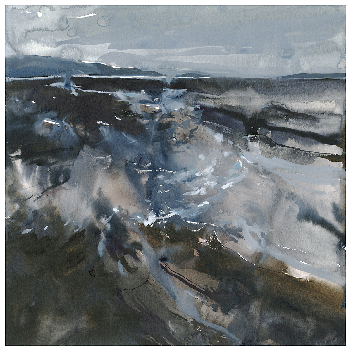
“The Falcon Cannot Hear the Falconer”

“The Blood-Dimmed Tide is Loosened”
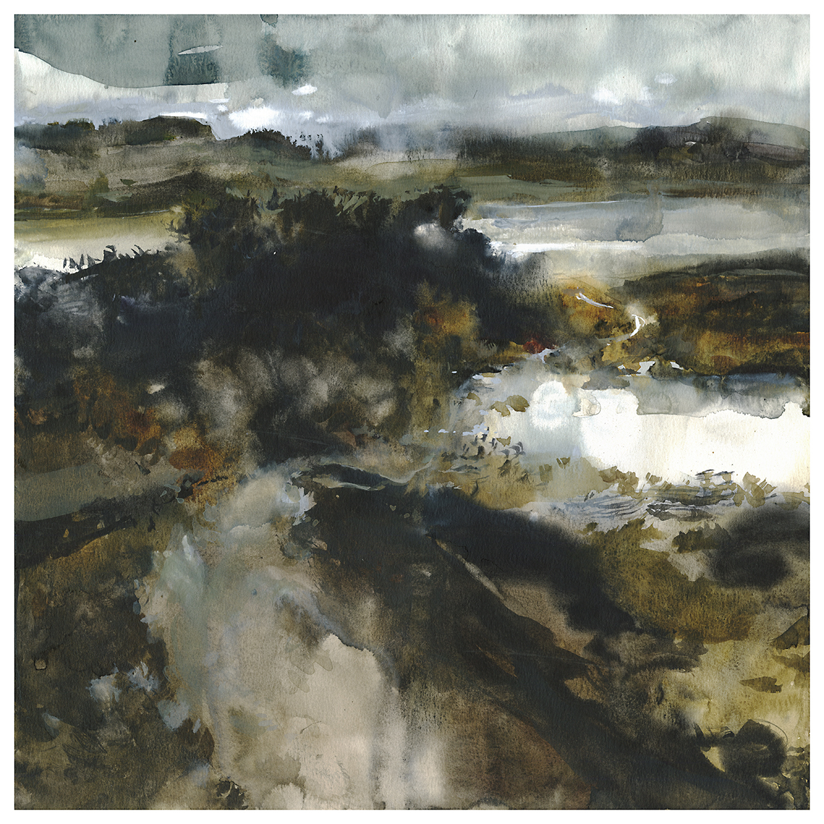
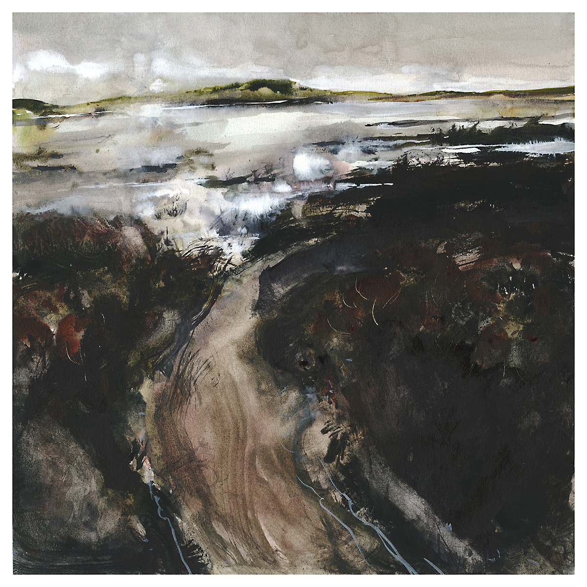
Day 11 : #30x30DirectWatercolor2019 : Wet-in-Wetlands
The sketch for this – just something that appeared – ended up feeling oddly specific to me. I think it’s a recasting of an oil painting I did last year. But its also a memory of a visit to the nearby Coopers Marsh. Though it doesn’t look anything like the work I did on location.
Of note to watercolorists: these paintings – the whole series – use a fair bit of white pigment. Both Titanium White, and a mix from Holbein called Grey of Grey – which is just a dirty white. I’m not even sure why they make it – but I find it attractive so I guess that’s why. A cool grey mix that explodes nicely when placed into wet. If you had to make it from black and white, I suppose you’d be hard pressed to get it as pale as it is.

I know many people don’t use white in their watercolor paintings. Our national watercolor society doesn’t even allow any significant use of opaque pigments in the competition entries. They used to have an arbitrary rule of only 10% opaque pigment allowed. Lately they’ve been saying, opaque pigment must not be a “significant portion of the work”.
Whatever that means.

But of course, the use of mixed whites is completely different than reserving paper. Mixed pigment can bloom and float, and it takes on the color of nearby wet areas. Reserved white will always be hard-edged and overly brilliant.

So, if it’s mist, weather effects, frost or seafoam – or returning white glints to a dark passage – I think watercolorists should reconsider the old-school mentality forbidding white. Just the same as banning black. Nothing should be off limits if it gives you the results you’re looking for.

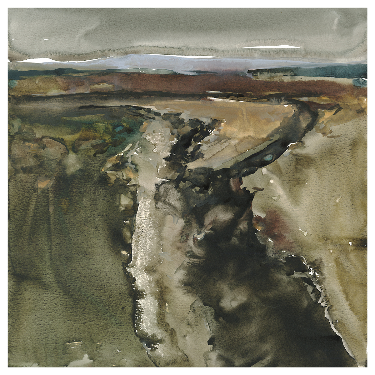
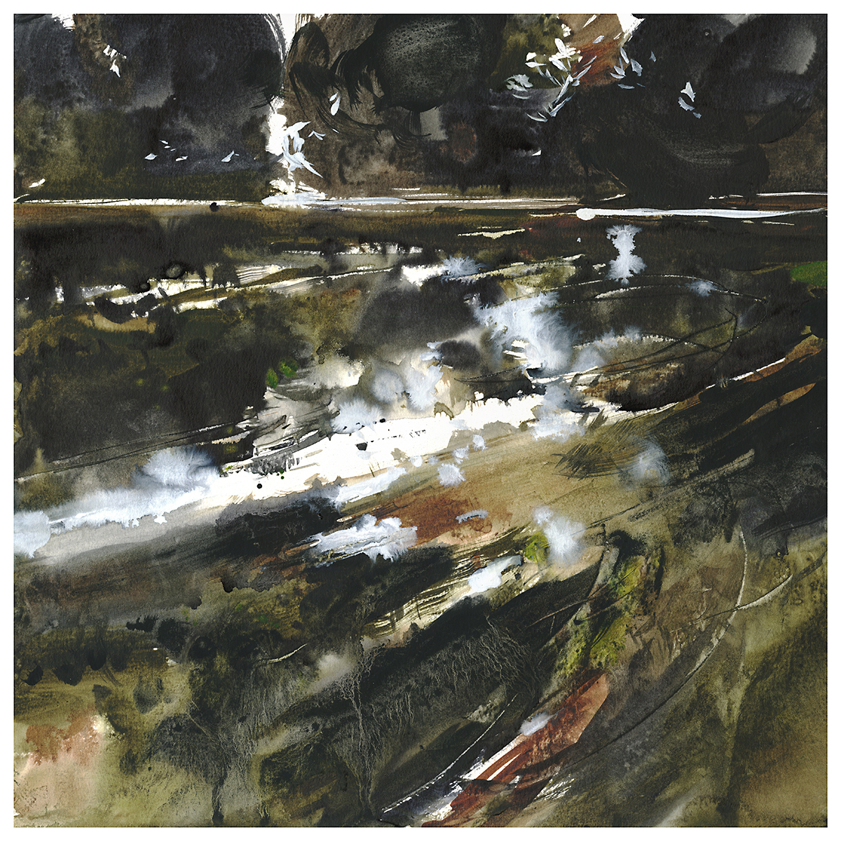
Day 10 : #30x30DirectWatercolor2019 : Wreckers’ Beach
I have this theory that landscape paintings are a kind of magic teleporter.
When I look at a great painting, I feel like I’m actually there – traveling into the picture plane.
I’m telling myself a little story about wandering down this path towards the seashore, early morning mist sparkling on the water. It’s cold out, and the land is back-lit, pushing everything into shadow. I can see the path wind out of sight, off the edge of the painting and into the dunes. There’s a little inlet here, with the sea out in the distance.
You can create a whole novel imaging yourself traveling through the image.

Perhaps, this was the goal of all the plein air painting I’ve done. To build up a mental library of scenery for future-me to draw upon. Except, I’m pretty sure I’ve never actually been to this place.
~m
I wonder if this one didn’t capture the mood of the sketch? Maybe…maybe not…still debating with myself.

In my mind, looking at the black and white, I was seeing a great green slow-moving river surrounded by jungle, something like the Amazon. Seen from the point of view of a boat drifting downstream. Made me think of Joseph Conrad’s Heart of Darkness. For me, first encountered as a teenager through the Coppola film Apocalypse Now.

I did a couple more tries, but – ultimately I think this one still has potential that I haven’t captured. Something about it isn’t black and glossy enough for this series.
No worries, there’s always other go.


Day Eight : #30x30DirectWatercolor2019 : Two Million

OK, this is my favorite painting ever! (I’m always saying that. I think it’s best if that’s your attitude about every new painting). I love the amount of abstraction – but it’s also exactly what I wanted – a foggy, brooding rendition of a wetland marsh.

The sketch was from imagination, but, also fairly similar to a place I painted in real life – though you would never know it looking at the plien-air version. Doing the notan sketch, I was just free-forming it, and this dark, forbidding scene appeared out of the heavy values.

I liked this so much I did a second version.
I was researching bogs and peatlands after the fact, and I came across Bolshoye Vasyuganskoye – a region in Russia of some 2 million square kilometers containing 2 million lakes. I’ve never been up north in Quebec, but I have this feeling there are areas that look like this. Home to moose and waterbirds and a million wetland creatures.

I feel like I’m hitting my stride. This is a pattern for me with these painting marathons. It takes a few days for the best paintings to appear. I can expect, from past experience, that I’ll peak a bit after the mid-point. I’ll get tired, and things will decline toward the end. But right now, I feel 100% in the zone.

This is a new thing for me. Not a landscape, not an abstraction, but something in between.
There are a lot of things I love about painting in a marathon-series. Mostly, I feel the pace of the work is important. Painting very quickly – to meet self-imposed deadlines – and painting every day – it starts to push a little further each day. You have this desire to do something a little better than the day before. Soon enough you’re past your comfort zone. I don’t find myself settling for repetitive, safe compositions – because I’ve *just* done the last painting and I have to make this next one stand out. That’s a good kind of pressure on your work.


I have this idea that paintings are Psychic Teleporters.
Great paintings can send you a mental journey. Drawing you in and transporting you somewhere. It’s even more interesting when that place doesn’t really exist. You’re picked up and transported somewhere – even if it’s just into a mood the artist has set down.

I think this is a universal ability. To anyone born with sight. But it might be something you can get better at over time? Being a skilled viewer of paintings.
Being able to look at a painting and getting drawn in – even if that painting isn’t necessarily realistic. At first, we need completely realized paintings to be transported. But the more we look at art, the more we’re able to go into an imaginary place.

A while back we finally got around to hanging some paintings in our dining room. Now, every morning across the table, there are these portals to other places. I can spend a few minutes diving into each one.
Want to practice your high level teleporting? Here are some totally abstract places :)


This one isn’t my favorite. Though it does have some nice areas.
Each time, I look at the work before and see if I can push it a little bit. Eventually, I push something too far. I think this is maybe enough with the blacks.
I think I’m using Neutral Tint mixed with a Lamp Black. Can’t be sure what was in the mix, as, I have different blacks – but all the mixing cups look the same after a while :) Probably should have labeled them.
But you can’t read black marker on cups of black paint :)
This is the nature of a series of work right? Set some parameters and start producing work quickly – staying (mostly) within the guidelines, but testing out variations. Each time they will be versions of the theme. You won’t always like every single one.
Sometimes though, the ones you don’t like at first, end up being favorites later. Have you ever have that happen with an album? The song I always skip ends up being the only one I play a year later.
~m
Day Five : #30x30DirectWatercolor2019 : Melt Water

I have always thought oil paints were better suited to detail and realism. Because of their ability to correct themselves in so many ways. Now I suppose I would add digital art to that. If I wanted realism, I’d absolutely be working in 3D these days.
Watercolor, on the other hand, is naturally suited to seascapes, clouds, anything fluid and dynamic.

I’ve never been to the Antarctic sea. But I’m pretty sure this is what it looks like.