Dawson College Watercolor Demo : Second Annual Poe Trait!
In what is becoming an annual tradition, I was recently at Dawson College doing a demo for the Illustration department watercolor class. Thanks to Lucy Trahan for the invite.
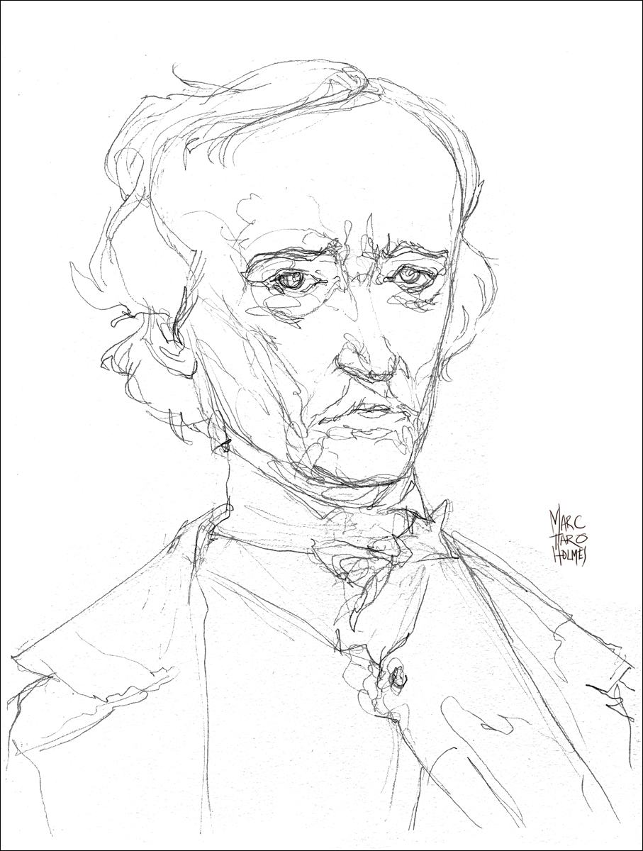
Another annual tradition, in honor of Halloween, is my annual PoeTrait. (Ok not every year. Here is my PoeTrait from 2009). I could have sworn I did that last year.
As I was looking for a suitable subject to demo, and it had been awhile since I sketched Mr. Poe – here he is again, this time in watercolor.

I should say, I don’t consider myself a portraitist, in the sense that I prefer to draw my idea of a person, rather than a dead-on likeness. So you’ll forgive some exaggeration in his physiognomy. I want to capture the barely contained churning thoughts roiling in his stately dome. And that pale sickly complexion that hints at his upcoming descent into the drugs and madness which ended October 7th, 1849, the day of his inadequately explained death.
Here’s the progress between my passes of watercolor. This is step 1, and 2/3 combined. The first stage of the head was handled wet-in-wet for softness, the rest wet-on-dry – to get crisper edges. Darks were laid on only after the paper had fully dried. The hair, and the shadow planes in the face first, then some tiny line work at the end – mostly wrinkles around the eyes.


In the event I’ve piqued an interest, here’s an online resource to read some Poe.
Syn Studio Classwork: Demo Two: Cast Drawing
Second project for the watercolor class at Syn Studio was this cast drawing subject. A small statue of Ganesha. The goal here was a classic demonstration of Tea, Milk, Honey – my phrase that encapsulates a working method which is simultaneously Larger-to-Smaller, Fluid-to-Gel, Wet-to-Dry, Lighter-to-Darker.

Here’s the progress steps. Drawing>Tea>Milk> and then Honey (above).

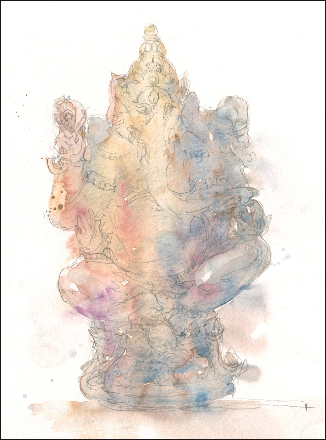
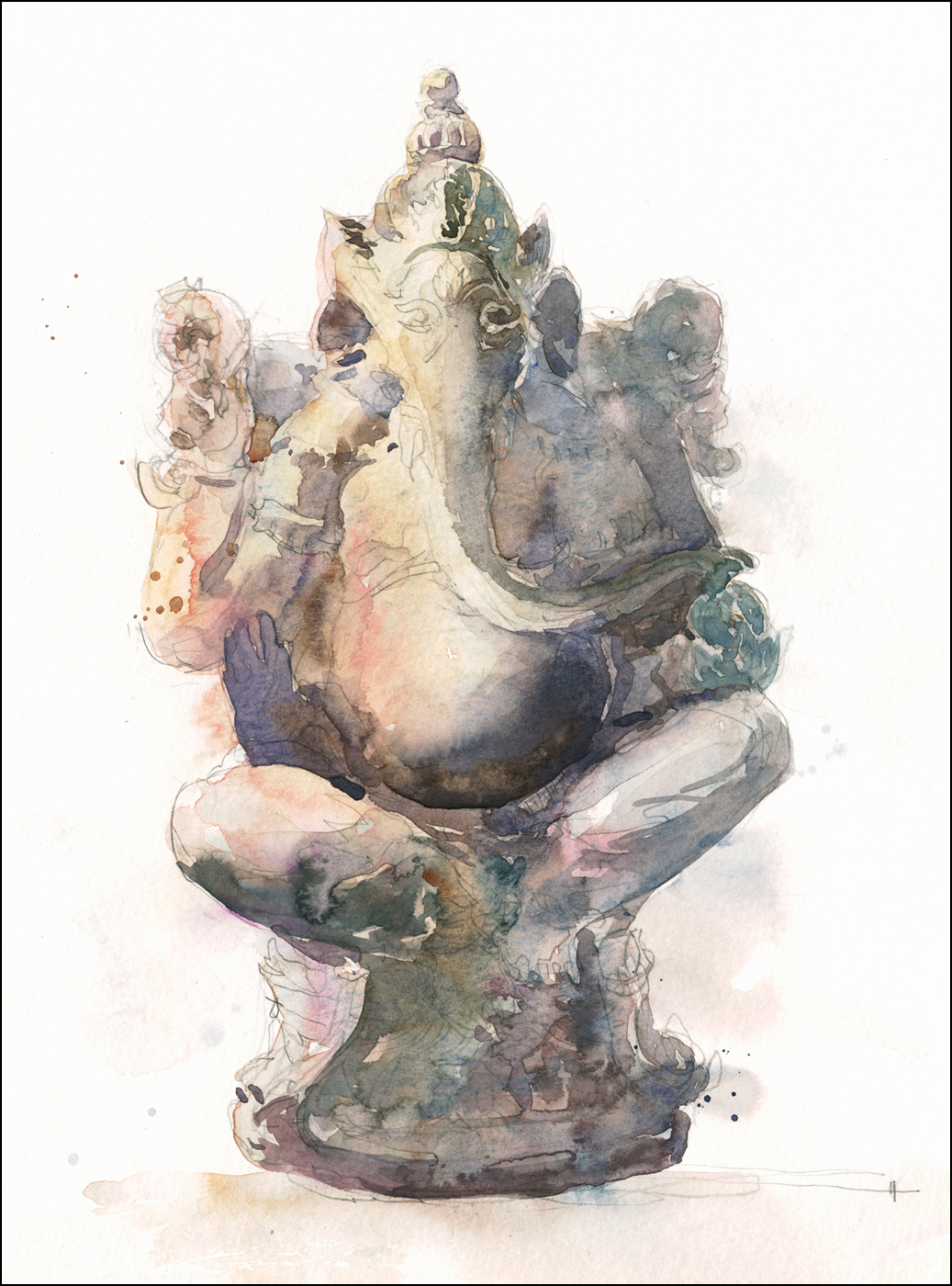
Key thing to remember: Work Wet on Dry: Each pass must be bone dry before the next. This allows you precise control over what edges are hard and what are soft.
Note how color in the first pass is super arbitrary. Just have fun with Pouring the Tea. Then you can draw in shadows with Milk, and re-enforce only the darkest dark cast ‘contact’ shadows with the final Honey pass.
Since this one we’ve done another day on still life subjects, and are graduating to working with the model. This promises to be a lot of fun, introducing people to life drawing with watercolor!
Oka Crisis 2013
When my friend Shari suggested going to Oka to sketch, the first thing I thought of was the Oka Crisis. I have very vague memories of events back in 1990. I can recall it was an armed standoff between the Mohawk and the Sûreté du Québec instigated by local developers plans to put a golf course on top of sacred ground.
On arrival at the State Park, we were impressed to find people still manning the barricades 23 years later.
I shouldn’t joke. The situation with the Mohawk was serious business. Today the park employees appear to be on strike over injustices that could not be made clear to me, as they had no English and I have no French. Perhaps the strikers should take a page from history. They could get much more attention to their cause by blockading the Mercier Bridge.
In any case, we were allowed in, and enjoyed the day painting in the park. We had remarkable weather for October, surround by amazing fall colors. You wouldn’t know it in this painting.

Someone who is a landscape a painter will have to explain to me why I can’t seem to wrap my head around pictorial composition out of doors. Shari and I were both attracted to a marshy area with overhanging dead trees casting interesting reflections. I find I’m always immediately locking into these compositions that are not landscape paintings at all, but are in fact portrait studies of trees or rock formations. I can’t banish this instinct from Urban Sketching to stick a detailed subject front and center :)
Well, still, was a great day painting in this last gasp of fall – I can apply myself to scenic views again next year!
Syn Studio Classwork: First Demo
Last week was the first session of my 10 week watercolor course at Syn Studio. I started people out with some very simple still life situations. The old Fruit and Veggies. I just wanted them to try out the use of wet-on-dry zones to separate shapes with hard edges. (Work loose inside firebreaks of dry paper). I started that Mango with the ‘Drawing with Clear Water‘ trick.

I talked about working in three passes – Tea Milk Honey – but with something this simple it might have been hard for them to see the benifit of that. Tomorrow night however, we’ll be doing much more complicated studies. The learning curve starts immediately! (Oh I also did a tiny tentative bit of scratched paper on those limes. Thanks J.S.Sargent! Good trick).
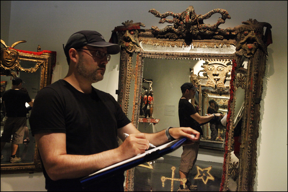
Museum of Civilization: Vodou
Just back from the Museum of Civilization in Ottawa where we spent the day sketching their current exhibition: Vodou. On display until Feb 23. Info here: http://www.civilization.ca/vodou/.

The exhibit is more of an art installation than anything else. You’ll find sculpture, carvings, and numerous artifacts of religious significance. I found it fascinating and well worth the visit, but I’m not sure it would be to everyone’s taste.
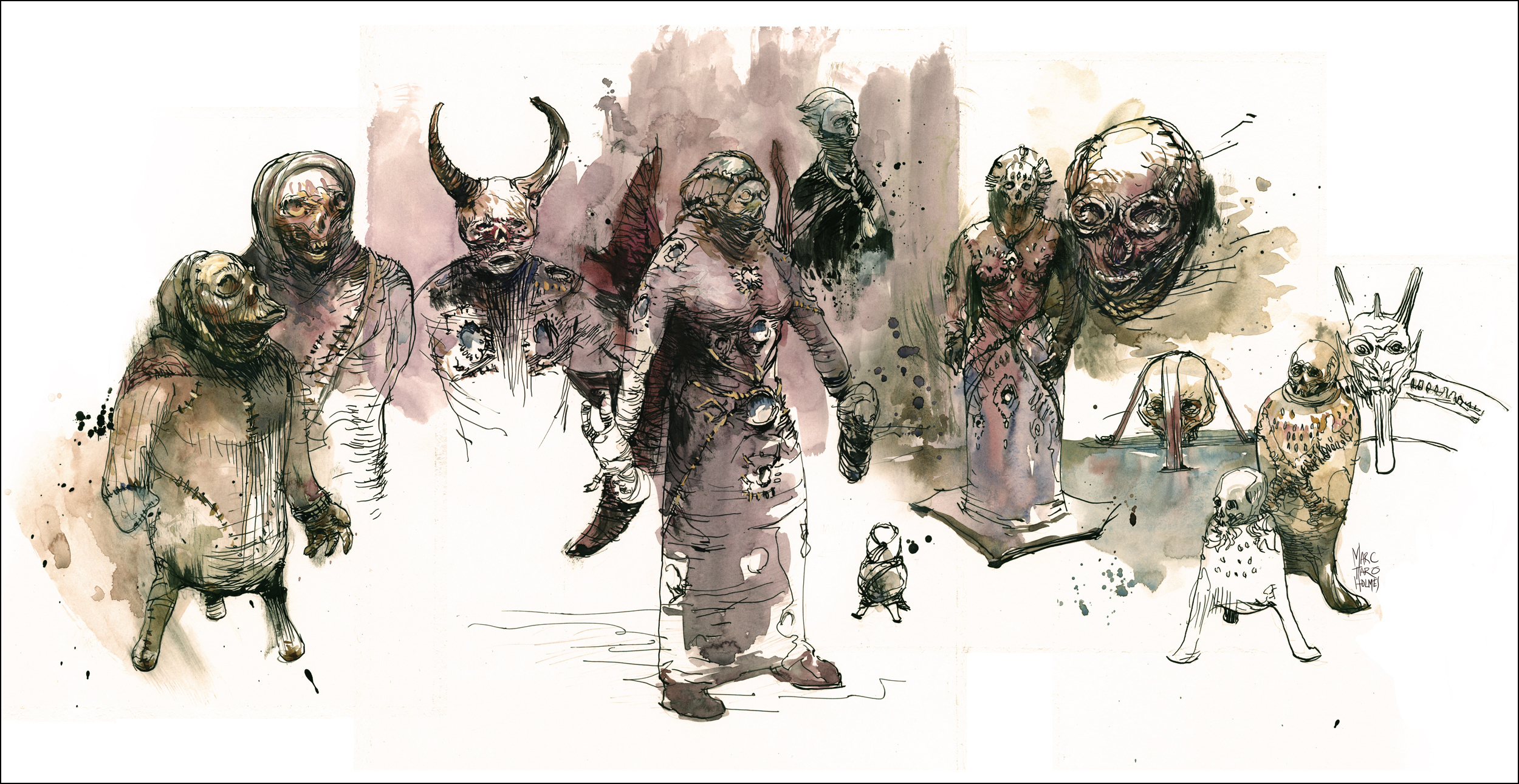
The highlight of the show is a room of curious figures. I am tempted to call them ‘dolls’, because of, well, Voodoo.
Many of them seem to be crudely stitched from canvas or leather of some kind. Most are painted in drips of blood red and some kind of dark waxy streaks. They range between two and five feet tall. Many sprout horns or bat wings and carry weapons – swords, spears, clubs. The scars of their seams, lashed with careless stitching can’t help but suggest an autopsy, or perhaps Dr. Frankenstein’s handiwork.

Given the overly theatrical red walls and halloweenish smoky-acid-green lighting, the curators have created a bit of a house of horrors. Complete with a room of leering demonic mirrors at the exit.
There is a great deal of chit-chat in the wall text about how Vodou has been misrepresented in Hollywood – but I can’t say the museum is doing much to clear that up. It seems more like they’ve put on a show for the kids this October.
But behind this circus freakshow, there are disturbing hints at a darker possibility. The heads on these creatures with their malformed faces drawn in coils of rope, might appear to be cartoons of skeletons. But the presence of a few three-legged ‘urns’ capped with authentic boney skulls suggest to me, that there could well be a human head inside each one of these bizarre figures, eyes blinded with mirror, a new face of waxed leather stretched across the skull. I couldn’t help but feel that all of these things conceal human remains.
The impression I received, quite likely having nothing to do with reality, resulted in these sketches.
Official Video, USk Barcelona Symposium
4th International Urban Sketching Symposium. July, 11/13-2013. Barcelona. Official Video from Urban Sketchers on Vimeo.
Great work on this video from Barcelona – thanks to Hug Cirici and Marta Castro. They have done an excellent job capturing the Barcelona Symposium.
Pointe-a-Calliere New France Market: Sunday Sketching

Just back from yesterday’s event at the Pointe-a-Calliere museum in old Montreal. A big group of USk:MTL sketchers came out to draw the costumed re-enactors at the 18th century public market.

We had great weather for drawing and plenty of subject matter. Musicians and merchants, potters and soap makers, sea captains taking on crew, pirates dodging soldiers, and the black-robed priest chastising tourists about their immodest clothing.


If you’re in Montreal on a fourth Sunday, we hope you’ll look up our sketching plans at the USK:MTL blog. Everyone is welcome!

Mosaiculture and Magnets
This summer the Montreal botanical garden (Jardin Botanique) is the host for Mosaiculture International. It’s a show of topiary follies. Painstakingly planted and clipped sculptural works on a grand scale. I’m estimating some of the larger ones being 30 feet across.
It’s certainly a spectacle, attracting big crowds. Get your tickets online to avoid a significant wait; but alas, no Access Montreal discount for the speedy service.

At best the plantings can feel like forest spirits. A sculpture of organic material – clay, dead wood, antler, moss, lichen, (on a steel armature) combine with plant species selected for color and texture to create figures of living foliage.
At worst, it’s high-kitsch. Enormous blooming bumble bees knock over pots of cartoon flowers. Leafy lemurs, flowery clown fish, and succulent gila-monsters amuse kids and oldsters alike.
I’m not going to try and convince you it’s worth the steep admission – it is after all just an extravagant walk in the park. But if you’re looking for something to sketch (or photo) in Montreal right now – it was many years in the making, and might not happen again soon.

I’ve been talking a lot lately about painting on location, with the big easel and the whole shebang. I thought this time I’d try out something completely opposite. A real guerilla operation. This is a trick I saw at some sketchcrawl – perhaps it was our workshop in Portland?

The idea is to use super strong magnets to clip water bottles and palettes onto a drawing board. (One magnet goes right in your bottle of water, the other goes underneath the board – jumping from your fingers and clamping on).
It gives you some freedom to walk around, wave the board in the air, and generally not worry too much about holding stuff while you try and see through a crowd of tourists. Certainly, if you’re walking all day, it’s nice not to have to carry a tripod or easel. I used it standing for short periods of time, but more often it’s a kind of lap desk.

With strong enough magnets it’s not a fragile setup. Things won’t fall off on their own – but the magnets will slide if you push them – so could end up nudging things off the edge. If that happens, the magnets will snap together with wicked force. I got some nice pinches getting used to that behavior.


I’ve seen a variation on this, a sketcher had a large panel of sheet magnet (sold as something to make photographic fridge decorations) contact cemented to their board. Making a kind of bulletin board for art supplies. Her Altoid tin watercolor kit stuck on nicely.
This trip I was experimenting with Line over Color – (reversing the normal approach – loose, exploratory washes first, tightening with line after). Something I’ve seen offered as a class at the USk symposium, but never had the chance to do.


So, there you go – something worth trying out. I think this magnetic setup is best suited for clipping a bottle of india ink to your board and doing big brush drawings in the field. It would probably be great at life drawing. I’m going to try that next. Something a little more streamlined than clipping on my full size folding palette. Perhaps just a few bottles of pre-mixed watercolor. Should be interesting to play with.
People always ask about the easel
EDIT: FEB 2017 – THREE YEARS OUT: I will probably go back to using the easel one day. However, the older I get, the less stuff I want to carry all day.
In recent months I’ve refused to bring any tripod/easel at all. I still think you get better paintings if you use one. BUT – I’m also willing to sacrifice some quality in exchange for remaining light on my feet.
Here’s a recent (mid 2016) shot of working on location, doing a 30-45min painting, standing up.
I’m painting on a coroplast drawing board, with a small palette clipped to the board. Extra paper/boards are clipped behind. Normally they’re stacked a bit neater. I’m not sure what I was up to in this shot. I’m carrying paint water in 125ml nalgene jars in a ‘purse’ style bag (open jars, in the bottom of the bag, I reach into the open zip for water).
Perhaps I’m getting faster at painting? or more forgiving at what I want out of a sketch? But in any case, I’m not needing the easel as much as I used to.
Still – I leave this long historical post up for posterity. It was an important tool for many years.
EDIT: SEPT 2014 – ONE YEAR OUT: The article below is now out of date, but I’ll leave it up for posterity – and because I still like the setup described – BUT – I no longer carry the full-size tripod and accessory trays into the field.
I’ve decided it’s simply too heavy to take on trips that involve walking to the location.
I still use it extensively in the studio, so I can paint in different locations (in front of a model or still life, or near the computer if I’m looking a reference images). But for field work, I’ve gone down in size to a lightweight aluminum folding tripod that looks like THIS in use.
Painting in progress are clipped to the tray like THIS with the palette similarly clipped on to the front like THIS. (That’s a bijiou box in the shot, but I also do it with a larger 12-well tin box).
My main reason for going big in the first place was stability in the wind. My current theory is: “oh well- some paintings r’gonna flip”. That’s the trade off for less weight in my bag.
So, back to my OLD OUT OF DATE info:
Original Post: The easel can be a bigger star than the paintings sometimes.
Every time one of my Frankenstein painting rigs appear in a photo, I get questions about it. Which is natural. Everyone loves gadgets, if they’re going to make for better paintings.
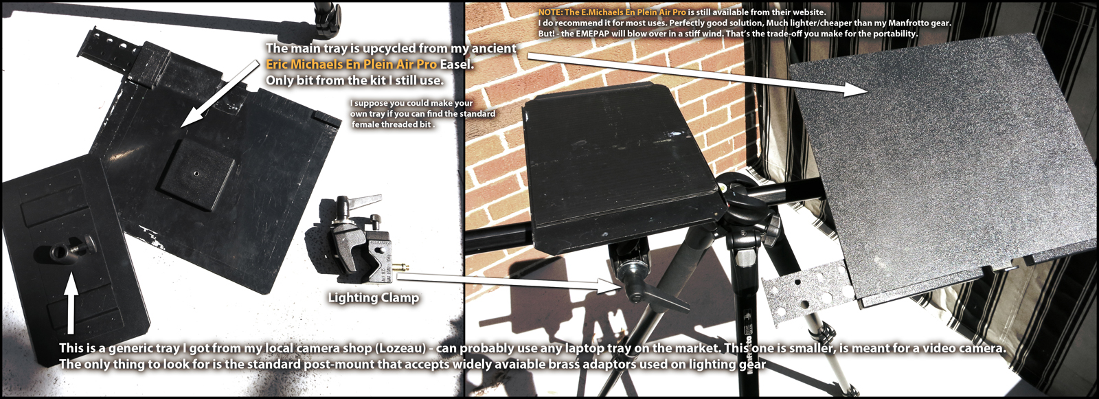
I’ve tried a variety of gear aimed at artists – the best of which (IMO) is the Eric Michaels En Plein Air Traveler. Basically not an easel at all – but rather a set of trays that attach to a light-weight camera tripod.
(NOTE: I go my E.M. Plein Air Traveller in the USA. I’ve recently been told that E.Michaels and Co. charge exorbitant shipping to Canada – almost doubling the price of the item – possibly Europeans might be in the same boat. So perhaps people might be even more interested in my kit-bashed solution).
This is the most practical off-the-shelf solution I’ve seen, but it has one drawback. It’s build to be light, portable, and easy to set up. Which is great. (I used one for years). But it means it’s *too* light for any kind of serious wind.
There have been many windy outings where I had to keep one hand on the tabletop at all times to stop it lifting off. On a few occasions, walking away at the wrong time resulted in a wind gust flipping the whole thing on it’s head. Once you push the situation up to 16×20″ panels you’ve essentially made a land-surfer.
So, that’s where higher quality camera gear comes in. Full size tripods have the weight to counterbalance big paintings, yet still fold up smaller than purpose-built artists gear. (I’m talking to you Jullian Easel). Personally, I’d much rather carry a tripod over my shoulder and the paints in a backpack, than try to haul around one of those wooden boxes.
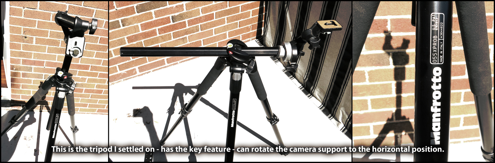
The best tripod I’ve found so far is the cleverly named Manfrotto 055XPR08. To which I attach my old E.M.Plein Air Pro tray, using a bare bones tripod head. (Not the nice camera head it came with, but a very basic one I had lying around. No reason. Just using the good one somewhere else).
The 055XP has the key feature: You can fold the camera head to a horizontal position.
Perfect for my needs – panel on one side, and the remainder of the T-Bar to clamp on whatever else I want. Usually just a small accessory tray for my palette. I have a battery driven LED light panel for night painting, and eventually I’m planning to add in a Shade Buddy umbrella. I could even clamp on a Go-Pro or similar mini-camera and capture progress photos of the art, or record the scene in around me.
You could make your own tabletop out of wood or plastic by attaching the standard camera threading that’s on the base of every DSLR. I haven’t needed to researched where to get this tiny piece of hardware yet, but any camera store could order it. (EDIT: I’ve been told the threaded bit of hardware is called a Tee Nut or T-Nut, and is available in hardware stores, or online). You could also use a ‘shoe’ type quick release attachment which can be purchased from tripod manufacturers as a replacement part. You’d just have to mount it to the back of your tray.
There are also many types of laptop tray on the market these days, aimed at digital photographers who want to shoot with a computer next to the camera. They are however, often quite expensive. I bought one, but it’s cast metal and too heavy to haul around all day. Another thing for the box of expensive easel hardware I don’t use anymore. There are some nice aircraft aluminum models out there – so maybe someday :) Check out a site called Tether Tools if you’re feeling spendy.
The painting itself, brushes and folding palette are clipped on with bulldog clips. (see up top). I bring a variety of sizes if clip to hold all the various brushes. (Brushes go handle down into the wire ‘arms’ of the clip, not under the clampy part).
This all might seem like a bit of the overkill – but I will say: try painting on your lap, when you have to juggle palette, brushes, water etc etc – and you’ll discover immediately that having all your tools to hand – without fumbling for things – is actually a basic requirement for making a good painting. You can’t work a bead of water if you have to dig around in your bag for brushes while it’s dripping down the page.
If you try out something similar, or know of some better accessories, send me some of your photos from the field. Maybe we can get Manfrotto to make purpose-built art gear. They can put them out in pretty colors instead of photographer black.
~m
Shari Blaukopf: Wet in Wet Watercolor Demo
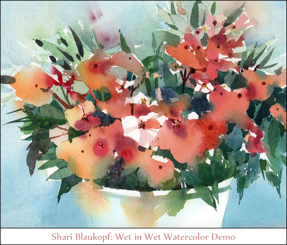
Yesterday afternoon Shari Blaukopf, my co-instructor from the USK Montreal workshop came by to give me a wet-in-wet watercolor demo.
She’s been telling me for a while that I don’t have to stretch watercolor paper if I just work wetter.
I’ve always been told, in order to work larger, you soak the paper, then nail it to a board with a few hundred staples. (I have an electric staple gun. Kachunk Kachunk chunkity chunk. 100 staples in a minute).
She insisted this wasn’t necessary, I didn’t believe her, so she came by to prove it. She should have made a wager, because – turns out – I was wrong, she was right.
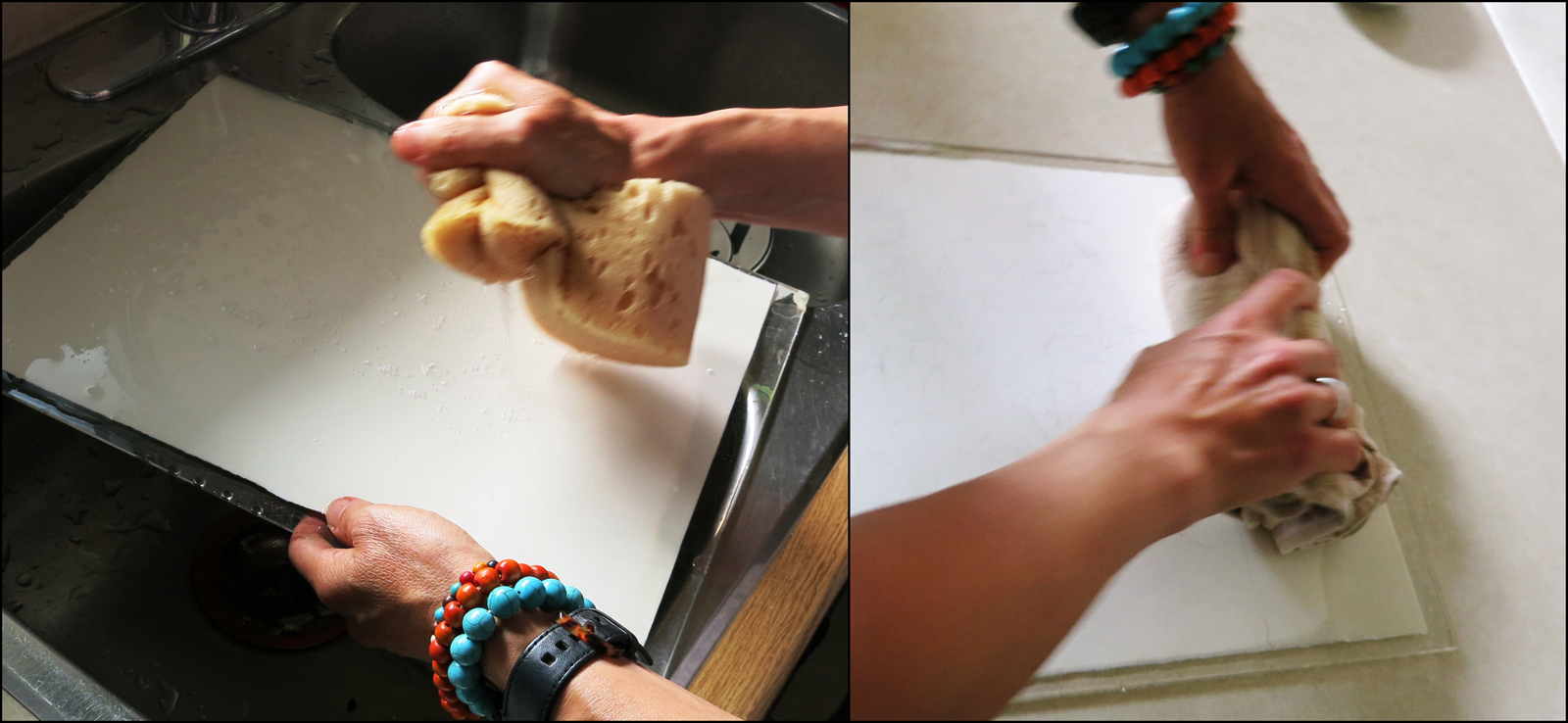
First she wets a quarter sheet of 140lb Arches Cold Press paper – completely soaking both sides with a sponge. (This would work with any size, she’s worked this way on sizes up to double elephant).
Then blot/rolls the excess water away with a towel. (“Like rolling pie dough – from the middle outwards”).
The resulting damp-all-the-way-through paper is glossy but not glaringly glassy-wet.
It’s kind of amazing how it works. She can do a whole painting in the time it takes the soaked paper to air-dry. Though she does say, if you need more time, you can just re-wet the paper (from the back).

She paces herself to get soft washes early and comes back at a dryer (later) stage for smaller hard-edged details. It’s a display of perfect timing, and the hard earned experience mixing the right paint/water viscosity for every stroke. (Richer milkier mixes of paint will keep a cleaner edge, even early on when the paper is soaked).
The work comes together remarkably quickly. Dextrous strokes of pure color mixing on the paper into soft edges and blooming transitions. Wherever pigment touches pigment, the wash that’s slightly wetter expands slowly into the previous color.
Note how large a brush she’s using. She really did 85% of the painting with that 2” flat. No fiddly #0 brushes for her. She puts in small stems and striations just using the sharp edge of this gigantic brush.
My own method involves starting with dry paper and flooding it with pale pigment – creating the wet areas into which I’ll “charge-in” pigment. There’s a narrow window while the wash is wet enough to work. Her approach is much wetter, giving her a lot more ‘open time’ – at least 30 minutes under today’s conditions. (Varies with humidity and direct sun).

Because her paper fibers are fully saturated with water (all the way through the sheet), color blooms can travel quite a bit further, and with a softer effect, avoiding the sedimentary edges I get on puddles. (Though, I like those edges. But I can see the appeal of avoiding them). Some of this might be her pigment choices, rather than just the wetness, not completely sure.
The end result is a beautiful painting with a full range of soft to hard edges, executed in about 45 minutes.
I’ll just note that some of Shari’s original work will be available at the Lakeshore Artists Association’s Fall Exhibition, September 7th and 8th. Details (HERE).

