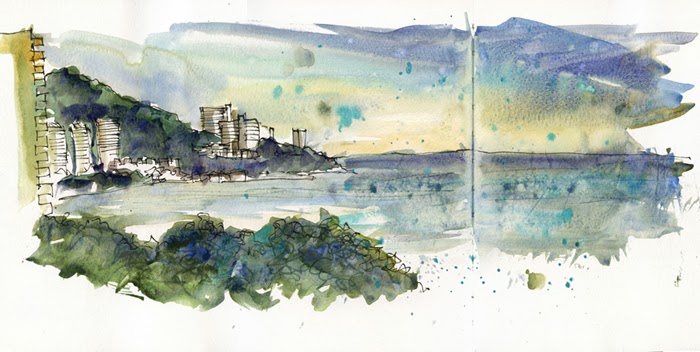
Up on Vice Magazine
A recent job of mine just went up on Vice Magazine. It’s an interesting article – a positive story about a bad situation. Have a read here: {Vice}
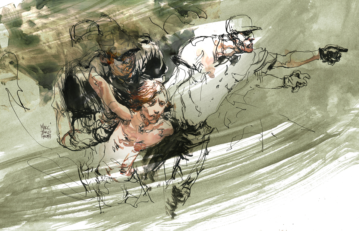
The neat thing about these illustrations – these are probably the first ‘pro’ work I’ve put out directly based on my ‘Drawing People in Motion’ workshop. (Free PDF download of teaching pamphlet here). As any regular readers know, I’m very involved in the urbansketching.org community, and consequently I think a lot about the value of drawing on location, from life. The spontaneity of un-posed work, versus the ‘polish’ of a studio piece.
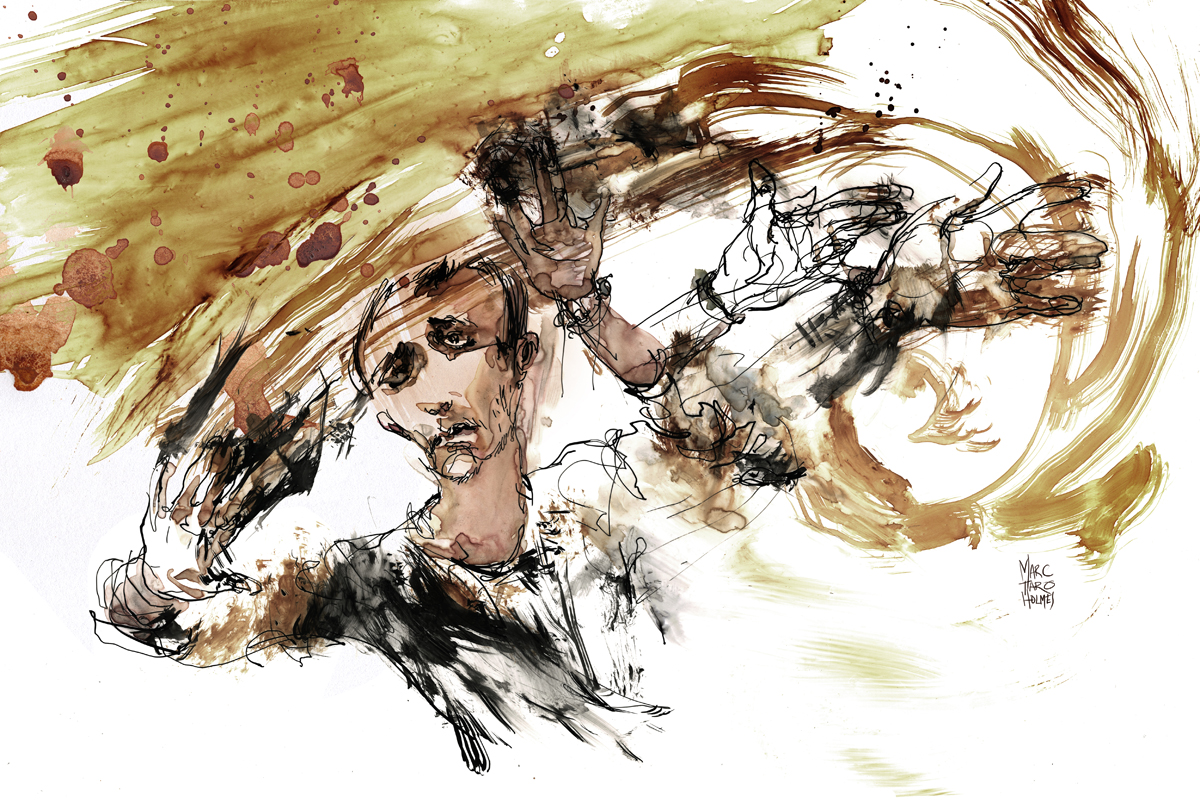
Now, these of course are done from photos. The events in the article happened years ago. But the idea is to treat the drawing exactly the same way. Work just as fast, combining from multiple reference sources, try to get the work in the studio to match the energy of the work in the field. My goal is of course to be going out on assignment, getting reportage in real time. But, in the mean time, the philosophy can be the same.
A side benefit for illustrators is, the drawing part of the job was done in a single day. I imagine that’s not uncommon for editorial artists, but that kind of turn around is something I couldn’t have managed a few years ago. Not sure how important that is in the long run, but its certainly suits the situation in the editorial illustration market right now.
[Images roughly 10×17″, pen and ink and watercolor on yupo]
Announcing Shari Blaukopf West Coast Workshops
My USK:MTL co-conspirator and occasional teaching partner Shari Blaukopf has some (few) spots left for her summer workshops.
- Anacortes Island: Sold Out!
- Vancouver: July 4 & 5
- Seattle: July 12 & 13
Contact her if you are interested, spaces are going fast. Her site info: [HERE]


Announcing Liz Steel and Paul Wang: Workshop in Sydney!

PLEASE NOTE: PAUL AND LIZ’S WORKSHOP IS SOLD OUT !
This just in: Super Sketching Duo Liz Steel and Paul Wang are offering a workshop on Cockatoo Island, Sydney.
Sounds like they have some creative stuff planned. Check out the full workshop description [HERE].
Book this fast, it’s sure to sell out!

I’ve had great days drawing with both of these artists in Lisbon and Barcelona (we usually go sketching in the few days after the big USk workshop) – I highly recommend this event, I’m sure you’ll have a great time, and I know they can help energize your sketching. If you were thinking of getting over to AUS, here’s a fine reason.


USK:MTL Sunday Sketching video on La Presse.ca

Hey! Some video from our last Sunday Sketching just went up on La Presse (video in French). They did a great job! Thanks to Denis Wong (and I forget the name of his camera person – oops).
Sunday Sketching
The USK:MTL group recently met for Sunday Sketching at McGill’s Redpath Musuem. We had a pretty good turn out, especially considering the cold. I was pleased to see a little crowd on the steps of the museum when I showed up. They were banging on the door trying to get the museum caretaker to open up on time. (It’s hard to be patient in this weather). I don’t think the staff are used to a big group appearing at opening time Sunday morning.
It was great to see a lot of new sketchers come out – I hope we can continue to build up our group, one day it would be great to be putting on a show or collaborating on a book based on the Montreal sketching community.
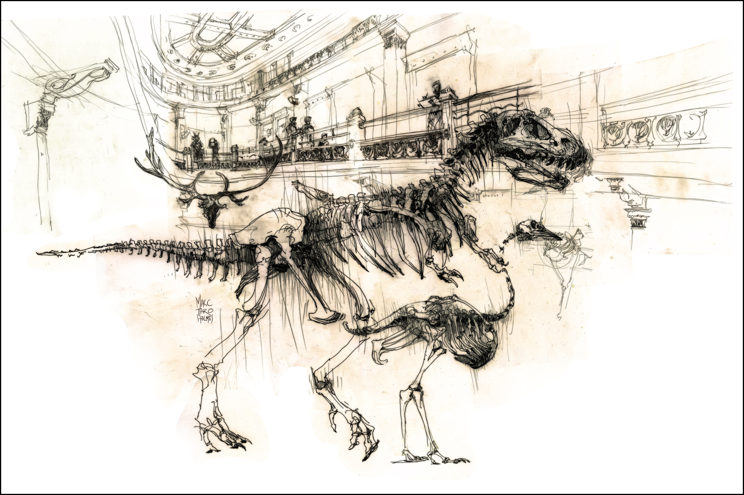
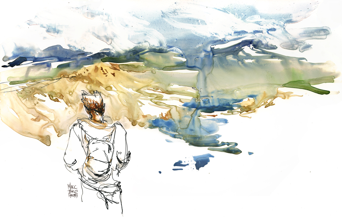
[Pen and Ink, composite drawing, roughly 24×36″]
Sketching wise, I stuck to drawing – though this is one of my composites, done on 12×16″ plate finish Bristol using about 7 sheets in collage. It’s sort of a mental game of mine, planing how the final drawing will stitch together. I have ballpoint, brush marker, some rust colored ink and dip pen and pencil in this. The haze over everthing is something I do in the scanning process – exaggerating the smudges left by my hands. I like the tone that develops by accident. This is the sort of thing that would make a good underlay for a painting.
This day, we had a pair of reporters from La Presse show up to shoot some video (one of our French language daily papers, if I dare say, the ‘real’ paper (the others are tabloids)), so I’ll let you know when their footage goes up. I did some drawing under the camera, so we might see some timelapse of my sketch. Fortunately Shari was there to do an interview in French. (I’m sadly not doing anything about my monolingual situation – my art will have to speak for me). Of course it’s also fascinating to me that the paper sends a camera crew, but I suppose it is only a matter of time before there is no more dead-tree paper, and we get it on our mobile devices. I’m sorry journalists! but I can’t wait. It’s ok, there will still be journalists! Just like artists, they will have more, and better tools at their disposal.
Hey everyone! I’ve been talking with some of the other regional Urban Sketchers blogs about a fun project.
One of the most interesting things about Urban Sketching is that it’s a global movement. There are sketch groups like ours all over the world. We have a shared passion and each group is filled with people who are potential friends.
Mark Leibowitz (NYC) has proposed the idea of an exchange of original art.
A ‘Sketch Swap’ between urban sketching artists in Montreal and a person in one of the other three participating cities. (NYC, Sao Paulo, Girona).
Sounds like fun! I’m in!
Here’s the idea:
- Everyone who is interested, (and lives in Montreal!), mail me at marc.taro(at)gmail.com. BEFORE FEB FIRST! Please put ‘sketch swap’ in your subject line.
- Each participant will be (randomly) paired with a buddy in one of the other cities.
- Before the swap day (early Feb – date to be announced) we all email our sketch-partners and exchange mailing addresses.
- We all send our sketches by mail. I’d recommend we all do it on the same day – I think its more fun if the exchanges happen promptly.
- Sketches don’t have to be large – postcard size to 8×10. (I can say from my etsy experience, keeping a package under letter size keeps the cost down, and gets through the mail system faster :)
- Remember to put a (slightly larger) cardboard backing behind your sketches.
- I’m going to keep the sketches I send out a surprise, but we encourage you to post pictures of the sketches you get back.
- I hope everyone has fun, and makes a sketching friend we stay in touch with!
Urban Sketchers coverage in ImagineFX magazine

In recent news, here’s a short piece in ImagineFX magazine about the 2013 Urban Sketchers symposium in Barcelona.
The magazine is focused on fantasy and science fiction illustration, but I think they appreciate their target audience has a strong interest in observational drawing. It’s cool they gave our street-sketching community such great coverage. Also nice to see some of Laurel’s photos of the event again :)
I hope it’s enough of a teaser that some new people will be convinced to come to the 2014 event in Paraty Brazil. I’ve applied to instruct again this year and am hoping to hear soon if we’ll be going. It would be tremendous to see everyone again- and to add another country to the sketchbook!
Interview with James Gurney
 Arkell Museum Dinotopia Exhibition
For many readers, illustrator/artist James Gurney needs no introduction. His imaginary world Dinotopia has delighted fans of fantastic art, and inspired artists both young and old for 20 years.
More recently his well-researched non-fiction guides to realistic painting of fantastic subjects have become keystones in any illustrator’s library. It’s safe to say he has been an influence on a generation of illustrators.

What is perhaps less known, is his passion for painting and drawing on location. He keeps followers of his blog and YouTube channel well up to date on his sketching adventures. I highly recommend subscribing to both.

I recently had the privilege of sketching with James and Jeanette Gurney, and a group of artists in their Tri-state/New England coterie. As you’d expect, I found them all to be knowledgeable art historians, avid sketchers, and all around great people.
James has graciously agreed to a short interview for Urban Sketchers.org.

MTH: I asked around if any of our sketchers had a question for you. Here’s one that’s a great opener from Cathy Johnson of Missouri:
“I’ve loved James Gurney since his very first book, back in the 80s; The Artist’s Guide to Sketching, with Thomas Kinkade (yes, that Kinkade–they took different paths!) Two young men taking off to sketch across America…it’s delightful! “
J.G: Thanks, Cathy! I love your work too, ever since I first saw it in An Illustrated Life.
Tom Kinkade and I were assigned together as freshmen roommates at UC Berkeley when we were both 17 years old. Over the years we went on a lot of sketching adventures together. I knew him long before he became the “Painter of Light.”
We both went to the same art school, but we left after a couple semesters because we started getting jobs, and the school wasn’t teaching what we wanted to learn. Plus, after reading the on-the-road adventures by Jack Kerouac, Charles Kuralt, and John Steinbeck, we wanted to leave behind the cramped, windowless classrooms and confront the real world with our sketchbooks.
We filled our backpacks full of art supplies and hopped on a freight train heading east out of
Los Angeles. We were too broke for hotels, so we slept in graveyards and underpasses and we sketched gravestone cutters, lumberjacks, and ex-cons. To make enough money for food, we drew two-dollar portraits in bars by the light of cigarette machines.

Here’s a picture of Tom and me wearing matching gas station uniform shirts with our sketchbooks in rural Missouri.
We made it all the way to Manhattan. We sketched the city by day, and by night we slept on abandoned piers and rooftops. We had a crazy idea to write a how-to book on sketching, so we made the rounds of the publishers. There weren’t many books in print on the subject, other than the 1976 book “On the Spot Drawing” by Nick Meglin. But our heroes were older: Menzel, Guptill, Watson, and Kautzky.
We hammered out the basic plan for the book on paper placemats in a Burger King on the Upper West Side. We were never completely comfortable with the word “sketching,” because it implied something that is cursory or casual or tentative. We wanted to do art from observation that was accurate and detailed, but more importantly, vital, probing and totally committed.

We eventually got a contract from Watson-Guptill, and the book was published in 1982. It is as much about the adventure of sketching on the road as it is about technique. It’s out of print now, very expensive to buy. Before Tom died we talked about bringing it back to print again, but we just got too busy with other projects.
MTH: What effect did that adventure have on your location work?
J.G: One effect of that trip on both of us was that we developed a healthy respect for how different people look at artwork. We set up a little stand at the Missouri state raccoon-hunting championships with the goal of doing portraits of everybody’s favorite dogs. The owners were very particular about the dogs’ proportions and markings, and they weren’t going to pay us the two dollars we were asking unless we got the details right. It was a tougher critique than we ever got in art school.
MTH: As a follow up to that, you are well known for your works of fantastic art, and your vivid realizations of ancient history (I’m thinking of the National Geographic work). These seem like ideal subjects for a illustrator– depicting things that no longer (or never did) exist – but making them as real as possible. As an Urban Sketcher, naturally I wonder how much of this you credit to your background sketching? What’s the relationship between observing the world and visualizing your imagination?
J.G: Yes, the inner eye and outer eye. The two are inseparable. A few times I got to travel on research assignments for National Geographic with the art director J. Robert Teringo, who was also a fanatic for sketching and a graduate of the Famous Artist’s School.
We brought our watercolors to Israel and Jordan and Petra while researching an archaeology story about Palestine during the time of the Caesars. I brought a camera, too, but the location studies were more useful. It wasn’t hard to imagine the clock turning back to a time before photography was invented, when artists were necessary members of archaeological expeditions.

You mention fantasy work. I’m probably best known for writing and illustrating Dinotopia, the book about a world where humans and dinosaurs coexist. Dinotopia’s whole premise is that of a 19th century explorer named Arthur Denison documenting a new world with his sketchbook. The idea for Dinotopia came directly from my on-the-road sketching days with Kinkade and my field research sketching for National Geographic.
MTH: Would you say that all of your major works have some element of field study? Which happens more often – an idea for an imaginative work that requires you to make field studies, or a sketch on location that inspires a studio painting?
It goes both ways. Sketching from life definitely builds my visual vocabulary, which helps when I’m trying to conjure a fantasy world from thin air. I often dig into my sketchbooks for poses, rock formations, trees, landscape effects, or other details. That’s one of the reasons I like to draw everything. As Adolph Menzel put it: “alles Zeichnen ist nützlich, und alles zeichnen auch” (“All drawing is useful, and to draw everything as well.”)
MTH: You seem to enjoy using sketching to get behind-the-scenes access. To put yourself in front of out-of-the-ordinary subjects many of us might never get to sketch. What are some of the most exotic places location sketching has taken you? When you plan these missions, how do you select a worthwhile subject? What makes your list of “must draw” places? Any advice for Urban Sketchers on how to make these adventures happen?
Rather than retell stories that I’ve told on the blog, why don’t I just mention a few experiences, and people can follow links to a fuller description.
Crescent wrench factory:

Dangerous neighborhoods:

Boat in Shanghai:

Monkeys in Gibraltar:

MTH: There’s plenty more! James’ blog is encyclopedic. Some places exotic, some more commonplace.
The Metropolitan Opera | Gorillas at the Zoo | Nursing Home | Antique Dealer, Tangier | Car Dealership | Laundromat | Supermarket Loading Dock
J.G.: I have no list of must-draw places. I’m usually not interested in art-workshop destinations in Tuscany or touristy places that are overrun with artists. I prefer non-motifs, the little beauties that everyone passes by. The sketches that mean the most to me are closest to my own life. I love what Andrew Wyeth did by staying within a very narrow perimeter.
MTH: In the Urban Sketching community we have a kind of ‘aesthetic agreement’ that we are all sketching from first hand observation. (At least, what we choose to post on these pages). Mostly this is because we enjoy the idea of getting out and seeing the world. But it can lead to an assumption that drawing from life is always superior to drawing from reference. We started to touch on this topic on our sketching outing, but didn’t get too far in. I get the impression you don’t use much photographic reference, or try to avoid it when possible. Is that generally true? How do you feel about all that – the from life vs. from photography question?
J.G.: I love photography and I use photographic reference in my studio work. But keep in mind that my specialty is painting realistic images of things that can’t be photographed. Photos only get you part way there. For that work, I build maquettes and get people to pose and look at reference. But what I’m actually visualizing is something that is altogether beyond the reach of a camera, such as a dinosaur, an ancient Roman, or a mech robot.
When I’m outdoors sketching from observation, my goals are very different. I’m trying to catch life on the run. I love the challenge of trying to record changing light and moving subjects.

[Mass in C]
The sense of urgency that it induces in me forces me to improvise and act on intuition. There would be no reason for me to take photos on location and work from them in the studio, because that exercise would have no purpose and would hold no interest for me.
MTH: So, your YouTube channel is pretty awesome!
Your mini-documentaries of your sketching outings are quite sophisticated – voice over, multiple cameras, establishing footage, even tracking shots. And you’re very generous with the amount of content.
It must take a lot of mental energy, juggling between doing the artwork and operating multiple cameras. Can I just outright ask – what makes all of that worthwhile? You’re a rare example, an artist who chooses to do all that on location. Many of us would find it terribly distracting. Yet you are able to make excellent drawings, and be a documentary filmmaker at the same time. (Not that I am trying to get you to stop – please do keep making these films).
J.G.: Thanks. Why do I do it? I grew up in a family with no artists, I didn’t take art classes, and I was kind of a loner. So all through my youth, I never got to watch anyone else drawing or painting from life.
Once I arrived at art school and started meeting other artists, I was completely captivated with how other people made a picture. And I was fascinated to learn what they were thinking about as they did so.
I believe that drawing from observation is an intensely magical act, like a form of conjuring. What I’m trying to do with my videos is to try to bottle that magic, to catch the fish and tell the fish story at the same time.

[Sketchbook Pochade – Note Gopro Hero attached to egg timer. Some Yankee ingenuity at work.]
Yes, it takes a good deal of focused attention to document a sketch while I’m making it. Sometimes I get so wrapped up in a piece that I forget to get good coverage.
But a separate film crew can’t get the kind of coverage I’m after. They’re always on the outside looking in. In my videos, I not only want to show the viewer what I’m doing close up, but also to let them inside my head so they can see what I’m thinking.
The other answer to what makes it worthwhile is that over the next few years I will be building a library of instructional videos for sale showing in detail how I use various media and how I solve various problems.
In 2014 I will be releasing a video on watercolor painting on location, followed by other plein-air media.
MTH: Do you have some tips for a sketcher who wants to capture their own work on video? Some good introductory gear, or reliable techniques.
J.G.: Let’s start with techniques—Basic tips for shooting video of urban sketching:
1. If you’re a beginner, use a tripod and NEVER pan or zoom.
2. Get coverage. Shoot a lot of four second clips. It really helps to have a nice range of shots: an establishing shot, some closeups, some palette or pencil box shots, time lapse, reaction shots of people around you, plus a shot of the motif that you’re looking at. Get some audio background sounds and add voiceover later if you don’t want to narrate what you’re doing in real time. Editing is much easier if you’ve got good coverage, and it’s frustrating for the viewer if you don’t.
3. Get a camera with manual controls, esp: focus lock, custom white balance, and manual exposure control, and learn to use them.
4. You can use a basic editing program like iMovie. Edit your footage down as much as possible. Art in real time, like life in real time, is boring. It only gets exciting when it’s well edited.
Gear:
1. I use relatively inexpensive gear: a Canon Vixia HF R40 camcorder, a Canon T3i digital SLR, and a GoPro Hero2, with audio recorded on an H1 Zoom. I purchased all that gear for around $1,000.
2. All the dolly rigs and motion control rigs are super cheap DIY workshop projects using Legos and broomsticks and stuff like that.
3. I learned about video shooting and editing techniques from watching YouTube tutorials online. I shoot and edit all my own stuff.
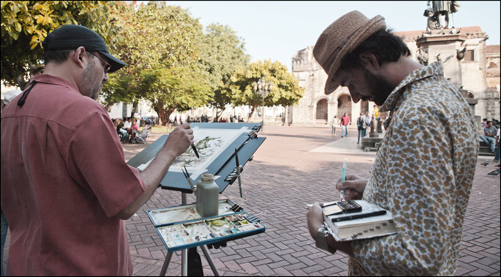
MTH: Orling Dominguez of the Dominican Republic wanted me to ask about your technical process. You have an interesting mixed media approach, open to any tool or technique you can combine. What are you thinking as you bring all these different materials together? Have you developed a step-by-step process to your choices, or is it more ‘by feel’? What makes something suited for one approach over another?
J.G.: Good question, Orling. In my urban sketching kit, I bring art supplies that are totally cross-compatible: a fountain pen, water-soluble colored pencils and graphite pencils, water brushes (one with water and a couple others with water-soluble colored inks), a small Schmincke watercolor pan set, and a few tubes of gouache. I also have an oil painting kit and a casein kit.

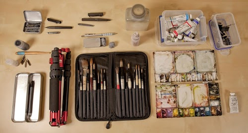
[What’s in my bag?]
Basic thinking: there is no line between drawing and painting, and there are no “purist” rules. Anything goes as long as it’s conservationally sound. I use whatever media or methods convey the most information or mood in the time available. And of course, I only bring out what is reasonable to use in a given situation, such as a concert hall, a subway, or a restaurant.

[Plein Air Monterey]

[James’s watercolor gear. Not afraid to be an art nerd I see. I kid! We are all the same :)]
MTH: I’m always interested if an artist has a philosophy about this: What makes something a sketch vs. a painting? Is that line so blurry you don’t even worry about it any longer?
I don’t place any boundaries between a sketch and a finish, or between a drawing and a painting. I like the word “study” because it implies a more carefully observant and patient mindset, but a work done as a study from life can have the power and detail of a finished work as well. A study is not necessarily a means to an end. But since we have to call our works something when we refer to them, we’re stuck with the limitations of the lexicon.
MTH: You have always been an example to other artists of a self-taught, highly motivated individual who is doing their own thing. Given that, I think this is a great closing question from Nina Johansson from Stockholm:
“I assume that Gurney lives off of his art, and it would be interesting to get some hands-on advice for others who dream of doing that. We have been having this discussion at the school where I work, about how artists are usually not great at doing business, and how we would like to give our art students some classes in how to run a small business to be able to make a living – only the curriculum gets in the way. We’ll see how it goes, but in the meantime I like to show them good examples. :)”
If I can just add to that: I’m assuming at this stage of your career, you can pretty much do what you want, pick your projects. What do you see as the most interesting ventures for artists in the next decade?

[Highland Avenue]
Thanks, yes, it’s true, I’ve always lived off the brush and I’ve always painted what I want. Some years a lot of money rolls in; other years I make less than the janitor. But I’ve always been happy and followed my muse.

[Mud Puddle]
I believe every art student should get schooling in business: marketing, contracts, accounting, publicity, and especially in this age of creator-producer, it’s important to know about distribution, and sales. If art schools don’t offer this, you can pick it up on your own. I’m always trying to learn new things about how to make what I love to do pay for my living.
That said, I try to keep business considerations from driving what I do or how I do it. I just want to have fun doing the very best quality work I can. I’m glad that the internet lets me share what I produce and what I learn with others. I have faith that enough people will support me to keep me doing it.
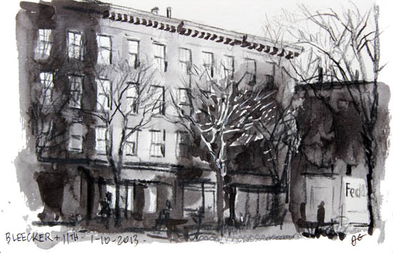
[Bleecker and 11th]
Sketching from life is making big strides forward, both with the Urban Sketchers and the plein-air-painting movements. Some people make a living doing these things, but that’s not why they’re important. People who sketch in their spare time from other jobs, and professionals who do it for relaxation or learning are just as important to the movement.
Working directly from nature has always brought fresh blood into Art, and we’re all lucky to be living in the midst of this revival.
MTH: Well, thanks for all your generous time – you’ve given us great answers, it’s been really excellent having you! Hope to see you sketching on the street. If you’re ever on the road, feel free to look up the local Urban Sketchers group wherever you are.
Oil Painting Experiment
One of the many things on my back burner is experimenting with oil paints. Last year two years ago I took a course with Atelier de Brésoles, a while before that I did a workshop with Jeremy Lipking – it’s funny, the kind of work I *think* I want to do isn’t much like the work I *actually* do. Not that I’d mind if I could do that smooth surface work. I’ll just have to admire it from the other side of the ADD spectrum.

This is a 14″ square panel, painting impasto, at least half knife work. (Here’s some plein air studies from California (2009) where I had a bit of a break-through concerning the palette knife).
This recent bout started with USK:MTL sketcher Shari Blaukopf and I talking about Roos Schuring – a Dutch painter – master of greys, and hard core four season plein air painter.
Ms. Schuring was sufficient inspiration for us to do a little painting party this afternoon. This is Shari’s painting, which, by the way, is her first oil painting ever. Off to a good start eh? We’re going to do this at least a few more times during the holiday break. Wish us luck!

Up on Parka Blog!
Teoh Yi Chie over on ParkaBlog had just posted a short Q&A about my art tools. Just a walk through the stuff I take out location sketching. Kind of cool to be up on there, I’ve been using his book reviews for years.