Book Excerpt : Simple Sight Measuring Example
This is the second in a post series of ‘excerpts’ from my book The Urban Sketcher. This time I’m going right back to the very first lesson in the book; Sight Measuring.
I shouldn’t really call these excerpts. This is more like the director’s cut. Here’s the full length text, before edits for word count limits and layout. Mainly, because this is the text I have easily available in electronic form, but also, so you get the full explanation, and larger pictures.
[Excerpt from The Urban Sketcher Begins]
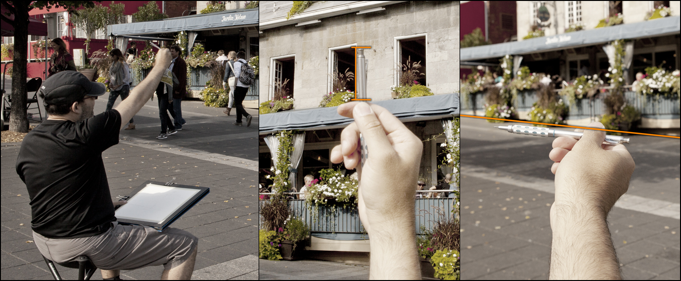
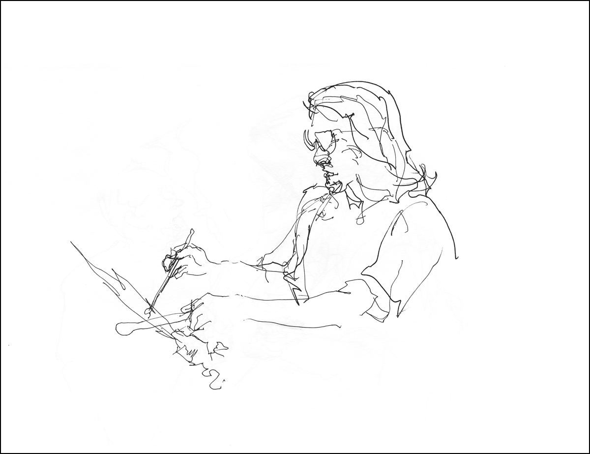
You are probably familiar with the image of the artist with their arm extended, holding a brush upright, their thumb up like a hitchhiker. Usually they are shown with their eyes squinted and tongue sticking out. This is not just a funny cartoon image of an artist – it’s a real measuring technique!
In this shot I am checking things like the angle of the sloped street, and the height of the windows.
The idea is, we want to spot errors in proportion in the first few minutes of a sketch. I use two simple techniques called Sight Measuring and Angle Checking. These are a simplified version of what academic ateliers might call Sight-Size Drawing.
There’s nothing worse than drawing in a lot of interesting details, only to realize you’ve drawn an important part out of scale. Or worse yet, you haven’t judged the height right, and you’re about to go off the edge of the page. That has happened to me many many (many) times. It’s quite frustrating to say the least :)


This sake set, found at a Chinatown knickknack shop, is a great introductory subject for sketching ‘outside in’.
To recap, the plan of attack is: get the outside silhouette shape first, spot check your accuracy, and then proceed to subdivide into smaller and smaller details until the whole thing is drawn.
The very first step is to decide roughly how large you want the drawing on the page.
Mark a small dash at the top and the bottom of your subject and lightly sketch a ‘scribble’ of the outside shape. No internal detail, just the silhouette, as if it was cut out of a piece of paper. (Pencil sketch is darkened for clarity).
This simple outline is all you need to ensure accumulating proportional errors don’t expand off the edge of the page. You have a ‘box’ to work within. All future details will fit inside this box. Or that is, they will, once we make sure the silhouette is accurate.
The best thing is, that scribble only took a few seconds. We don’t mind correcting a scribble. There is nothing to lose. If I’d gone right into the pattern or shading on the object, I’d start to get that feeling of, ‘oh, I like what I’ve done! I can’t erase that – it will be ok, I’ll just keep going’. Until, suddenly it’s not ok – it’s way off :)

Here’s how sight measuring works.
As you look at the subject, extend your arm straight (elbow locked), and line up the tip of your pencil with the top of the subject. Slide your thumb down until it’s lined up with the base. That position you’ve marked on your brush or pencil – that is a unit measure you can use to check against other objects.
(Line A)
Keep your thumb in position on the pencil to preserve the measurement you have marked. Keep your elbow locked to maintain the same distance from the subject.
Now, look for something you can compare your measurement against.
It so happens that the height of the jar is equal to the width across the three cups.
(Line A = Line B)
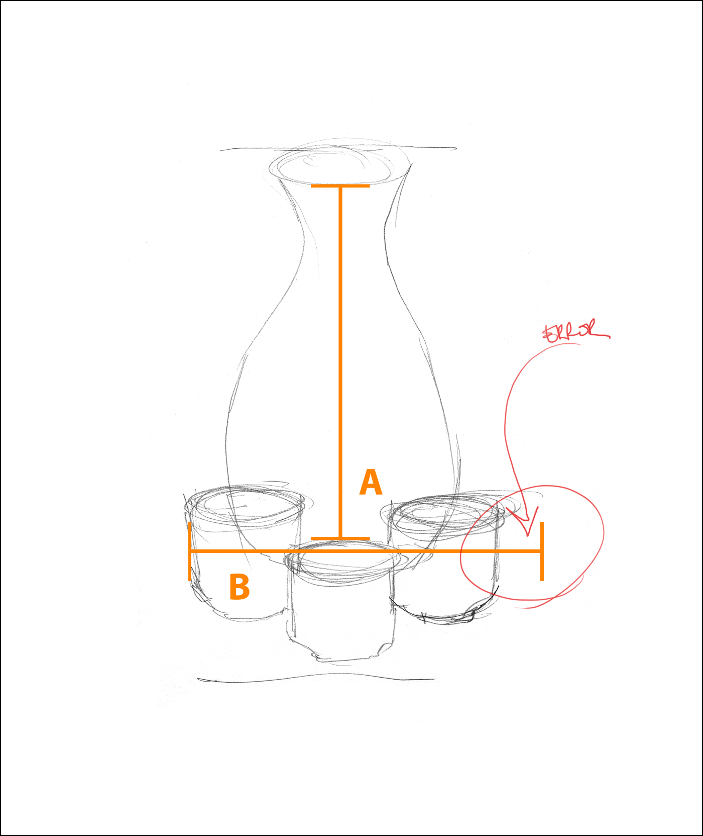
So, if we compare the height and width on our drawing– oops! The drawing is not correct.
See how we have caught that error with this simple measuring trick?
It’s really not a big deal, this is a pretty small error. In a simple subject like this it wouldn’t really matter that much, it’s not like people won’t know it’s a sake set :) But since it’s so easy to spot the issue and fix it, I might as well refine my sketch. I’ll make that fix to the silhouette so that the jar height (A) matches the cup width (B).
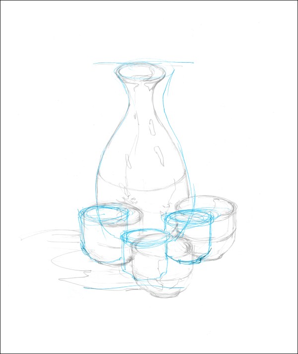
Blue lines are the original scribble, grey pencil the revised drawing.
The other big thing in this step is to sketch in the dividing line between the dark ceramic base and the upper patterned area. And, I fix a proportion error on the width of the neck.
This is what I mean by working larger-to-smaller. Once you have the outside shape, what is the next biggest thing you can draw? The ‘waist’ of the bottle is the next-to-largest shape. Dividing the jar in half. If you keep dividing each shape by half, eventually you are drawing very small details.


The other kind of sight measurement is what I call an Angle Check. Measuring the slope between two points.
When drawing outdoors, this is ideal for finding roof lines or checking perspective on narrowing city streets.
Place the base of the pencil on the first point, (the edge of the cup) holding the pencil perfectly vertically, rotate the tip until it lines up with your second point (the lip of the jar). In this case, rotating counter clockwise.
Now – lock your wrist. Don’t lose the angle of the pencil. Place it over your drawing, and see how well the angle lines up with what you’ve drawn. Not too bad hey? It’s looking reasonably close after widening those cups.

At this point, my planning is done. I can sit back and have fun with the pattern. That fish scale design is what attracted me to the thing in the first place. But by starting outside-in, I can see for certain I have a shape I like before I get into those details.
I want to be able to freely scribble in that pattern, without a care in the world. It’s a picky thing, sketching those repeating shapes – and I don’t want to stiffen up while doing it.
I wouldn’t feel as ‘ free’ if I wasn’t sure about the underlying structure. If I had to start and stop the pattern a few times, erasing and correcting the shape, it wouldn’t turn out as ‘loose and sketchy’ as I want.
Oddly, it’s the measuring that allows the sketch to look spontaneous. I’ve heard artists use a saying; ‘loose is how a drawing looks, not how it’s made’.

This particular example is fairly faithful to reality, because the subject is an easy one. As we move on through the book, you’ll see I only use as much precision as I need to get the sketch on paper. Those measurements only took seconds to do. In no way do I want this to become hard labor.
My feeling is, you should do whatever measuring you need to do so that you are satisfied with your drawing. You decide how accurate you want it to be.
I enjoy it when everyone can recognize my subjects, but I don’t want to be doing so much measuring that the drawing feels mechanical. Accuracy is a skill I want to have, it helps me do more challenging things. But I don’t ever want it to slow me down.
[Excerpt from The Urban Sketcher Ends]
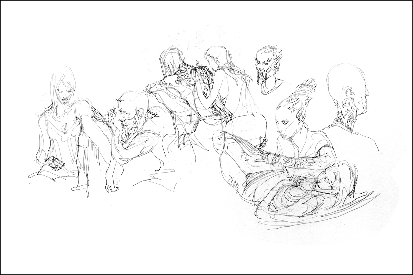
Cutting Room Floor : Montreal Tattoo Expo


Here’s a few drawings from the 2013 Montreal Art Tattoo Expo that didn’t make it into The Urban Sketcher.
In the book one of these drawings is broken down into six step-by-step illustrations, showing exactly how these are done.
It’s kind of fun to see a gradual improvement from the sketches I did at the 2012 show.

Called out by the Model
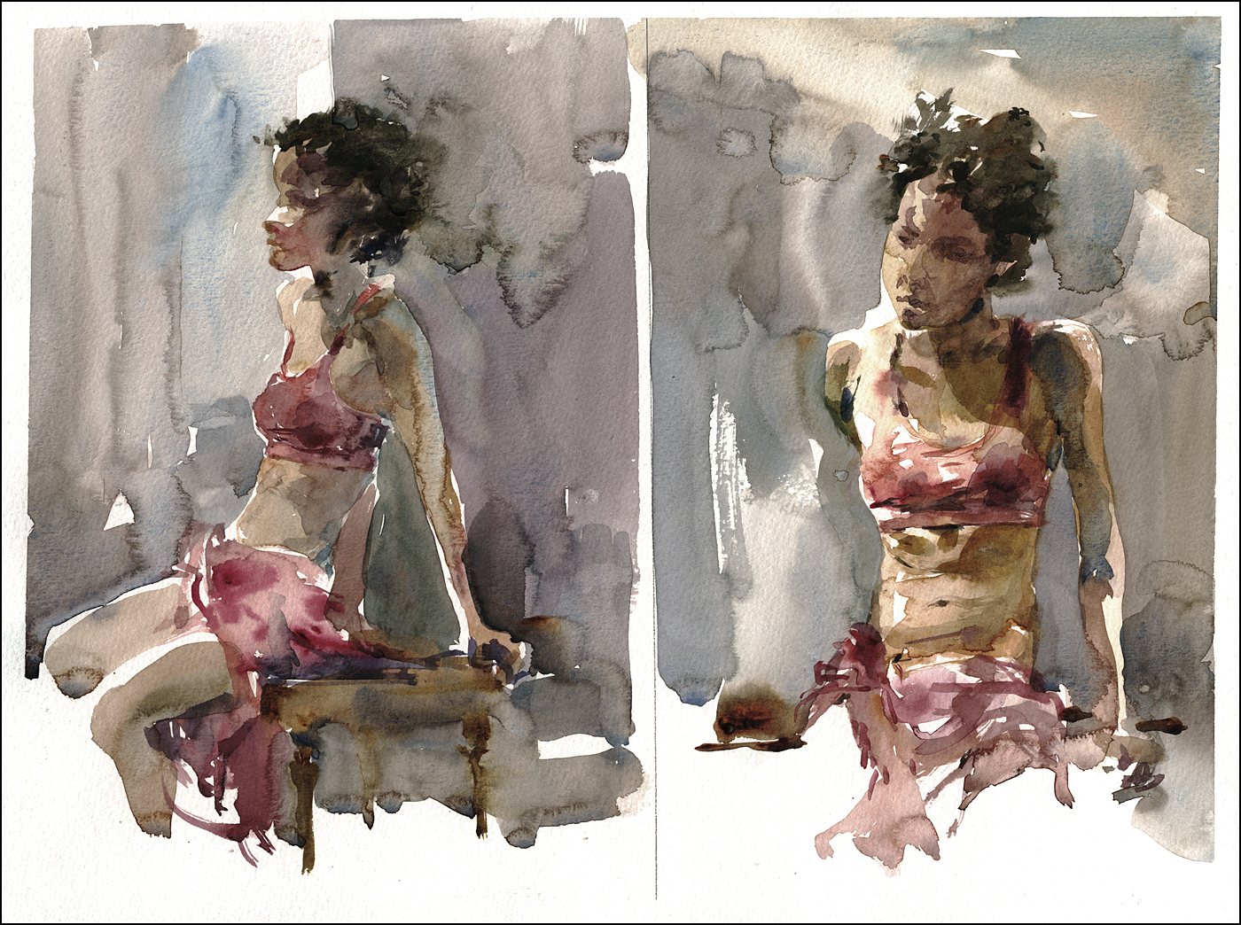
[Long pose session, these were half hour warmups. Watercolor, 12×16″]
I was at the daytime long pose session at George Vanier Cultural Centre, which is always a nice opportunity. It’s one hour longer than a standard life drawing workshop. Which is just fine by me. I like to get at least two watercolors out of a long pose – so that extra hour to warm up feels like a luxury.
I was happily sketching way – trying to to focus on a few things:
- Draw directly with the brush (dropping my pencil drawing safety net),
- Establish a silhouette with the first few strokes,
- Work color variation into the shapes while wet, (charging in).
- Don’t neglect the background tone. I’m often making figures on blank whiteness.
That was going well enough. But in the break our model called me out.
“I look like a 9 year old girl!” she says.
Rightly so. That was a weird mistake. Not sure how it happened. Her head had definitely gotten large and child like.
In the second half, I pushed to get a real likeness. I’ve been giving myself a free pass on likeness for so long (I mean, you have to start somewhere, and getting a nice figure is hard enough, I just say “Don’t worry if it doesn’t even look like them. After the model is gone, who’s going to know?’). But the time has come that I have to be able to get both a painting and a portrait, hey? If I’m going to do this work professionally :)
I’ve only done a few commissioned portraits – and each and every one of them has been sweating bullets. Until this year. Magically – that practice stuff is starting to pay off.
I’m pretty happy with this one. In particular, the shape of her hair and cast shadows on the forehead. At the time her hair was throwing me off my stride – I only realized it after the fact – it’s because Afro-textured hair doesn’t reveal the shape of the skull like I’m used to in a Caucasian. Funny – It’s one of my own bon mots that a portrait is just a ‘Head Shape / Hair Shape’. Yet it took me a few tries to get it right on her.
I’m glad Sarah called me out. I needed that push. That right there is a hidden reason to work from life. You don’t get that collaboration from photo reference.
Brush-wise: In the future I have to focus on a few more things:
- Make the shadow shapes melt a bit more into the light,
- Same with the background – more lost edges – less cut out shapes,
- Wet-on-dry gives you plenty of control – but it errs on the side of sharp edges,
- I’m going to experiment with painting the figure in reverse silhouette next time – to allow better melting into the background.
Book Excerpt : Sketching En-Passant
I thought I’d do a few posts excerpting sections from my book The Urban Sketcher. I’ll be resurrecting some stuff that was cut due to space limitations, and taking the opportunity to show larger images than we can get away with in print.
Here’s the section as it is in my manuscript, before the final edits in the book:
>>>>
[Excerpt from The Urban Sketcher Begins]
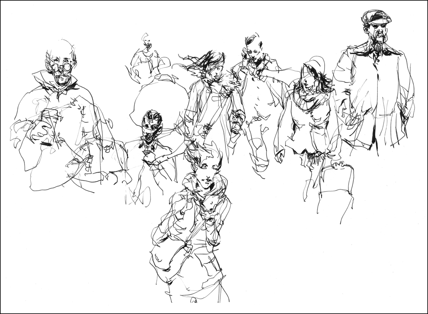
Exercise #9: Sketching En Passant: or The Long View: So the final situation to discuss is the capturing of people who are truly in motion. Not conveniently doing something for your amusement, but only seen for a few moments as they flow through your drawing. I call it ‘en passant’, the chess term for ‘capturing in passing’.
In the normal case of a person walking towards you, even in the best situation where you have an unobstructed view, you have only the time between spotting your approaching subject and about 20 or 30 feet before they pass you by. It’s very rare that you have a longer sight line than this. People in the extreme distance are just too small, and are frequently blocked by the crowd in front.
So we can say you have a 10-15 second window to sketch. I would agree, that is not a lot of time. But! Of course, I have a strategy for this situation.
There are two things you can do to help yourself out. The first, and most basic, is to widen the window of opportunity. Try and find a position that gives you the longest possible view of the most people.
You want to be a small island in a river of people, with a long straight, preferably up or down hill view. (A steep angle allows seeing over people’s heads. They don’t obscure each other as much).
To avoid being jostled by pedestrian traffic, I’ll lean with my back against a wall or a lamp post, so I’m only a little bigger than an obstacle they’d have to avoid anyway.
If you can get up somewhere, a balcony or bridge, you can benefit from the bird’s eye view. Other possibilities are the head of a long escalator, (trapping people for a few moments gliding up to you). Or across from the exit to a stadium or theater when a big show is letting out.
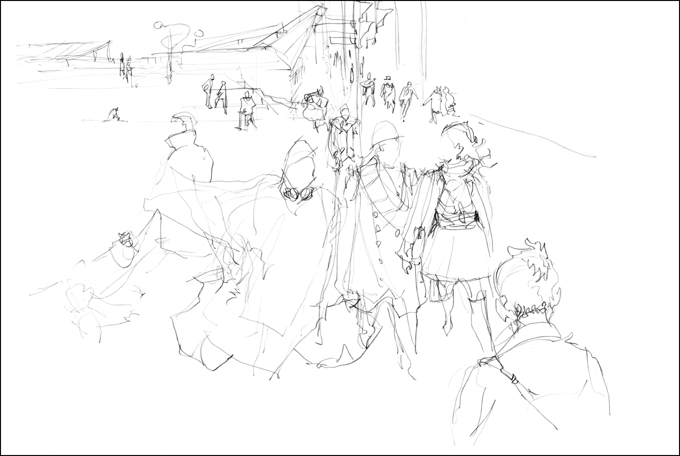

If nothing else presents itself, you can use any major downtown intersection during rush hour. Scribble people waiting for the crosswalk as they stream out of the office buildings.
The further you can see, and the more populated the street, the more fuel you will have for your fire. You want the best possible view for the longest possible time. (Even if that’s not very long).
In these examples, I scribbled in pencil and did calligraphic line over top using three colors of ink and a dipping nib. It was a cold windy October day, so I had plenty of interesting scarves, hats and jackets to sketch. The best character was a person wearing a neon orange plastic rain poncho and dragging a pair of bulging black garbage bags. This is a classic example of something you couldn’t make up.
The second thing you can do to increase your time window, is to cheat.
Don’t restrict yourself to one ‘exposure’. Instead of trying to draw an entire person in that 20 second window, I create a composite figure, combining multiple passersby, as if they were key frames of a single character in motion.
In a given crowd of people there are always ‘types’. People dress according to fashion trends, their jobs and economic standing, and the local weather.
In a street market in Asia there will be a never ending selection of wiry guys in t-shirts, shorts, and flip flops, often carrying heavy loads on their backs. On a blustery day in Montreal, everyone has long scarves, layered jackets, and wool caps.
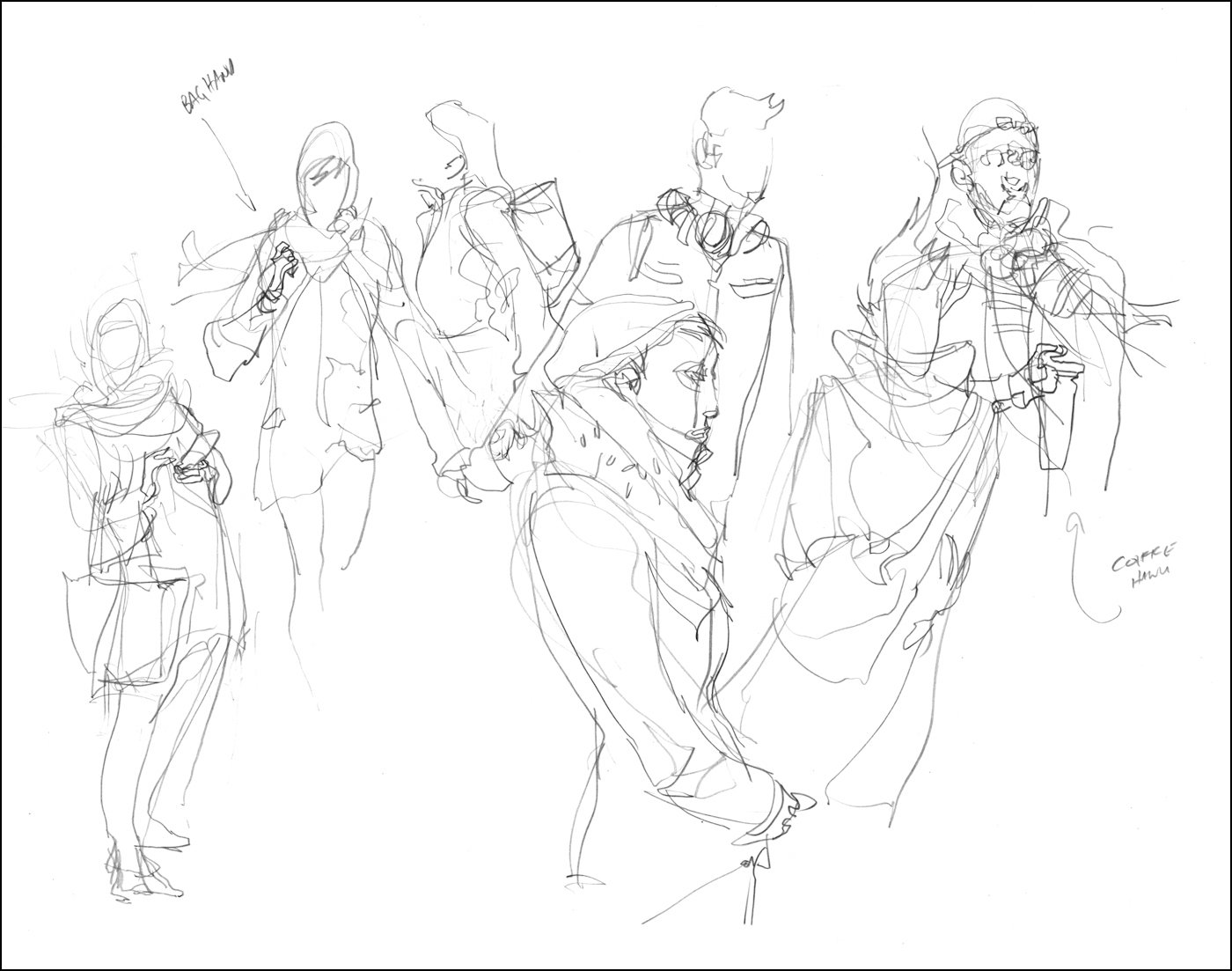

You can choose a ‘type’ – such as the smartly dressed man walking his dogs – and if you’ve chosen well, you’ll get another matching type in short order. In this area of expensive condos, it didn’t take long to get another dog walker.
Just as with the key frames of repeating motions, I can combine these passing ‘twins’ into a single drawing. Try and spot your character types as far back as possible, and keep your eye on them. Don’t get distracted by anyone else until they get so close they’re about to stride out of your working zone.
If I can gather one detail from each person – the shape of a hairstyle, a pair of glasses, the clasps on a bag – fairly quickly I have an entire composite figure. The gesture is the framework I am looking to fill in. I am adding appropriate details on top of the gesture, so it hangs together as a convincing person.
The character types that are more common are by definition best descriptions of the time and place you are in. Whatever you are seeing a lot of, is what will get drawn.
Try to get four or five character types going at once and you can do the multi-tasking trick while you wait for clones to appear.


This is an excellent time to try skipping pencil and going straight to ink – if you dare! Speed is of the essence here, so perhaps this is the best time to save a step. En passant is a great way to become more comfortable sketching without the safety net of pencil.
You end up drawing so many people so quickly this way, it’s possible to get a tremendous amount of training in a single day. A year’s worth of life drawing classes in a week.
A serious student might set aside a small sketchbook, and try to fill the entire book with direct-to-ink en passant sketches. Can you devour your way through an entire book in a week? Or a month? If you can do it, without editing yourself, or concerning yourself with ‘quality’ – simply devoting yourself to the process, I am sure you will see tremendous results.
Here’s an example where I went directly to ink. I’m using all the ideas we’ve covered, drawing Outside in, gesture followed by Calligraphy, and Spot Blacks. Doing it all in one continuous process.

With these ones I’m using the Lamy Safari Fountain Pen and a Kuretake Sumi Brush Pen, then melting the water soluble ink with a little clean water.
I normally prefer the more aggressive line weight of a dip pen, and the more expressive range of a natural brush – but when you are doing it as fast as humanly possible, these kind of cartridge fed fountain pens are more practical. The chance of an ink spill goes up considerably when you’re in a rush.
[Excerpt from The Urban Sketcher Ends – thanks and hope you like the book!
Order now from Amazon or your local bookshop].
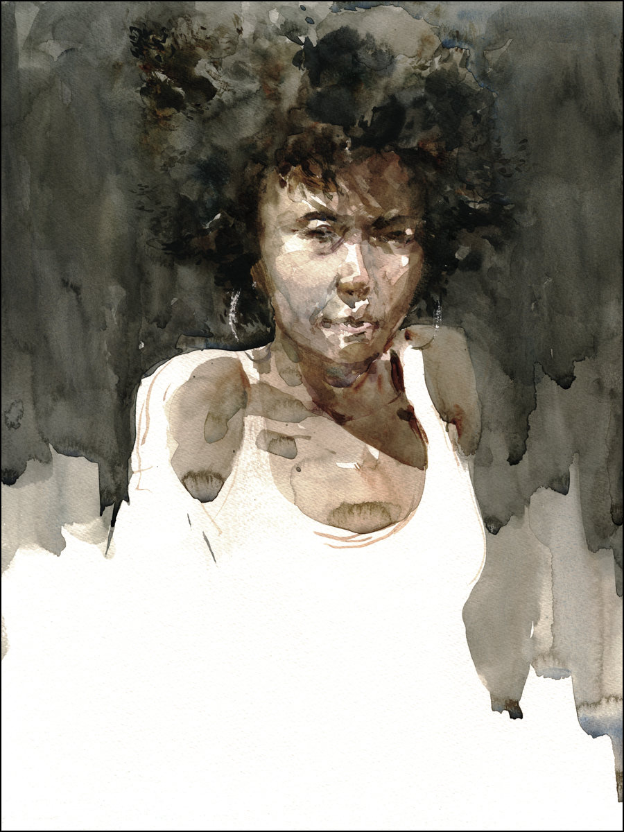
The Weary Gladiator
I don’t usually post nude figure drawings on this blog. I have another page for that (over here). But, as my life drawing classwork gets better, there’s becoming an overlap between the academic stuff, and the urban sketching. The way I’m doing spontaneous watercolor portraits – it’s all sort of all the same thing these days.
Anyway, I won’t make a habit of it. Posting too many life drawing studies just gets repetitive. But I did go to a couple sessions the other week – as part the traditional “It’s January, let’s go back to the gym”, kind of new years resolution :)

[Figure drawing workshop, various 10, 15 and 20 minute poses, watercolor, working wet-on-dry]
The model for this session was an older gentleman, in great shape for a person of any age. In his youth, he must have been a handsome beast.
I always give models a little code name in my head. This guy was ‘the weary gladiator’.
I don’t know if he’s been a life-long art model – but he clearly knows how to set a pose. One of the best I’ve seen in Montreal. You occasionally see models use a wooden pole for supporting a raised arm. But not many models use posing blocks. Simple cubes of wood that let you raise a hand or foot, or brace a neck. It’s an old-school technique that really helps shape the body. In traditional ateliers you might even find block and tackle to allow hanging a model from the ceiling.
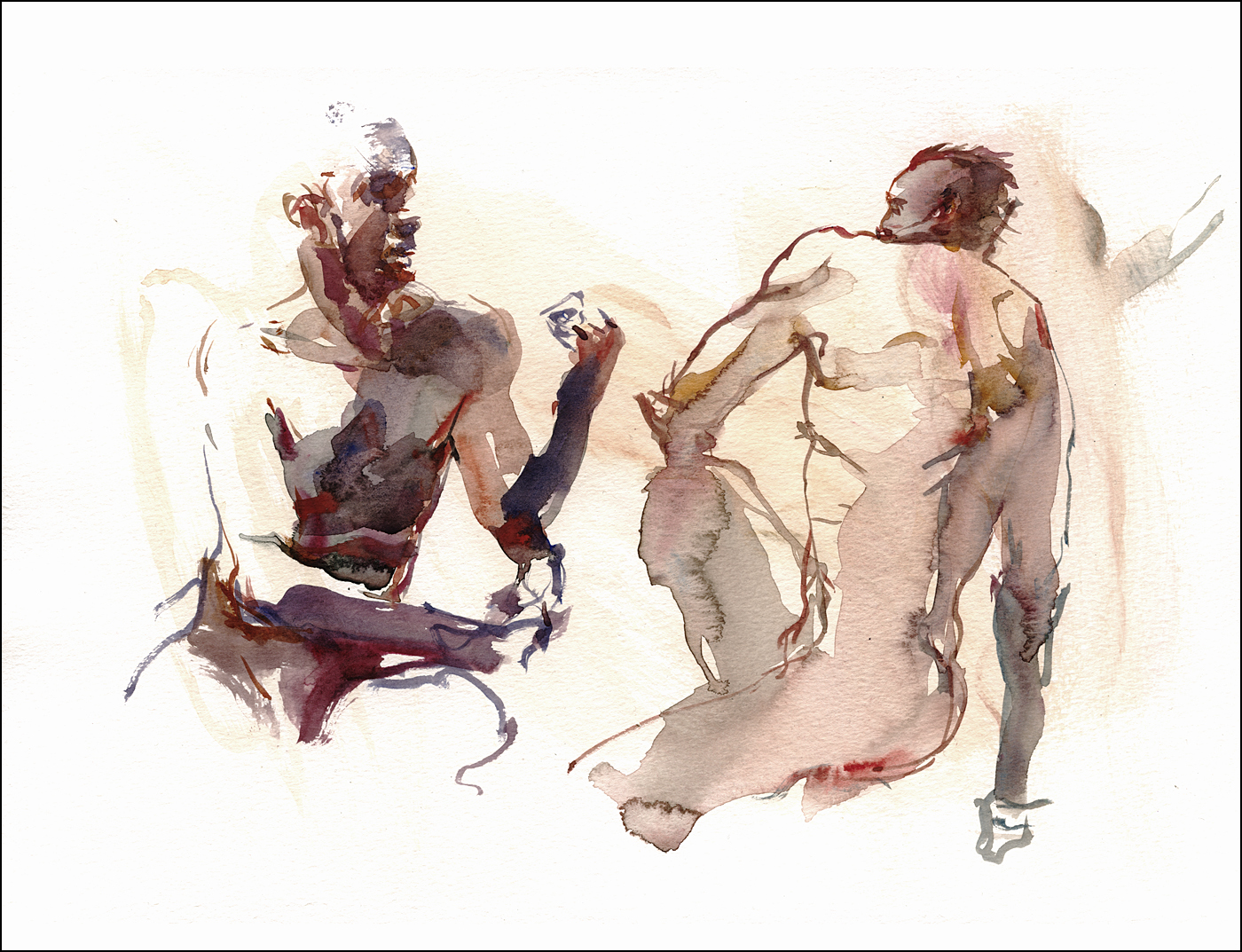
This was at UQAM at the Sunday afternoon quick pose session. It’s a good work environment, (tables, easels, benches), always with good models. If 5-20’s are your thing, I recommend checking it out. I will say, the spots by the door are back lit by the skylights at this time of year – so head to the back of the room unless you like silhouette shapes as much as I do.
Persistence: The Only Technique that Matters
I don’t usually show my ‘bad’ sketches. I often draw on loose sheets of paper, and tear up bad ones right on the spot. So there’s no evidence.
These happen to be in a sketchbook, and this was such a classic incident, I figured I’d post it for you.
Here we have what I’d consider to be a pretty average drawing. Not very structurally sound. It’s stiff. And it doesn’t even show what’s going on.
I ran into this fellow doing a lampworking demonstration at the Corning Museum of Glass. He’s probably there 9-5, five days a week, doing his thing. But I only had 20 minutes before I had to be somewhere.
I’d found him just as he ignited his jet of flame and started to melt glass. I’m a sucker for a jet of flame. I’ll watch anything on fire.
So I dive right in aaaand – – – terrible sketch right?
Despite the interesting subject – it just didn’t turn out.
We had driven two hours out of the way to see the other demo I was heading to – so, I wasn’t interested in missing that. But this drawing was really bugging me. I had already taken five steps away when I thought ‘No. Actually – I can’t live with it”.

So – turned around, did another one.
But, wouldn’t you know it!
Still a pretty weak drawing.
I’ve become a lot more demanding about capturing a likeness in recent months. It’s never going to be perfect – but this isn’t even close.
Plus – I don’t mind a messy drawing – I’m fine with a sketchy feeling. But I want open, floating lines that have some elegance. This guy looks hunched over – his shoulder is a mess.
Even though the clock was ticking, there was nothing to be done but try again.

I had to slow down, ignore the possibility of losing a good seat for the show, take my time, and really look at the guy. Find what is distinctive about him.
His shoulder length hair rolls down the back of his skull, and flips up around his neck. It’s not just a bunch of lines – it’s a flowing shape with weight. Smoothly falling, only then dissolving to brush work.
He had a bit of a heavy jaw (a little chubby – after all, he’s a desk worker like me). His goatee was very specifically trimmed. Almost a Fu Manchu mustache – not just a generic scruff of hair. A beard always follows the jaw line. It’s not pasted on – it reveals the shape of the jaw.Solving that leads me to his somewhat fleshy lips, and prominent – yet pointy – nose.
Now I have an actual person, not a generic human.
As well, the strange device spitting flame – it’s like a little cannon on spindly legs jetting blue fire. That’s a unique prop that is important to get right. Add in the glass rods and sculpted vials he’s crafting – and now I have a real description of an artist doing lampwork. A useful document of the day, not just a scribbled person.
Hope that helps you feel good about any bad drawings that happen. Use them as an opportunity. Flip the page and keep going. Getting a bit better each time. Persistence is everything in this game.
Ahoy! Pirates and Ships at the Pointe

Who doesn’t love those rascally swashbuckling pirates?
They’re the embodiment of the 99%. Romanticized history. Escaped slaves giving what-for to the Empire that shanghaied them. It’s the Robin Hood thing. With more robbing, and less giving to the poor. Unless you use the classic rationalization: ” Well, I’m poor, so I’m keeping this booty”.
I wanted to escape the winter with an afternoon of museum sketching – so poked my head into the relatively new Pirates or Privateers exhibit at the Pointe a Calliere Museum of Archaeology. I was actually there for an entirely different show, but I got distracted.
I’m about 25% through the book The Republic of Pirates: Being the True and Surprising Story of the Caribbean Pirates and the Man Who Brought Them Down, by Colin Woodard. Speaking as an author of my own book bearing a long subtitle – I wonder if he regretted that choice. But then again, it was my publisher’s idea not mine, so the dislike of typing that might go double for Woodard.
But I digress.
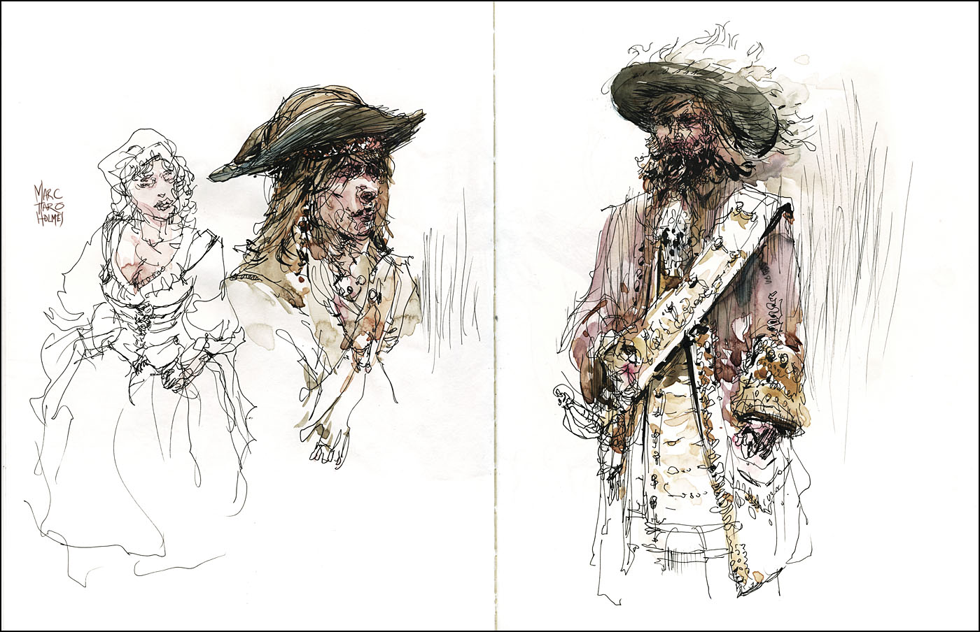
This is really an exhibit for kids. There’s not a lot to see. And a great deal of imagination is required to enjoy it. If you’ve seen it, and compare your memory with these drawings, you’ll already know what I mean.
There’s a pair of wooden ship models (I can never resist drawing a model ship), a few historical costumes on manikins, (also a go-to sketching thing for me) and otherwise it’s a few flintlocks and sextants in glass cases, and a lot of cut-out graphics and interpretive signage of the dreaded ‘interactive’ variety – where the kids can push a button to hear some recorded voice acting.
The only real attraction is that the room is filled to bursting with a full size pirate ship!
As if the building was somehow built around the thing. It’s perfectly planned for kids to run around, playing pretend pirates, while parents in turn pretend their kids might be getting an education. But I can’t criticize. If you have a 5 year old, they’ll probably dig this place. It can be their reward after you drag them through the grown up exhibits.
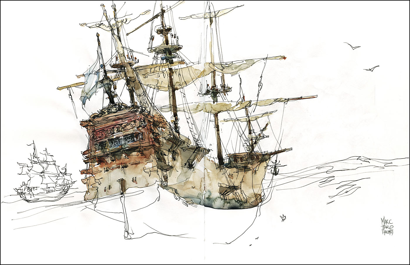
No major art-tips to say today, other than these are in a shiny new Stillman & Birn Epsilon Series Sketchbook (8.5 x11″). A smooth, lightweight paper – really a joy for a detailed pen drawing. I’ve avoided watersoluble ink this time – that darn rigging would just melt to nothing.
I’m also pleased to say we can now get Stillman & Birn books in Montreal. Pierre, the owner at our local shop Avenue des Arts has gone out of his way to organize Canadian distribution. He mentioned you can also get them in Edmonton at the Paint Spot (I worked there with some good friends back in art school!). Thanks to their teamwork on the import effort.
So, that’s good news. S&B have put out a few new sizes as well – I’m looking forward to trying out a nice Alpha Series 9 x 6″ landscape format they’ve introduced.
Winter in Montreal : Sketching from the Car

[Random street view in Westmount, watercolor, approx 12×16″, about 45 mins]
Went out painting the other day with Shari. We practiced our Great White North version of plein air painting – sketching from the car.
It’s not the ideal circumstance by any means :) A little cramped for space. I had a small bottle of water in the gearshift drink holder, and my clipped on palette-and-board combo leaning on the passenger side dash. It was worse for Shari behind the steering wheel. You have to alternate the heat from blowing on your feet to clearing the window. And your views are chosen for you, depending on where you can find snowplowed parking space.
But, this is what you do in winter to get a chance for good conversation and urban sketching. Have to keep the brush in play, even in the grey months.
There are beautiful days when it’s blue sky and the snow looks crisp and clean. But a lot of the time, the dominant colors in Montreal are warm grey. Overcast sky, wet sandstone, leafless trees and greeny-black pines. Lucky for me, I love these colors!
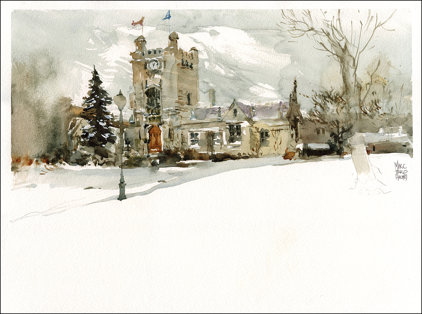
[Westmount City Hall, watercolor, approx 12×16″]
Smoke and Mirrors : Big Tobacco on Trial
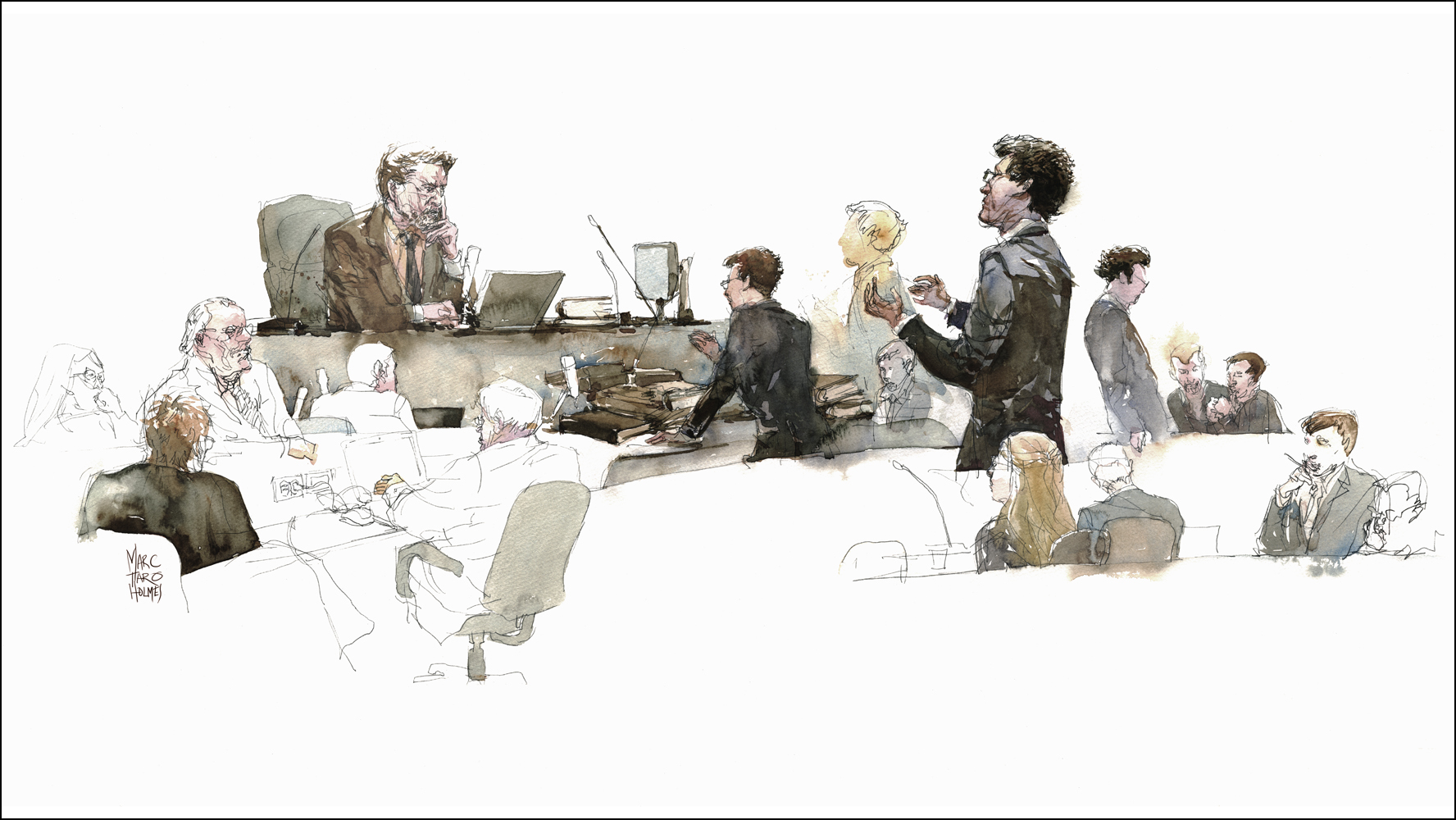
As an Urban Sketcher, I’ve always been curious about the practice of courtroom sketching. Especially now that cameras are permitted in much of the US and the profession seems to be dying out.
Luckily for Canadians, the decision here whether to allow photography is decided on a case-by-case basis and is pretty much reserved for public inquiries with a significant social or humanitarian issue.
In serious criminal cases and some corporate law, if anyone wants a visual record of events there’s still a need for someone scribbling away with pencil and paper.

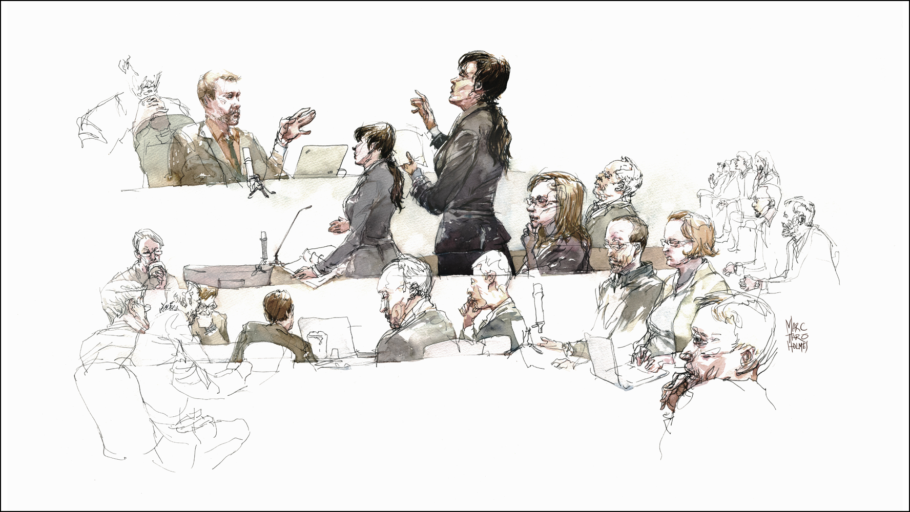
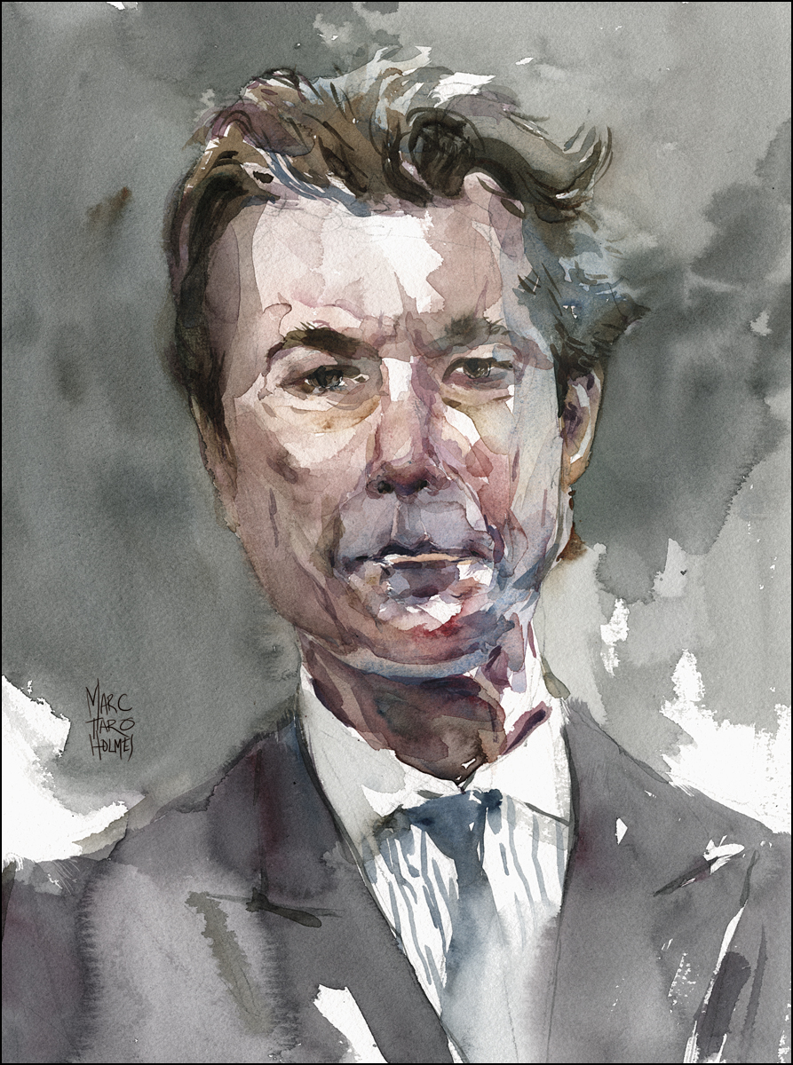
Suzanne Côté, recently appointed to the Supreme Court of Canada, (standing) and Deborah Glendinning (seated, right). representing Imperial Tobacco.
I was surprised to learn no special permission is required to sketch. Any member of the public is free to attend and stay as long as they like.
However, no liquids are allowed in the courtroom. This is probably more about spilled coffee than watercolors, but it meant I had to draw in the moment and paint later.
I ended up spending four days making small sketches in pencil and taking them back to the studio to assemble into digital collages. These were printed onto Fabriano 140 pound paper and painted in watercolor, allowing the drawing to show through. (This is my typical solution when I can’t paint on the spot).

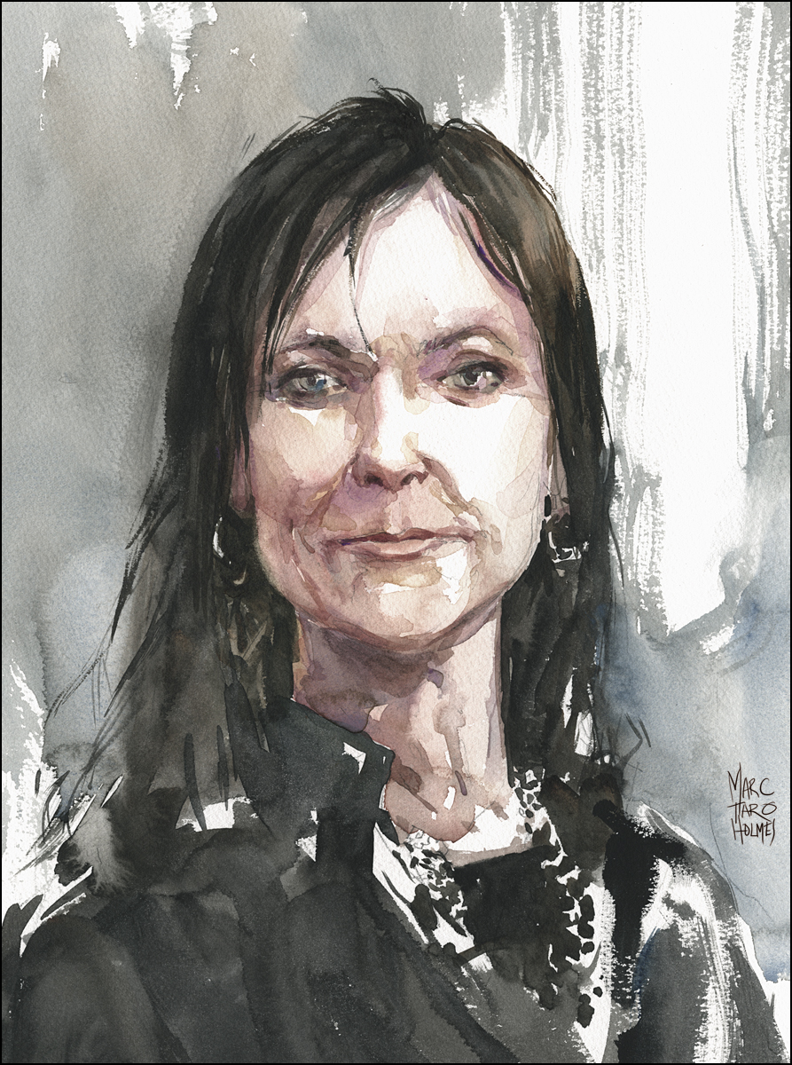
Cynthia Callard and colleague blogging the proceedings
So, you might ask, how did I choose this particular trial to sketch?
Initially, I was interested in a high profile murder case, but thinking it over I decided the killer didn’t need any more publicity.
Fortunately, while asking around about the regulations, I met journalist Cynthia Callard. Cynthia has spent the last three years (250+ days in court) observing a set of class actions brought against cigarette manufacturers Rothmans Benson and Hedges, Imperial Tobacco Ltd., and JTI-Macdonald. She has collected everything into a day-by-day narrative on her blog: Eye on the Trials.
It makes fascinating reading. It’s hard to tear yourself away from this epic tale of people unable to limit their addictions. Cigarettes on one hand, and to making money on the other.
Simon Potter representing Rothmans Benson and Hedges
At stake is a record-breaking $27 billion figure that would pay restitution for anyone in Quebec, going back 50 years, who suffered damage to their health from smoking.
This is only the first of these Canadian suits to come to trial. They were filed in 1998 and have taken 13 years to work their way through the system. Other attempts are underway in various provinces, and will likely proceed no matter what is decided here.
The validity of these suits seems pretty clear. On the face of it, things look pretty dark. The plaintiffs assert that:
- Tobacco companies planned massive advertising campaigns designed to hook people on their products, even after it was understood that cigarettes were dangerous. They knew people would die, yet they carried on making money.
- There is written proof in their own words that instead of choosing to stop killing folks, manufacturers did their best to hide the facts. Including destroying documents containing too much hard truth, and enriching a select group of experts, paid to obfuscate the science for as long as possible.
- Worse than that, manufacturers doubled down, focusing new marketing on teens, setting them up for a lifetime of addiction, planning on making profits at the expense of public health for an entire generation.
To say this version of events describes a failure of corporate citizenship seems to be putting it lightly.
However – I only know this second hand. I’ve come in at the very end of this long affair and I didn’t see any of that evidence myself.
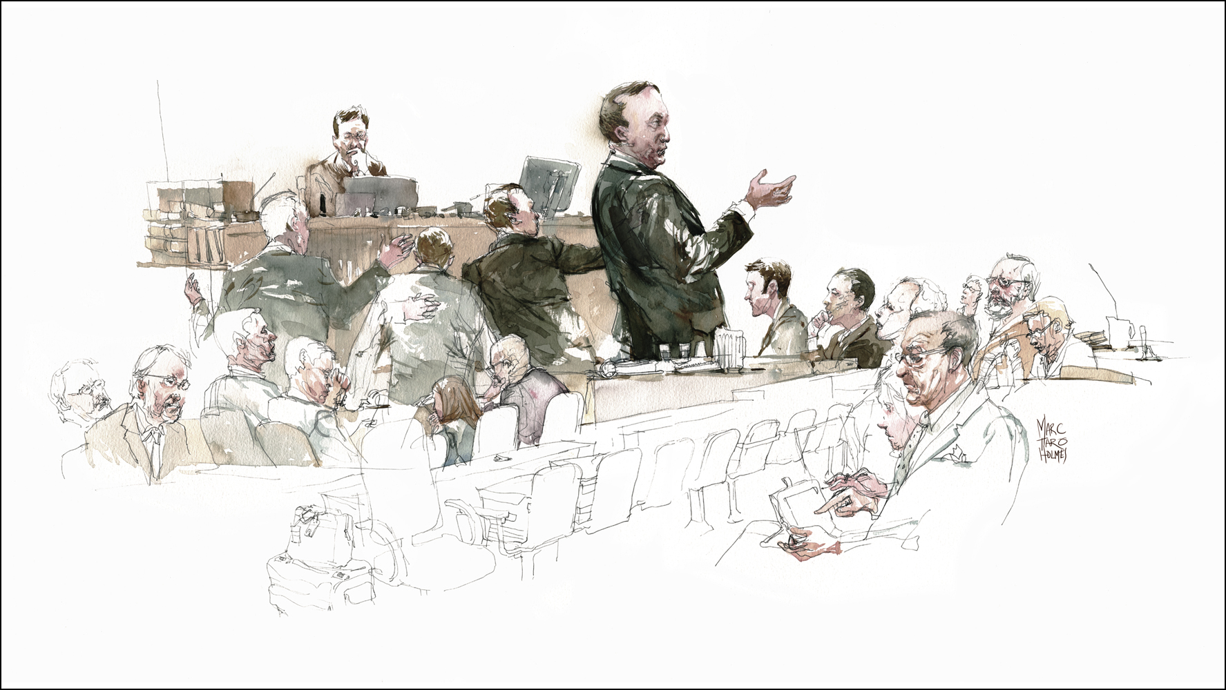
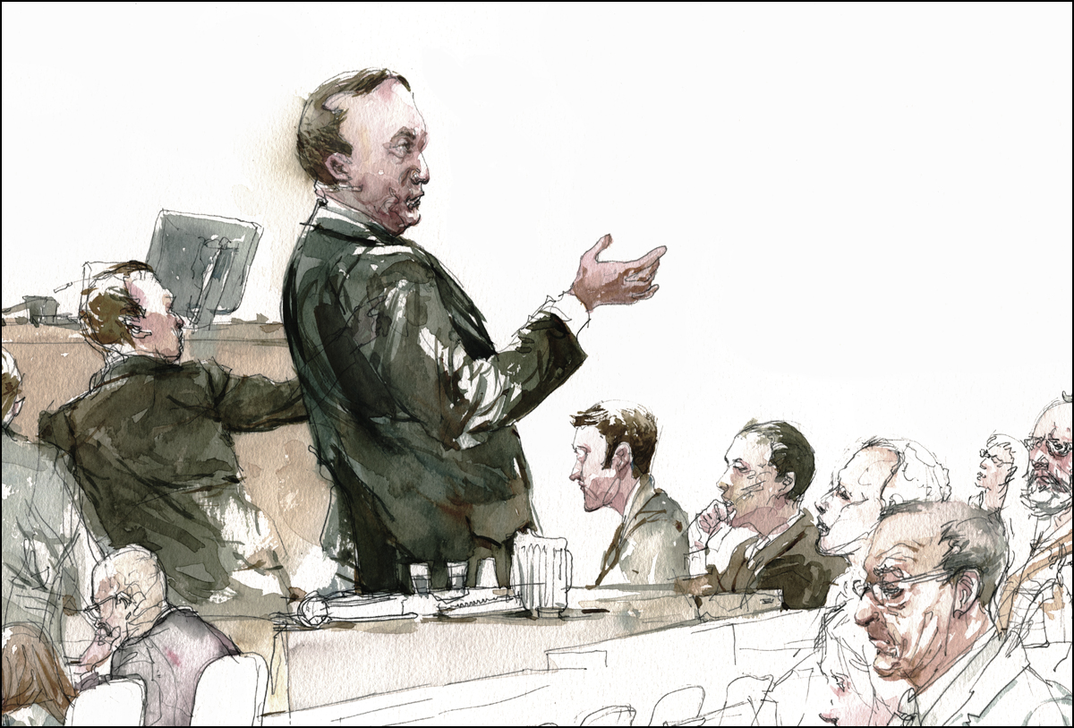
All I was actually able to observe, was the summation by the defense team. And I have to say, they are very convincing speakers.
Here is the tobacco companies version as best as I can recall:
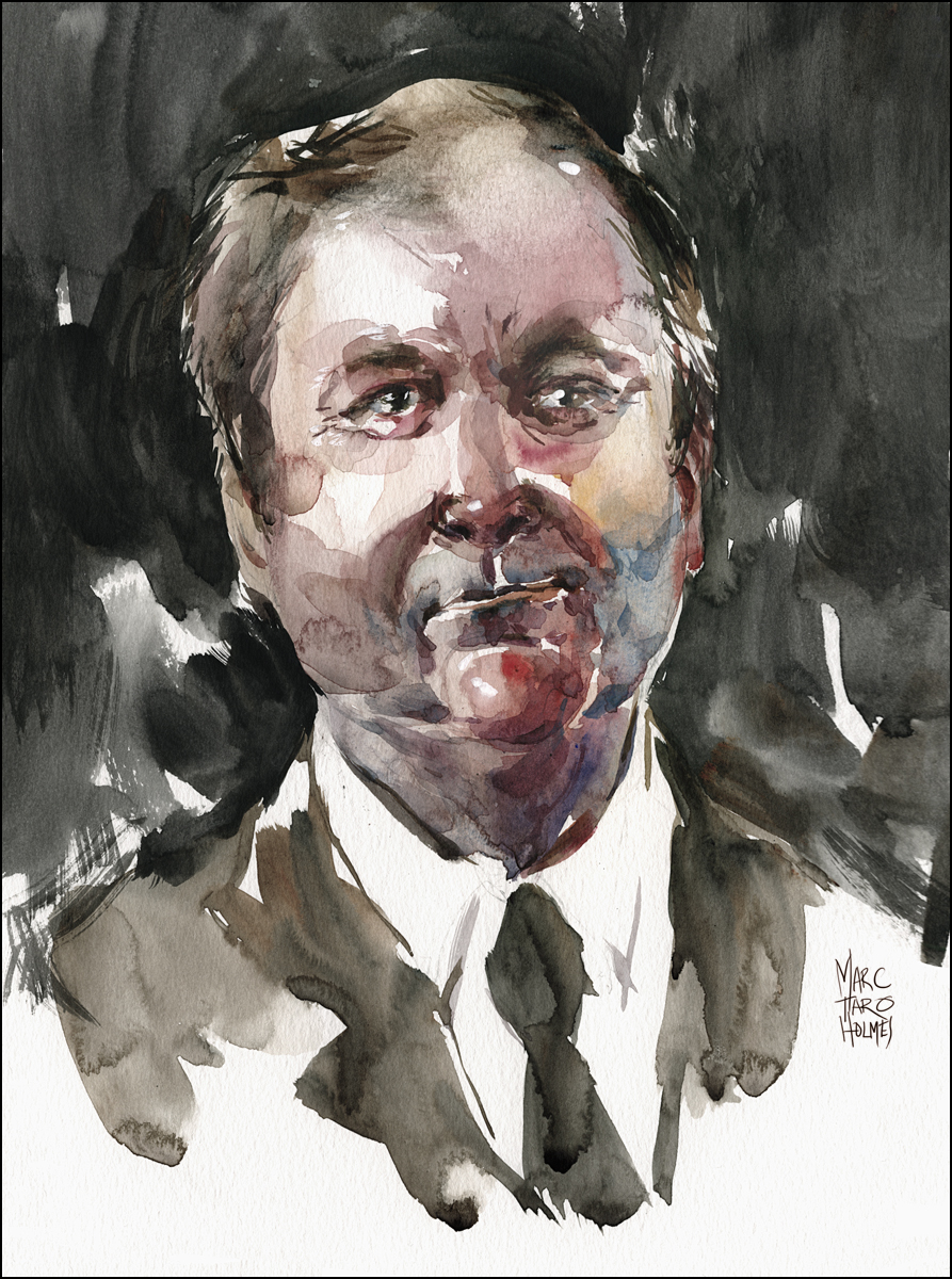
Potter, Pratte, and Côté, (studio portraits, from publicity photos)
- Ok, we admit now scientists have proven that smoking is addictive and dangerous. But, we couldn’t have known that back when we started this business.
- The government said Health Canada would take care of spreading the bad news to smokers. So that wasn’t our job – and in fact, we were initially ordered to stay quiet on the subject of risk, so the message would come from reliable sources.
- Also, there are plenty of dangerous products, (like say, motorcycles or ice climbing gear), so that’s why we have a consumer protection act. It wasn’t our decision to give tobacco an exemption under that act – that was the government’s choice. So, it’s democracy to blame, and anyway, if we didn’t sell it, others would.
- Besides, tobacco manufacturers operate under a federal license, and as a requirement of that, for years now we have put big, scary, un-missable health warnings on every package – making it very clear you should not buy our products.
- Plus, we don’t do any of those evil ads anymore! Haven’t for years. Kids shouldn’t smoke, this is a problem with schools not being strict enough in the ’70s and ’80s, not with us targeting youth.
RBH council Simon Potter argues – why should smokers, who have accepted the risks, be compensated when the risks materialize? People who chose to smoke don’t deserve compensation just as “I don’t deserve compensation because I am overweight.” (Which he is, speaking factually).
I personally felt this argument is tarnished by the uncharitable conclusion it offers. To whit: If you didn’t quit smoking and died from it, it’s your own fault buddy. Everyone else knew, why not you?
Guy Pratte speaking for Imperial Tobacco Ltd
Honestly, I can’t see how the tobacco companies could lose in the short run here. I am just a layman – but it seems, no matter where you fall on the morality of selling tobacco, they are selling a legal product, in a legal way.
Yet – Even if the companies are released from responsibility, doesn’t that mean we are all left with the larger questions?
How can our government continue to license the sale of a product that kills people?
How can the shareholders, managers, and owners of these companies continue to turn a blind eye to the cost of profit?
If the best defense is: “We all agreed in the ’70s that smoking deaths were an acceptable risk” – well – how much longer do we have to put up with that poor choice?
Judge Riordan’s final decision will likely take weeks or even months. And after this, there are certain to be appeals. But I am waiting with great interest to see what develops. Is it possible that this is the first step towards a smoke-free Canada?
Editors Note: Jump to the conclusion of the story! The judgment is out!

After-Sketching Sketching

There are only a few doodles from the workshop trip to Brazil I haven’t posted yet: The party sketches.
After all the official workshops and stand-and-deliver painting demos are done, it’s an Urban Sketchers tradition to hang out and draw each other over dinner. This is social drawing time, so it tends to be simple pen doodles. Just a Pilot G-Tec 0.4mm ballpoint in this case. It’s a chance for some great conversation, with friends who don’t mind if you draw them obsessively.


This particular day Liz Steel and I had gone out to demo for our friend Rafa and his students from Federal University. Afterwards the gang from the symposium met up, and he took us out for our first taste of Feijoada and then on a sketchwalk through Rio’s historic Santa Teresa neighborhood, (past a big police checkpoint), and down to the Rio Scenarium for a night of sketching and Samba.

These may not be the great artworks that go on gallery walls – but they’re the best memories of a sketchers workshop. I’m just now (20 years on in drawing) starting to feel like I can sketch spontaneous portraits. I’ve been practicing getting likenesses. (More on that in future posts). And it’s a great relief to be able to do it. Drawing people you know personally is kind of nerve wracking. What if they turn out funny looking?
Fortunately everyone I know is already funny looking. No! wait. What I mean is, fortunately fellow urban sketchers are good natured about it. Nobody cares if the drawings turn out odd, because we know that’s the only way to learn – making a lot of odd looking people – until you get the hang of it.


This was the night Laurel captured my favorite USK photo of all time – so here it is again, just because I think these guys look so cool.