It’s all about Class Struggle innit?

Last USK:MTL outing we went to the Beaux Arts for some indoor sketching.
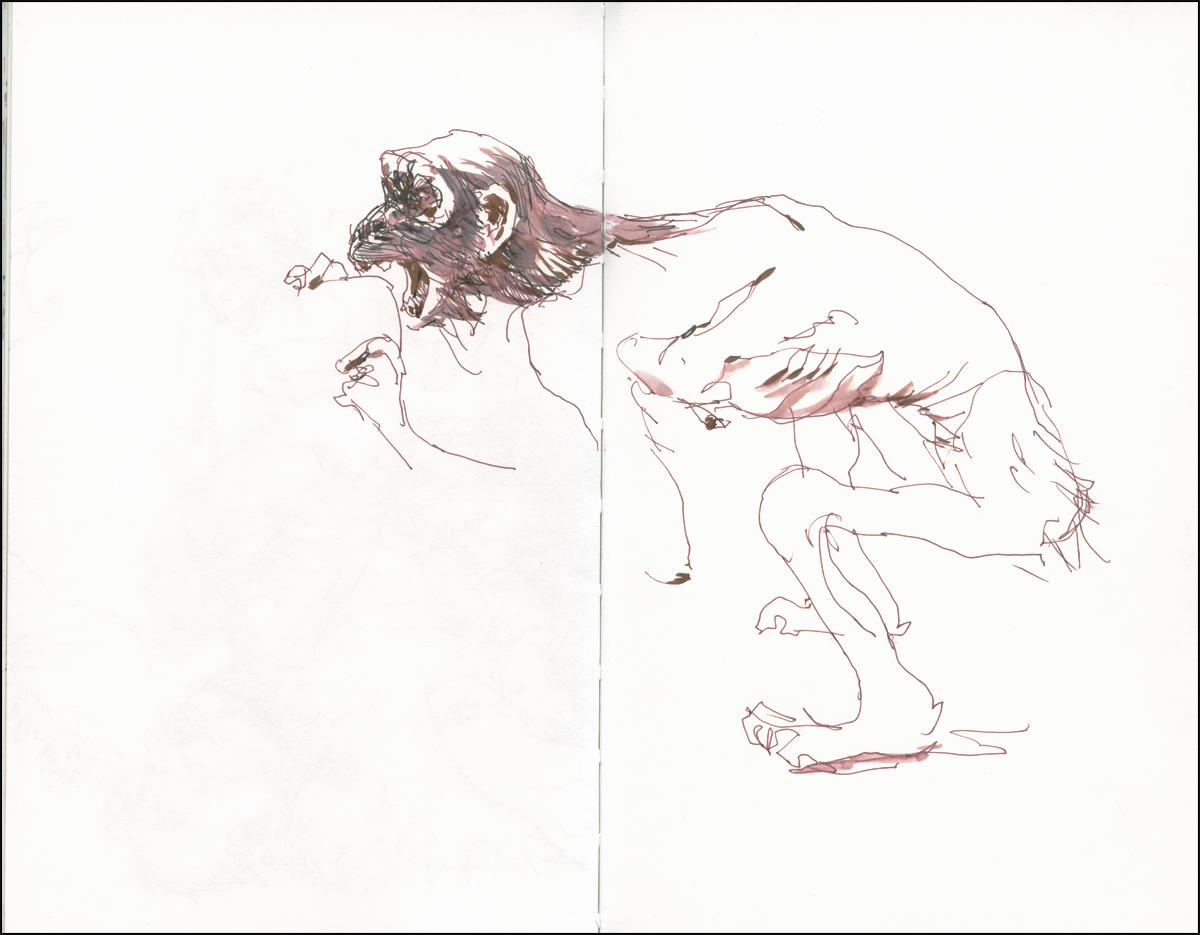
There’s a sculpture in the permanent modern collection that I always enjoy, despite its hideous appearance.
Tony Matelli’s Old Enemy, New Victim depicts a pair of emaciated Chimpanzees attacking a morbidly obese Orangutan. It seems an act of monkey cannibalism is imminent.
As I was sketching, a young dad and his cute moppet passed by, and I heard him explain “It’s all about class struggle innit?”
In the distant past, in one of my teen dropout phases, I had a job delivering junk mail flyers in a rather posh neighborhood. Actually, my ex took this job, thinking it might be easy side money. That illusion didn’t survive the first day, and I was roped into going door-to-door schelpping huge bags of paper pulp.
Naturally it was the middle of winter in Alberta, so by the time we were hitting the streets it was freezing cold, dark and knee deep in snow. You could see that inside the cheerily lit windows, these were some beautiful homes. They certainly all had monster long sidewalks. I think we were paid a penny per flyer.
Matelli’s sculpture encapsulates my feelings quite well.
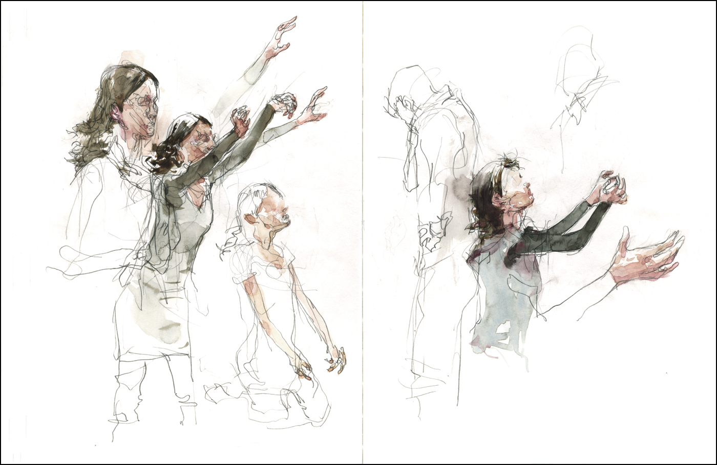
Kung Fu Fighting : Fast as Lightning
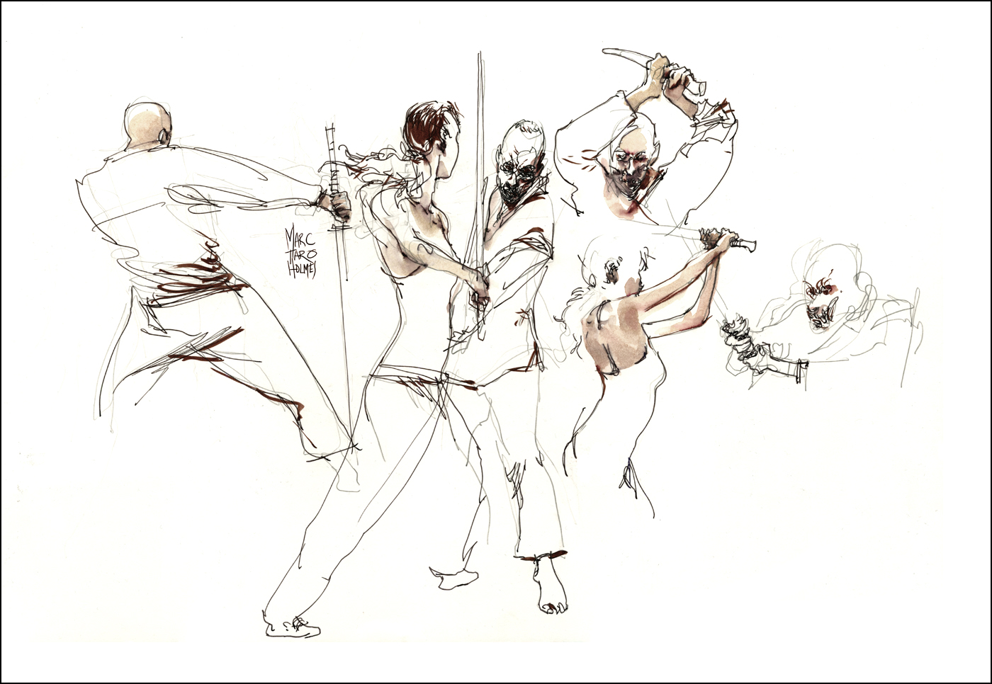
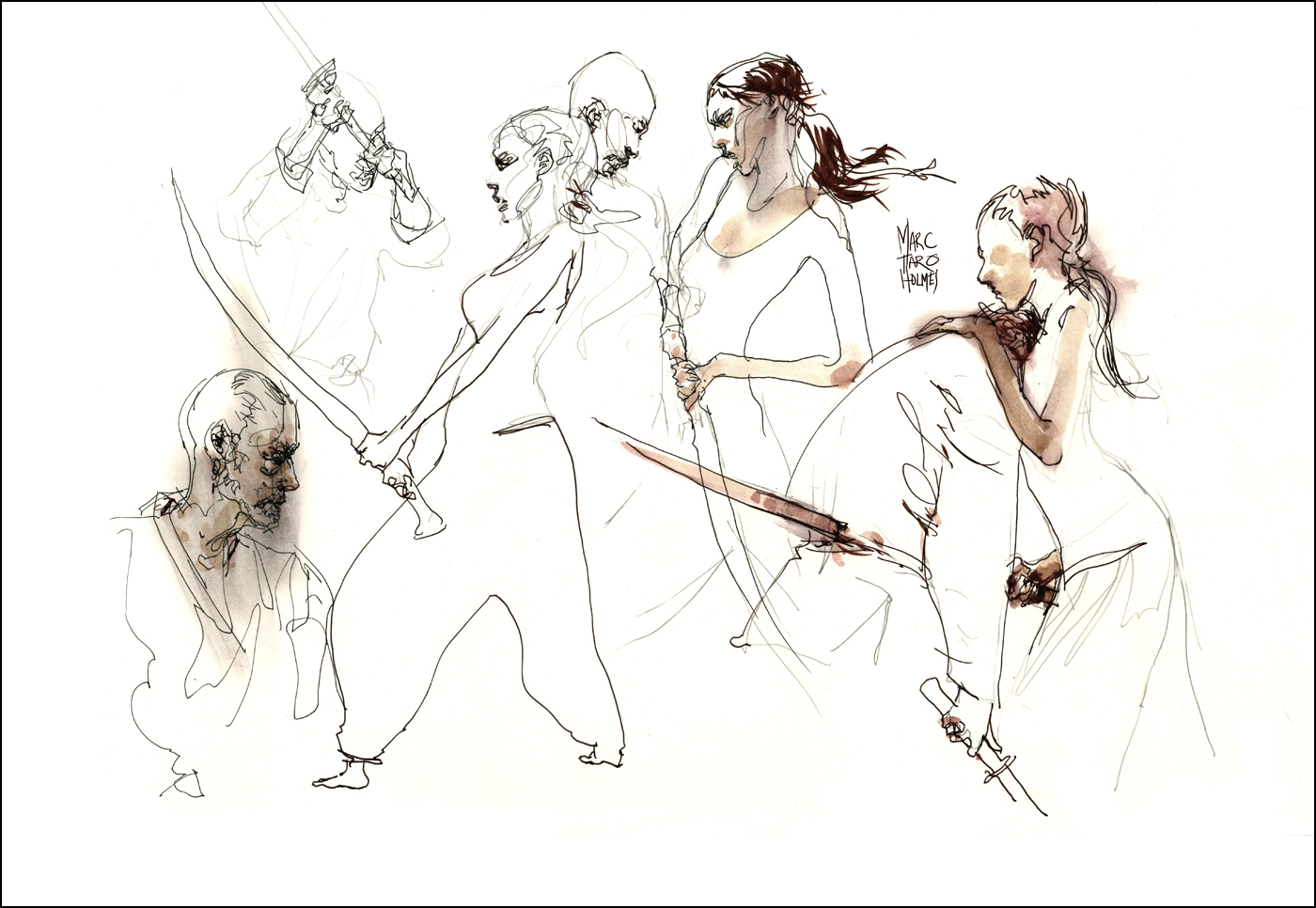
I was just over at Montreal’s Syn Studio sketching a duo of cinematic fight choreographers. Putting a bit of the Martial into the Arts :)
Considering my video-workshop Sketching People In Motion is in full swing, I couldn’t pass up this speed-sketching workout.

This event was three hours of slow motion fighting. They would work out a combat exchange, making sure to take turns dying, and we’d sketch furiously as they moved through it in slow motion, repeating the sequence four or five times.
Occasionally they’d freeze a pose for a while – but never the most dynamic ones. Impossible to freeze yourself begin punched up on your toes like a cartoon boxer :) Sometimes they’d be ‘helpful’ and rotate their combined axis – supposedly showing us another angle – but really just messing us up completely.
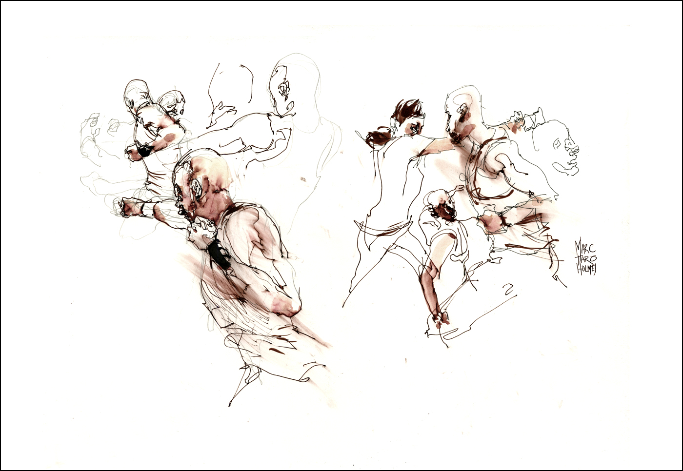
You can see visible evidence of the three-step sketching process in these drawings. It was going so fast I didn’t always finish the figures. I’m starting with a pencil, doodling through the first slow mo, and then coming back for refining detail in ink as they repeated the sequence five or six times through.
Usually I’d focus on refining faces and hands. In the breaks between fights I’d place some darks with a brush pen. I have Kuretake Sumi Brush in the red barrel version loaded with a 50/50 black/scarlet ink mix, just for these occasions. The blurred red effect is smearing the fountain pen ink with a bit of paper towel.
Other color notes were made with watercolor melting the dark red pen line.

I suppose some of this looks a little violent. But you have to imagine them doing it in a light-hearted manner. Cracking jokes and making crazy faces. Dying with lots of gurgling sounds. It seems like a good job for a couple of over-grown kids.
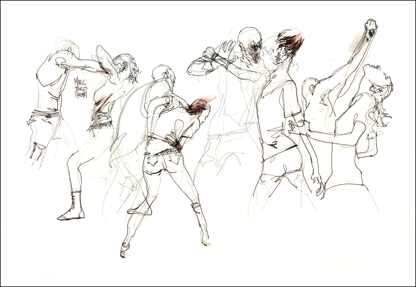
These are 15×22″ on some 20 year old unidentified 100lb-ish paper stock. (Felt a lot like Moleskine classic paper). I used three art boards with sheets taped on both sides, so I could draw faster. Just swap boards and keep drawing. No waiting for the ink to dry. Wet boards are leaned up against my chair while dying. Swapping back to old boards in the breaks for brushpen and watercolor.
Cutting Room Floor : Sighting the Maya
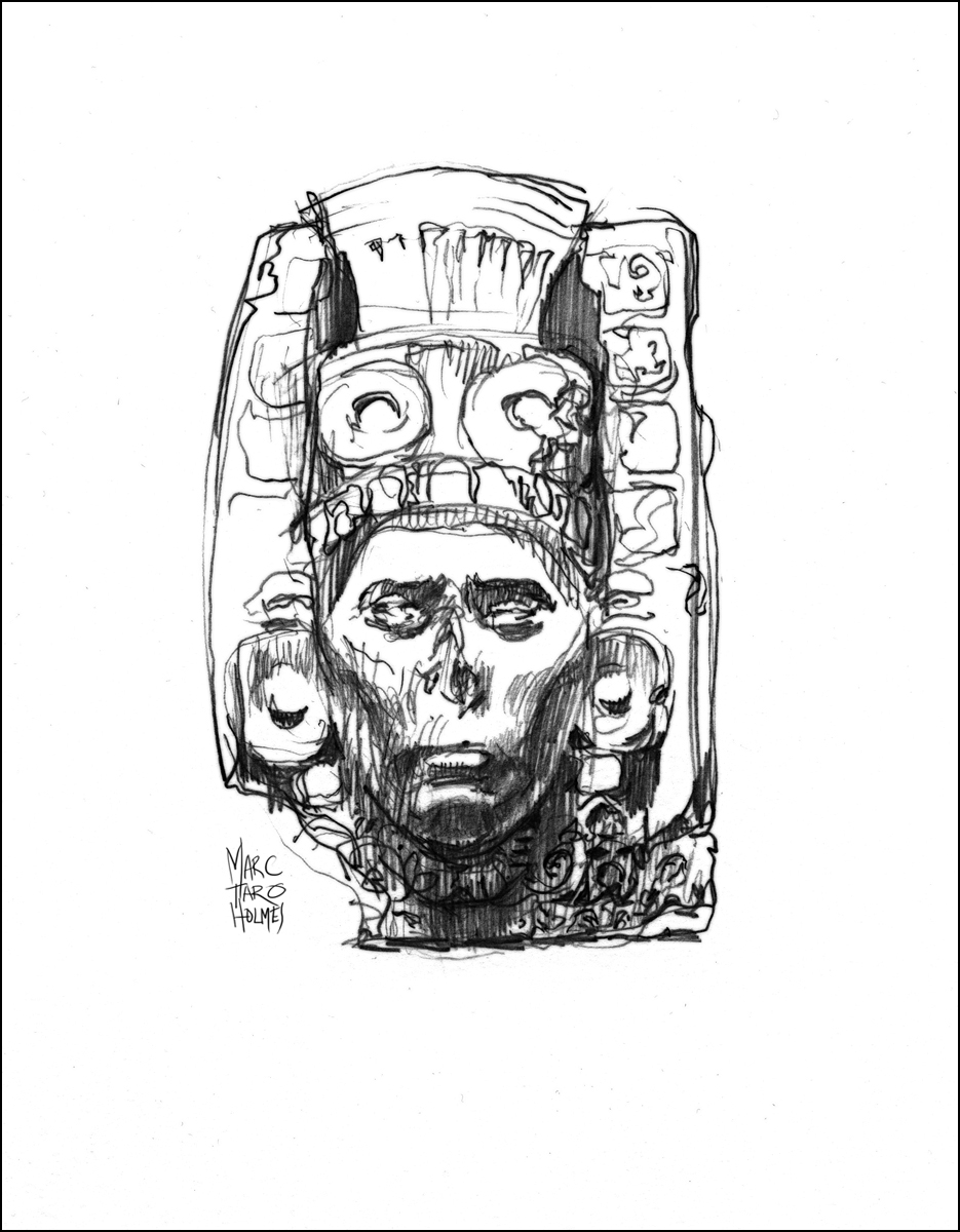
Welcome to another episode of Cutting Room Floor. Drawings from The Urban Sketcher that didn’t make it into the final edit, or were perhaps shown on the smallish size.
I had to do the previous post on the technique of sight measuring because this one is about the payoff of that method.
These are older drawings. From 2012 I do believe. At the time I had traveled to Toronto, and then Ottawa (Museum of Civilization), to sketch an exhibition of ancient Mayan stone stele, and terracotta funerary urns. I know – too cool right!? That’s my kind of drawing party right there.
There’s a funny story about the first attempt.

This weekend was a breakthrough drawing event for me. I’d been studying at Montreal’s Atelier de Brésoles, (outstanding instruction, I highly recommend them), and all the theories of sight measuring had come together.
Sketching these fantastically detailed things was pure fun. Like playing a technically demanding piece of music, and finally enjoying hearing it from yourself.

It’s mesmerizing doing detailed studies. The world fades away, and there is nothing but the drawing and the objects. I think it’s therapeutic. A kind of meditation.
Brings to mind a recent NYT piece “The Art of Slowing Down in a Museum“.

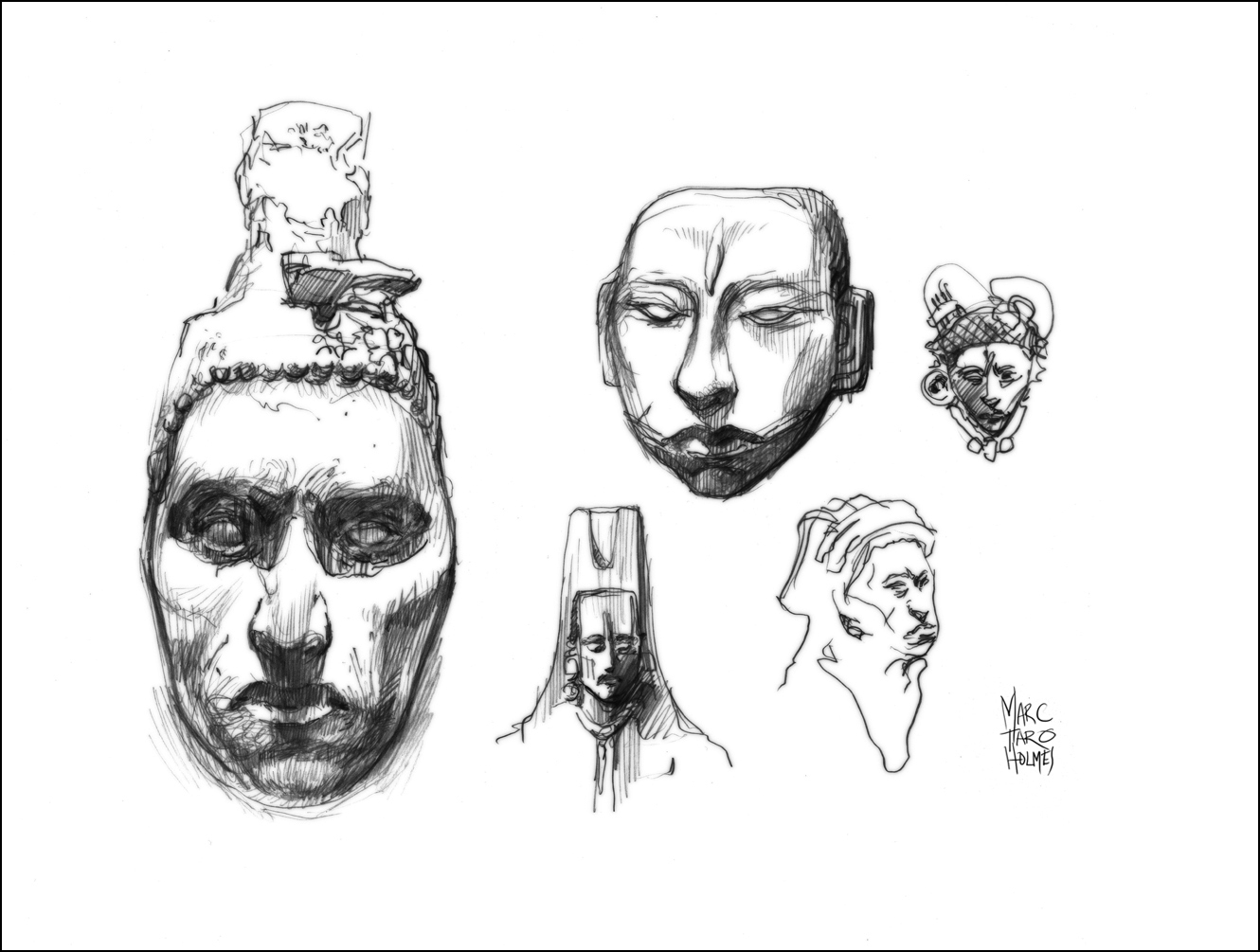
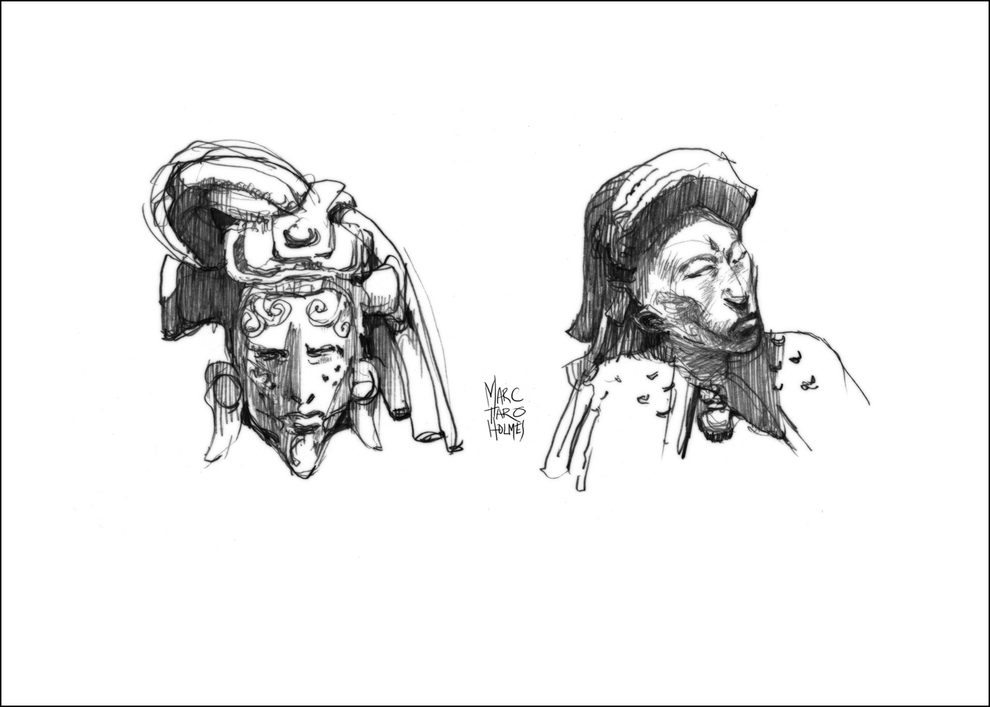


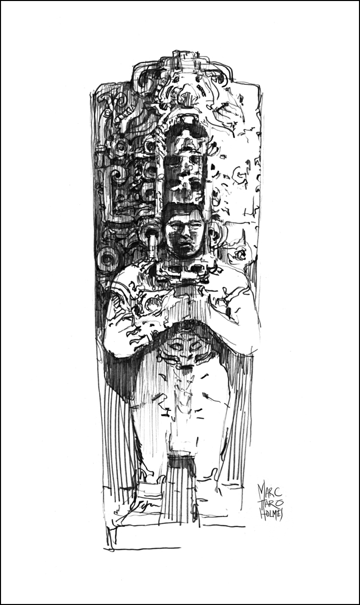
All these sketches are 0.7mm HB mechanical pencil on plate finish Strathmore Bristol – darkened for presentation during the scanning process. This last one is a watercolor copy of the original location drawing, done at home in the studio with the assistance of a reference photo for better proportions.


Just to announce – USK Quebec Sketcher Bethann Merkle is hosting a field sketching workshop in Glacier National Park. Friday June 19th, 2015. The emphasis will be on fusion of art and the natural sciences. If you might be in the area this summer, find out more here.
Student Question: Sketching Small
Followup to a students’s comment/question about how to sketch very small.
The trick is simplification. Here’s some big heads in a small book, versus a really tiny portrait. It means leaving out all the non-essentials.
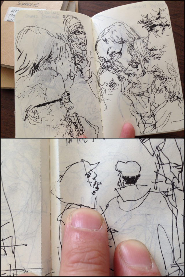
Recently, (prepping for People in Motion) I’ve started sketching in some very tiny books (on the subway, or whenever I’m waiting around somewhere). For very fine work like this I’m using a Platinum Carbon Fountain Pen, Super Fine. (Plus these water PROOF refills: Platinum Carbon Ink Cartridge – Black). and Moleskine Cahier Journals (3 x 5″).
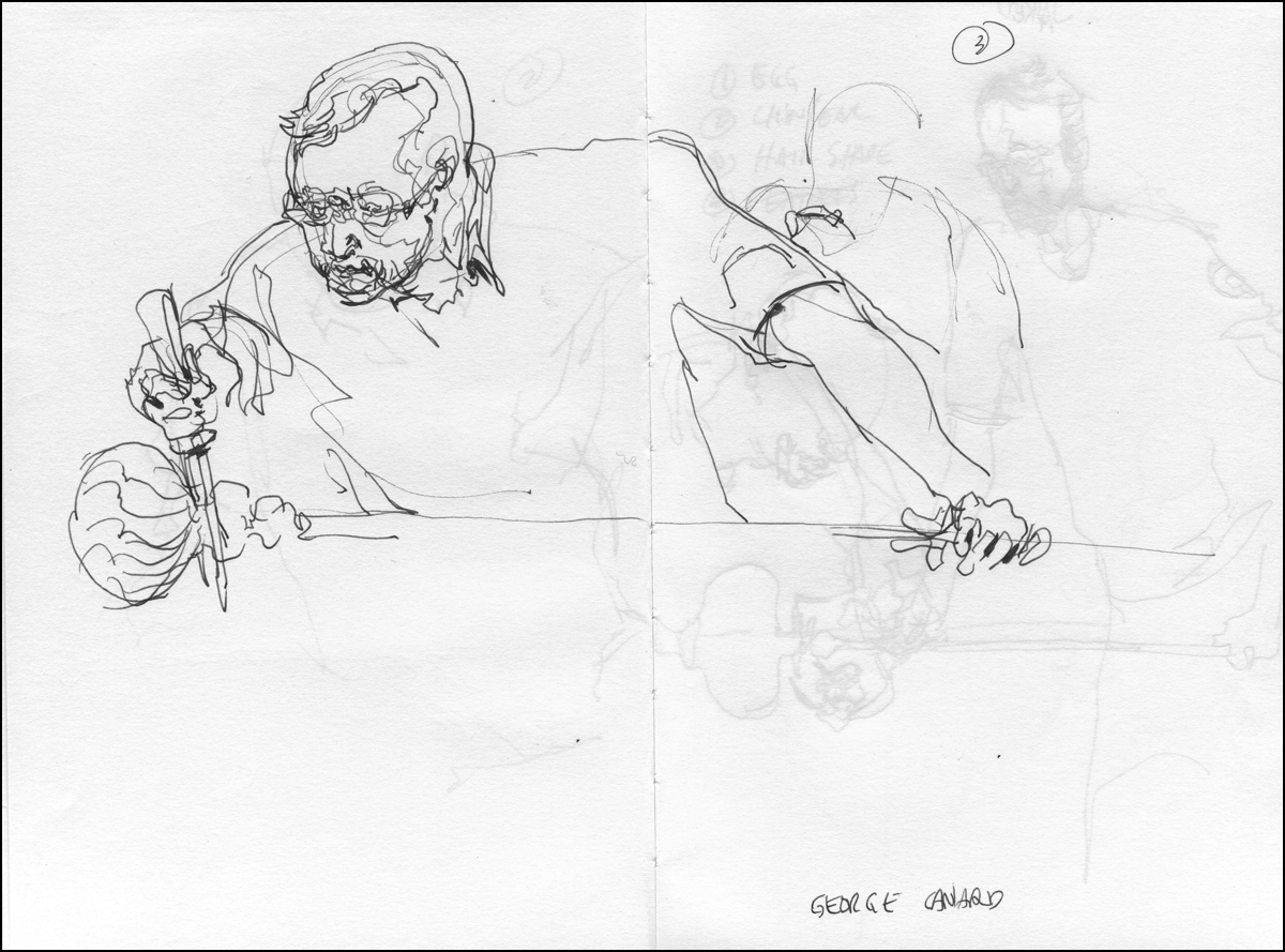
Life Sketching vs. Studio Montage
My video class on Sketching People in Motion is in full swing. Which means I’m getting lots of great questions from students.
The course starts with the basic techniques of speed sketching, followed by tinting in watercolor, and some demonstration of direct watercolor sketching.
In the later lessons, I get into some discussion about ‘reportage’. The practice of using your sketches to document events.
This montage of sketches from the Corning Museum of Glass is one of the more complex examples I talk about near the end of chapter 7. We do an animation showing how it’s put together, but I’ve had a question about it in the class discussion, and I’d like to go into more detail here.


I love this kind of drawing. It’s a way to get out into the world and discover things I would otherwise never encounter. [Beekeepers | Rock Climbers | Trial Lawyers | Alzheimers Patients]
To some extent, every sketch done on location is a documentary. But in these reportage drawings, I’m consciously trying to show a sequence of events. To visually describe a process.
I suppose it’s just part of how I learn. I have a very short attention span. I’m not sure if it’s pathologically short – but it seems to be sometimes. The act of drawing things allows me to slow down. To stay locked into something long enough to try and understand it.
I always feel, when teaching sketching, that there are two things I’m responsible for.
Primarily we’re here to learn the actual skills. That’s what most people are wanting. This is in fact the easy part. Hand skills are just a matter of showing clearly what to do, and tricking the student into a lot of practice.
But secondly, I feel I have to touch on Aspirational Goals. What we are ultimately going to do with this skill. Fun as it is to simply sketch, with no motivation beyond doing it (Life Drawing) I think we must have, in the back of our minds, a real world application.
Maybe we want to be travel sketchers, seeing the world and reporting in our sketchbooks (sounds great right?). Maybe we want to be investigative journalists, or biographers of great individuals (or all three!). Whatever your goal – the question is – how will you use your sketches to communicate?
I don’t want to actually start quoting the lesson from class. But I do want to show exactly how I did this particular composition.
The heart of the question is Location Sketching vs. Studio Work. How much do you draw on-the-spot, and how much do you finish later.
I firmly believe the best drawings are completed entirely on location. You have 100% of the information you need right there. All the color, composition and detail of real life to choose from. Anything you do after is going to require visual memory (which is a trained skill), or reference material (which is impossible to collect at the same time as sketching – unless your wife is a photographer), or you might even be tempted to fake things (aiee!). This all means, I prefer to do it right there, beginning to end.
However. There are practical concerns.
I can, and do, bring large sheets of paper on location. My largest field sketches are 18×24″. The only limit to how wide a view and how many details I can get in, is the size of the board I can carry around all day. That’s why I’ve started to do diptych’s on location. So I can use two boards, spread open like a sketchbook, and go even larger.
But – when you’re seated in an auditorium, or standing in a small space, or are with an audience of folks who don’t want to be distracted, sometimes you simply have to work on a smaller scale.
The actual original drawings for this montage are done in a Stillman & Birn Epsilon at 6×9″. I’m sketching these as quickly as possible, doing what they call Key Framing (freezing motion).
It is a juggling act between A: what can you see from your vantage, B: what you have time to draw before it’s gone, and C: what you need next to explain the action – what part of the operation is missing? The goal is for every sketch to show something new. Usually, you don’t have time to repeat yourself. Collect information and keep moving. Prioritize – what is the anchoring activity, and what doodles might support it. (Here’s an older example).

Doing all these small sketches allows me great flexibility. I never have to erase – just flip the page. I can do a few very rapid ones, because I know they are going to be in the background, or used as ‘supporting cast’ for the main actors. I can write notes about color or action, that I will erase later.
In my head, I’m already combining them into a collage. The old-school method for the actual combination is to trace your drawings – or transfer with graphite paper. I do this digitally these days, simply because it’s faster. Collage in Photoshop, and print to the final paper.
Nobody regrets the vanishing art of tracing. In fact, mid century illustrators didn’t trace either – people used to physically cut and paste sketches and do large photo prints to paint over. Talk about costly and time consuming. I’d rather take my chances doing it all in one drawing if it came to that. I suppose that is part of why illustration used to be a highly paid career. (I suppose it’s still ok? Will let you know re: that).
Here’s a few steps from the in-class animation showing how all the loose sketchbook pages are combined together:


After that, it’s simply a matter of tinting the drawings. (That’s lesson 4 in the series).
OK! sorry for the long winded post – but I wanted to be able to fully answer the questions that came up. I hope it’s interesting for anyone who is thinking to take their field sketching further – illustration, journalism, fine art – even comics and cinematic story boarding.
~m
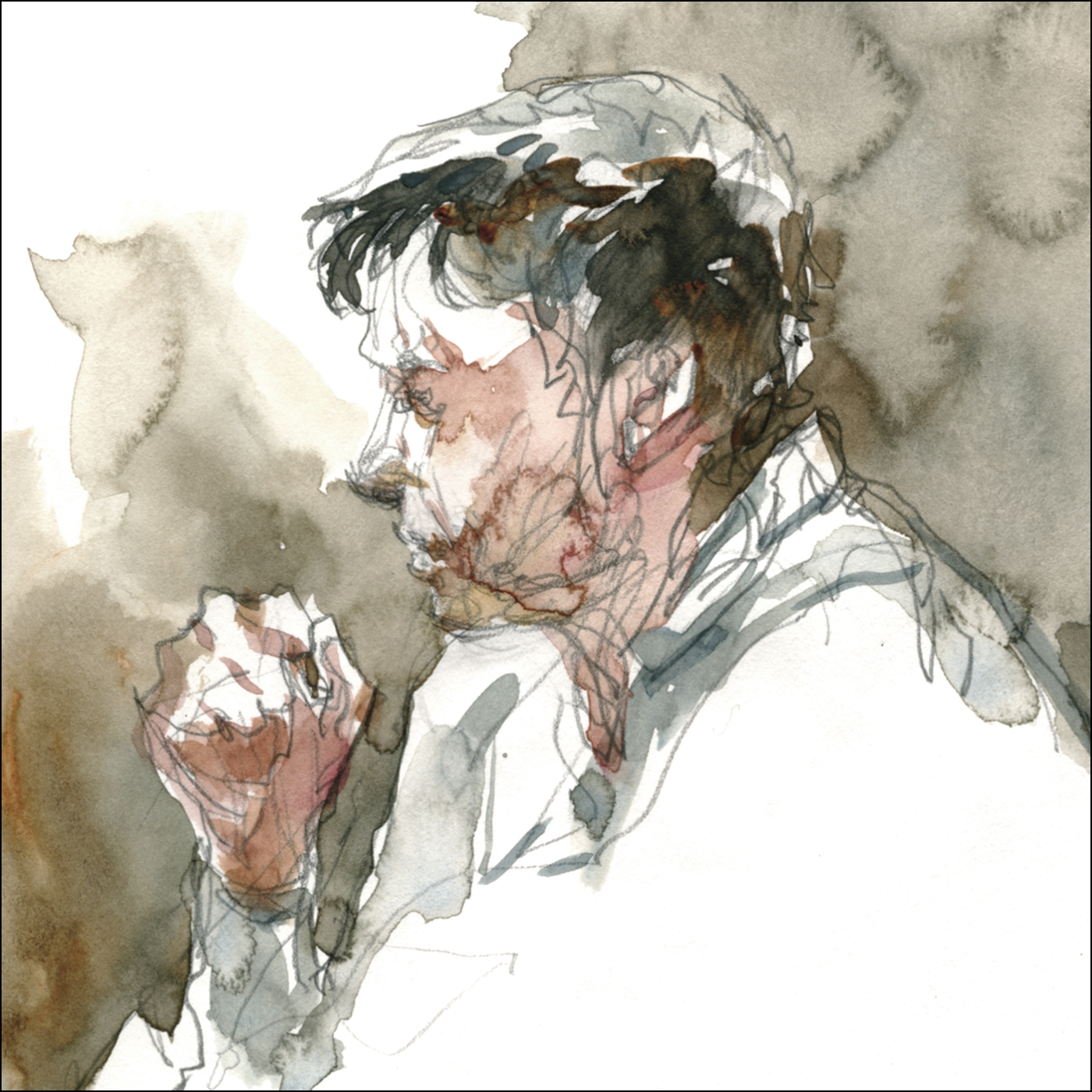
The Medea Effect : Day 02
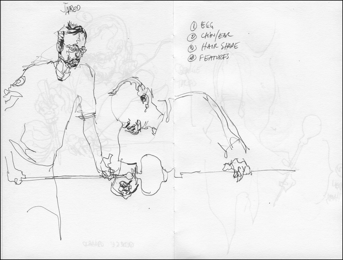
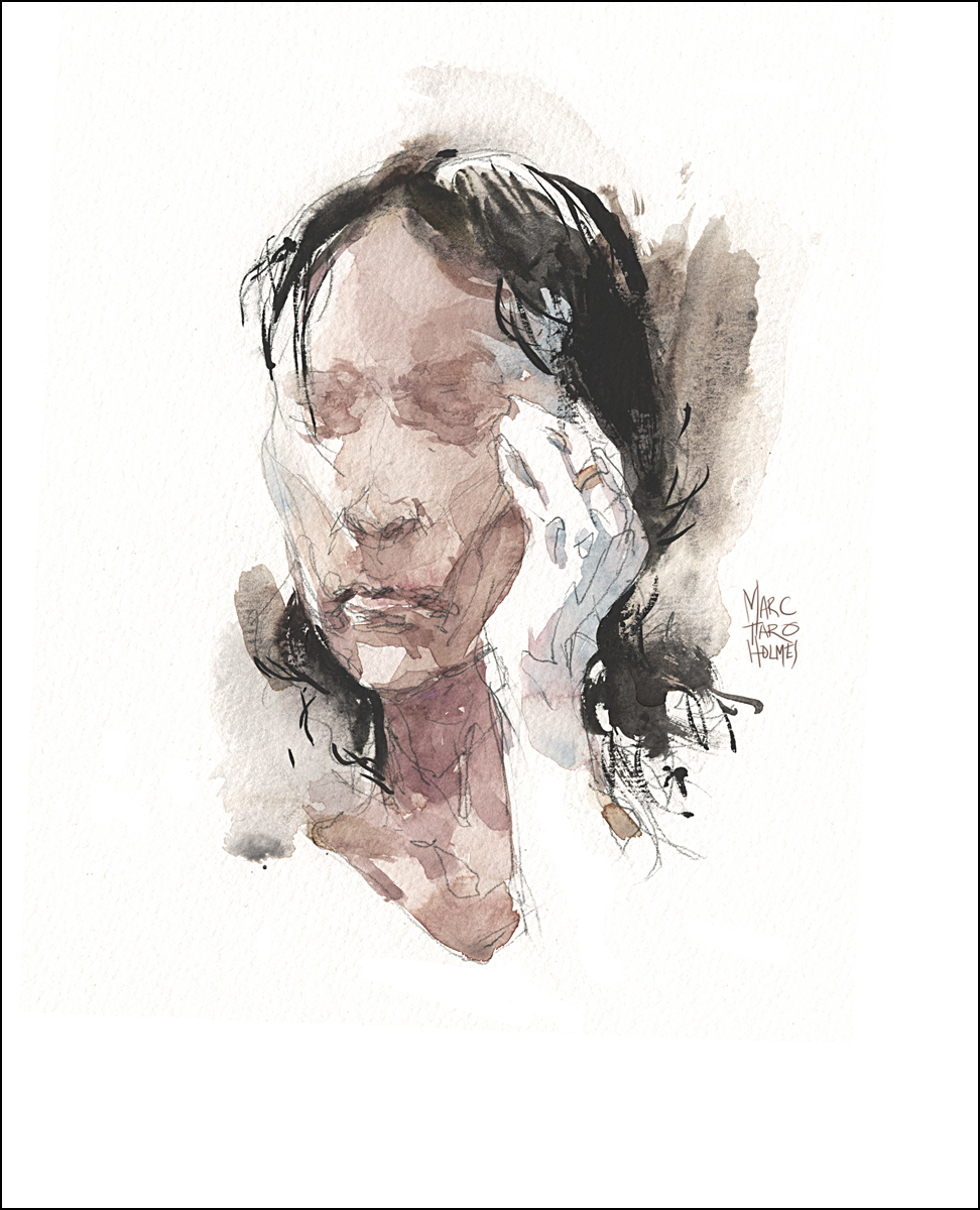
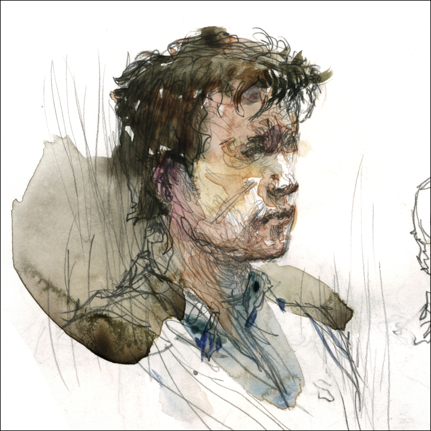
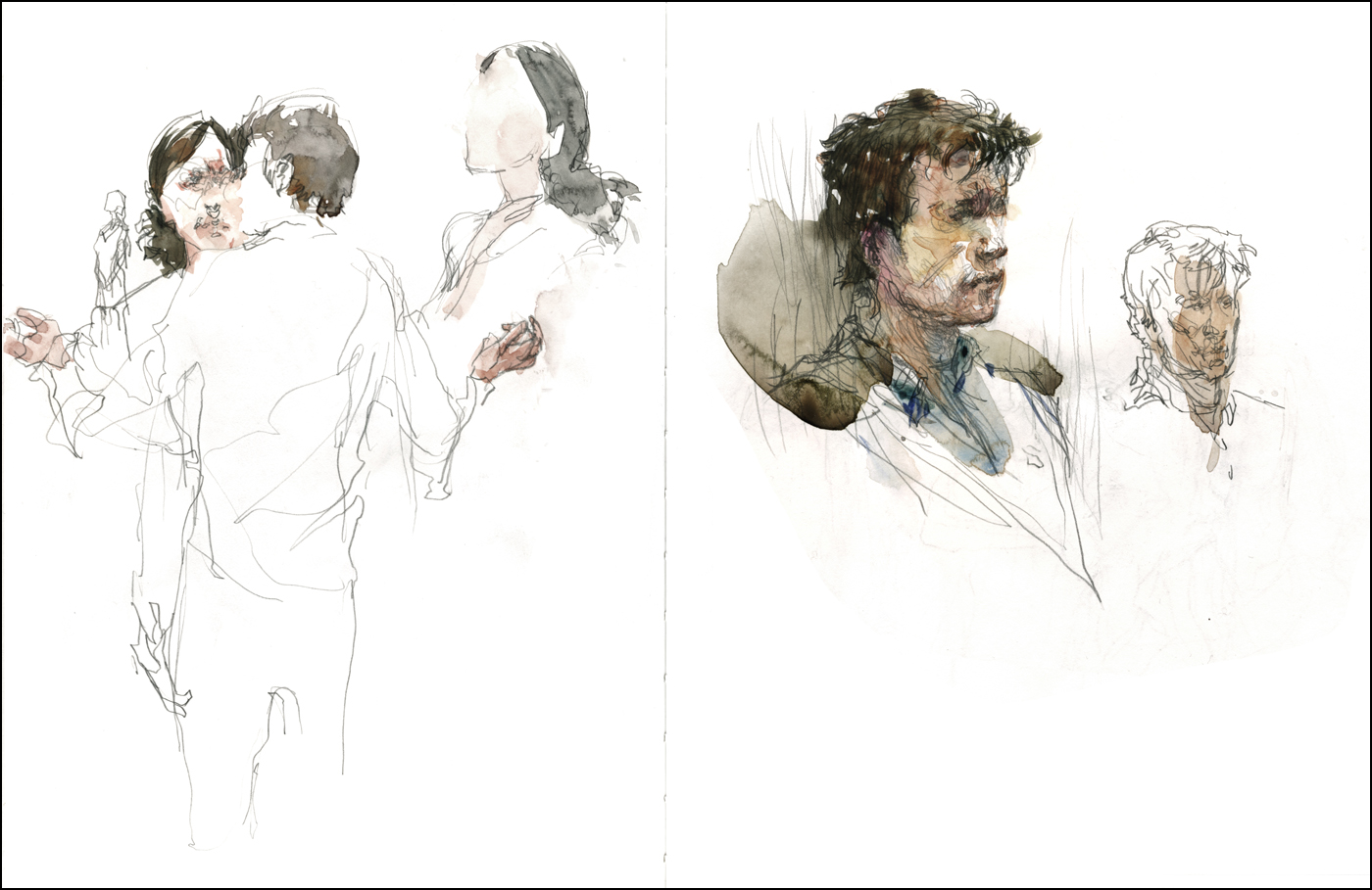
I’ve been back for my second day in rehearsal with James Loye and Jennifer Morehouse at the Talisman Theatre production of The Medea Effect, (Get Tickets Here)
After my first day of pencil sketches, I was excited to return and do watercolors on location. It so happened, this day they were going over some of the same material – the first quarter of the story – in which the characters spar. Ada, the aging actress pressing her case with Hugo the young genius director.
Good, in that, I was able to carry on right where I left off. But, on the other hand, I’m still in suspense how the story ends!

At the start of each day the actors do an exercise where they interfere with each other’s personal space. Pushing back and forth with their presence, moving about a tight circle without colliding. Initially the overbearing director looms over the pleading actress. It almost looks like psychic pushing hands Tai Chi. They are exploring physical stances, becoming comfortable projecting a shifting balance of power between them.
“Yes, I’m proud of each of my wrinkles. I know why they are there, I could catalog them, say which one appeared first and why, I could trace the path of my wrinkles, name each tragedy”…
Talisman Theatre has its own interesting story. Very much a reflection of Montreal.
From their own site “Talisman has a vibrant, living mission: to produce English-language premières of Québécois plays for Montreal’s public and students”. I think that’s a fascinating response to the perception of Two Solitudes in Quebec culture. They continue: “…we retain the essence of traditional Québécois theatrical practice as part of our hybrid development process; and we have developed a talented bi-lingual team with its own distinctive artistic approach.”
My answer, whenever asked about my own progress with the French language, is that drawing is so consuming, I couldn’t possibly study another language at the same time.
So I have no qualifications whatsoever to say – but to my ear, the translation by Nadine Desrochers from Suzie Bastien’s original, sounds authentic. There are word choices that seem pitch perfect.

“They are an obstacle to her fall. And her fall must be perfect. Let me try. Let me say those words. Please listen to me”.

“SLAUGHTERS. SLAUGHTERS. SLAUGHTERS. Her children. The FLESH of her FLESH”.
Directed by Emma Tibaldo (a older piece on her here), The Medea Effect is on stage February 3 to 7, 2015 at the Segal Centre Studio. (Get Tickets Here)
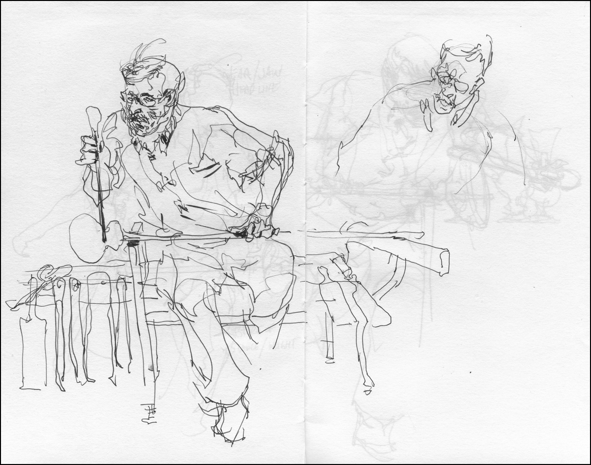
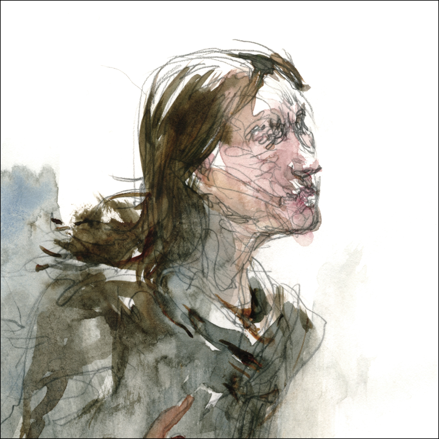
Actors in Rehearsal : The Medea Effect
Last week, fortunate circumstances allowed me another step in an ongoing experiment. I like to say this is a thing I do – but in truth, it’s a very rare privilege that doesn’t happen very often. For only the second time in my career, I’ve been sketching actors in rehearsal.
This time, James Loye and Jennifer Morehouse at work on the Talisman Theatre production of The Medea Effect, on stage February 3 to 7, 2015 at the Segal Centre Studio. (Get Tickets Here)
Readers of the blog might remember my 2013 sketches from the Centaur Theatre production of Innocence Lost: A play about Steven Truscott.
I’ve been tremendously lucky to get another chance at this unusual experience. Being in the room, a fly on the wall, observing the actors, director, and motion designer at work. Seeing their trade-craft, and learning more than most will ever know about the subtext of the play.
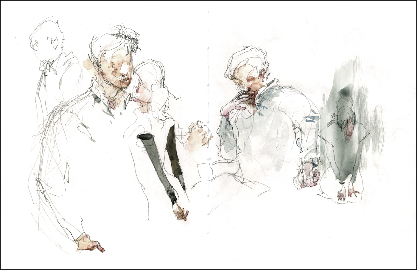
It’s uncommonly generous of them to allow me to watch their process. After all – it’s meant to be seen, much like a painting, only in the finished state. After they’ve fully mastered the roles. Yet I’m there to see the relationship form before my eyes. The characters become real, and the tension between them deepens.
[Pencil, with light washes on Stillman & Birn Epsilon Series Sketchbook 8.5 x11″]
The play rests entirely on the interaction between two people. It must be a tremendous challenge for the actors – they’re called upon to create a complex psychological narrative with only body language and gesture – a larger, gradually revealed, hidden story, that rides above-and-beyond the simple words they’re speaking. I’ve only seen the first half of the thing – and the suspense is killing me!
In rehearsal – there’s nothing but the actors. No costumes, no set. Though the actual performance will be presented in a stripped down almost bare set, it will be enriched with lighting, sound and video. Here there’s nothing to distract from the physicality of their performance.
It’s surprising to me, in this age of video games and film. I mean – I’m right there – only a few feet way from these people. Their voices are LOUD. You actually feel the tension. Even a stomped foot or a snapped gesture makes a solid noise. A tossed chair can really mess you up.
For me the first day is a matter of studying their faces. Getting to know the actors. It’s a kind of portrait exercise. Research drawings. I’ll be going back next week, and we will see what develops. Like I say, the suspense is killing me. Like all drawing from life – you only get one chance to make a record. I’m just hoping to live up to the experience.
(Update: click over to day two of the rehearsal).
Announcement: Urban Sketchers Workshop, Coventry UK, April 8-10
Urban Sketchers Isabel Carmona, Simone Ridyard and Swasky are putting on a three day workshop in Coventry, UK.
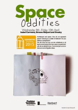
I won’t be able to attend myself, but encourage anyone who might be in the area to find out more on the USK workshops page.
Sketching People in Motion is Now LIVE!

Thanks to everyone who entered the draw for a free registration! We have three winners from 500 entries. One from here, one from USK:MTL, and one from Urbansketchers.org, It’s great to see that much interest in the new course!
For everyone who didn’t win – I can at least offer you a small Blog Readers Discount :) Approximately 15% off just for being a reader of Citizen Sketcher. Just click over to the new VIDEOS page, for the discounted registration link and details about the class.