Up on Vice Magazine
A recent job of mine just went up on Vice Magazine. It’s an interesting article – a positive story about a bad situation. Have a read here: {Vice}
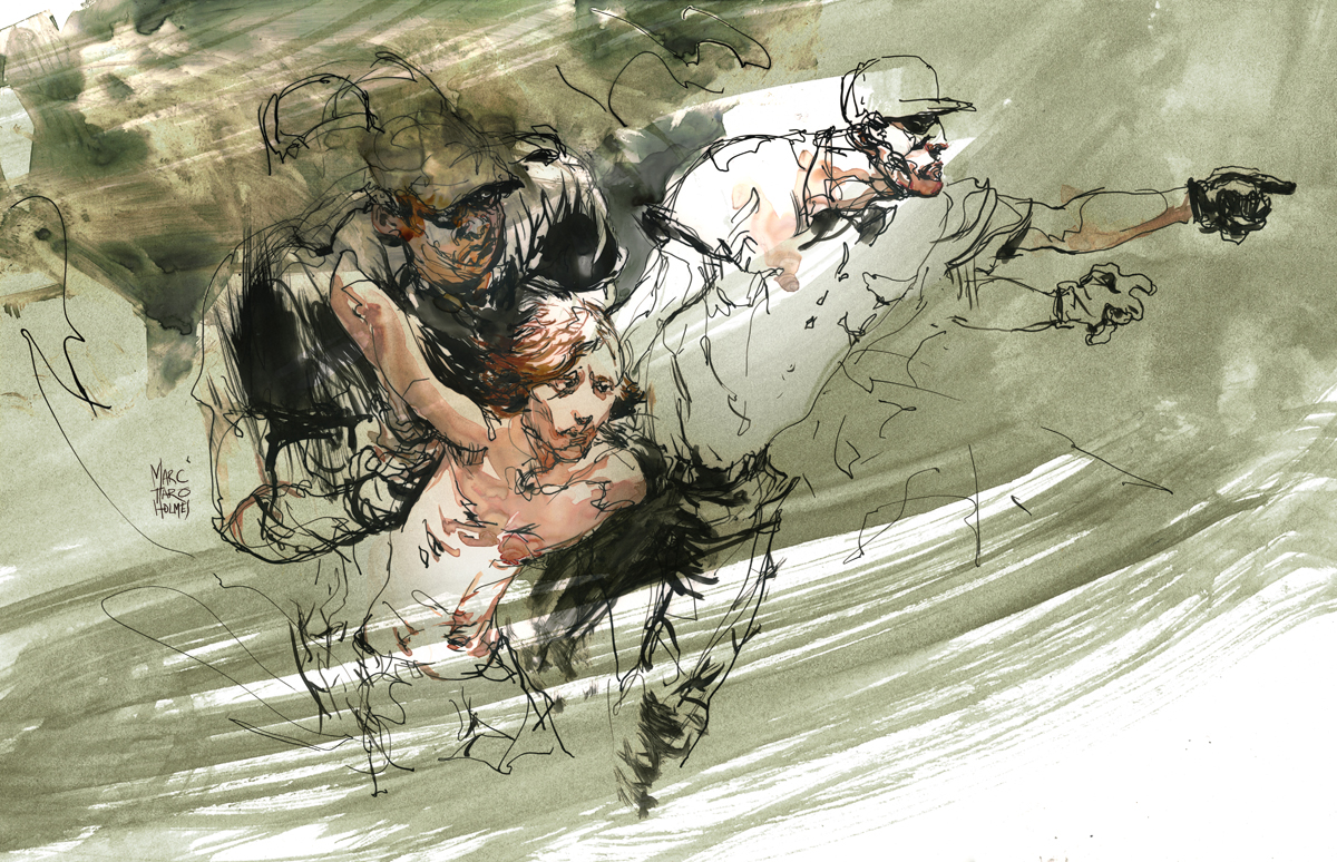
The neat thing about these illustrations – these are probably the first ‘pro’ work I’ve put out directly based on my ‘Drawing People in Motion’ workshop. (Free PDF download of teaching pamphlet here). As any regular readers know, I’m very involved in the urbansketching.org community, and consequently I think a lot about the value of drawing on location, from life. The spontaneity of un-posed work, versus the ‘polish’ of a studio piece.
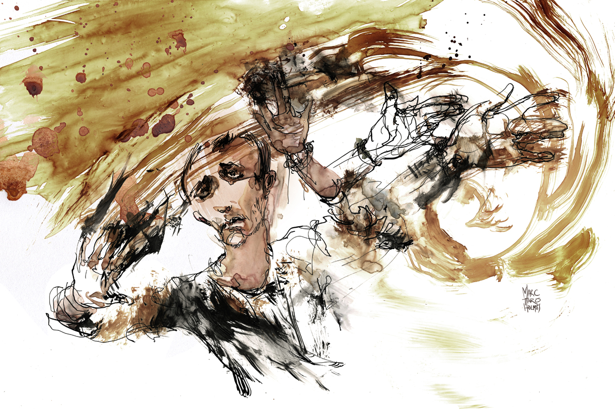
Now, these of course are done from photos. The events in the article happened years ago. But the idea is to treat the drawing exactly the same way. Work just as fast, combining from multiple reference sources, try to get the work in the studio to match the energy of the work in the field. My goal is of course to be going out on assignment, getting reportage in real time. But, in the mean time, the philosophy can be the same.
A side benefit for illustrators is, the drawing part of the job was done in a single day. I imagine that’s not uncommon for editorial artists, but that kind of turn around is something I couldn’t have managed a few years ago. Not sure how important that is in the long run, but its certainly suits the situation in the editorial illustration market right now.
[Images roughly 10×17″, pen and ink and watercolor on yupo]
Announcing Shari Blaukopf West Coast Workshops
My USK:MTL co-conspirator and occasional teaching partner Shari Blaukopf has some (few) spots left for her summer workshops.
- Anacortes Island: Sold Out!
- Vancouver: July 4 & 5
- Seattle: July 12 & 13
Contact her if you are interested, spaces are going fast. Her site info: [HERE]


Sunday Sketching
The USK:MTL group recently met for Sunday Sketching at McGill’s Redpath Musuem. We had a pretty good turn out, especially considering the cold. I was pleased to see a little crowd on the steps of the museum when I showed up. They were banging on the door trying to get the museum caretaker to open up on time. (It’s hard to be patient in this weather). I don’t think the staff are used to a big group appearing at opening time Sunday morning.
It was great to see a lot of new sketchers come out – I hope we can continue to build up our group, one day it would be great to be putting on a show or collaborating on a book based on the Montreal sketching community.
[Pen and Ink, composite drawing, roughly 24×36″]
Sketching wise, I stuck to drawing – though this is one of my composites, done on 12×16″ plate finish Bristol using about 7 sheets in collage. It’s sort of a mental game of mine, planing how the final drawing will stitch together. I have ballpoint, brush marker, some rust colored ink and dip pen and pencil in this. The haze over everthing is something I do in the scanning process – exaggerating the smudges left by my hands. I like the tone that develops by accident. This is the sort of thing that would make a good underlay for a painting.
This day, we had a pair of reporters from La Presse show up to shoot some video (one of our French language daily papers, if I dare say, the ‘real’ paper (the others are tabloids)), so I’ll let you know when their footage goes up. I did some drawing under the camera, so we might see some timelapse of my sketch. Fortunately Shari was there to do an interview in French. (I’m sadly not doing anything about my monolingual situation – my art will have to speak for me). Of course it’s also fascinating to me that the paper sends a camera crew, but I suppose it is only a matter of time before there is no more dead-tree paper, and we get it on our mobile devices. I’m sorry journalists! but I can’t wait. It’s ok, there will still be journalists! Just like artists, they will have more, and better tools at their disposal.
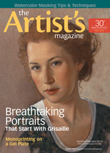
Urban Sketchers coverage in ImagineFX magazine

In recent news, here’s a short piece in ImagineFX magazine about the 2013 Urban Sketchers symposium in Barcelona.
The magazine is focused on fantasy and science fiction illustration, but I think they appreciate their target audience has a strong interest in observational drawing. It’s cool they gave our street-sketching community such great coverage. Also nice to see some of Laurel’s photos of the event again :)
I hope it’s enough of a teaser that some new people will be convinced to come to the 2014 event in Paraty Brazil. I’ve applied to instruct again this year and am hoping to hear soon if we’ll be going. It would be tremendous to see everyone again- and to add another country to the sketchbook!
Oil Painting Experiment
One of the many things on my back burner is experimenting with oil paints. Last year two years ago I took a course with Atelier de Brésoles, a while before that I did a workshop with Jeremy Lipking – it’s funny, the kind of work I *think* I want to do isn’t much like the work I *actually* do. Not that I’d mind if I could do that smooth surface work. I’ll just have to admire it from the other side of the ADD spectrum.

This is a 14″ square panel, painting impasto, at least half knife work. (Here’s some plein air studies from California (2009) where I had a bit of a break-through concerning the palette knife).
This recent bout started with USK:MTL sketcher Shari Blaukopf and I talking about Roos Schuring – a Dutch painter – master of greys, and hard core four season plein air painter.
Ms. Schuring was sufficient inspiration for us to do a little painting party this afternoon. This is Shari’s painting, which, by the way, is her first oil painting ever. Off to a good start eh? We’re going to do this at least a few more times during the holiday break. Wish us luck!

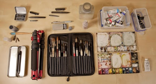
Up on Parka Blog!
Teoh Yi Chie over on ParkaBlog had just posted a short Q&A about my art tools. Just a walk through the stuff I take out location sketching. Kind of cool to be up on there, I’ve been using his book reviews for years.
Finally I can show these sketches from Barcleona!
So, right after coming back from Barcelona last summer I happened to be talking to a writer at The Artist’s Magazine.
Actually this is a funny story, so I will digress. Our group USK:MTL was sketching musicians at an event for historic re-creators, and there was this guy with a lute. I didn’t actually recognize it as such, I’m just sketching away and I think to myself “I don’t know what that instrument is – I could just make up some nonsense and nobody would care”. But, I’m a well trained Urban Sketcher so I drew it exactly as I saw it. Soon after I get a message – “Wow, my friend is a lute player, and I never see drawings of lute players, can I purchase that sketch?”. So that is a little tale of why it’s good to get out and draw the unexpected things life shows you.
Anyway one thing lead to another, and it turns out the lute fan is a writer for The Artist’s Magazine. This leads to me doing a small interview about the Barcelona Symposium, and giving them two of my watercolors from the trip. So finally, the short article is out in the world. (Appearing right next to a short bio on Kansas correspondent Cathy Johnson, which is another small-world thing). Here’s the issue if you happen to see it on the stands:
So that means, hurray! I can finally show you guys the paintings! It’s always unexpected, what with the world of blogging, how long it takes to see things in print. Our expectations change so fast hey?

[Casa de Les Punxes, Barcelona, 12×16]
I didn’t know what to expect out of BCN – but it certainly was not these ‘witches hat’ buildings. I had no idea this was a thing. But they’re seemingly everywhere in the city, and they’re always charming to see. Such a whimsical bit of architectural nonsense. Barcelona, of course, has the world crown for whimsical architecture.
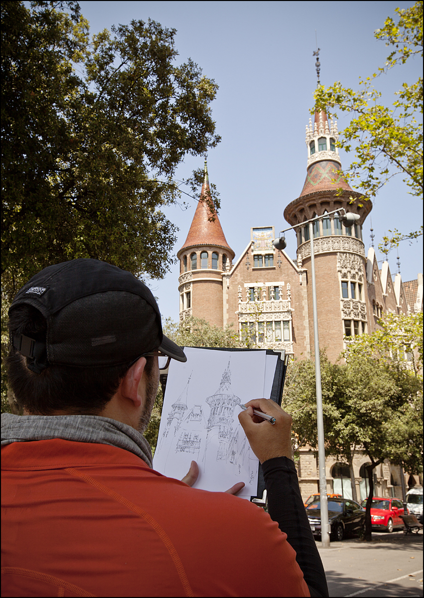
Here’s the drawing in progress on location.
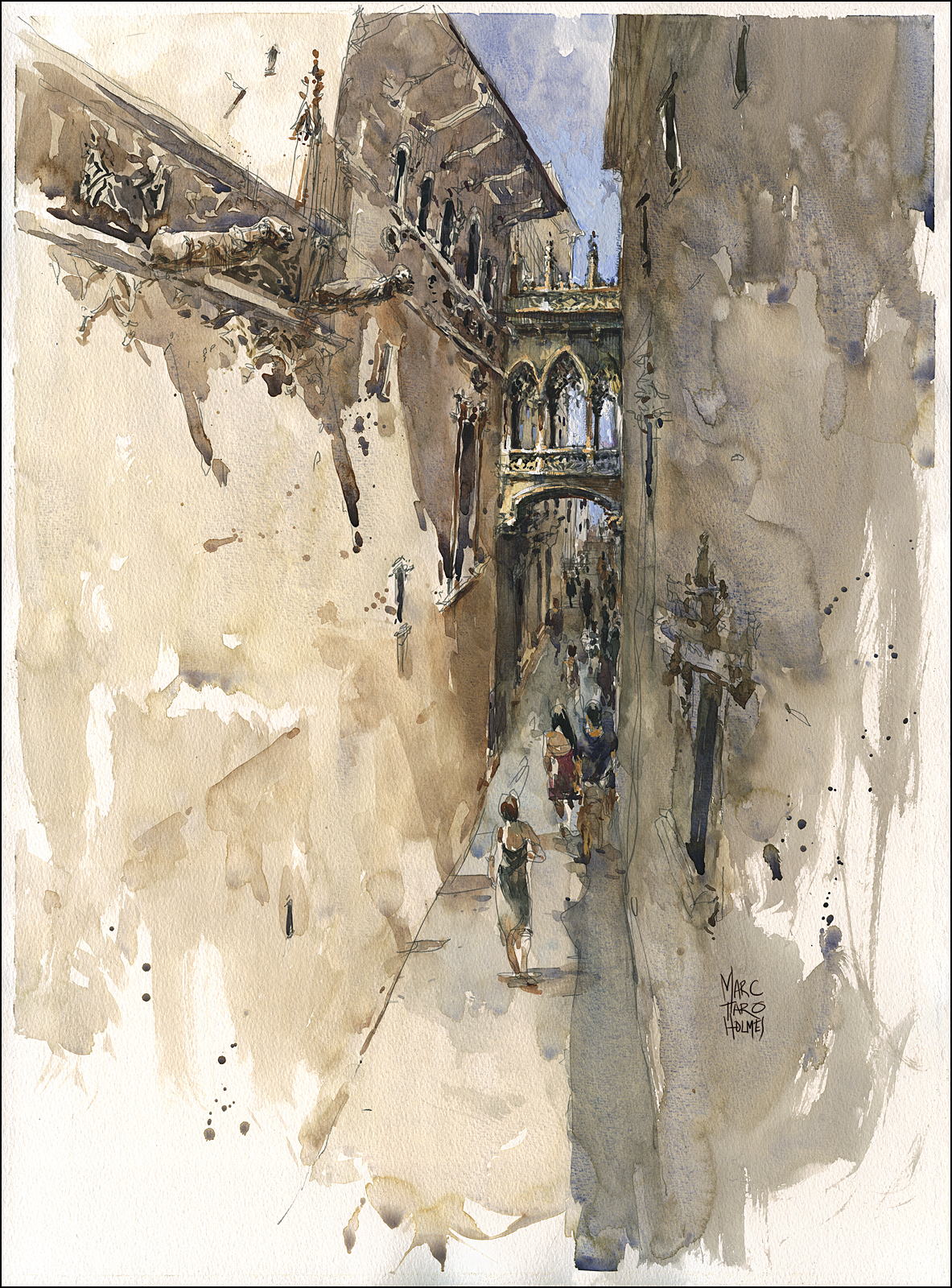
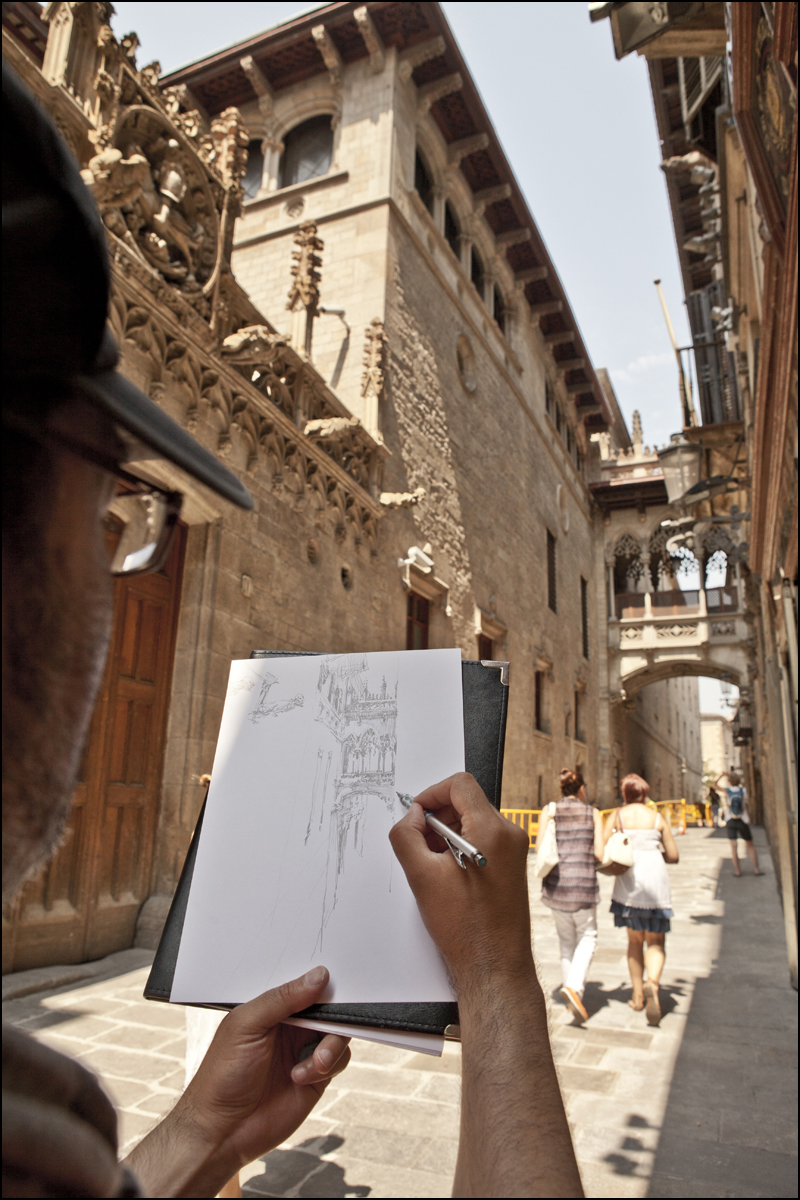
[Bisbe Street Bridge, Gothic Quarter, 12×16]
This little bit of fun is in behind the cathedral in the Gothic quarter, and is probably the most photographed bit of the city. Because it’s so cute! How could you not love a style of architecture called ‘Flamboyant’.
Wikipedia has an interesting side-thread on the authenticity of this area. I gather there was a strategic policy in the 1920’s to insert some history into this neighborhood. A plan to improve the image of the city and attract visitors. I would bet that has been an excellent return on investment. Architects are divided as to if this sort of faux-history is valid. I personally like it – why not? It’s an artistic response to the past. I’m ok with seeing reproductions, especially if the alternative is seeing functional modernism.
I drew this with Liz Steel on one of our post-workshop rambles. I always get the best stuff by hanging around with the architects. They scout the spots so well. For some reason I didn’t get a good shot of her drawing. Next time, better reporting skills!
TIP’s And Tricks Here! >>>
Just a side note for those interested in the process. This trip I was sketching multi-page drawings on location, (the trick shown here, and here) printing them onto watercolor paper back home, and painting in the studio.
There is an interesting discussion to be had as to how true to ‘Urban Sketching’ that process is :) We have a desire to draw on location, from observation, which has so many advantages I won’t even get into it. Of course, we’d prefer to do the whole painting on the spot as well – it’s easier, and the results are always better if this is possible – but it’s a trade off isn’t it? Do you spend three hours on location getting one painting, or do you get as many sketches as possible and paint them later?
I’ve done it both ways. This trip I opted for sketching like mad and finishing later. There was so much to see in such a limited time, I’d kick myself if I came home with only eight paintings, instead of this stack.
Street Drawing Tip! >>>
The other deciding factor was the high incidence of pickpocketing and theft in this area. Unfortunately we had a number of street-crime incidents before, during and after the workshop, so I decided on the-better-part-of-valor and carried everything on my person in a very small bag. I hope to do more painting in Brazil this upcoming 2014 symposium. I should think Paraty would be more laid back than downtown Barcelona. <Edit – yes it was!< Check out the paintings :)
Quick Dash to the Redpath
My friend John Wright, (Ottawa) was in town for the afternoon – we ducked into the Redpath Museum (McGill Campus) for a quick bit of sketching and jawing about the life of the traveloguer. (Spell check says that is not a word. Seems like it should be.)
[Ballpoint and Brush Pen]
I’m planning to go back to the Musuem in January for the USK:MTL open sketching Sunday. Maybe I’ll see some of you there? I’m always sketching the stuffed animals, but there is something to draw there for every taste.
Class Demo: Sargent Copy
As part of my watercolor class at Syn Studio (which I am hoping offer again next January: five spaces left I believe: register here). I had the students doing a master copy, (or a work from a photo, their choice).
I found some time to do my own – a copy of a Sargent. I wasn’t attempting to get the drawing perfect, this was only about an hours work, demoing in class. Mainly I wanted to see if I could reach the same values in three Tea, Milk, Honey passes.
Achieving sufficient contrast is an obsession with me. I love contrast. Comes from many years of drawing with pen and ink I suppose. I’m always feeling watercolor is at risk of looking pale.

Things I would do if I wanted to really get this right:
1: Work from a better reproduction. I just had a jpg to work from.
2: Cotton paper with more texture (Arches 300 probably). I was using Canson Montval machine made paper. Which is fairly slick, lacking texture.
3: Sables. I am always telling people Sable brushes are not absolutely necessary. Now, in trying do some of the dry brush that I’m seeing Sargent’s sketch, I’m really noticing synthetic fibers don’t do the job. They don’t splay out as naturally, and don’t hold a ragged shape when ‘stabbed’.
4: Deeper pigments. I think I’m seeing Indigo blue? something other than the Sap Green/Prussian/Burnt Sienna I used for my dark
5: Practice. Of course, goes without saying. My own brushwork is clumsy by compare. But if I might be so bold – I can tell if I invested effort in this, it would be possible someday. That’s good enough for me for now.
Here’s a larger shot:

USK:MTL Portrait Party
This month USK:MTL needed a place to sketch indoors. It’s officially too cold to sketch in the streets. It seemed like a great idea to do a Portrait Party.
Even if you’ve never been to one, it’s pretty straightforward hey? Just invite a bunch of artists, sit around a big table and draw whoever is sitting across from you. Nobody is supposed to worry about accurate likenesses or being flattering. Anything goes as far as media or style. You shouldn’t be a perfectionist, approach it with a sense of fun. You are donating your own visage, in return for borrowing another person’s face.
In order to loosen up for the night I sketched a few students in my watercolor classes. (Which still has a few openings next session :) They were working an ‘open’ assignment, doing their own thing, so I stole some high speed impressions in between my walk-and-talk critique rounds. (Ballpoint and Kuretake #13 Brushpen).

After last week’s drawing day at the Higgins Armory, some of the artists headed out for dinner. Immediately (without even asking) we brought out sketchbooks and began drawing each other.


Here’s Greg Shea, James Gurney and Gavin Baker.
The week before that I’d gone to a Montreal Drink and Draw party – and brought back these – done with Private Reserve water soluble inks.

So, what with all these social drawing situations I was thoroughly warmed up for USK:MTL’s official portrait party.
I brought three Canson 9×12″ watercolor blocks and just rotated through the sketches – switching whenever the paper was soaked, so they’d be mostly dry by the time I got back to the top of the rotation.
It was quite cold at our location – (you’ll see everyone is wearing scarves indoors). A chill always slows down drying time. I think that was actually an advantage – I ended up working more wet-in-wet than I would normally, which is handy inside the flesh tones. Though, strategically speaking, I’m still mostly following my wet-on-dry, Tea, Milk, Honey method of three passes of gradually richer washes.

[Benedicte]
I think these are all good examples of my philosophy about drawing eyeglasses. Which is – as much as possible – don’t draw them at all.
I try to indicate the frames with open shapes – dashed arcs that do not close the outline of the lens. Hint at the thickness and the distortion of the glass, but don’t over emphasize the frames. Even when they are the chunky dark kind that are in fashion these days. Also, consider how the eyebrow often merges with the frame. And, don’t forget the cast shadow. Just like drawing the hair line, the arms and nose-piece might need a subtle, descriptive shadow.

[Lucy]

[Suzanne}

