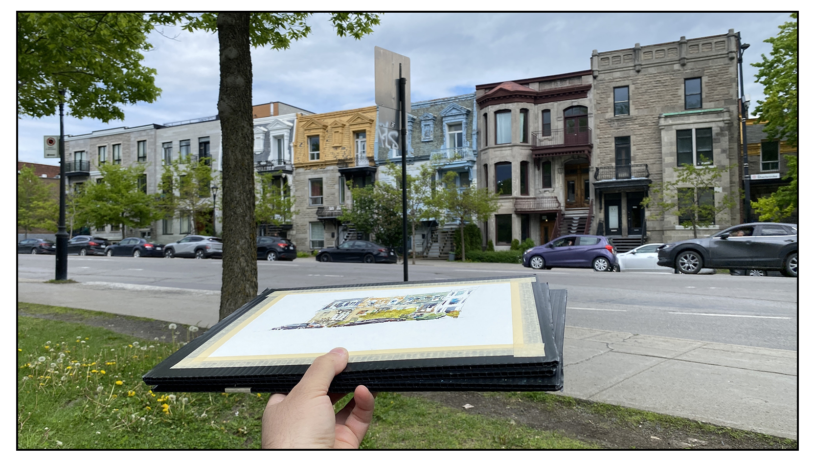
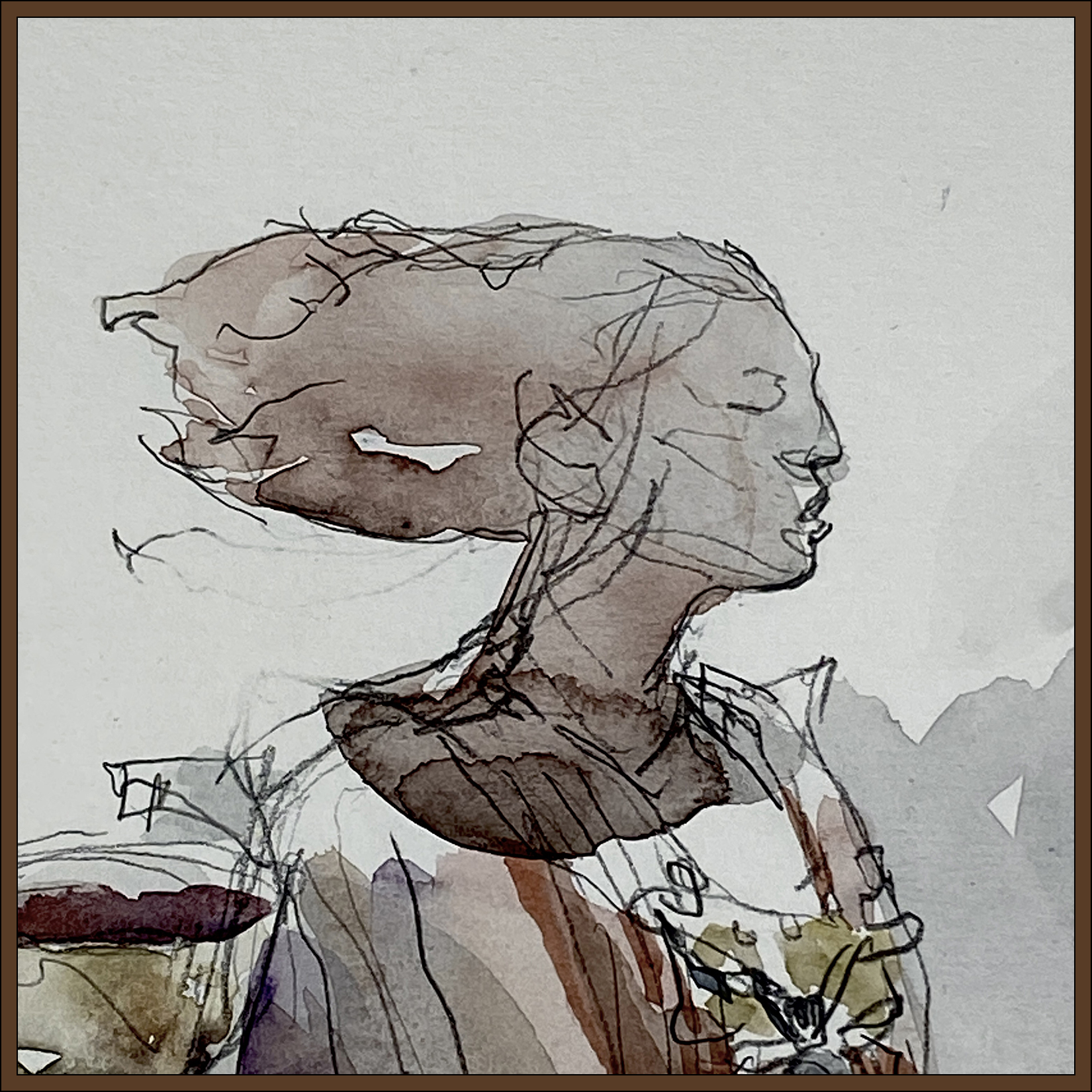
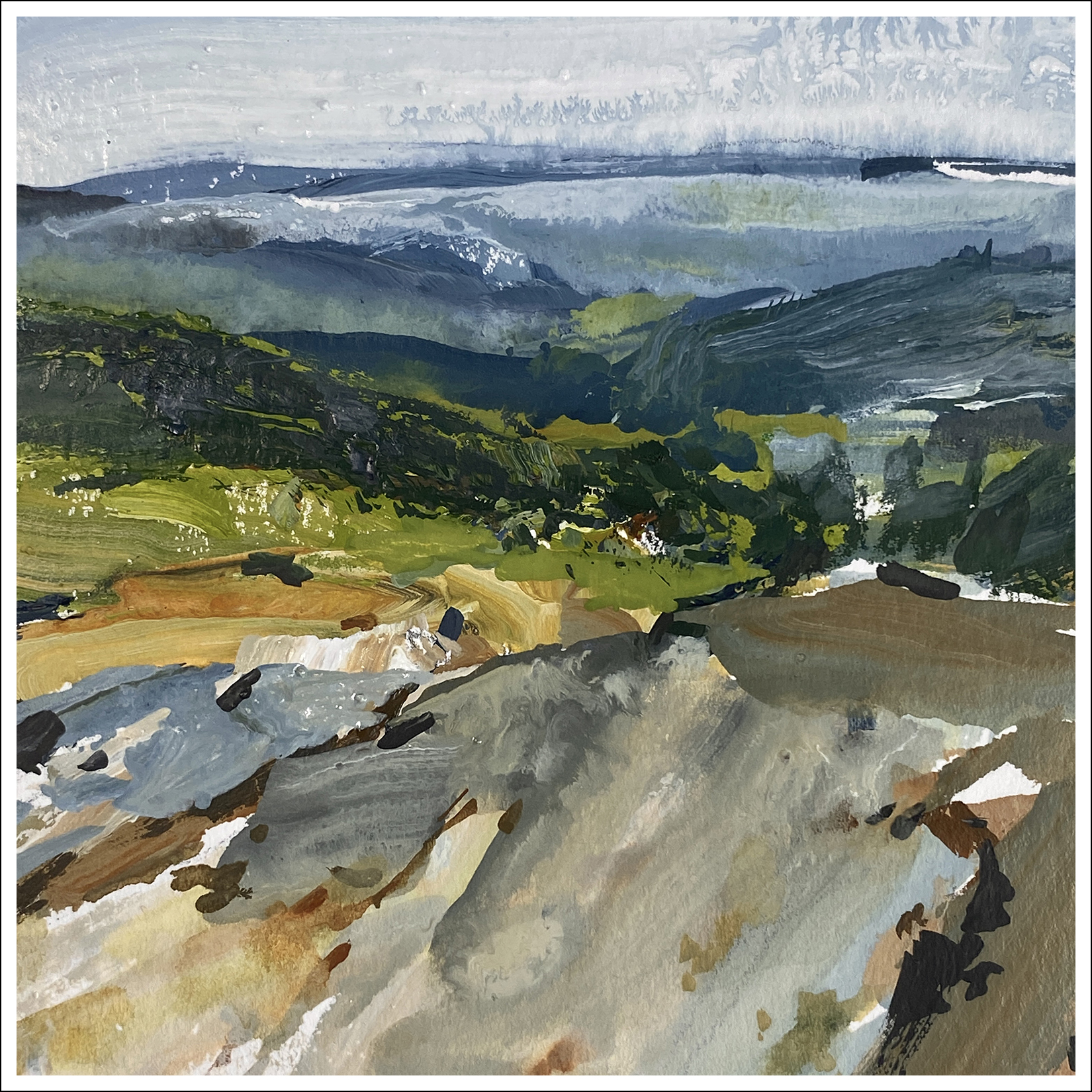
#30×30, 2025, Day 15: Day Off for Urban Sketching
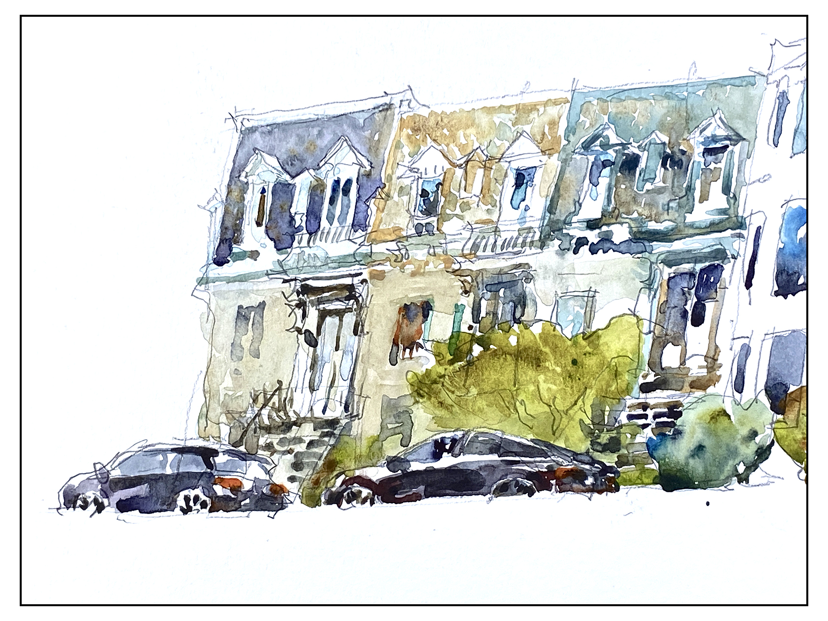
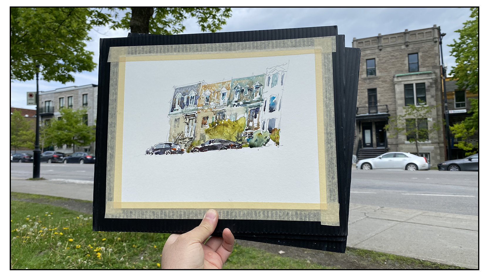
Out and about on the Montreal Plateau with some friends. Just sketching for fun. Something is happening to me – as I get older, a really nice day is almost euphoric! It’s not worth it to be inside!

Have to say – I kind of love these cars I’ve drawn :)
I don’t usually put the cars in – but lately I’m feeling they add some urban-ness, some signs of life.

But look at all the line drawing in this sketch! Really lazy today! Hah!
This isn’t really a direct watercolor painting to be honest. Can I call it ‘Crazy Person Adult Coloring Book?
Take this advice if any of you are planning to become art-bloggers! Never go around talking about RULES when it comes to art. You open your big mouth too many times and you’re just going to get into trouble later on :) Nobody forgets the things you say!
But I feel like those were the ground rules for event so I am a little stuck:)
What would you guys think if we changed it next year to be all-media? Would all the water-painters who participate go on strike in protest?
Really – it’s the same value for everyone right? The encouragement to paint every day is more the point, it’s never been about HOW you paint.
Let me know what you guys think in the comments.
~m
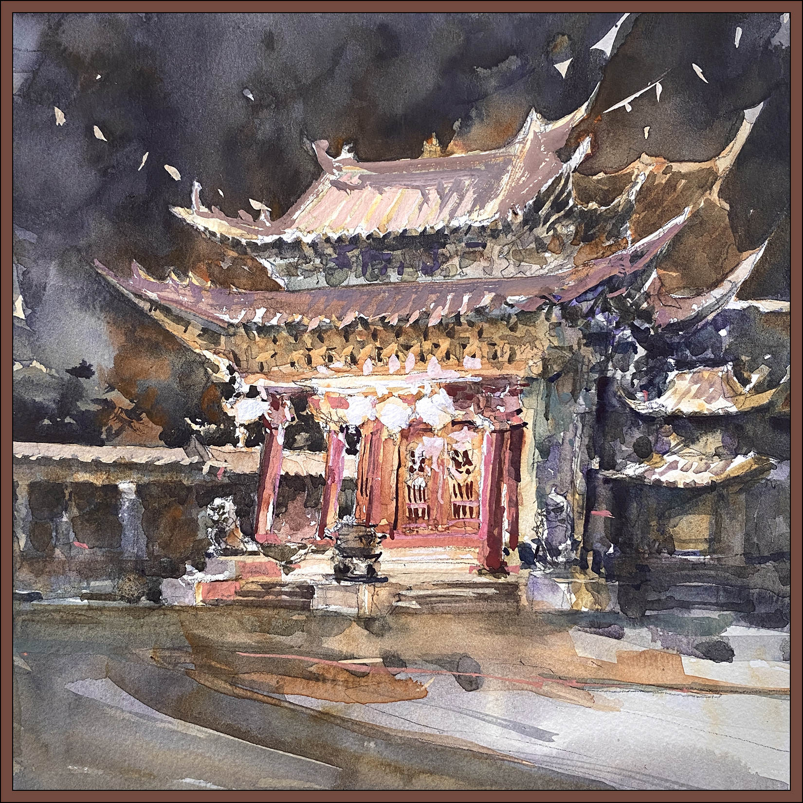
#30×30, 2025, Day 14: Like a Phoenix From the Ashes

Today was an epic battle! It took forever to finish a small 10×10″ sketch – and there were multiple points where I though the day would end in disaster.
I think it’s normal for me – around the midpoint of the thirty day marathon I’ve done some warming up, things are starting to flow, and then I think; I should do a really good one!
That’s always a huge mistake :)
Putting pressure on yourself to do a good one? In the middle of a public event? On a deadline?
Huge mistake!
Whenever you’re afraid you’re going to ruin a painting, you’re in big trouble.

So yes; here’s the piece at the first moment of crisis. The halfway point. This is the finished underpainting in watercolor.
I had been going very carefully – much too carefully – making little wet areas and charging them in with color. This often happens with detailed subjects. I get lost in the details – treating them all with the same importance.
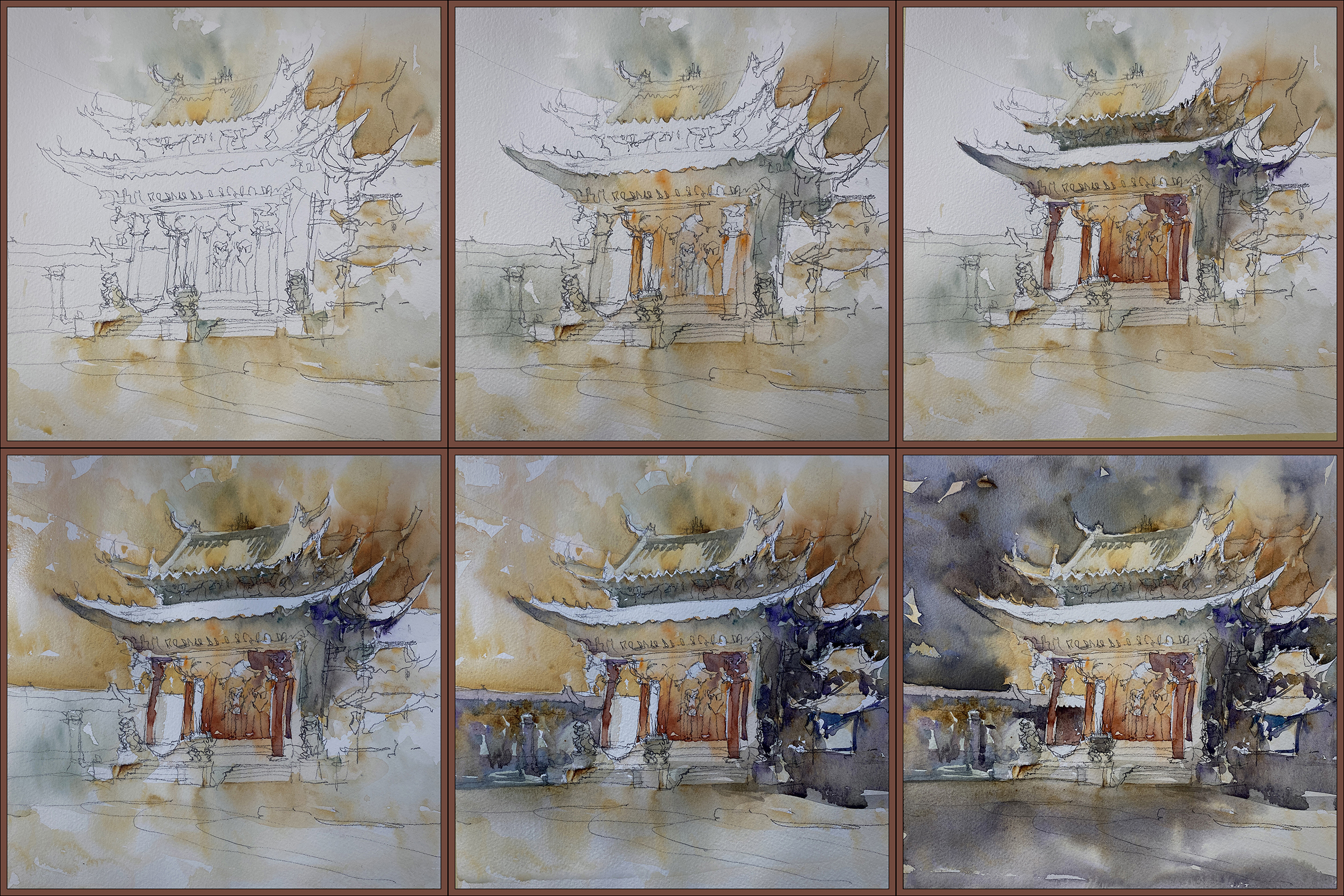
When I put in the sky I had thought I was done!
But then you step back and realize – wow. This whole thing is FAR too light! There’s nowhere near enough contrast!
I really dislike going over a wash twice. The goal is to get the color right the first time. It’s very easy to just muddy what you have if you go over again. And – there’s no way you can cut around a complex shape twice. You’ll end up with a messy complicated silhouette if you try to do it twice.
I felt stuck!
That sky was NOT dark enough. And why did I leave the roof white? It’s not daytime with the noontime sun shining down!
I’ve really messed this up!
So – I had an ice cream. Laid about the studio for a while. Fussed about.
And finally decided; I have to do something right?
So I did cut in AGAIN, against my better judgement.
And then, in a cascading series of problems – as soon as I had a darker sky, it was clear that the darks in the temple were far too pale – including that white rooftop I had left for no good reason – so maybe (in desperation) it was time to bring out the gouache!
Oh My God!
Here it is with some very heavy handed retouching in gouache.
Now I’m REALLY thinking I ruined it!
I’ve been having such great luck with painting-over in gouache. It’s supposed to be a simple way to fix anything! How did this one get so overworked?
Well – because of course, trying to paint this fantastically detailed Chinese temple is completely different from slashing out a sky on a 4″ abstract landscape. Truth is – nothing I’ve done for first two weeks has been anywhere near this difficult.
So; I fussed about some more, seriously considered tearing it up – which of course broke the spell.
Once you decide you hate it – you can do anything :)
So I laid in a dark orange/sepia wash over the whole thing – soaking the entire image with wet paint. I had the board tilted practically vertical – you can see color running down the image in the middle there.
Miraculously – this melted all the overworked gouache. It reduced all of the contrast, neutralized all the color, and served to unify all the distraction in the background.
In the moment, I wasn’t sure if I’d ruined it for good, so went and ate some chocolate chip cookies, then came back and realized – – all I had to do was re-state the lanterns and pillars with white, and lo’ and behold – it suddenly works.
That’s the kind of retouch that works. Minimal touches! Not a complete paint-over :)
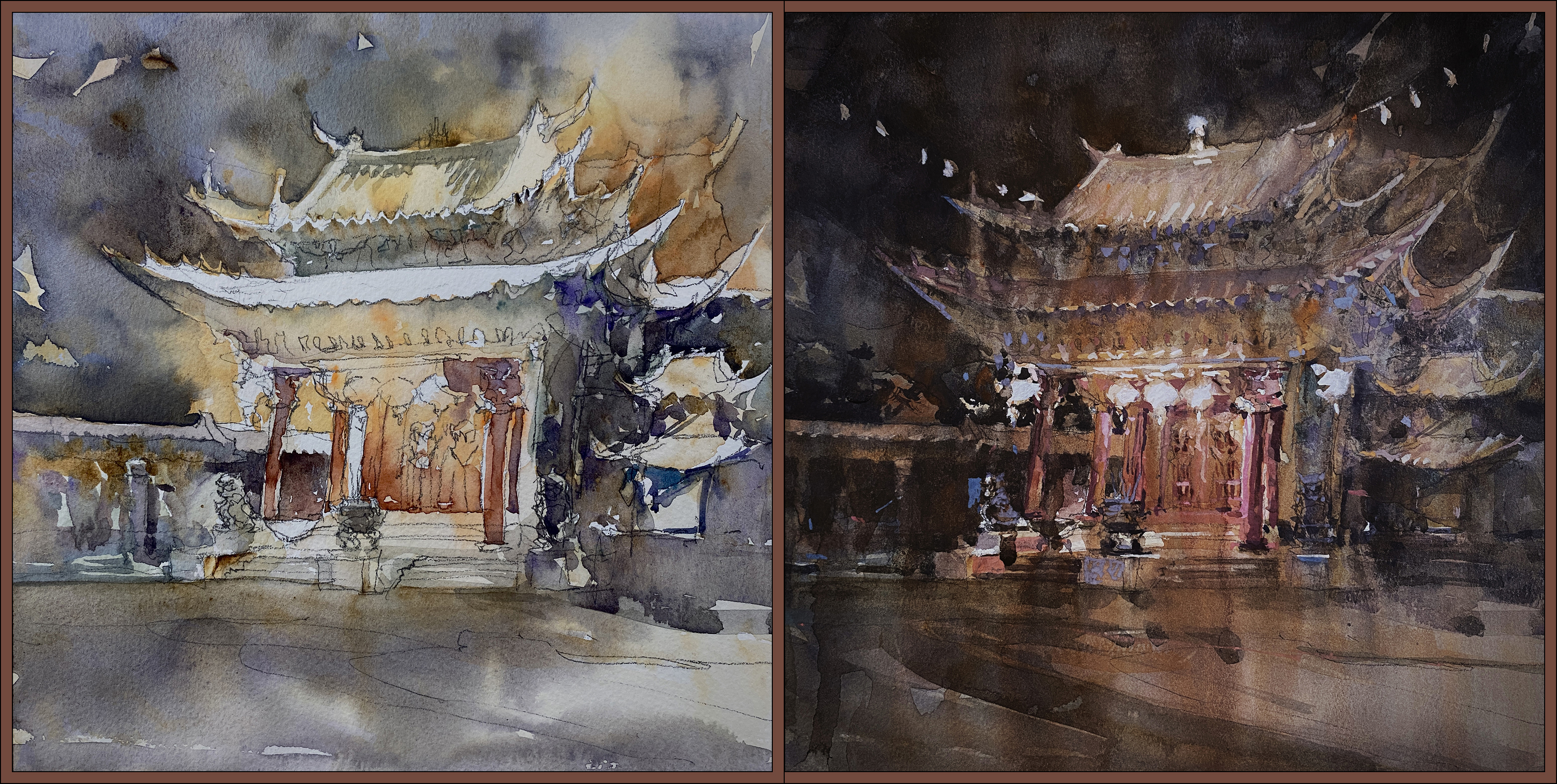
So – watercolor midpoint vs gouache-wash over top.
That’s how you spend an entire afternoon on a 10″ painting, almost give up three times, eat lot of junk food, and in the end, like a Phoenix from the ashes – you can only save a painting by deciding to burn it to the ground :)


~m
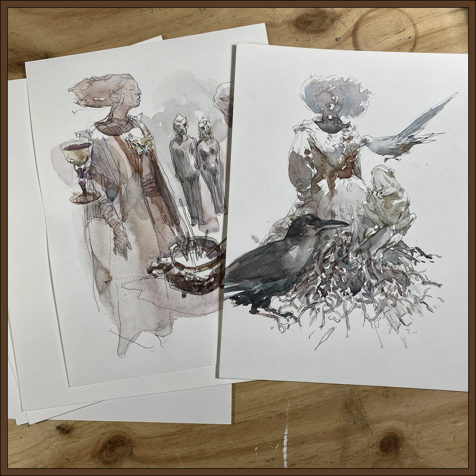
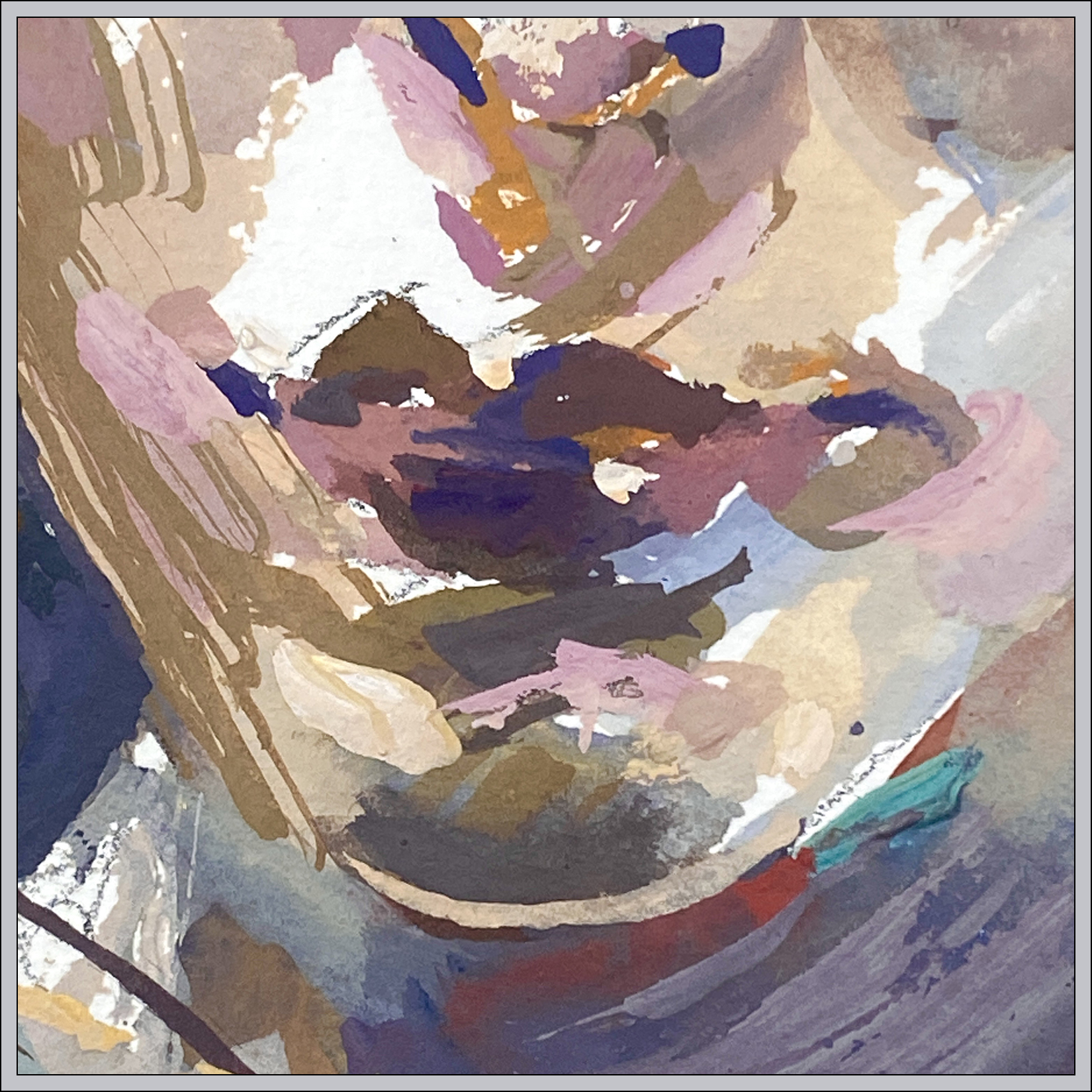
#30×30, 2025, Day 13: Cheat Day!
Every so often you need a Cheat Day.
This is a *significant* cheat! These are not from the 30 day marathon window. We’re not supposed to post older art, otherwise it turns into a portfolio showcase – so don’t do what I’m doing :)
In any case: here’s a couple of sketches from the Pointe-à-Callière Museum’s unfortunately disappointing exhibition on witchcraft.
What can I say about these drawings? It’s not really direct watercolor is it? But I feel like the wash is handled in a direct manner. I know I keep saying that – and I’m not sure why I can’t bring myself to just paint purely directly anymore. I have mentioned before that it’s a kind of performance anxiety. The act of showing your work to the public, as we do in this marathon, often creates a significant mental pressure that it has to be perfect. To the point where some people can’t even do it. Too much anxiety! So I know it’s related to that. (Even though I know nobody will criticize me :) Just my own brain).
I know I could get back to it (pure directness) – especially if I publicly shamed myself about it – and perhaps that is what I’ll do next year. I kind of put myself in weird position this year, going in with the plan of ‘Miniatures to Masterworks’ – that is far far too much focus on results.
Anyway, that’s why; here are some museum sketches :)
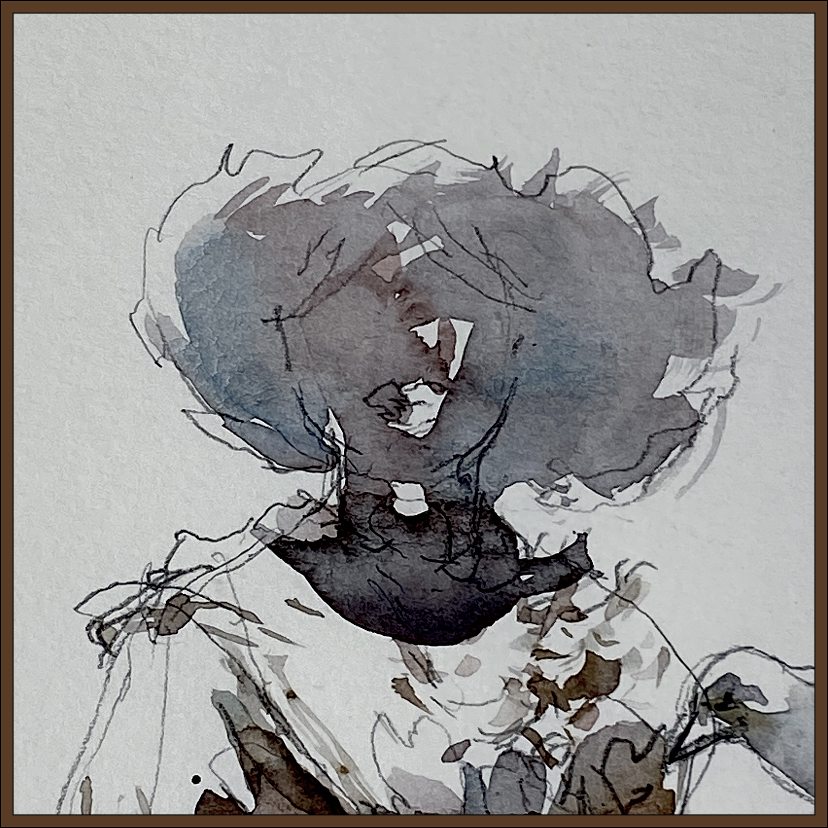

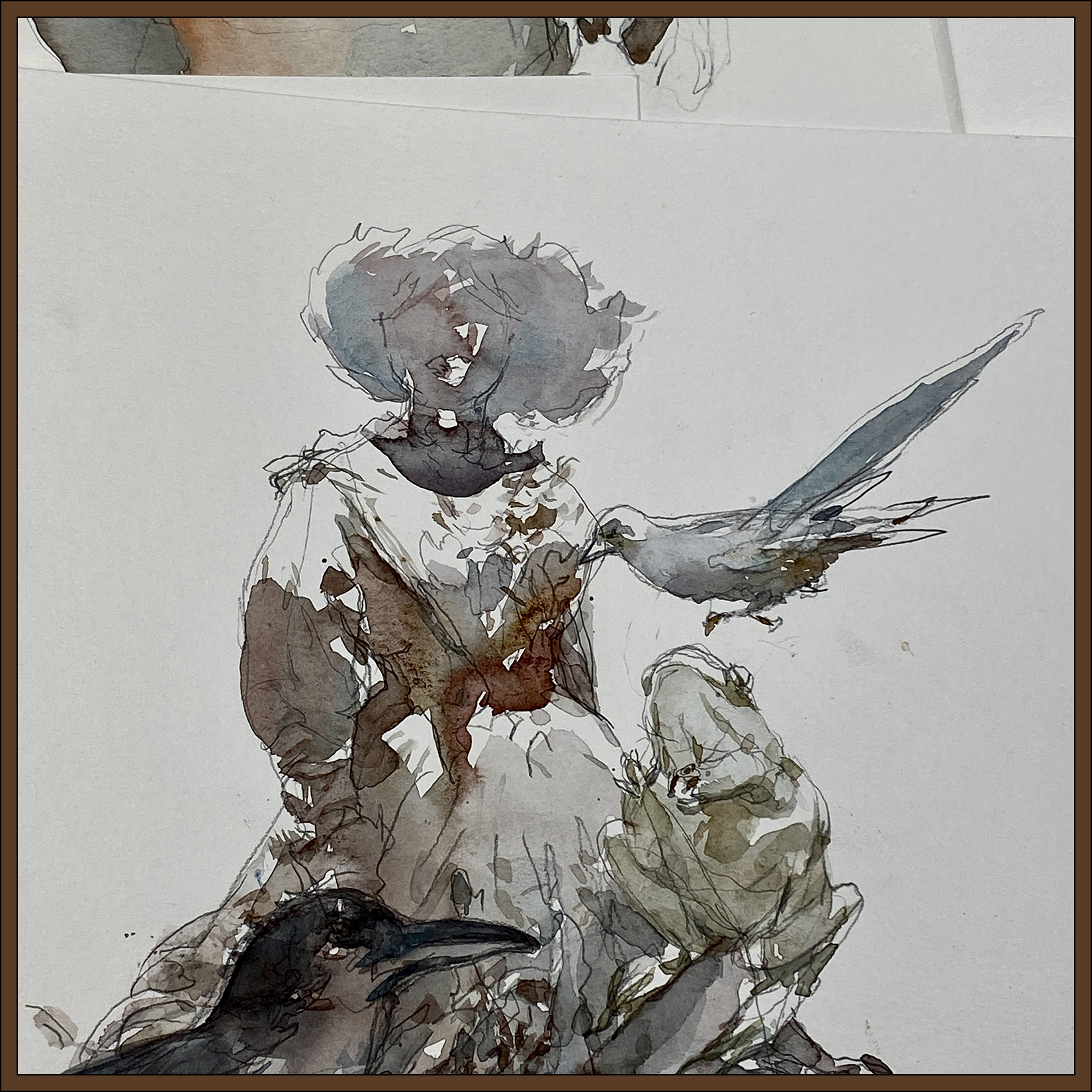
The best thing in the exhibit was a display of movie-costumes from various cinematic witches. They were just dresses on body, forms, so I added the heads. I believe the one with the skirt of twigs is from The Princess Bride. She was a very short person! The other robe is from the Netflix series, The Witcher, worn by Meng’er Zhang playing the character of Milva.
I can’t say there was much else of interest. A few preserved animals, some Halloween-y looking props, and some random pop-culture items and toys. I am very sure they will do better for the upcoming exhibition on Knights Chevalier!
~m
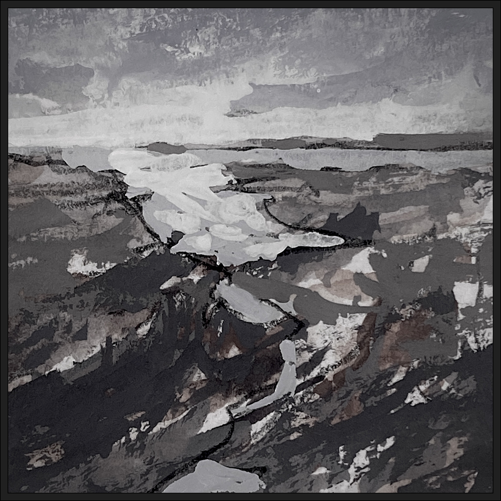
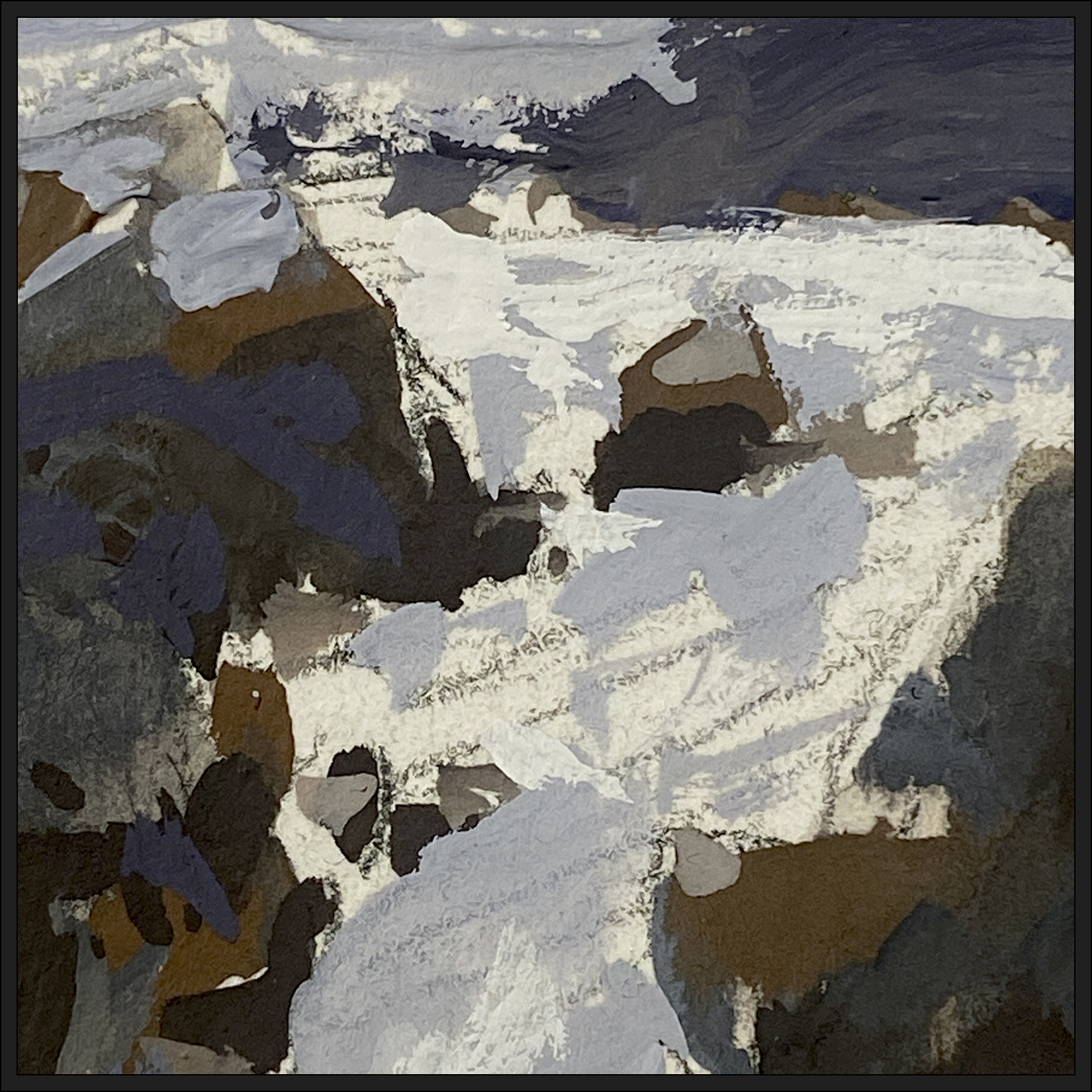
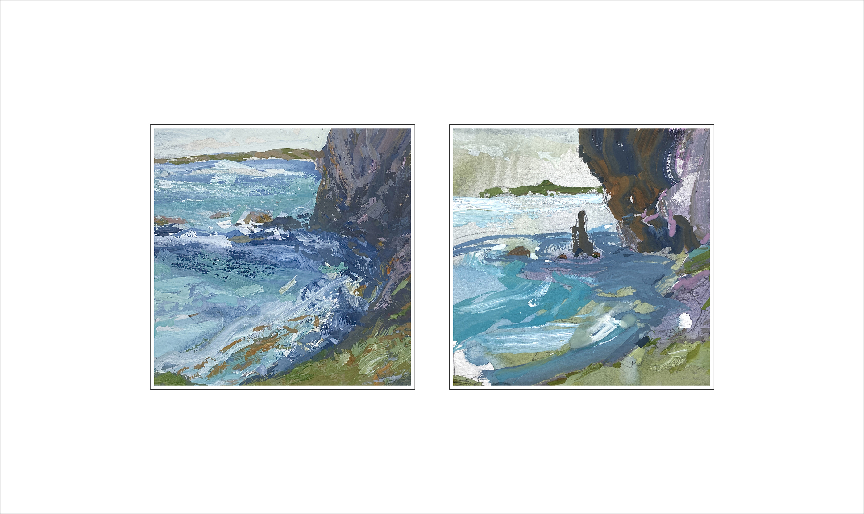
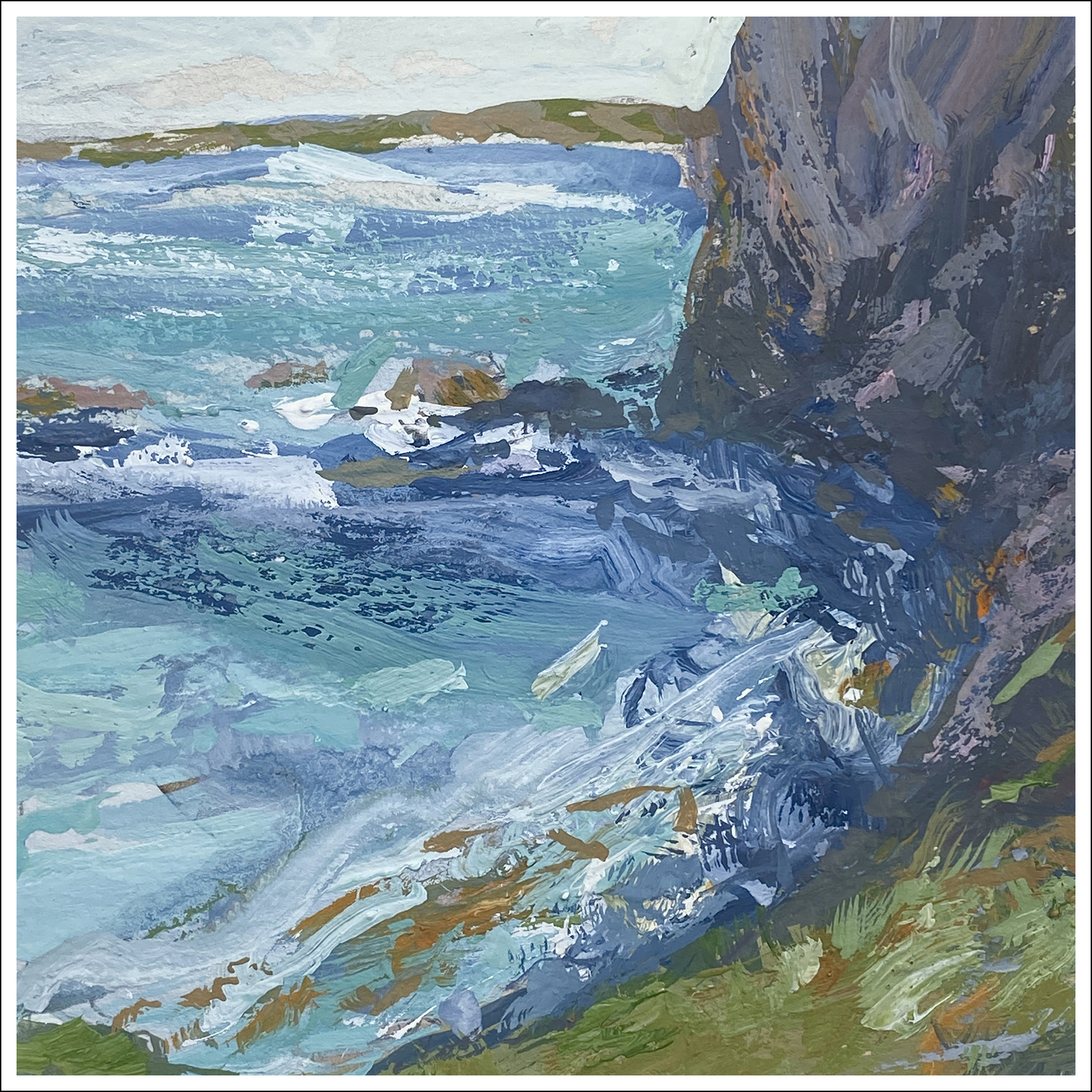
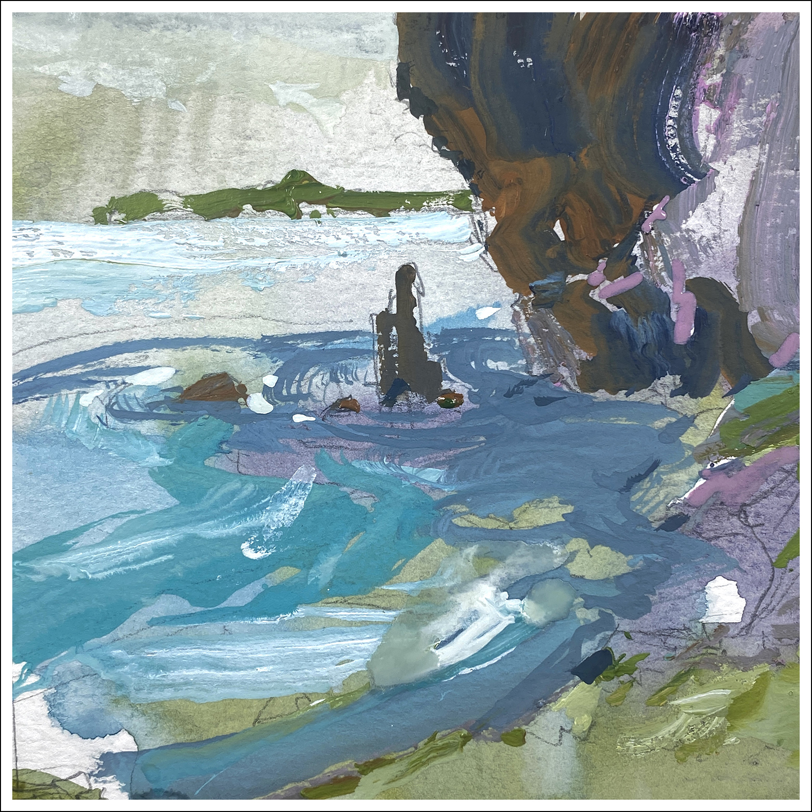
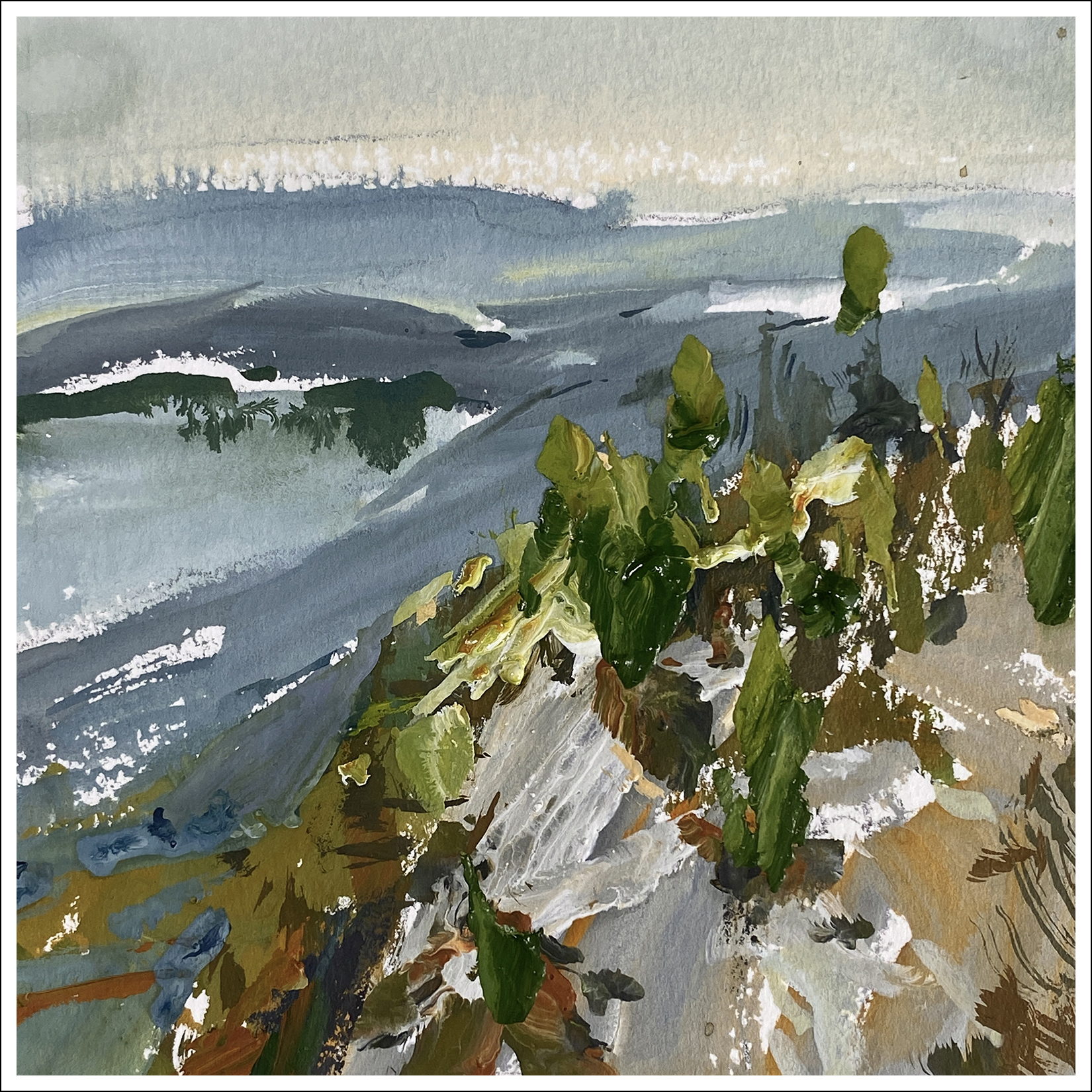
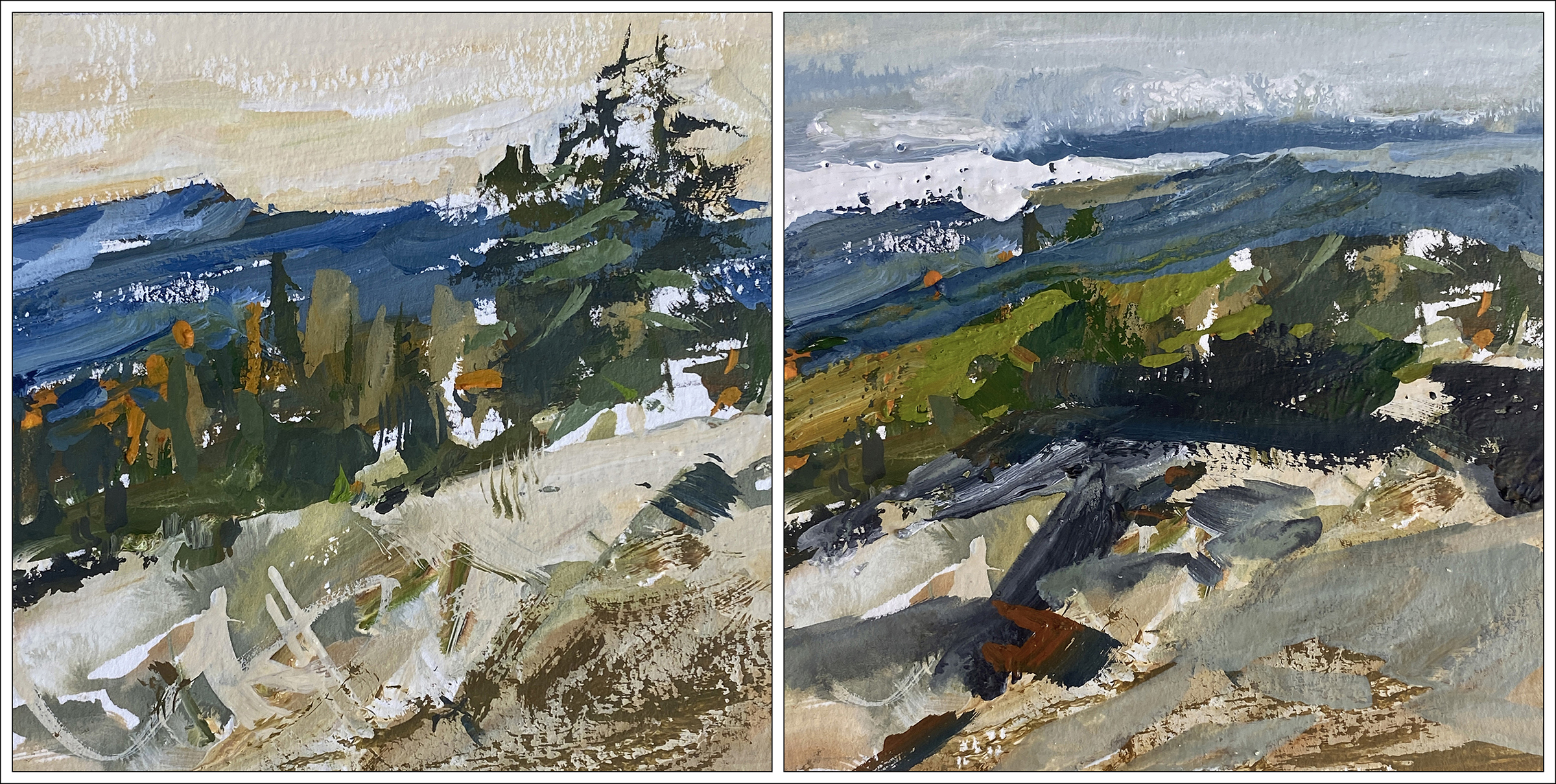
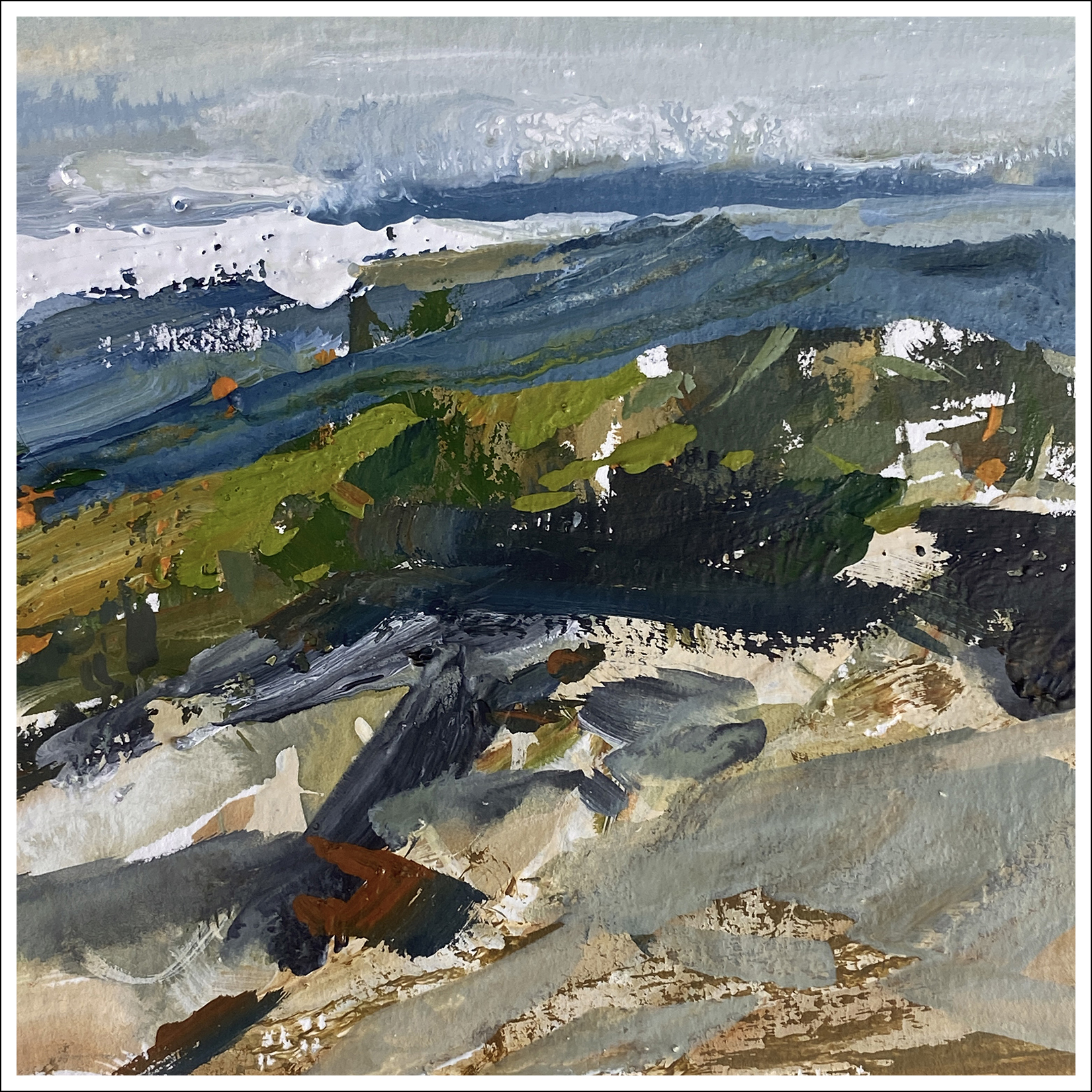
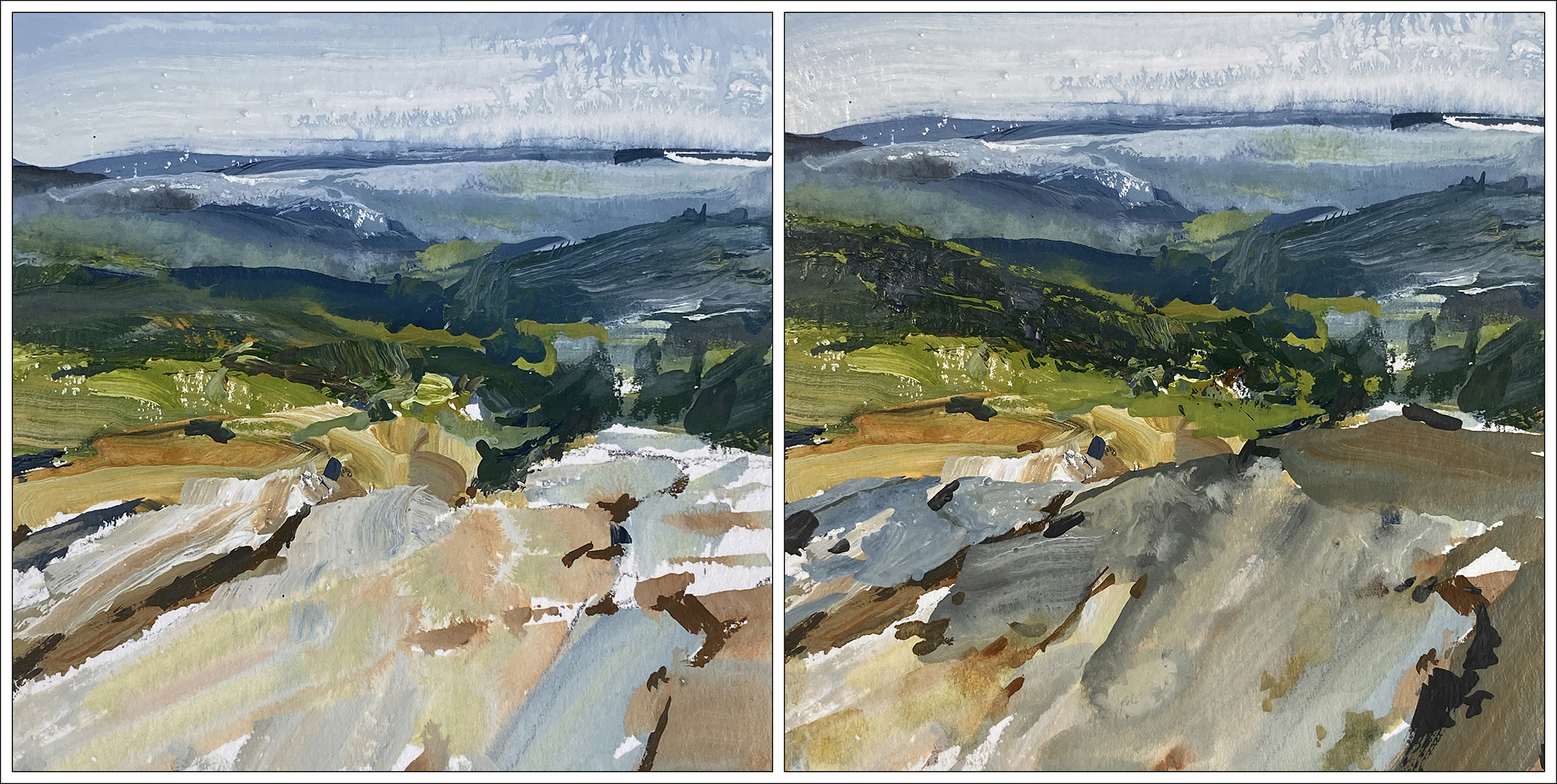
#30×30, 2025, Day 12: Chinese Gate
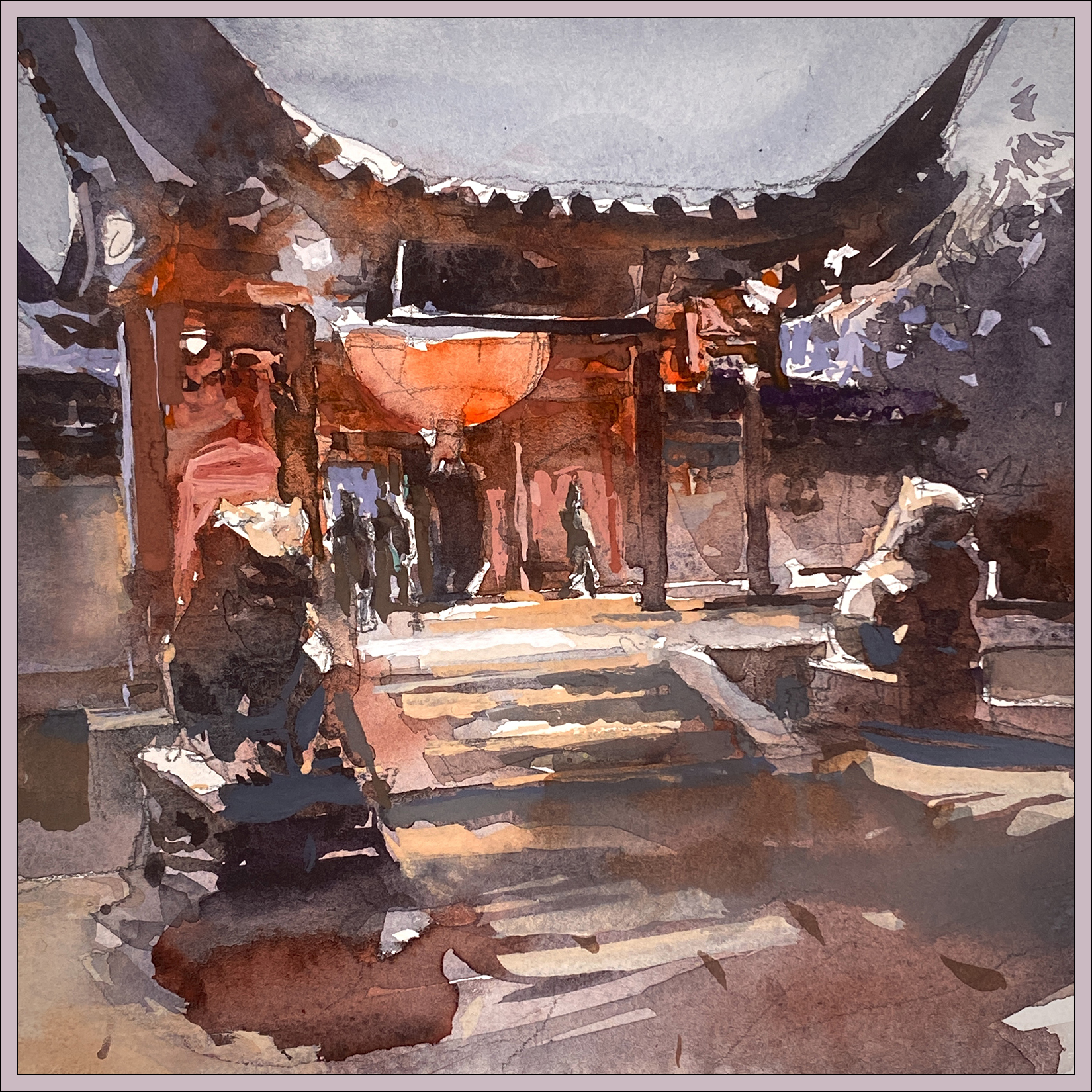
Here’s a speedy 8×8″, of the Chinese pavilion in our Montreal botanical garden, during the festival of lights last October.
My goal was to see if I could do it mostly in watercolor – not holding myself back in any way. You know, not concerning myself about accuracy or detail :) Because this time, I know I can fix any issues that arise with gouache. (Hah! That’s some confidence :) But I think it worked out in the end!

So; here’s the Before/After. The ‘pure’ watercolor on the left, and the gouache ‘retouch’ on the right. You might notice a color-cast in the sky – that’s just some kind of iPhone camera thing – the sky is actually untouched from A to B.
So let’s see; looks like these are all the opaque touches:
- The red light bouncing off the doorway – especially where it backlights the stone lion.
- The orange light on the steps, helping to re-draw that geometry. (Steps are such a pain!)
- The hot-whites in the spotlights under the eaves. I reserved some of them, but had to re-state a few.
- Some corrections on the pillars helping define the structure.
- Cutting around the confusing figures coming though the gate. (Still confusing, but hey).
- Poking a few sky-holes in the tree mass on the far right.
- Tiny but important tweaks to indicate the shape of the lions’ heads. (Ears in particular).
- Some work in the shadow on the ground, that ultimately I wish I’d left alone.

So; what do I want to say about this? I guess it’s this: The ability to make corrections lends a great deal of confidence! < Go figure, right?
I am seeking a kind of bold, ‘effortless’ painting that conveys a scene without too much reliance on detail. I want the work to look ‘direct’; in the moment; impressionist – but also to be abstract.

And of course – I love contrast! Bold color and dark darks. I don’t think I’m a very subtle person :)
So – given those goals, I’m pretty exited about this one! I wish now (of course) that I’d painted it larger.

Side note: Because of the ‘silhouette-y’ nature of this image, I was thinking very consciously of the way the French artist Marc Folly paints shadows. Here’s a video of him at work. It’s in French, but he’s hilarious in any language, (you’ll see what I mean) and you can easily follow what he’s doing.

And here, just for your curiosity, is the cellphone snap. So you can see how bad I am at perspective.
~m
#30×30, 2025, Day 11: How to do 20 Paintings in a Day!
So I did 20 paintings today!
(I don’t know why I didn’t do 30. That would have made more sense considering the name of this marathon :)
That brings my grand total to 58 – and it’s only Day 11 :) Not that anyone’s counting, that would be silly :)
Now – these ‘paintings’ are only 2×2″ square; so some people would say they shouldn’t count.
It would be kind of hilarious to put them in a gallery :) In a giant gold frame! :)
But really – if you blow them up to full screen would you really say they’re not finished? I don’t see why not? They have all the complexity you’d want in a wall painting. There’s nothing fundamentally wrong with the composition. They happen to be a bit dark; a bit contrast-y; but that’s ok – sometimes I like that.
So this is round two in my side-project to make ‘black and white’ Notan, with the intention to pull from these later on to create wall paintings. The challenge to future me is redoing these, presumably improving them, but not losing what I like about the composition.
I have no evidence this will work :) but I like to dream big :)


~m
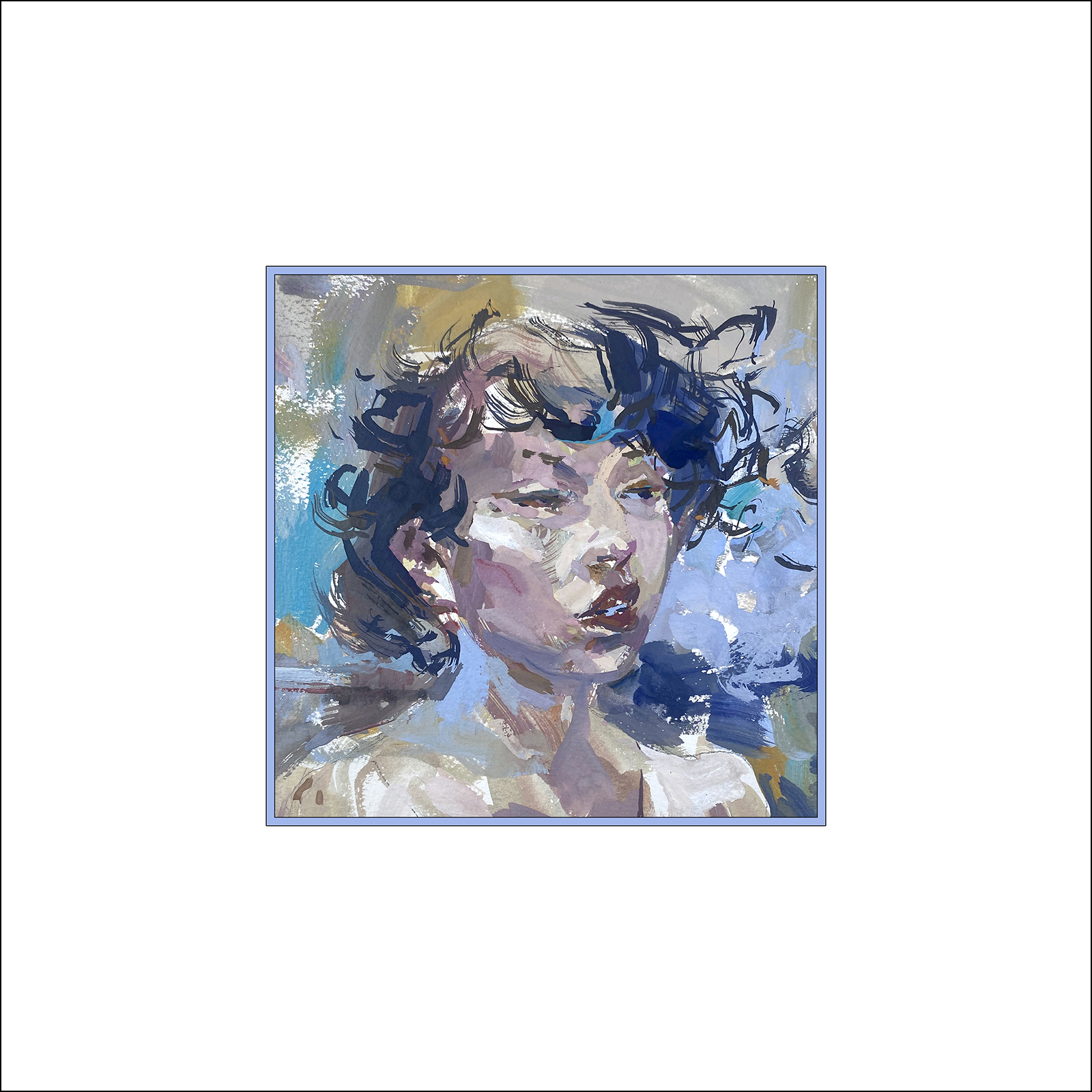
#30×30, 2025, Day 10: A Head of the Game!
I just want to say; that’s 38 paintings today! :) So I’m well ahead of the game. :) :)
Now, most of them are only 4 or 5 inches, though this one is 10×10″. Sooooooo – I can’t *really* say that’s totally playing fair. But why not! Working super-small is certainly a strategy for working daily.
My goal of course, is to use these miniatures to I can re-recreate the best ones in full-size. Or just use what I’ve learned and apply it to scaling up. Which is something I’ve always had problems with – I’m pretty comfortable small, but I have a hard time scaling up my brushwork to larger work.
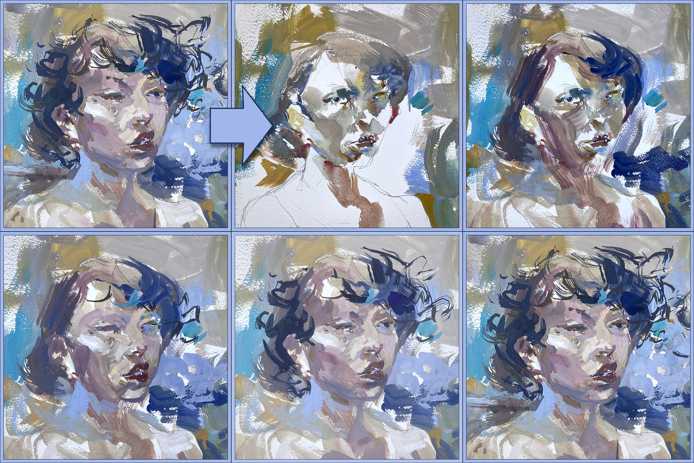
But I’m still mulling all this over; so here’s a little portrait in Gouache; done from a random Instgrammer:)
The beauty of the opaque watercolor; you really and truly can do *anything* in the first layers. It really doesn’t matter. Just keep layering on top and it eventually comes together :)

So this is what – seven or eight days playtesting the gouache?
This one is pretty much identical to how I’d approach it with oil. I didn’t really use any watercolor concepts. SOOOOO – not sure if that’s good or bad.
Possibly; the problem is, this paint-box I’m using.
It’s certainly convenient for plein air – but maybe for studio work, it’s just not enough mixing area? Maybe I should work from fresh-mixed paint every time? In the week or so I’ve had this, the box is drying out. Even though I keep it in a plastic storage box with a wet sponge.
Perhaps I could be more flexible with how wet the mixes are. I have a pile of little Chinese sauce dishes for more saucy mixes, so probably I need to work with those next.
—

This sketch was actually the first one of the night, I’m less happy with it – overworked I think! And the face is a bit crooked.
But there are some nice chunks of color.
~m
Two versions of; ‘Cliff over Tropical Water’.
First version on the left. It’s based on something I saw in a video. There’s a girl in a bikini in the foreground, she’s doing a hair flip, or dives off a boat, I can’t remember. We’ve all seen that video. I’m just here for the views of New Zealand – or wherever this was.
My first try felt overworked to me. Didn’t like the depth planes. Felt the water was too much of the same draggy texture.
Second version on the right – drastically simplified shapes.
Which would work better on the wall?
Maybe try not to think – “Which is the better painting?”
“Better” often means “Has more detail” or “Looks like a photo.”
Me, I prefer the second try. It has cleaner shapes that I can read across the room.
I suppose thinking out loud; I began my artistic life as a sketch artist and illustrator. Everything was about telling a specific story, documenting a time or place with my sketchbook. And; the final goal was the book itself. Seeing the art from arm’s length. The more I think about painting as the final goal, (being seen on the wall), my taste is changing to be more about composition and color; not so much about drawing.
I suppose it’s also a mode you go in and out of. If I’m in sketching-mode in a museum for instance, I draw completely differently. But when I look at my sketchbook drawings, they often seem like comic-book artwork these days? I don’t think of them as finished pieces anymore.
Ok ok! Rambling now!
So that’s Day Nine! So now I have to go get ready for the Video call we’re recording! Take care and keep painting! We’re just grinding up the hill, only 1/3 of the way!
~m
#30×30, 2025, Day 08: Into the Thick of Things
Ok – I’m really starting to like these gouache paints.
These are still miniatures, (still 4×4″) – but they look HUUUGE to me. Like – if they were wall paintings? They’d be amazing!! If only I can pull these off one day at a full size!
Day Eight feels like an important stage in the work – when I feel like I have a few good ones under my belt, so therefore I can take some risks?
Like if I blow it, I can look back at the good ones and defend myself from internal criticism :)
The internal critic is the worst. No matter how many paintings you’ve done, you somehow feel like the next failure will reveal you’re a total fake, and you should just give up :)
At least that’s how it works for me; and that’s why this kind of exercise offers me so much freedom.
These tiny, rapid paintings keep everything feeling low stakes. There’s no risk when you’re just playing around with paints.
I firmly believe this is the only way to be creative. To stay in the sense of play; not in a place you might call ‘performance’. You can’t let it matter if they turn out good or bad!
There is a huge risk around showing your work online, that you might enter ‘performance mode’, where you’re showing off for the audience – and suddenly you care too much what the audience will think.
What do you think about this painting?
If this was a painting in a gallery, on the wall with all the other masterworks, would you choose this one?
I can easily imaging most people saying ‘Ermmm, no thanks?’
Or, maybe not specifically rejecting it, but looking around and seeing something more ‘finished’, something ‘well done’ and maybe they think – ‘I like this realistic one better. It’s so much more detailed. It must have been so difficult to paint. I respect that artist.’ And then two minutes later, ‘Wow, I like this one with a horse in it, I love horses.’
If you listen to these imaginary critiques, you just go crazy. Suddenly you’re painting horses in a field and you’re drawing every blade of grass, and maybe you’re not having any fun anymore :)
—

So: this is kind of a dumb comment “Captain Obvious!” here; but – – you can’t do this in transparent watercolor :)
This is the same painting. Before, on the left, with a stand to trees, then After, on the right – with the pines completely removed.
(I very much prefer the simplification. No trees is preferable to some poorly painted trees!)
Mainly the trees were blocking my sense of a distant horizon. So I just deleted them. And cooled off the sunset colors in the sky, gave it a misty, low cloud kind of feeling, and entirely reworked the foreground to make some diagonal movement leading into the center of the image.
It’s completely transformed!
Honestly, I had to carefully study my in-progress pics to convince myself, yes, this is in fact the same painting before and after. There’s two orange dots on the right side, just above the midline? They were my my proof that these are the same panting.
Only a watercolorist could be so excited about this thing, which is so basic to every other kind of painting :) Imagine that! You can paint *on top!* Hahaha!
One last pitch for miniature studies:
I’m pretty sure I’d never do a revision like this on a wall size painting! I mean maybe? But I’m really not sure. Certainly not without a lot of procrastinating, and agonizing.
If this was a ‘real painting’ I’d have to deal with the fear that I was about to obliterate all my work. That I would only make it worse! That I’d be wasting all that expensive paint! All these thoughts that get in your way when you need to make a major revision.
Tiny and fast = freedom!
—

One more before and after.
It’s subtle – by if you compare the painting left to right, maybe you can see how I’ve created a stronger overlap in the planes?
There’s a more clear set of ‘steps’ in the terrain. The diagonal foreground rocks cast a blue shadow on the orange step below, leading down once more to the grass-green hill, and again to the blue horizon beyond.
Less dramatic example – but still a pretty good argument for having gouache in your painting kit.
Ok – that’s my Day Eight! How about you guys?
Post me some links in the comments! Show me your socials! – Or maybe you are already sharing on Vivify? I hope you guys are getting into the flow. Things are starting to click for me! The magic of daily painting is working!
See you tomorrow :)
~m

So we are going to use Vivify’s new zoom type feature for a video chat Monday June 9, 5pm PST / 8pm EST.
Just visit the MEETINGS tab on our Vivify pod by clicking here: https://www.vivify.ai/pods/30x30directwatercolor-2025?tab=meetings
There’s a big orange Start Meeting button :)
Uma and I will just chat about how our marathon is going so far, and then open it up to the audience for Q&A.
If you’ve been trying out Uma’s new Vivify platform, please stop by – or if not, you can register with your Gmail in one click and join in!
~Marc
Well – what is this? Six tries at the gouache? Plus a couple days doodling in the park? Whatever I said now would be premature judgment :)
Is it better? Should you switch from watercolor?
Well absolutely not if you like the flow of watercolor!
Watercolor if full of natural effects that cannot be reproduced or replaced; floating color mixes on the page, there are back-flowing blooms, subtle granulation of sedimentary pigment, and of course it’s famously soft gradations.
With gouache; well of course the ability to paint light over dark is the most obvious. But it also changes color mixing completely for me.
I ‘ve been making my gouache from scratch, but even if you were using tubes – I’d be mixing colors with the palette knife on a palette, not on the page. No guessing about the right amount of dilution, or how the washes will lay over each other. You have your piles of paint, and you move them around, cross mix between colors, neutralizing, warming or cooling, greying – you can do whatever you want! You get to have a perfectly customized palette before you even begin.
I’d say; in watercolor you paint with the colors you brought. In gouache, you can mix a new paint box for every scene.
And then there is Contrast. Because the gouache is opaque, the darks are significantly darker. Even if you use black-ish watercolors (Perlyne Green, Indigo, Neutral tint), a watercolor is never as contrasty as one might like.
Even though the gouache will change when it dries (dark colors lighten, and light colors darken – leading to an overall shrinking in gamut). Of course it does contrast up again if you varnish it. I’m using Pebeo Gouache Varnish – but I wont stick with it after this first can runs out, its too shiny for my taste. I’ll probably try the Krylon Matte next – or possibly Cold Wax! (which is matte as well). Some people burnish their painting with wax, just like a car :) Though I do worry about disturbing impasto areas.
So: My thoughts right now?
For high contrast? Bold brushwork? For pre-mixing your color? For broken color (like the impressionists)? For loading brushes with more than one color? Yes, I think gouache it’s worth a try!
But does this count as Direct Watercolor? (Dang it Marc! Why can’t you stick to the topic?!)
I’m not sure yet :) What do you think?
It is absolutely Alla Prima painting – but it’s not watercolor; because you’re not dancing in partnership with the water. You’re making brushstrokes and they stay where you put them. Gouache is more of a directed experience, much less of a cooperation with the medium. You might not guess it from these sketches; but gouache could be great for control freaks :)
Anyway! Lets keep going and see what I learn.
The end goal is to get the best of both worlds. I want to get to the point where I’m combining wet-in-wet and dry brushing on top, and figuring out how to make it all work together.
It’s only Day Seven :) Let see what happens!
~m

